Key Takeaways
- Despite being a multibillion-dollar industry, telco struggles with basic UX
- Participants in large-scale telco testing abandoned when core plan details, pricing, and network coverage were unclear or unavailable
- Telco sites have a major opportunity to improve UX and make the process of switching to a new mobile provider easier and more intuitive
Key Stats
- 85% of all participants abandoned at least one site during their test session
- 100% of telco test sites experienced at least one abandonment during testing
- 1,800 medium-to-severe usability issues were observed during telco testing
At Baymard our research team has spent 3,500+ hours on new large-scale qualitative usability testing and researching “Telco” website features, layouts, content, and designs.
This study included 16 sites focused on US and UK telco providers, including both large mobile networks and MVNO (Mobile Virtual Network Operator) carriers.
The 16 test sites included the following:
- US carriers: T-Mobile, US Cellular, AT&T, Verizon, Optimum, Visible, Mint Mobile, TracFone
- UK carriers: EE, Vodafone UK, Three (3), O2, Sky, GiffGaff, iD Mobile, Tesco Mobile
This research is based on more than 290 qualitative participant/site usability test sessions on desktop and mobile following the “Think Aloud” protocol (1:1 remote moderated testing).
During testing, the participants encountered 1,800+ medium-to-severe usability issues.
These issues have subsequently been analyzed and distilled into the 500+ UX guidelines found within our Telco Deep-Dive UX research study (which are available as part of our Baymard research findings).
The 500+ guidelines cover aspects of the telco mobile plan-finding experience, at both a high level of general user behavior as well as at a more granular level of specific issues users are likely to encounter.
In fact, a staggering 85% of participants abandoned at least one site during their test session, demonstrating just how frustrating a process it can be to switch to a new telco provider.
In this article, we’ll introduce 3 high-level UX best practices for telco sites:
- Always provide comprehensive plan details
- Always convey clear pricing and promotions
- Always provide easy access to the coverage map
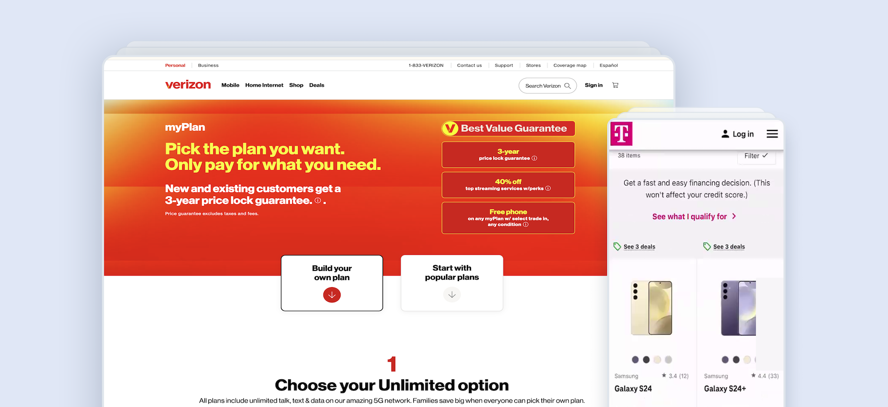
Always Provide Comprehensive Plan Details
“No, nothing ever makes sense…, when I look at providers, it’s always like witchcraft. I never know what the hell is going on. It’s so confusing. You look at the numbers. They never — like, I’m a math person. I’m used to, like, two plus two equals four. And it just doesn’t work that way with cell phone providers.”
When considering a new mobile provider, the most important factor for most users is the strength of their core product offering — that is, mobile service plans that offer their desired combination of data allowance, contract length, benefits, and price.
However, in our telco testing we observed that participants often struggled to review and understand these key plan features.
“I think the thing that I don’t like is the confusion over, is this a one year contract that I’m signing up for? Because I’m not sure. It’s just got how much it costs per month, but do I need to sign up for 12 months? That would put me off, not knowing what period of time I need to sign up for…To be honest, I’d just go to another site if this was me shopping for something.” The lack of clarity around plan contract length at Sky’s mobile site (iOS) led this participant to abandon the site.
![”I couldn’t tell [if international coverage is available] right away, I’ll be honest. So just by looking at it, I thought the answer would be no. If they’re specifically saying ‘Mexico and Canada’ — to me, if they’re not mentioning the international [coverage] right away on here on this checklist, then I just imagine they’re not offering it.” Browsing plans at US Cellular (iOS), this participant falsely assumed that the available plans did not include any service abroad because it was not listed or linked to as a plan feature.](https://baymard-assets-cdn.imgix.net/research/media_files/attachments/164566/original/research-media-file-d7e412e609cd3a9fce6a7e1e26efdd4c.png?auto=format&dpr=2&fit=max&q=50&w=880)
”I couldn’t tell [if international coverage is available] right away, I’ll be honest. So just by looking at it, I thought the answer would be no. If they’re specifically saying ‘Mexico and Canada’ — to me, if they’re not mentioning the international [coverage] right away on here on this checklist, then I just imagine they’re not offering it.” Browsing plans at US Cellular (iOS), this participant falsely assumed that the available plans did not include any service abroad because it was not listed or linked to as a plan feature.
![”I don’t see — let me just look in here. Yeah, doesn’t look like there’s anything. I don’t see anything about a hotspot, and those [details] are usually on the pages. So that would probably put me at a ‘no’ on this one.” This participant wanted to verify whether hotspot data was included with her selected plan. Unable to find this information, she eventually abandoned the site.](https://baymard-assets-cdn.imgix.net/research/media_files/attachments/164583/original/research-media-file-9bcf7b750eb6c9a12ad2229497a97b2d.png?auto=format&dpr=2&fit=max&q=50&w=880)
”I don’t see — let me just look in here. Yeah, doesn’t look like there’s anything. I don’t see anything about a hotspot, and those [details] are usually on the pages. So that would probably put me at a ‘no’ on this one.” This participant wanted to verify whether hotspot data was included with her selected plan. Unable to find this information, she eventually abandoned the site.
On some test sites critical plan information was missing altogether, making it impossible to verify key details without leaving the plan-selection process (see guidelines #2955 and #3027).
In fact, those who were unable to easily access this additional key plan information on the plan list were more likely to abandon.
For example, 20% of participants abandoned suitable plans on sites where the contract length was not obvious.
What’s more, navigating away from the plan summary to confirm key plan details not only demands additional time and effort but risks users never returning to complete their plan selection.
![”Oh, this one has the ‘Easy Unlock and Go Back Guarantee’, which is like — what is that? I don’t know [laughing]. Like, what does that mean?…Why did they even put that in there without an information thing next to it?” This participant at T-Mobile (iOS) was surprised to see no additional information provided for the advertised “Easy Unlock and Go Back Guarantee”. Without enough information to understand every listed feature, unclear ones are no longer selling points, instead increasing uncertainty.](https://baymard-assets-cdn.imgix.net/research/media_files/attachments/164584/original/research-media-file-2ce3bbef9ab82aed9c7fce49d7560666.png?auto=format&dpr=2&fit=max&q=50&w=880)
”Oh, this one has the ‘Easy Unlock and Go Back Guarantee’, which is like — what is that? I don’t know [laughing]. Like, what does that mean?…Why did they even put that in there without an information thing next to it?” This participant at T-Mobile (iOS) was surprised to see no additional information provided for the advertised “Easy Unlock and Go Back Guarantee”. Without enough information to understand every listed feature, unclear ones are no longer selling points, instead increasing uncertainty.
”Let’s just expand both of those out.” At Vodafone, plan details were hidden behind collapsed accordion mechanisms by default, as shown in the left-most plan. As a result, this participant had to click multiple times to expand each plan individually to see the key differences between them.
Meanwhile, other important plan details were hidden or unclear across many telco test sites, significantly slowing progress and causing some participants to overlook them (see guidelines #2850 and #2970).
Without comprehensive details and clear explanation, critical plan info risks being misinterpreted or entirely missed.
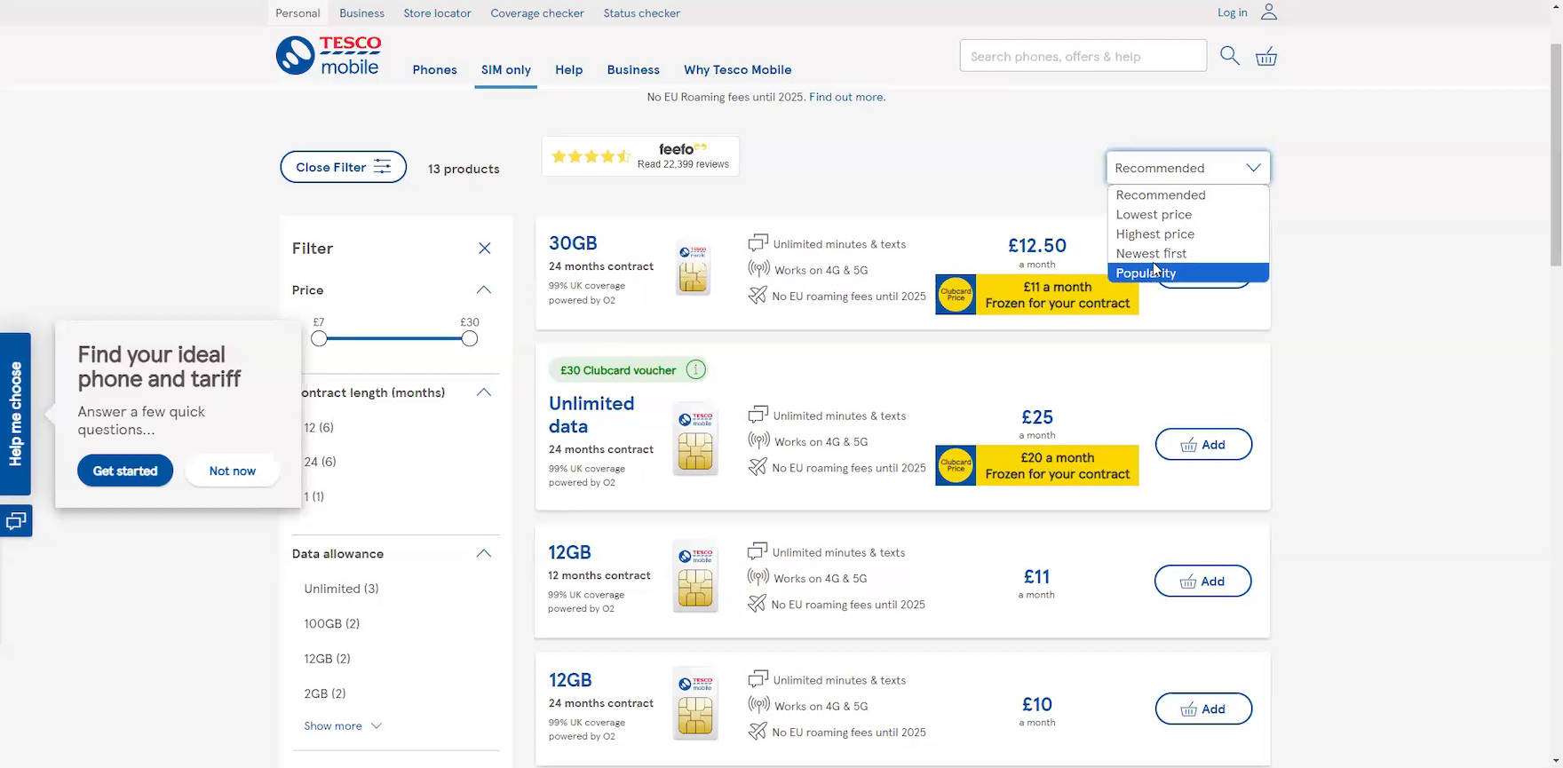
”I was hoping I could sort them by gigabytes, but I can’t.” This participant shopping for mobile plans on Tesco Mobile wanted to focus on affordable plans with a minimal data amount and was surprised to find he could not sort the listing by data allowance. When users’ preferred sort types are unavailable, they must fall back on suboptimal options to target the plans they were attempting to find.
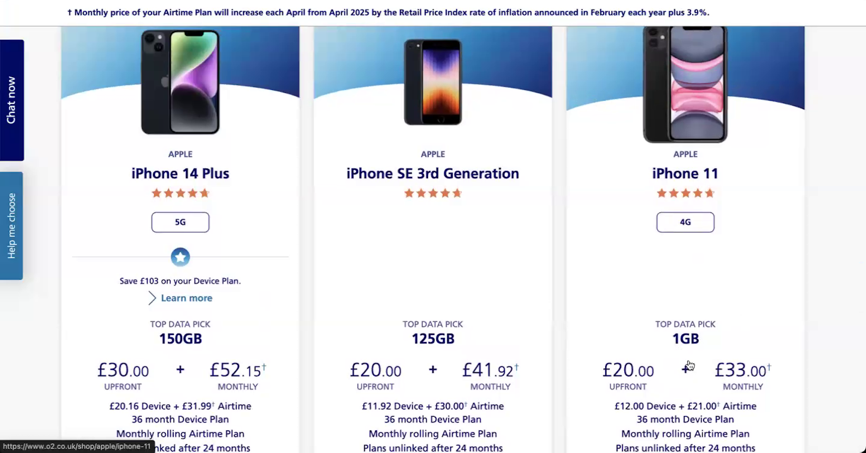
Additionally, the number of available plans — and the way they were presented — sometimes hindered participants’ ability to easily find a suitable option.
For plans presented as a vertical list, sort and filter options proved vital to helping participants manage what could be an overwhelming array (see guidelines #2837 and #2834).
”It feels like it also has the one plan here. So I guess this is — does it have other ones? Oh, okay, you can scroll. All right, I didn’t realize that.” This participant at AT&T’s mobile site (iOS) at first assumed the site only offered one data plan option, as the cue of further options off-screen was too subtle (first image). Only after scrolling up and down the page, ready to leave the site, did she realize she could swipe to reveal additional plans (second image).
Meanwhile, presenting plans in a horizontal “side-by-side” layout performed well in some instances but not others (see guidelines #2961 and #2964).
When there are too many options with this implementation, participants in testing struggled to easily compare across plans and sometimes overlooked options appearing outside the viewport.
Indeed, 10% of participants on mobile sites without a clear indication of additional plans off-screen overlooked them.
In short, both the quality and presentation of plan information make a difference for users researching mobile plans.
There are 36 guidelines that describe how to present plan details in our Telco Deep-Dive UX study.
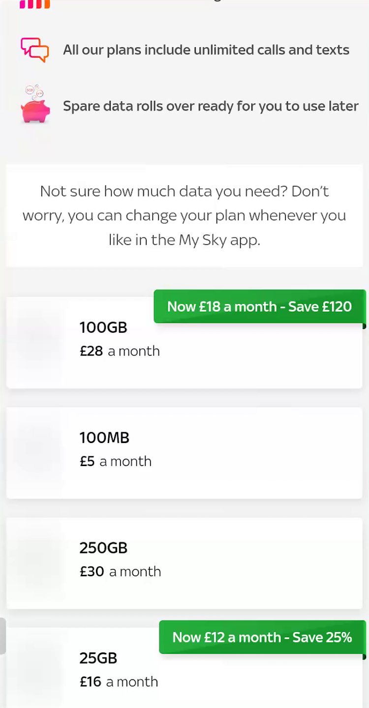
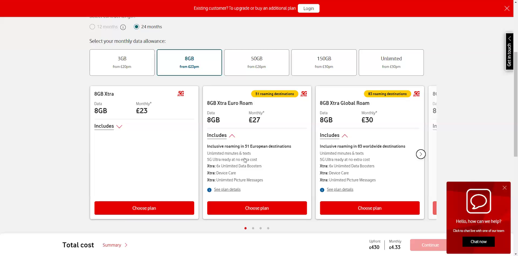
Always Convey Clear Pricing and Promotions
This participant on Vodafone’s mobile site (iOS) scrolled up and down the phone-listing page reviewing not the available devices, but the associated data plans — presented in fine print alongside each phone. She eventually came to the conclusion that the site did not offer her preferred data allowance and subsequently abandoned, never reaching the actual plan-selection phase. Combining phones with plans on the phone-listing page makes it more difficult for users to focus on the primary purpose of this step: Selecting a device.
”Let’s see. Probably looking to like 30 and under range. So this is getting a little bit better, but 1GB is very little. So it looks like these plans don’t work for me.” This participant scrolled through the phone list on O2 with a total monthly amount in mind, but the only displayed bundle that was near that price range had too little data, causing her to abandon the site as not having plans that would suit her. In reality, both the device repayment terms and the data plans (such as contract length and data allowance) were customizable, meaning she might have found an option within her budget had she not dismissed the site based solely on the preselected plans shown.
We also observed multiple issues with how telco sites conveyed pricing information.
When offering phone/plan bundles, participants sometimes struggled to understand the core cost of each component (see guideline #2892).
In testing, 14% of participants on sites with this presentation abandoned because they believed the site did not offer a plan that met their desired specifications for the phone they had selected.
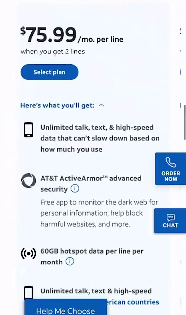
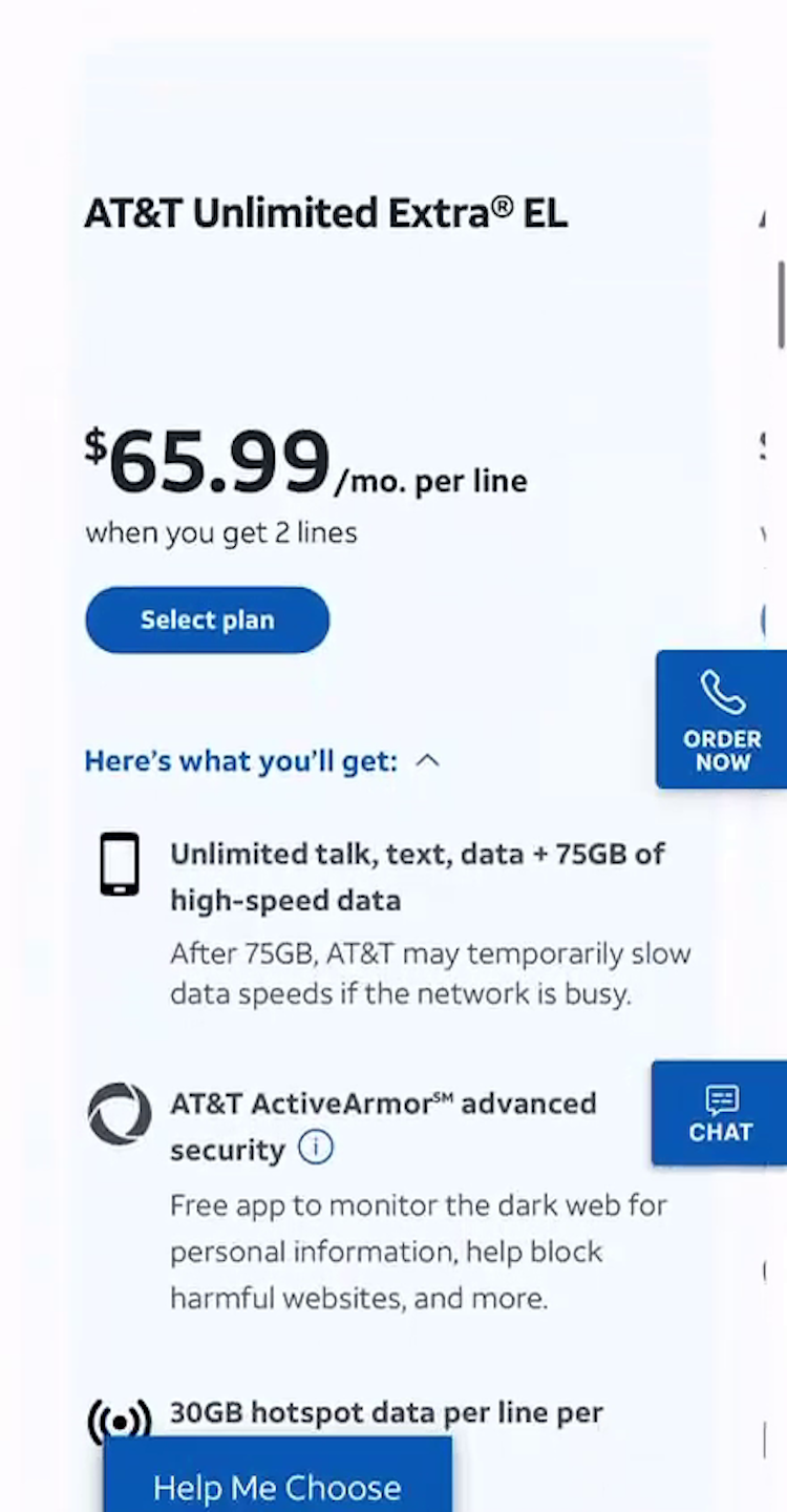
”I don’t know, they don’t have a cheaper plan than this.” This participant at Verizon’s mobile site (Android) swiped through the “popular plans” — the only ones available on the plans list — and immediately dismissed them as too expensive, not realizing they all included optional add-ons that inflated the cost, and that cheaper plans were available.
”Let’s see, why is it so much? ‘Upgrade every year’ — I don’t care about that at all.” This participant at T-Mobile balked at the expensive prices of many plan options, realizing that they often included “perks” and features she did not want. The inability to customize plan features can lead participants to abandon the site over a lack of viable options.
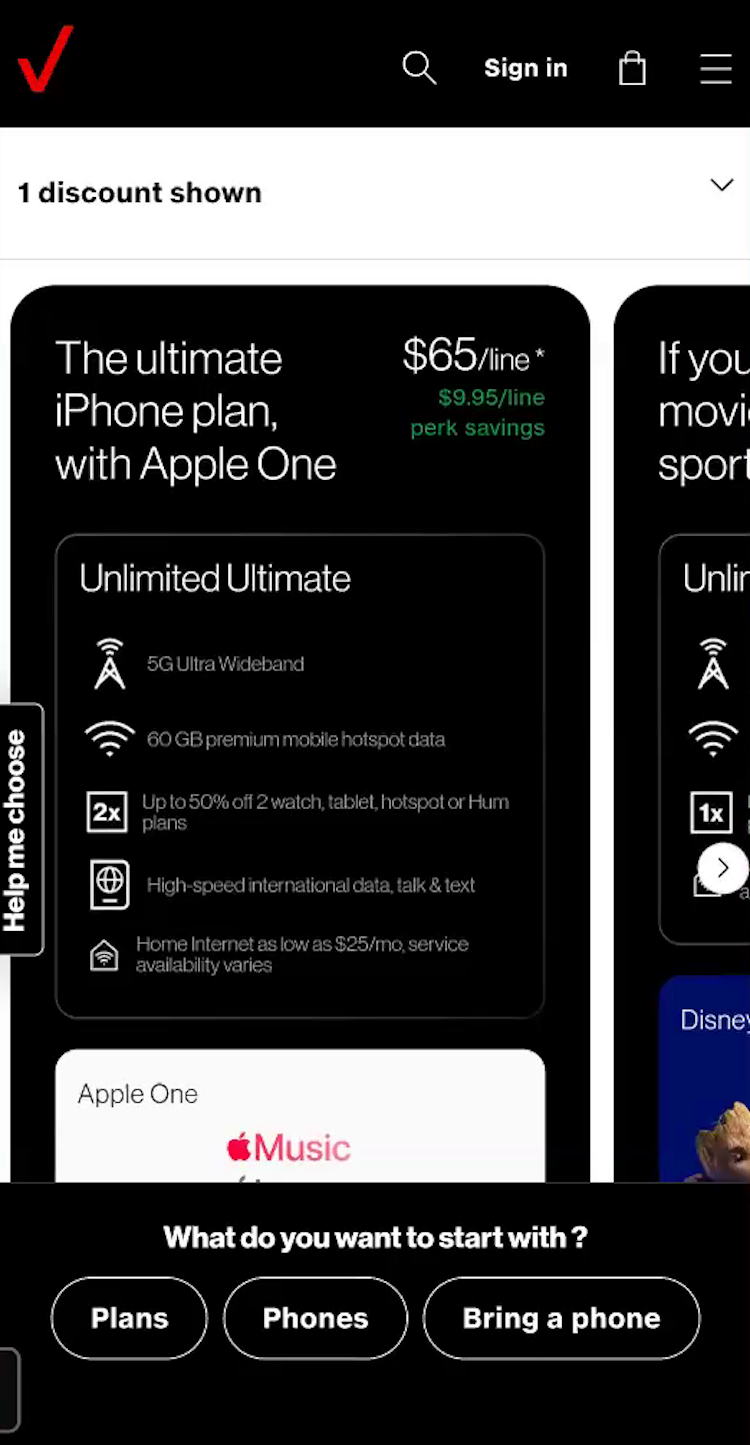
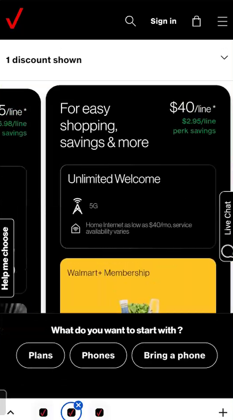
We observed similar issues with telco plans that came prebundled with additional features, such as digital platform subscriptions, insurance, and other undesired features (see guideline #2859).
In testing, participants often abandoned plans that appeared “too expensive” or came bundled with unwanted services.
Data from our large-scale testing shows that most users shopping for telco plans are — not surprisingly — most interested in the telco-specific features available in the different plans.
In fact, only 1% of participants on sites offering optional digital perks opted into them.
When these “perks” appear as essential elements of a plan, some users will misinterpret this as “either select a plan with unwanted extras or find another telco provider”.
As one participant put it, “It’s like I’m getting loads of extra stuff there. I just want a really simple, basic plan…I don’t want all these kinds of bells and whistles”.
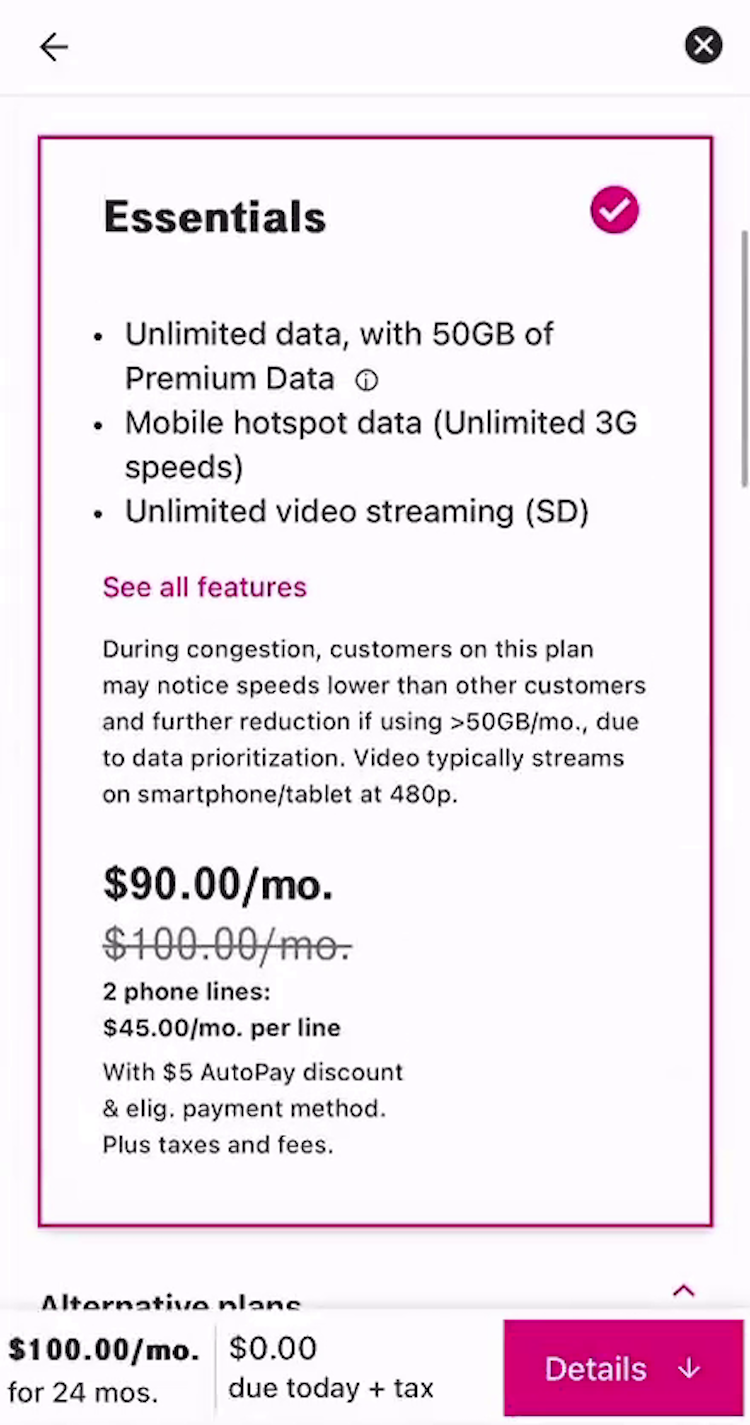
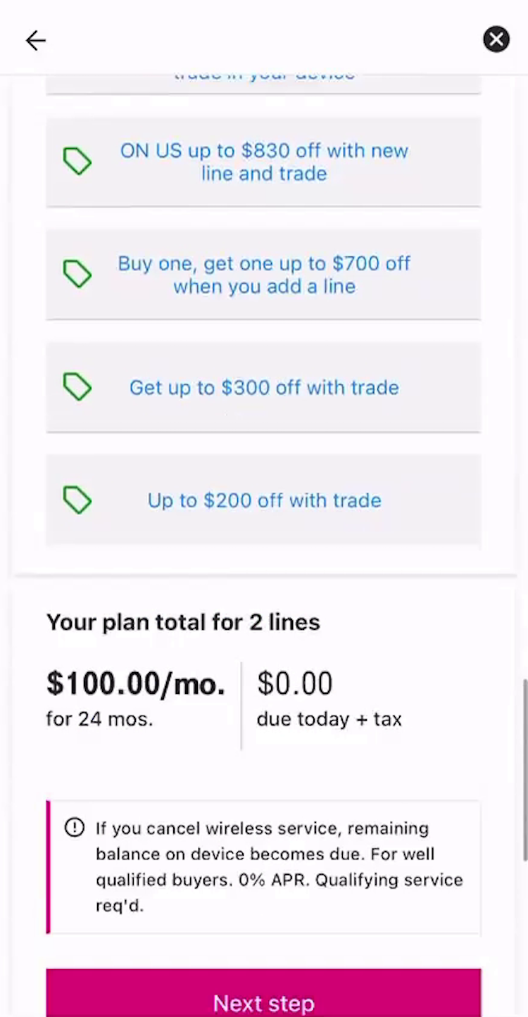
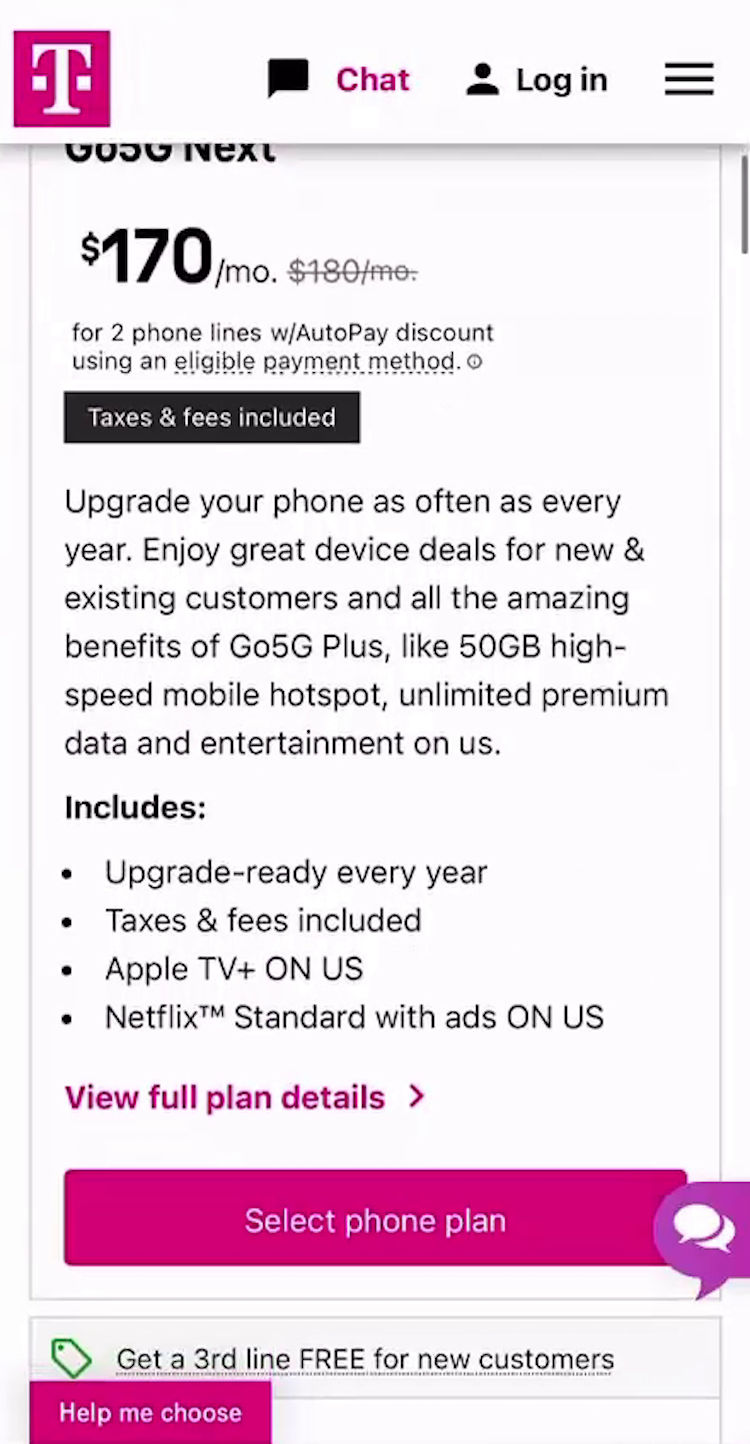
”$100 a month because I bought that phone? No, $100 is [the plan], that’s just $10 extra for something. Who knows what it is? I don’t know. Tax or something?” On the plan list at T-Mobile (iOS), this participant’s preferred plan was labeled as $90/month; however, at the bottom in the running order summary $100 is listed as the cost (first image). Additionally, after selecting it the price reflected an increase of $10 (second image). Confused, she scrolled up and down the page to determine what accounted for the price difference but was ultimately unable to do so. In reality, the difference was a $5 per month, per line autopay discount (2 lines = $10), which was reflected on the plan list but not the order summary.
Participants were also frustrated by what they perceived as inconsistent pricing throughout the plan-selection process, with discounted plan costs being displayed on the homepage or product list but not after plan selection (see guidelines #3030 and #732).
Together, the lack of pricing transparency risks users losing confidence in telco providers and abandoning the site.
There are 12 guidelines in our Telco Deep-Dive UX study on plan and phone pricing.
Always Provide Easy Access to the Coverage Map
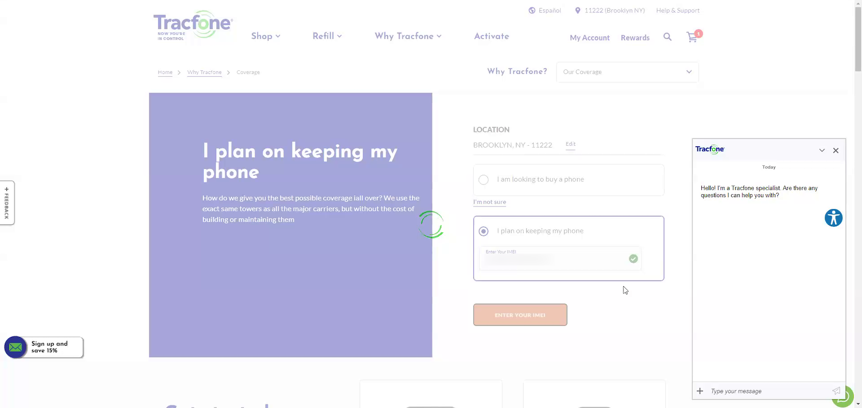
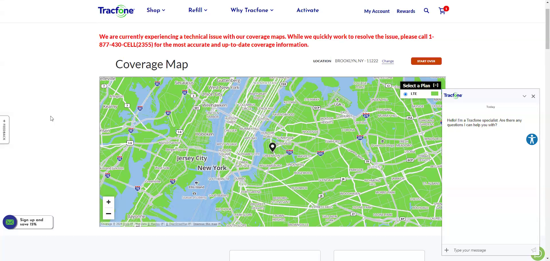
”Unfortunately, technical issues. Um, that’s a little frustrating, and at this point, I probably wouldn’t call the number. I’d probably just go look somewhere else.” After a very long loading delay (first image), the resulting coverage map at Tracfone loaded with an error message warning of technical issues (second image). Discouraged, this participant decided to abandon the site, no longer trusting that she could find the information she needed.
”I mean, that clearly doesn’t work either. I don’t know what that’s supposed to be. It’s supposed to be a map or something.” At iD Mobile, this participant was unable to verify coverage in his area when the coverage map failed to load. Technical issues with the coverage map can compound with other site performance or UX issues to create an overall negative experience.
During telco testing, over half of participants visited the coverage map at least once to verify local service availability, making this page an important step of the information-gathering process.
However, participants often found this vital feature plagued with tech issues, rendering it completely unusable and risking loss of trust in the brand (see guideline #2913).
In fact, 13% of participants who used the coverage map in testing experienced technical issues — double the rate observed across Baymard’s other large-scale industry studies.
Because the coverage map is of critical importance for many users who need to verify network coverage in their local area, the risk of abandonment due to technical issues is much higher, especially when compounded with other issues experienced across their site experience.
Furthermore, some users may associate the reliability of the site with the reliability of the service, further undermining confidence and increasing the risk of abandonment.
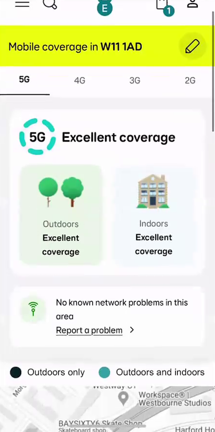
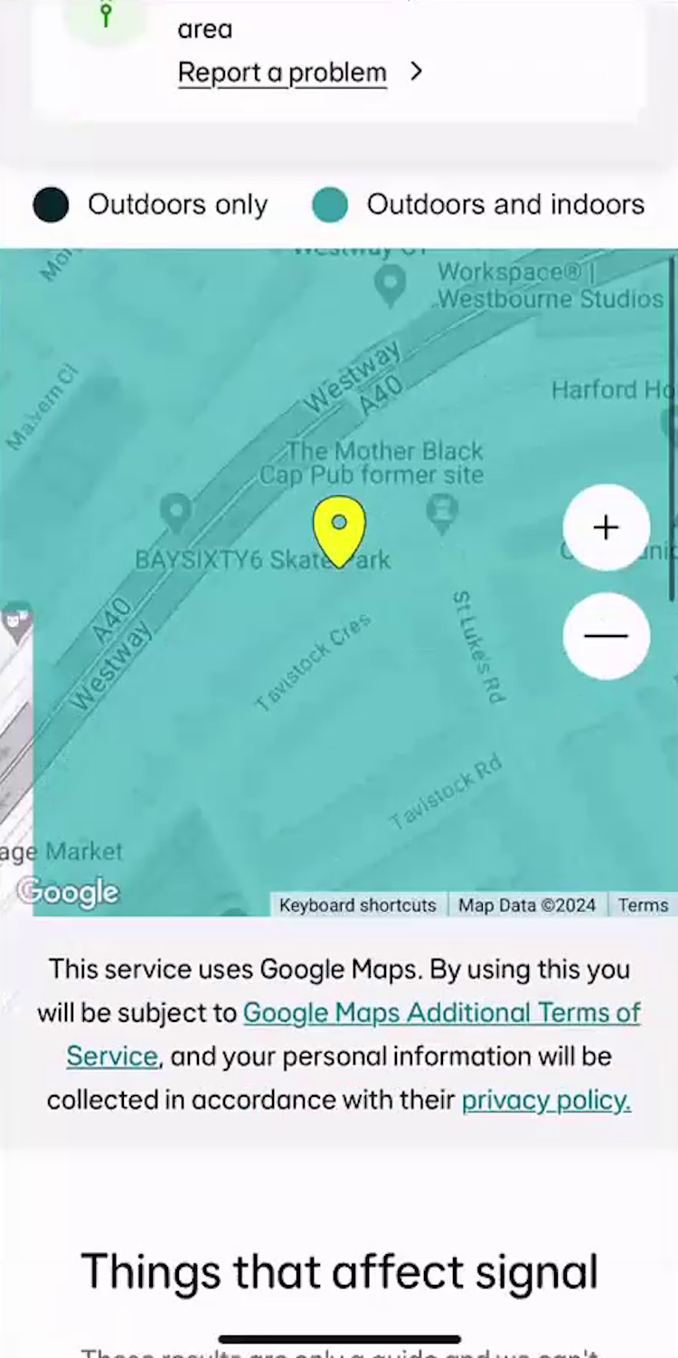
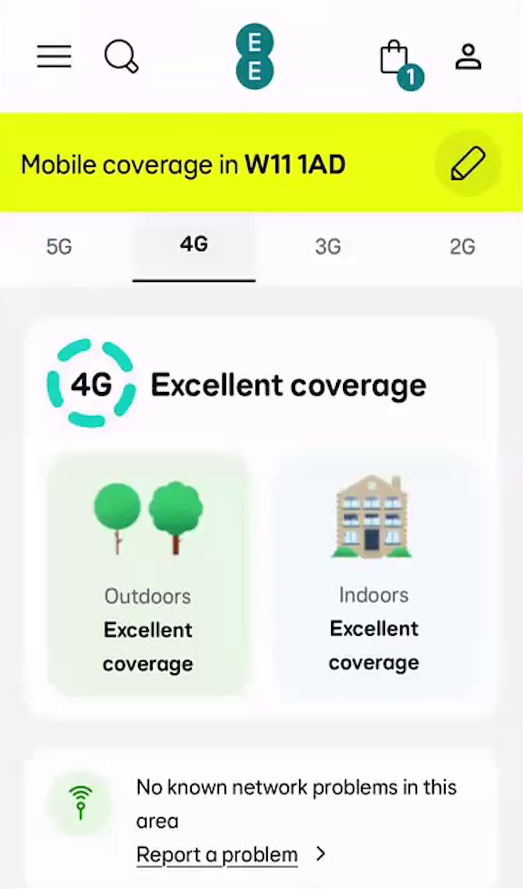
This participant at EE had to toggle between different levels of coverage to gain a complete understanding of service in their area, selecting a coverage level (first image), scrolling to view and interact with the map (second image), and scrolling up again to repeat (third image).
Even when it was available, participants often found the information difficult to use and interpret, especially when coverage was presented across multiple tabbed maps (see guidelines #2931 and #2919).
In fact, 56% of test participants who used the coverage map on sites displaying multiple tabs had difficulty interpreting coverage, leading them to hesitate over or abandon the provider as a viable option.
We have 6 new guidelines in our Telco Deep-Dive UX study on how to display the coverage map and what level of detail to include.
Telco Users Need Clarity and Access to Key Information but Are Not Getting It
![”It’s just got three plans for me, so they’re all basically unlimited…so the same plan, they just cost a different amount [because of] how long they’re for? Now I’m confused.” This participant at iD Mobile overlooked the varying data allowances among the featured plans, misinterpreting the “unlimited texts and minutes” as the data allowance for all plans. After a long moment of confusion, he realized that the plans varied not only in contract length, but also amount of included data: “So, they’re all unlimited, ‘unlimited texts’ — oh, there’s more data. Sorry, I didn’t spot about the data”.](https://baymard-assets-cdn.imgix.net/research/media_files/attachments/164639/original/research-media-file-7d012951ef0699ea5dbc1bc0624de44d.png?auto=format&dpr=2&fit=max&q=50&w=880)
”It’s just got three plans for me, so they’re all basically unlimited…so the same plan, they just cost a different amount [because of] how long they’re for? Now I’m confused.” This participant at iD Mobile overlooked the varying data allowances among the featured plans, misinterpreting the “unlimited texts and minutes” as the data allowance for all plans. After a long moment of confusion, he realized that the plans varied not only in contract length, but also amount of included data: “So, they’re all unlimited, ‘unlimited texts’ — oh, there’s more data. Sorry, I didn’t spot about the data”.
Telco is a multibillion-dollar industry, but our large-scale UX testing suggests that users still struggle to confidently complete even the most basic and vital of relevant tasks, including selecting a satisfactory mobile plan and verifying network map coverage.
These issues are underscored by our observation that a staggering 85% of participants abandoned at least one site during their test session.
It’s worth emphasizing that this abandonment rate, and the overall UX issues experienced by our telco participants, is unique in Baymard’s UX testing.
Indeed, while we always uncover many severe UX issues whenever we test a major industry (e.g., Apparel and Accessories sites, Groceries sites, etc.), our telco testing produced the most severe UX issues and abandonments of all the industries we’ve tested.
As such, even modest improvements to the UX of sites will give telco providers a major opportunity to win out against competitors by making plan and pricing information transparent, comprehensive, and easy to access.
See Baymard’s new Telco Deep-Dive UX research study for complete findings on how to best optimize telco sites for users.
Getting access: all 500+ Telco UX guidelines are available today within Baymard. (If you already have access through an account, open the Telco Deep-Dive UX study).
If you want to know how your telco desktop and mobile site performs and compares, then learn more about getting Baymard to conduct a Telco UX audit of your site.