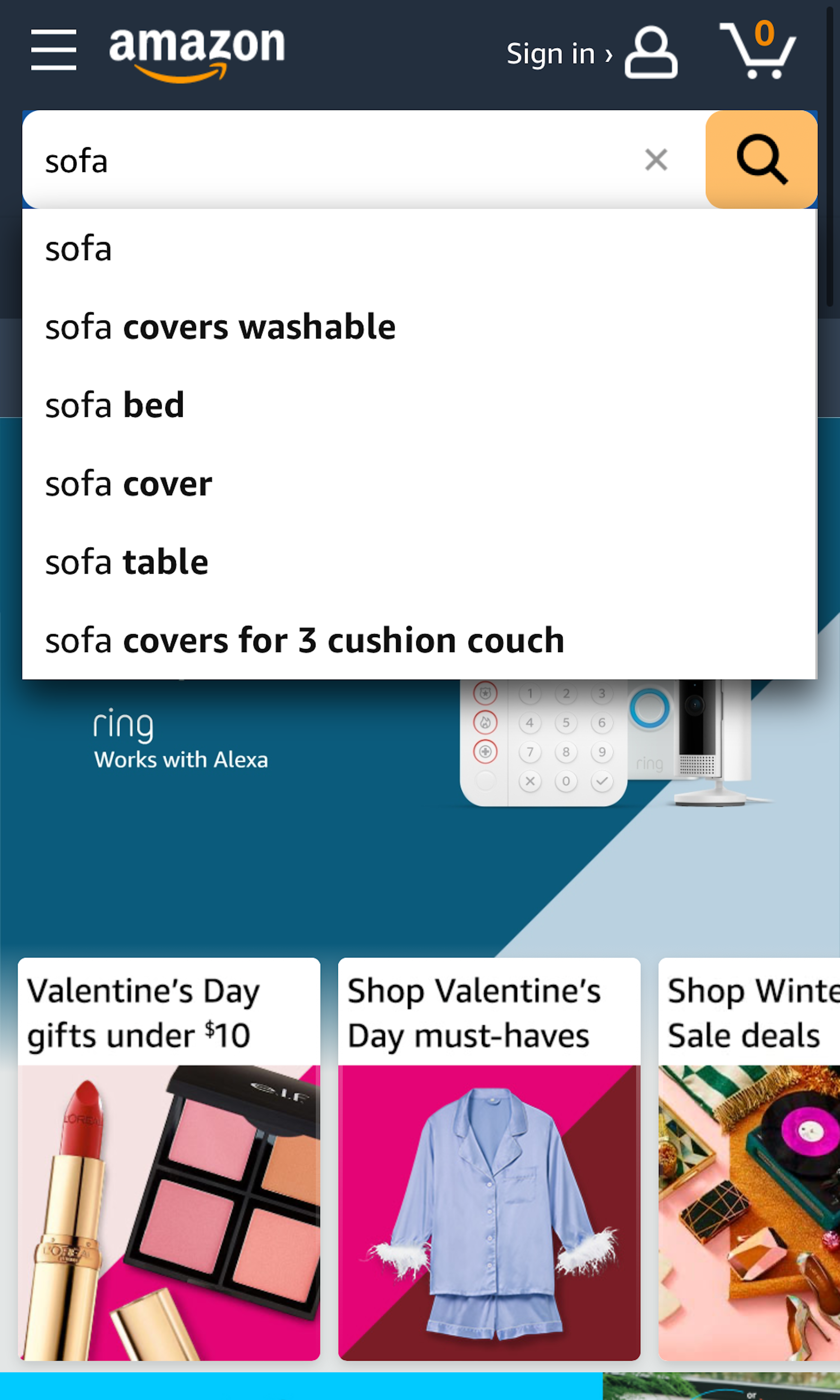
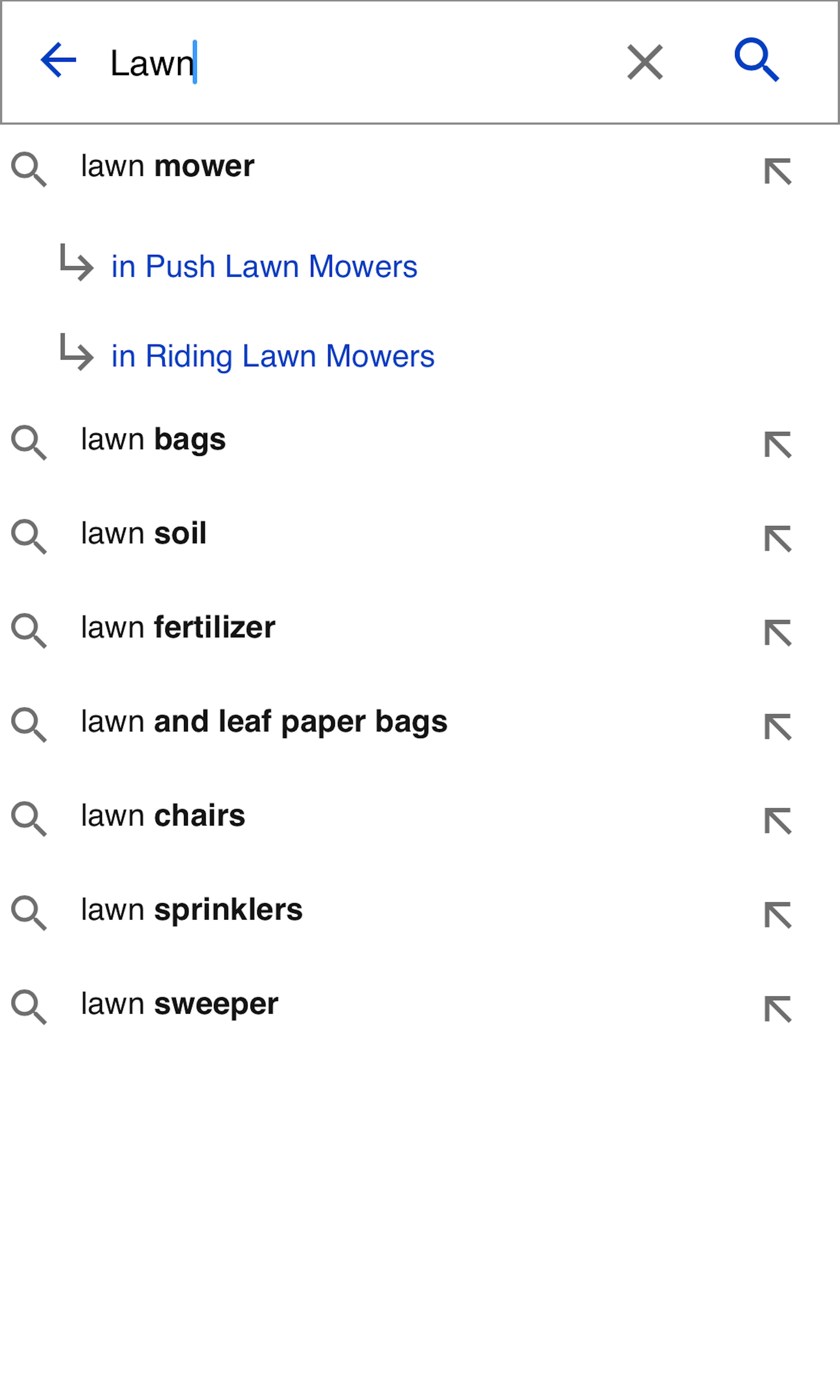
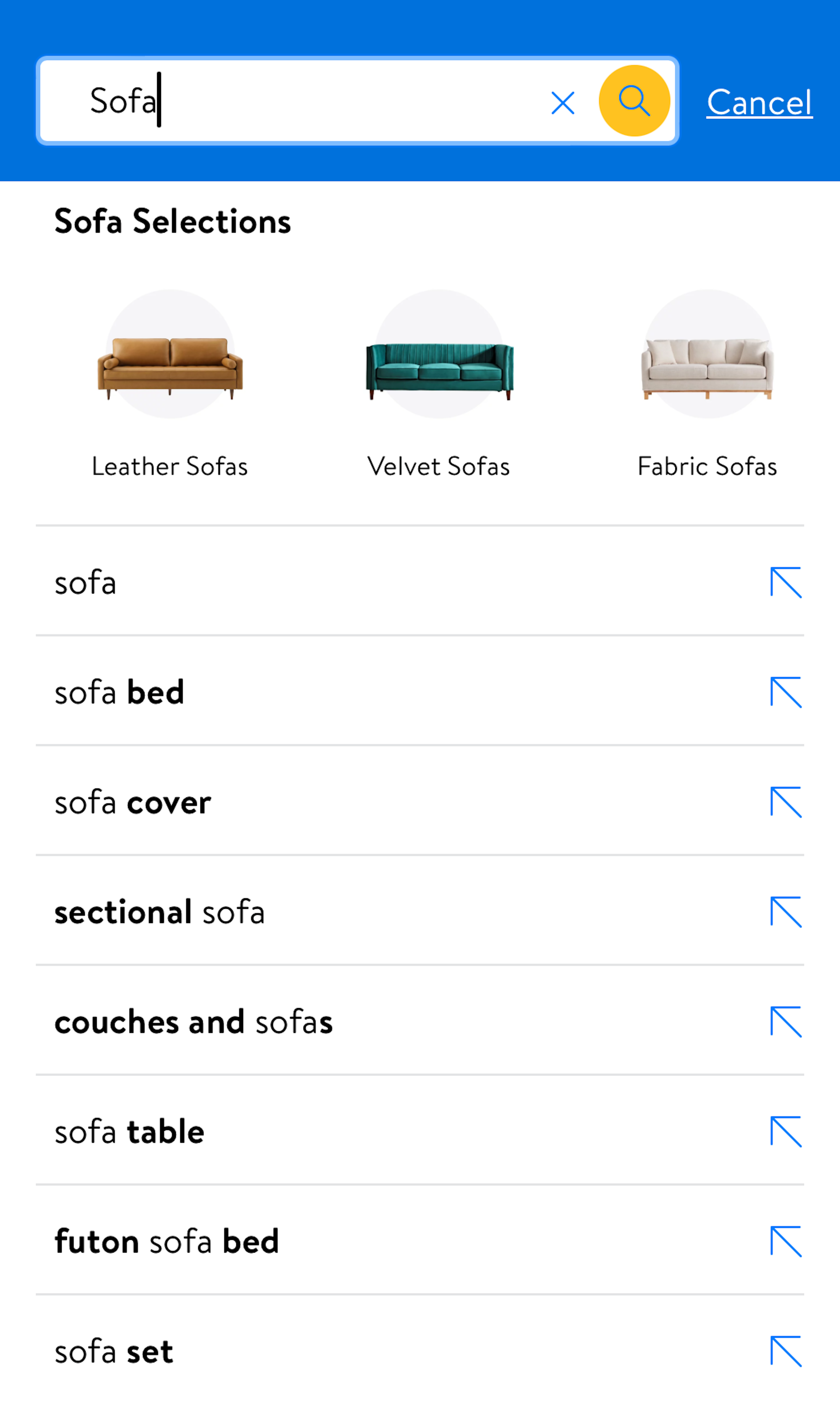
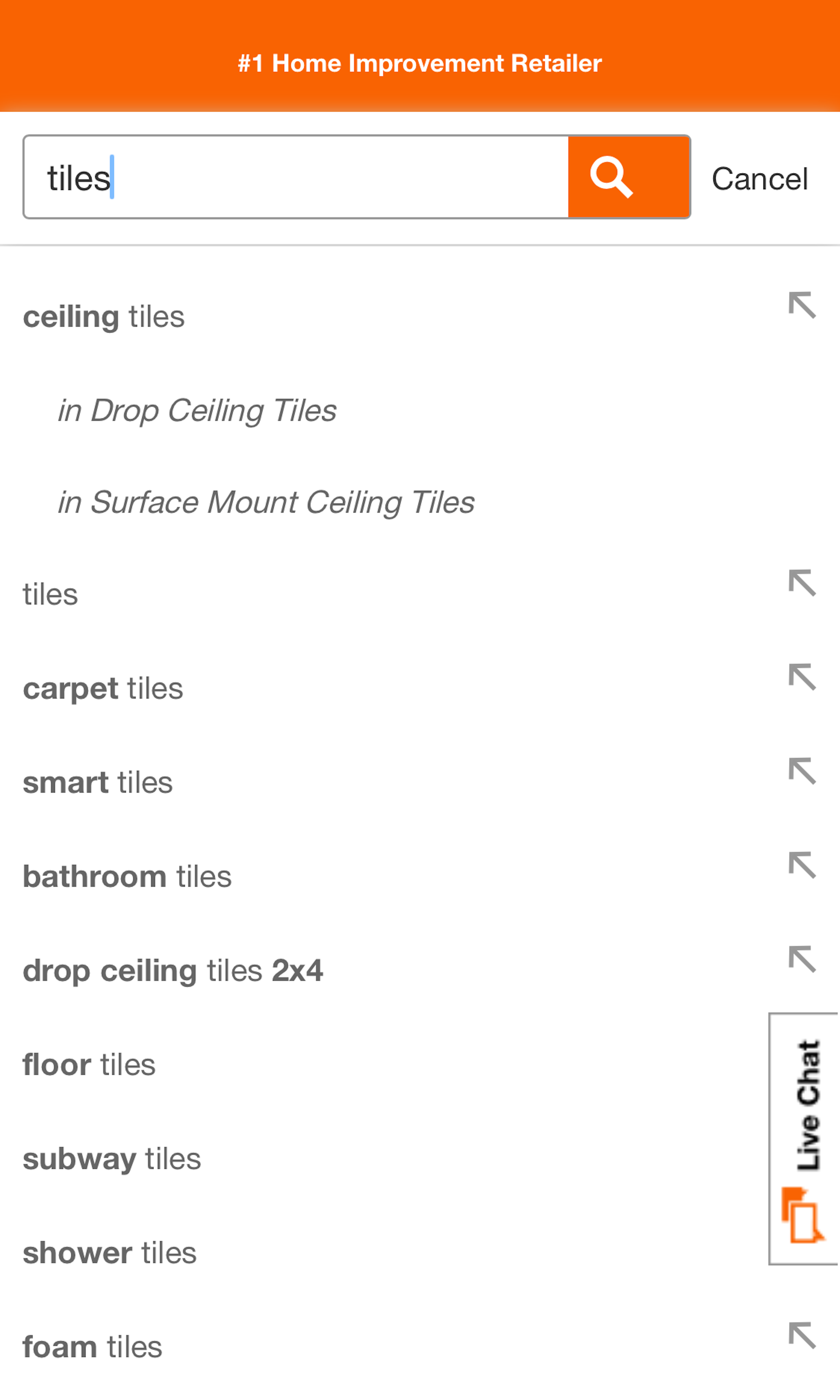
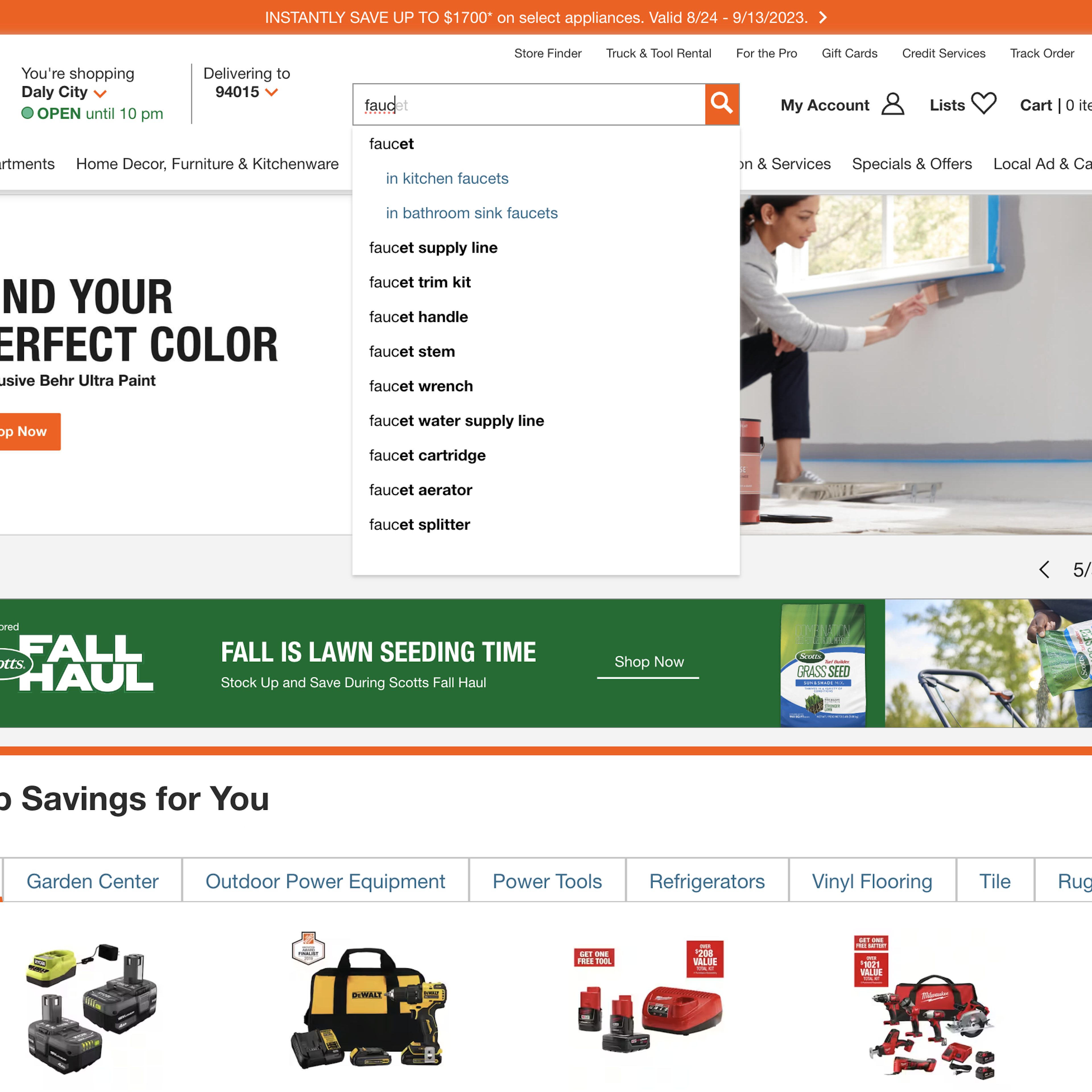
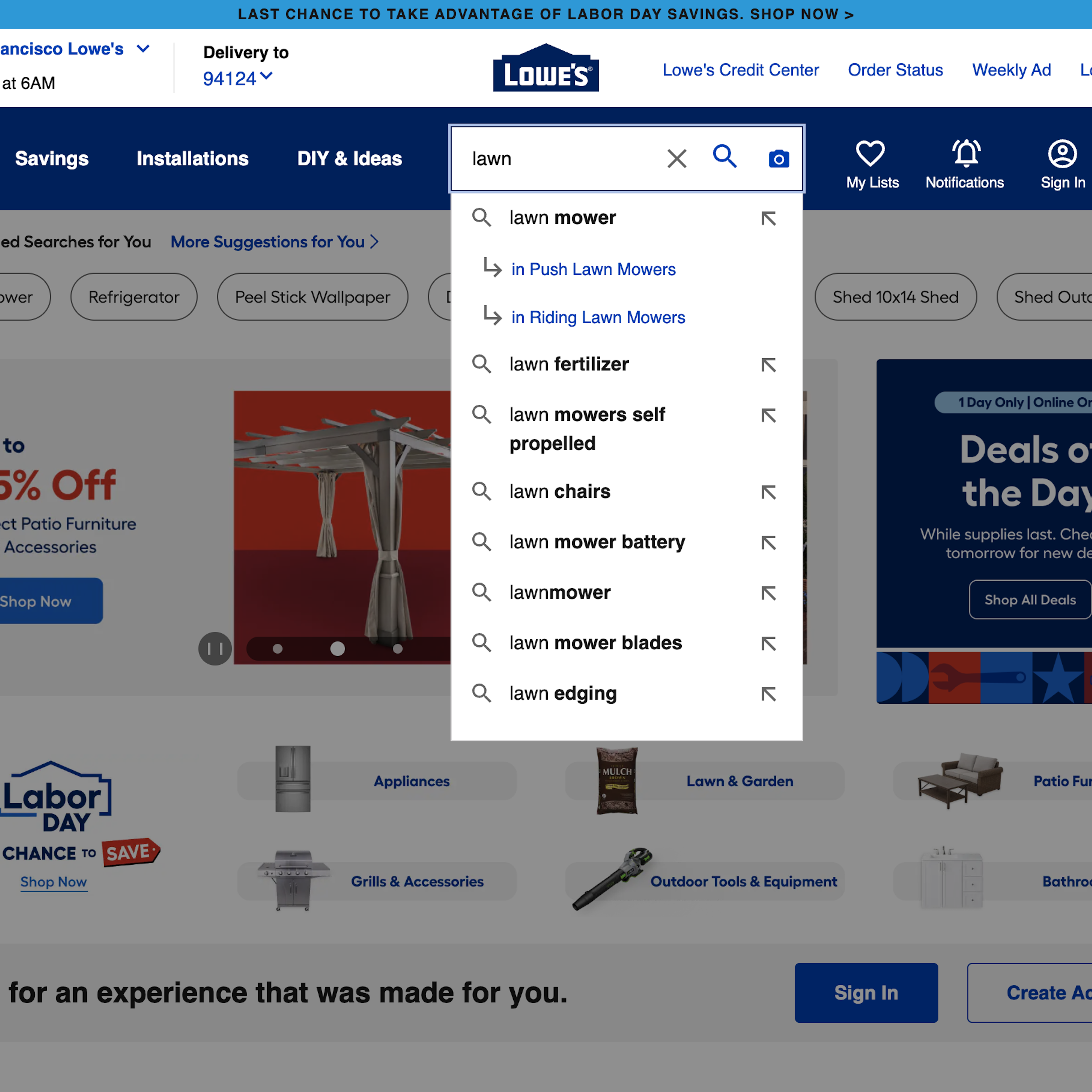
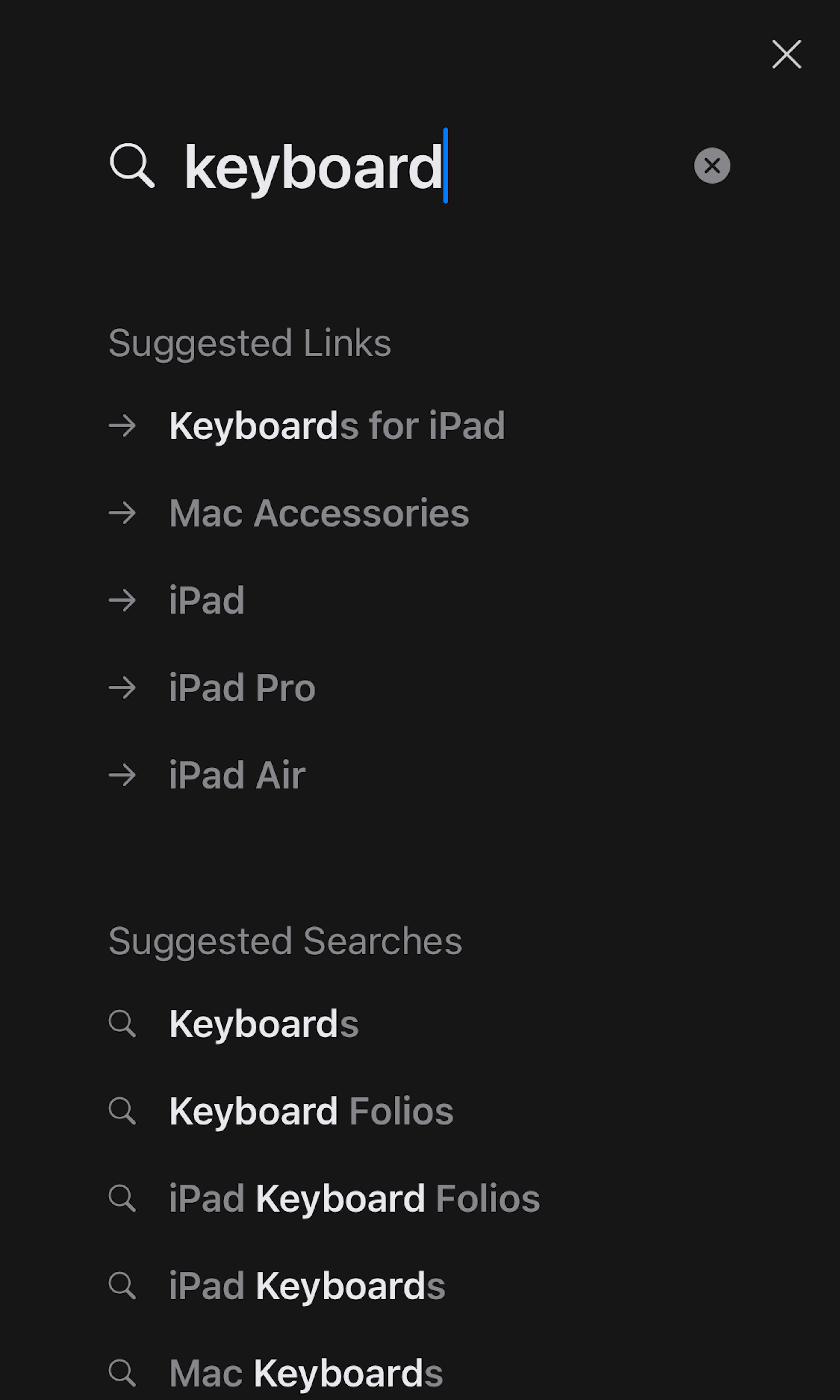
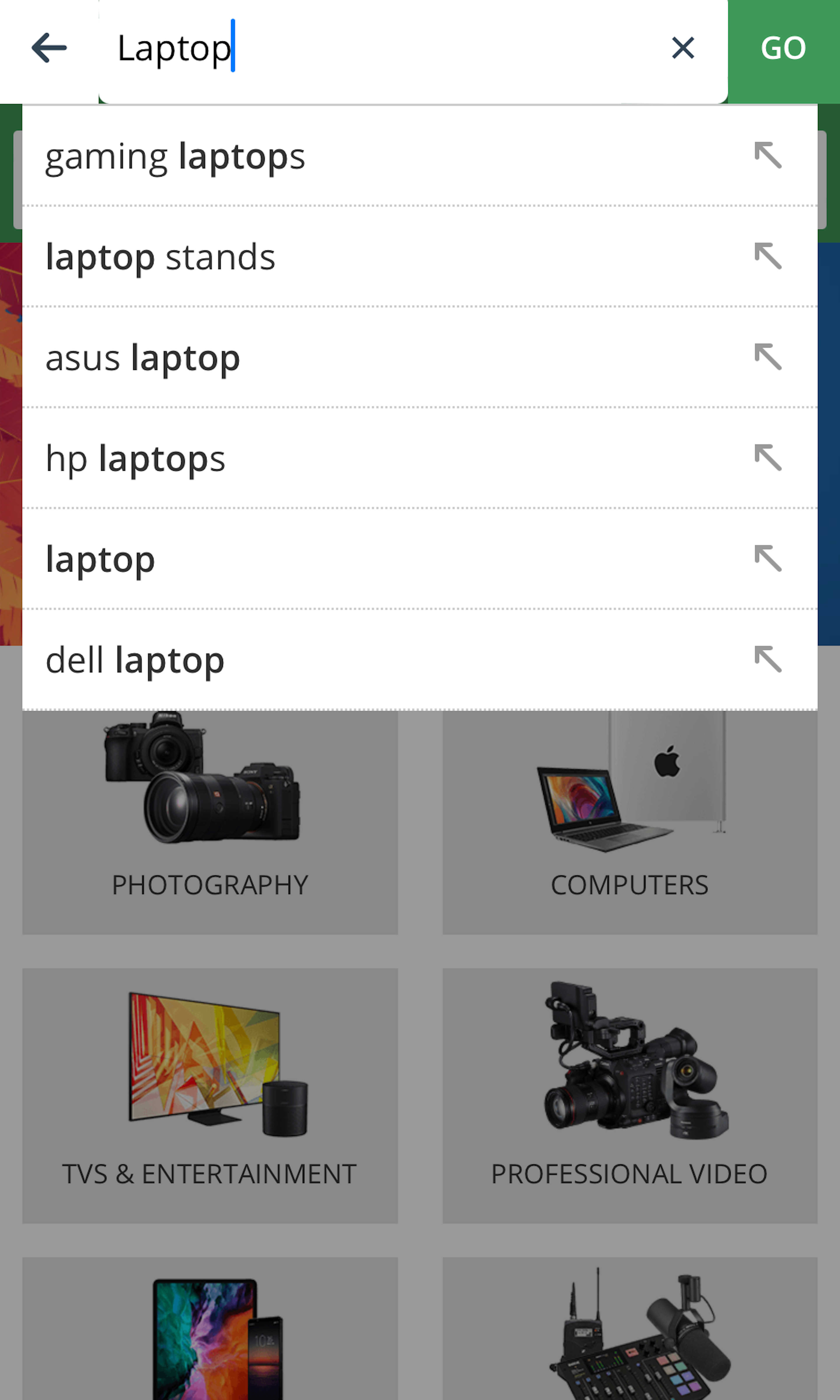
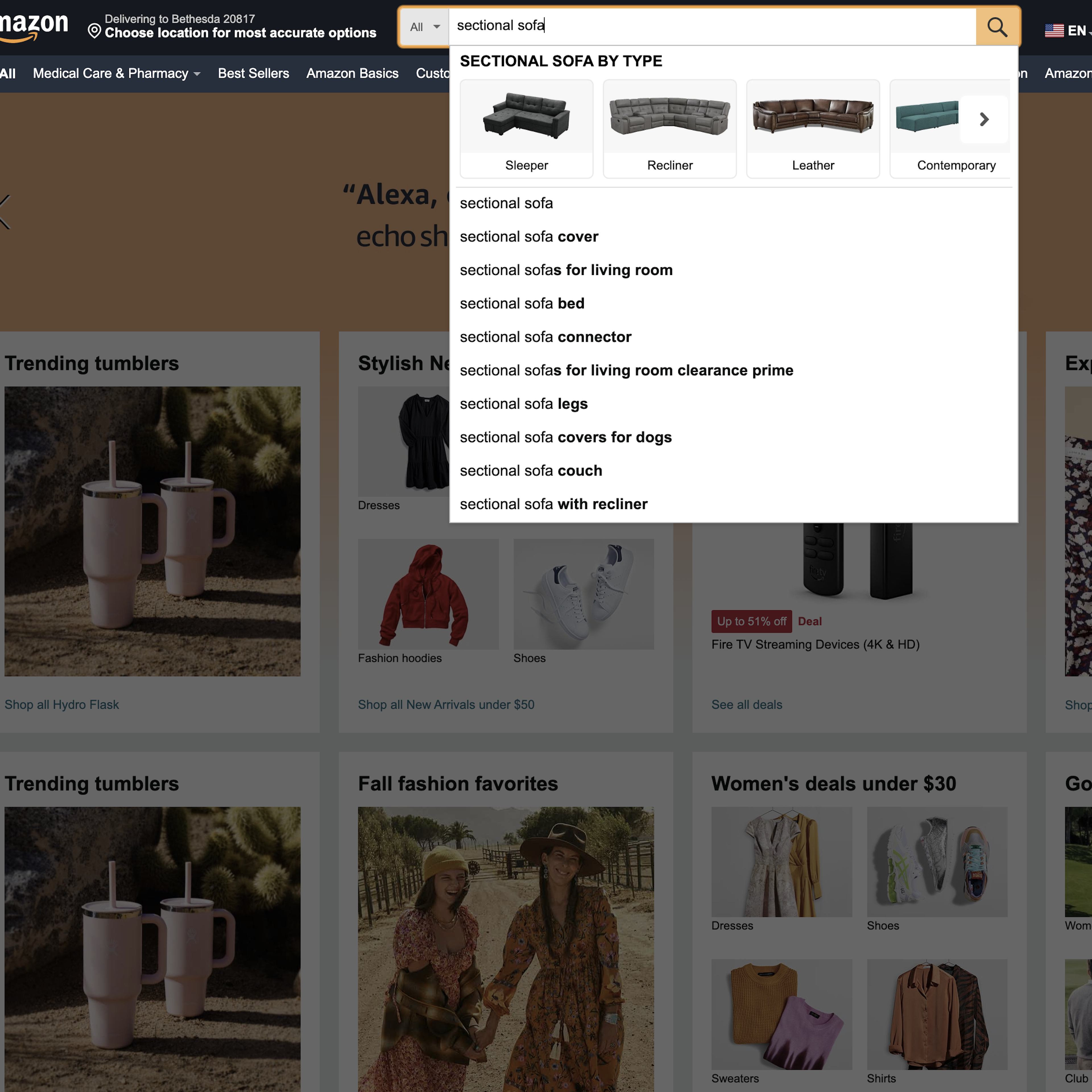
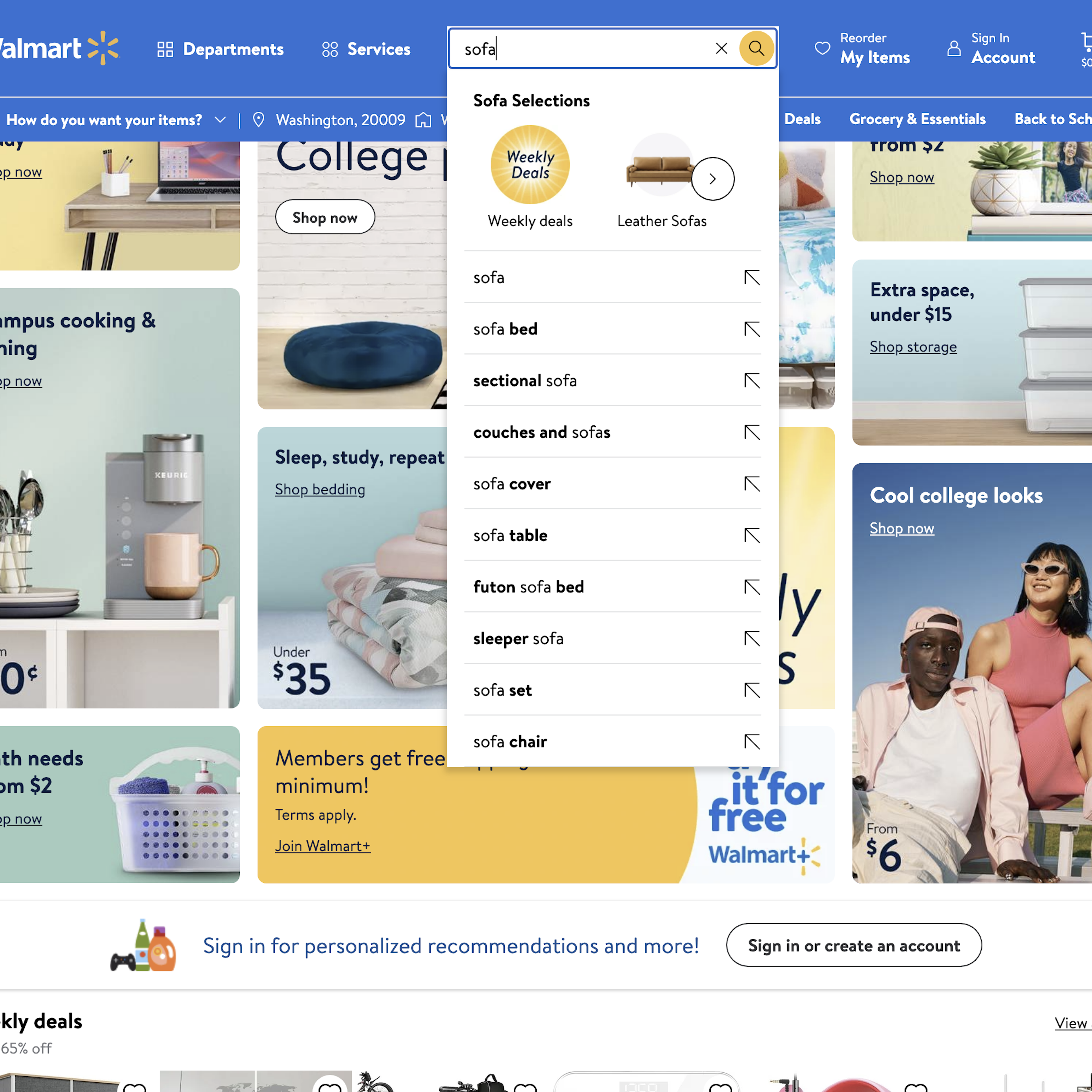
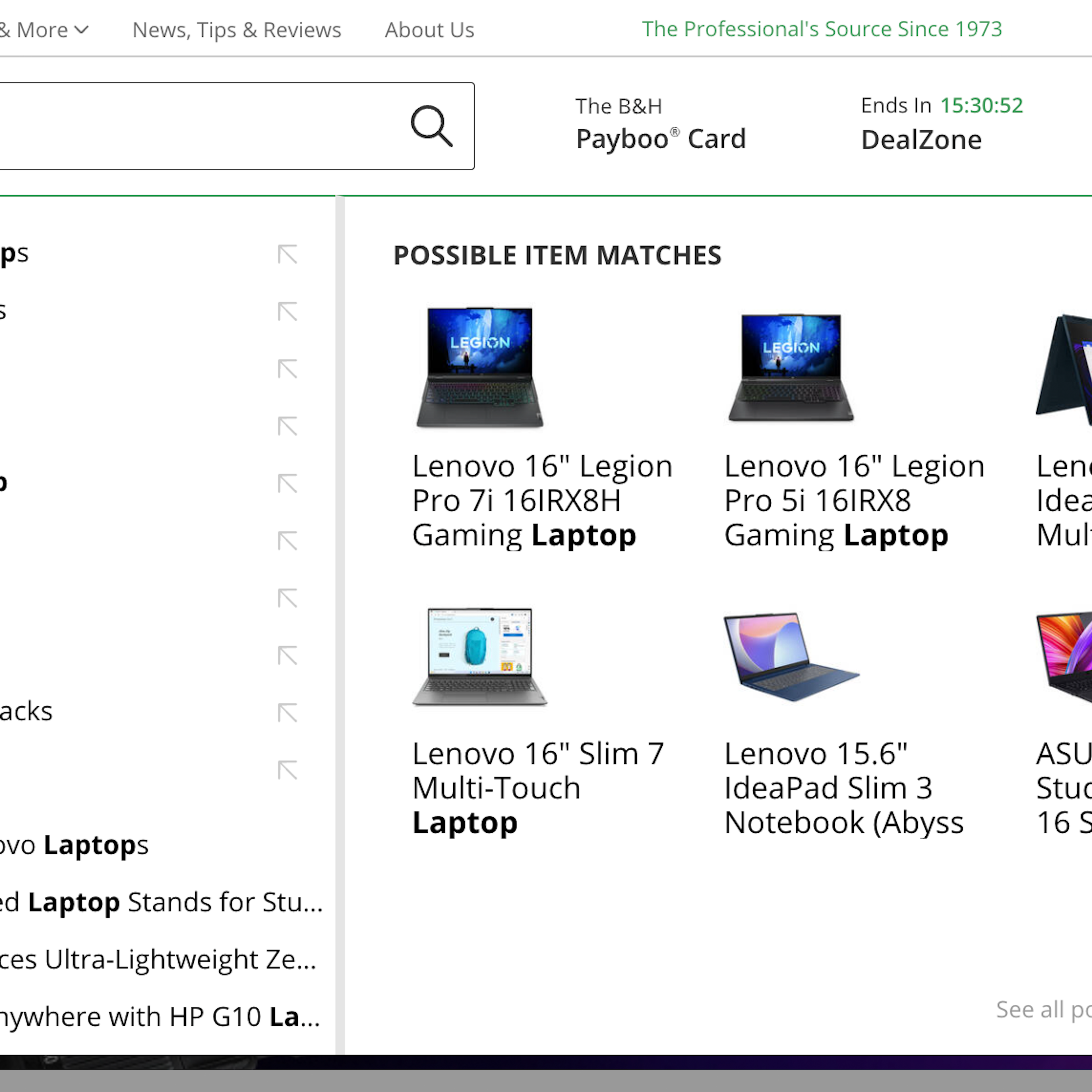
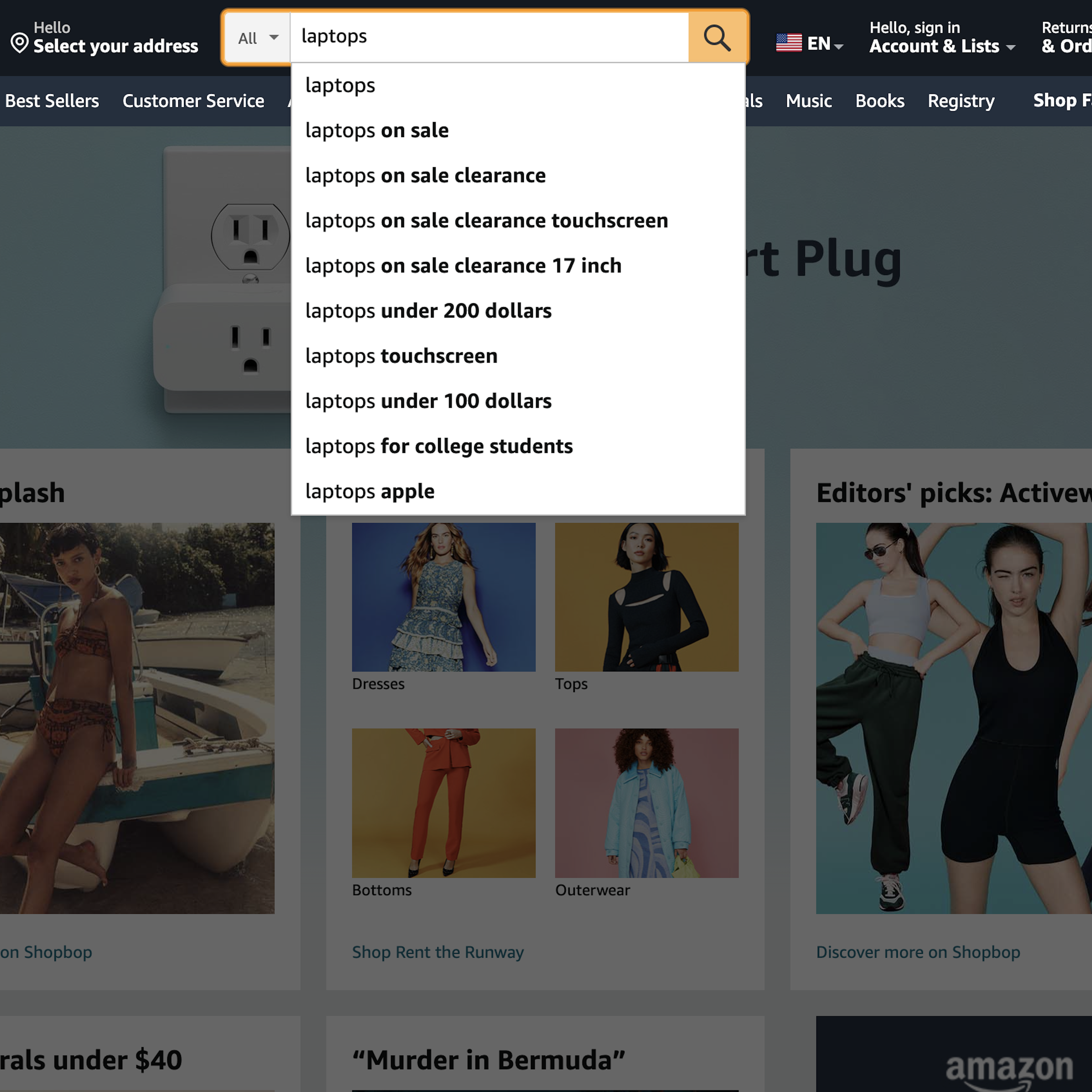
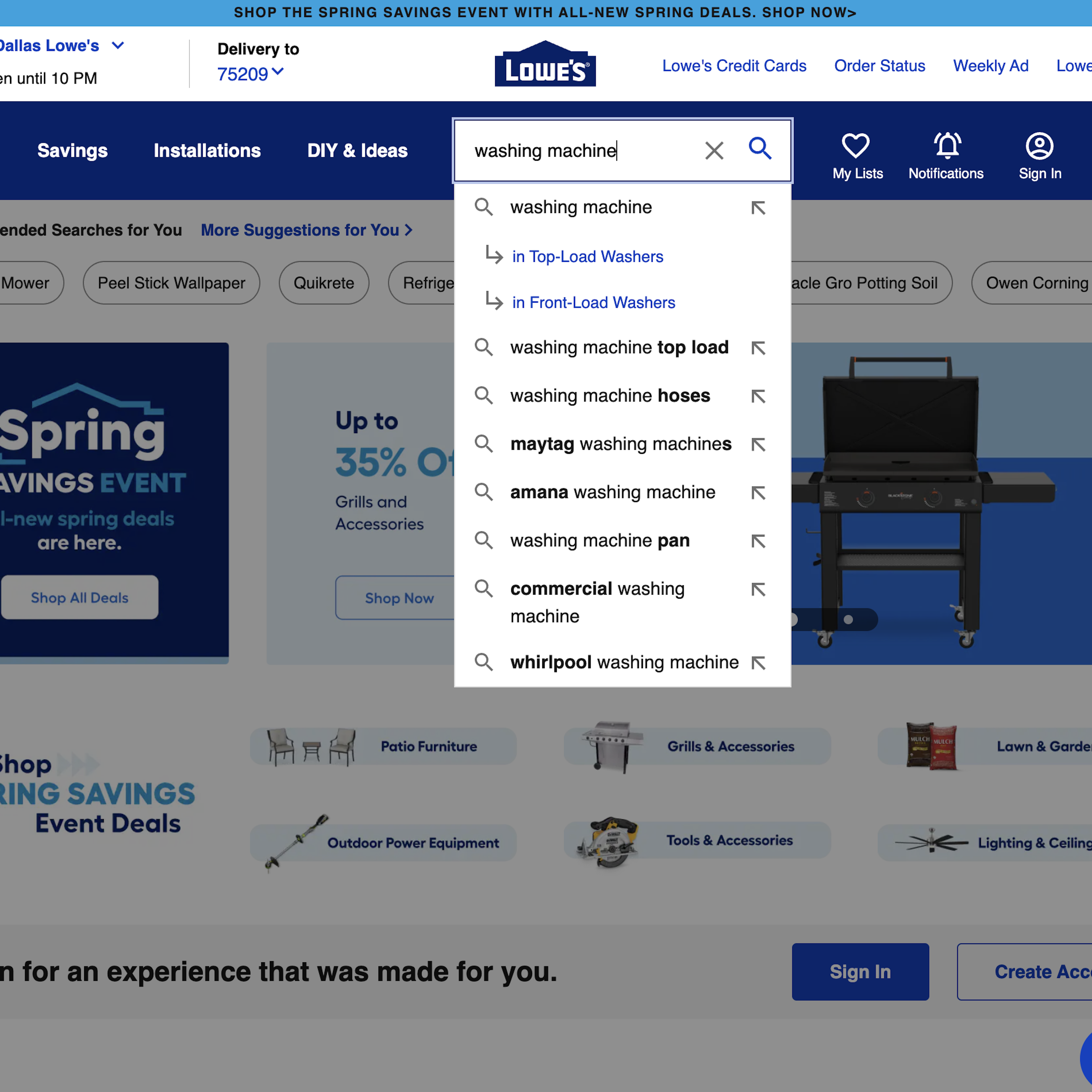
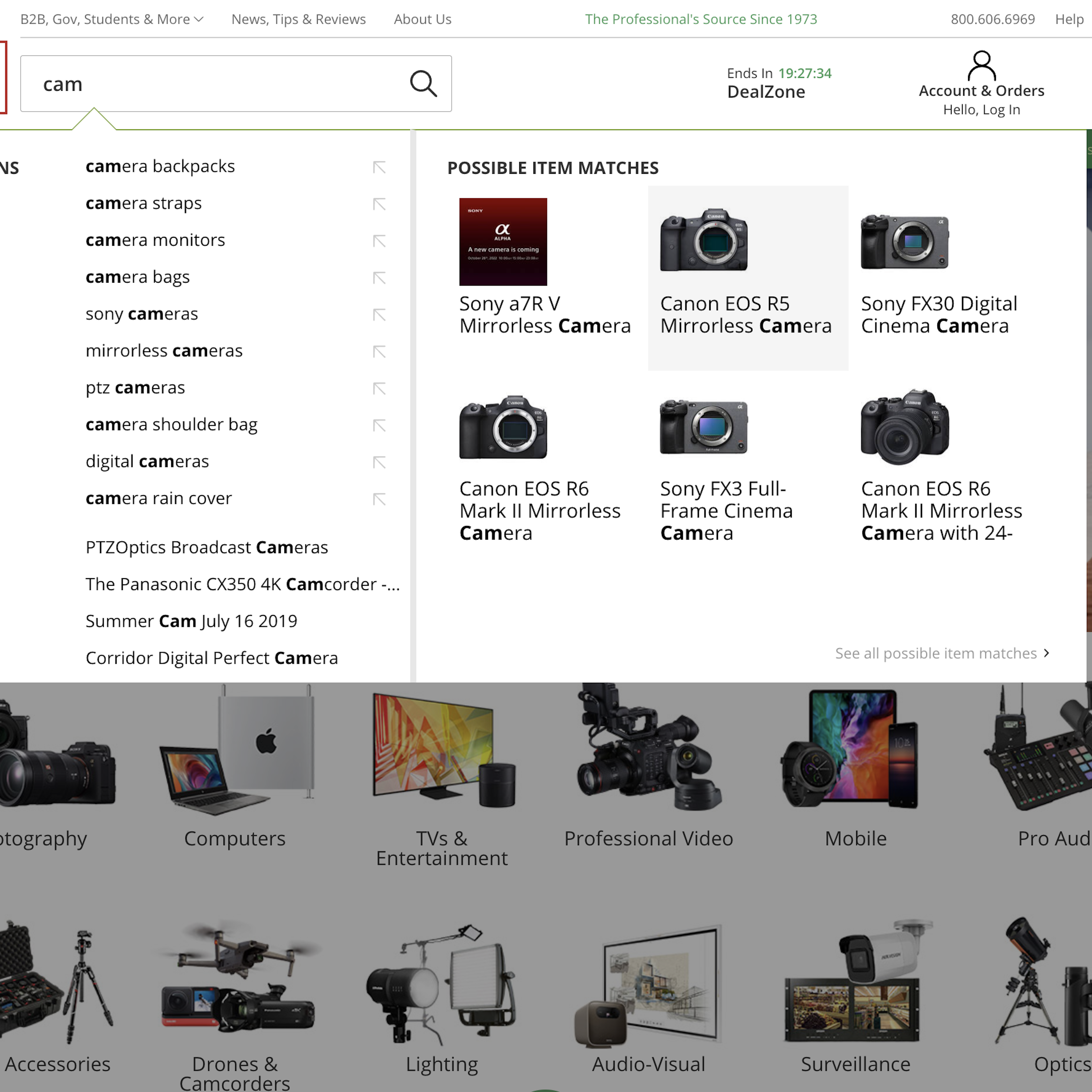
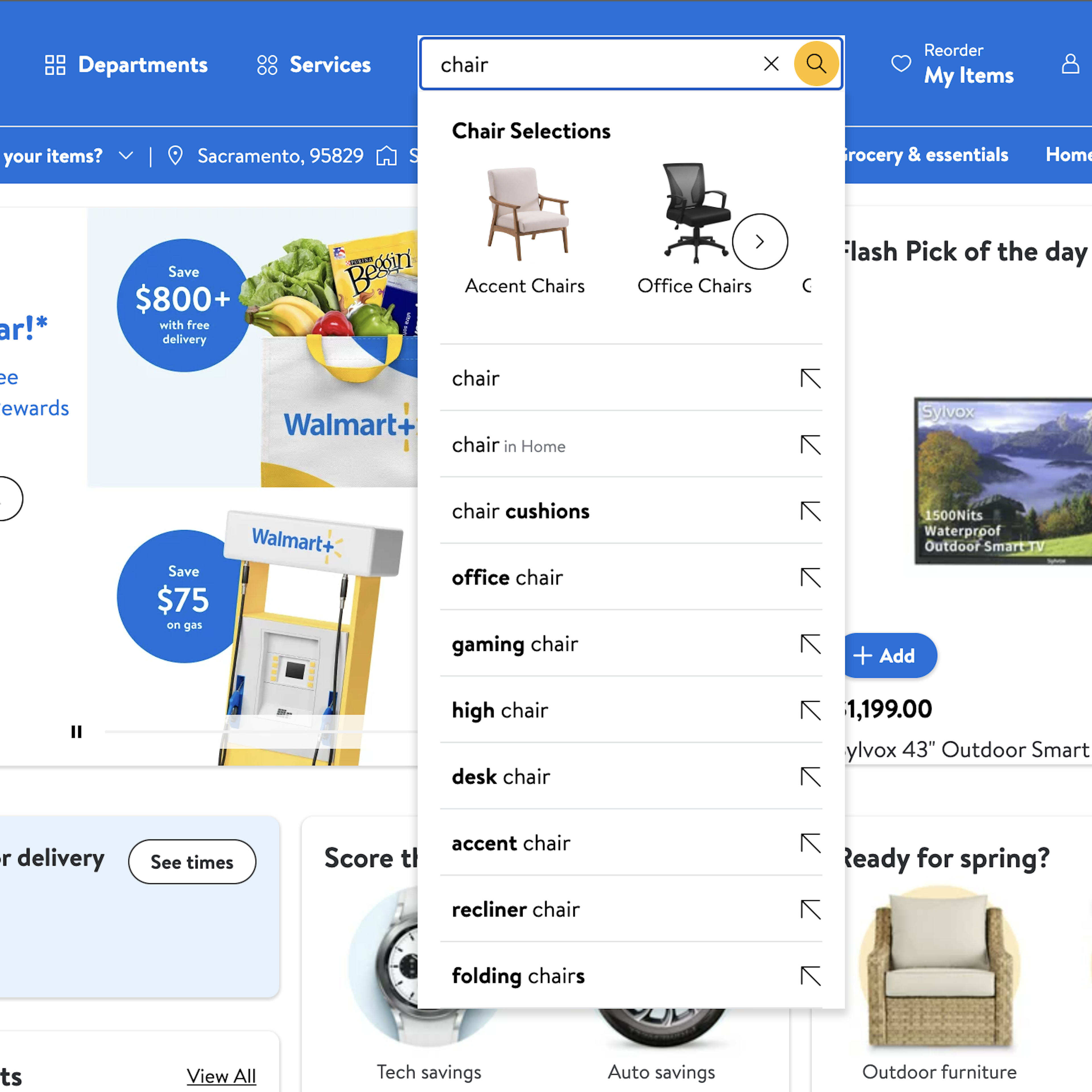
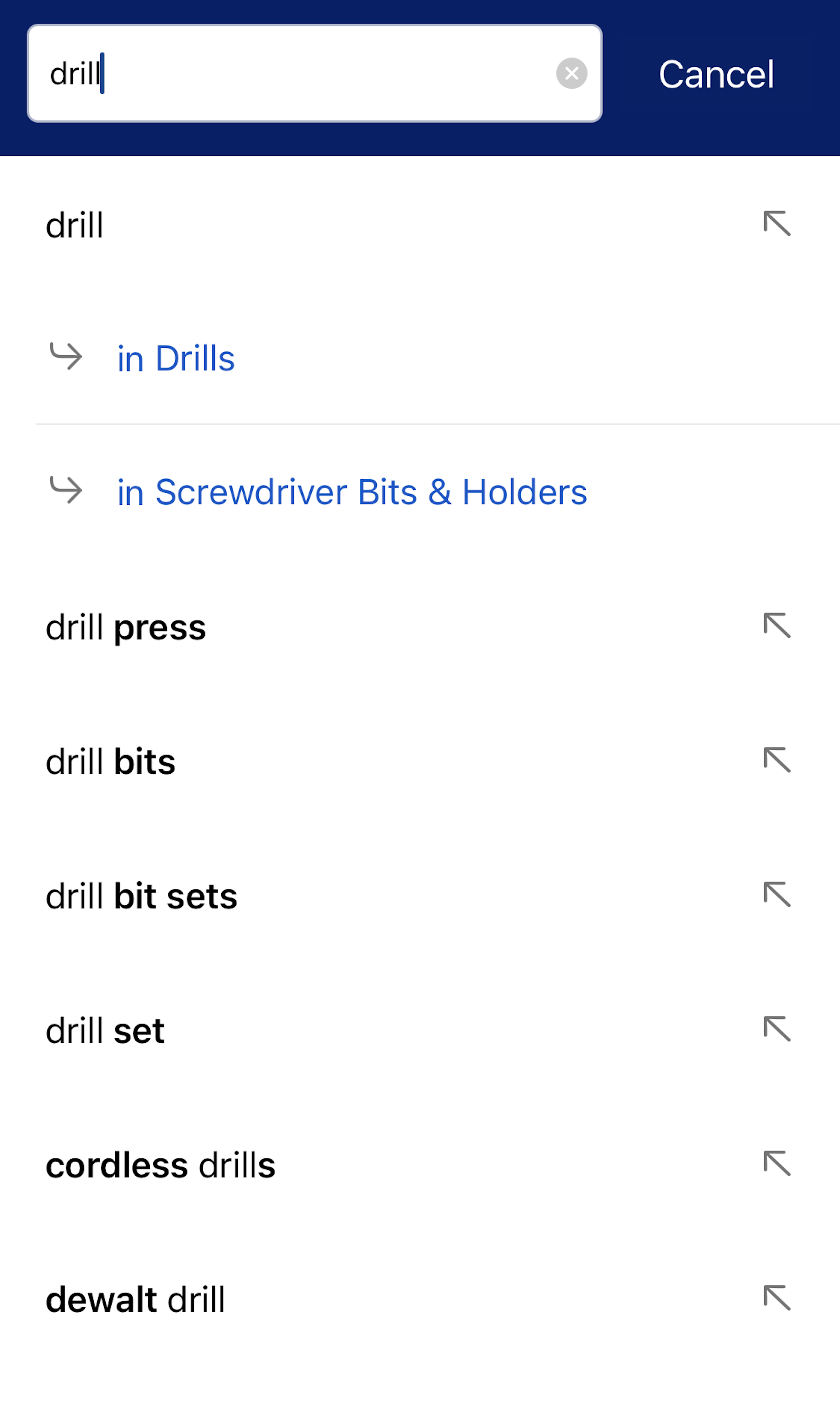
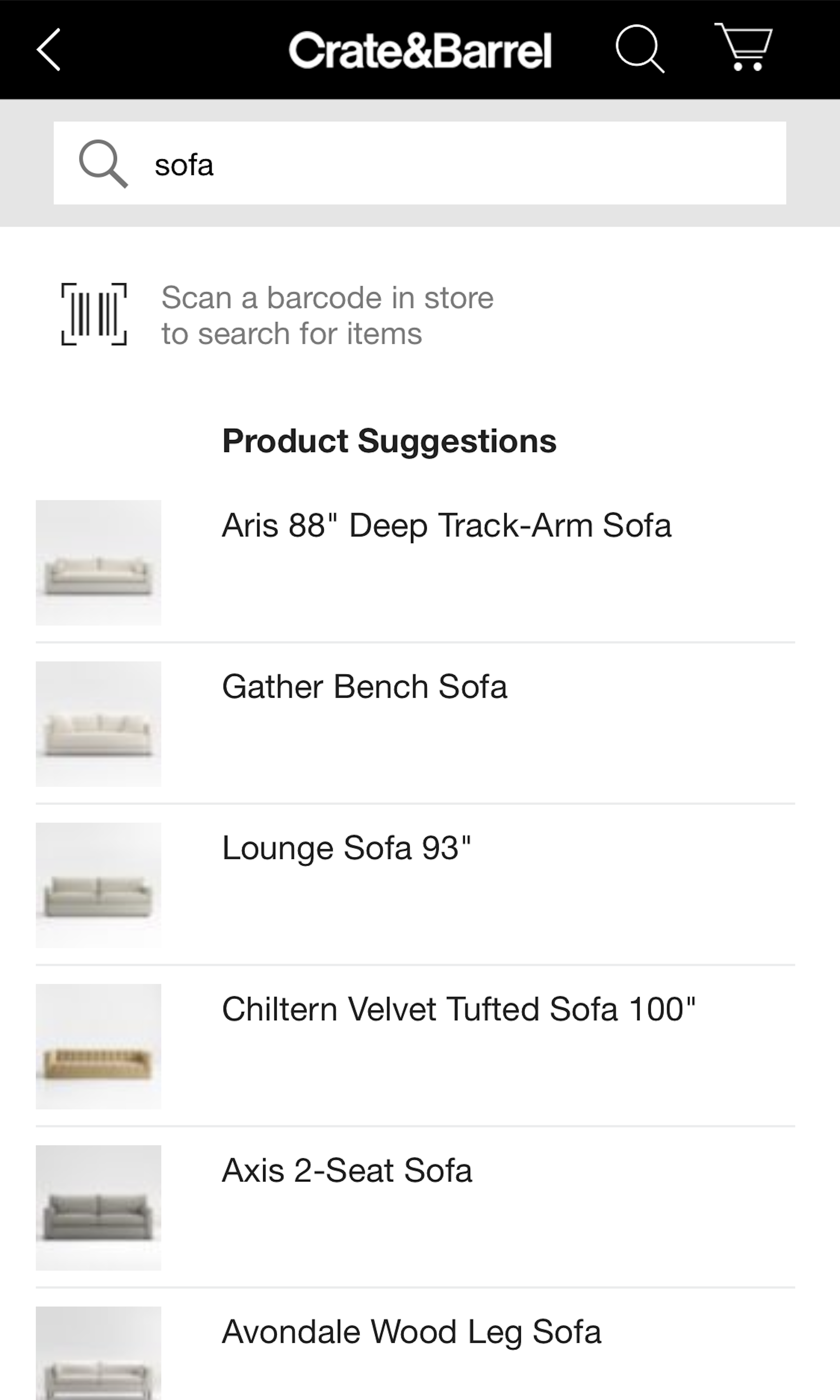
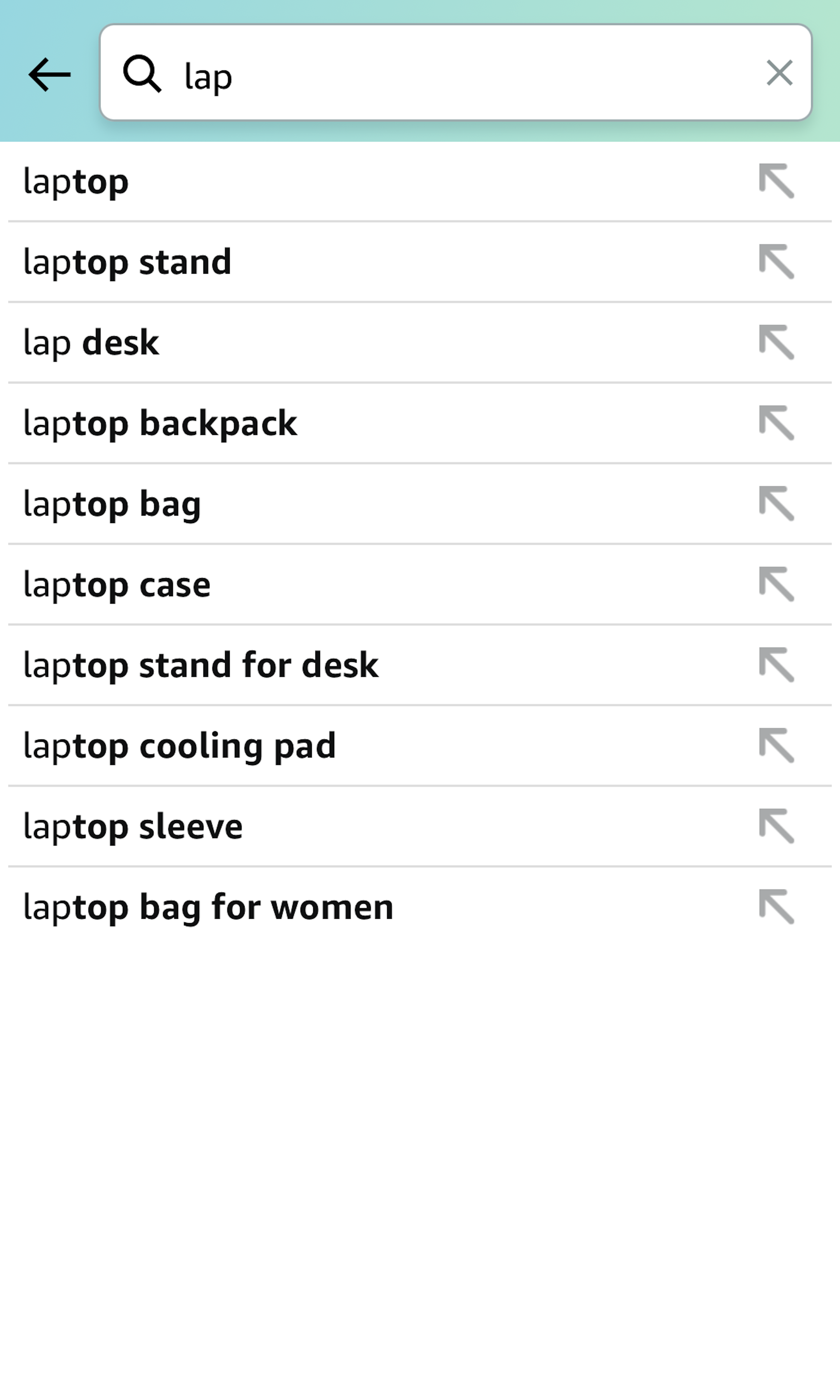
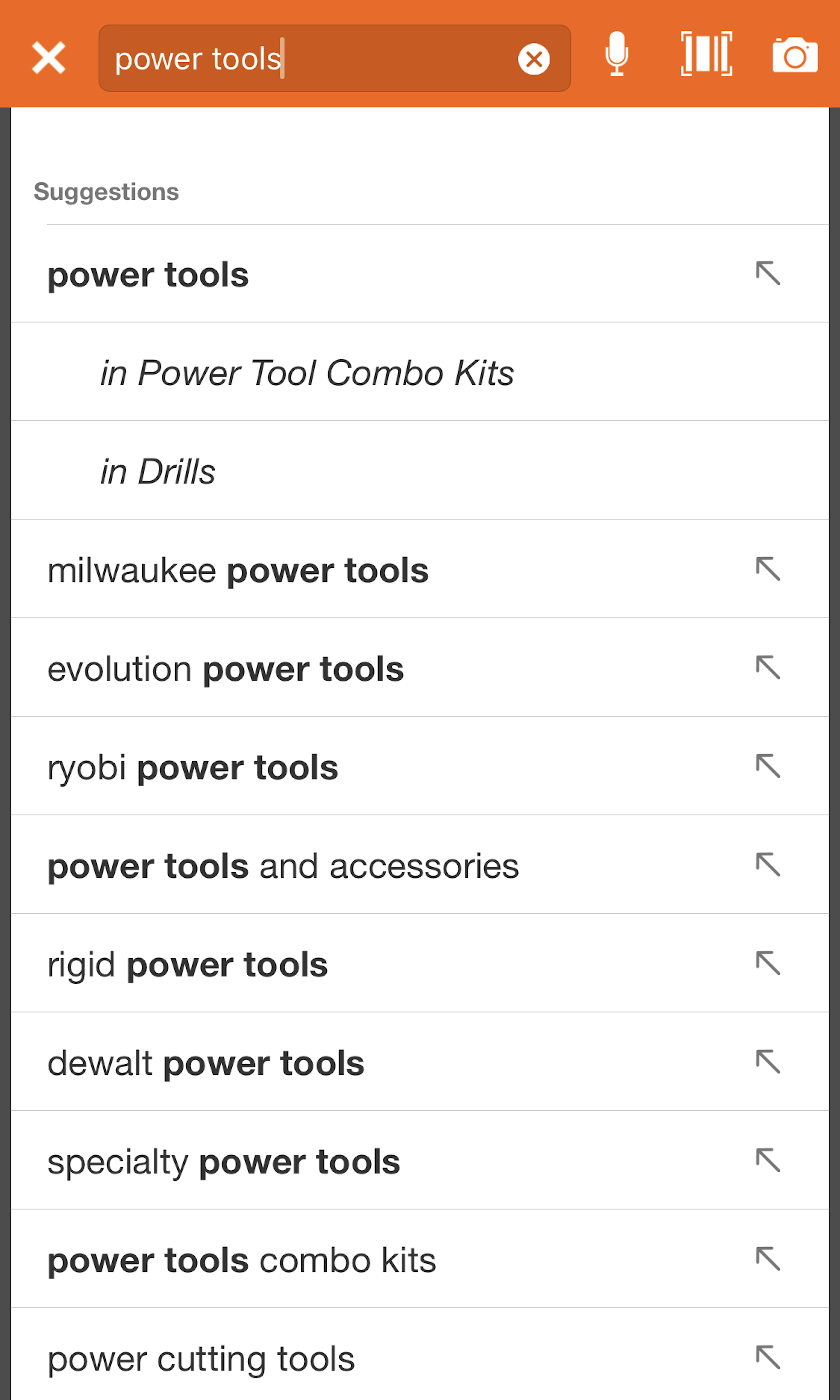
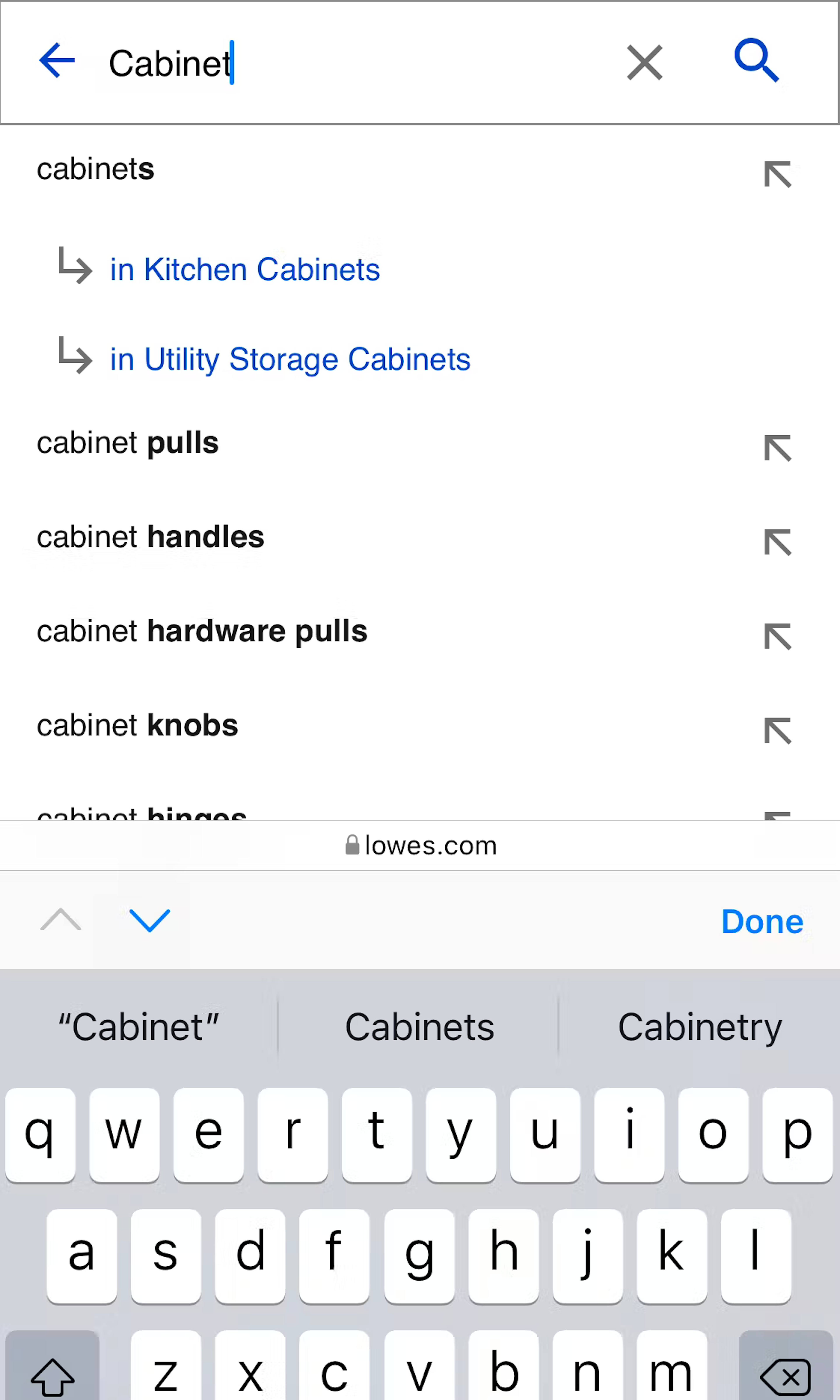
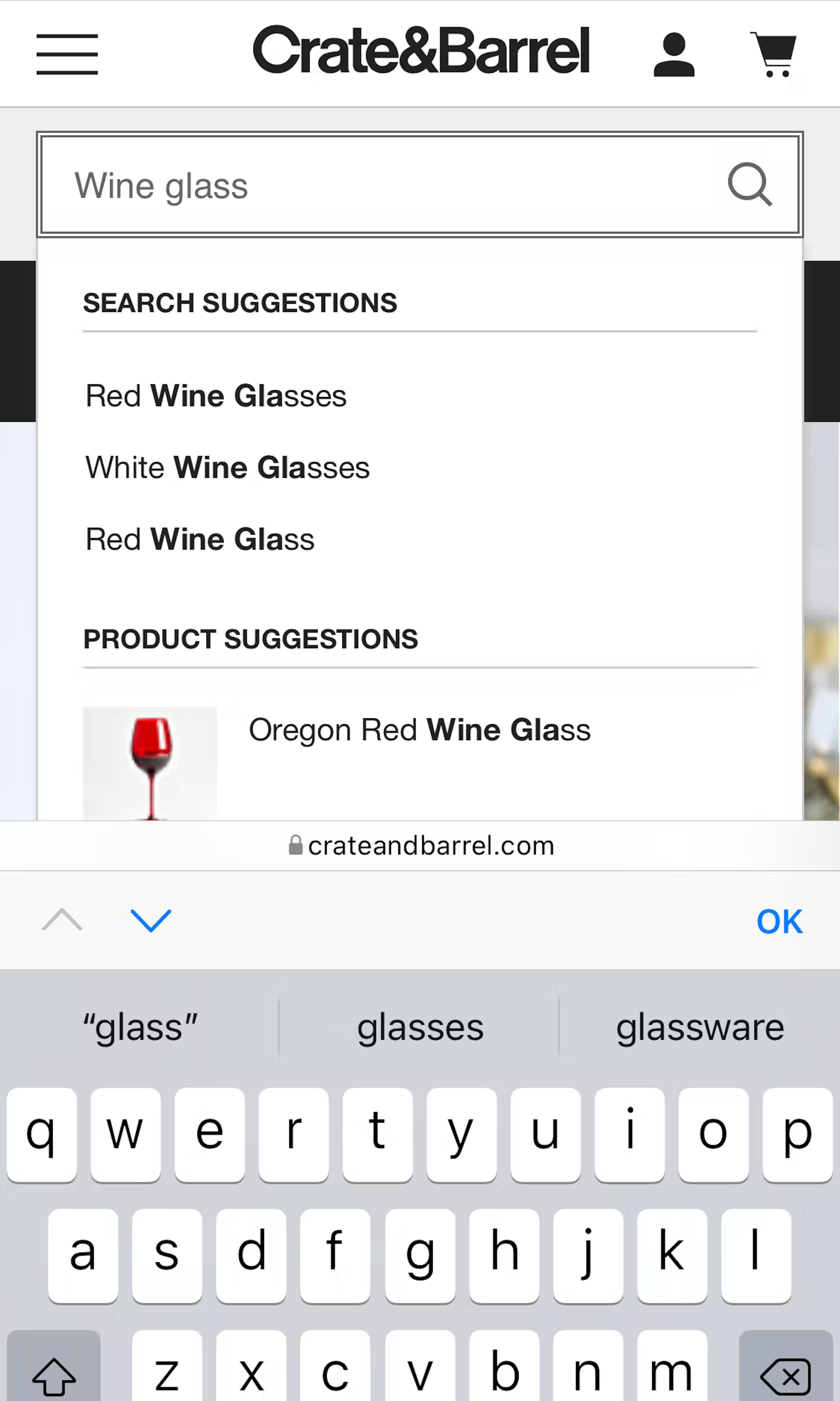
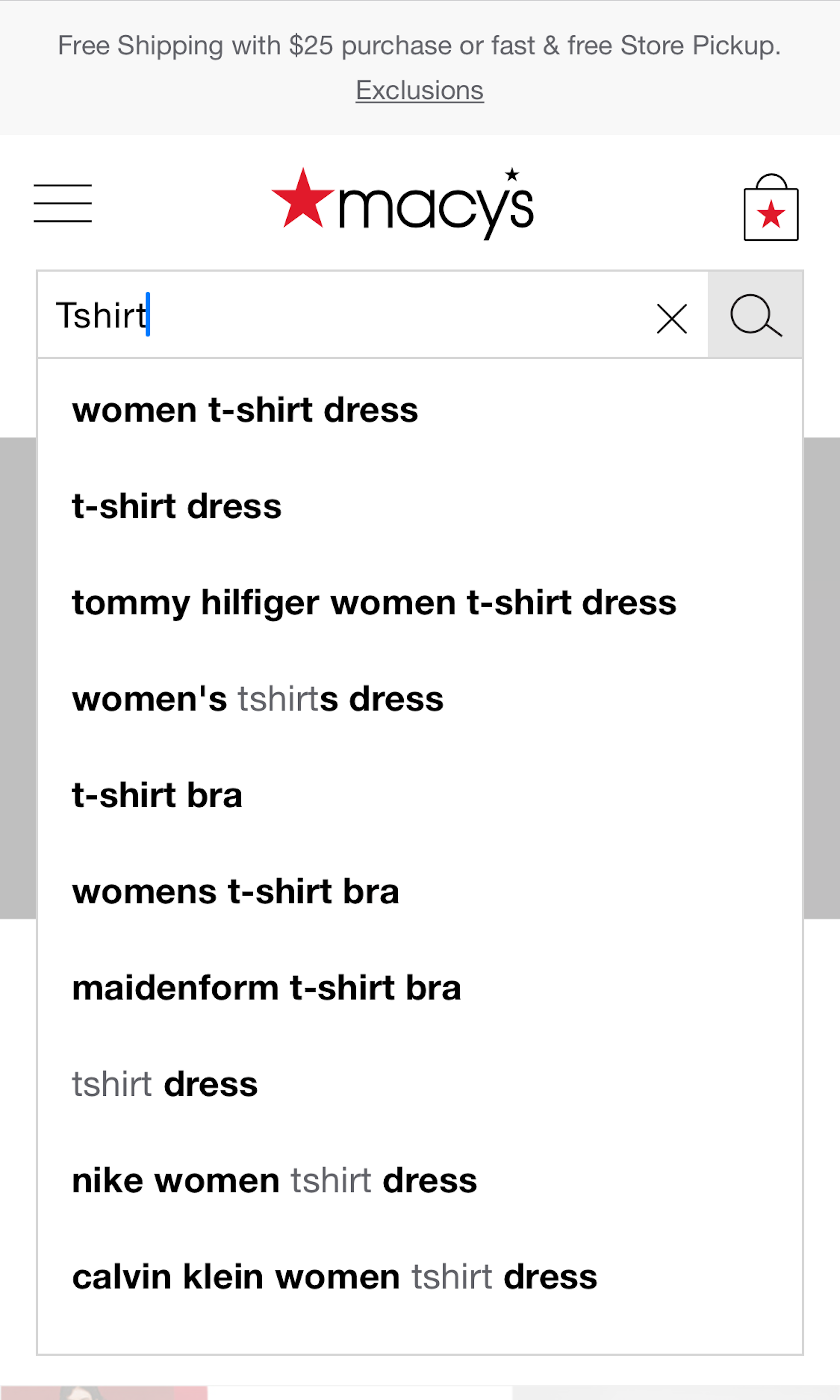
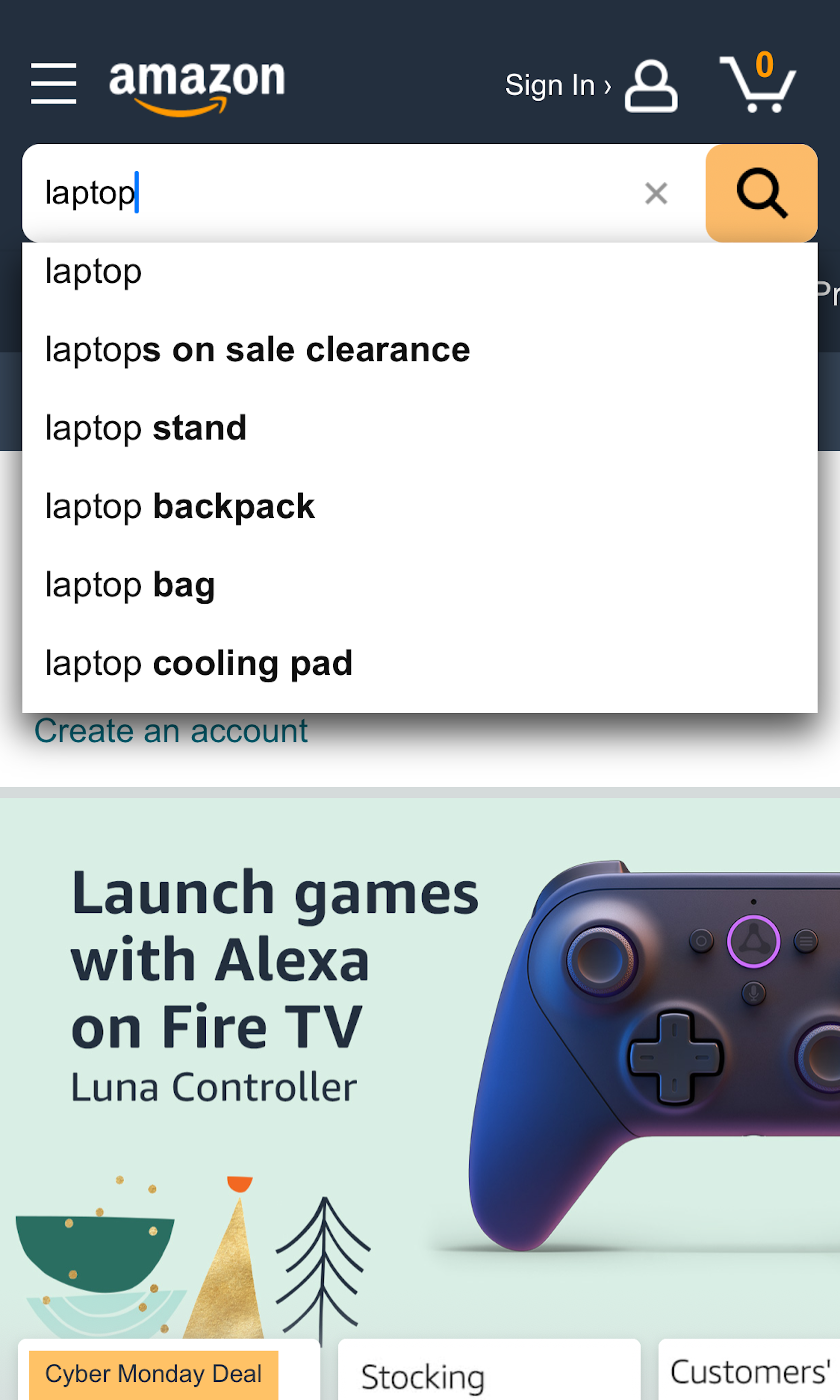
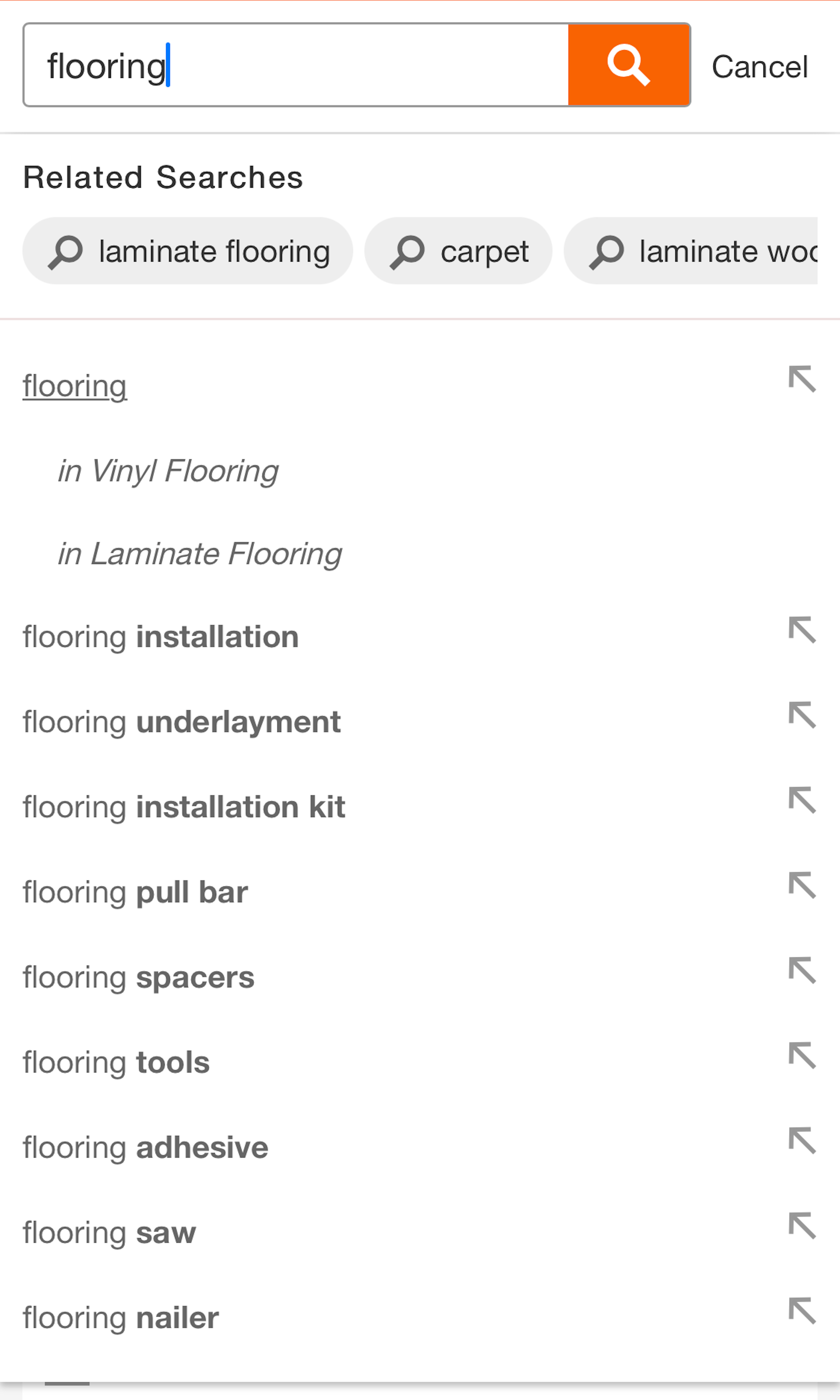
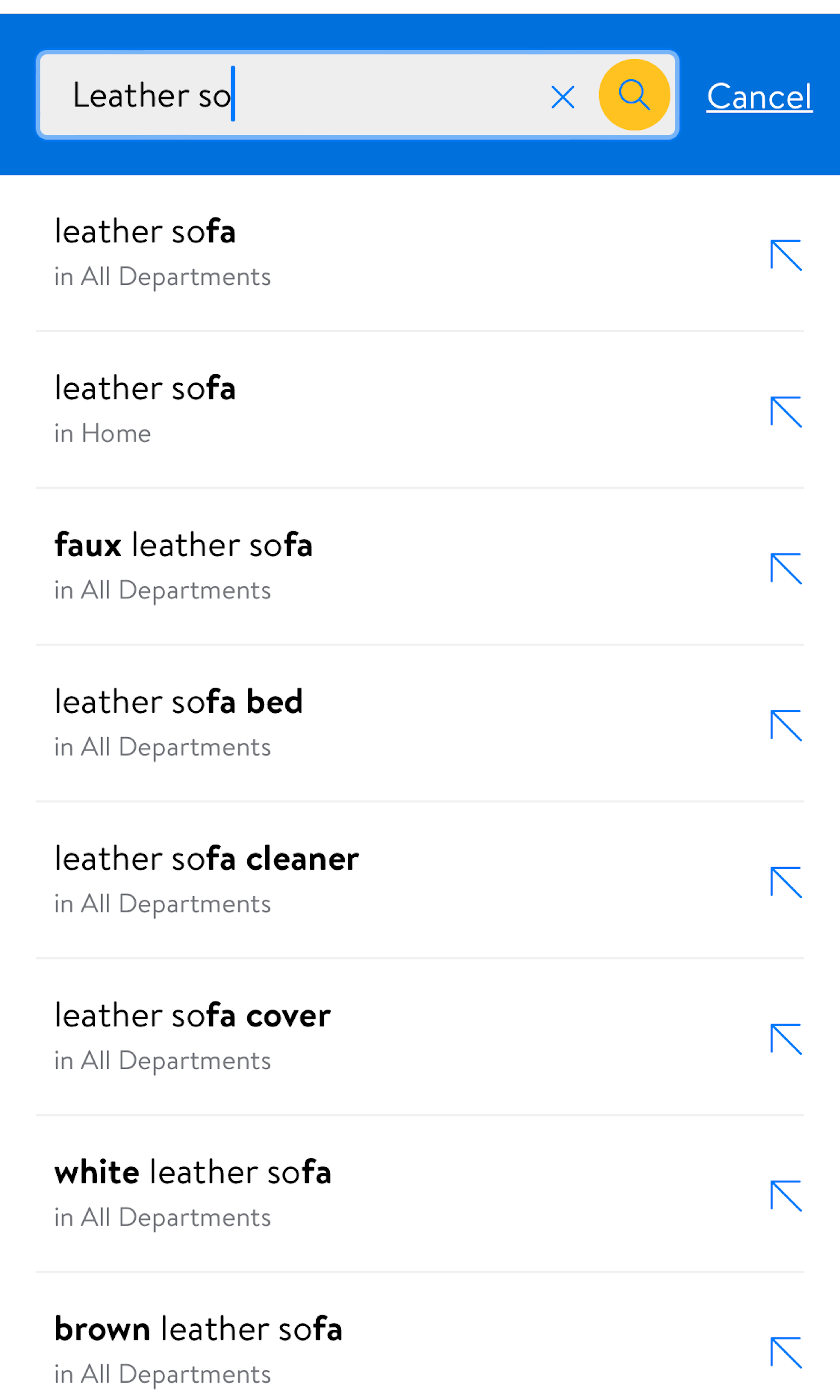
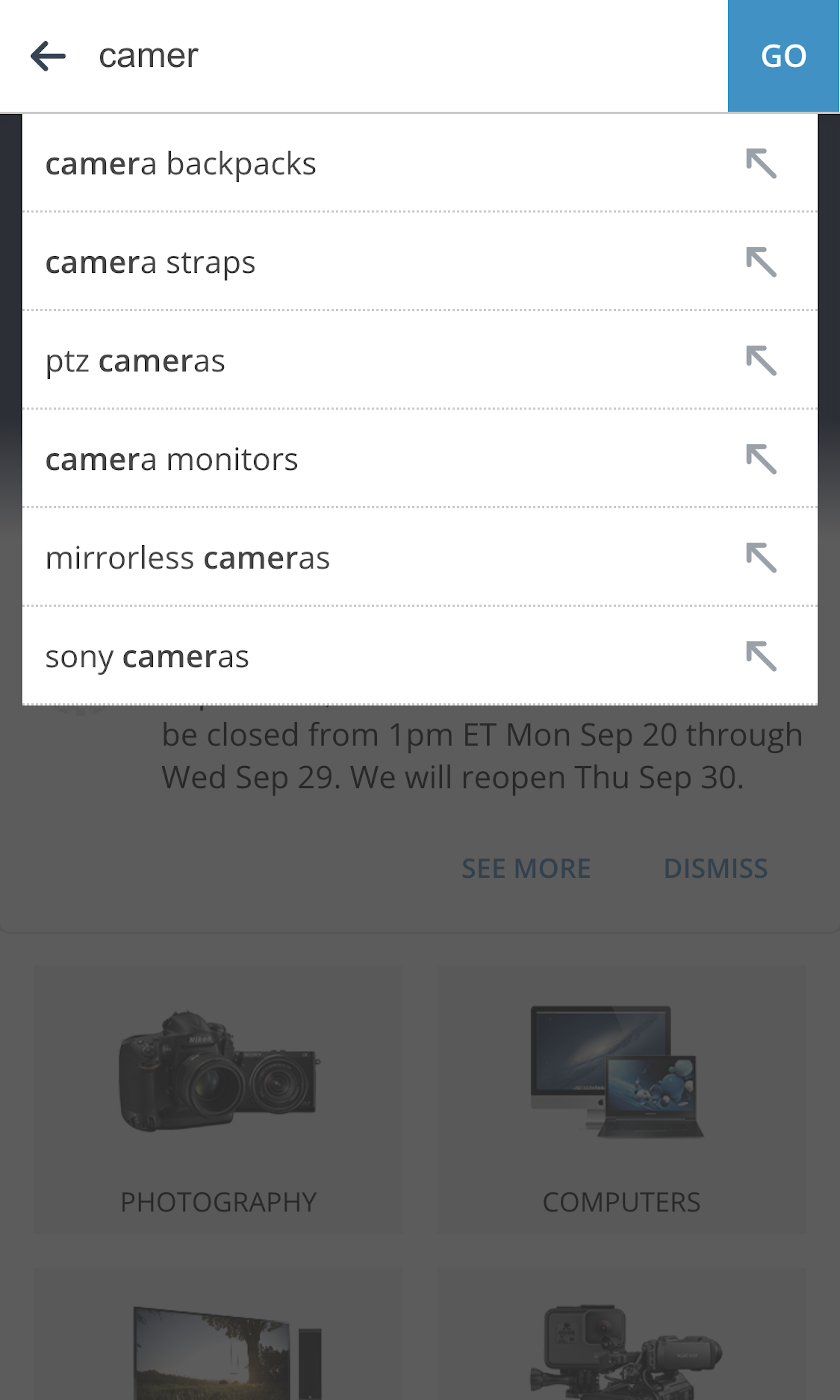
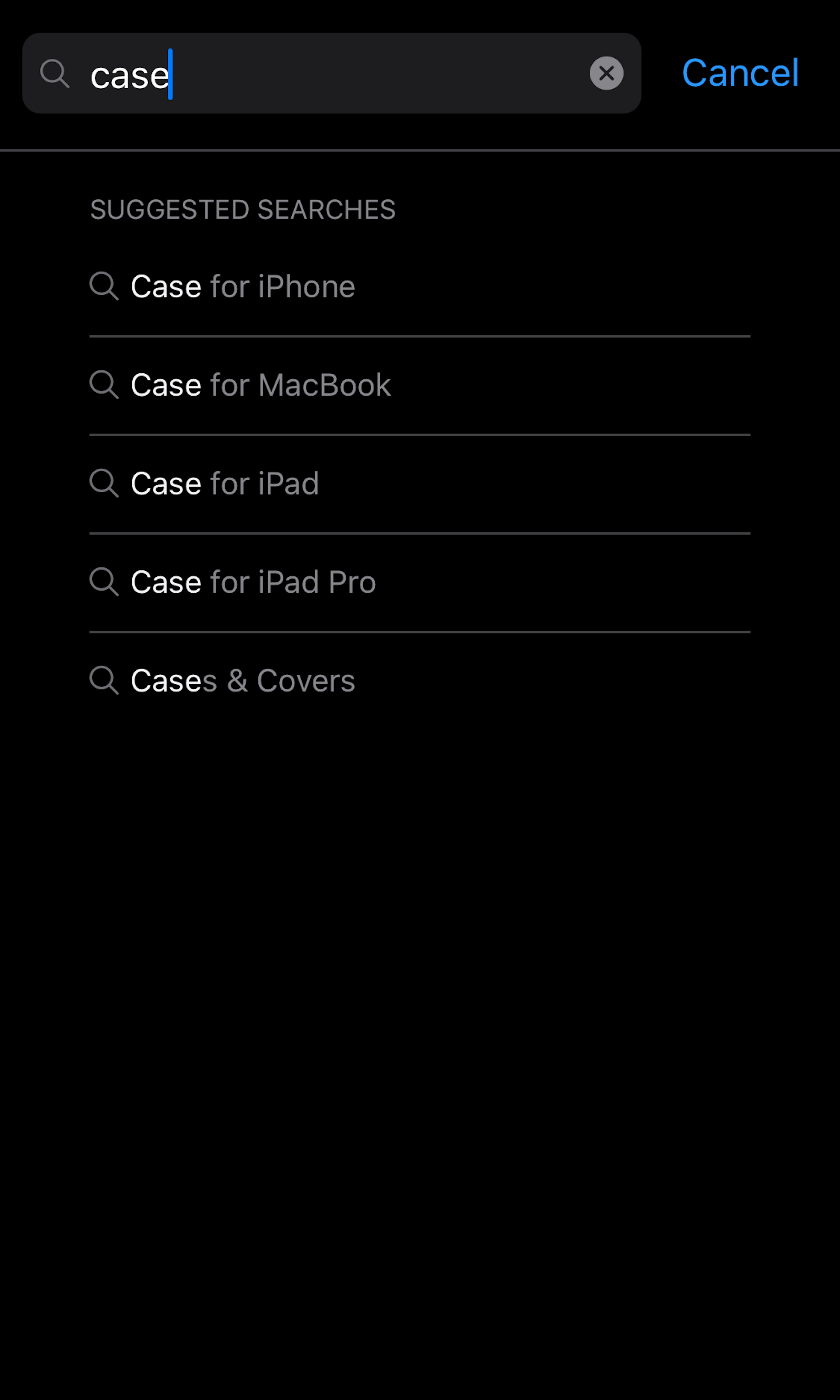
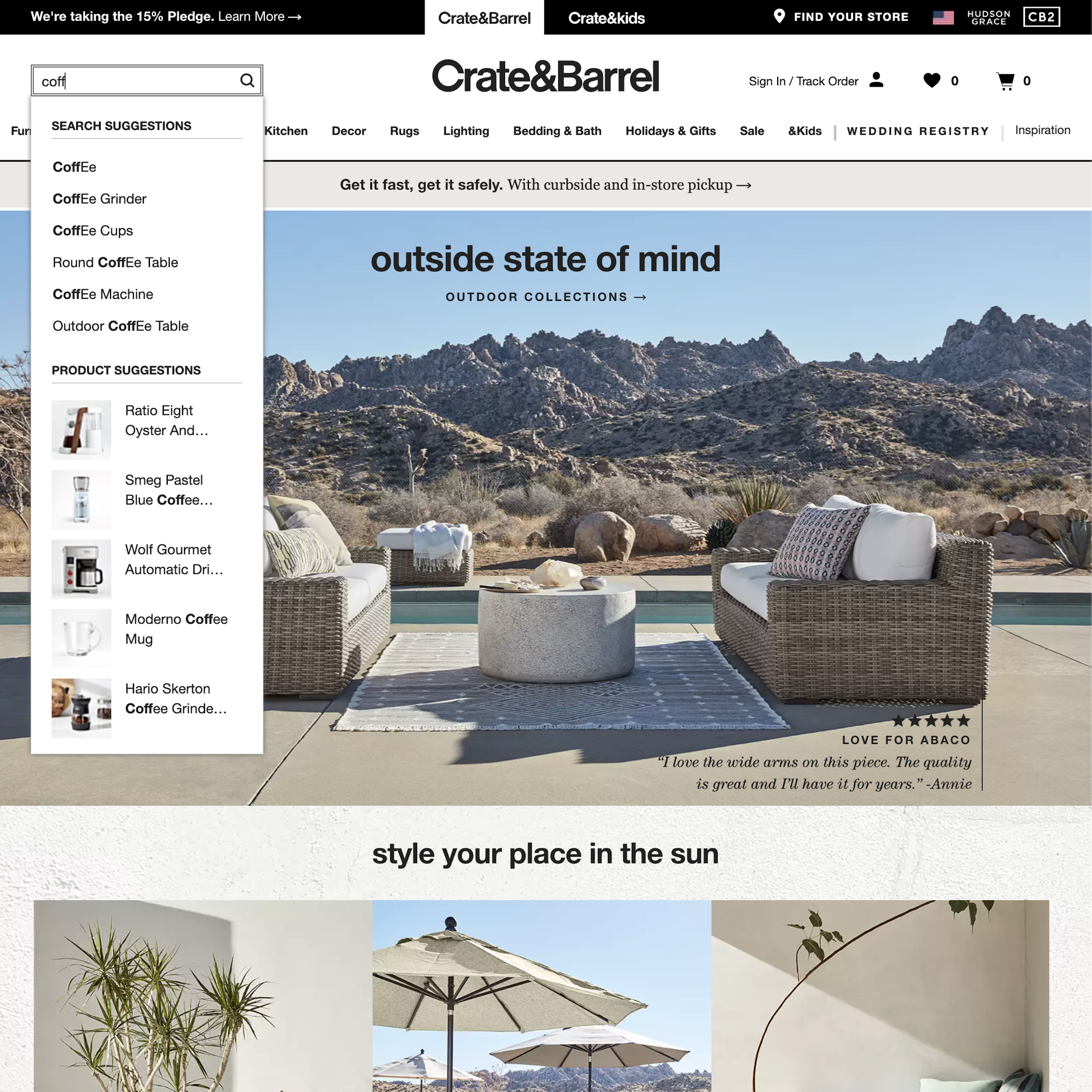
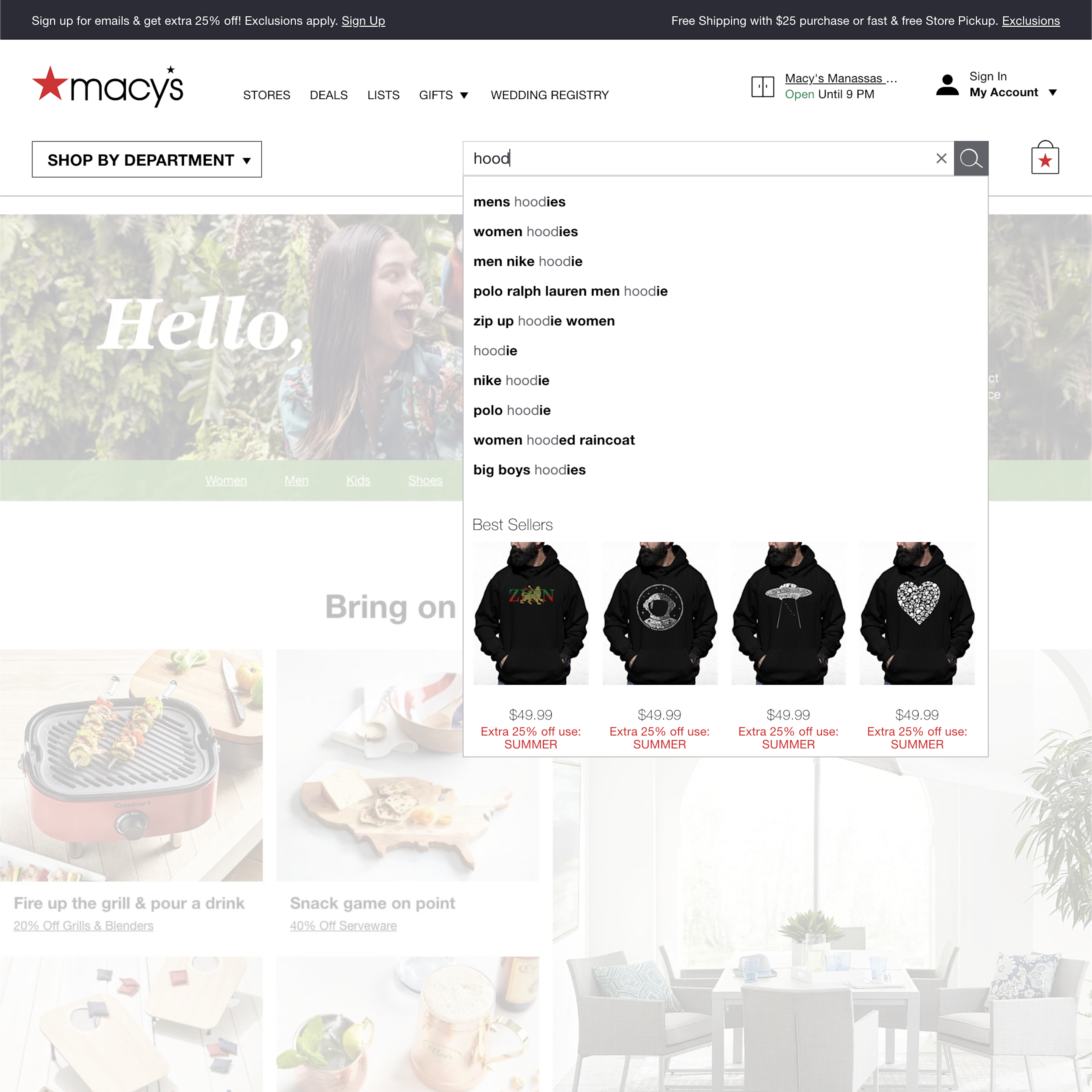
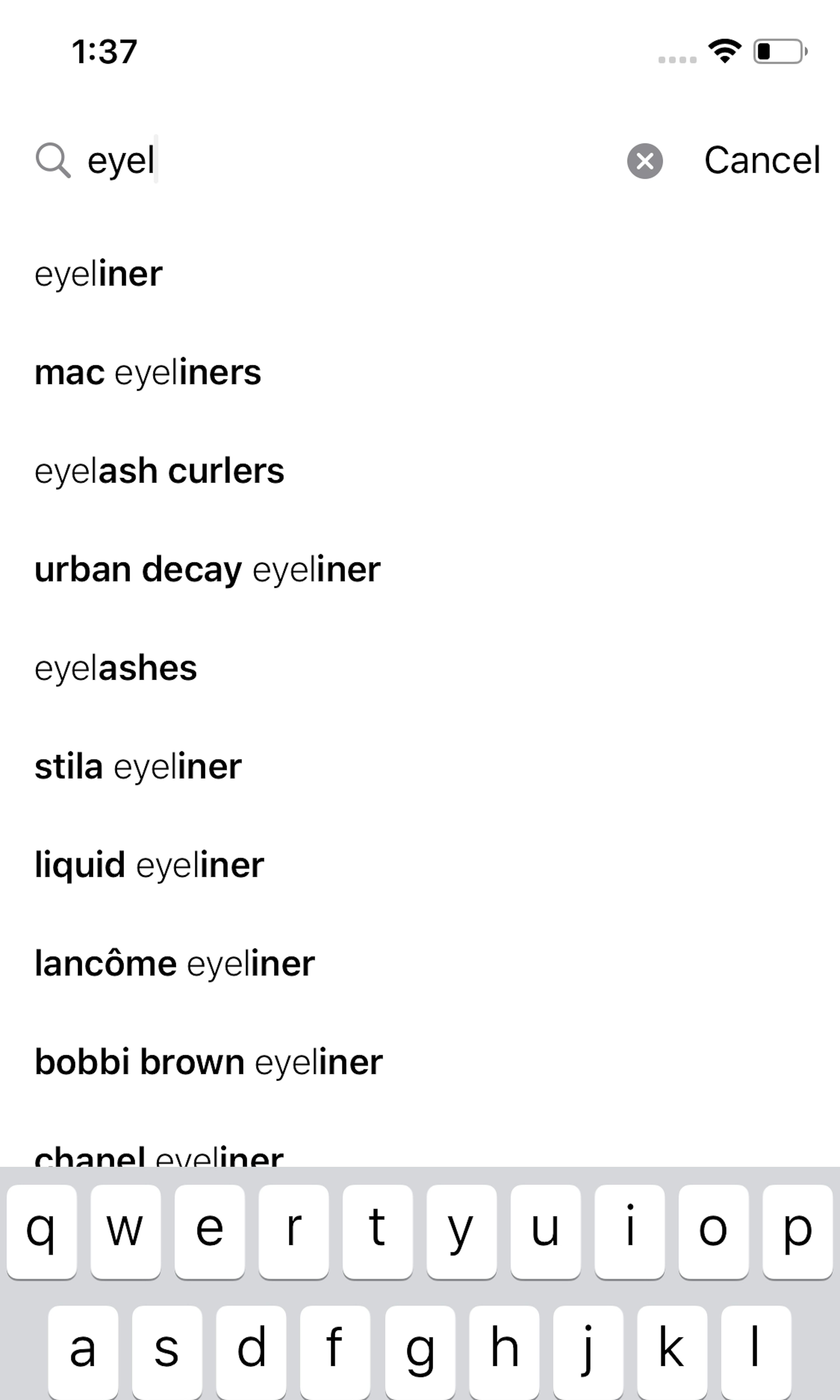
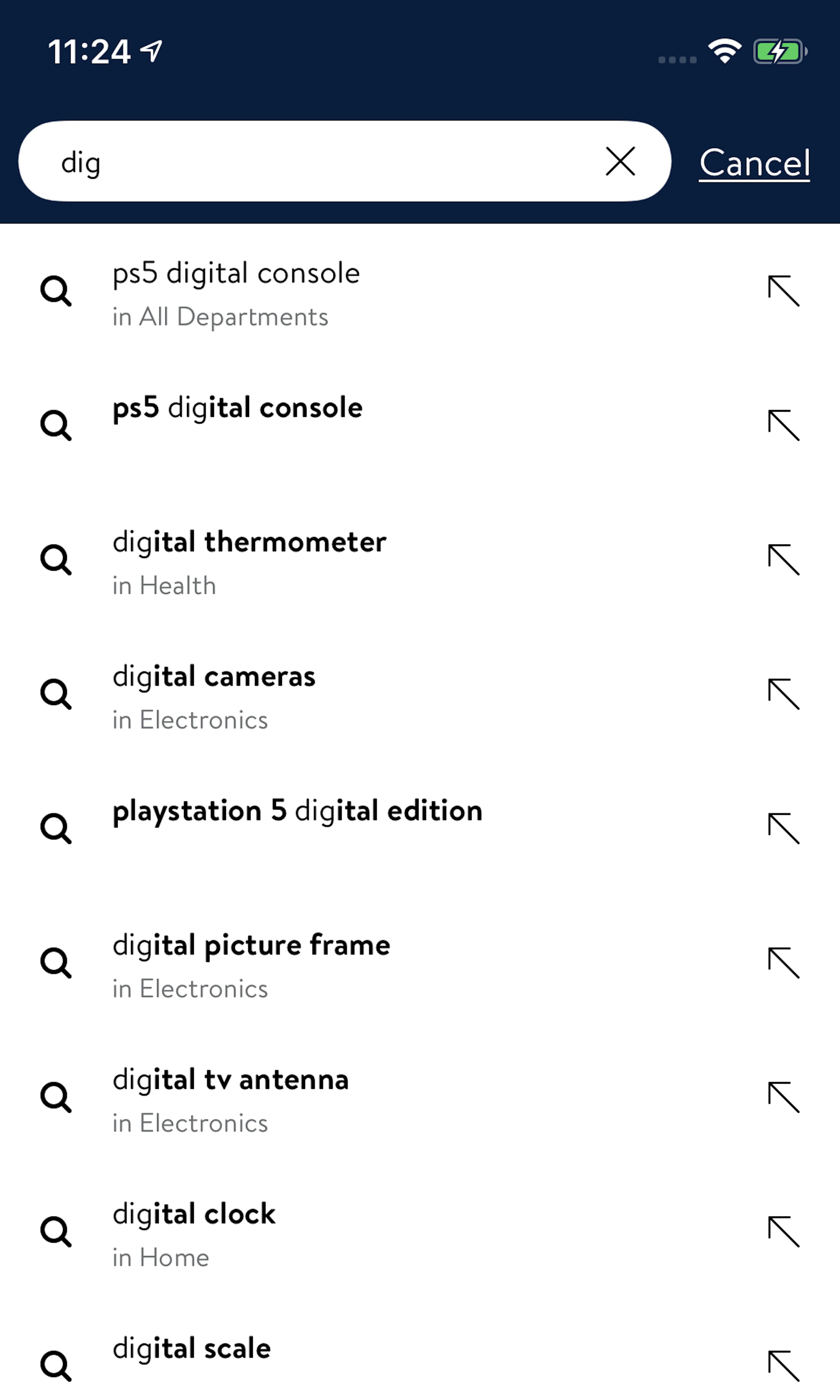
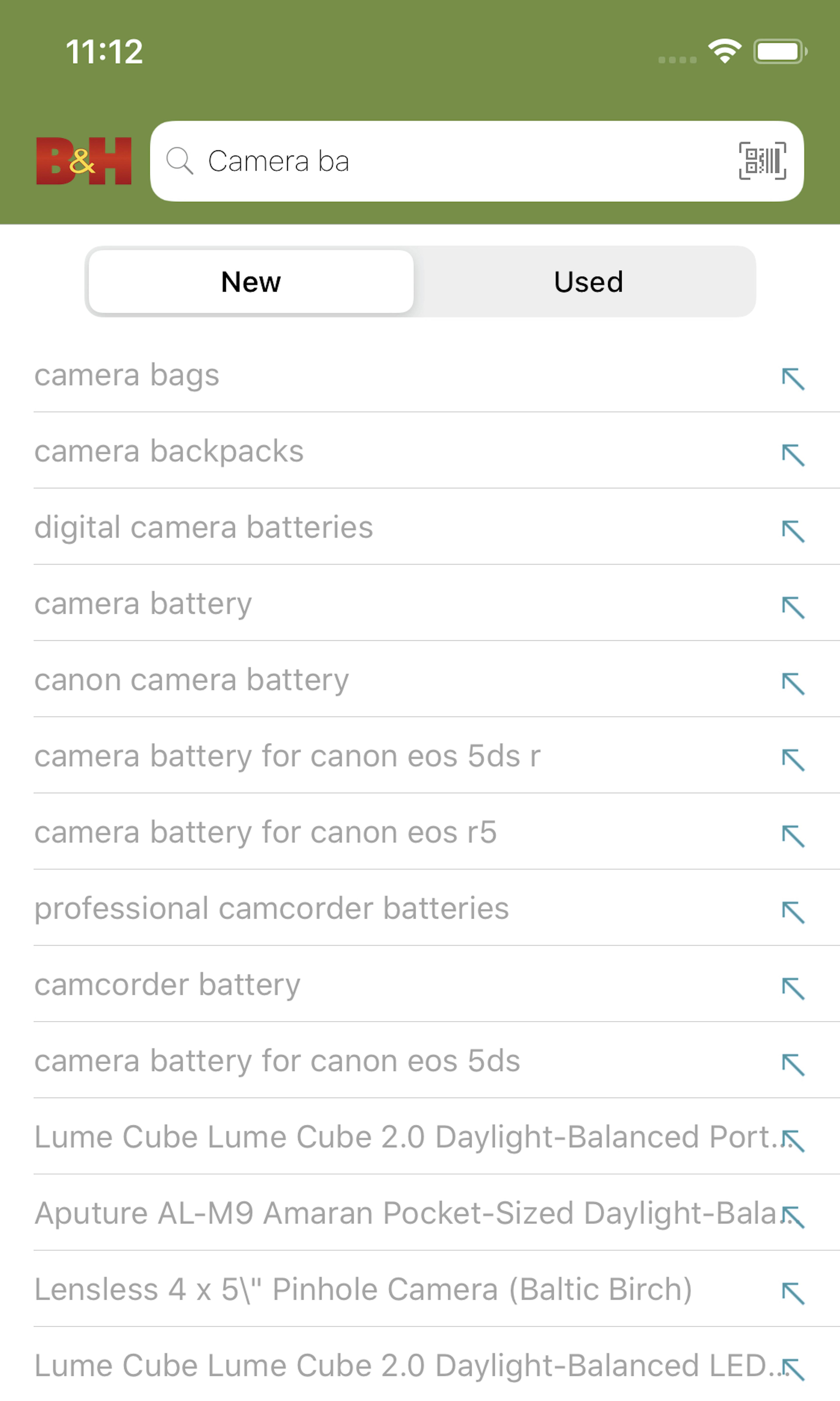
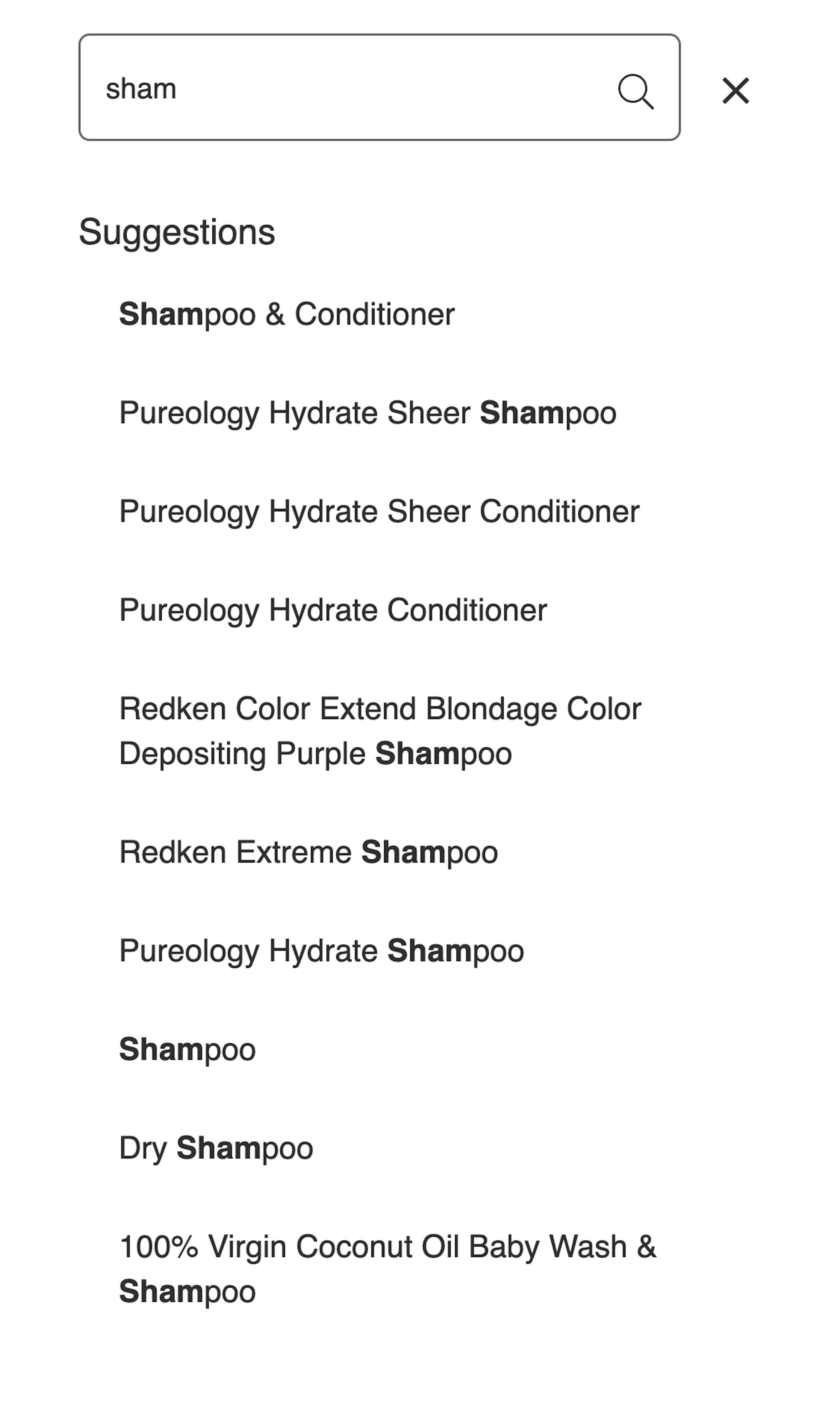
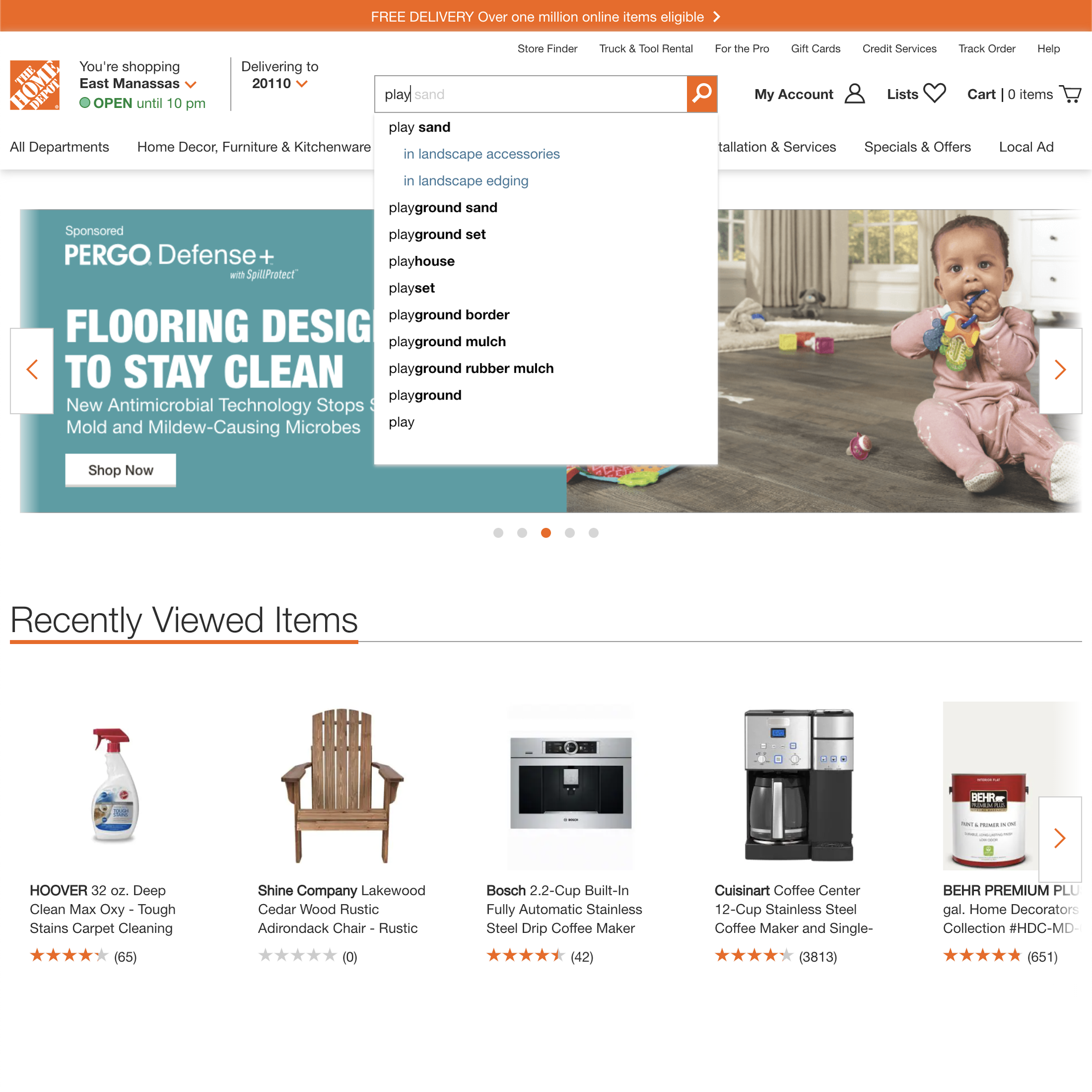
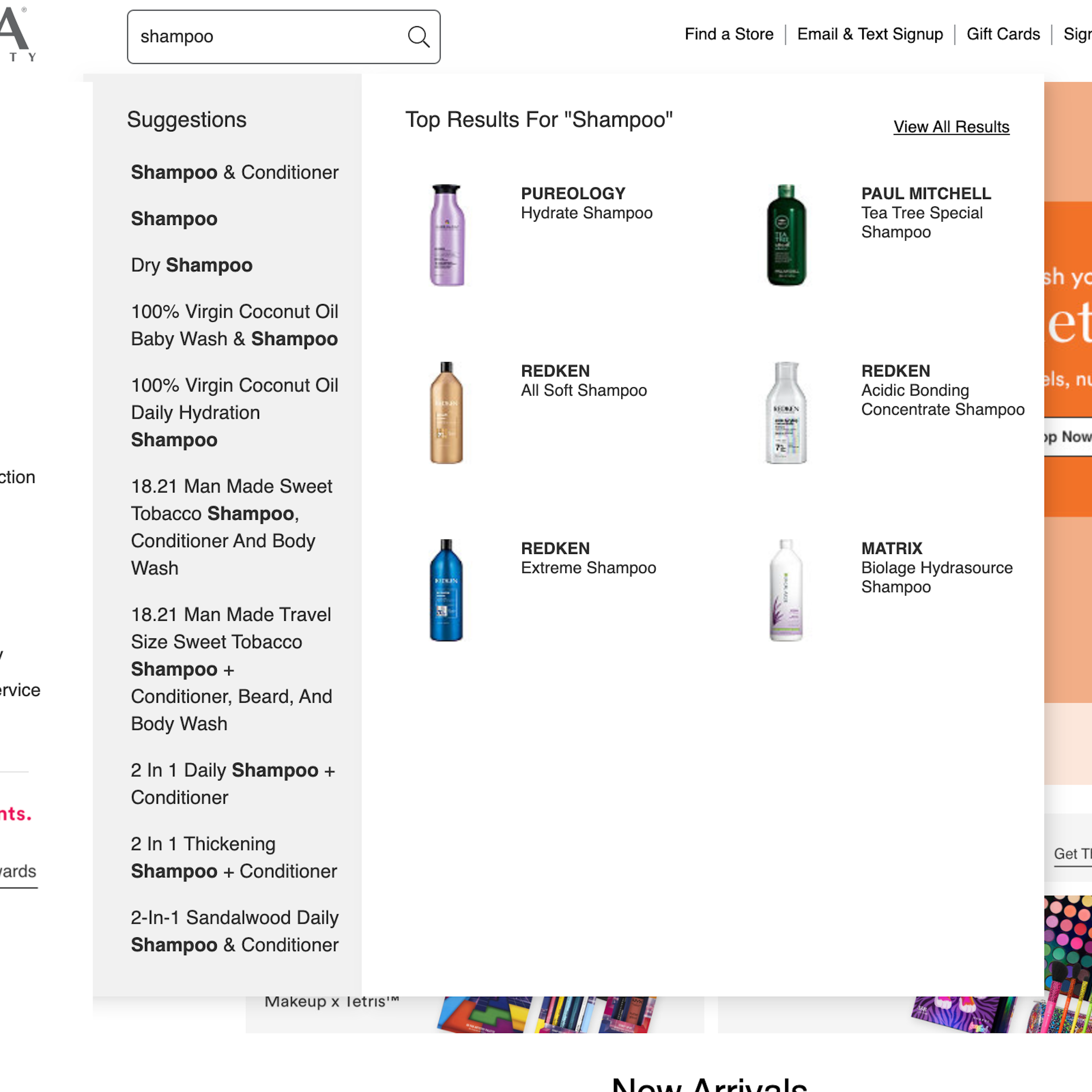
1075 ‘Autocomplete Suggestions’ Design Examples
Also referred to as: Query Suggestions, Predictive Search, Typeahead Search
What’s this? Here you’ll find 1075 “Autocomplete Suggestions” full-page screenshots annotated with research-based UX insights, sourced from Baymard’s UX benchmark of 327 e-commerce sites. (Note: this is less than 1% of the full research catalog.)
Our large-scale search UX testing reveals that having autocomplete suggestions (sometimes also called “Predictive Search” or “Search Typeahead”) appear as users type their search query isn’t about speeding up the user’s typing process. The true value comes from how autocomplete suggestions can assist and guide users toward submitting better search queries. When autocomplete suggestions are done well they inspire users about the types of queries to use, teach correct domain terminology, help avoid typos, and assist users in selecting the right search scope.
More ‘Autocomplete Suggestions’ Insights
-
Autocomplete search suggestions have become increasingly popular on e-commerce sites over the past years, and our benchmark documents that search autocompletes are now used at 90% of major e-commerce sites. Precisely because autocomplete suggestions are so common, users also have fairly well-established expectations of how the autocomplete widget will work. When these expectations are violated, the user’s search experience plummets and, in some cases, leads them astray. During our testing, suboptimal autocomplete suggestions sent multiple subjects on detours, often with a completely wrecked search experience or site abandonment as the result.
-
As autocomplete directly manipulates what users will search for and how they search, it’s one of those features that can do more harm than good if not implemented properly. Users generally expect ”the site to know better”, and during our large-scale testing users were very faithful to the site’s suggestions. Therefore the quality and relevance of the autocomplete suggestions should be taken just as seriously as the search results’ quality and relevance.
-
Learn More: Besides exploring the 1075 autocomplete examples below (for general inspiration), you may also want to read our related article “8 Design Patterns for Autocomplete Suggestions”.
-
Get Full Access: To see all of Baymard’s e-commerce search research findings you’ll need Baymard Premium access. (Premium also provides you full access to 200,000+ hours of UX research findings, 650+ e-commerce UX guidelines, and 275,000+ UX performance scores.)
User Experience Research, Delivered Weekly
Join 60,000+ UX professionals and get a new UX article every week.

User Experience Research, Delivered Weekly
Join 60,000+ UX professionals and get a new UX article every week.

Explore Other Research Content

300+ free UX articles based on large-scale research.

327 top sites ranked by UX performance.

Code samples, demos, and key stats for usability.


