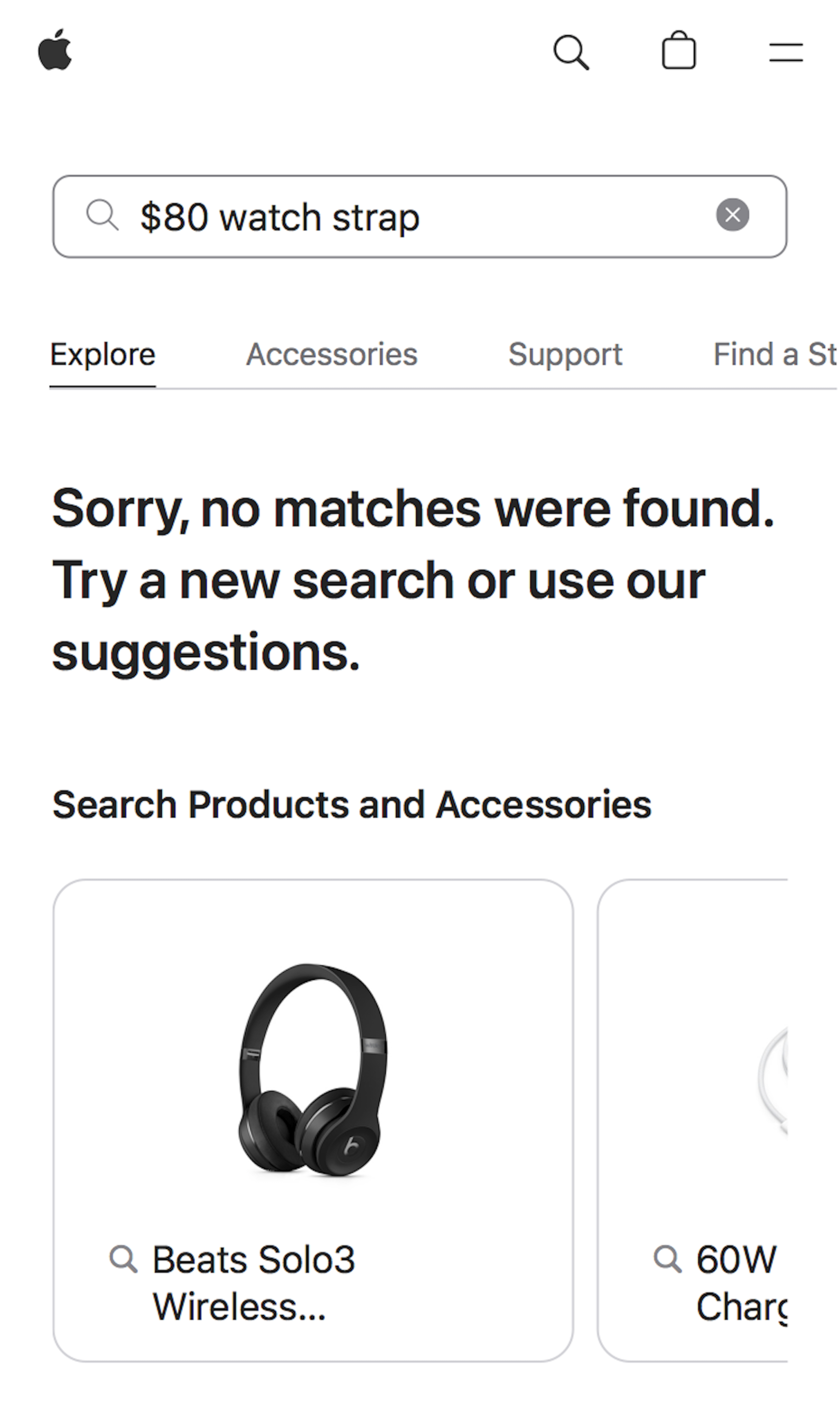
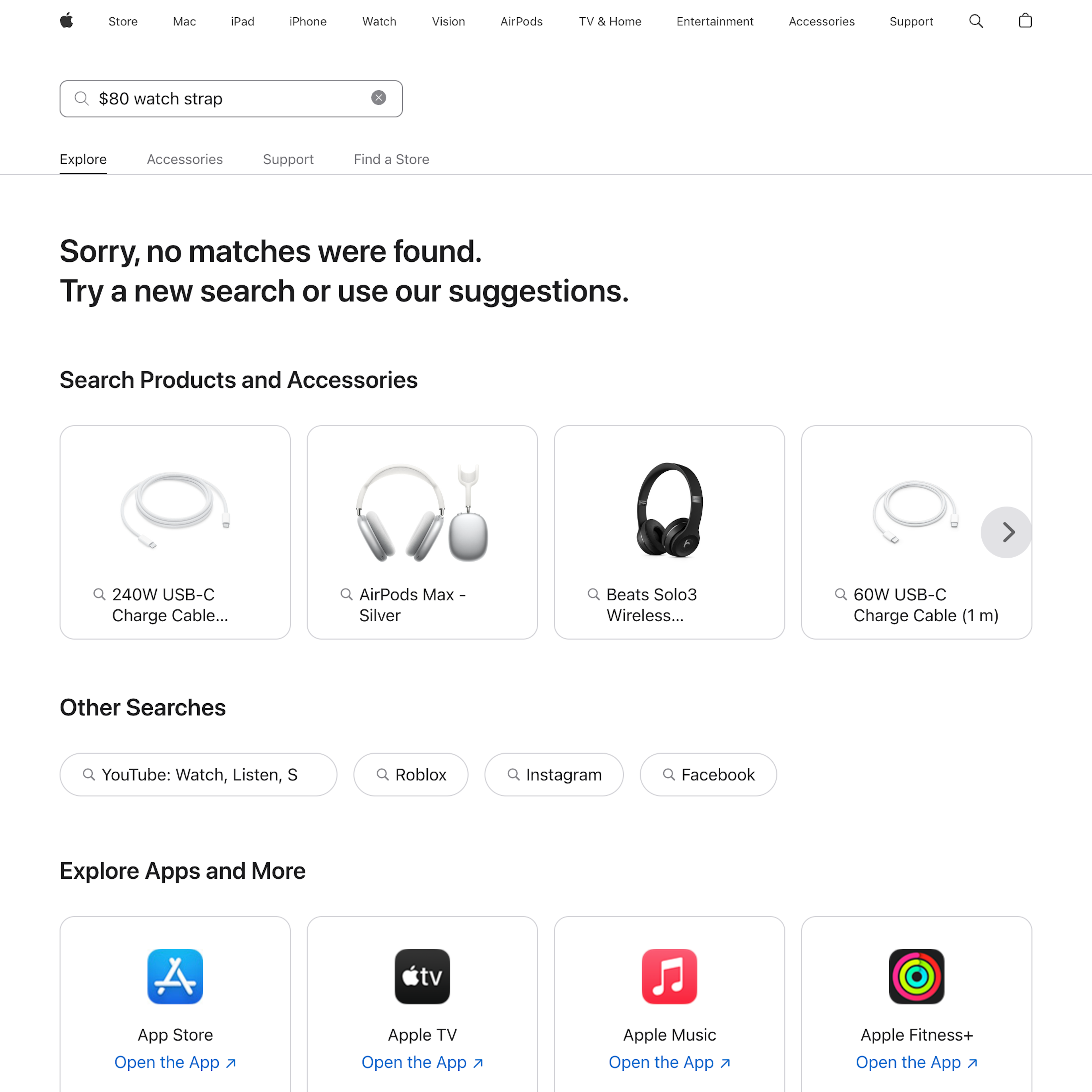
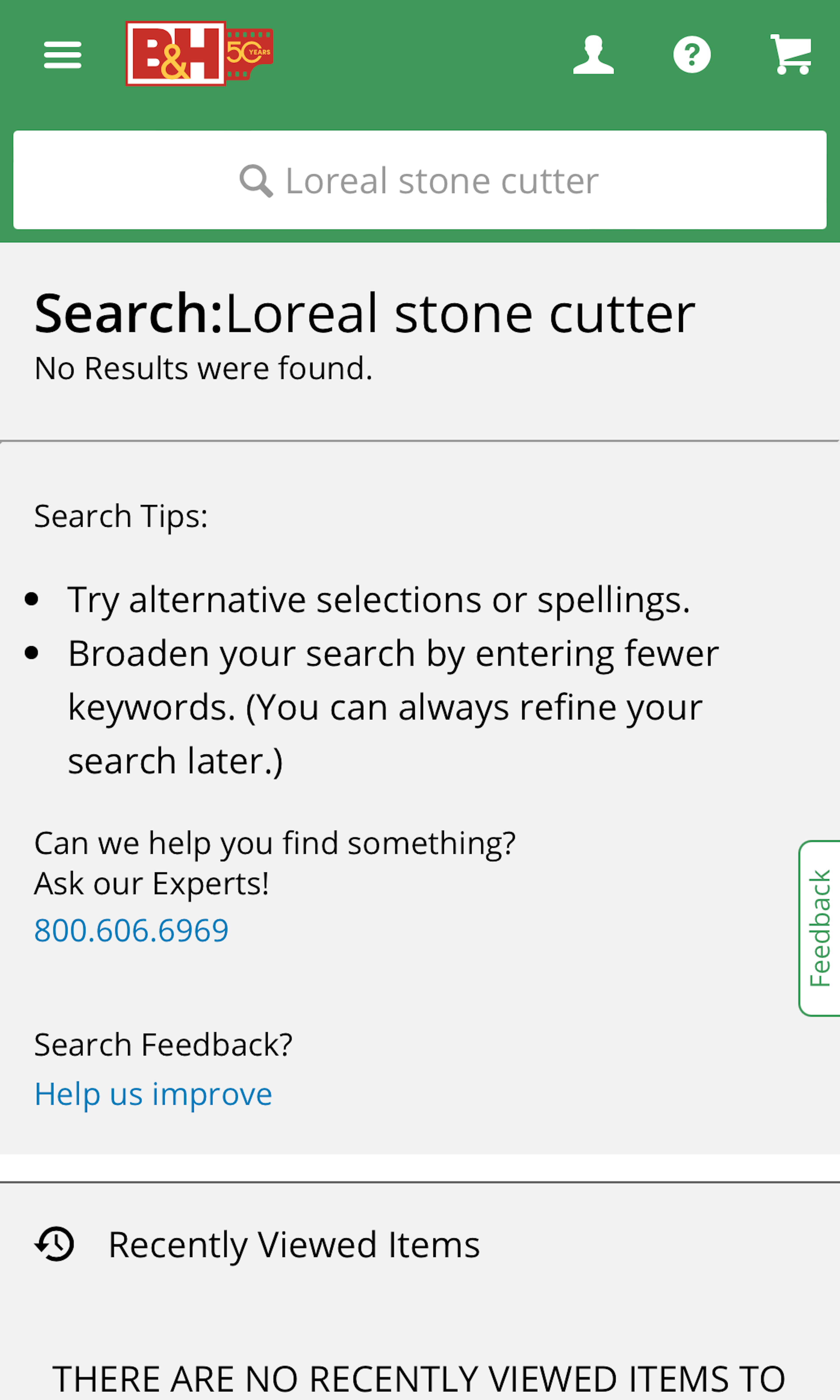
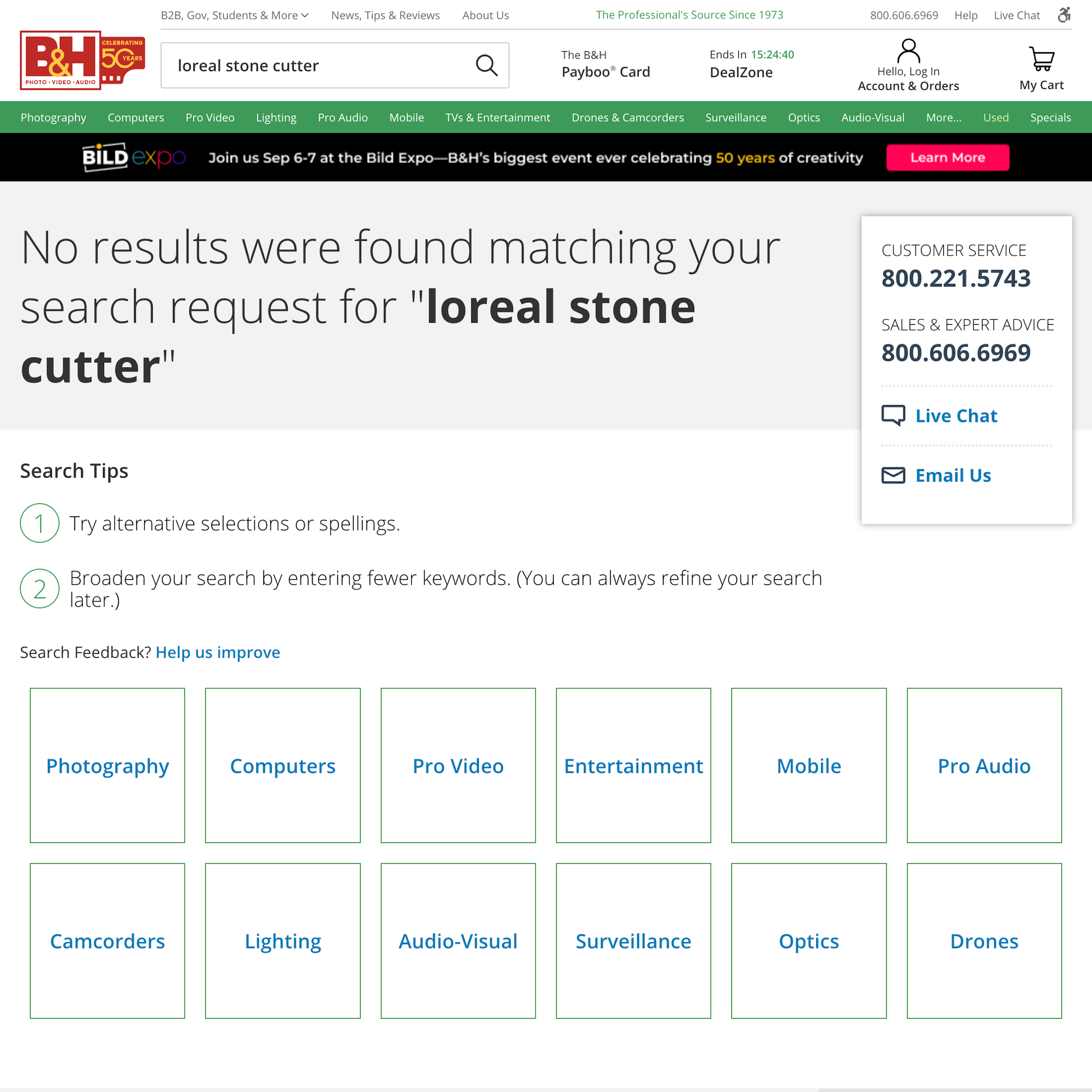
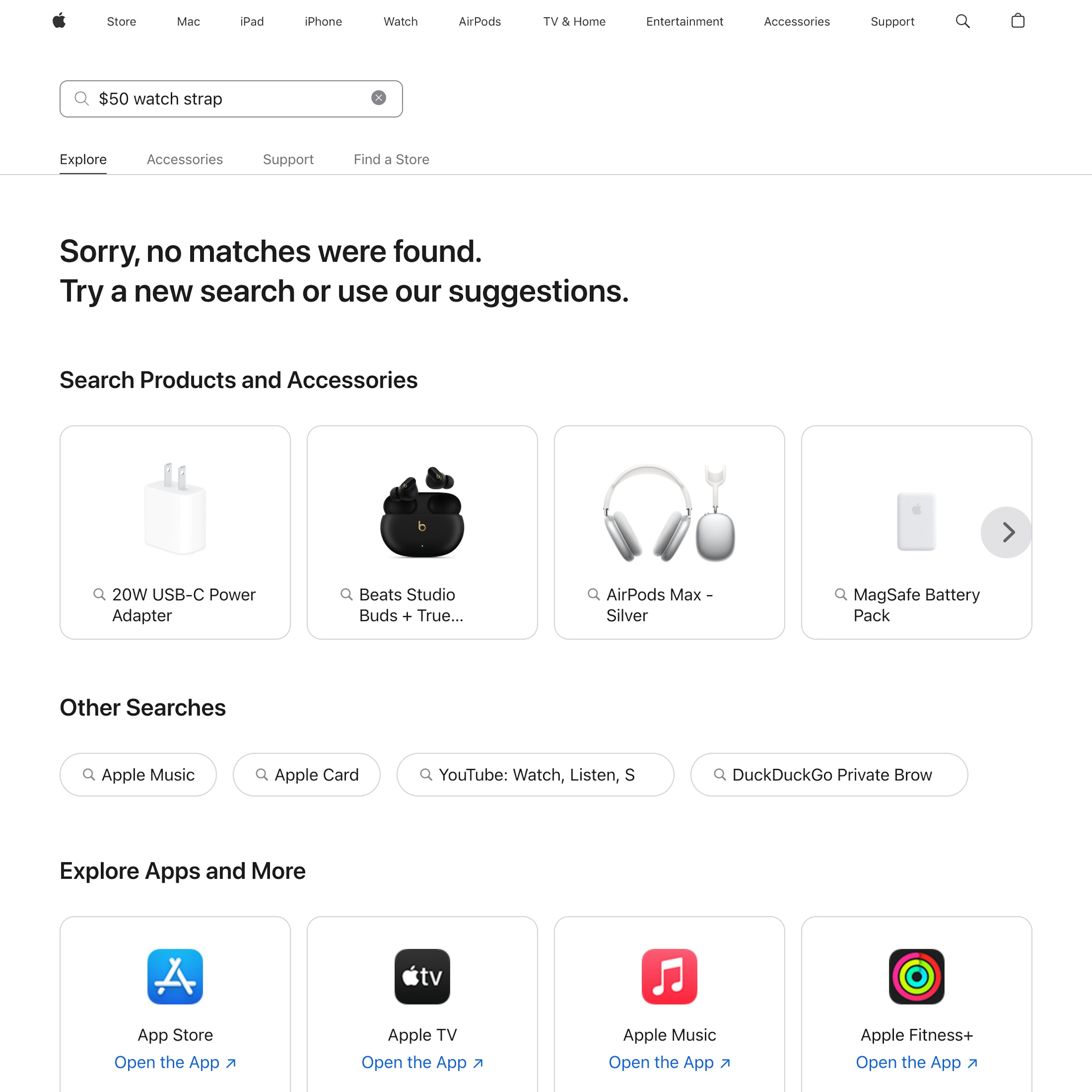
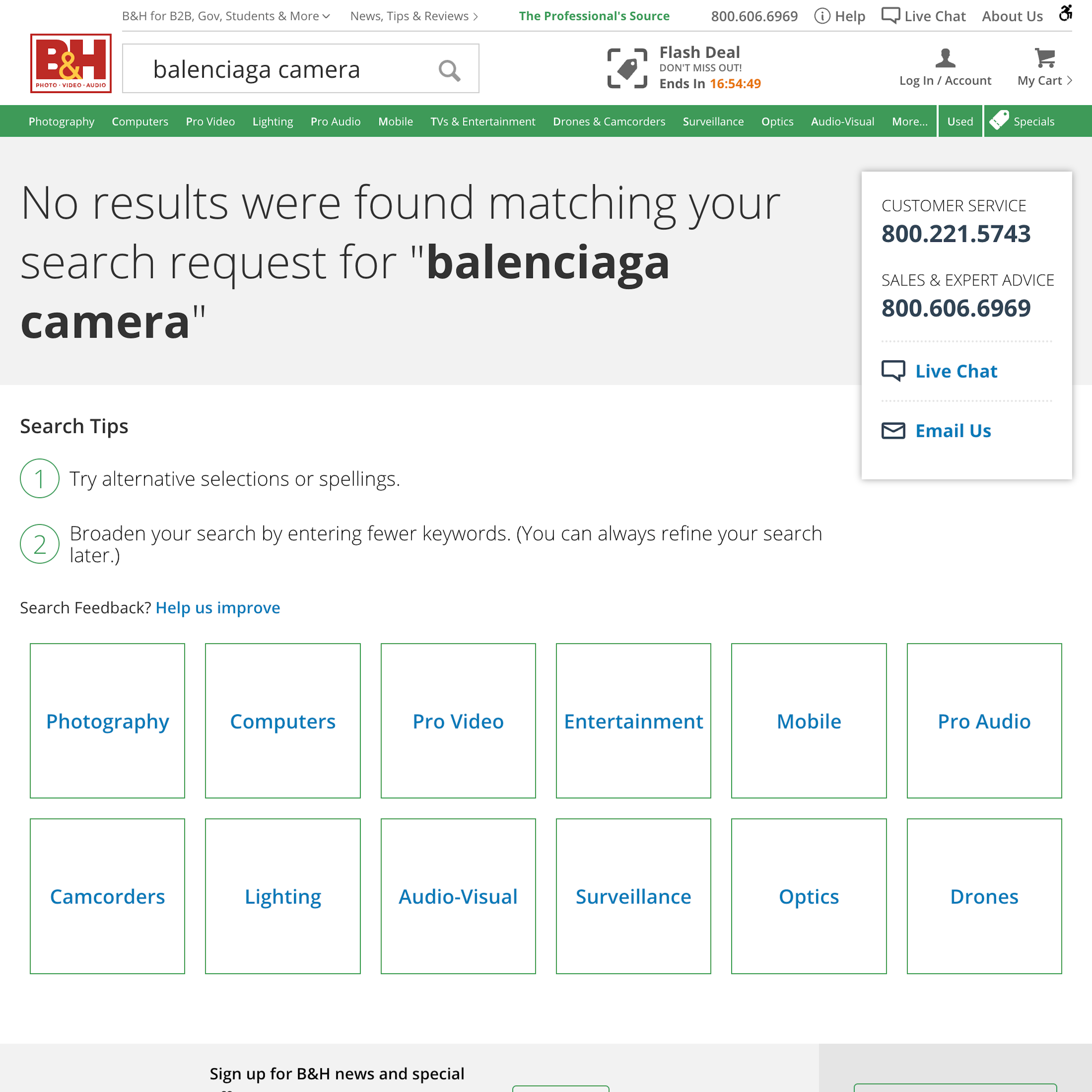
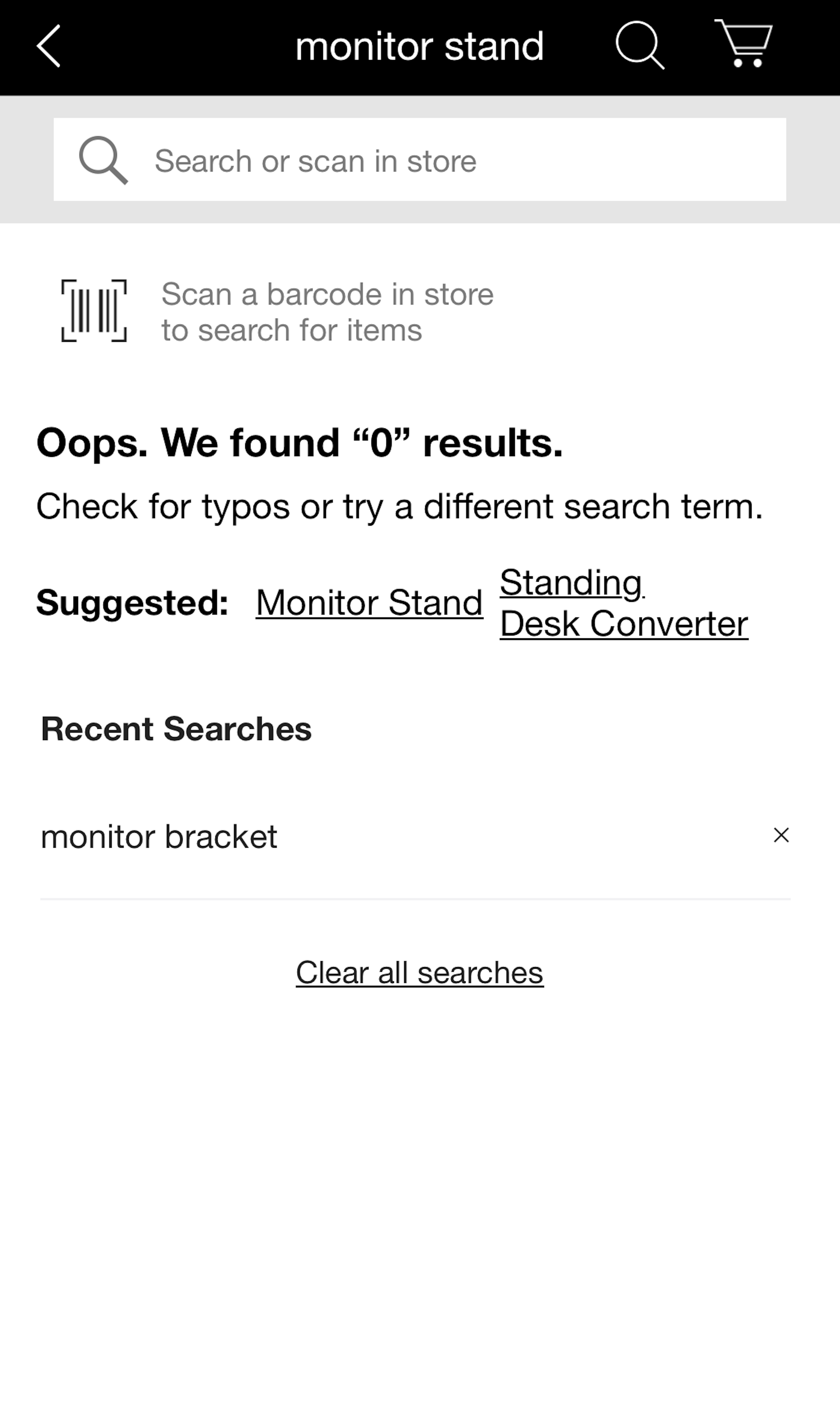
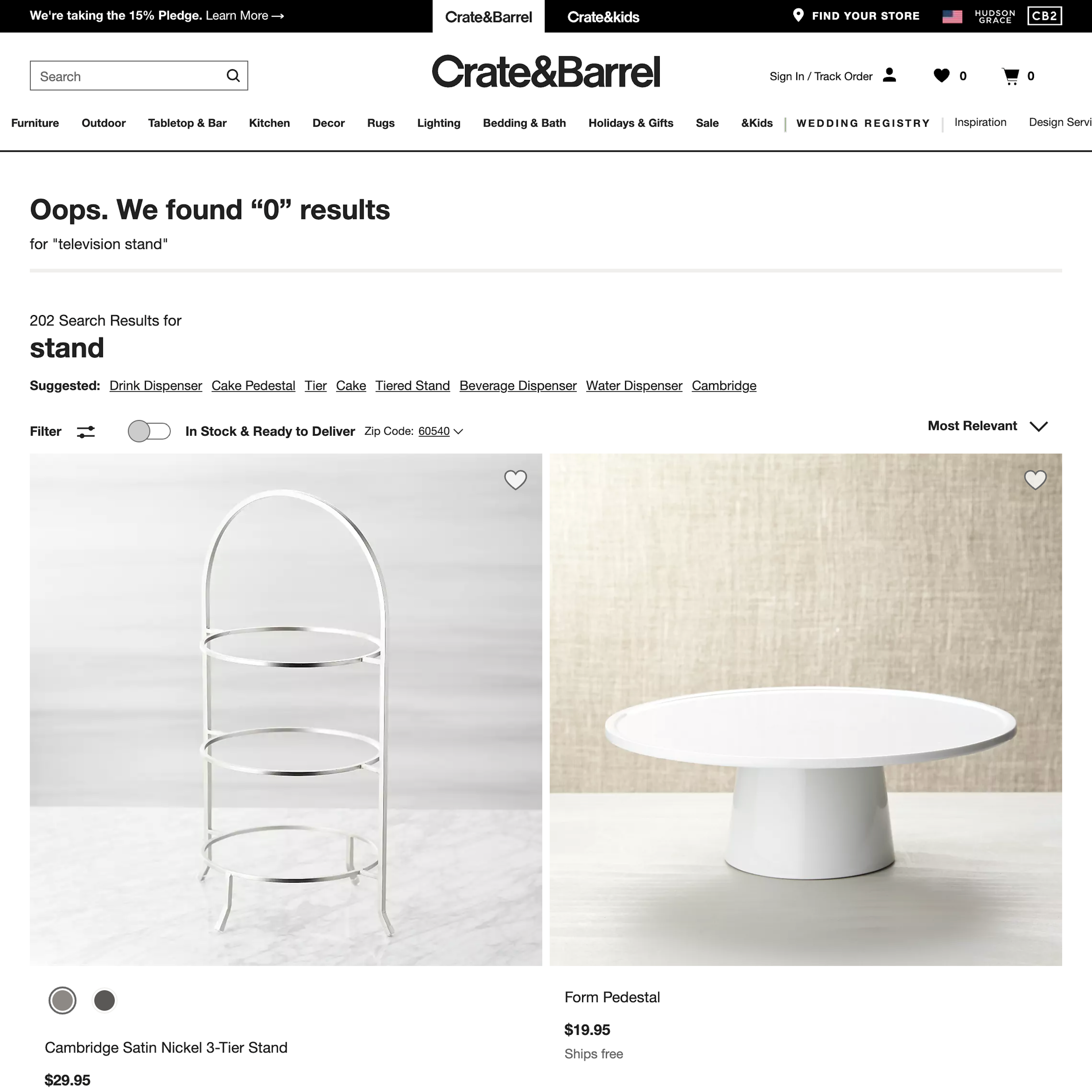
617 ‘No Results Page’ Design Examples
Also referred to as: No Results Found, No Search Results
What’s this? Here you’ll find 617 “No Results Page” full-page screenshots annotated with research-based UX insights, sourced from Baymard’s UX benchmark of 325 e-commerce sites. (Note: this is less than 1% of the full research catalog.)
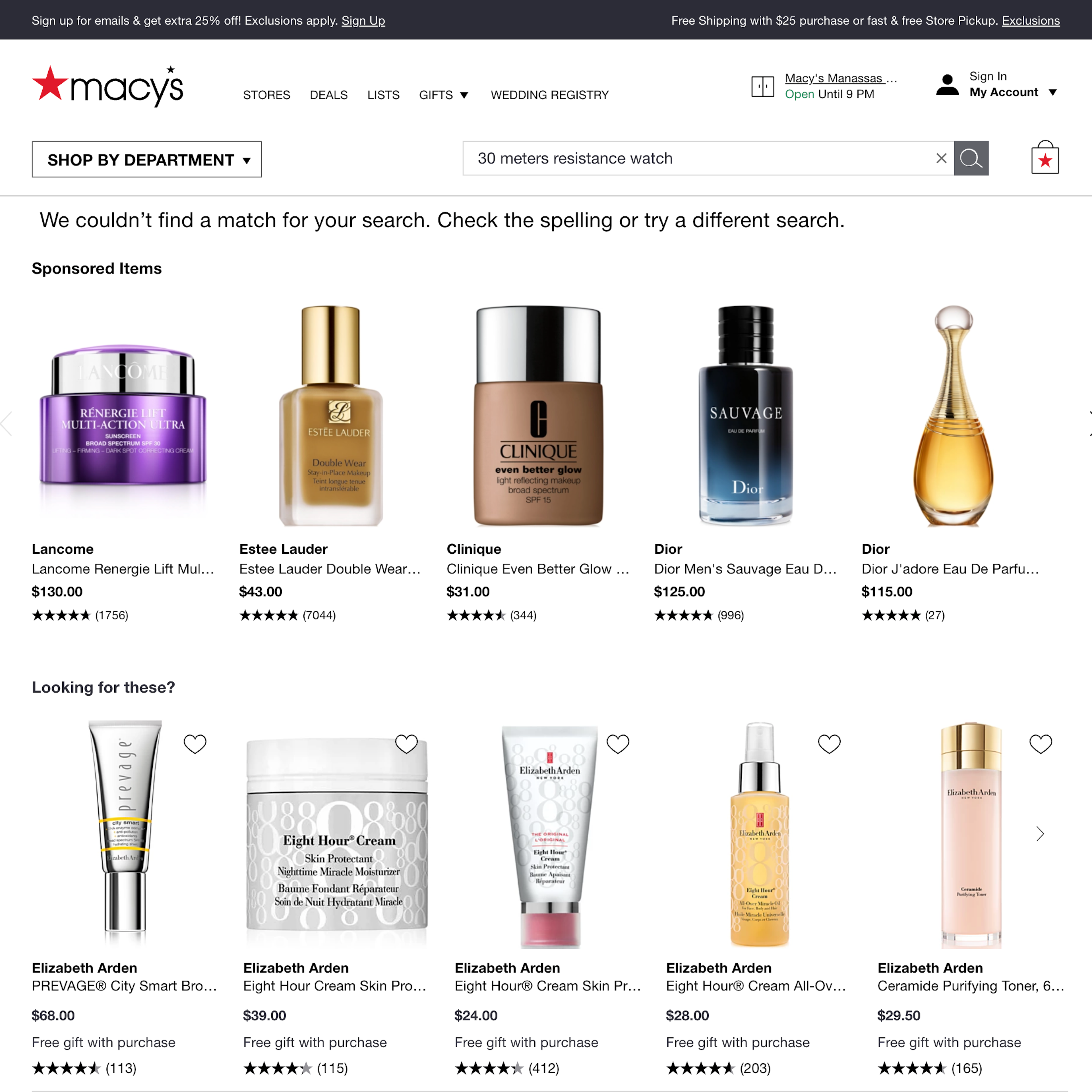
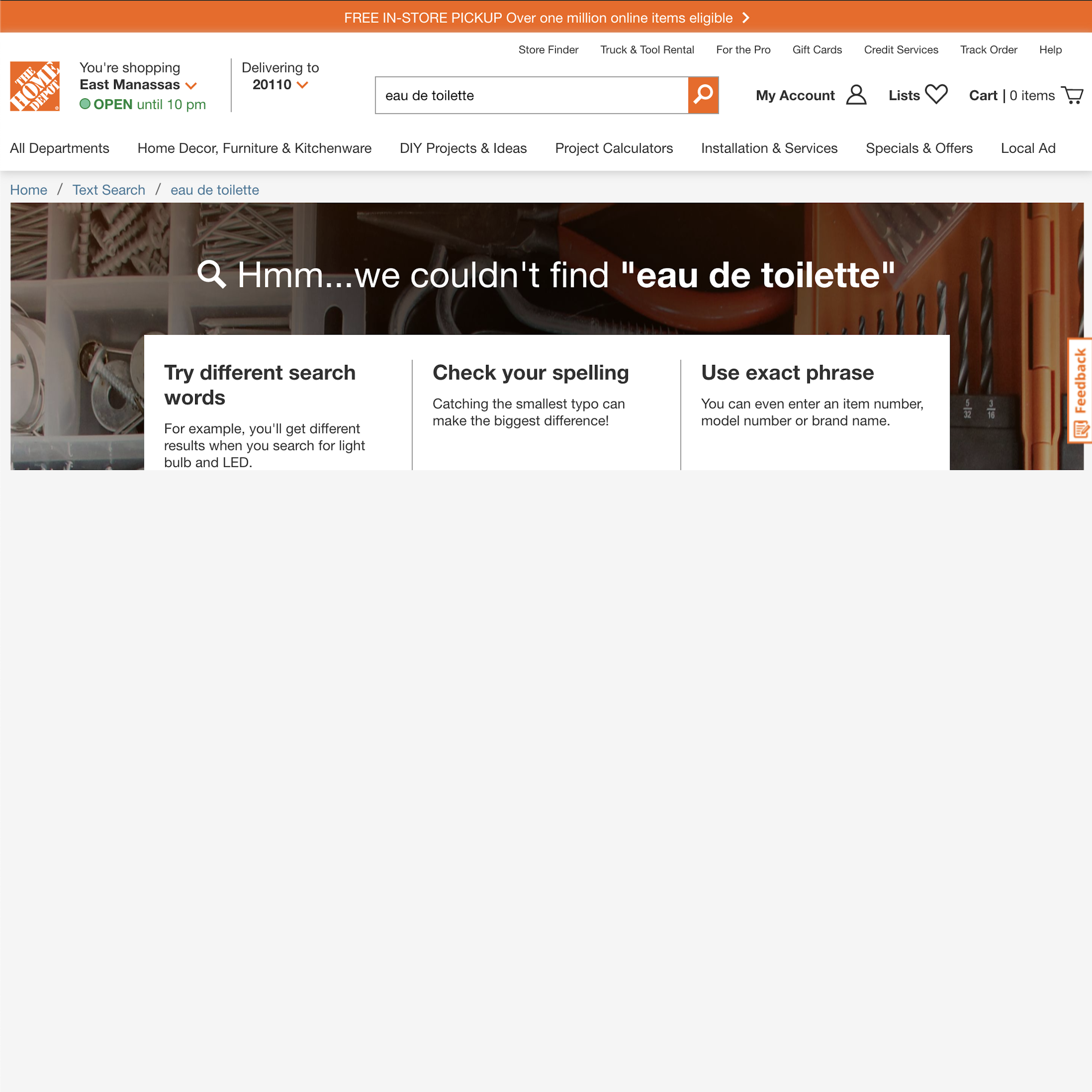
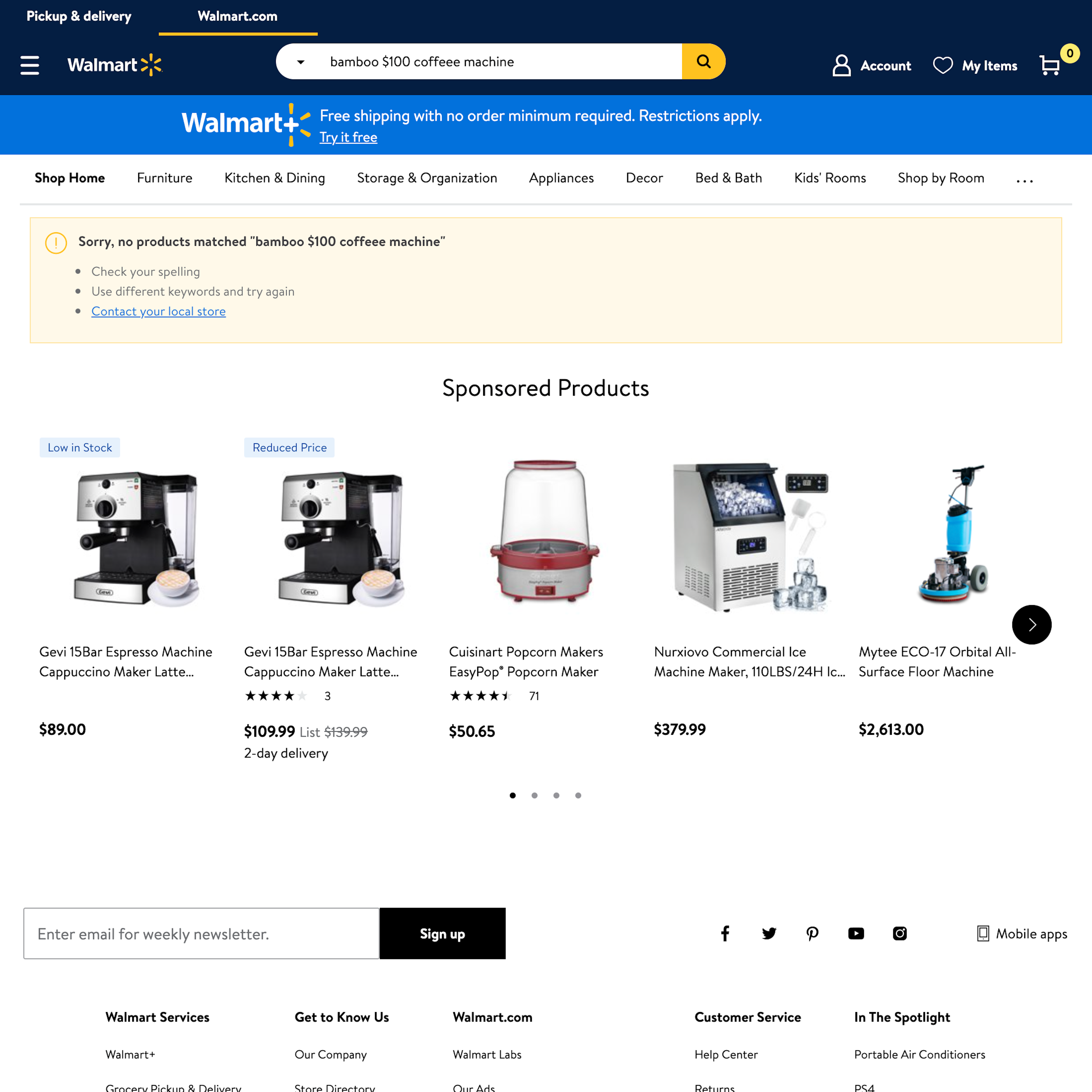
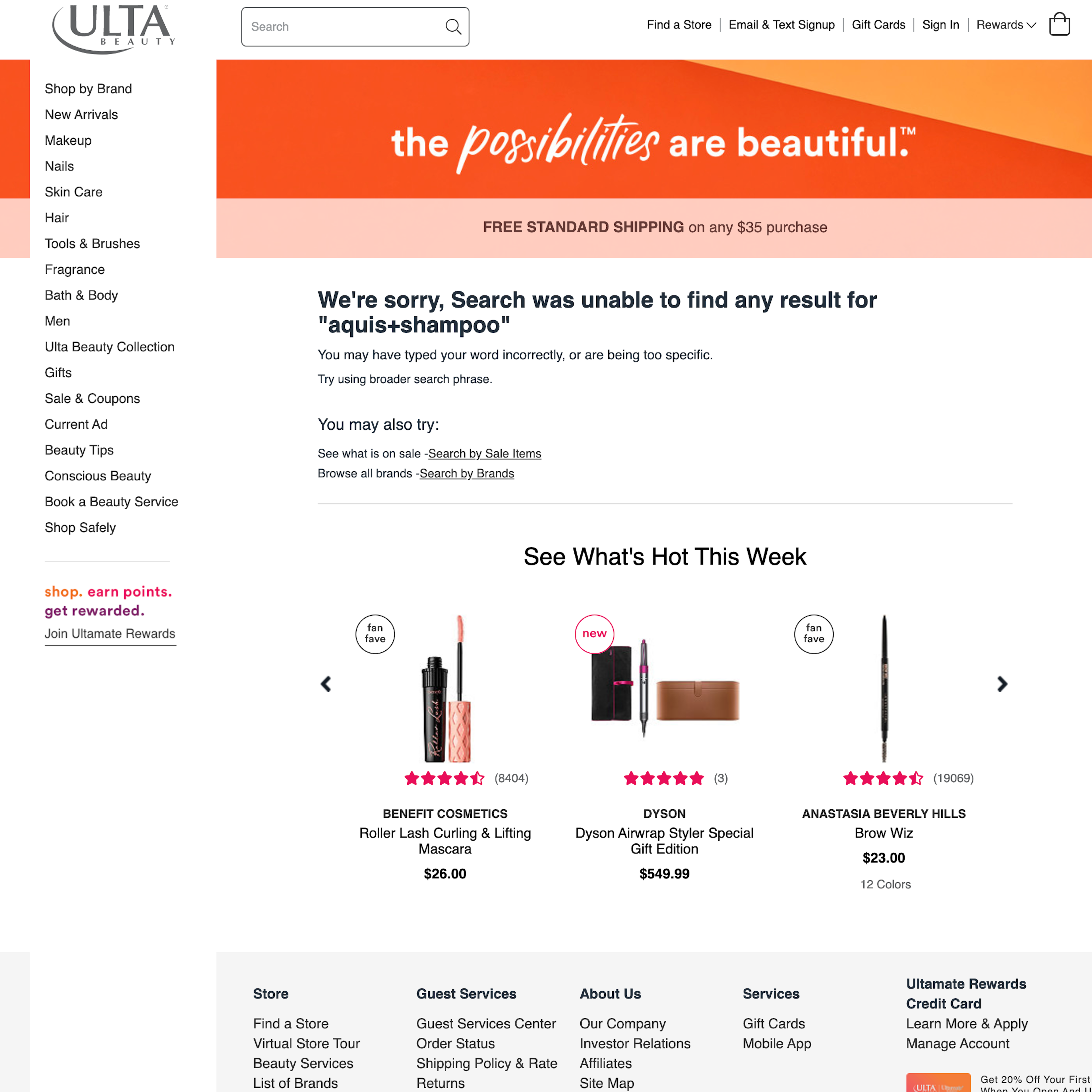
It won’t always be possible to show search results — sometimes the store doesn’t have what the user is looking for, other times the search engine isn’t fully capable of understanding what the user searched for. In these cases, it’s important to have a helpful “No Results” page that guides the user back on track. However, our usability testing reveals that 68% of e-commerce sites have a “No Results Page” implementation that is essentially a dead-end for users, offering no more than a generic set of search tips.
More ‘No Results Page’ Insights
- With little or no helpful guidance or content on the “No Results” page, the user has two options — either think up a whole new product-finding strategy (which may or may not be successful) or abandon the site. During testing, we time and again observed subjects who got stuck on a poor “No Results” page and, with no easy options for getting back on track, simply gave up and abandoned the site. However, there’s good news too. Because, on the opposite end of the spectrum, we found that great “No Results” pages that take users by the hand and point them toward meaningful content and solutions can become an enabler rather than a roadblock.
-
The “No Results” page is, in other words, not a problematic page in and of itself — but its implementation is hugely important and can lead to anything from a severely harmful user experience to a highly positive one. During testing we found 8 different elements for “No Results” pages that were identified to consistently perform well during testing.
-
Learn More: Besides exploring the 617 “No Results” page design examples below, you may also want to read our related articles on “Search UX: 6 Essential Elements for ‘No Results’ Pages” and “Deconstructing E-Commerce Search: The 12 Query Types”.
- Get Full Access: To see all of Baymard’s e-commerce search research findings you’ll need Baymard Premium access. (Premium also provides you full access to 200,000+ hours of UX research findings, 650+ e-commerce UX guidelines, and 275,000+ UX performance scores.)
User Experience Research, Delivered Weekly
Join 60,000+ UX professionals and get a new UX article every week.

User Experience Research, Delivered Weekly
Join 60,000+ UX professionals and get a new UX article every week.

Explore Other Research Content

300+ free UX articles based on large-scale research.

325 top sites ranked by UX performance.

Code samples, demos, and key stats for usability.


