Key Takeaways
- On-site searches sometimes return no matching results, whether due to the product catalog or the content of the user’s query
- “No Results” pages that lack new avenues for users to explore can lead to site abandonment, yet 50% of sites struggled to provide these paths
- 5 proven strategies help users bounce back from failed searches and continue their product-finding journeys
Video Summary
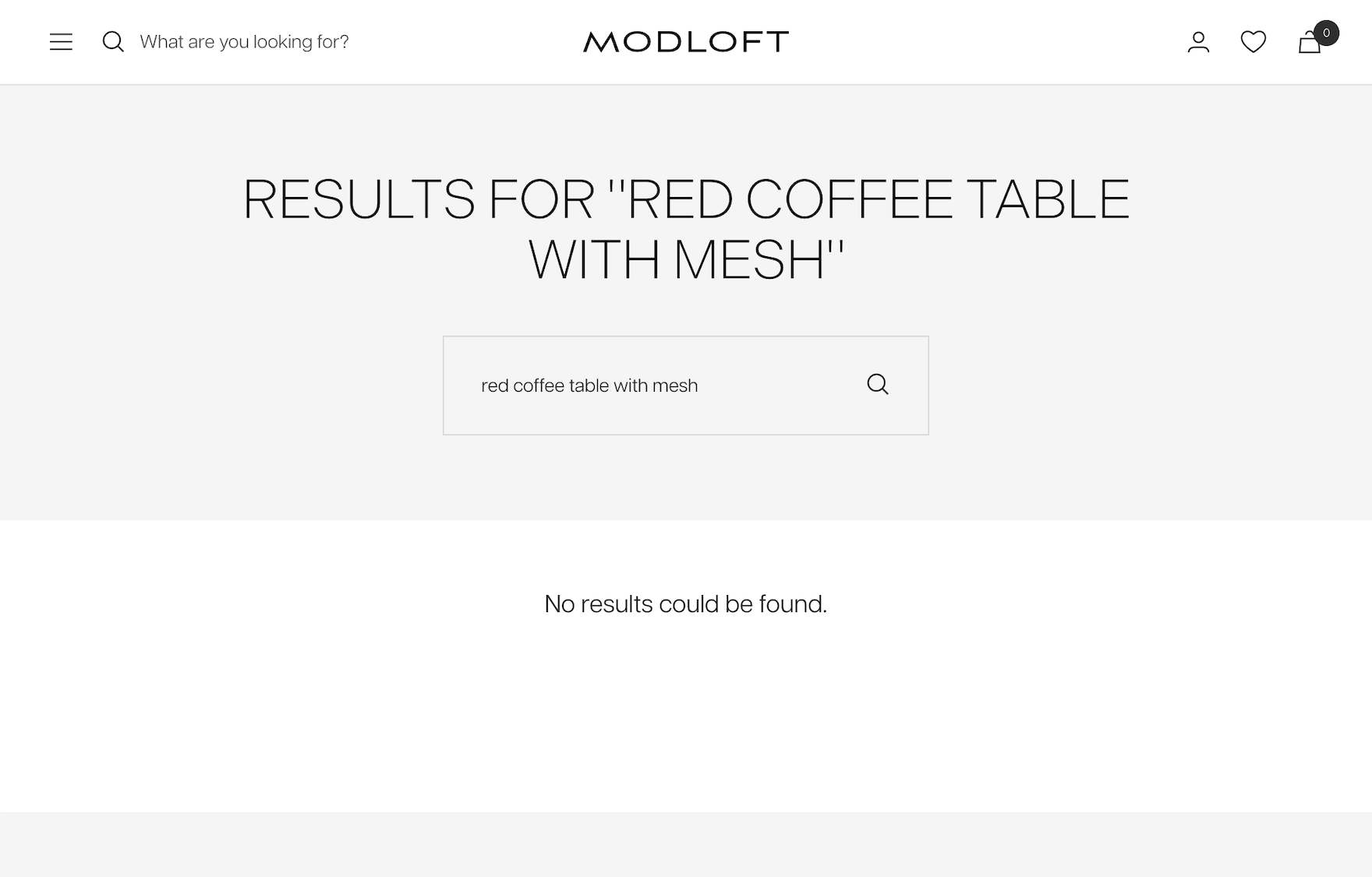
During our large-scale On-Site Search usability testing, many users encountered a “No Results” page while searching for products.
A “No Results” page itself isn’t the problem — it becomes one when it offers few or no options to continue, turning into an unnecessary dead end that often leads to site abandonment.
Baymard’s latest ecommerce Search UX benchmark shows that nearly 50% of sites fail to provide users with effective ways to recover from a search that yields no results.
Fortunately, our testing uncovered 5 proven strategies to transform “No Results” pages from dead ends into helpful guides that keep users engaged, exploring, and shopping.
In this article, we’ll dive into our Premium research findings on “No Results” pages to uncover:
- Why “No Results” pages often trigger site abandonment
- Why “search tips” alone fall short
- 5 proven strategies that help users recover from failed searches and continue their journey through your site
Why “No Results” Pages Often Lead to Dead Ends
At Tirerack.com, users who encounter a “No Results” page are left stranded with no guidance to get back on track — turning this page into a complete dead end.
Similarly, Gucci’s “No Results” page lacks any form of support, leaving users struggling to recover from an unsuccessful search.
At some point, even the best search engines will fail to return results for certain user queries.
This can happen when a site simply doesn’t carry the item users are searching for, or when the query is too ambiguous for even a well-honed search engine to interpret correctly.
Another common scenario is a search engine’s inability to handle any one of the 8 most common types of queries that users employ in ecommerce searches.
Regardless of the cause, when users land on a “No Results” page with little or no helpful guidance, they typically face two options:
- Devise a new product-finding strategy (e.g., rethink their search query or attempt category navigation — with a risk of another failure)
- Abandon the site entirely (often turning to external search engines, where they are more likely to succeed)
The good news? When designed well, “No Results” pages can act as helpful guides rather than frustrating roadblocks.
Testing shows that effective pages can redirect users toward meaningful content and solutions, helping them to find products and complete purchases (while a poorly designed one can drive them away).
In short, the “No Results” page itself isn’t inherently problematic — it’s all about how it’s implemented.
Yet our benchmarking finds that about 50% of ecommerce sites implement “No Results” pages in ways that create user frustrations and ultimately increase site abandonments.
Search Tips Alone Aren’t Enough
Our usability testing also reveals that many sites include “search tips” on “No Results” pages, such as suggesting users check for spelling errors or try broader, more general terms.
While these tips are well-intentioned, we’ve observed that users rarely read or apply them effectively, and the tips instead can create a reason to leave the site.
Even when users do read the tips, they often remain stuck — unsure of which term is misspelled or unaware of the site’s preferred alternative terms.
Simply put, search tips aren’t enough on their own.
While they can be a useful supplement to the proven strategies listed below, they shouldn’t be the only form of assistance available on a “No Results” page.
5 Ways to Engage Users Encountering “No Results”
When a well-intentioned search returns nothing it’s a frustrating setback.
However, our testing reveals that equipping “No Results” pages with most — or all — of the 5 proven strategies can turn that setback into an opportunity to guide users back on track.
Let’s review each of these strategies along with best practice examples from our benchmarked sites.
1) Feature Related Categories
At Evo, a user searching for “cheap snowboards” can navigate to the “Snowboard” category.
First suggest one or more categories related to the user’s search query to help them explore alternatives.
For instance, if a search for “red winter jackets” yields no results, suggest a link to the broader “jackets” category — or better yet a link to a product list of “jackets” with the “winter” filter applied.
Category suggestions associated with words in the user’s search can prompt users to explore what’s available in a category or product list and work from there.
2) Suggest Alternative Searches
If the search engine identifies related queries that could yield results, these should be suggested — especially when users are searching for something highly specific and where simply removing certain keywords can improve search outcomes.
Although users could manually remove keywords, they’re often hesitant, fearing they’ll hit another “No Results” page.
Ecommerce sites, however, can handle this behind the scenes by performing query permutations and suggesting simplified versions that are likely to produce results.
For maximum effectiveness, display a preview of the top 3–5 products for each alternate query, giving users a quick glimpse of what’s available.
If only one alternate query is found, it should be automatically applied, with a notice explaining that no results were available for the original query, but the site found relevant results for the revised search.
3) Provide Personalized Recommendations
While Williams Sonoma’s search engine couldn’t make sense of this query, the site offered suggestions based on the user’s previous browsing history, offering users the opportunity to return to something else of interest.
Similarly, when users at Build.com are unsuccessful with search, they are offered links to products they have recently browsed.
Product recommendations based on a user’s browsing history and shopping behavior may not always lead them to the exact product they were searching for, but they can effectively redirect their attention to other items of interest.
For example, if a user gives up searching for an obscure 1920s black-and-white silent film, their visit doesn’t have to end there, as a “Recently Viewed Products” section could remind them about the poetry books they explored earlier.
Personalized recommendations based on information the site knows about the user can keep them engaged and encourage further shopping.
4) Display Sales Phone Numbers, a Chat Feature, and Other Help Links
Both J&P Cycles and Ace Hardware provide a phone number directly on the “No Results” page, while the former also includes the “Live Chat” feature. If needed, users have a way of quickly engaging with customer support to recover from a failed search.
If your site offers a sales call center, live chat, or other customer service options, be sure to include the direct phone number and links to support resources on the “No Results” page.
This gives users an immediate means of finding help for what they need.
While some sites may hesitate to prominently display support contact details, users on a “No Results” page are in a high-risk group for abandoning the site.
Displaying the direct phone number — rather than hiding it behind a generic support link — can make it easier for users to reach out and stay engaged.
Additionally, consider including an option to start a live chat directly from the page, as our testing shows some users prefer to chat rather than make a phone call, presenting this as a valuable alternative.
5) Promote Popular Products and Categories
Users coming up empty at L.L. Bean can peruse the site’s “Popular Items”, affording the opportunity to shop for the season.
Northern Tool features its most popular categories to help entice users into other types of purchases.
When the user’s search query doesn’t map well to a category or product type, a last resort is to link to any highly popular content.
For example, displaying “Trending Now” products or “Best Sellers” leverages social proof, making users feel confident that these items are worth exploring as others are interested in them.
Featuring popular categories and products also helps demonstrate the breadth and variety of products available on the site, which can subtly reinforce the idea that the user can find something they need, even if their initial query was unsuccessful.
In short, presenting popular options shifts the user experience from a “failure to find” situation to an opportunity for discovery and exploration.
Don’t Let “No Results” Pages Become Dead Ends
At Jimmy Choo, the “No Results” page offers 4 of the 5 winning strategies: related categories, an alternative search suggestion, personalized recommendations, and phone numbers to call — making it more likely users will find something worth pursuing.
A “No Results” page doesn’t have to be the end of the journey.
By implementing smart design strategies like featuring related categories, alternative searches, personalized recommendations, sales contact information, and popular product suggestions, you can transform potential dead ends into productive user experiences.
Providing clear, helpful paths prevents frustration, encourages discovery, and reduces the risk of abandonment — all while boosting the chances of users finding what they need.
With thoughtful implementation of these 5 proven strategies, you can turn “No Results” pages from obstacles into opportunities that keep users engaged and shopping.
Tip: Don’t forget to review the 500+ different “No Results” page implementations from leading ecommerce sites within our catalog of Page Designs.
This article presents the research findings from just a few of the 700+ UX guidelines in Baymard – get full access to learn how to create a “State of the Art” ecommerce user experience.
If you want to know how your desktop site, mobile site, or app performs and compares, then learn more about getting Baymard to conduct a UX Audit of your site or app.


