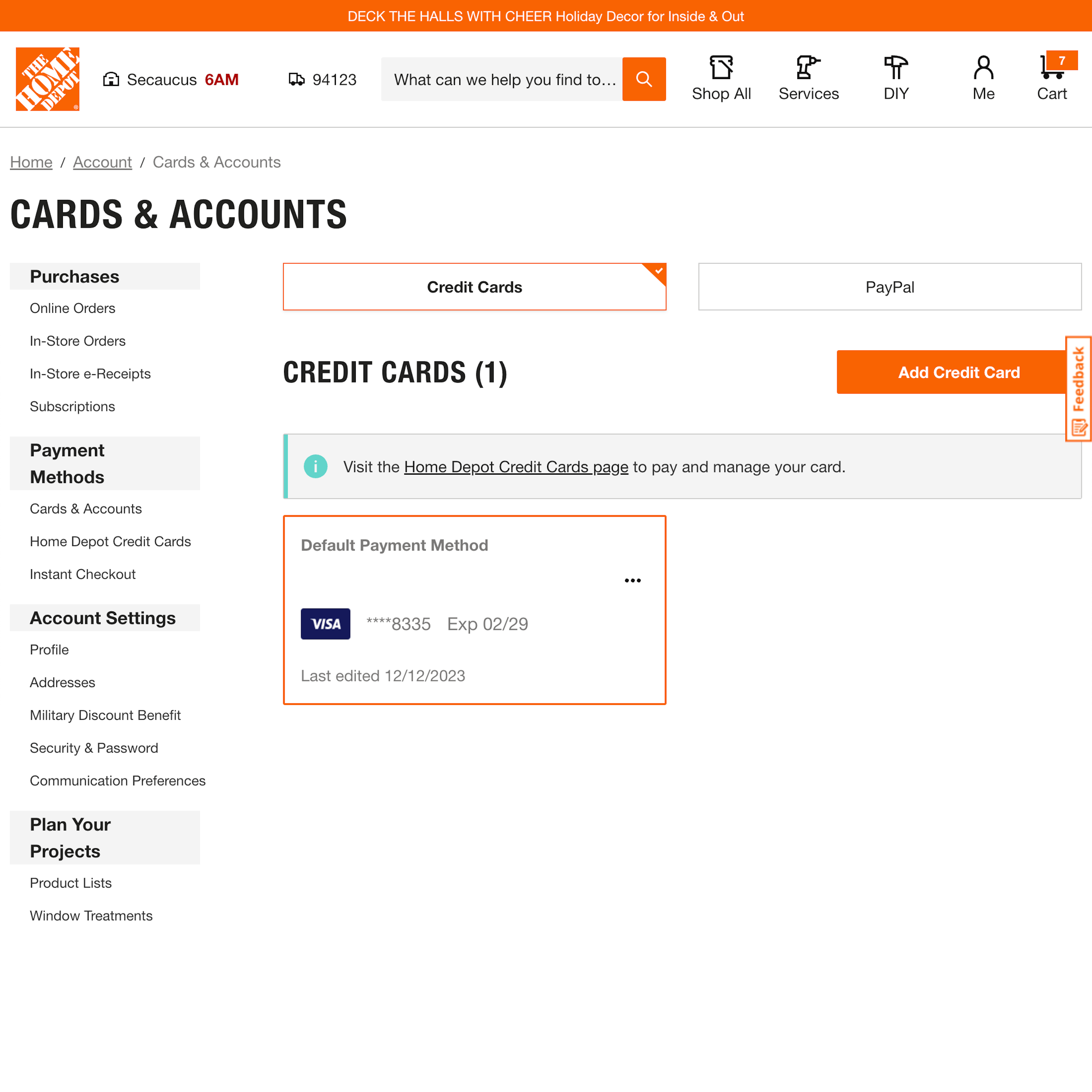
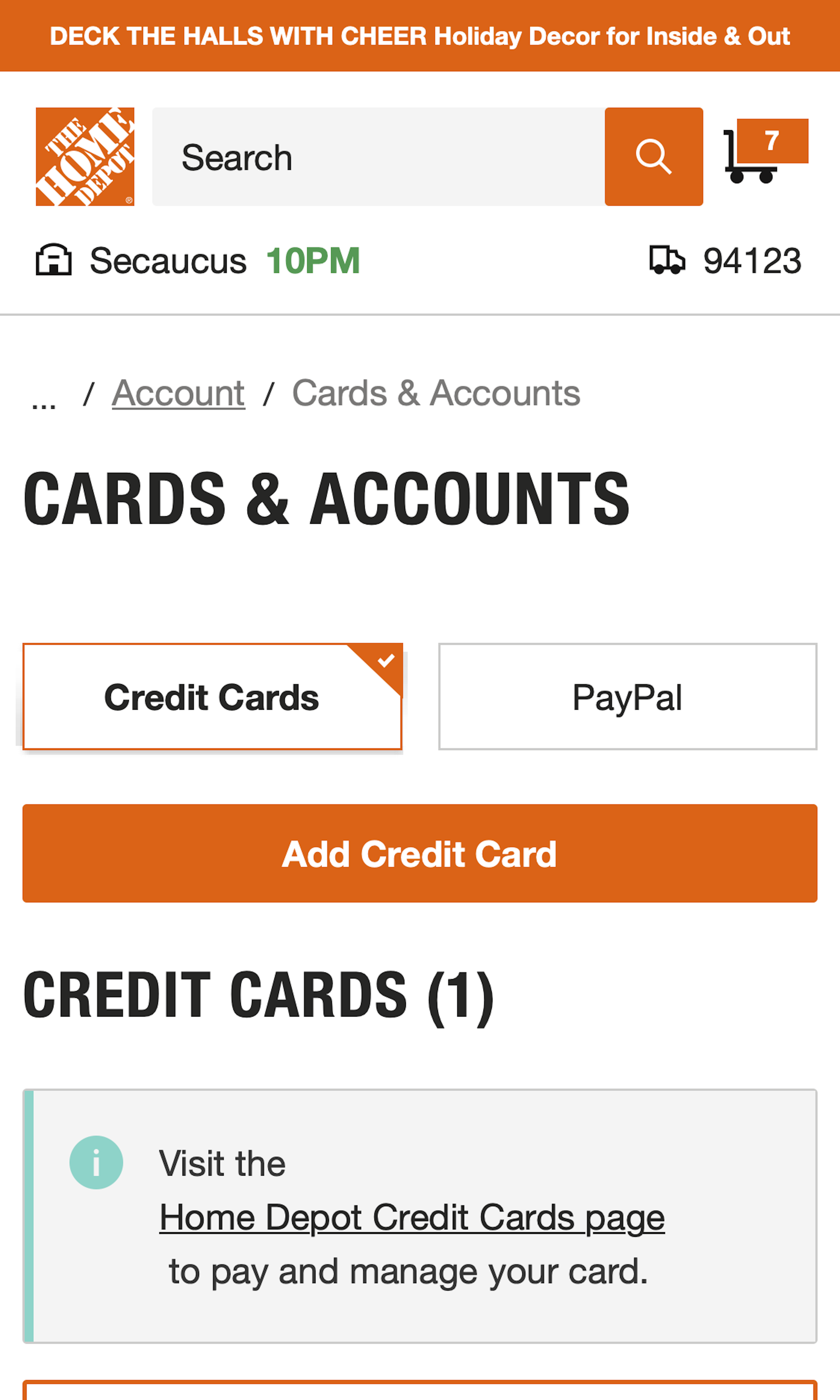
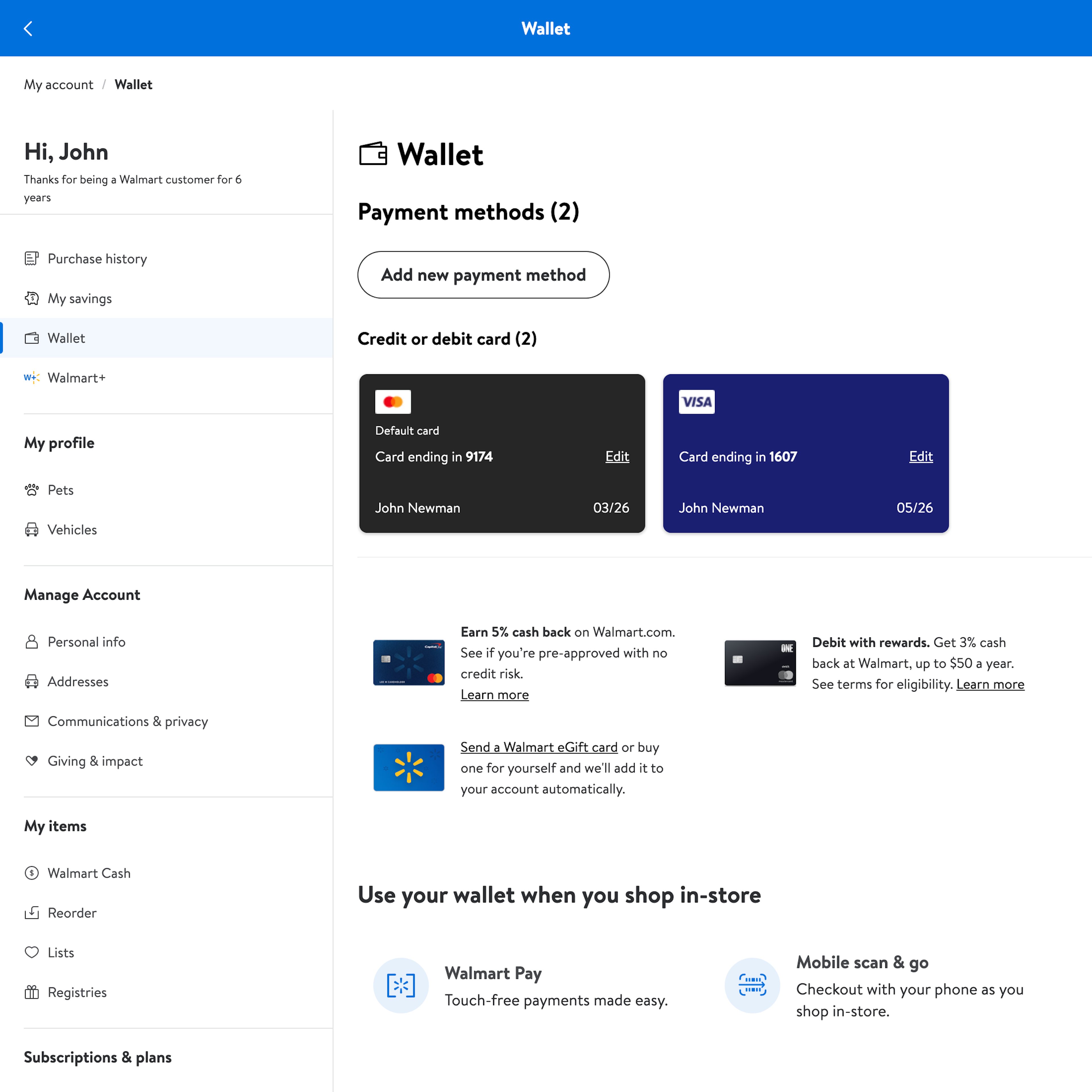
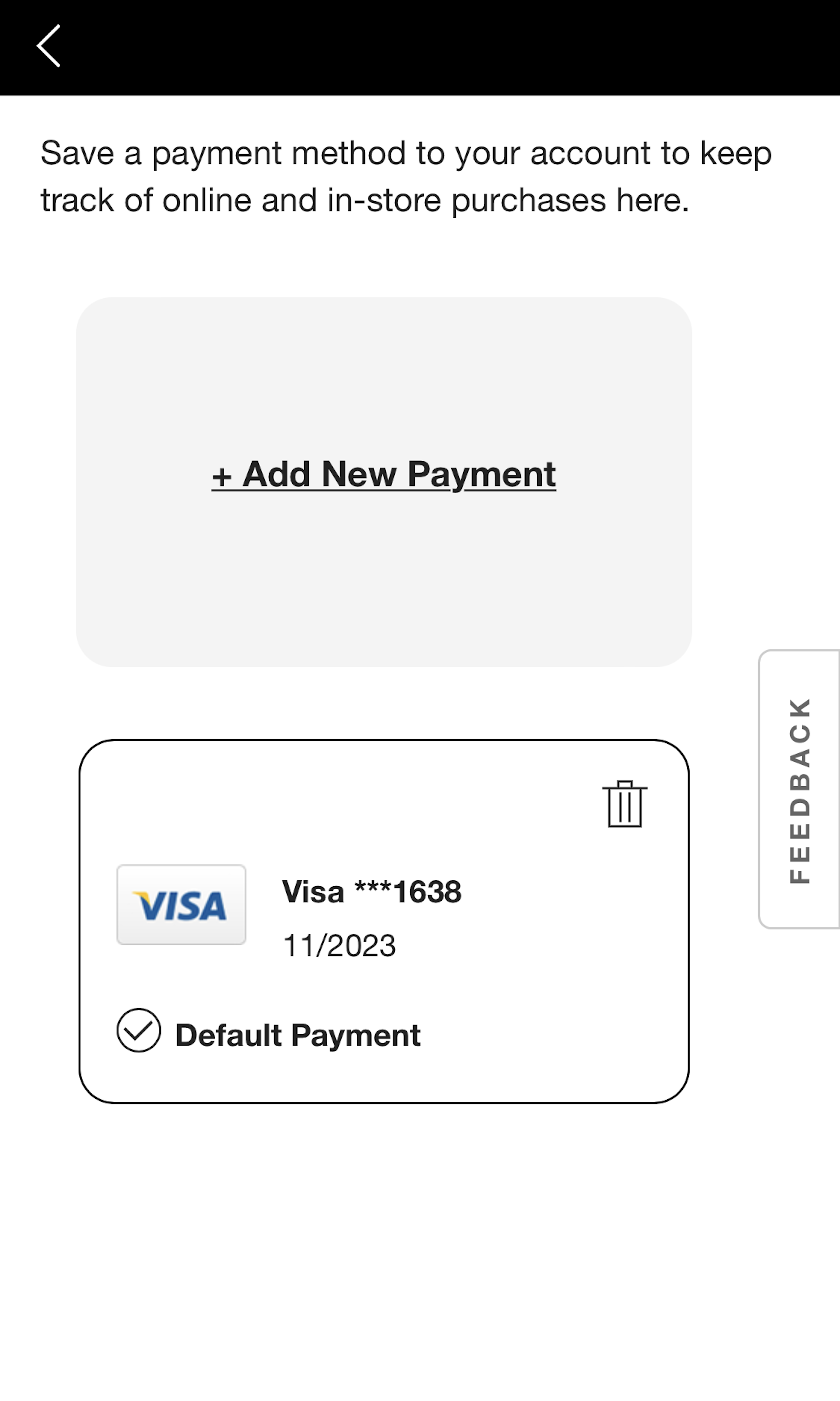
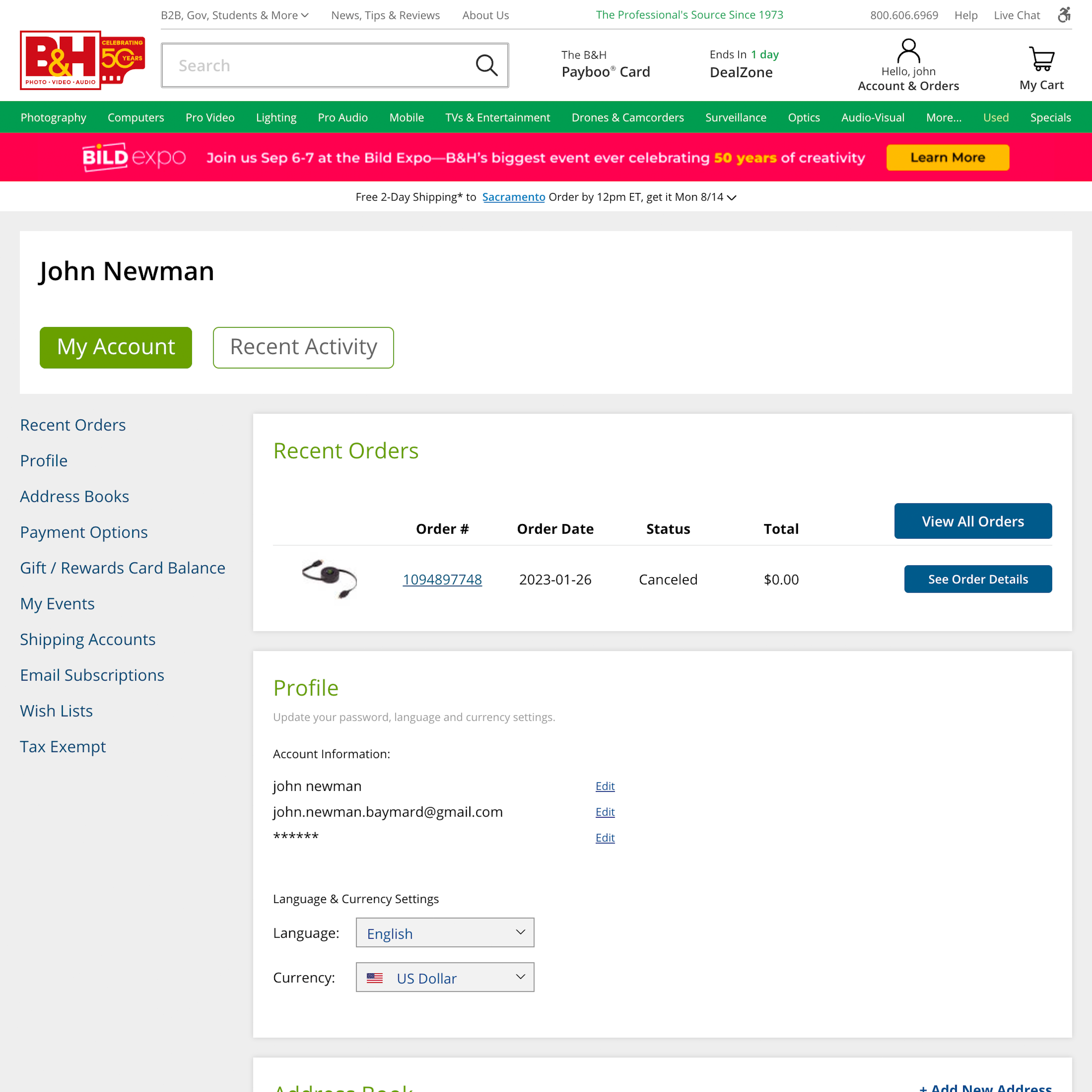
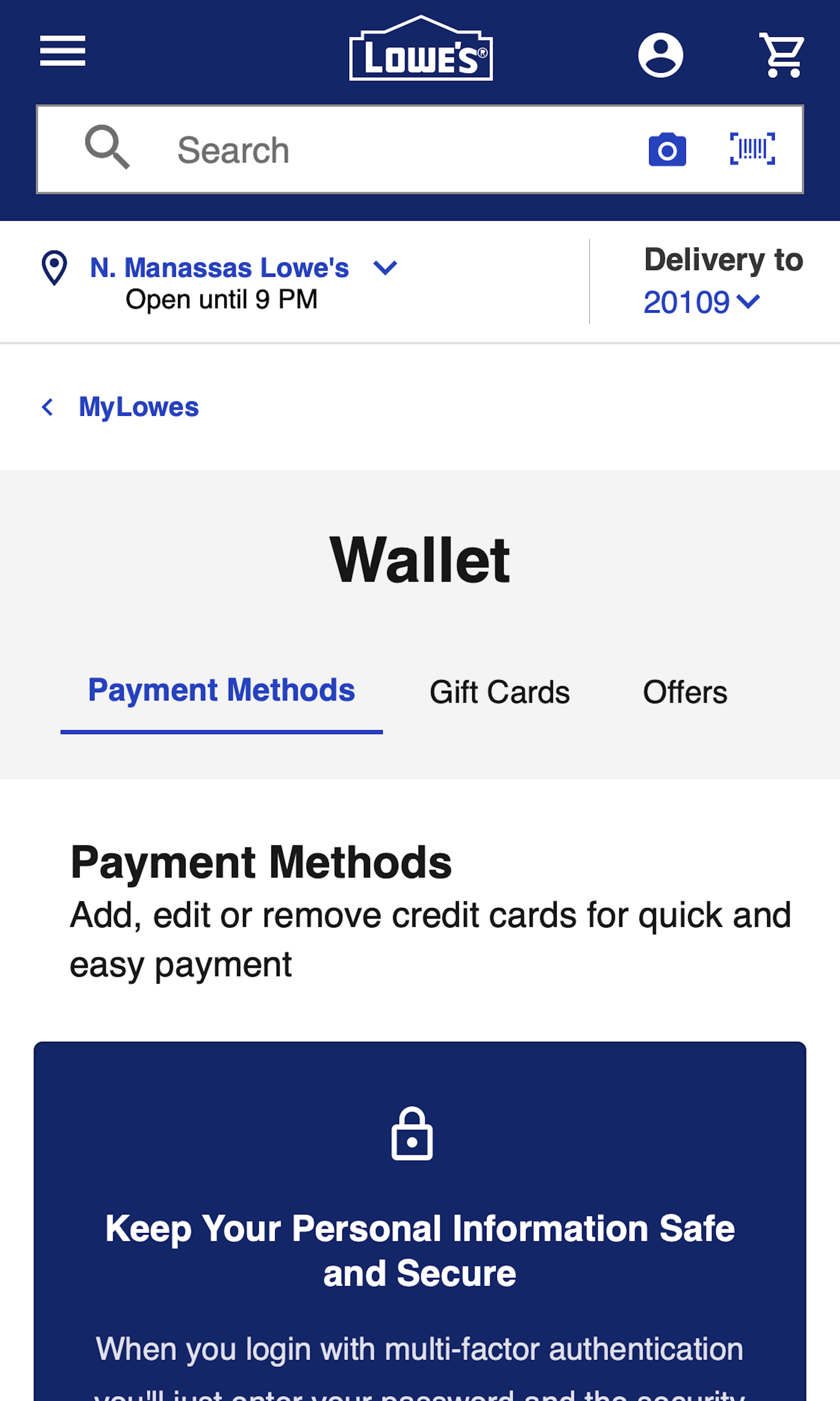
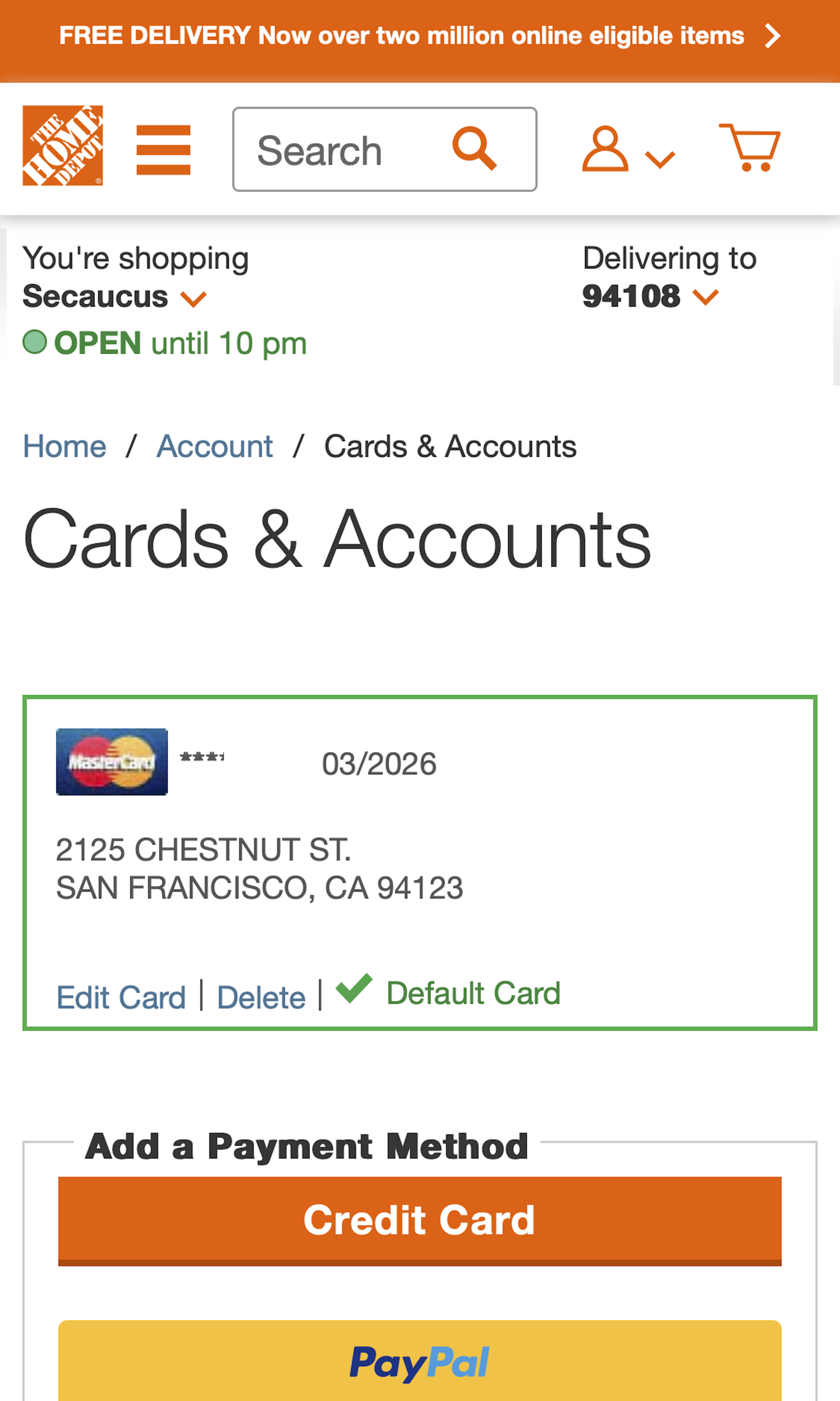
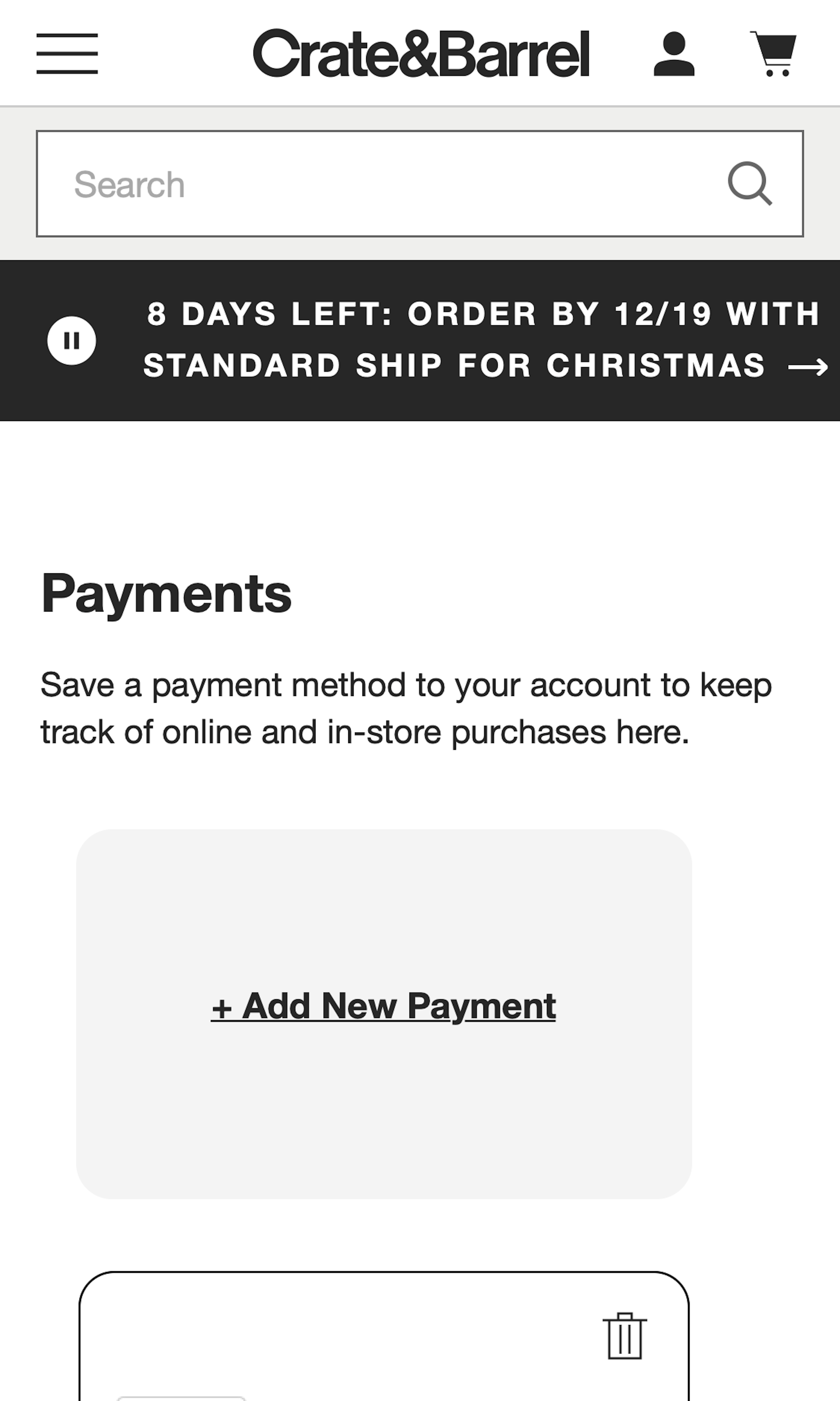
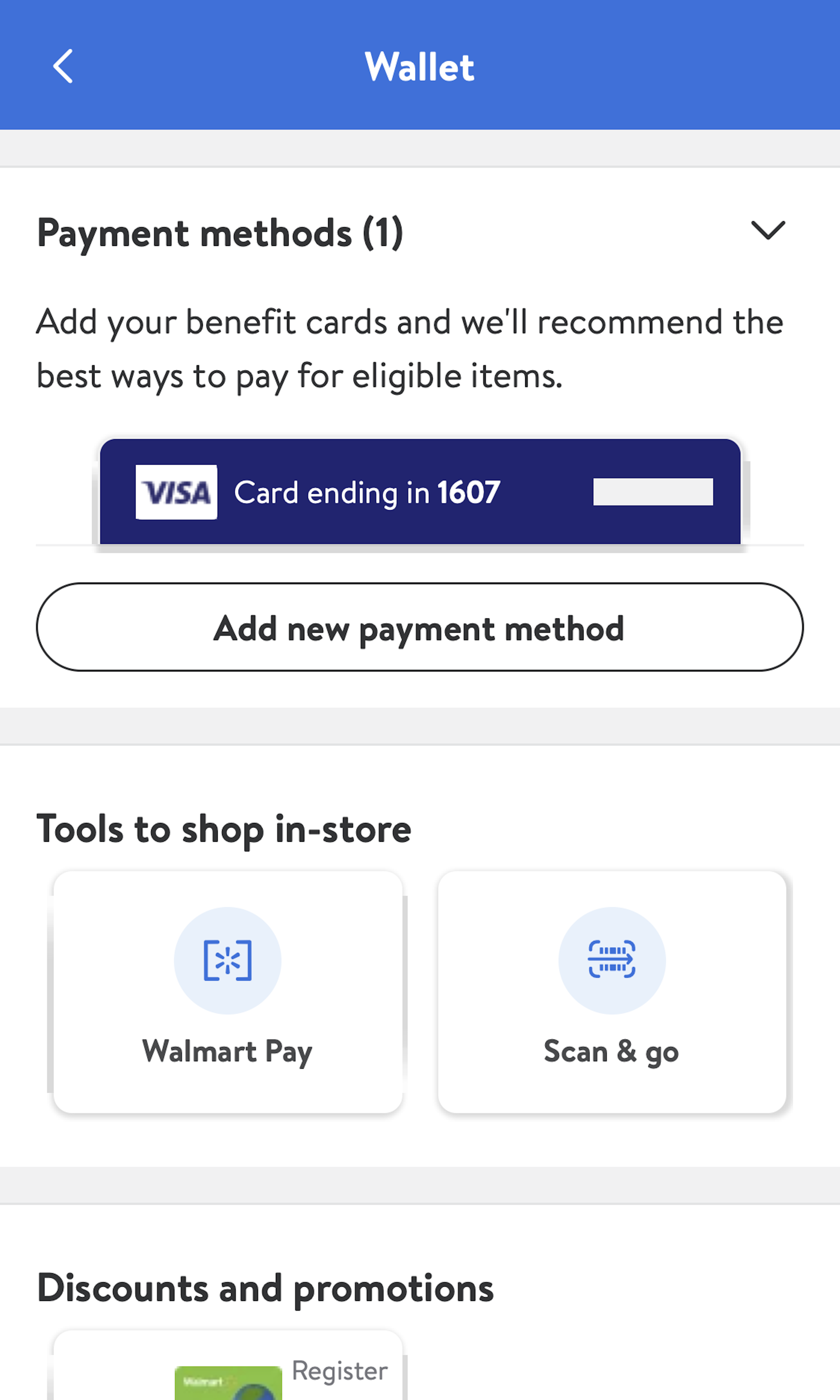
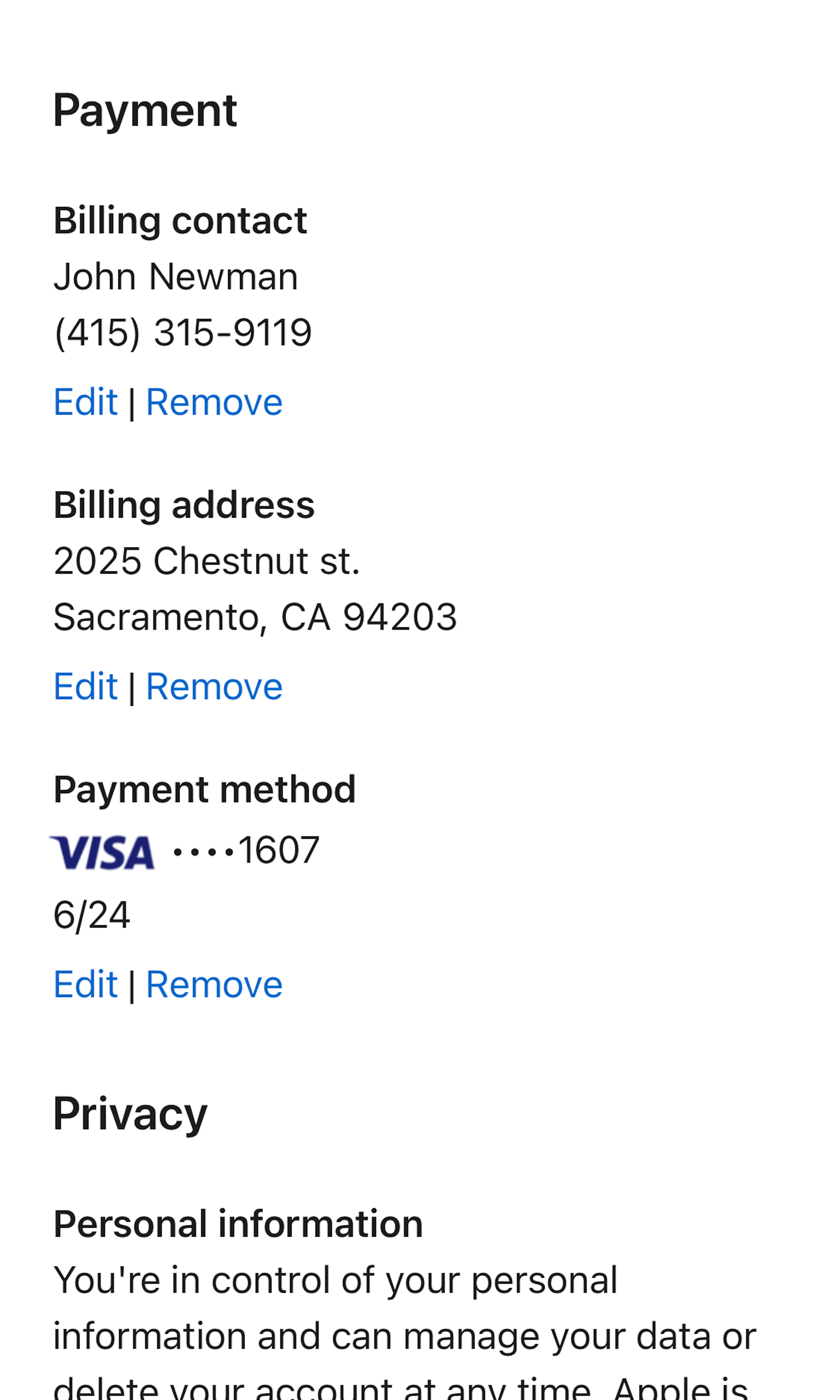
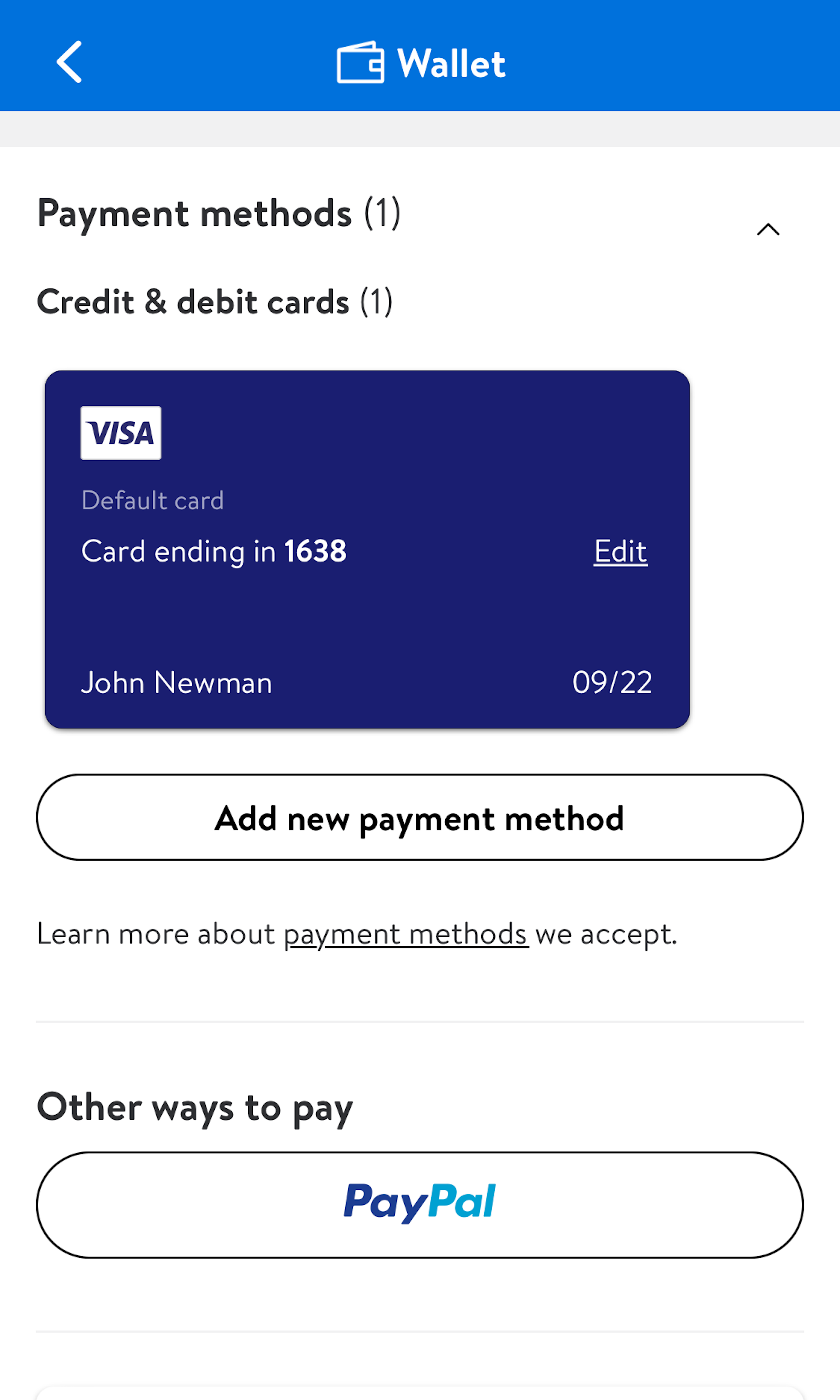
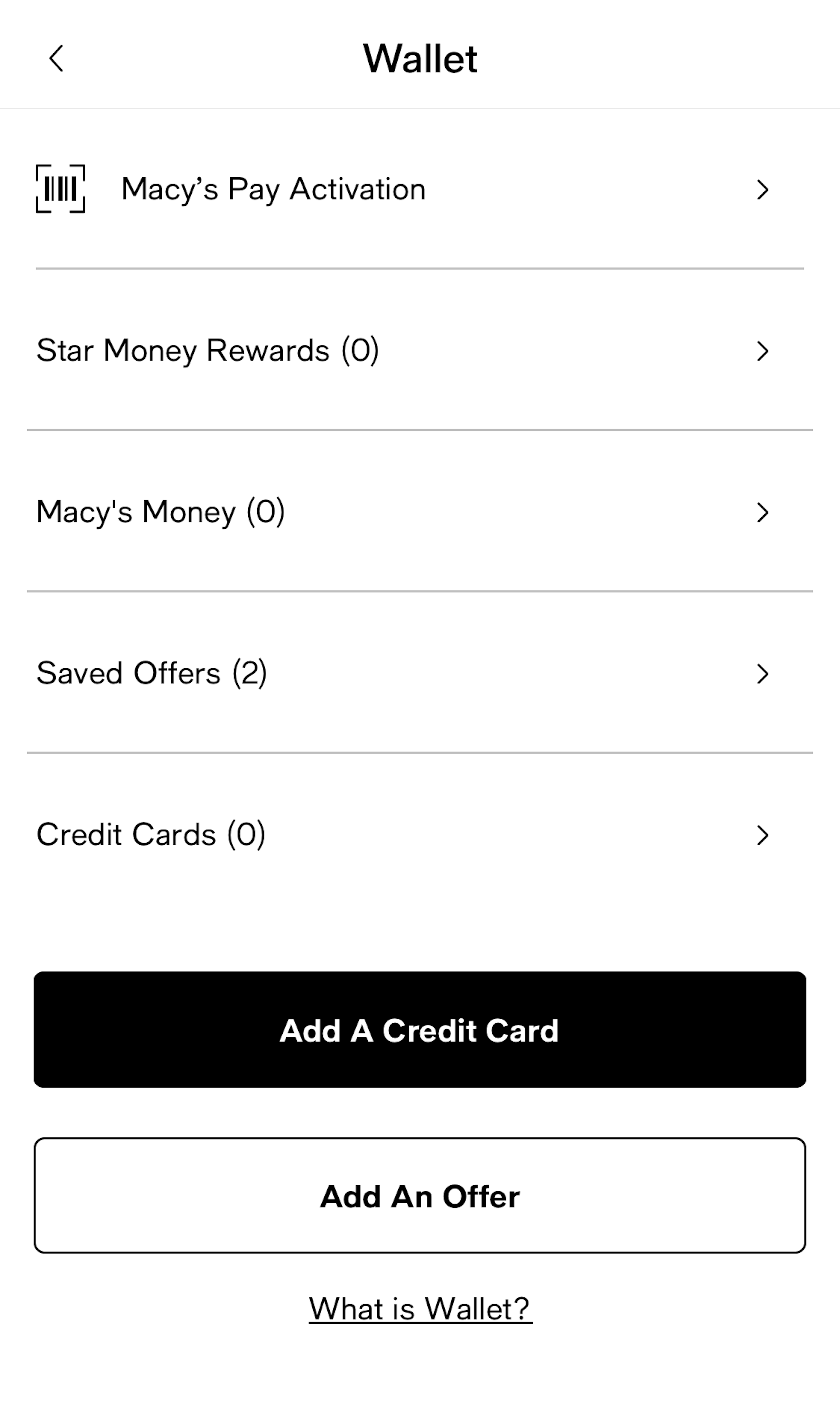
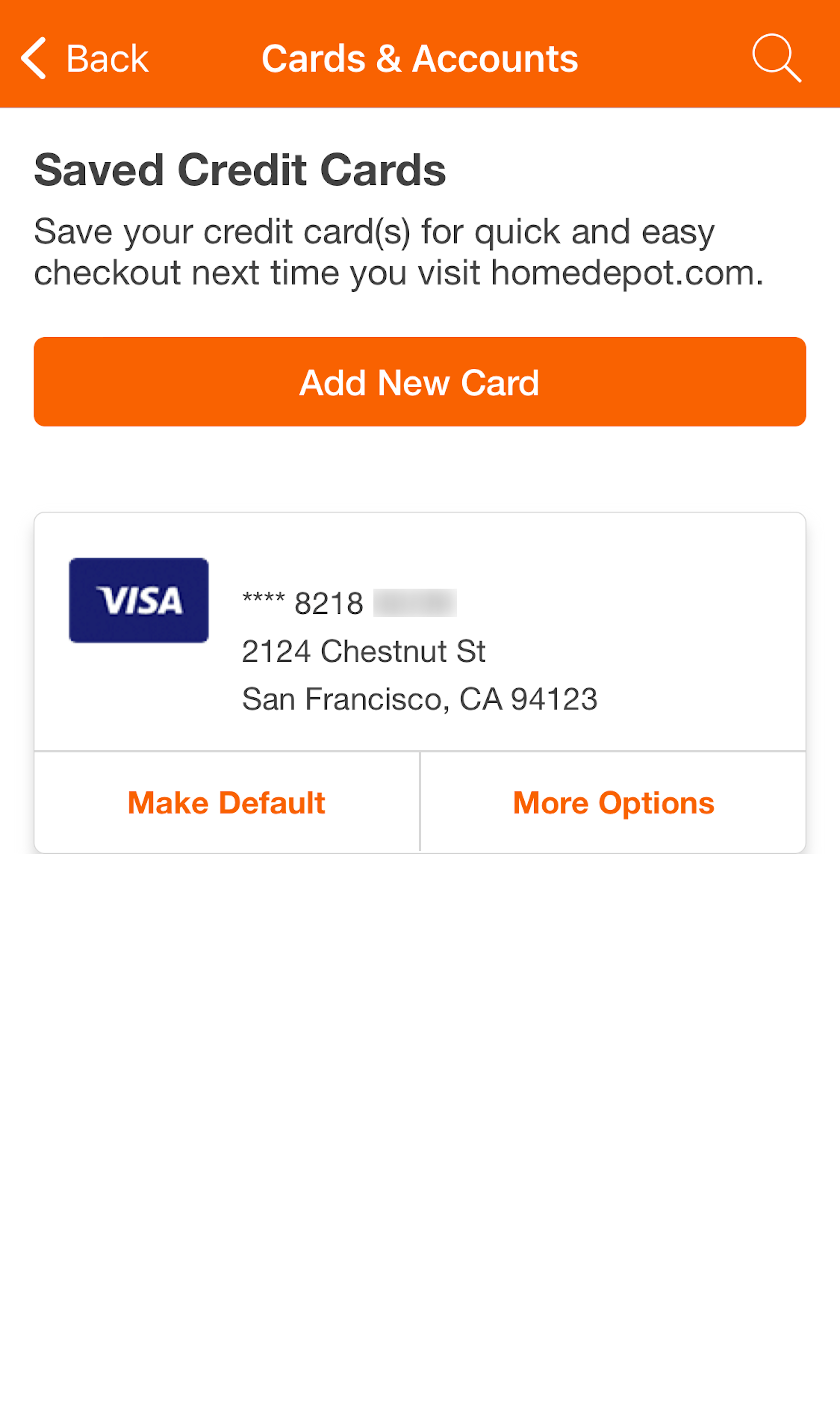
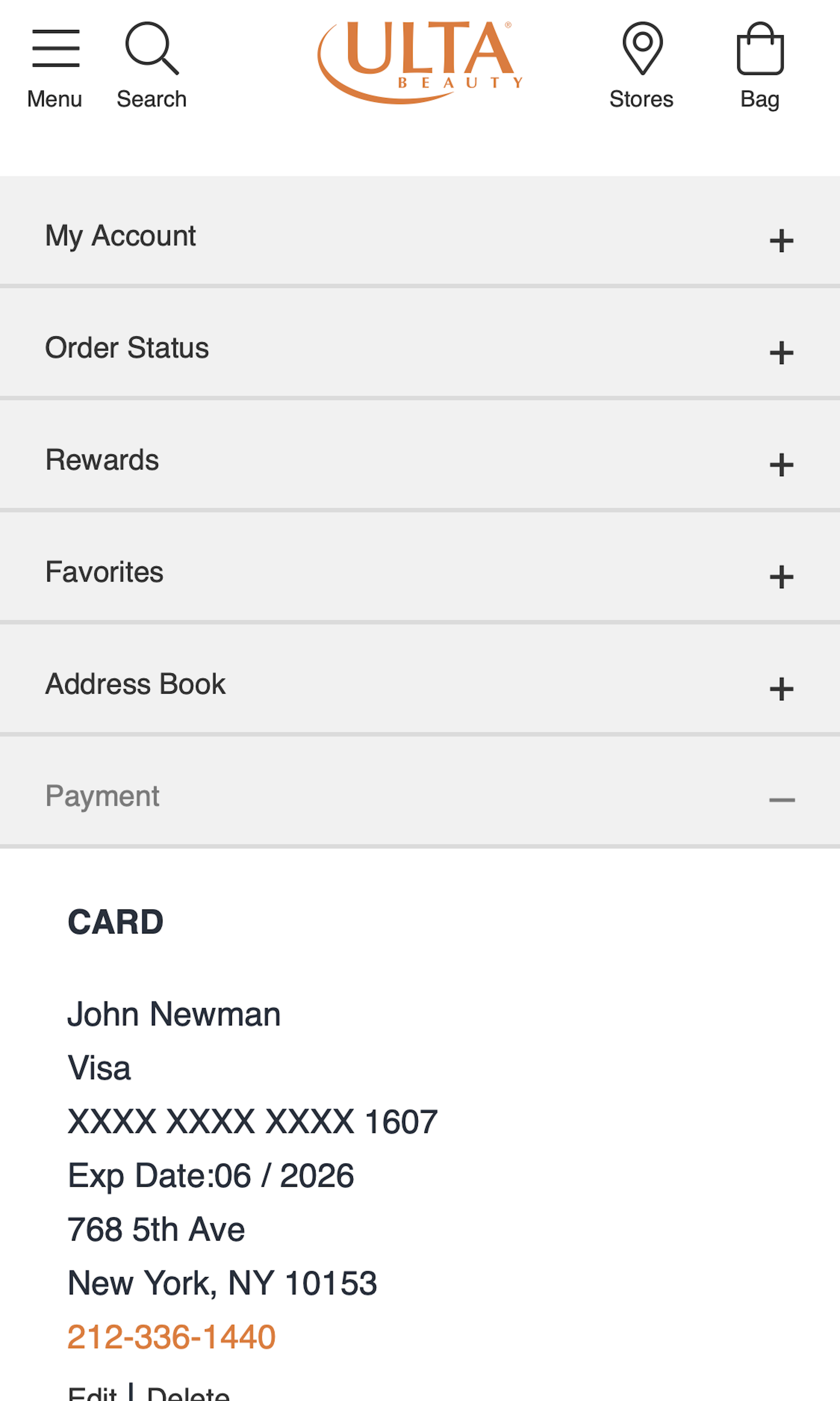
493 ‘Stored Credit Cards’ Design Examples
Also referred to as: Stored Payment Cards
What’s this? Here you’ll find 493 “Stored Credit Cards” full-page screenshots annotated with research-based UX insights, sourced from Baymard’s UX benchmark of 327 e-commerce sites. (Note: this is less than 1% of the full research catalog.)
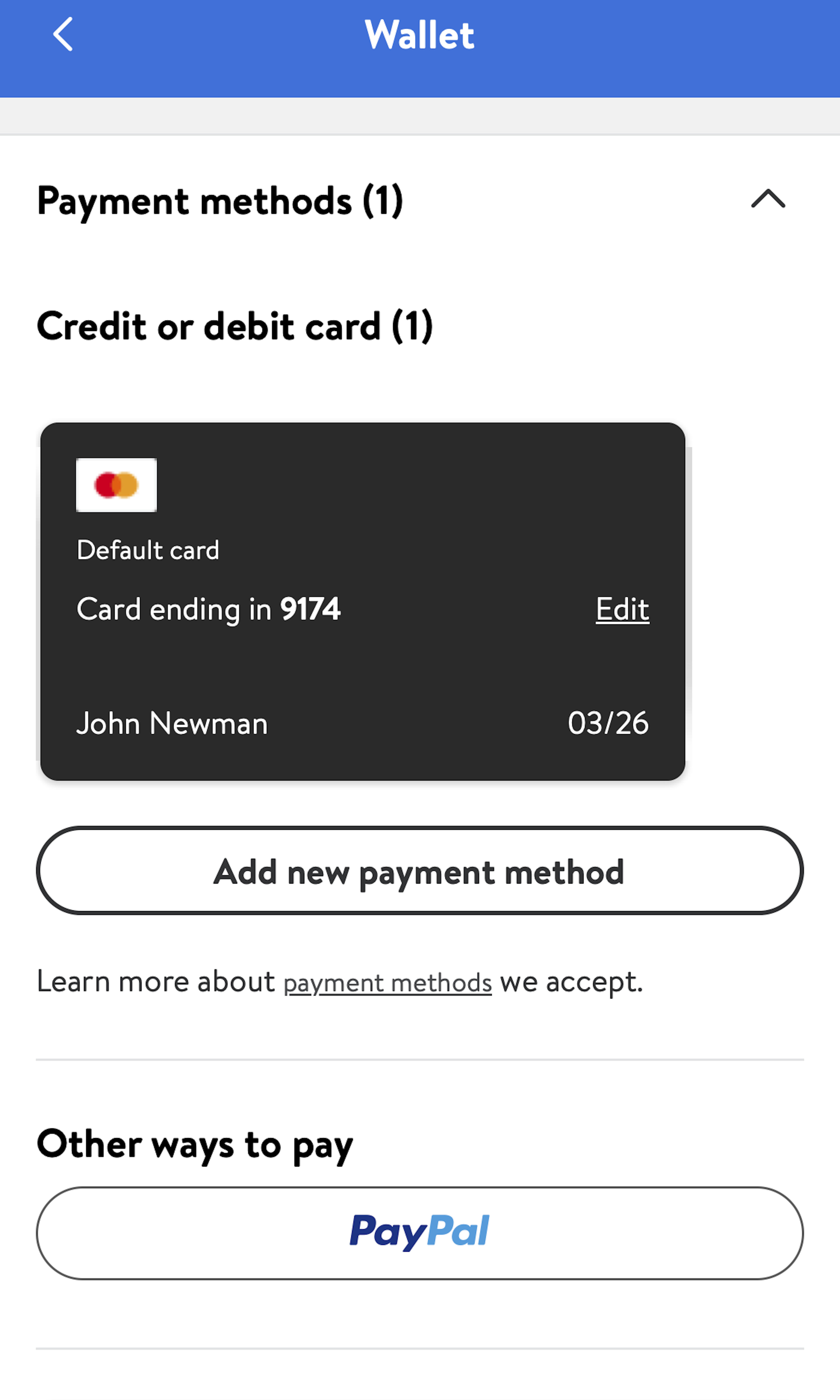
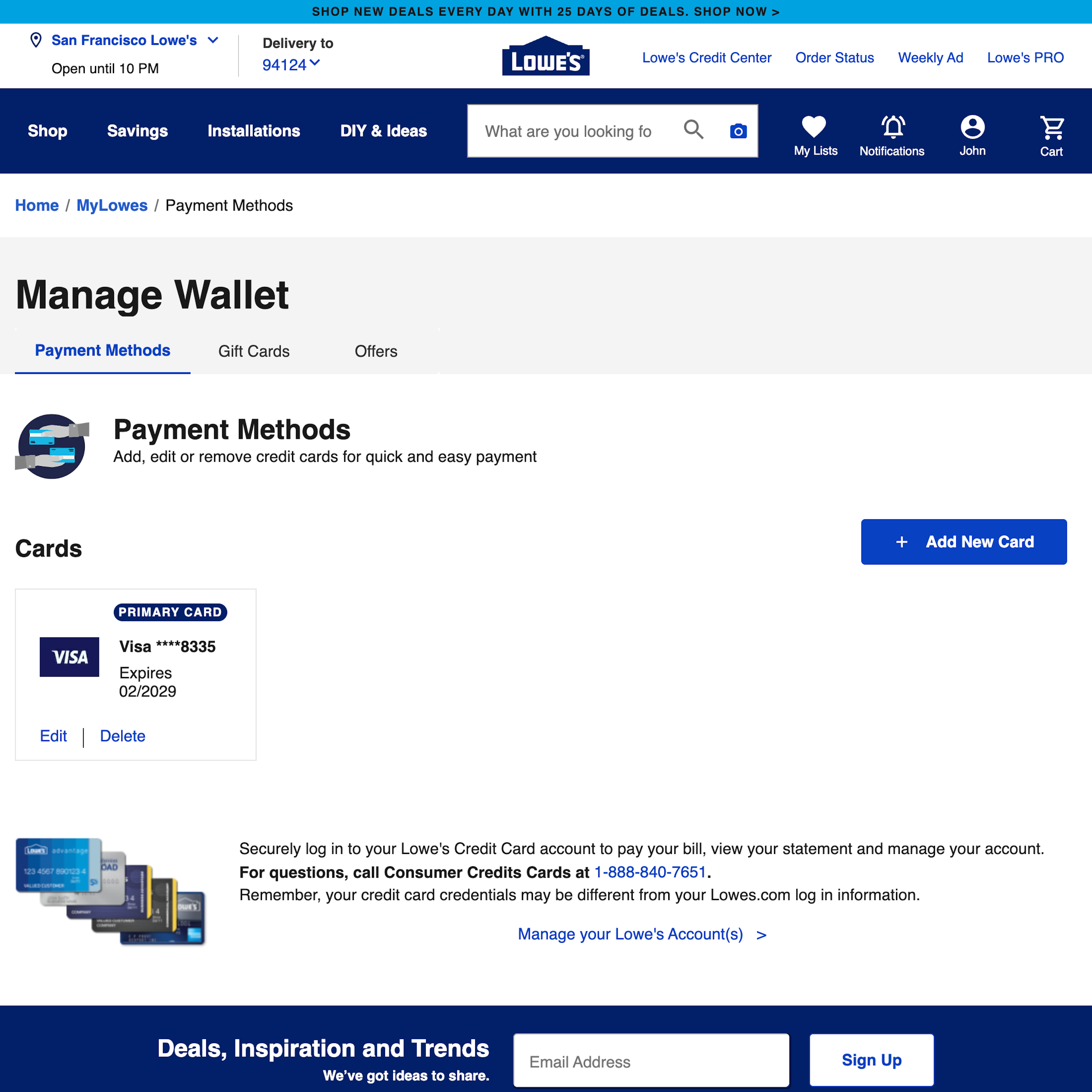
Stored payment methods are somewhat unique when it comes to account features, because while users can manage their stored credit card via their e-commerce account settings, most users in practice actually added their stored credit card during the checkout flow when placing an order.
In our large-scale usability research of how users manage their e-commerce accounts, we’ve observed that this unique context set strict design and flow requirements for how the process of updating a stored credit card should unfold, if it’s to align with user’s expectations and behaviors.
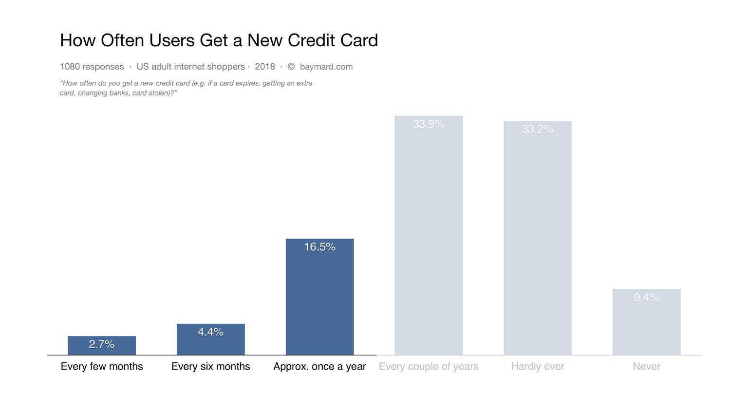
Our benchmarking reveals that 84% of e-commerce sites fail to provide an editing flow for stored credit cards that aligns with how users expect to actually update their stored credit cards. Our research also shows that 24% of users update their credit card at least once a year.
More Insights on ‘Stored Credit Cards’ Pages
Our quantitative study of how often e-commerce shoppers in the US change their credit card.
-
At the same time our qualitative research reveals that managing credit cards and payment methods is second-most important account feature for users, with 24% saying that they update their credit card at least once a year.
-
And yet our large-scale usability testing shows that, for example, 84% of sites fail to provide an editing flow for managing credit cards that aligns with how users expect to actually manage their credit cards. In particular when attempting to edit payment method details, many users struggled to understand that the interfaces would not allow them to “edit” their credit card number. While there are strict policies for storing card data we observe that sites can with a few simpler changes “emulate” a “editing flow” for stored credit cards, while still reamingn fully PCI compliant.
-
Learn More: Besides exploring the 493 “Stored Credit Cards” design examples below, you may also want to read our related articles on “Use a Fake ‘Editing’ Flow When Users Try to Update Their Stored Credit Card - 84% of Sites Don’t”, “New Research Findings on ‘Accounts & Self-Service’ UX”, “Format the ‘Expiration Date’ Fields Exactly the Same as the Physical Credit Card ”, “The ‘Credit Card Number’ Field Must Allow and Auto-Format Spaces”, “Visually Reinforce Your Credit Card Fields”. You may also want to explore our related collection of design examples for Payment Method steps during the checkout.
-
Get Full Access: To see all of Baymard’s design guidelines on Accounts & Self-Service pages and features you’ll need Baymard Premium access. (Premium also provides you full access to 200,000+ hours of UX research findings, 650+ e-commerce UX guidelines, and 275,000+ UX performance scores.)
User Experience Research, Delivered Weekly
Join 60,000+ UX professionals and get a new UX article every week.

User Experience Research, Delivered Weekly
Join 60,000+ UX professionals and get a new UX article every week.

Explore Other Research Content

300+ free UX articles based on large-scale research.

327 top sites ranked by UX performance.

Code samples, demos, and key stats for usability.

