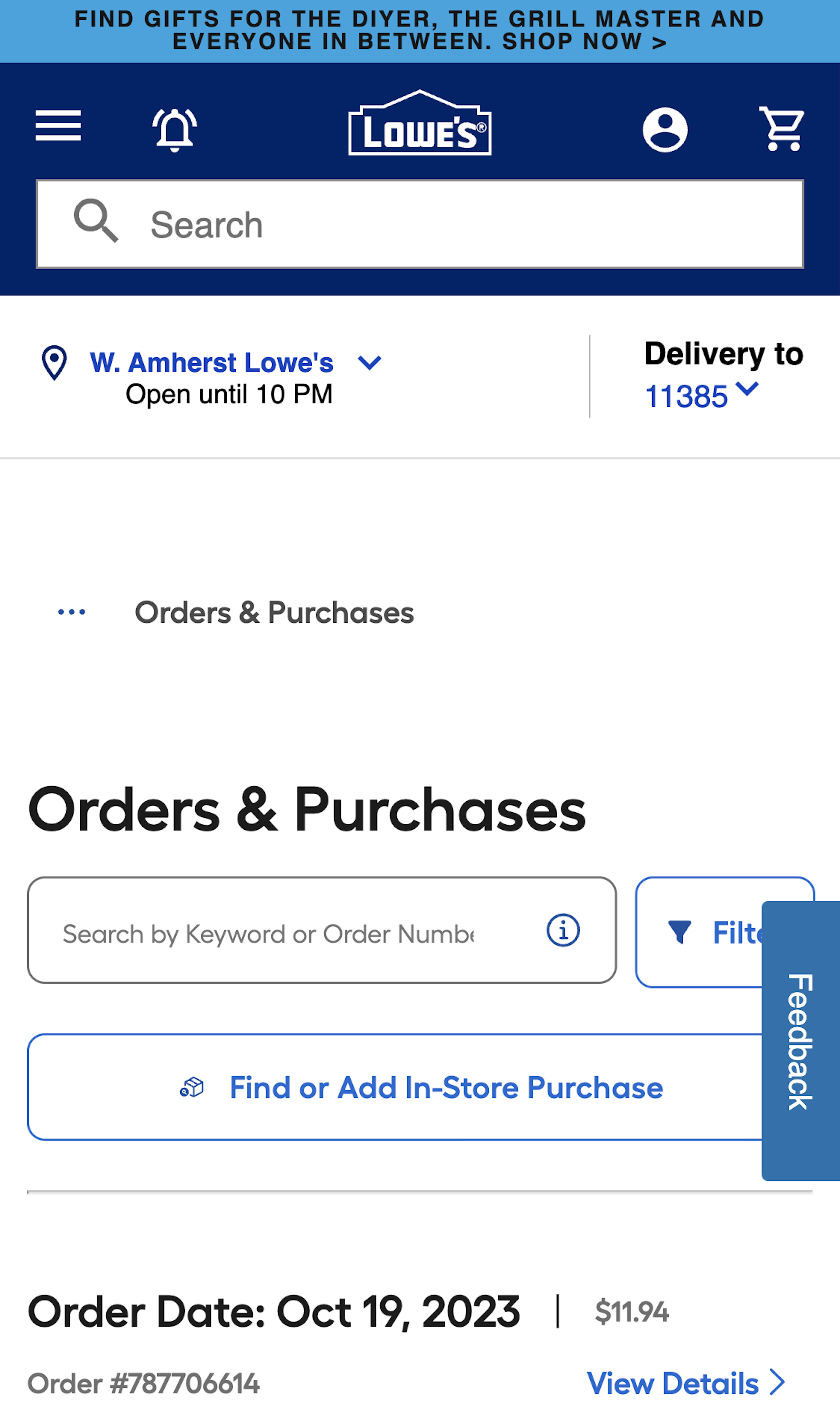
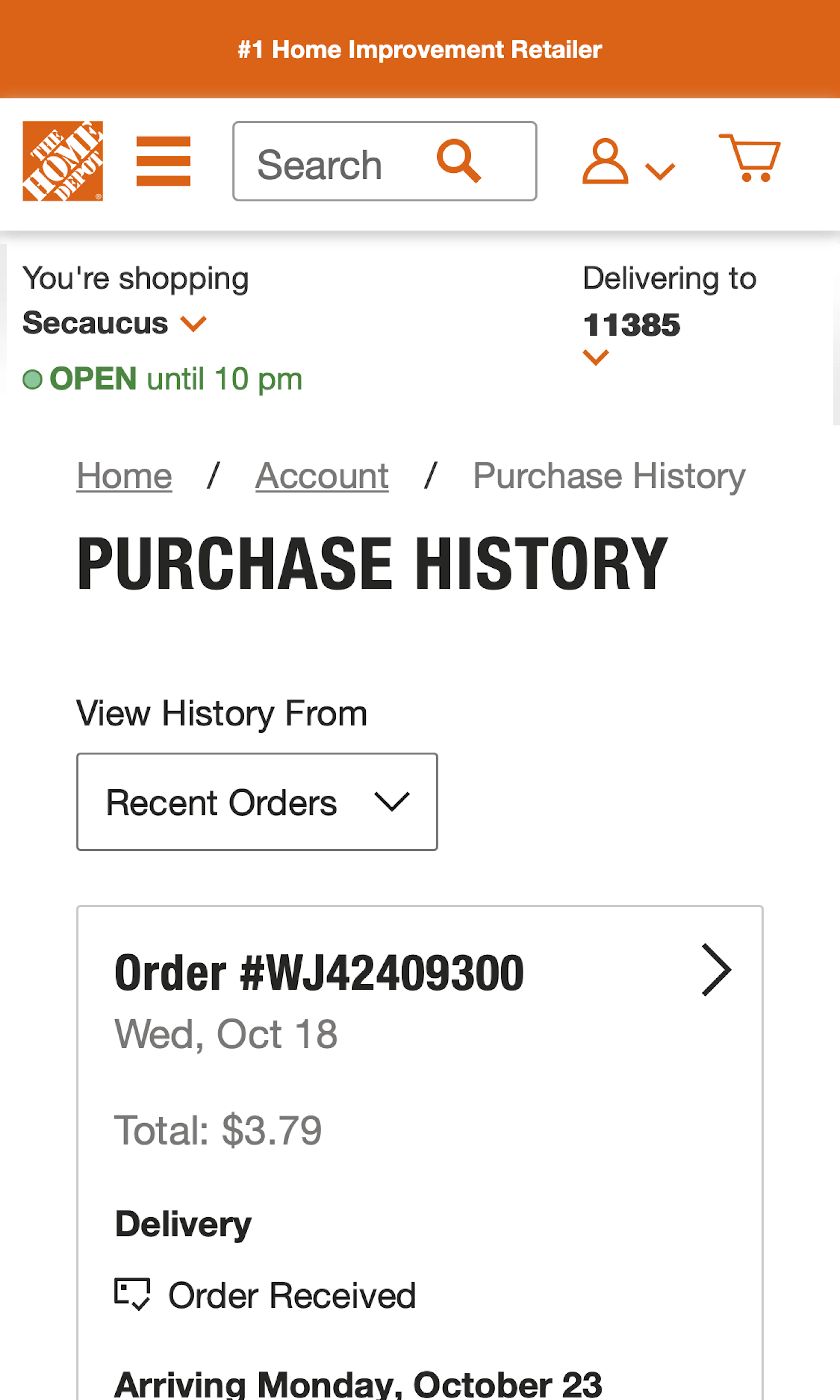
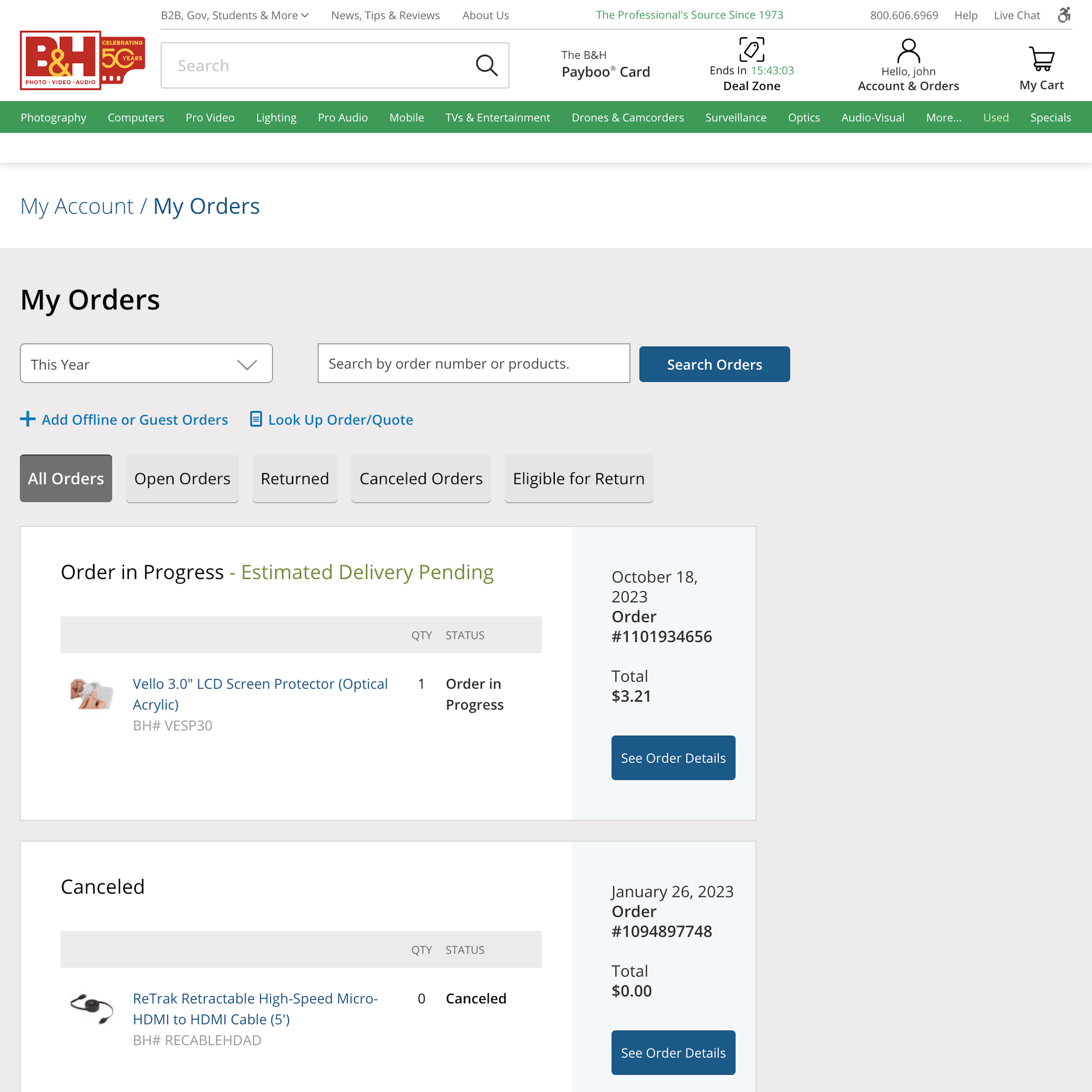
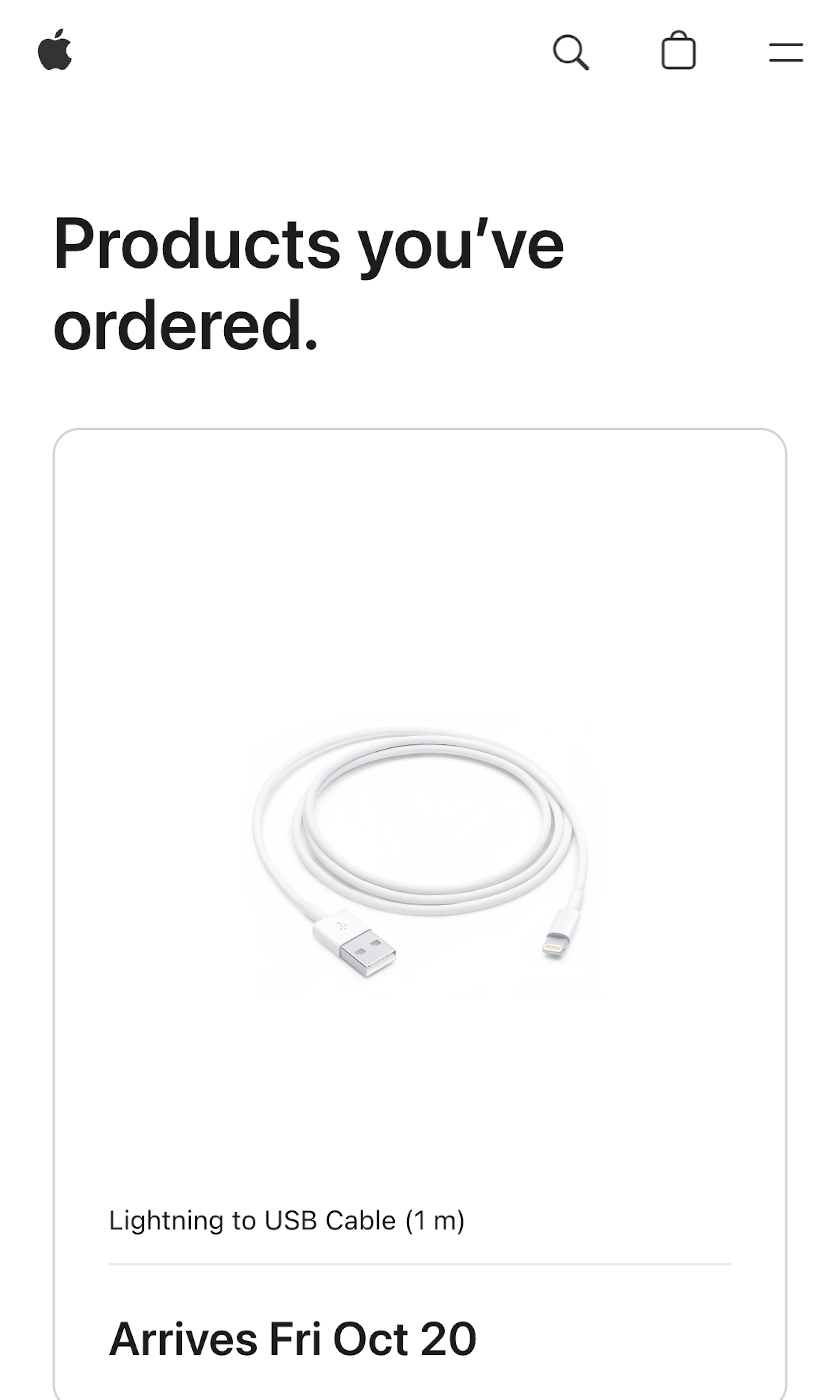
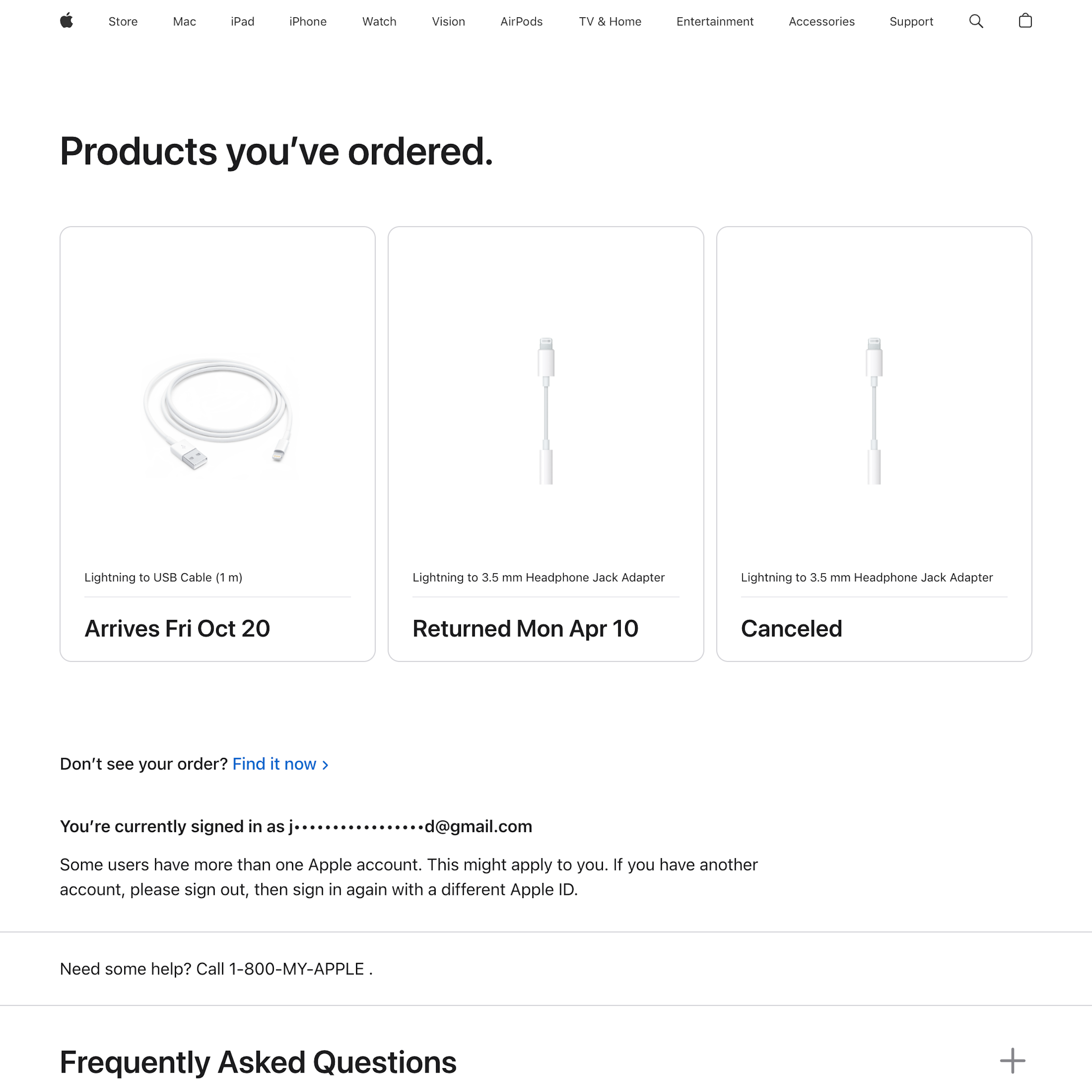
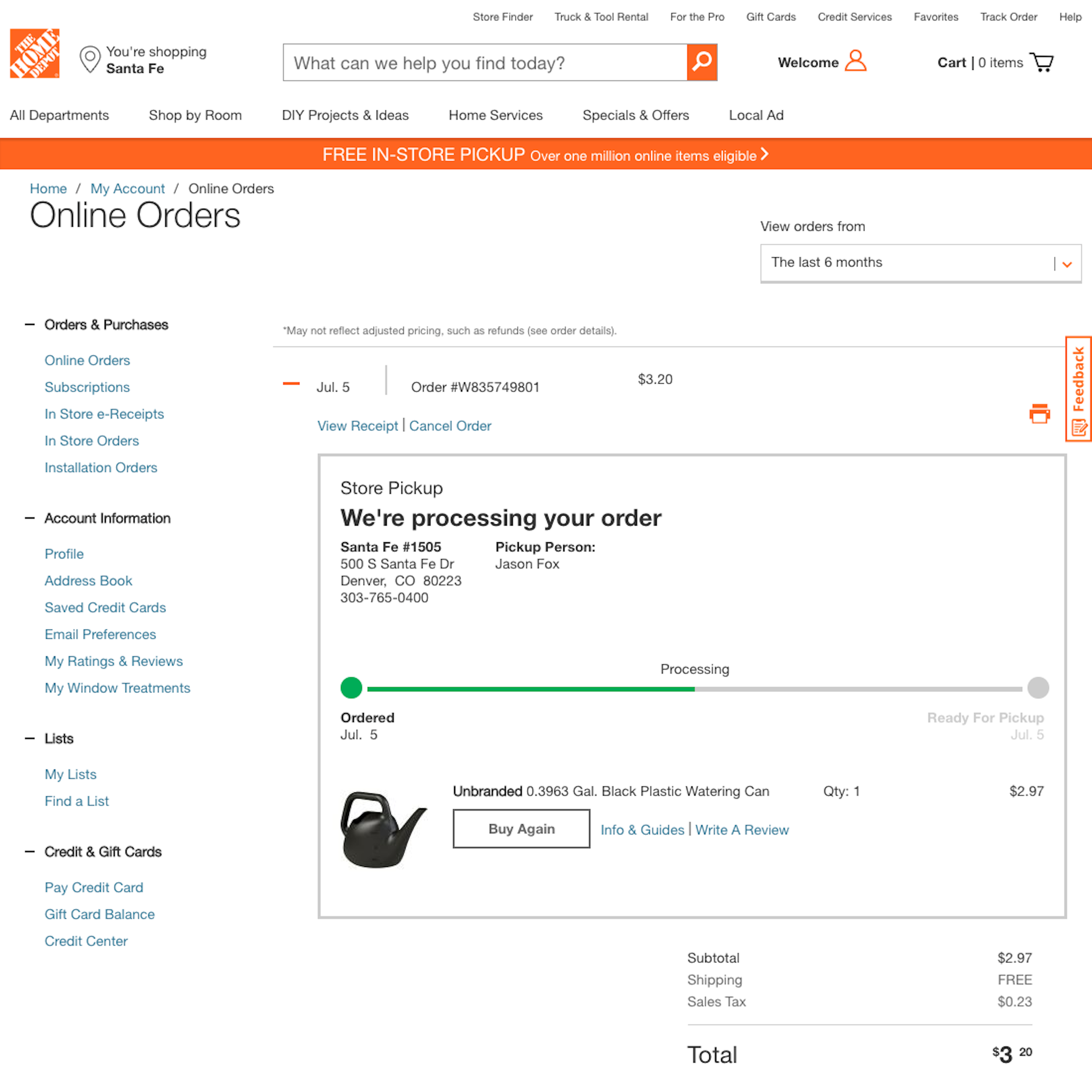
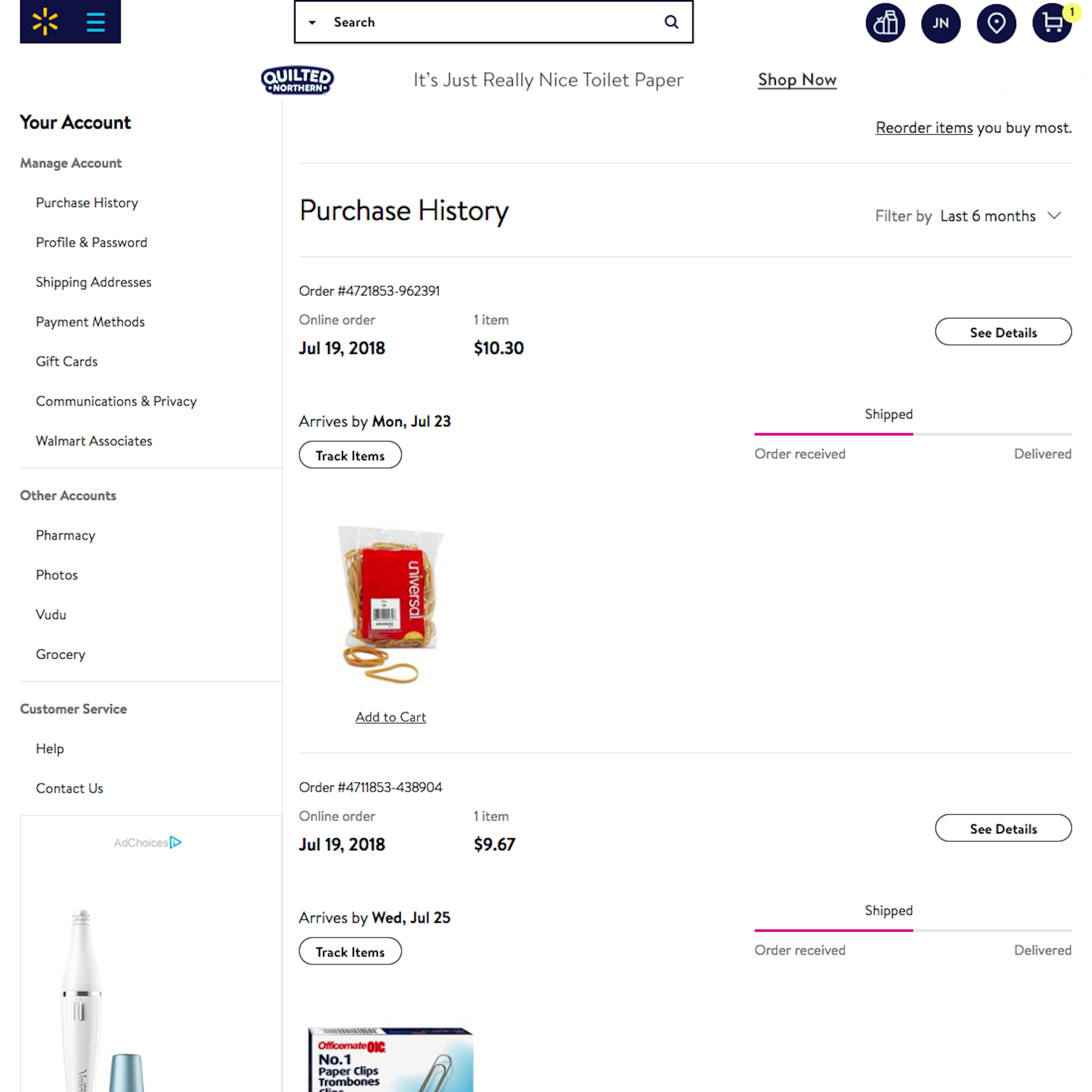
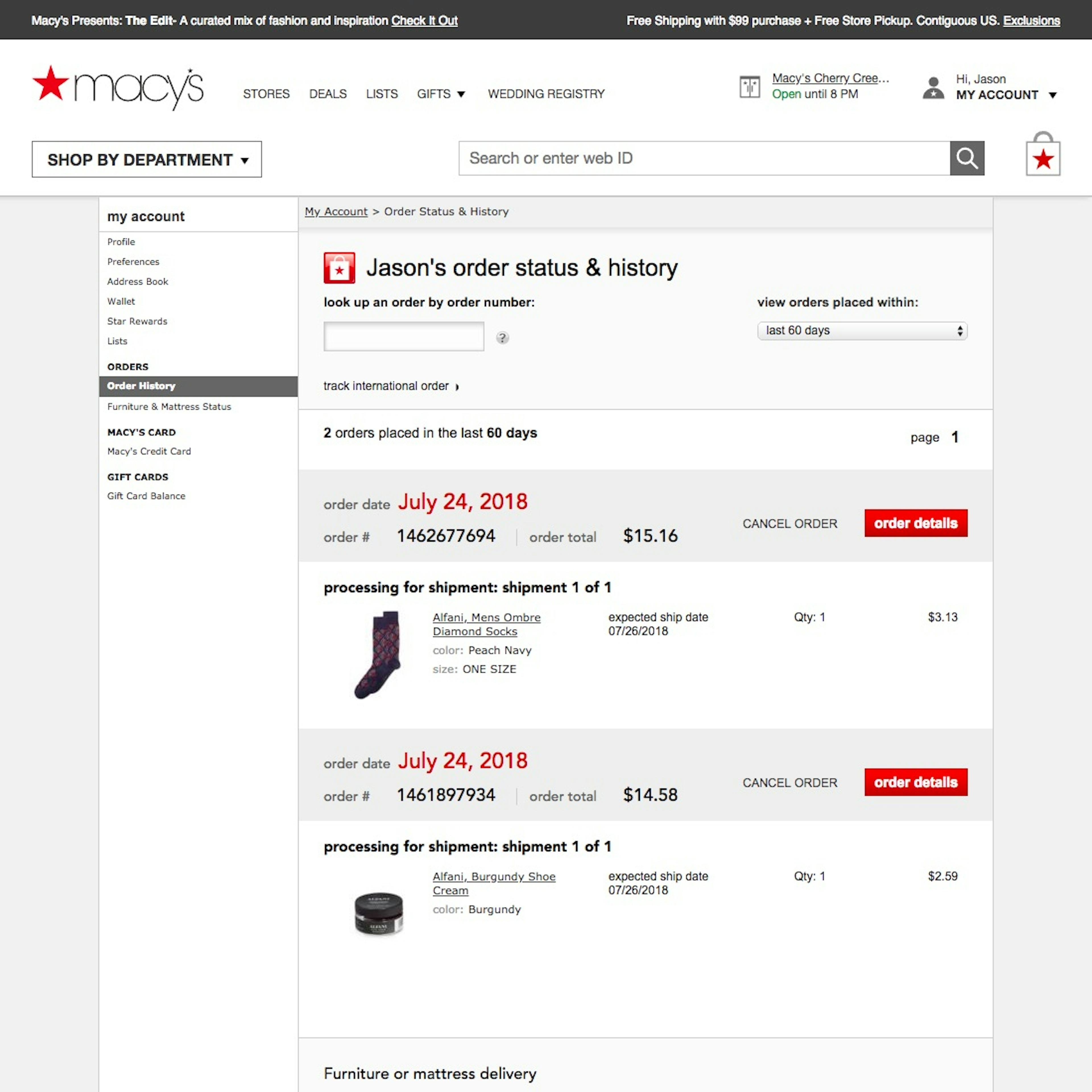
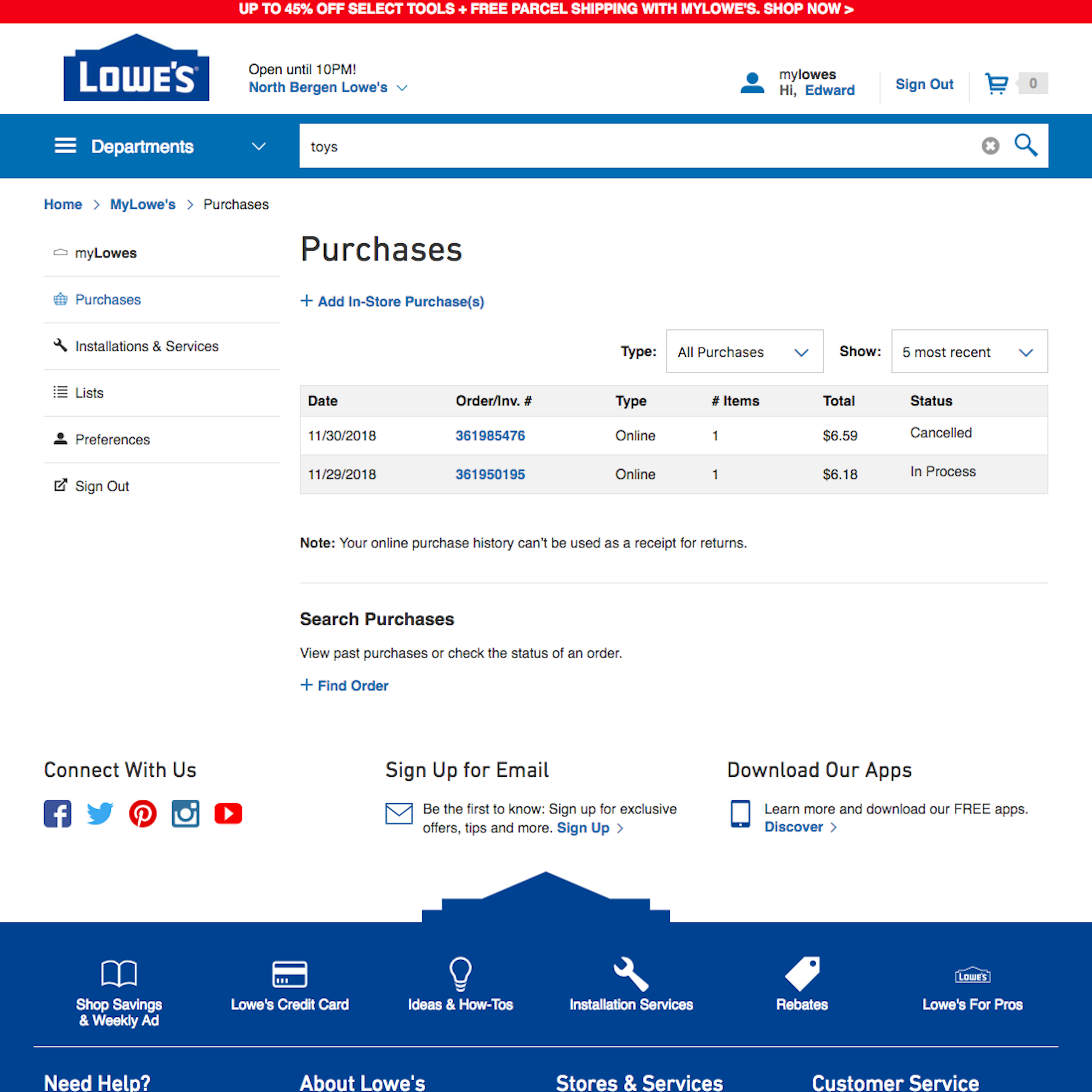
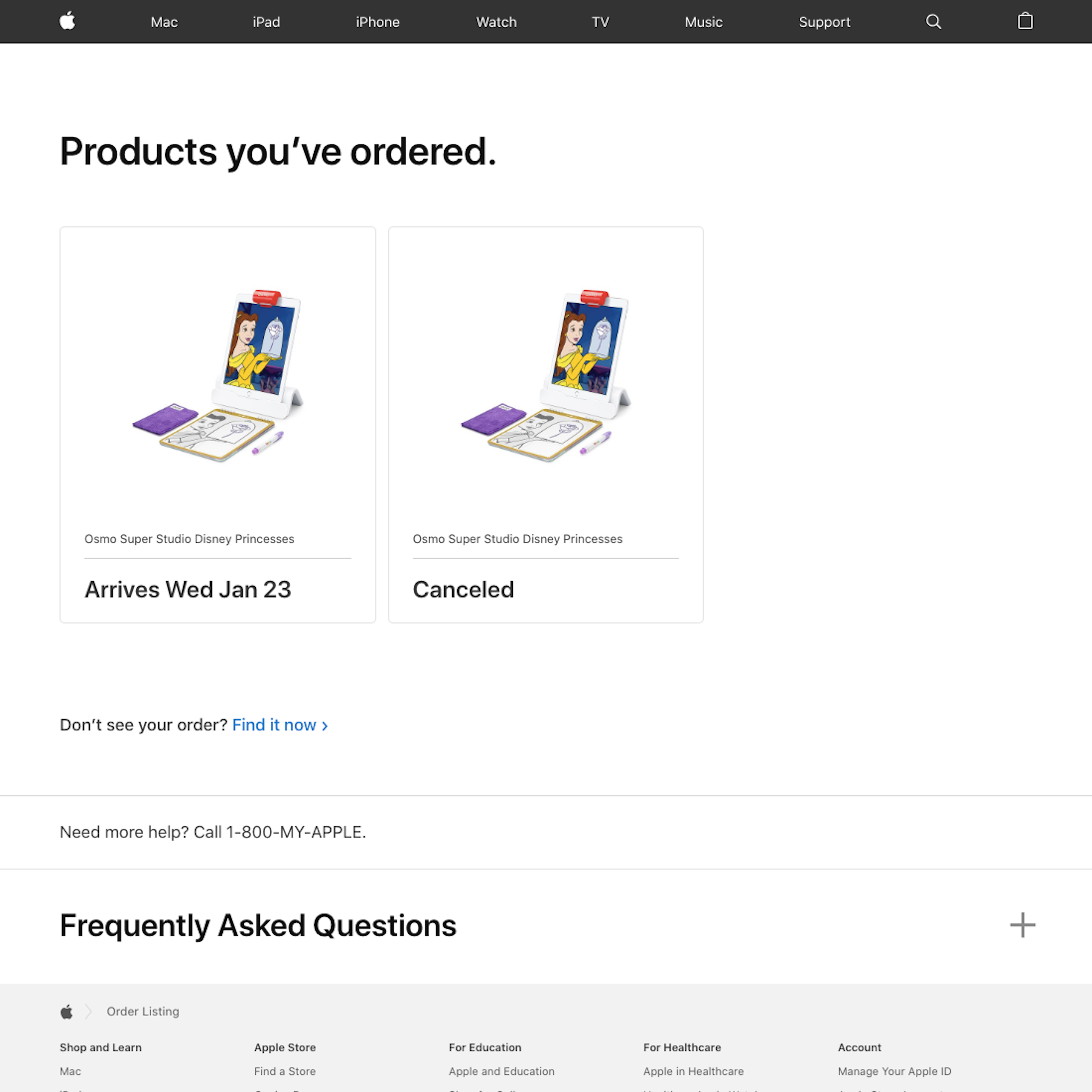
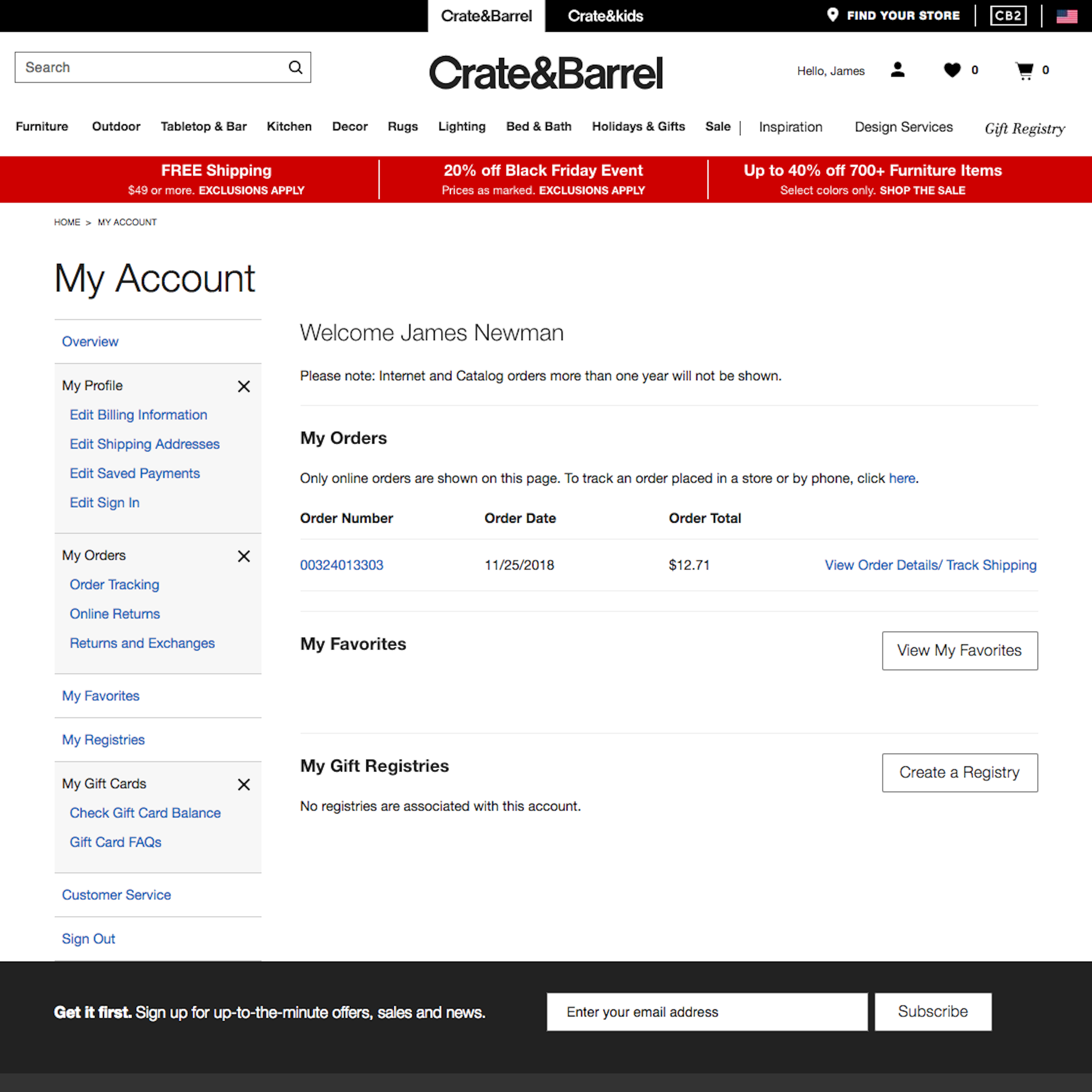
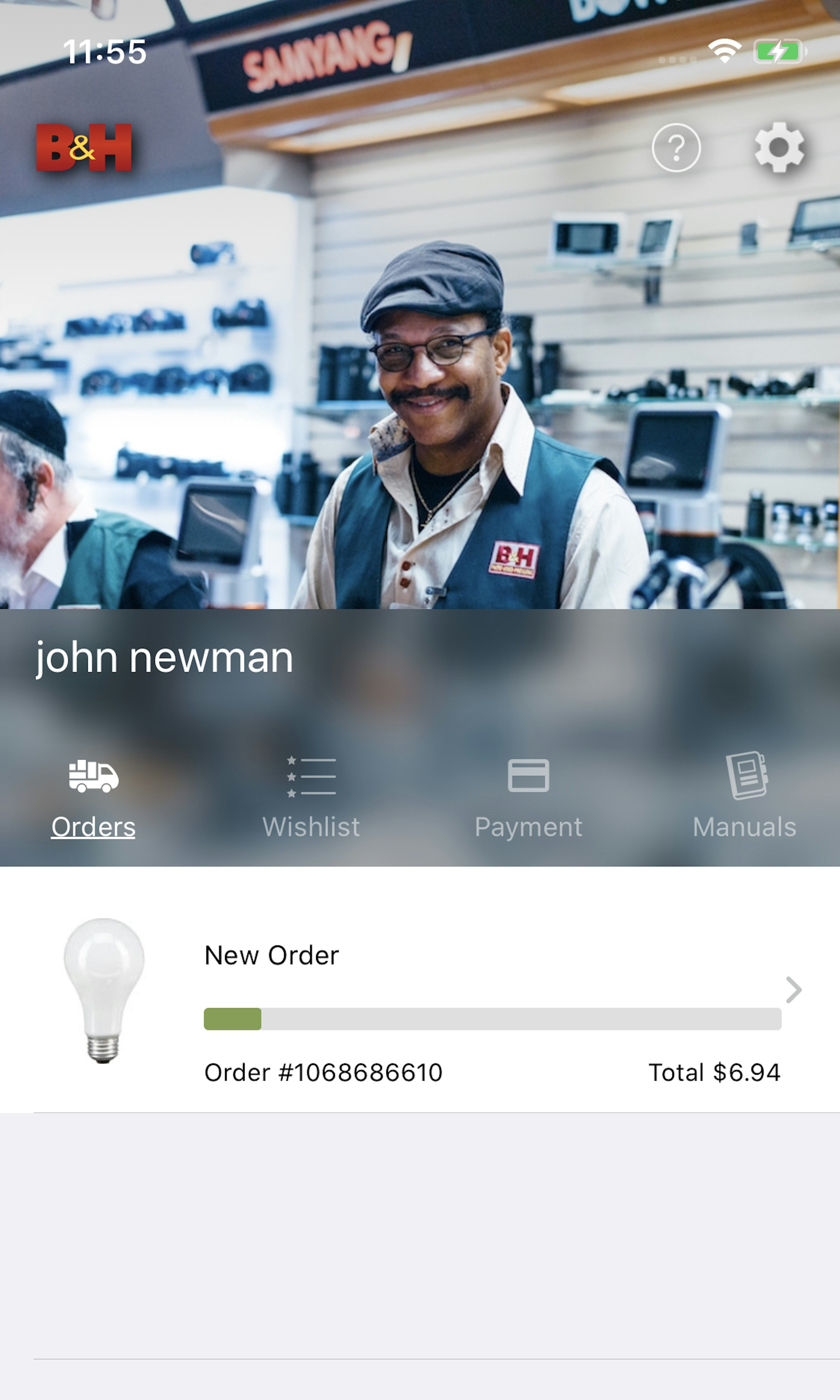
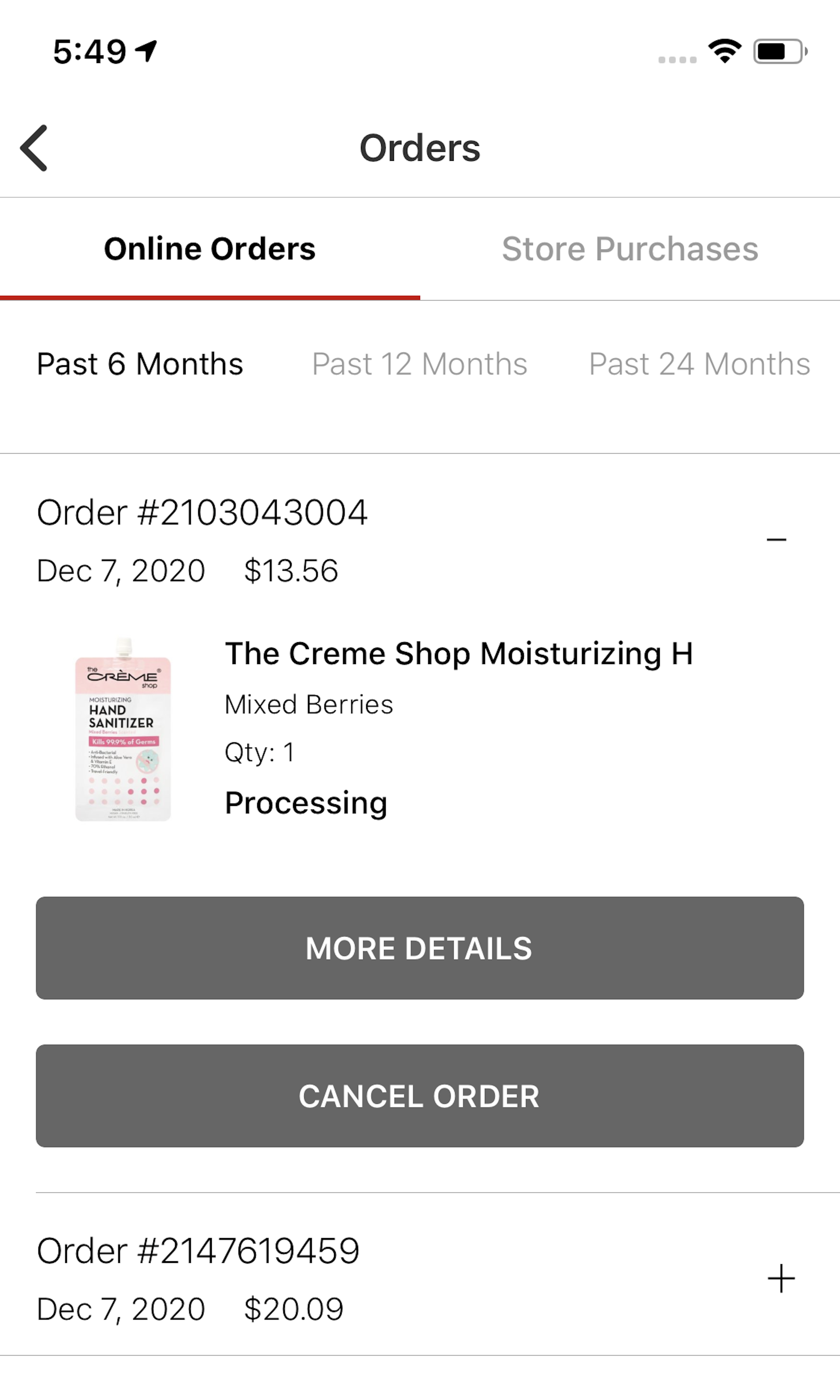
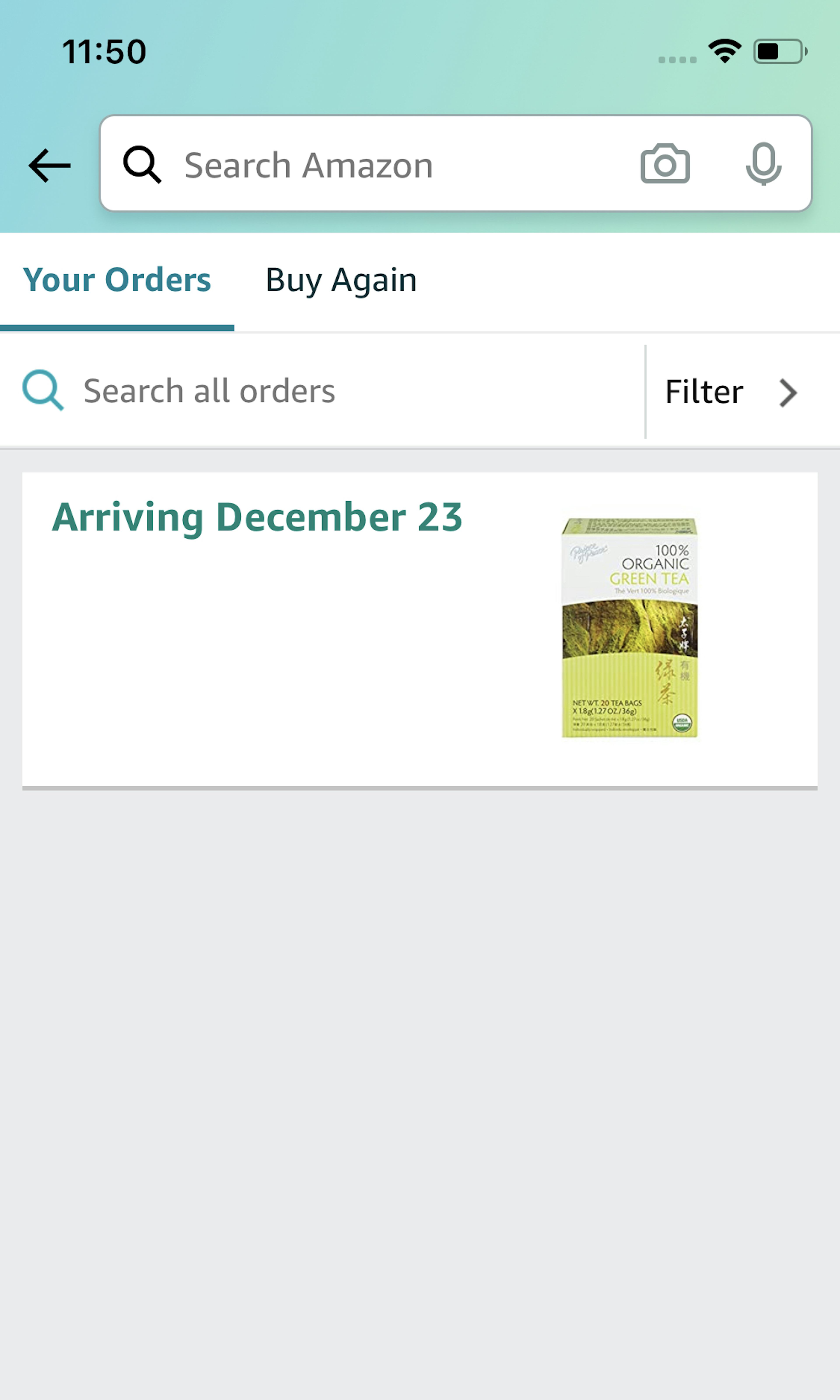
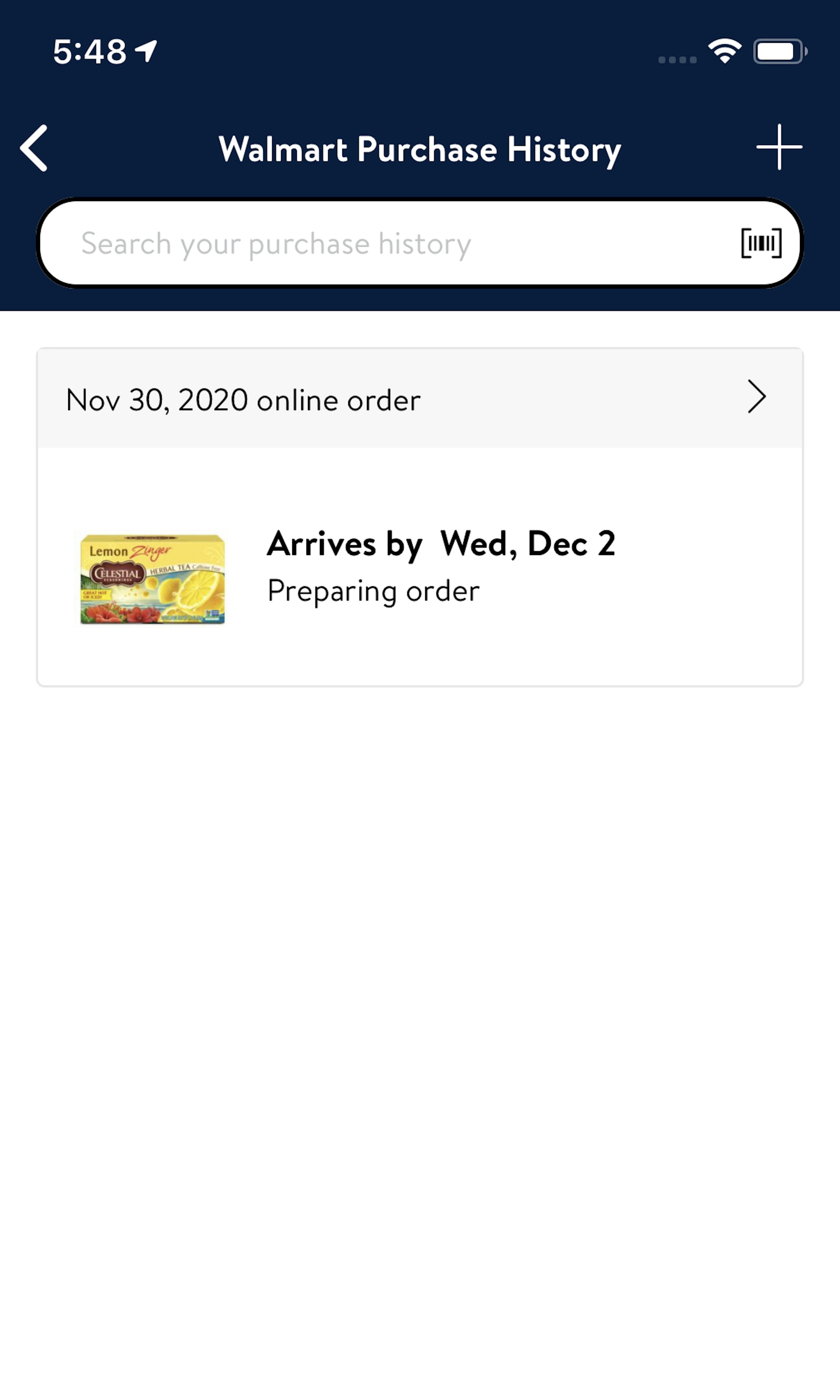
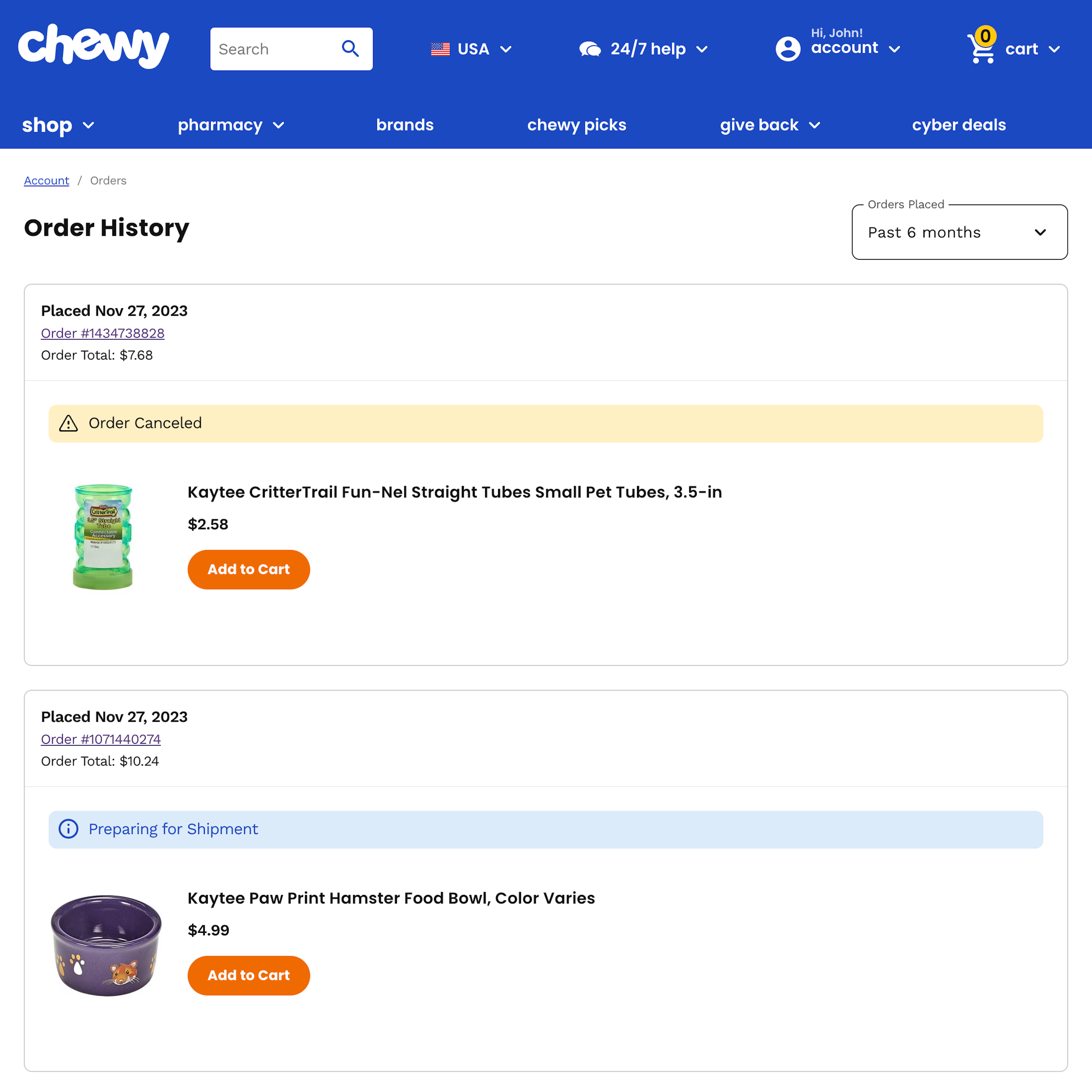
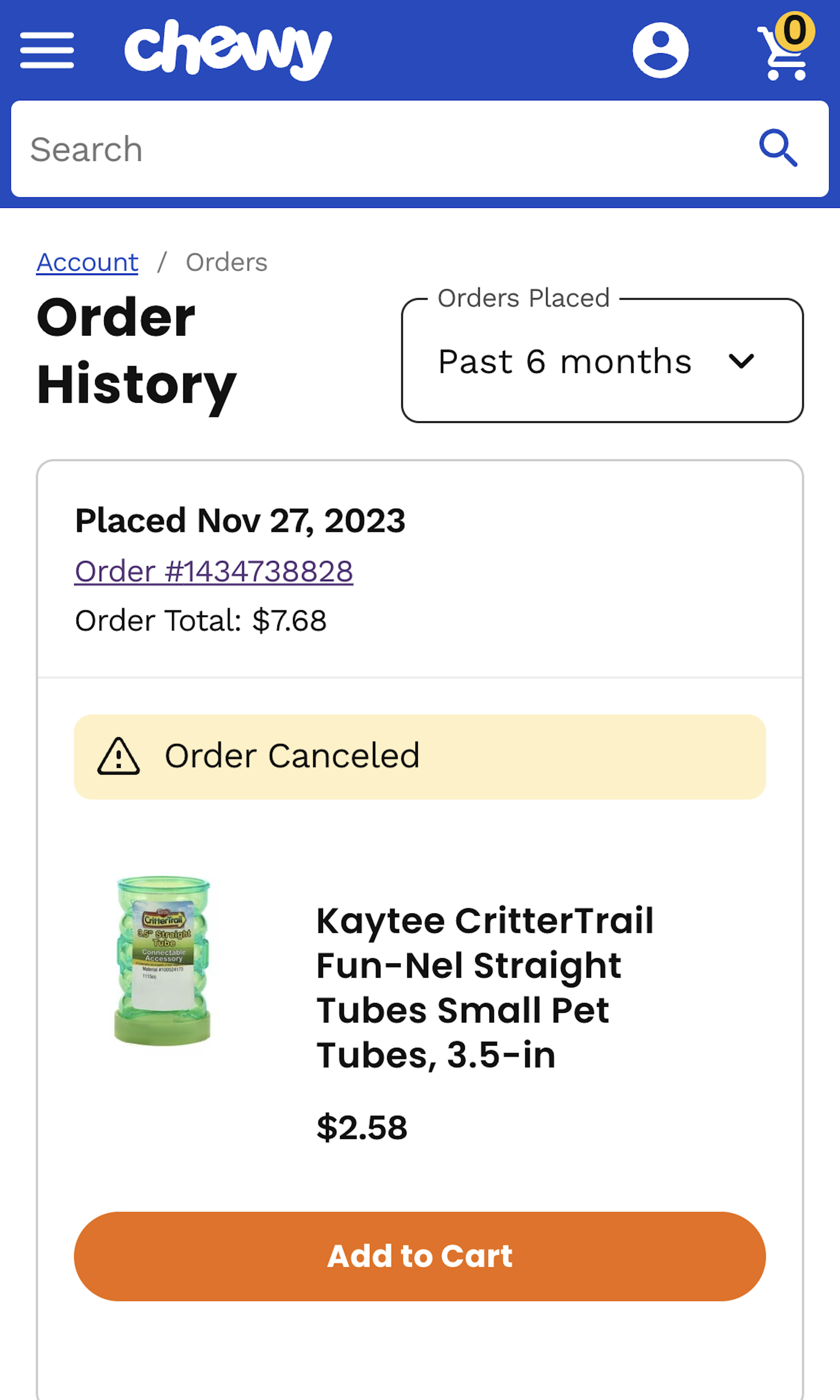
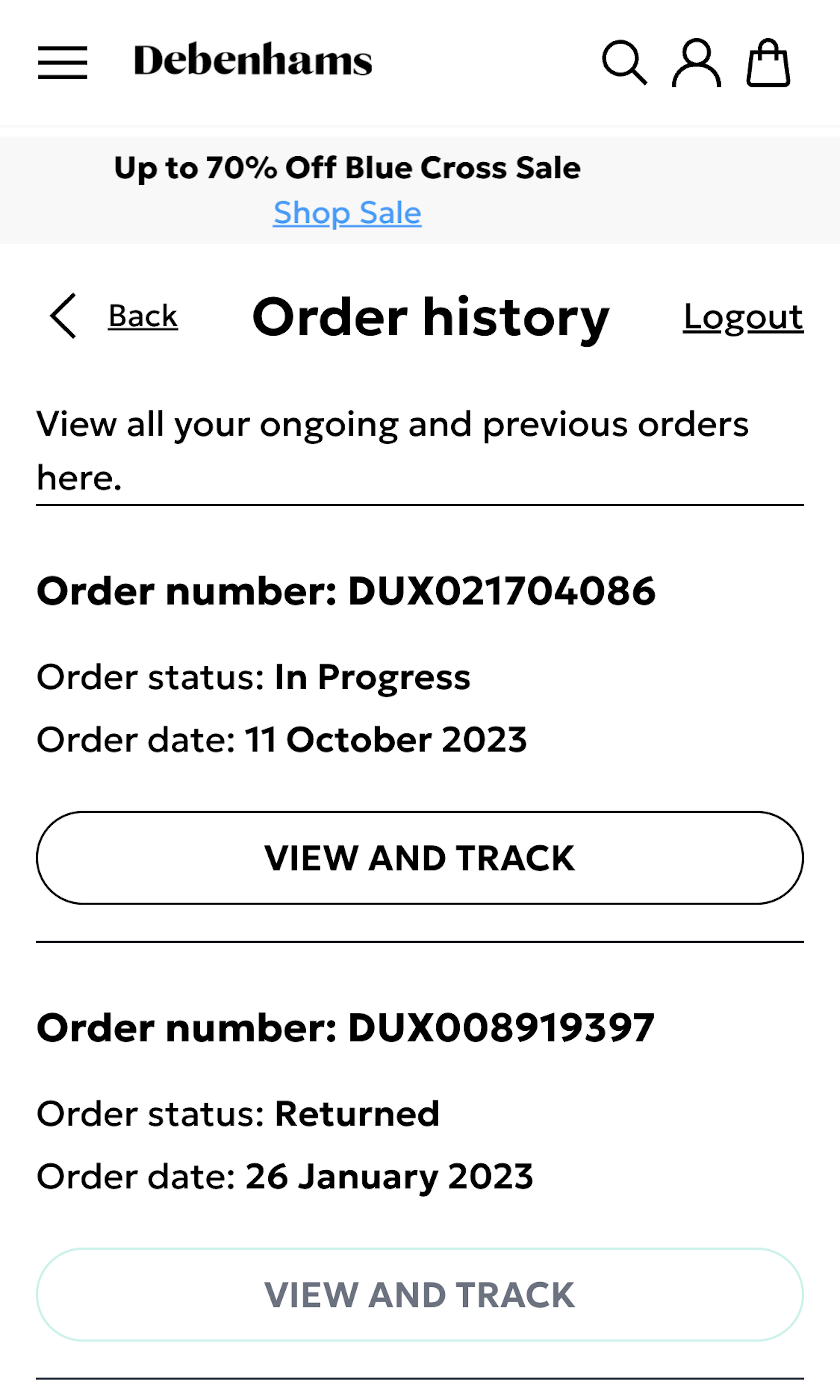
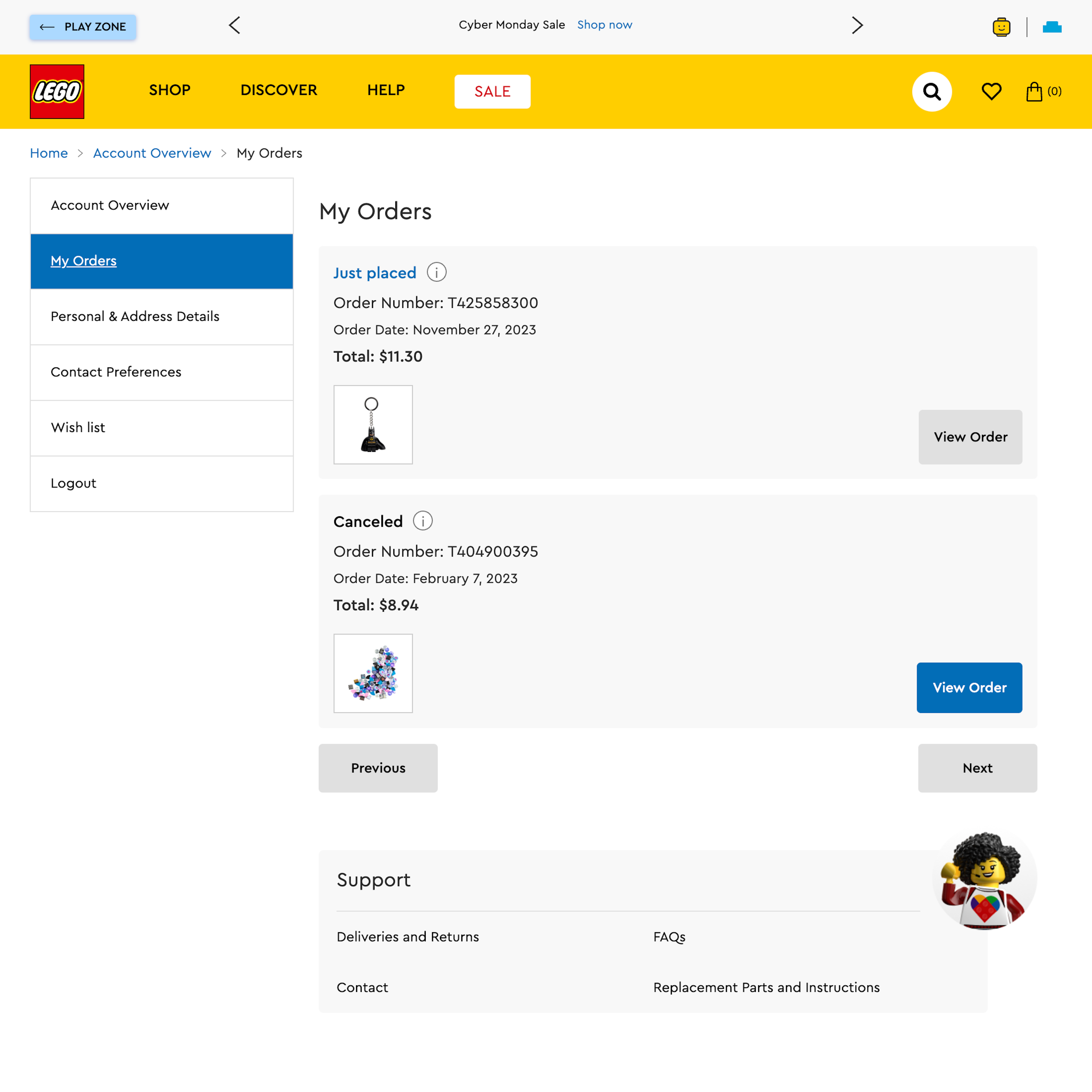
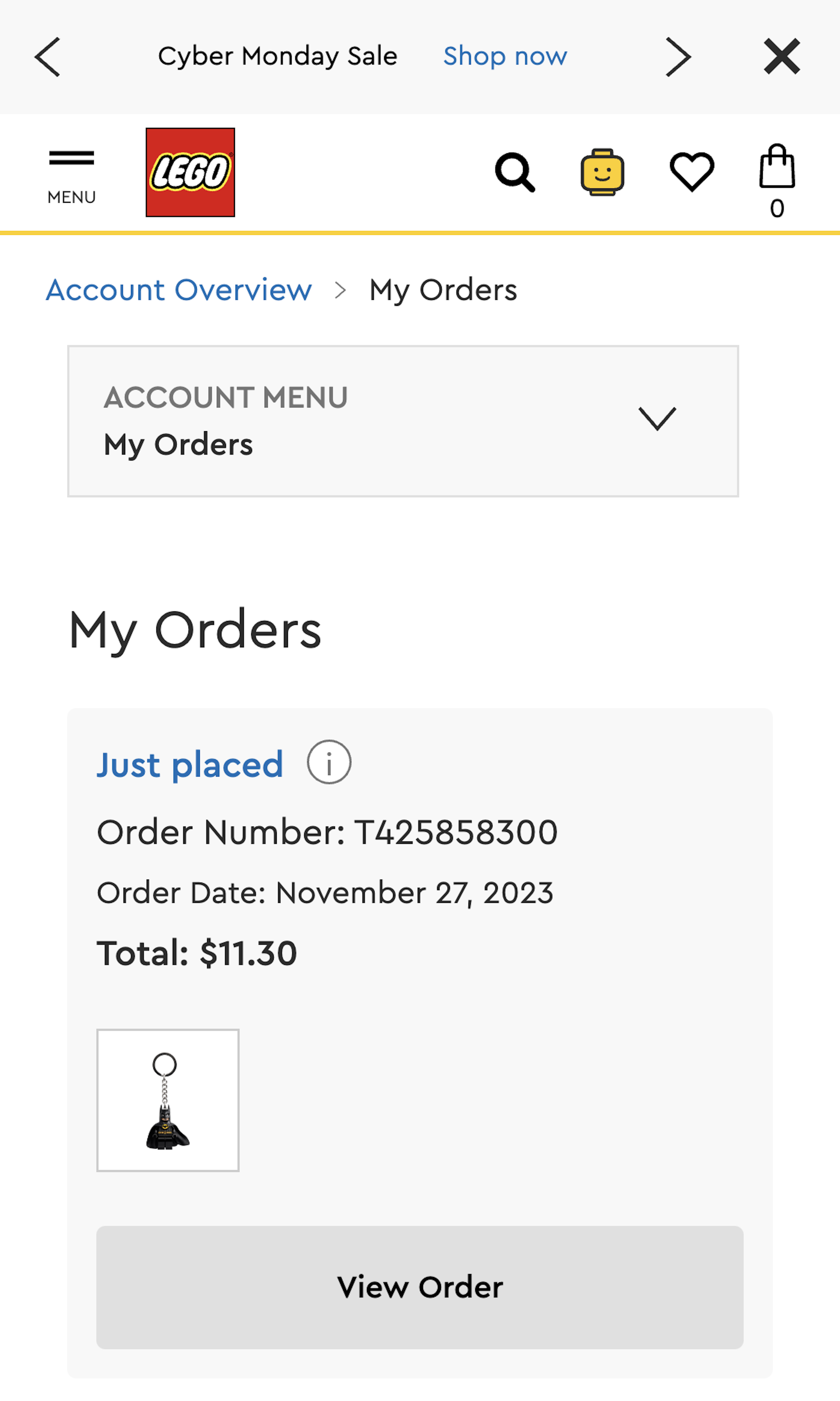
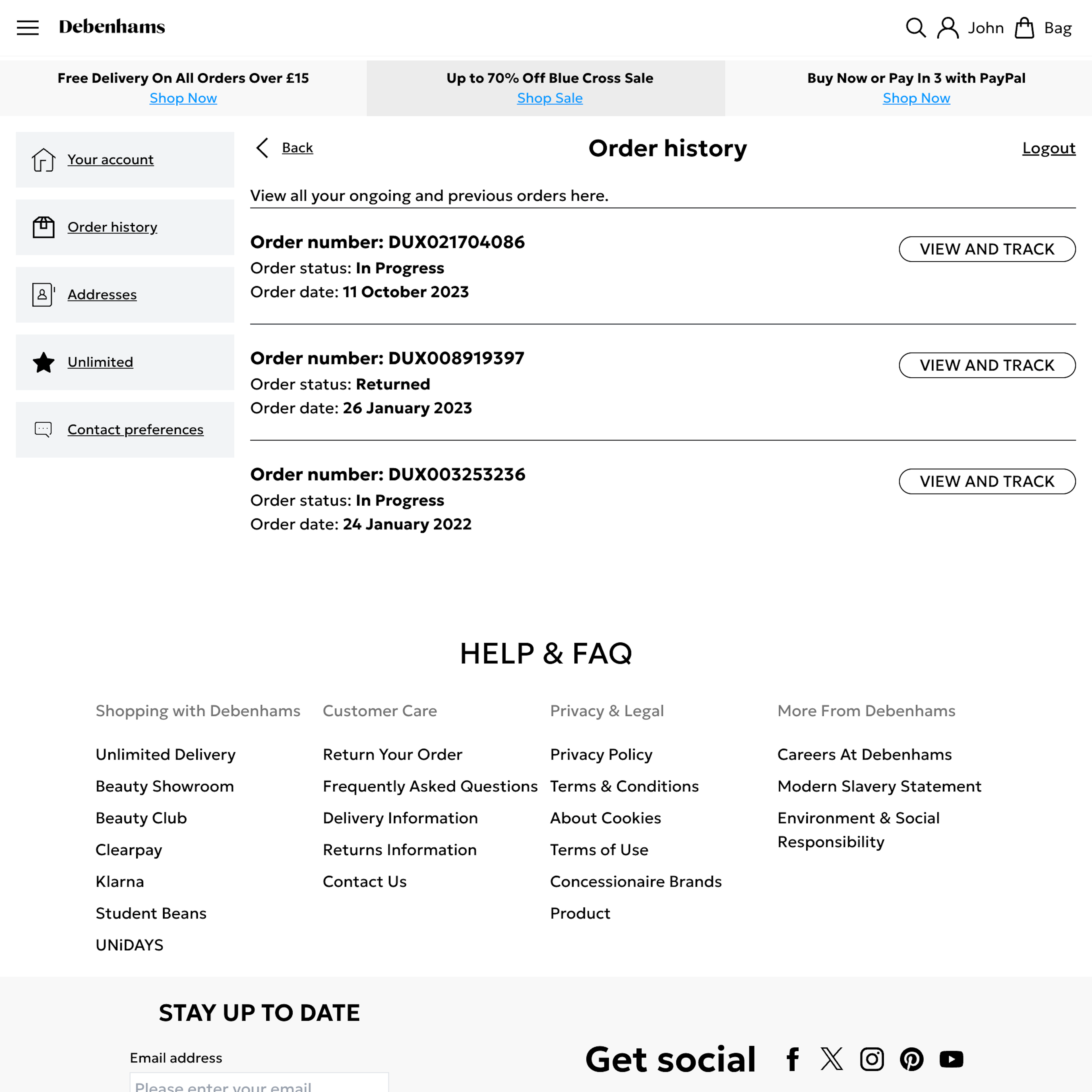
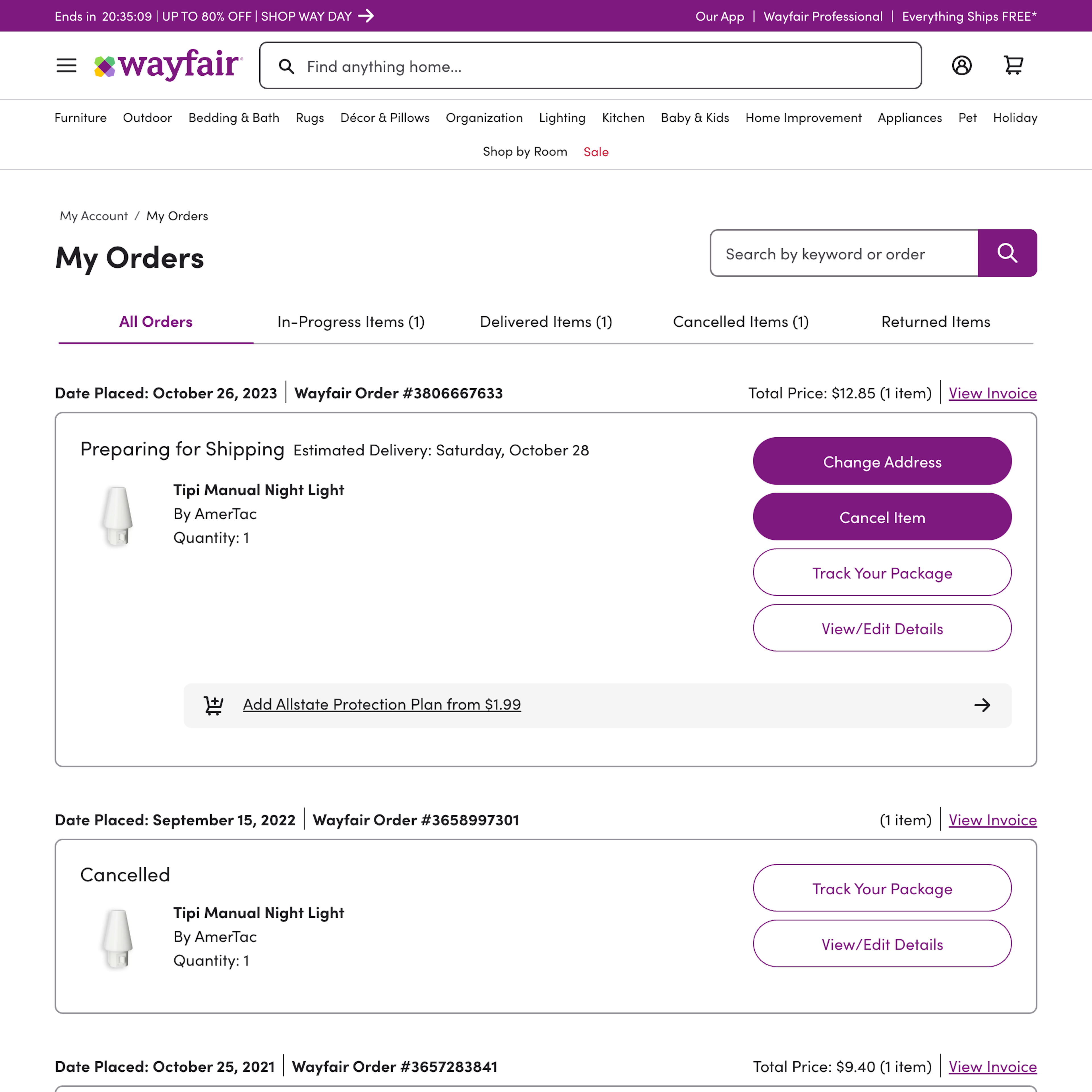
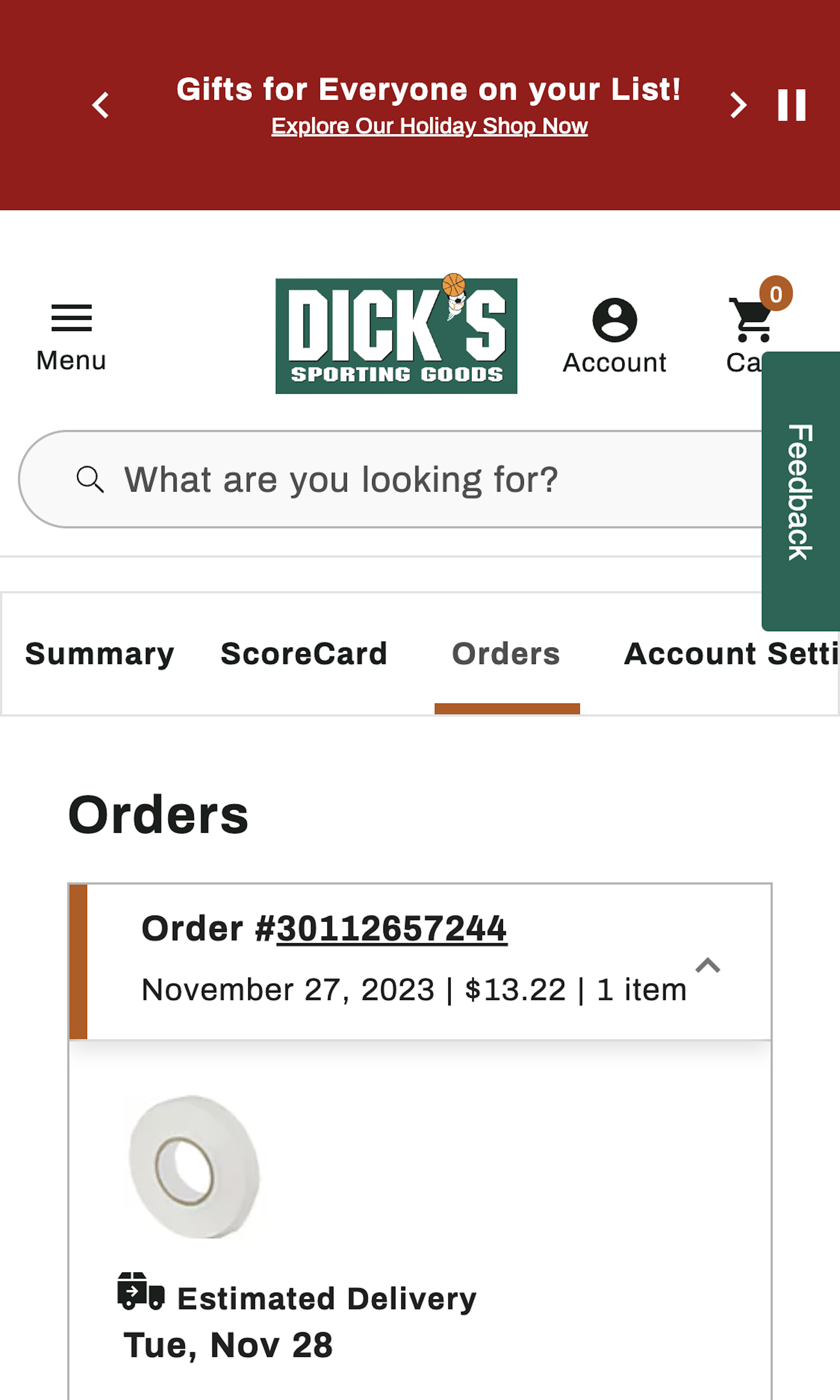
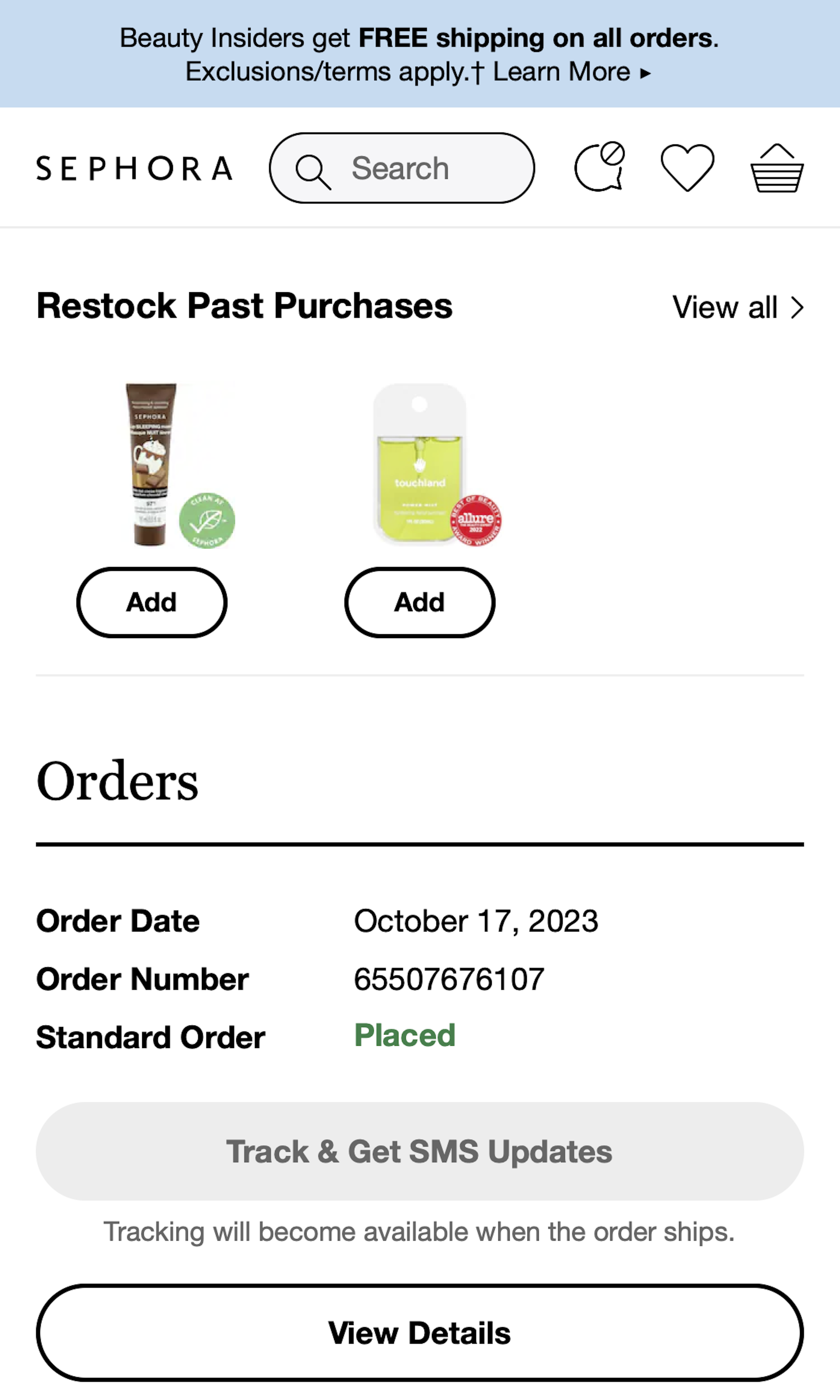
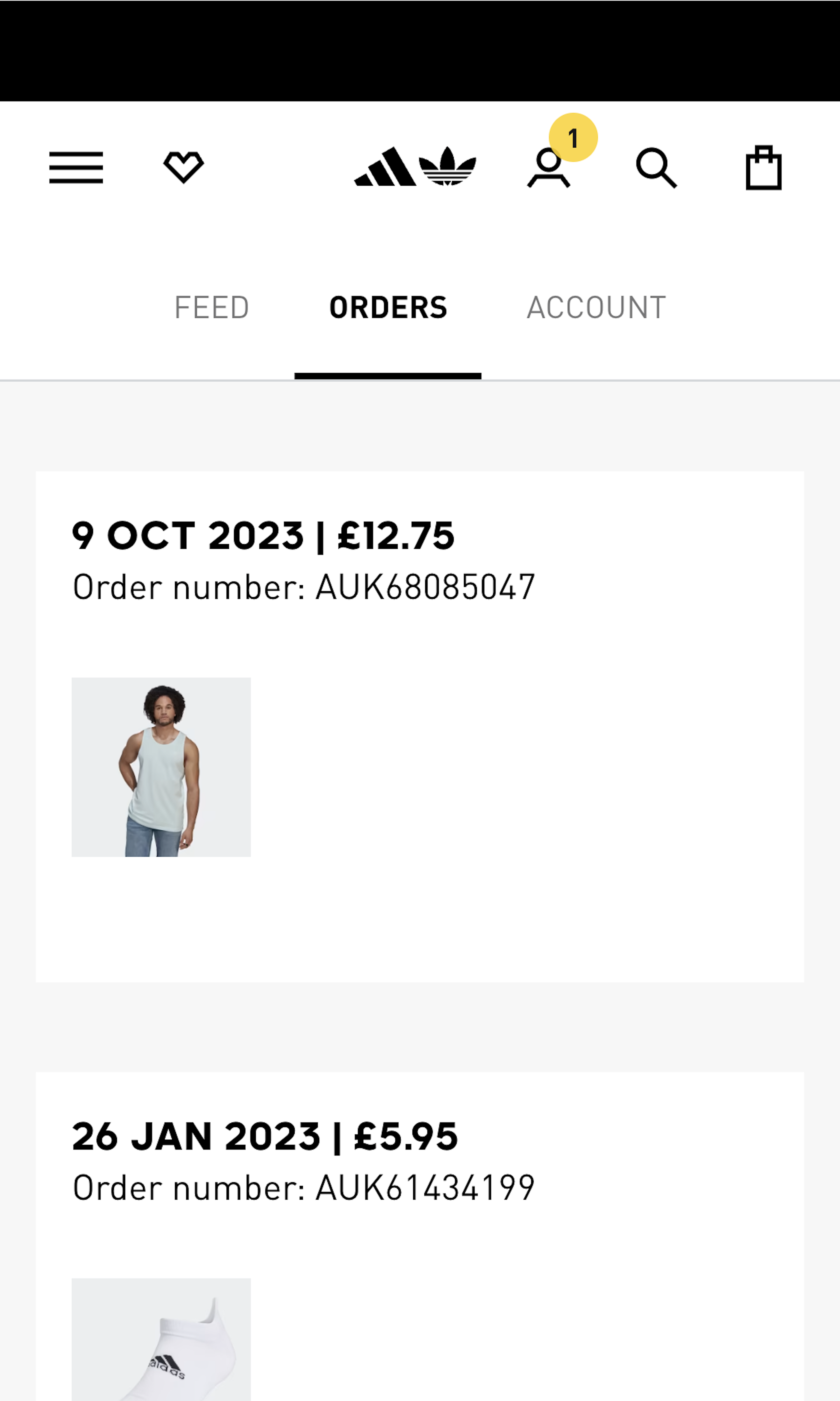
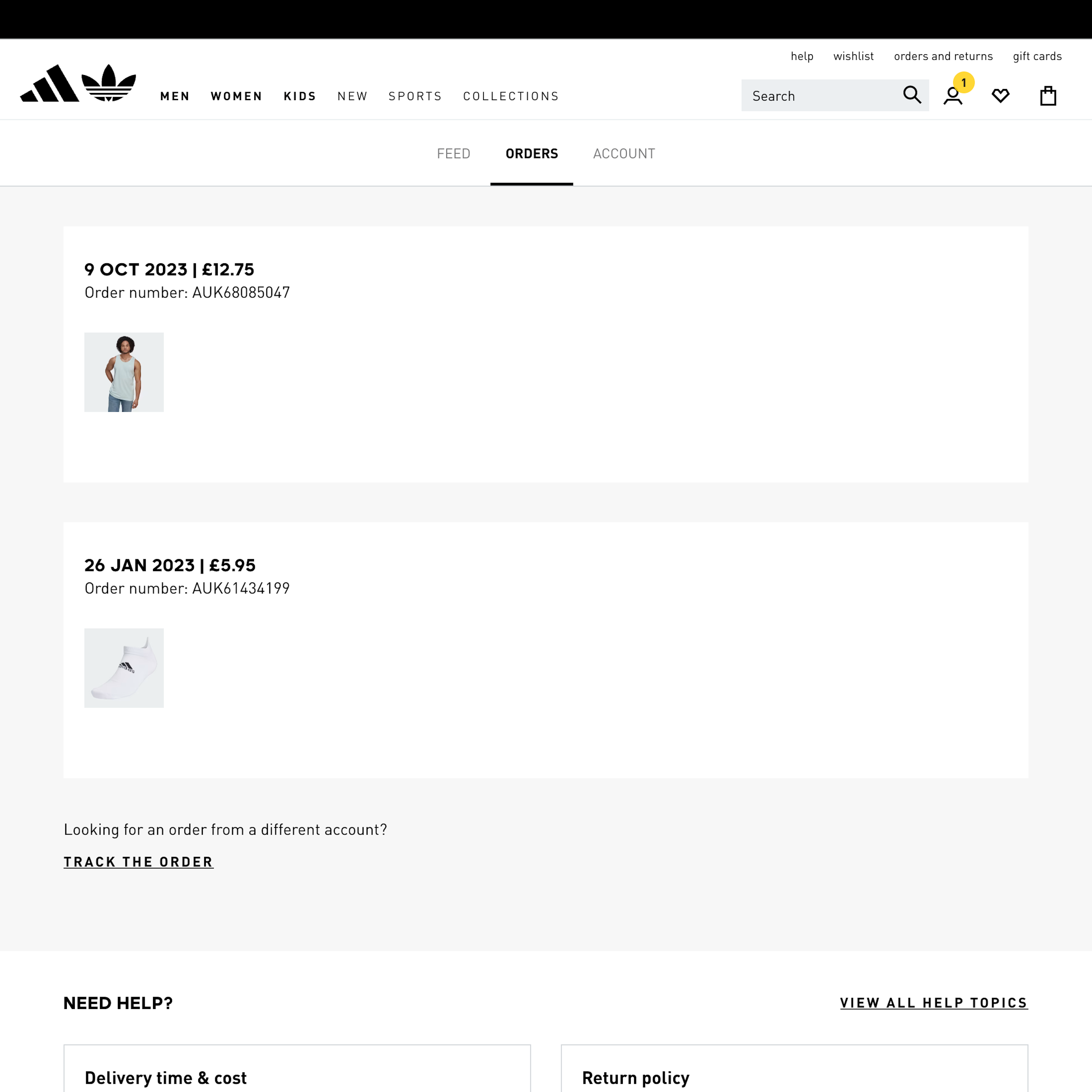
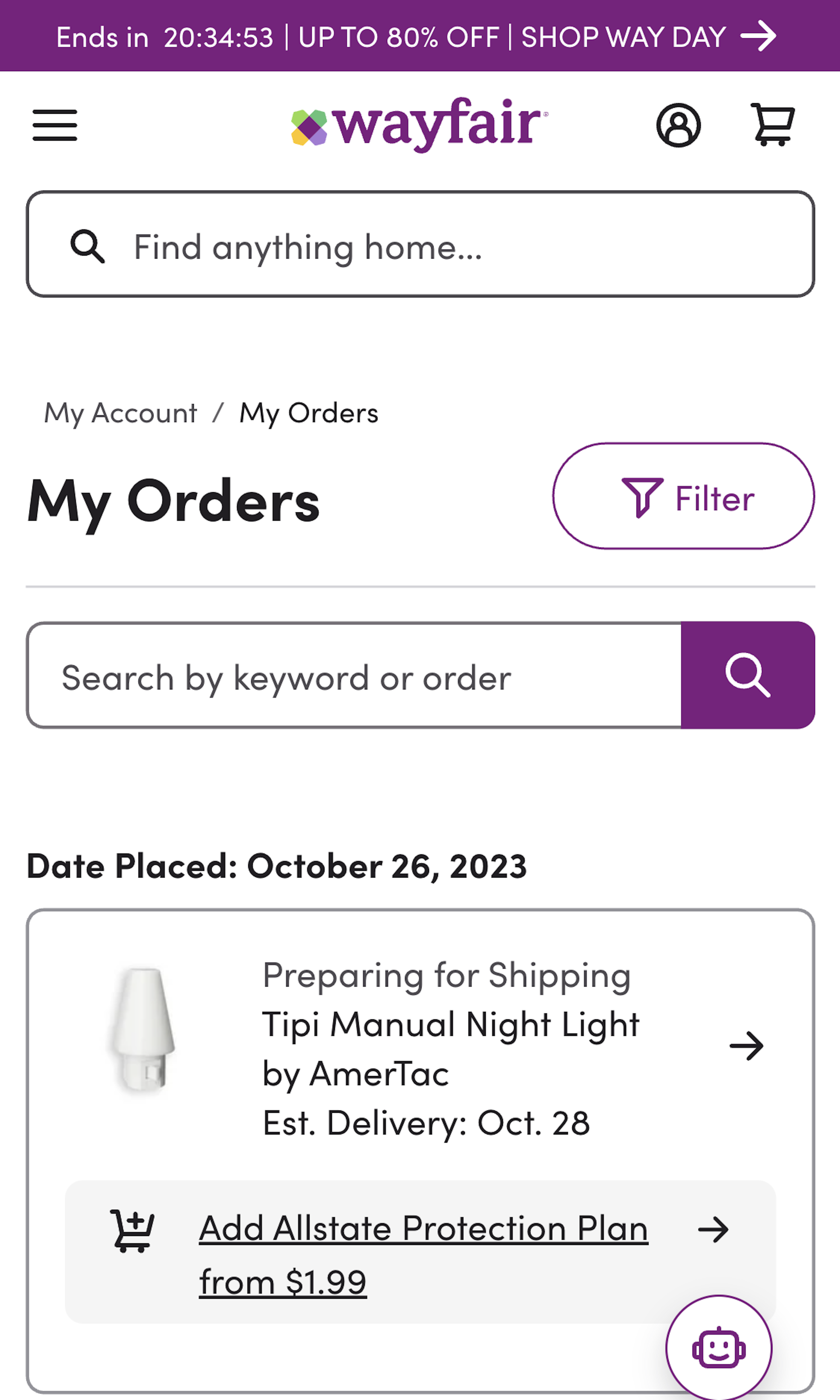
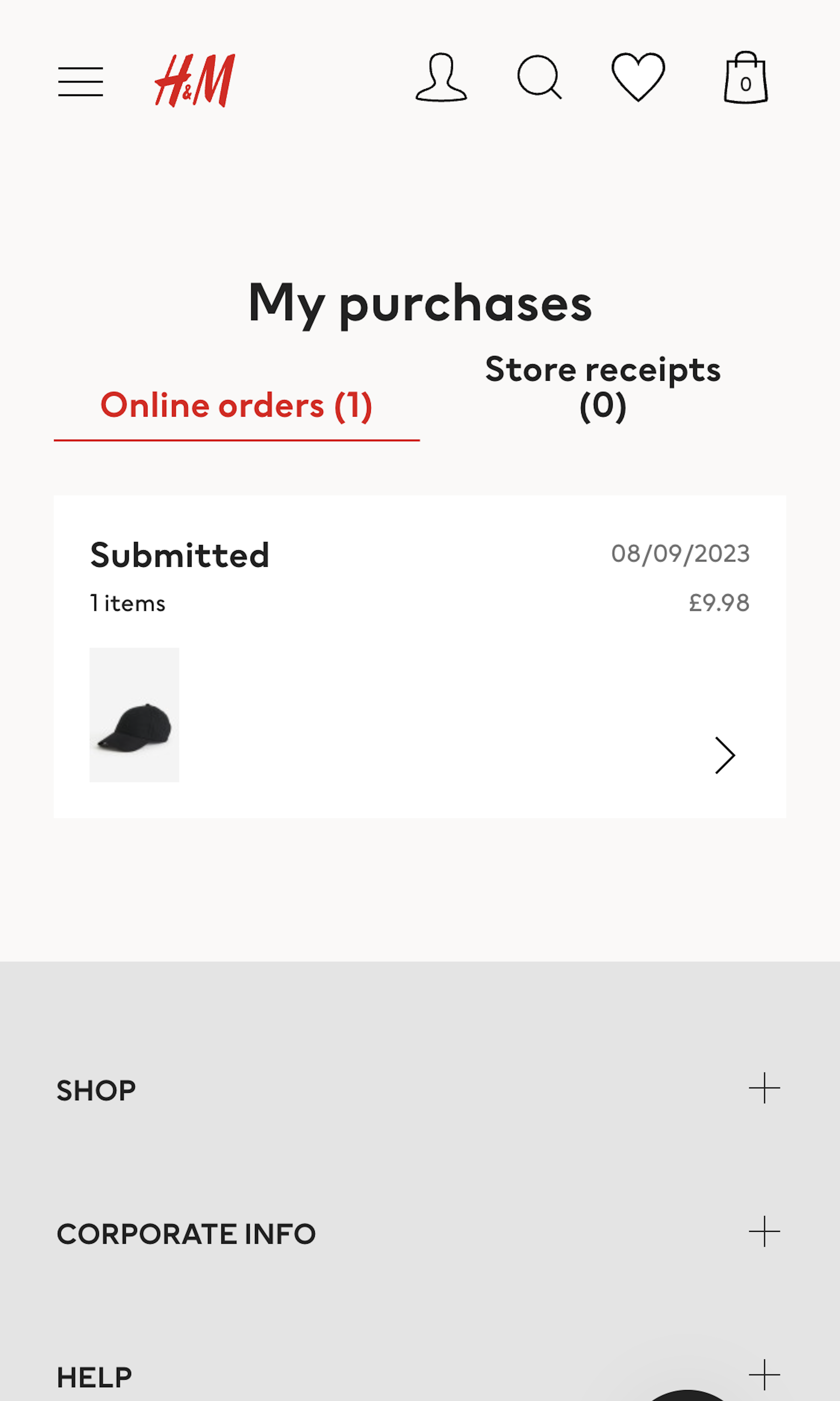
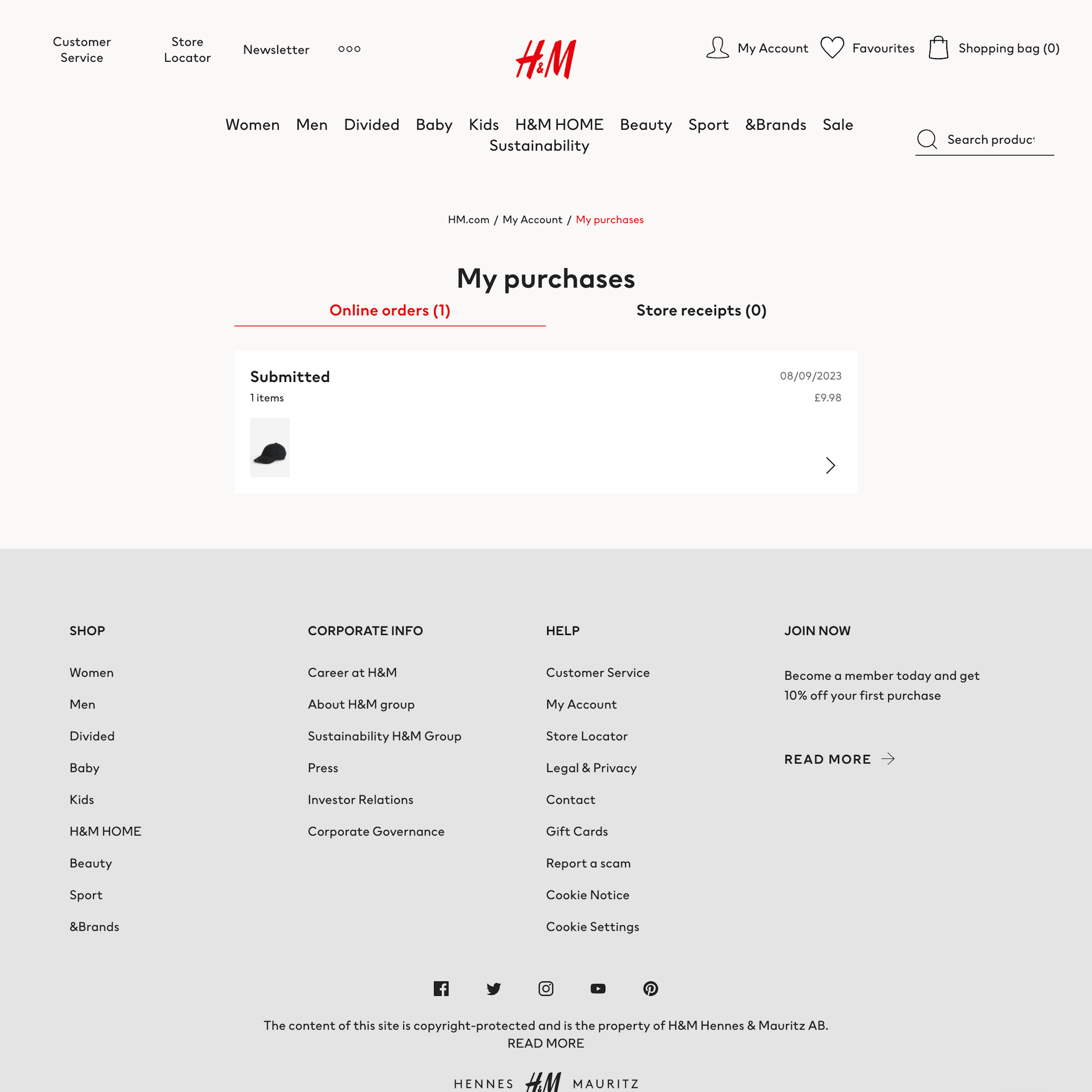
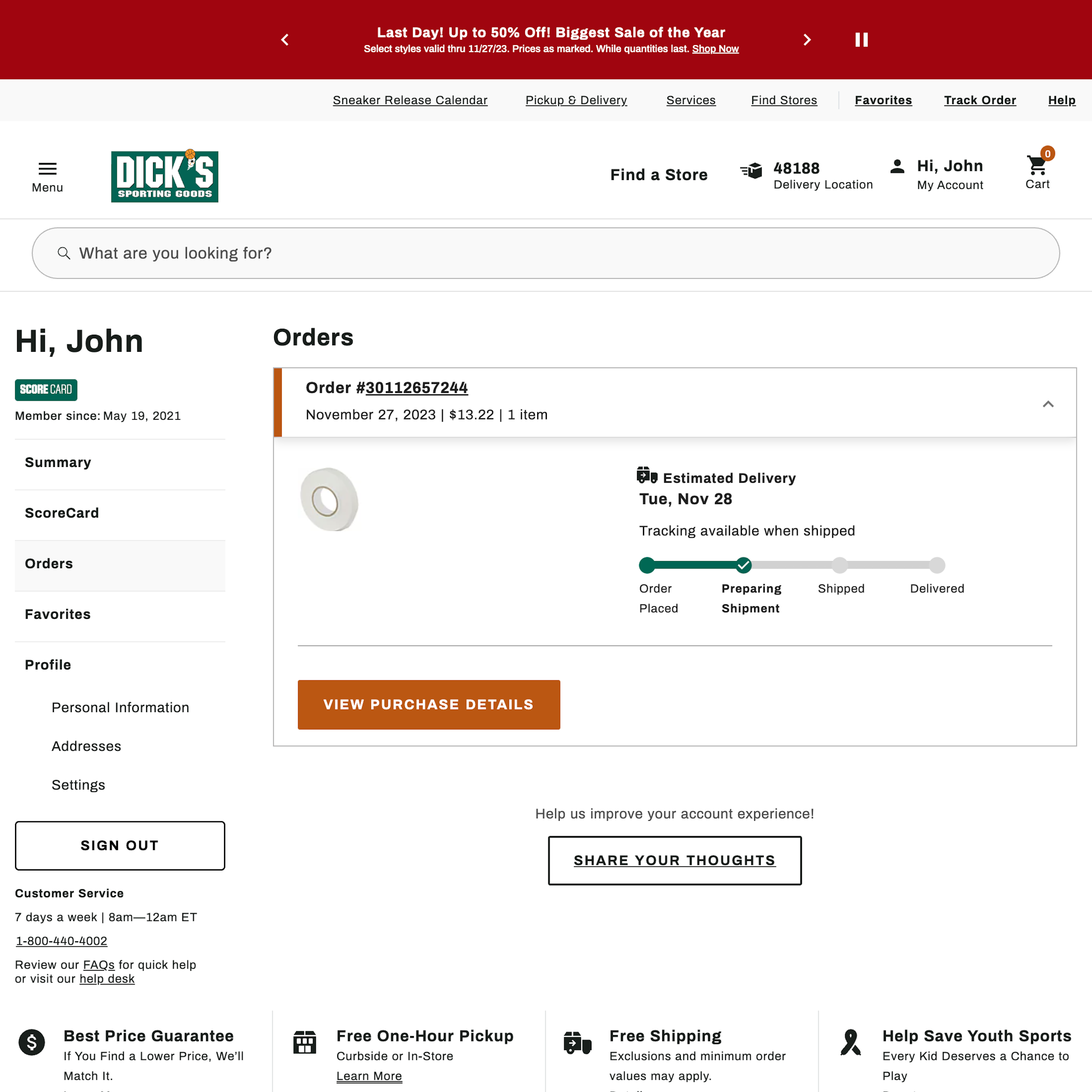
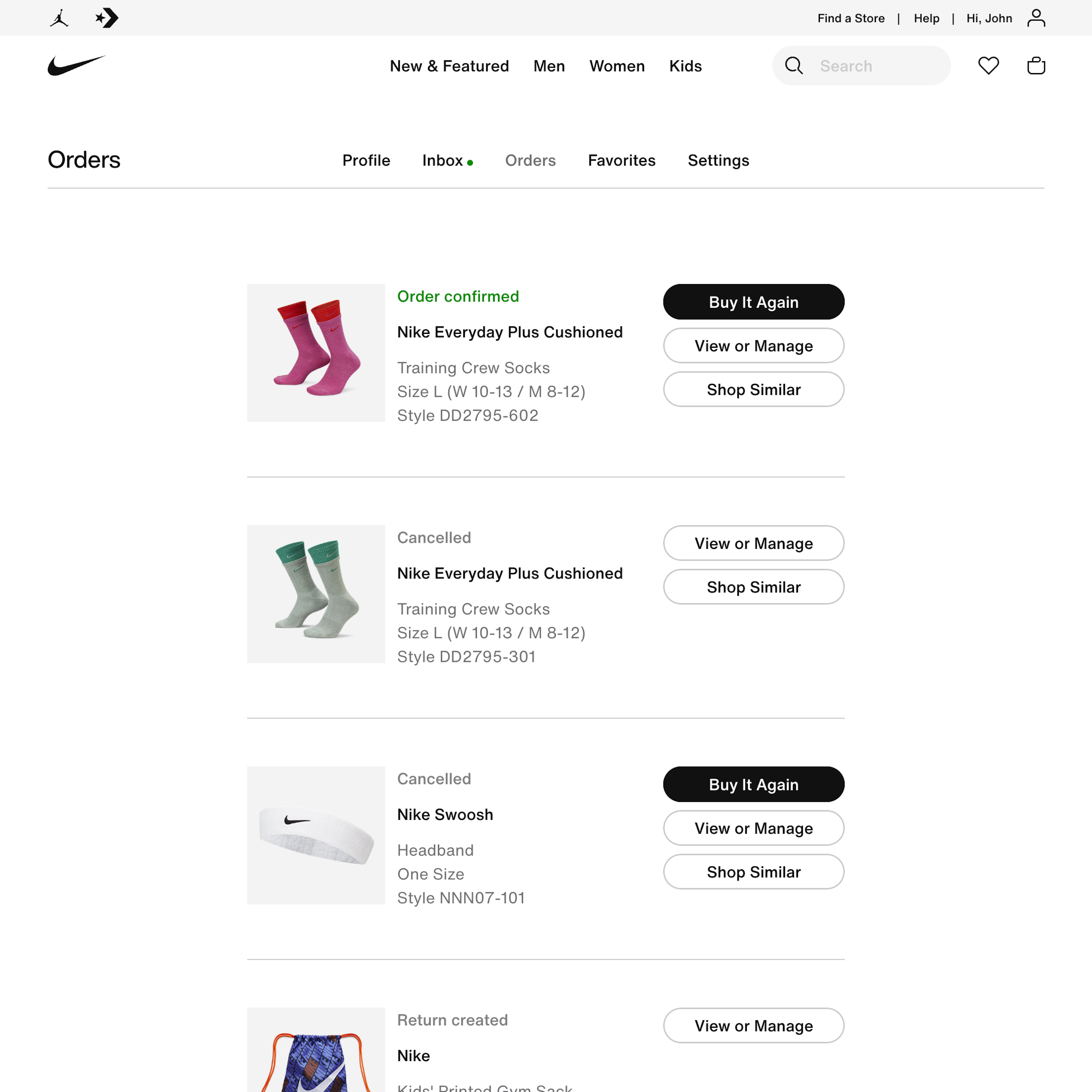
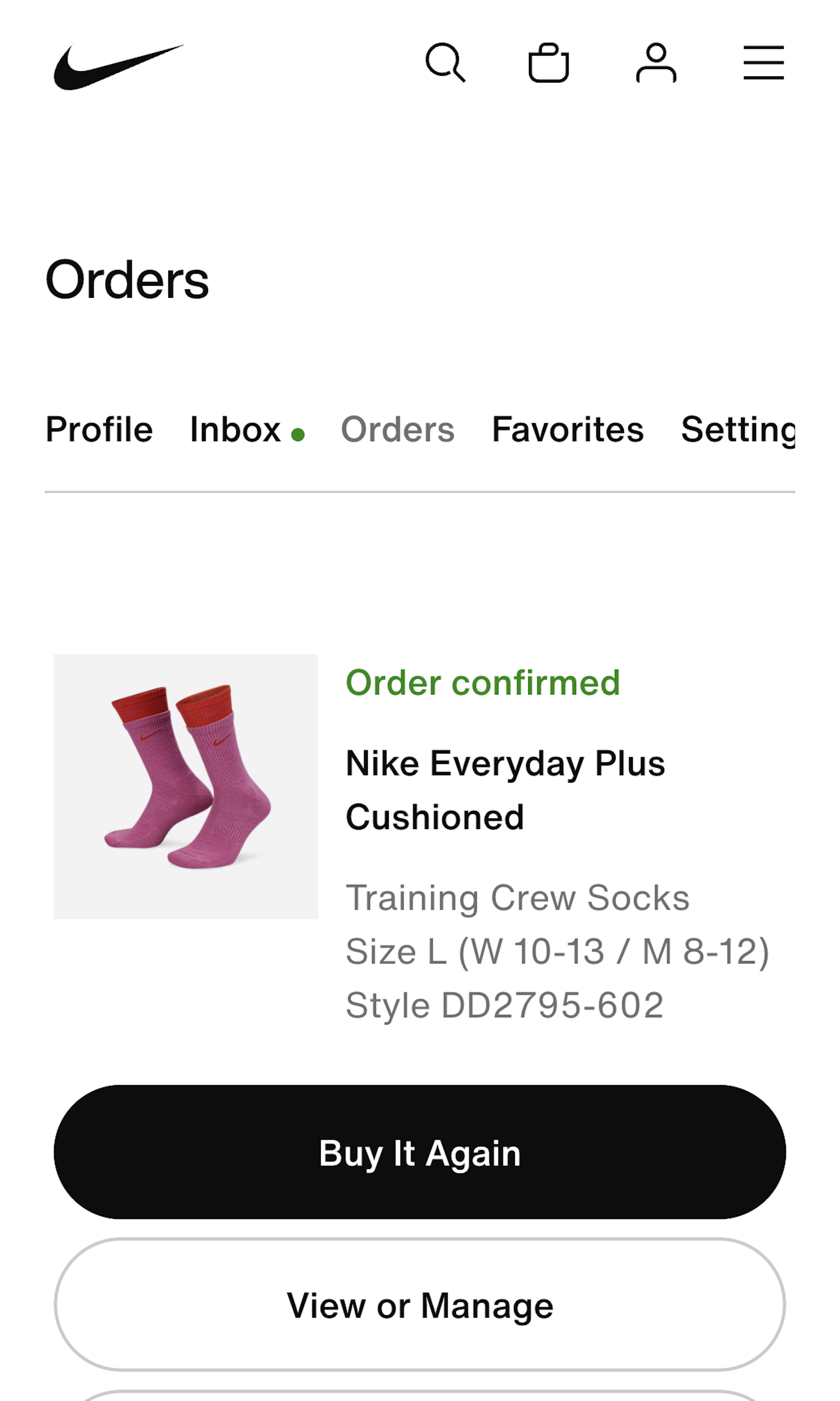
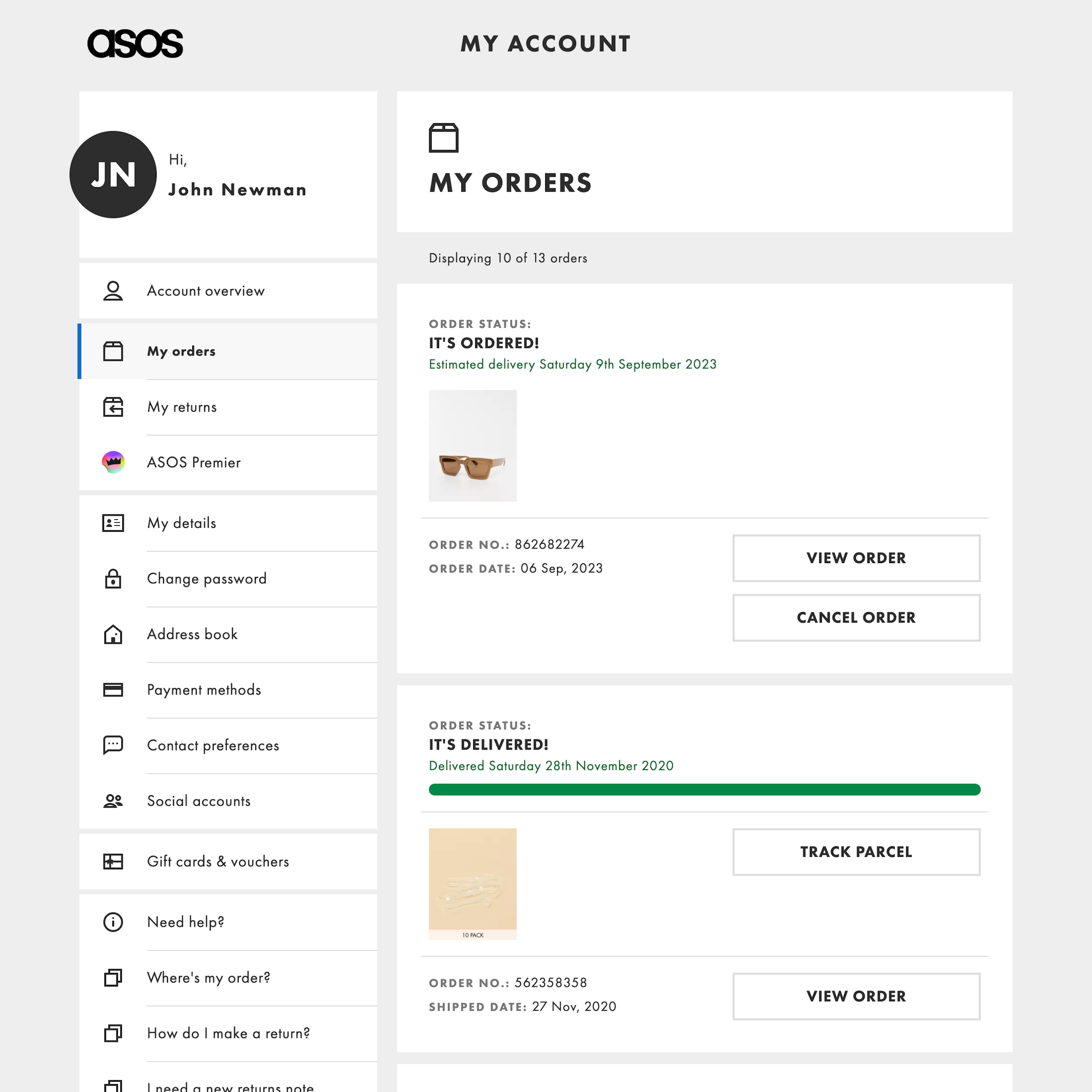
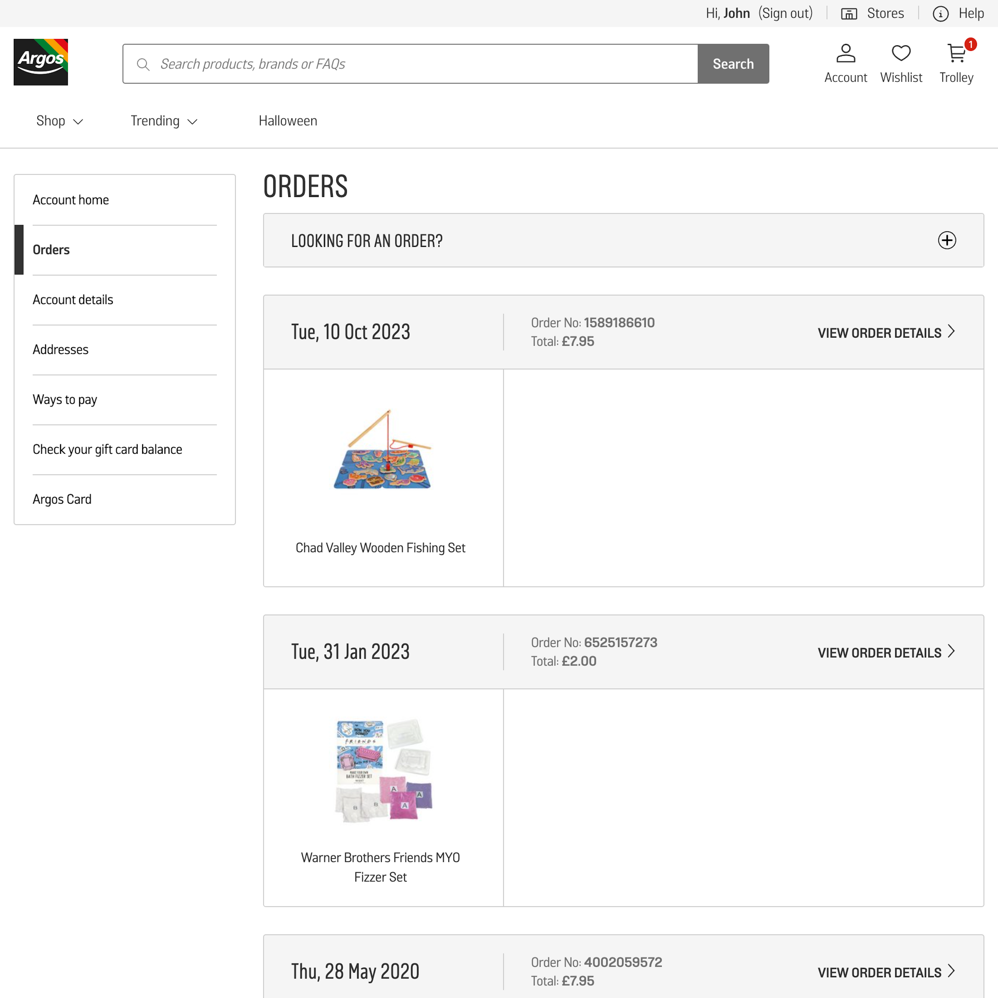
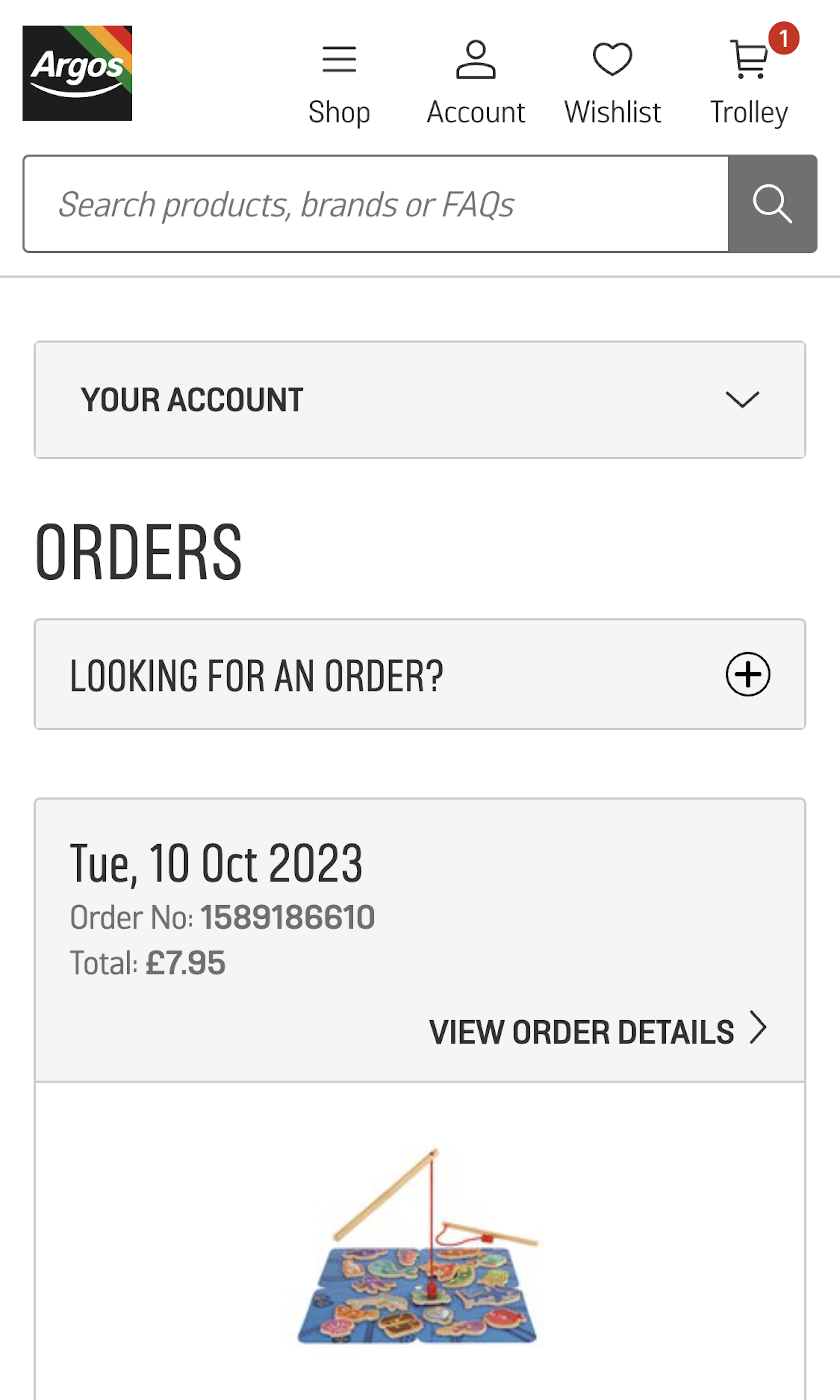
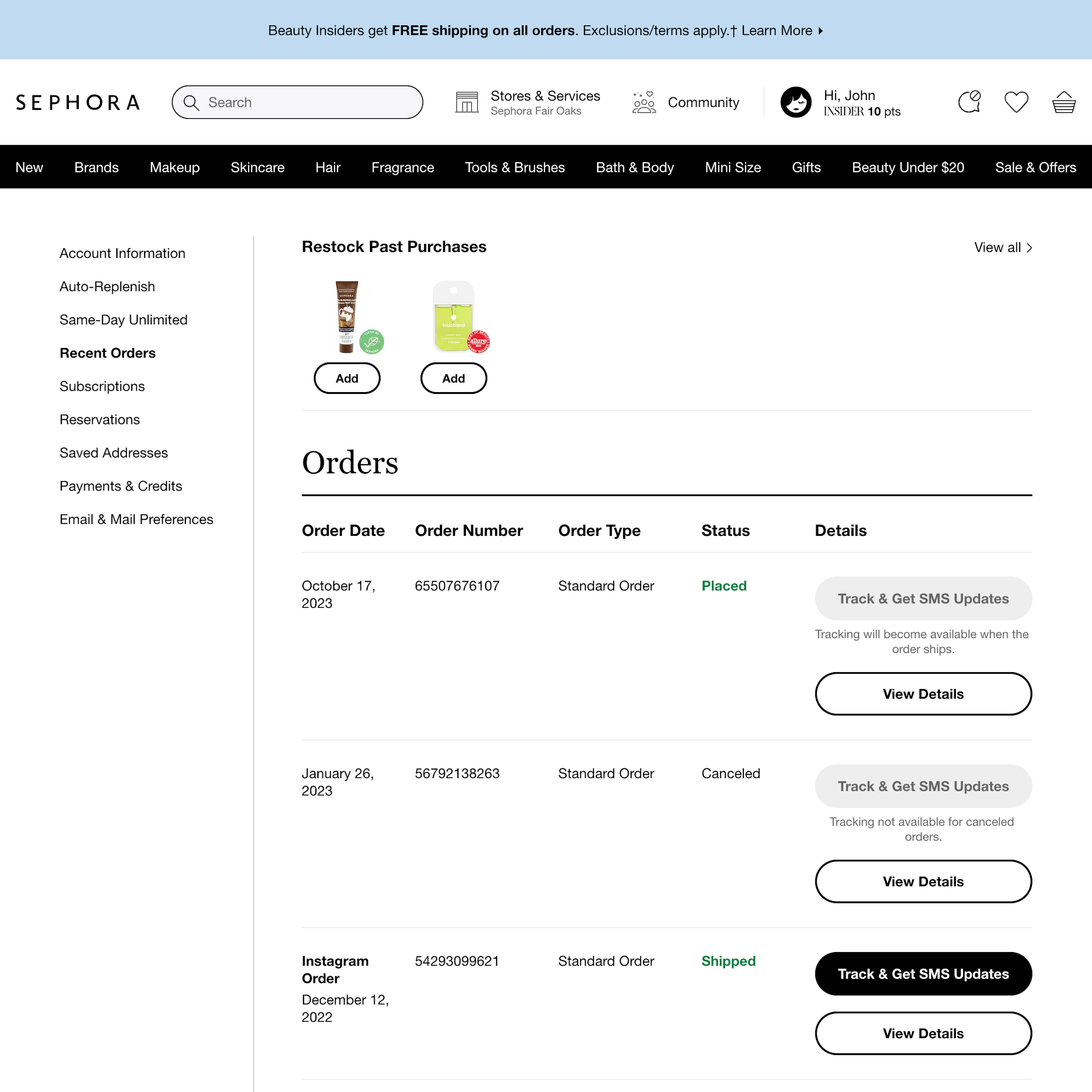
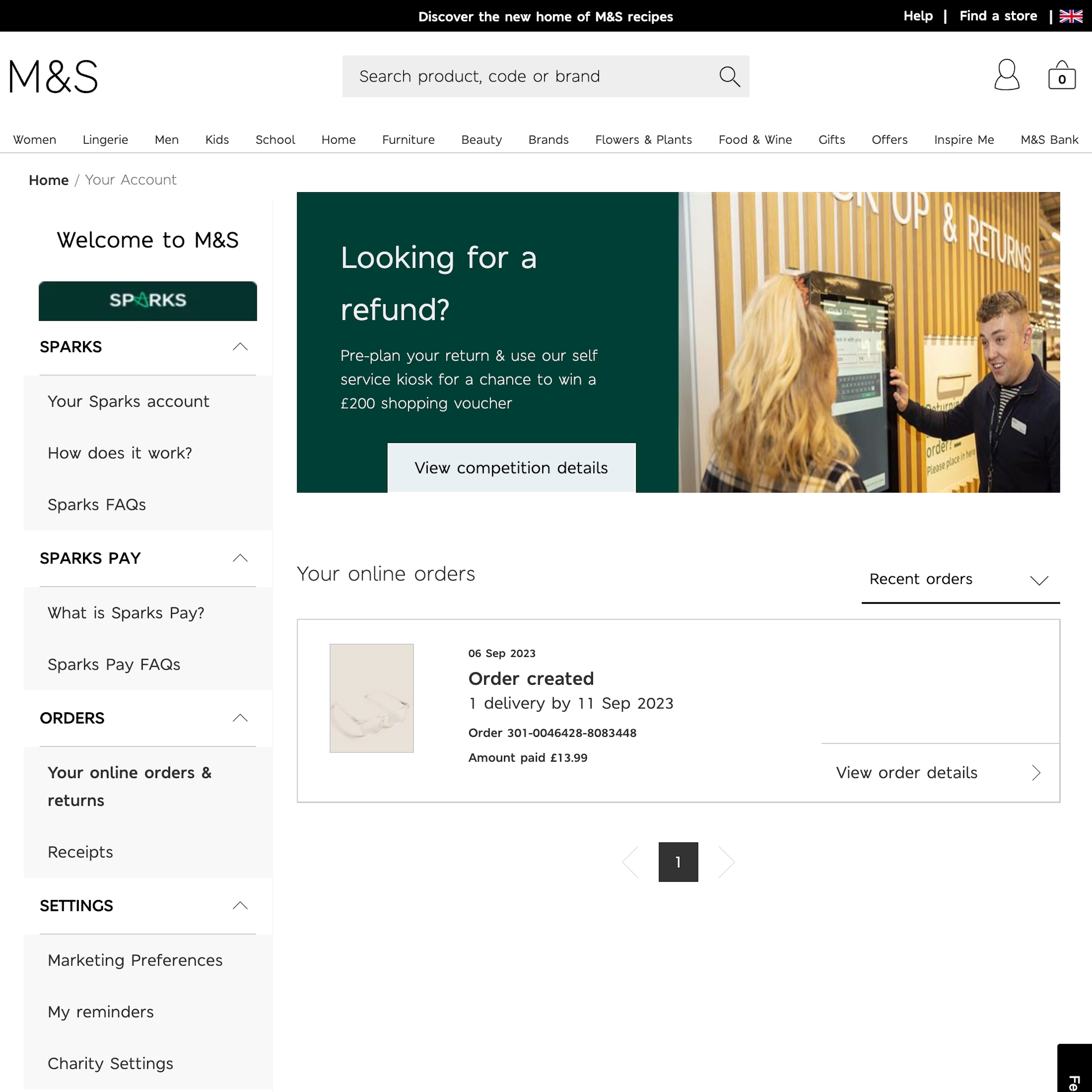
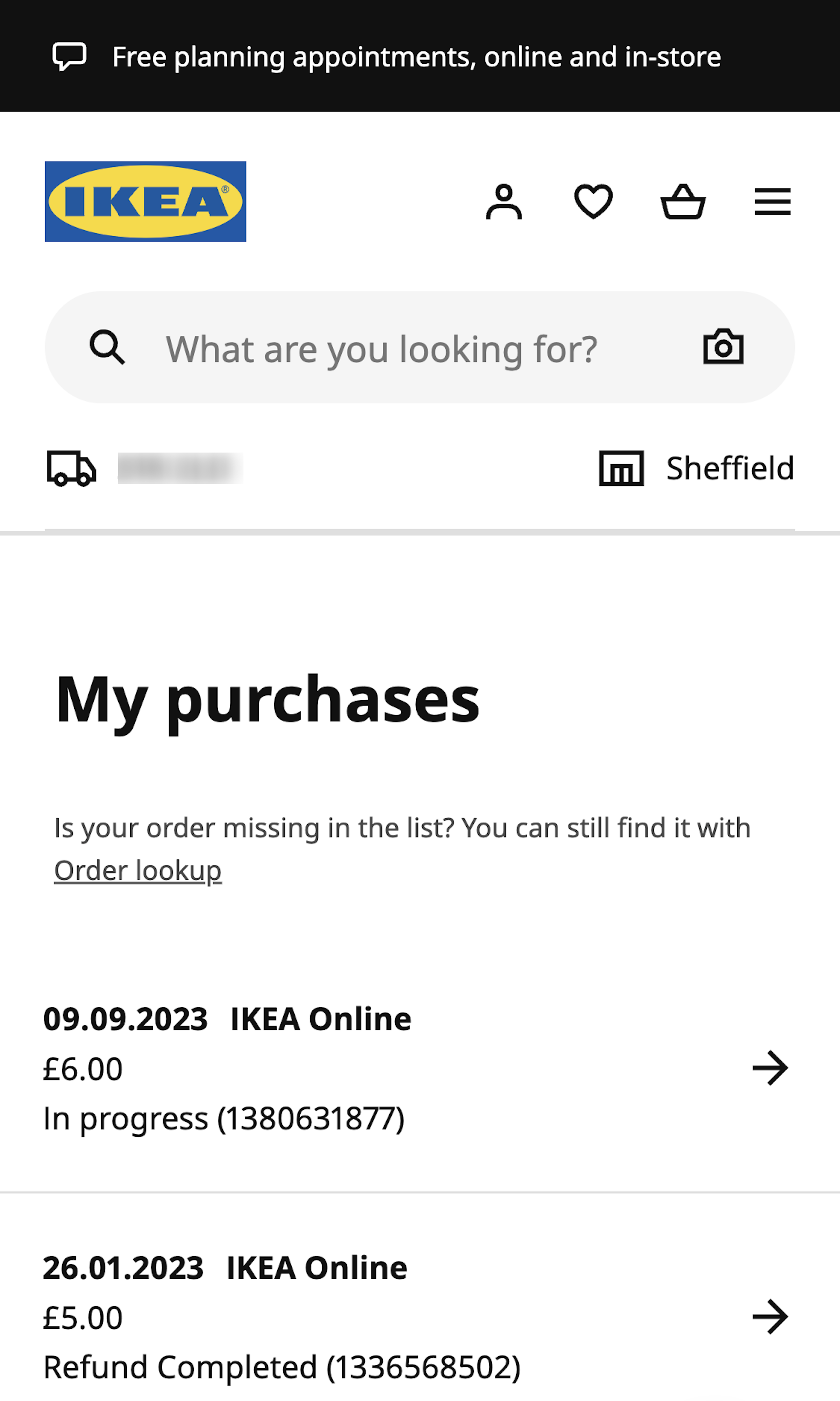
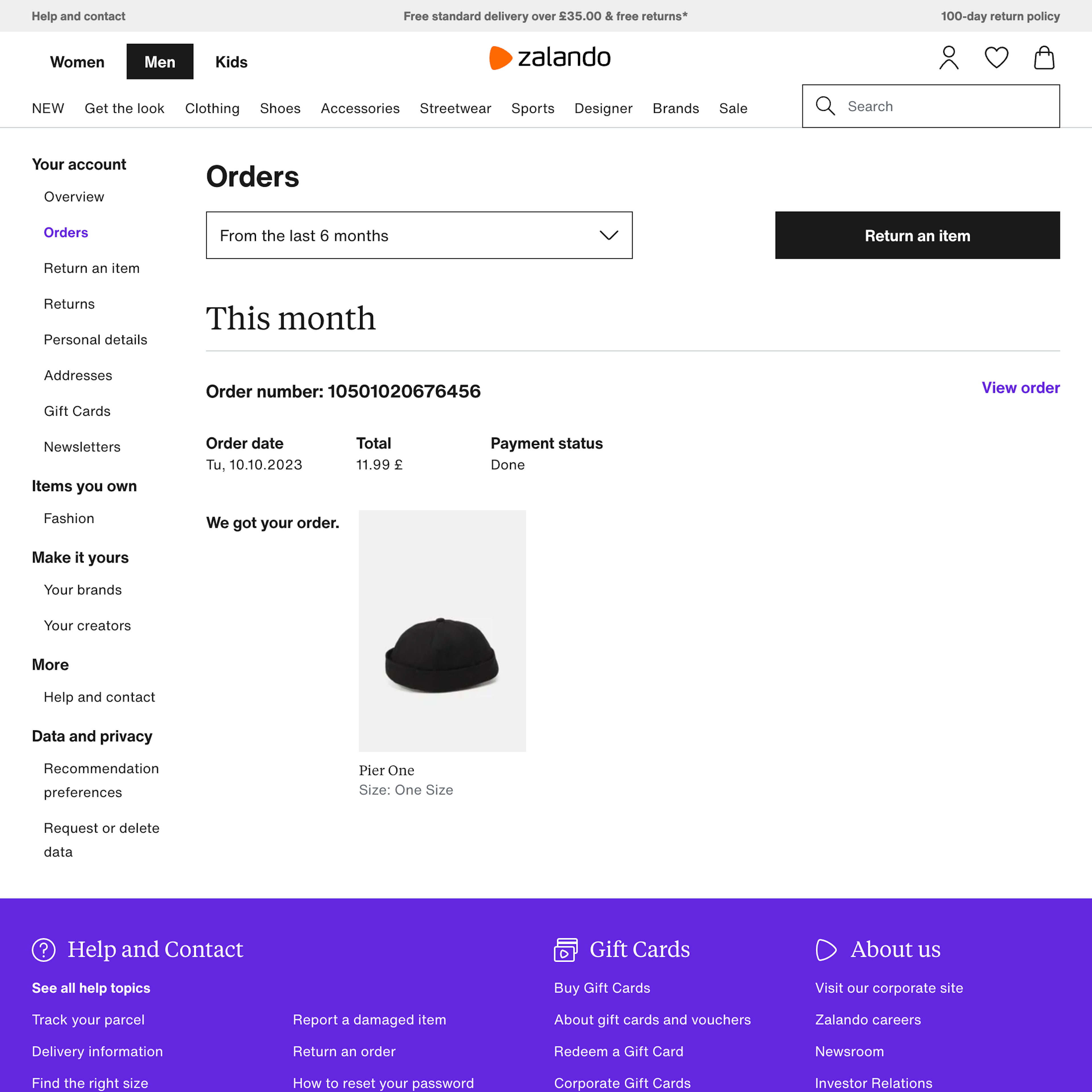
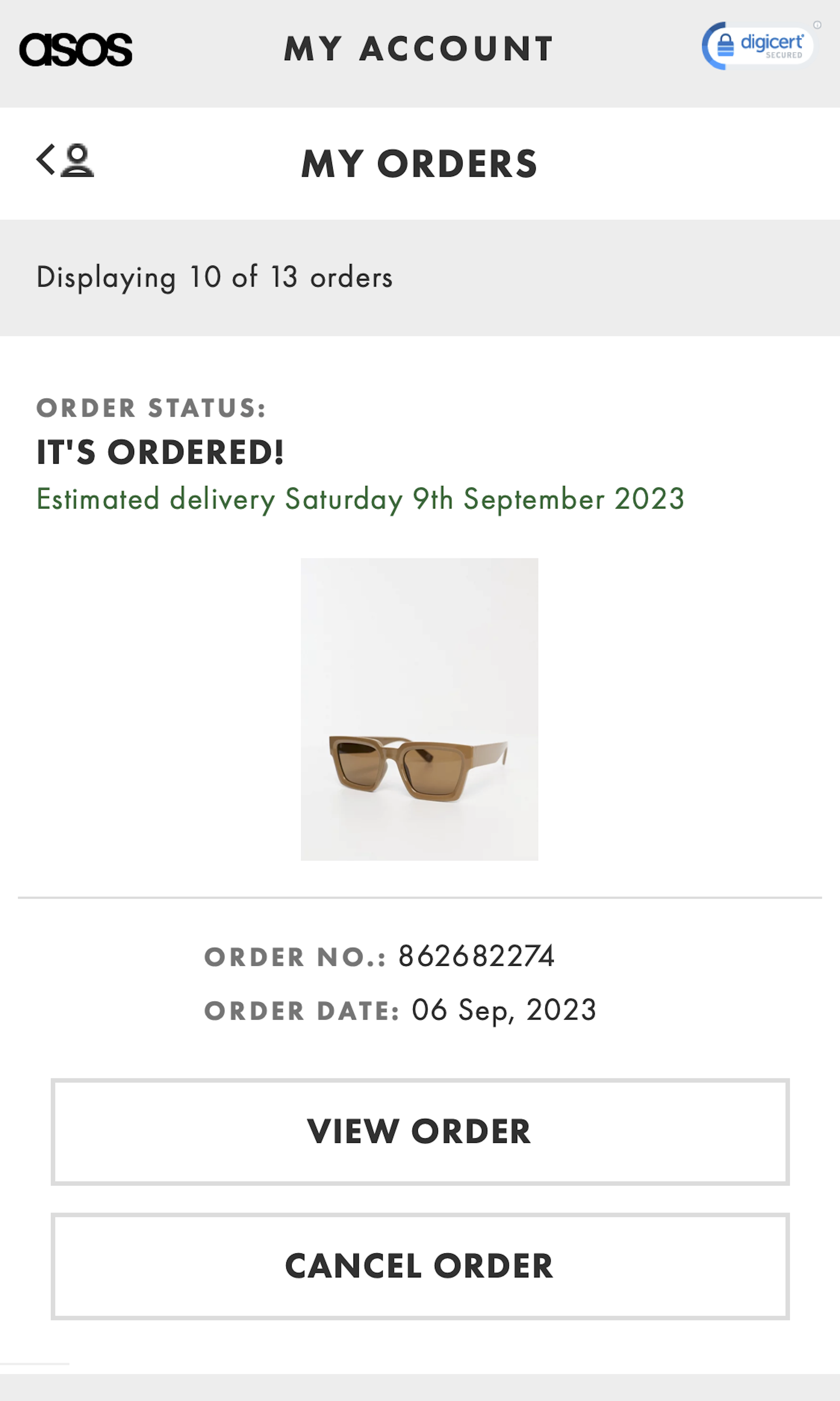
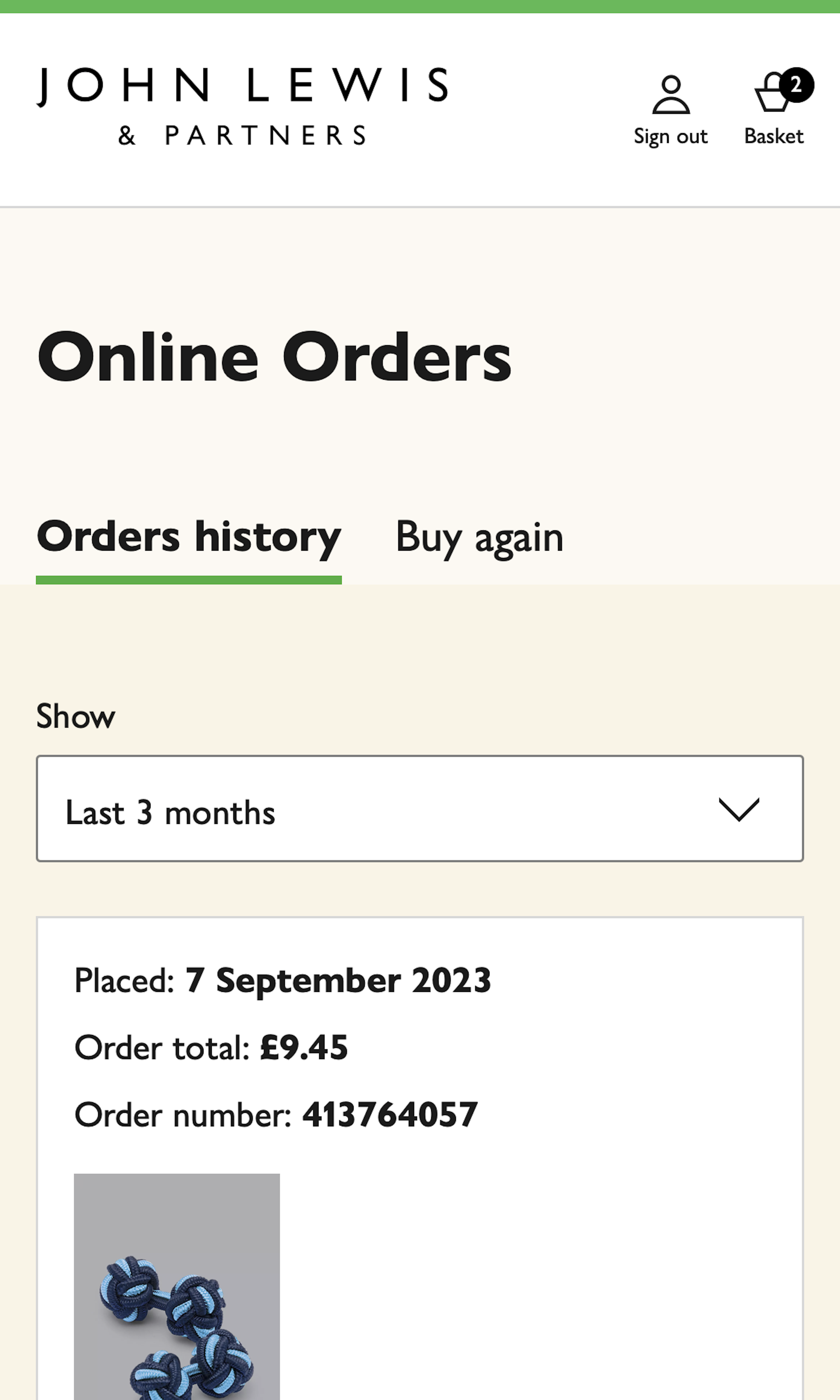
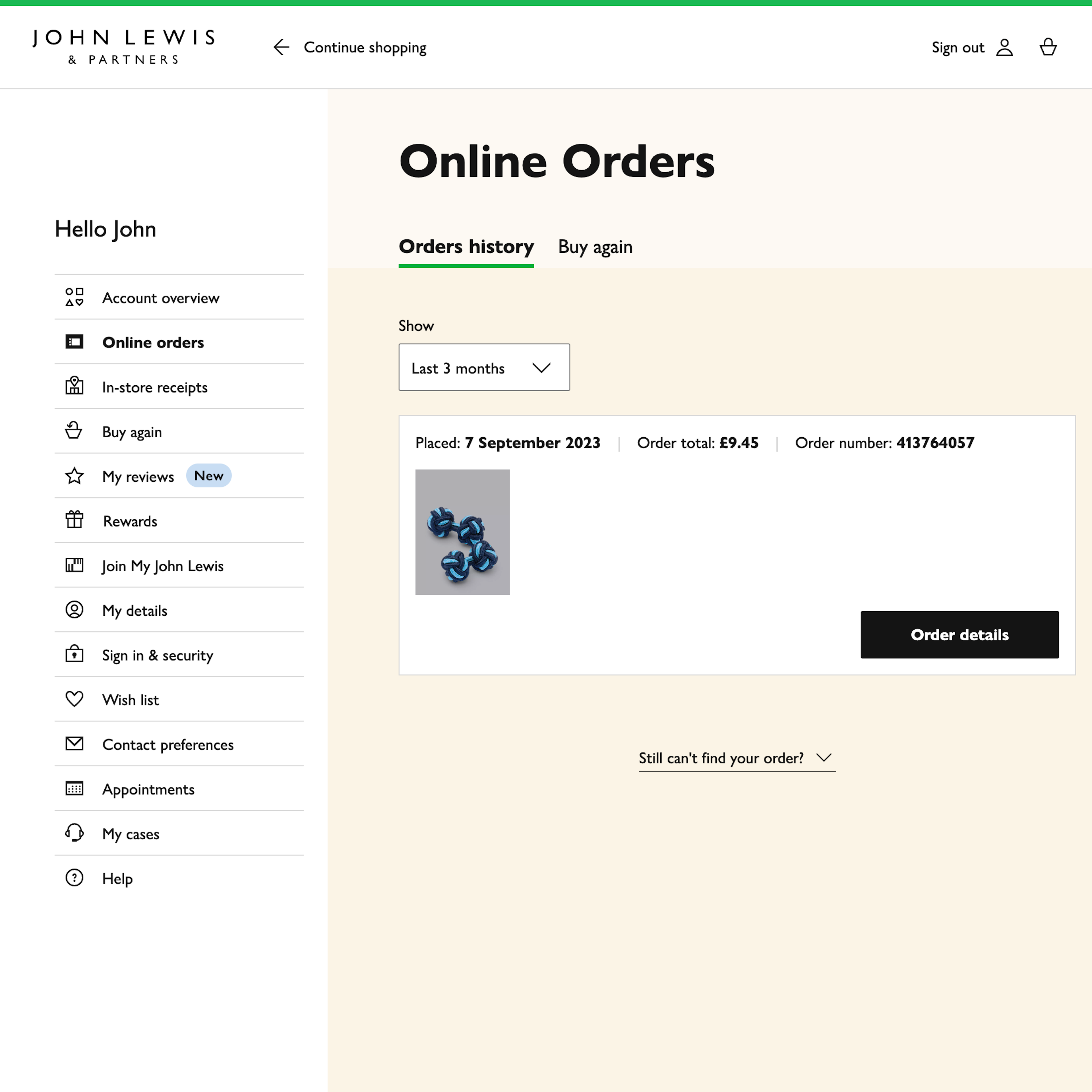
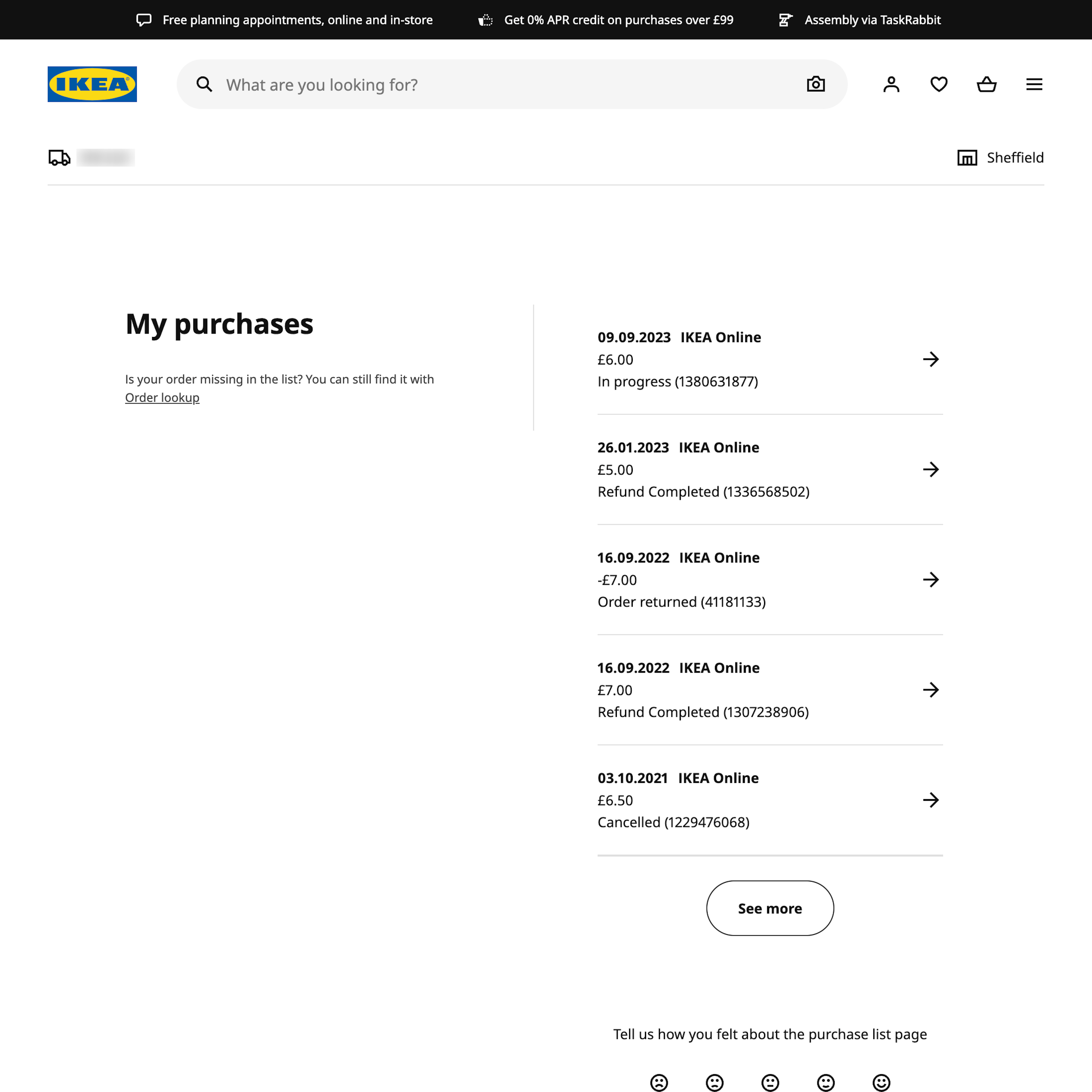
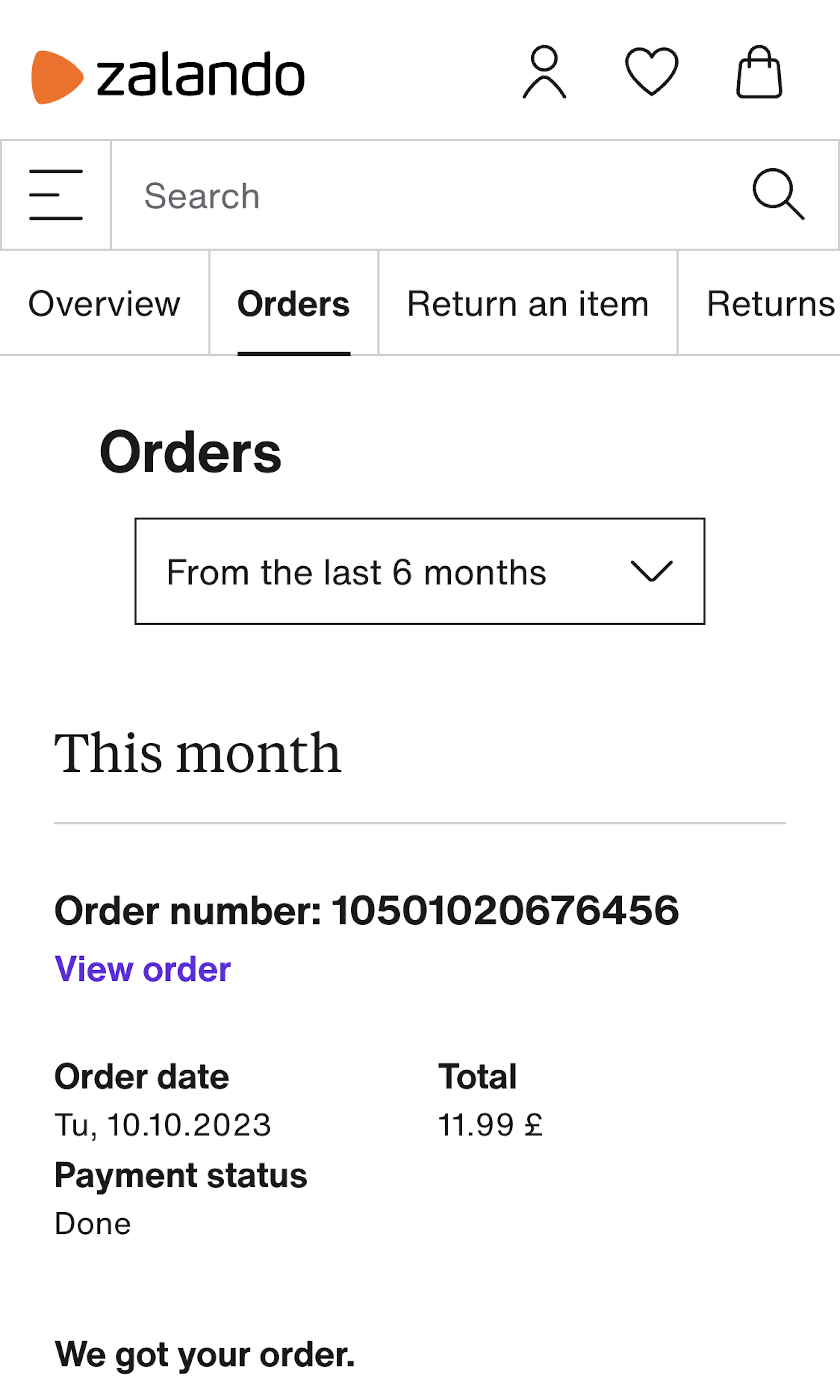
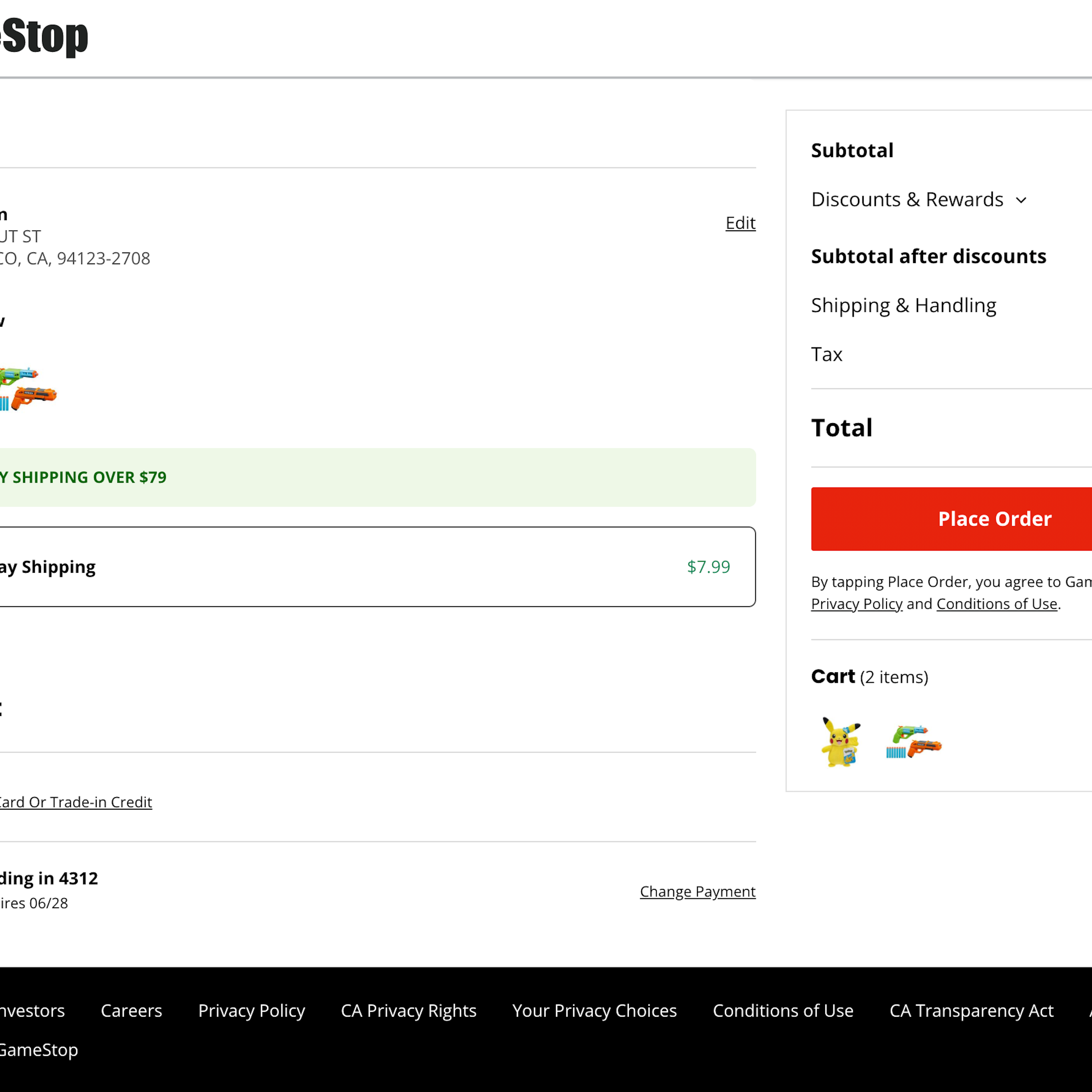
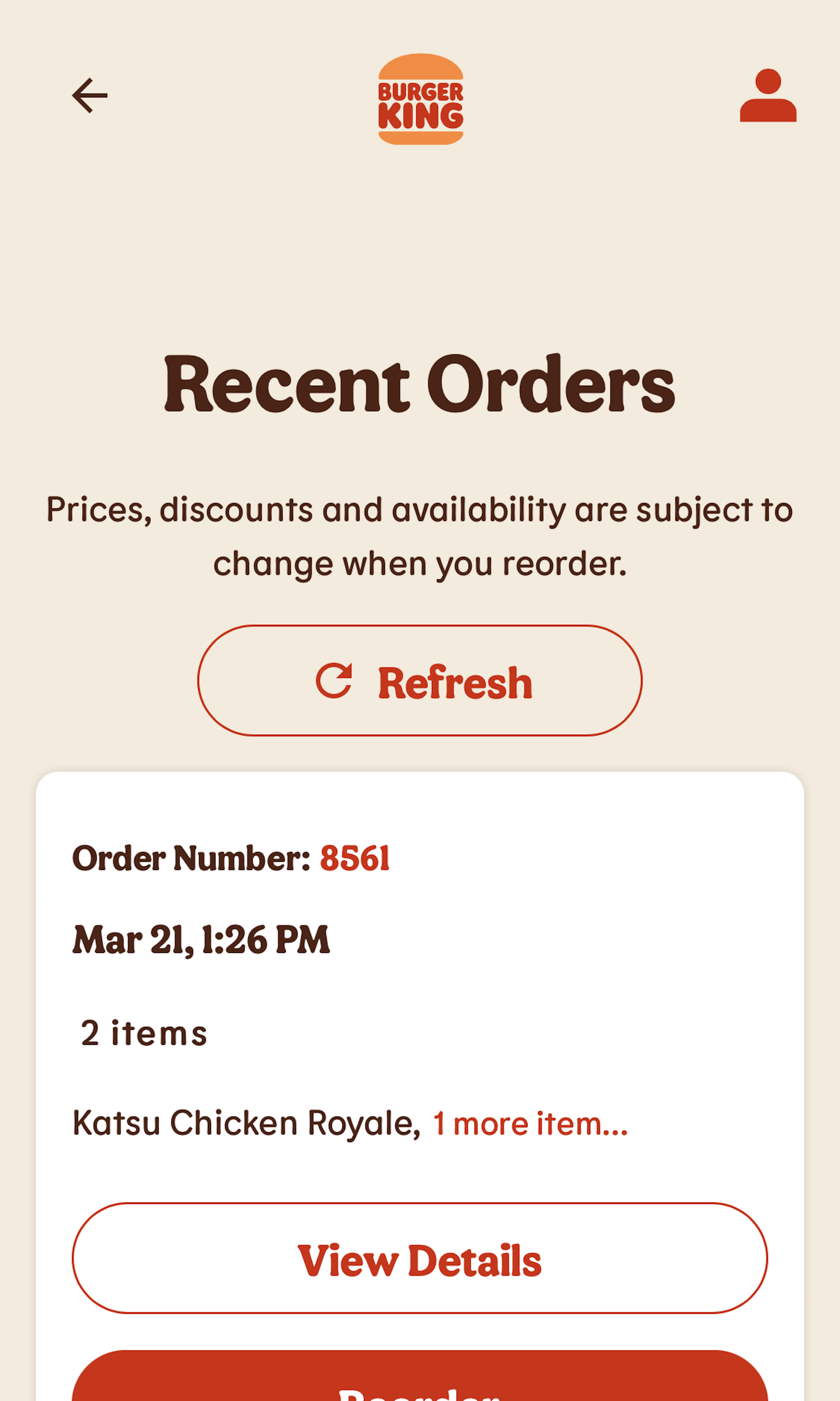
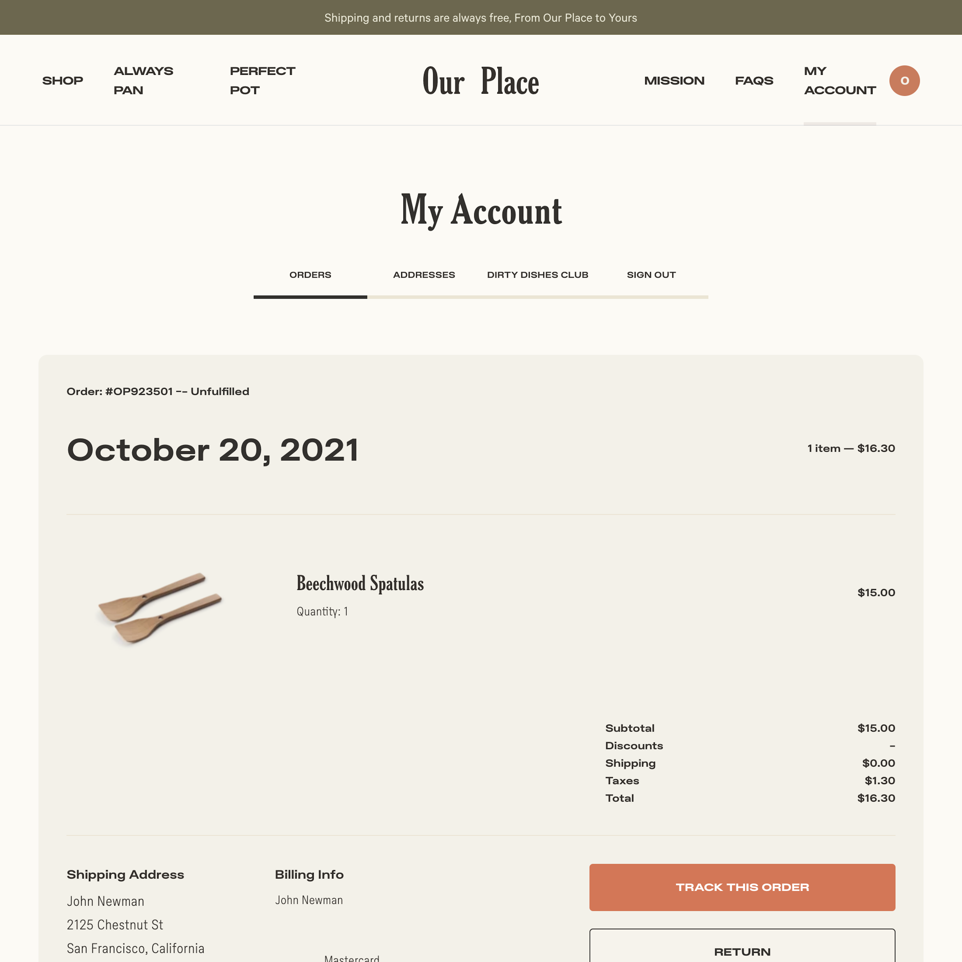
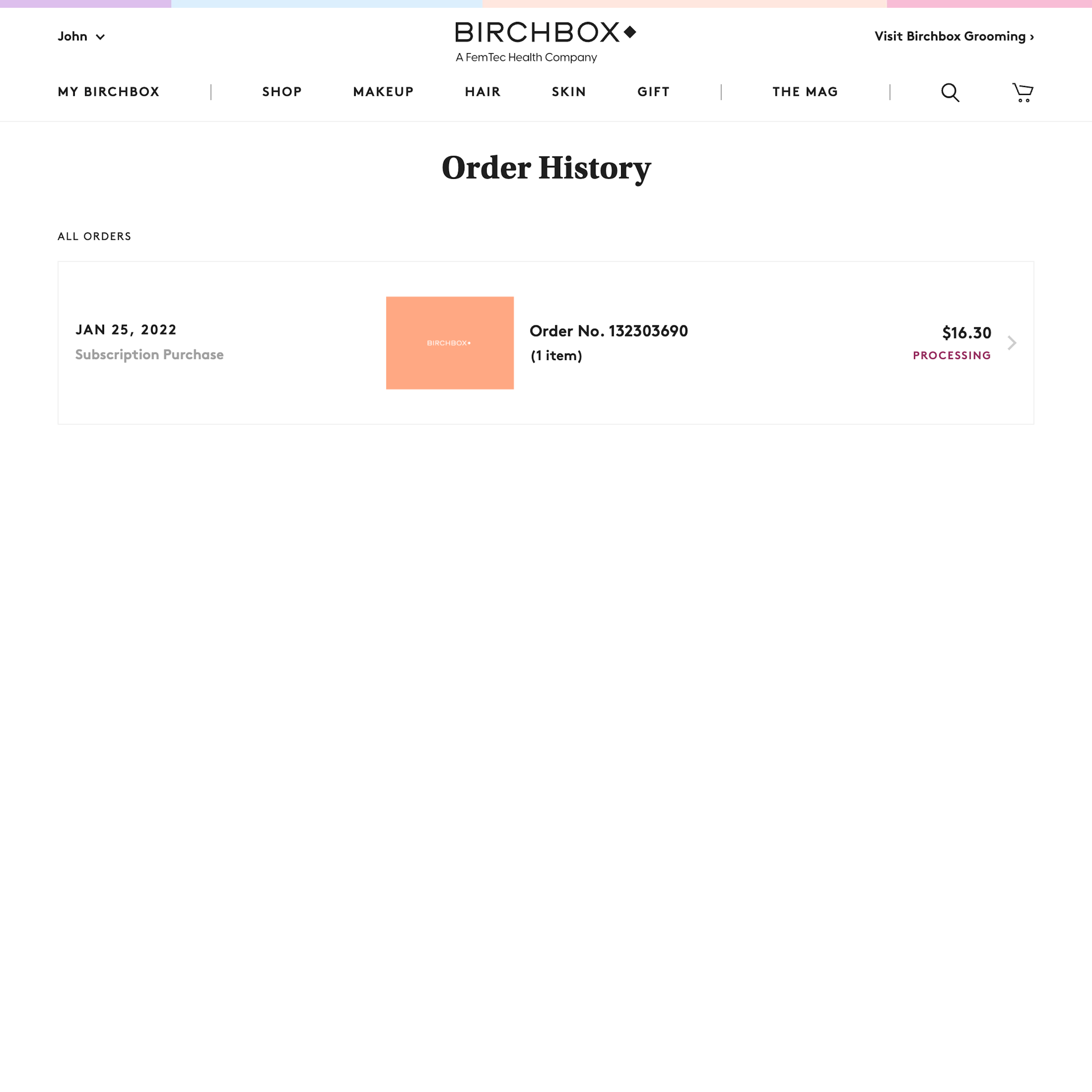
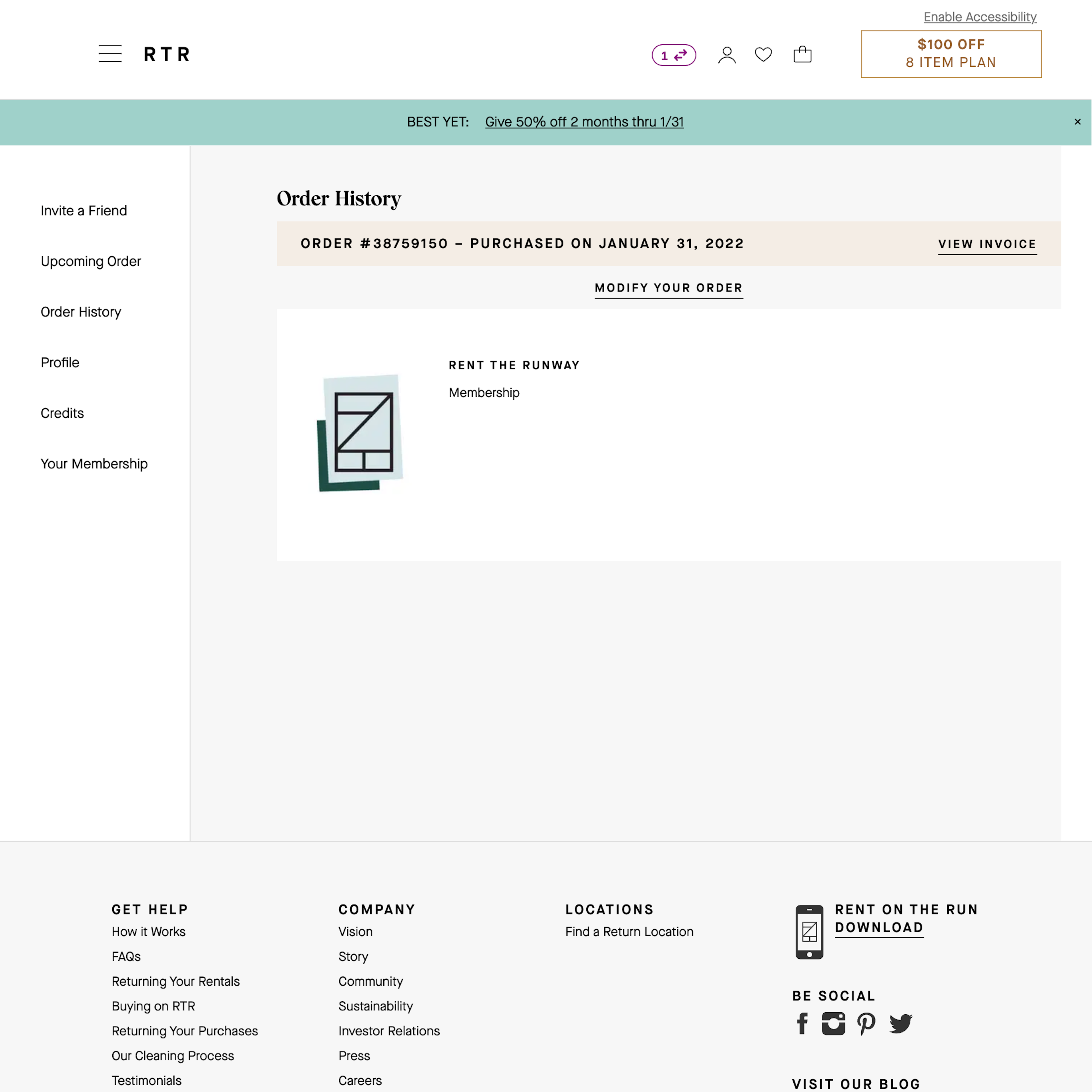
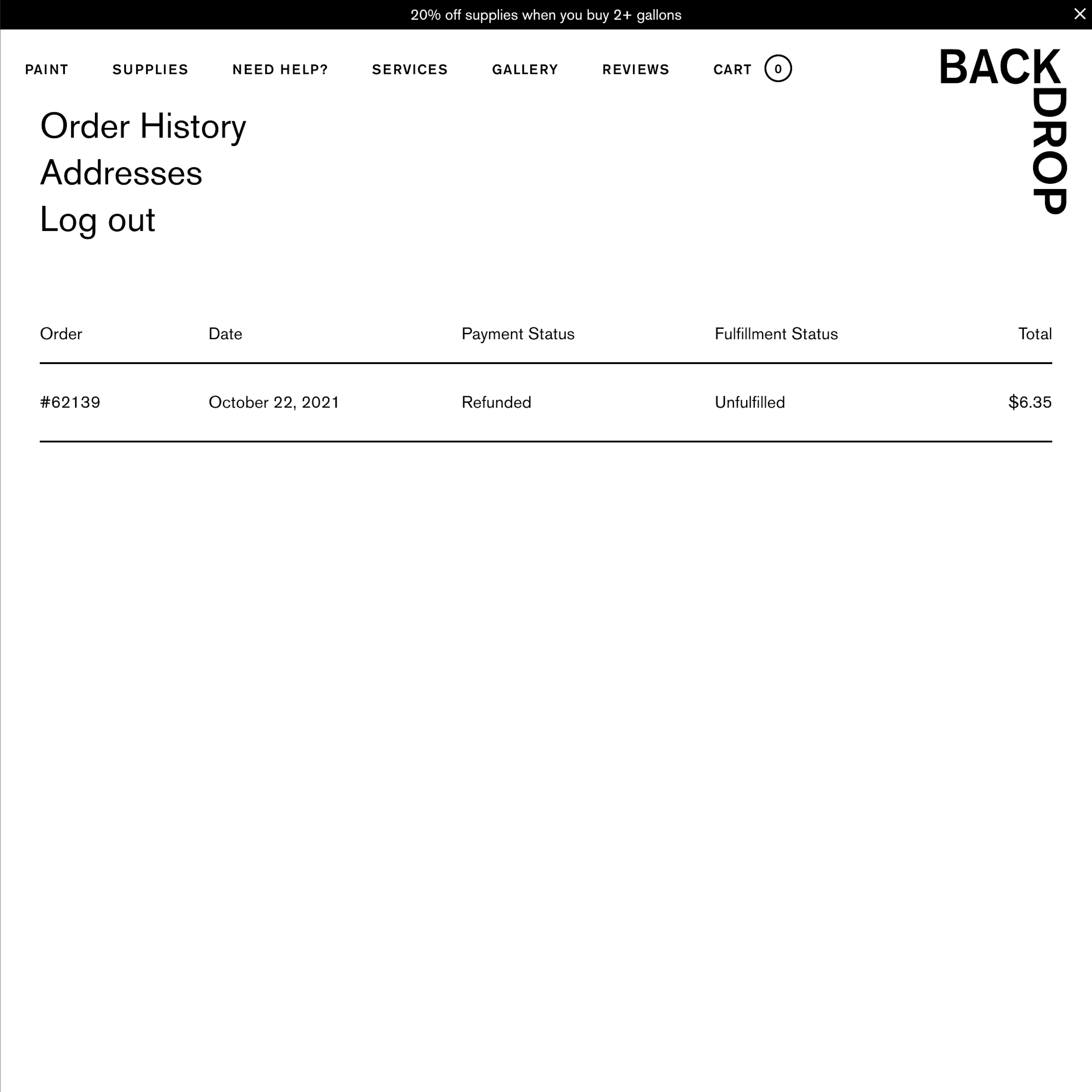
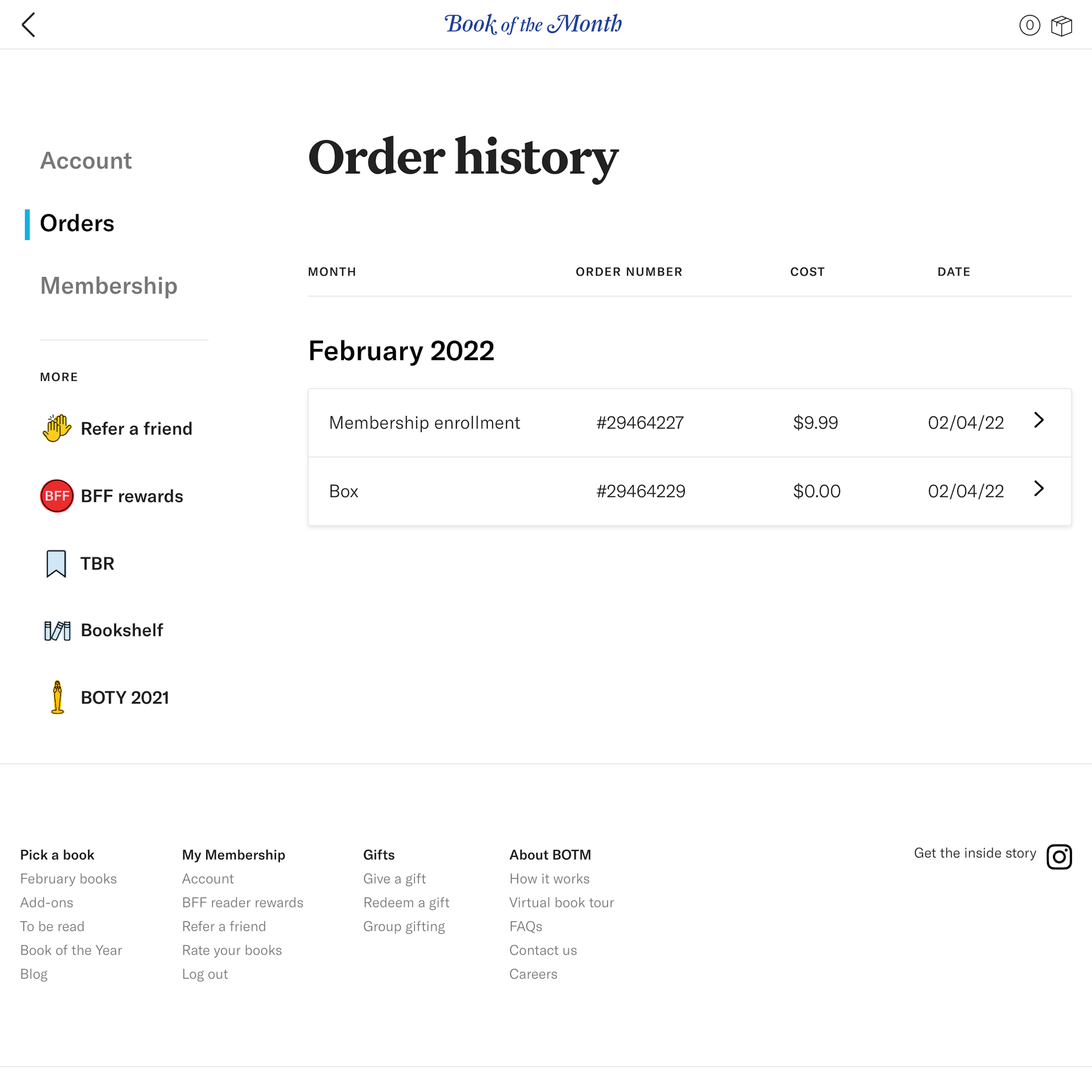
132 ‘Orders Overview’ Design Examples
Also referred to as: Purchase Overview, Order History, Purchase History
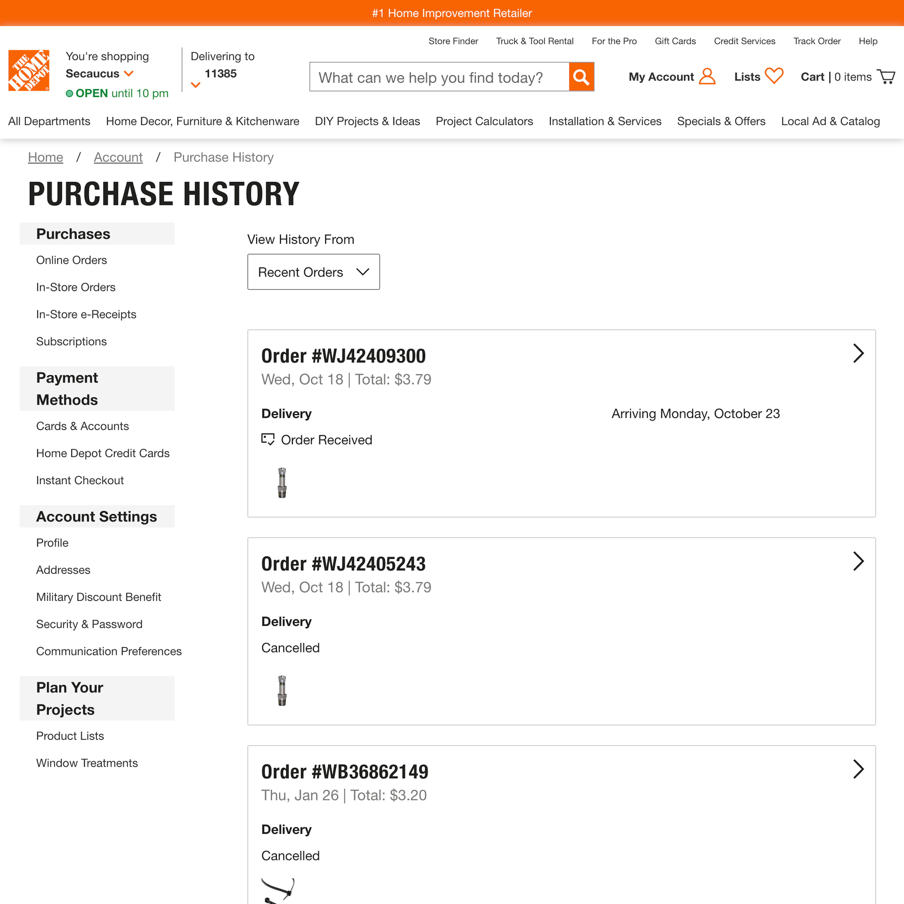
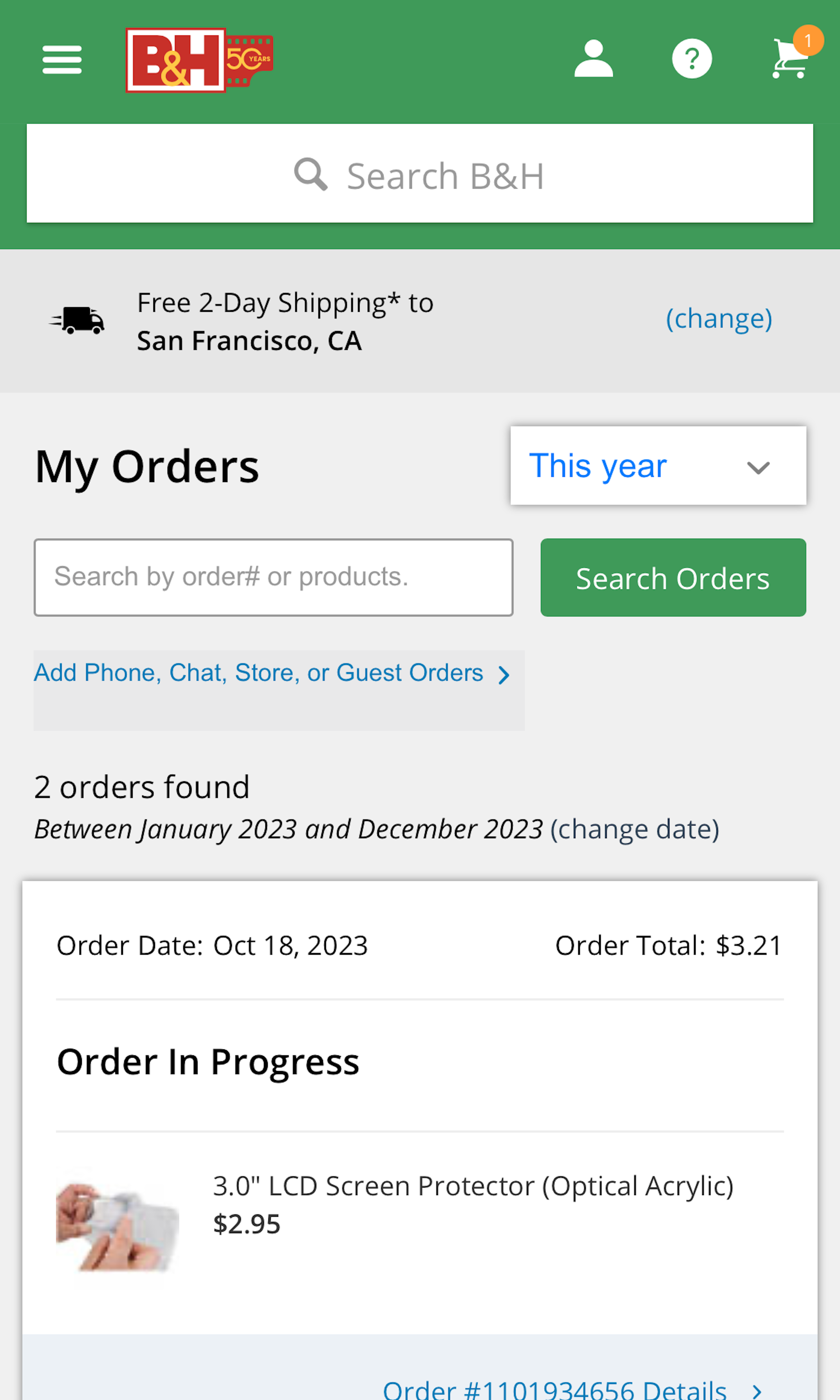
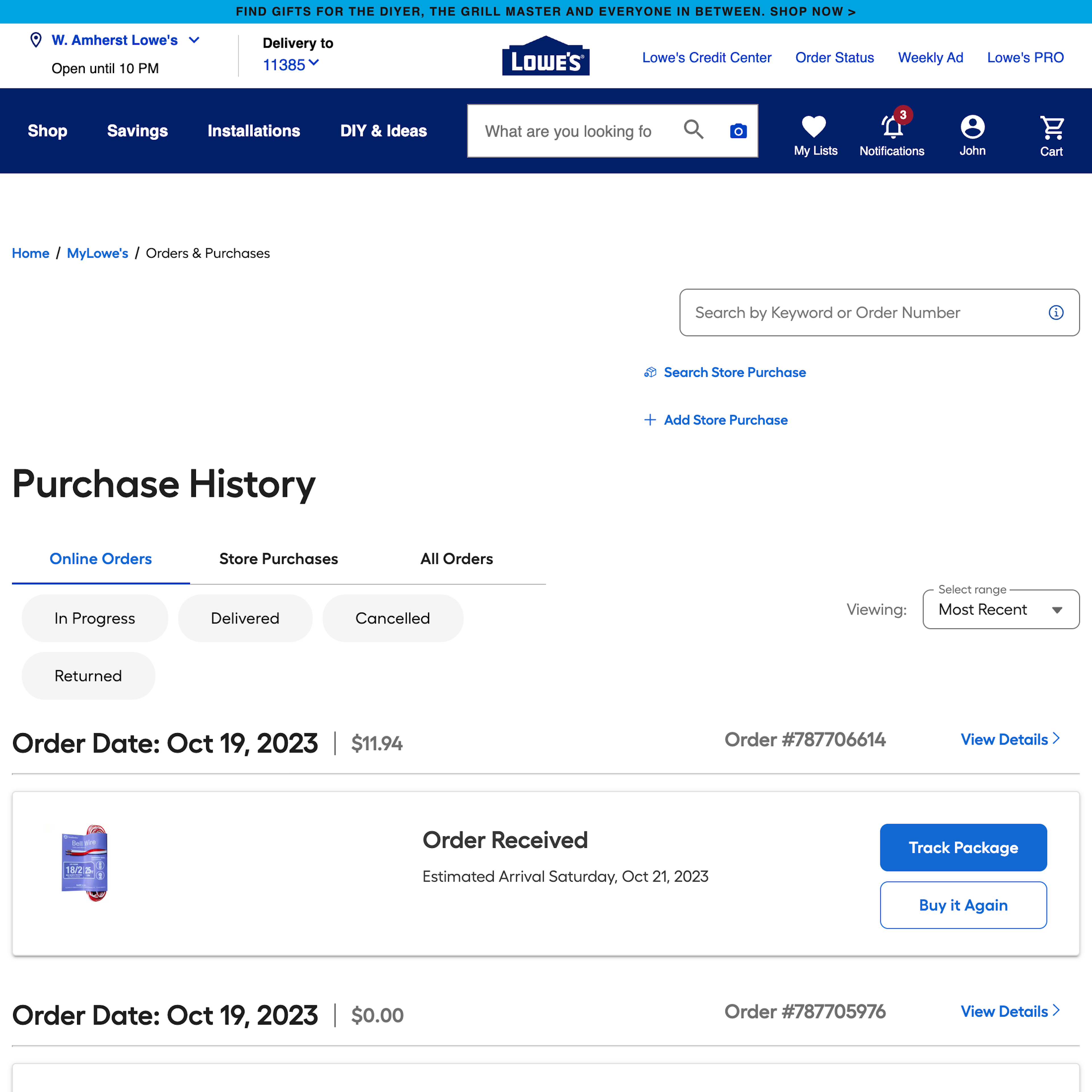
What’s this? Here you’ll find 132 “Orders Overview” full-page screenshots annotated with research-based UX insights, sourced from Baymard’s UX benchmark of 326 e-commerce sites. (Note: this is less than 1% of the full research catalog.)
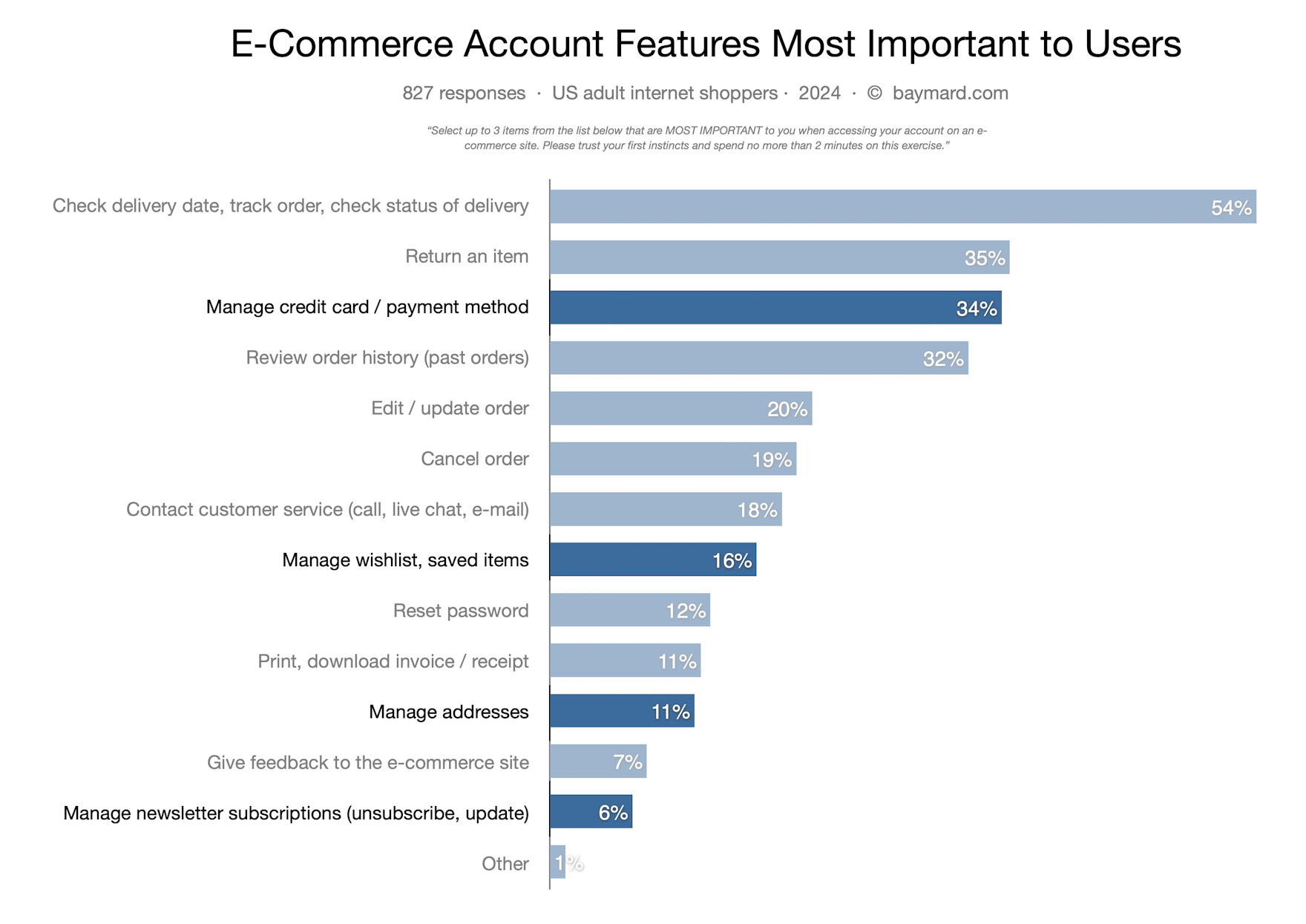
Both our large-scale usability testing and quantitative studies of Accounts & Self-Service features at e-commerce sites show that users come to “Orders Overview” and “Order History” pages with many different intents and mindsets – beyond just tracking an ongoing open order (50%).
Other top reasons users visit the order history page includes: 26% wants to initiate a order return, 26% wants to simply review the order history itself, 19% of users wants to edit an ongoing order, 8% view the order history to download an invoice/receipt, and 15% to cancel an order.
In testing we observe that the many different intentions users have with visiting the Orders Overview and Order History pages consequently set strict requirements and limitations for the overall order page design and features available.
More ‘Orders Overview’ Insights
Our quantitative study of what Account & Self-Service features are most important to users. (The non–order-related features are dimmed out.)
-
Due to the diversity of users visiting the “Orders Overview” we observe that users will often need basic order information and actions available directly on the order overview, so they’re able to get an overview of their order history. However, in many instances in testing these weren’t provided, making it more difficult for users to manage their orders, which can result in unwanted orders and place more strain on customer service. In particular, order cancellation features must be easy to find and understand and include dynamically updated “cancellation states.”
-
You may also want to see our related Page Designs for “Order Tracking Page” design examples.
-
Learn More: Besides exploring the 132 “Orders Overview” design examples below, you may also want to read our related articles on “Have a ‘Cancellation Requested’ Order State” and “New Research Findings on ‘Accounts & Self-Service’ UX”.
-
Get Full Access: To see all of Baymard’s design guidelines on Accounts & Self-Service pages and features you’ll need Baymard Premium access. (Premium also provides you full access to 200,000+ hours of UX research findings, 650+ e-commerce UX guidelines, and 275,000+ UX performance scores.)
User Experience Research, Delivered Weekly
Join 60,000+ UX professionals and get a new UX article every week.

User Experience Research, Delivered Weekly
Join 60,000+ UX professionals and get a new UX article every week.

Explore Other Research Content

300+ free UX articles based on large-scale research.

326 top sites ranked by UX performance.

Code samples, demos, and key stats for usability.

