
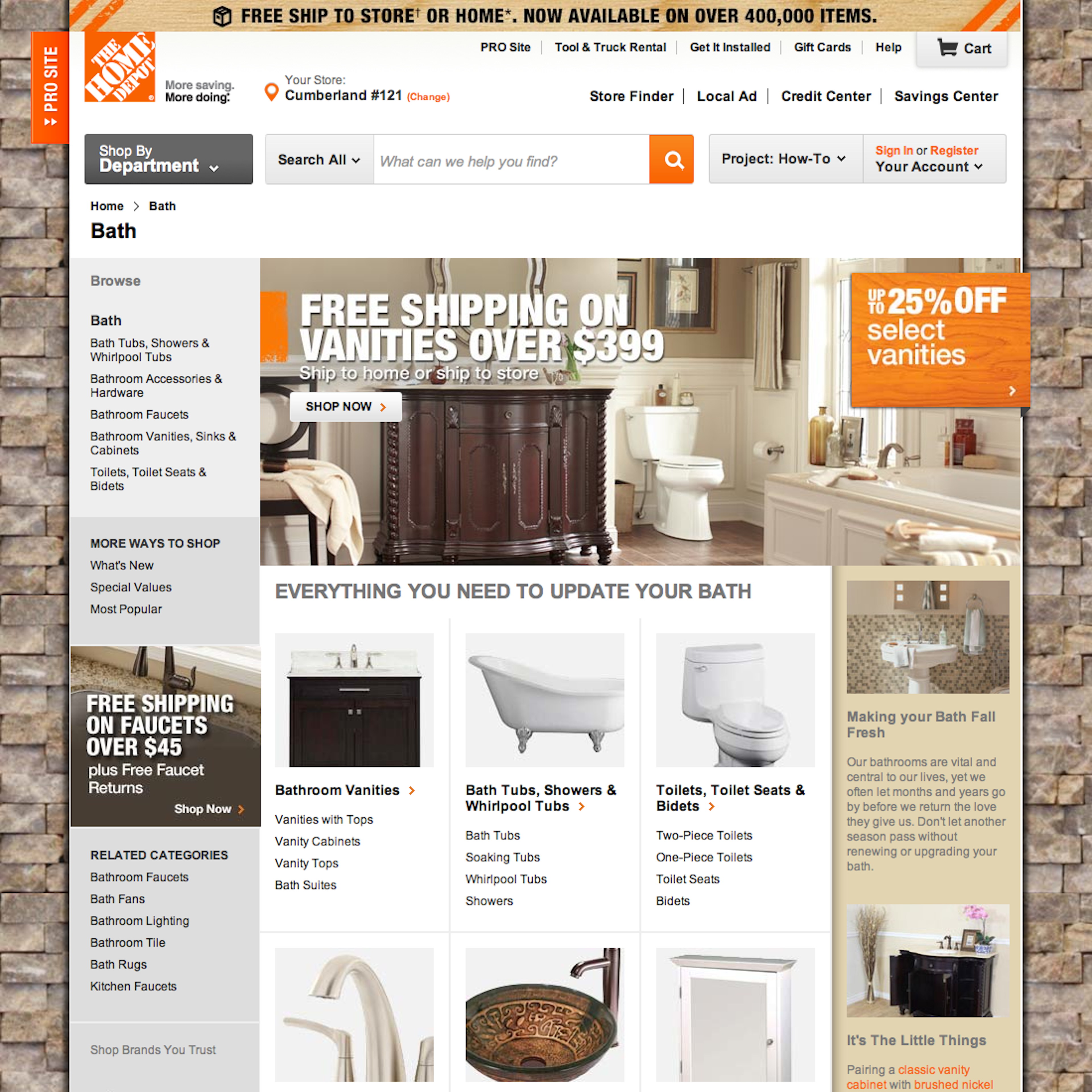
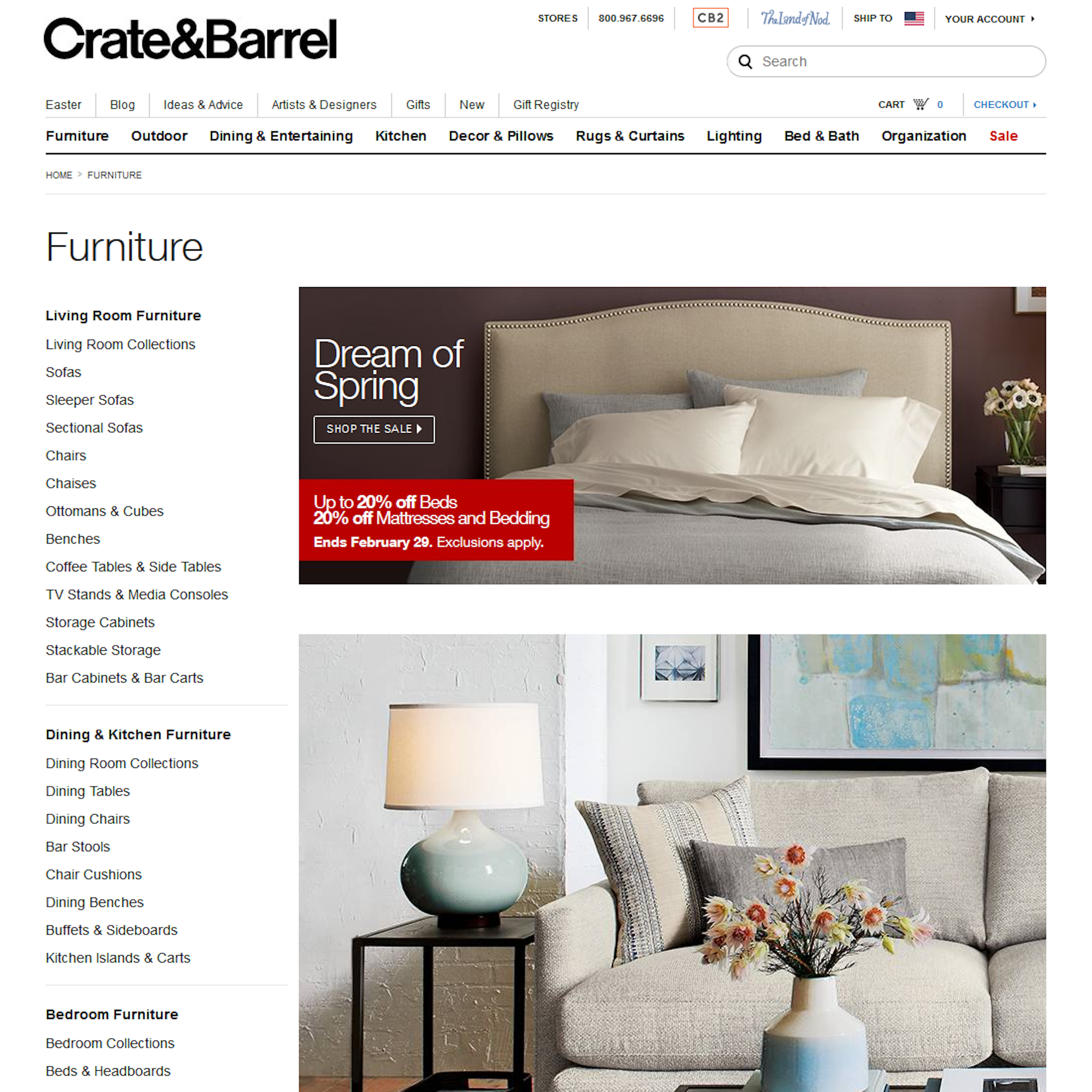
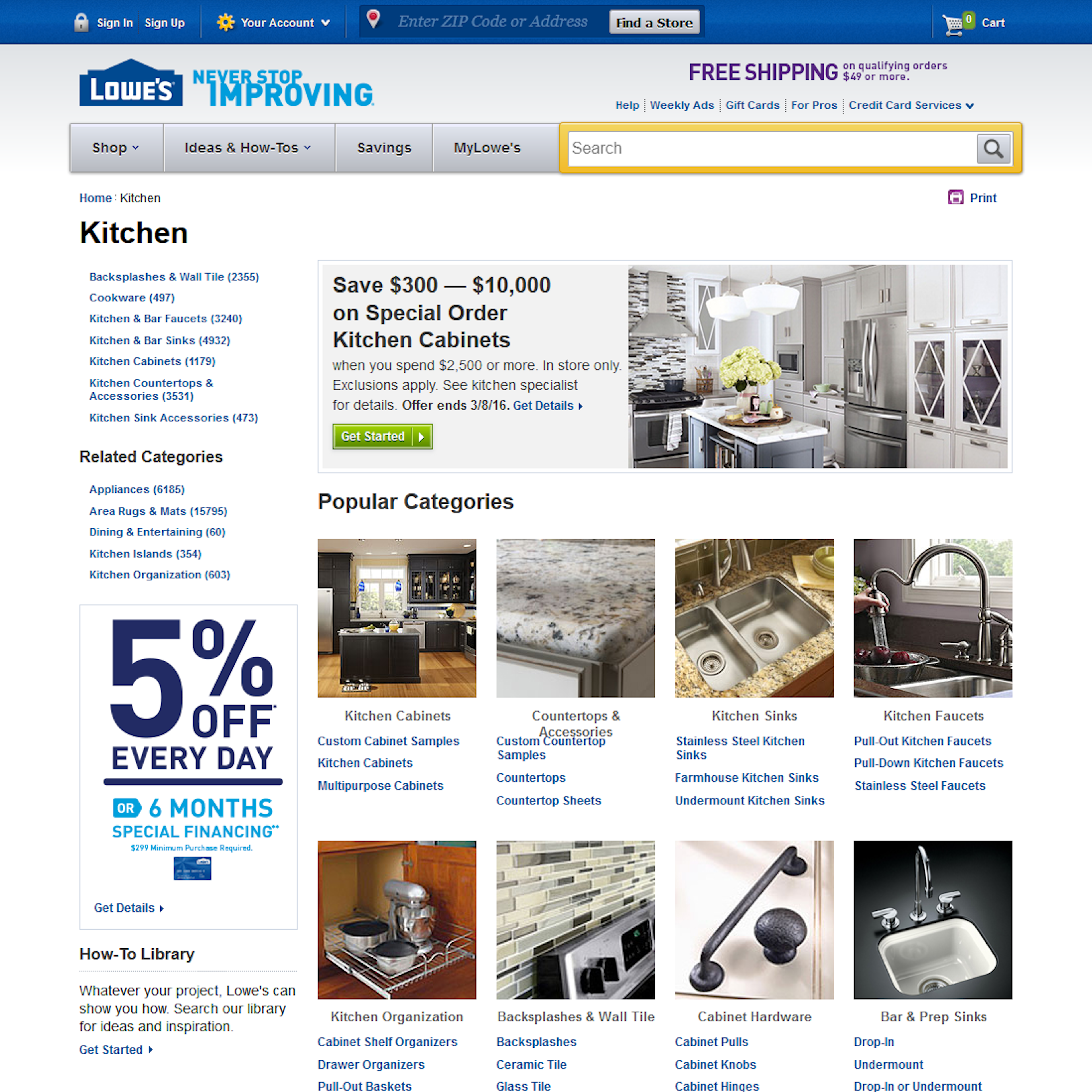
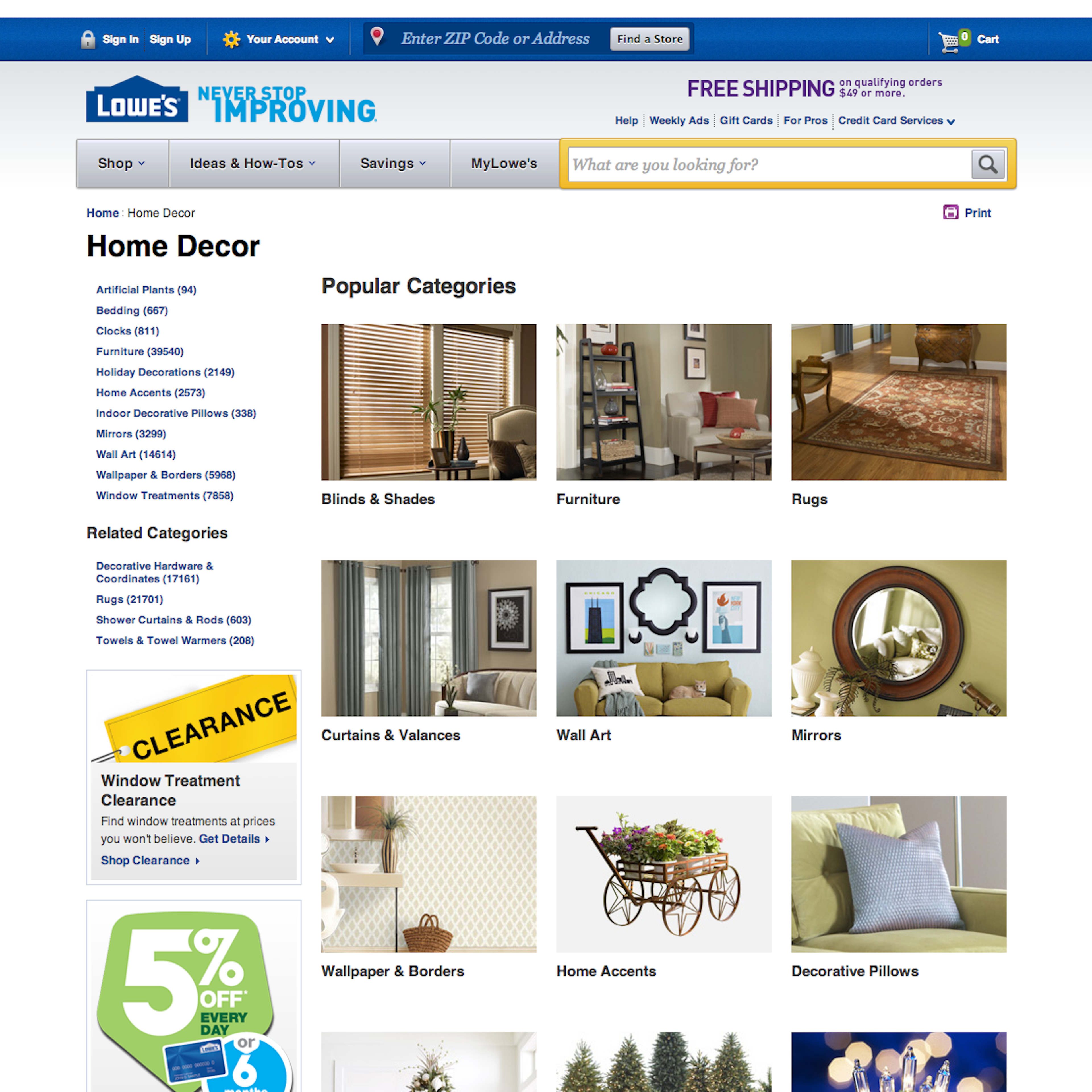
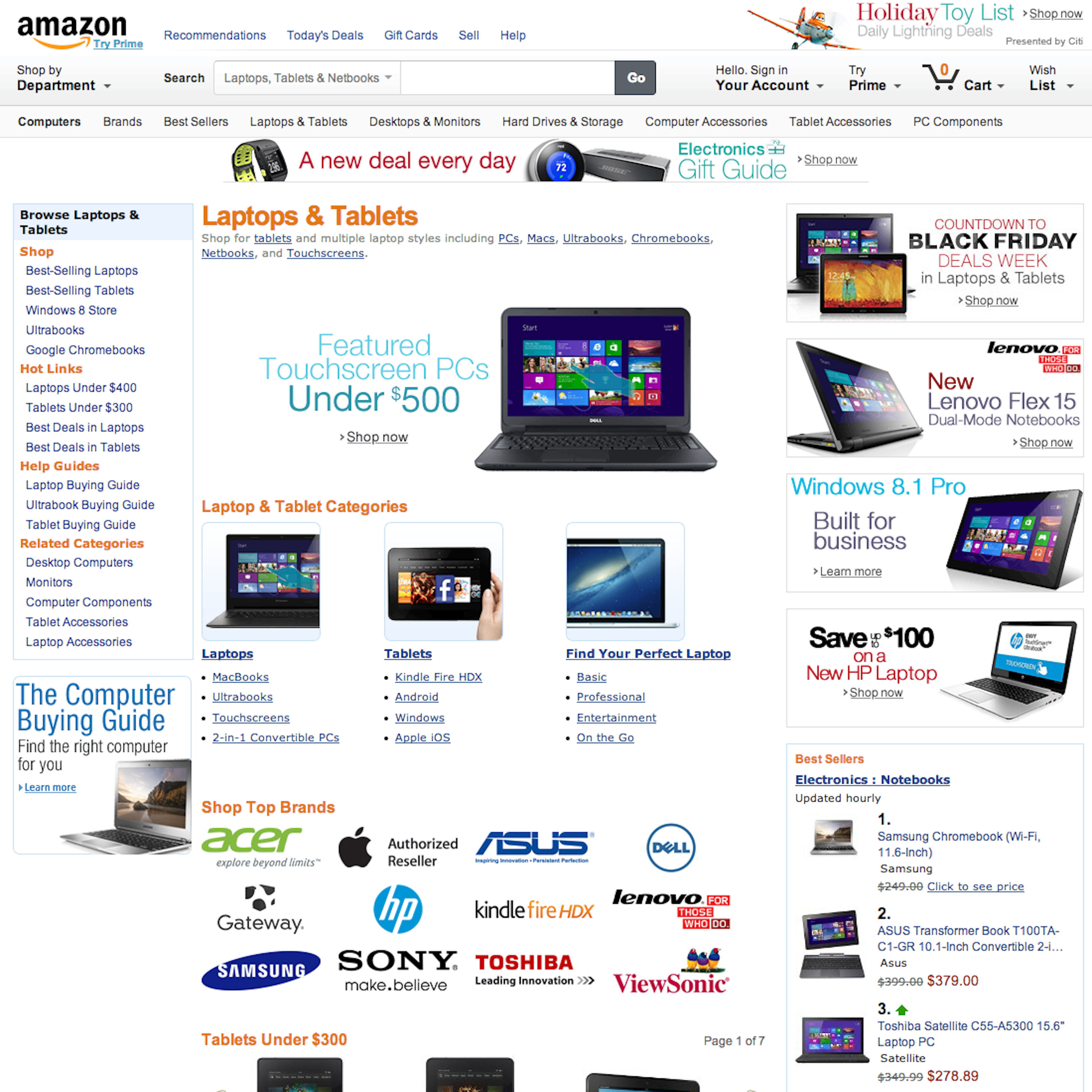
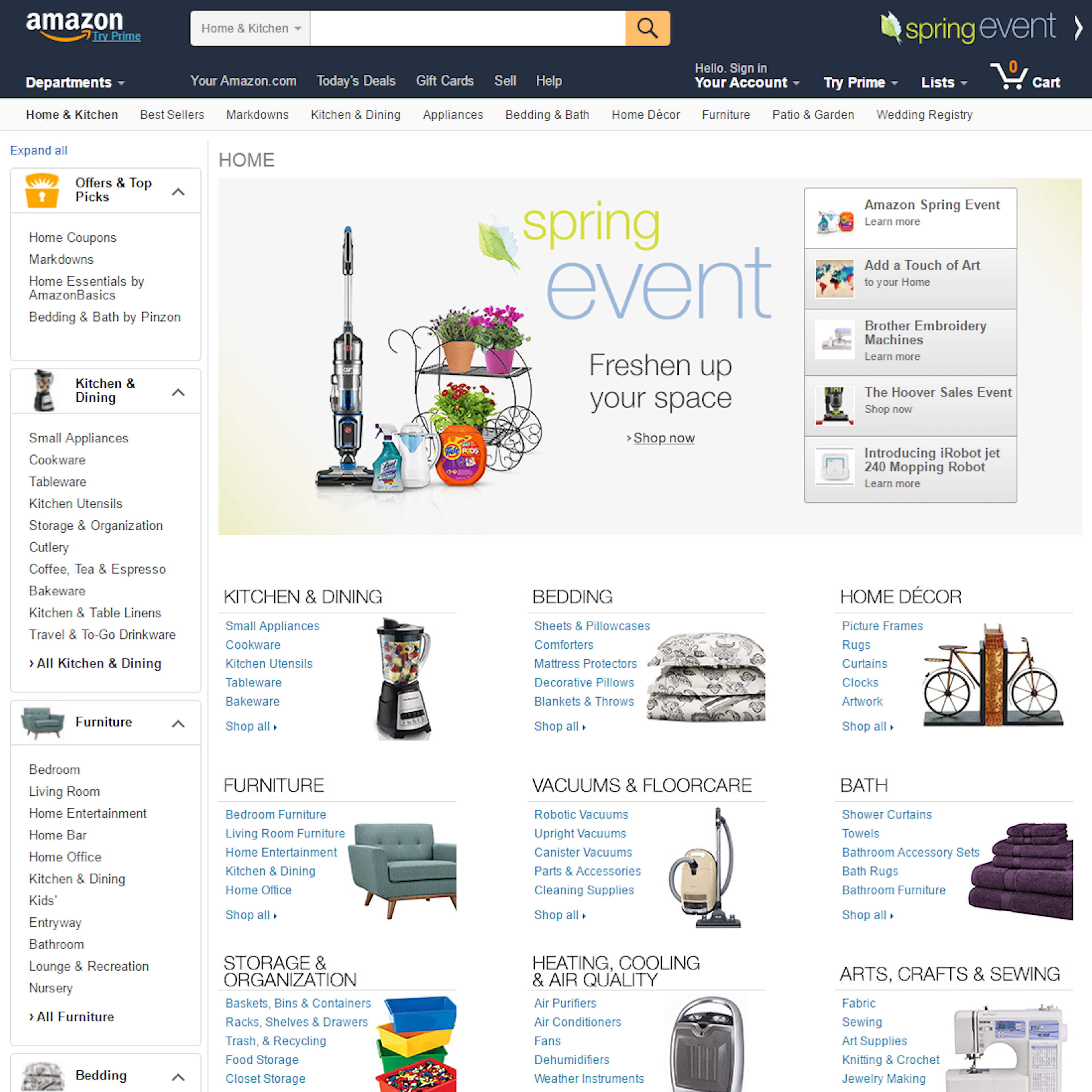
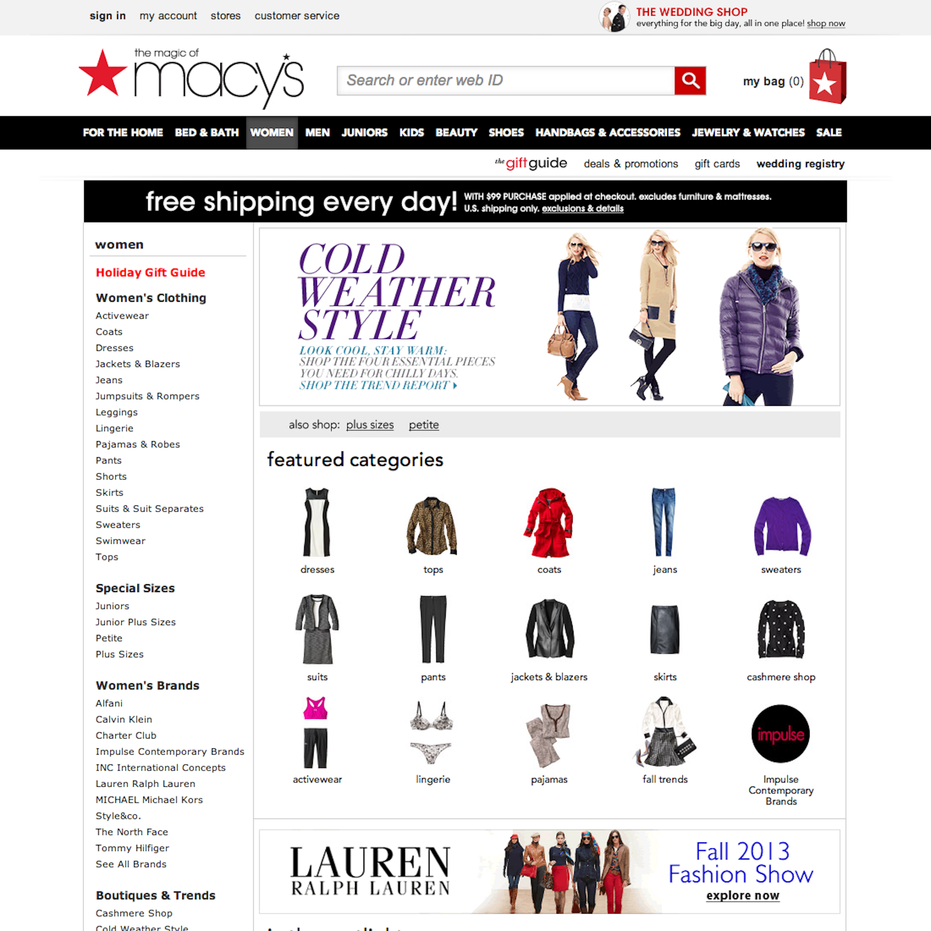
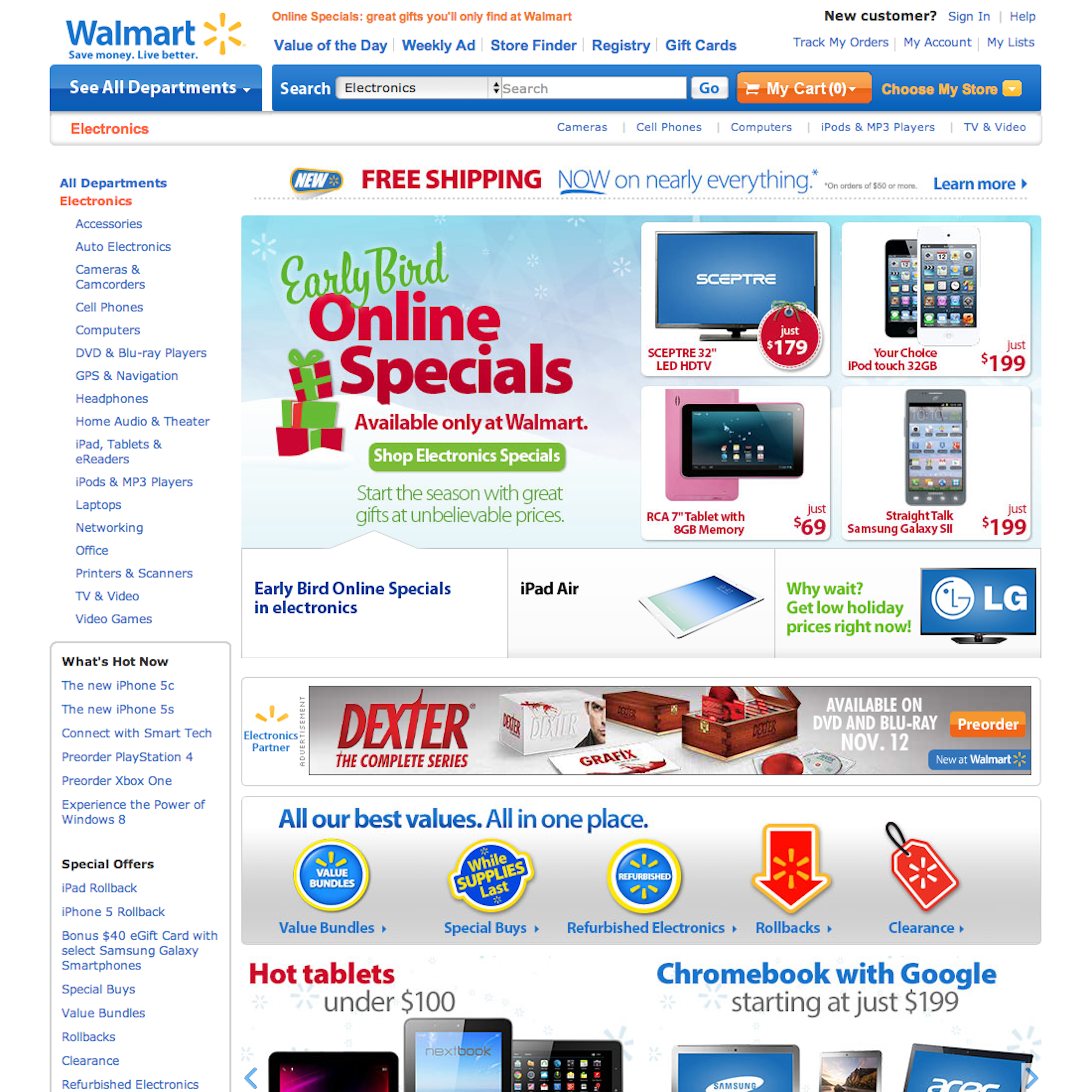
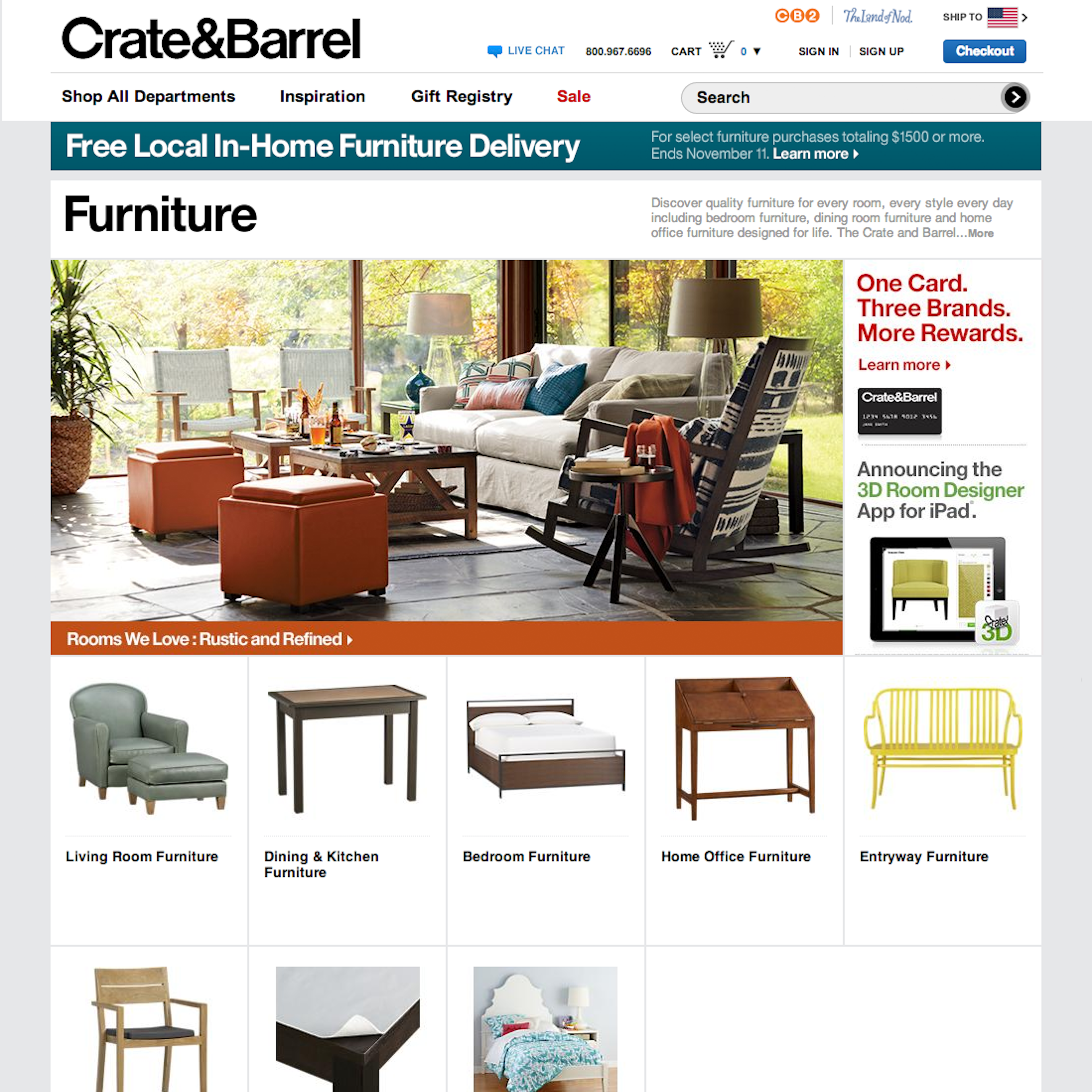
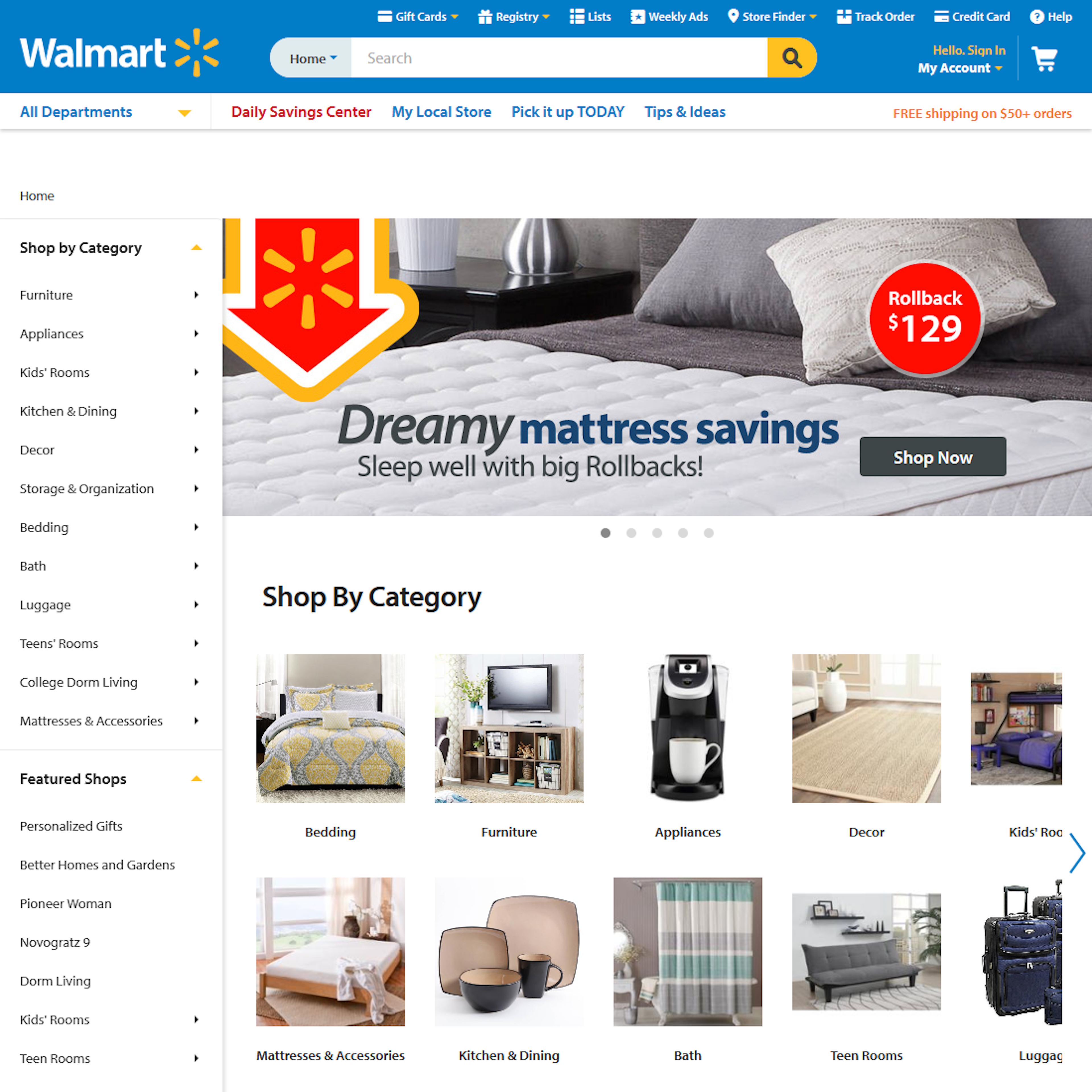
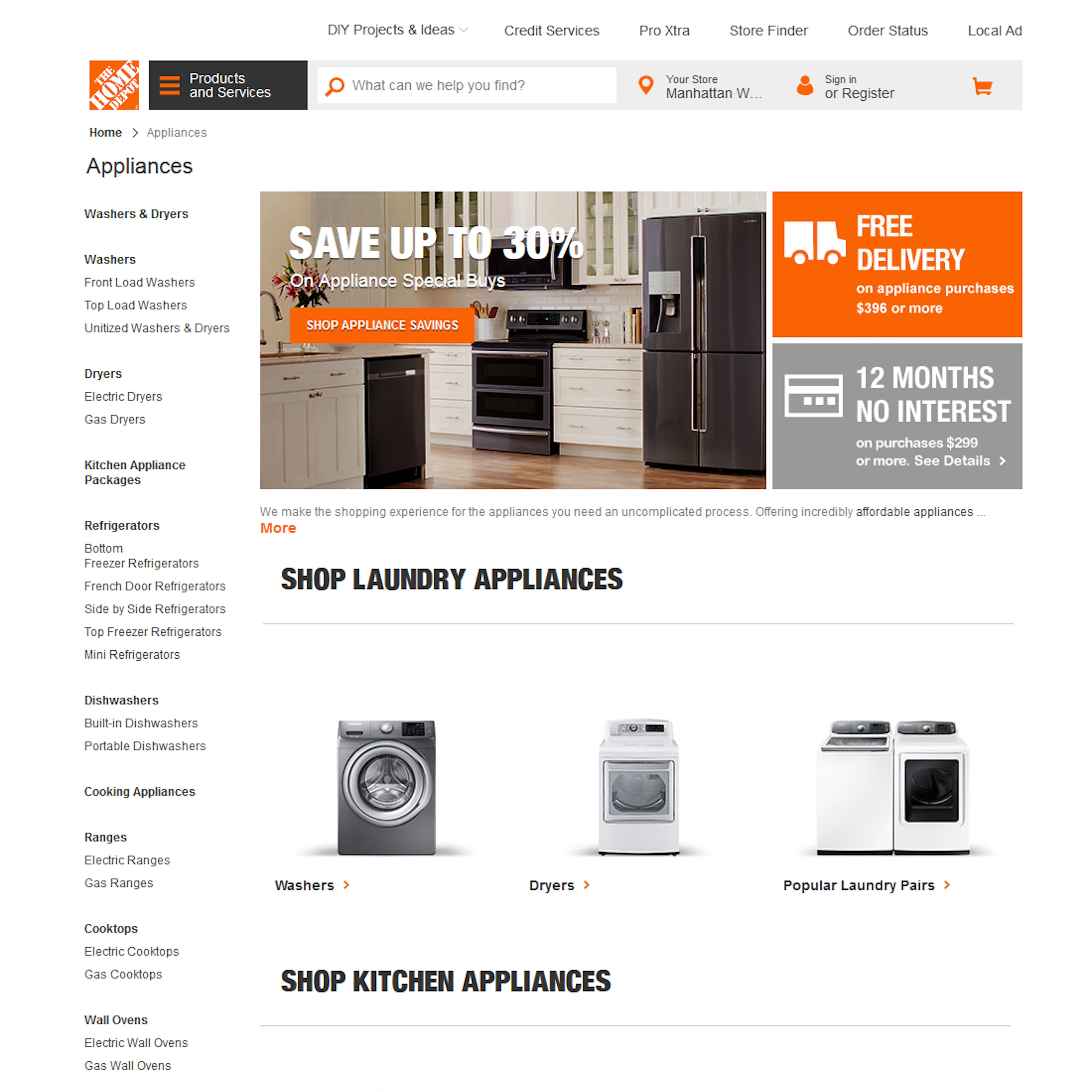
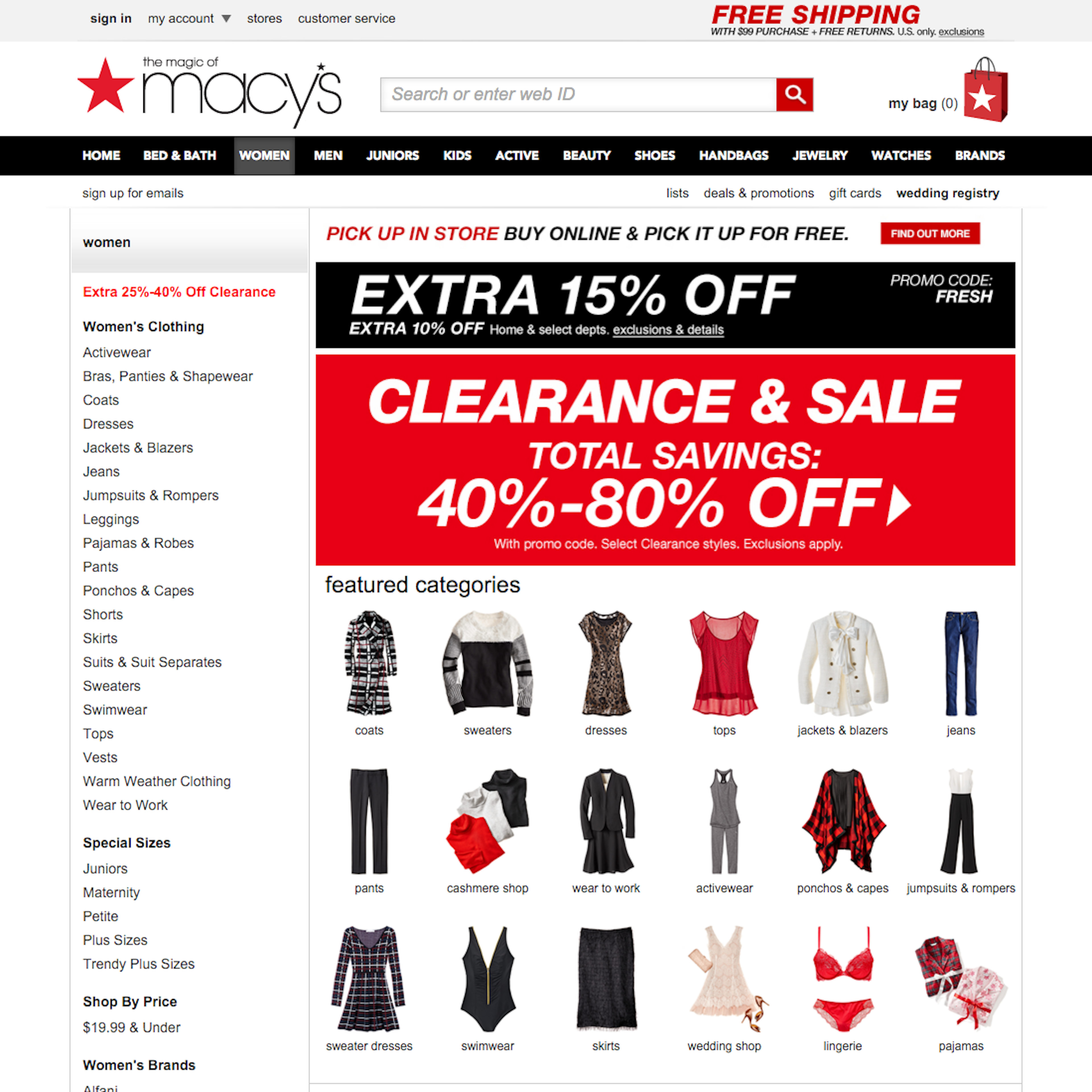
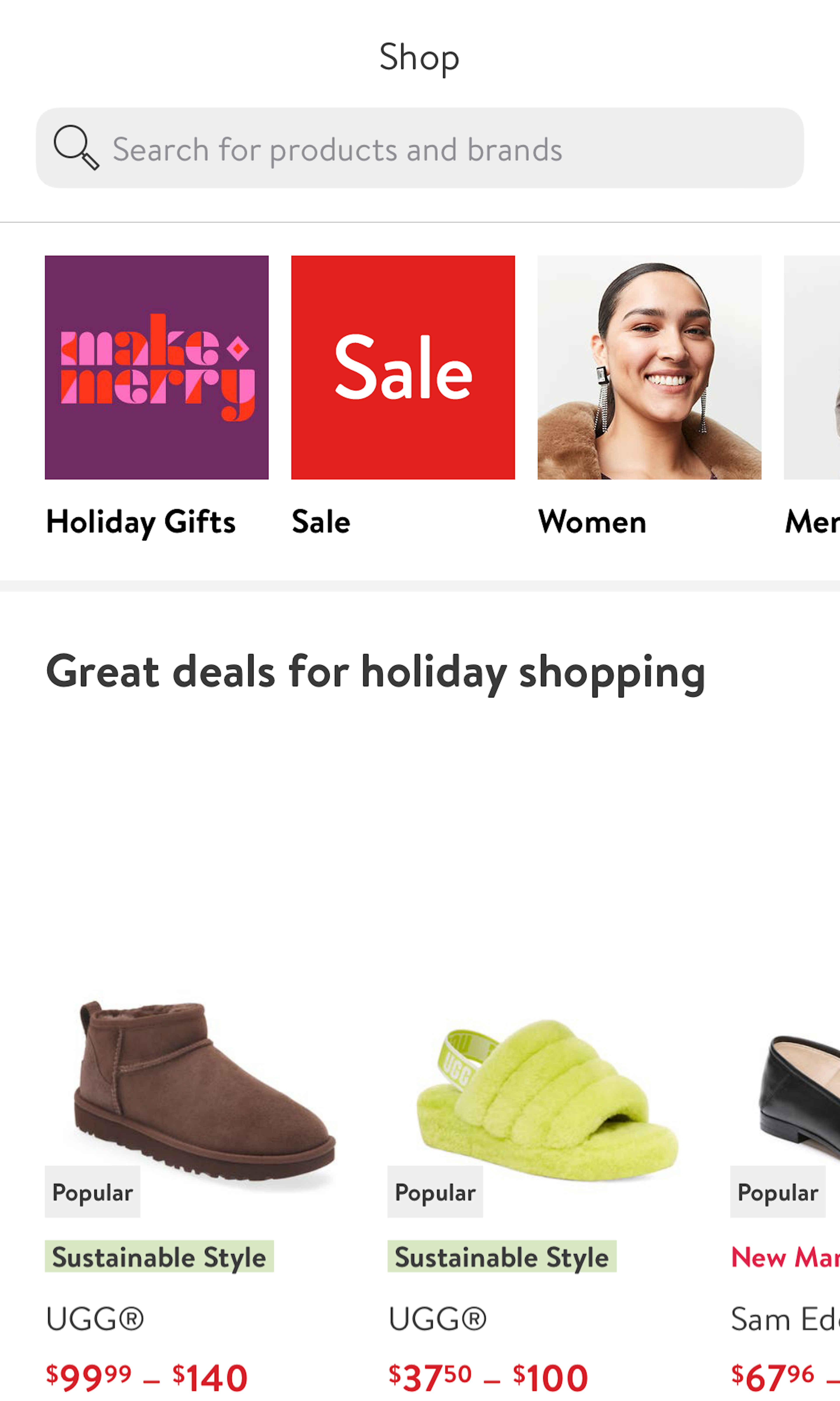
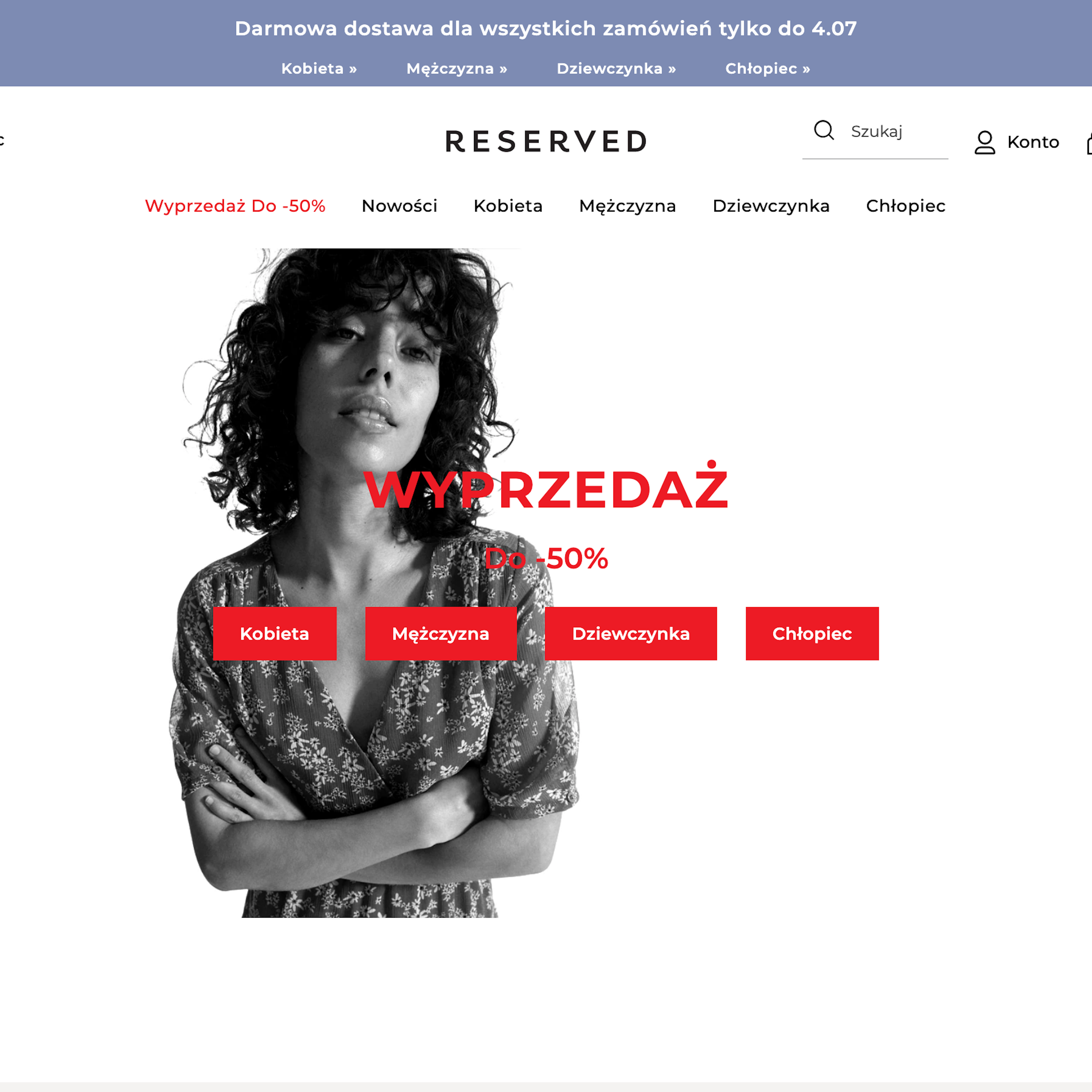
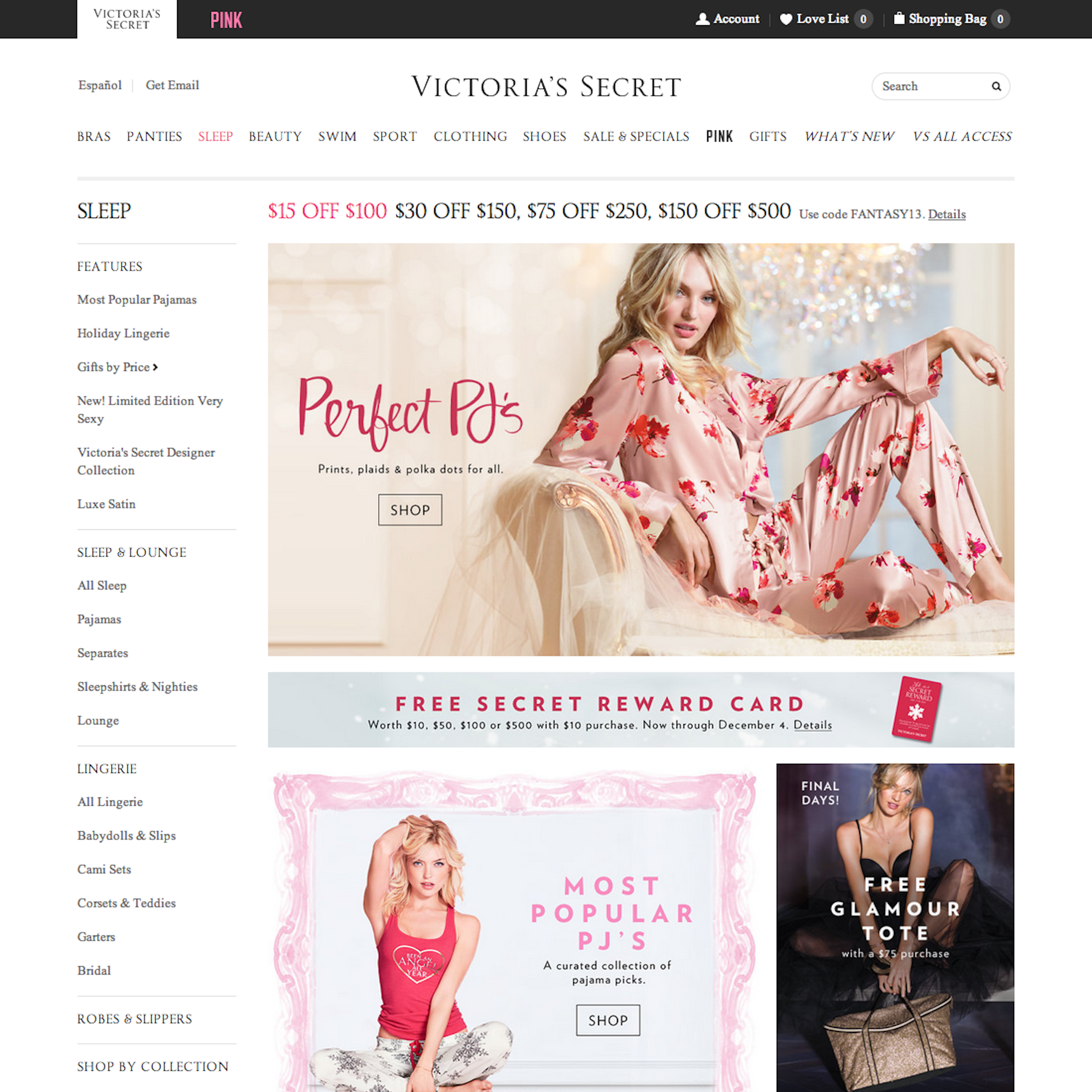
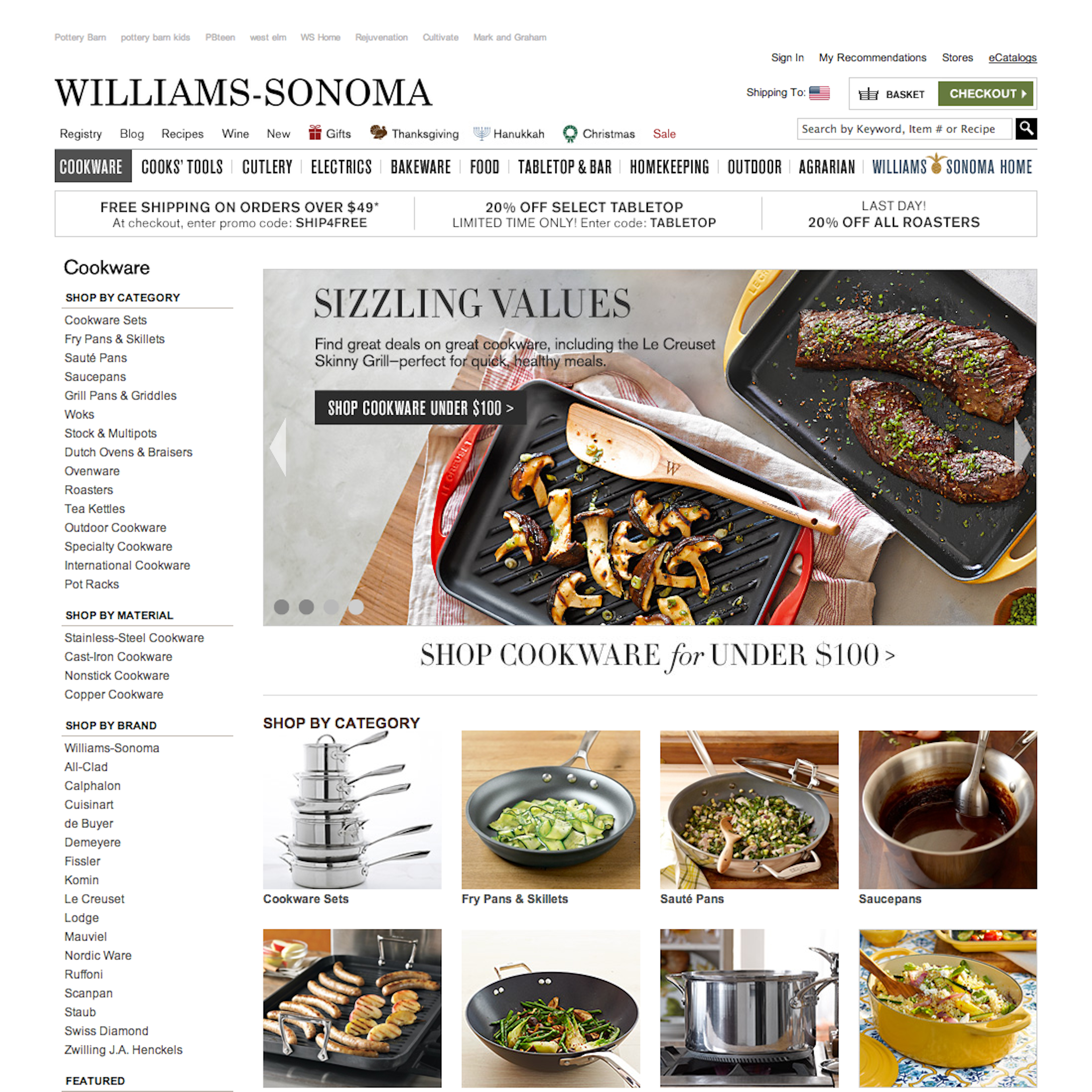
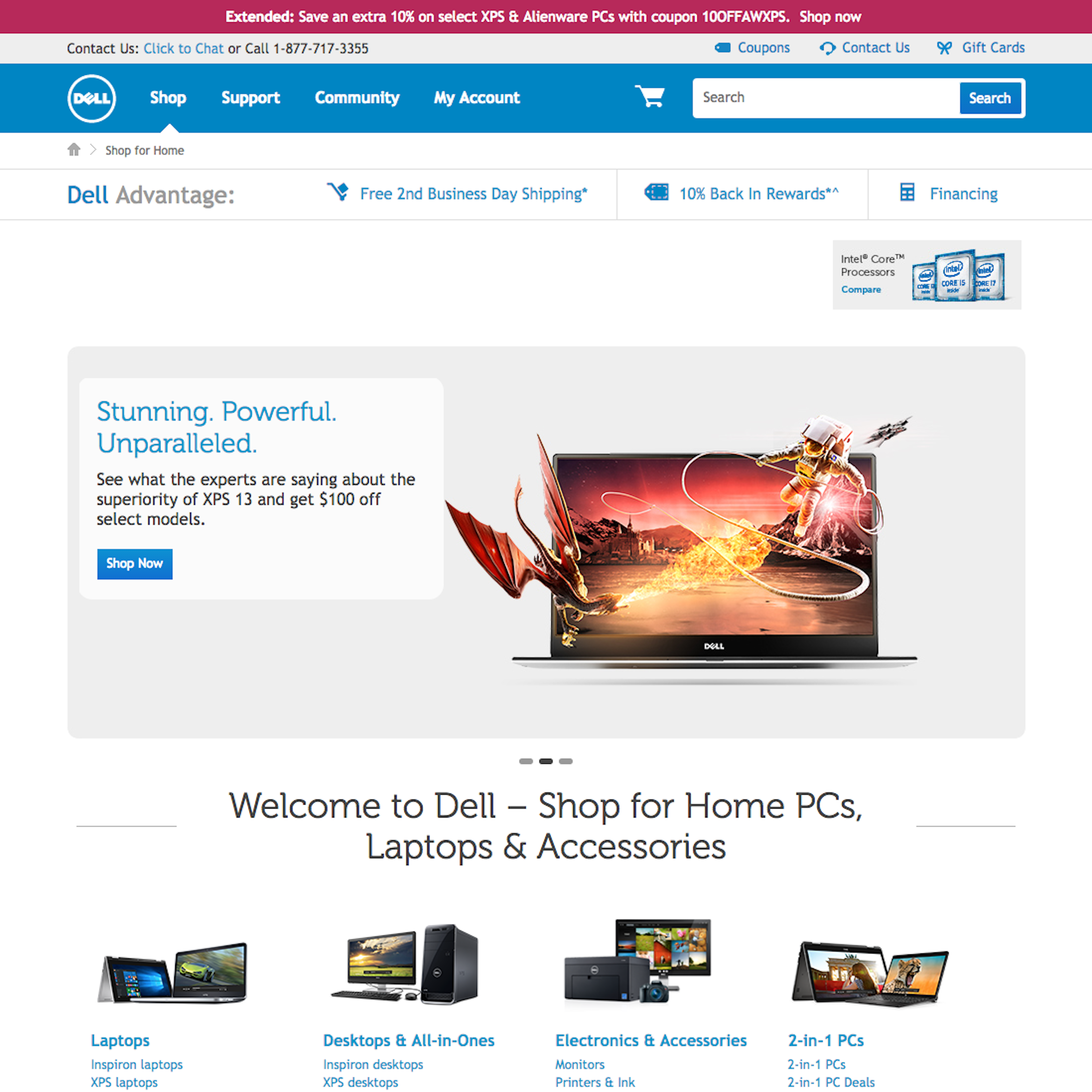
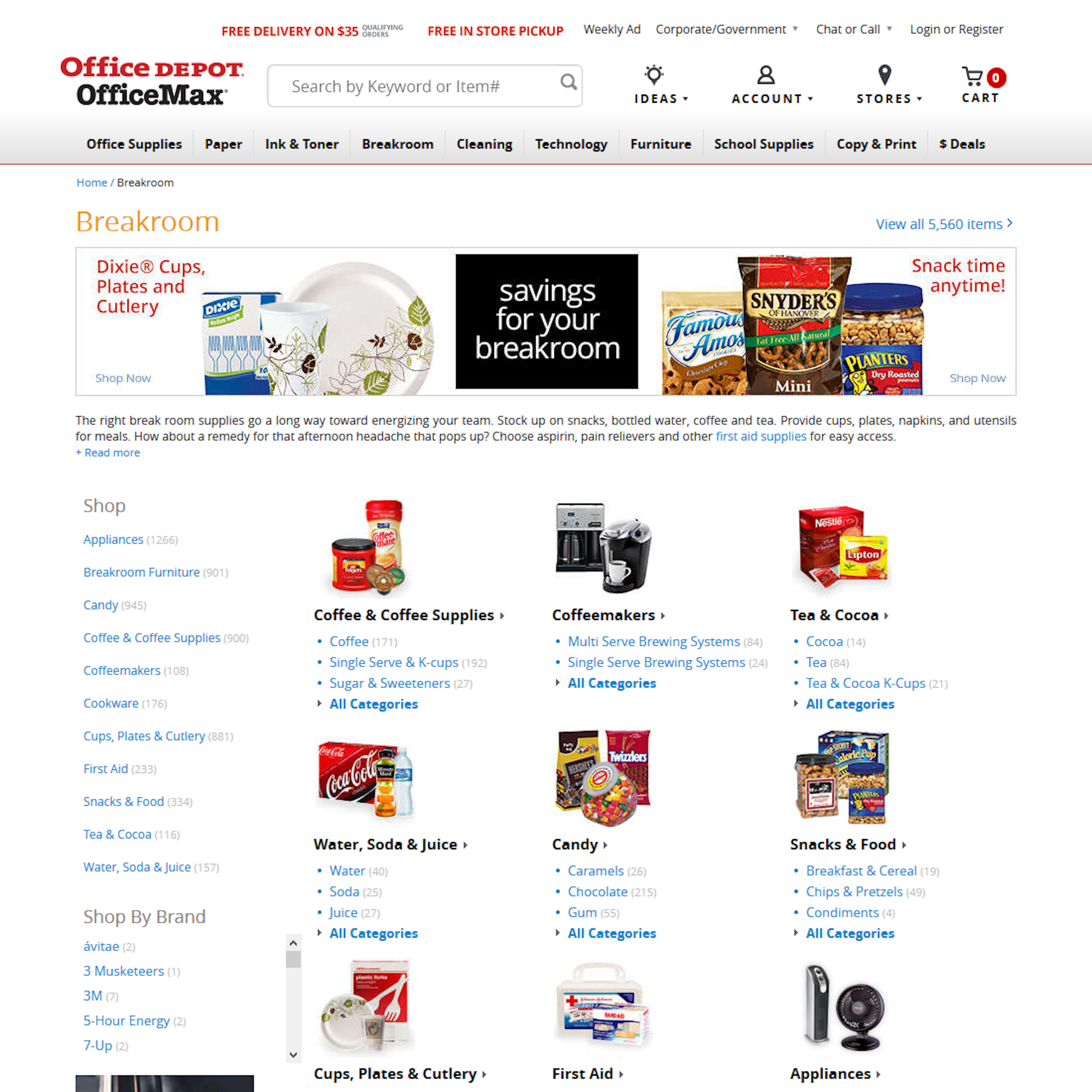
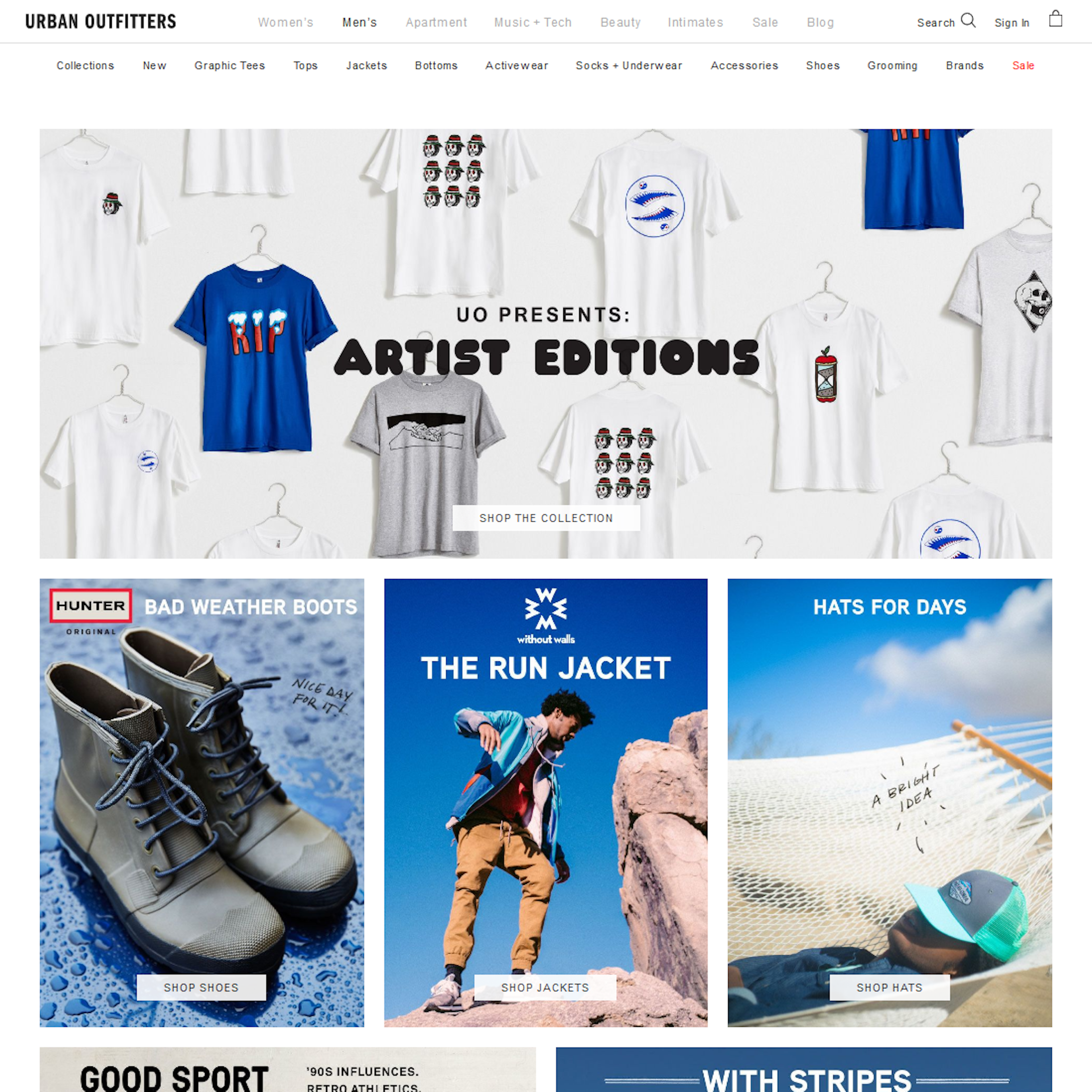
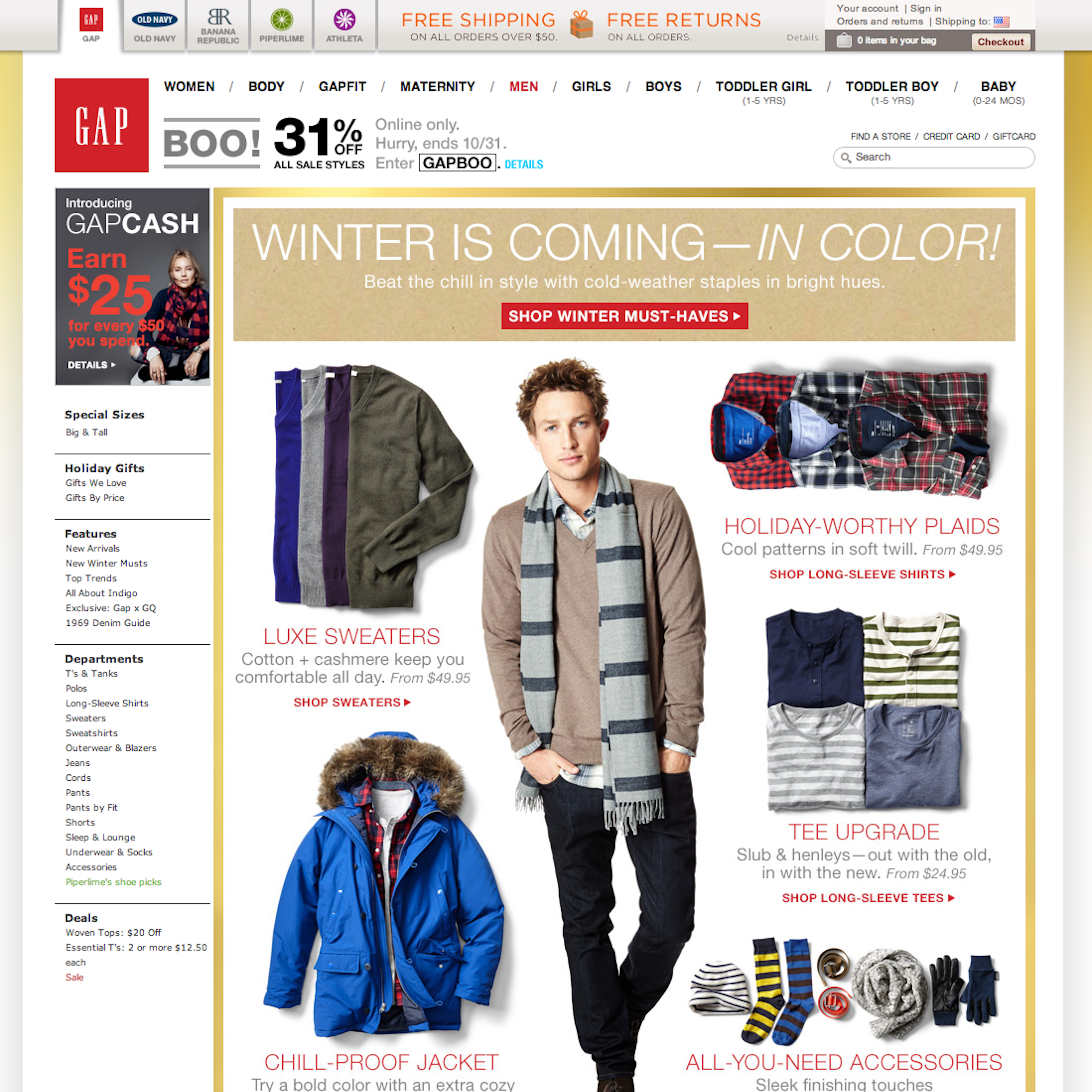
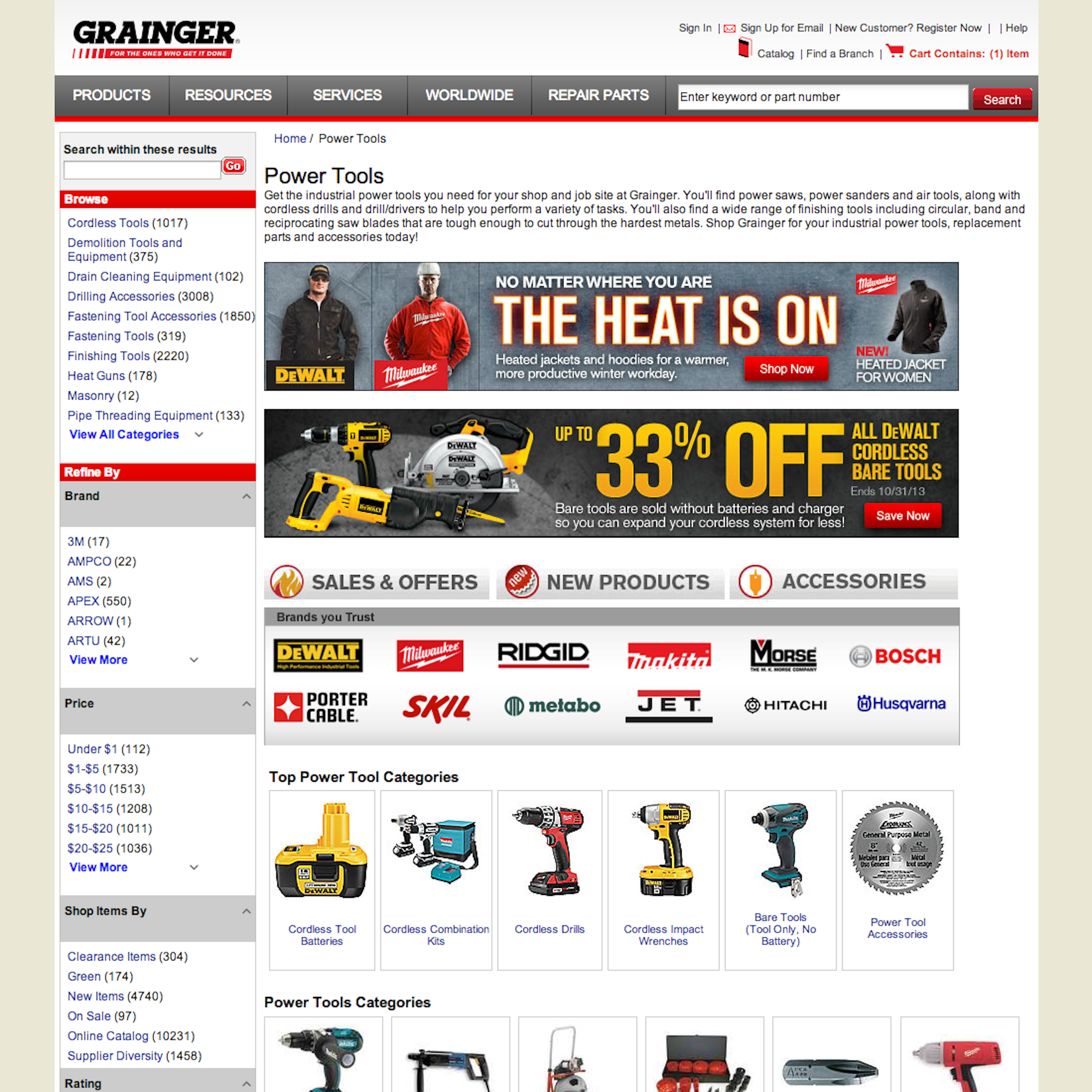
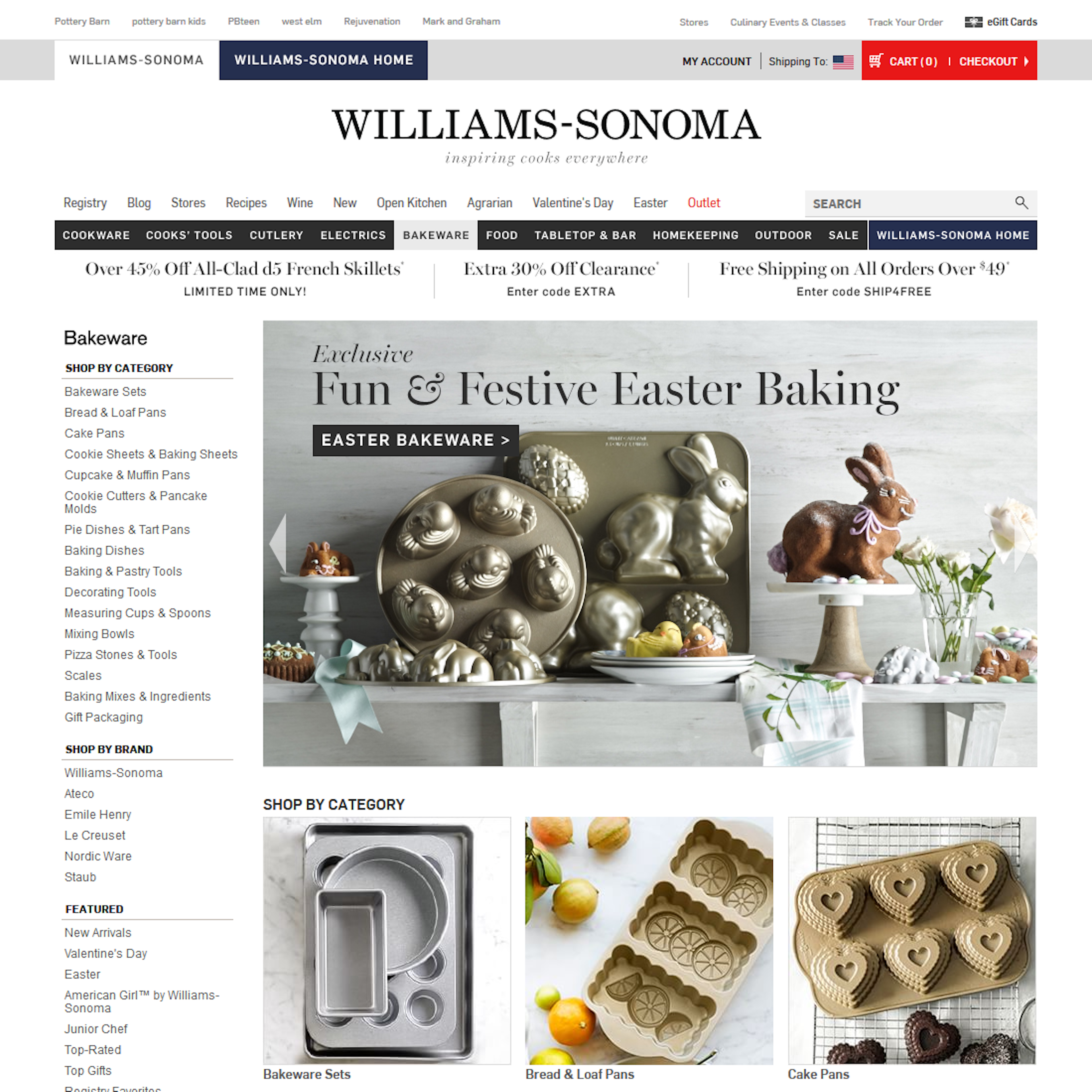
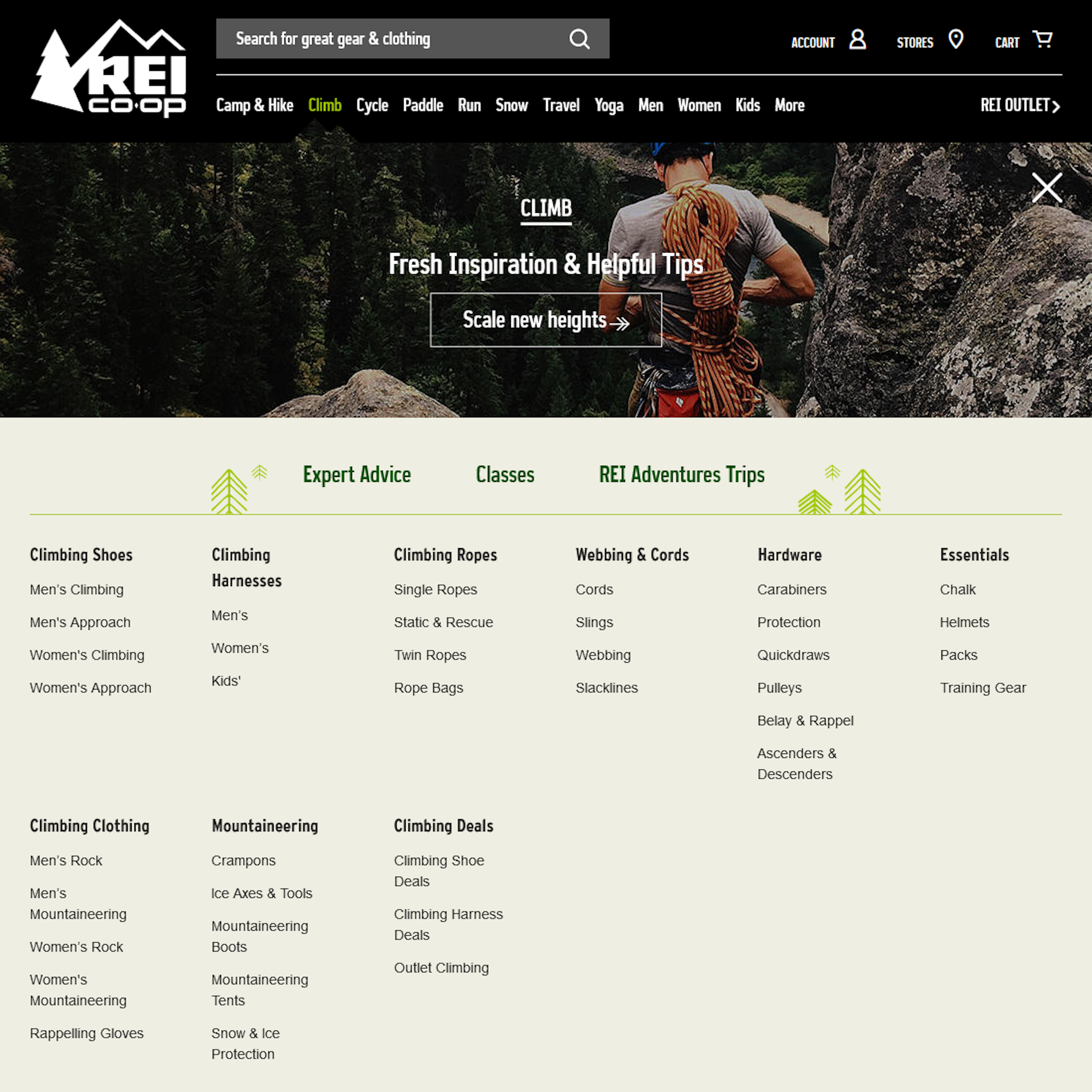
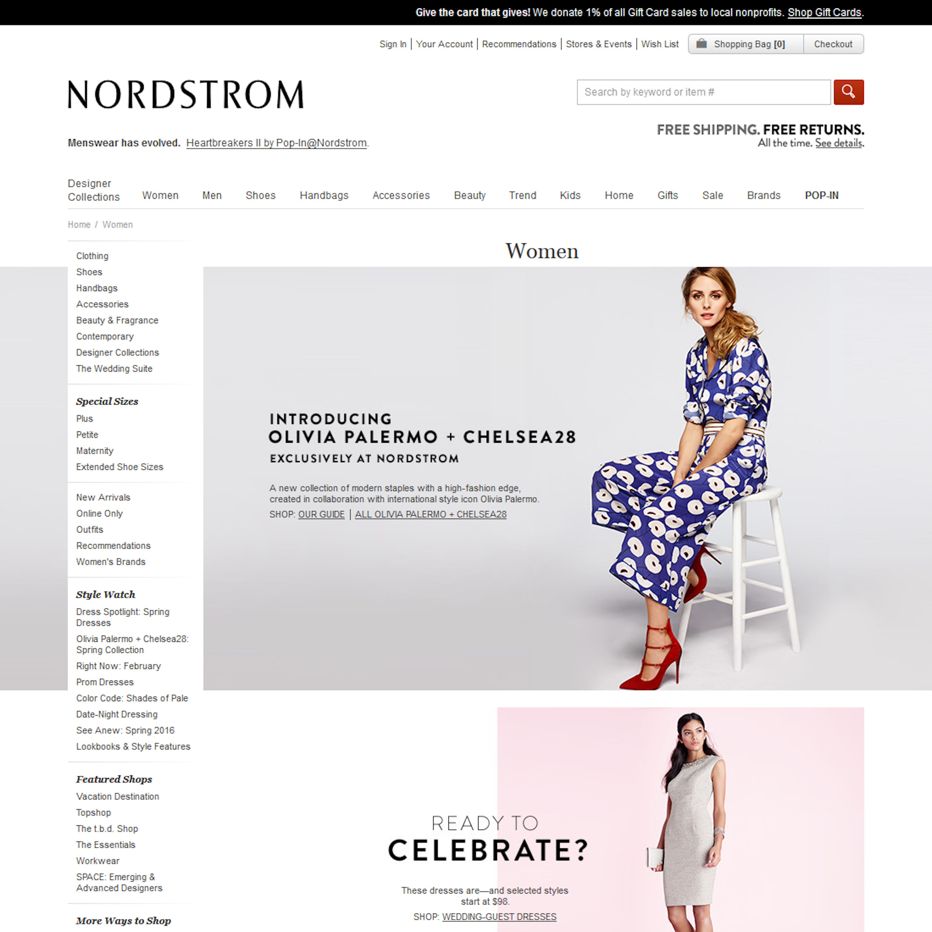
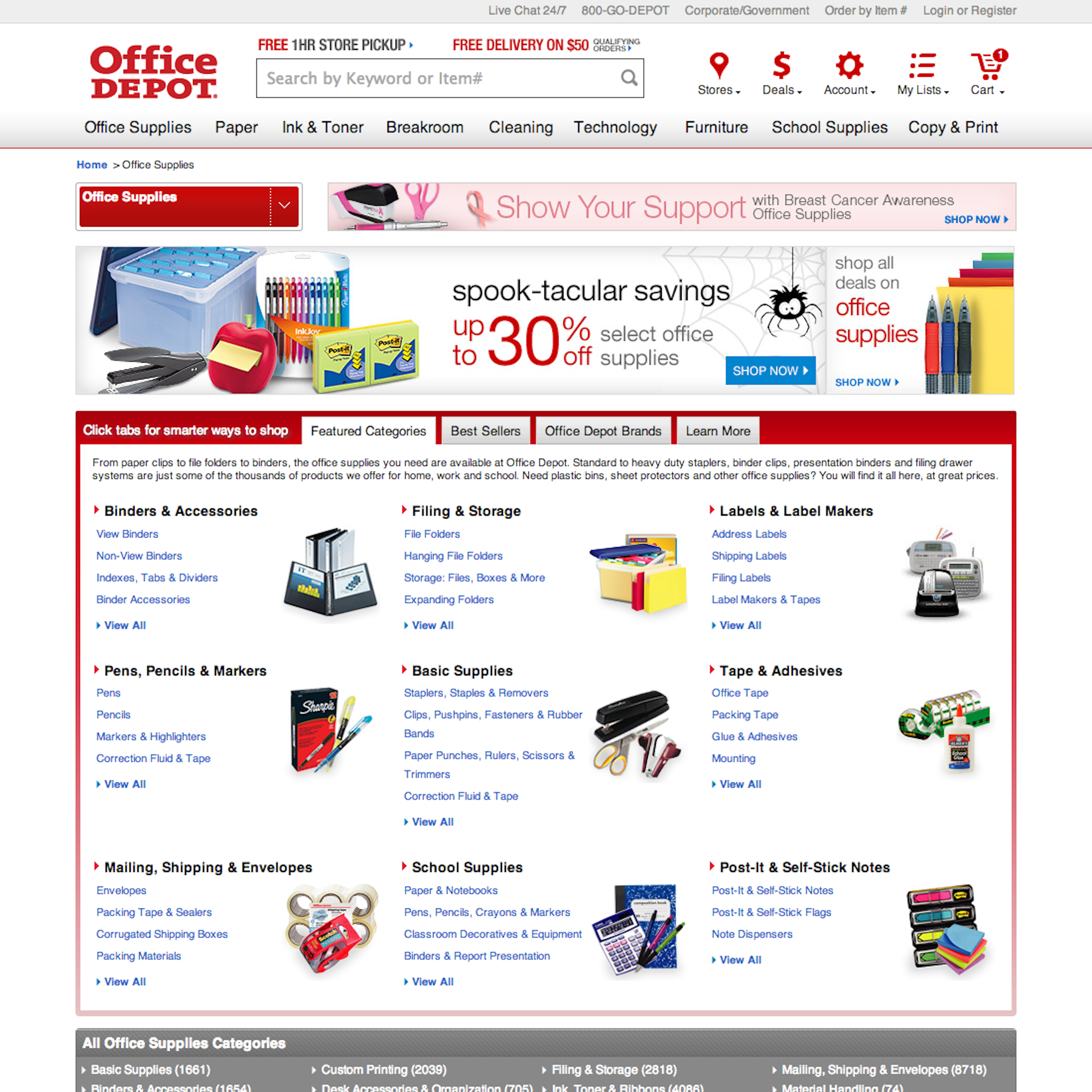
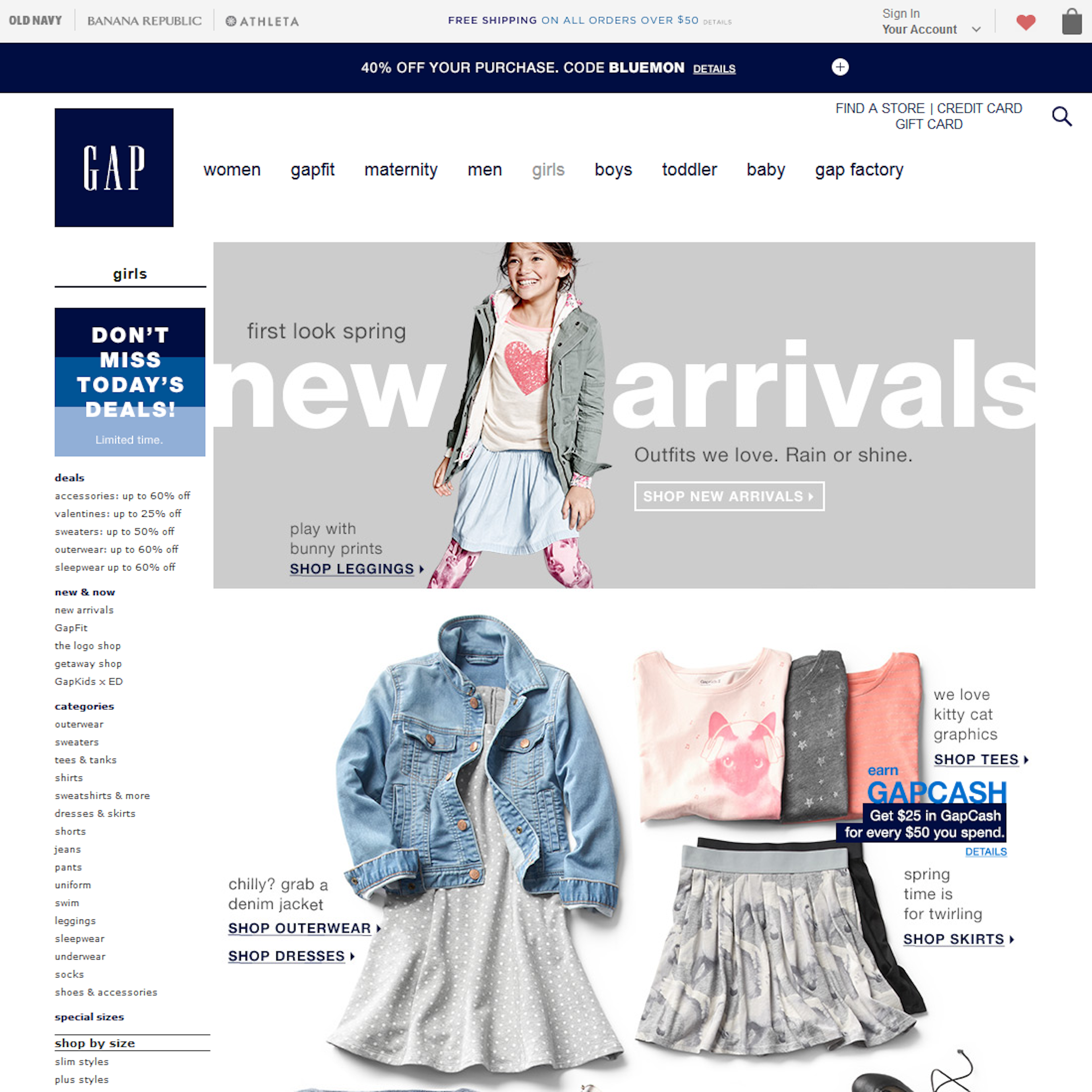
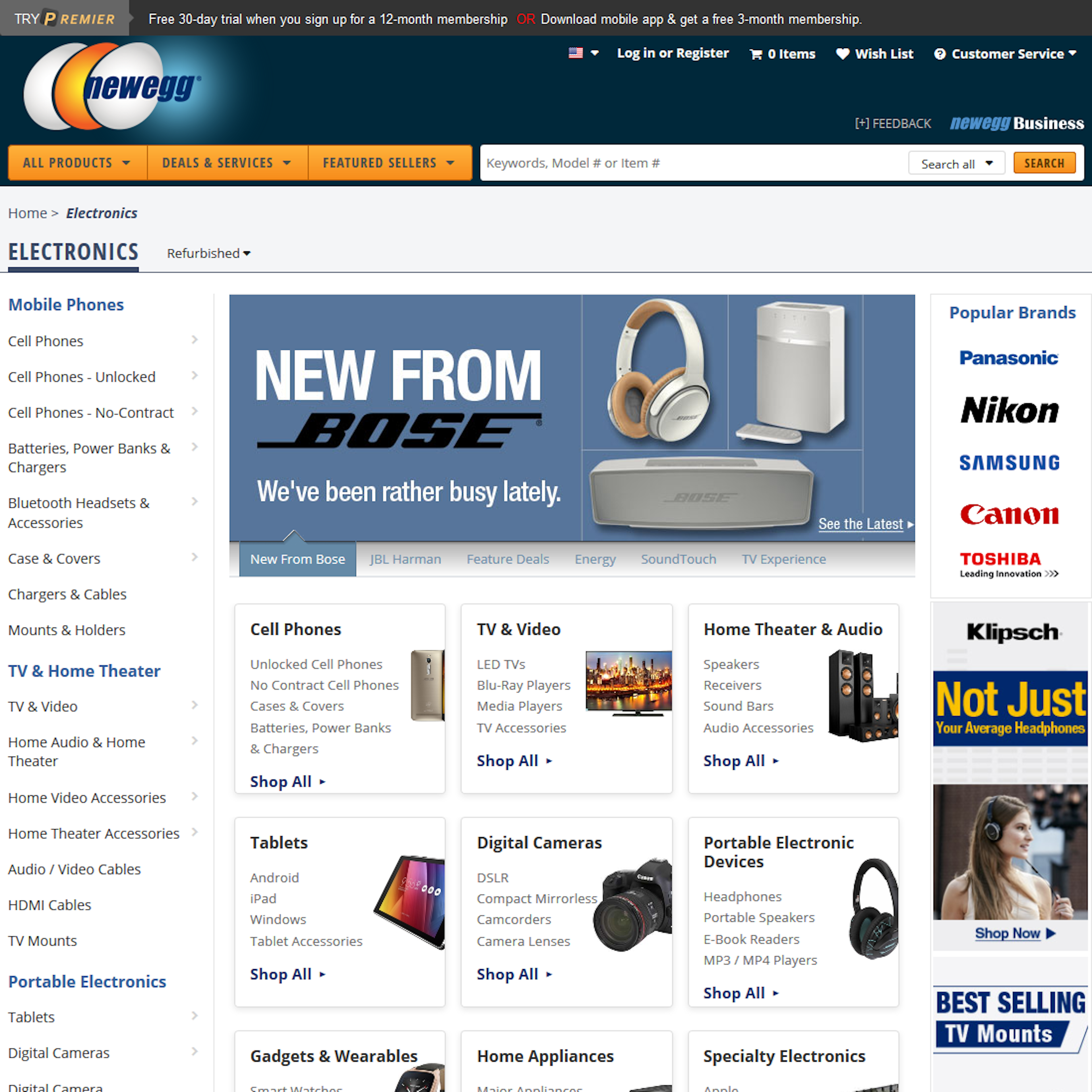
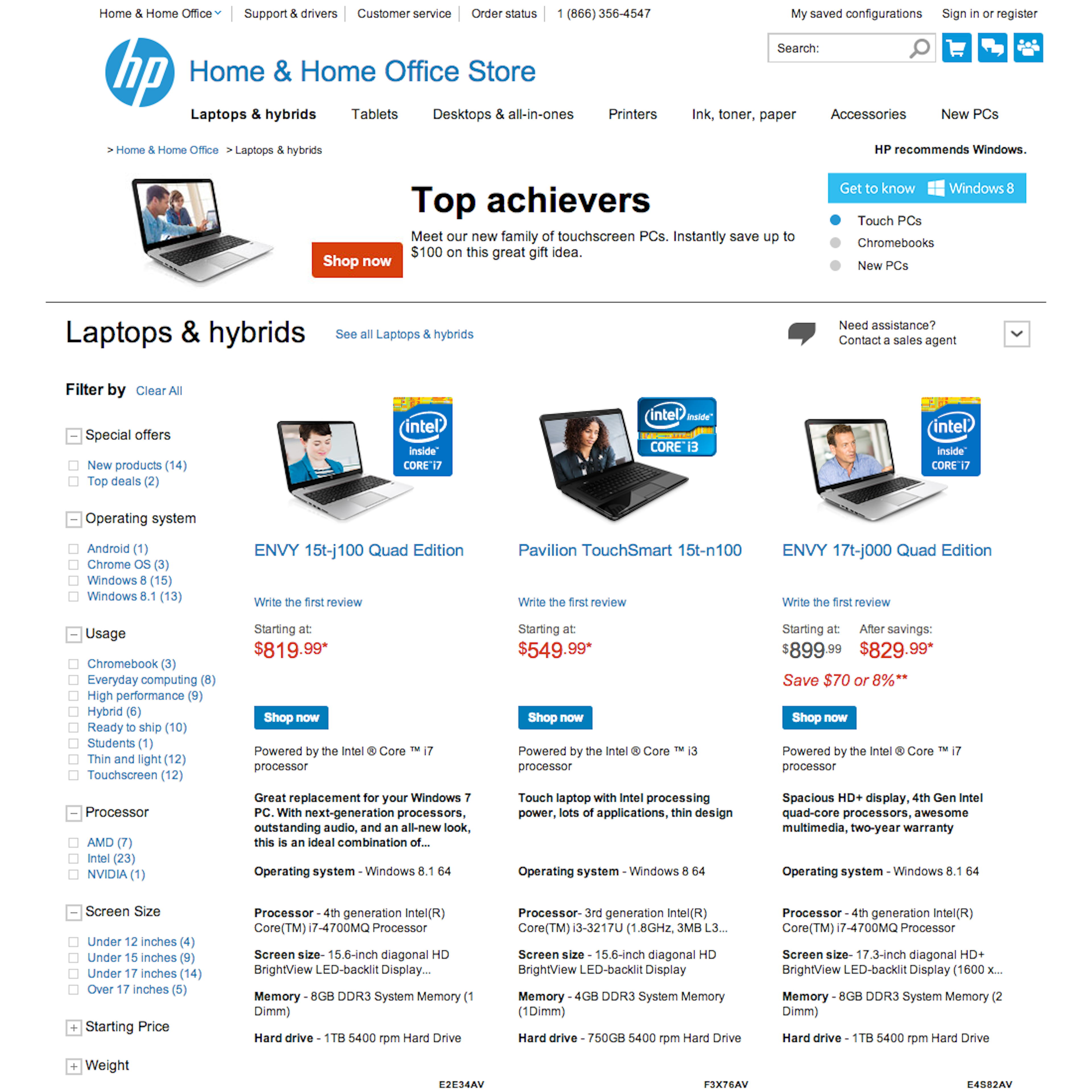
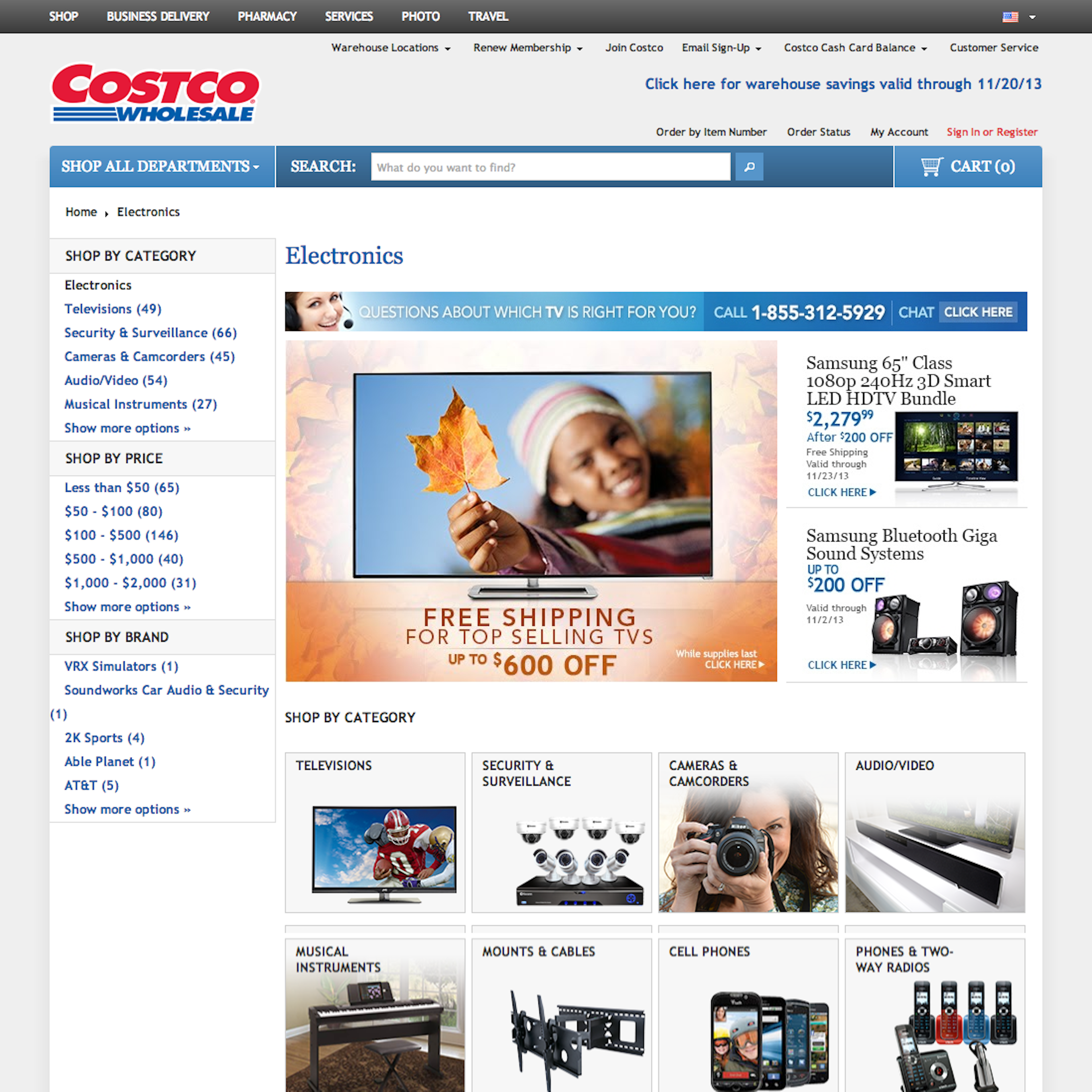
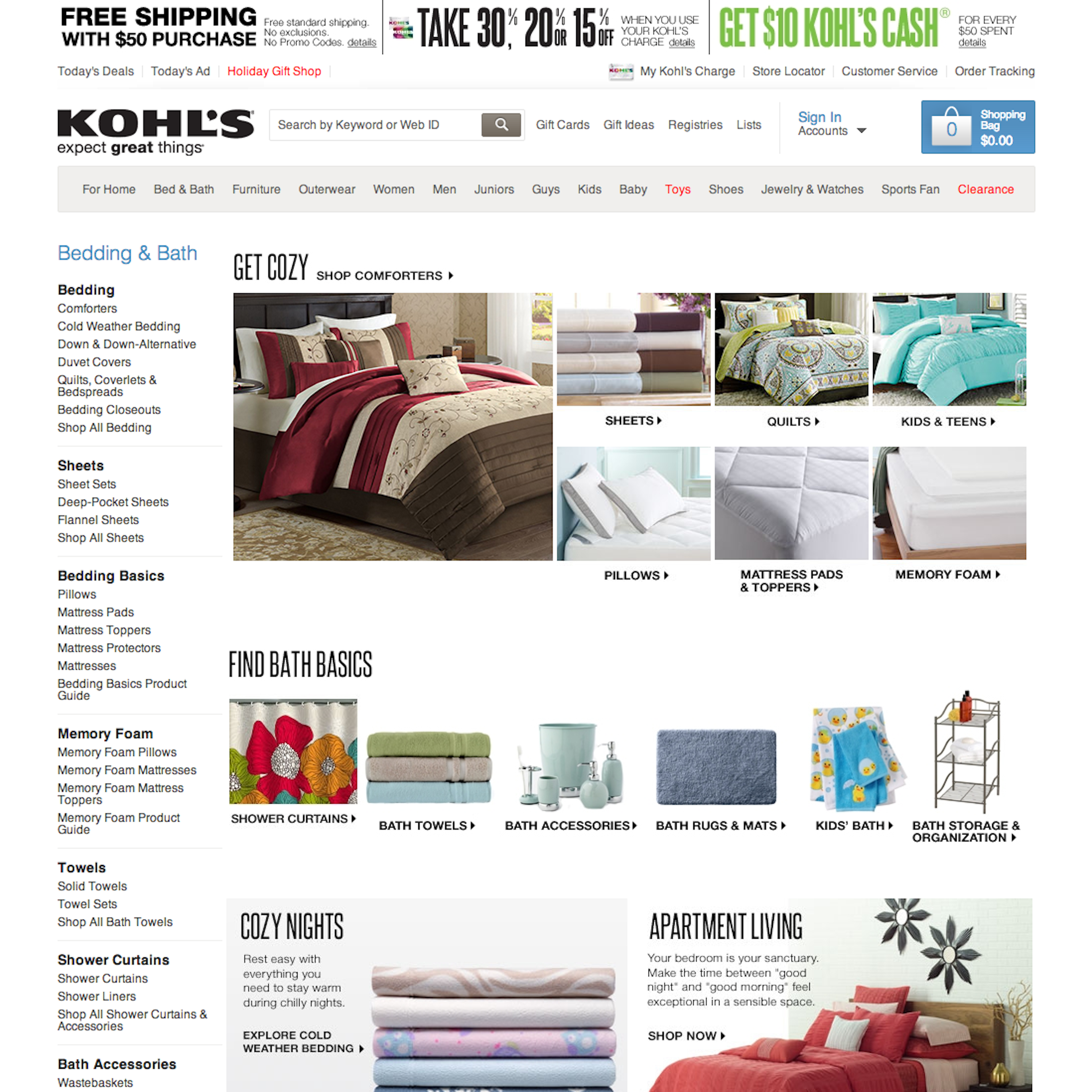
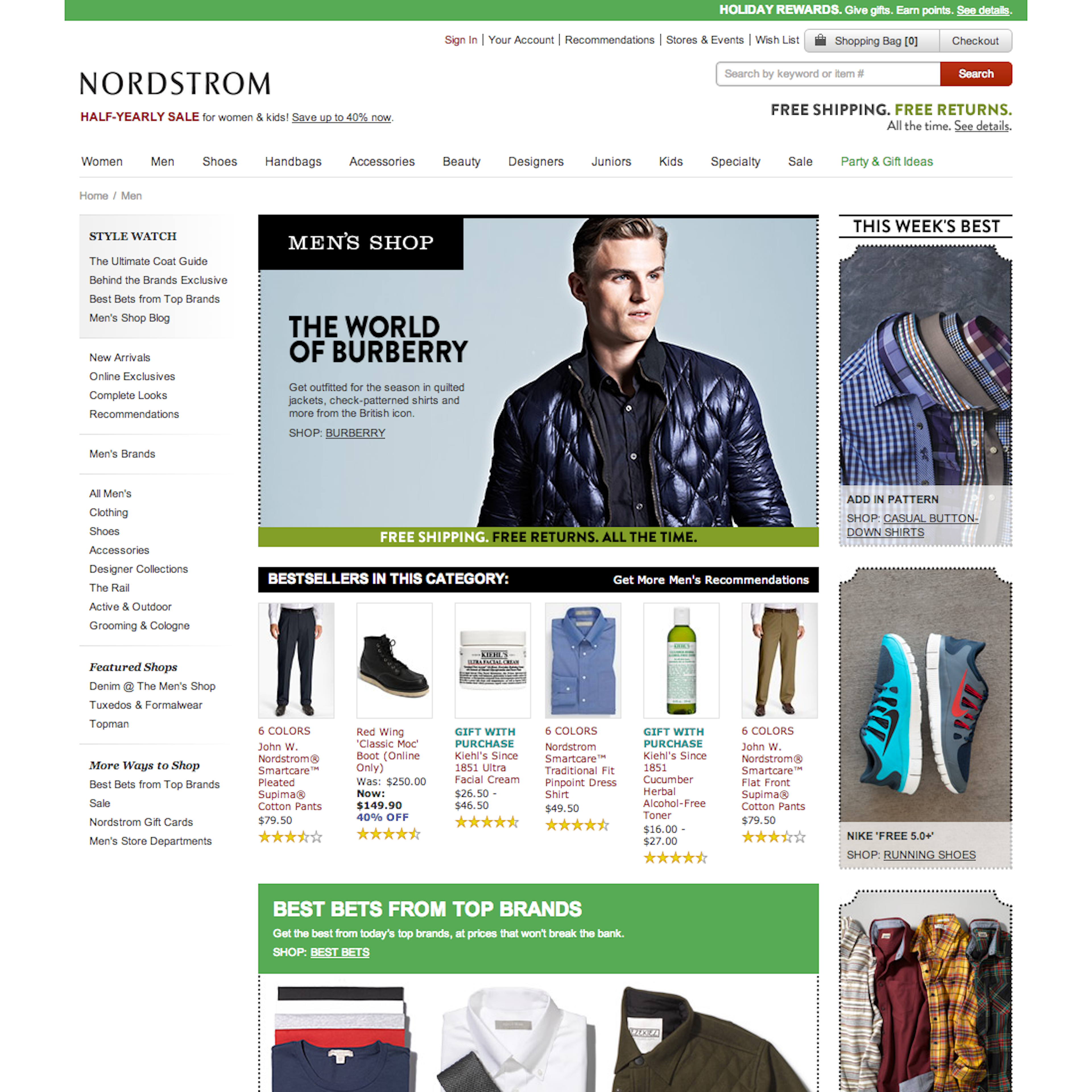
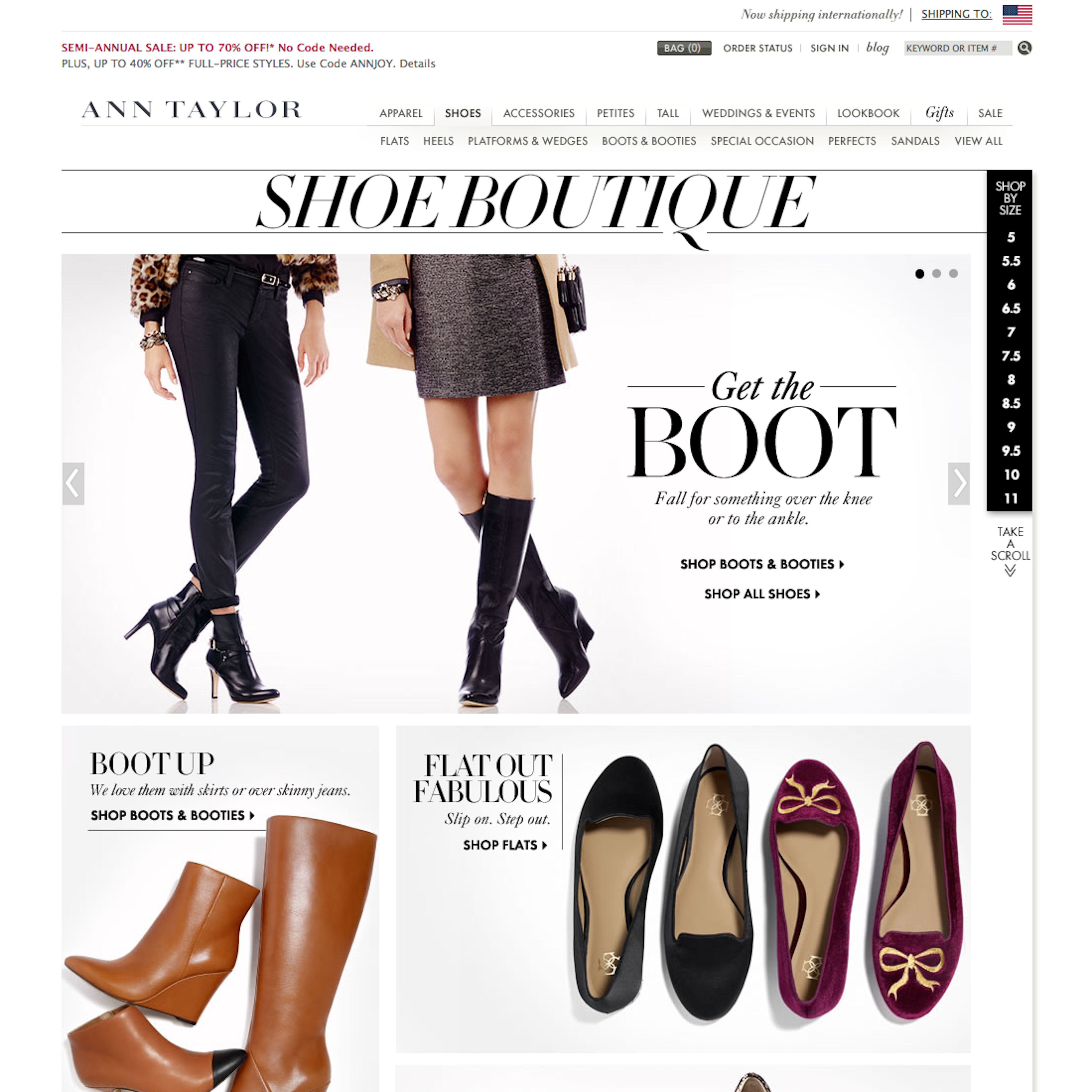
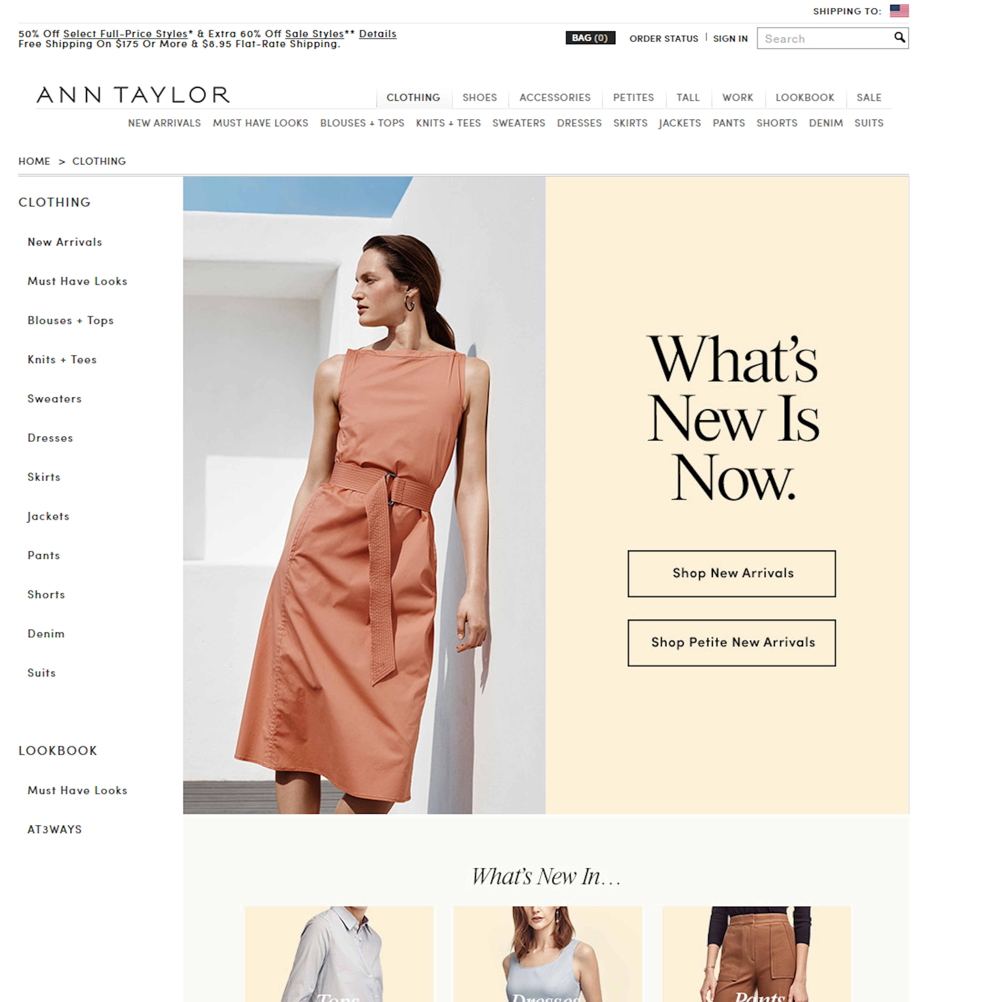
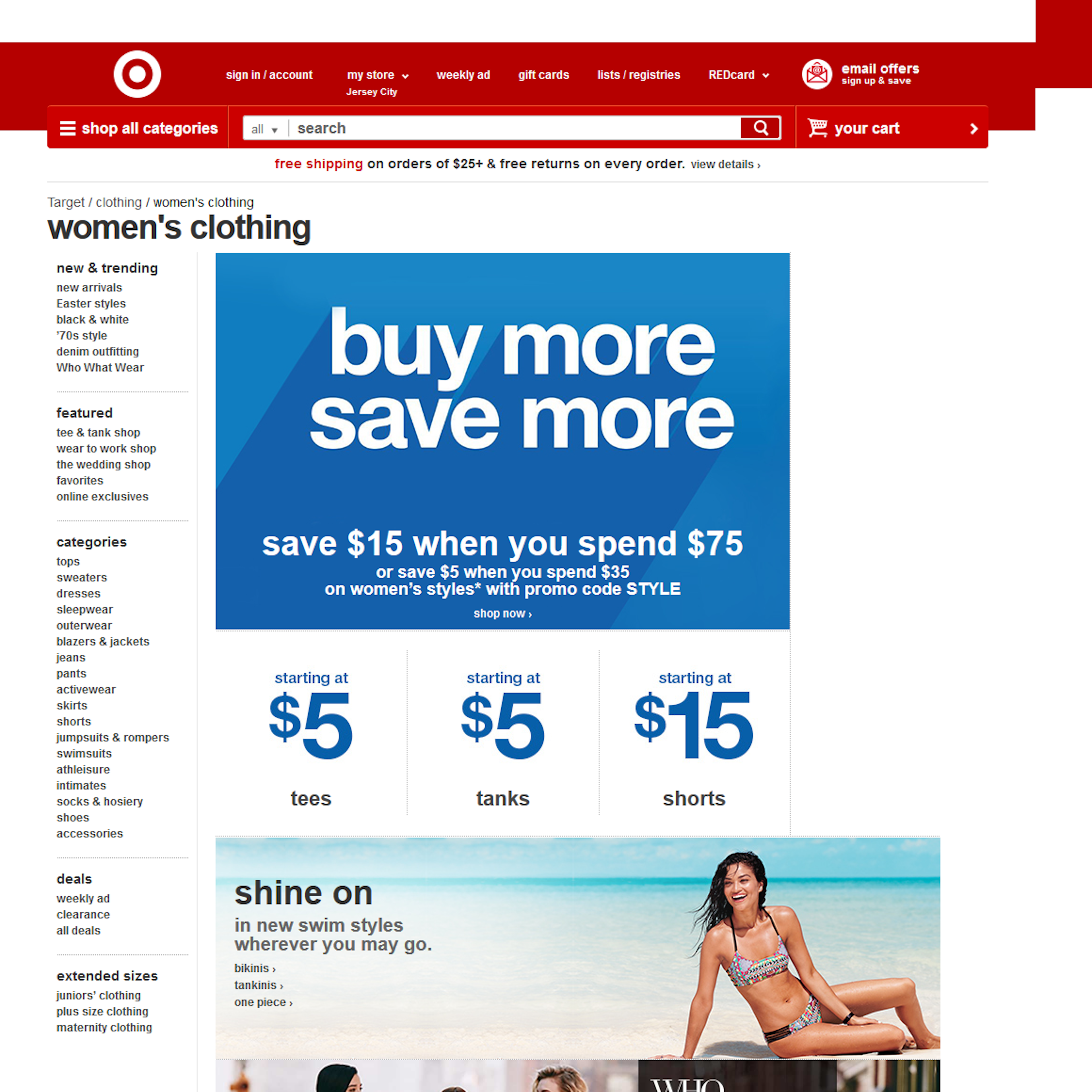
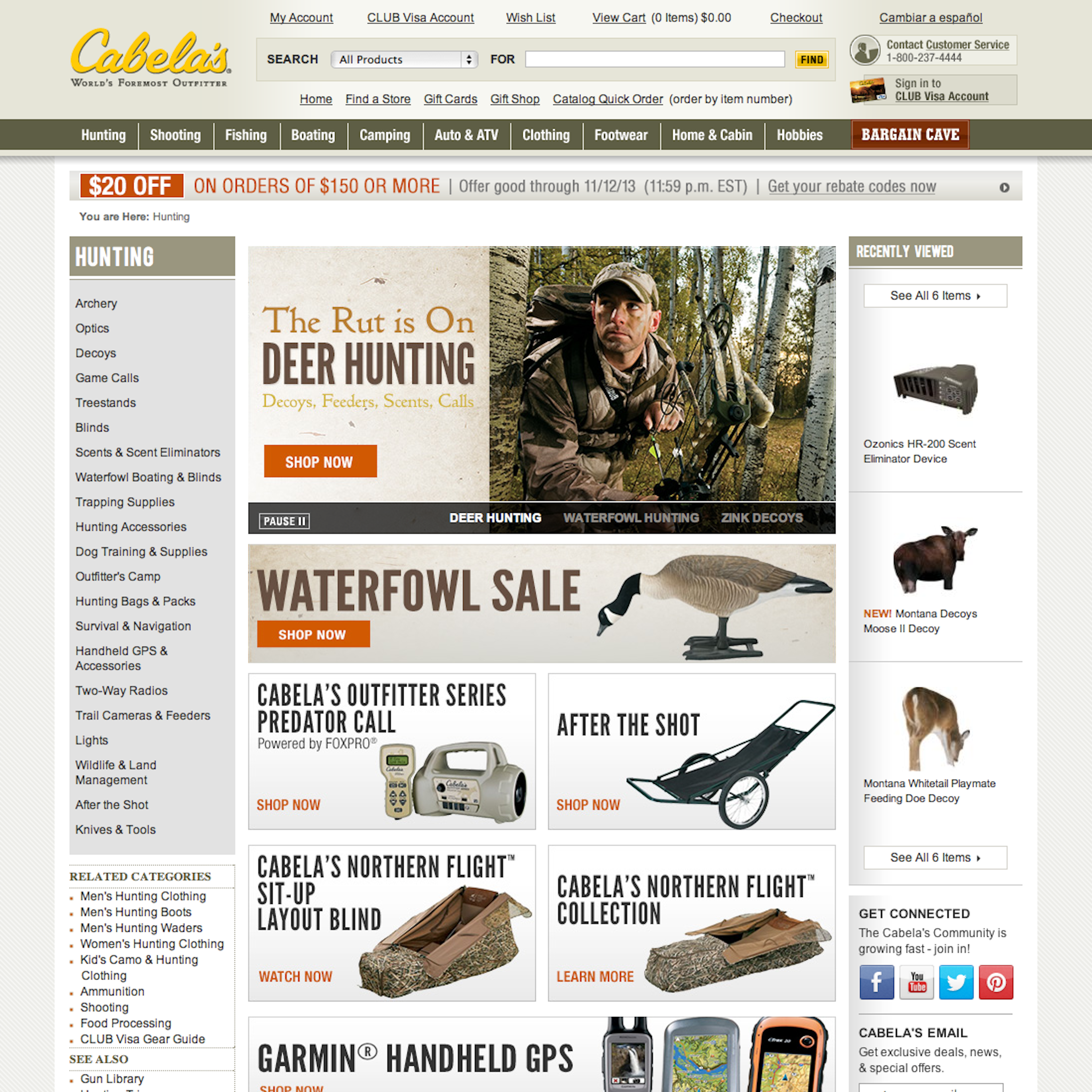
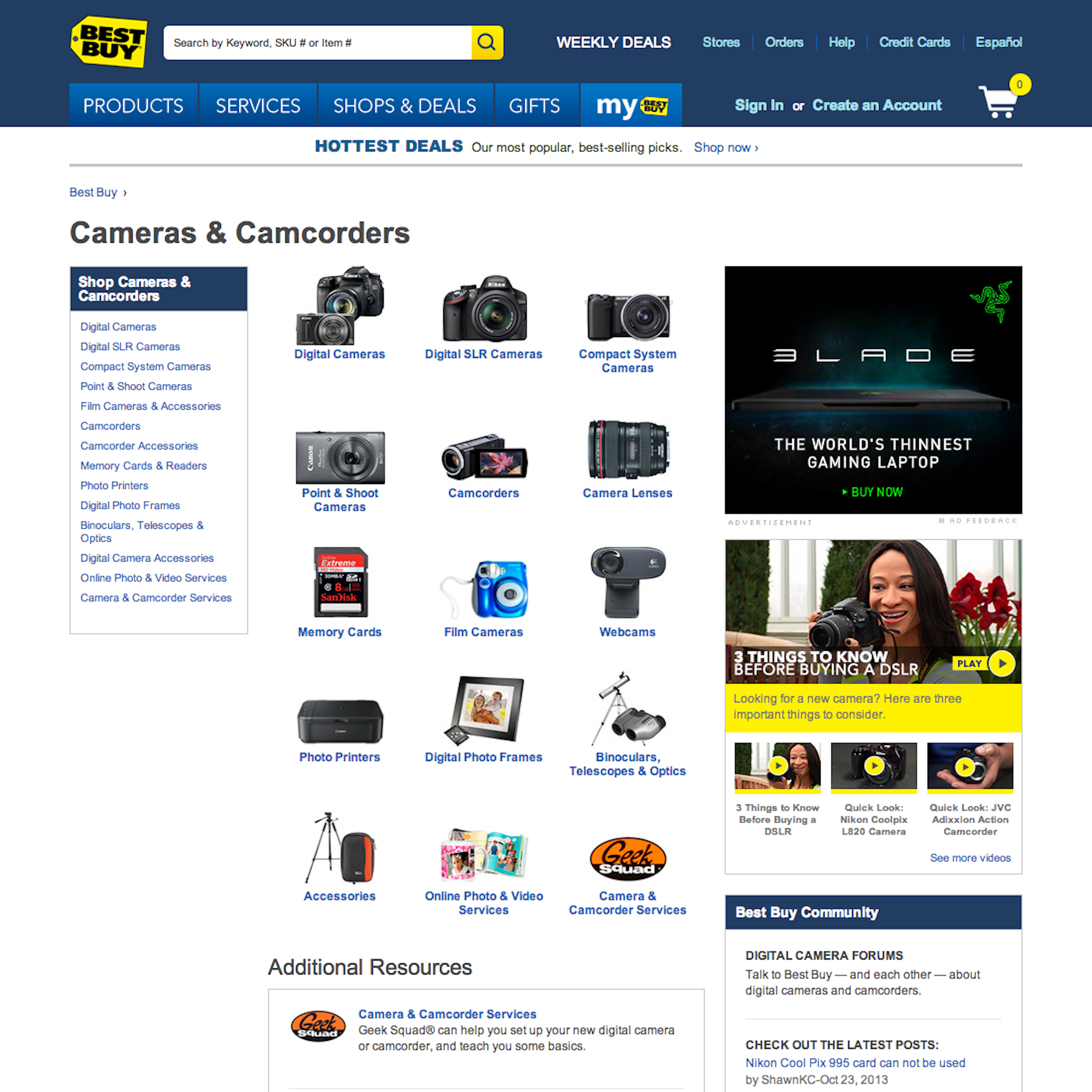
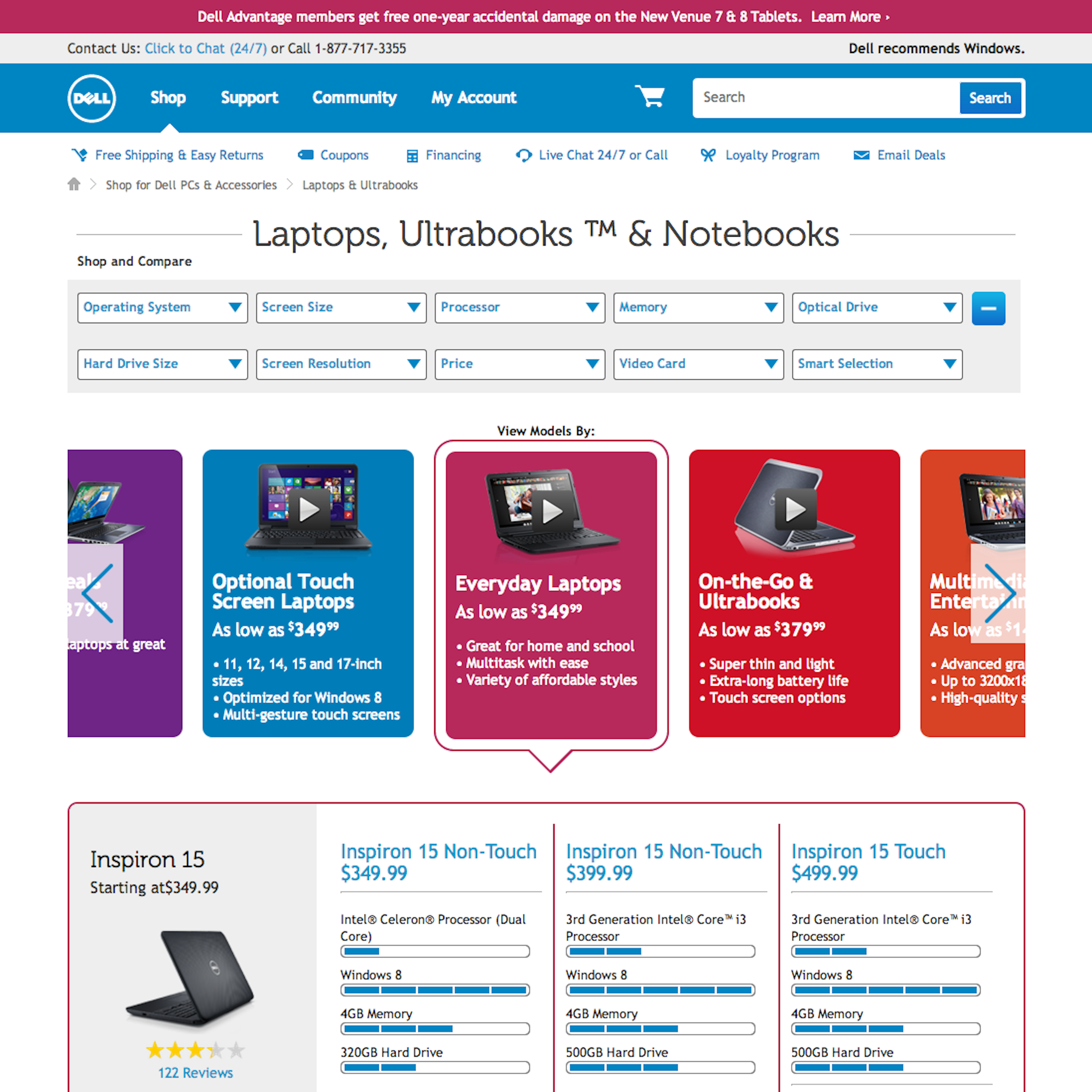
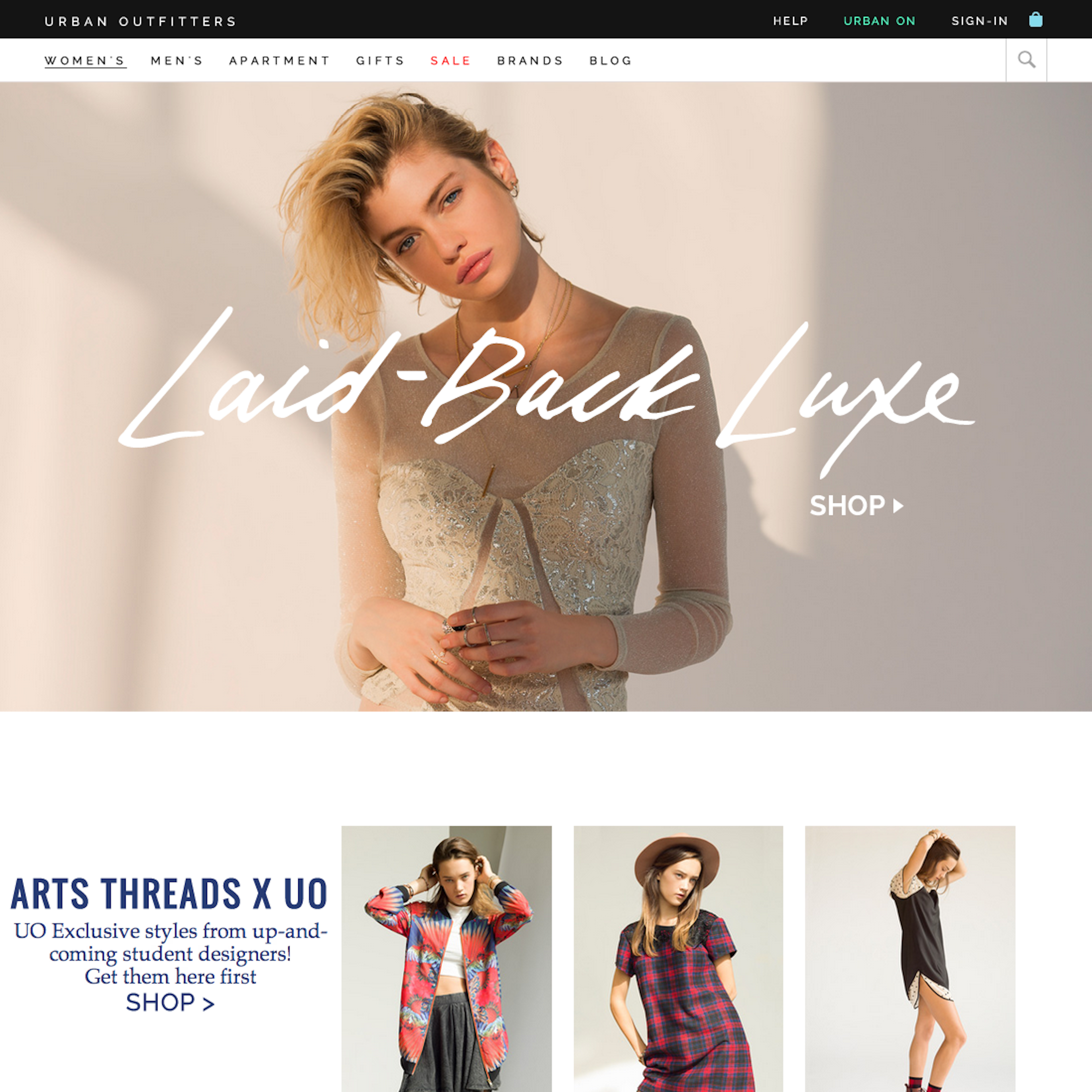
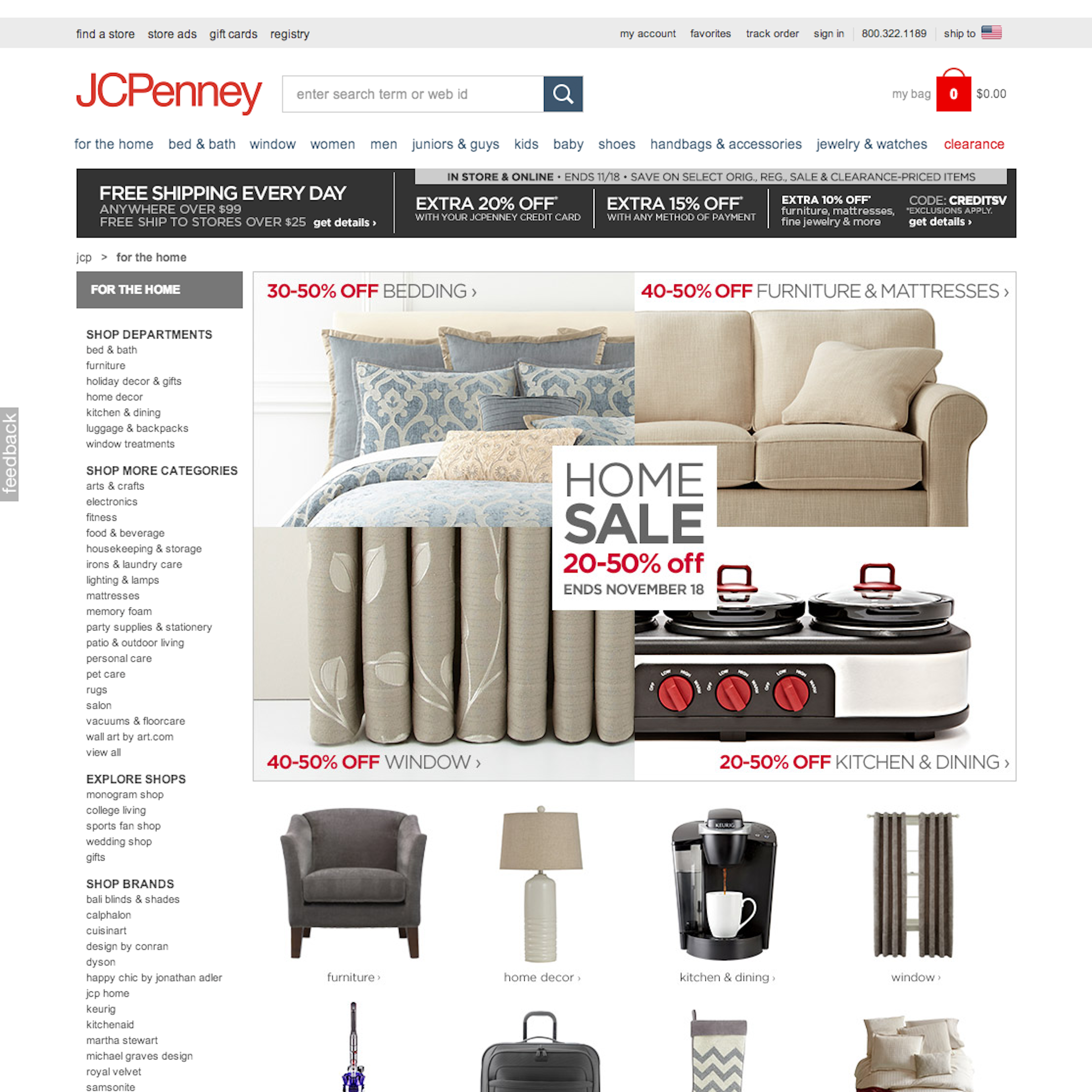
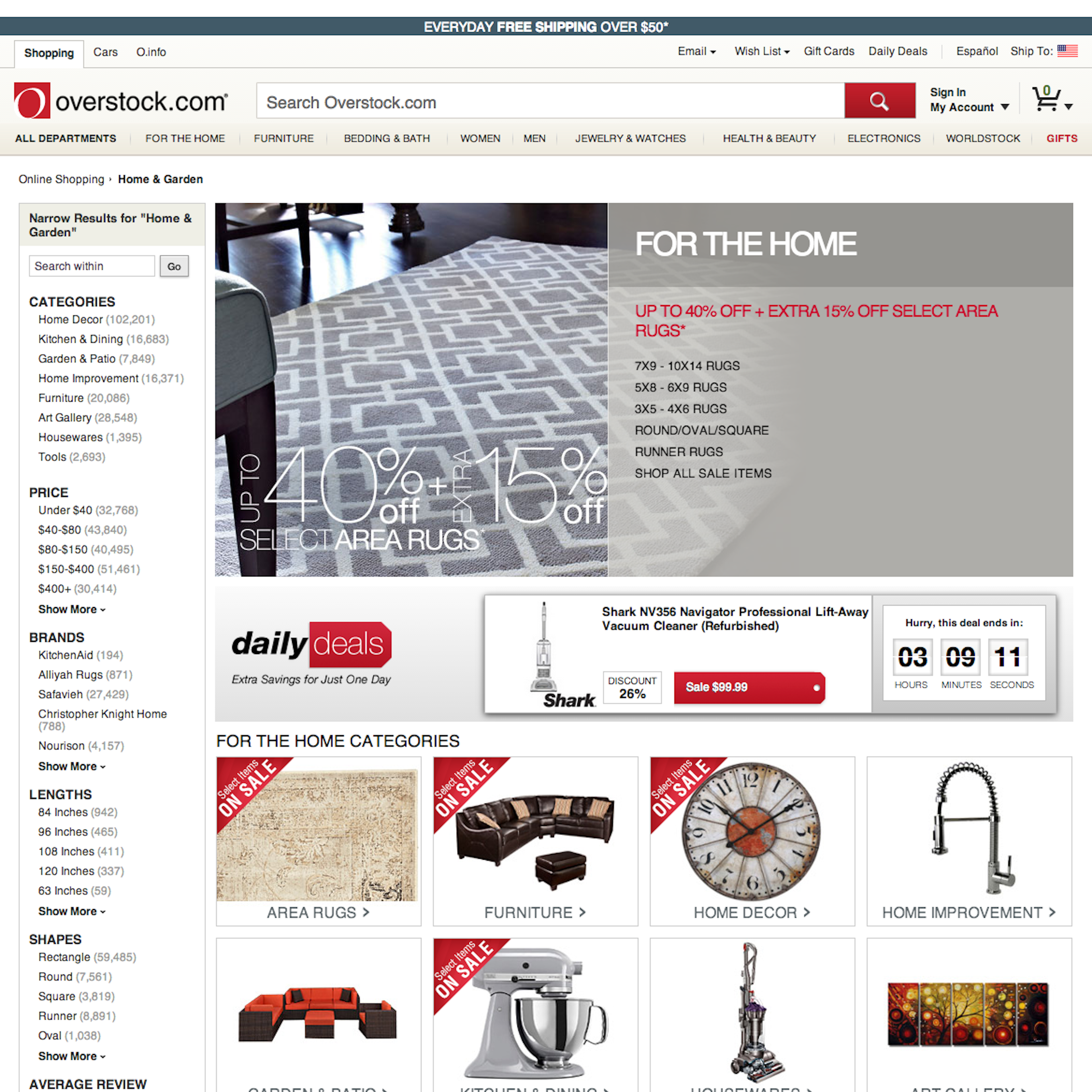
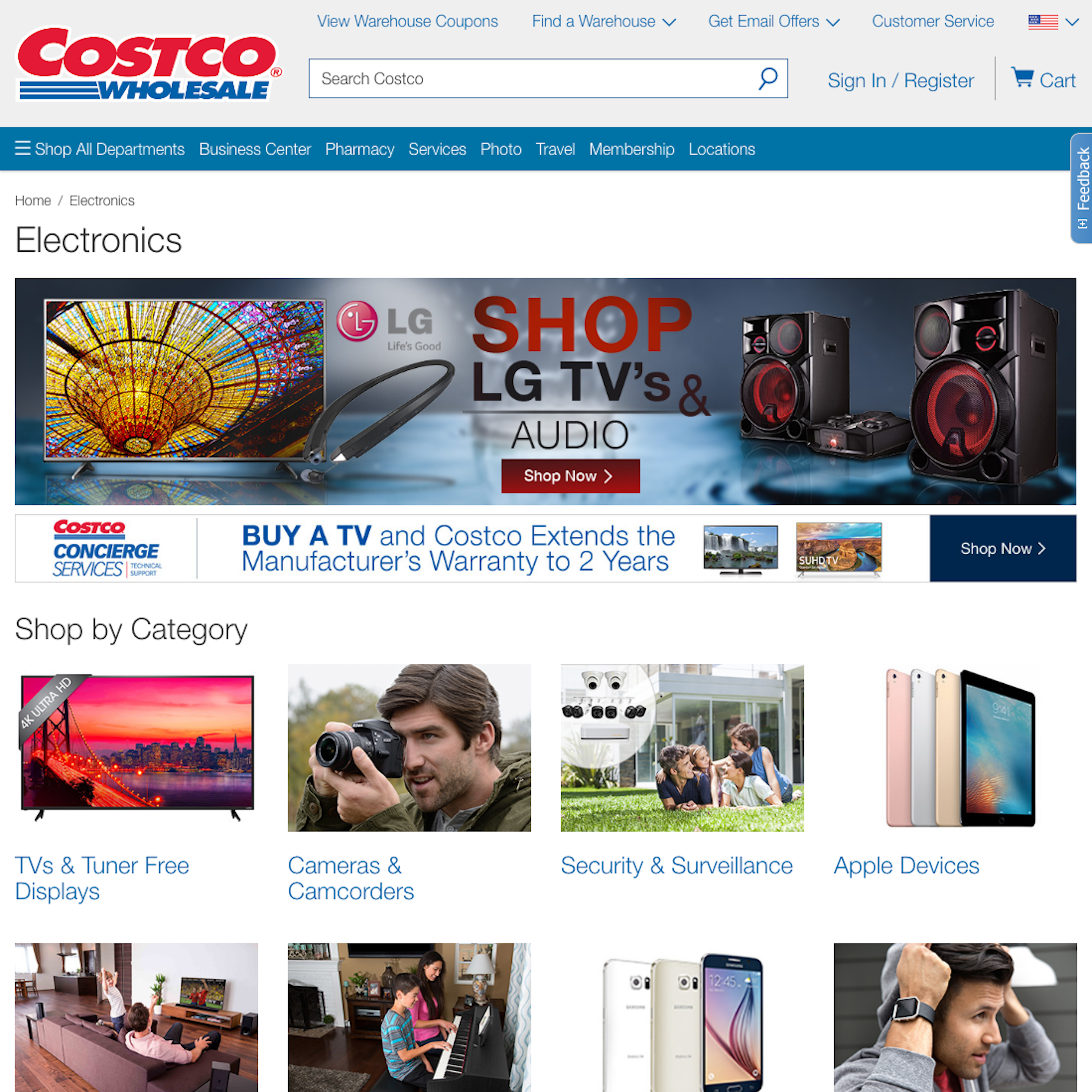
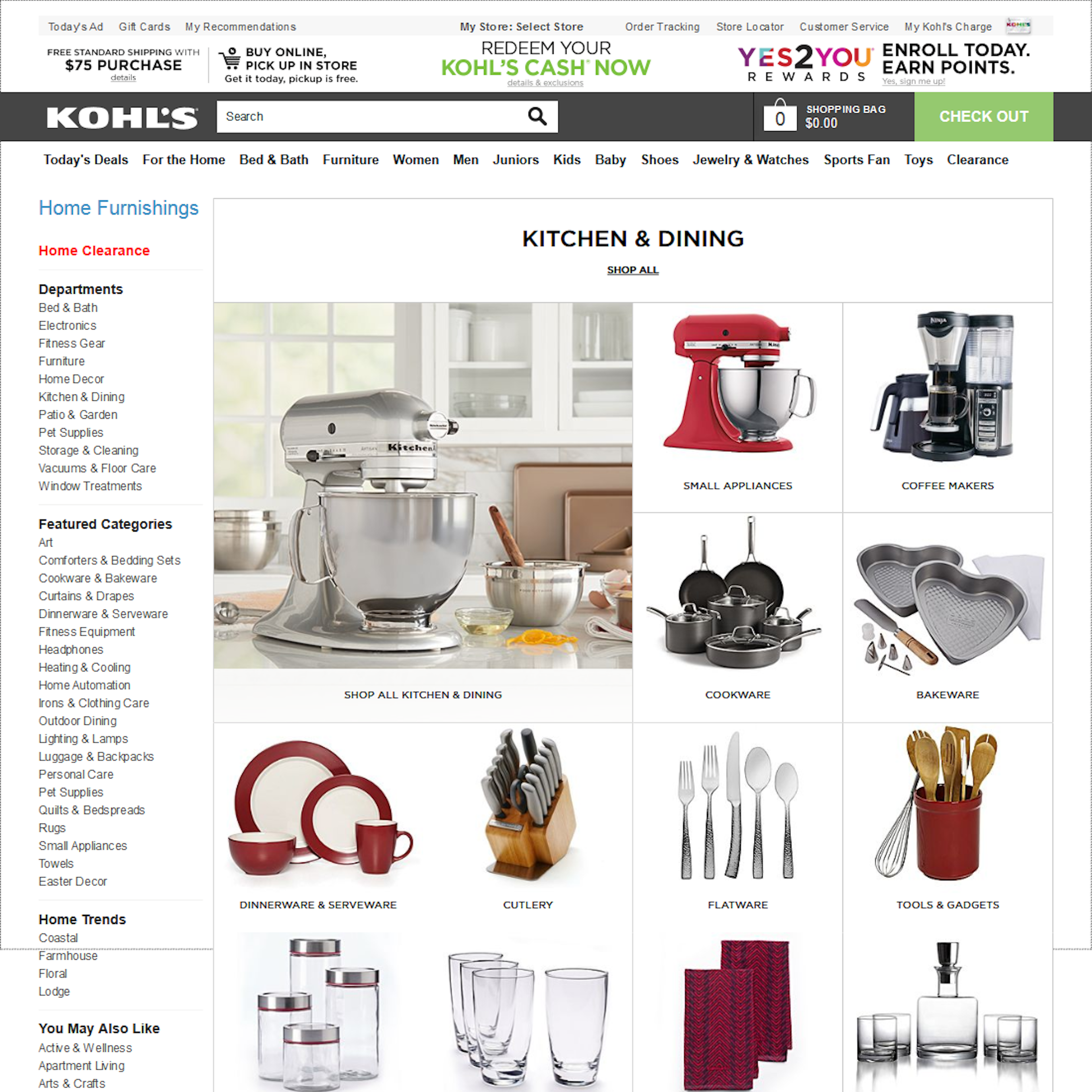
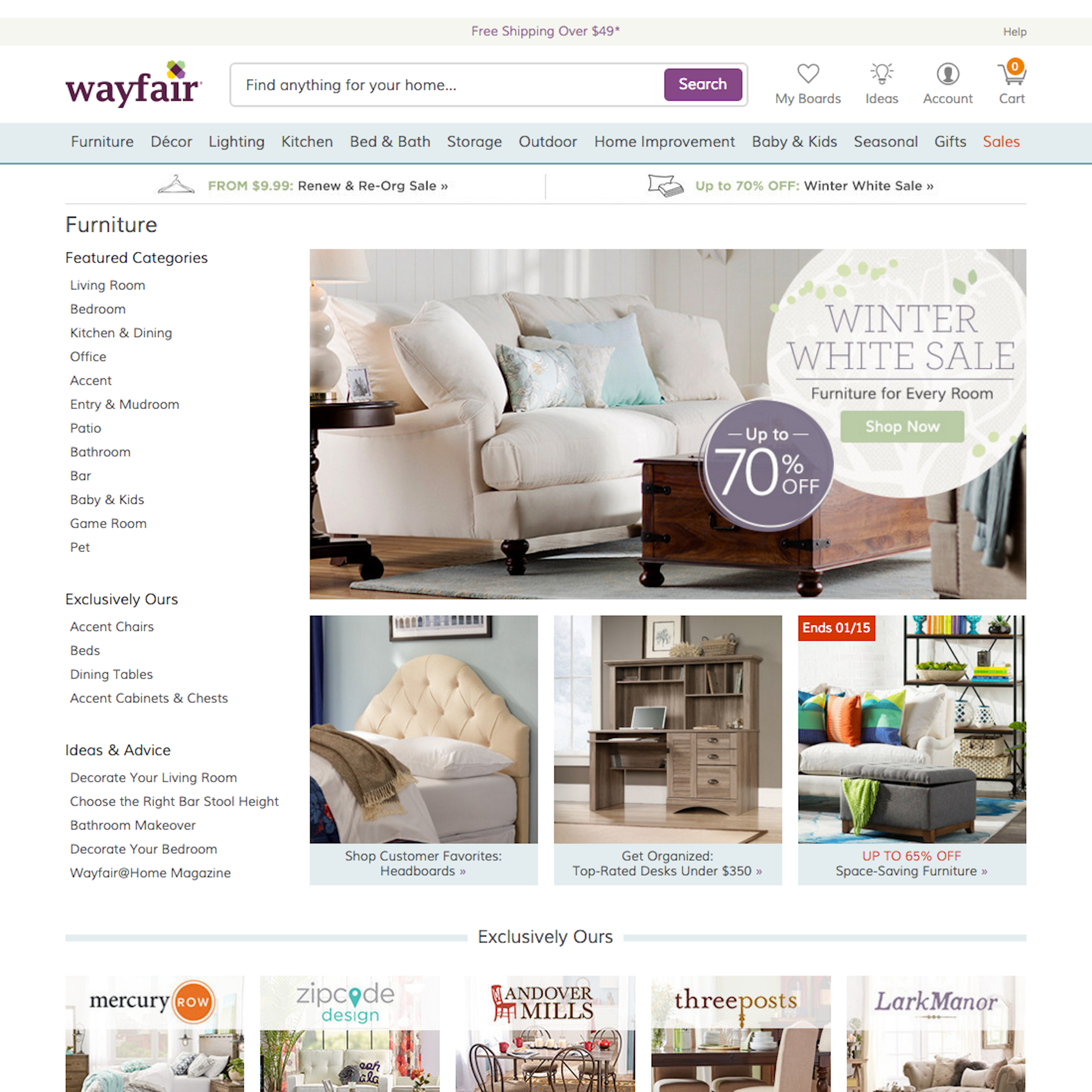
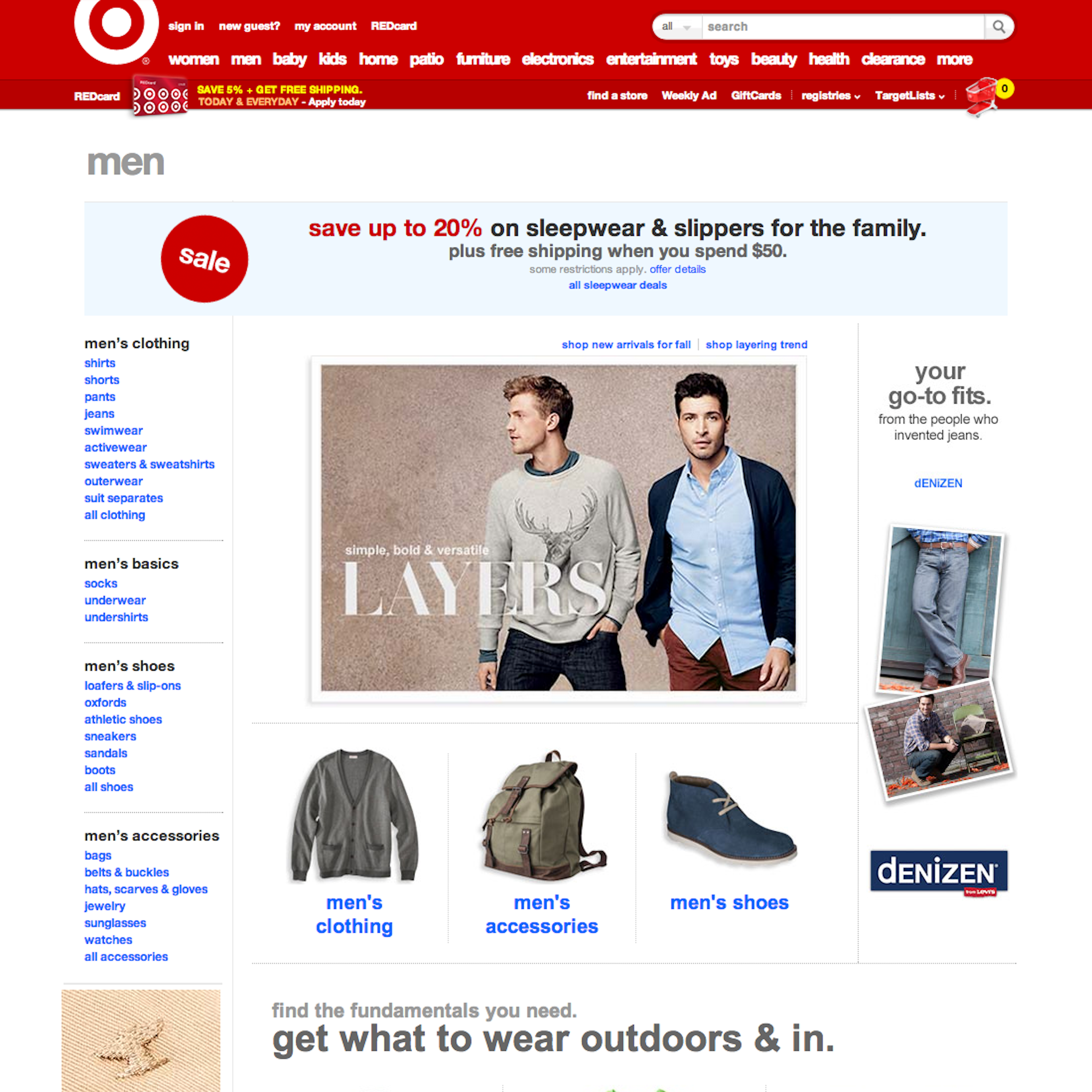
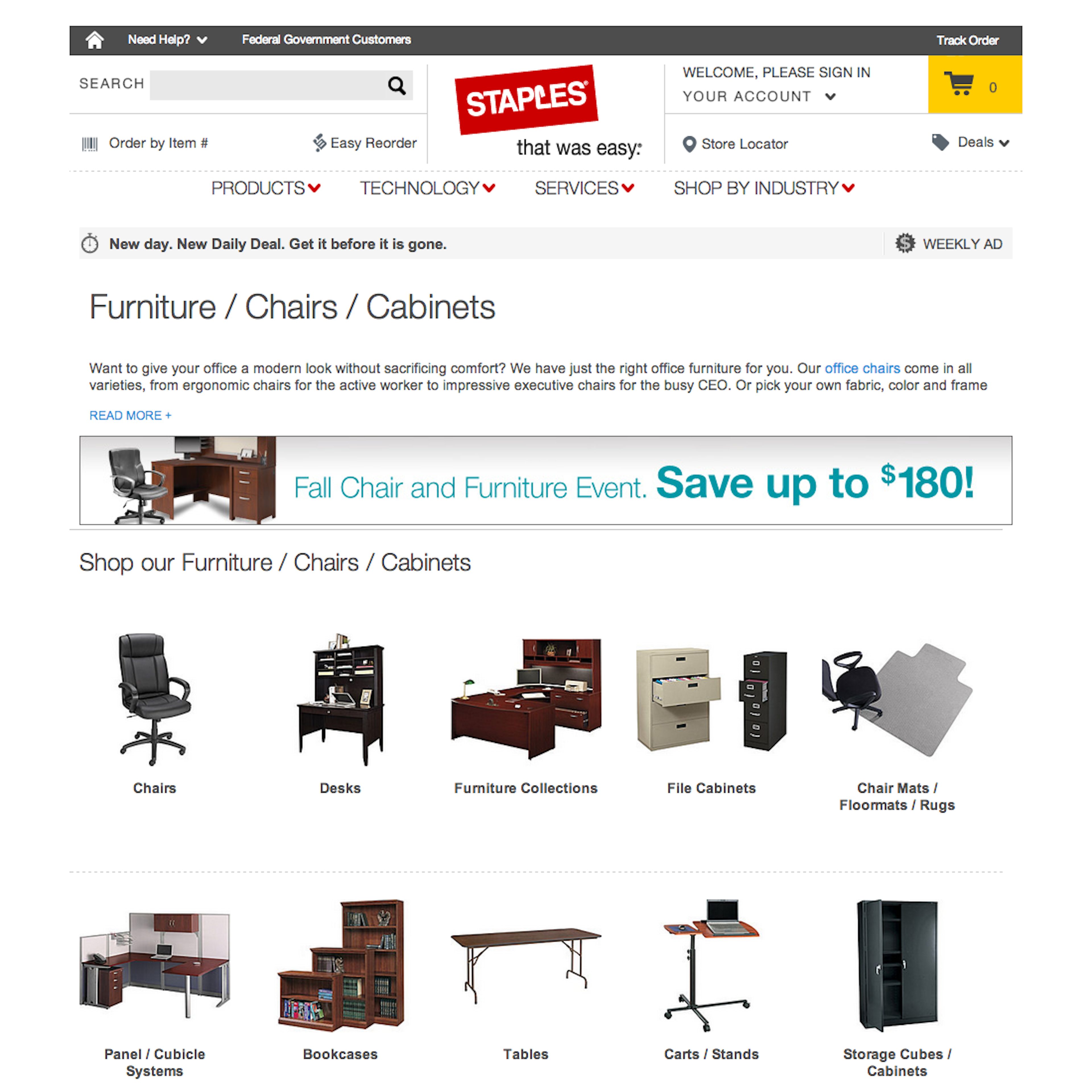
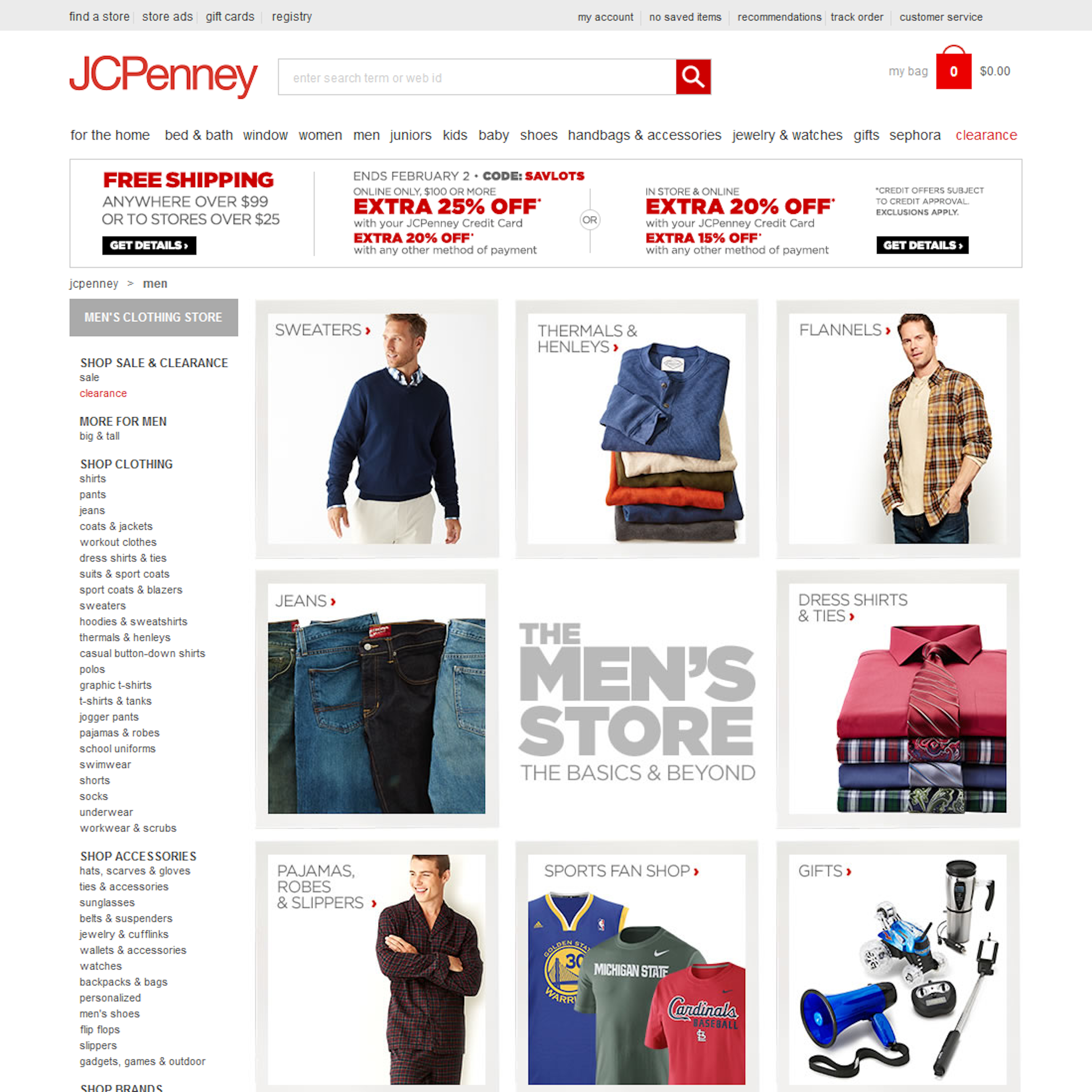
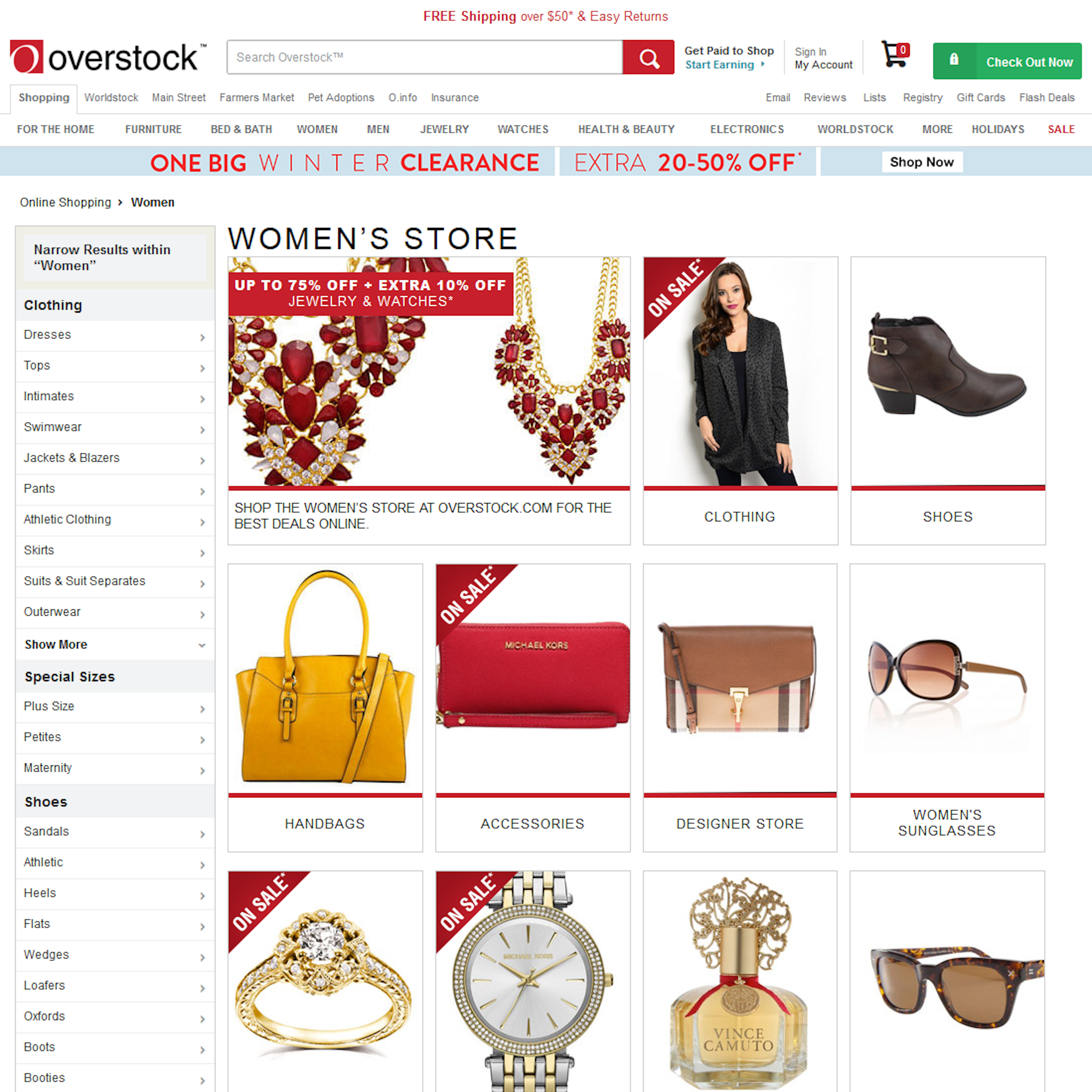
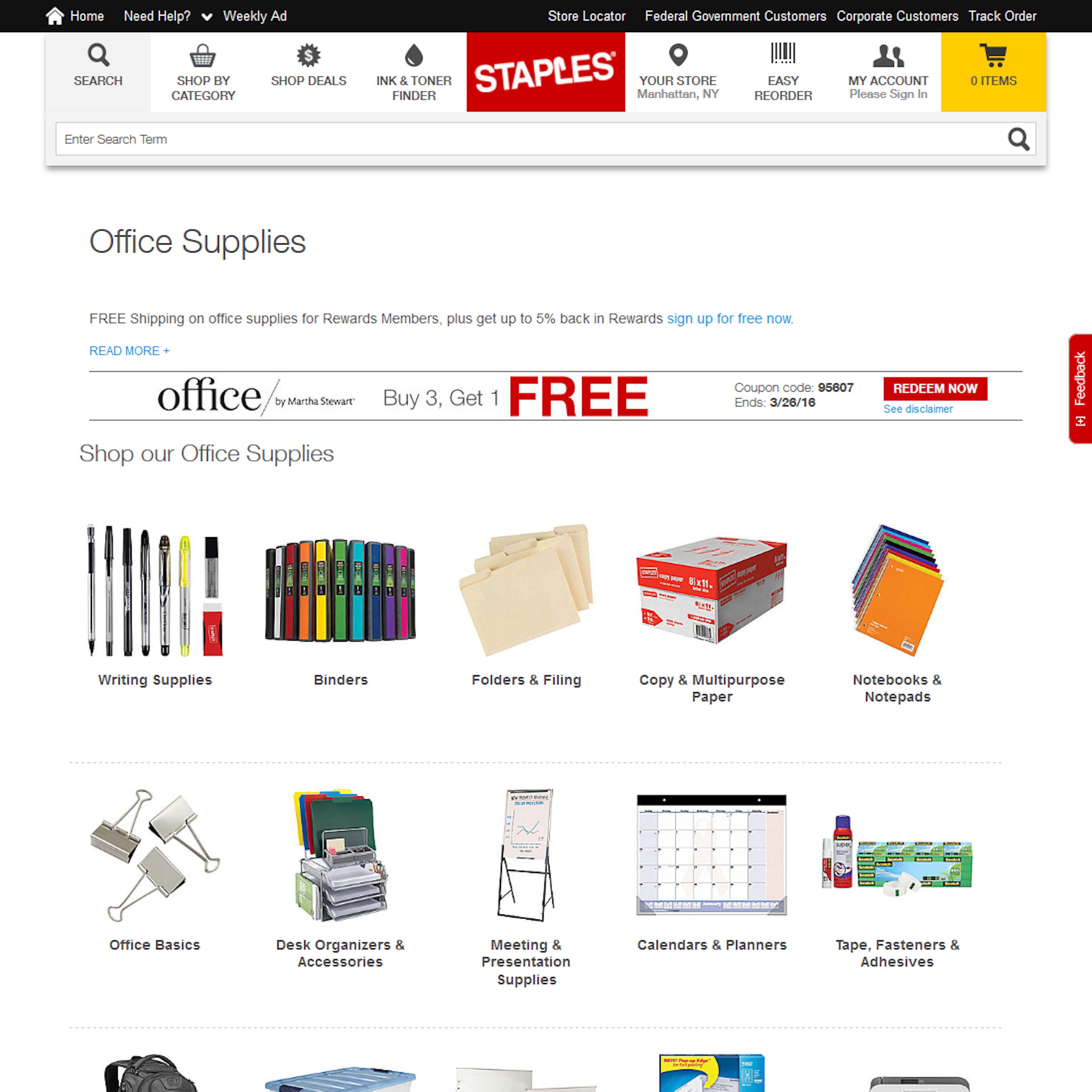
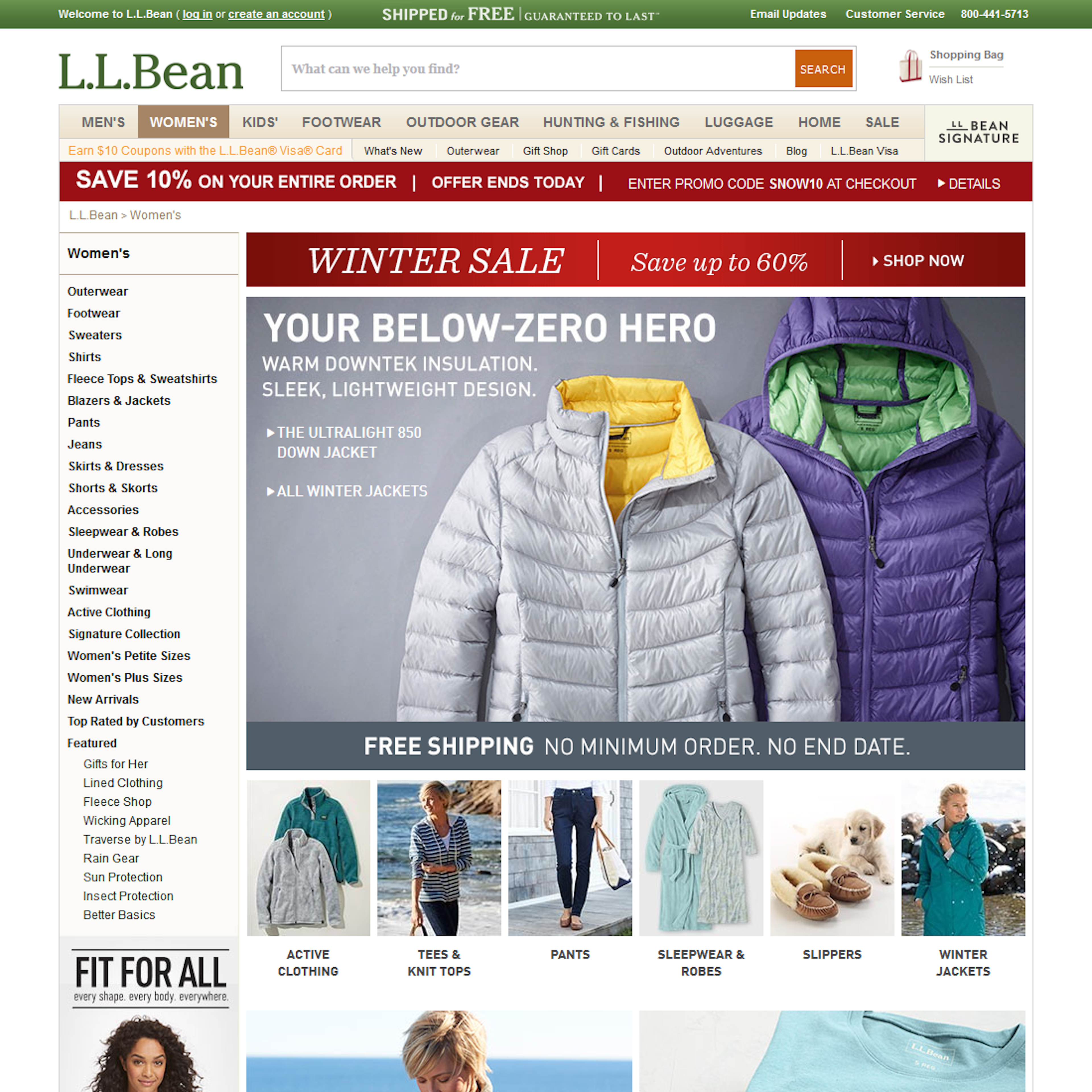
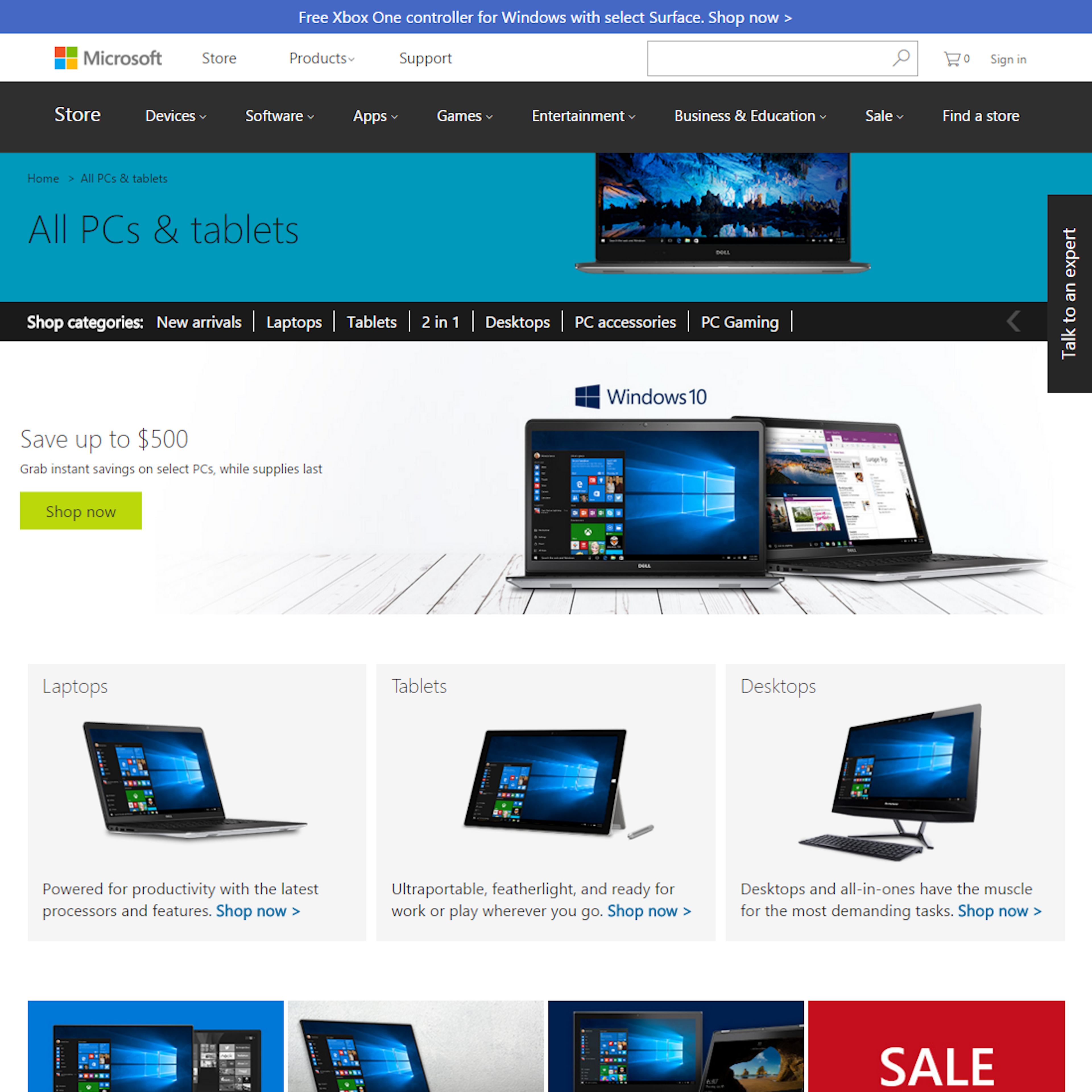
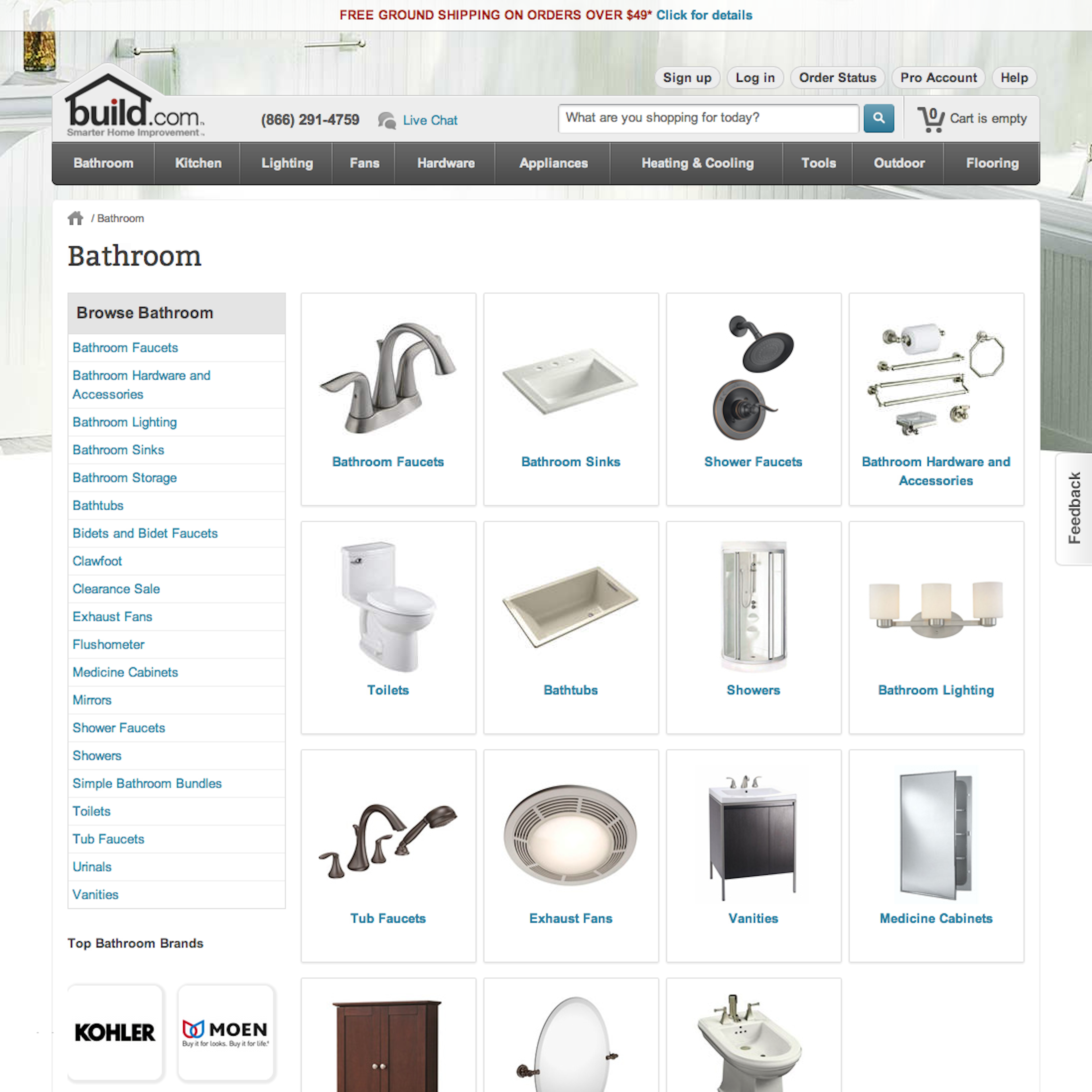
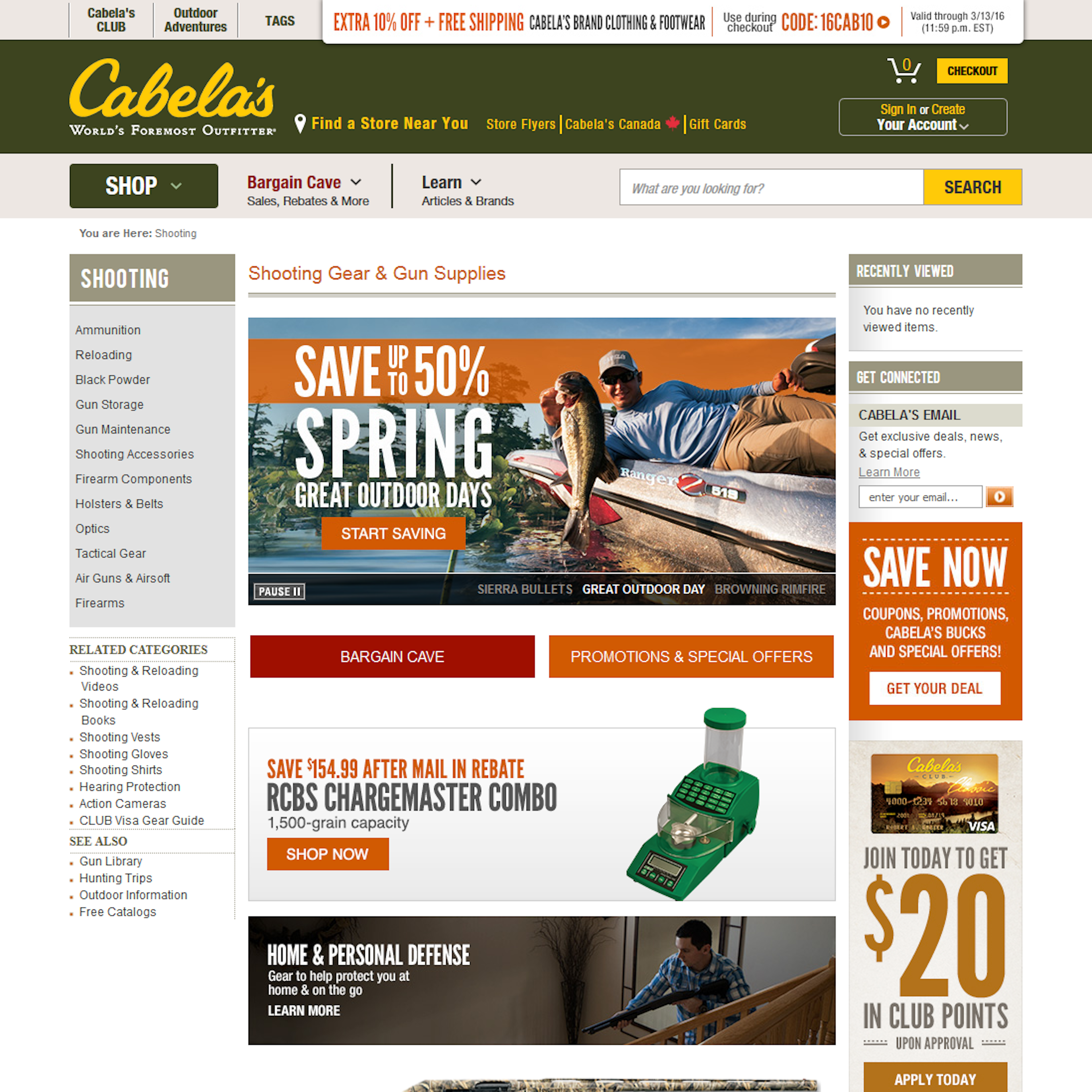
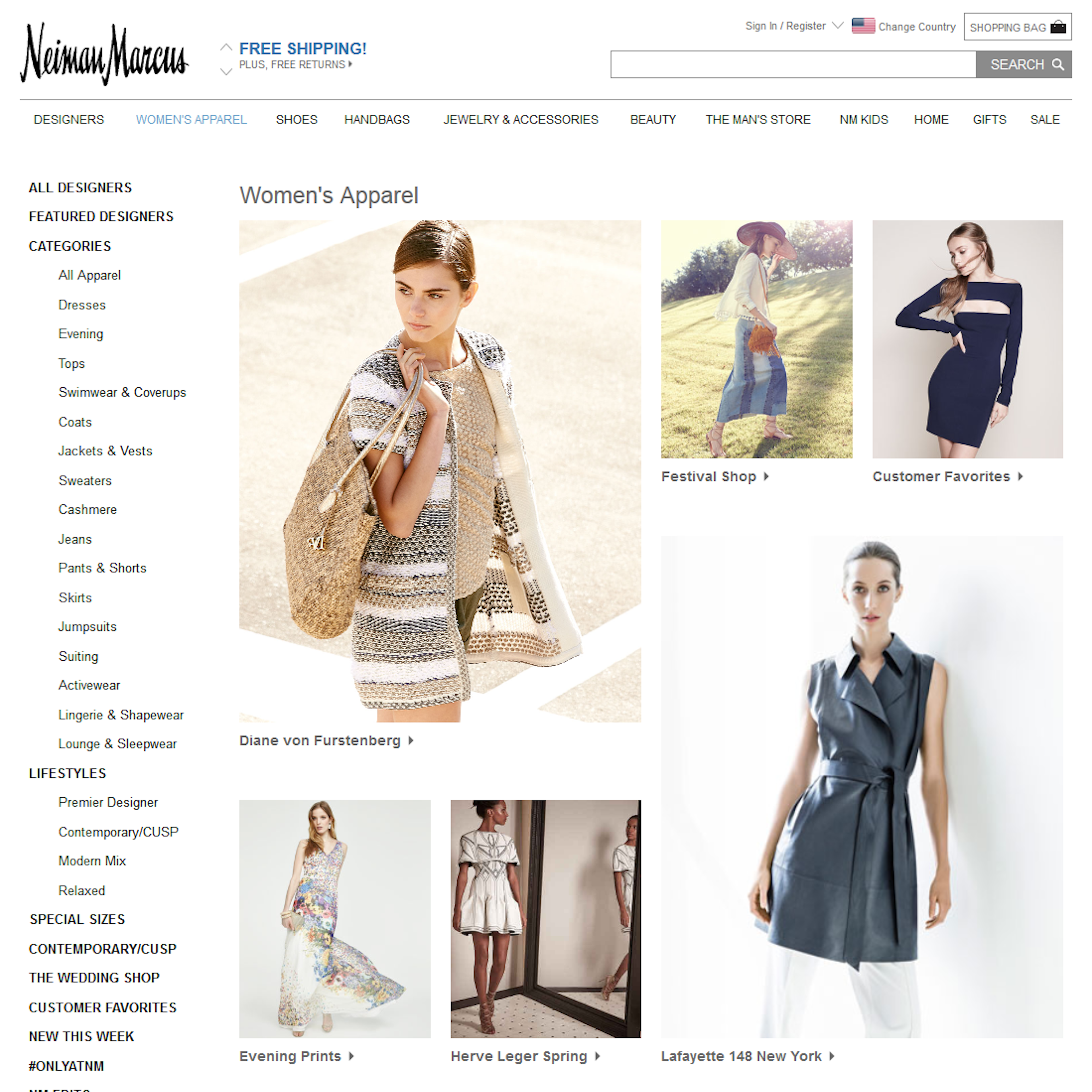
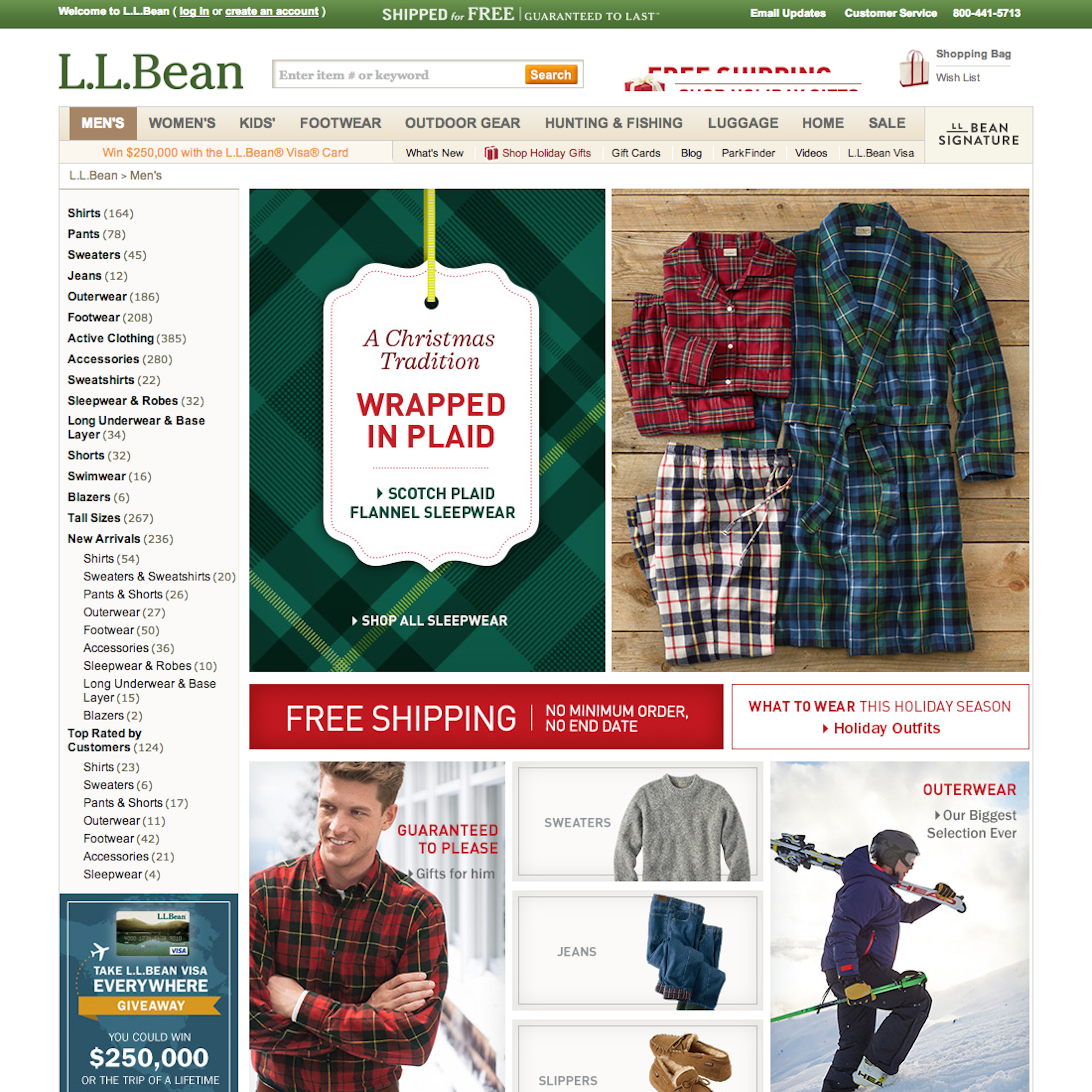
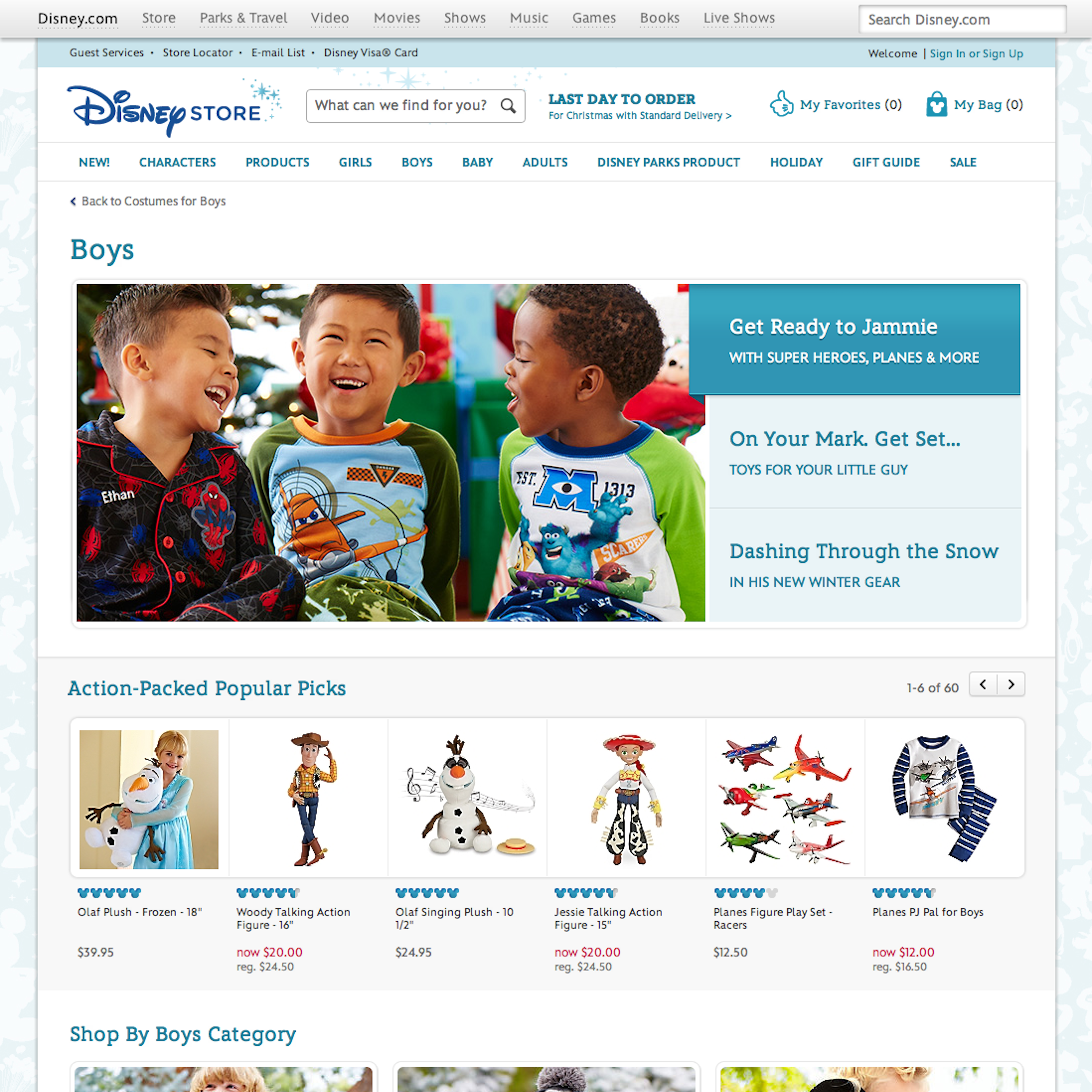
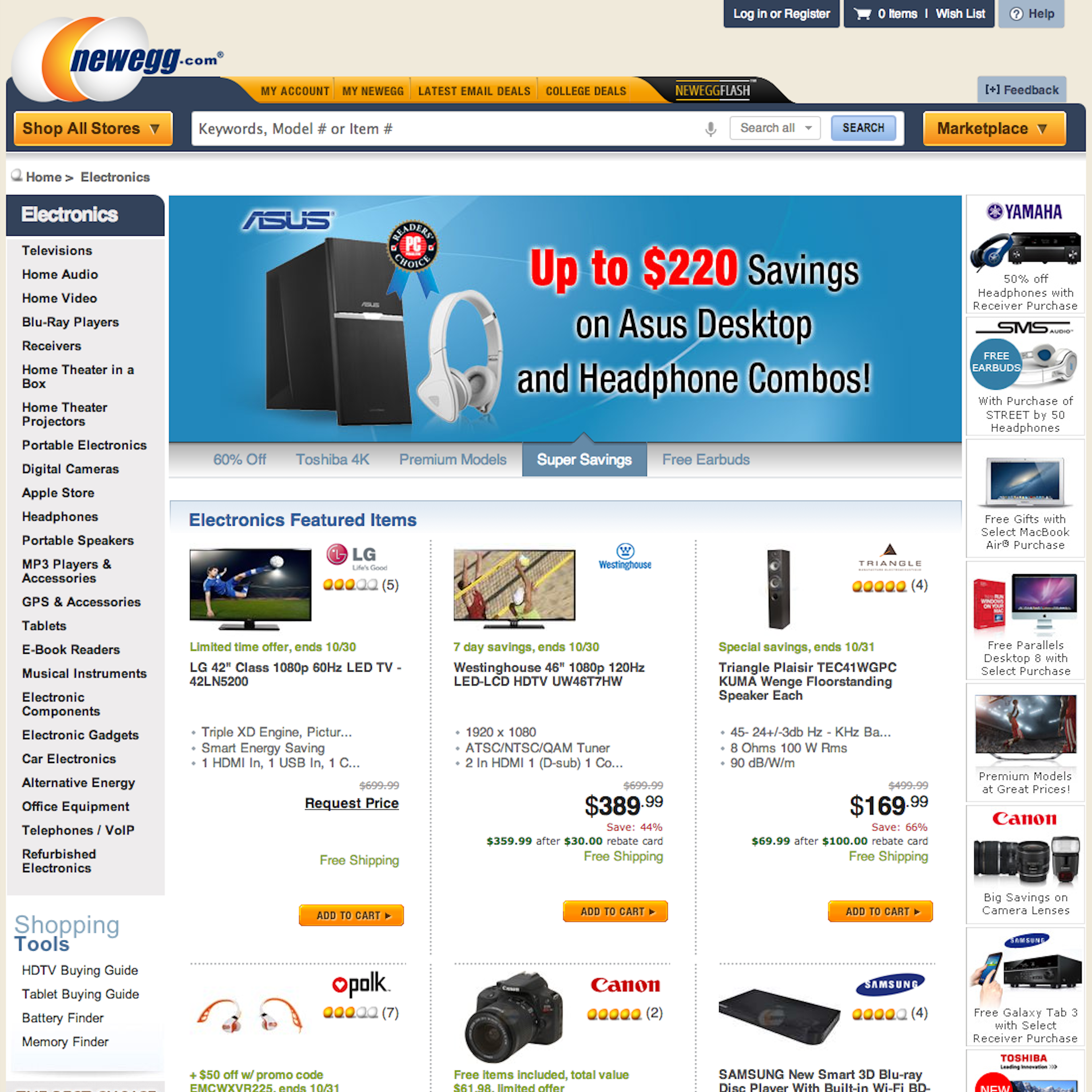
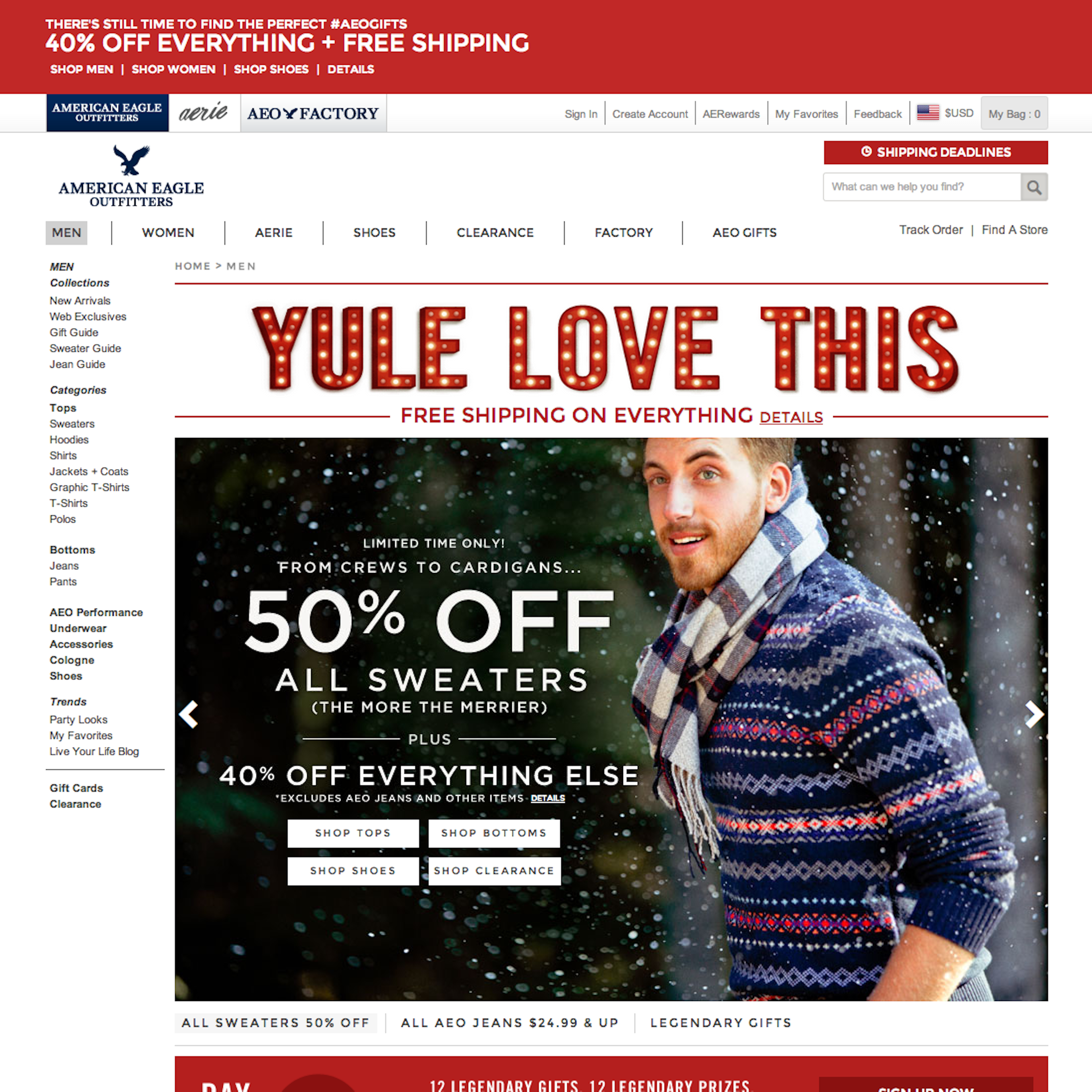
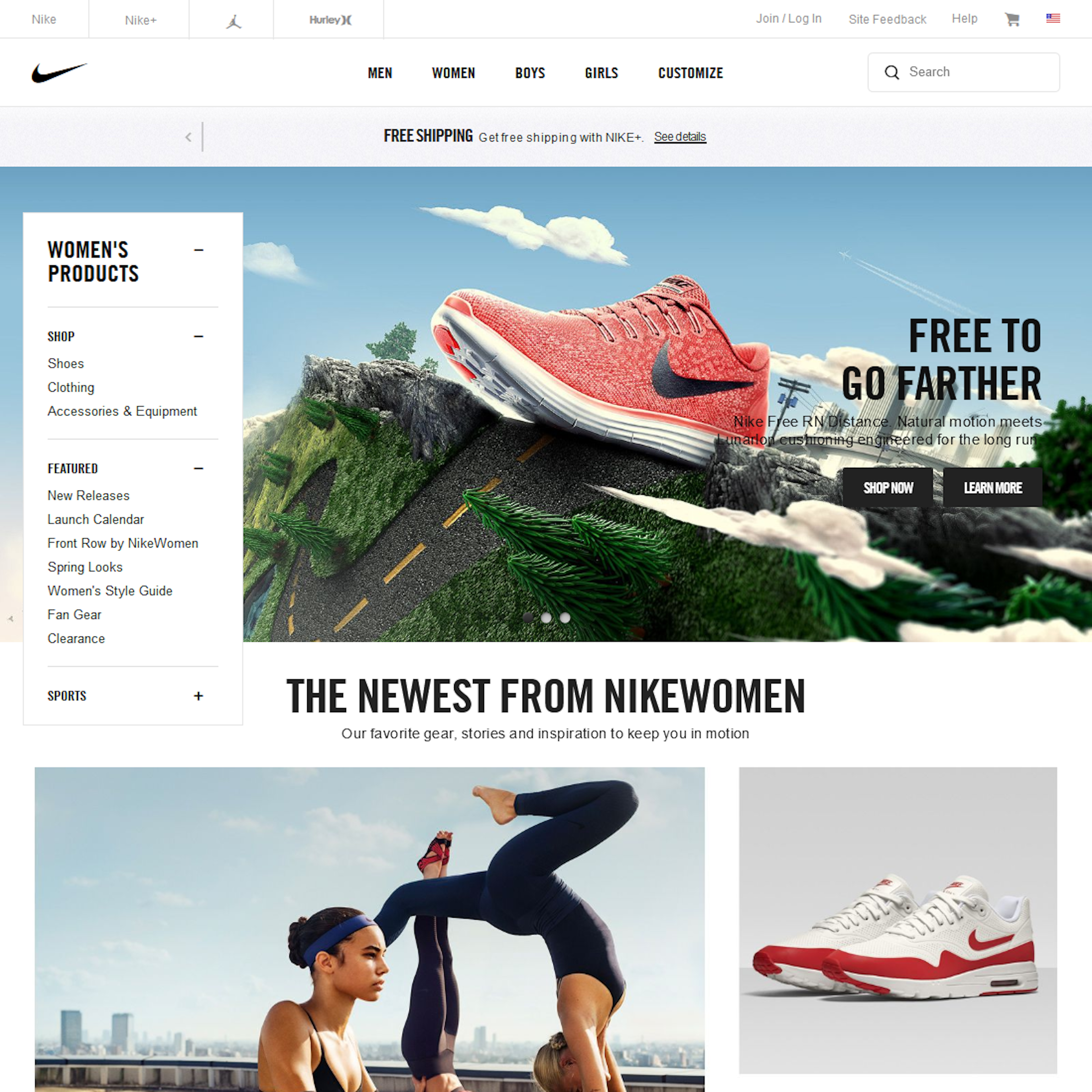
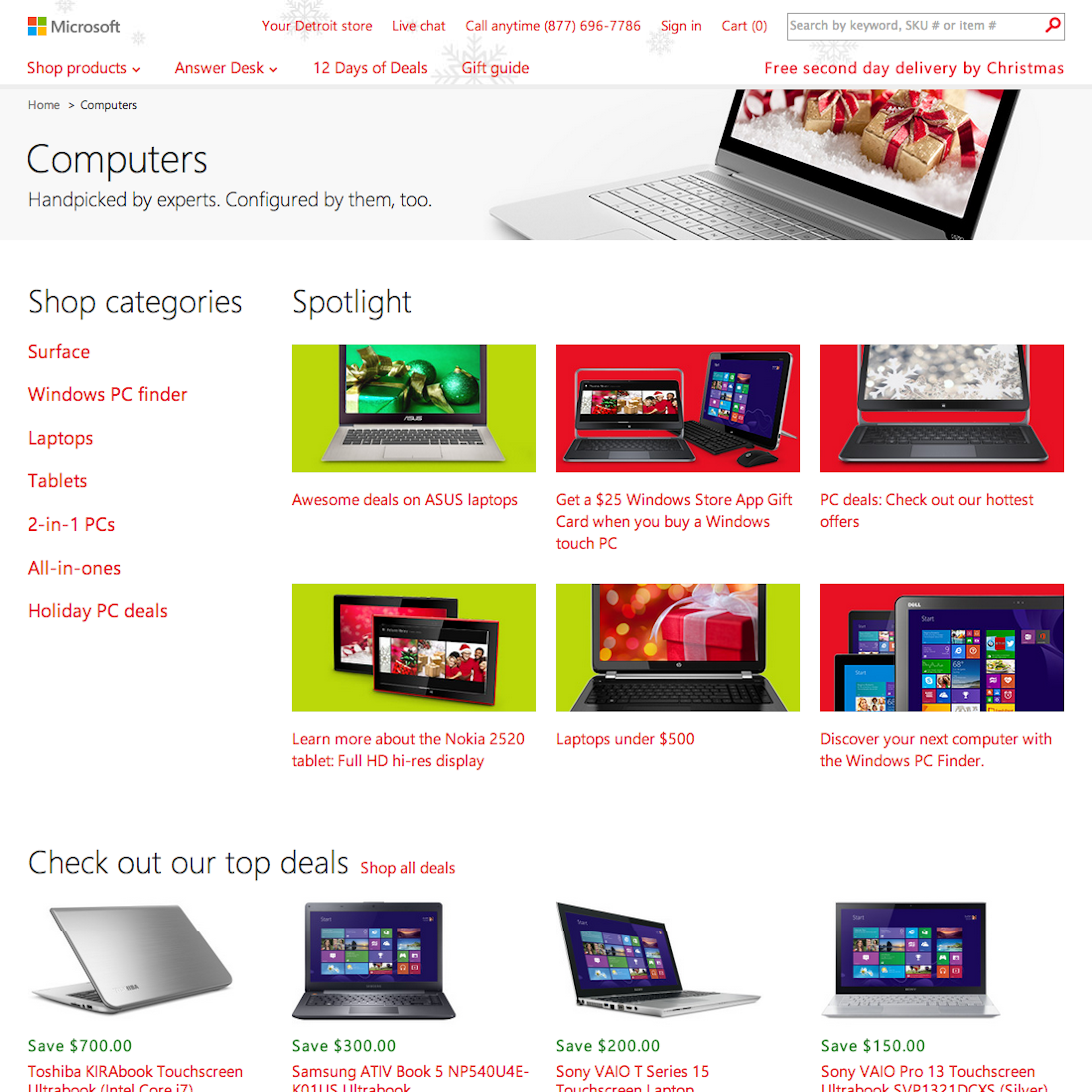
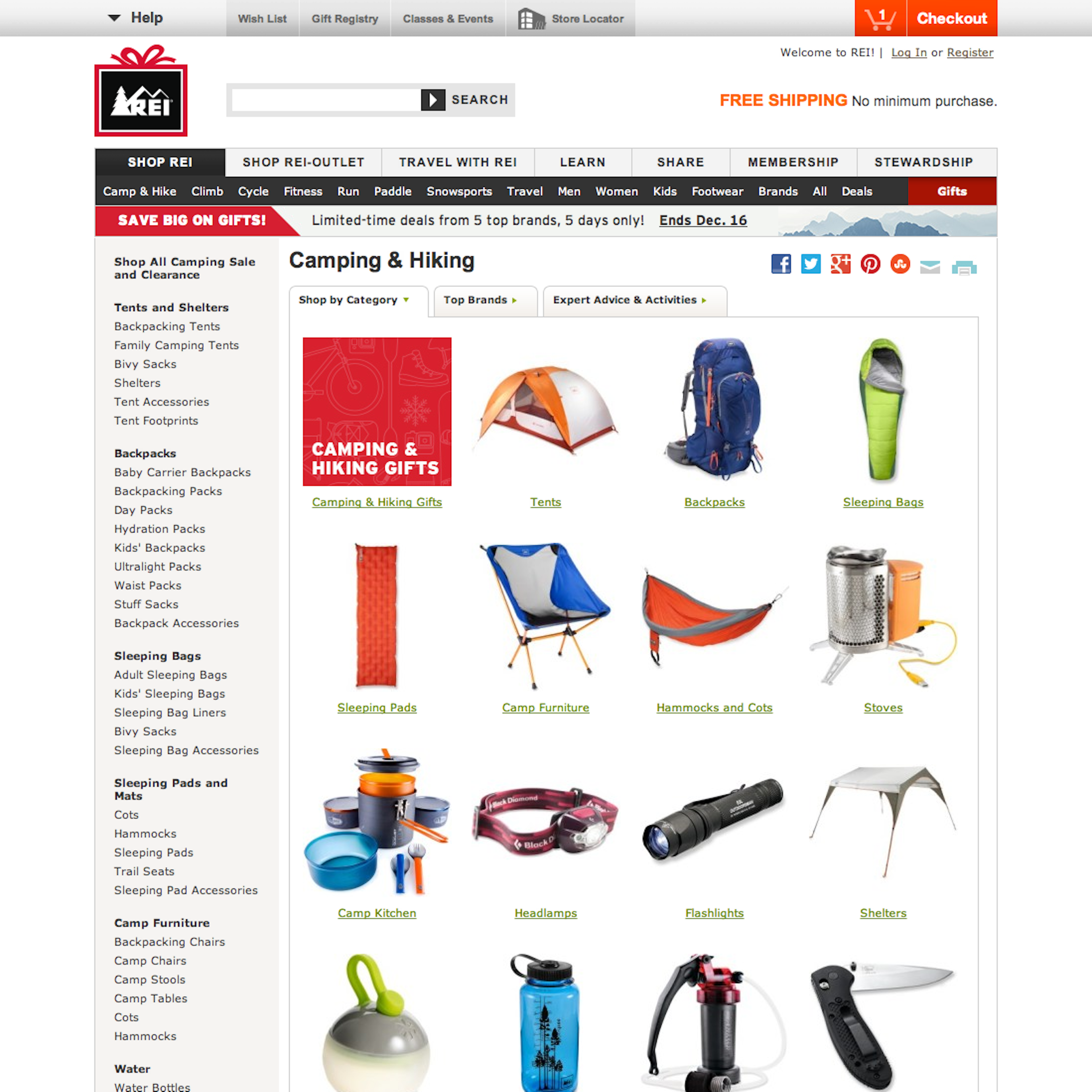
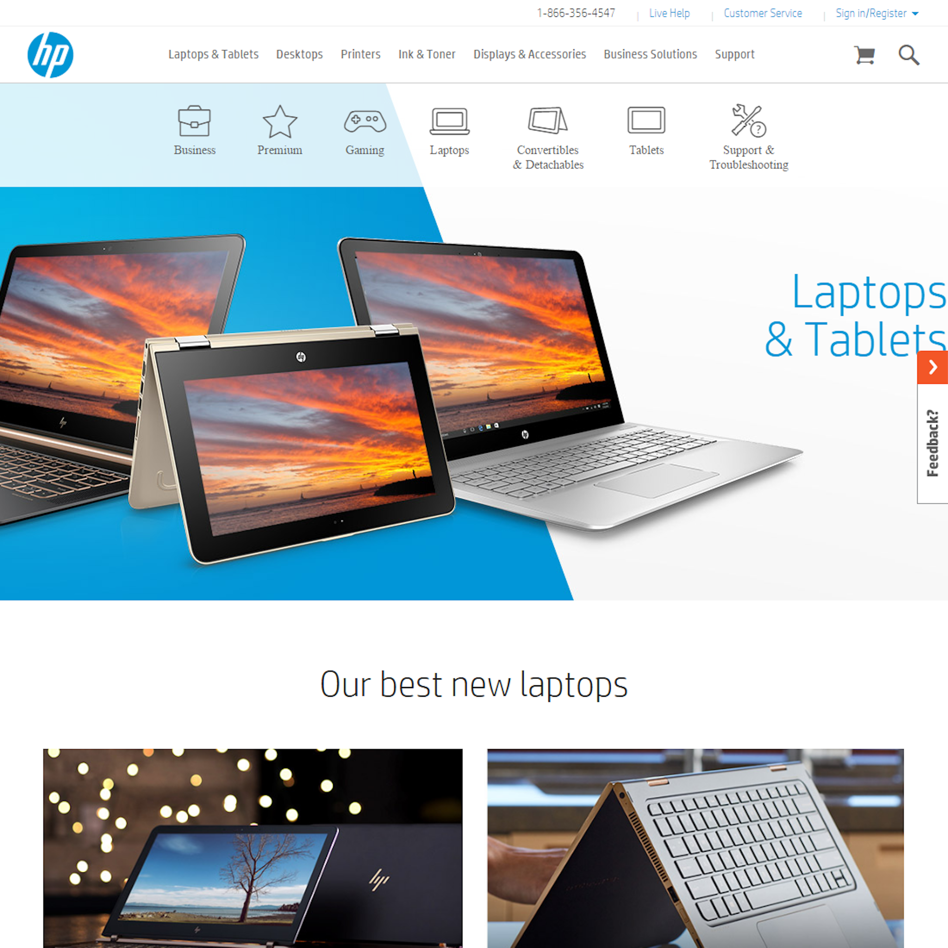
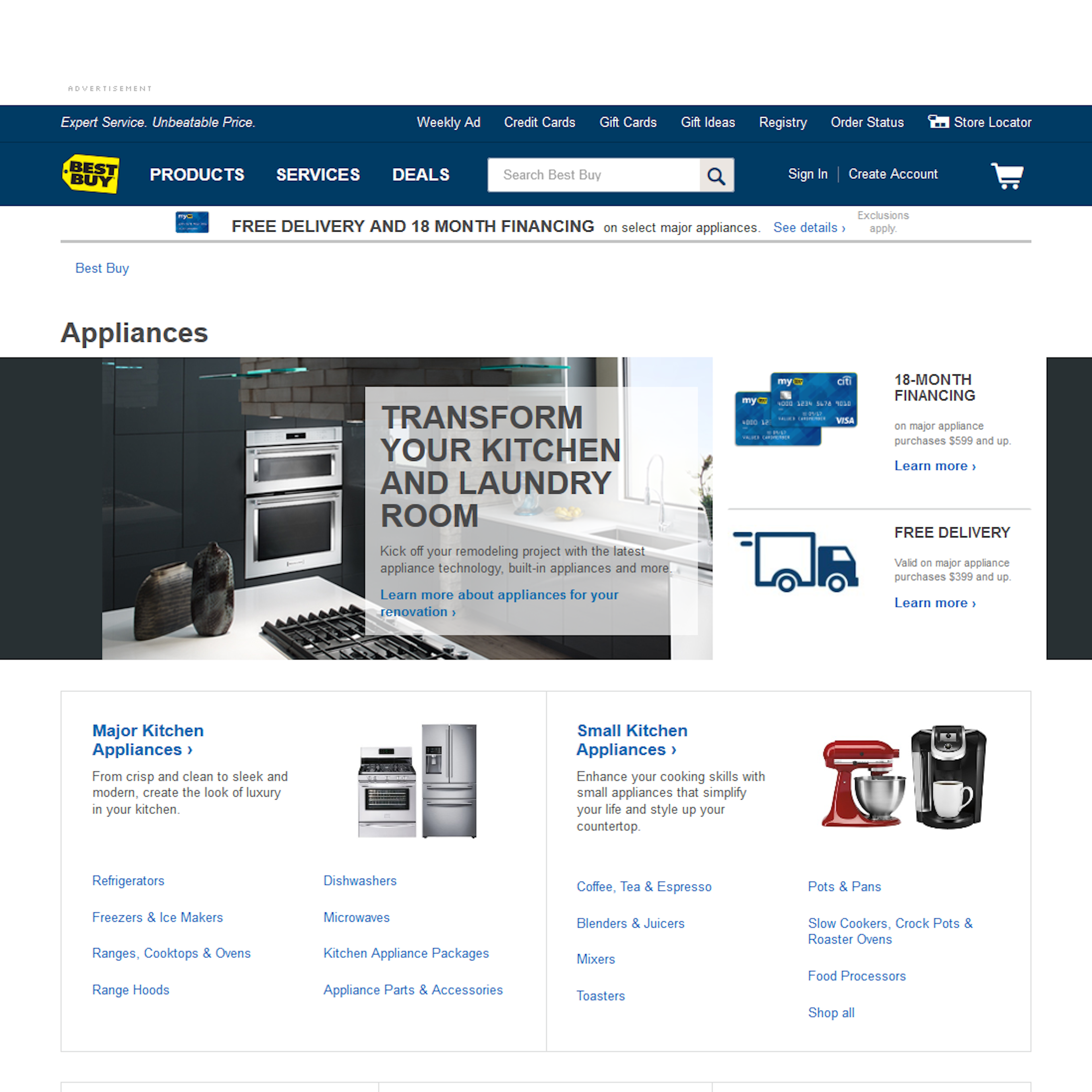
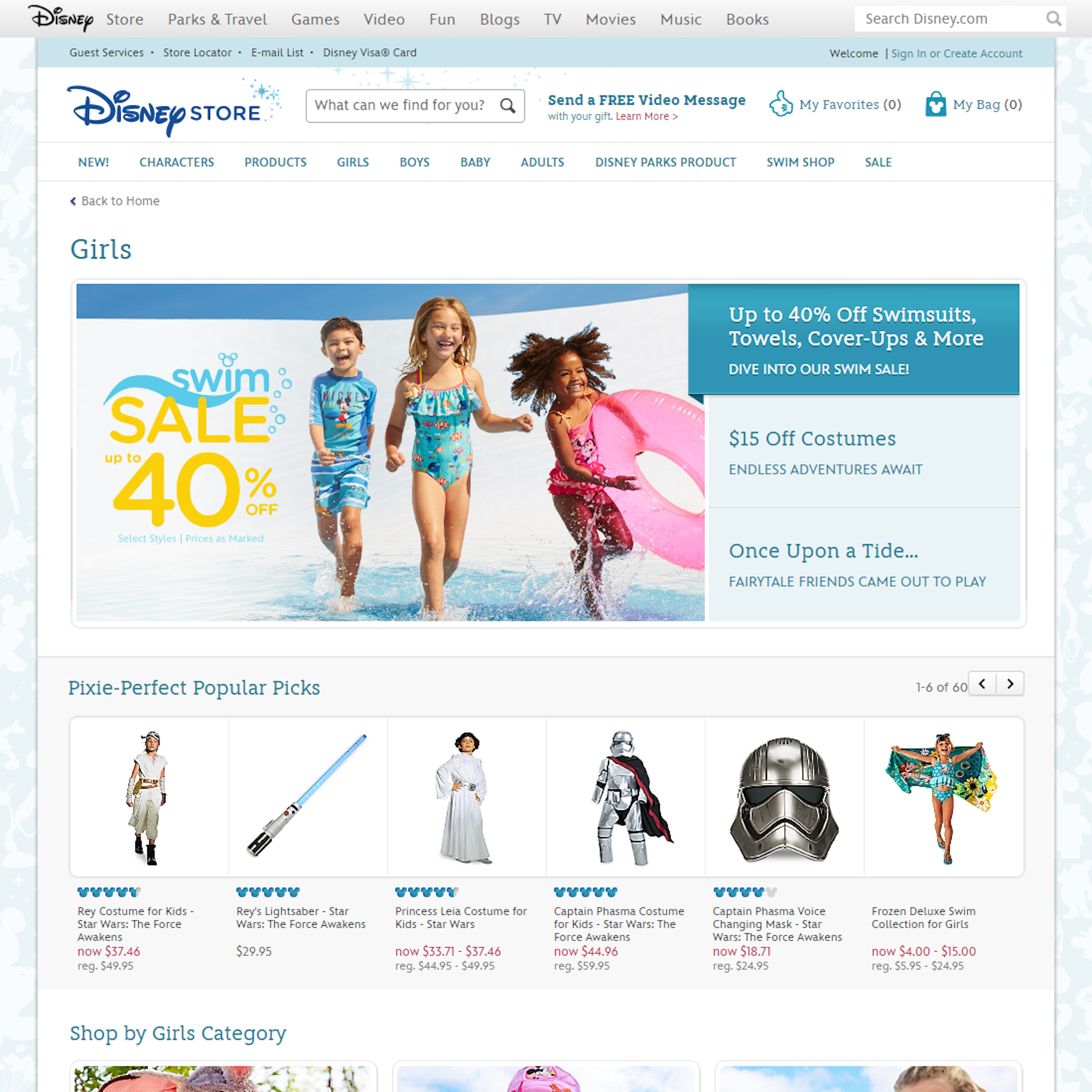
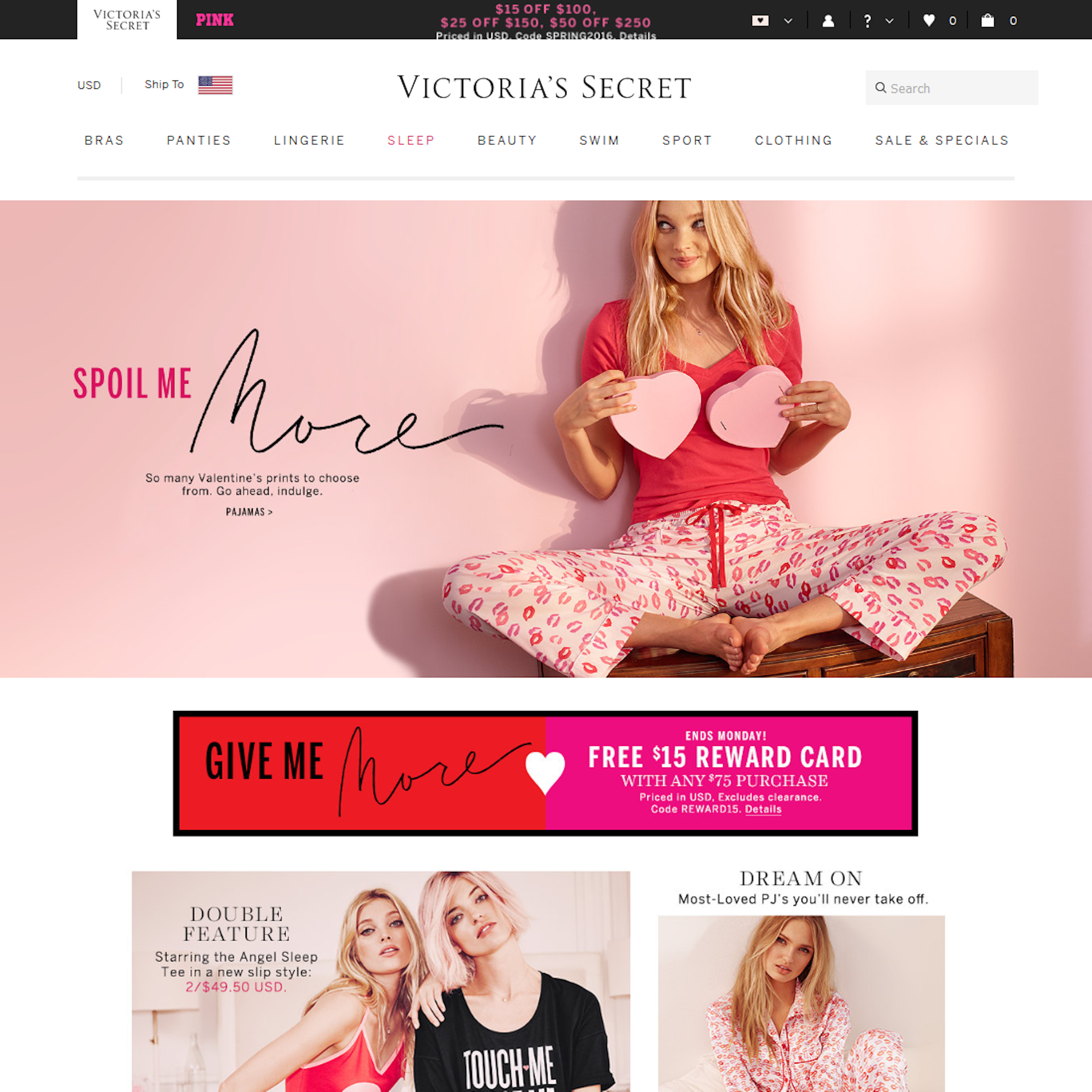
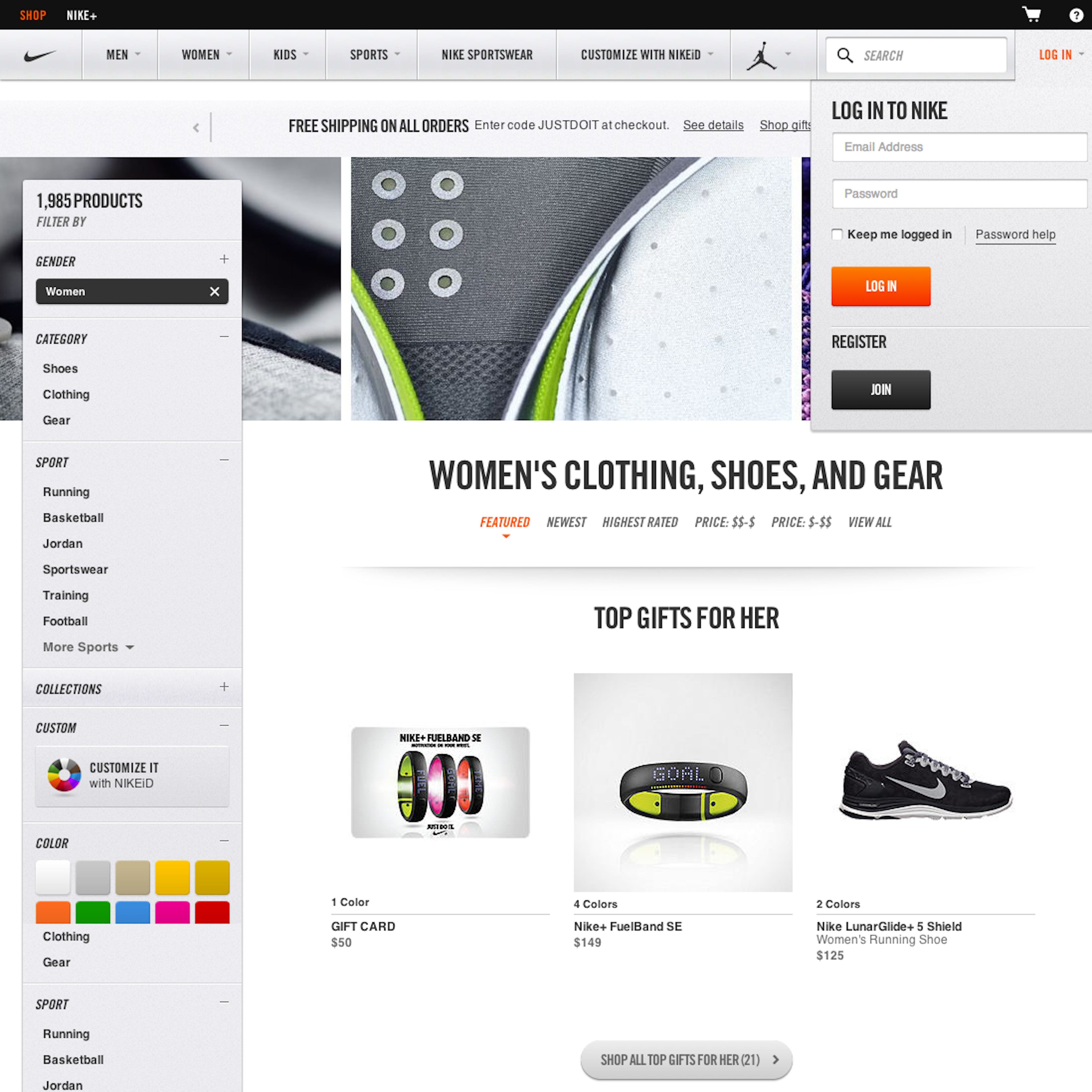
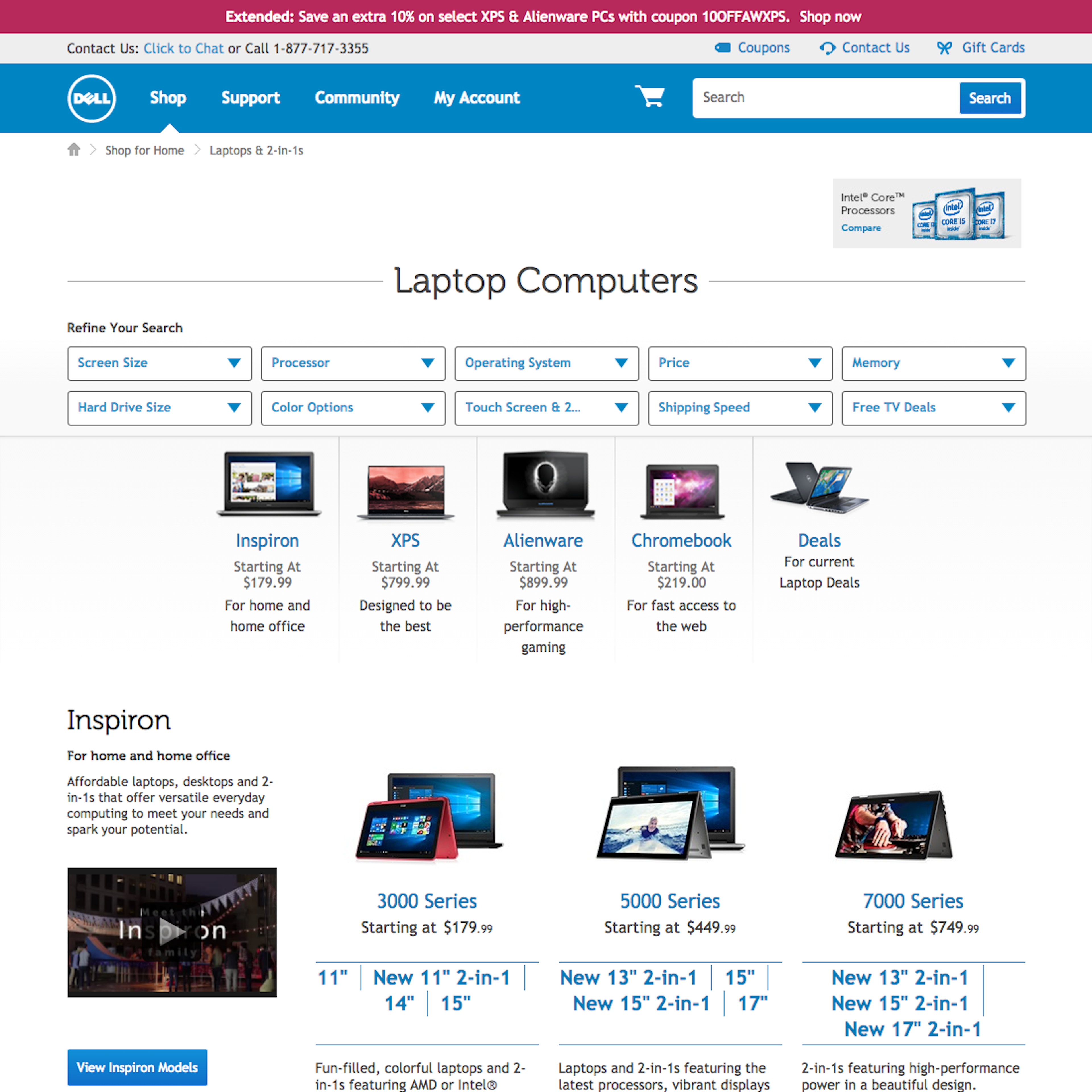
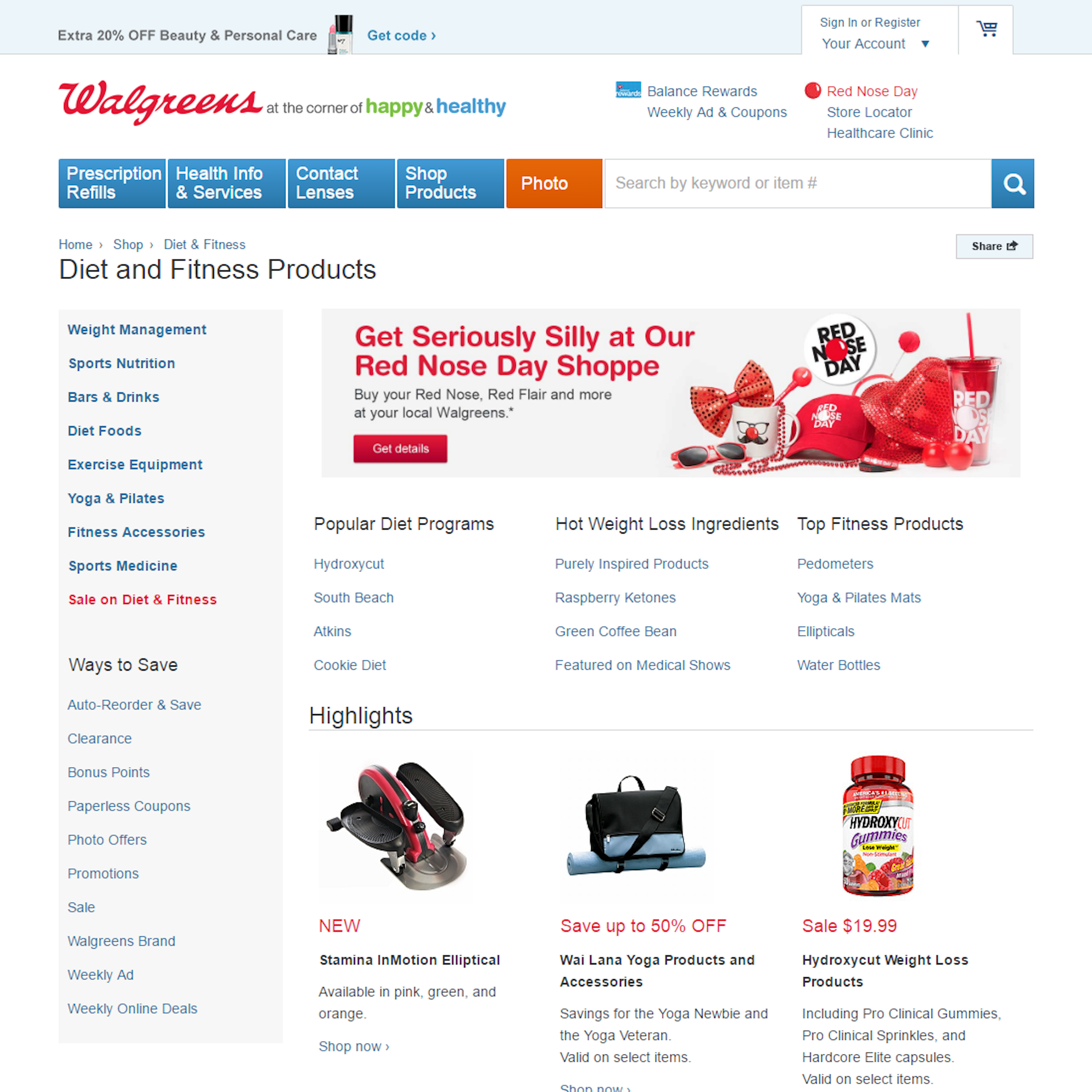
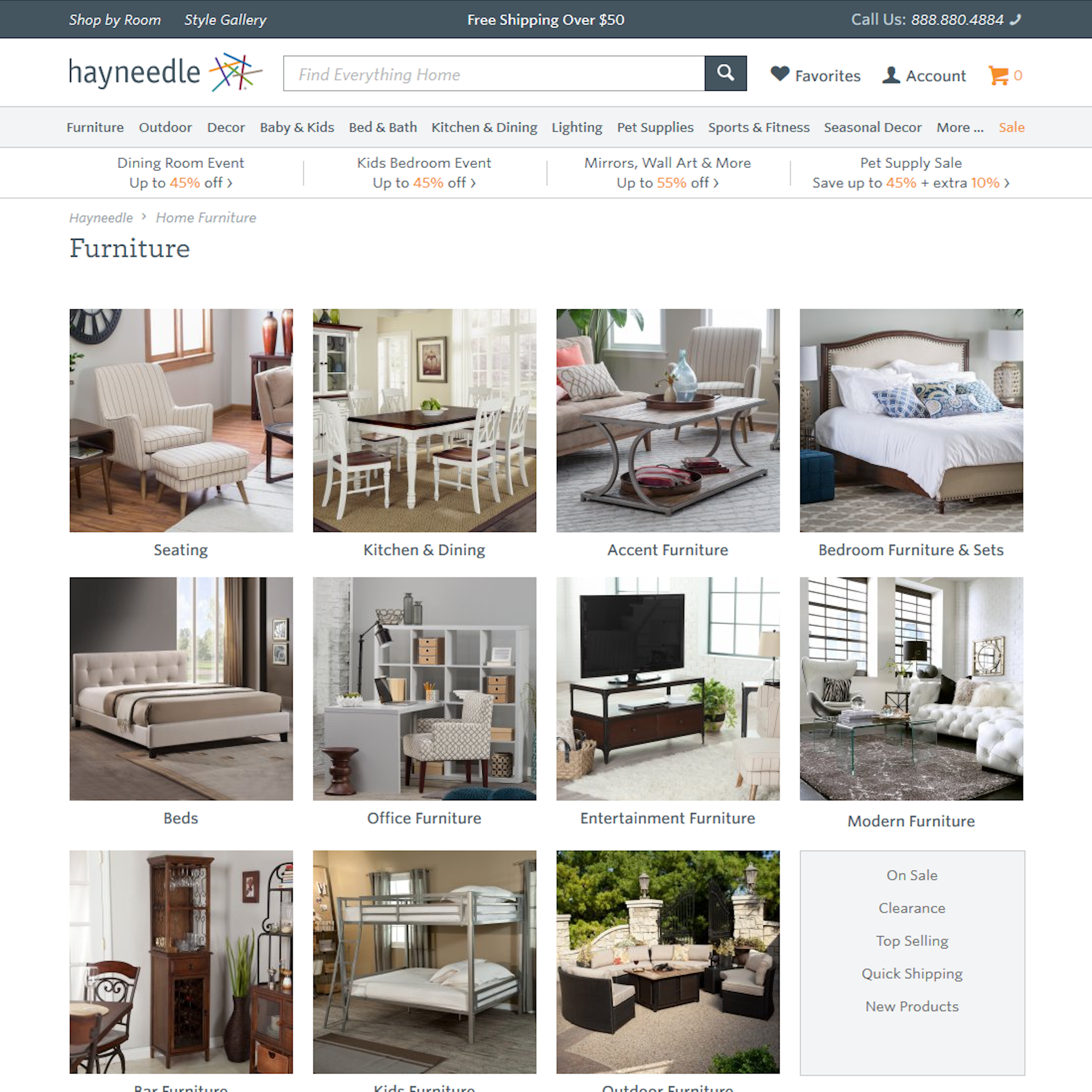
91 ‘Top-Level Navigation’ Design Examples
Also referred to as: Level 1 Category
What’s this? Here you’ll find 91 “Top-Level Navigation” full-page screenshots annotated with research-based UX insights, sourced from Baymard’s UX benchmark of 327 e-commerce sites. (Note: this is less than 1% of the full research catalog.)
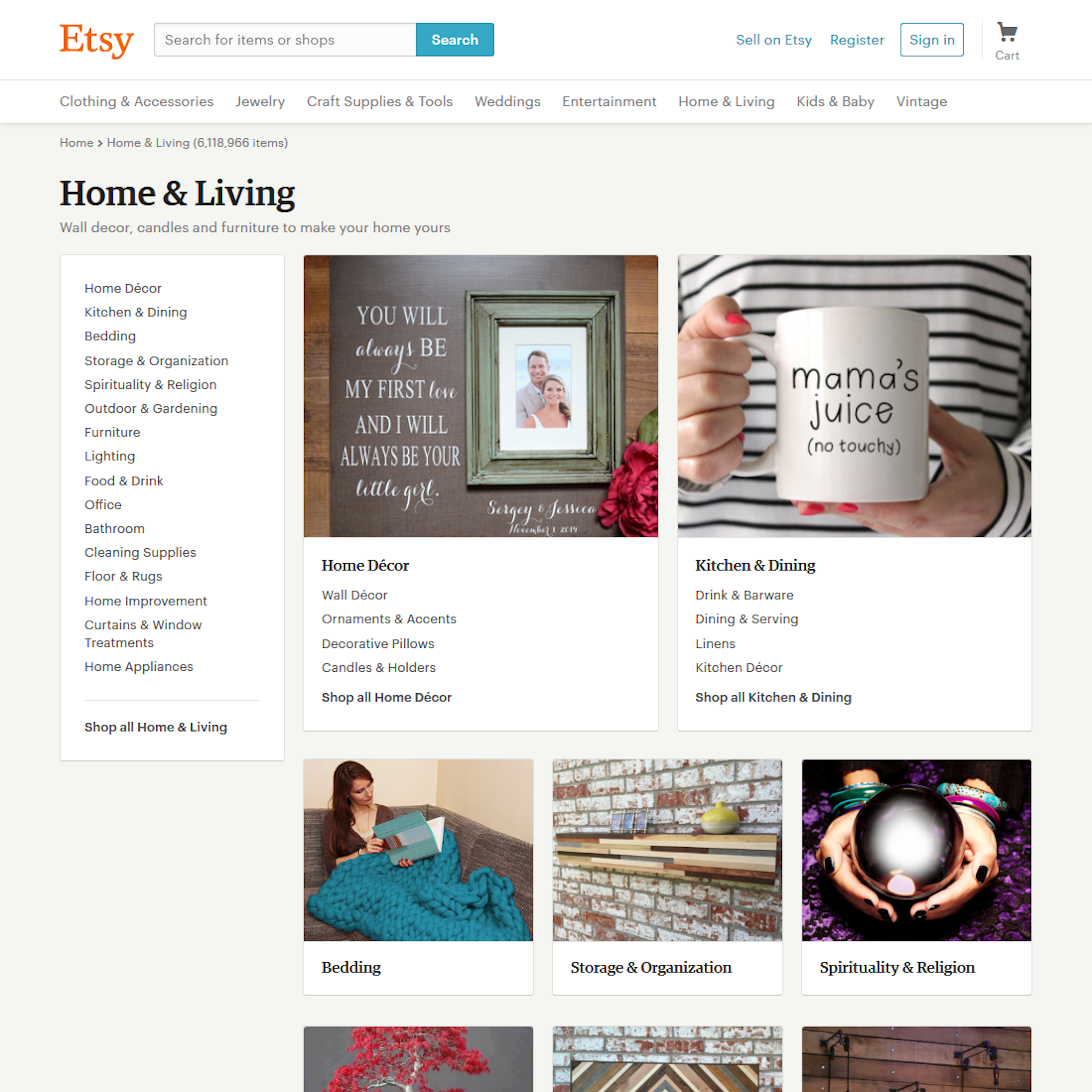
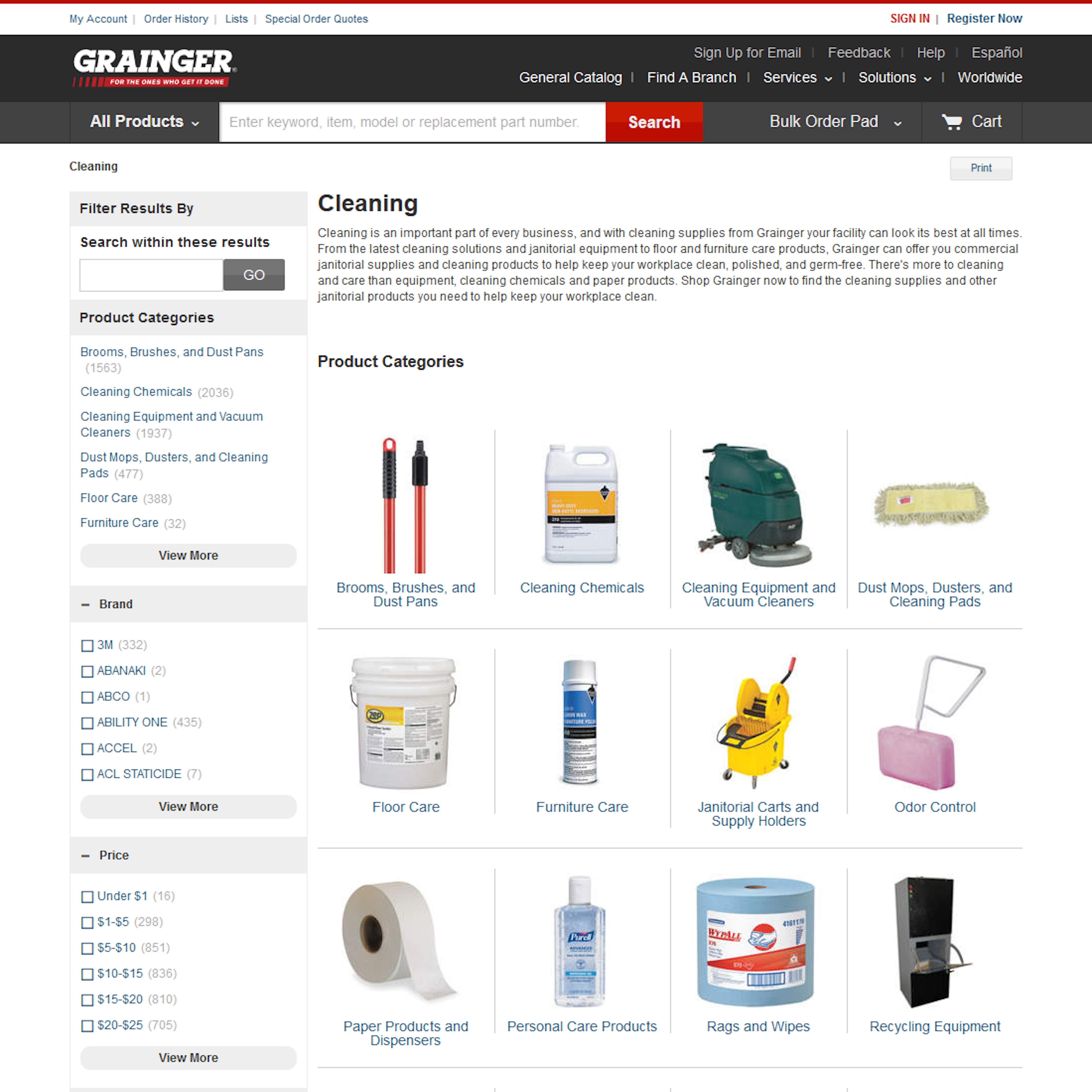
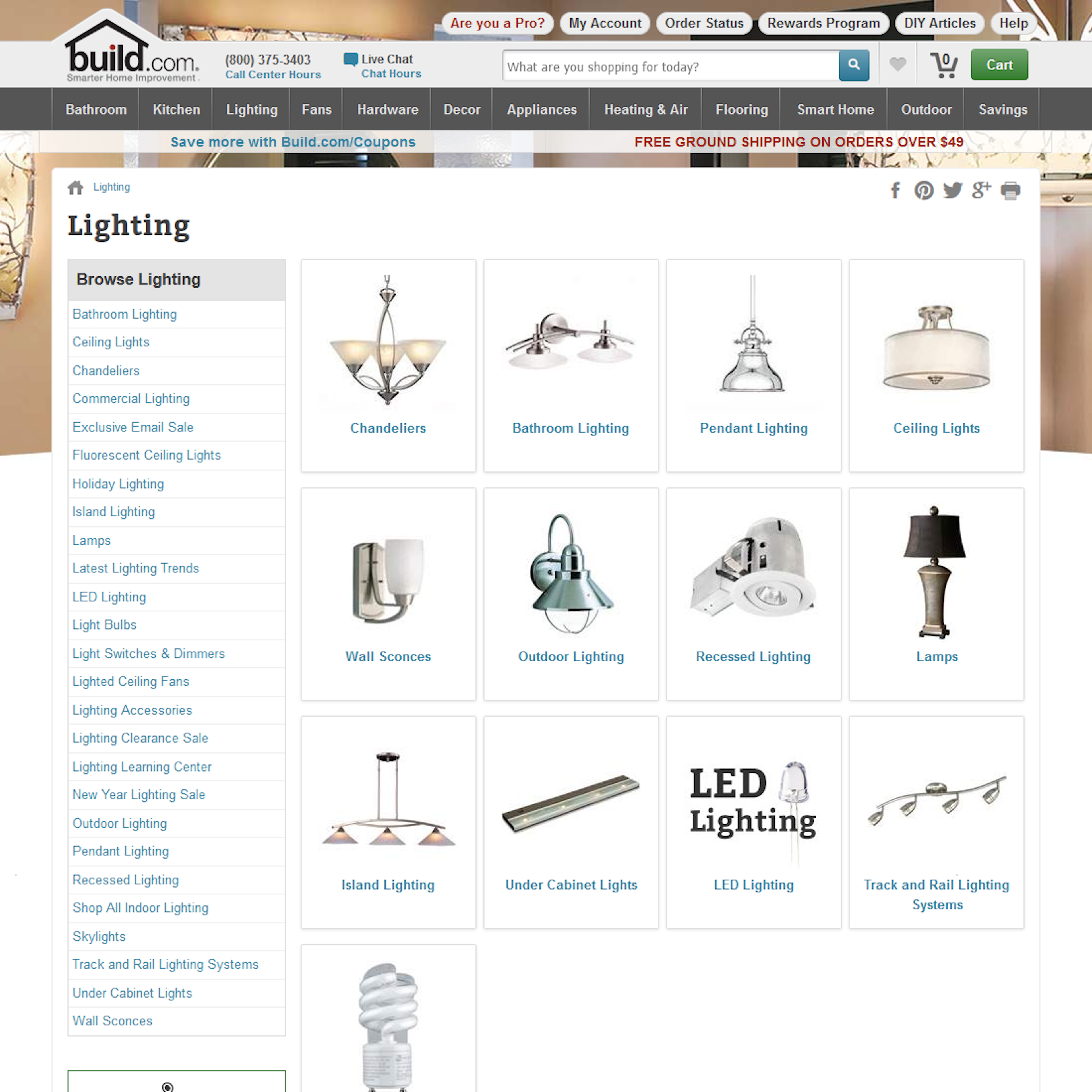
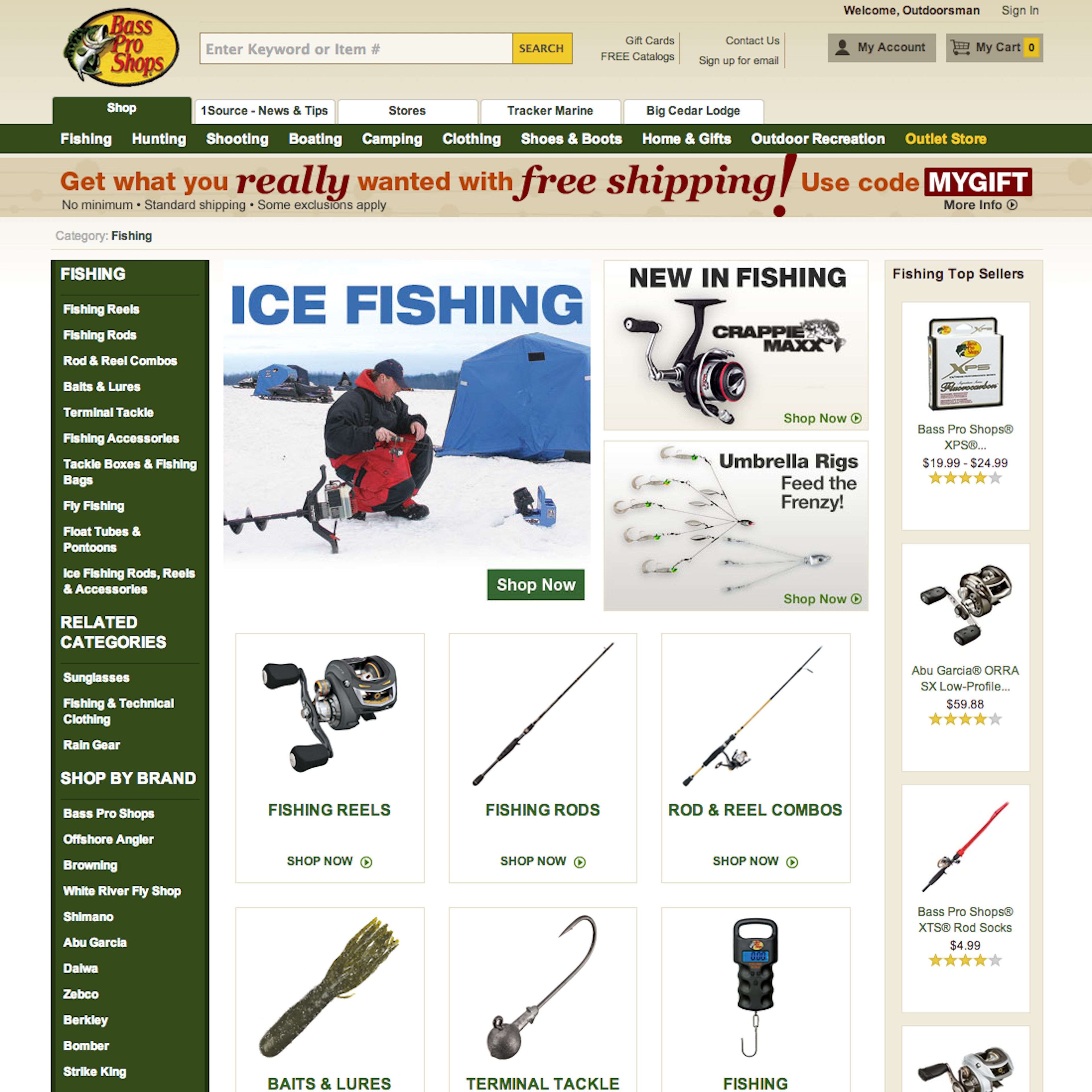
The Top-Level Navigation is the first layer of the product navigation, sometimes called a “Level 1 Category”, or just “L1”. Depending on the site context and site category taxonomy, this first level page should often be an Intermediary Category Page. You may also want to explore Main Drop-Down Navigation examples if you’d rather want to see the sites primary navigation.
More ‘Top-Level Navigation’ Insights
-
Learn More: Besides exploring the 91 “Top-Level Navigation” design examples below, you may also want to read our related articles on “E-Commerce Usability: The Main Navigation Should Display Product Categories (18% Don’t)” and “Over-Categorization: Avoid Implementing Product Types as Categories (54% Get It Wrong)”.
-
Get Full Access: To see all of Baymard’s homepage and category navigation research findings you’ll need Baymard Premium access. (Premium also provides you full access to 200,000+ hours of UX research findings, 750+ e-commerce UX guidelines, and 77,800+ UX performance scores.)


User Experience Research, Delivered Weekly
Join 60,000+ UX professionals and get a new UX article every week.

User Experience Research, Delivered Weekly
Join 60,000+ UX professionals and get a new UX article every week.
Explore Other Research Content
300+ free UX articles based on large-scale research.

327 top sites ranked by UX performance.

Code samples, demos, and key stats for usability.