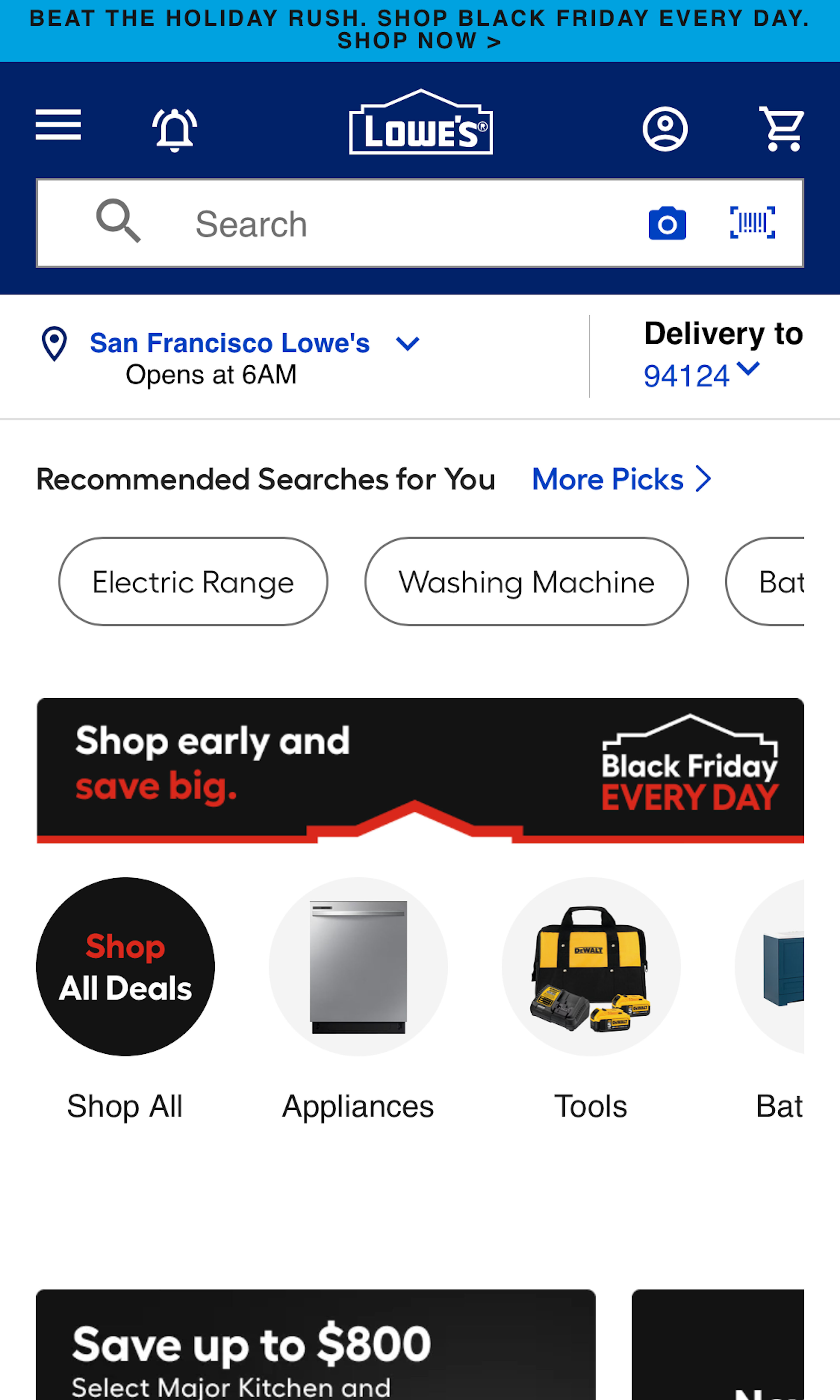
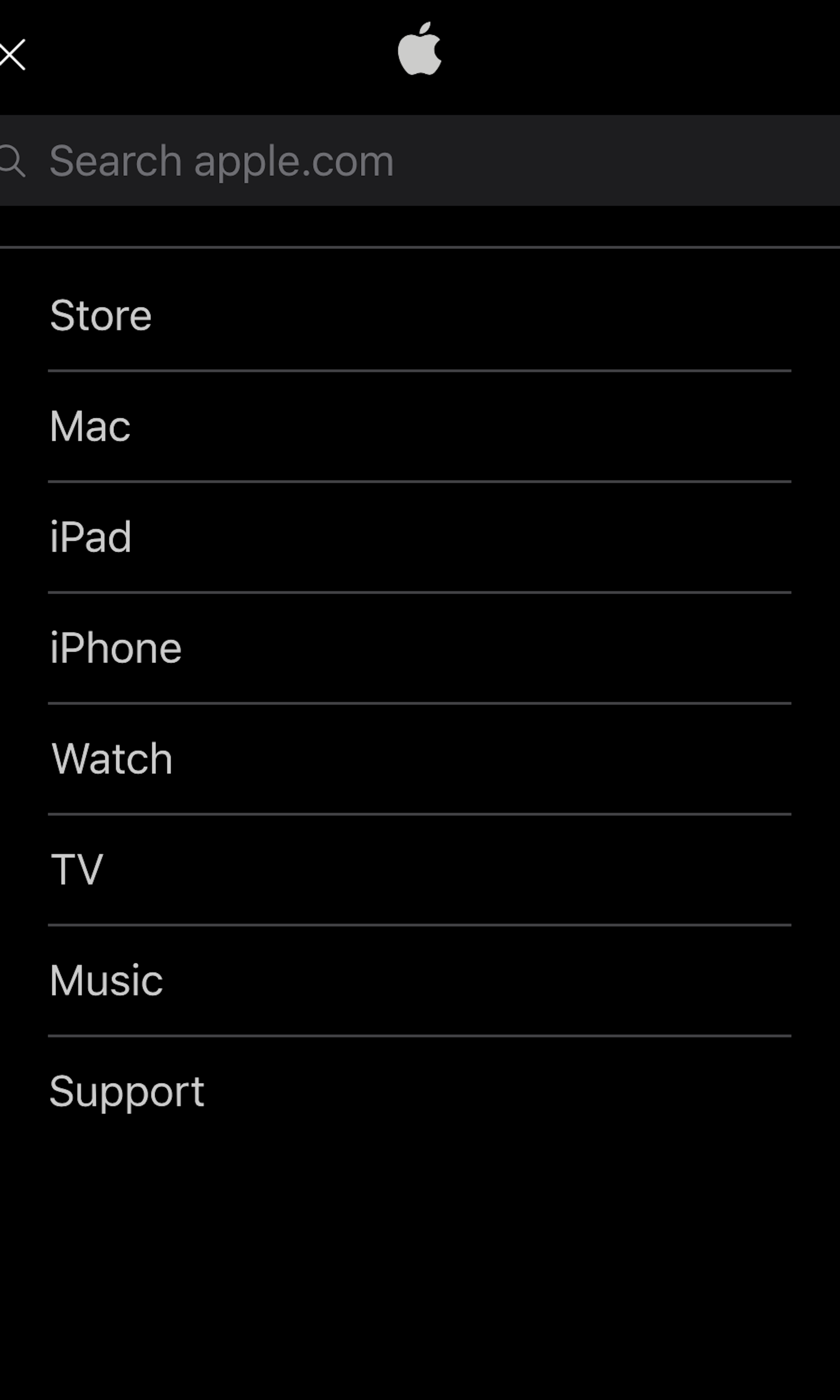
What’s this? Here you’ll find 500 “Mobile: Search Field” full-page screenshots annotated with research-based UX insights, sourced from Baymard’s UX benchmark of 93 ecommerce sites. (Note: this is less than 1% of the full research catalog.)
In testing we observe that the design of the search field itself directly alters if and how users search on an ecommerce site. The design of the search field often differs significantly on the mobile site, compared to the desktop site. On mobile sites the search field is often collapsed behind a search icon or located within the mobile ‘hamburger’ main menu, whereas on desktop the search field is typically directly visible in the page header.
More ‘Search Field’ Insights
-
Desktop Examples: Besides the mobile examples below, we also have 170+ desktop examples of Search Field implementations.
-
Learn More: Besides exploring the 94 mobile “Search Field” design examples below, you may also want to read our related article “Allow Mobile Users to ‘Search Within’ Their Current Category - 94% Don’t”.
-
Get Full Access: To see all of Baymard’s 351 mobile research findings you’ll need Baymard Premium access. (Premium also provides you full access to 200,000+ hours of UX research findings, 650+ ecommerce UX guidelines, and 275,000+ UX performance scores.))
User Experience Research, Delivered Weekly
Join 60,000+ UX professionals and get a new UX article every week.

User Experience Research, Delivered Weekly
Join 60,000+ UX professionals and get a new UX article every week.

Explore Other Research Content

300+ free UX articles based on large-scale research.

327 top sites ranked by UX performance.

Code samples, demos, and key stats for usability.


