
729 ‘User Reviews Section’ Design Examples
Also referred to as: User Ratings, Customer Reviews, Product Reviews
What’s this? Here you’ll find 729 “User Reviews Section” full-page screenshots annotated with research-based UX insights, sourced from Baymard’s UX benchmark of 327 e-commerce sites. (Note: this is less than 1% of the full research catalog.)
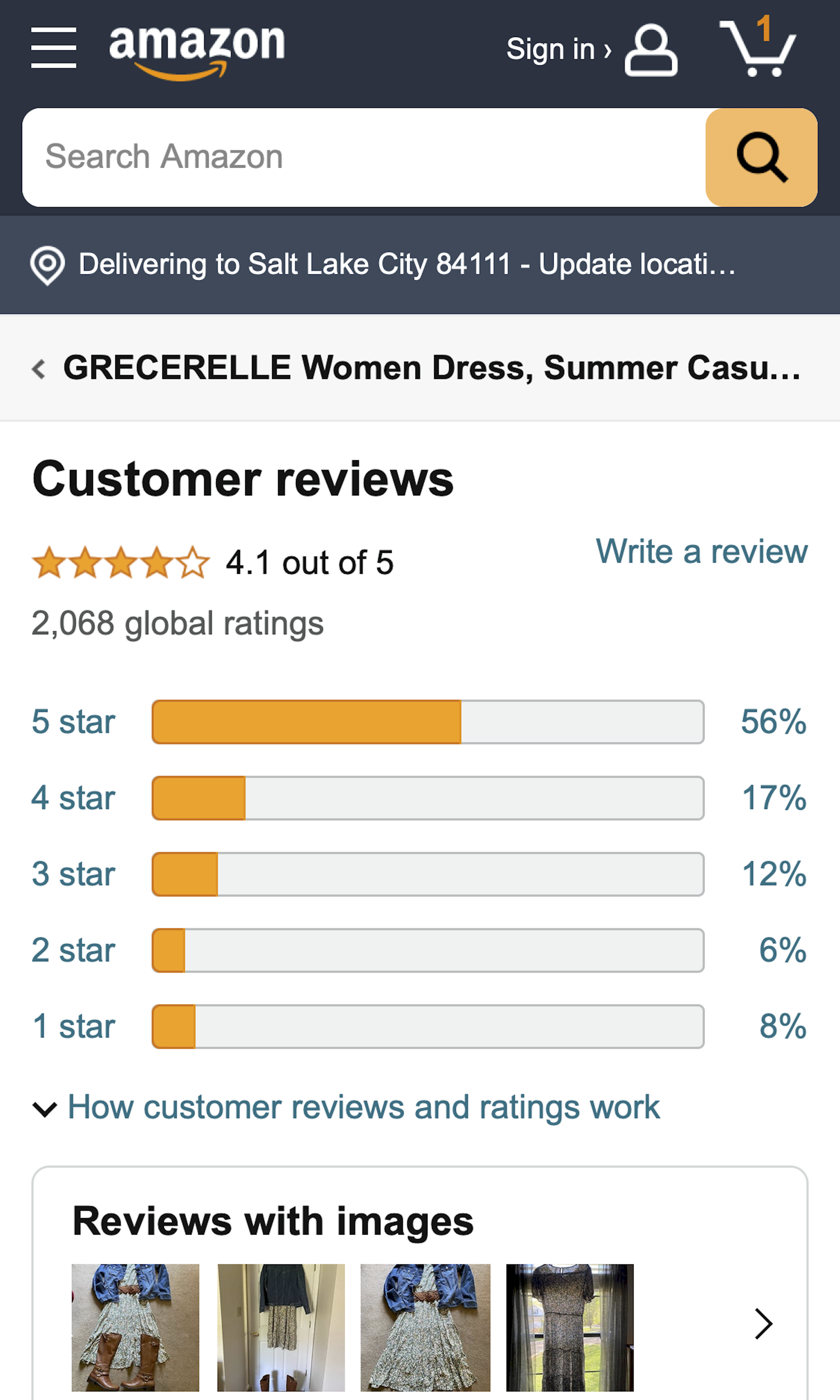
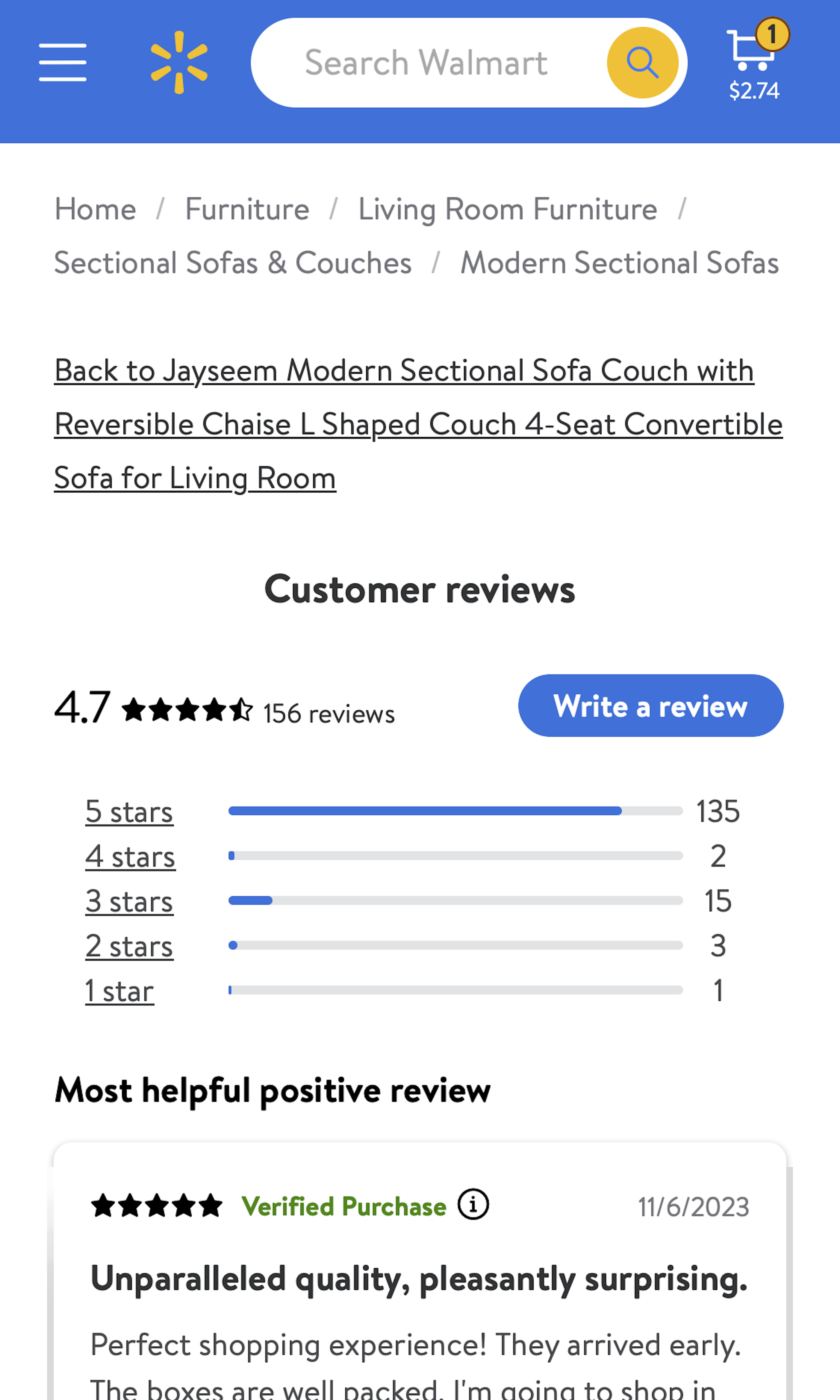
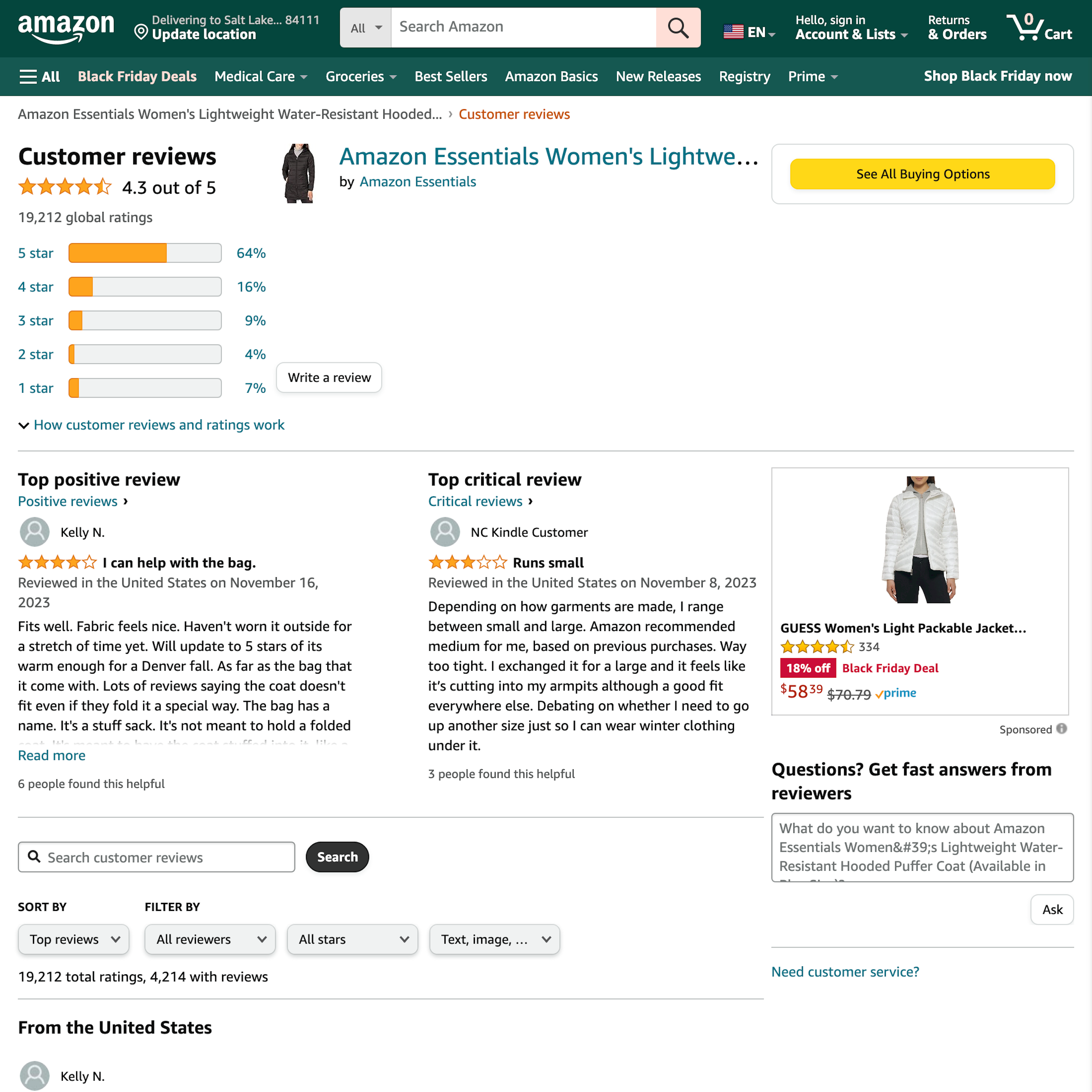
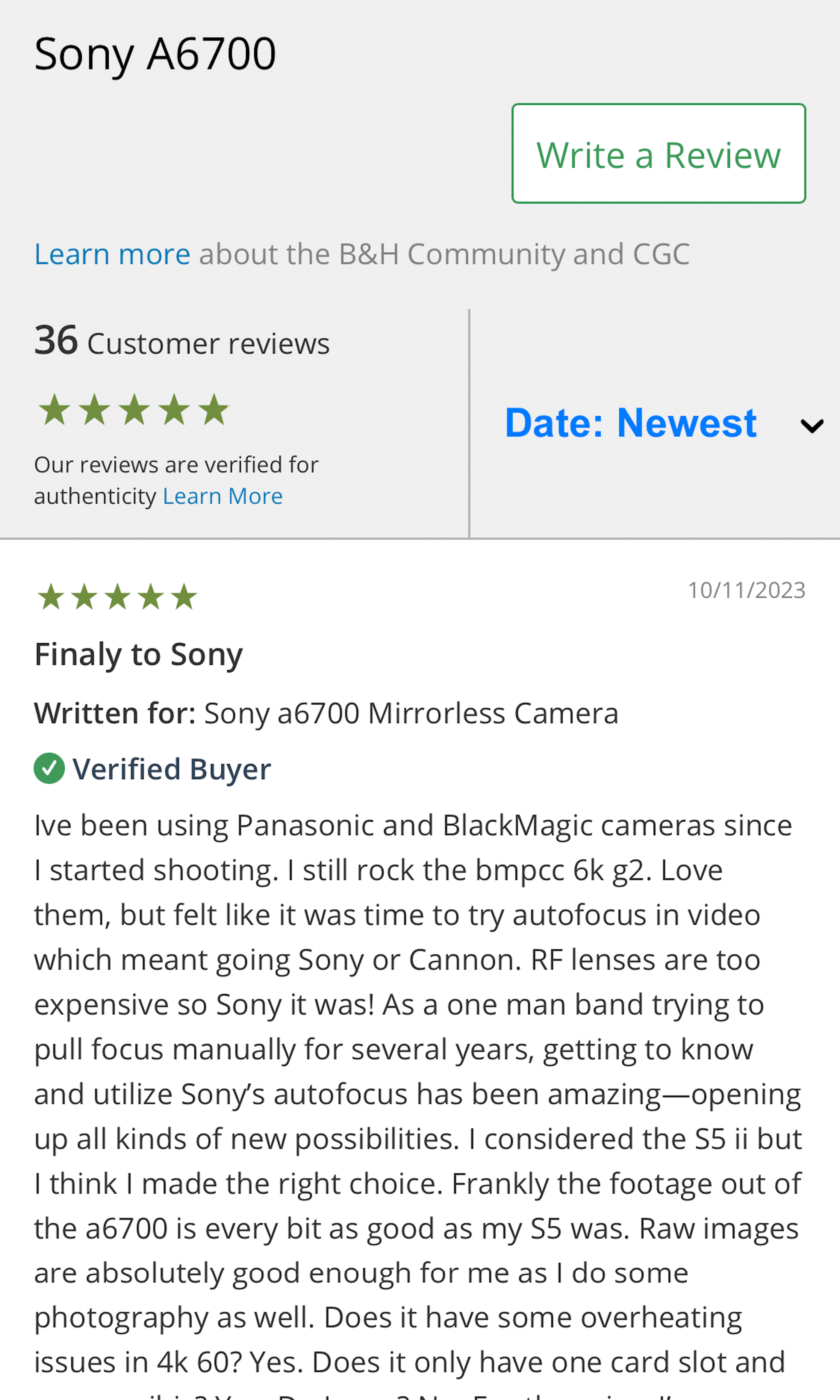
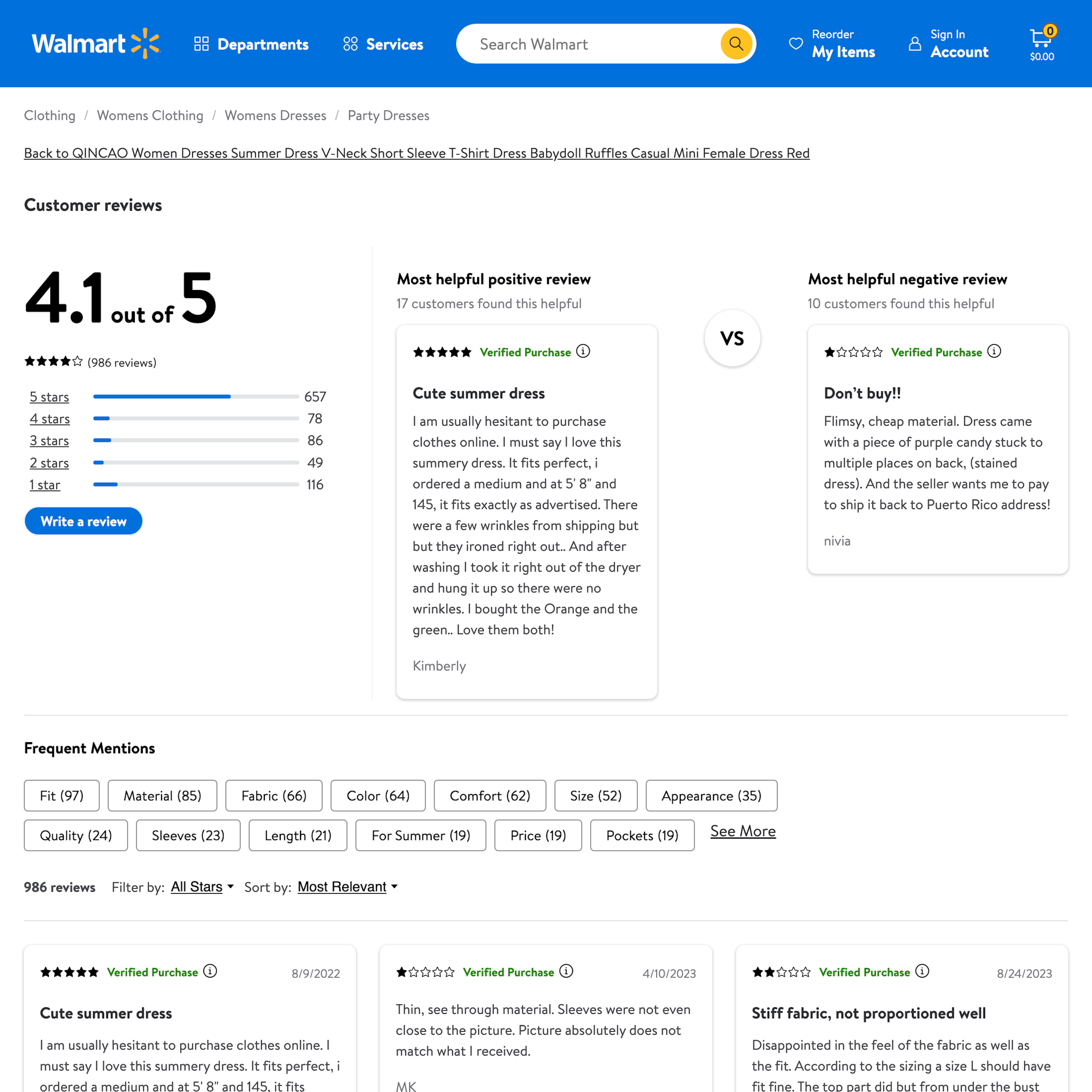
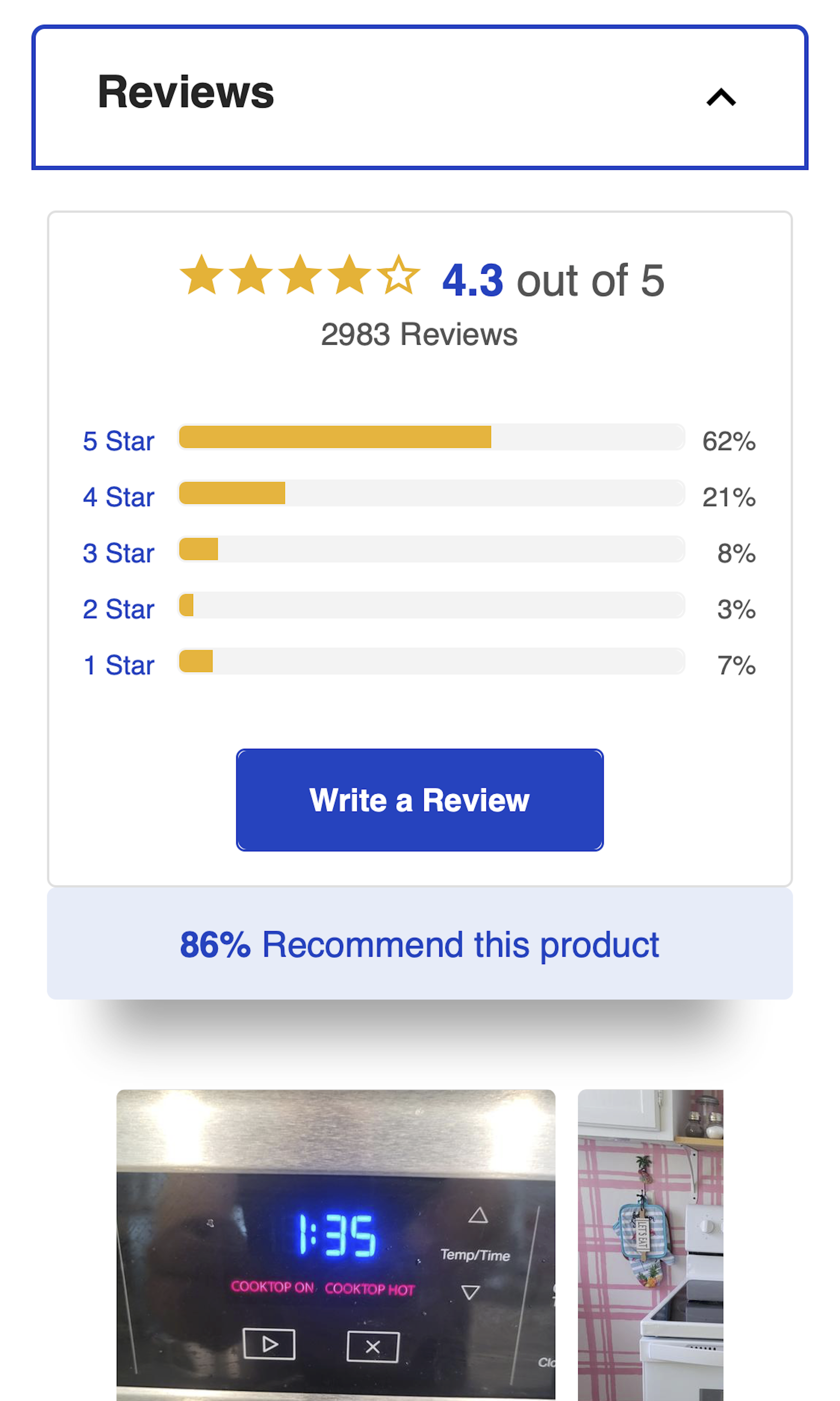
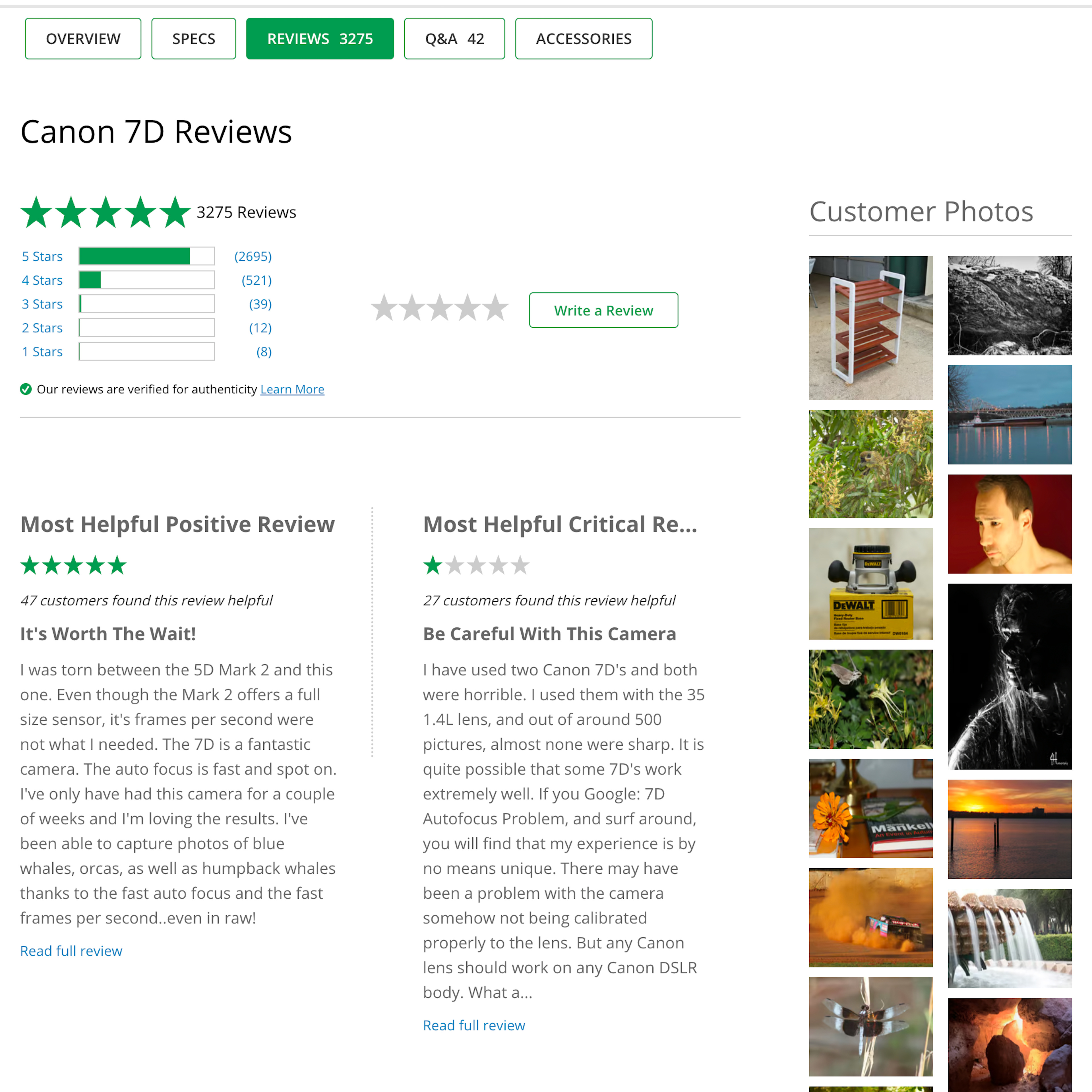
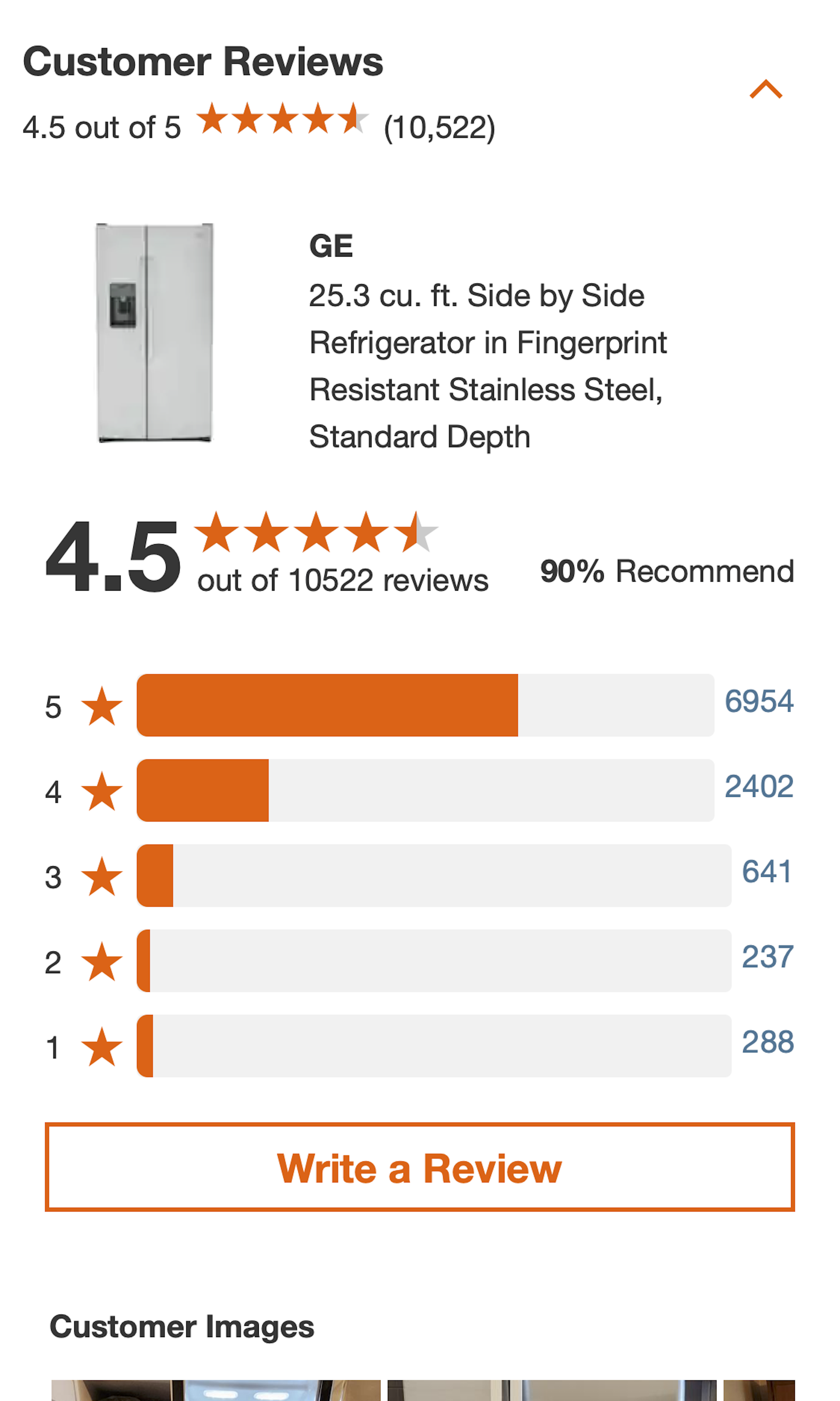
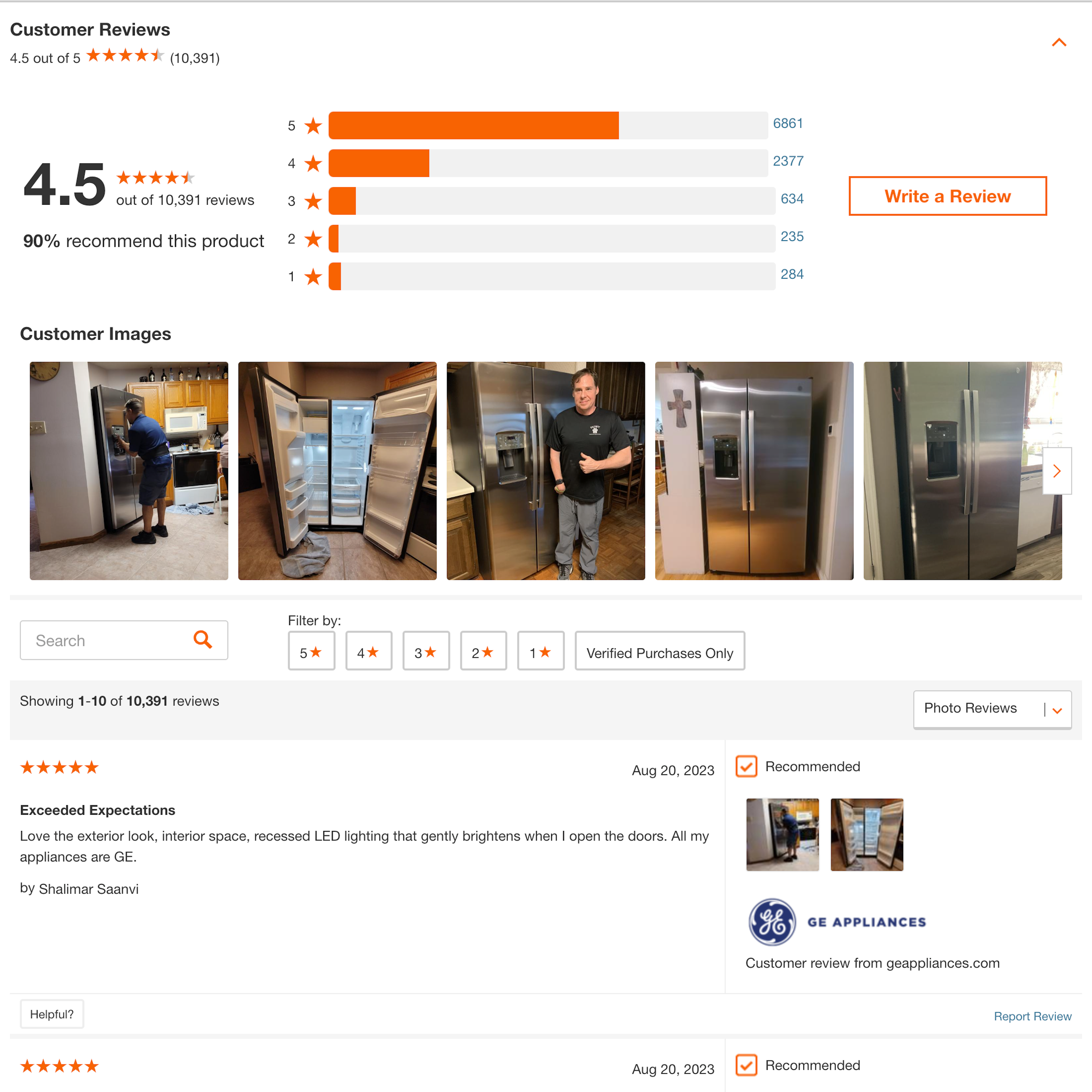
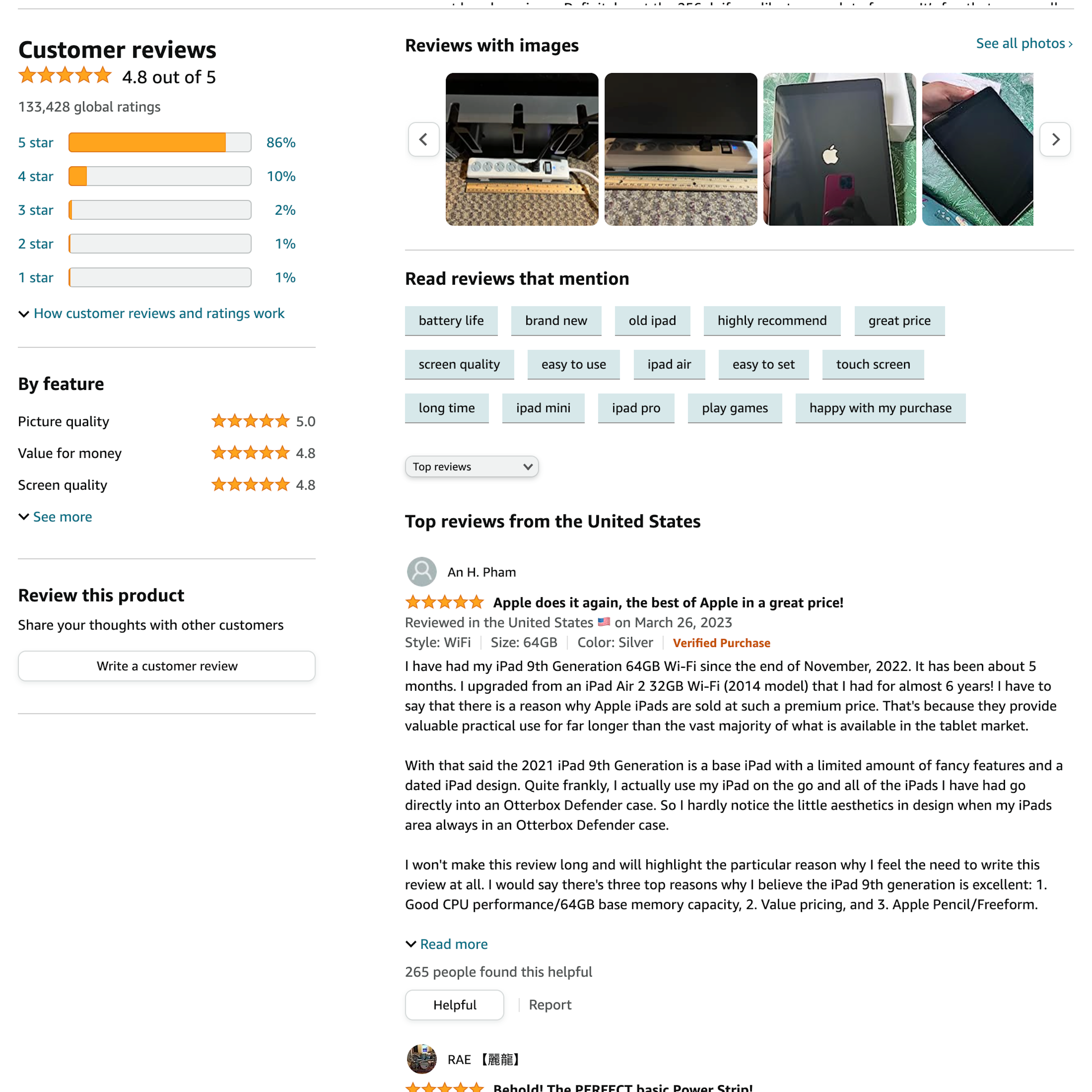
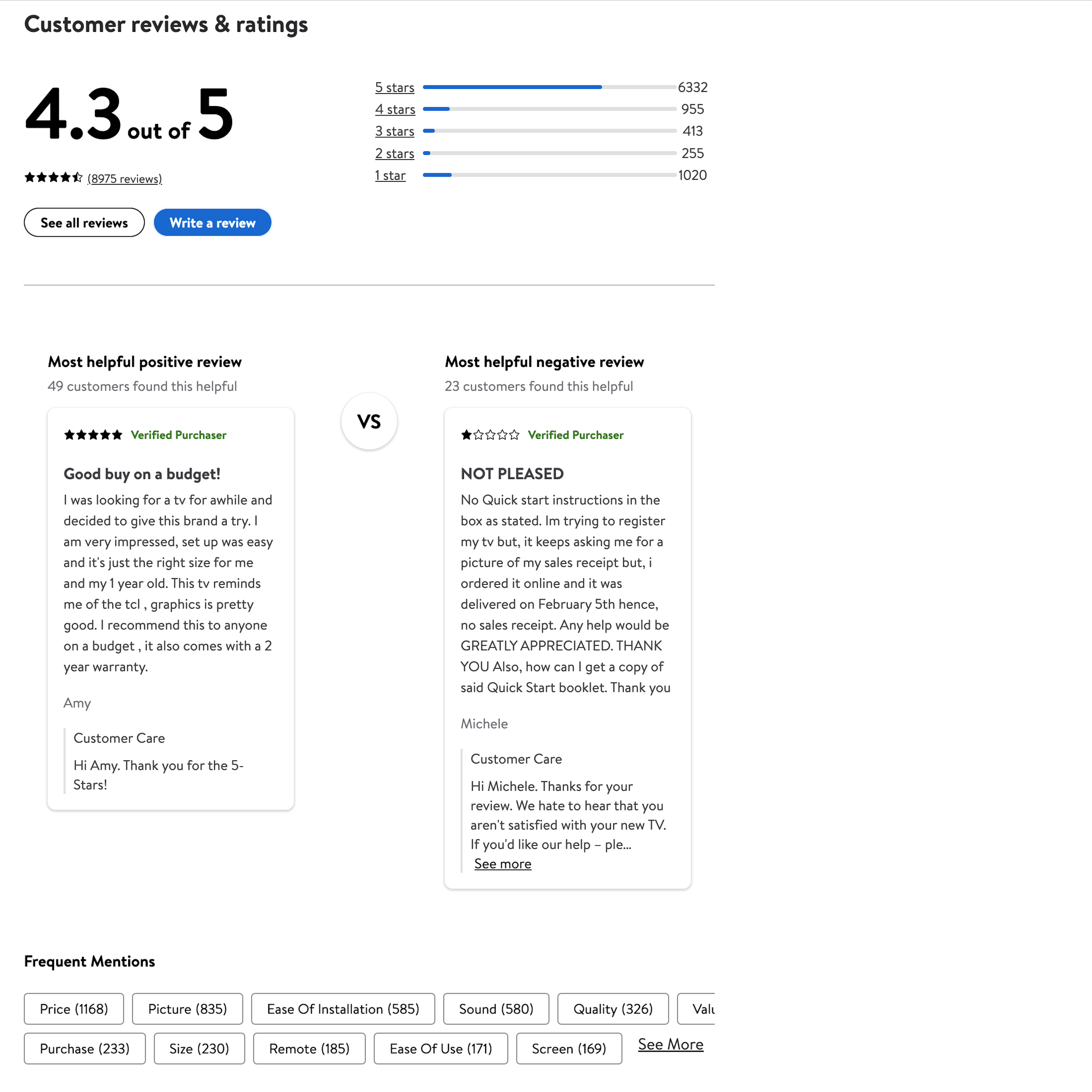
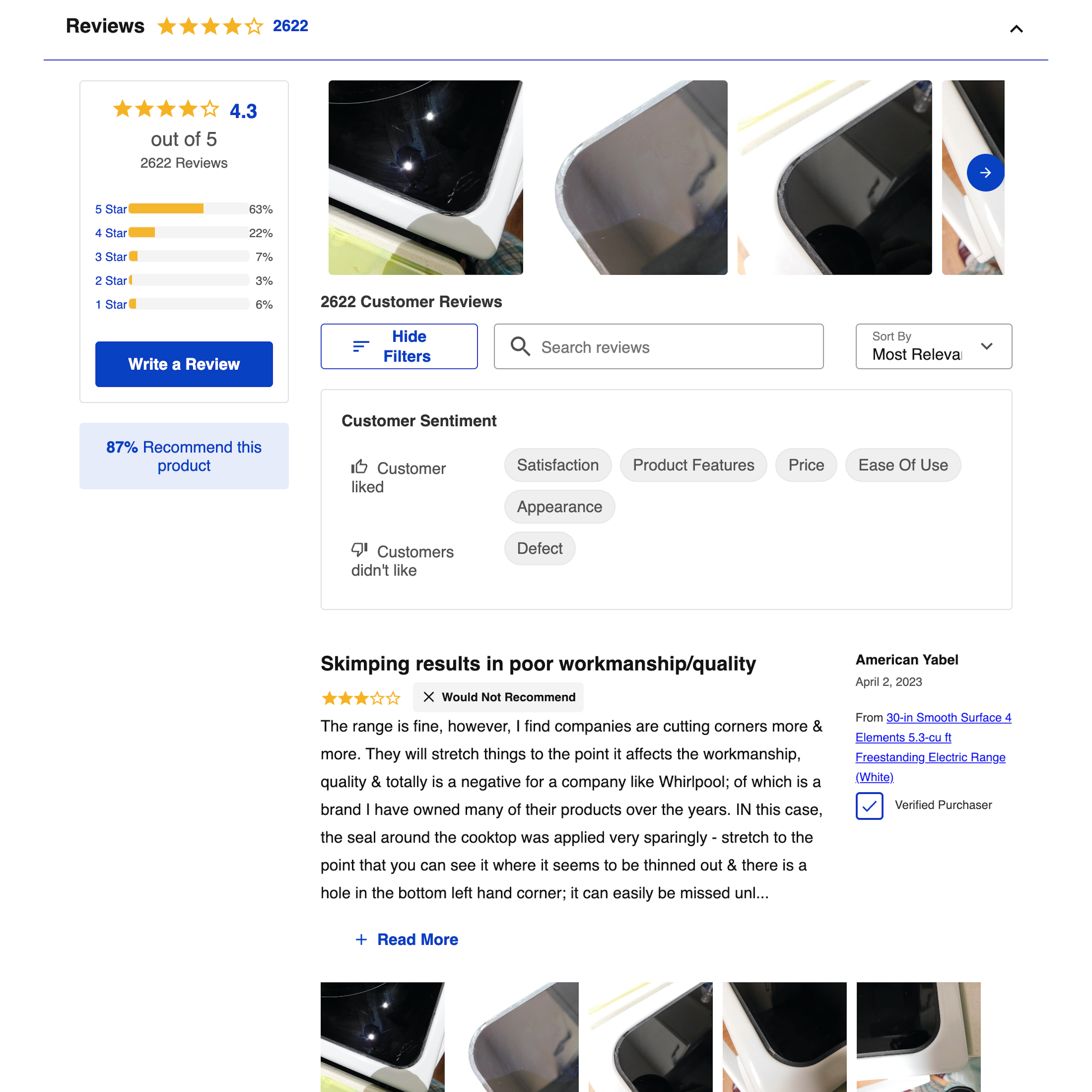
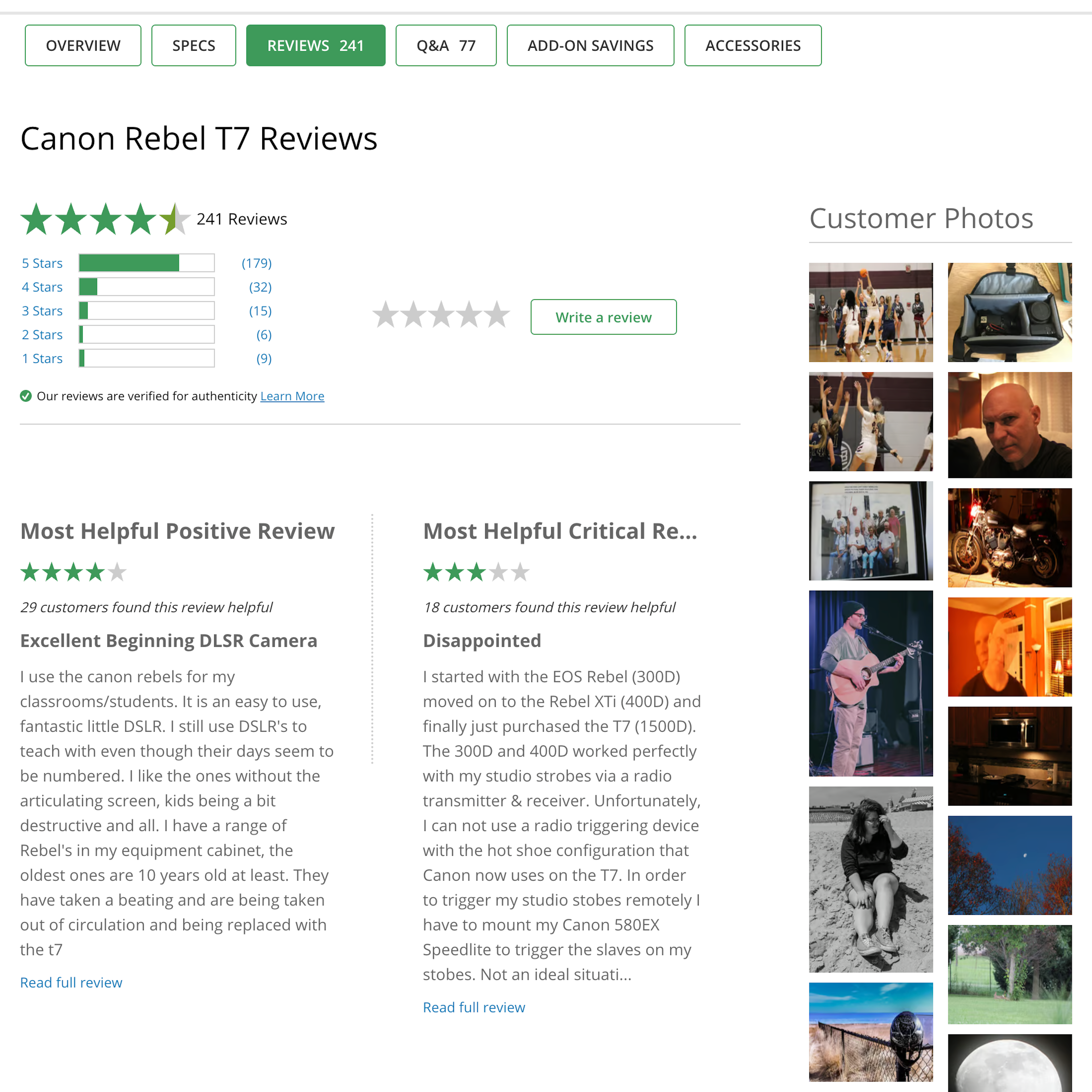
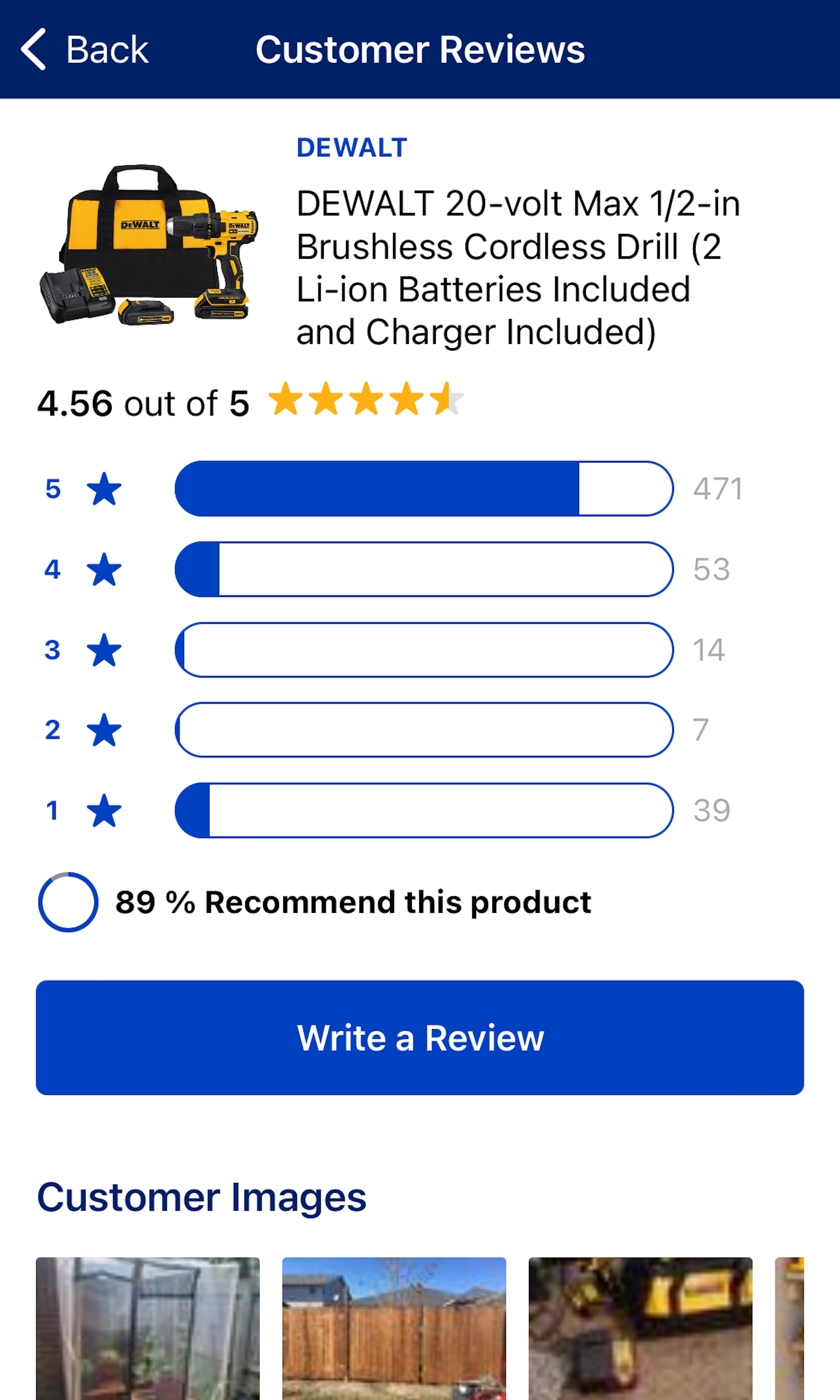
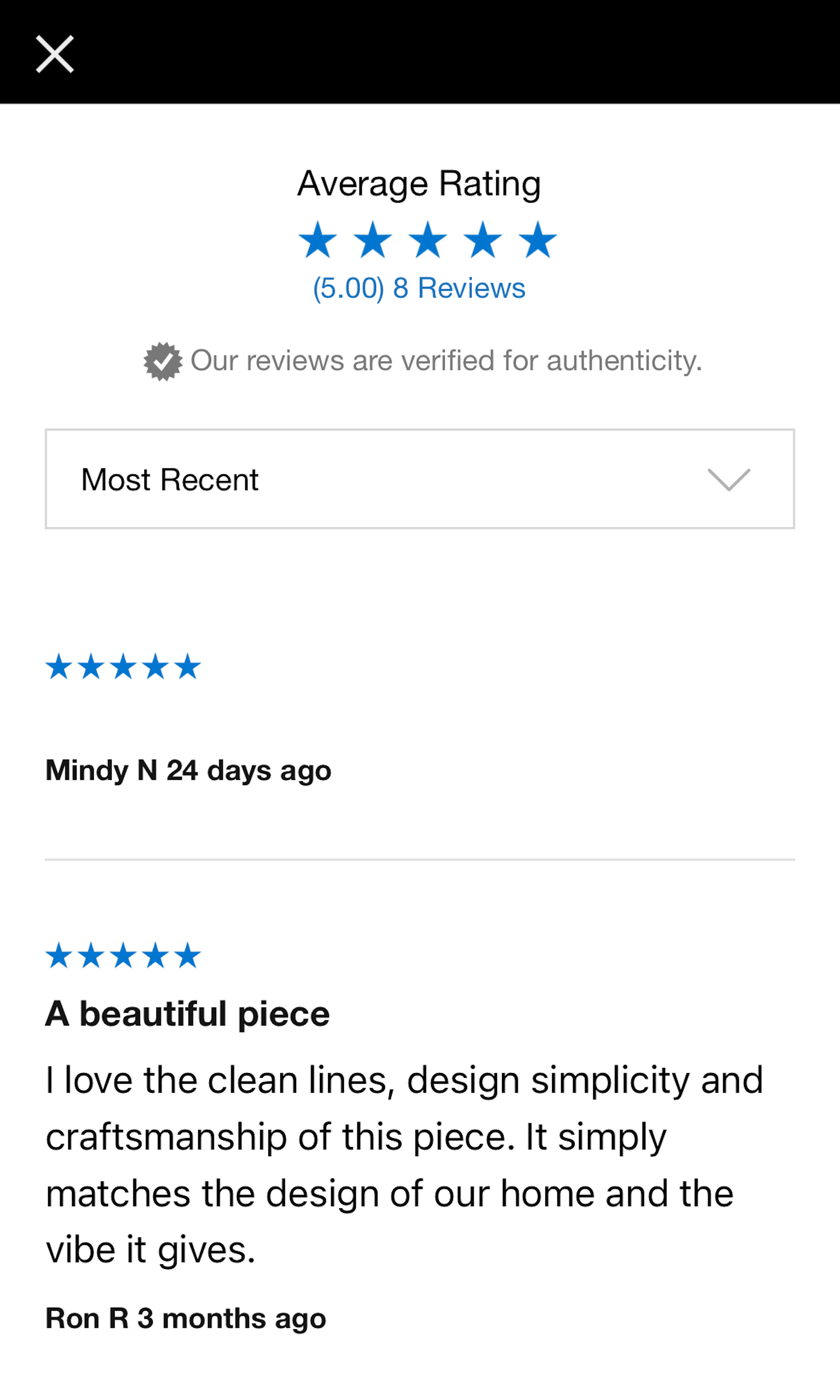
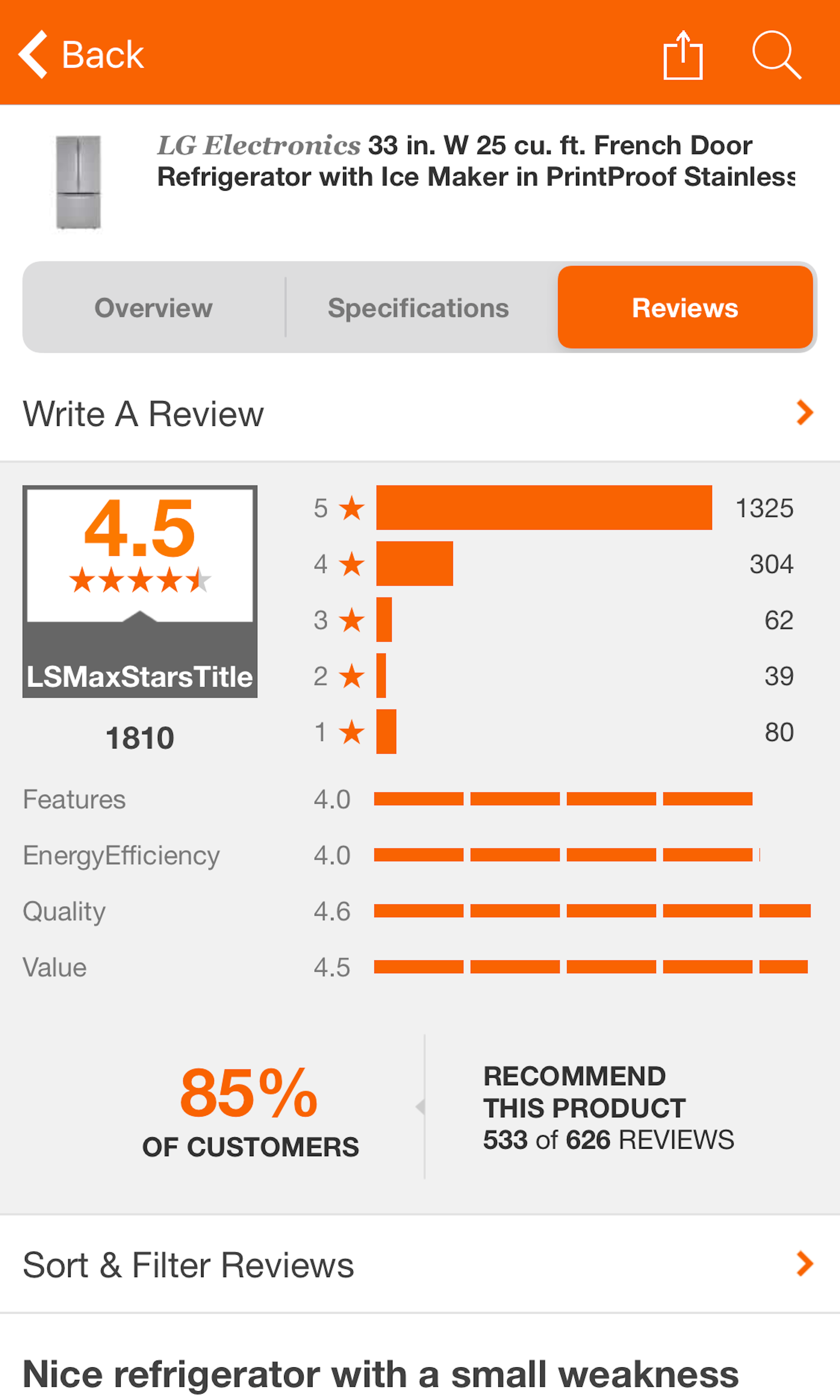
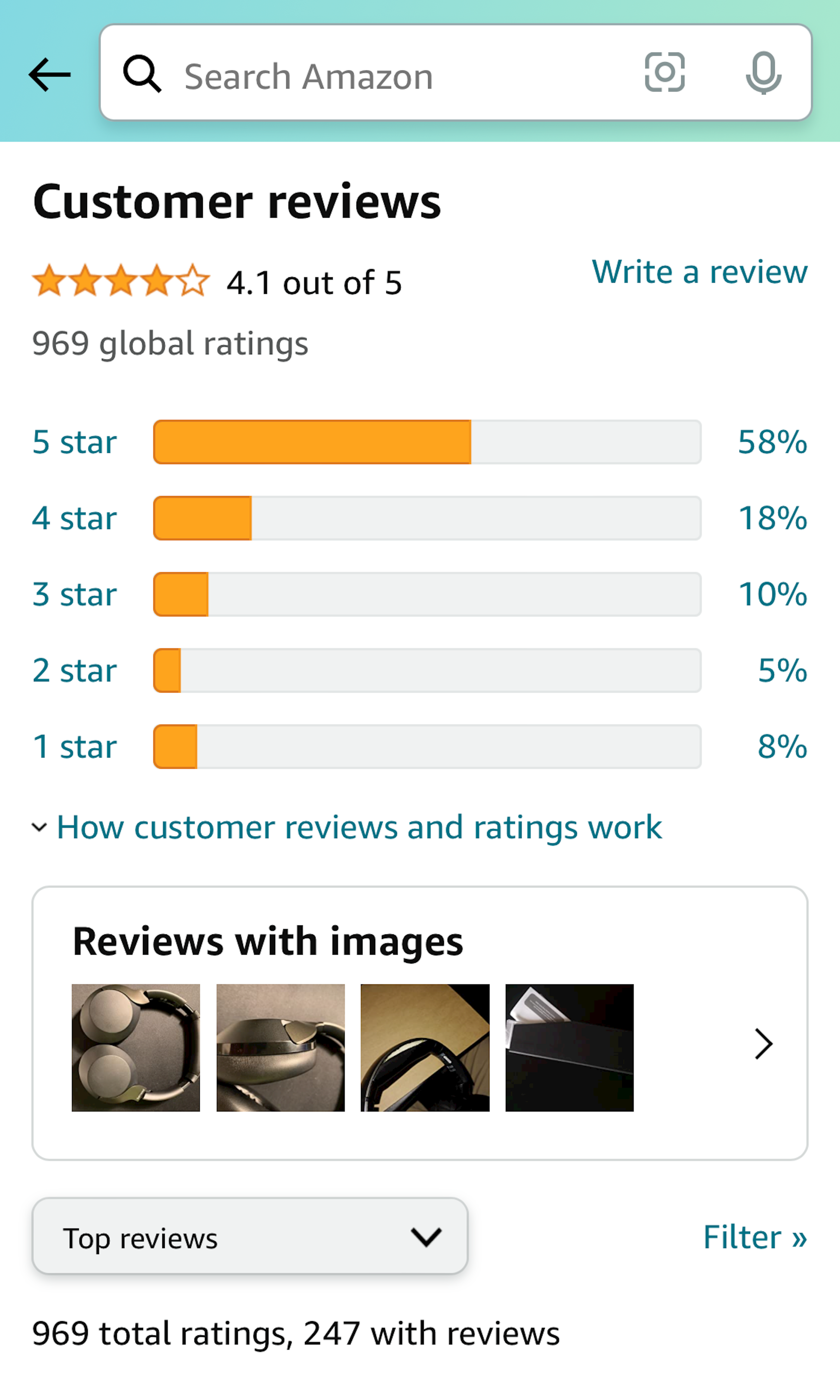
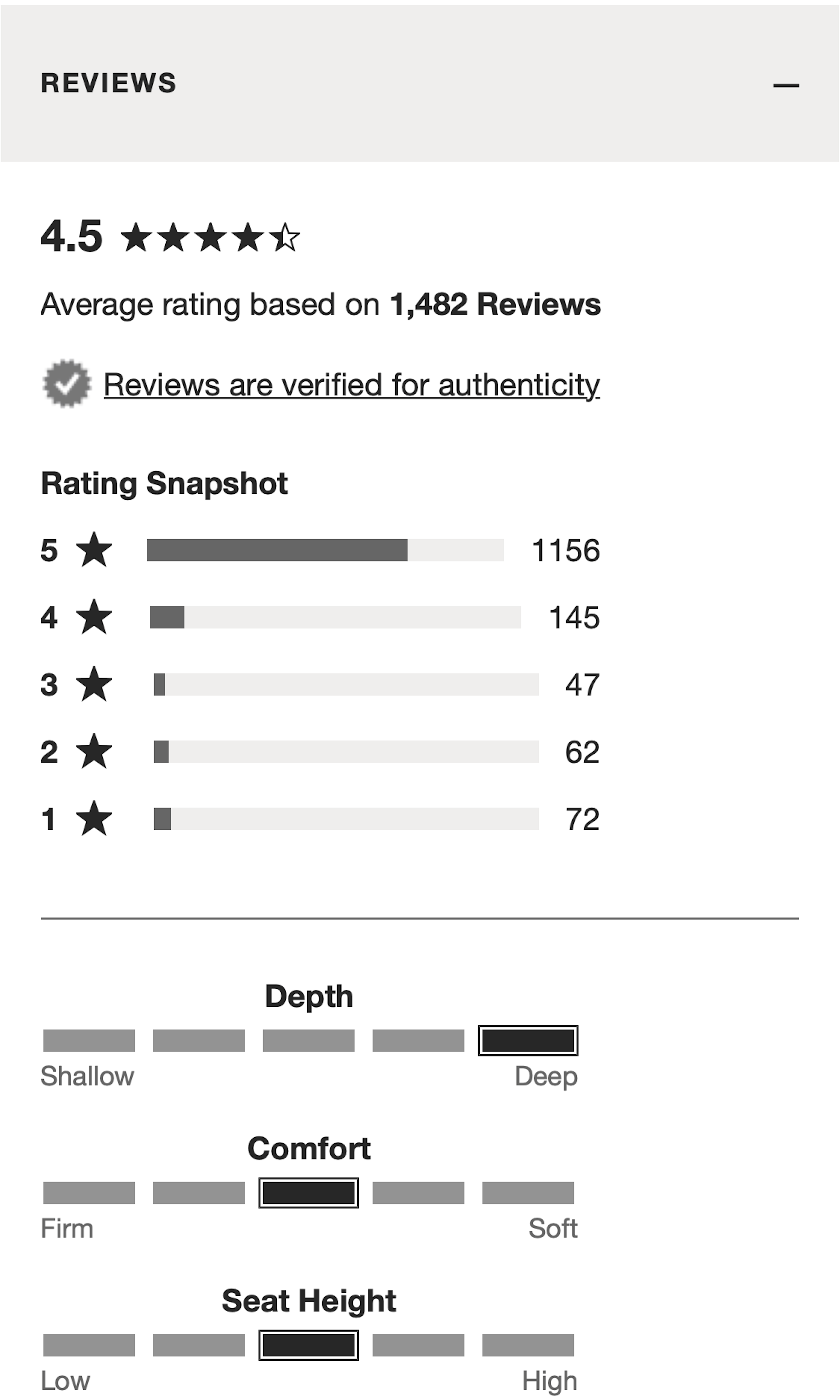
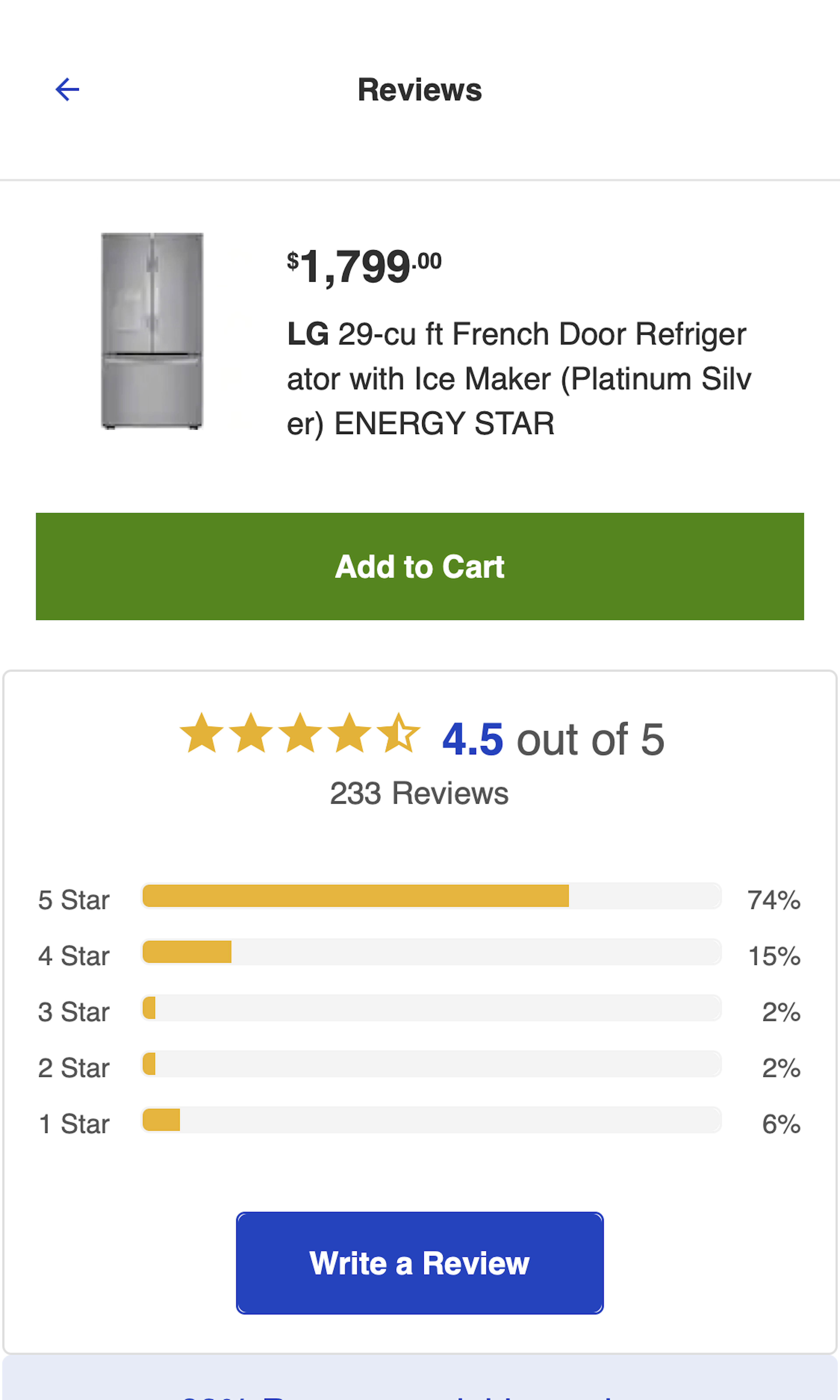
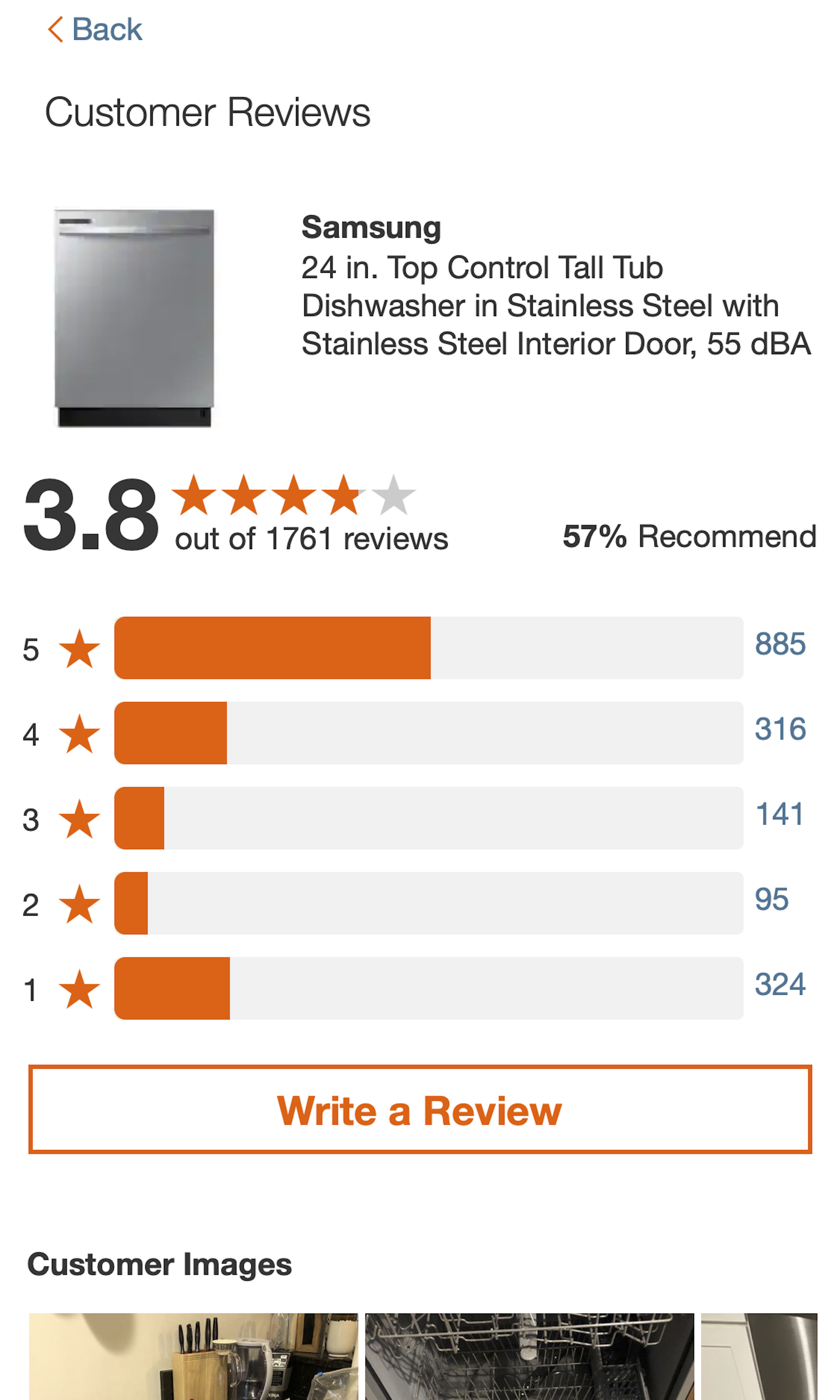
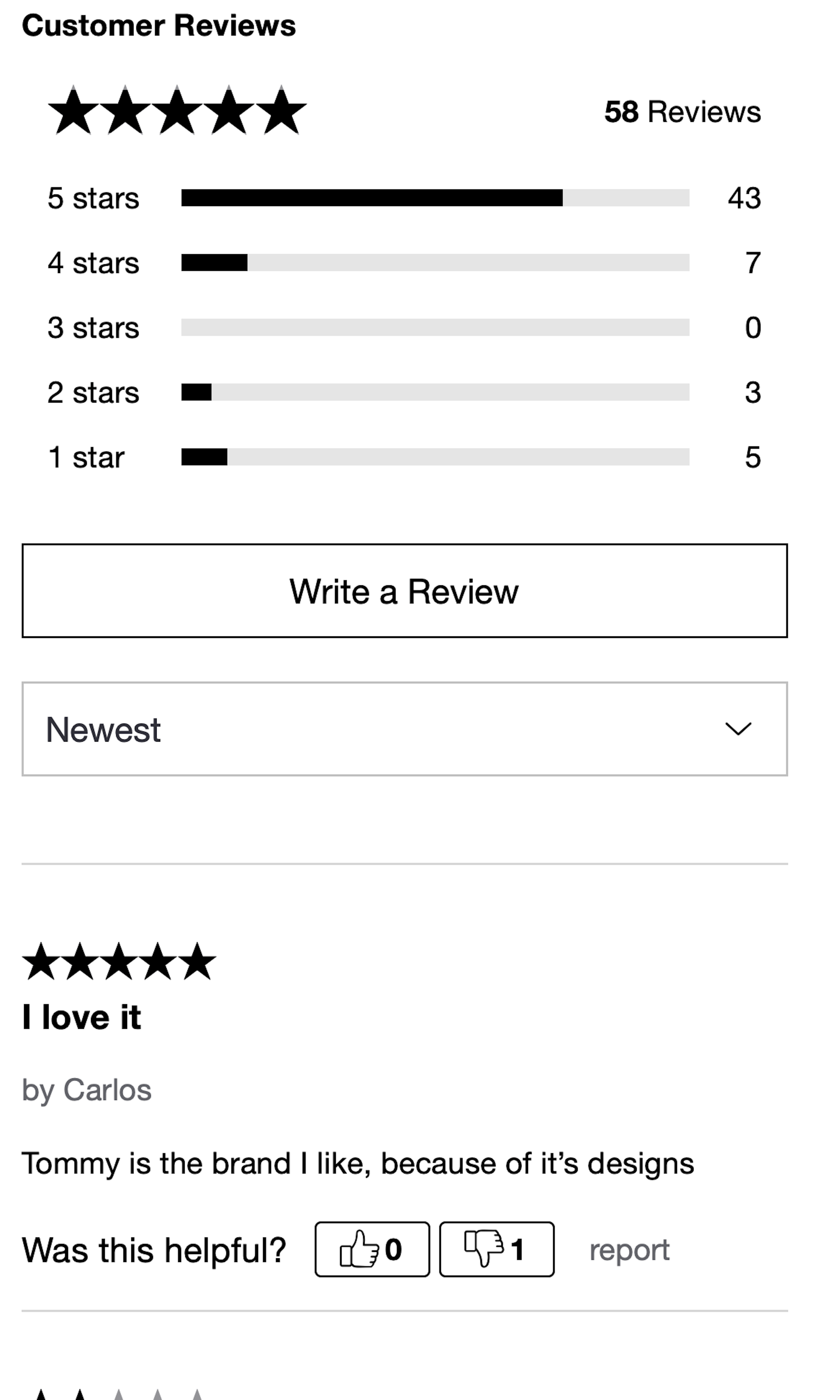
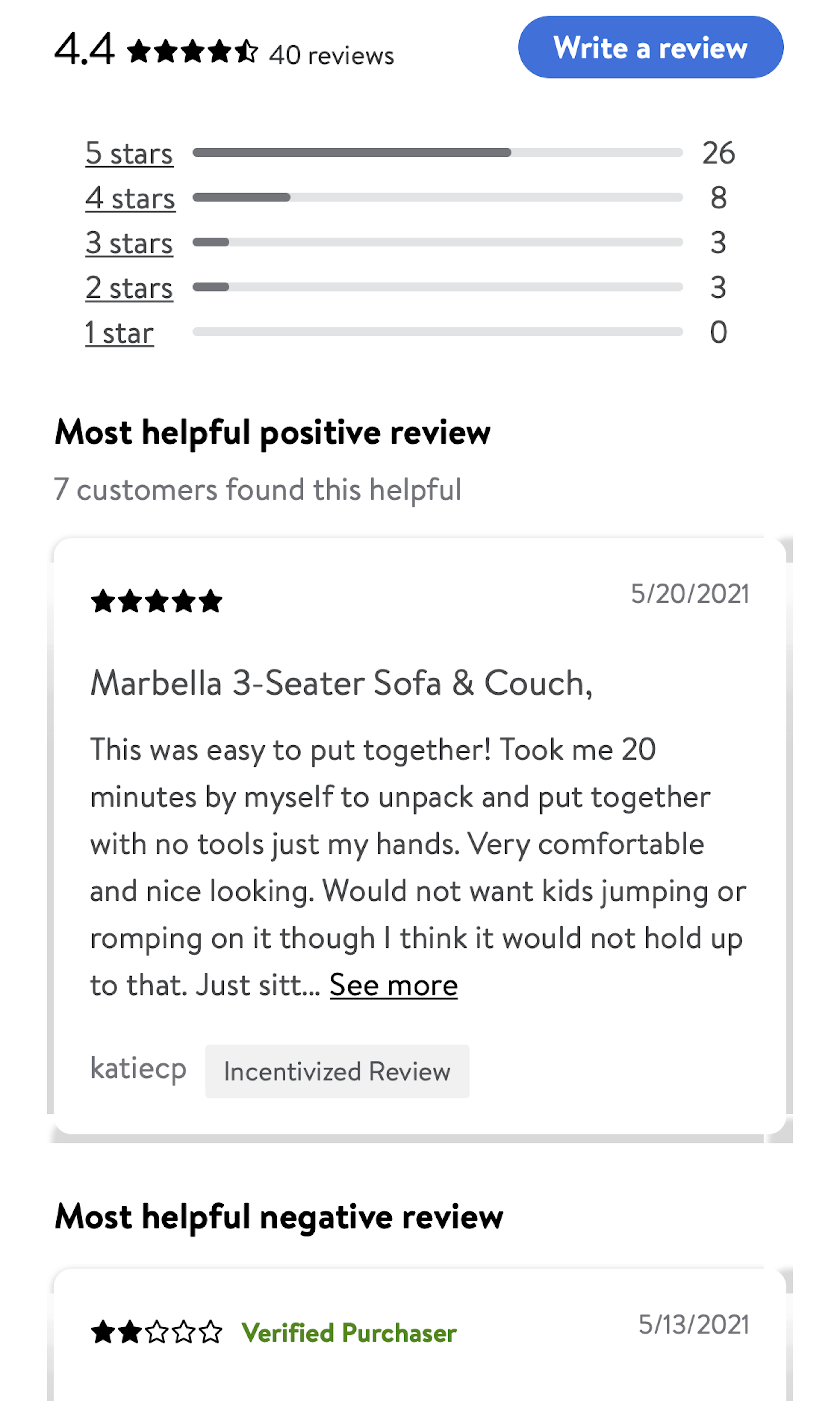
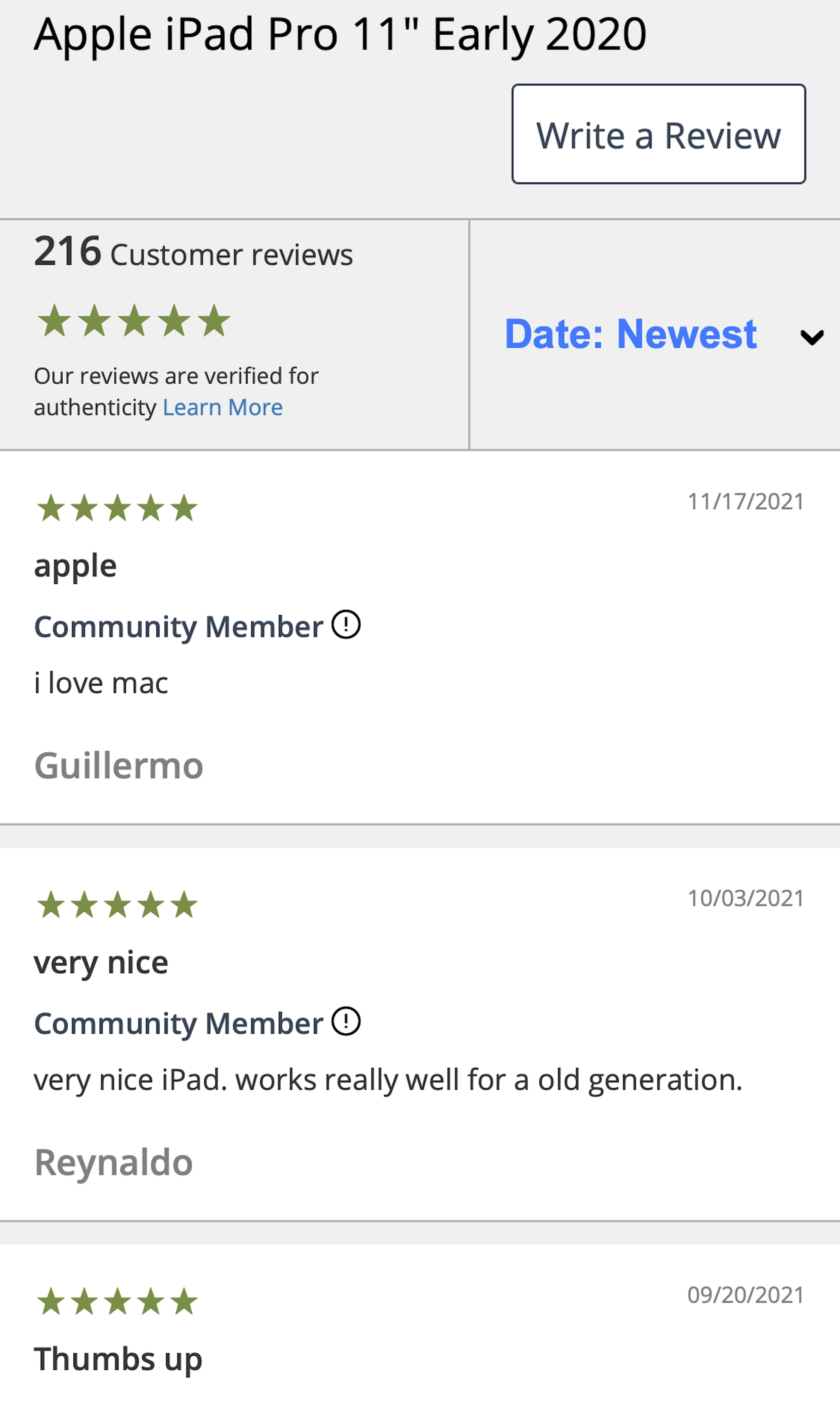
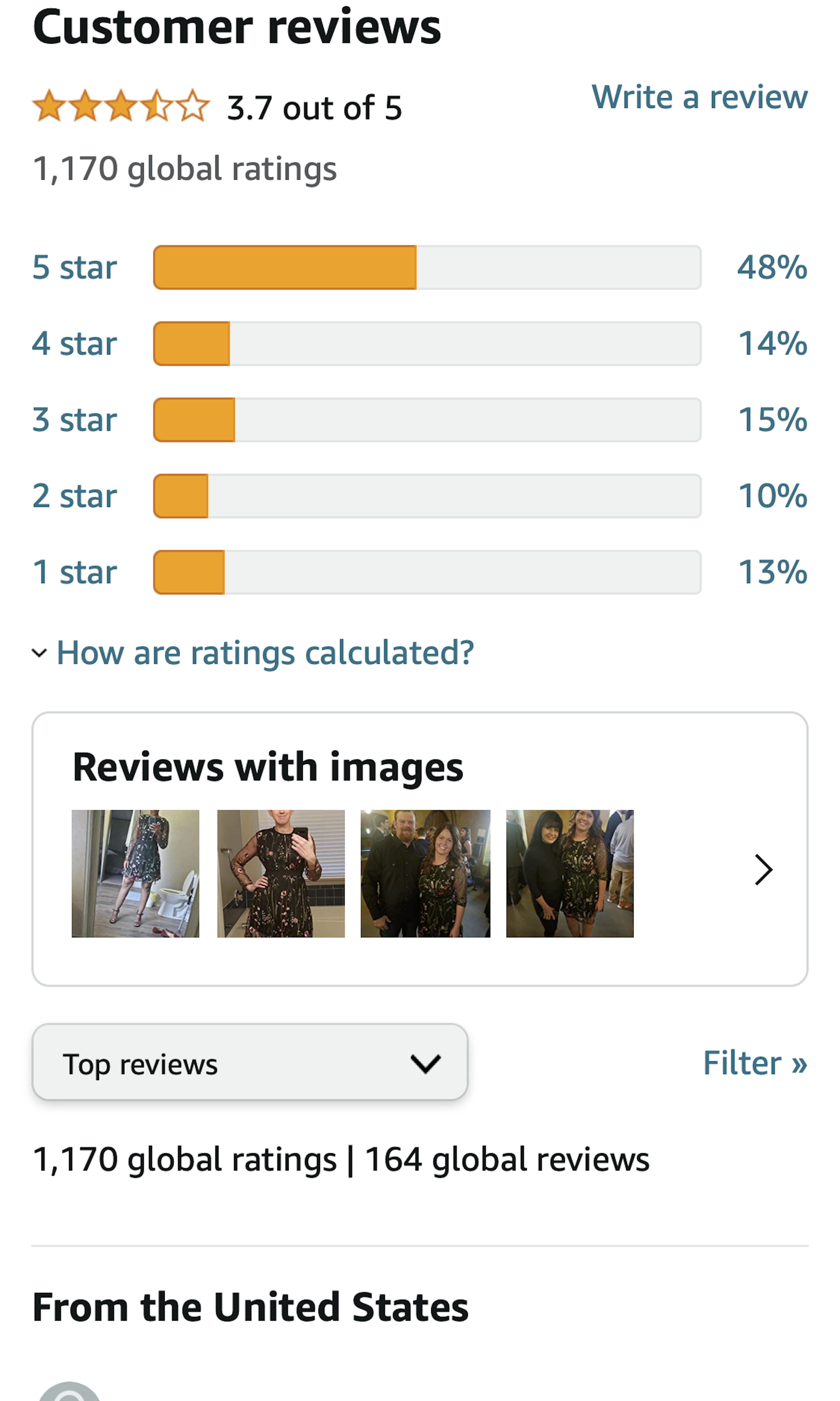
User reviews aren’t just important, they are critical to users’ purchasing decisions. During our large-scale usability testing, 95% of users relied on reviews to evaluate the product or learn more about products. In some cases, users mainly used the product information contained in the reviews instead of the product descriptions or spec sheets. (User reviews are sometimes also referred to as “user ratings” or “customer reviews”.)
More ‘User Reviews Section’ Insights
-
Despite the importance of reviews, our benchmark reveals that most e-commerce sites have severe issues. For example, 60% of sites require too-much data in order to submit a review, in particular requiring an account, with the consequence being that there aren’t many reviews available for a product. And 80% of sites don’t respond to even just some of the most negative reviews (not even for the site’s best-selling products) despite users consistently interpreting a site’s response to negative reviews as a strong indication of a site having good customer service.
-
Learn More: Besides exploring the 729 “User Reviews Section” design examples below, you may also want to read our related articles
“The Current State of E-Commerce Product Page UX Performance - 19 Common Pitfalls” and “Allow Users to Upload Images with Their Review (34% of Sites Don’t)”. -
Get Full Access: To see all of Baymard’s product page research findings you’ll need Baymard Premium access. (Premium also provides you full access to 200,000+ hours of UX research findings, 650+ e-commerce UX guidelines, and 275,000+ UX performance scores.)


User Experience Research, Delivered Weekly
Join 60,000+ UX professionals and get a new UX article every week.

User Experience Research, Delivered Weekly
Join 60,000+ UX professionals and get a new UX article every week.
Explore Other Research Content
300+ free UX articles based on large-scale research.

327 top sites ranked by UX performance.

Code samples, demos, and key stats for usability.