Our large-scale checkout usability testing reveals that 16% of e-commerce sites use a CAPTCHA at some point in the checkout, or present users with one while performing account-related tasks.
While CAPTCHAs may be implemented for solid reasons — for example, to protect against automated or manual brute force attacks by ensuring that it’s a real user who is performing multiple log in attempts or a password reset — CAPTCHAs will frustrate nearly all users, as they are difficult to type, and because we found that around 8.66% of all users will mistype their first attempt (it’s 29.45% if the CAPTCHA is case sensitive).
In fact, our research findings indicate that no matter how perfectly CAPTCHAs are implemented, they will lead to some degree of lost sales. Therefore, we never recommend a CAPTCHA from a usability perspective. But, if finding yourself in a situation where it is truly required (or not having a CAPTCHA is simply out of the project scope), there are several issues to be aware of to ensure the CAPTCHA causes as few issues as possible.
Additionally, some e-commerce sites have instead applied another security measure that we in testing found even more devastating: temporary account lockouts.
In this article, we’ll discuss the test findings from our checkout usability study related to CAPTCHAs:
- Typical CAPTCHA failure rates
- Why account lockouts aren’t the solution (they are even worse than CAPTCHAs)
- 3 ways to improve the usability of CAPTCHAs (if you truly need to use one)
(Note: this article covers CAPTCHAs from an e-commerce angle specifically.)
8–29% Failure Rate for CAPTCHAs
To protect user information, sites frequently employ several security measures, like setting minimum password requirements, limiting password attempts, not telling users if it’s the email or password which is wrong during sign in attempts, or using CAPTCHAs.
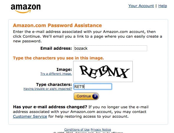
Only 66% of users during our qualitative usability testing successfully entered the CAPTCHA on the first attempt. One wondered at Amazon, “Hmm. Is this a 9 or an L?” Another sarcastically remarked, “Then it’s always nice when you have to type one of these. Now this time you can see what it says, but I often think that you can’t.”
However, we observed during our qualitative usability testing that while these measures are designed to keep robots and hundreds of manual attempts out, they in practice also cause users to give up on valid sign ins and purchase attempts.
In e-commerce CAPTCHAs are mainly used an extra measure of security during password reset or on a high number of sign-in attempts — our benchmarking reveals that 16% of the top 50 grossing e-commerce sites use CAPTCHAs for this purpose.
To get a more quantitative assessment of the impact CAPTCHAs have on users’ ability to sign in to their existing accounts and place an order, we, beyond the qualitative checkout test sessions, also commissioned a quantitative study. In our quantitative CAPTCHA study, 1,027 test subjects (subject demographic mix matched to the US internet user base) were shown the above two CAPTCHAs (taken from Amazon’s password reset CAPTCHA) and asked to type the characters exactly as pictured on two individual pages.
When looking at misspellings and casing errors, an average 29.45% of the 1,027 test subjects failed to complete each CAPTCHA. If ignoring casing errors the average misspelling rate was 8.66%.
The 8.66% of users who get the first CAPTCHA wrong will therefore be presented with a second CAPTCHA. Assuming users are largely equally good at their first and second attempt, this also means that around 0.75% of all users will get two CAPTCHAs wrong in a row. Based on our qualitative usability test observations, users who get two CAPTCHAs wrong in a row are very likely to abandon the e-commerce site.
Also alarming was that an additional 1.47% of the subjects abandoned a larger incentivized survey when presented with the CAPTCHA at the end of the survey. These subjects didn’t even attempt to fill the CAPTCHA, despite having completed 80% of the survey and only missing the two CAPTCHAs to qualify for their monetary compensation.
The potential implications of these results are clear. While CAPTCHAs will likely frustrate close to 100% of a site’s users right out of the gate, around 8% will have to type it twice, and, most importantly, presenting users with a CAPTCHA can result in a 1+% abandonment, even for critical funnels users have a strong desire to complete.
Even Worse than CAPTCHAs — Account Lockouts
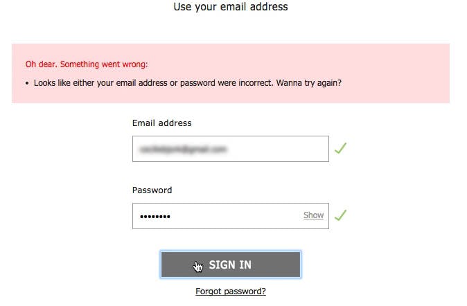
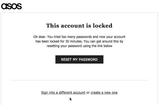
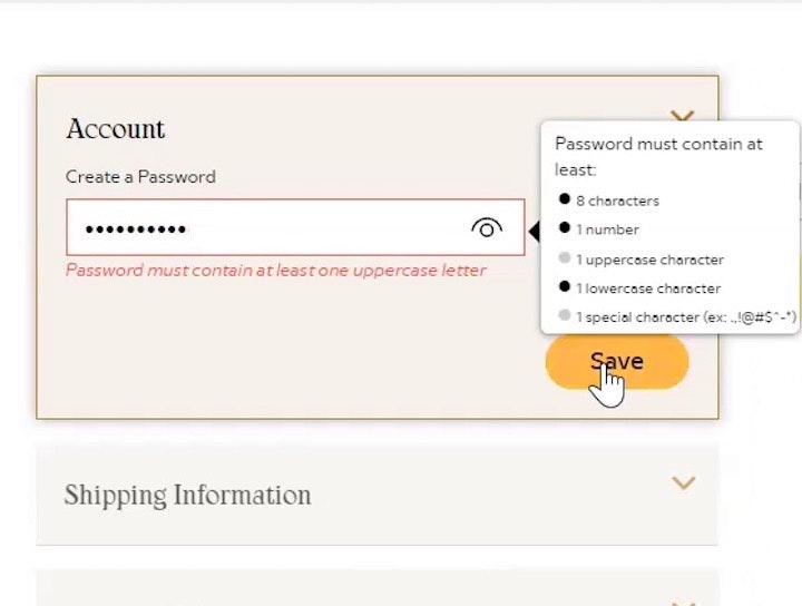
“Hey, what…Ohh, what do we then do? It has never done that before. I always try 10 different passwords. How the hell…” A test subject was locked out of her ASOS account (second image) after only 3 attempts at typing her password (first image).
While CAPTCHAs will cause some degree of abandonments by themselves, testing revealed that some sites use an even more aggressive security measure that results in even more abandonments by users — account lockouts.
Account lockouts often occur when users have submitted an incorrect password a specified number of times within a certain timeframe. After the threshold of attempts has been reached users are prevented from accessing the account for a specified duration of time (though sometimes they’re allowed to reset their password to reaccess the account).
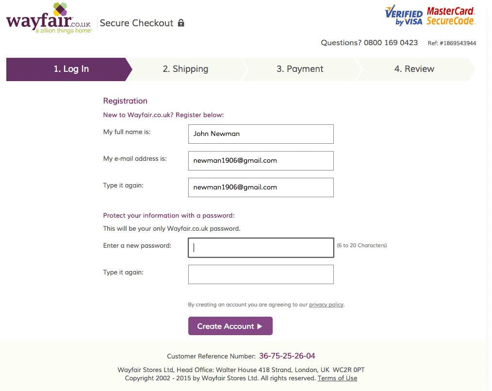
“I’d type one of my passwords. I have multiple. It depends on how important it is. At a site like Wayfair, it’s just a simple code, because it isn’t PayPal or my email account, or stuff like that.” Users often want to reuse a standard password for e-commerce sites they deem to be of “medium” importance, like this subject at Wayfair.
As discussed in our password requirements article, overly strict password requirements are a direct cause of users forgetting what their password is at a certain site, and thus end up trying multiple different passwords, triggering the account lockout.
The issue lies in the fact that users rely on a few “standard” passwords, which they reuse across multiple e-commerce sites. When users are forced out of using their standard passwords because of strict password requirements, they later on are very prone to have difficulties remembering it, and, hence, very frequently experience sign in issues on subsequent visits.
During our testing, we observed that users who tried signing in to their private accounts at sites like Amazon and ASOS had an 18.75% checkout abandonment rate, all caused by a forgotten password, followed by “password reset email” issues.
Therefore, due to issues caused by strict password requirements, some users will need multiple attempts before (or if) they sign in with the right password. However, locking users out of their accounts after a few attempts prevents them from checking out and is almost guaranteed to result in lost sales for the users who encounter the account lockout.
Such aggressive account protection should be used cautiously, and a CAPTCHA will often be more appropriate than restricting user access completely — in particular when the total amount of password attempts are reasonable (e.g., in testing we observe that some persistent users can validly have 10–20 password attempts). While CAPTCHAs are annoying and cause errors, they are in the end solvable if users really really want to proceed, whereas a temporary account lockout is not.
Three Specific Issues to Avoid when Using CAPTCHAs
Due to the friction CAPTCHAs cause, sites should carefully evaluate whether or not a CAPTCHA is necessary and, if possible, avoid using one entirely. However, if using a CAPTCHA is necessary, the following three approaches were observed to be key to minimizing user frustration and friction:
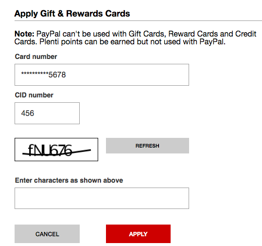
At Macy’s, the CAPTCHA force users to distinguish between uppercase and lowercase characters – something our test reveal will increase users’ error rate by as much as 300%.
1) Never distinguish between lowercase and uppercase letters when validating the CAPTCHA. Making a distinction between upper and lowercase was in our quantitative study observed to increase failure rate by more than 300%. This significant an increase in failures indicates that users generally don’t think they have to match the displayed CAPTCHA casing. Additionally, casing is harder to type on mobile devices with touch keyboards.
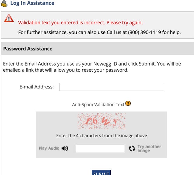
At Newegg, any error inputting the CAPTCHA will also clear the input from the email field.
2) Don’t clear other fields when a CAPTCHA is entered incorrectly. If a user gets a CAPTCHA wrong, reload only the CAPTCHA and ensure that the user doesn’t have to fill out other form fields on the page again. In other words, typed passwords, credit card numbers, email addresses, etc. must be persisted.
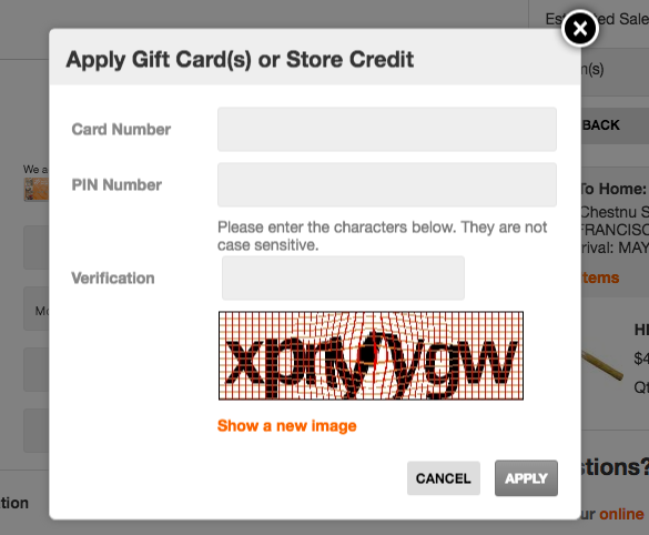
At Home Depot, if there’s a validation error with the gift card number or PIN users must reenter a CAPTCHA after correcting the input.
3) Only ask users to type a CAPTCHA once throughout their entire browsing session. For example, if there’s a validation error elsewhere on the page, but the CAPTCHA was completed correctly, don’t keep showing a new CAPTCHA at every new request (for security, it can be reshown only every 5–10 requests).
Be Extremely Cautious When Using CAPTCHAs
Given the issues CAPTCHAs introduce to the checkout process, and the inevitability of lost sales, consider alternatives to CAPTCHAs.
At the most basic level these include asking users to complete simple tasks or identifying simple images, or using services like reCAPTCHA. Just make sure that these security obstacles are actually solvable for users who really want to place an order, so it doesn’t completely block out users from placing an order (like a temporary account lockout does).
But be aware that any tool that interrupts users and expects them to complete a task unrelated to checking out will negatively impact their experience. No matter how perfectly the security obstacle is implemented, it will lead to some degree of lost sales.
Regardless the security measure chosen, the checkout friction they cause should always be minimized through a solid integration with the rest of the checkout flow, by
- ensuring that when users do fail the security measure it doesn’t clear out form field inputs and selections elsewhere on the page, and
- ensuring that the security measure doesn’t have to be re-completed if users have normal form field validation issues elsewhere on the page.
This article presents the research findings from just 1 of the 700+ UX guidelines in Baymard – get full access to learn how to create a “State of the Art” ecommerce user experience.

