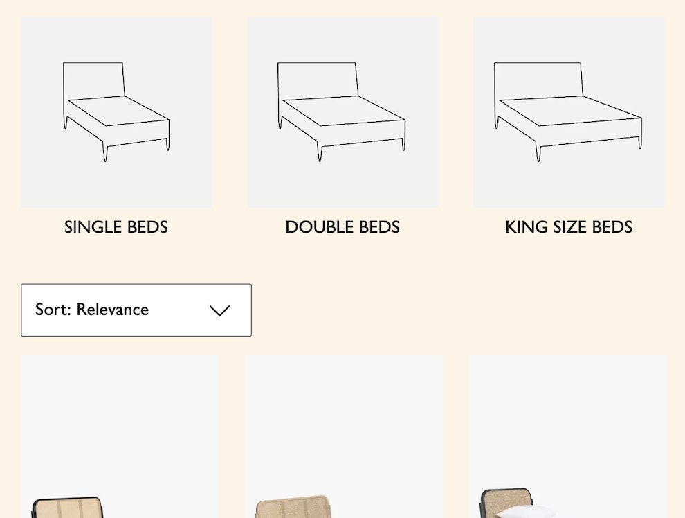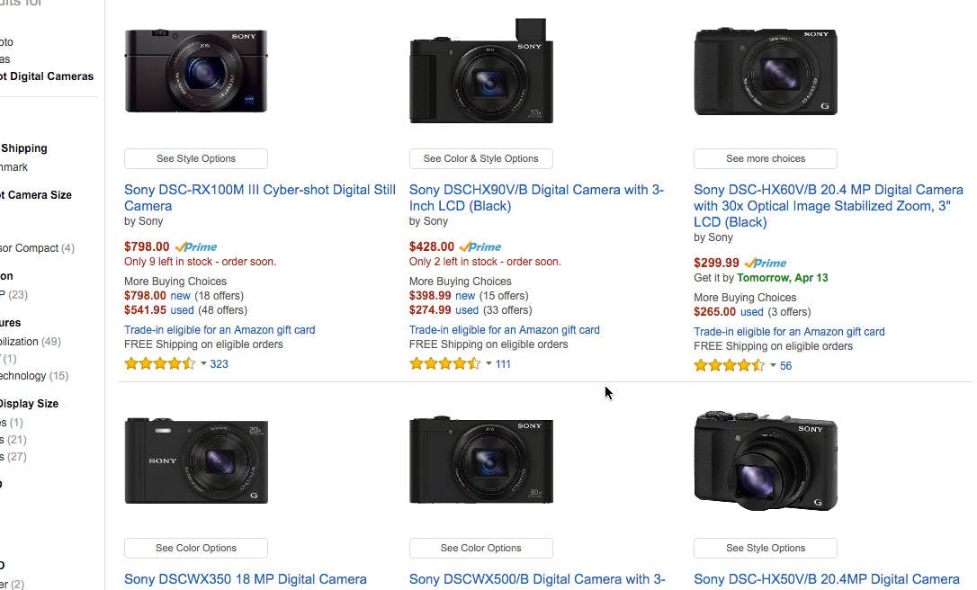
At 96% of e-commerce sites all items in the product list are styled identically, which means the user can’t immediately identify products they’ve already added to their cart. Here seen at Amazon.
During our large-scale usability studies of product lists and category navigation, we found that, when items a user had already added to their cart weren’t also highlighted in any product lists they subsequently navigated, their ability to recognize and re-find products was impeded. This in turn made product comparison and finding related products needlessly difficult for these users.
While the solution to this usability issue is relatively simple and straightforward – highlighting any product list items already in the user’s cart – our product list benchmark of 50 of the largest US e-commerces sites revealed that 96% of e-commerce sites fail to do this.
In this article we’ll present our test findings on the observed usability issue, along with a few different implementation considerations for how items are best highlighted, how this feature can be enhanced to also expose cross-sells options, and why it’s particularly important for sites where users can “reserve” inventory (tickets, deal sites, etc).
Identifying Already-Added List Items
During testing, whenever the test subjects wanted to purchase more than a single product on a site, they would, after having added one item, often go back to their previously visited product lists (categories, searches, etc.) and use these as the starting point for finding other products. They typically did this in an attempt to find accessory products or related items via their previously visited products or product categories. However, simply re-finding the already-chosen items in those product lists often turned out to be surprisingly difficult to the test subjects, as the items within a product list are often described and look very similar.
When all items are styled the same in the product list, it can be surprisingly difficult for users to spot which of the items they’ve already added to their cart.
Not being able to easily identify already added products can be an issue both for users wanting to revisit the product page (expecting to find accessory- or compatibility-based products listed here) and for users looking to add other products of the same kind to their cart. In both instances being able to immediately identify the already-chosen product(s) determines how quickly users can proceed to their actual task of finding and evaluating additional items. Time wasted on trying to locate added products and orient themselves in a list will often be time taken away from exploring additional items that the user may be interested in purchasing.
(Tip: see more of our findings on displaying compatibility accessories and supplementary products on the product page.)
Furthermore, a significant sub-group of users are consistently observed to frequently use the shopping cart as a makeshift product comparison tool during their product-selection process (more on this in a future article). Here, being able to easily distinguishing the items already added to the cart becomes even more important.
By adding a distinct graphic to any list item already in the cart, as seen here at Northern Tool, users can immediately identify items already added to their cart.
When a product is already in the user’s cart, it’s therefore a good idea to highlight that in the product list and possibly even include additional information and enable extra features for that particular item. At the most basic level a background color, a border, or a label can be used to make the list item stand out in the product list. By tweaking the visibility of the list item, users will have an easier time recognizing and thus re-finding it when revisiting categories and searches throughout their shopping session. (It is in fact especially important for search result pages since any alterations to the search query will reorder the search results and the user therefore can’t rely on an item’s position as a way to gauge whether they’ve visited in the past.)
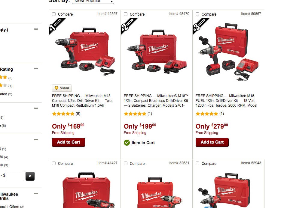
The highlight is taken one step further at B&H Photo by also altering the feature set, providing a “view cart” link for any items already in the user’s cart. This could be taken even further by displaying related items and accessories to make it easy for the user to explore matching items.
For a slightly more advanced version, consider also including other features for products that are already in the user’s cart. If users have added a particular item to their cart, it is safe to assume that they deem it highly interesting and relevant to them, and it therefore makes sense to provide them with direct access to extra content and features for that particular list item. Whereas such additional features would normally clutter and overcomplicate the interface if done for all products in the product list, it can enhance usability when only done for 1-5 items that the user has explicitly shown great interest in.
For instance, the list item for products that are added to the user’s cart could dynamically update to allow the user to adjust the cart quantity of that product. Or the list item could include links to supplementary products – for example, having a dynamic link reading “See Matching Accessories (23)” – or could even indicate delivery date if ordered on the same day.
These content and feature differences alone may provide sufficient visual contrast to the regular list items that aren’t in the user’s cart, reducing the need for having explicit highlights via callouts, colors, borders or backgrounds.
Consider Also Indicating Visited Products
A similar aspect of product list navigation that may work well in tandem with highlighting already-added products is allowing users to be able to distinguish visited products from unvisited products.
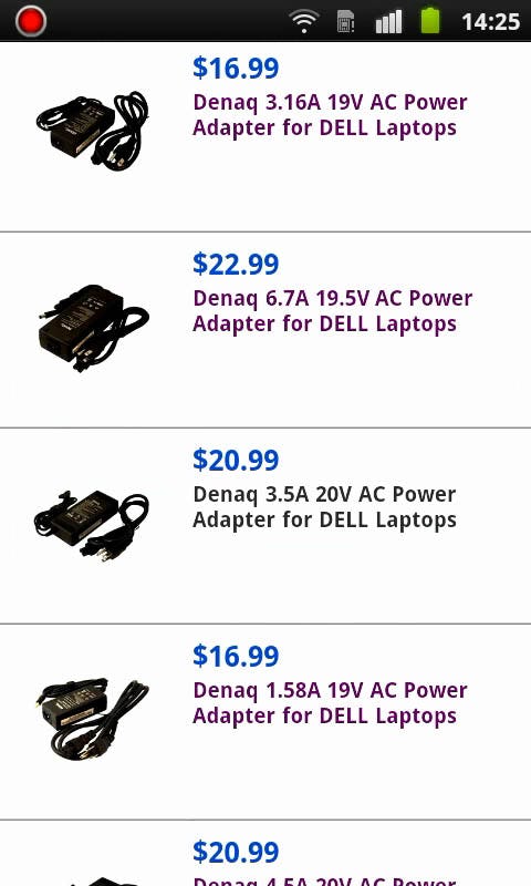
This subject was looking for an AC adapter for her Dell laptop. With six very similar product images and product titles, Walmart’s highlighting of the already-visited product pages was the only thing that kept her on track. It allowed her to methodically check all the products in order to find the one that was compatible with her exact Dell laptop.
When users browse a list of otherwise similar looking products, they often have difficulties both when they want to explore the remaining “new items” in the list they currently haven’t visited and when they want to re-find a previously visited product that they have decided on.
Usability testing revealed that this issue was easily solved by simply indicating previously visited product pages. (An easy way to implement this is by relying on the browser’s :visited CSS selector.) Highlighting visited products enable users to avoid wasting time on products they’ve already rejected once. In particular, we’ve observed this to be important for mobile interfaces, where users less frequently open product pages in new tabs and therefore frequently go back and forth between the product list and multiple product pages in the same browser window.
‘Reserved’ Items
A similar list item customization / highlight should be employed on sites where users can “reserve” items or when stock quantities live-update on the site based on items added to a cart. For example, on several deal-, reservation-, and ticketing-sites, items will be temporarily reserved as soon as they are placed in a user’s cart. During testing this caused some confusion as those items were then displayed as “Sold Out”, “1 left”, or “Currently Unavailable” in the list item information, when in fact this was because the users themselves were the ones who had reserved the item!
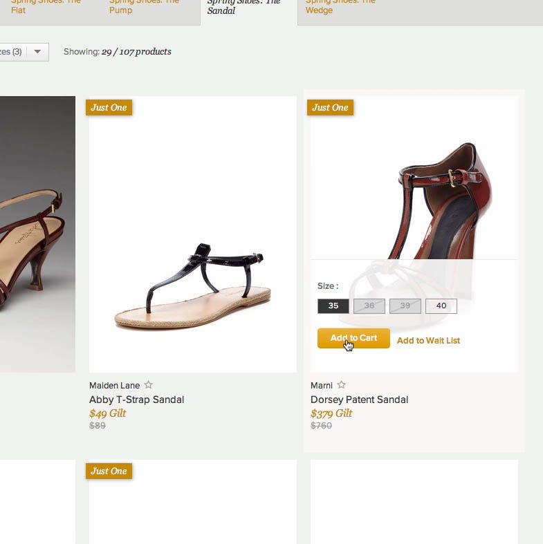
After adding the – here hovered – pair of shoes and continuing to browse Gilt for other items, this subject noted the status reading “Just One”, and said, “Maybe that means it is soon sold out”, expressing her uncertainty. However, the confusion was unnecessary as she had already reserved a pair of the shoes in her cart – this just wasn’t explicitly indicated to the her.
Explicitly changing the list item status to state that the product is in the user’s cart is vital on these types of sites, as it helps clarify the availability status and helps put the user at ease. The implementation may take things a step further and also include information on how much longer the item will stay reserved in the user’s cart. One can easily imagine how a live countdown of the reservation could create a strong sense of urgency – providing more than a gentle nudge for the user to place that order already!
Simple Step Towards Personalization
Given its simplicity, highlighting products already in the user’s cart should be a straightforward implementation for most sites that want to dip their toes into the waters of e-commerce personalization. A 21st century e-commerce site must adapt its content and features to match the individual user’s context, and this is an easy early step in that direction.
Now, it is important to underscore that this is not a deal-breaker or a major roadblock to a site’s overall usability (unlike over-categorization, or incorrectly interpreting user’s search queries, or having an overlay narrow product selection on the homepage, etc). In fact, highlighting products already in the user’s cart is what we’d consider a “UX enhancement” or “bonus feature” – something to implement only once a rock solid foundation has been put in place. However, if your site has all of its bases covered, this is a simple form of e-commerce personalization that can help make your site feel more intelligent and responsive to your users.
This article presents the research findings from just 1 of the 700+ UX guidelines in Baymard – get full access to learn how to create a “State of the Art” ecommerce user experience.