Key Takeaways
- “Quick Views” are of little-to-no use for most users shopping for spec-driven products
- “Quick Views” are often a substitute for a poor-performing product list
- Focusing instead on improving the product list and list items is a better use of design resources
“Quick Views” provide a user with a “quick view” of a product by opening an overlay that displays a preview of the selected item.
This preview often includes additional product details, images, specs, etc.
This is done without pulling the user away from the product list, which allows the user to take a closer look at the product without having to leave their current product list context.
Yet despite these seeming benefits, Baymard’s large-scale testing of “Quick Views” on spec-driven sites (e.g., Newegg, Grainger, Northern Tool) revealed that “Quick Views” add an additional layer of friction to the product-browsing experience — without adding substantial UX benefits.
(Note: we did in fact observe the opposite for “Quick Views” for visually driven product types.)
Despite the drawbacks, our e-commerce UX benchmark reveals that 21% of spec-driven sites provide “Quick Views” — an unnecessary feature that can hinder product exploration.
In this article, we’ll discuss our Premium research findings for “Quick Views” on spec-driven sites:
- Why “Quick Views” aren’t suitable for spec-driven sites
- 3 often-overlooked areas to focus on instead to improve the UX for users on spec-driven sites
Why “Quick Views” Aren’t Suitable for Spec-Driven Products
While “Quick Views” were observed to be helpful to users considering visually driven product types such as apparel, decorations, and other sites selling products with few key attributes, during testing we observed that users considering spec-driven product types found “Quick Views” much less useful.
Spec-driven products generally have far more features and attributes than visually driven products and even the extra space afforded by “Quick Views” is unlikely to accommodate all features of interest to every single user.
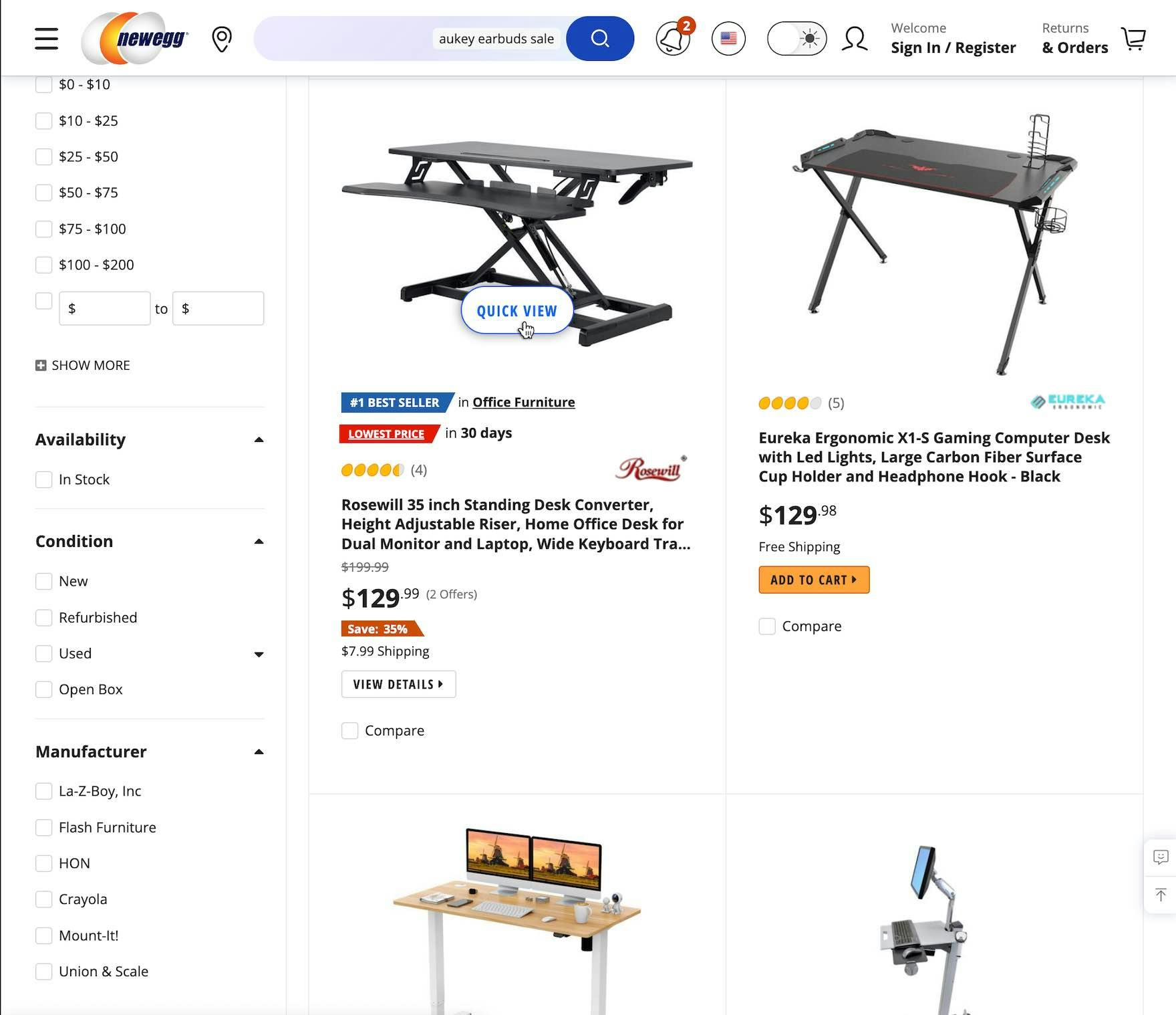
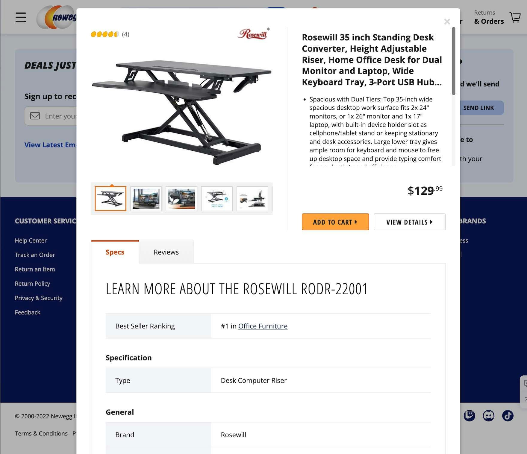
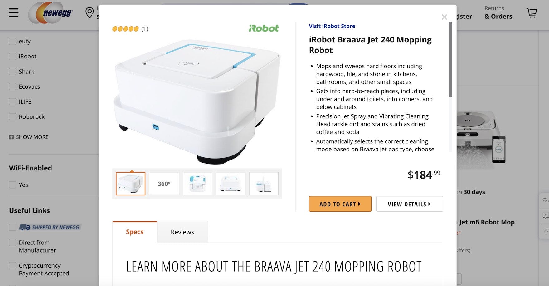
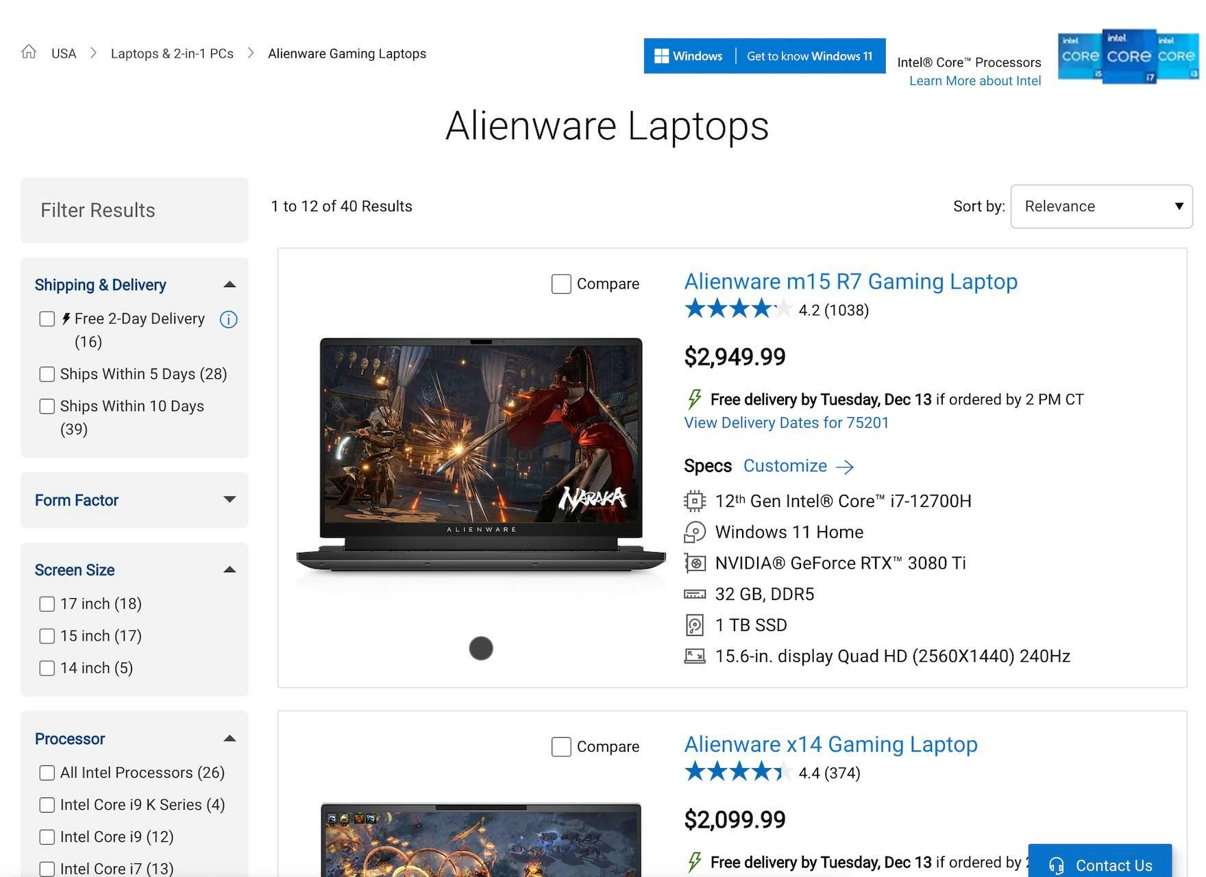
At Newegg, the “Quick View” operates as a “Product Page Lite”: halfway between a list item and a product page. Yet the additional information provided by the “Quick View” is unlikely to be decisive for users considering this standing desk — nearly all of whom will need to go to the product details page anyway to fully consider the product.
In short, while users considering visually driven products can often get the information they need by considering the few additional details provided by “Quick Views” (especially a larger product image), users considering spec-driven products typically have to go to the product page to perform a thorough consideration of a product.
For example, a user considering a dress mainly performs a visual inspection of the product, and the larger image of the dress provided by a “Quick View” will often be enough for the user to add the product to the cart.
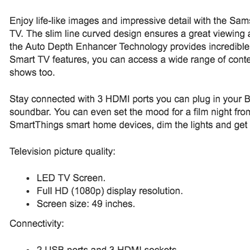
On the other hand, a user considering a laptop will conduct a cursory visual inspection of the laptop thumbnail in the product list before diving into detailed specs (e.g., screen size, operating system, weight, use cases, etc.).
And these detailed specifications are typically best provided on the product details page, where there’s enough room to provide tables, user manuals, warranty information, and so on — often in a easy-to-scan way.
Moreover, spec-driven products tend to be, generally speaking, relatively expensive purchases.
Thus, users are often reluctant to perform a cursory consideration of a spec-driven product, and want to “dive into the details” to ensure they’re getting the best possible product for their needs.
In the end, for sites mainly offering spec-driven product types (e.g., consumer electronics, home appliances, tools, automotive, office supplies, industrial equipment), resources are better spent on improving other aspects of the Product List UX, rather than developing or maintaining “Quick Views”.
3 UX Areas to Focus on Instead of “Quick Views”
While “Quick Views” are generally not useful for users considering spec-driven product types, testing revealed 3 areas in particular to focus on to assist users in product lists.
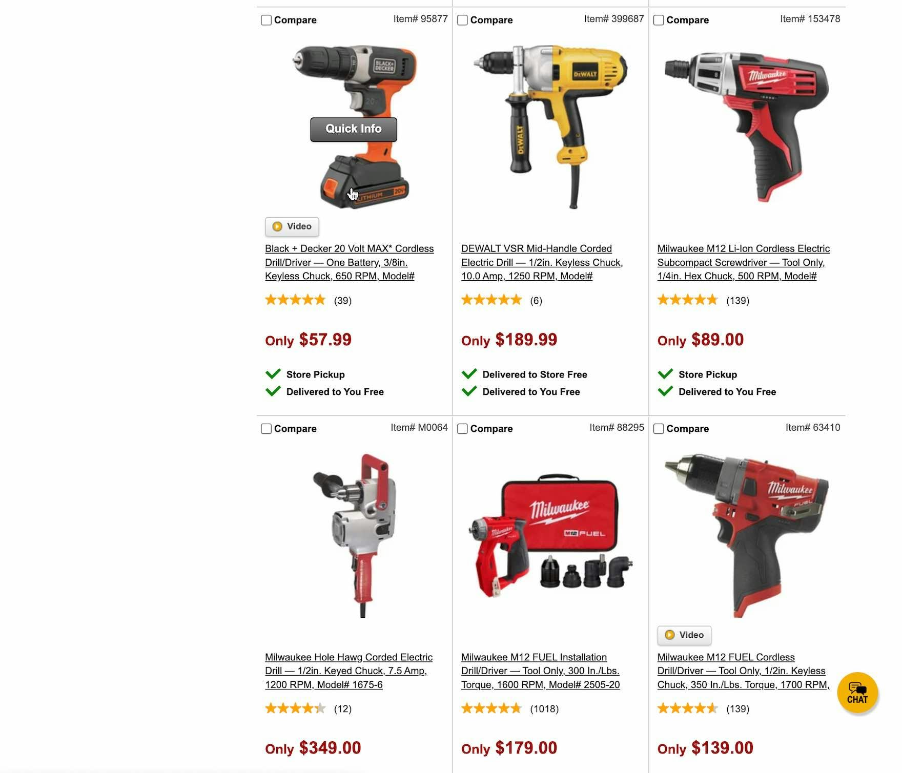
1) Use a “List View” for the Product List Layout (23% Don’t)
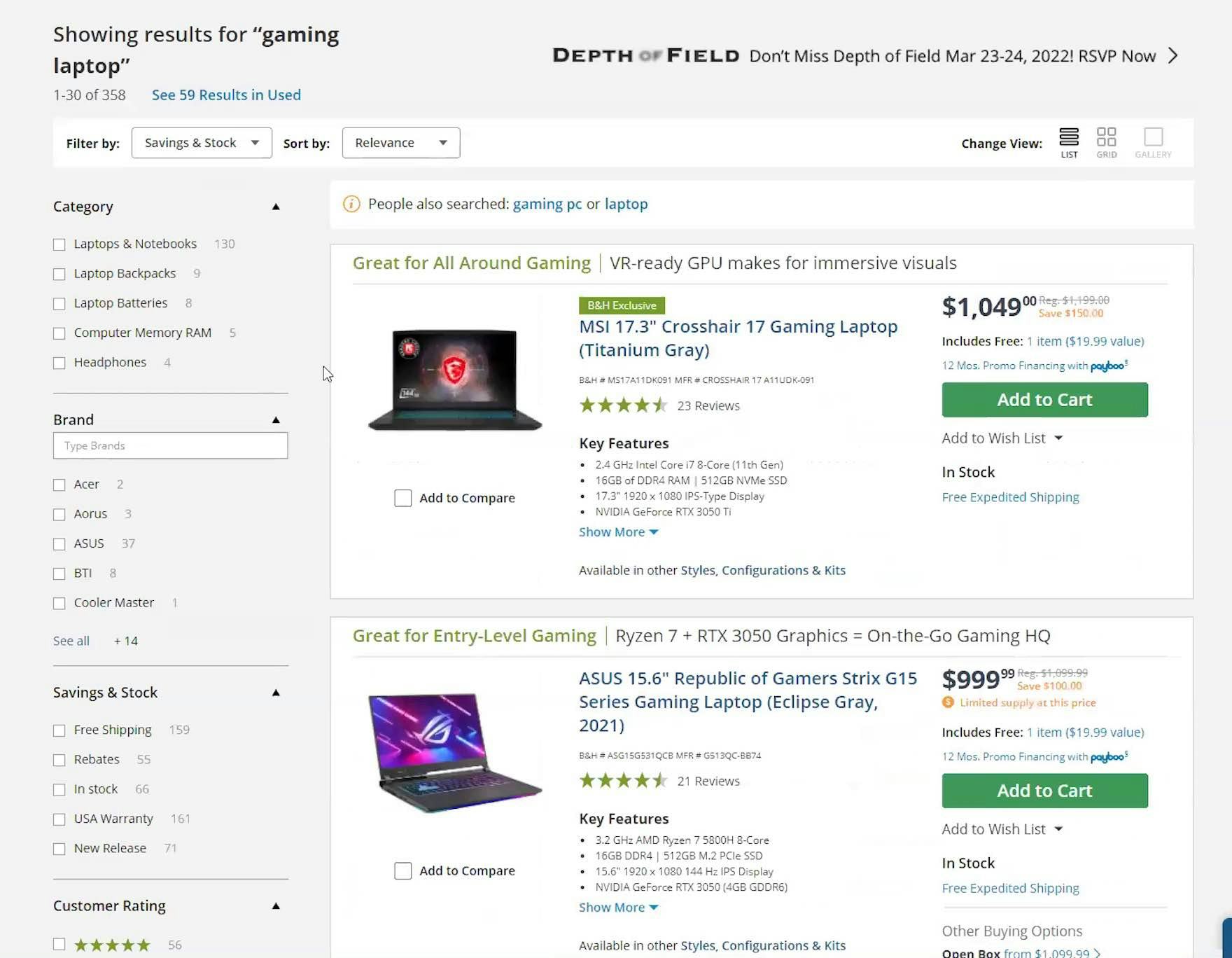
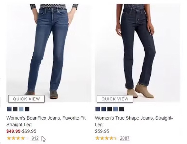
“Checking out ‘grid view’. You lose that good comparison ability that you really need to be able to compare these…and other than the color and the series, what differentiates these? You have no way to tell. I feel like you got to stay in list mode at least if you’re trying to get any good amount of information from these.” On B&H Photo, which gives users the option to switch views, this test participant disliked “Grid View” (first image) because he was shown less information and specs for each product than in “List View” (second image).
The primary purpose of product lists is to allow users to make basic decisions about suitability before narrowing down the selection for comparison and eventually visiting product pages.
For spec-heavy products, it’s therefore critically important to show key product attributes in list items (see #2 below).
However, if a “Grid View” is used for the layout, list item info has less room within list items because significant space is dedicated to thumbnails (which are also important for spec-driven products, just less so than for visually driven products).
With this level of spec detail in Dell’s list items — with ample space provided by the “List View” layout — users will be able to assess many of the most important product attributes before visiting product pages.
Therefore, to avoid the issue caused by list items displayed in “Grid Views”, a “List View” layout should be used for spec-heavy products.
Yet 23% of sites in our e-commerce UX benchmark provide a “Grid View” layout rather than a “List View” layout for spec-driven product types.
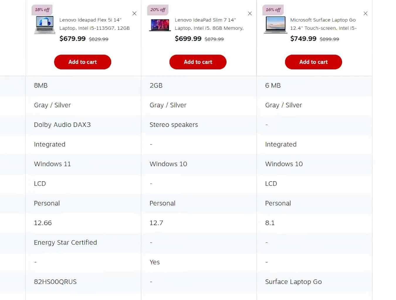
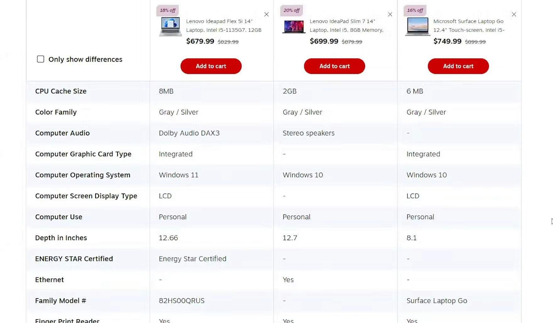
2) Provide Sufficient List Item Information (52% Don’t)
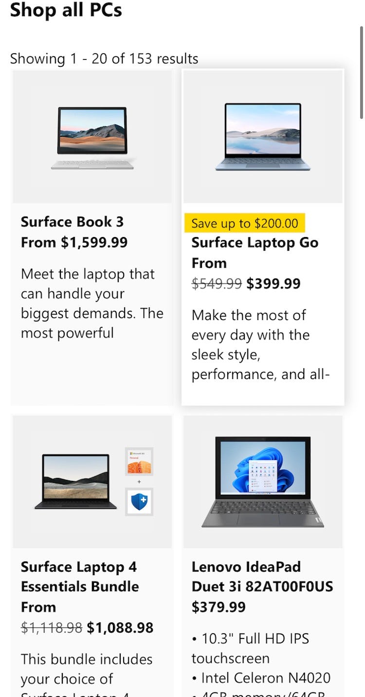
Microsoft doesn’t provide enough basic list item information — such as the review average and available laptop variations — as well as category-specific attributes to allow users to adequately assess the product list items.
Users select and reject products based upon the information available about those items in the product list.
During testing we observe that too-little or low-relevance list item information is highly problematic because users are unable to adequately assess the listed products.
This led some participants during testing to dismiss perfectly relevant products while others were forced into unnecessary pogo-sticking between the product list and the product page.
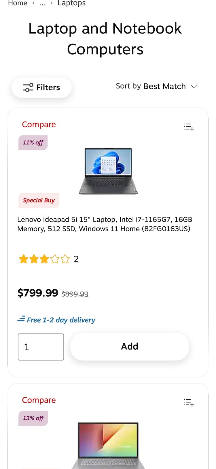
Staples provides essential list item info, as well as category-specific info, to help users make a decision on which laptop to explore further by visiting the product details page.
Therefore, it’s crucial to optimize list item information by providing both universal and category-specific list item info that users need to perform their assessment of the list items.
Additionally, the information should be designed to be as scannable as possible to support users’ ability to consider the items.
Yet 52% of sites in our benchmark don’t provide sufficient basic and category-specific list item info.
3) Provide Comparison Features (for Desktop Users) (17% Don’t)
It can be difficult for users considering spec-driven products, given the amount of information they need to consider when comparing products.
Indeed, visiting multiple product pages to compare specs can be time-consuming and troublesome (especially if users are not brought back to the same place in the product list on return).
Yet as established above “Quick Views” for spec-driven product types typically are insufficient for users’ information needs.
“It’s got a lot of info and that’s what I like. The more info, the better it helps me understand what it is. For example, it mentions if it’s a 2-in-1, it has the battery life, graphic processor, hard drive size, what type of battery, and the weight. That’s a lot of info and that’s what I need. The more info, the better it helps make my decision.” This test participant was keen to compare laptops across numerous features on Staples and was happy that the comparison feature made this easier.
However, our large-scale testing revealed that comparison features can help users by displaying many specs for multiple products side-by-side.
While not used by everyone, a subgroup of participants during testing found comparison features very helpful in condensing and organizing information so that they could make sound judgments regarding which product would be the most suitable for them.
(Note, for mobile users comparison features are not as helpful, as the reduced interface size means users have to scroll extensively to see the different features — largely negating the benefits of the feature.)
Importantly, to perform as users expect comparison features must be optimized for scannability.
Yet 17% of sites in our benchmark selling mainly spec-driven product types don’t provide comparison features.
Focus on Improving the Basic Product List Performance for Spec-Driven Products
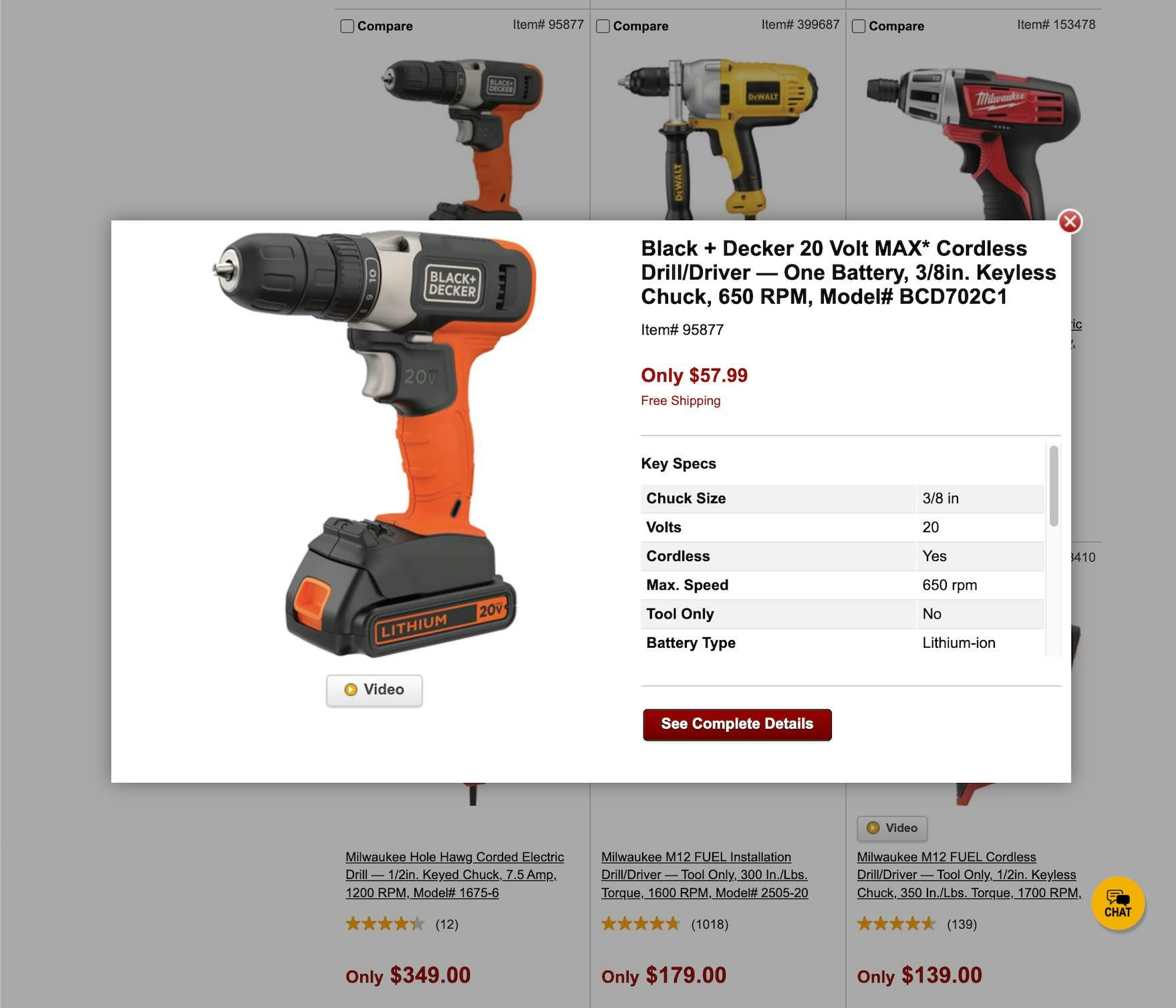
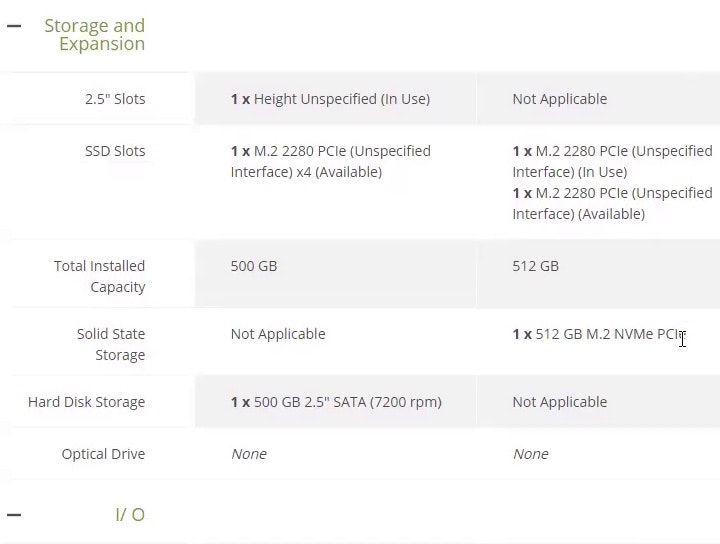
While “Quick Views” aren’t likely to be harmful to most users on Northern Tool’s product list (first image; except for those who mistakenly click on the feature when wanting to go to the product details page instead), the “Quick Views” don’t provide that much value either. The specs visible were mostly already shown in the product list, while others are out of view and users would have to scroll to see more (second image). In the end, simply going to the product page (or making use of a comparison feature) is a far better use of users’ time then fiddling with a “Quick View” on a spec-driven site.
The reason to avoid “Quick Views” for spec-driven product types isn’t that “Quick Views”, if implemented, will significantly disrupt most users.
Indeed, during testing most users on spec-driven sites, encountering “Quick Views”, simply learned to ignore them (however a few were disrupted when they mistakenly clicked on the “Quick View” in the list item).
Rather, the reason to avoid “Quick Views” for spec-driven product types is that nearly all spec-driven sites are better off putting their resources into ensuring the product list is generally high-performing; in particular, in the following 3 ways:
- Using a “List View” for the product list layout (23% don’t)
- Providing sufficient category-specific list item information (along with basic list item info) (52% don’t)
- Providing highly scannable comparison features for the desktop site (17% don’t)
Ensuring the above 3 key user needs are met will eliminate the need for “Quick Views” for nearly all users on spec-driven sites.
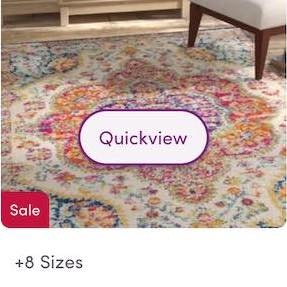
Finally, it’s worth noting that mass merchants and other sites with mixed product catalogs of spec- and visually driven sites can provide “Quick Views” to cater to users considering visually driven products.
However, our testing revealed that, even for visually driven products, focusing on basic product list improvements (along with ensuring users are returned to their place in the product list when they click back from the product details page) should take precedence over “Quick Views”, which are often simply workarounds for poor-performing product lists.
Thus, if “Quick Views” haven’t been developed yet for such sites, it’s far better to spend resources on general product list improvements.
Only after the product list is generally high performing should “Quick Views” then be considered for sites with mixed product catalogs.
This article presents the research findings from just a few of the 700+ UX guidelines in Baymard – get full access to learn how to create a “State of the Art” ecommerce user experience.
If you want to know how your desktop site, mobile site, or app performs and compares, then learn more about getting Baymard to conduct a UX Audit of your site.