Key Takeaways
- Visual depictions of the service UI was observed to be crucial to users when evaluating subscription services during our large-scale testing of B2B SaaS sites
- Yet 35% of SaaS and digital subscription sites fail to provide sufficient visual information
- Users who lack sufficient visual information for one service are likely to explore alternative services
When users are considering a SaaS or digital subscription service that they’ll interact with routinely as part of their work, they want to do more than just read about features, plans, and pricing.
At some point, almost all users will want to get a sense of what it would actually be like to use the interface.
Indeed, during our large-scale testing of B2B SaaS sites, the B2B participants were observed to seek out visual representations of the service’s UI — with some participants even preferring to focus on the visual aspects of the service, rather than read descriptions of the features in text.
Without an easy way to gain a visual understanding of the service, some users will leave the site, as they feel like they haven’t really “gotten a feel for” the service, and therefore couldn’t recommend it to their colleagues.
However, our SaaS UX benchmark shows that 35% of SaaS sales sites fail to highlight the service UI sufficiently — leaving them at risk of being abandoned for competing services.
In this article we’ll discuss the following from our Premium research findings of SaaS UX:
- Why users need visual information about a service’s UI in order to make a subscription decision
- 4 ways to meet this user need
The Importance of Users ‘Seeing’ the SaaS UI
All tested SaaS sales sites featured some screenshots or videos that included images of the user interface.
However, some sites only had a handful of images that featured the actual interface, or relied instead on graphics or abstractions of the interface, to provide this visual information.
Yet our testing reveals that B2B users considering a new digital subscription service — one that they’ll have to interact with frequently — need to get a sense of how the service looks “in real life”.
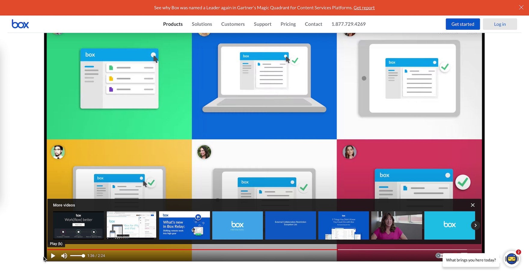
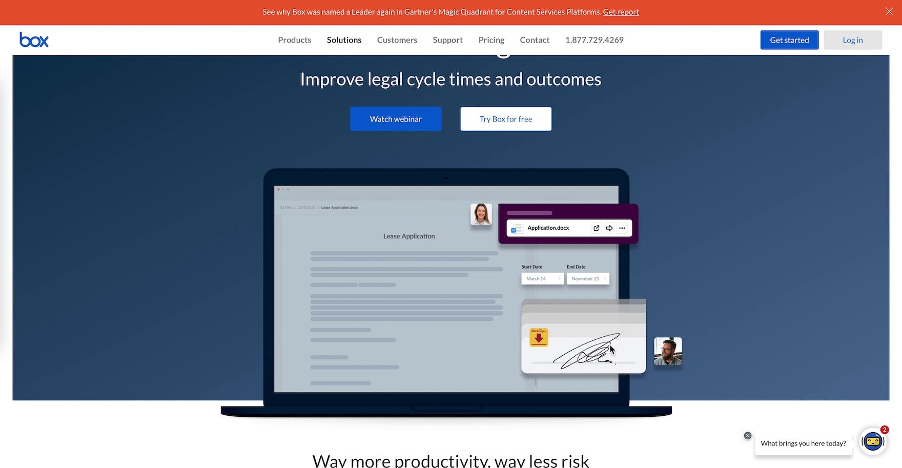
“I was hoping to see the interface but it really just kind of talked about it so it was still a little abstract to me.” A participant (a contracts manager for a medical devices company) fast-forwarded through a video on Box’s “Products” page (first image). He was disappointed not to be provided with images of Box’s user interface. Later, on the “Legal” page (second image), he was again disappointed to not see screenshots of the UI: “At this point, I’m just looking to see what it looks like, and I’m still not seeing that…I wouldn’t ever buy anything without seeing it, so that’s where I’m struggling a little bit.” He abandoned the site soon after. Without easy ways to see how the service will actually look, many users will feel like they’re missing crucial information.
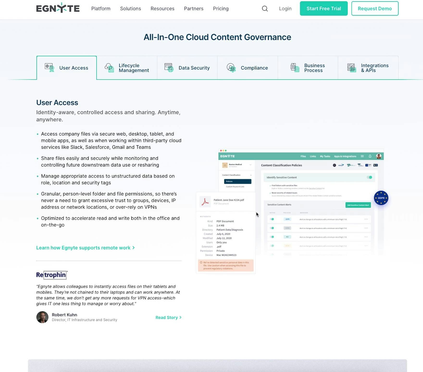
“Part of me just wants more of the user experience, either on video or in screenshots. I want to see that desktop folder.” A user (a senior product manager for an online media company) on Egynte’s “Platform” page didn’t think the one screenshot provided in the “User Access” tab provided enough visual information.
Without a clear sense of what the UI looks like, users are left to guess or fill in the blanks themselves about how the service’s UI will look — which can lead to some users simply deciding to consider another service.
After all, many users are concerned not only about if the service fits the budget, or what specific features it has, but rather if it will actually be adopted and embraced on an organizational level.
As one test participant put it, “I know that we have Box, and people don’t use it that often, because they can’t get it to work”. Without visual clues to how the service will work, many users will be hesitant to introduce a new service to coworkers.
![“It’s a lot cleaner…the idea of having the different faces here with nice color photos is very appealing…the problem [we had] with Webex before was people didn’t know where to click to get on the session, or how to access it…there are these little buttons at the bottom that seem to be working in terms of sharing turning on the microphone…turning on the camera, and I think that’s a lot easier…This looks like it’s a lot easier to use.” A participant (an e-learning training manager) focused on the homepage image on Webex of the video conferencing interface.](https://baymard-assets-cdn.imgix.net/research/media_files/attachments/68242/original/research-media-file-4a490748f5bd050efe5ddbc93fd210e6.jpg?auto=format&dpr=2&fit=max&q=50&w=880)
“It’s a lot cleaner…the idea of having the different faces here with nice color photos is very appealing…the problem [we had] with Webex before was people didn’t know where to click to get on the session, or how to access it…there are these little buttons at the bottom that seem to be working in terms of sharing turning on the microphone…turning on the camera, and I think that’s a lot easier…This looks like it’s a lot easier to use.” A participant (an e-learning training manager) focused on the homepage image on Webex of the video conferencing interface.
Therefore, it’s key to have multiple, high-quality depictions of the UI available on the site.
Seeing the actual interface was observed in testing to be helpful to participants when they were deciding among competing services, especially if they were previously unfamiliar with the service under consideration.
A visual sense of the UI provides users with a solid starting point to begin investigating specific features, plans, or pricing information.
4 Ways to Ensure Users Have an Adequate Visual Representation of the SaaS UI
When it comes to how to depict the interface, test sites communicated visual information about the UI through 4 different types of media, each of which can perform well for users (listed in descending order of importance):
- Images
- Gifs
- Videos
- Demos
1) Images
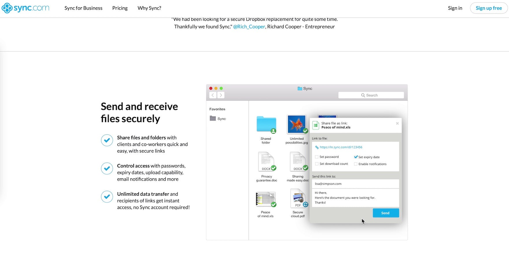
“I like that they have a Mac and Apple interface right here because all the other ones looked very PC focused…knowing that it might be a more Mac-forward company is definitely a plus.” A participant (a contracts manager for a medical devices company) on Sync liked seeing an image of the interface on the “Sync for Business” page. He added that he’d likely sign up for the free trial to test it out, and that the screenshot was a decisive factor for him.
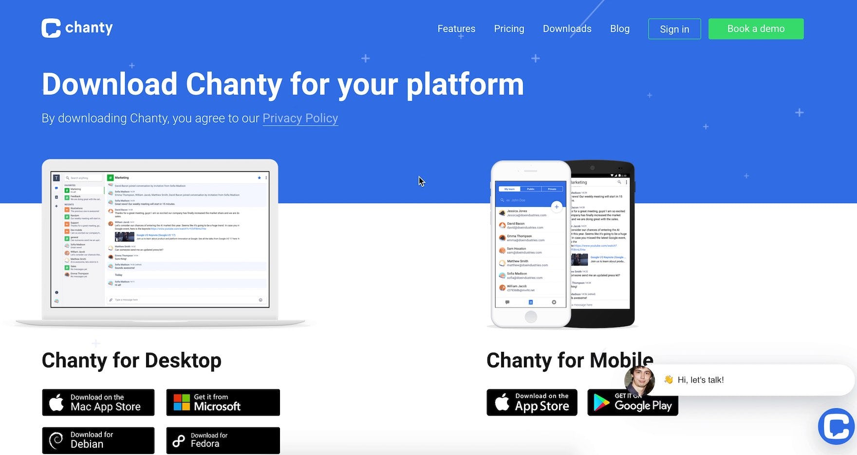
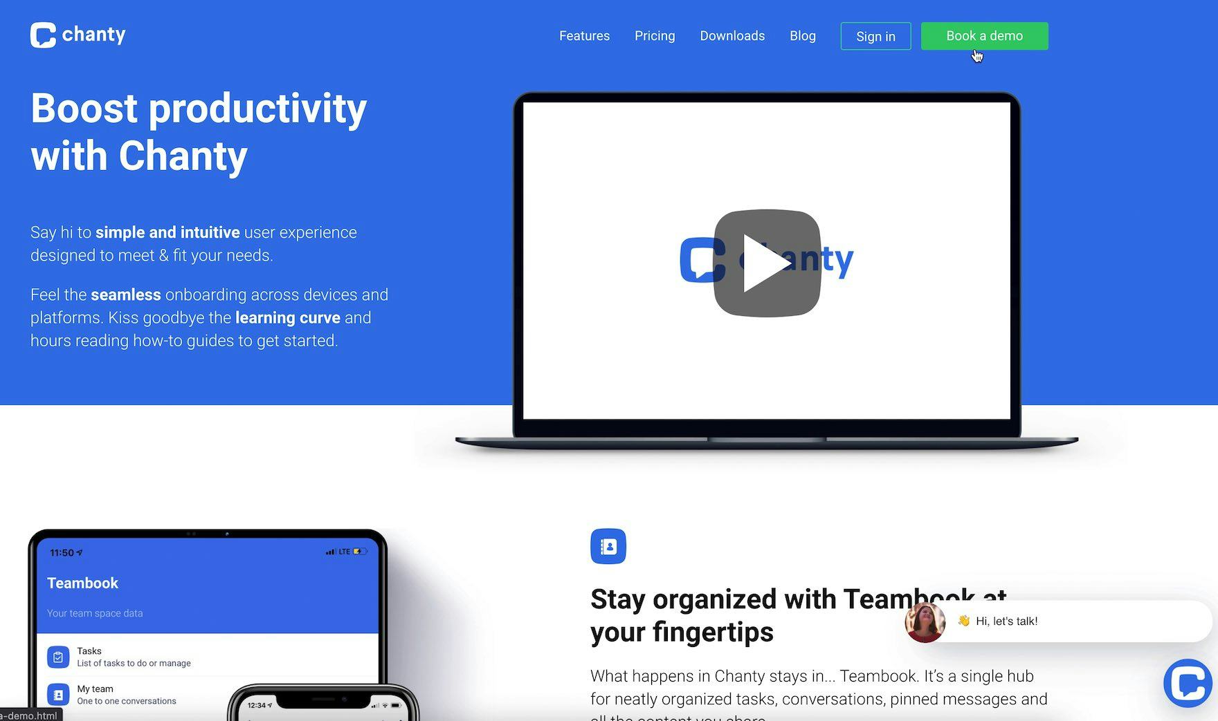
“OK, this feels like I’m already a part of it. I would download it.” A participant (a customer success manager for a computer software / SaaS company) on Chanty clicked the “Downloads” link in the main navigation and, on the “Downloads” page, focused on the screenshots and said she would download the product. A service’s visual UI can be what causes some users to decide to give the product a try.
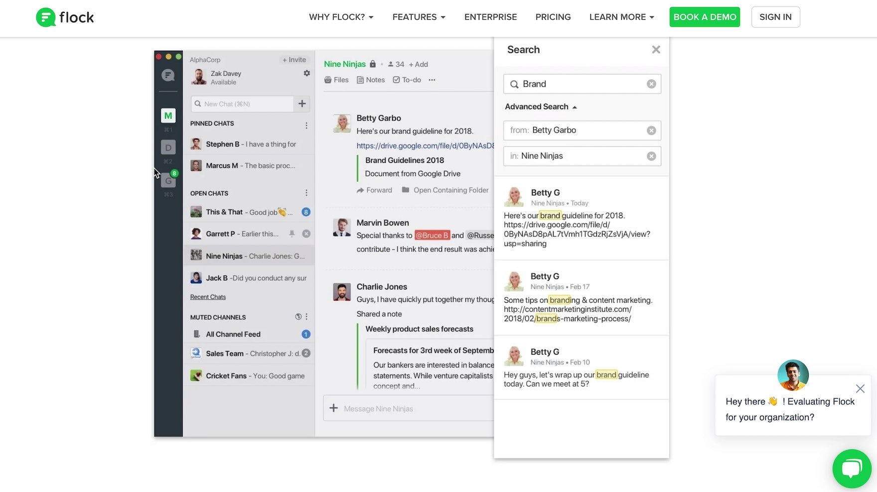
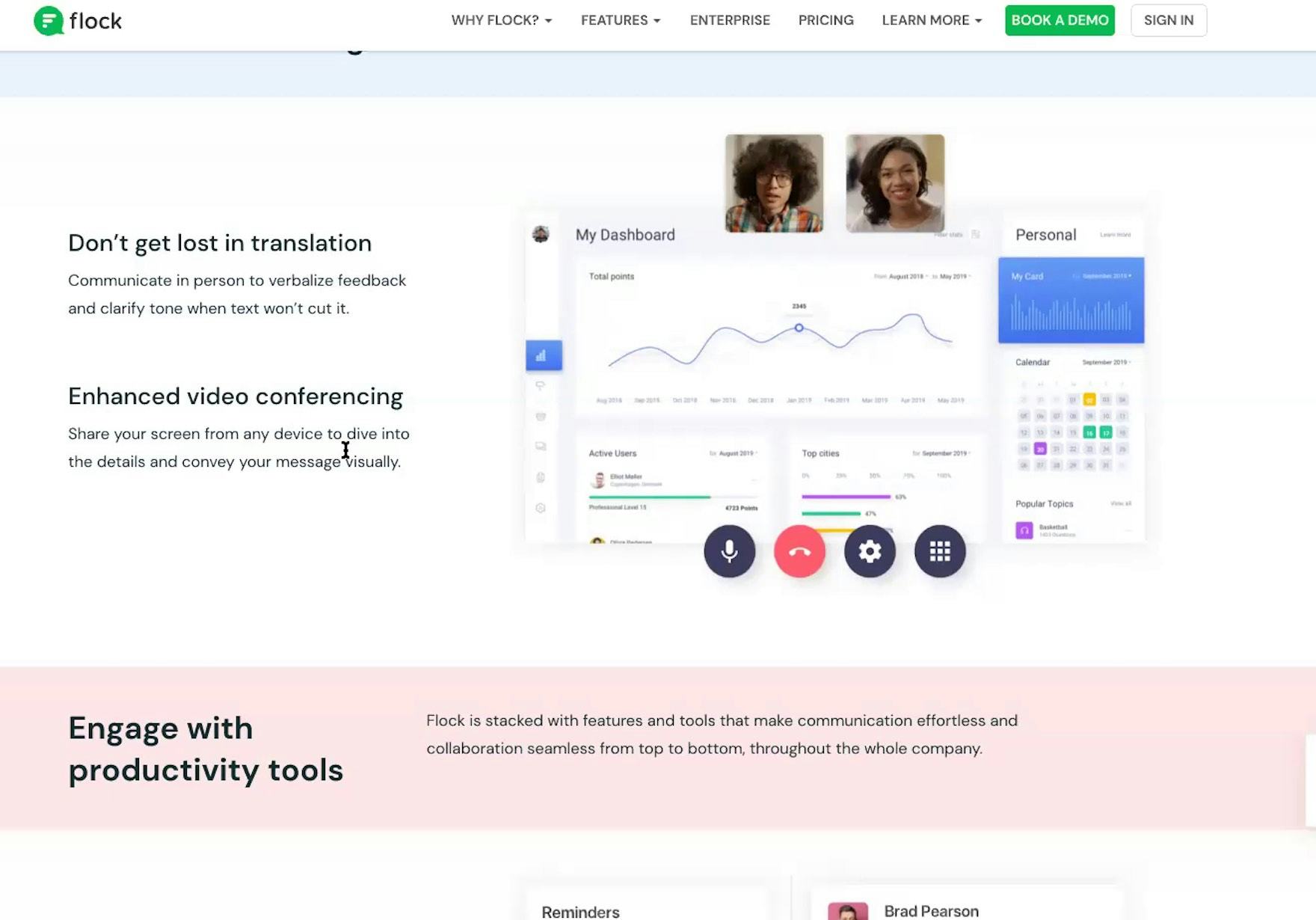
“I will say the layout and the look looks very much like Slack so this would not be a hard transition as long as it had all the same features because it almost looks exactly like Slack.” A participant (a director of operations for a digital product strategy consulting company) was uncertain about Flock as a service, but felt better after seeing a screenshot of the UI.
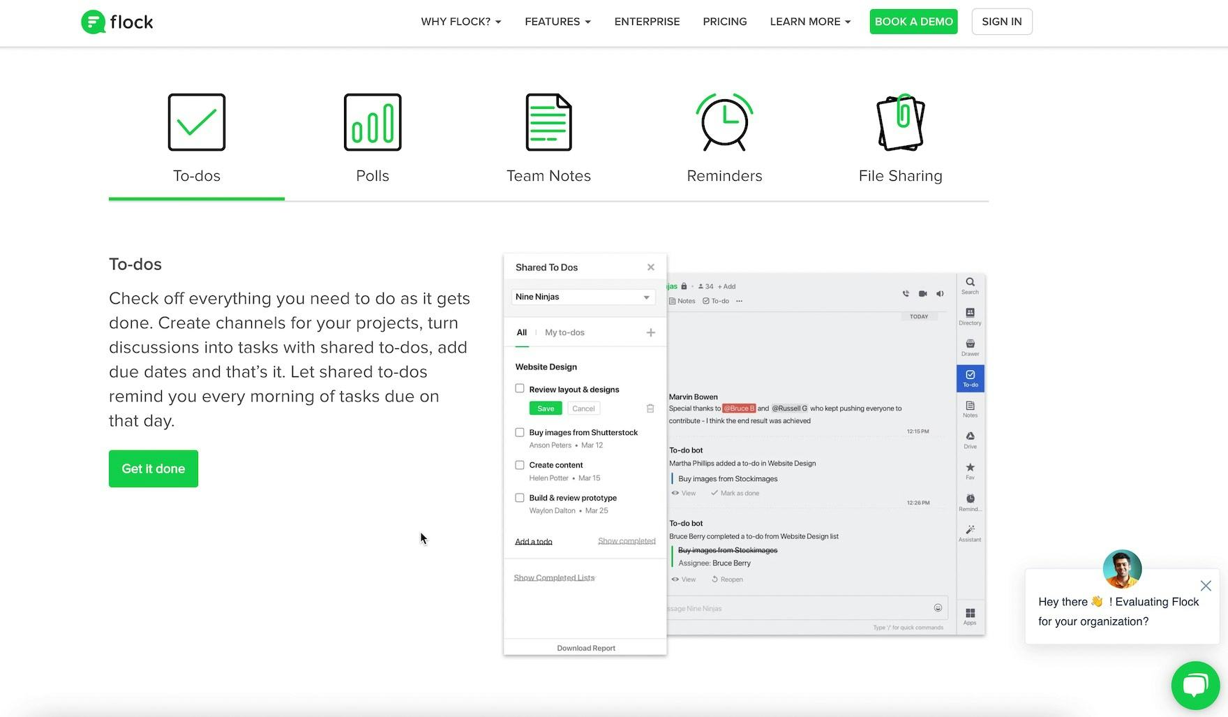
“I really like the way these ‘To-dos’ are set up.” A participant (an e-learning manager) stopped to consider a feature highlighted by a screenshot of the UI on Flock. Much like “Feature Callout” images in B2C e-commerce, images of the UI on digital subscription services sites can highlight particular features and benefits of the product — which would often be difficult to convey as quickly in text.
Images are crucial to users on B2C sites, and proved important as well during our digital subscription services testing.
Images should be considered to be the foundation of a site’s visual representation strategy, as nearly all users will see them.
For users, images tend to be interpreted as no-nonsense representations of how a site will look and feel, and thus are crucial to users’ ability to establish a visual sense of a service.
However, images that are abstractions or graphical representations of the interface — that is, not screenshots — performed more poorly during testing.
While having a few abstract graphics is okay, relying too heavily on them will eventually frustrate some users, who simply want to see “what it looks like” — not a designer’s interpretation of the interface.
In terms of the number of images to include, testing was somewhat inconclusive, beyond identifying that having only a few images that showcase the UI will likely not be enough to satisfy all users.
Therefore, err on the side of having an abundance of imagery (and gifs; see the following section), and providing the images where they make the most sense — for example, providing an image of the UI for each relevant “Feature” page, in addition to 3 or more images on the homepage.
2) Gifs
Gifs were observed to perform as well as images in testing and, in some instances, better, as they better highlight dynamic features and interactions.
Moreover, gifs avoid the major disadvantage of videos, in that the highlighted interaction is visible without users having to decide to click “play”.
Therefore, gifs should be considered alongside images as part of the foundation on which to build visual representations of the UI.
3) Videos
![“It looks really clean, the background is really simple…that looks nice…It’s really easy to vote. That’s something that’s important too, being able to get people’s input pretty quickly, and this is a really nice integration of voting. [After finishing watching the video.] This looks really good.” A participant (a technical project manager for an e-commerce company) watched an entire introduction video (nearly 5 minutes) at Flock, and came away much more impressed by the service on the whole.](https://baymard-assets-cdn.imgix.net/research/media_files/attachments/68249/original/research-media-file-972ec7345a23c198040c6b64e0e95589.jpg?auto=format&dpr=2&fit=max&q=50&w=880)
“It looks really clean, the background is really simple…that looks nice…It’s really easy to vote. That’s something that’s important too, being able to get people’s input pretty quickly, and this is a really nice integration of voting. [After finishing watching the video.] This looks really good.” A participant (a technical project manager for an e-commerce company) watched an entire introduction video (nearly 5 minutes) at Flock, and came away much more impressed by the service on the whole.
The impact of videos on participants on digital subscription sites was similar during testing to the impact videos had on participants during product page testing.
Namely, videos were very convincing — but only used by a handful of participants.
Therefore, digital subscription services sites should strongly consider including videos as a way to showcase the visual UI — but only after ensuring that there are enough images of the UI, as these are used by all users who encounter them.
If providing videos, ensure that they’re fast loading, have scrubbing previews, and include descriptive titles, as the few participants who viewed videos during subscription services testing often relied on similar video player features when navigating the content.
4) Demos
“I would probably do a demo with each of these.” A participant (an e-learning education manager) mentioned how she’d prefer to demo all of the communication services she was considering. She quickly found the link to the demo at Chanty, which was available as a prominent button in the main navigation.
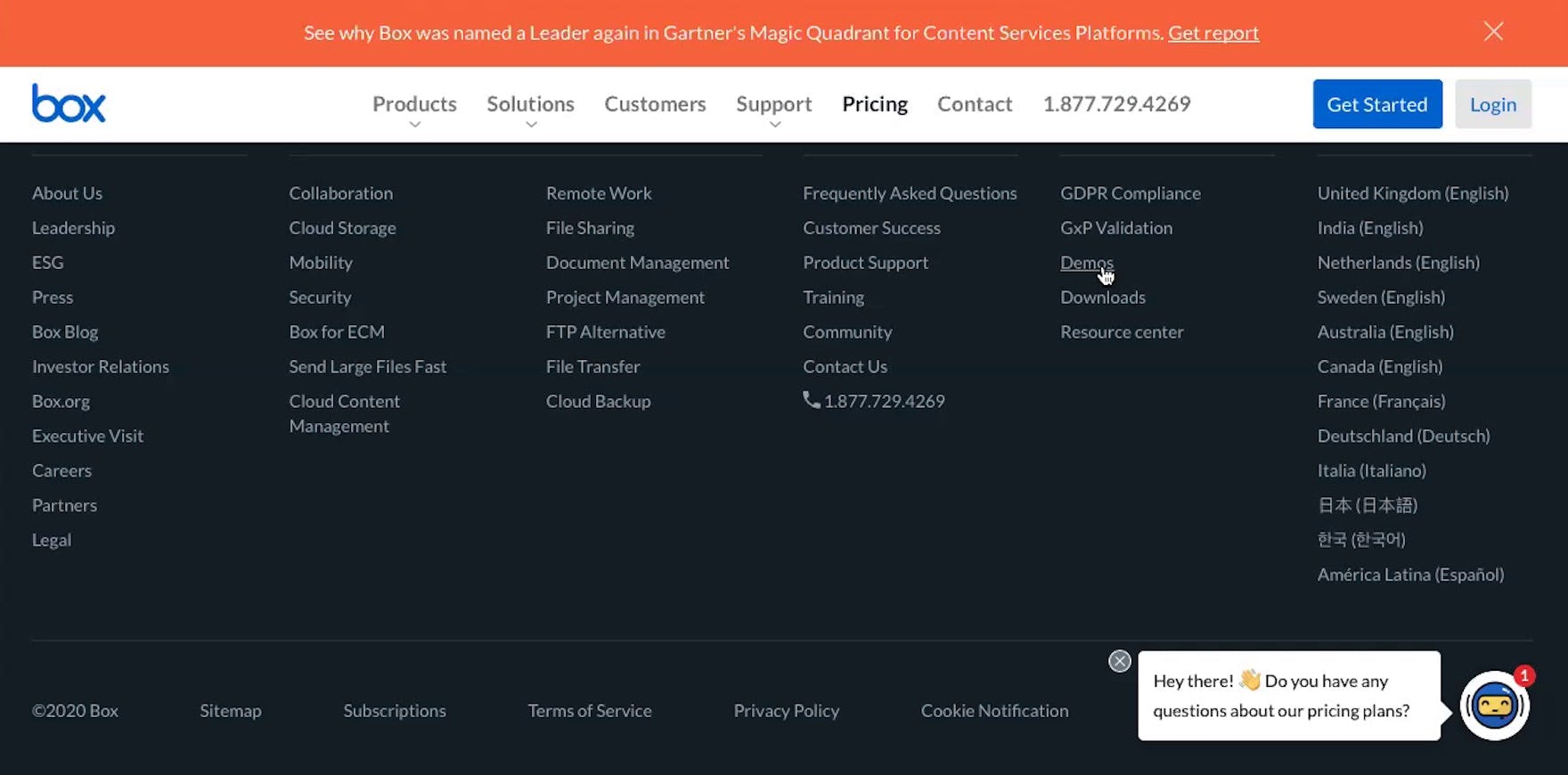
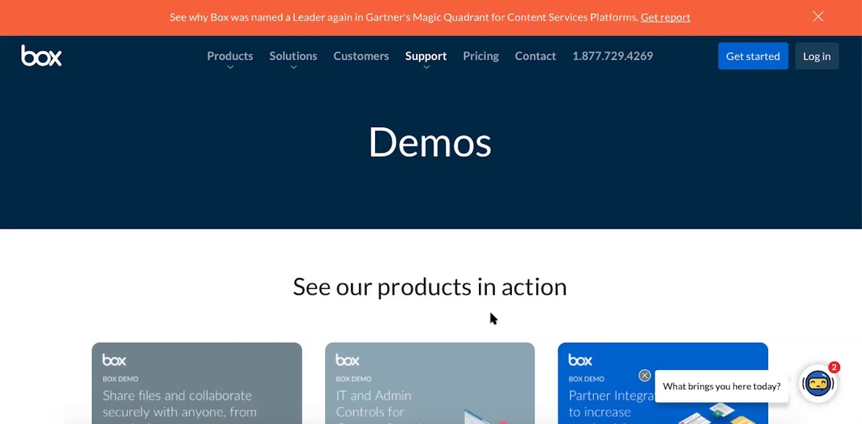
“Oh yeah, right there, ‘Demos’.” A participant (an enterprise knowledge manager for a financial services company) found a link to Box’s demos in the footer (first image), after searching for but not finding a link in the main navigation. He was taken to a page specifically devoted to demos (second image). He continued, “I’d probably spend about 5 minutes on sites like this…then I’m like ‘I want a demo’”. To ensure demos are easy to find, include links to them in the main navigation, on the homepage, and in the footer.
Finally, demos, like videos, can be very powerful at persuading users that a service may meet their needs.
After all, users get a chance to try out actually using the service (albeit in a limited capacity).
As one participant (an enterprise knowledge manager for a financial services company) said, “I look at 5 to 6 different things [features], and then after that it’s how it feels…To me a demo is incredibly important, and beneficial”.
However, like videos, demos are unlikely to be used by the vast majority of users, who view demos as even more of a commitment than electing to play a video.
Resources should be devoted to demos therefore only after ensuring that users have all the images and gifs they need to evaluate the UI.
Provide Users with the Visual Information They Need to Evaluate Your SaaS UI
In addition to having enough depictions of the UI via images, gifs, videos, and demos, it’s also important that they’re highly visible and scattered throughout the sales site.
“So this is kinda cool. This piques my interest — this dashboard where you can see your calendar for the day, tasks that are applicable to you.” A participant (an owner and director for a tutoring services business) appreciated finding an image highlighting the interface of one of Flock’s features midway down the homepage.
In particular, testing revealed that visuals of the UI are especially important to include on the homepage; ideally, near the top.
While users are likely to encounter these visuals organically as they browse the site, featuring them on the homepage was observed to more quickly entice participants to begin exploring the site in-depth.
The homepage visuals can serve as a general introduction to the interface, with more specific UIs being highlighted on relevant “Feature” pages (e.g., depicting the UI for a “polling” feature on the “Polls” “Feature” page).
Additionally, note that any specific feature highlighted in a depiction of the visual UI is liable to provoke further questions from users about what it is or does.
Therefore, if the visual depiction of the UI is specifically trying to highlight some feature or benefit — for example, a dashboard feature — be sure to link to additional information about the feature near the visual depiction of it, so users whose curiosity is sparked by the visual can learn more details about the feature.
![“I usually go right to [the imagery] more than seeing what the description is on the page because this shows me what it’s doing.” A participant on Chanty (a technical project manager for an e-commerce company) spent a minute investigating the screenshot of the interface, pointing out various features she thought would be useful to her or others in her organization.](https://baymard-assets-cdn.imgix.net/research/media_files/attachments/68256/original/research-media-file-fda0db183299e464f20fb39bef5ff86f.jpg?auto=format&dpr=2&fit=max&q=50&w=880)
“I usually go right to [the imagery] more than seeing what the description is on the page because this shows me what it’s doing.” A participant on Chanty (a technical project manager for an e-commerce company) spent a minute investigating the screenshot of the interface, pointing out various features she thought would be useful to her or others in her organization.
Providing users with sufficient visual information about the service UI can entice some to explore the service further, while cement for others the suitability of the service for their organization.
Yet 35% of SaaS sites fail to include sufficient visual information for users — leaving users with unanswered questions about the interface, which may be enough for them to decide to explore a competing service.
Getting access: all 196 Digital Subscriptions & SaaS UX guidelines are available today via Baymard Premium access. (If you already have an account open the Digital Subscriptions & SaaS studies.) (You may also want to see our SaaS UX audit service for information on booking a UX audit of your SaaS sales site.)