Key Takeaways
- Extensive multicolumn forms can lead to misreading and user input errors
- Using a single-column layout makes it easier to both complete and then review inputted form details
Video Summary
While multicolumn form layouts can achieve a more compact, shorter-scrolling page, we’ve observed across multiple rounds of Baymard’s usability testing that participants often struggled with them compared to single-column forms.
In practice, the different columns of empty fields and selectors draw users’ attention in multiple directions, making it more difficult for users to correctly interpret the form — including which fields or columns are required to continue.
As a result, multicolumn fields are more prone to errors, both from skipping overlooked required fields or spending unnecessary effort on inappropriate ones.
Yet our e-commerce UX benchmark reveals that 16% of sites use extensive multicolumn forms — which can result in checkout abandonment when users receive error messages due to their misinterpretation of relevant versus irrelevant fields.
In this article we’ll discuss our Premium research findings with regards to Checkout forms:
- Why extensive multicolumn forms are more difficult to complete
- How a single-column layout resolves the issue
Why Extensive Multicolumn Forms Are More Difficult to Complete
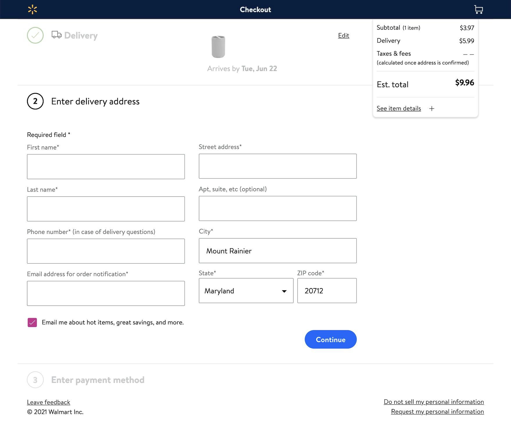
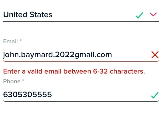
The multicolumn form layout at Walmart risks users skipping key fields — likely triggering a preventable error message.
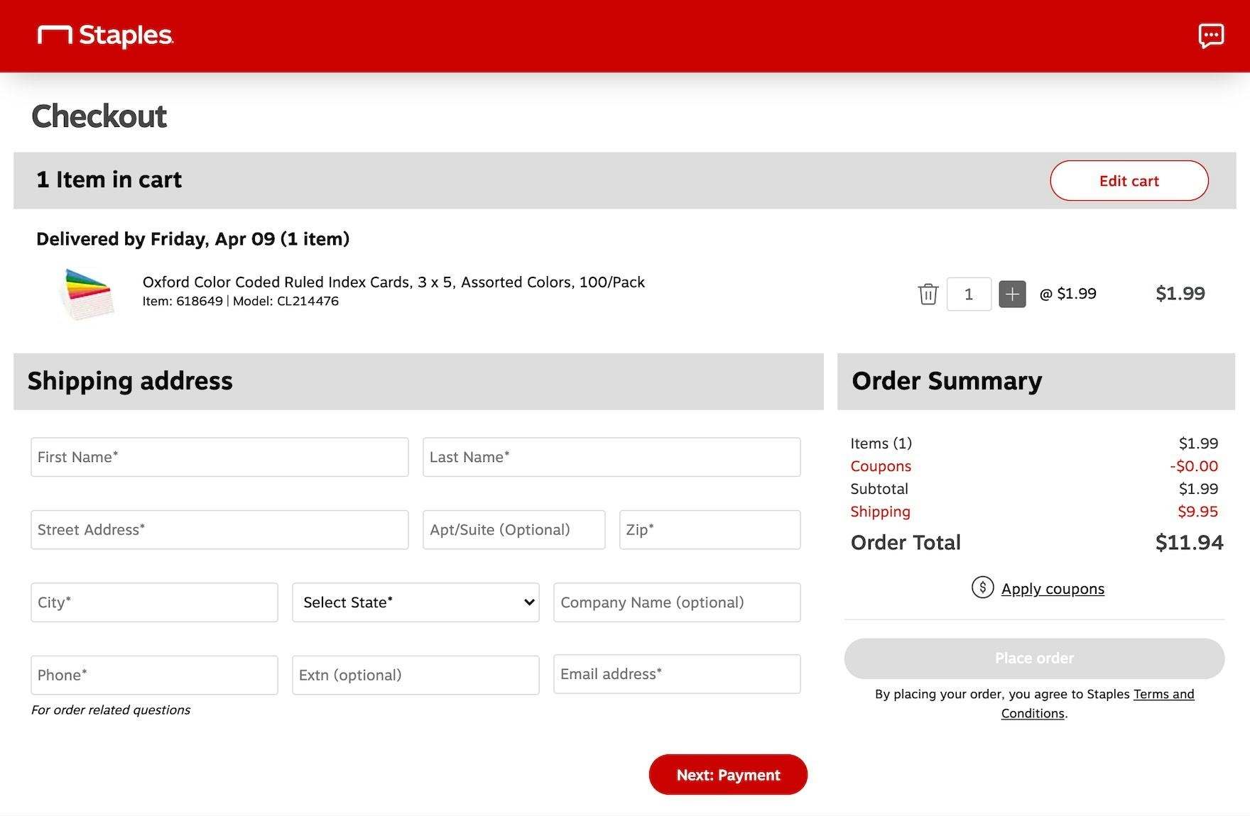
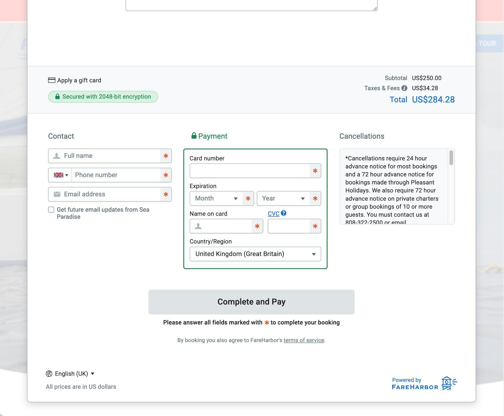
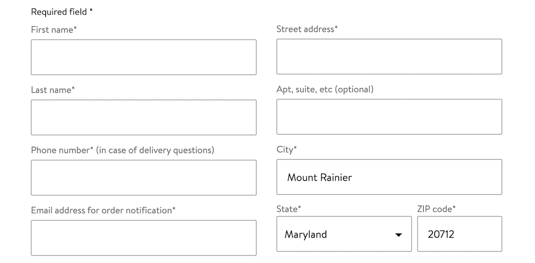
The multicolumn forms at Staples (first image) and Sea Paradise (second image) are prone to users missing fields as they scan back and forth across the form.
When users arrive at a page with multiple form fields in two or more columns, there are several different ways for them to interpret the correct sequence of fields.
For example, some multicolumn forms ask users to complete only the fields within a single column, while others intend for users to complete all or most fields in every column.
As a result of this ambiguity, we’ve repeatedly observed that forms with multicolumn designs often led a small subgroup of participants to either complete unrelated or unnecessary fields, misinterpreting them to be part of the required input, or to inadvertently skip or omit required fields that they had overlooked due to the multicolumn layout.
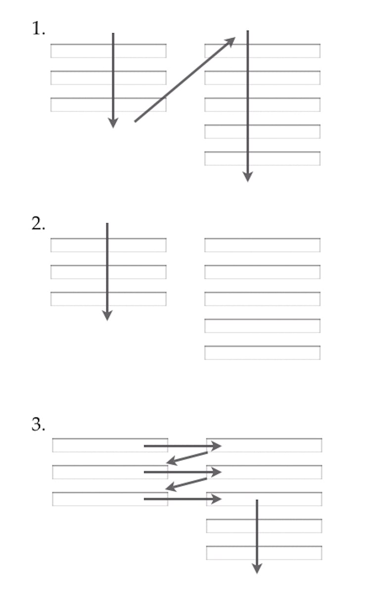
In practice, multicolumn forms are also prone to misinterpretation because users’ attention is drawn in multiple different directions, increasing the risk that users will complete the form incorrectly.
This was observed in testing even when the form incorporated other cues and design elements, such as separators between columns, intended to guide users on which to complete.
In short, multicolumn form layouts cannot fully eliminate the risk of misinterpretation, making them less intuitive and more error prone for users.
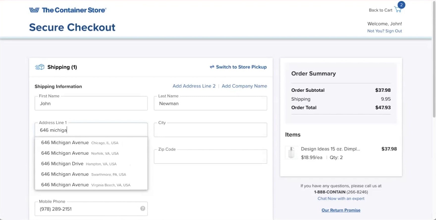
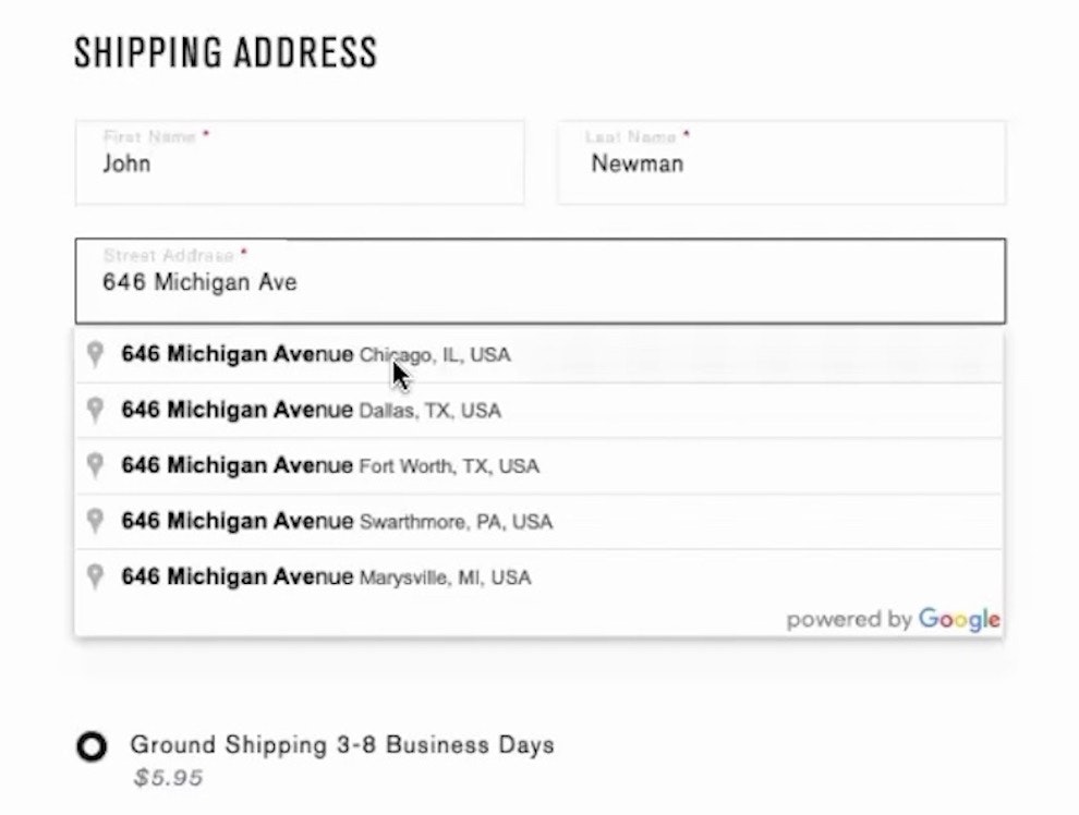
While features like “Fully Automatic Address Lookup” and browser autofill can enable users to effectively skip some data entry, the risk of multicolumn form fields cannot be entirely removed, as seen here at The Container Store.
In testing, multicolumn form layouts tended to cause fewer issues when data entry was bypassed by effort-saving features such as browser autofill or “Fully Automatic Address Lookup”.
However, these tools cannot completely negate the risks posed by multicolumn forms.
First, not all users utilize these browser features or are able to rely on browser autofill in all situations, such as when sending a gift to a previously unsaved address.
Likewise, a “Fully Automatic Address Lookup” feature can sometimes fail to return appropriate matches, requiring users to input all or part of their address manually.
Finally, even when data is automatically filled from these features, most participants in testing still preferred to review the entries for accuracy before moving on, requiring them to scan the autocompleted fields.
In reality, multicolumn forms are more difficult to visually scan, requiring users to look both down and across the page rather than down a single column.
As a result, users scanning a multicolumn form risk overlooking fields with undesired autocompleted input and submitting a form with incorrect information.
How a Single-Column Layout Resolves The Issue
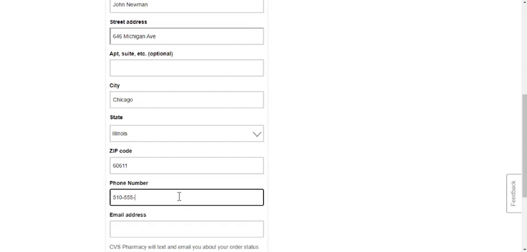
At CVS, the single-column layout of the checkout forms made it efficient for participants in testing to complete and move forward without errors.
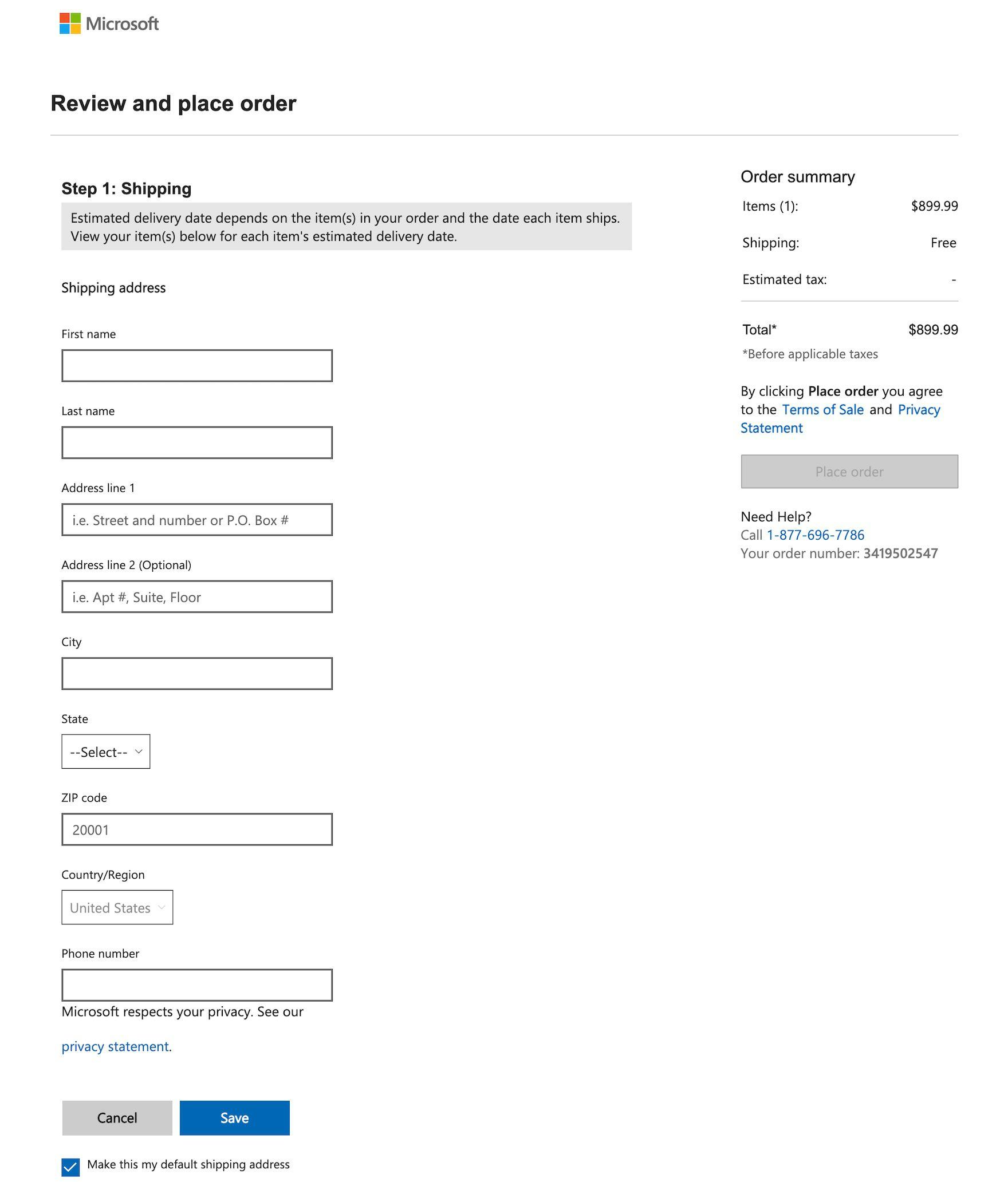
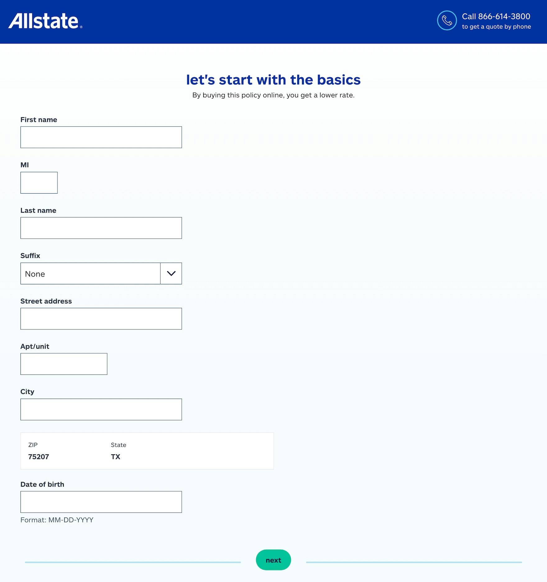
The forms at Microsoft (first image) and Allstate (second image) contain only a single column, making it easy for users to complete and review the fields.
In testing, we observed that single-column layouts resulted in fewer skipped fields, misinterpreted fields, and errors compared to multicolumn layouts.
When form fields are in a single column, users’ attention is guided in a single direction as users complete each field, moving down the form towards the bottom — rather than having their attention drawn both down and from side-to-side.
In practice, this layout helps ensure users find and complete all relevant fields.
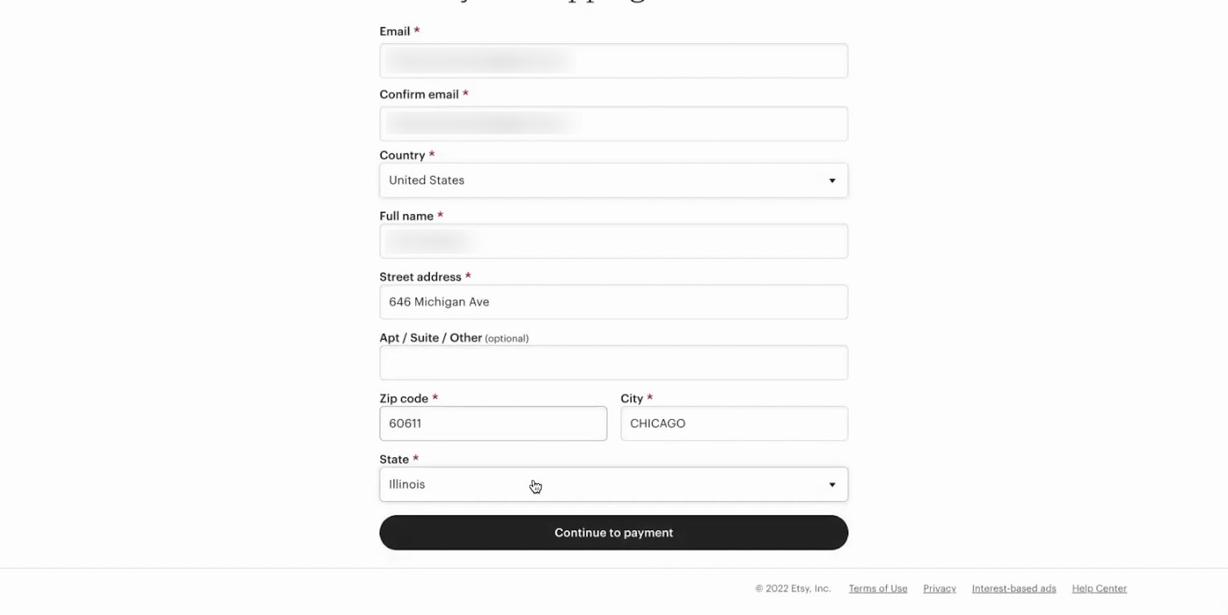
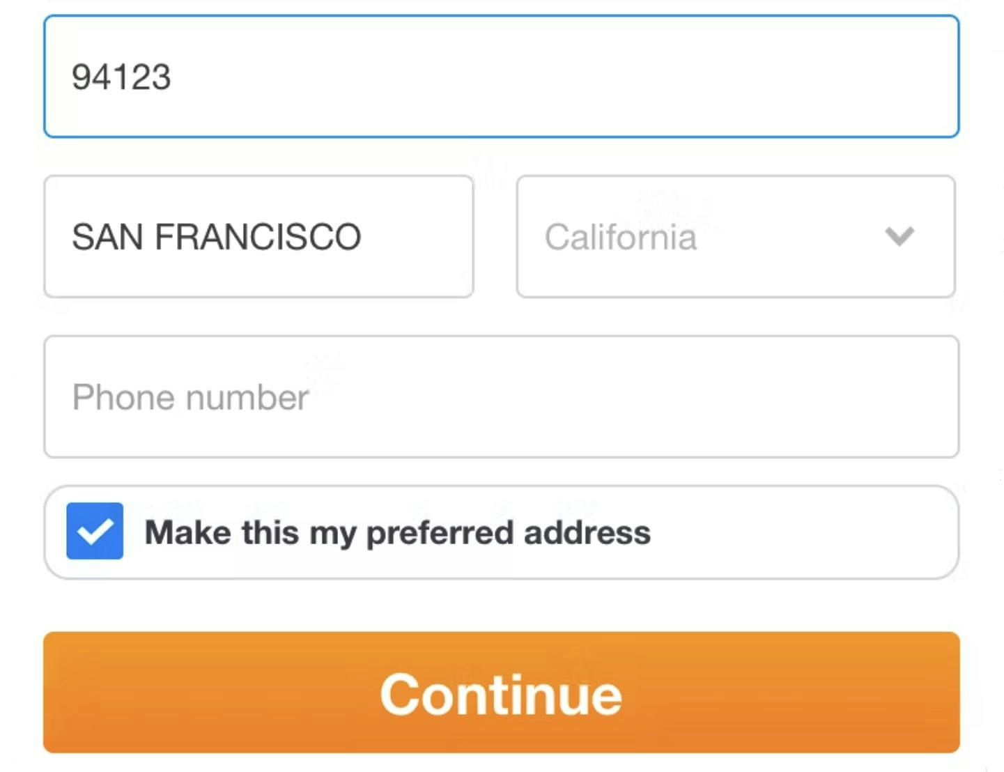
The single-column layout at Etsy makes a small exception for the “Zip code” and “City” fields, which makes sense both conceptually (as the two pieces of data appear alongside each other in a standard address format) and because the “Zip code” field autofills the “City” field.
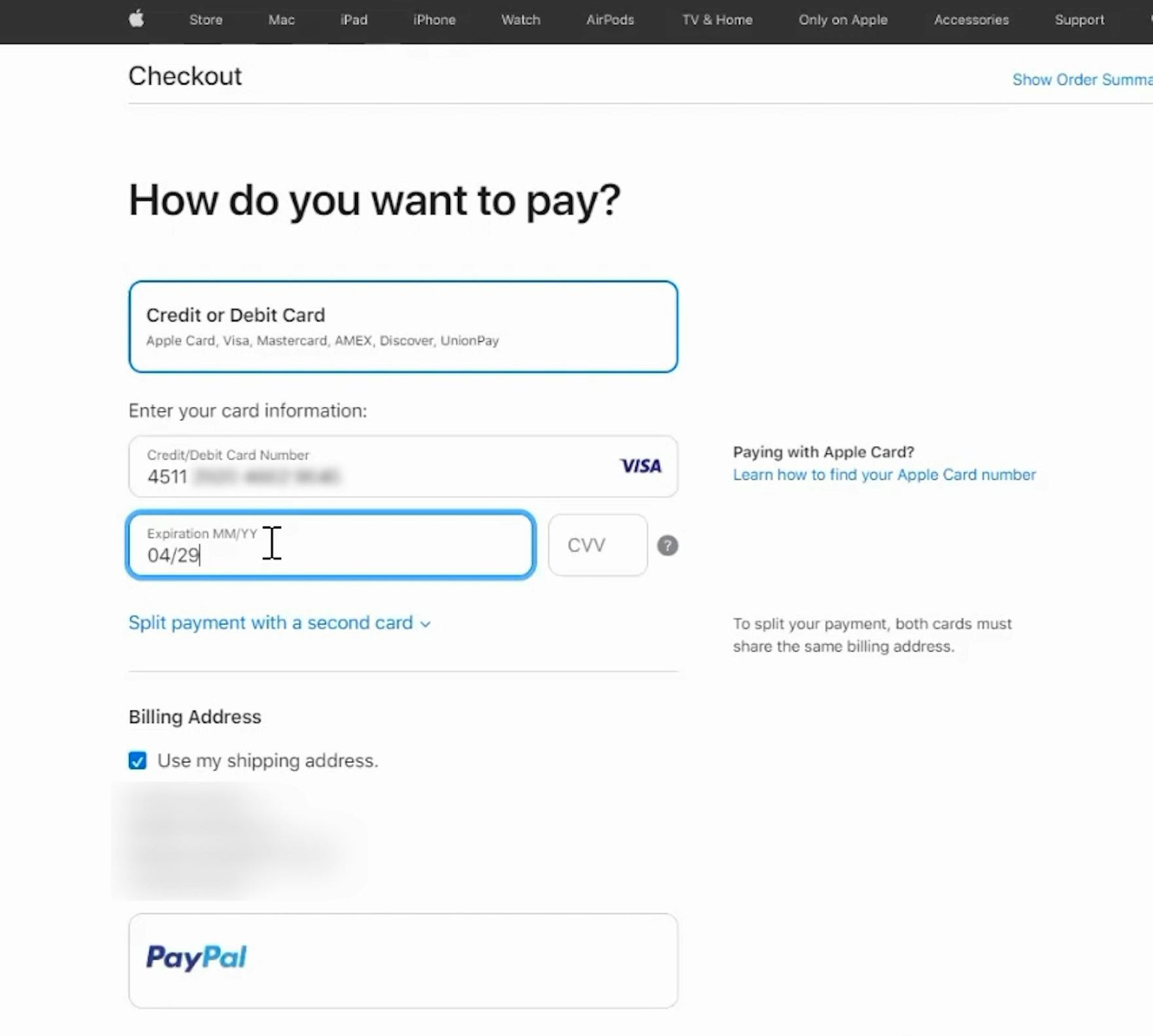
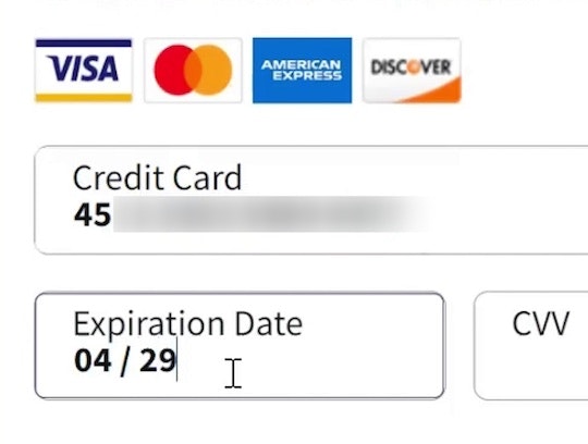
Likewise, the side-by-side fields for credit card expiration date and security code at Apple did not cause issues in testing, as these fields are conceptually related (and located together on some physical credit cards).
Notably, separate fields that are highly associated or can be thought of as a single coherent entity — such as dates (e.g., day/month/year fields); first, middle, and last name; city/state/ZIP or postal code; and credit card details (e.g., card number/expiration date/security code) — can be placed on a single line within a form.
Across multiple rounds of checkout studies, having 2–3 inputs on a single line didn’t cause issues when they logically belonged to the same single entity — and so long as the rest of the overall form layout only consisted of a single column.
In short, there is a distinction between “some lines having 2–3 fields per line” (an acceptable practice in certain cases) and an overall “two-column form layout” (generally problematic and never recommended).
However, in practice the kinds of inputs that may be acceptable to implement as multiple fields in a single line often have alternative solutions that may obviate the need to consider a “multiple-fields per line” design — for example, using a single “full name” field rather than separate “First” and “Last” name fields, or providing an automatic address lookup feature.
Use a Single-Column Layout to Support Users’ Visual Understanding of Forms
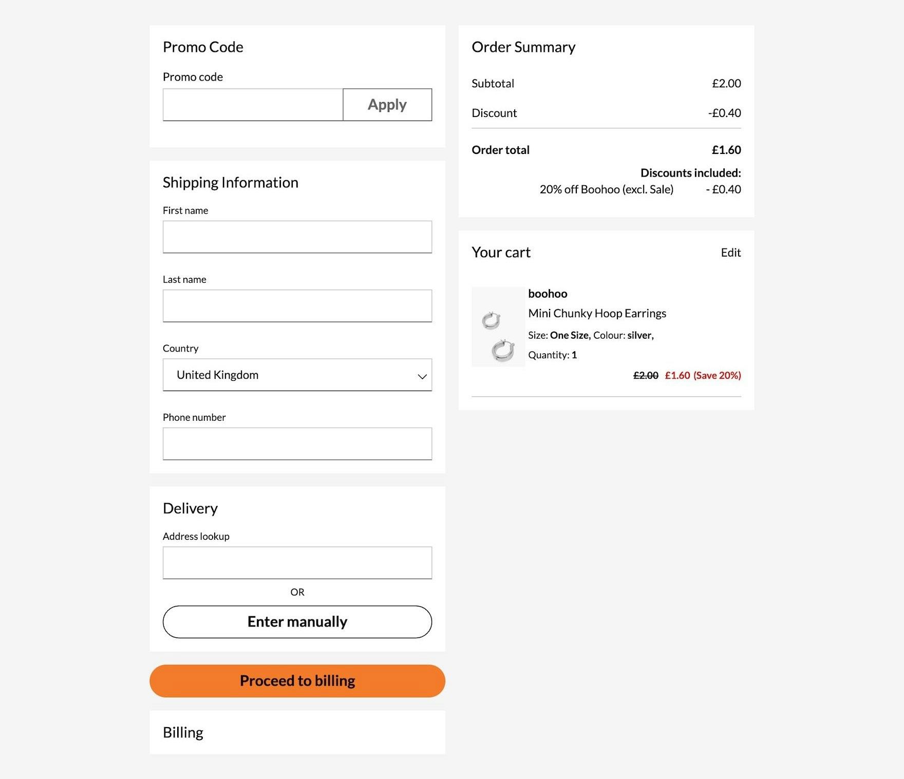
At Debenhams, a single-column layout for address forms supports users’ preference to fill and scan information in one direction. This also leaves room for other crucial information, such as the running order summary and cart details.
Users faced with extensive multicolumn form layouts will not only likely be immediately intimidated — some will also misinterpret the fields’ relationship to each other as well as to the overall form.
On the other hand, using a single-column layout ensures users only have one direction to go in while filling in information and scanning it, making it easier to complete and review the form.
Yet 16% of sites in our e-commerce UX benchmark use extensive multicolumn forms in checkout, making it more difficult for all their users to successfully complete these crucial fields — and more at risk of abandoning their purchase.
This article presents the research findings from just 1 of the 700+ UX guidelines in Baymard – get full access to learn how to create a “State of the Art” ecommerce user experience.
If you want to know how your website performs and compares, then learn more about getting Baymard to conduct a UX Audit of your site.