Key Takeaways
- Our new research has uncovered 1,000+ usability issues specific to Vitamins & Supplements sites
- The research has resulted in 490+ guidelines that describe the issues, as well as design patterns verified to perform well for users
- In particular, the research provides insights on the content and features Vitamins & Supplements sites need to provide users to ensure they’re able to make a purchase decision
At Baymard our research team has just spent 1,800+ hours usability testing and researching Vitamins & Supplements website features, layouts, content, and designs — leading to our new study on Vitamins & Supplements UX.
The research is based on more than 230 qualitative user/site usability test sessions following the “Think Aloud” protocol (1:1 remote moderated testing).
This industry-specific research study focused on a total of 13 sites that distribute vitamin and supplement products in the US — with almost all test sites operating worldwide.
Our study included 11 multibrand Vitamins & Supplements sites: eVitamins, GNC, iHerb, Lucky Vitamin, PipingRock, Pure Formulas, Puritan’s Pride, Swanson Vitamins, Vitacost, Vitamin Shoppe, and Vitamin World.
In addition to multibrand sites, our research study included 2 single-brand, or white-label, sites: Nature Made and Nature’s Sunshine.
During testing the users encountered 1,000+ medium-to-severe usability issues.
These issues have subsequently been analyzed and distilled into the 490+ UX guidelines found within our Vitamins & Supplements research study (all of which are available as part of our Premium research findings).
The 490+ guidelines cover most aspects of the online exploration and purchasing of vitamins and supplements, at both a high level of general user behavior as well as at a more granular level of specific issues users are likely to encounter.
In this article we’ll introduce 3 high-level UX findings for Vitamins & Supplements sites:
- Detailed product data is critical to users’ purchasing decisions
- Vitamins & Supplements sites need several specific image types to provide users with the visual information they need
- Filtering performance is key to users’ ability to find suitable products
1) Detailed Product Data Is Critical to Users’ Purchasing Decisions
Unlike general e-commerce sites, where even highly technical products will often still have aesthetic considerations that must be highlighted on their product pages, users shopping for vitamins and supplements will often have very little concern for a supplement’s aesthetics and instead will be on the lookout for information about the supplement’s ingredient names, their amounts, and the supplement’s key benefits.
Even if the content included in the supplement description isn’t going to be the deciding factor for all users, they will inevitably rely on supplement descriptions to validate whether or not the supplement fulfills their unique combination of needs.
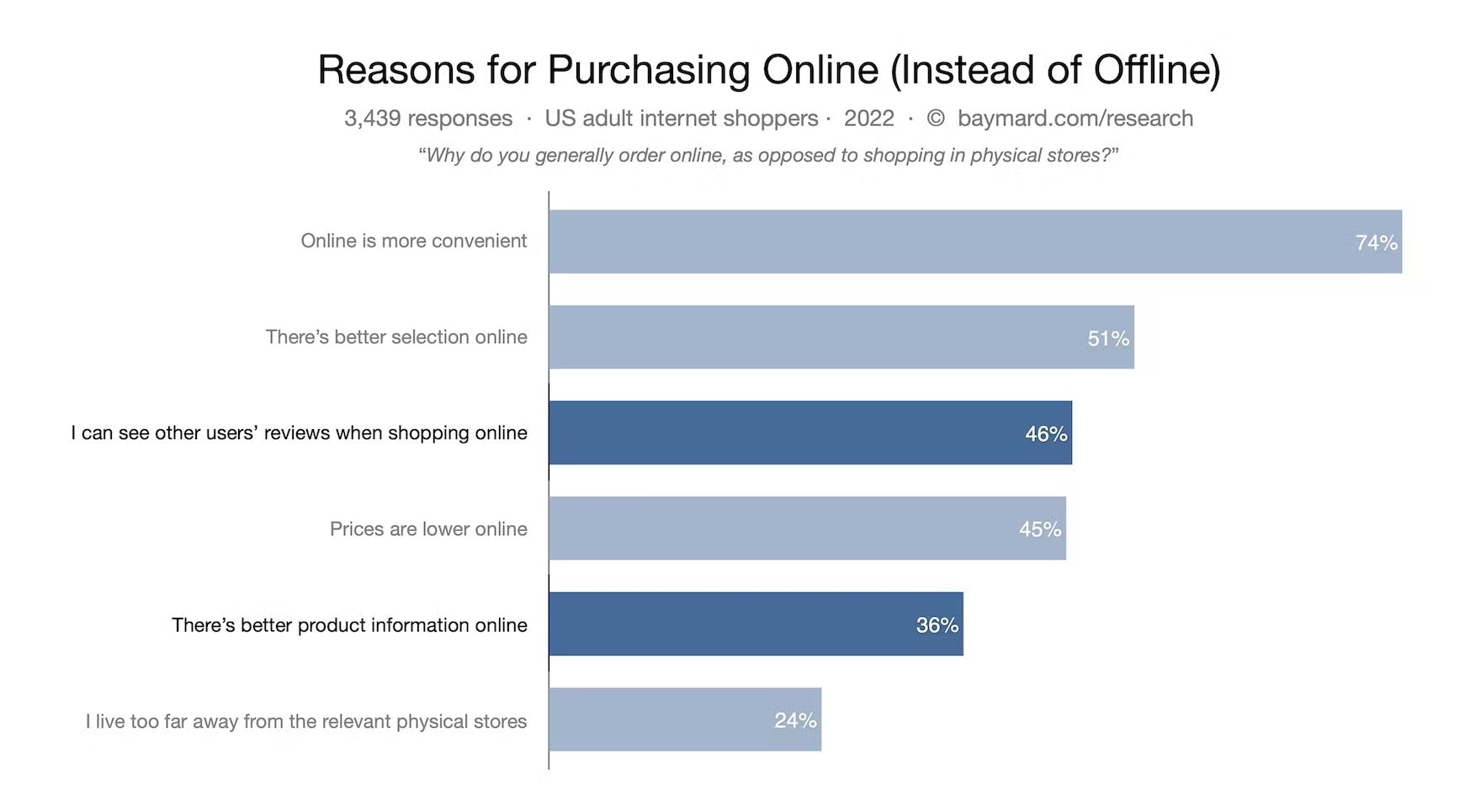
Indeed, our quantitative survey reveals that, out of 3,439 adult shoppers in the US, 36% consider “better product information online” as the most important reason to shop online (compared to shopping at physical stores).
Given how important product information is to users — especially users shopping for vitamins and supplements — online retailers should take care to make the supplement description information as thorough, trustworthy, and easy-to-find and -read as possible.
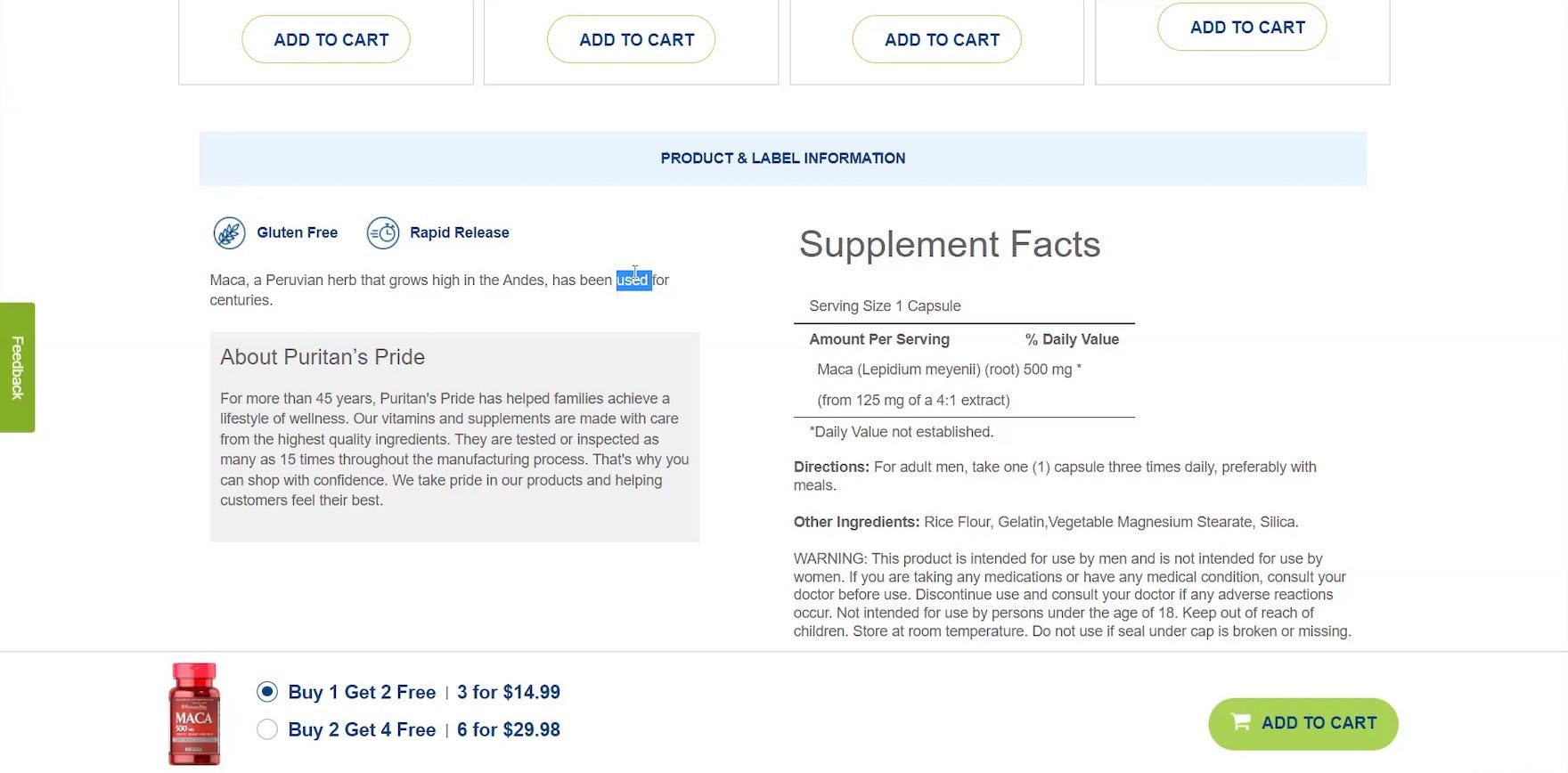
“’Peruvian herb that grows high in the Andes, has been used for centuries’. That’s all it says. That’s not enough for me, no. Yeah. This is very vague. Not even a whole sentence.” At Puritan’s Pride, the participant was only able to see one sentence about the history of the product’s key ingredient, which was almost no help in evaluating whether the product would work for the participant’s needs.
![“This site doesn’t have [a section] like the other site has where it says, ‘This does not contain this’”. At iHerb, a participant expected to find information related to the supplement’s diet and allergen status, but this information was missing entirely from the “Supplement Details” page.](https://baymard-assets-cdn.imgix.net/research/media_files/attachments/86178/original/research-media-file-0706a85cef24fcf6b8af984e570c3180.jpg?auto=format&dpr=2&fit=max&q=50&w=880)
“This site doesn’t have [a section] like the other site has where it says, ‘This does not contain this’”. At iHerb, a participant expected to find information related to the supplement’s diet and allergen status, but this information was missing entirely from the “Supplement Details” page.
![“So, this one has ‘Valerian Root’, ‘Hops’, and ‘Passion Flower’. Let me look down here [in the product description]. Let’s see…’Chamomile’, ‘Melatonin’, and others. It doesn’t tell you why these things are good for you.” At Puritan’s Pride, a participant wasn’t able to get a full understanding of the purpose of the key ingredients.](https://baymard-assets-cdn.imgix.net/research/media_files/attachments/86179/original/research-media-file-a8aa20b0b69feededd13ca5c069e38c7.jpg?auto=format&dpr=2&fit=max&q=50&w=880)
“So, this one has ‘Valerian Root’, ‘Hops’, and ‘Passion Flower’. Let me look down here [in the product description]. Let’s see…’Chamomile’, ‘Melatonin’, and others. It doesn’t tell you why these things are good for you.” At Puritan’s Pride, a participant wasn’t able to get a full understanding of the purpose of the key ingredients.
Yet some products during testing were missing the product description entirely — a surprising oversight given that users will likely simply reject out of hand any product that’s missing a description.
Furthermore, beyond the “e-commerce basic” of providing a product description, vitamins and supplement products need to be fully described; in particular, the key supplement ingredients, the amount of the ingredients, and any potential allergens the ingredient may contain (e.g., “Contains Tree Nuts”), as well as dietary information (e.g., “Vegan”).
Besides the obvious necessity for sufficient enough details in the supplement descriptions, our testing also revealed that users’ willingness to engage with and find answers in these areas is dependent on how the description is visually styled.
In particular, presenting all the critical vitamin and supplement info in an easy-to-scan format such as a “Supplement Ingredient Table”, which was observed to perform very well for participants during testing.
2) Vitamins & Supplements Sites Need to Provide Several Specific Image Types
At general e-commerce sites, product images have long been observed in our research to act as one of users’ primary methods for evaluating general products.
Without the ability to physically inspect a product (i.e., holding the item in their hands), product images offer an essential resource for users to gain a rich, visual understanding of a product.
![“Okay, [it] still doesn’t show me the back of the bottle, I don’t know why. I mean, even if it has [product description information], I just like [to] see the back of the bottle. It’s like…you’re at the store. You can turn [the bottle] around [and] see the whole thing.” Even though supplement products included some product description text above the fold, this participant at Swanson Vitamins still felt uneasy about buying a supplement when they couldn’t see the back of the bottle where the “Supplement Facts Label” is typically found.](https://baymard-assets-cdn.imgix.net/research/media_files/attachments/86180/original/research-media-file-c5a58335338fd692e61290477fef4bfd.jpg?auto=format&dpr=2&fit=max&q=50&w=880)
“Okay, [it] still doesn’t show me the back of the bottle, I don’t know why. I mean, even if it has [product description information], I just like [to] see the back of the bottle. It’s like…you’re at the store. You can turn [the bottle] around [and] see the whole thing.” Even though supplement products included some product description text above the fold, this participant at Swanson Vitamins still felt uneasy about buying a supplement when they couldn’t see the back of the bottle where the “Supplement Facts Label” is typically found.
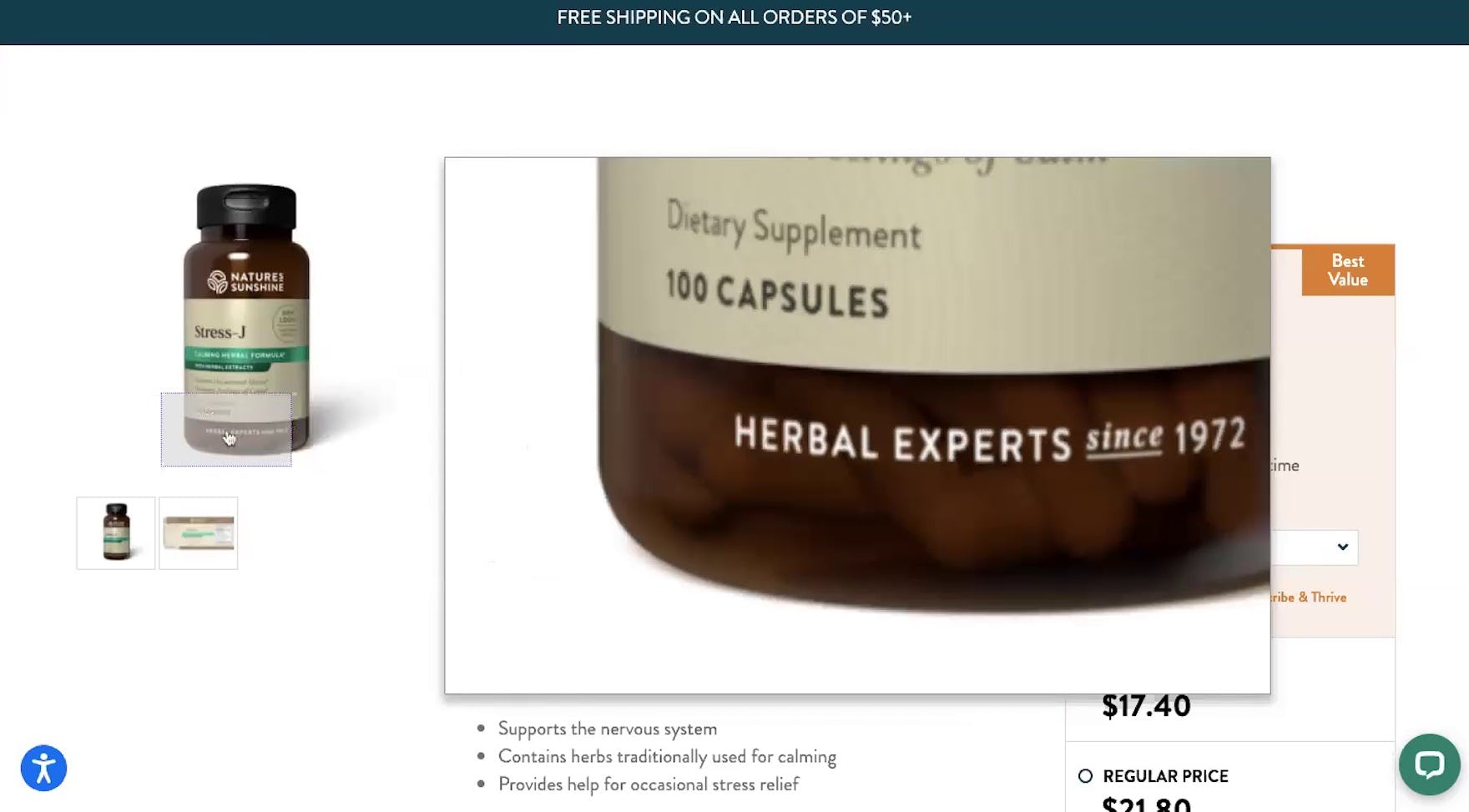
![“Where’s the nutritional label? [After locating the “Supplement Facts Label” image.] Oh, here it is. It’s an image. This doesn’t have any [hover-zoom feature]. Okay, so honestly at this point with this site, I might already ditch it.” At Nature’s Sunshine, a participant was irritated that the stand-alone “Supplement Facts Label” image was difficult to read and subsequently found the site had no zoom feature.](https://baymard-assets-cdn.imgix.net/research/media_files/attachments/86181/original/research-media-file-9d9af493d3999ea837e79c0ce1559fb3.jpg?auto=format&dpr=2&fit=max&q=50&w=880)
“Where’s the nutritional label? [After locating the “Supplement Facts Label” image.] Oh, here it is. It’s an image. This doesn’t have any [hover-zoom feature]. Okay, so honestly at this point with this site, I might already ditch it.” At Nature’s Sunshine, a participant was irritated that the stand-alone “Supplement Facts Label” image was difficult to read and subsequently found the site had no zoom feature.
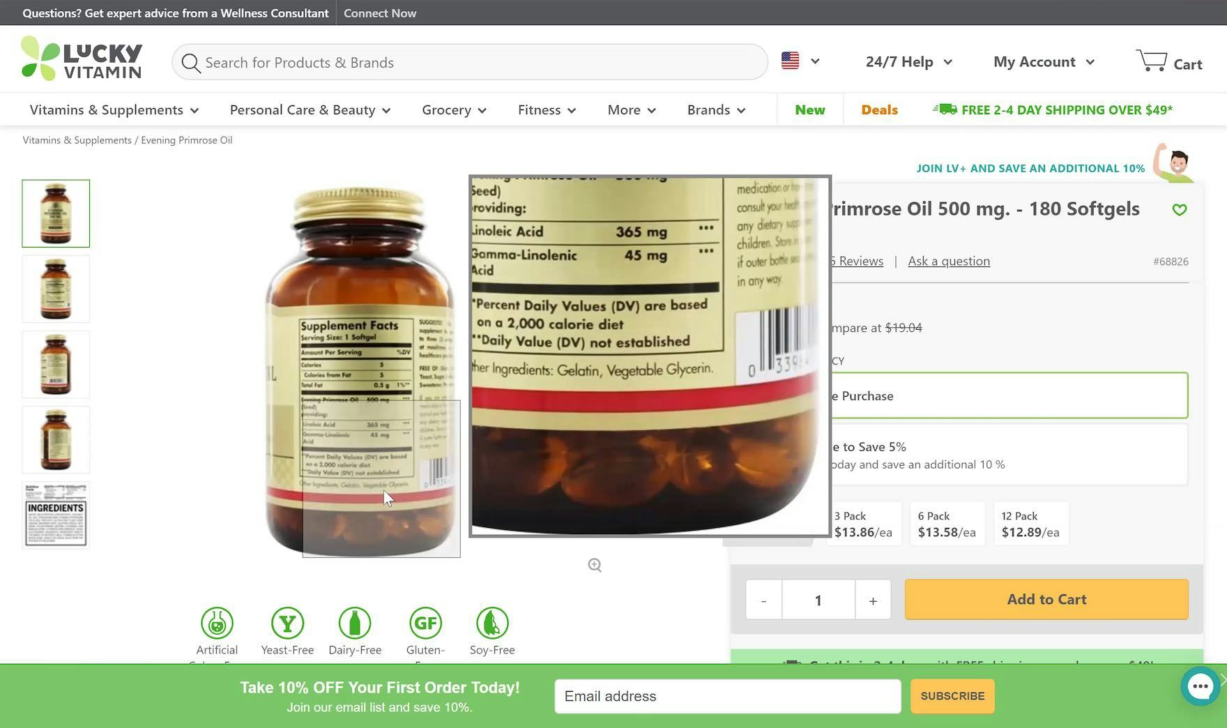
“Oh, you know what…this one doesn’t show how big the pills are per se.” A participant at LuckyVitamin struggled to get an impression of the supplement’s physical size through the supplement packaging, which in this particular case was semitransparent.
“I was looking to see if they had…the size of the tablets. I’m always curious, you know.” At Nature’s Sunshine, a participant wasn’t able to see the supplement’s physical size through the mostly opaque bottle.
For Vitamins & Supplements users, while the visual aesthetics of the products most often don’t matter, supplement images (e.g., packaging images, feature graphics, etc.) still provide a critical link for e-commerce shoppers to learn about highly technical supplement products.
In particular, images that provide the same function as the label on a physical bottle, as well as images that provide visual information on the real-life size of the supplement, were during testing observed to be important to users considering purchasing supplements.
Indeed, visually rich supplement images can provide users with a helpful informational safety net for verifying supplement information — or serve as a fallback if information is otherwise missing or hard to find elsewhere on the supplement details page.
While bespoke and quality imagery can be resource-intensive to produce, these images can be critical for users.
Consequently, any Vitamins & Supplements site should invest in these helpful user resources.
3) Filtering Performance Is Key to Users’ Ability to Find Suitable Products
Much like on general e-commerce sites, the ultimate purpose of the supplement list is to provide an effective pathway from product lists and search results to the all-important supplement details page — where many users’ final purchasing decisions will be made.
Indeed, users on Vitamins & Supplements sites will need many of the same visual considerations (e.g., page designs, text styling) that are important to high-performing product lists in general e-commerce.
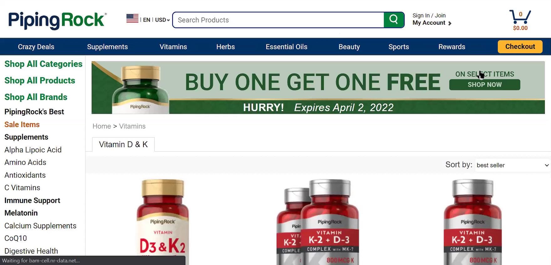
“Okay, I don’t see a way to refine this to show just liquids. And it doesn’t appear that there are just liquids. So, honestly, I’d probably say, ‘hey, they don’t have what I want’.” At PipingRock, a participant was looking to narrow the product list to just liquid supplements, but no filters were provided — only a list of category links on the left side of the page. Users faced with product lists containing numerous items — without a way to narrow the list — often decide to simply give up their search for a suitable product.
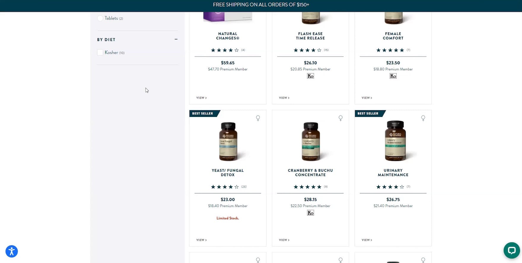
“Oh. Okay, there’s so few diet choices here. There’s just ‘Kosher’. Hmm.” A participant at Nature’s Sunshine was disappointed by the lack of dietary filter options available on the product list page. Note that while the filter category (i.e., “By Diet”) was offered, the actual options listed (i.e., only “Kosher”) wasn’t sufficient to account for users’ potential dietary restrictions.
“I don’t have a filter option. So now I’m having to rely on them having labeled these correctly and that they included the words that I’m looking for. In this case, ‘Grass Fed’ and ‘Organic’.” A participant at PipingRock had to rely on the product title to identify products with their desired product qualities (i.e., “Grass Fed” and “Organic”). Users who can’t filter out irrelevant supplements will have to manually scan the product list for potentially suitable supplements — requiring much more of users’ time.
However, without the right tools, finding just the right supplement can be an almost impossible task for the user.
Consequently, supplement lists and their built-in tools (i.e., filtering and sorting) will ultimately determine how easy or difficult it is for the user to browse the supplement catalog.
Moreover, on sites with large supplement catalogs, users having access to plentiful (and effective) filtering options can transform an initially daunting supplement list into something much more manageable.
In particular, beyond the “basic” filter types, providing several industry-specific filter types — such as “Diet” (e.g., Vegan, Gluten free), “Allergens” (e.g., Soy, Dairy), “Format” (e.g., Tablet, Capsule, Liquid), and “End User” (e.g., “Women”, “Kids”) — is key to allowing users to narrow down extensive supplement lists (which may contain 1,000s of items) to something easier to navigate.
Additionally, filtering design considerations — such as promoting important filters, displaying “applied” filters in an overview, showing the number of matches for filter values, etc. — are as important to supplement lists as they are to users on general e-commerce sites.
Ensure Users Shopping for Vitamins and Supplements Are Able to Find Critical Supplement Information
![“I like the fact that it’s showing exactly…giving you an idea of a realistic measurement of the [serving] size of the product that you would be taking.” At NatureMade, a participant found an image in the image gallery that contained both “actual size” (i.e., “1 inch”, abbreviated) and “relative size” (i.e., the hand) images, which helped them better imagine the actual physical size of the supplement.](https://baymard-assets-cdn.imgix.net/research/media_files/attachments/86187/original/research-media-file-a6a7fbe8f6a43420488927728f3afbae.jpg?auto=format&dpr=2&fit=max&q=50&w=880)
“I like the fact that it’s showing exactly…giving you an idea of a realistic measurement of the [serving] size of the product that you would be taking.” At NatureMade, a participant found an image in the image gallery that contained both “actual size” (i.e., “1 inch”, abbreviated) and “relative size” (i.e., the hand) images, which helped them better imagine the actual physical size of the supplement.
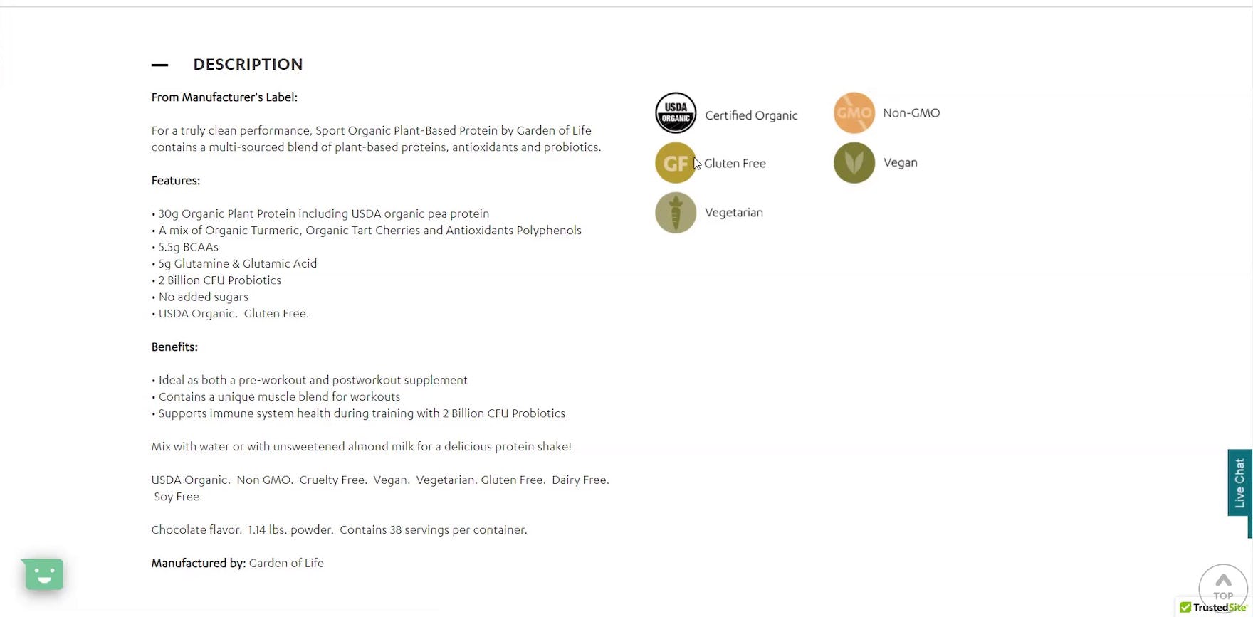
“It’s telling me all the high points. It’s ‘organic’, ‘gluten-free’, ‘vegetarian’, ‘vegan’, ‘non-GMO’. Those are what I call ‘Feel-good buttons’.” At VitaminWorld, a participant could easily find dietary and allergen information in the supplement description section because they were presented as graphic icons alongside the description text, as well as in line in the textual description.
Of the industry studies we’ve conducted, the issues Vitamins & Supplements participants encountered during testing perhaps bear the most resemblance to issues general e-commerce users face.
Therefore, in order to have a high-performing Vitamins & Supplements site, it’s crucial to ensure the site performs well across a wide range of UX considerations, from the Homepage, to Category Taxonomy, to Checkout, along with Product Details pages and Product Lists and Filtering.
Making sure the site performs well across the spectrum of e-commerce UX will set a solid foundation for user success, which can then be perfected by applying the Vitamins & Supplements–specific guidelines included in this new study.
Getting access: all 490+ Vitamins & Supplements UX guidelines are available today via Baymard Premium access. (If you already have an account open the Vitamins & Supplements study.) If you want to know how your Vitamins & Supplements Website performs and compares, then learn more about getting Baymard to conduct a UX Audit of your Vitamins & Supplements site.