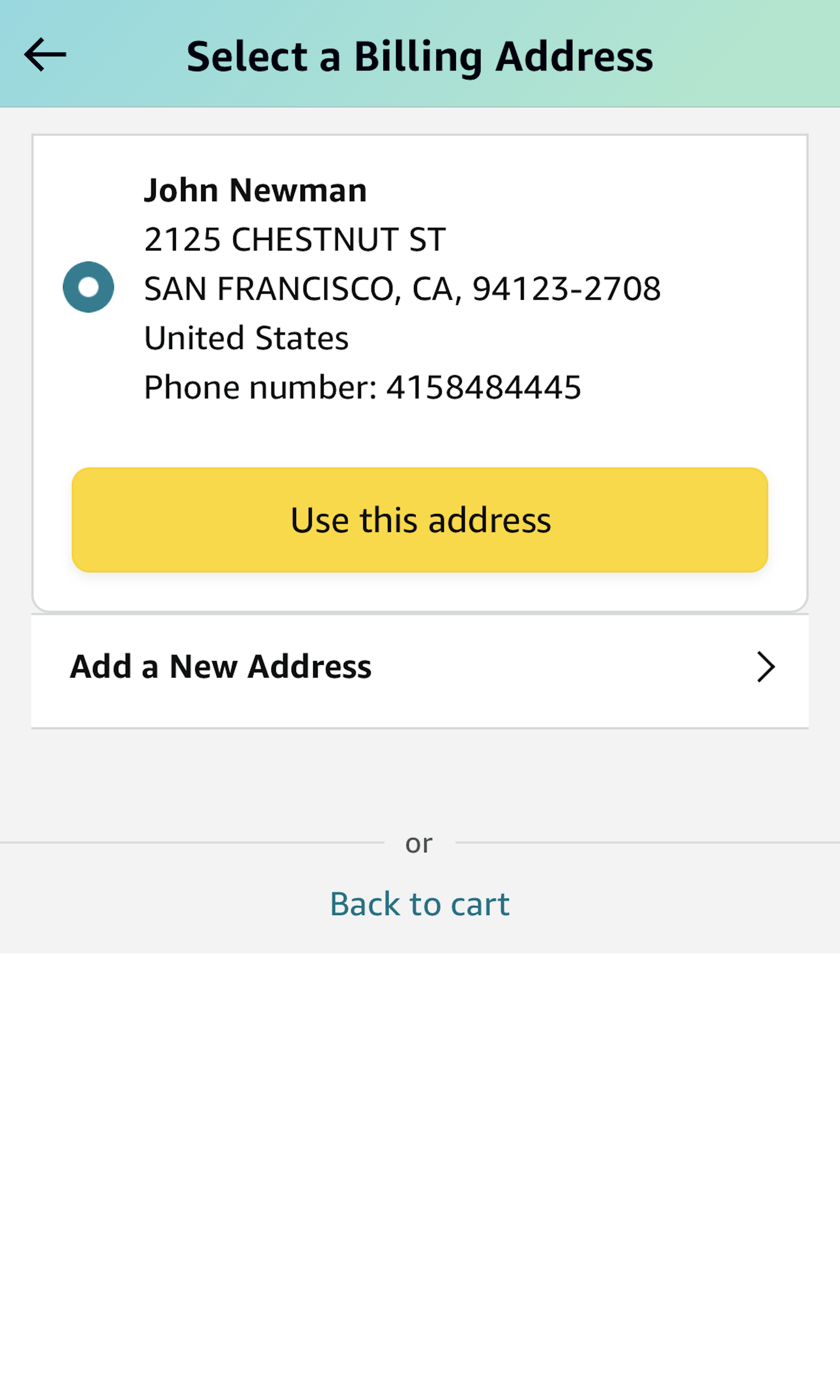
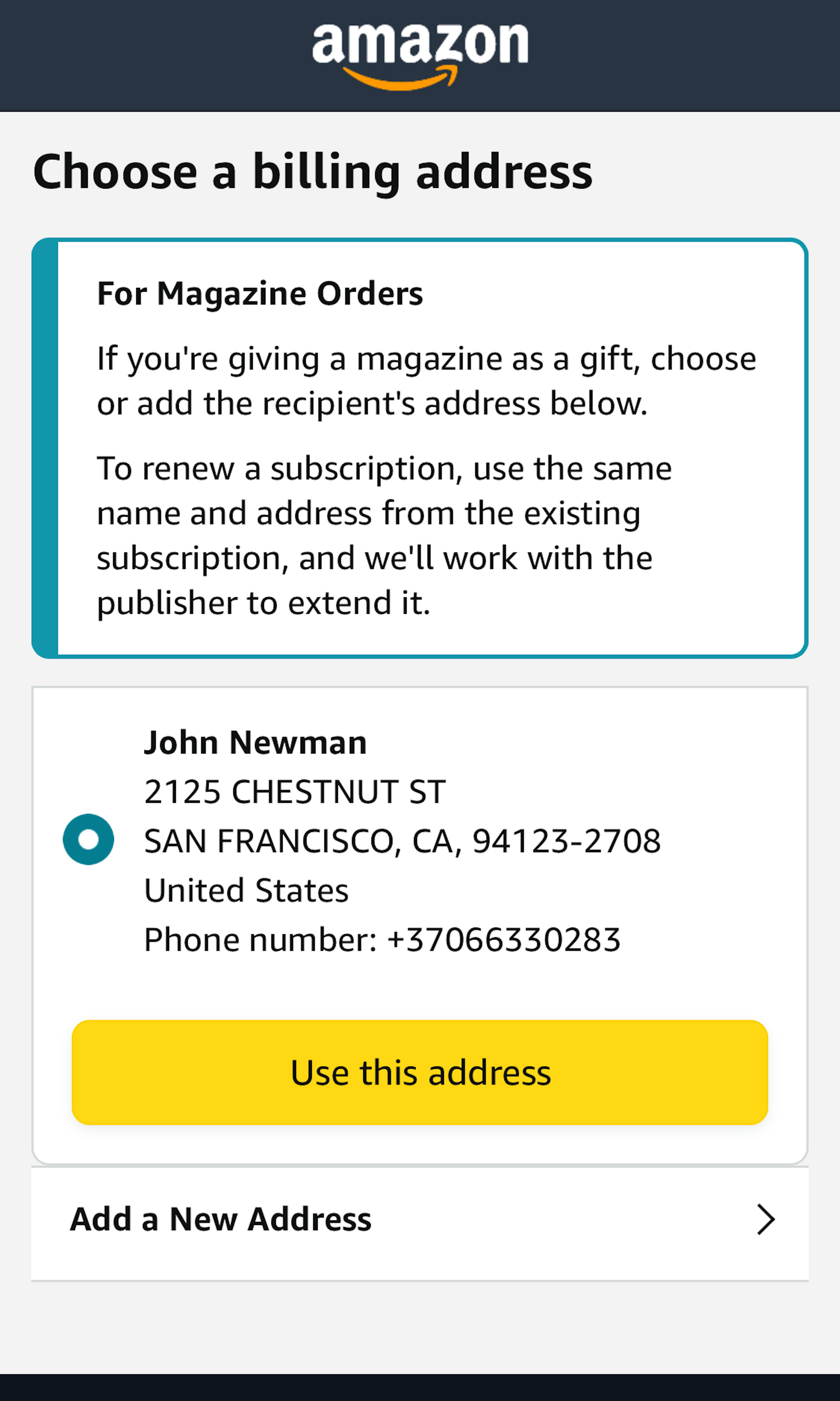
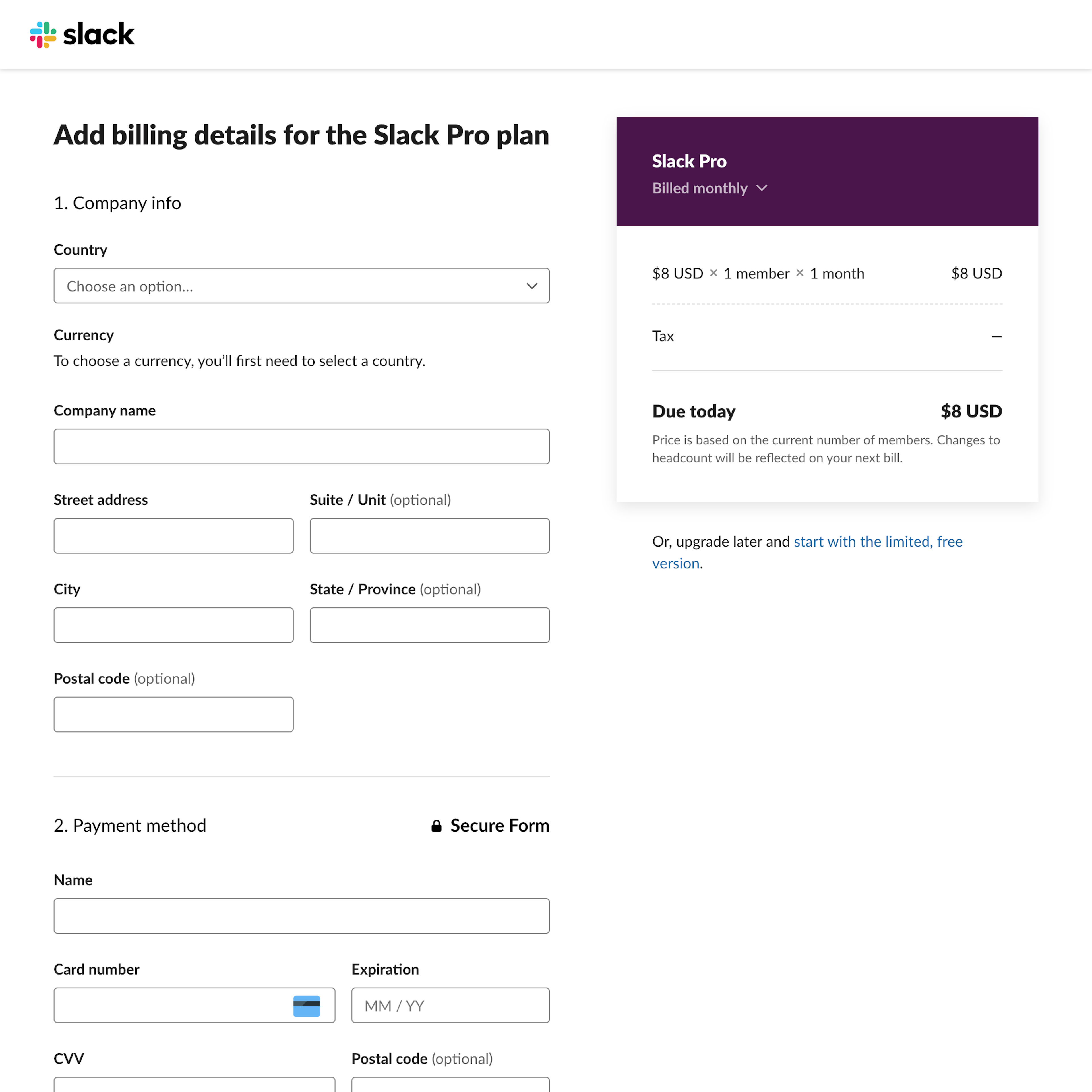
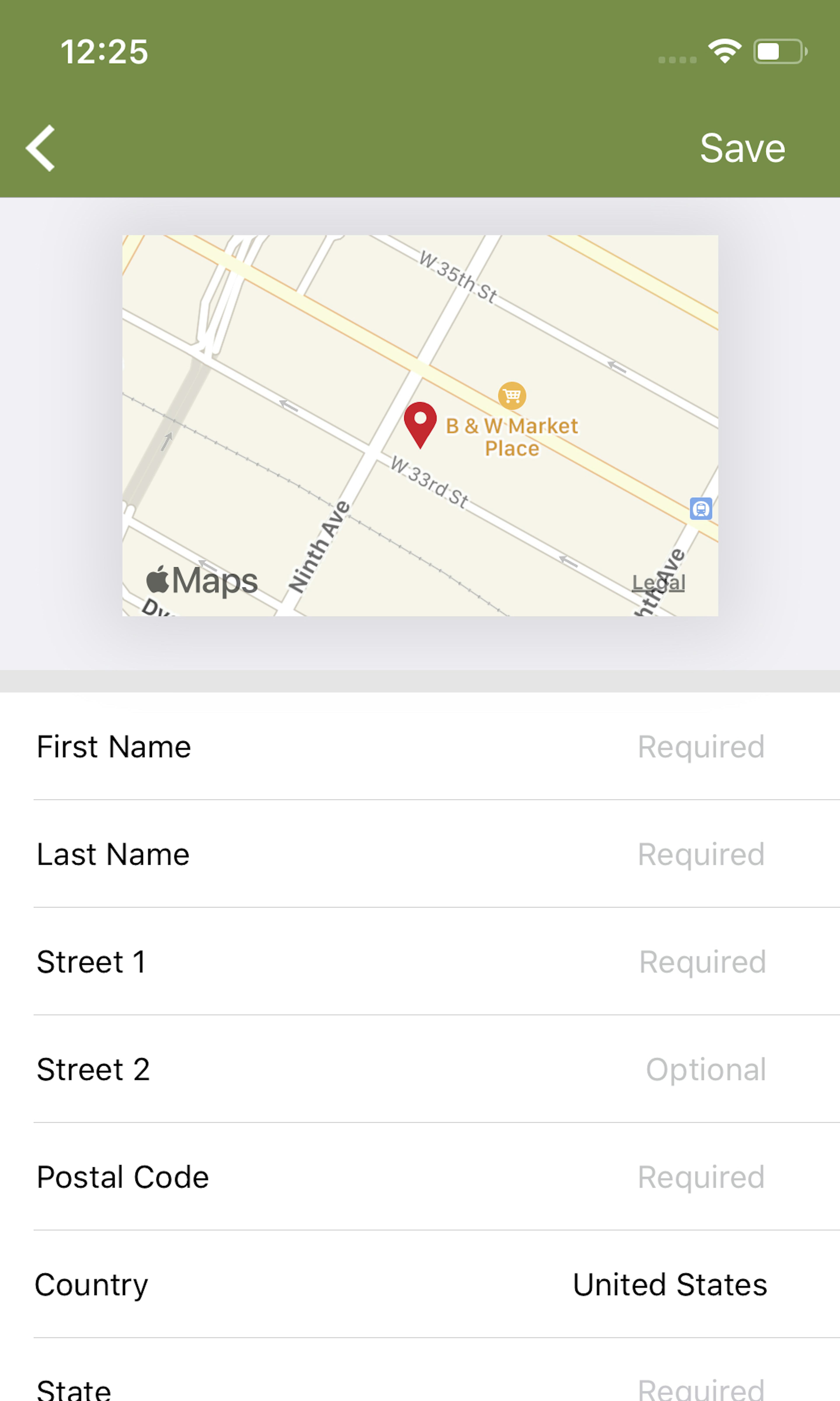
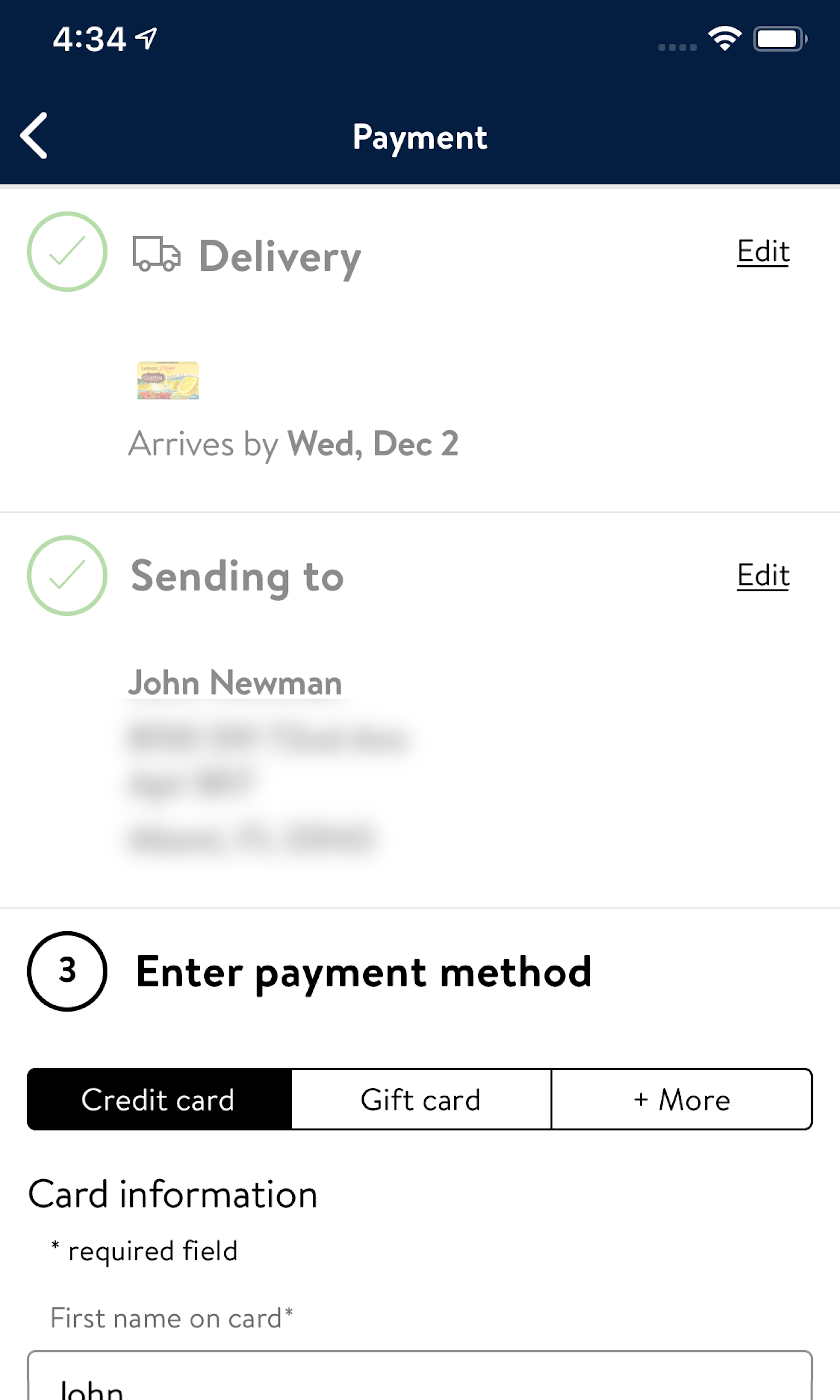
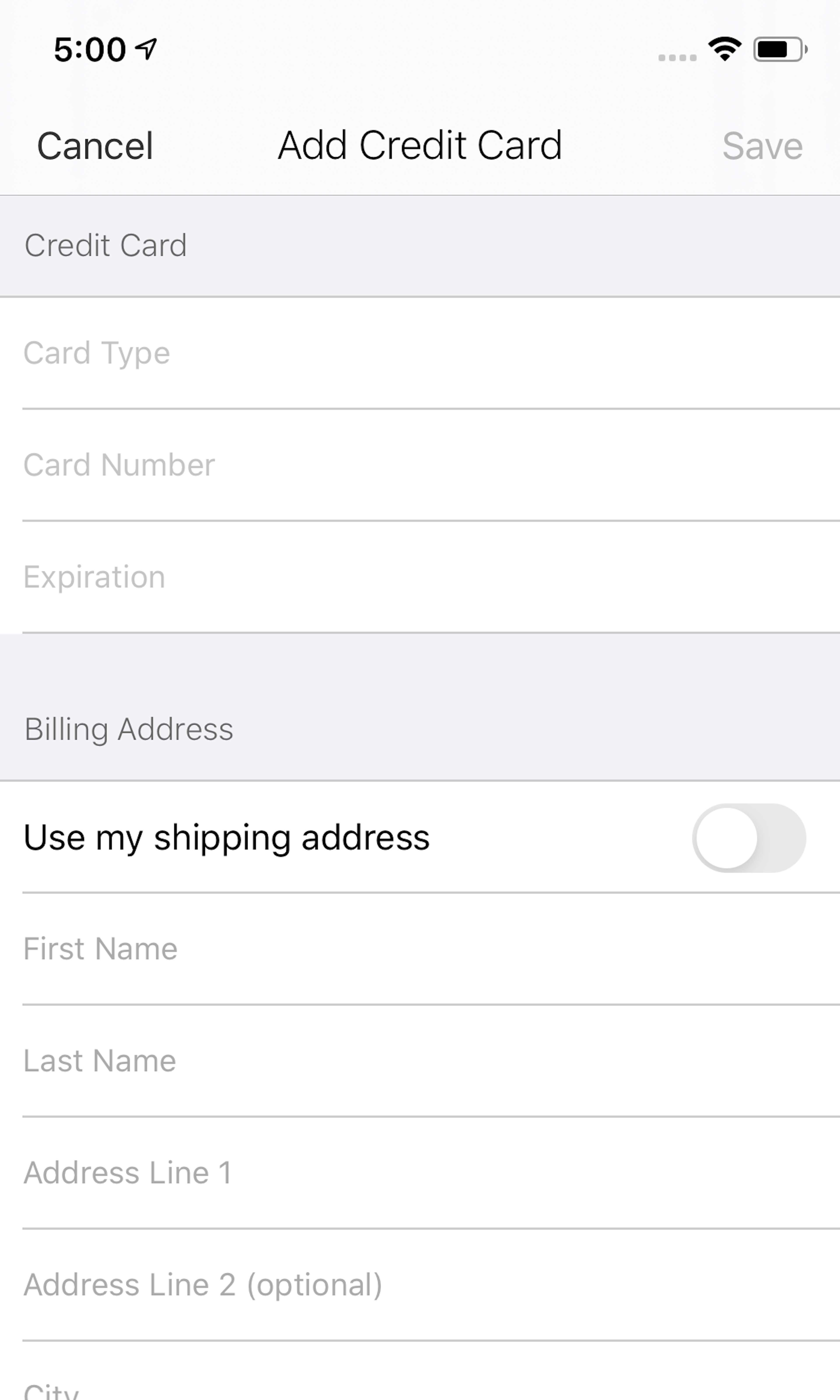
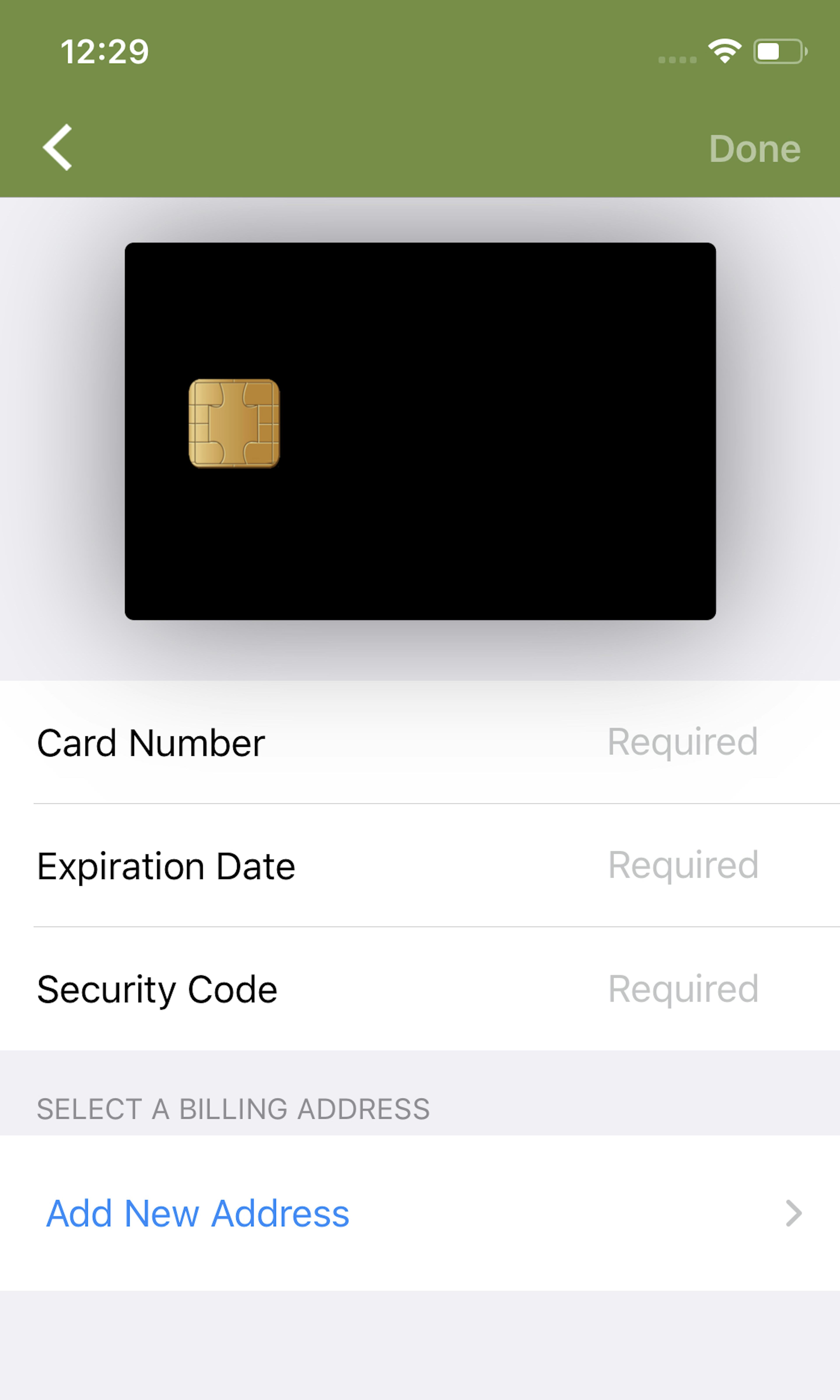
791 ‘Billing Address’ Design Examples
Also referred to as: Billing Information
What’s this? Here you’ll find 791 “Billing Address” full-page screenshots annotated with research-based UX insights, sourced from Baymard’s UX benchmark of 325 e-commerce sites. (Note: this is less than 1% of the full research catalog.)
For most B2C sites, the majority of users typically order products to be delivered to their own address. During all our checkout usability testing, setting the “Billing Address to equal the Shipping Address” by default has shown to perform vastly better than either not having the “same as” feature or not having it as a default selection.
More ‘Billing Address’ Insights
-
Defaulting the billing address to be the same as the shipping address should not just prefill fields but should rather hide the billing address fields entirely. This will reduce the amount of form fields shown by default in the entire checkout flow by 30–40%. Despite the importance, 14% of sites still don’t default the two addresses to be the same, and another 8% don’t hide the billing form fields when they are the same.
-
Learn More: Besides exploring the 791 “Billing Address” design examples below, you may also want to read our related article “The Average Checkout Flow Has 14.88 Form Fields – Twice as Many as Necessary”.
-
Get Full Access: To see all of Baymard’s cart and checkout research findings you’ll need Baymard Premium access. (Premium also provides you full access to 200,000+ hours of UX research findings, 650+ e-commerce UX guidelines, and 275,000+ UX performance scores.)
User Experience Research, Delivered Weekly
Join 60,000+ UX professionals and get a new UX article every week.

User Experience Research, Delivered Weekly
Join 60,000+ UX professionals and get a new UX article every week.

Explore Other Research Content

300+ free UX articles based on large-scale research.

325 top sites ranked by UX performance.

Code samples, demos, and key stats for usability.


