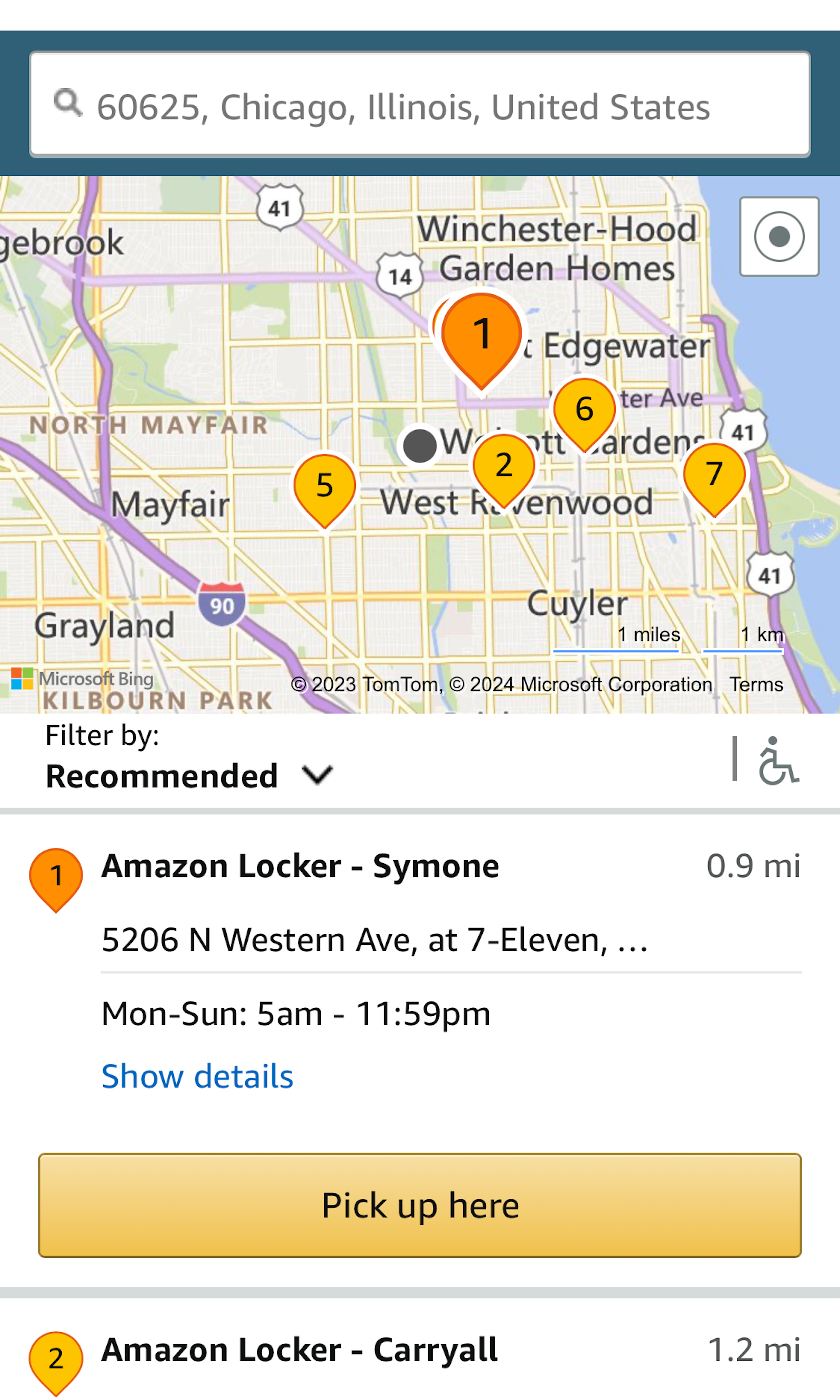
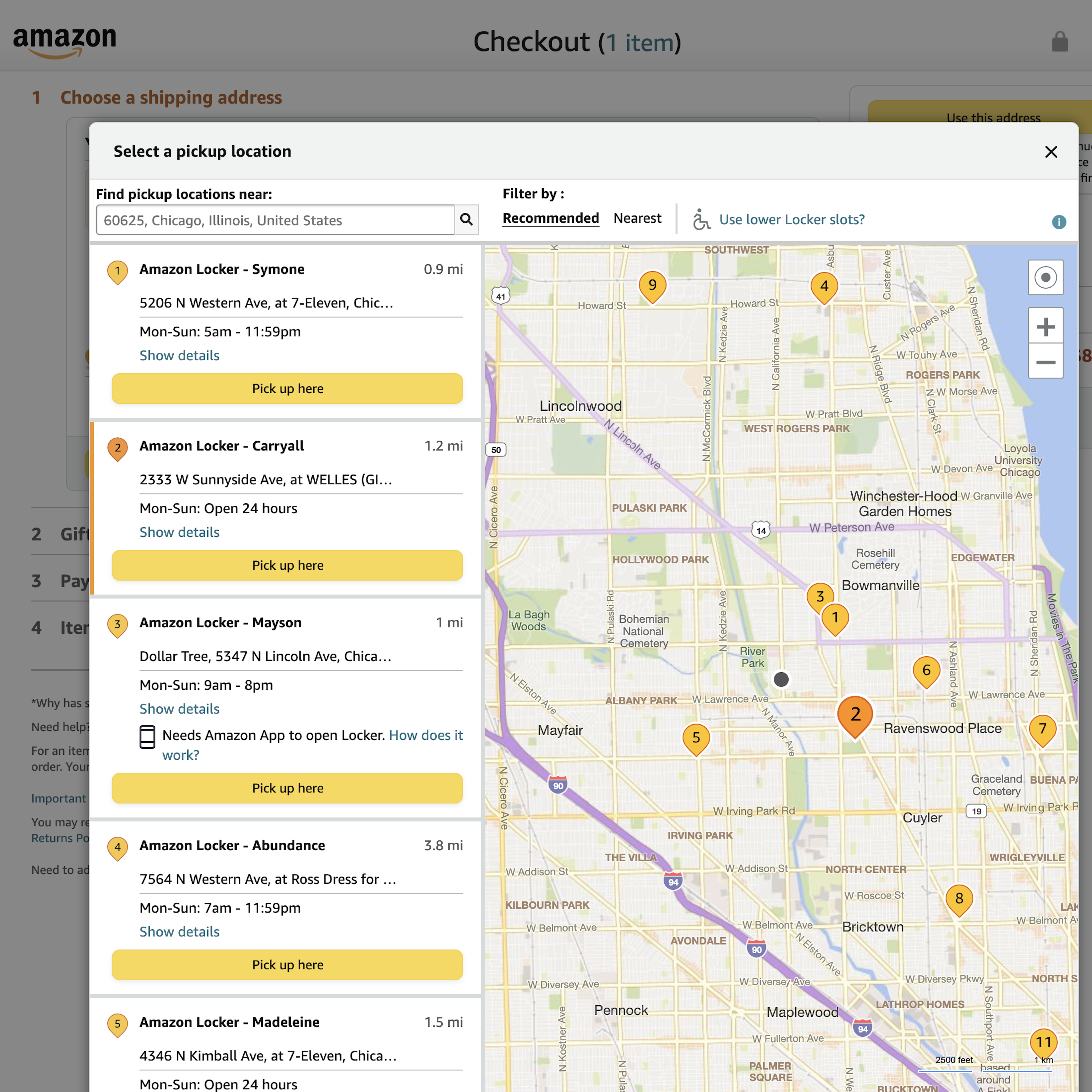
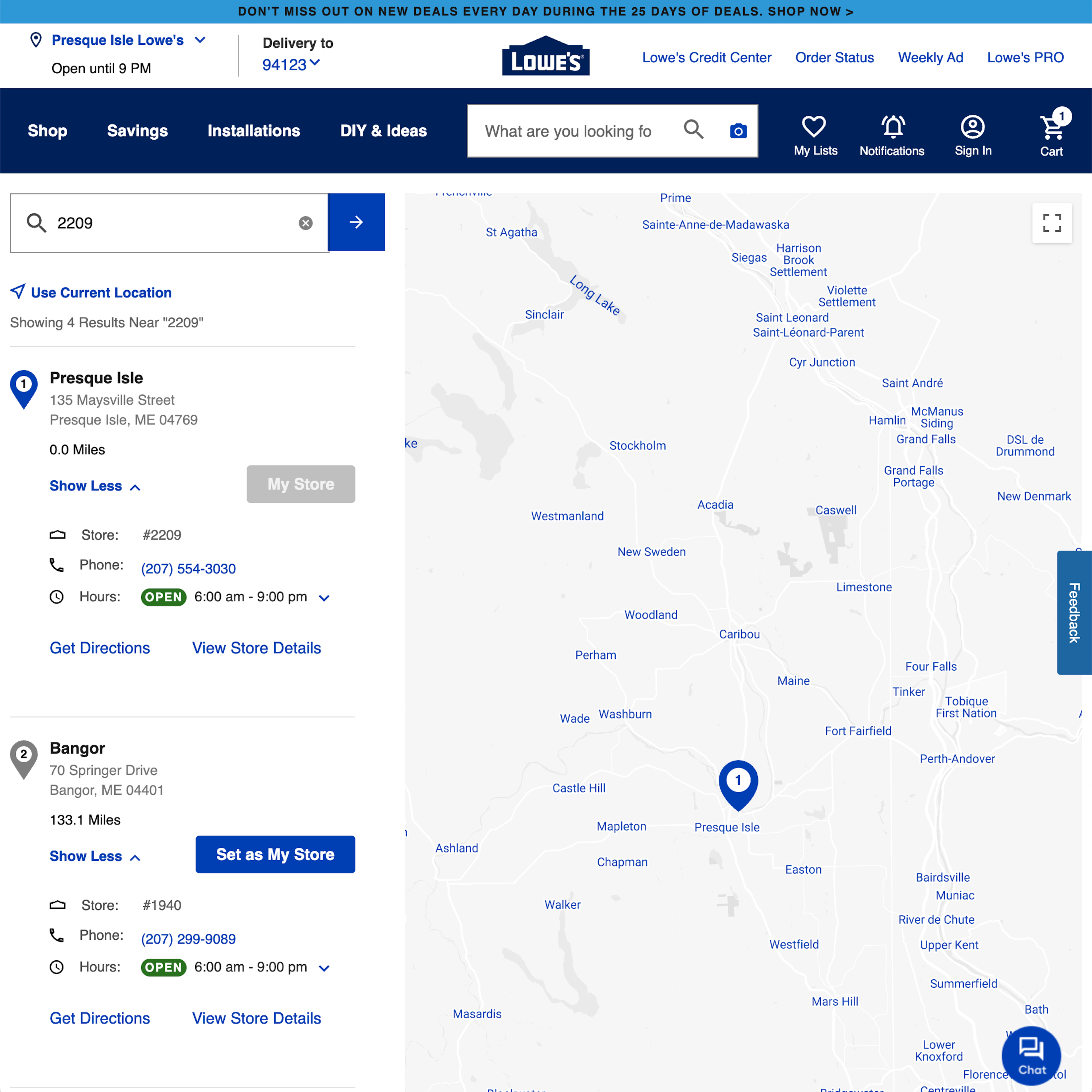
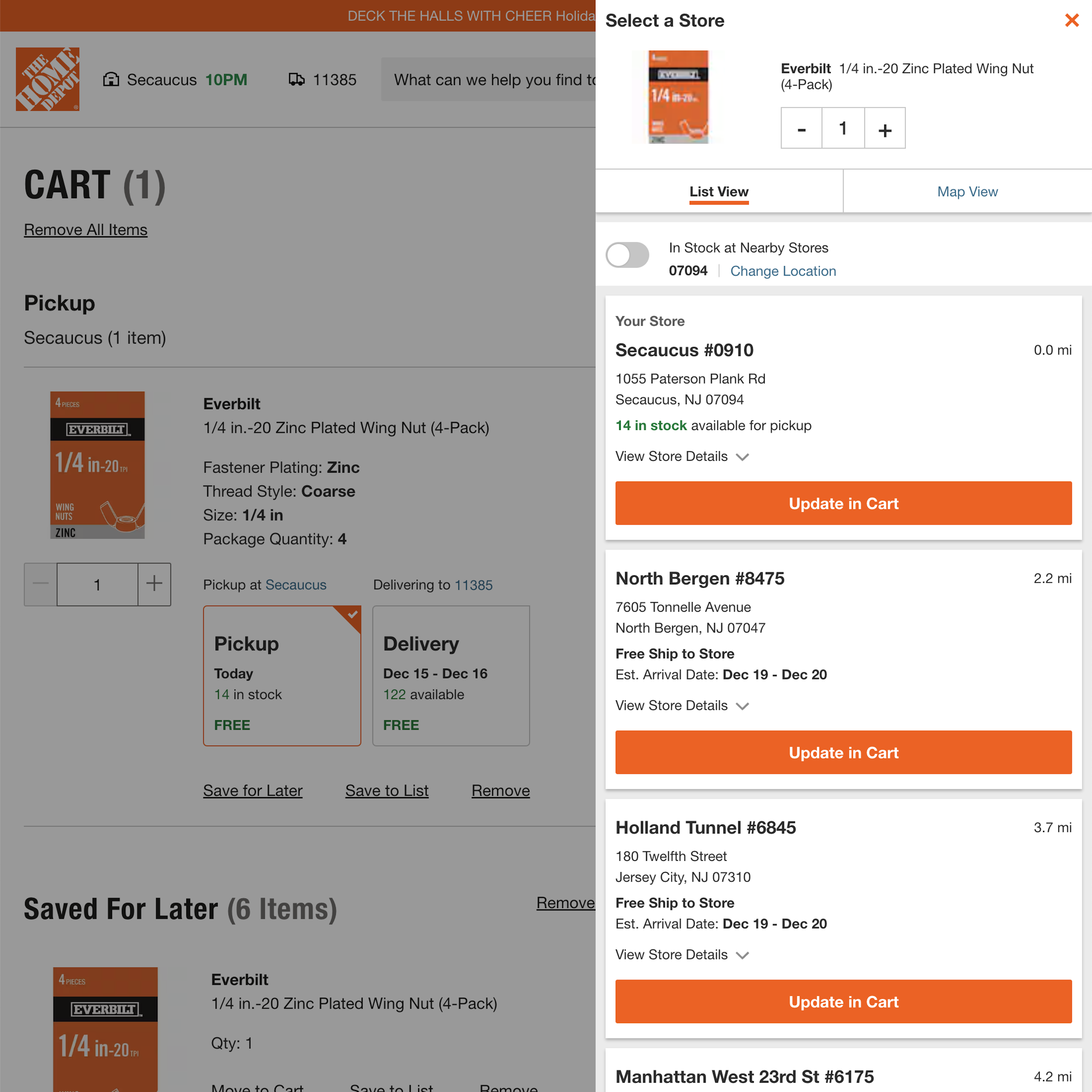
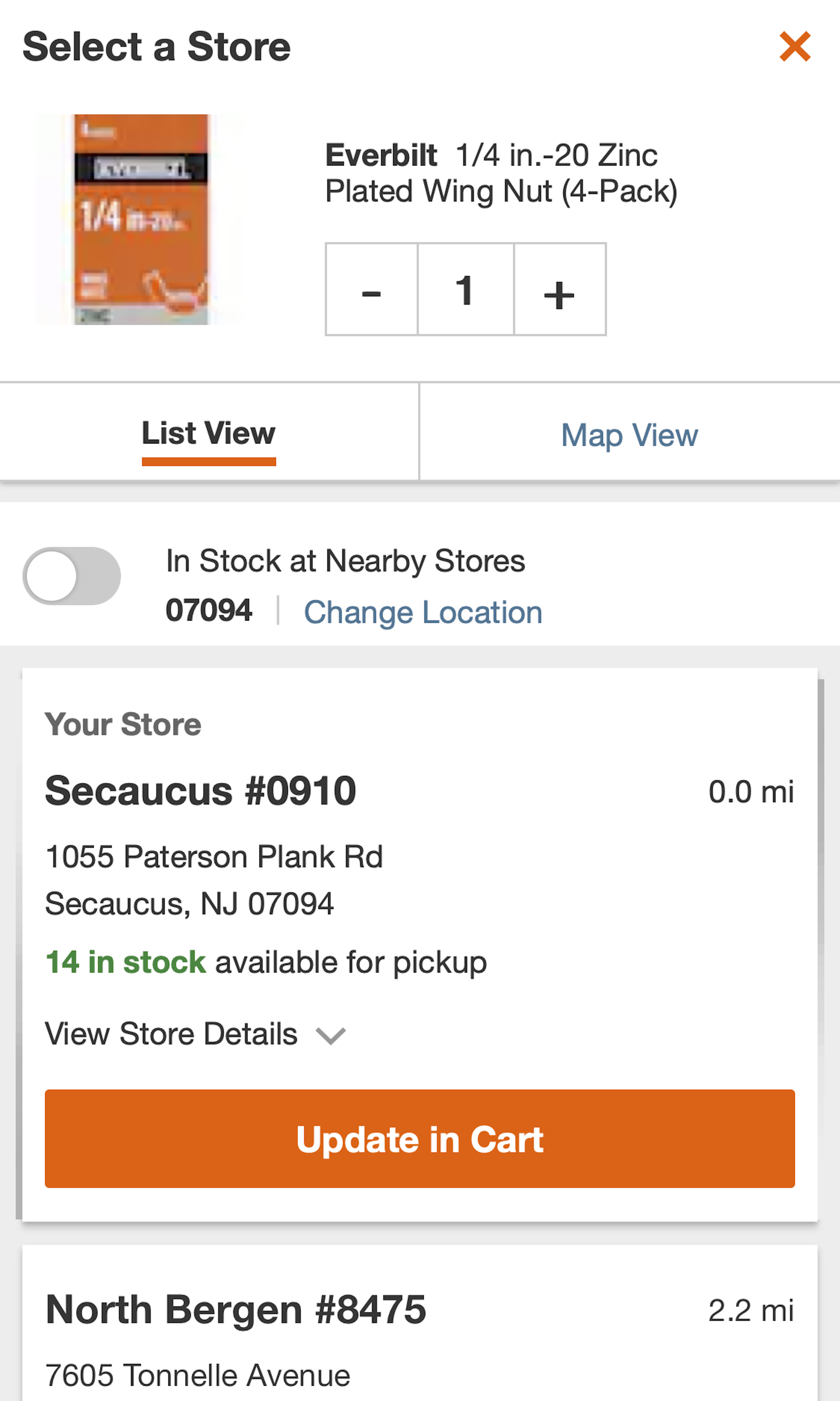
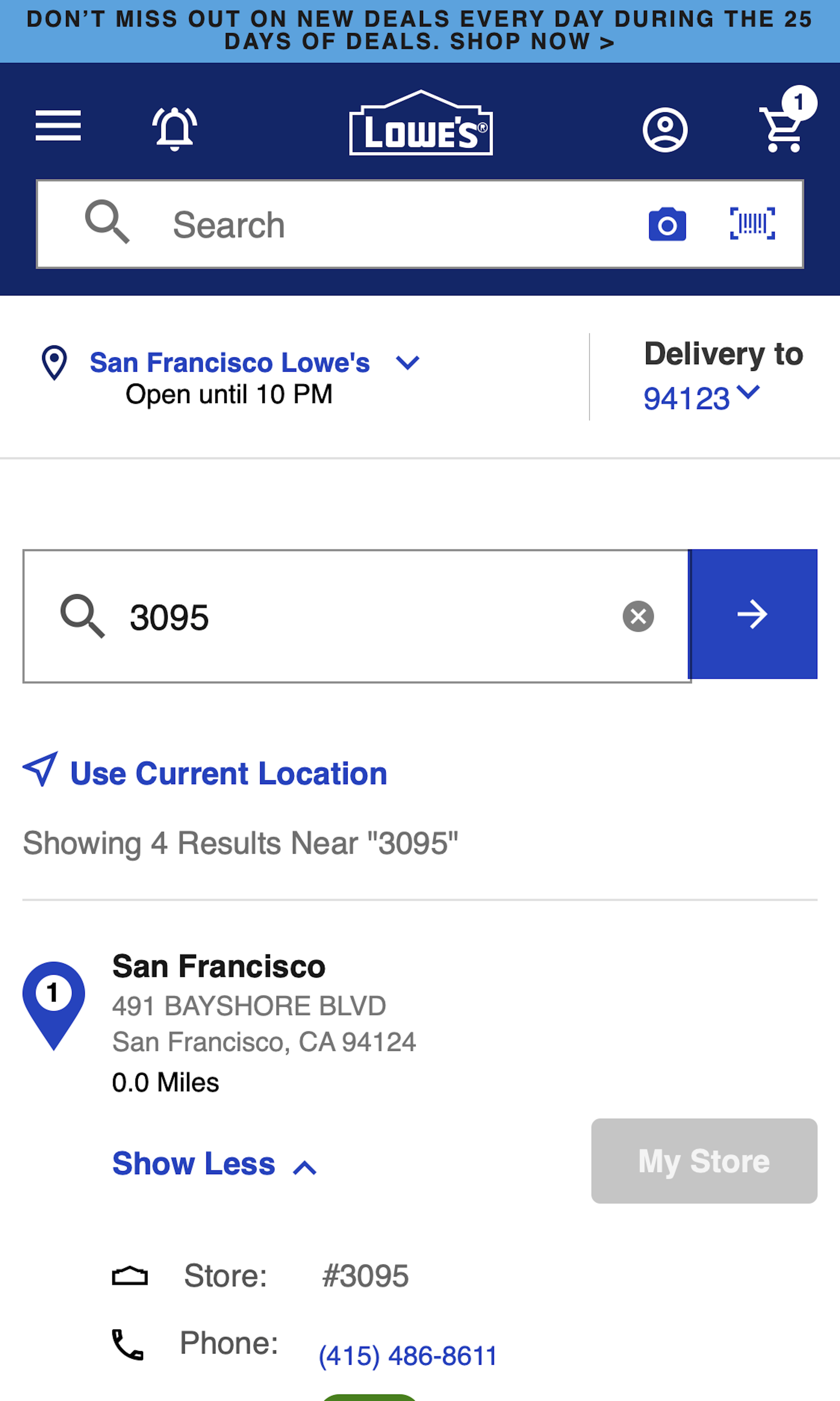
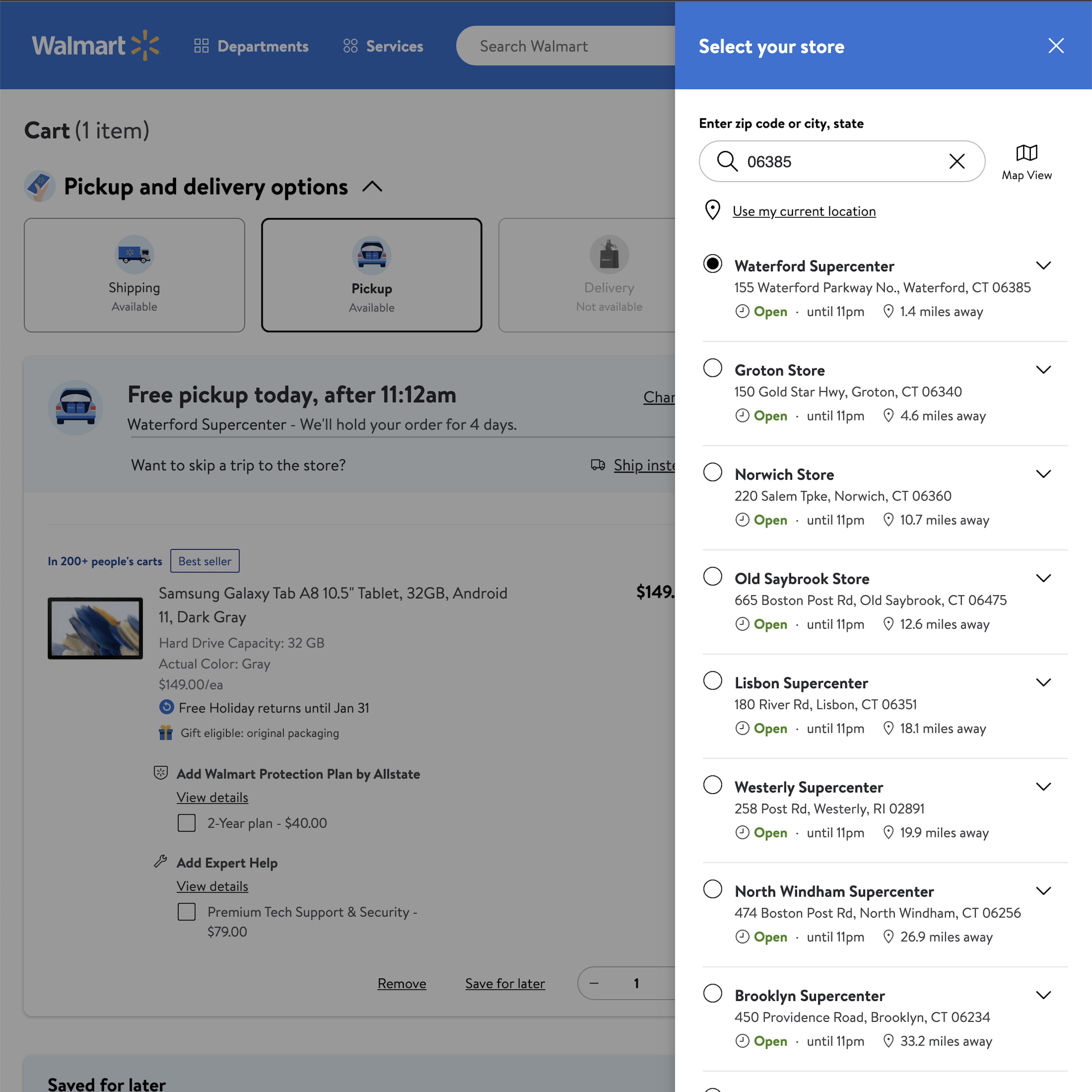
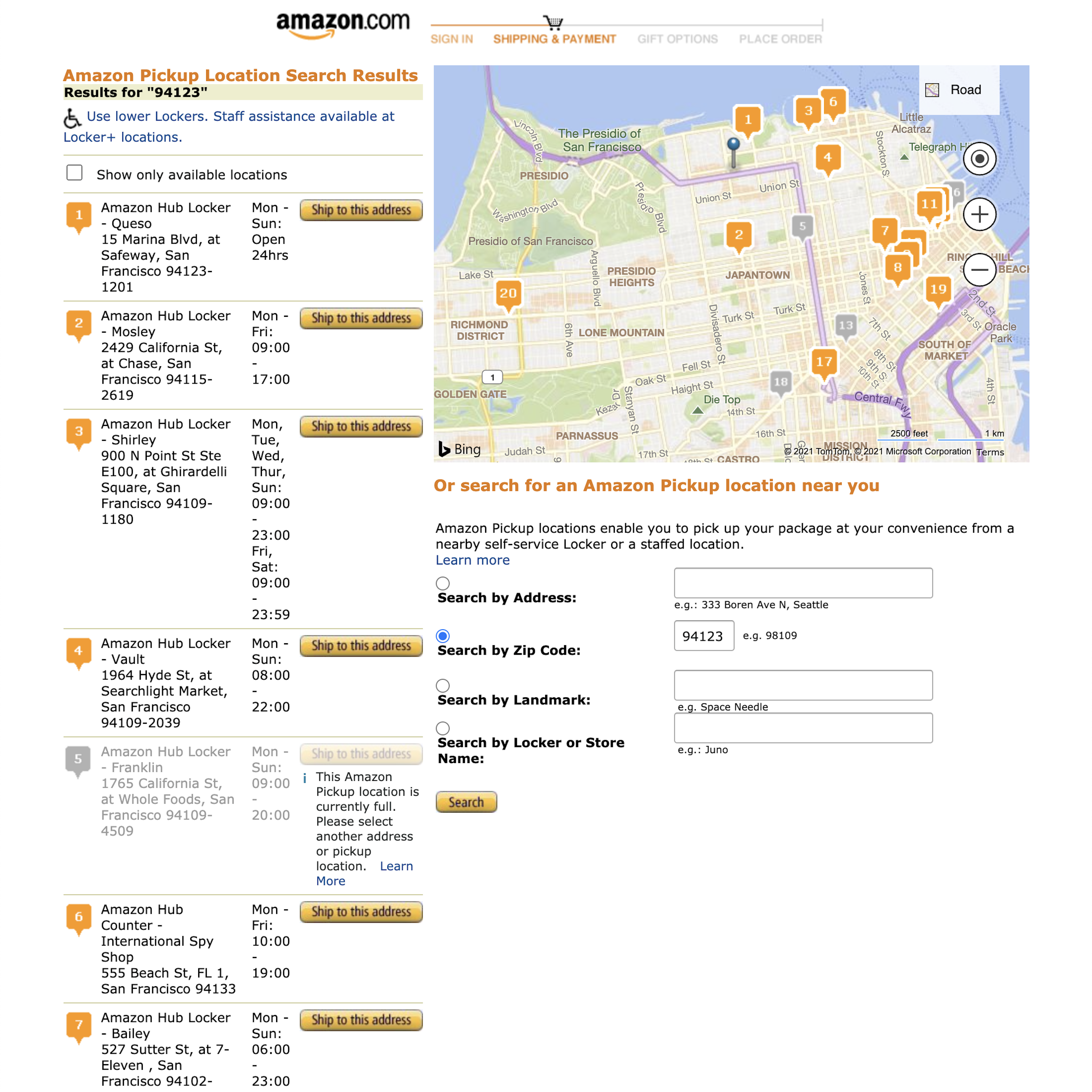
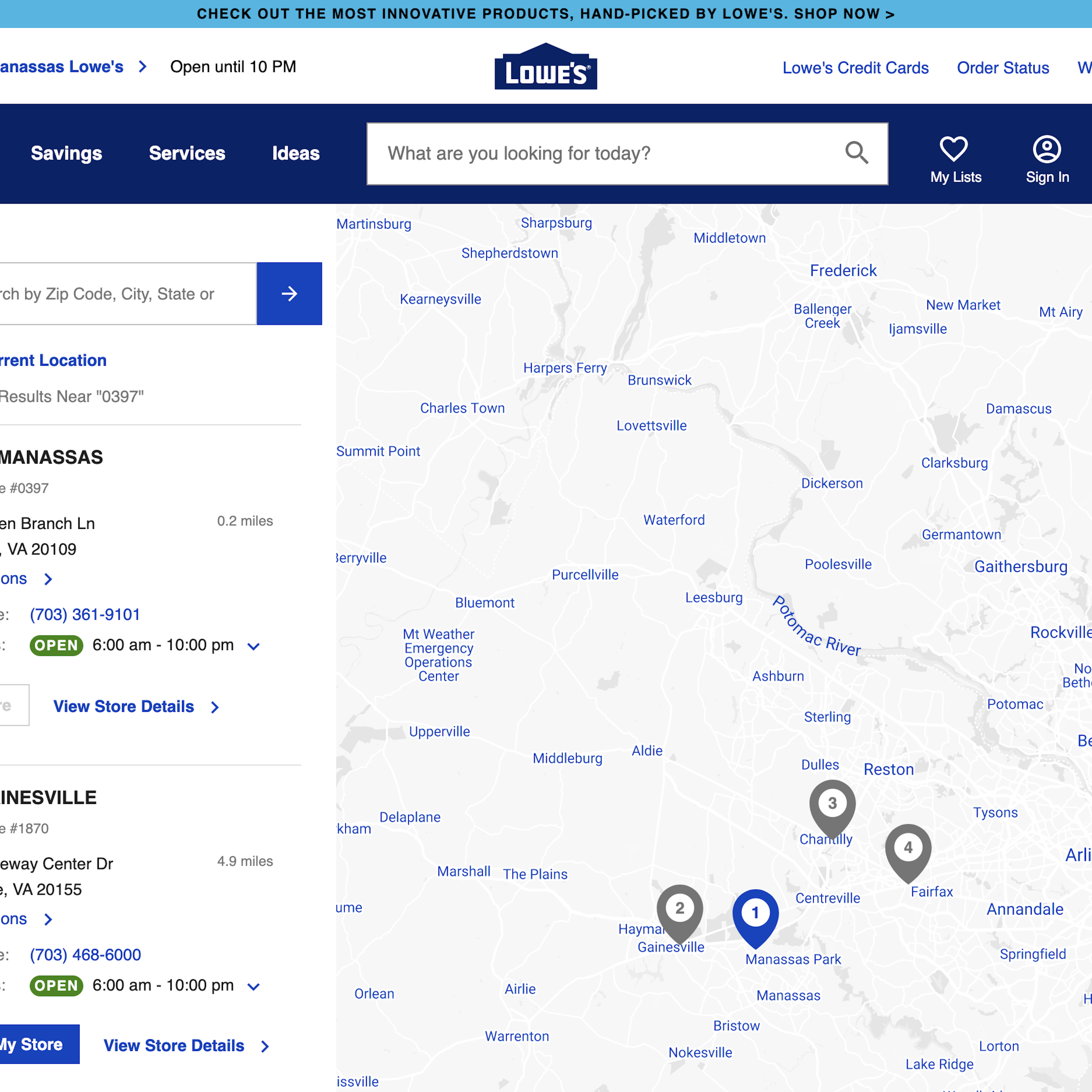
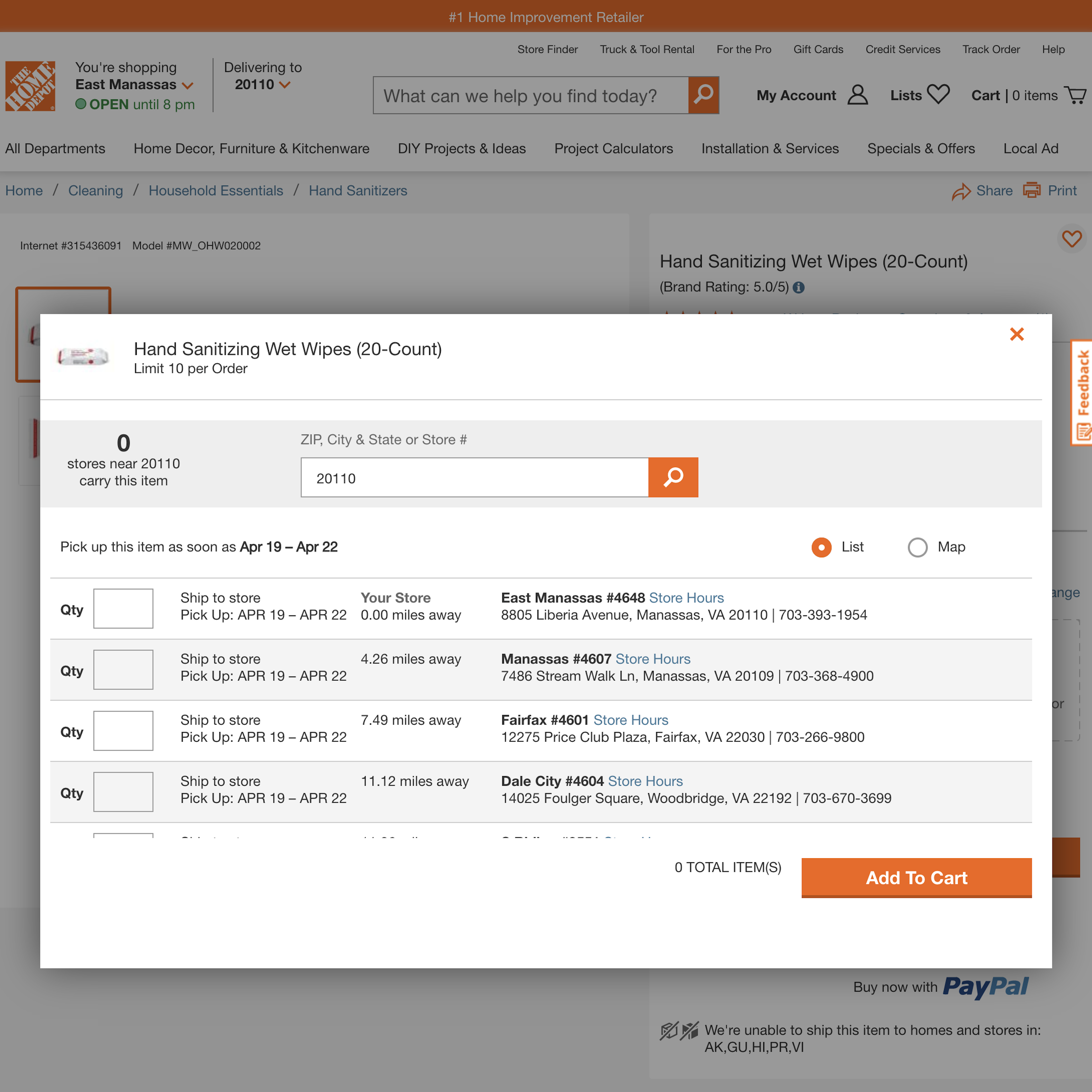
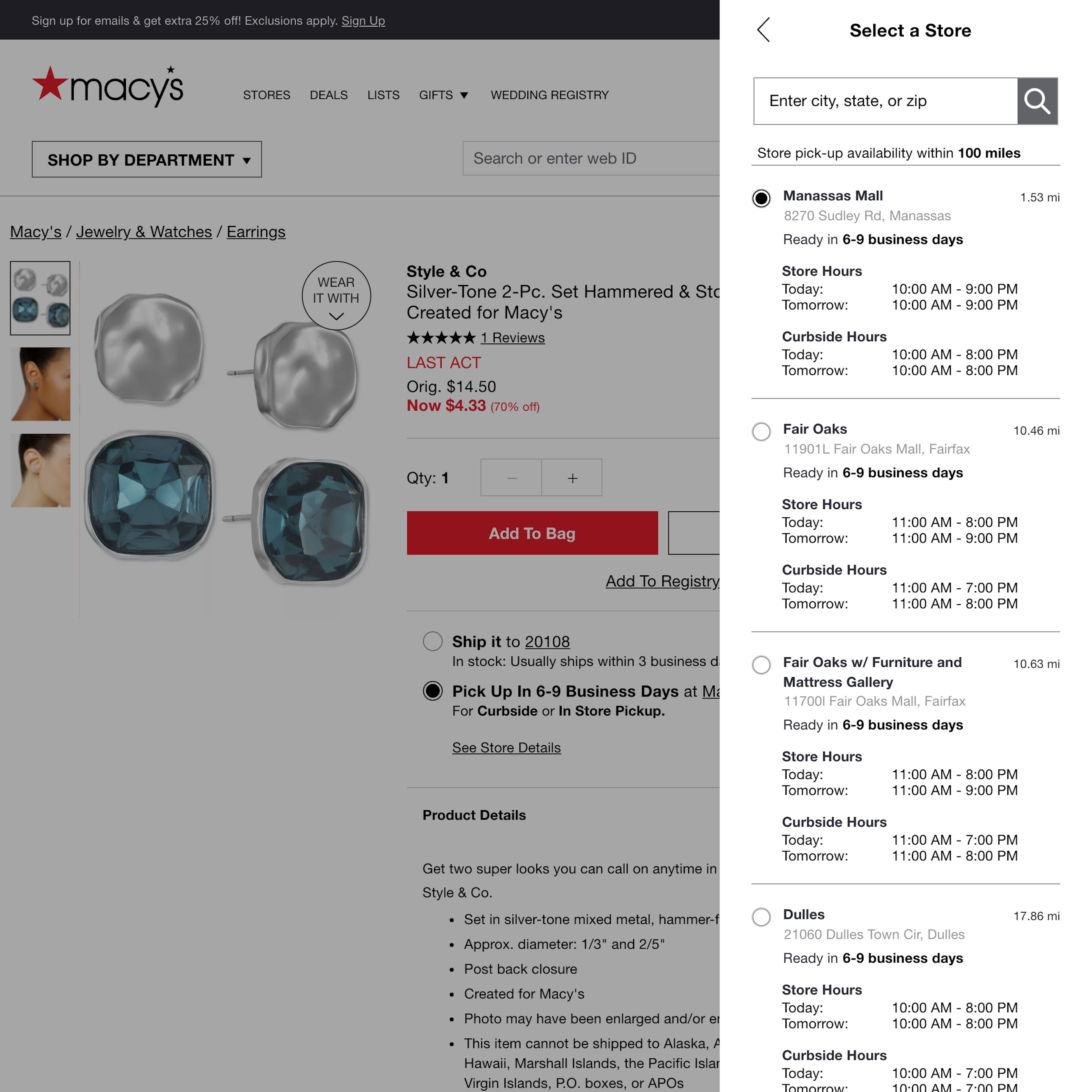
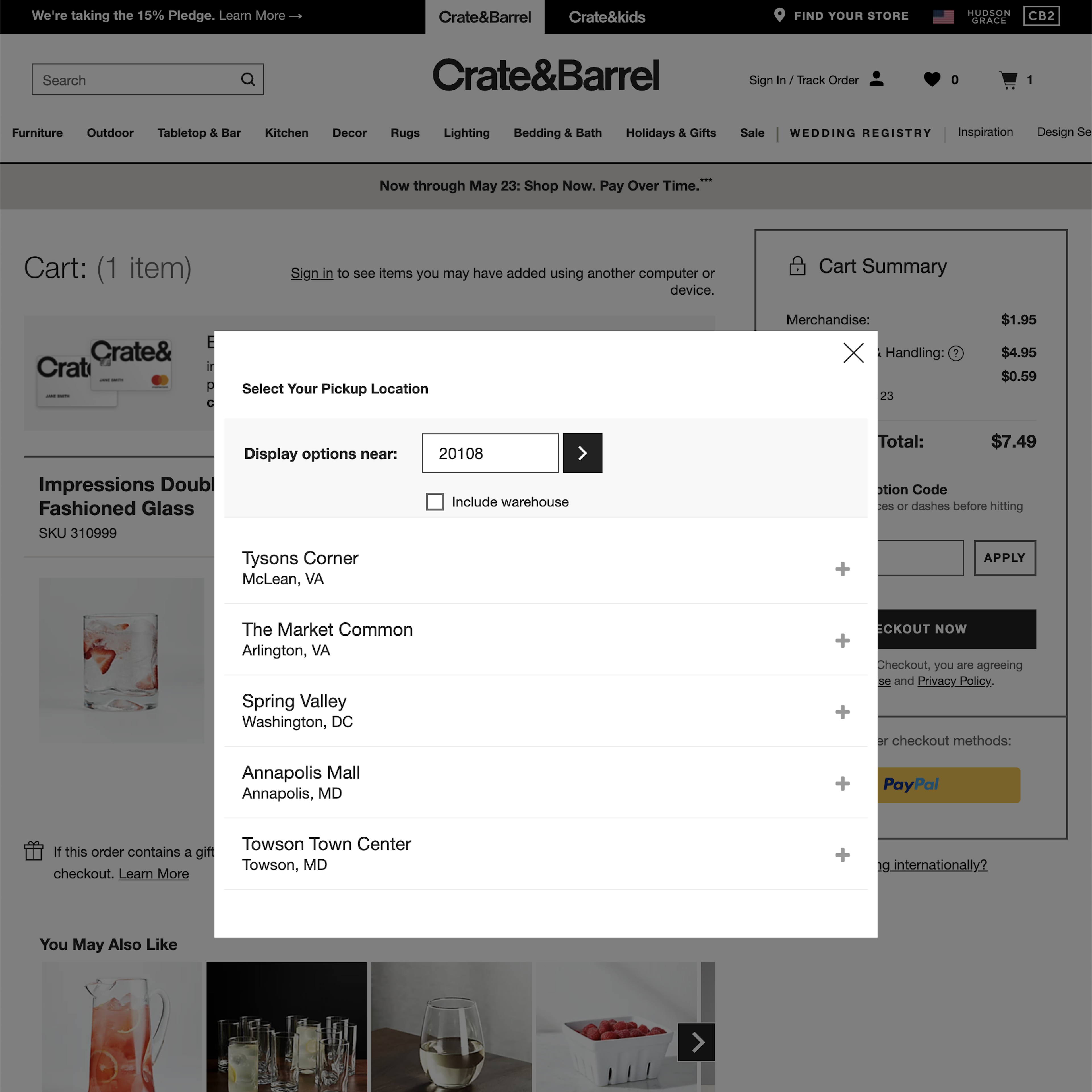
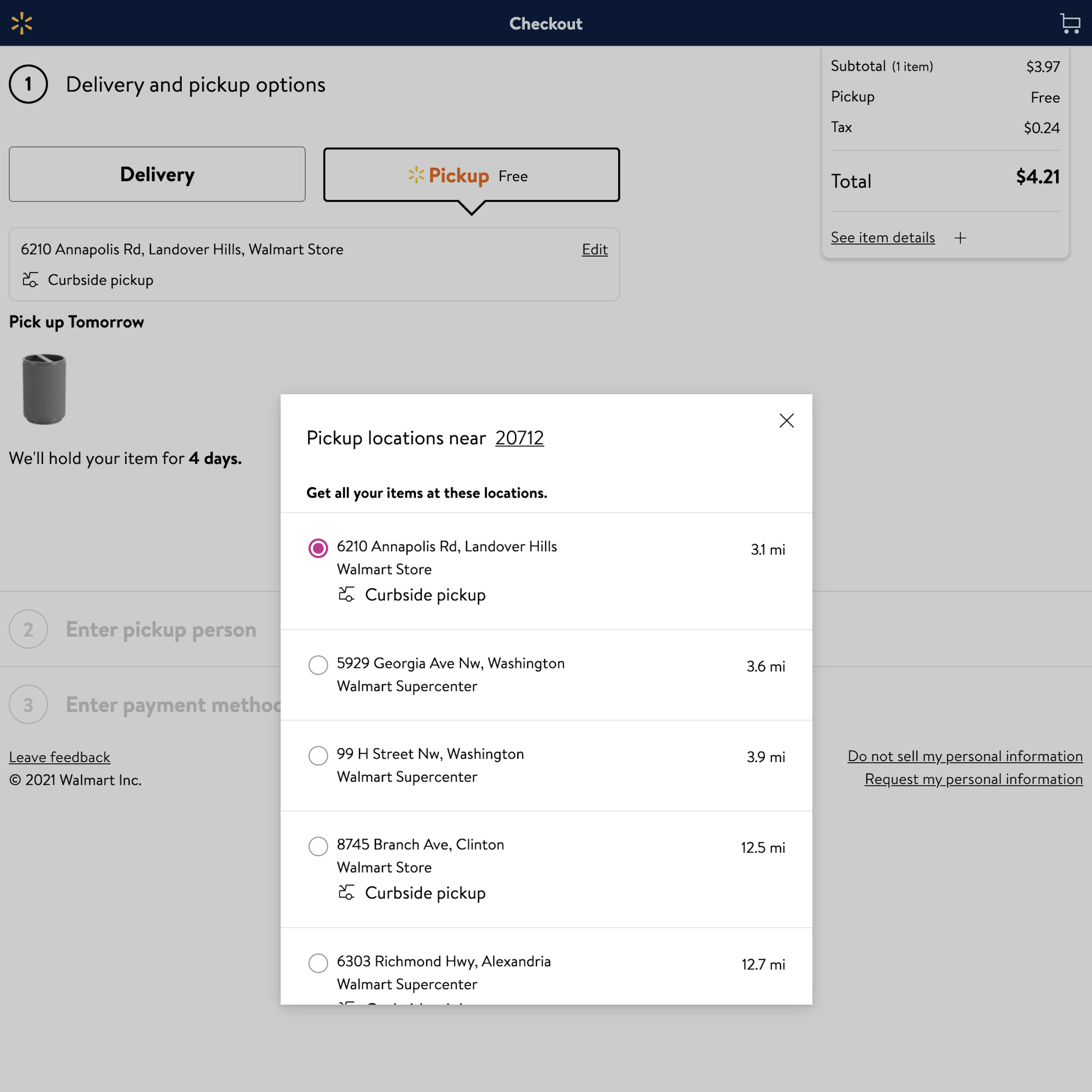
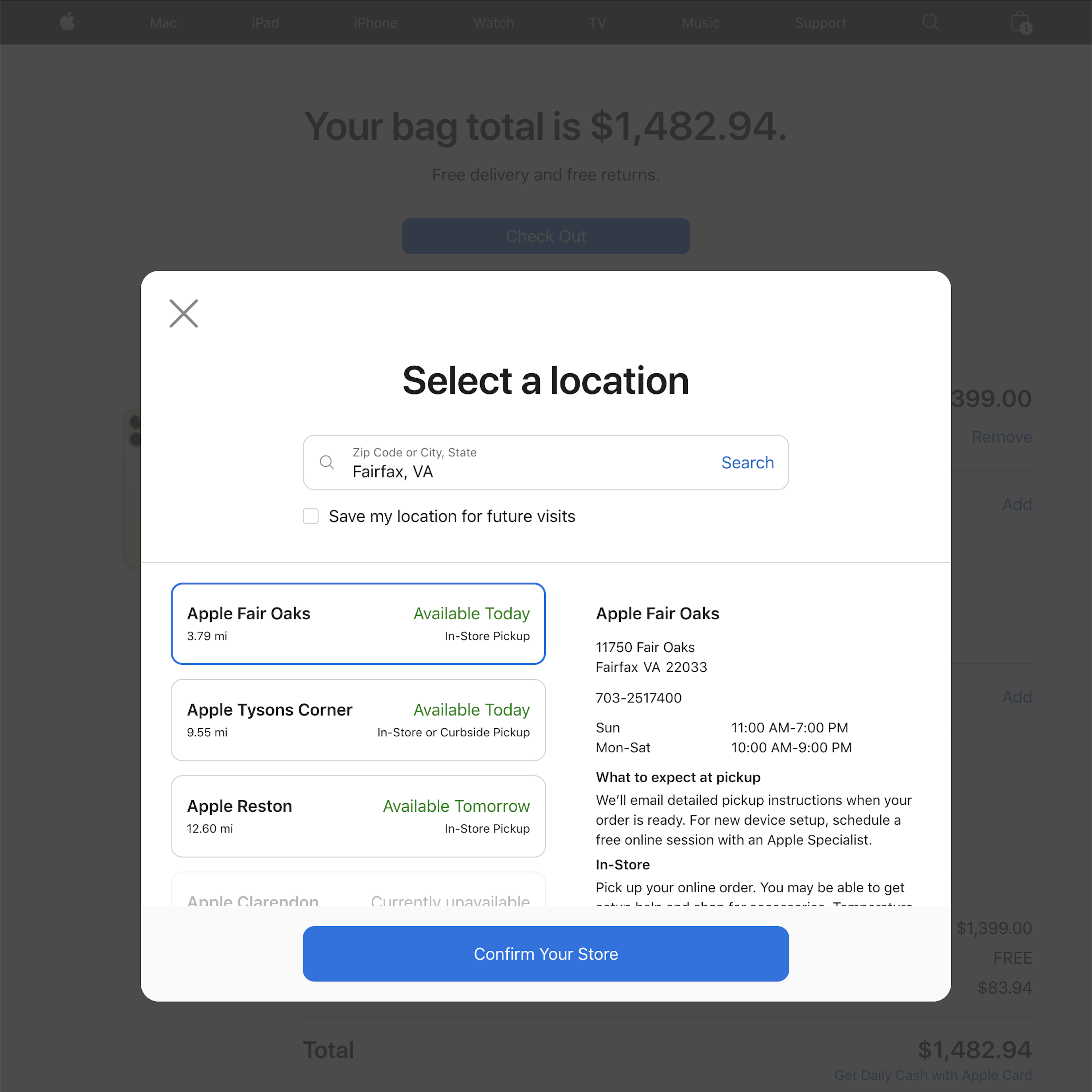
222 ‘Store Pickup’ Design Examples
Also referred to as: BOPIS, In-Store Pickup, Click & Collect
What’s this? Here you’ll find 222 “Store Pickup” full-page screenshots annotated with research-based UX insights, sourced from Baymard’s UX benchmark of 325 e-commerce sites. (Note: this is less than 1% of the full research catalog.)
Omni-channel e-commerce sites will often have a unique advantage over their “online only” competitors, in the form of “Store Pickup” option(s), which is typically free and fast - typically call “Buy Online, Pickup In Store” or “BOPIS”. This is important because our latest quantitative study on reasons for checkout abandonments reveals that 55% of US online shoppers have abandoned orders in the past quarter solely due to “Too High Extra Costs Added” (typically shipping), and that 16% have abandoned solely due to “Delivery Being Too Slow”. Hence, “Store Pickup” is a strong competitive advantage as it’s (typically) fast and free.
Yet, our large-scale UX testing also reveals that several of the design patterns commonly used for displaying “Store Pickup” and “BOPIS” actually cause most users to overlook the pickup option entirely.
More ‘Store Pickup’ Insights
-
Our large-scale UX testing on how users interpret and select “Store Pickup” options also reveals that of those users who do notice the alternative omni-channel delivery options, several users are unclear on the exact implications of choosing ‘Store Availability’ vs ‘Ship-to-Store’ vs ‘Store Pickup’.
-
In addition, the exact interfaces used for “Store Pickup” often don’t sufficiently account for the fact that many users will consider “Store Pickup” an alternative to home shipping, and hence wants to compare the details for these to options directly to each other.
-
Overall there are several, often missed, implementation details that can cause severe user misinterpretations when it comes to “Store Pickup” and other omni-channel delivery methods.
-
Learn More: Besides exploring the 222 “Store Pickup” design examples below, you may also want to see the related “Shipping Method” design examples, and read our related articles “Users Overlook ‘Store Pickup’ When Not Presented as a Shipping Option”, “‘Free Shipping’ Should Not Only Be in a Site-Wide Banner - 35% get it wrong”, and “Use ‘Delivery Date’ Not ‘Shipping Speed’”.
-
Get Full Access: To see all of Baymard’s cart and checkout research findings you’ll need Baymard Premium access. (Premium also provides you full access to 200,000+ hours of UX research findings, 650+ e-commerce UX guidelines, and 275,000+ UX performance scores.)
User Experience Research, Delivered Weekly
Join 60,000+ UX professionals and get a new UX article every week.

User Experience Research, Delivered Weekly
Join 60,000+ UX professionals and get a new UX article every week.

Explore Other Research Content

300+ free UX articles based on large-scale research.

325 top sites ranked by UX performance.

Code samples, demos, and key stats for usability.


