1505 ‘Main Navigation’ Design Examples
Also referred to as: Drop-Down Menu, Mega Drop-Down, Navigation Menu
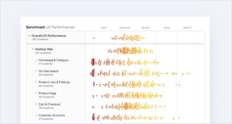
What’s this? Here you’ll find 1505 “Main Navigation” full-page screenshots annotated with research-based UX insights, sourced from Baymard’s UX benchmark of 298 e-commerce sites. (Note: this is less than 1% of the full research catalog.)
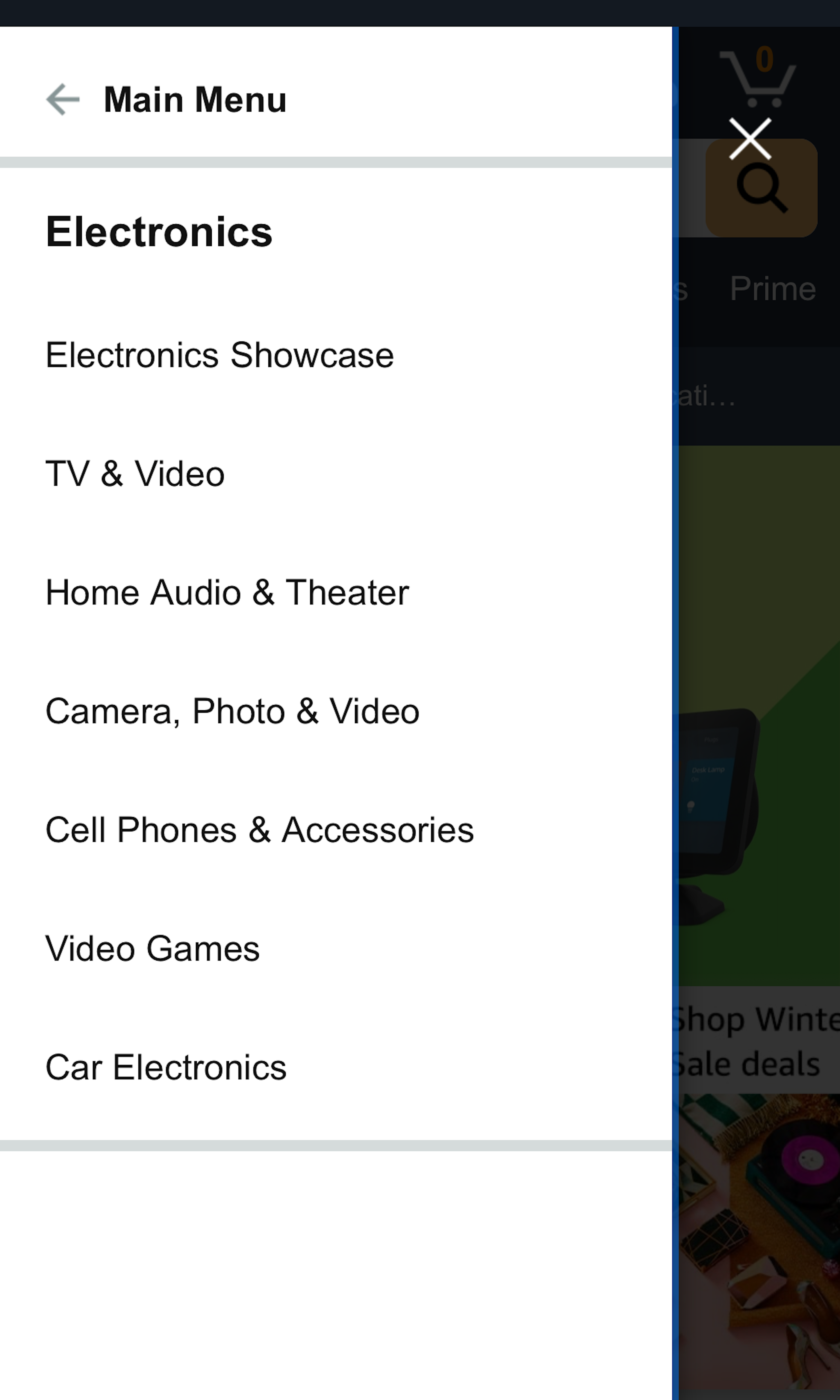
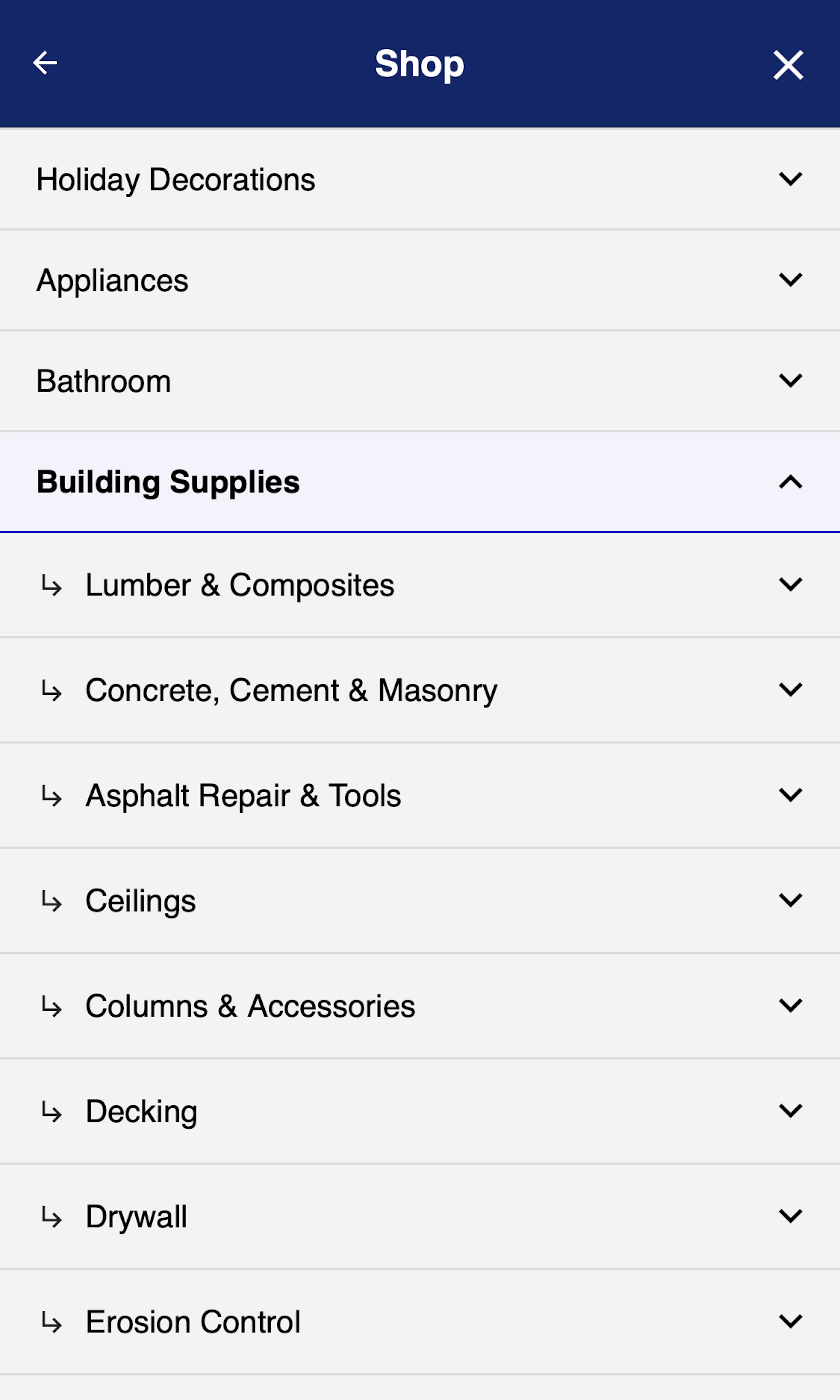
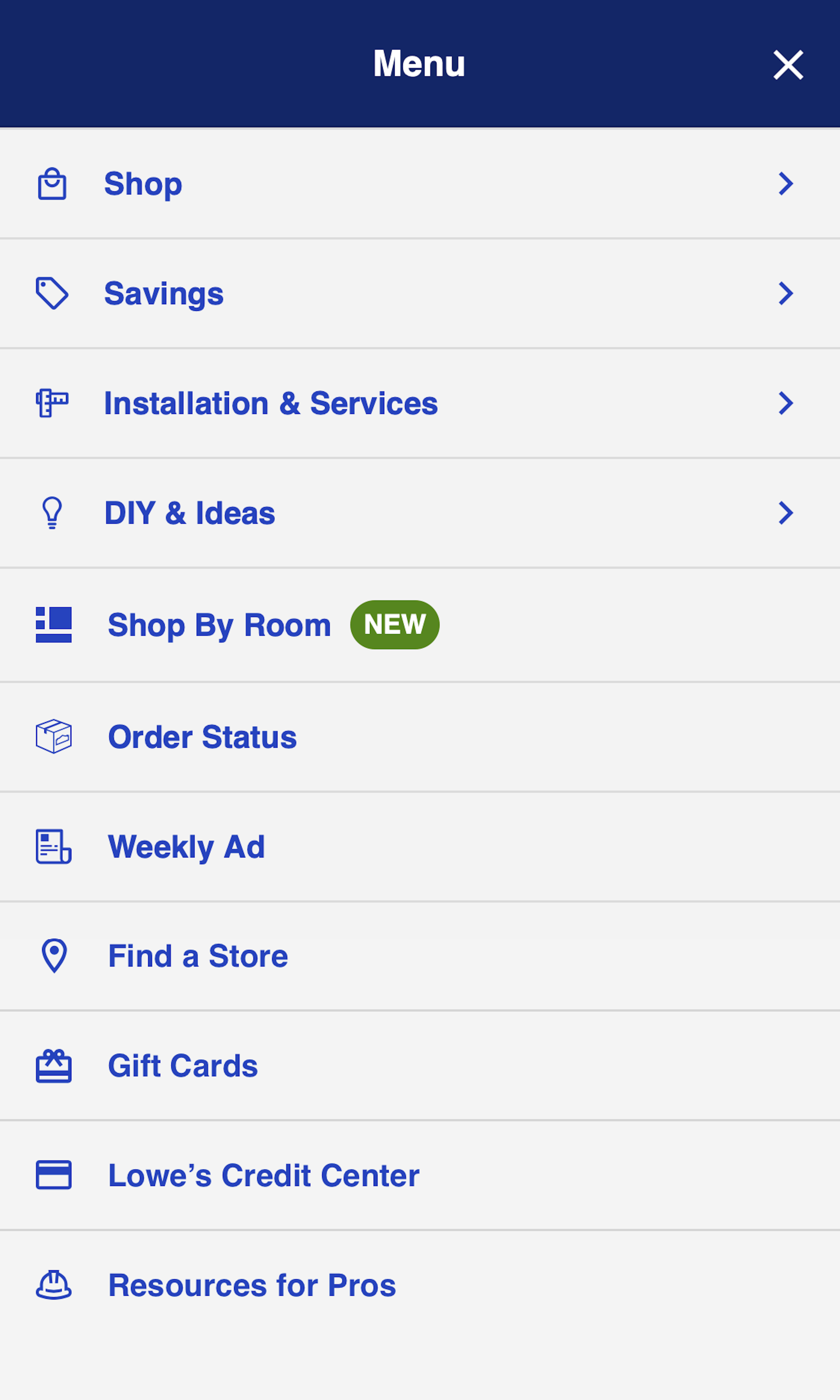
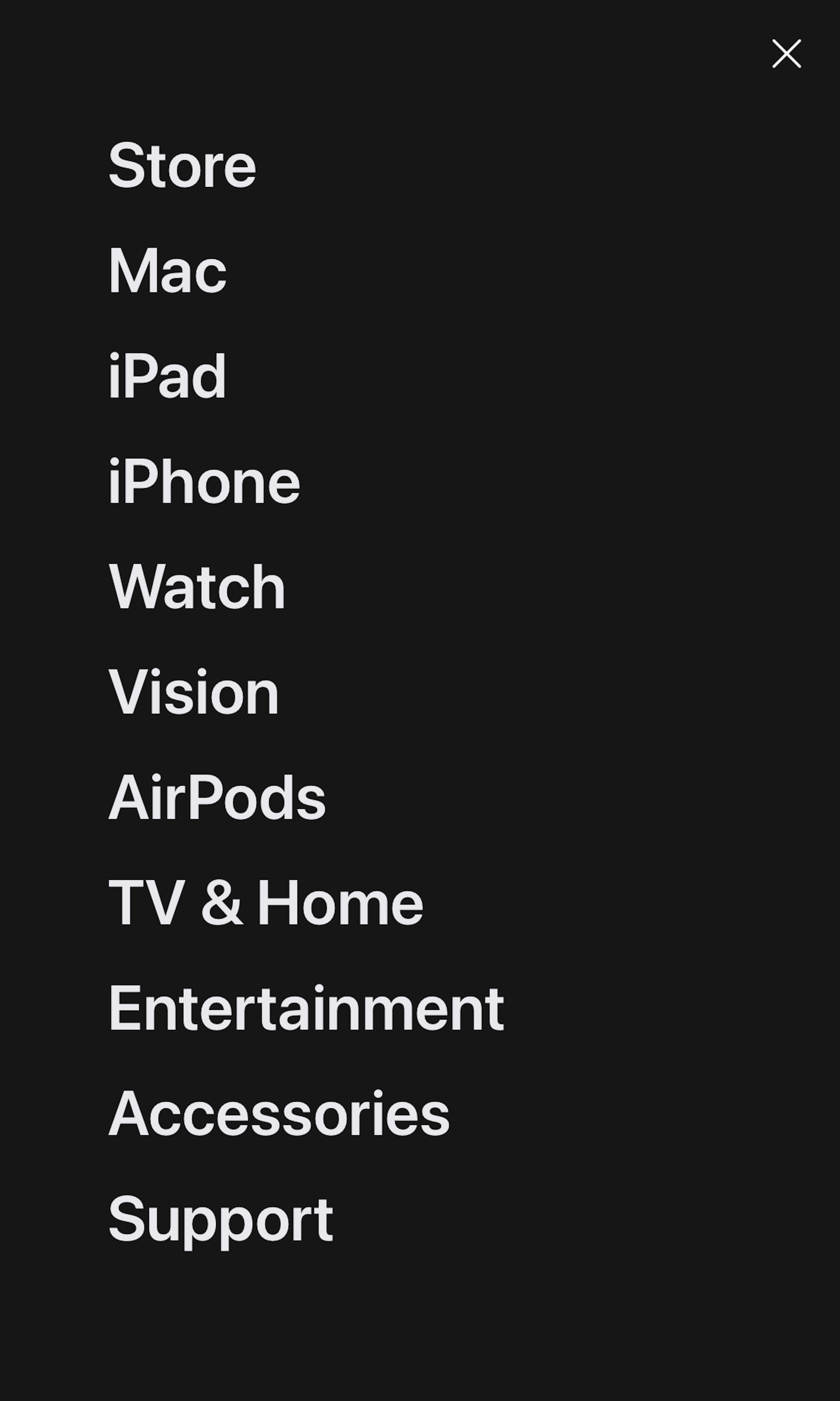
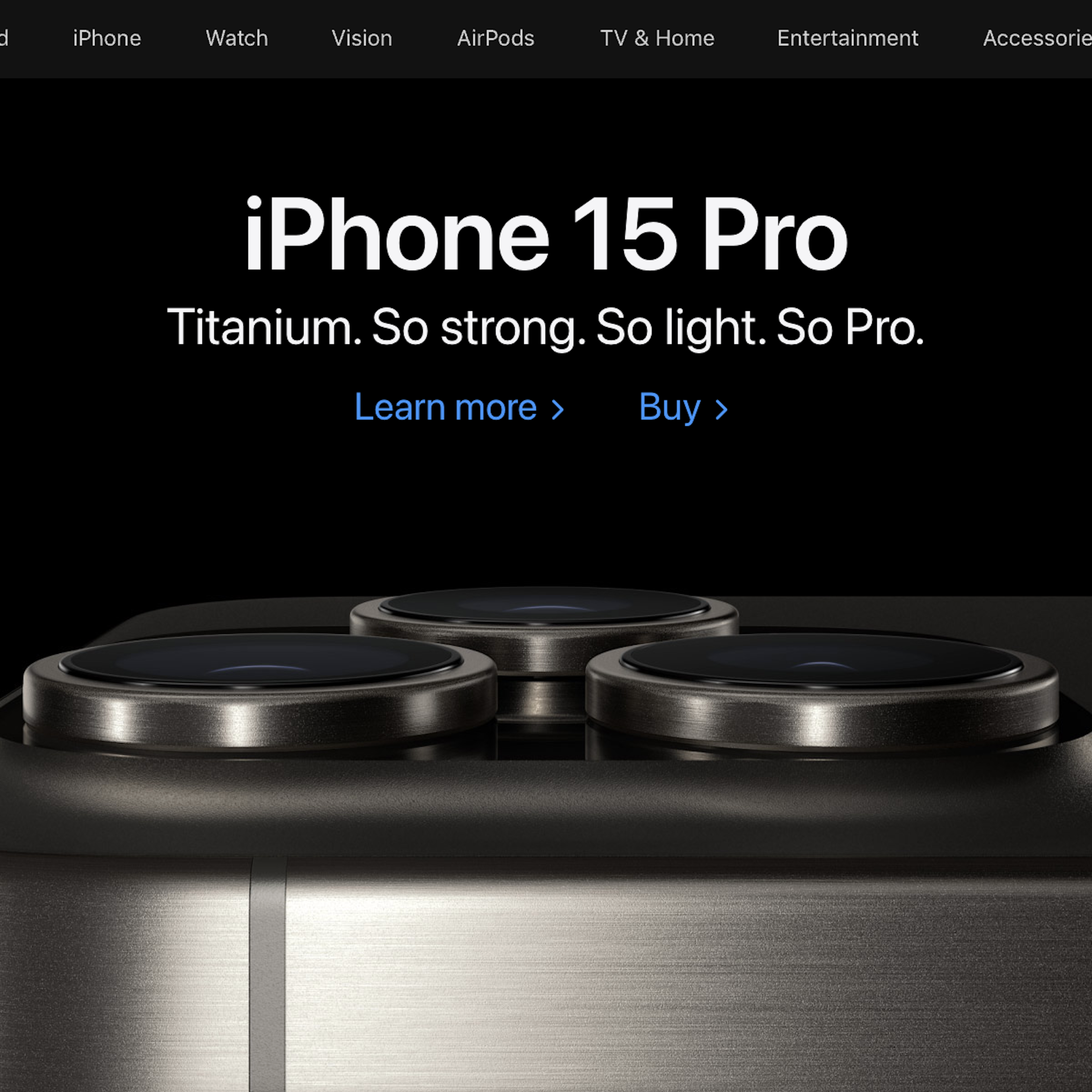
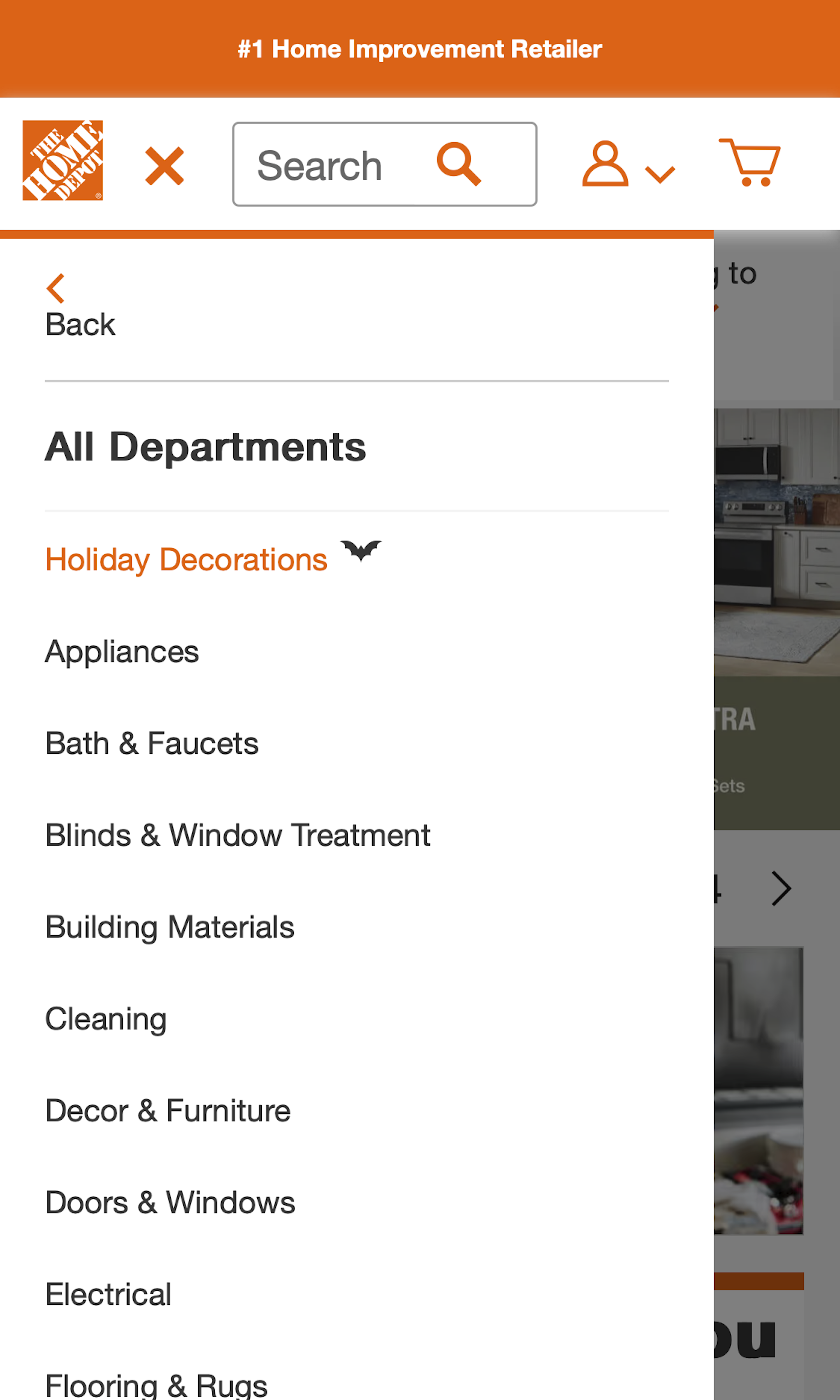
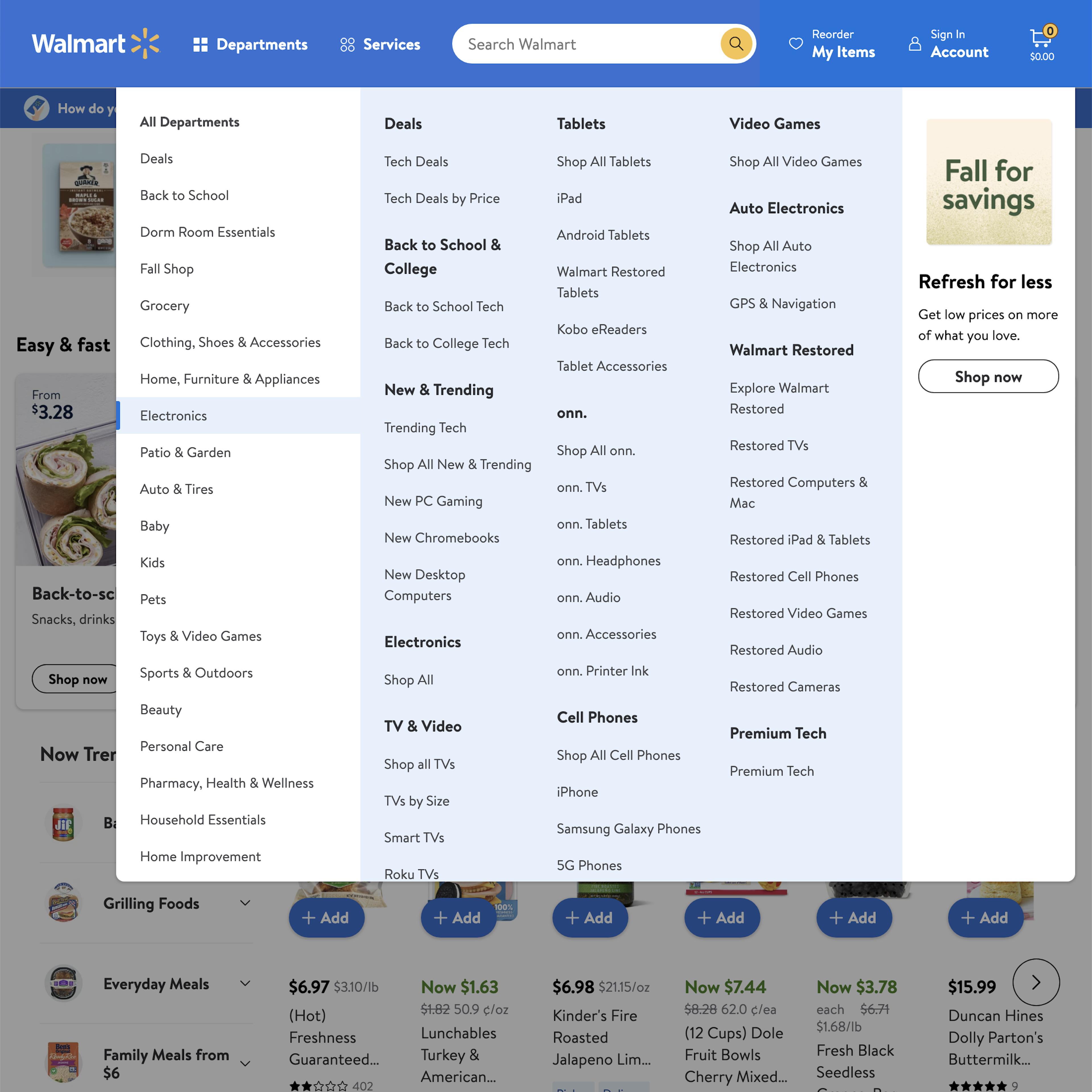
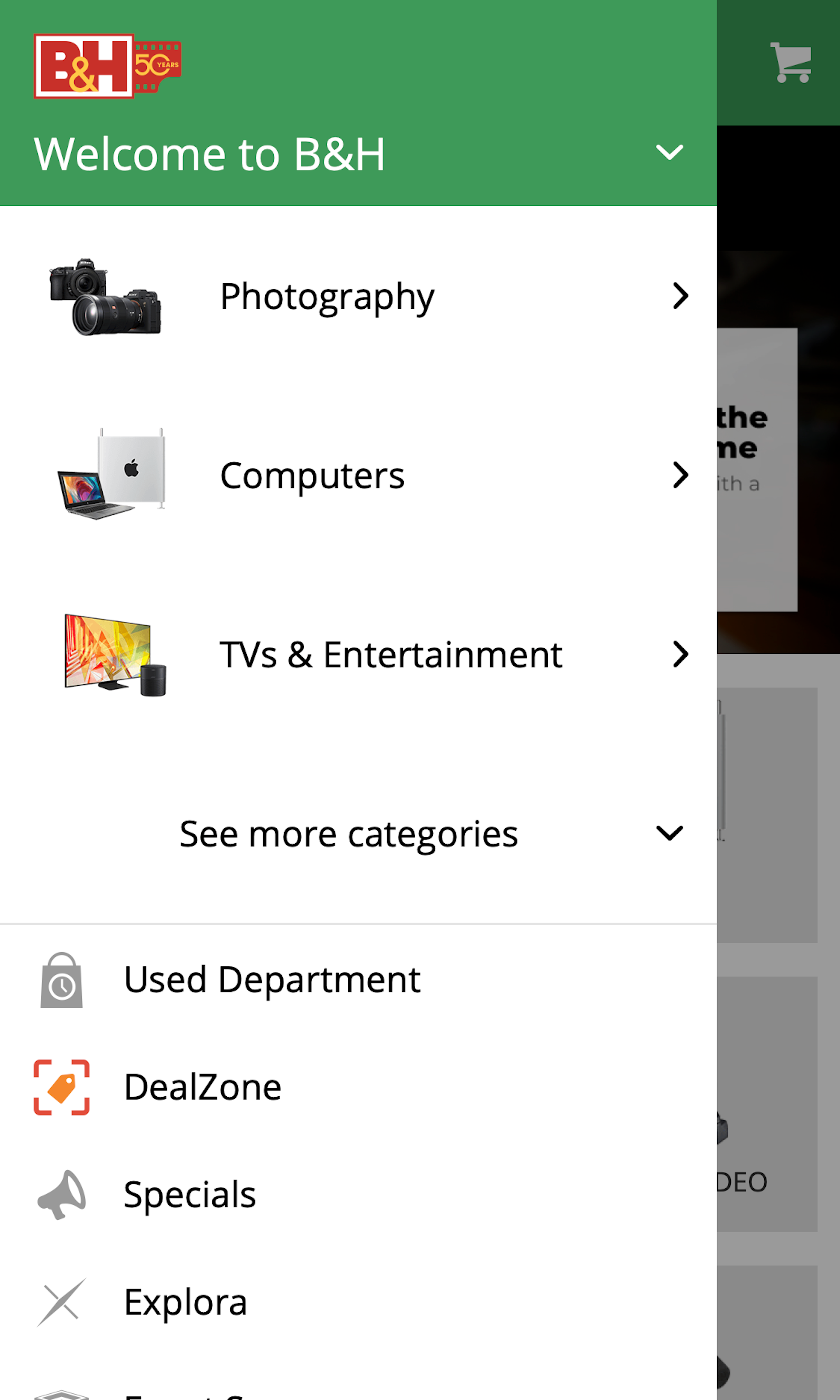
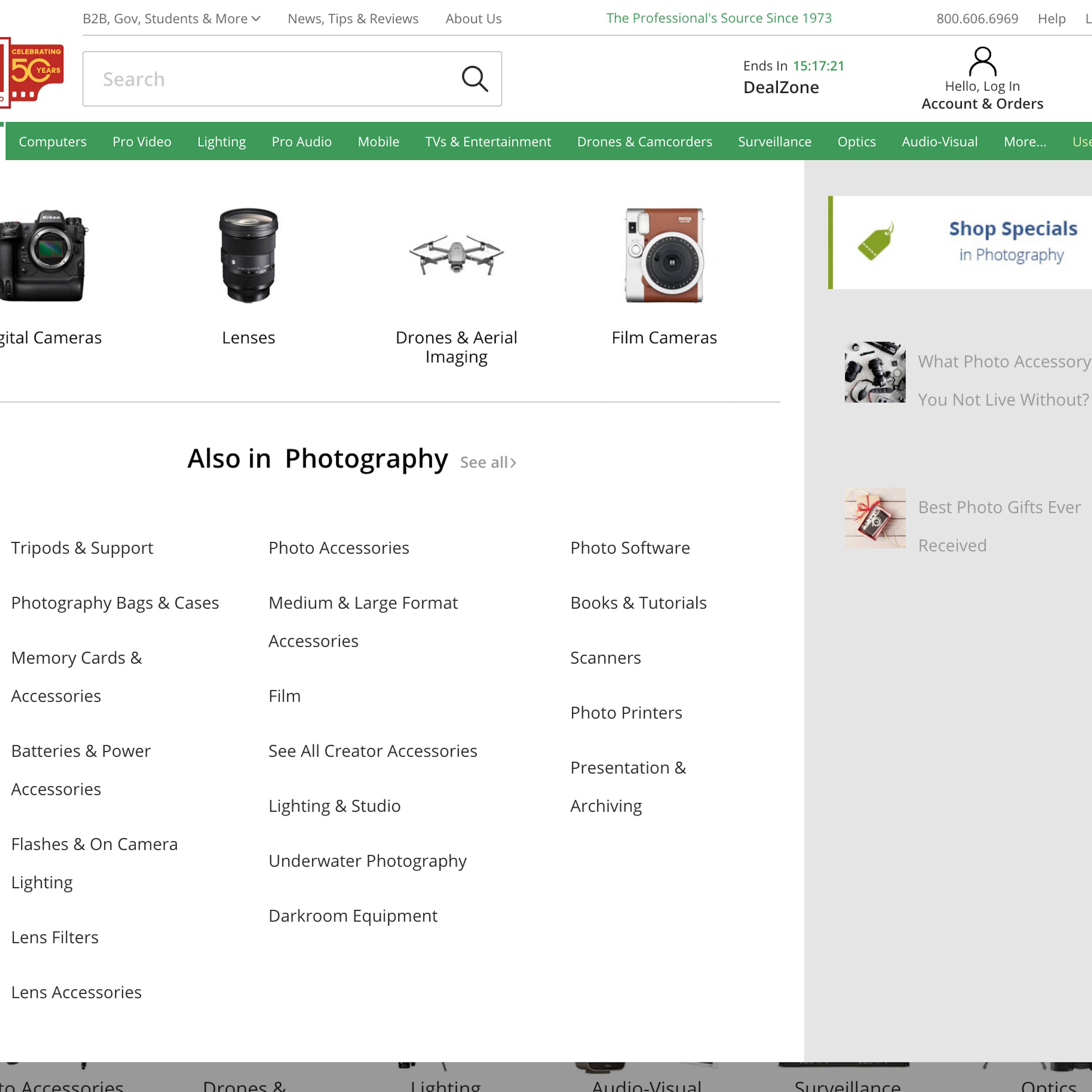
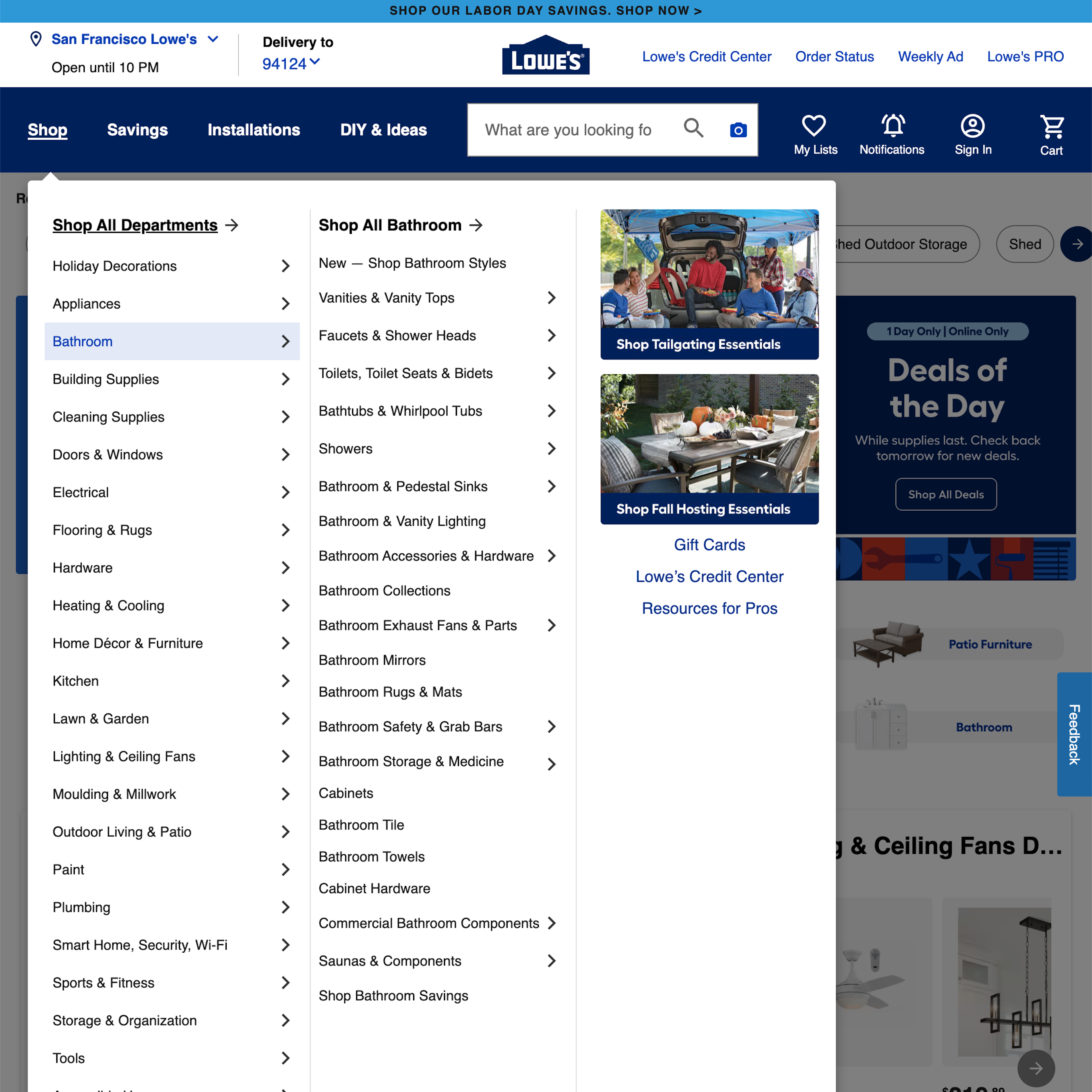
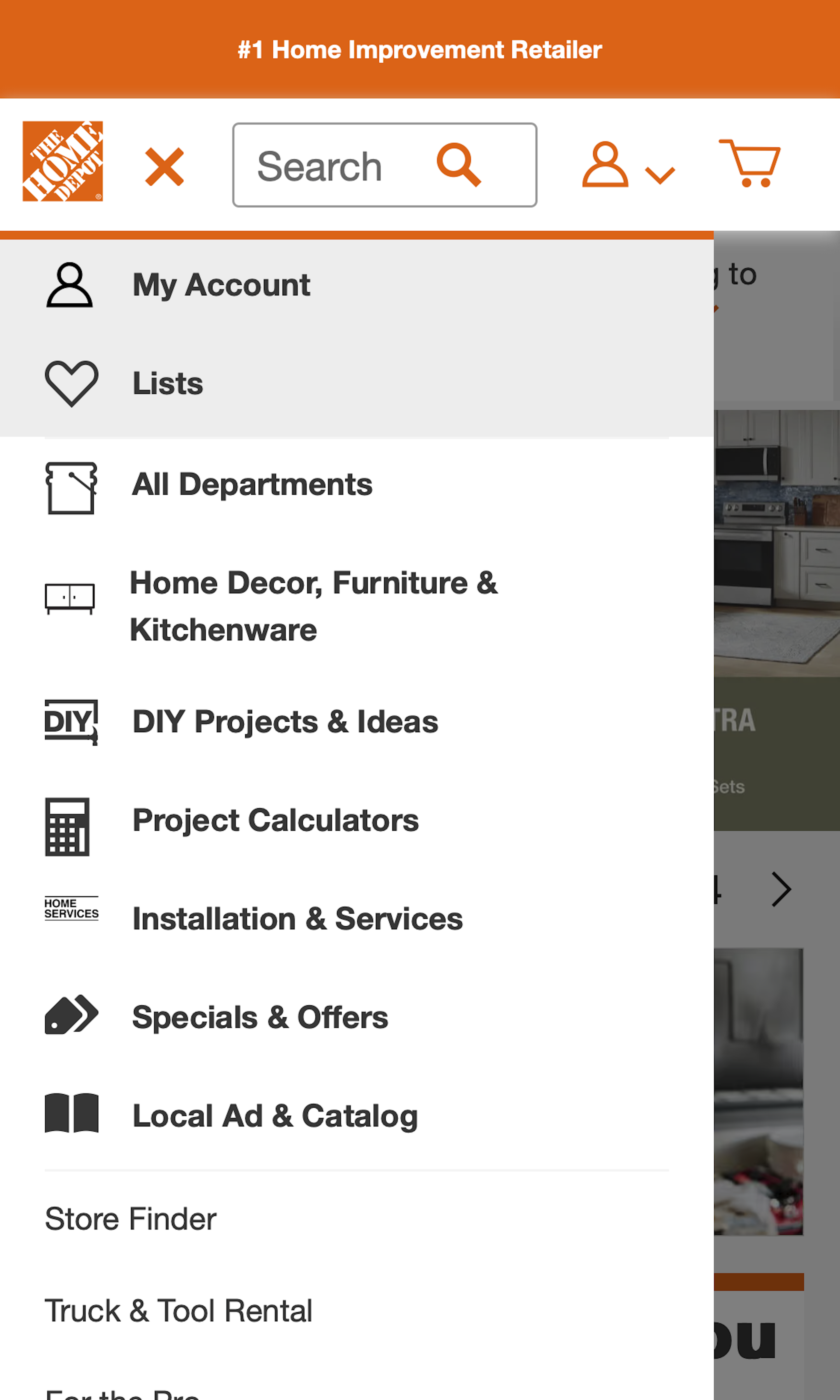
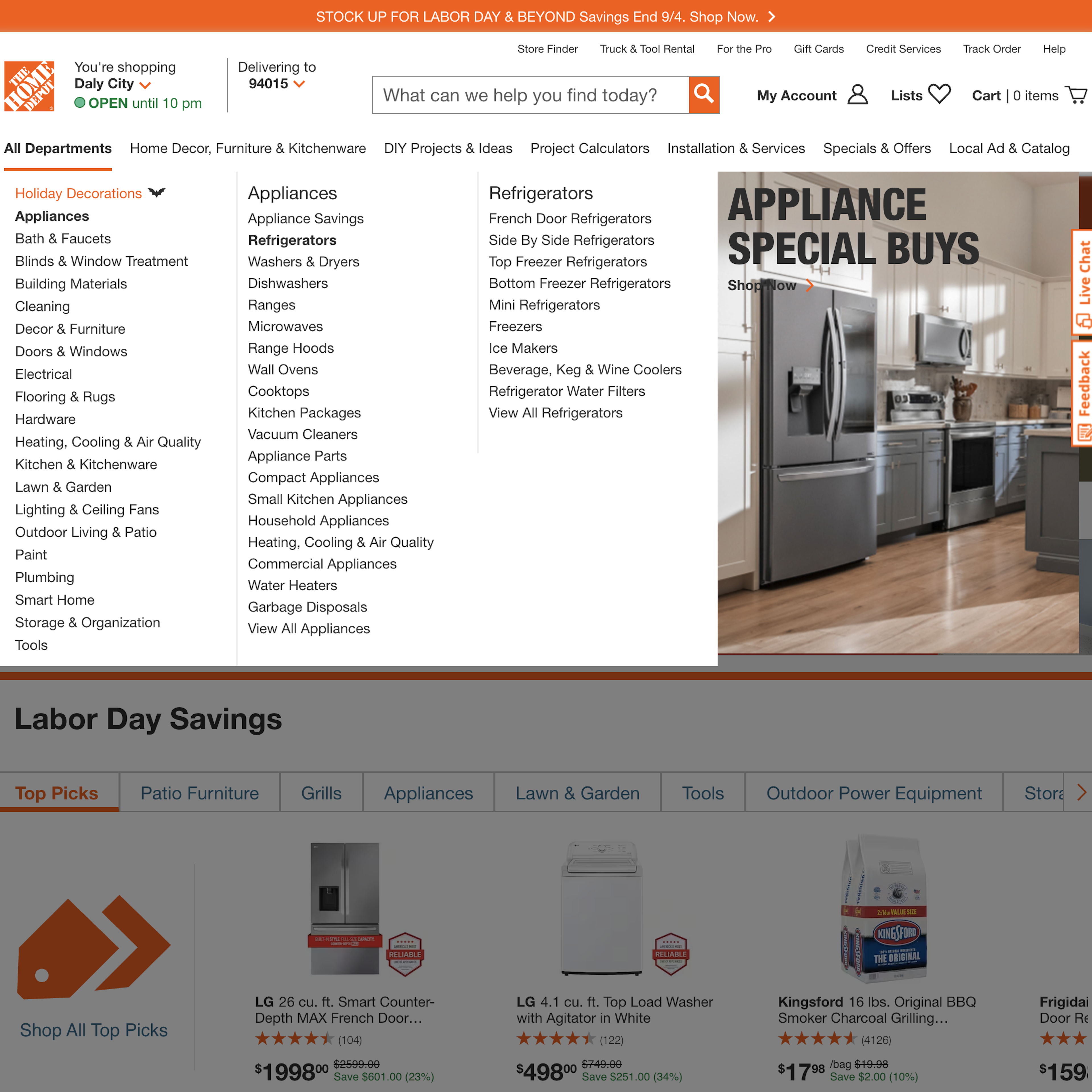
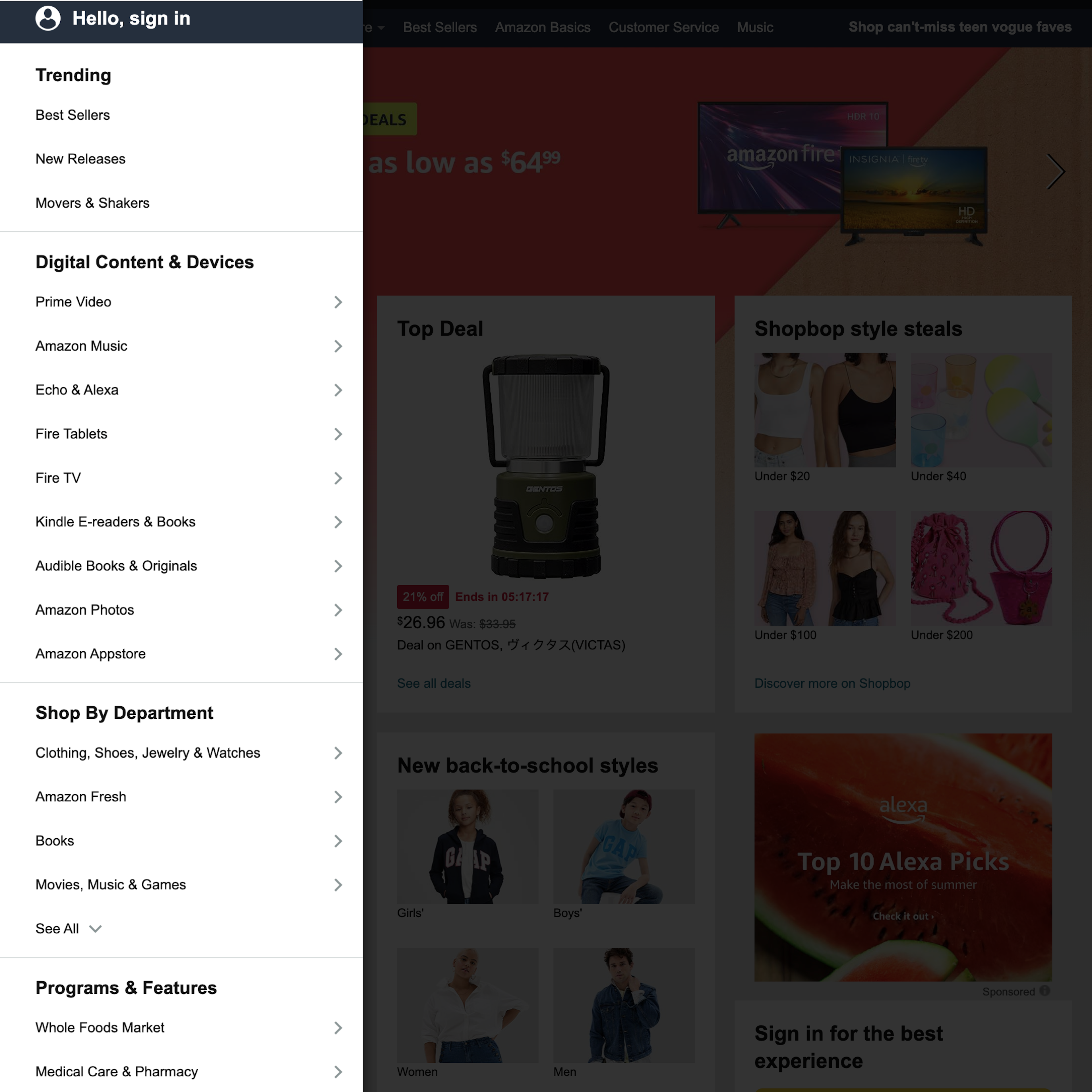
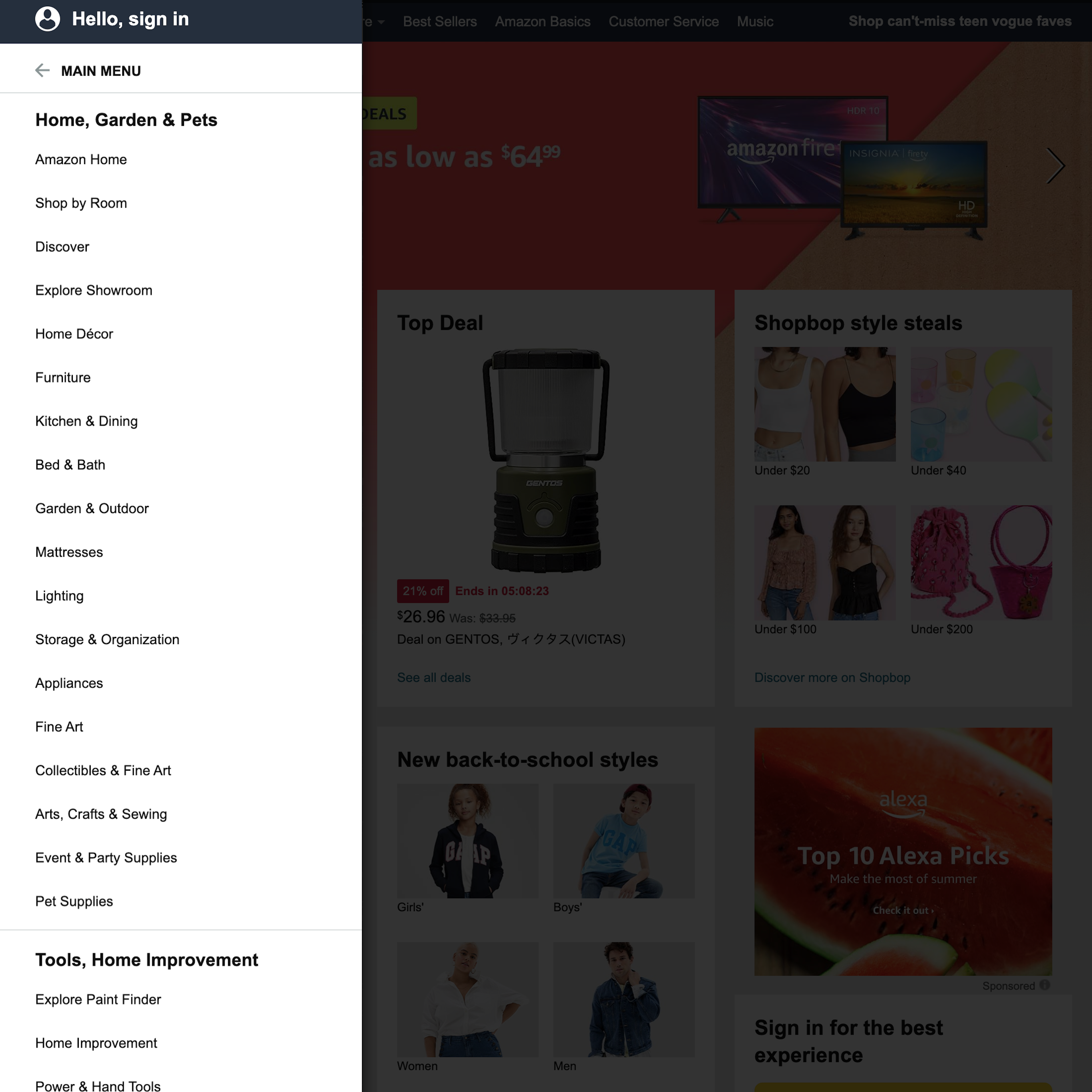
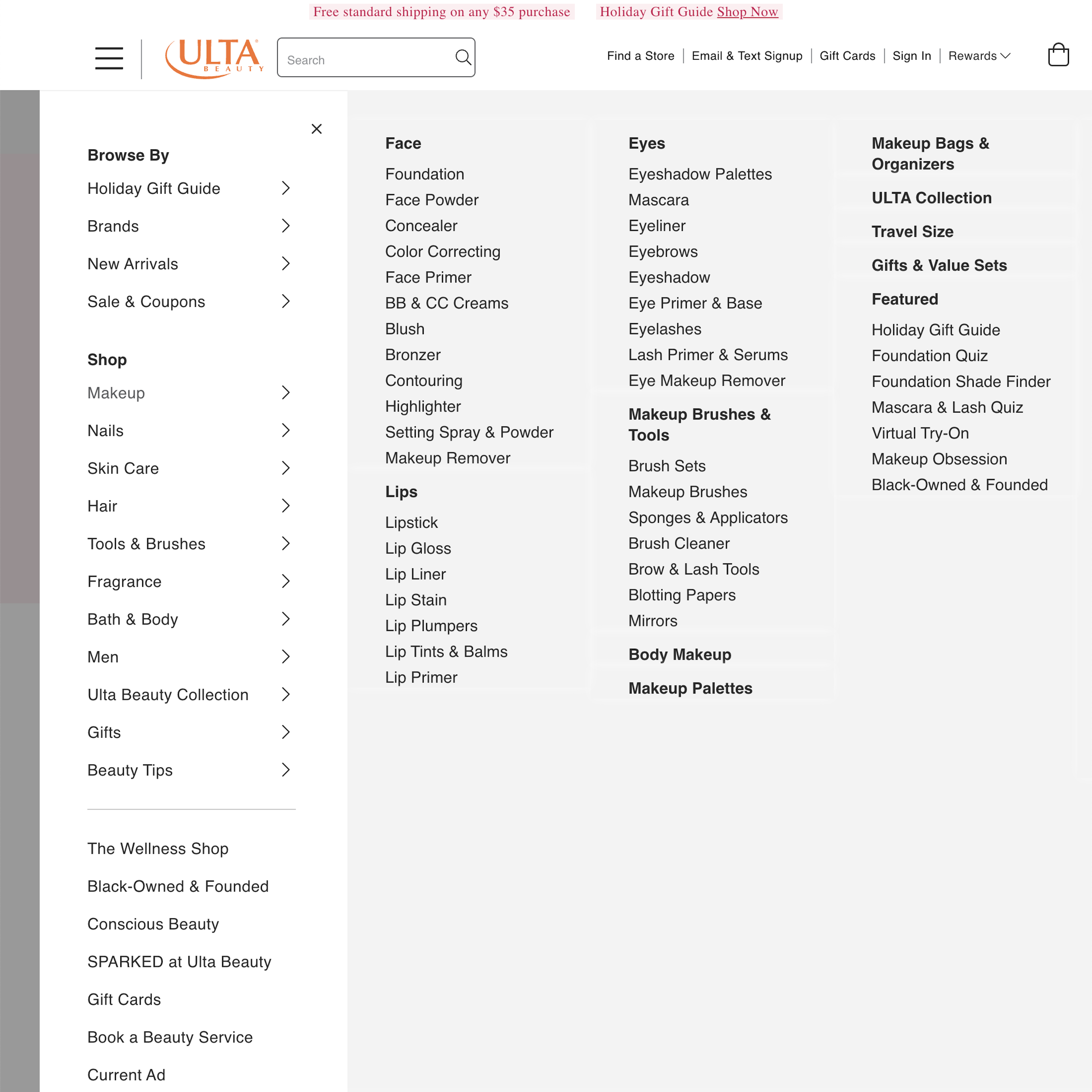
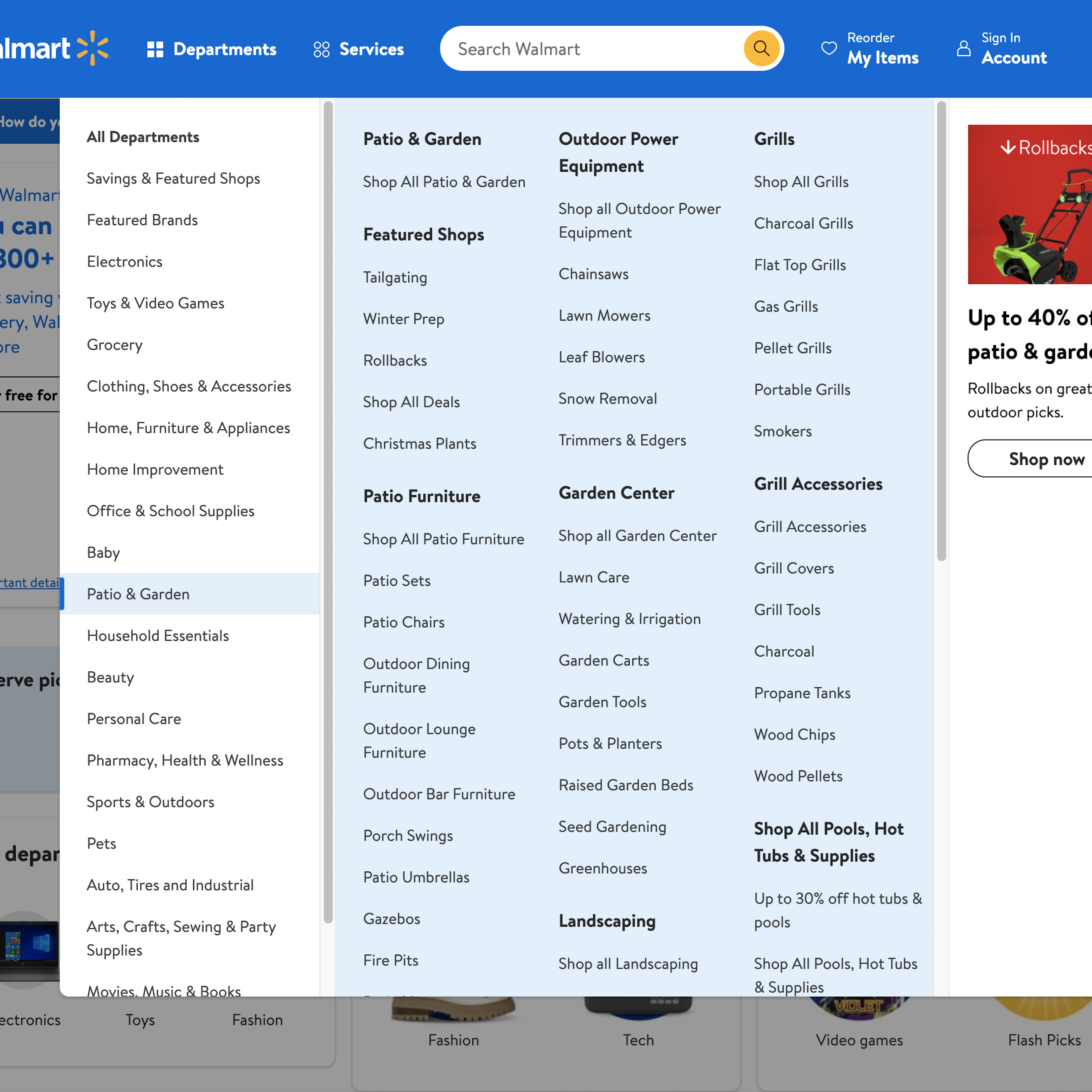
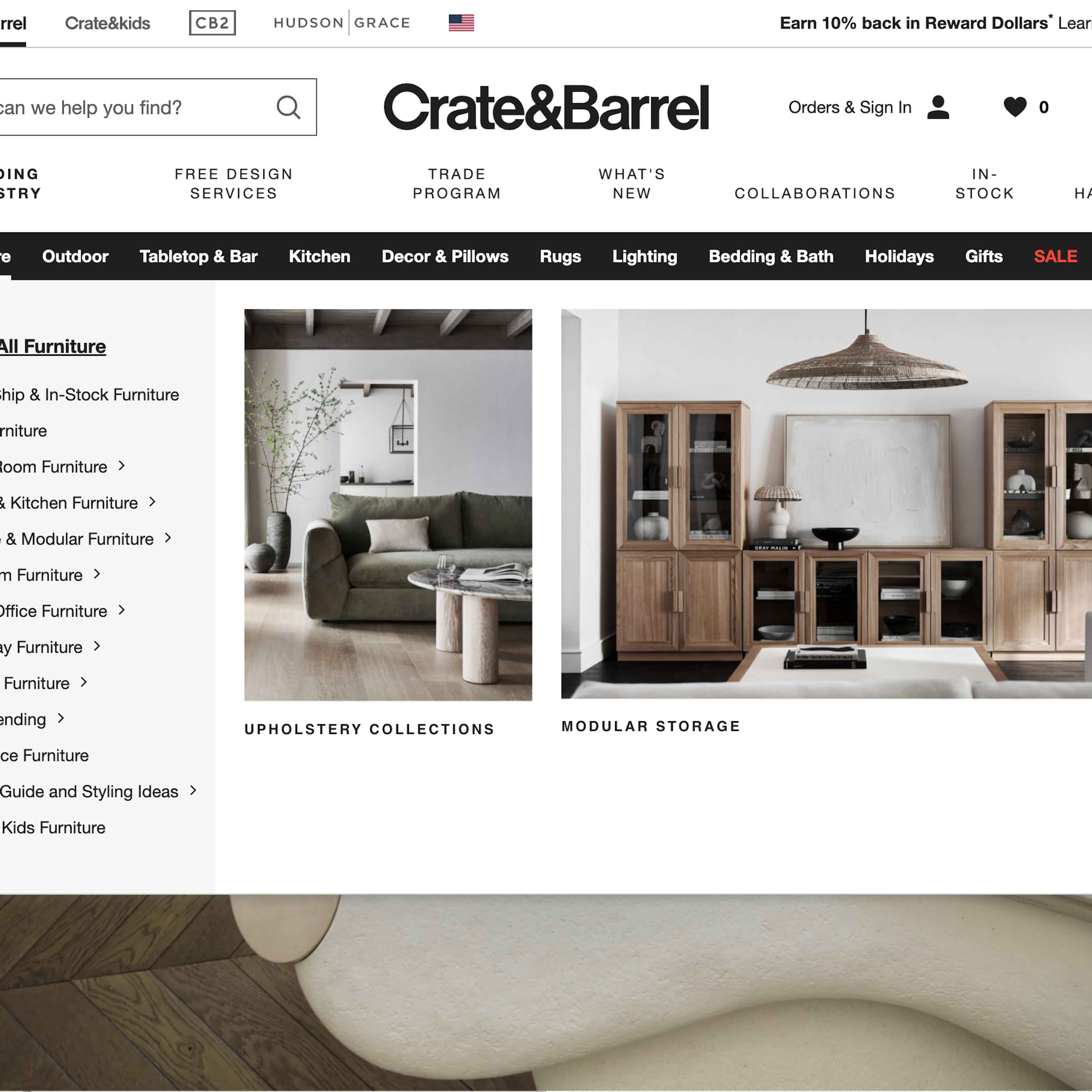
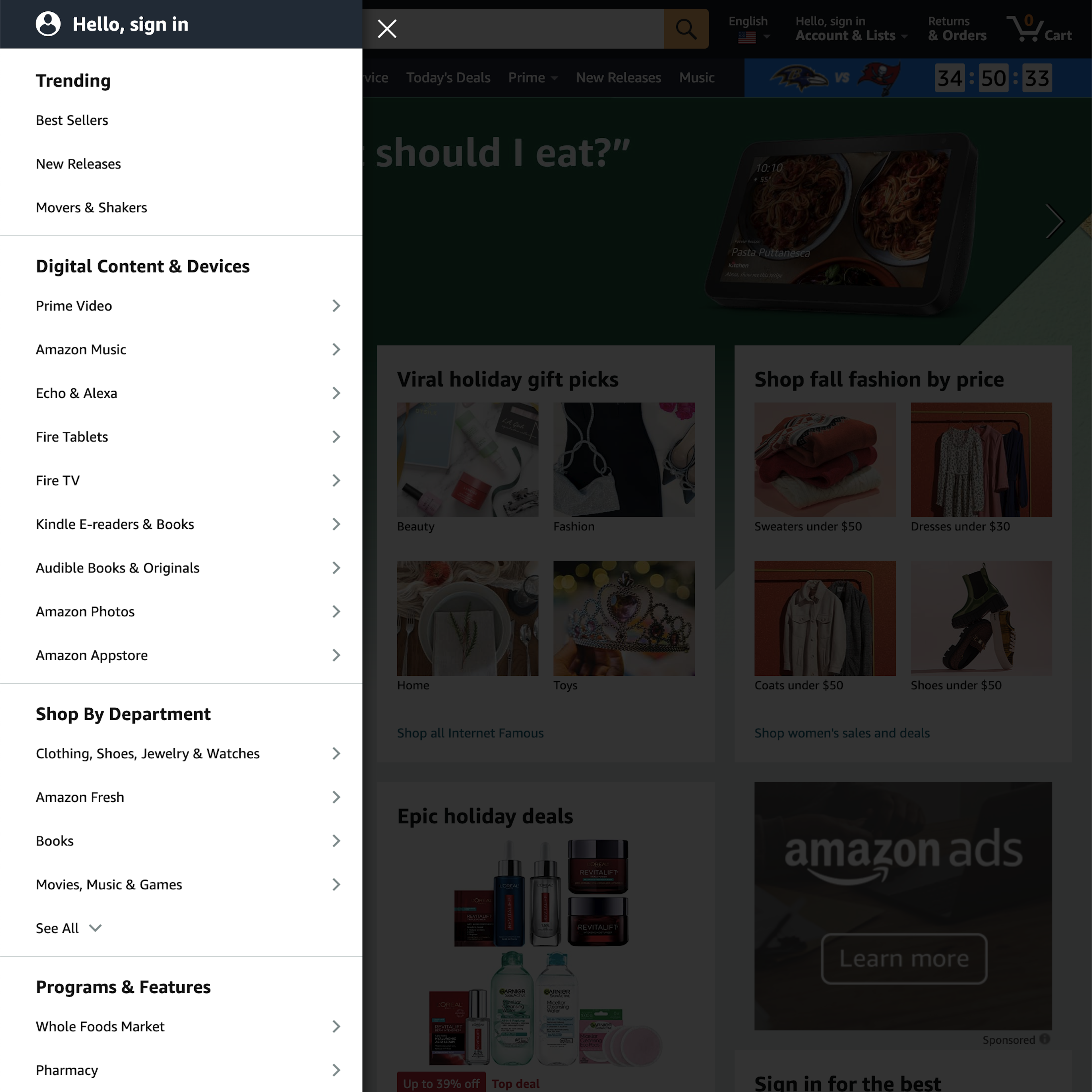
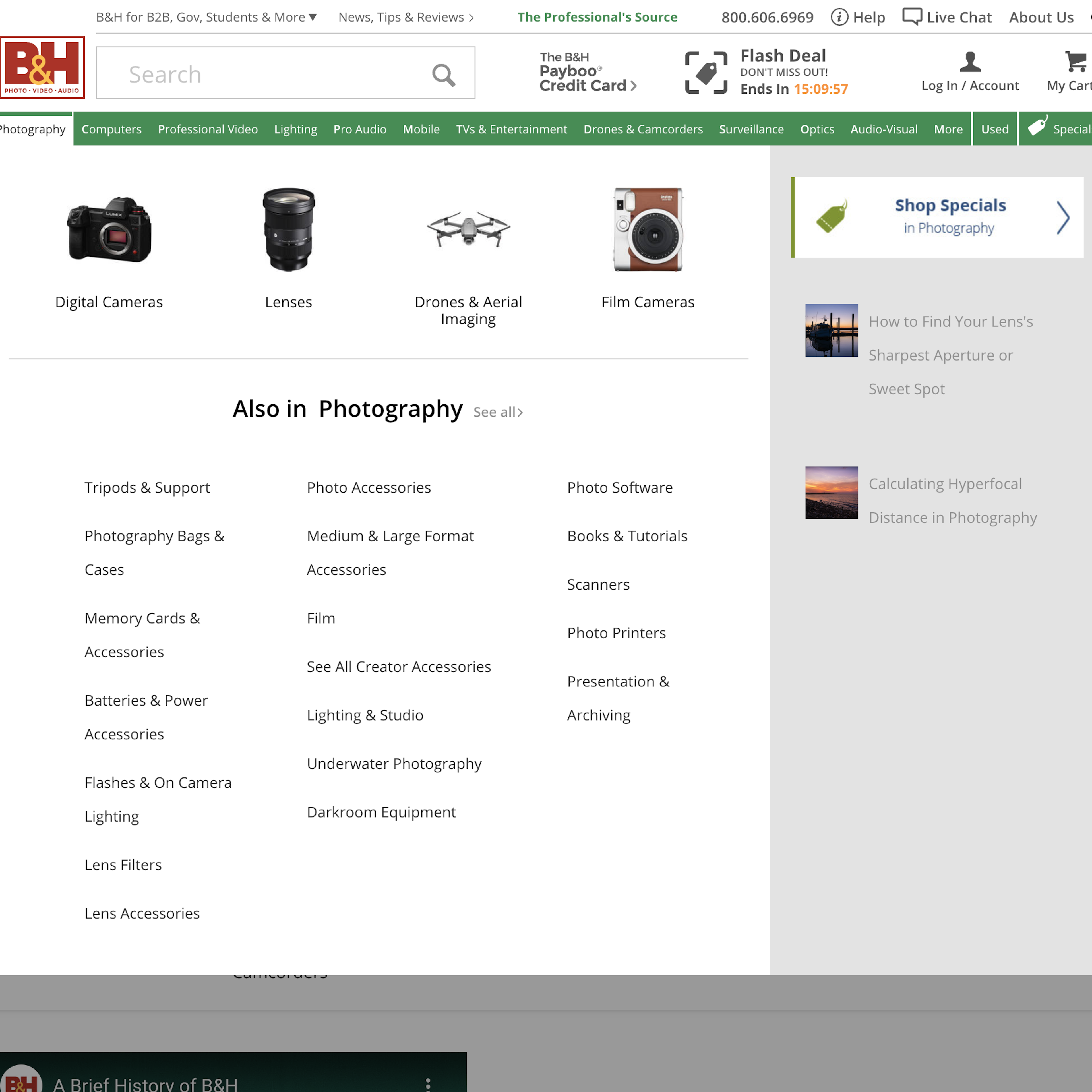
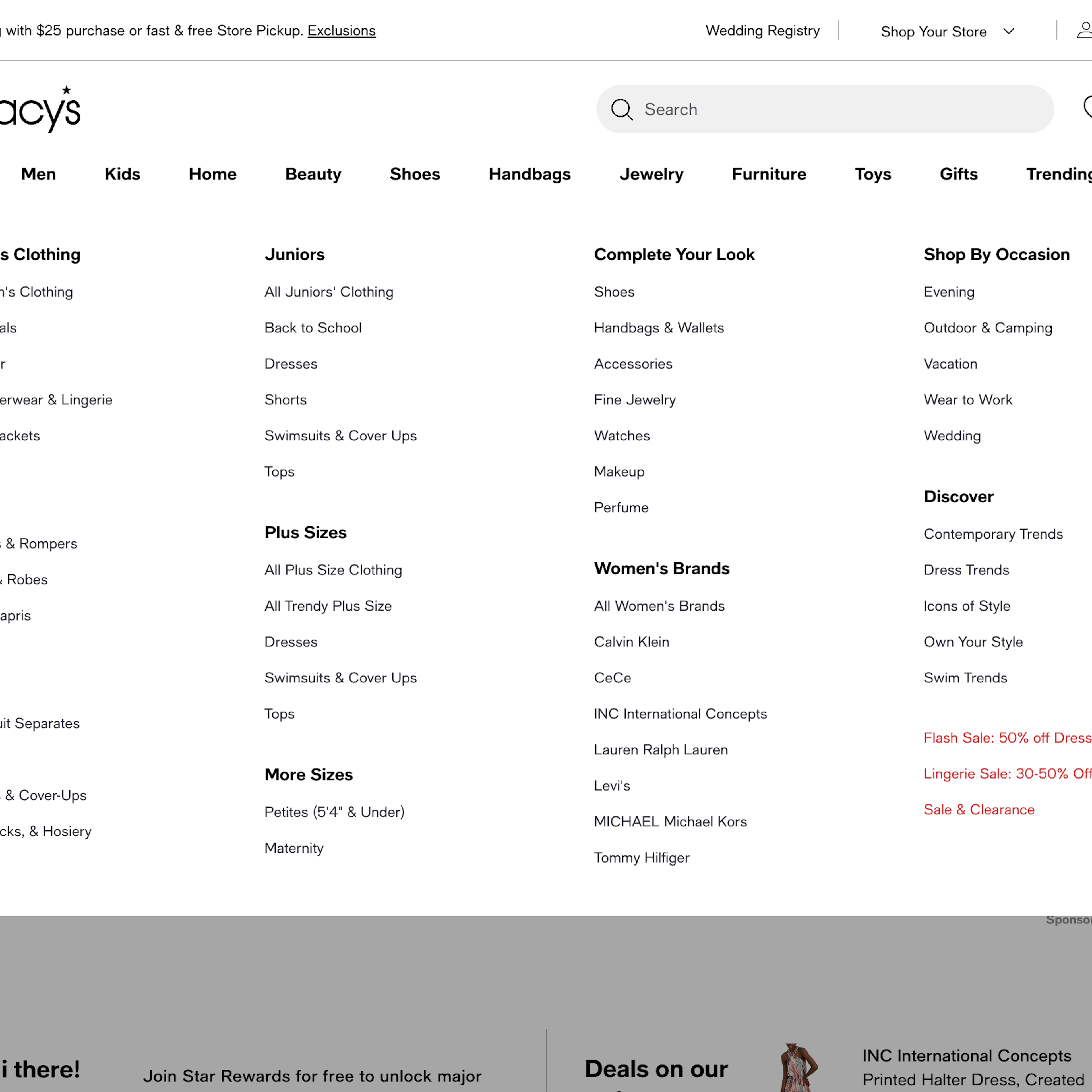
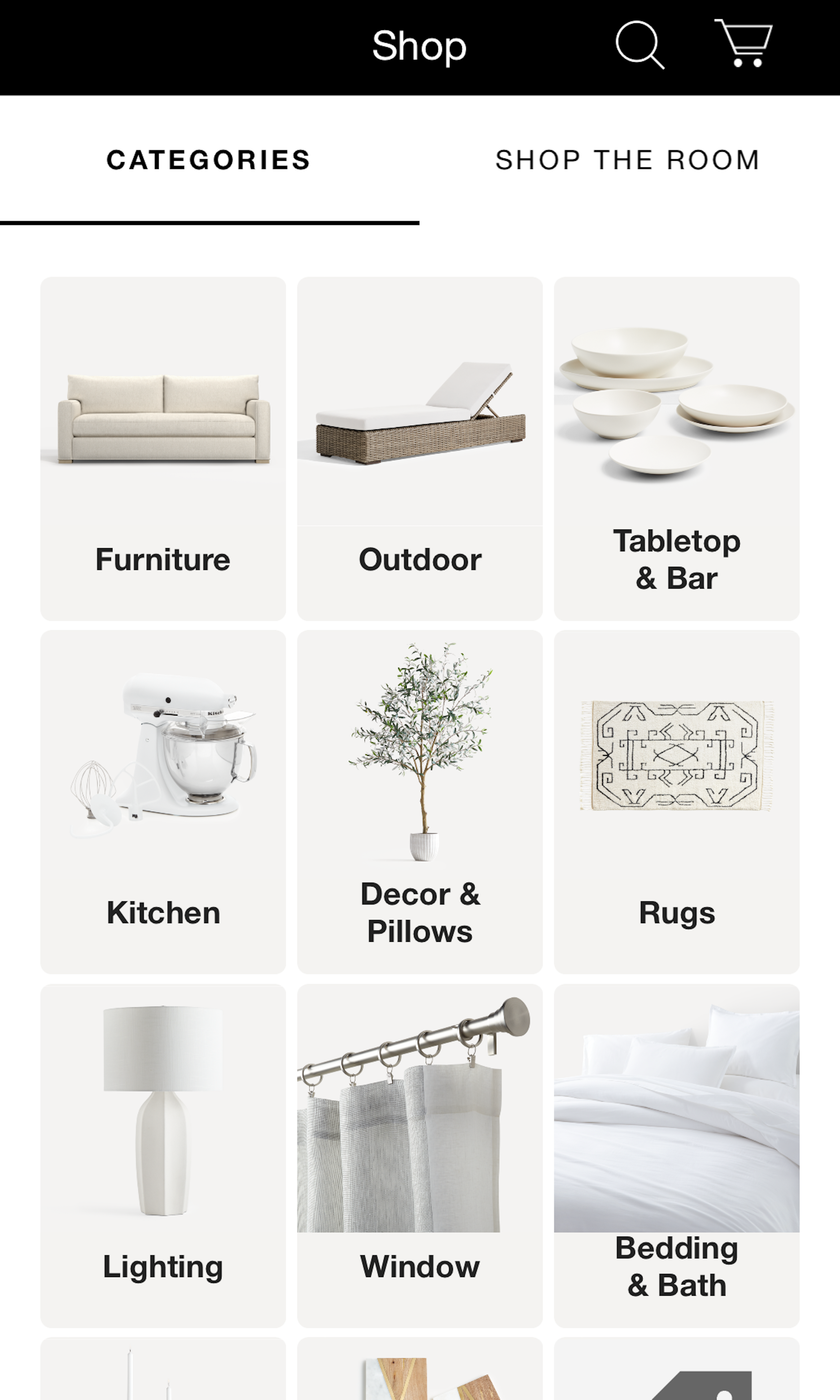
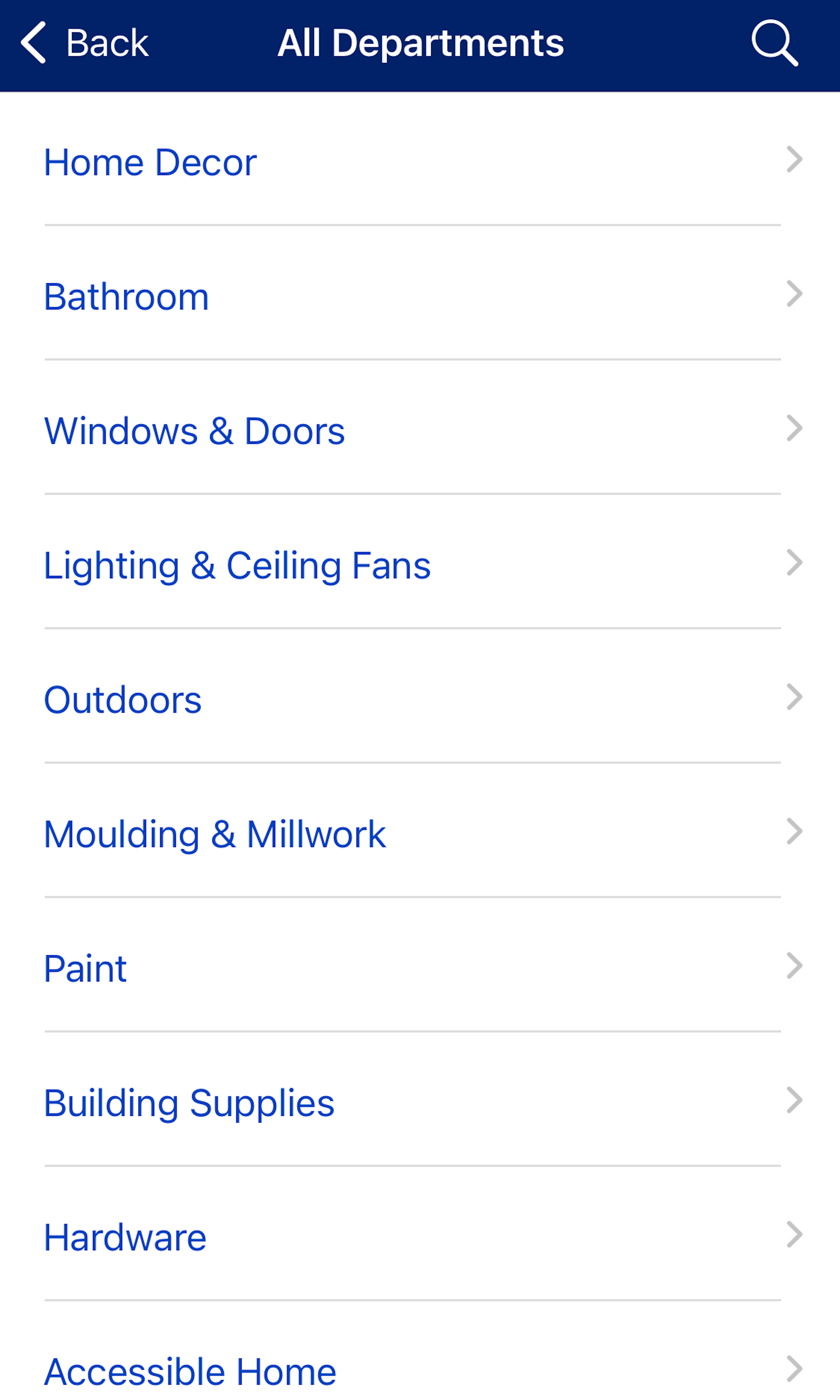
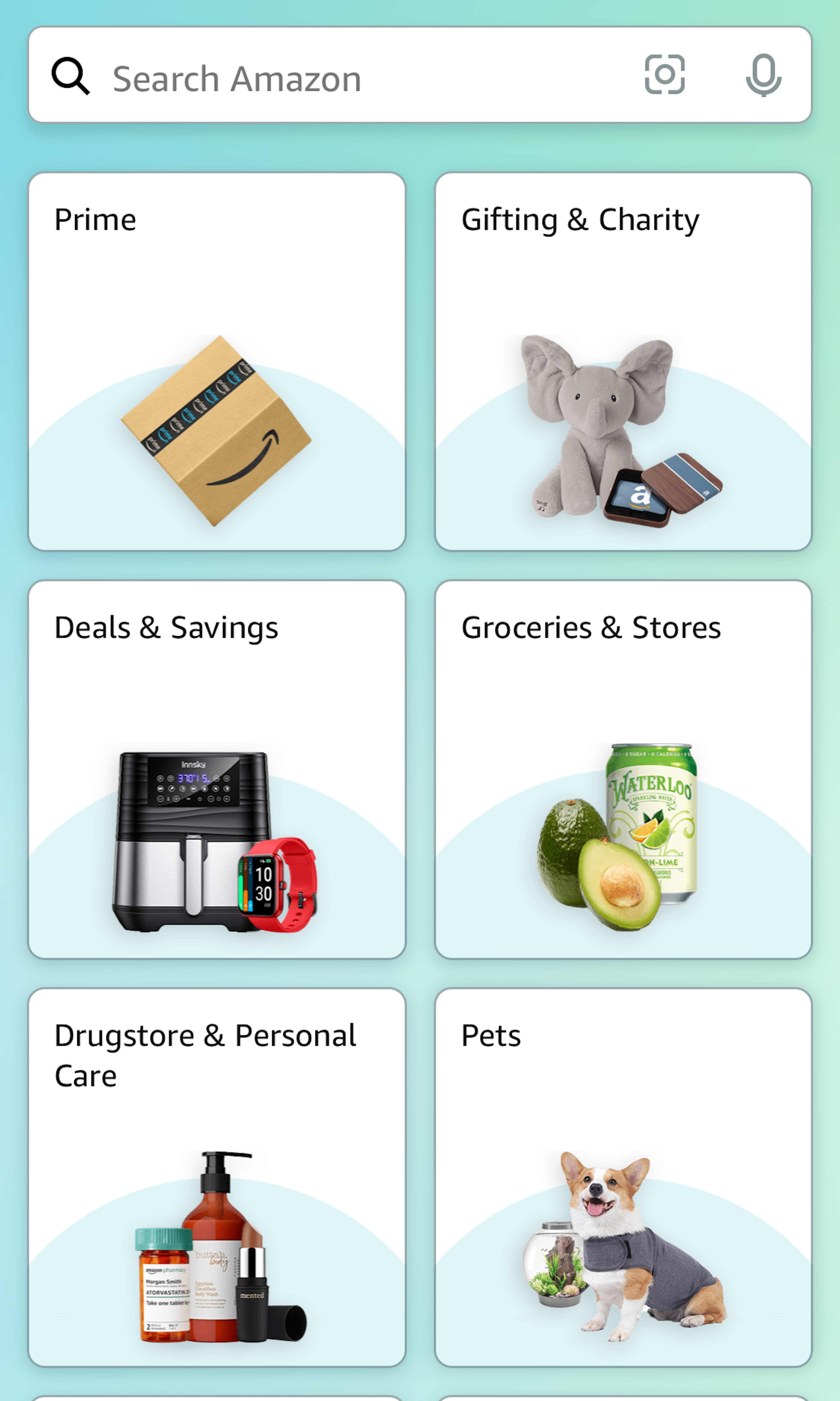
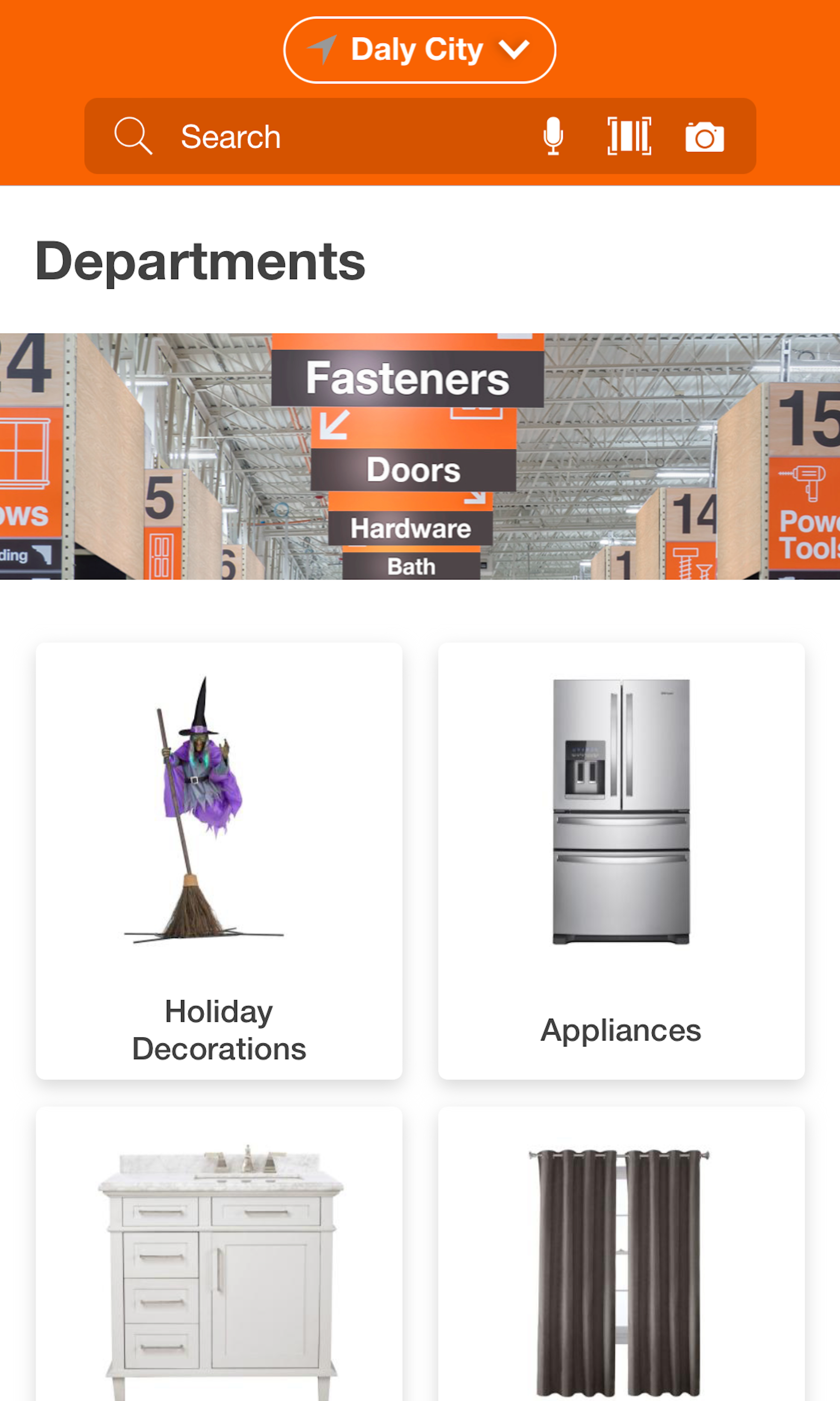
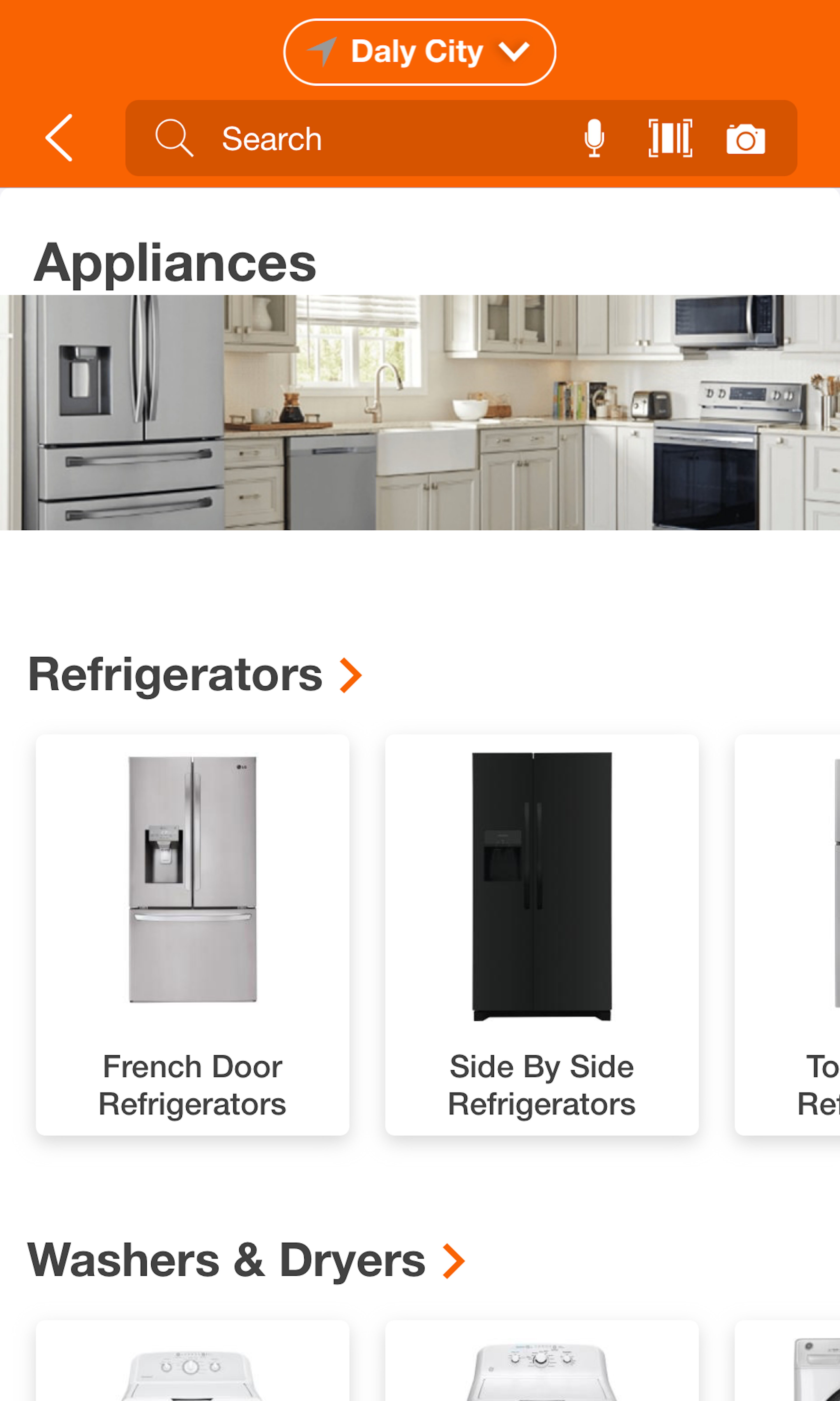
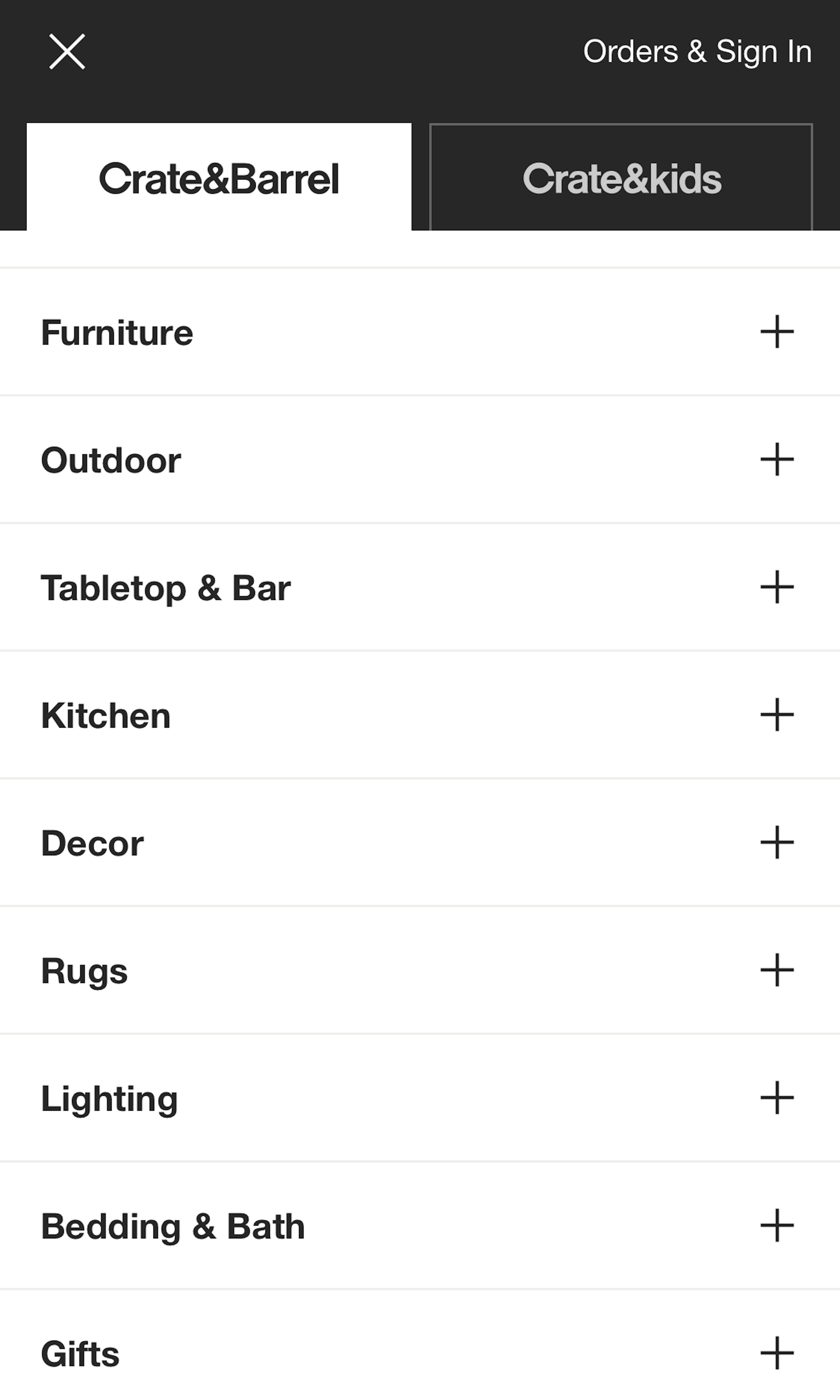
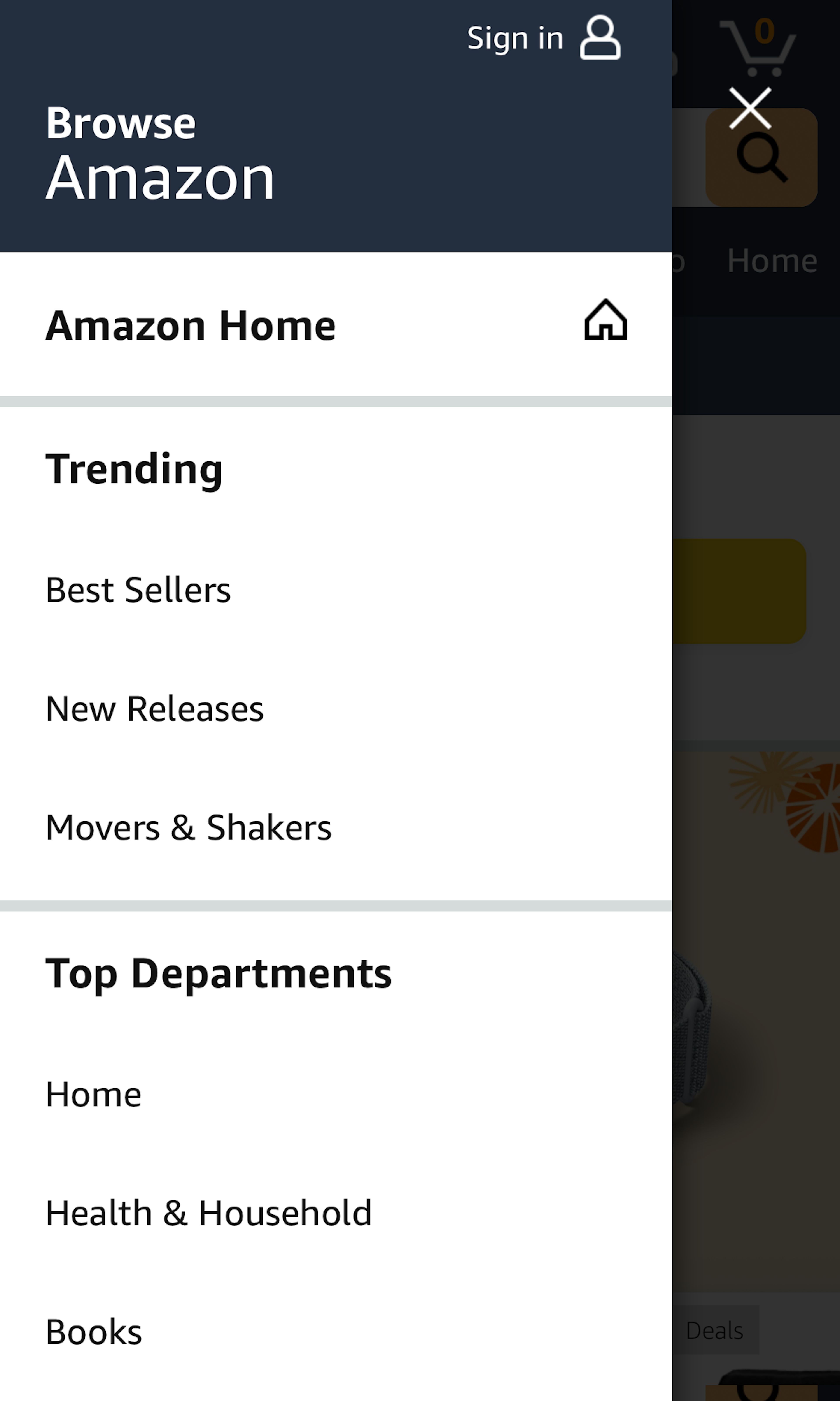
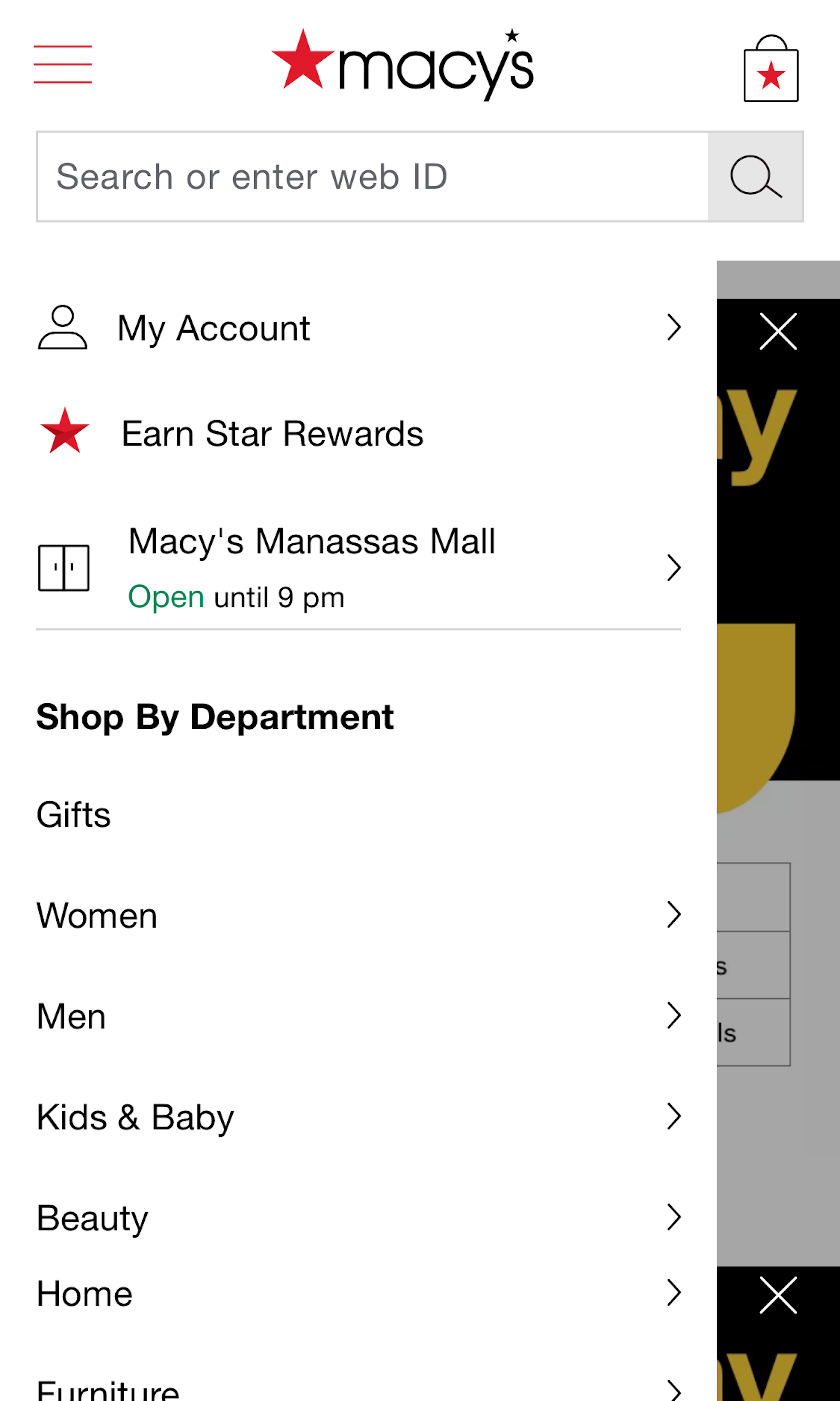
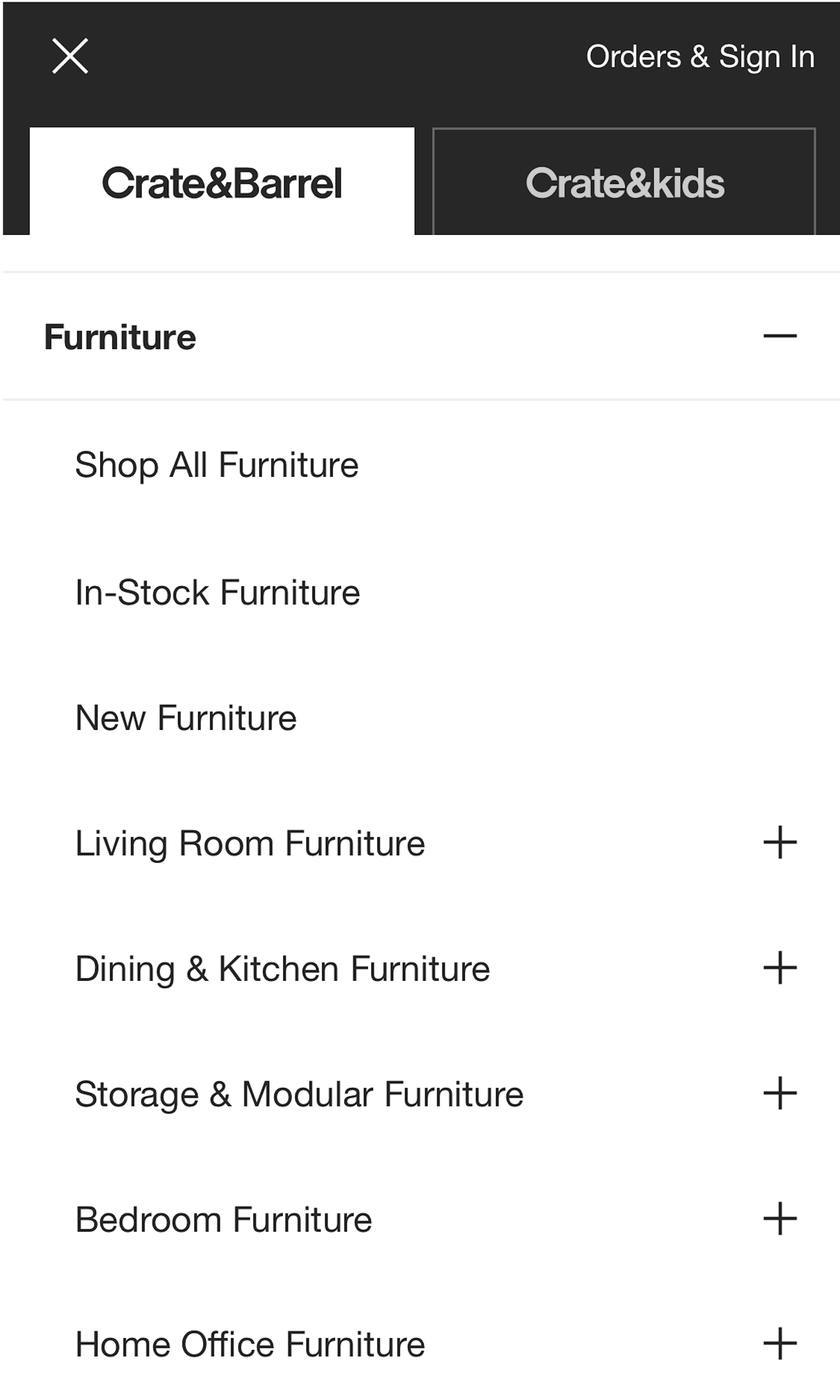
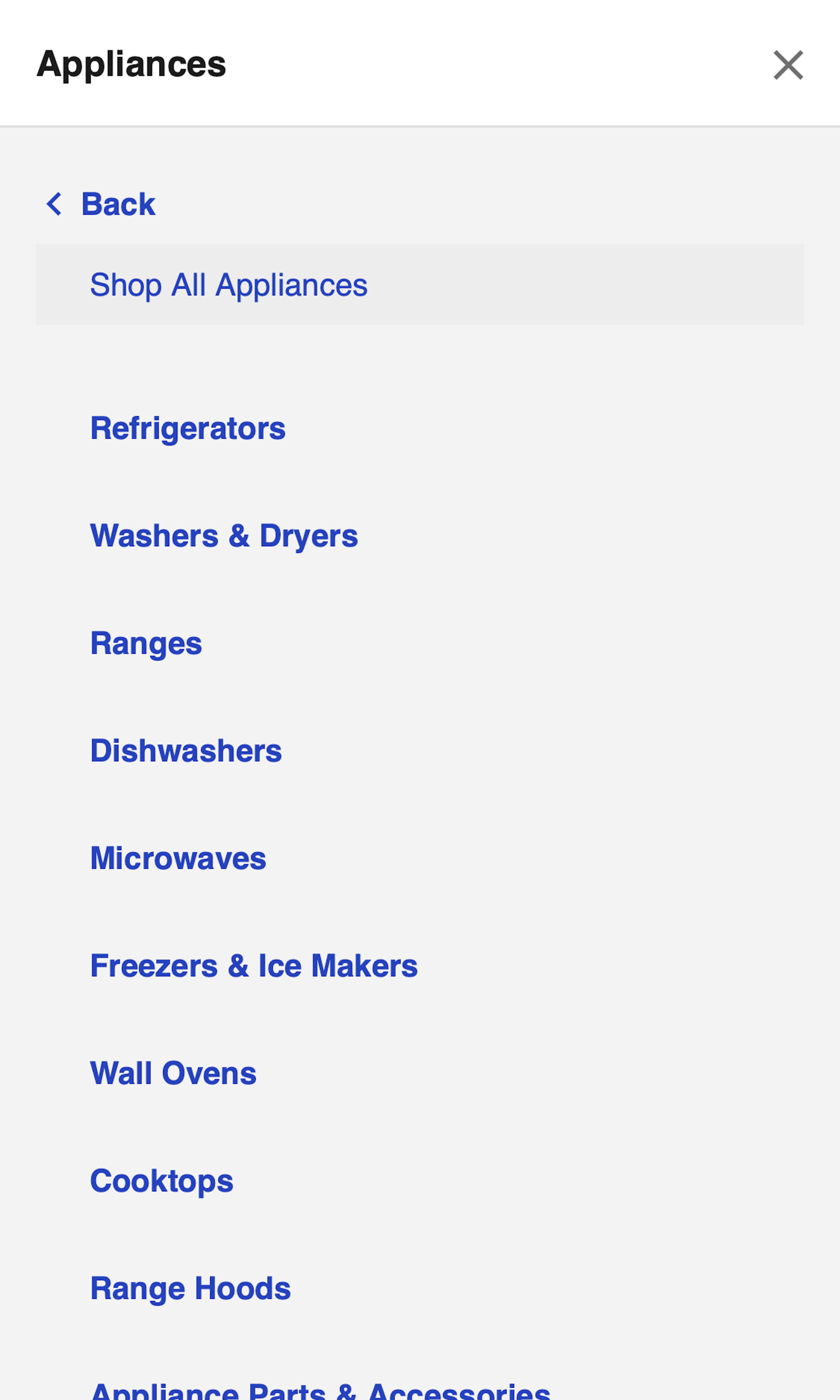
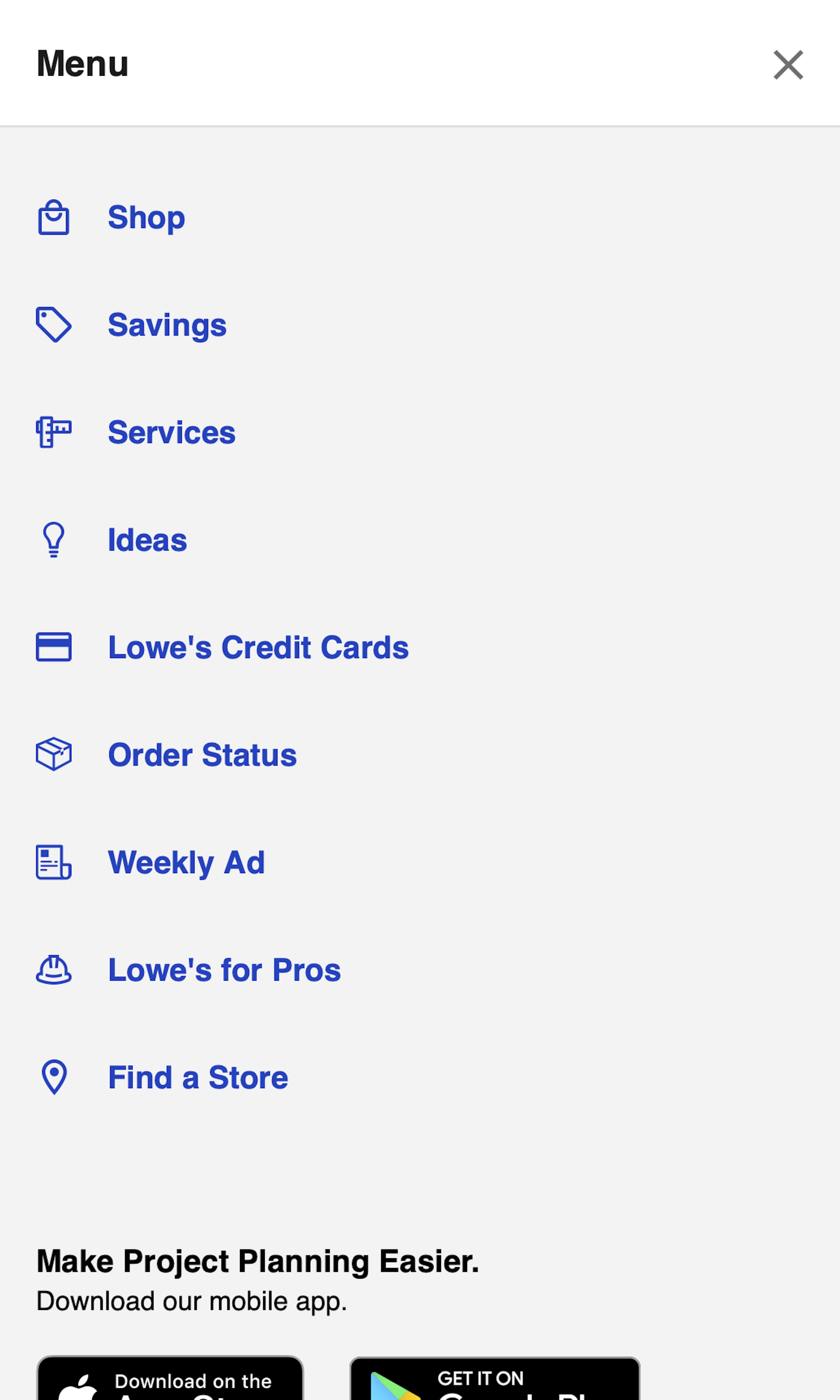
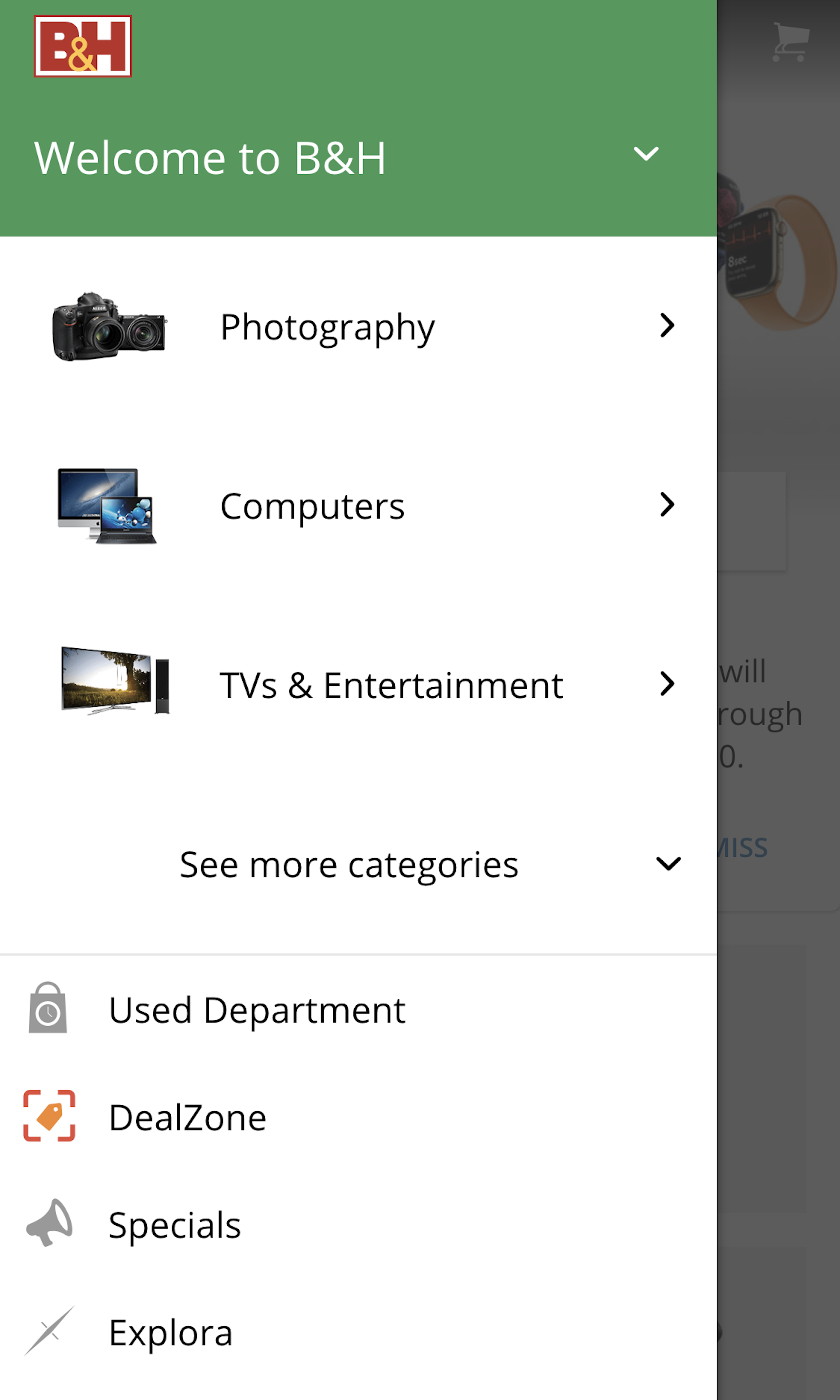
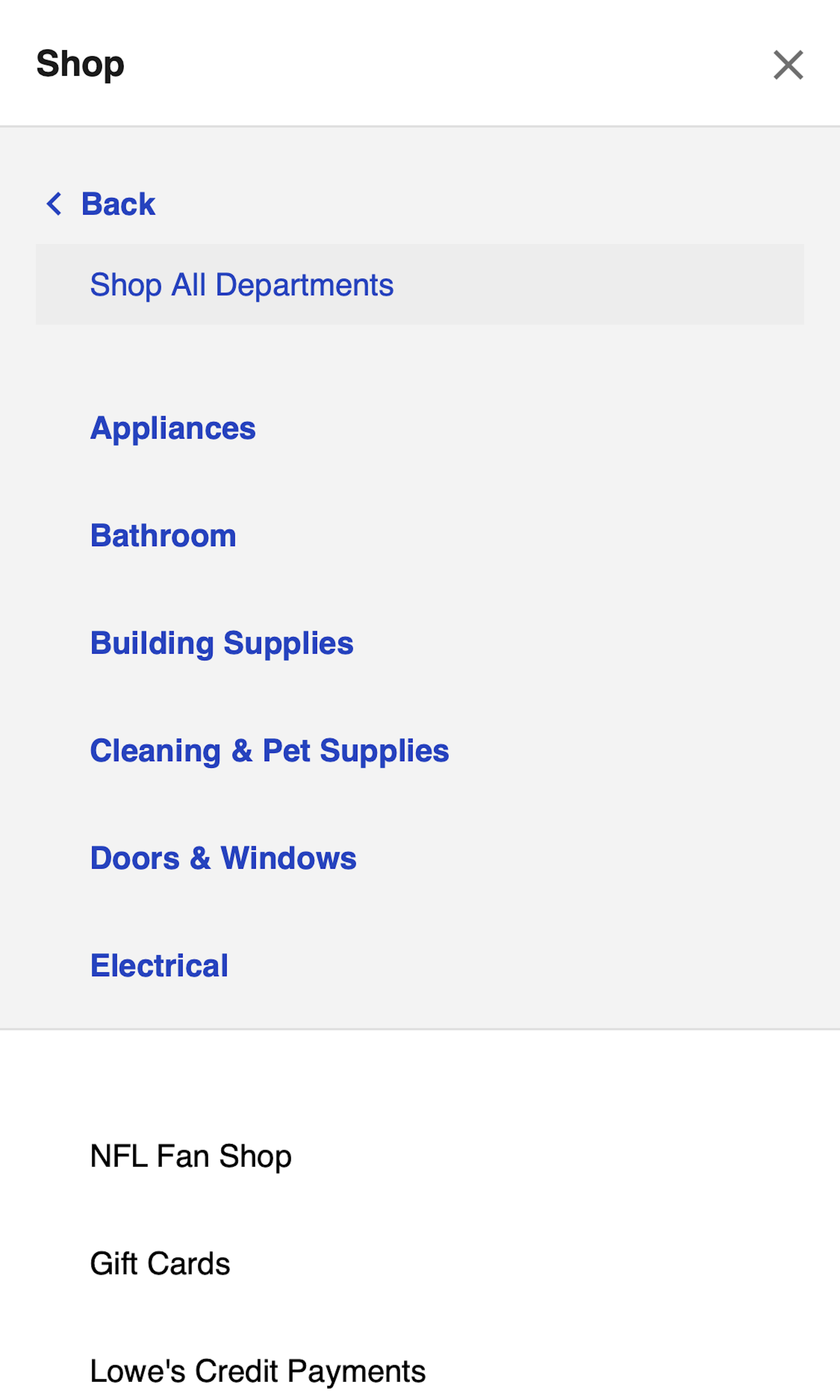
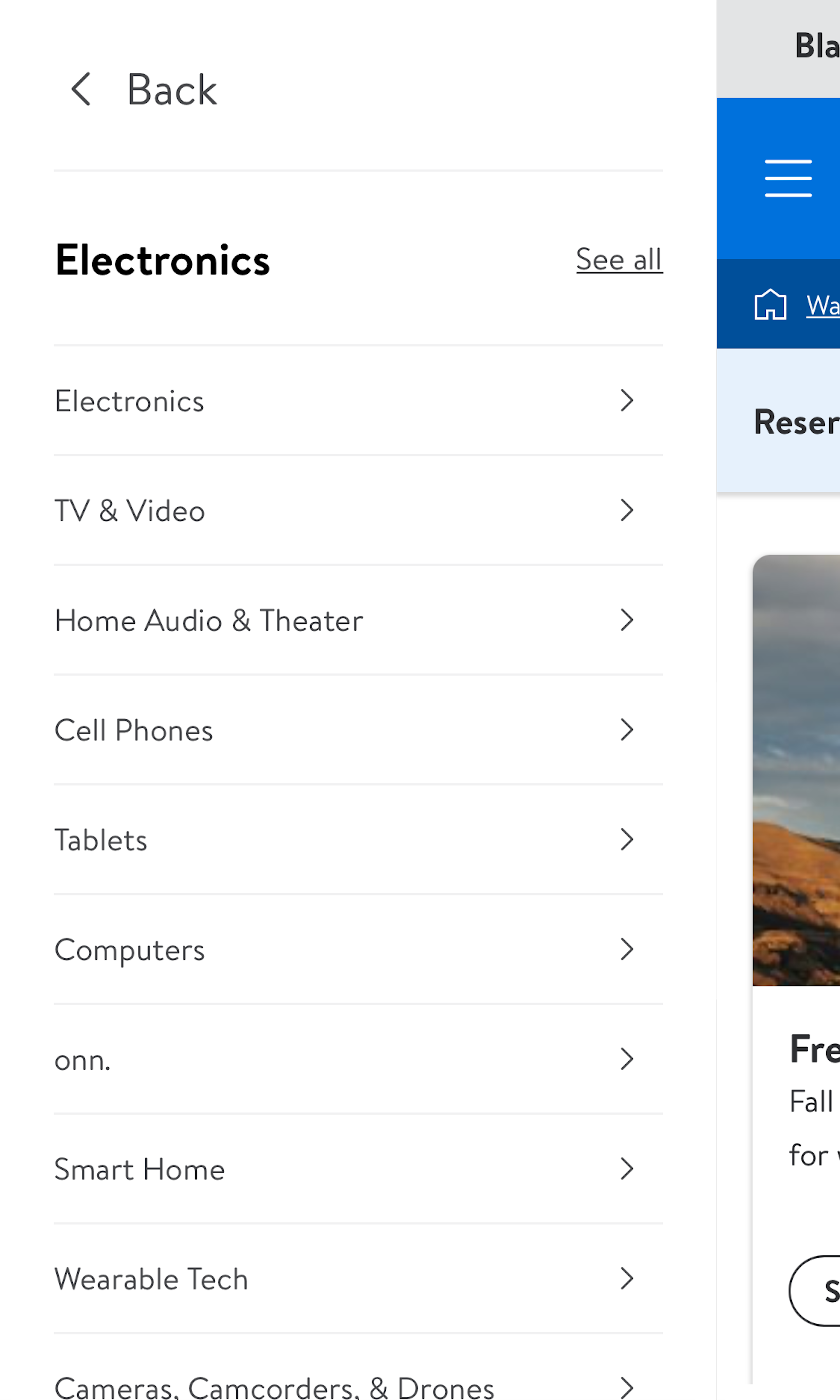
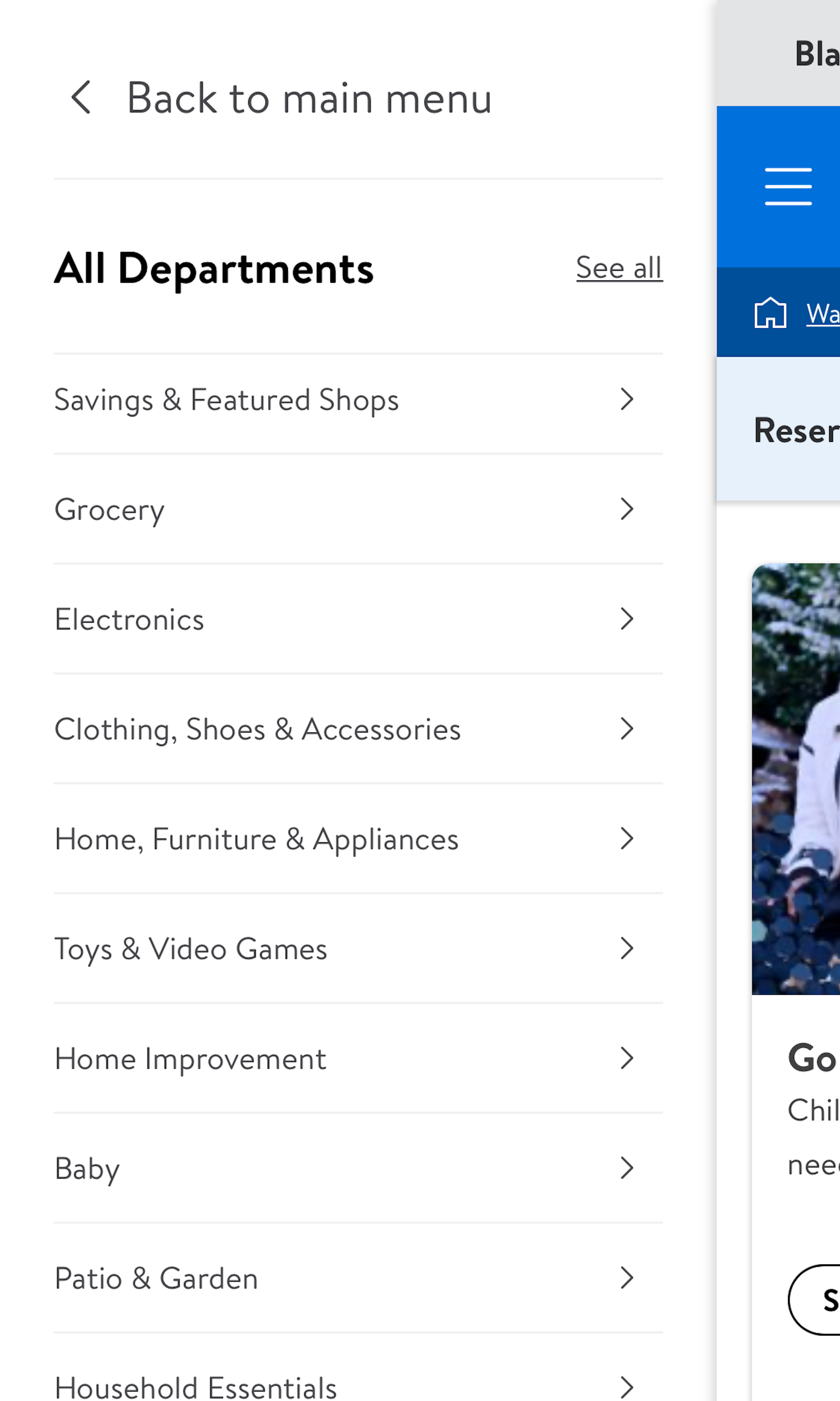
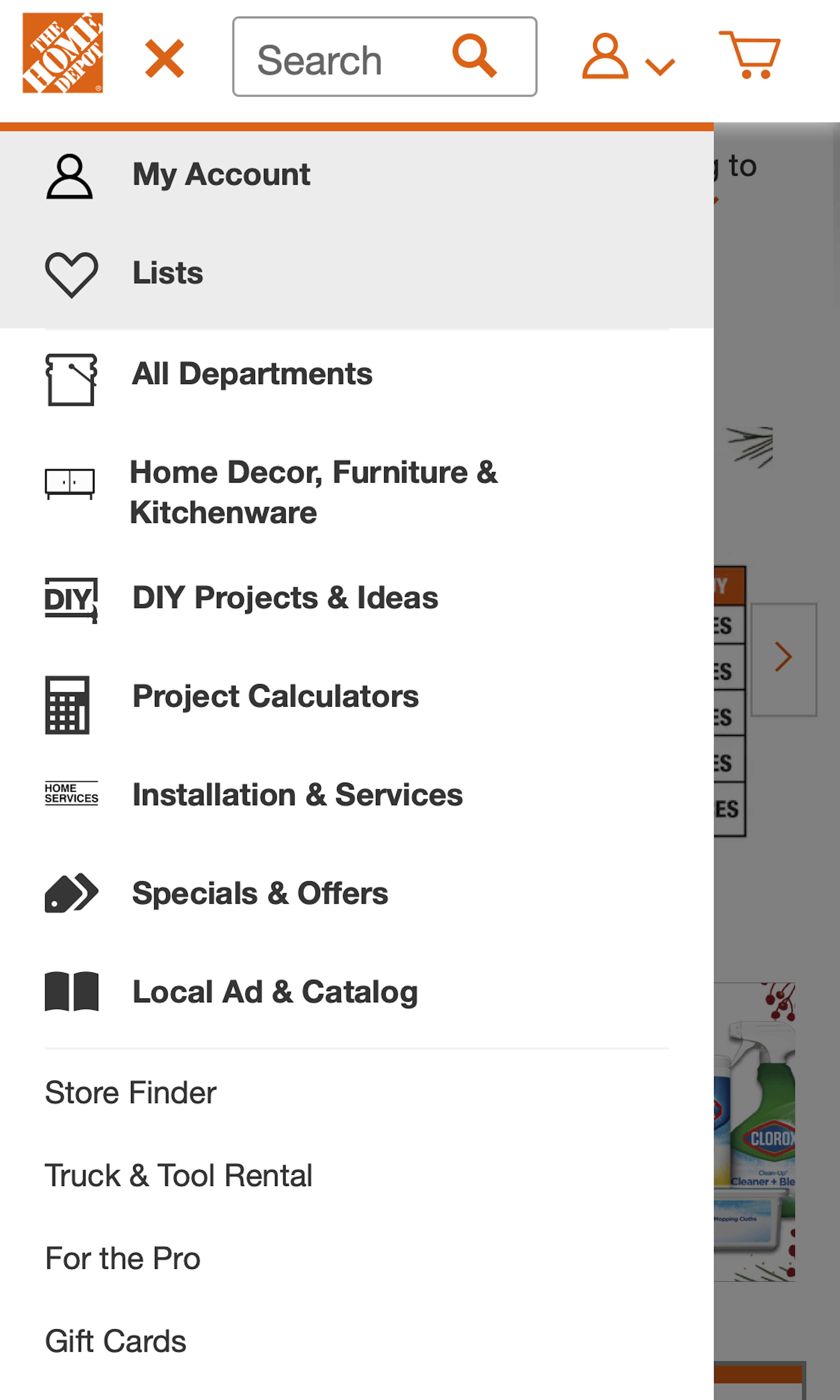
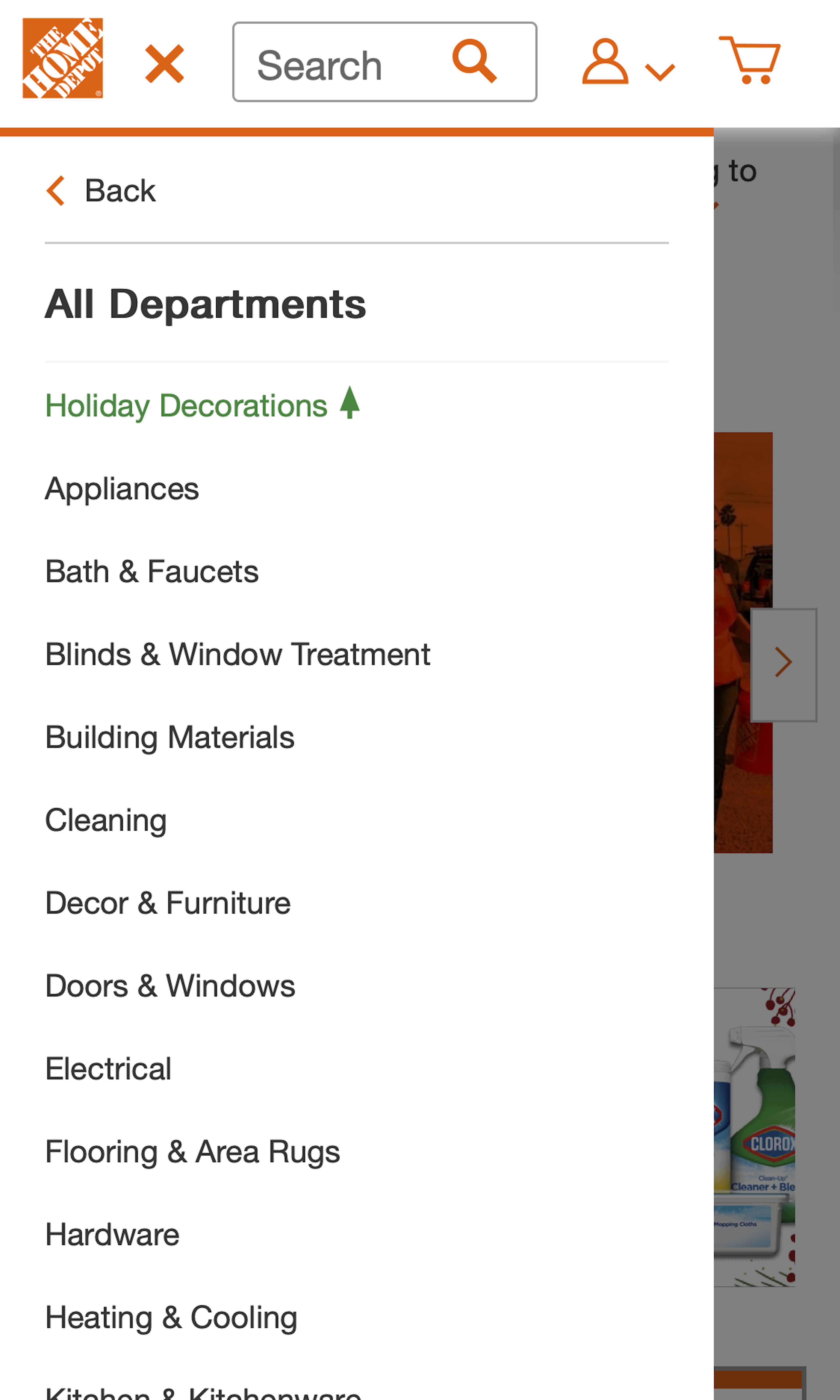
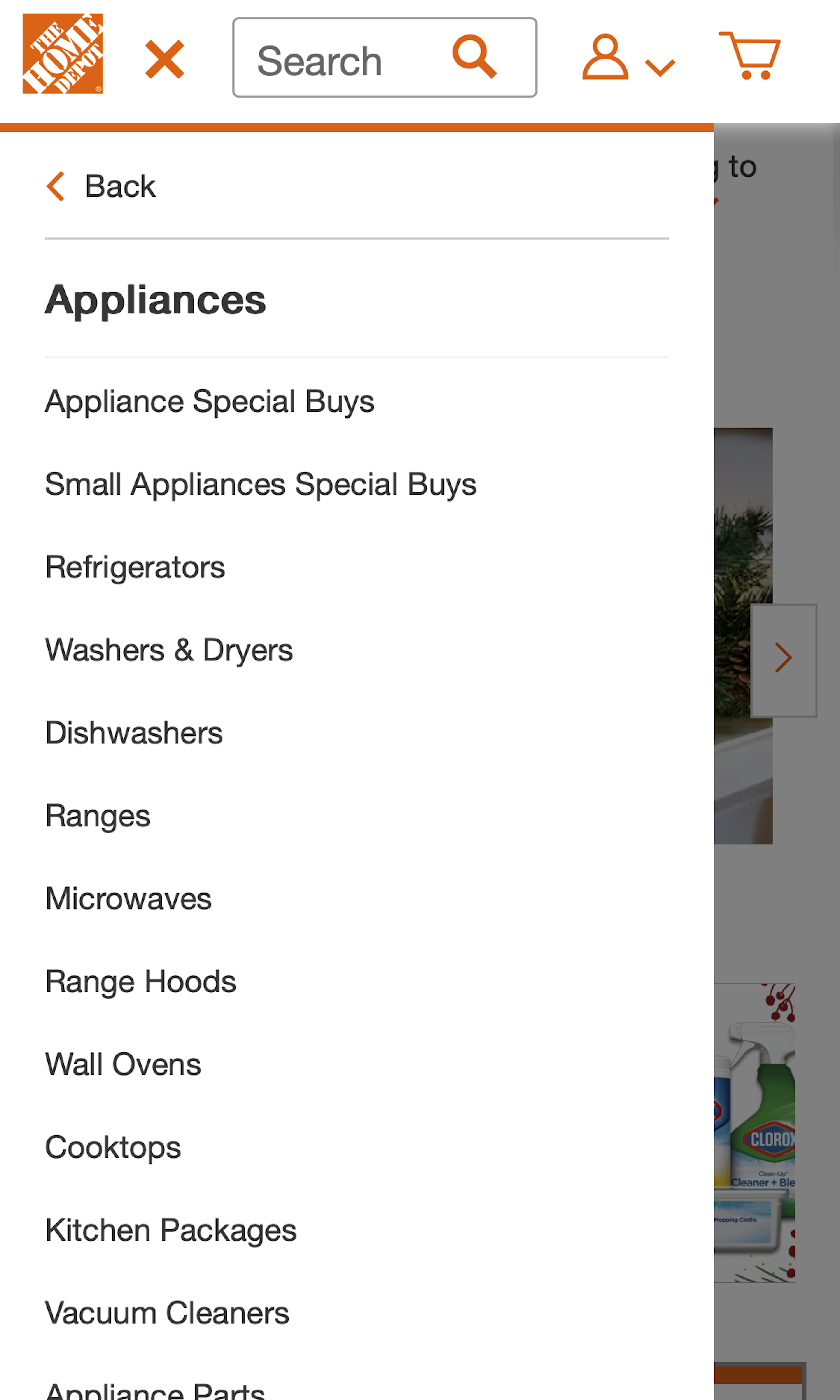
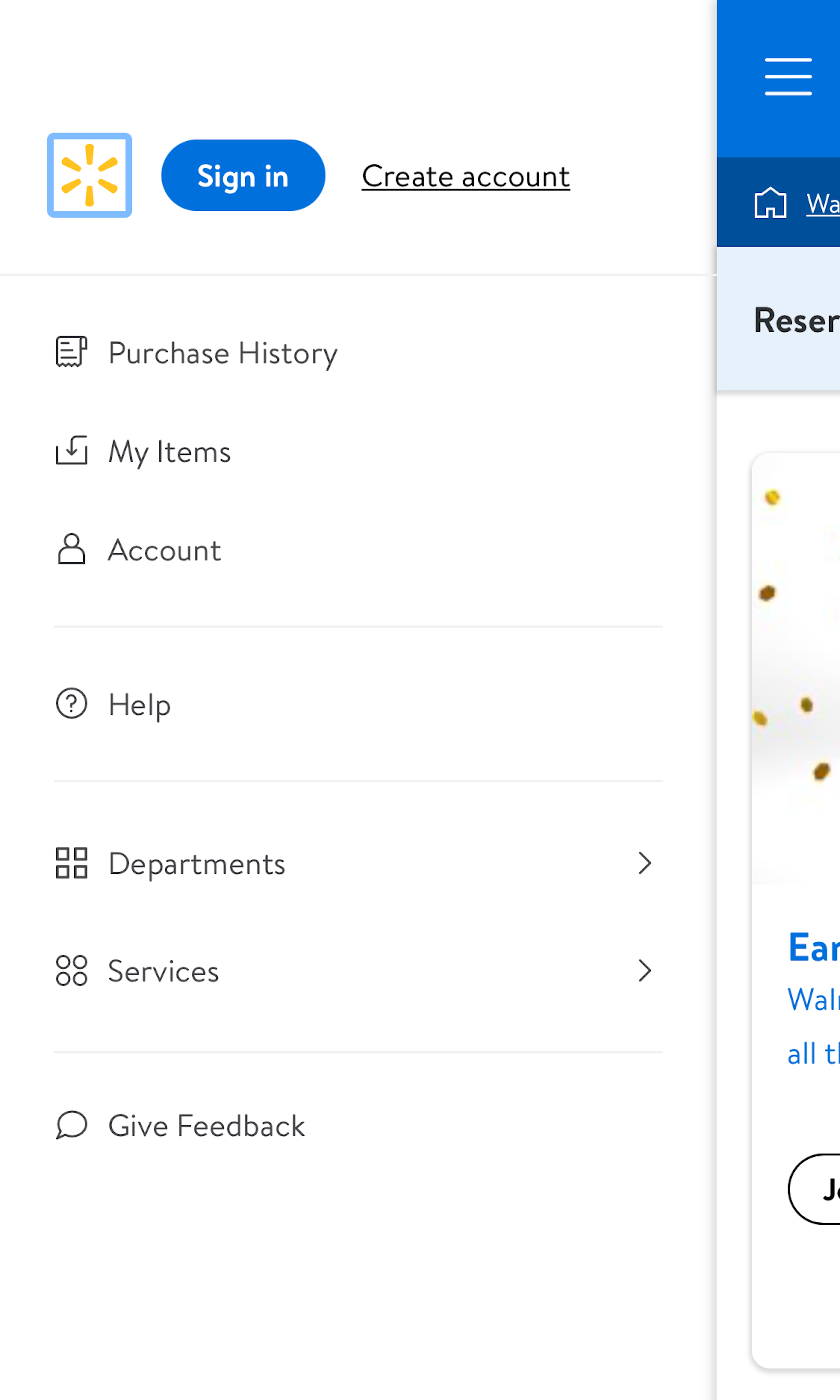
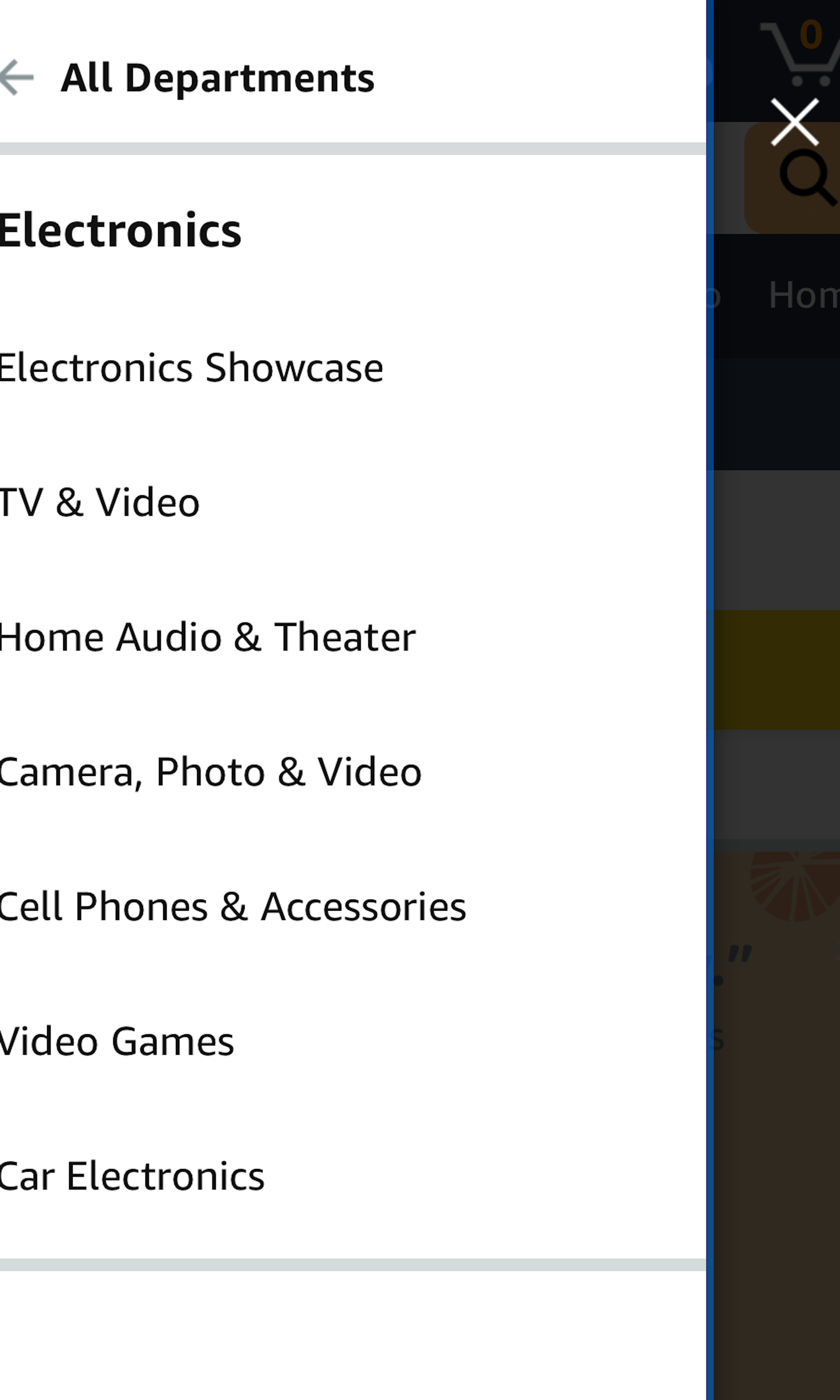
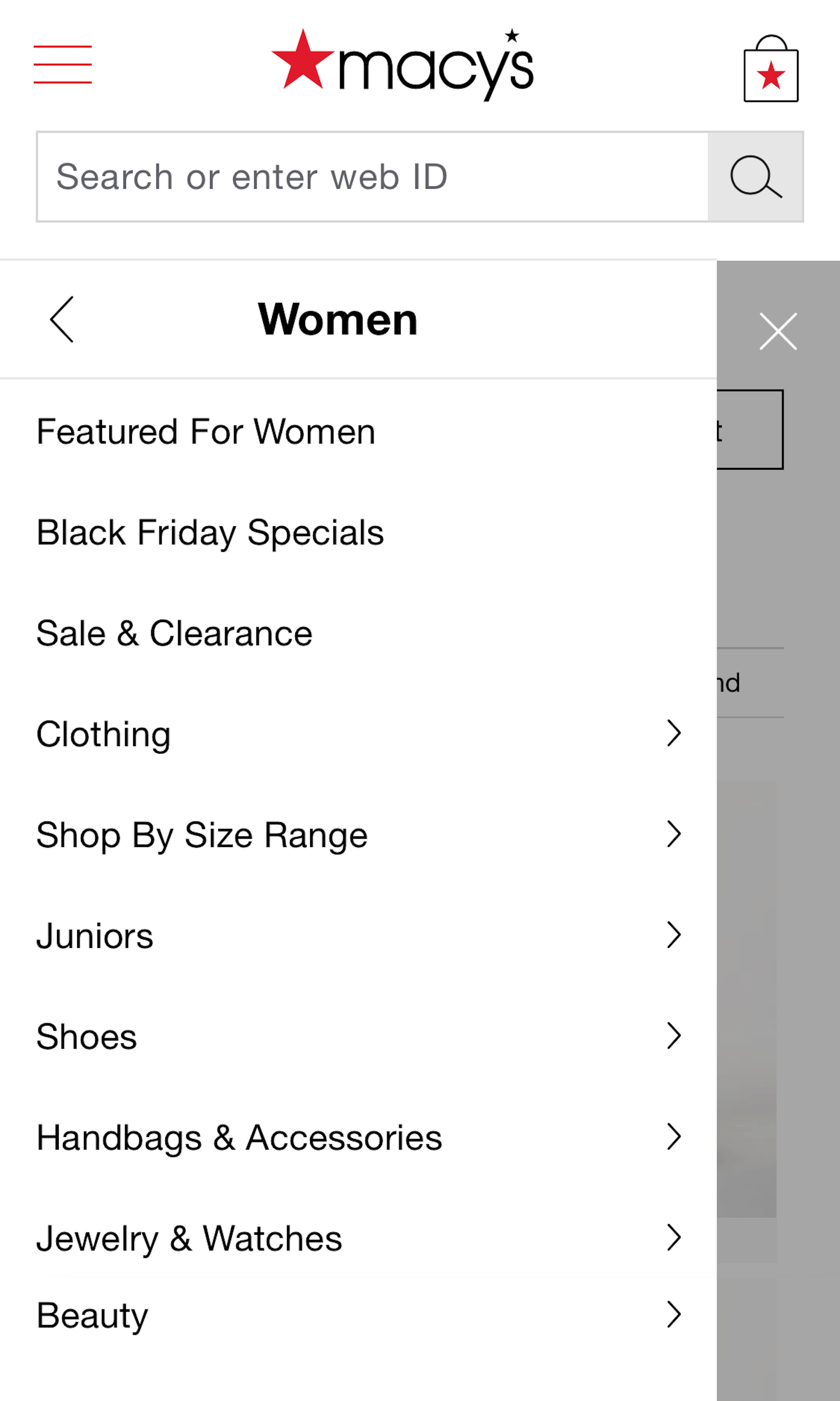
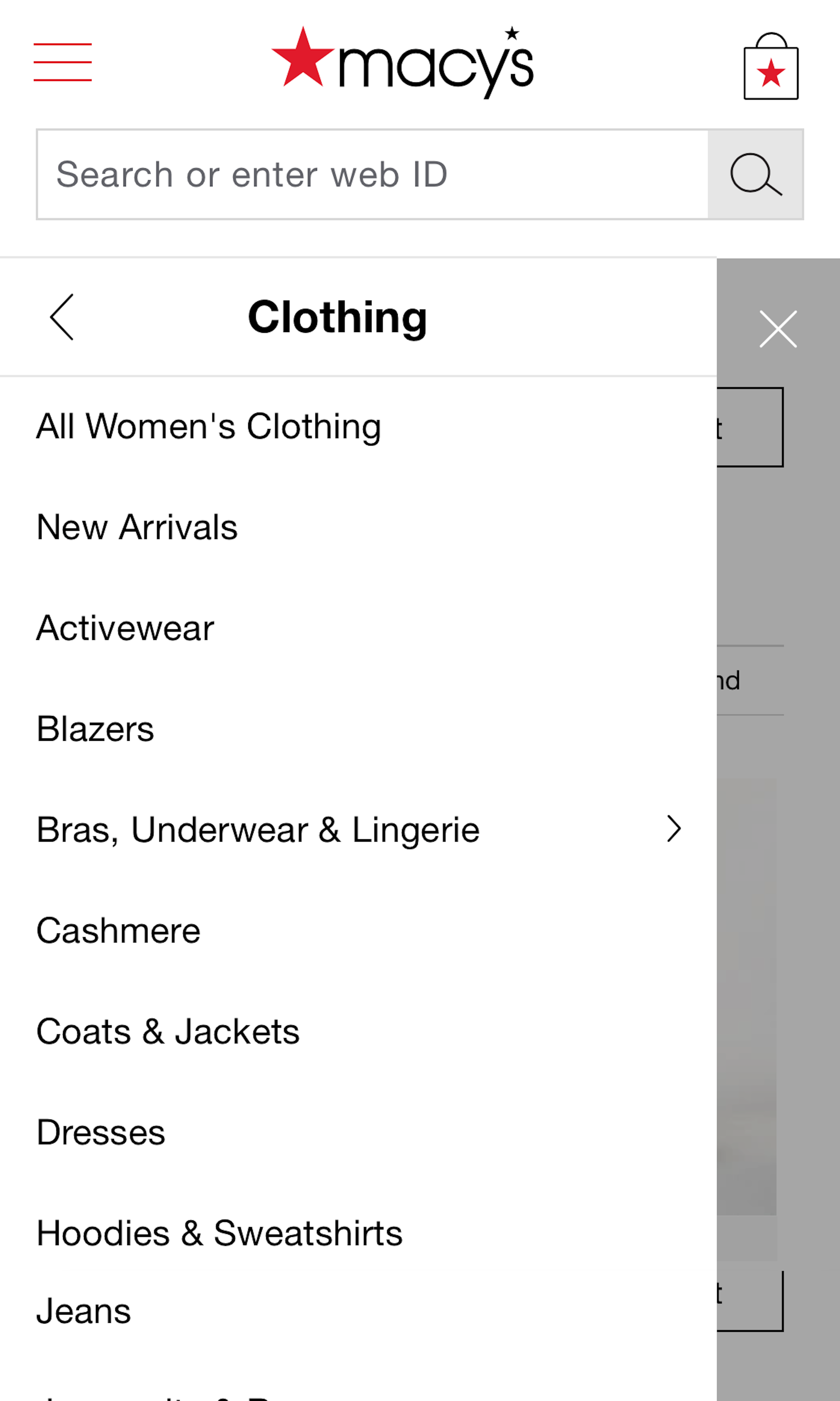
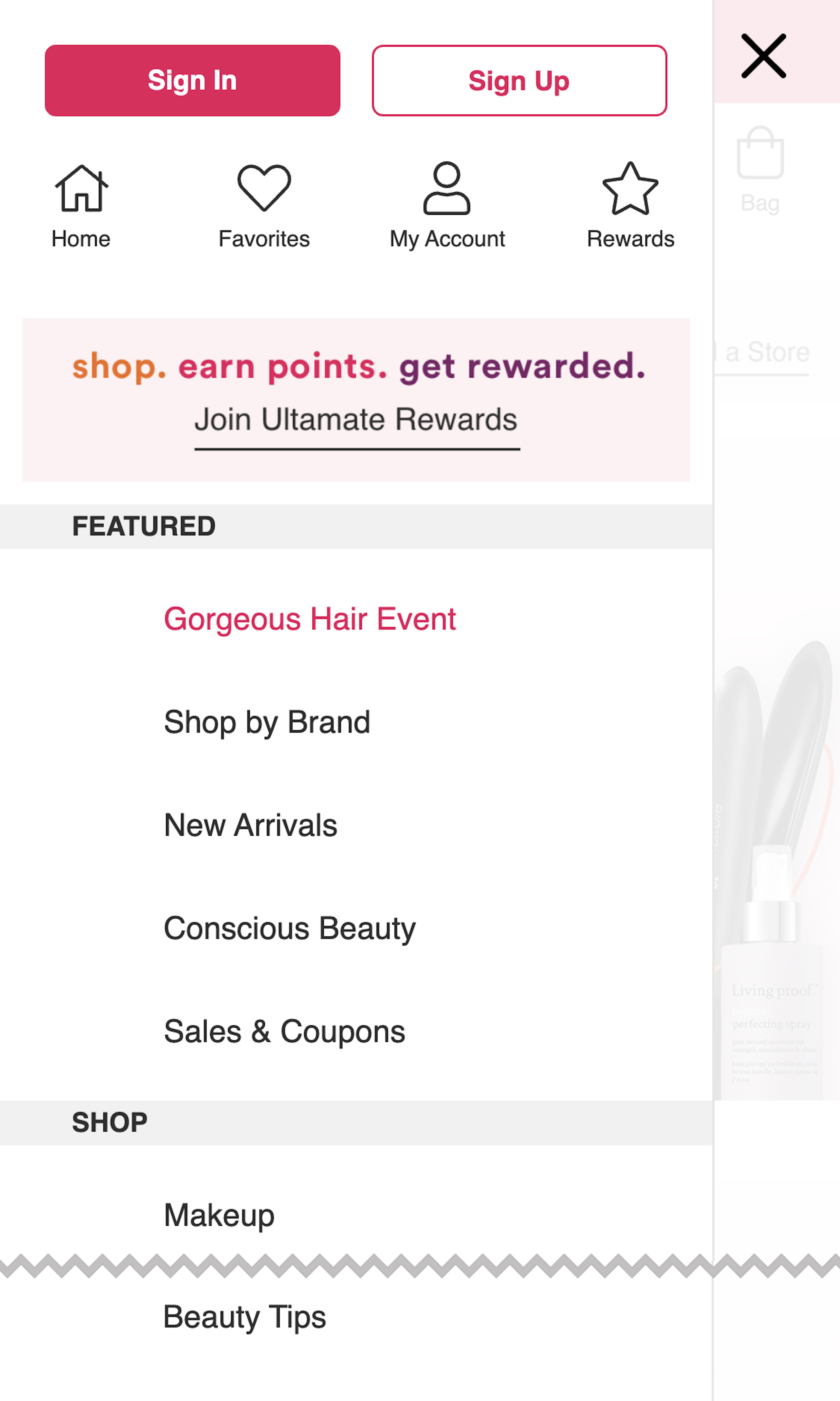
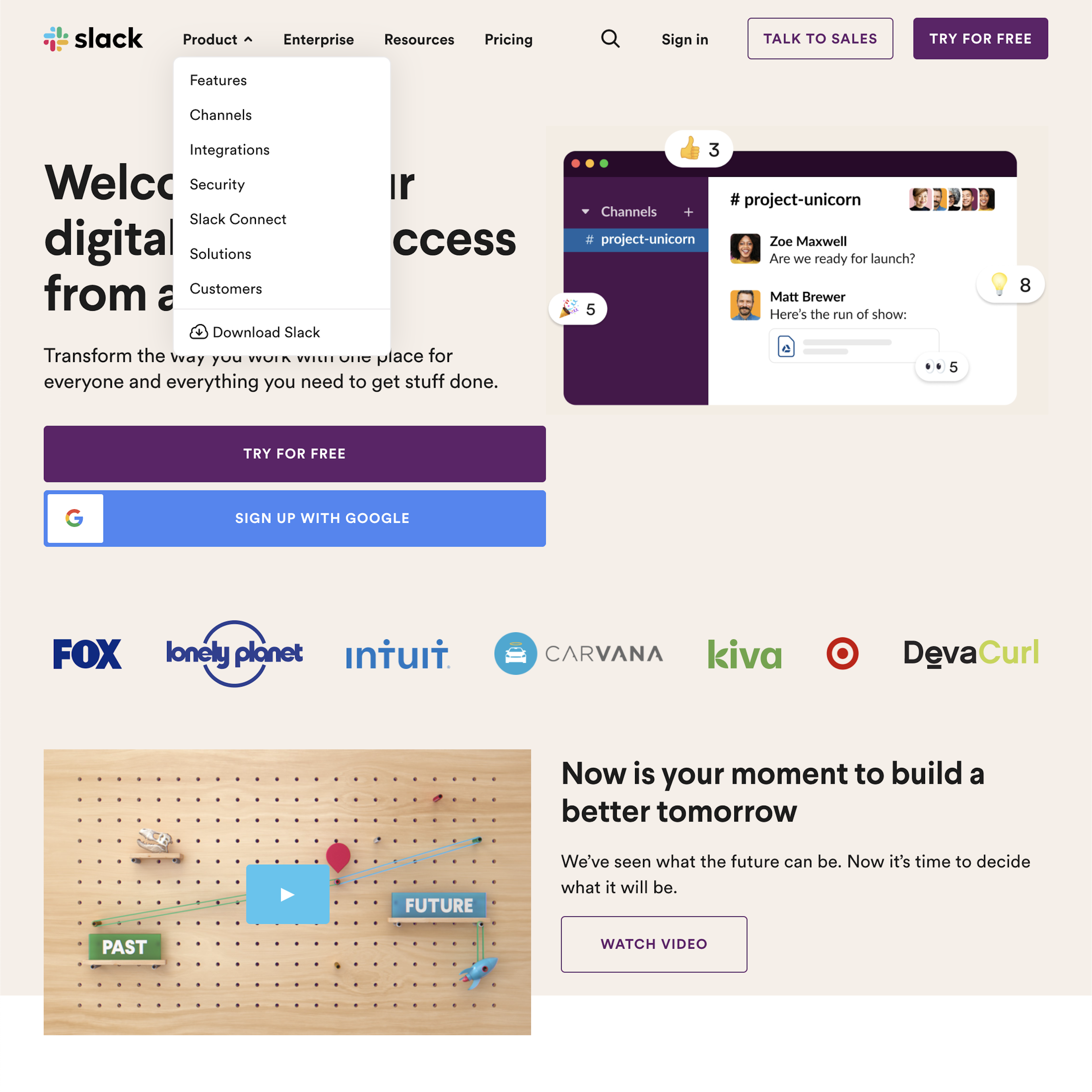
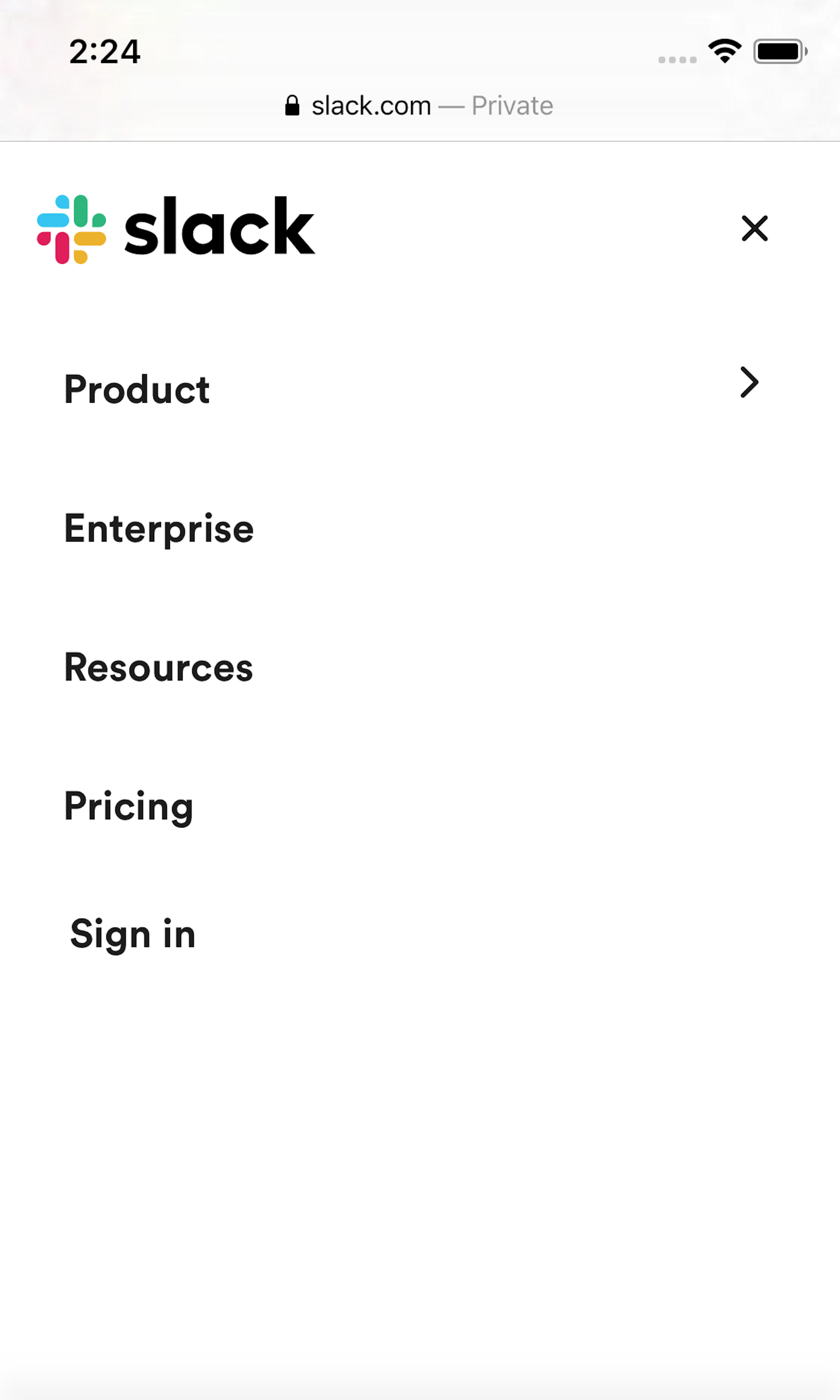
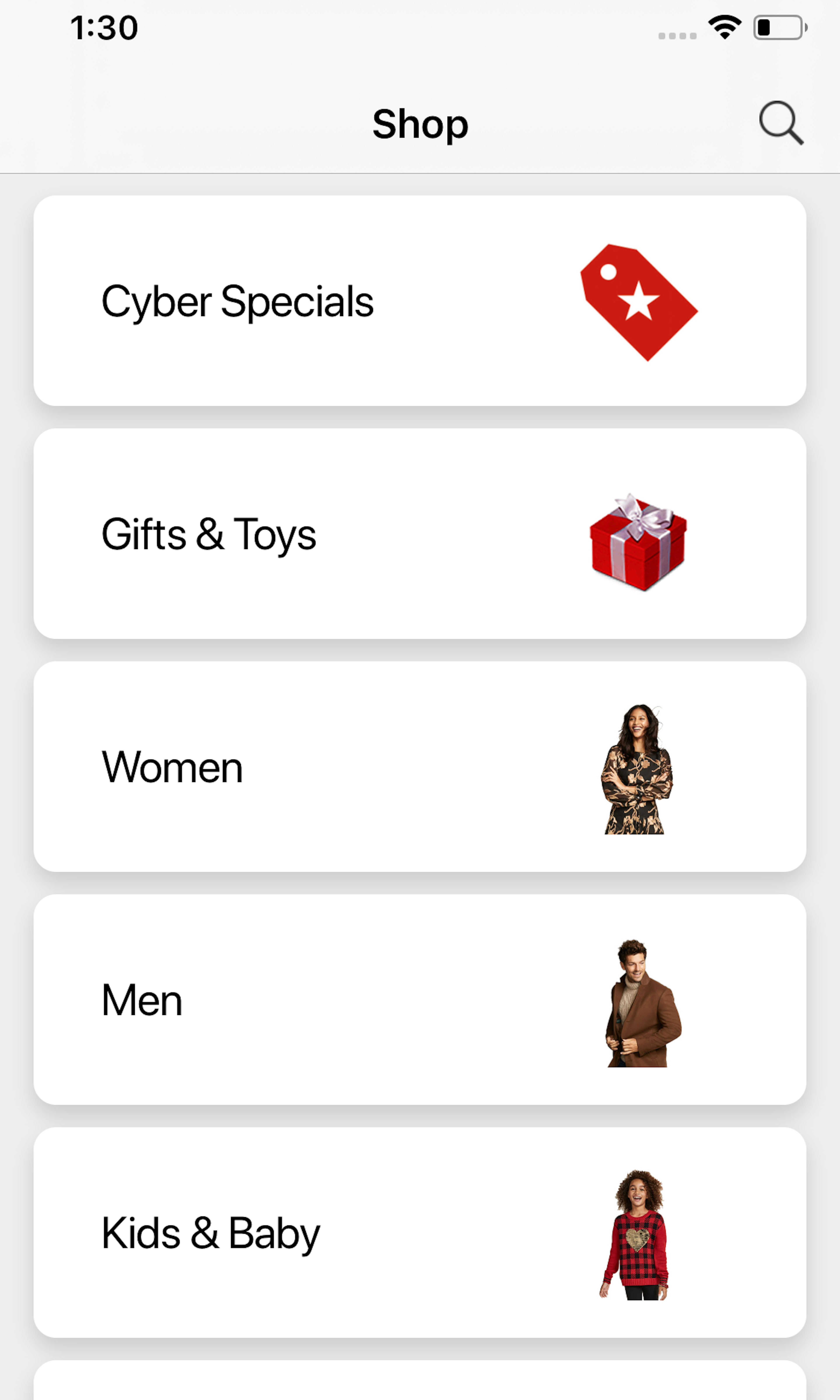
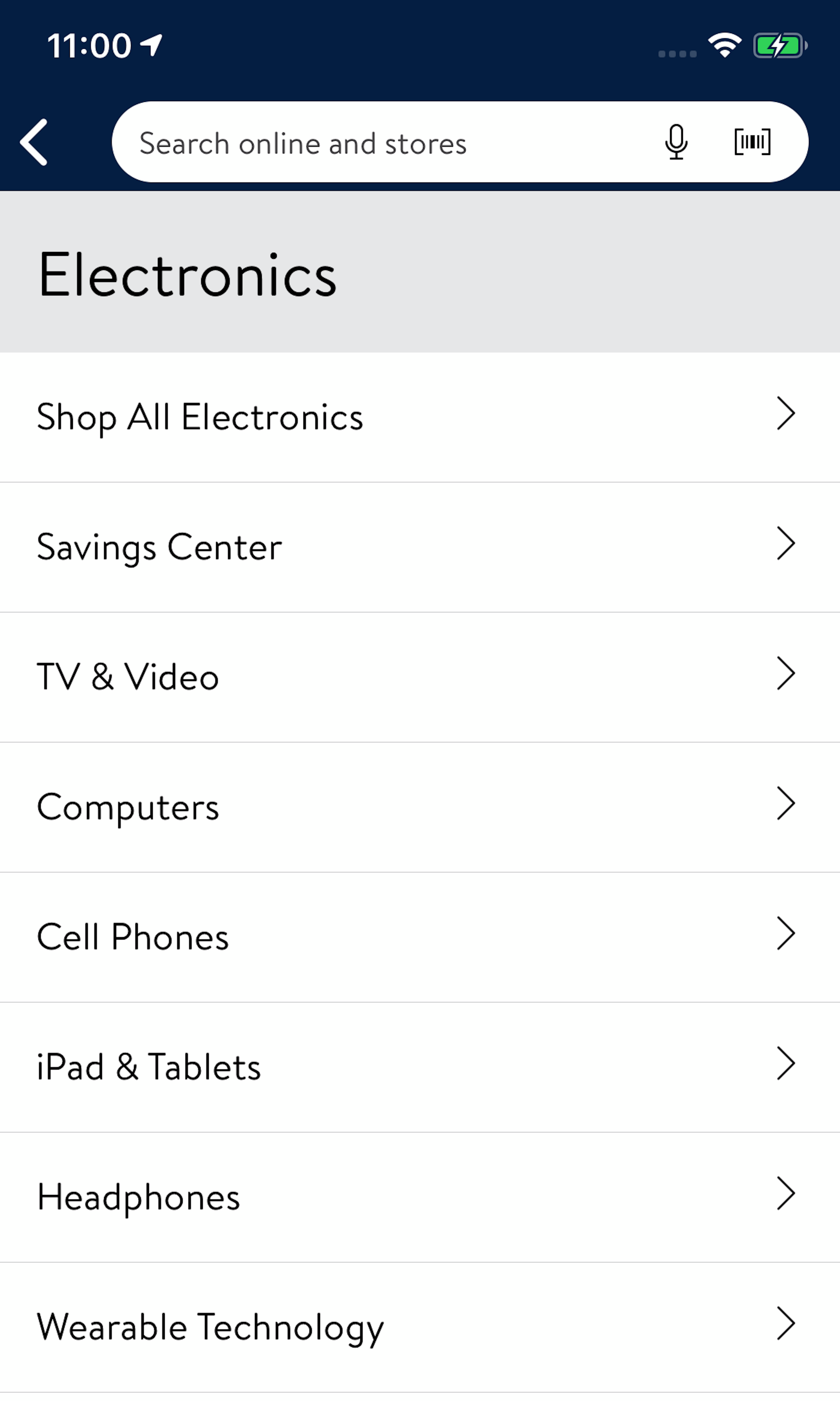
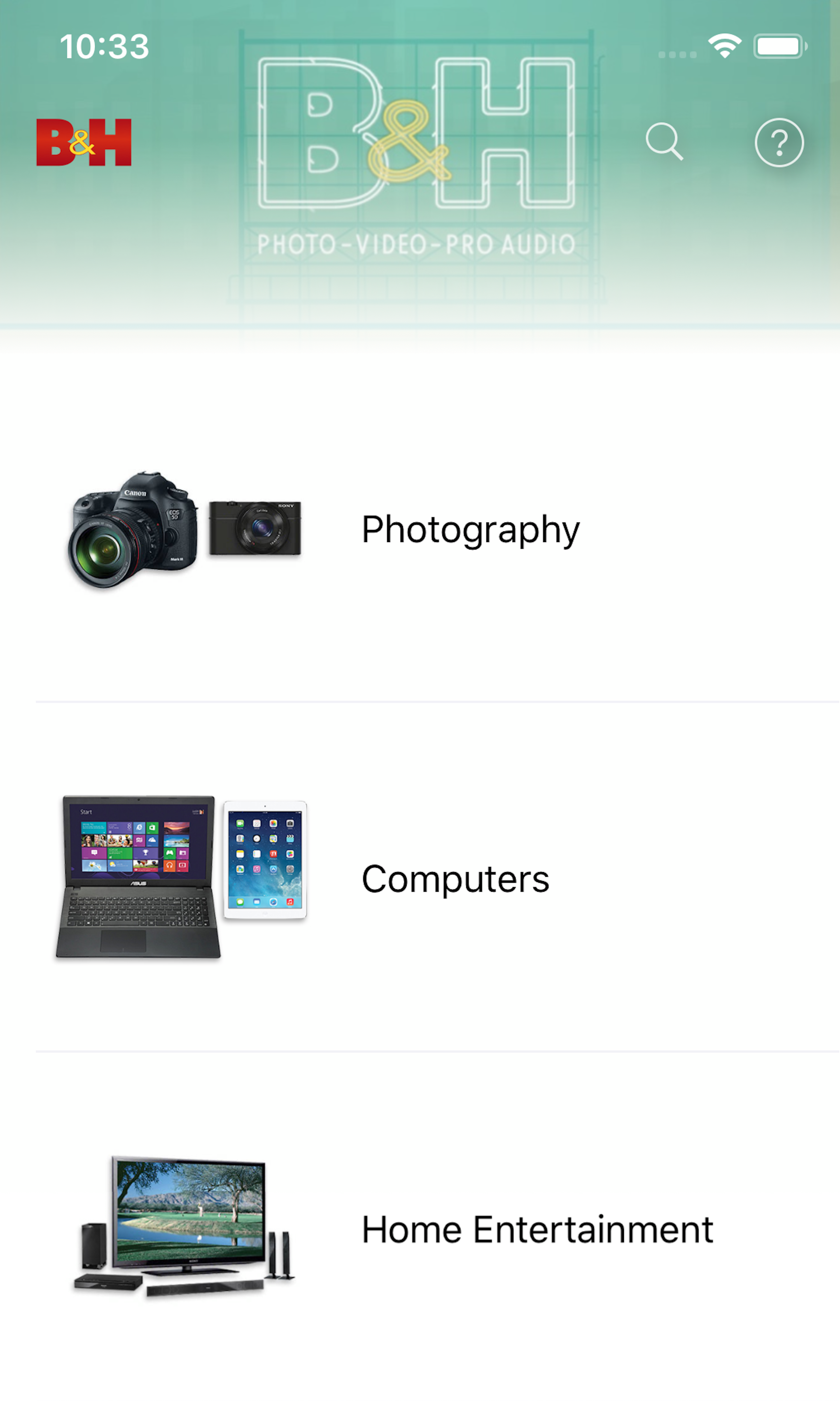
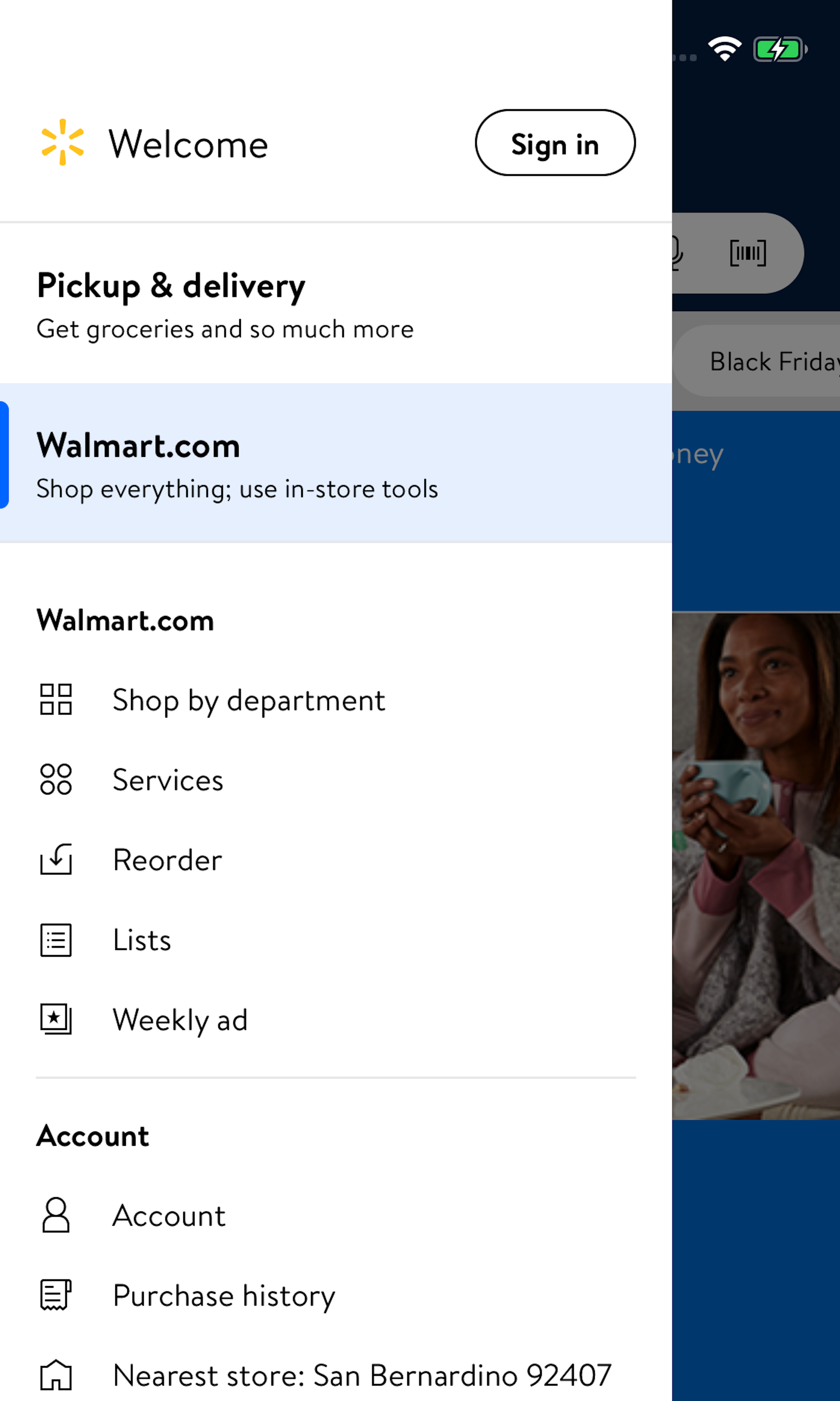
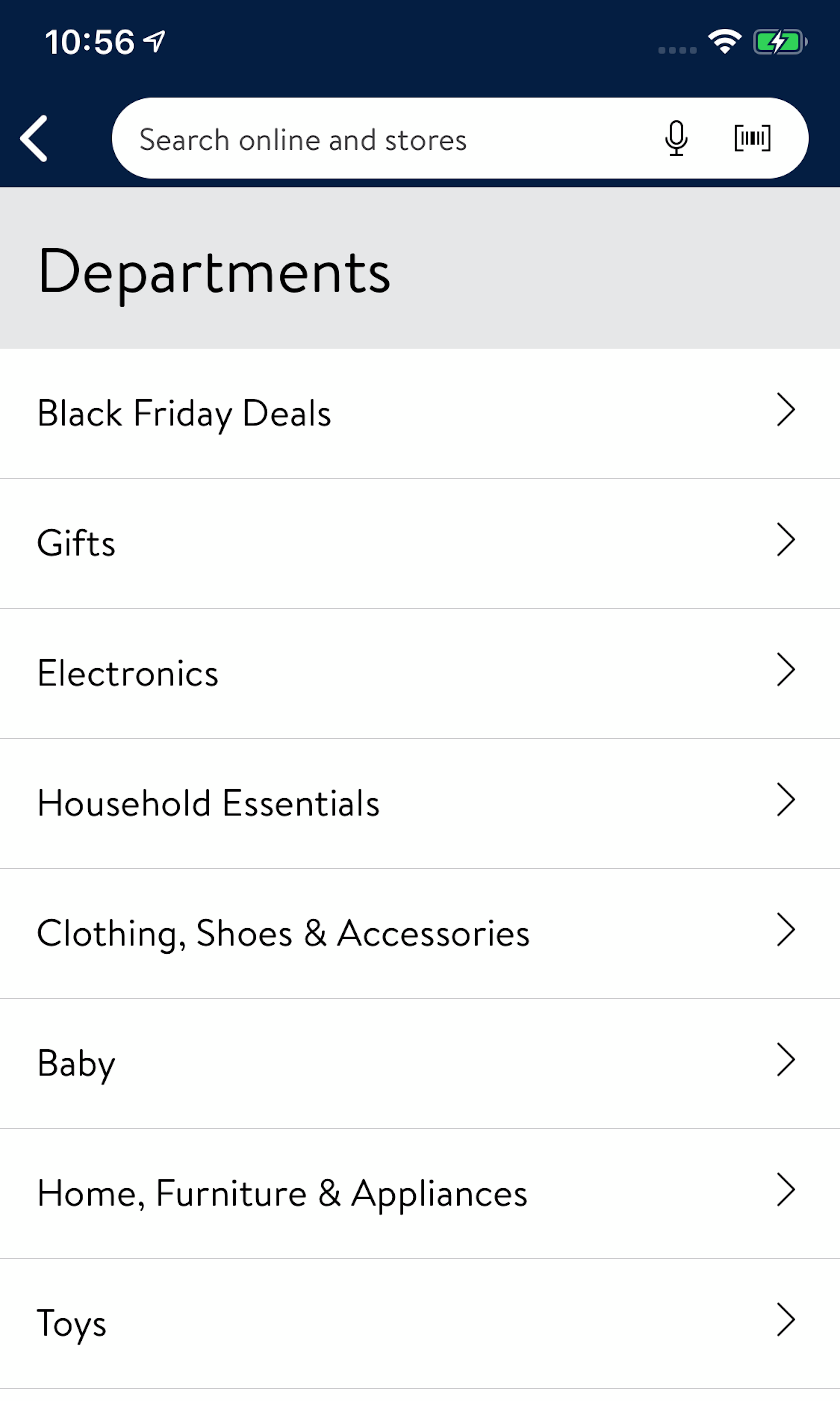
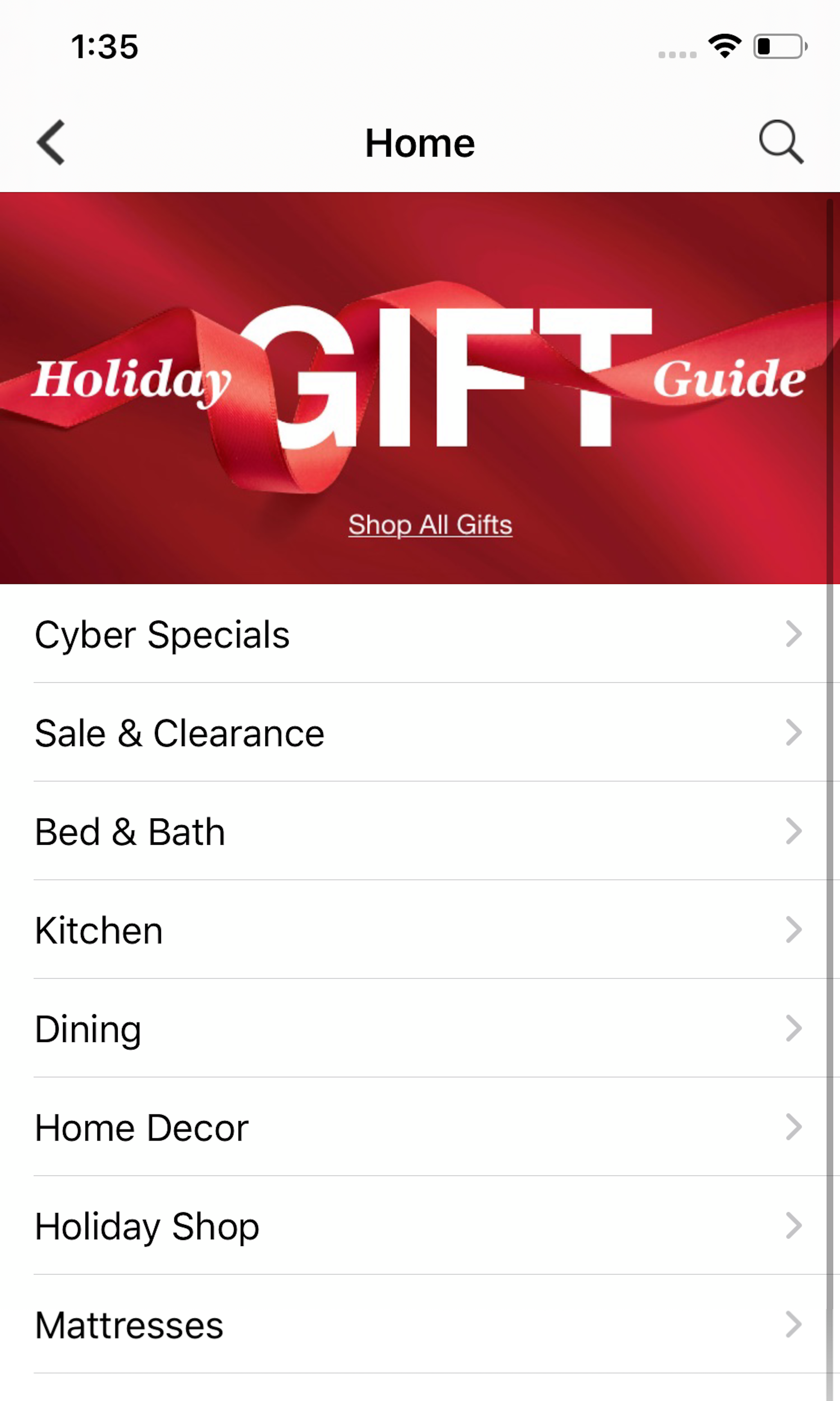
Having a user-friendly interface for the main navigation menu is as important as having a solid underlying category taxonomy, as what the user sees and interacts with largely determines if they will be able to navigate the site intuitively or are halted every time they try to browse the site’s categories. Hover-based drop-down menus (aka “mega menus”) are currently used as the main navigation at 88% of all top US e-commerce sites — yet our testing shows that drop-down menus require the utmost attention to interaction details if they are to perform well for users.
More ‘Main Navigation’ Insights
-
During our testing, what often at first seemed like minor navigation design details would end up severely misleading the test subjects. This led to fundamental misconceptions about the site’s hierarchy, selection of overly narrow scopes, inability to traverse back up to broader categories, etc.
-
Learn More: Besides exploring the 1505 “Drop-Down Menu” design examples below, you may also want to read our related articles on “Highlight the User’s Current Scope in the Main Navigation - 66% of Sites Don’t”, “E-Commerce Usability: The Main Navigation Should Display Product Categories - 18% Don’t”, and “Over-Categorization: Avoid Implementing Product Types as Categories - 54% Get It Wrong”.
-
Get Full Access: To see all of Baymard’s homepage and category navigation research findings you’ll need Baymard Premium access. (Premium also provides you full access to 150,000+ hours of UX research findings, 650+ e-commerce UX guidelines, and 275,000+ UX performance scores.)


User Experience Research, Delivered Weekly
Join 60,000+ UX professionals and get a new UX article every week.

User Experience Research, Delivered Weekly
Join 60,000+ UX professionals and get a new UX article every week.
Explore Other Research Content
300+ free UX articles based on large-scale research.

298 top sites ranked by UX performance.

Code samples, demos, and key stats for usability.