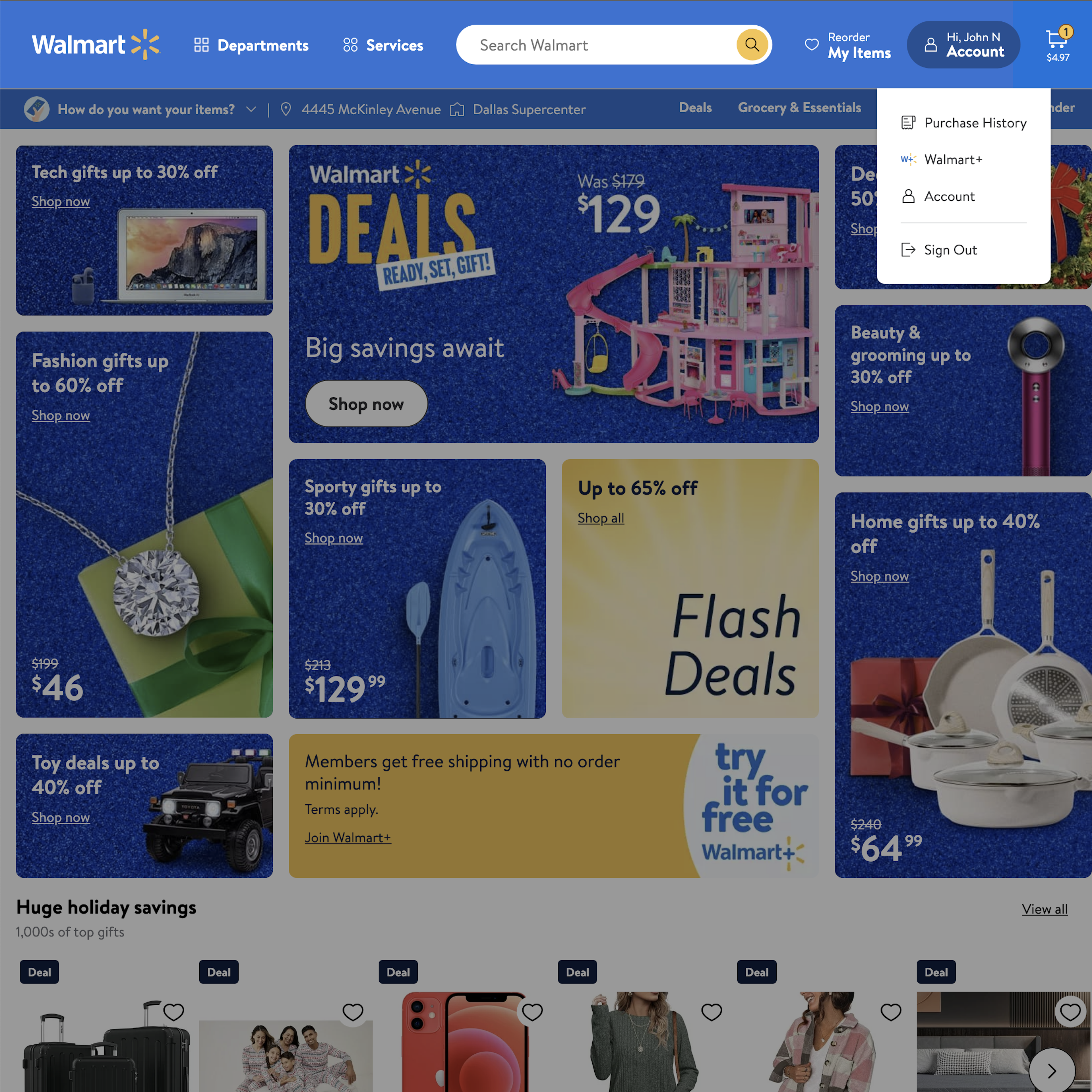
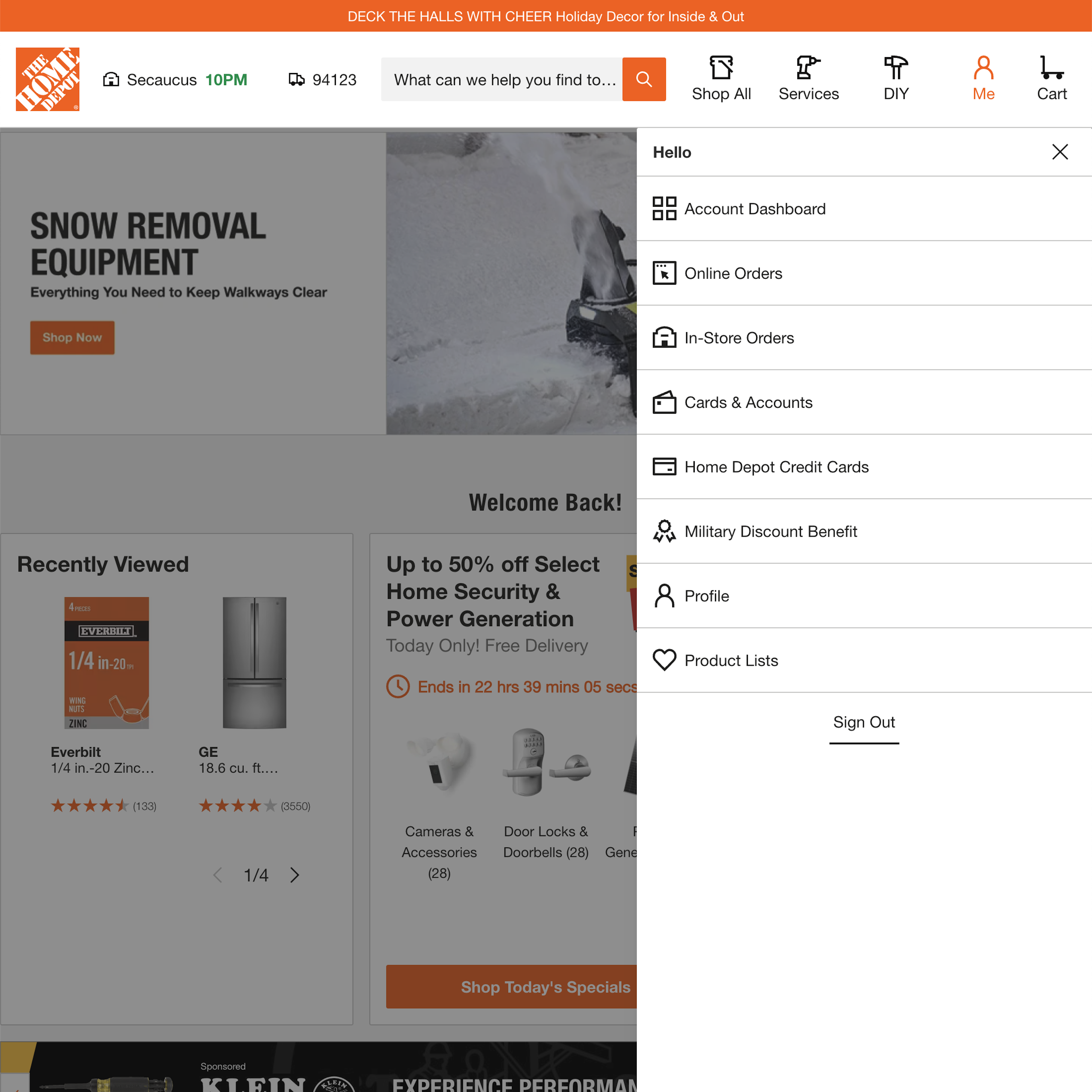
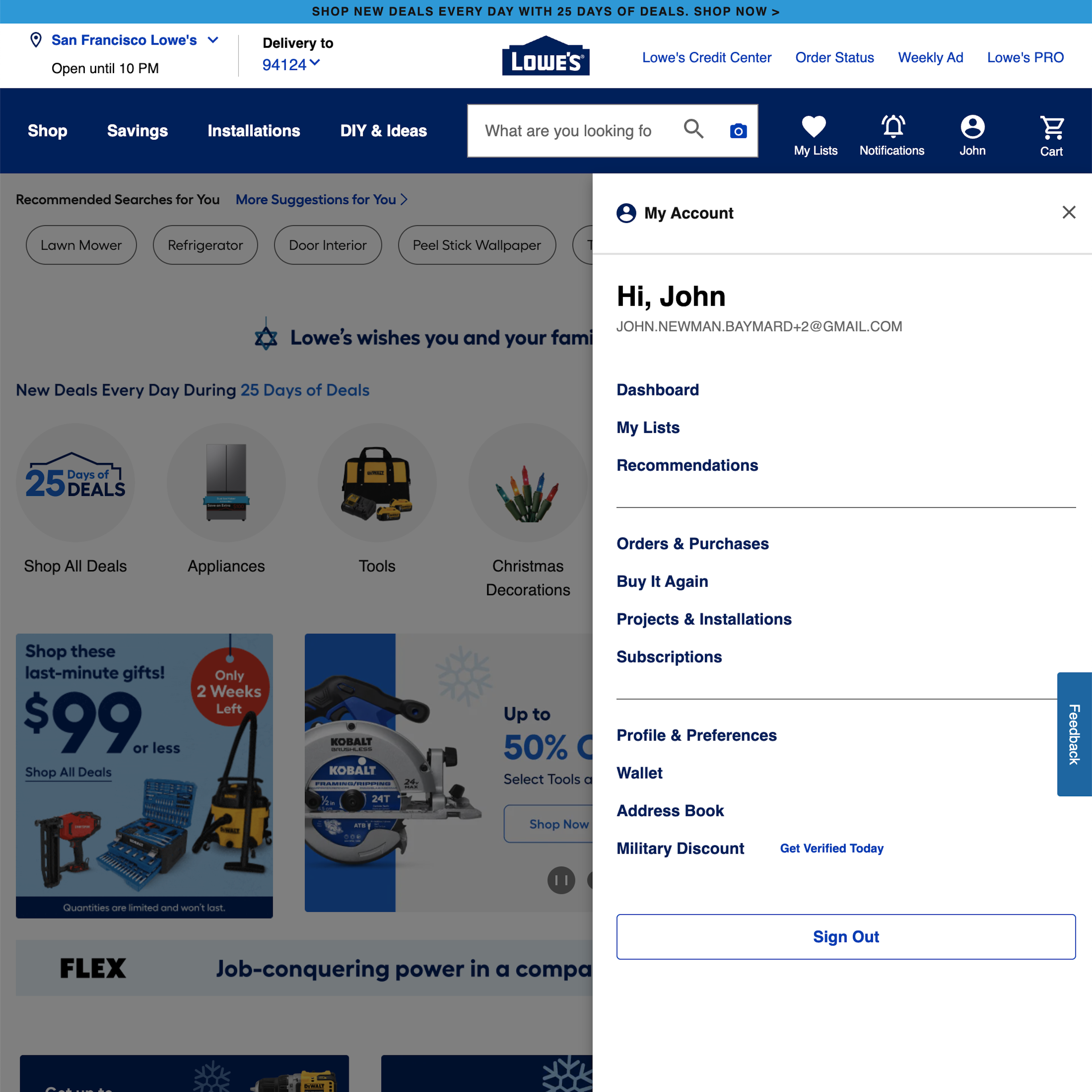
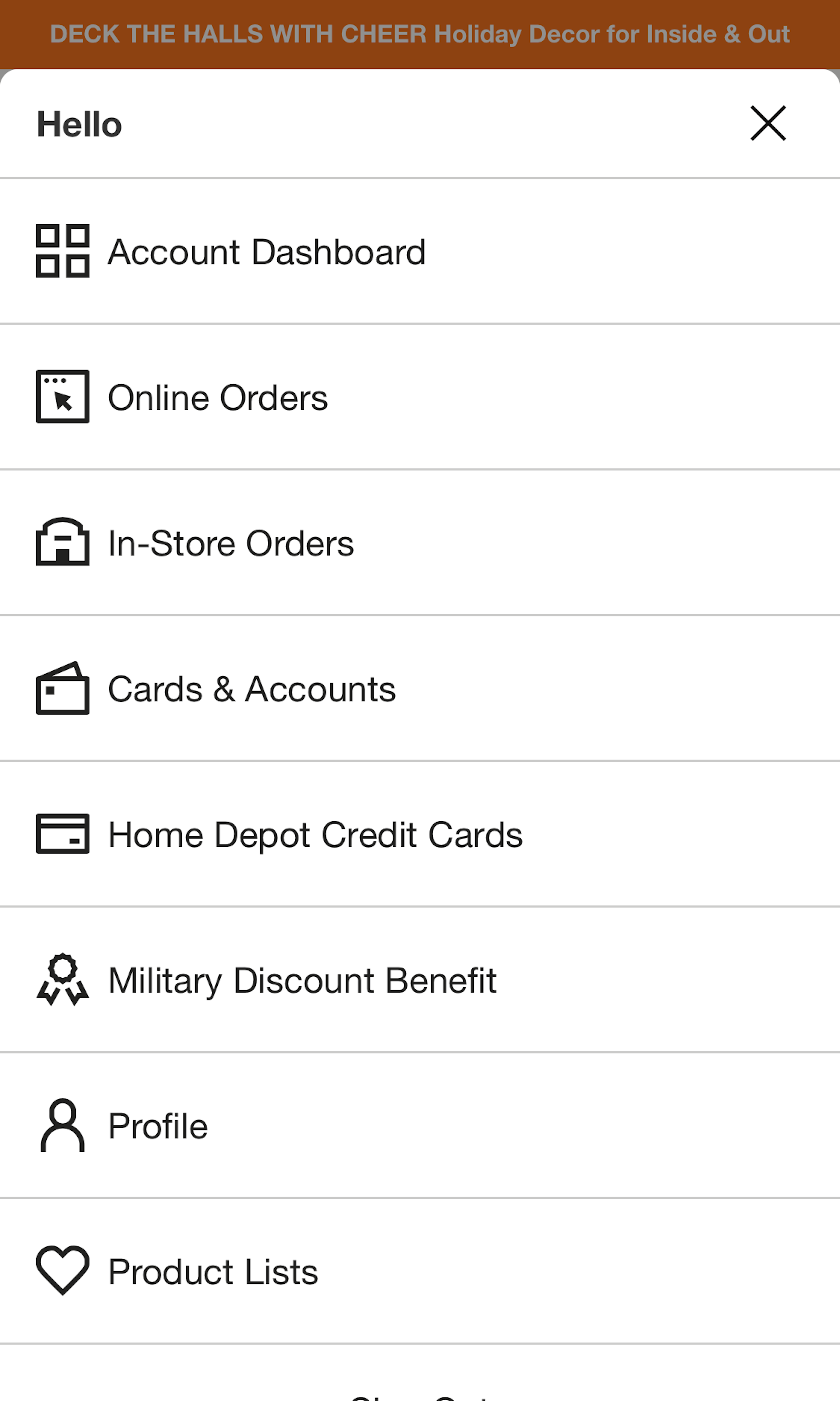
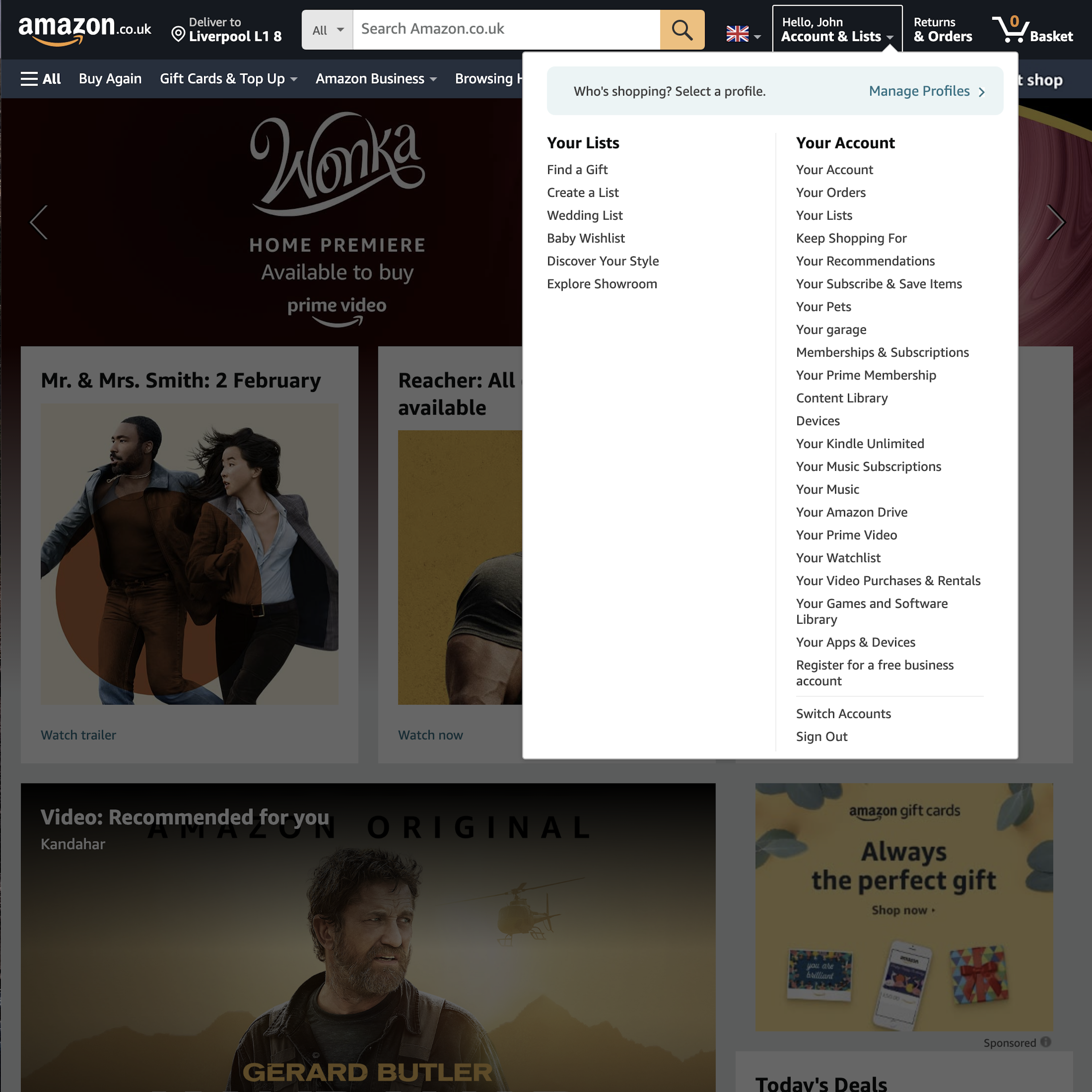
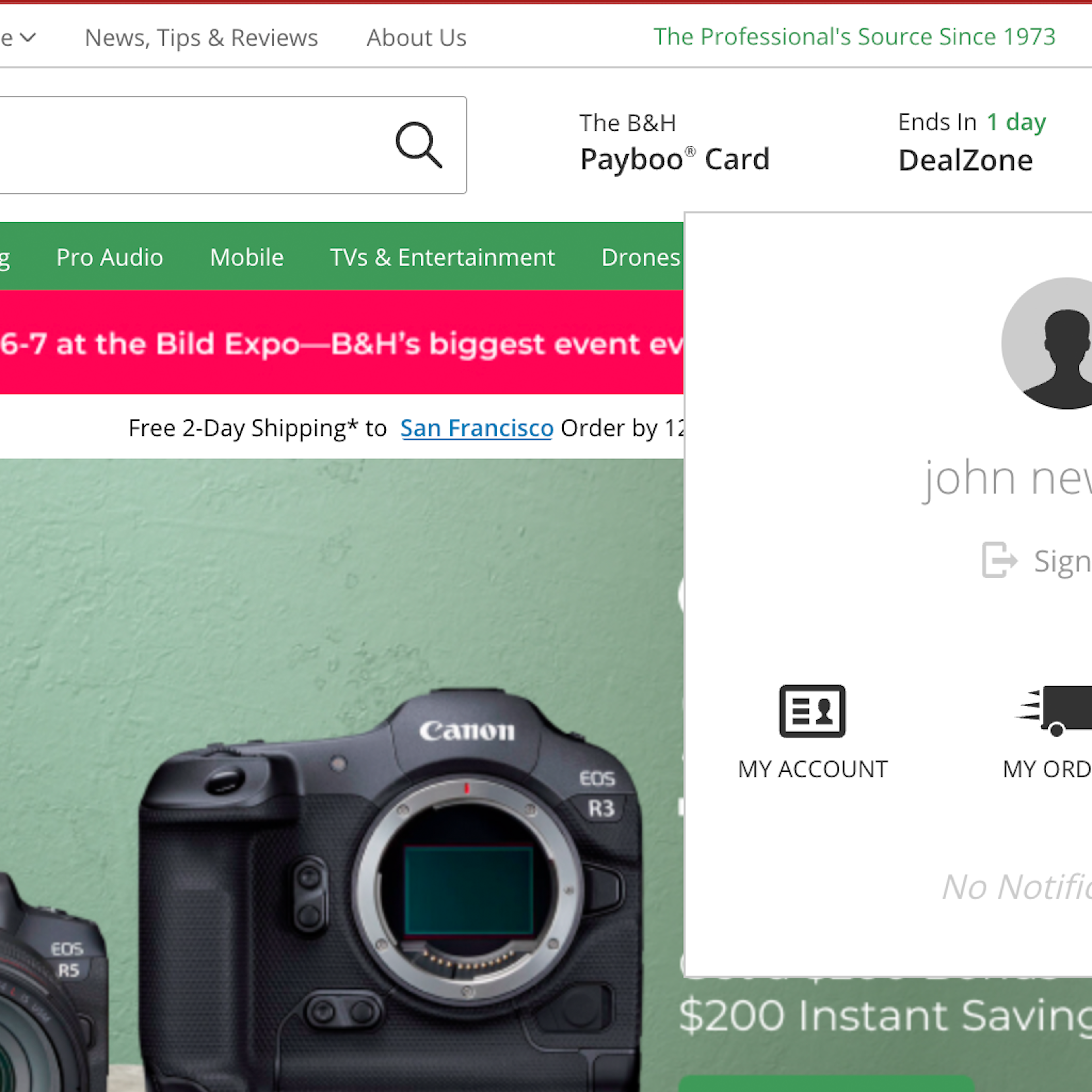
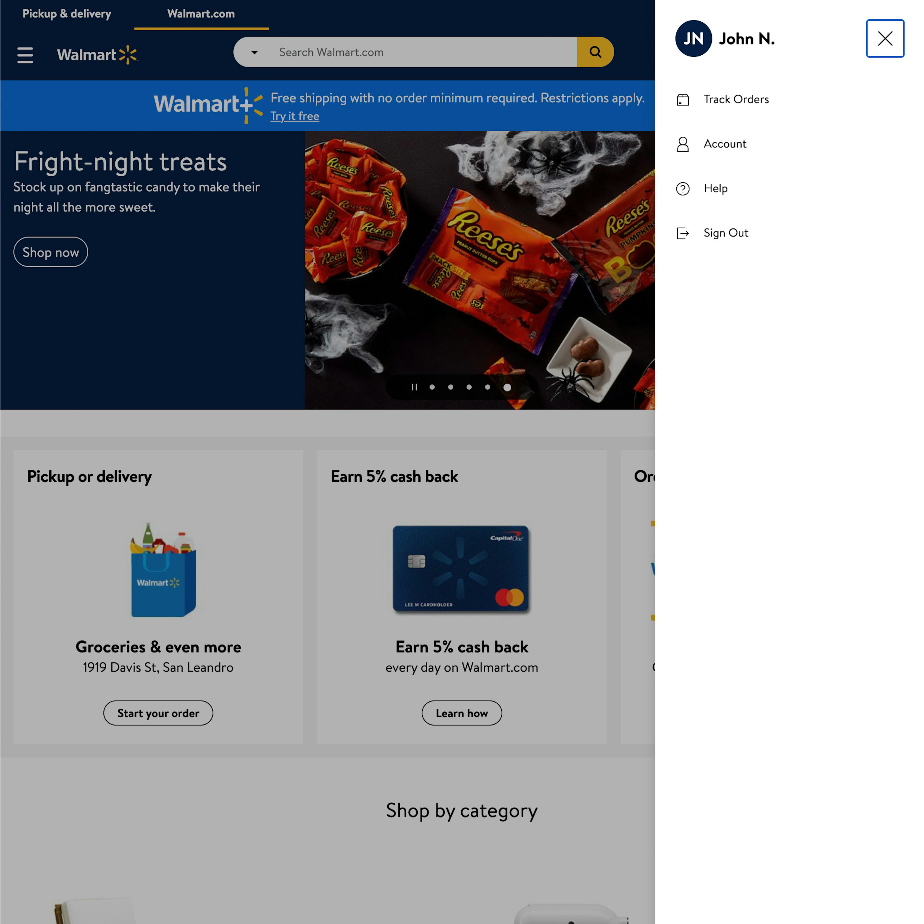
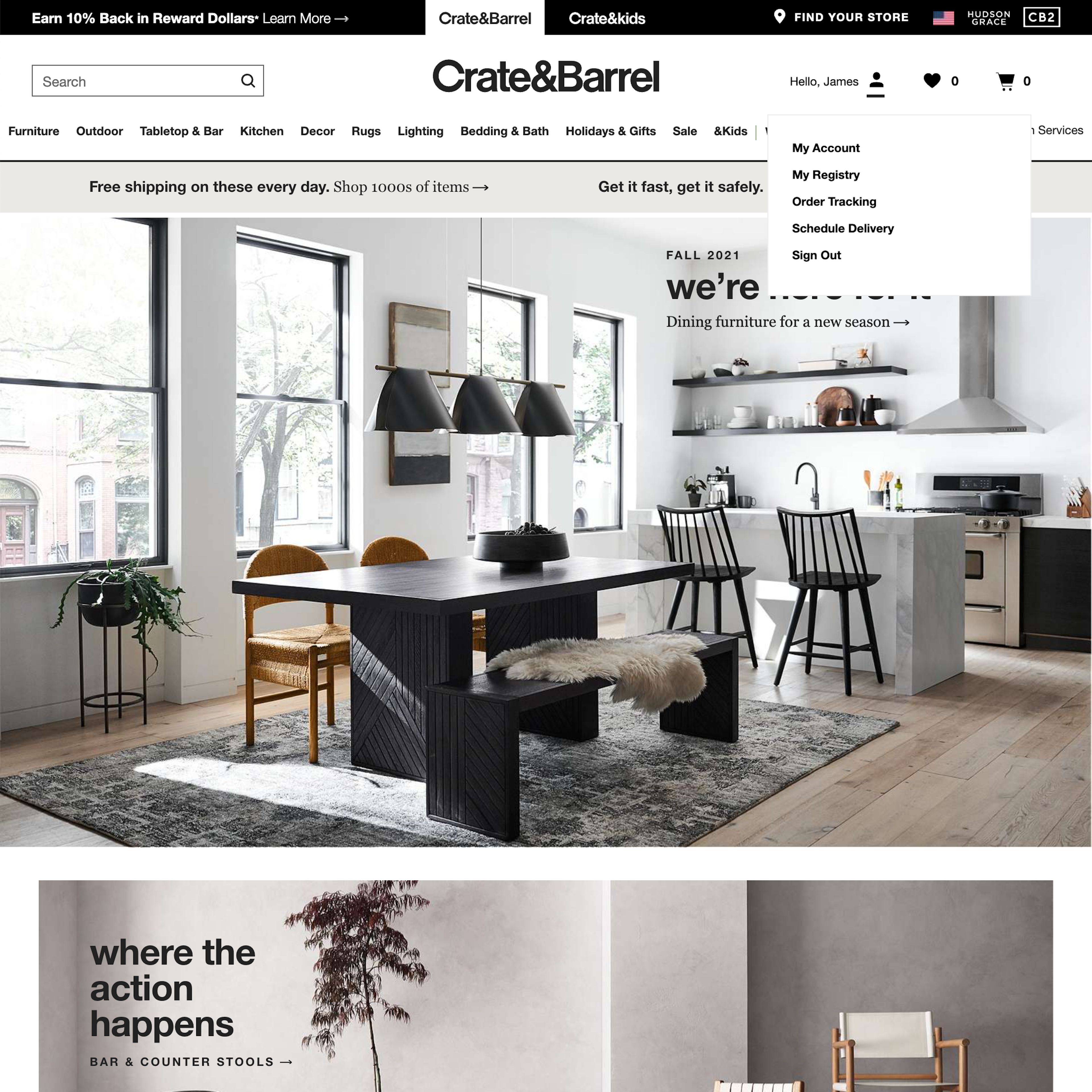
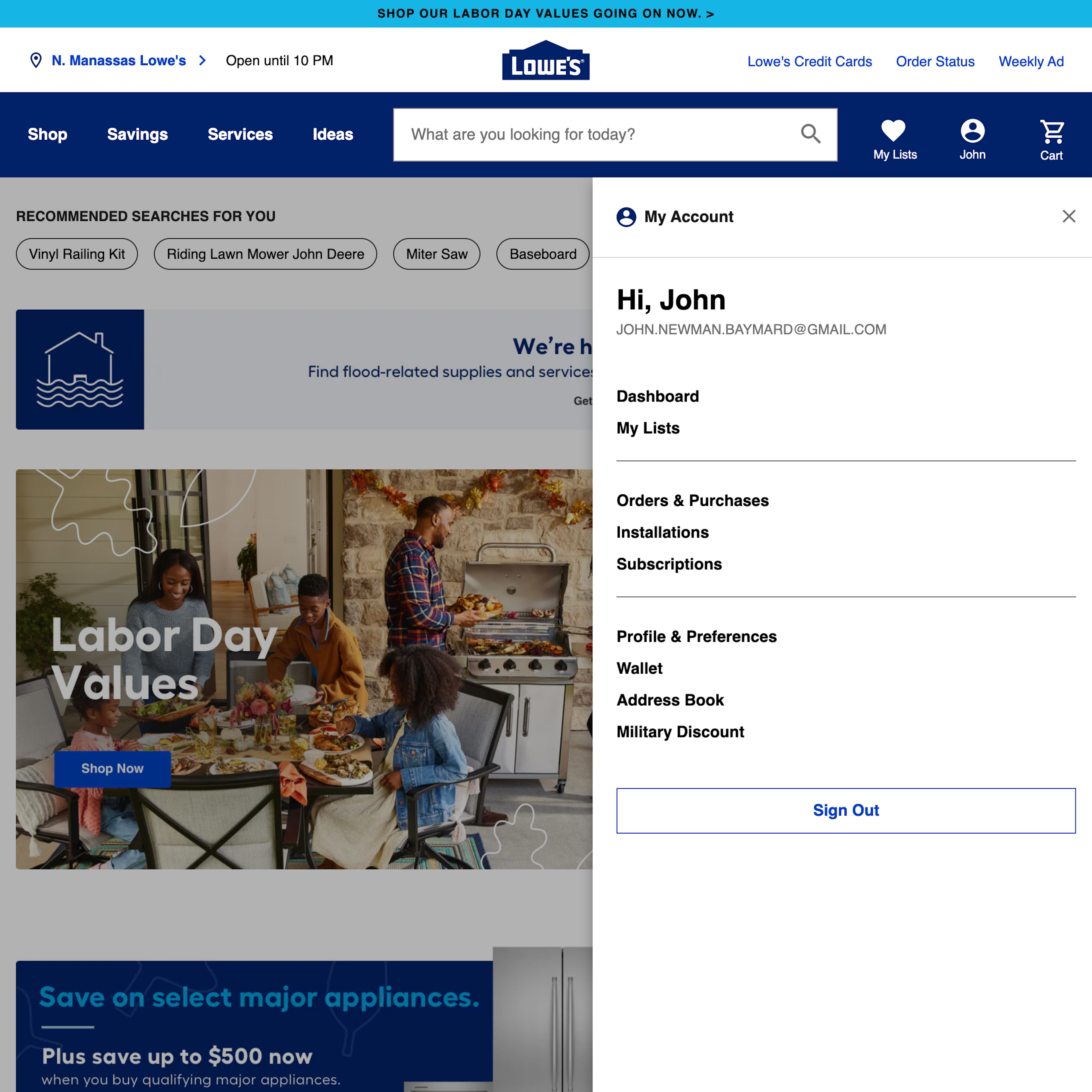
434 ‘‘My Account’ Drop-Down’ Design Examples
Also referred to as: 'My Account' Menu, Account Drop-Down, Account Menu
What’s this? Here you’ll find 434 “‘My Account’ Drop-Down” full-page screenshots annotated with research-based UX insights, sourced from Baymard’s UX benchmark of 326 e-commerce sites. (Note: this is less than 1% of the full research catalog.)
The “Account” drop-down, which allows users to access account-related features, is nearly always placed in the main navigation (frequently indicated by “Sign In” or “My Account”) and is by now an e-commerce convention. In our large-scale usability testing we observe that users’ first step on a site where they’re trying to track an order, initiate a return, update a payment method, add an address, or perform some other account-related task, is often to immediately go to the “My Account” drop-down — sometimes before the homepage has even finished loading.
More Insights on ‘My Account’ Drop-Downs
-
During testing we’ve furthermore observed that certain designs for “My Account” drop-downs slow users down as they try to access account features, make it more difficult to get an overview of the features available, and cause some users to simply give up, never finding the account feature they were looking for.
-
Aspects of the the “My Account” drop-down where we’ve identified a certain set design patterns to consistently issues for users include the placement of the drop-down, what features it should contain, and how those features should be structured and organized.
-
Learn More: Besides exploring the 434 ‘My Account’ Drop-Down design examples below, you may also want to read our related article on New Research Findings on ‘Accounts & Self-Service’ UX that contain stats on the most frequently used account features.
-
Get Full Access: To see all of Baymard’s design guidelines on Accounts & Self-Service pages and features you’ll need Baymard Premium access. (Premium also provides you full access to 200,000+ hours of UX research findings, 650+ e-commerce UX guidelines, and 275,000+ UX performance scores.)
User Experience Research, Delivered Weekly
Join 60,000+ UX professionals and get a new UX article every week.

User Experience Research, Delivered Weekly
Join 60,000+ UX professionals and get a new UX article every week.

Explore Other Research Content

300+ free UX articles based on large-scale research.

326 top sites ranked by UX performance.

Code samples, demos, and key stats for usability.


