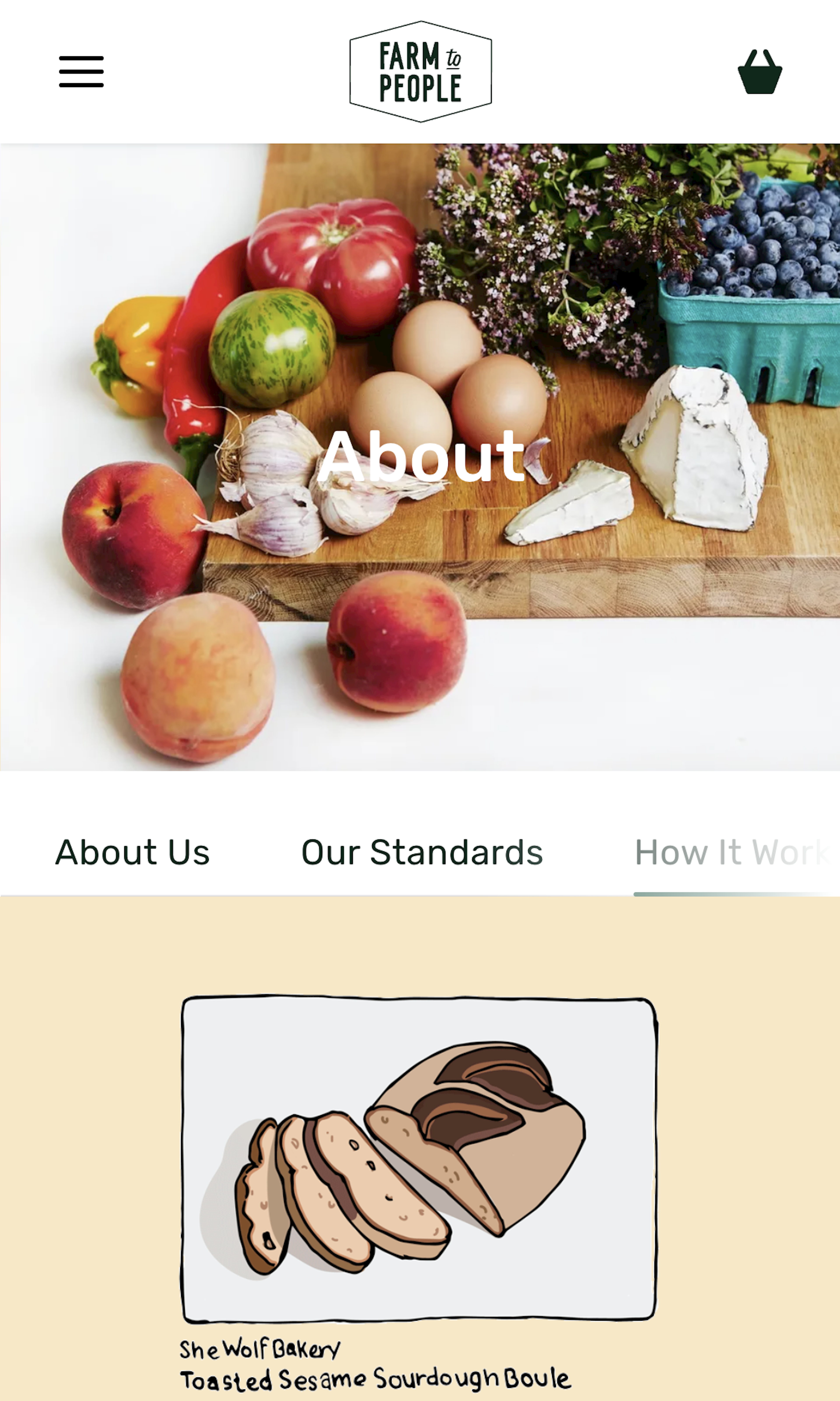
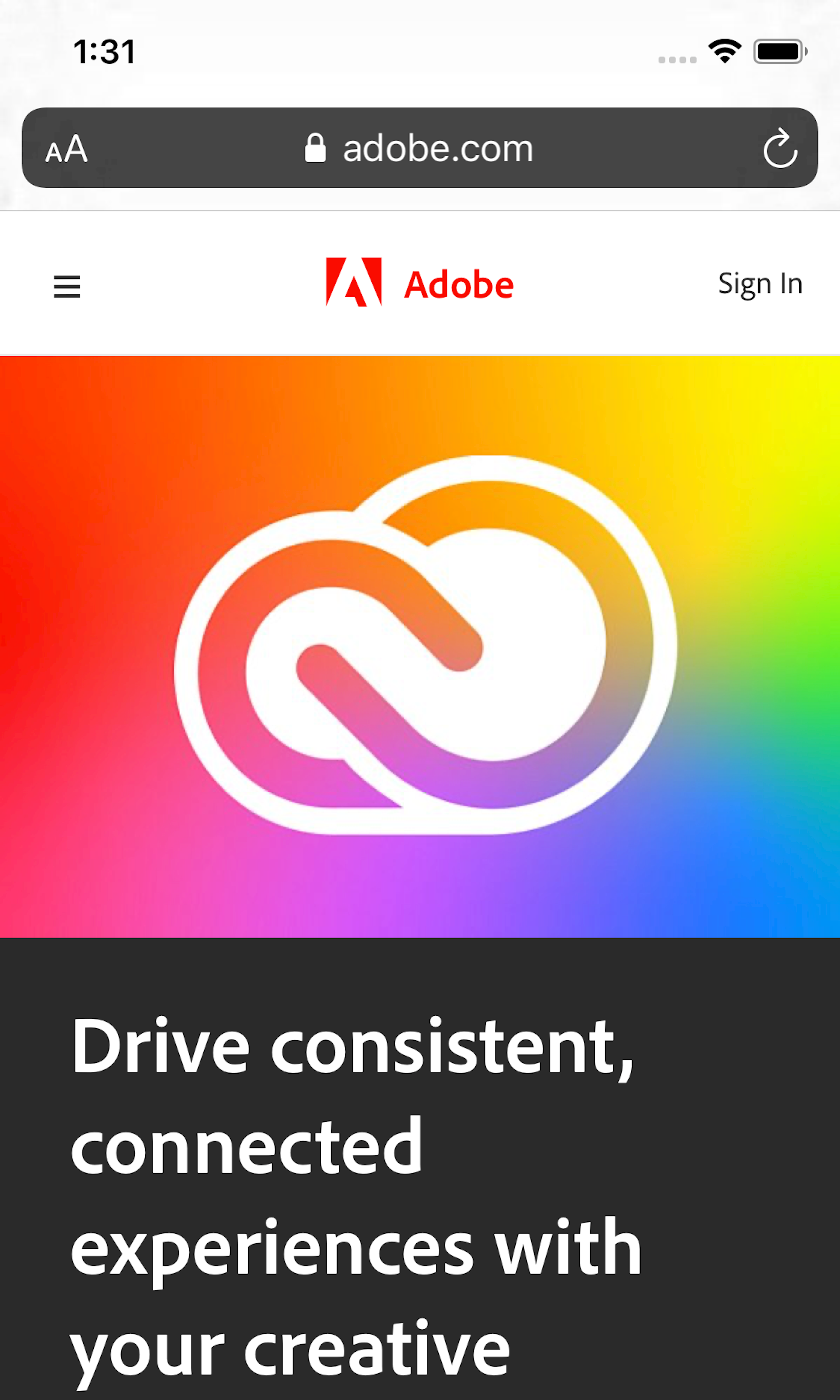
99 ‘Features Page’ Design Examples
Also referred to as: How It Works, Service Details Page, Service Details Steps
What’s this? Here you’ll find 99 “Features Page” full-page screenshots annotated with research-based UX insights, sourced from Baymard’s UX benchmark of 327 e-commerce sites. (Note: this is less than 1% of the full research catalog.)
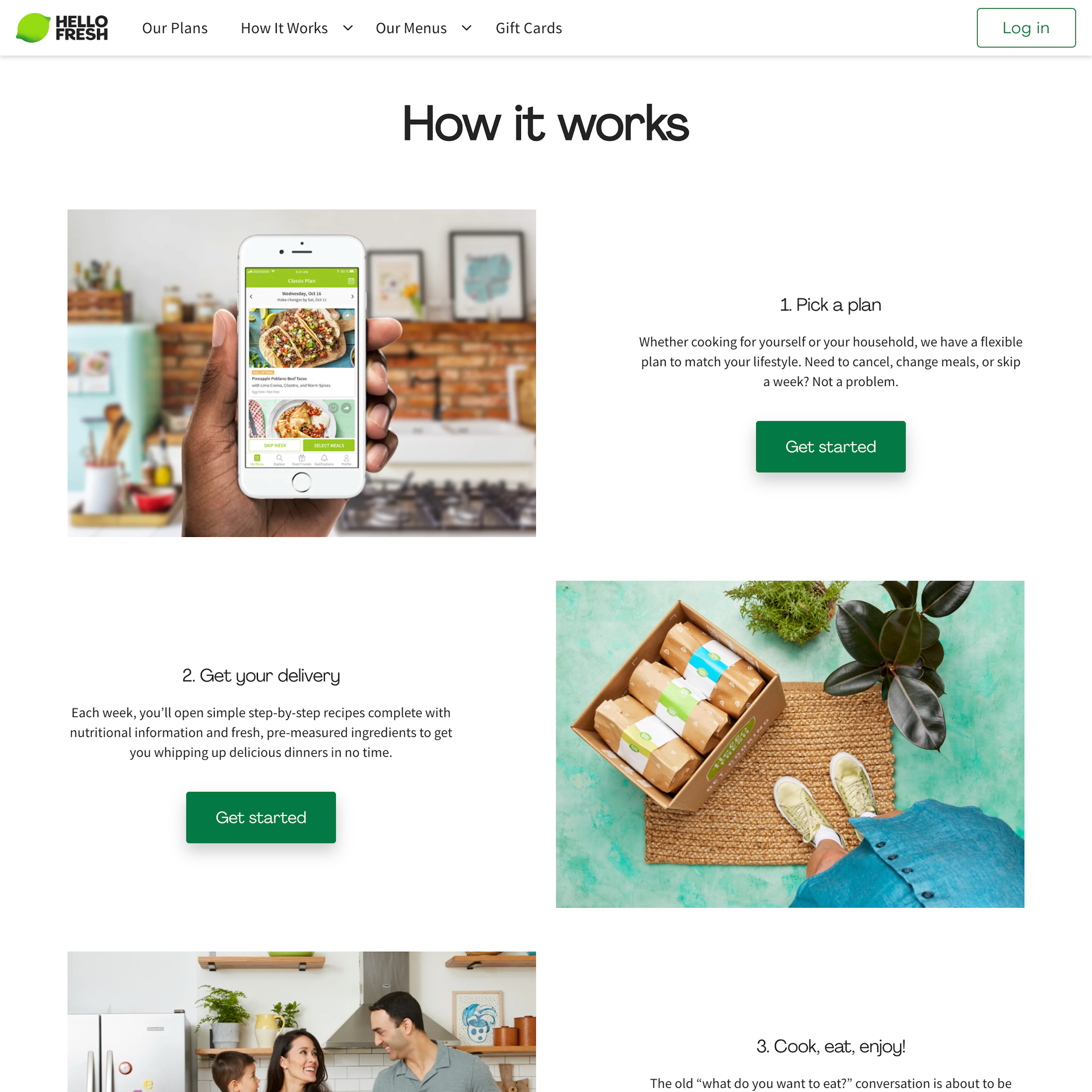
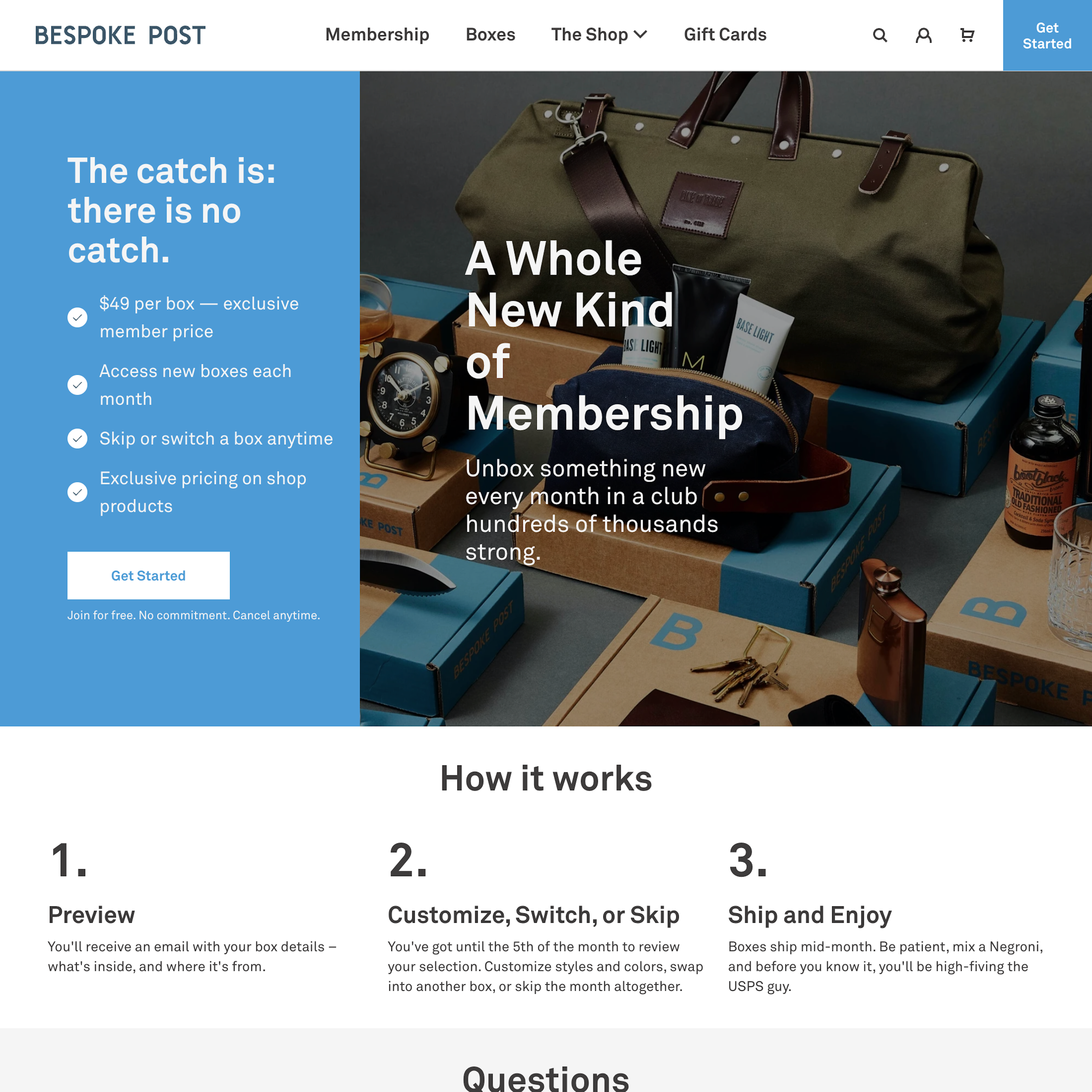
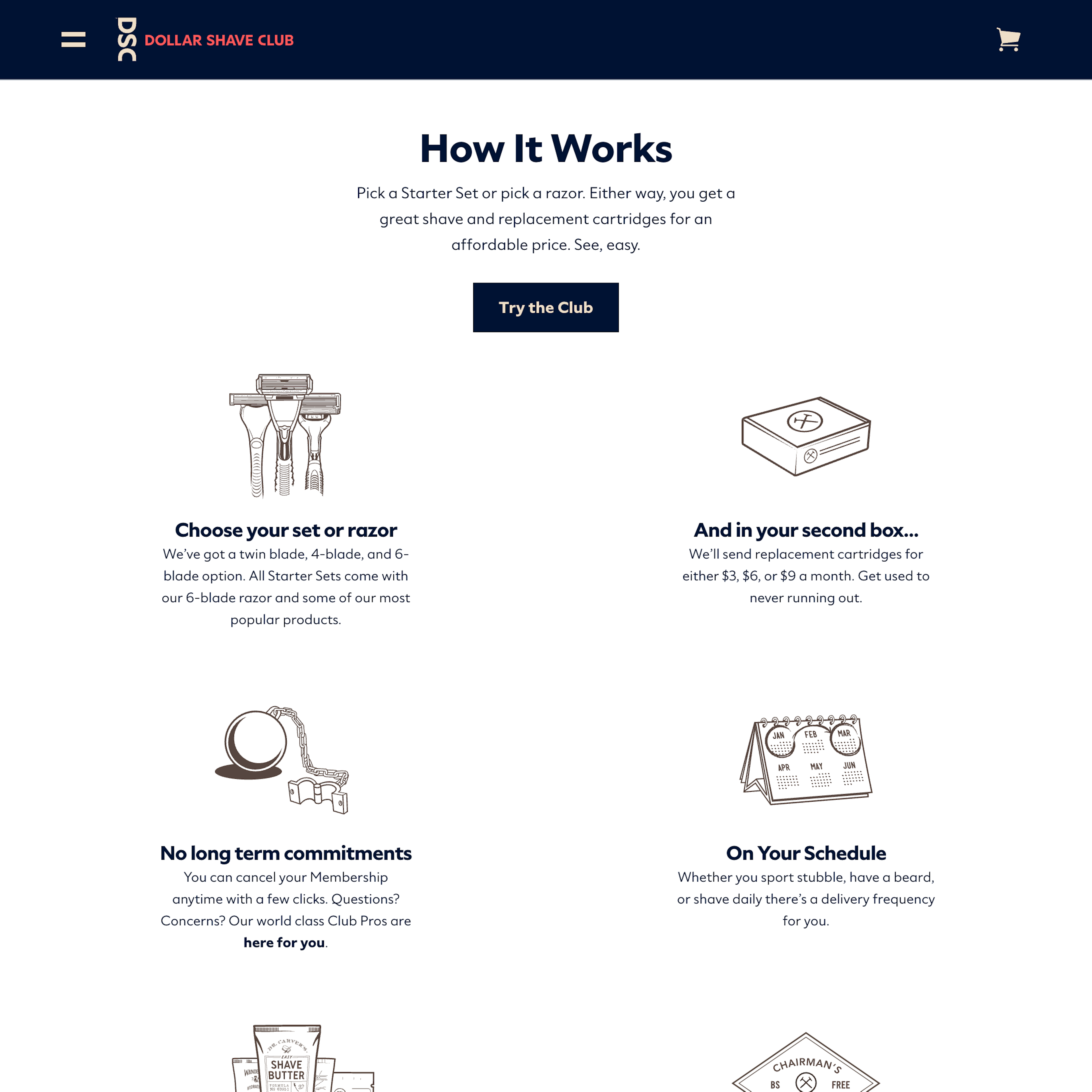
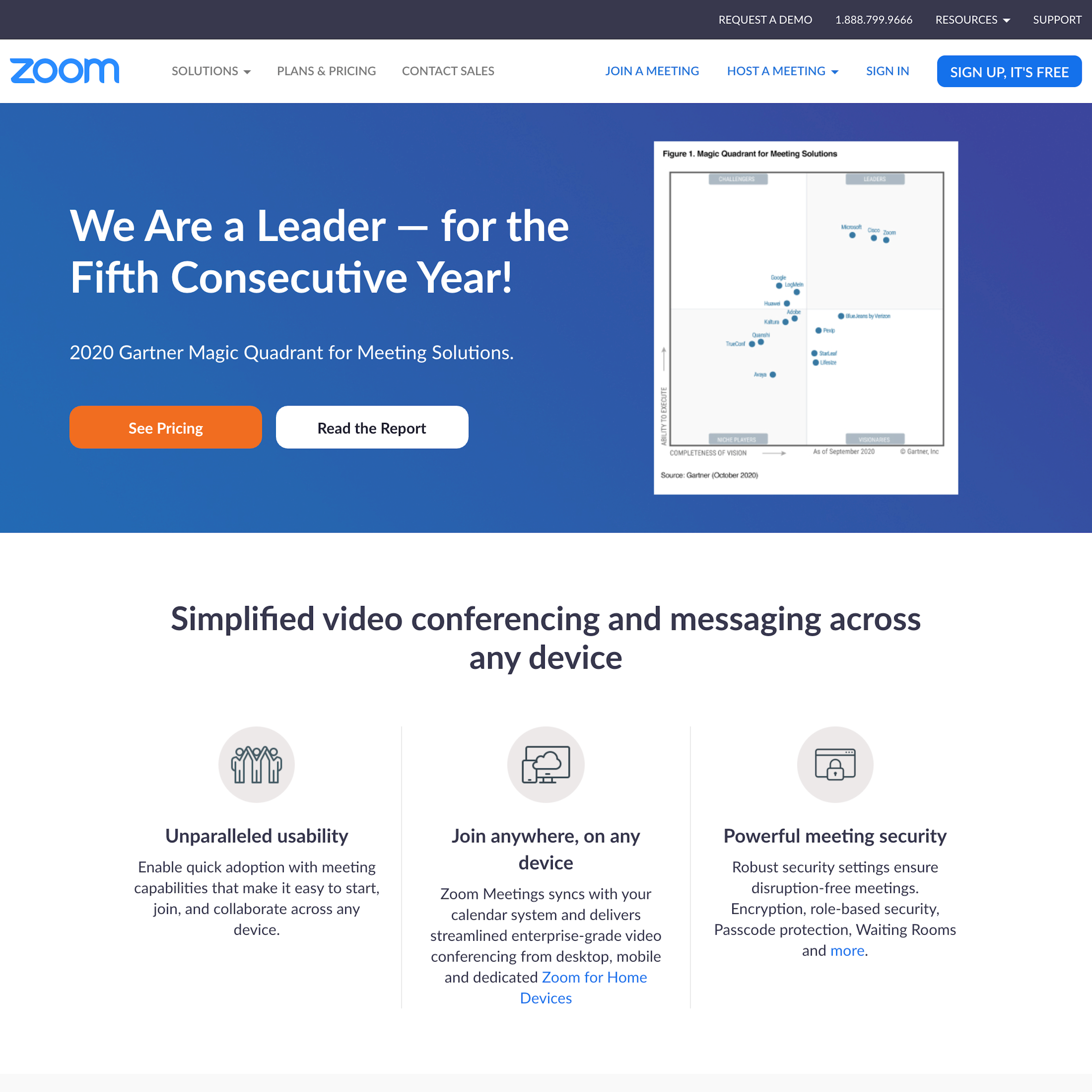
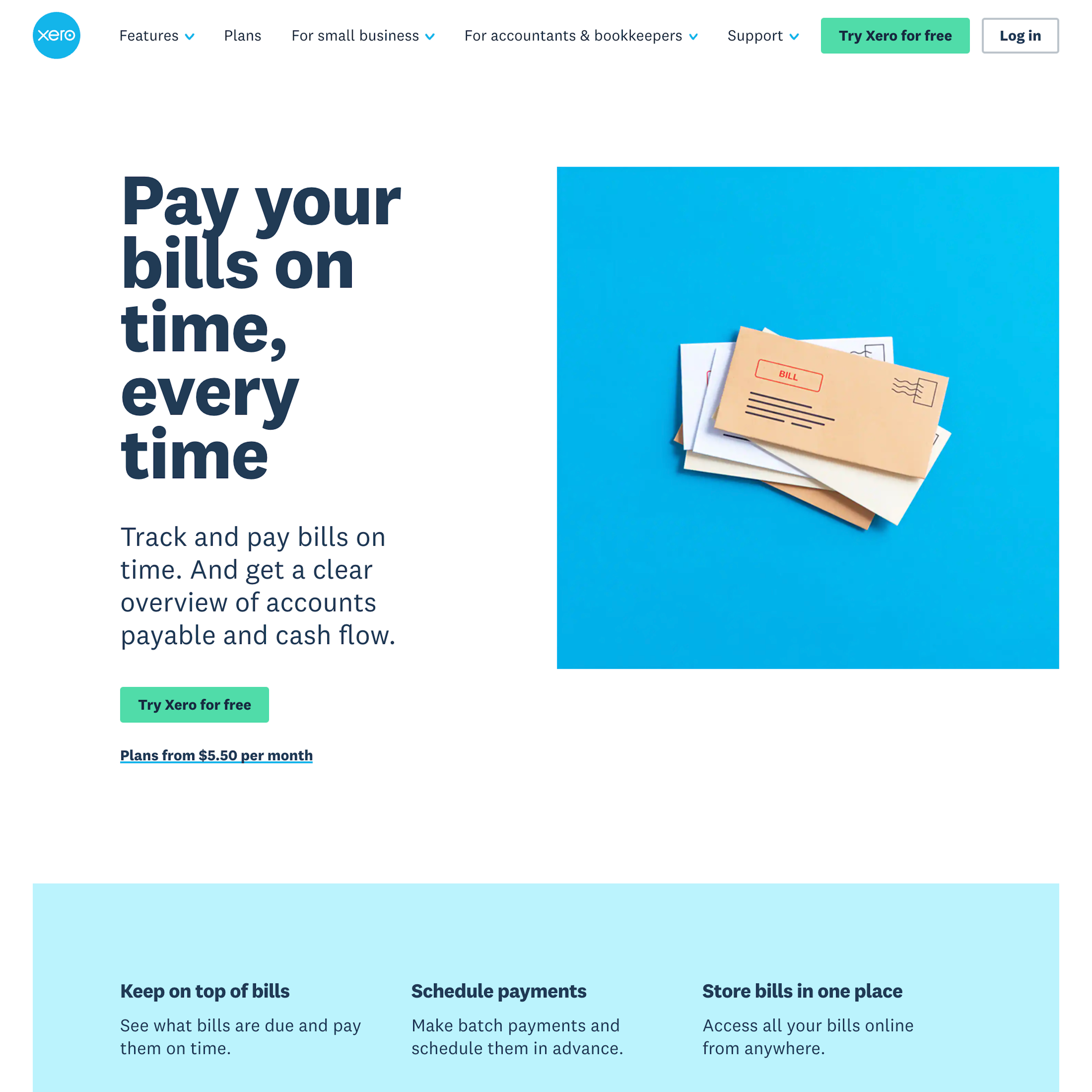
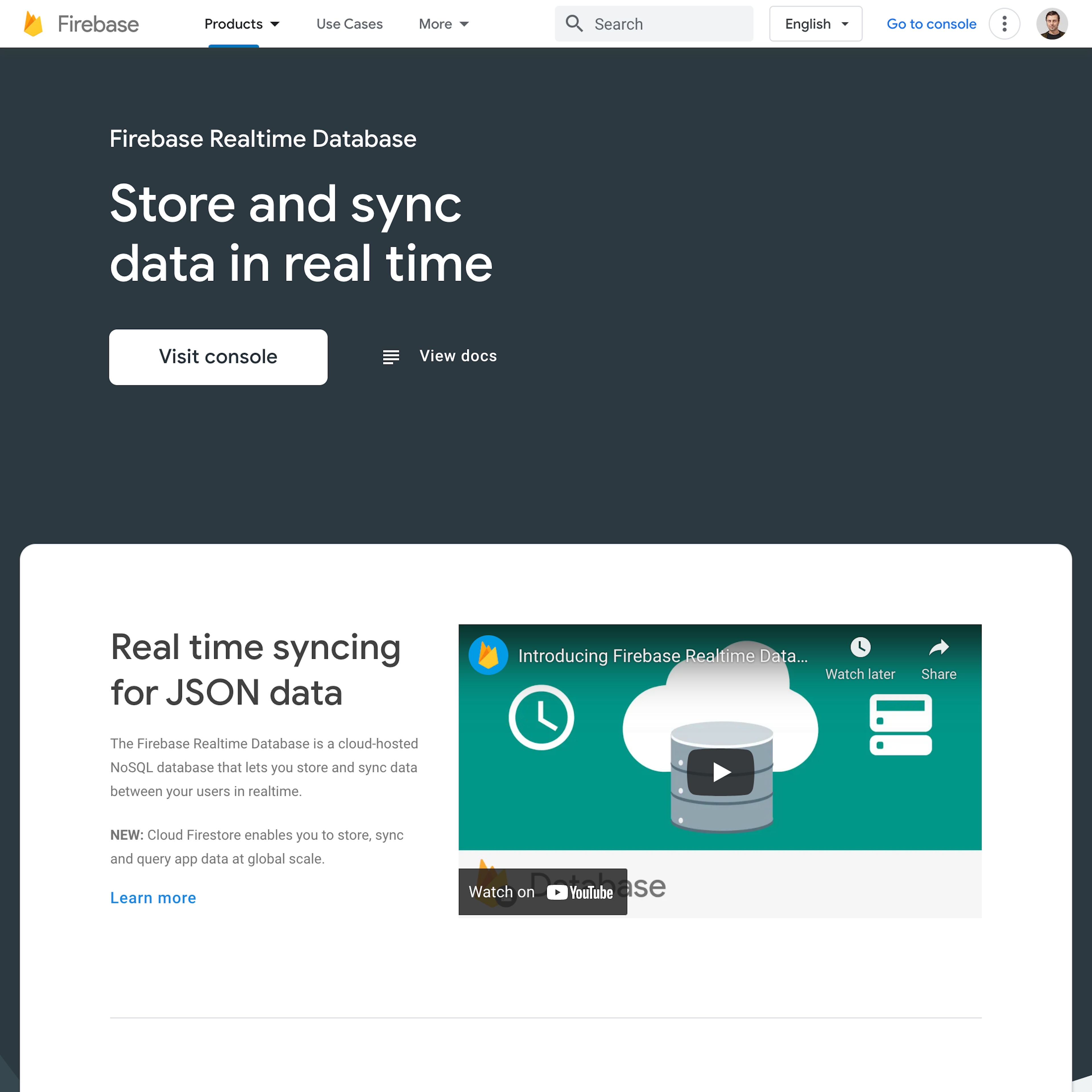
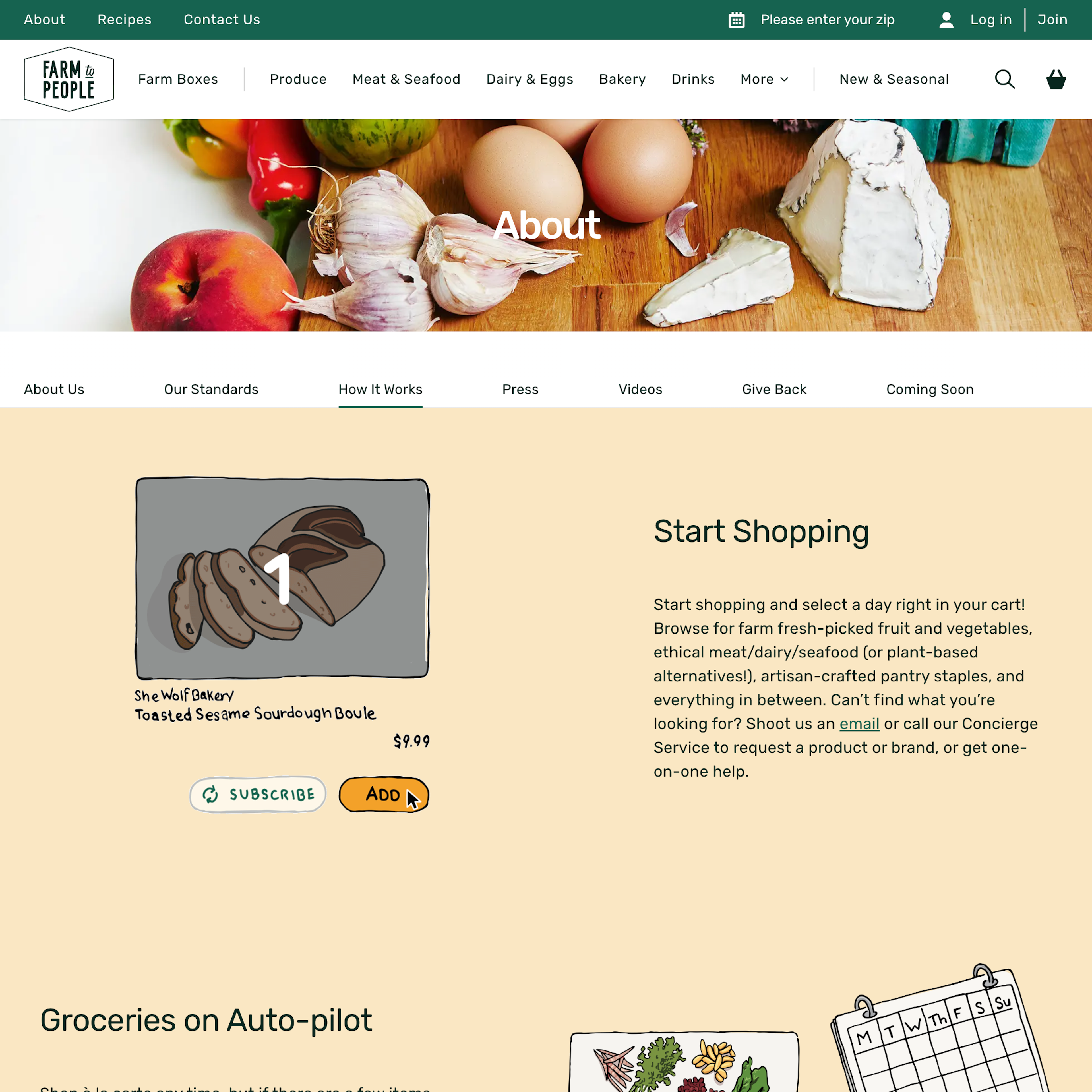
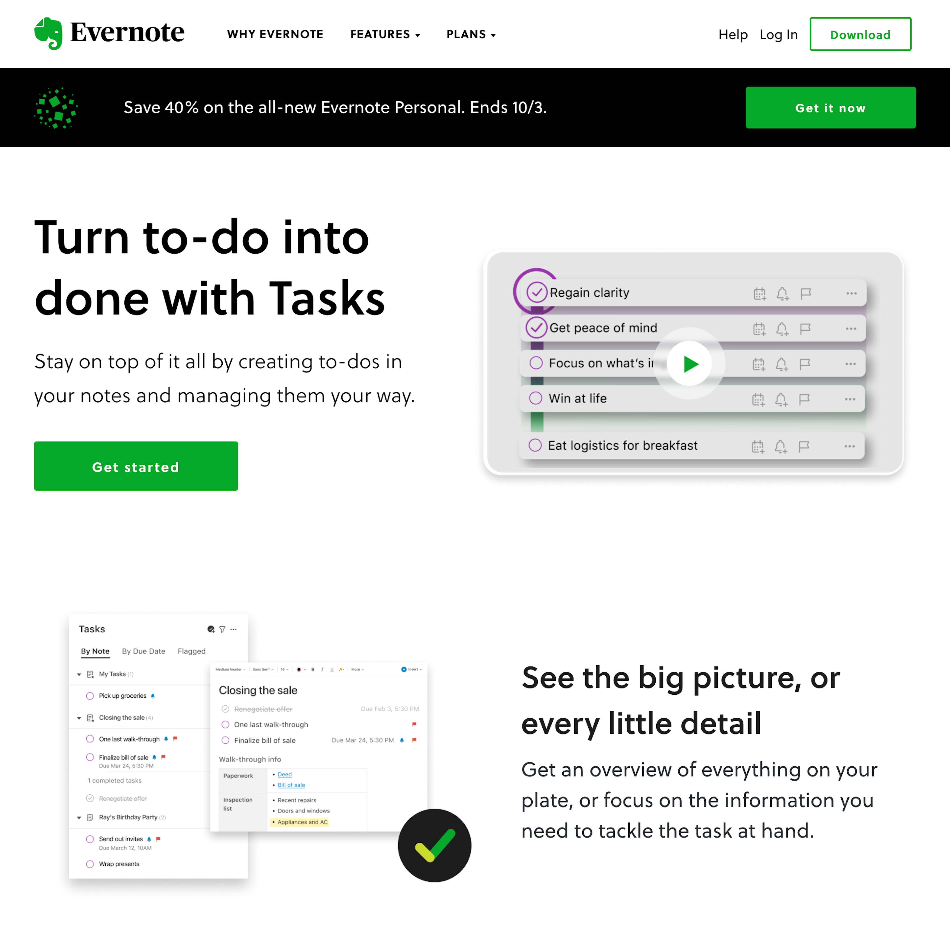
Whether digital service sites, meal kit sites, consumable subscription box sites, or other subscription service sites, they all make an attempt to communicate their services’ features. Yet the way these features are communicated varies widely from site to site. Testing also revealed that how the information is presented to users matters as well when it comes to how easy or difficult it is to conceptualize the service offerings. In the end, users who are unable to thoroughly understand the services’ core features will very likely drop it from consideration - which is a shame if this abandonment is only due to a failure to effectively communicate the core features.
More ‘Features Page’ Insights
-
Learn More: Besides exploring the 99 “Features Page” design examples below, you may also want to read our related articles “New Research Study on “Digital Subscriptions” (SaaS) UX” and “3 High-Level UX Takeaways from 950+ Hours of Testing Leading Meal Kits Sites”.
-
Get Full Access: To see all of Baymard’s “Features Page” research findings you’ll need Baymard Premium access. (Premium also provides you full access to 200,000+ hours of UX research findings, 650+ e-commerce UX guidelines, and 275,000+ UX performance scores.)
User Experience Research, Delivered Weekly
Join 60,000+ UX professionals and get a new UX article every week.

User Experience Research, Delivered Weekly
Join 60,000+ UX professionals and get a new UX article every week.

Explore Other Research Content

300+ free UX articles based on large-scale research.

327 top sites ranked by UX performance.

Code samples, demos, and key stats for usability.


