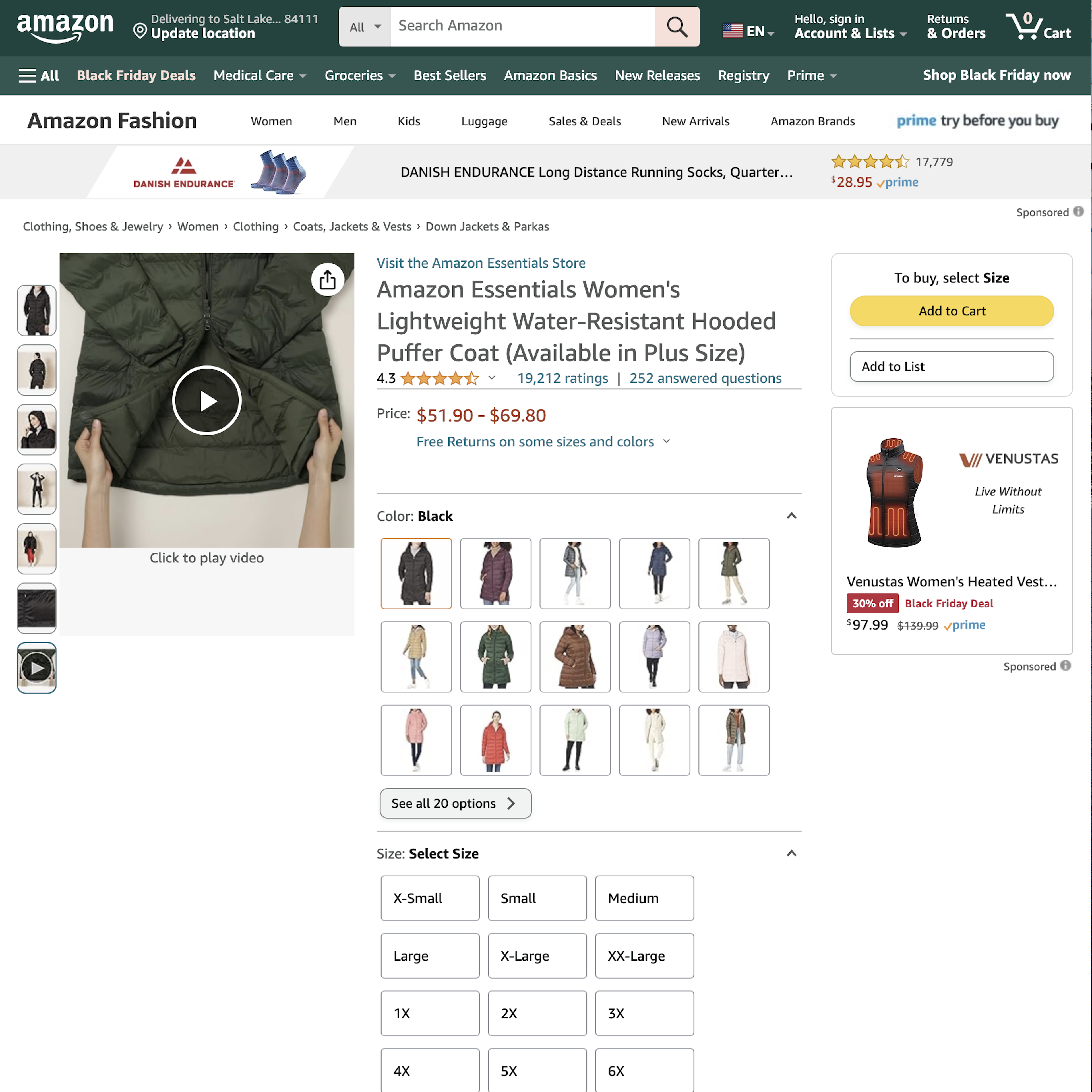
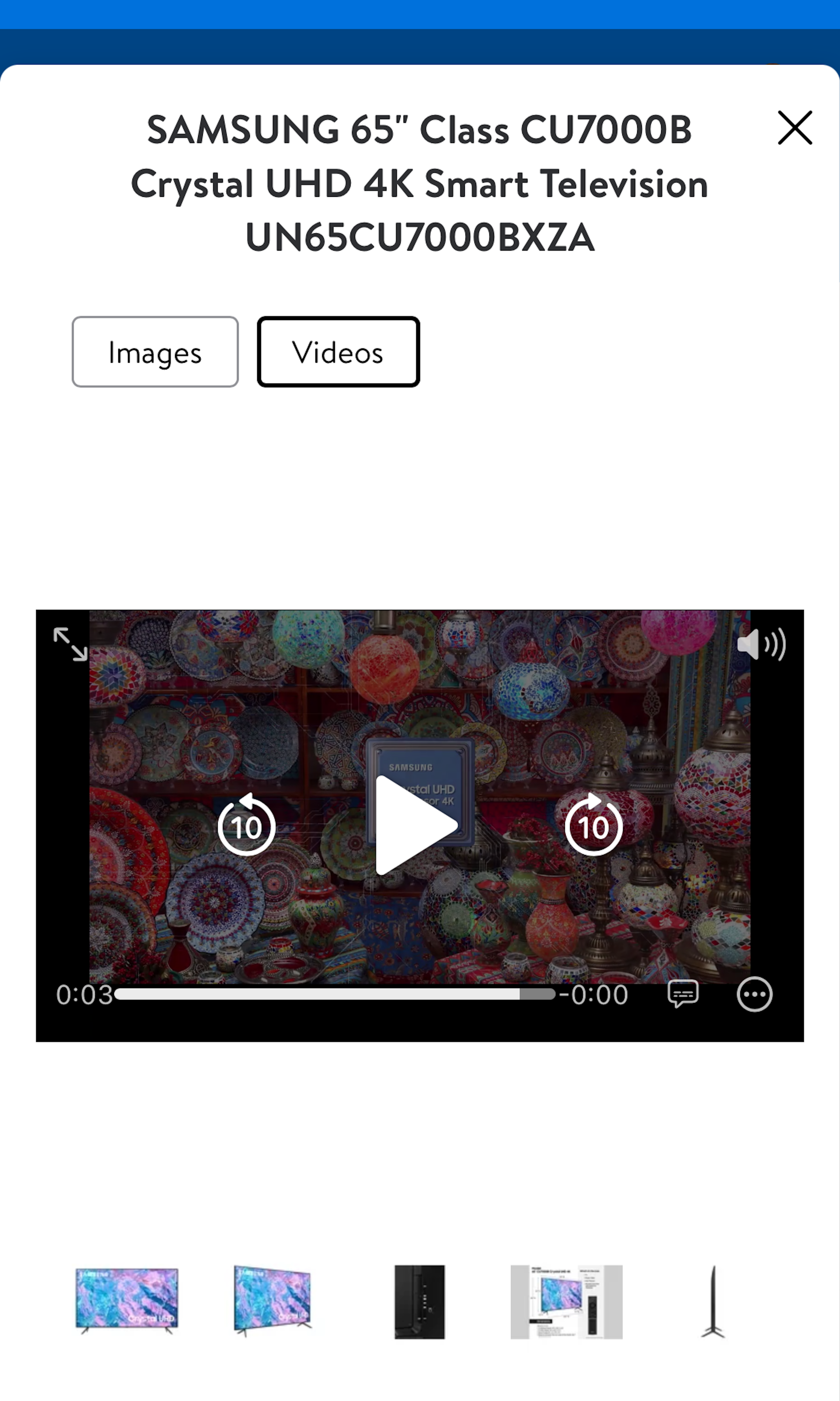
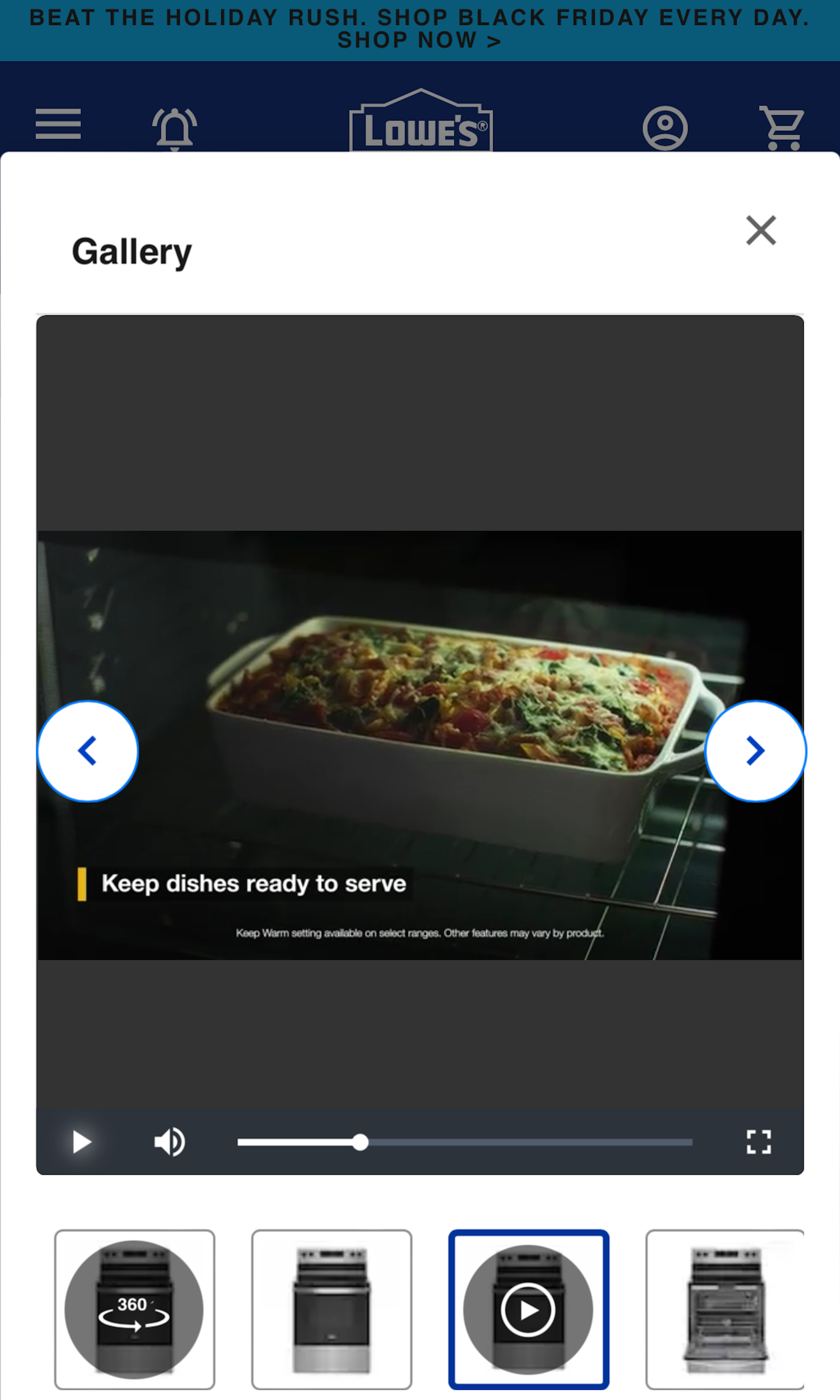
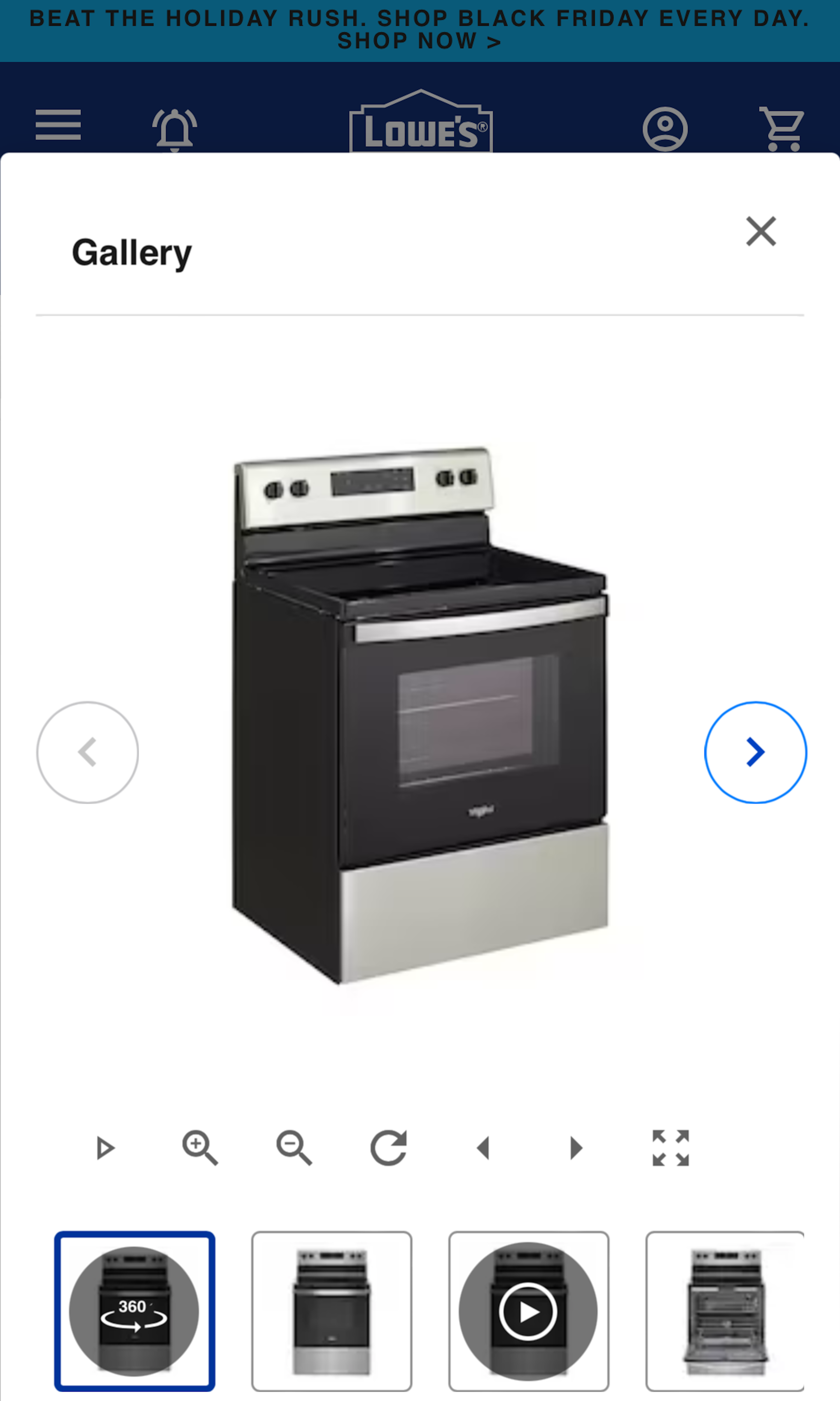
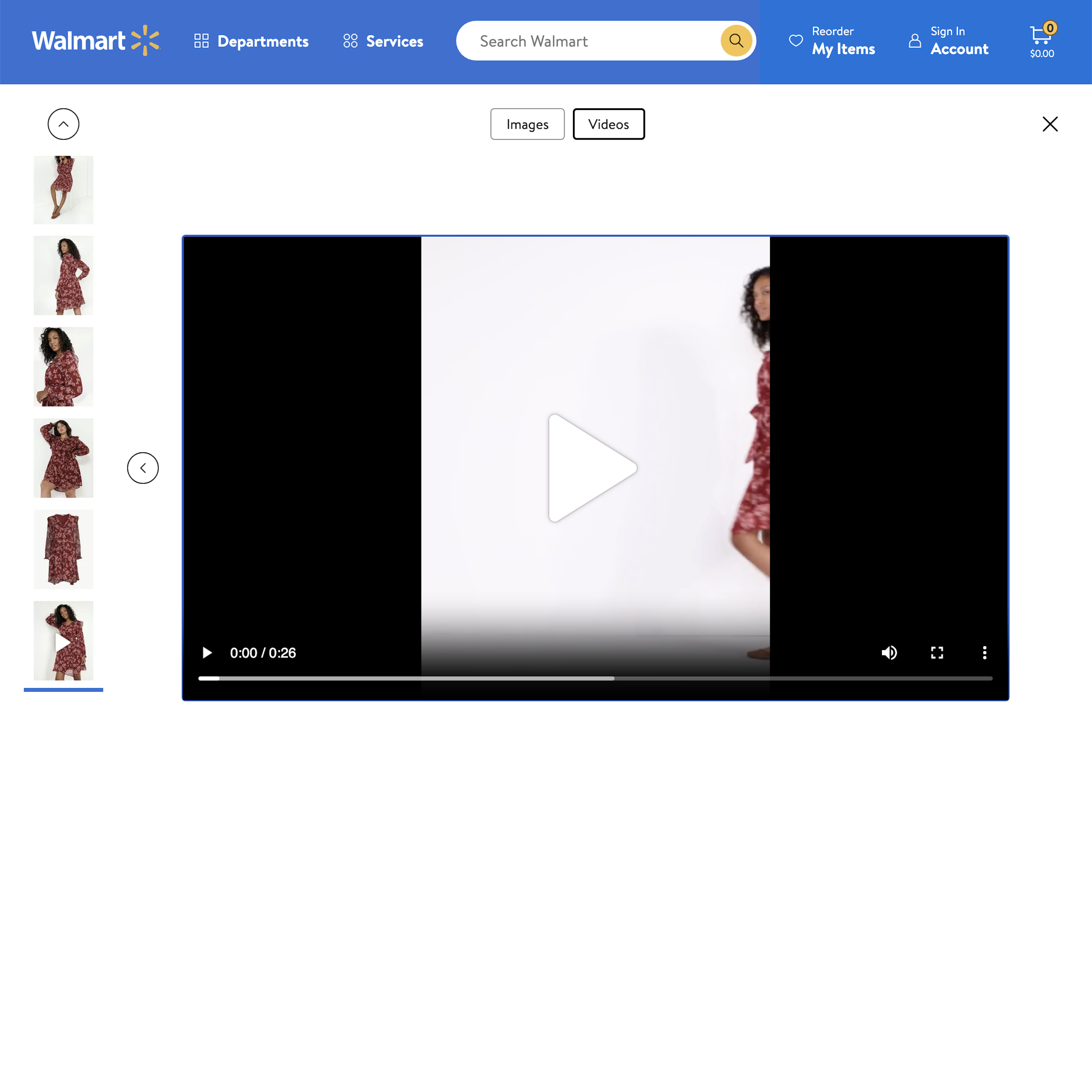
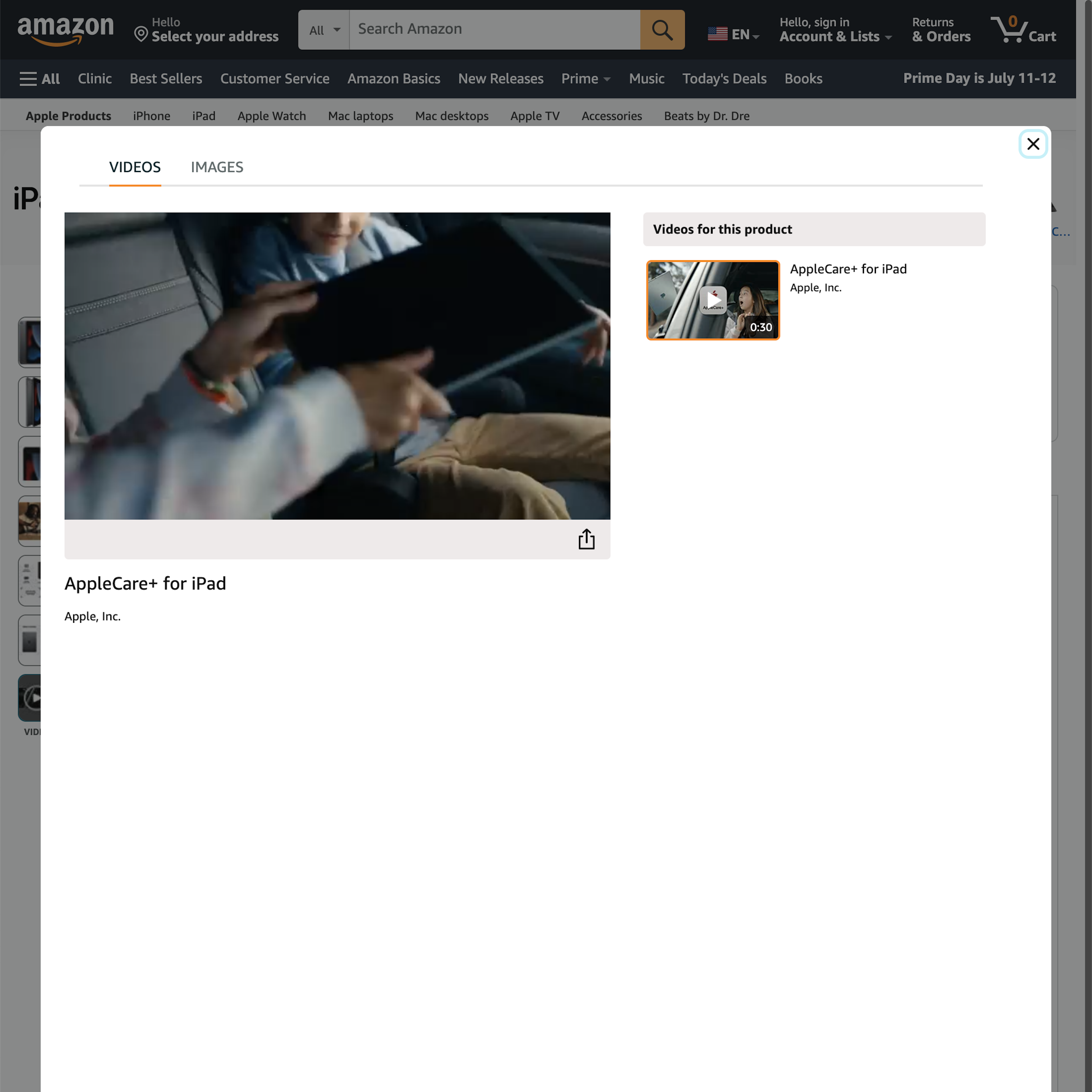
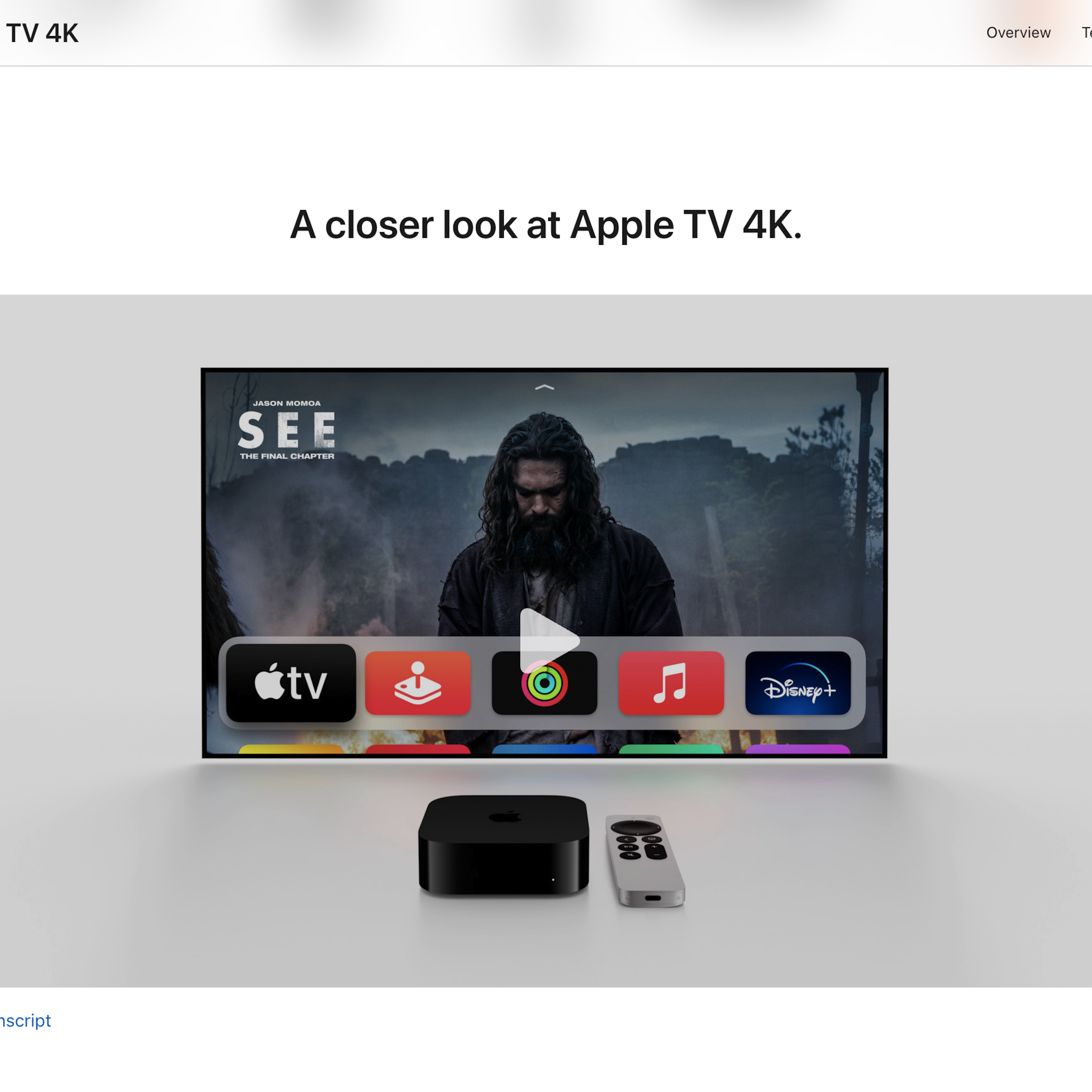
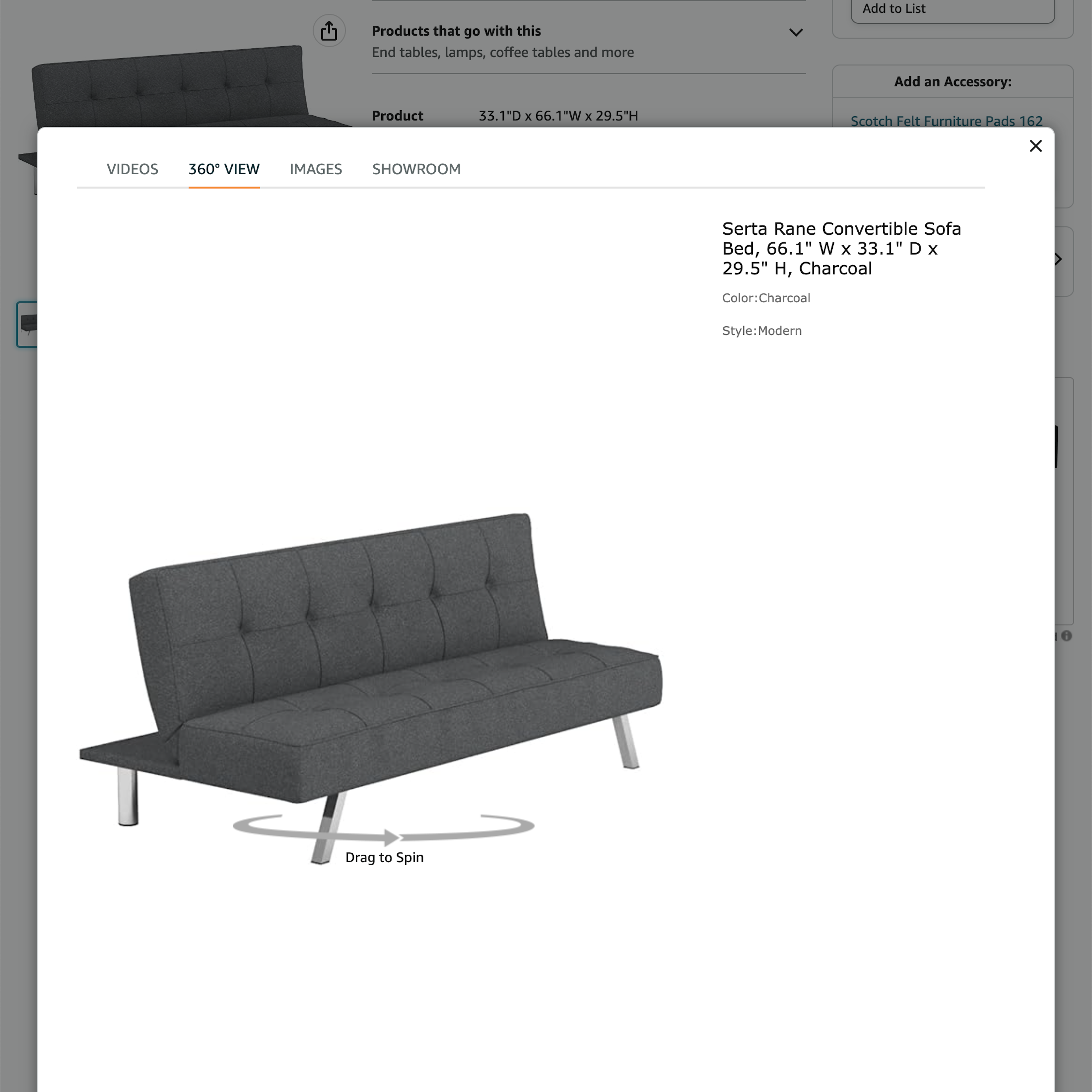
440 ‘Video & 360-Views’ Design Examples
Also referred to as: Product Video, 360 Product Viewer
What’s this? Here you’ll find 440 “Video & 360-Views” full-page screenshots annotated with research-based UX insights, sourced from Baymard’s UX benchmark of 327 e-commerce sites. (Note: this is less than 1% of the full research catalog.)
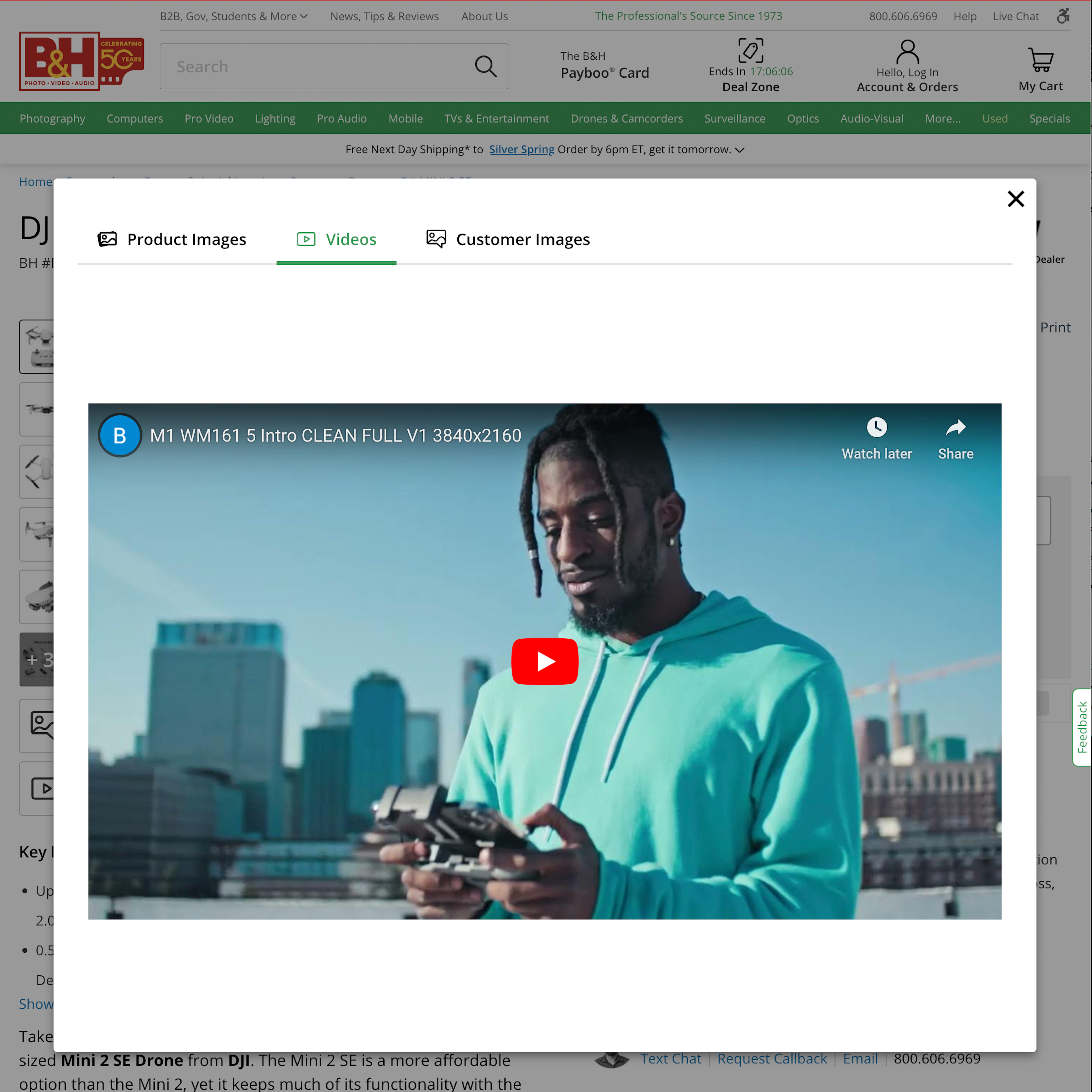
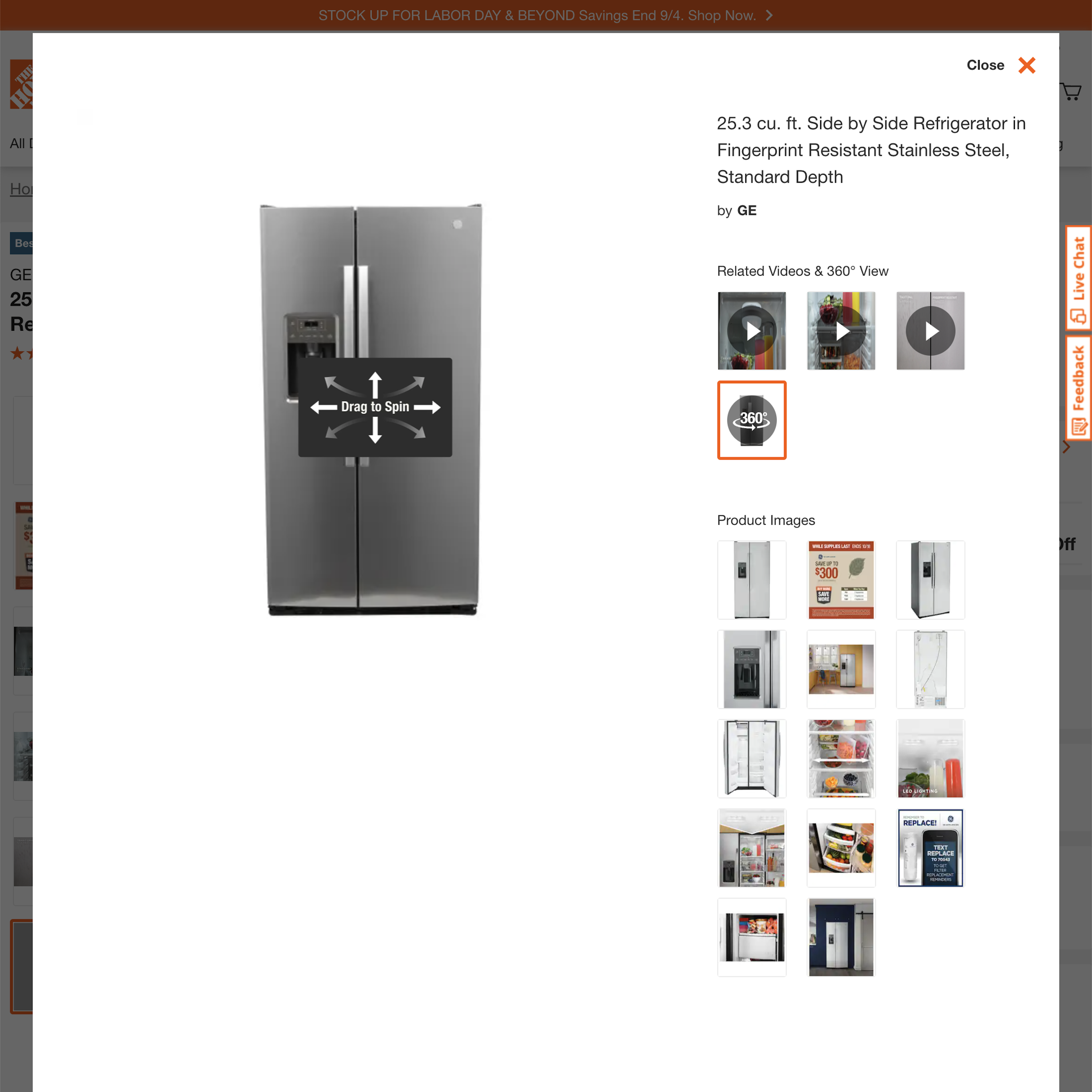
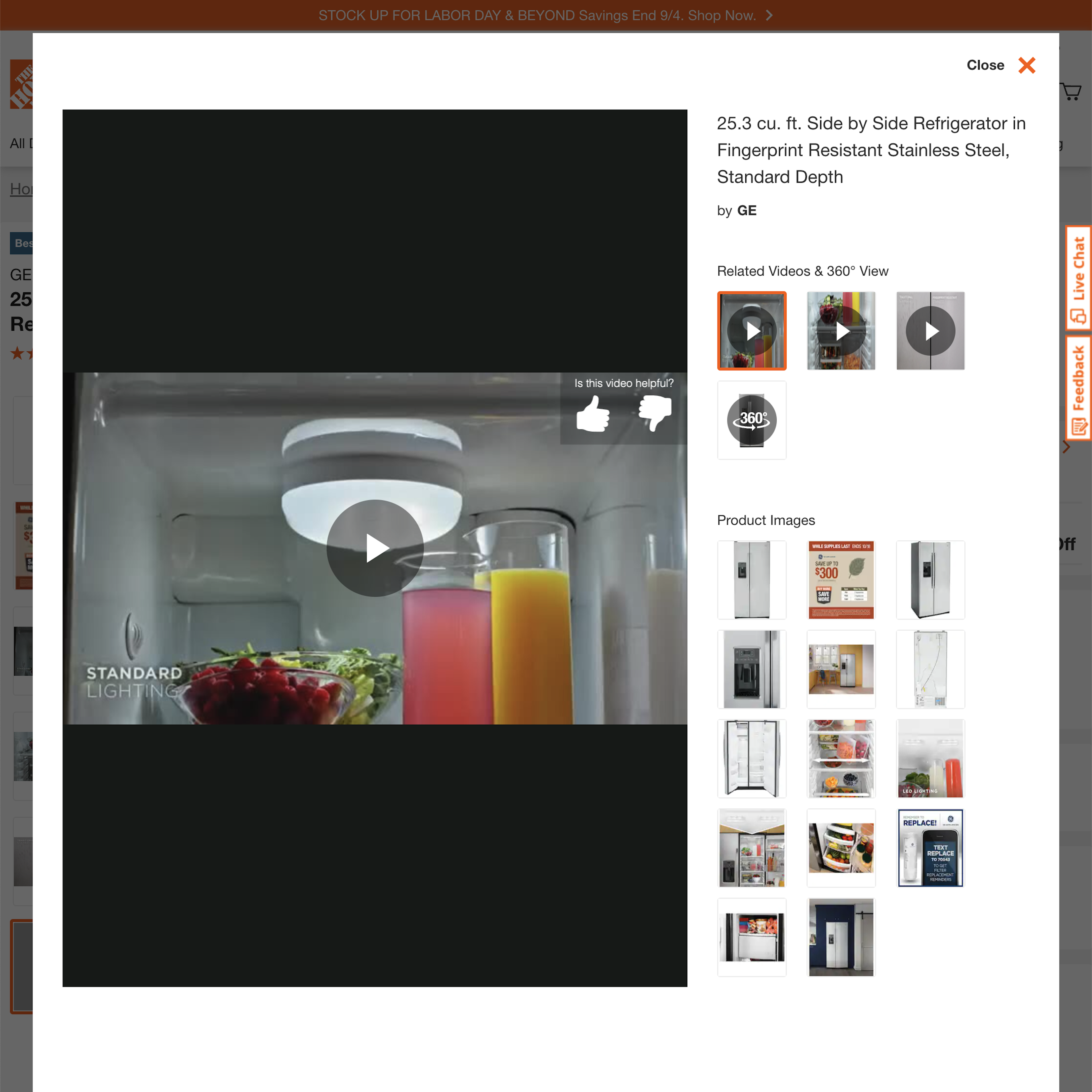
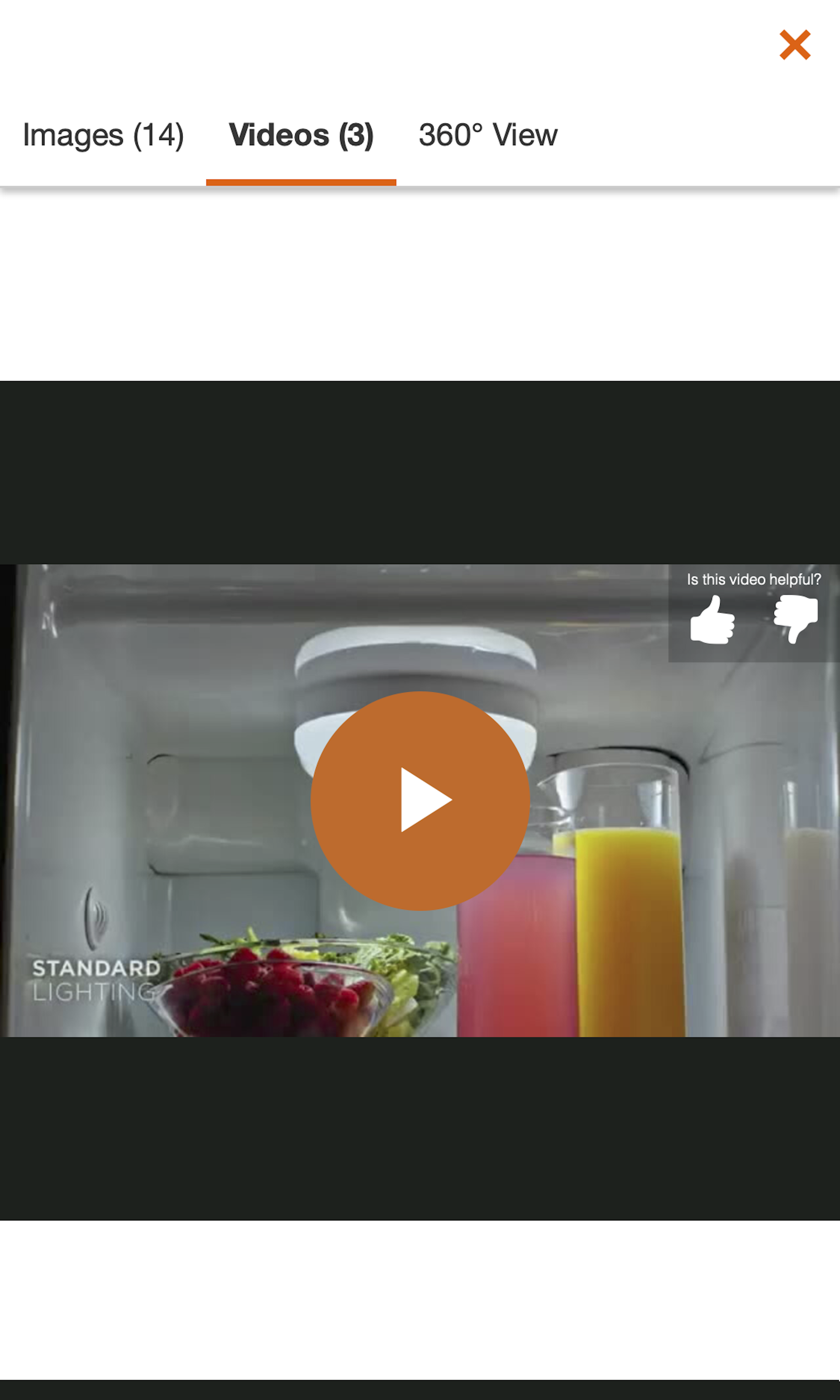
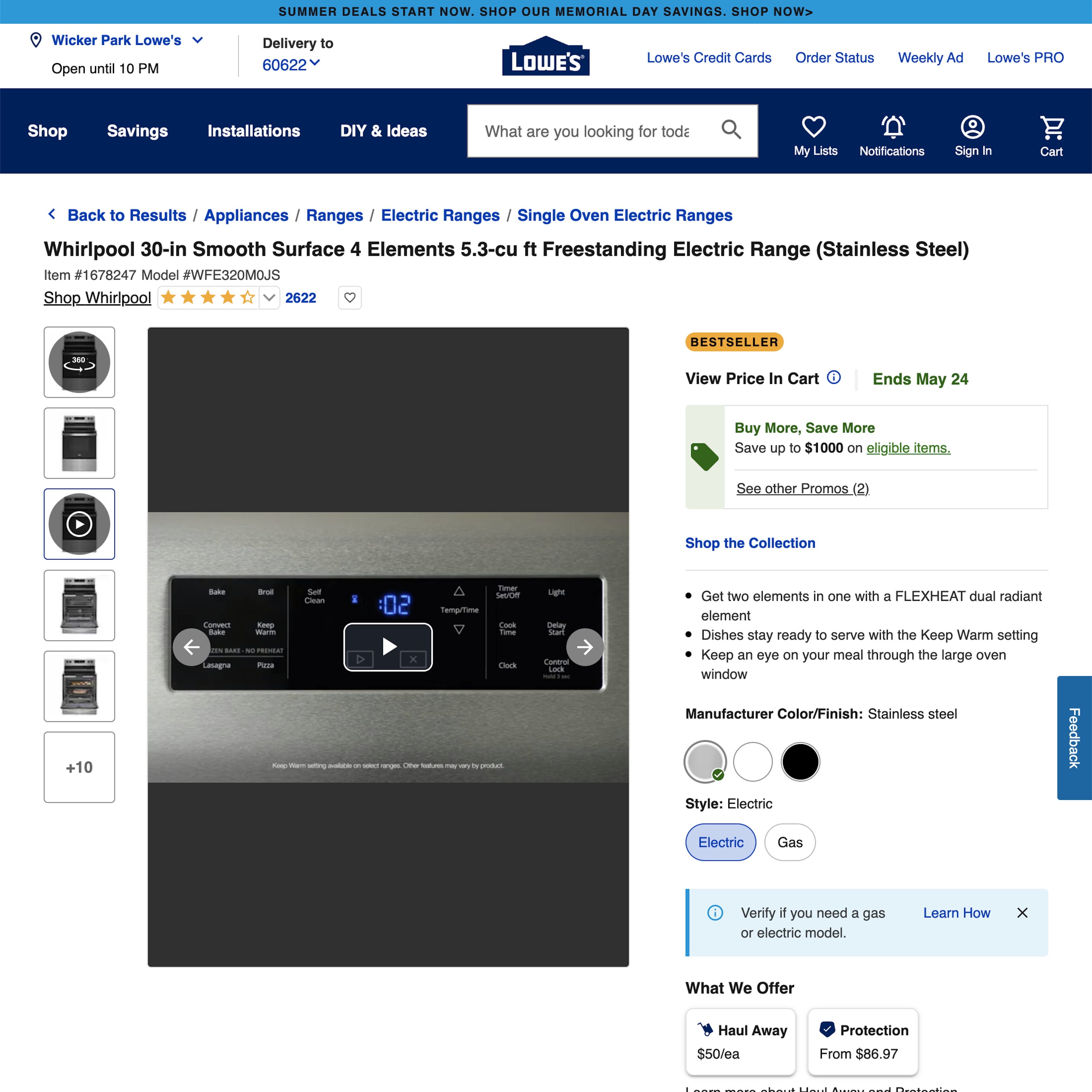
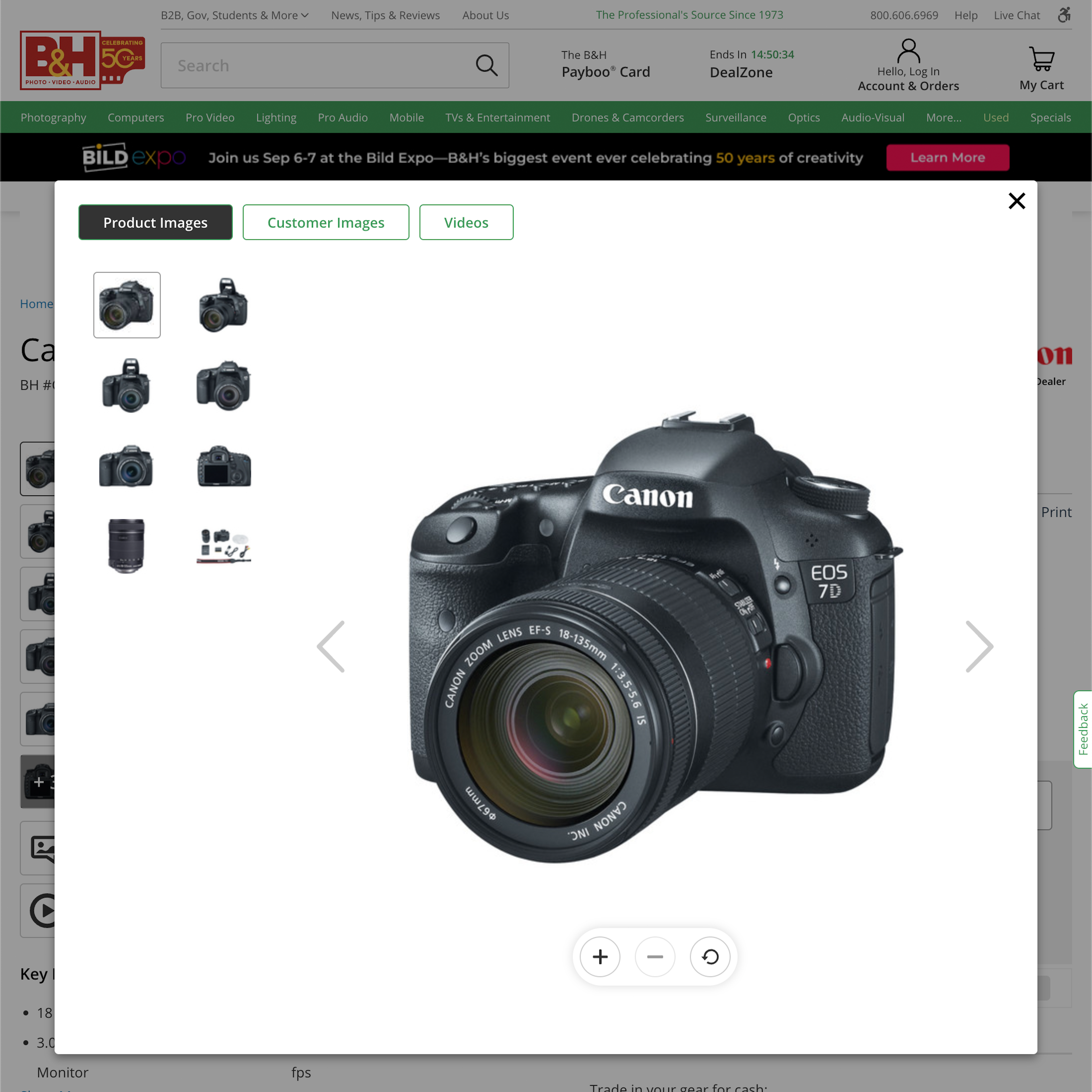
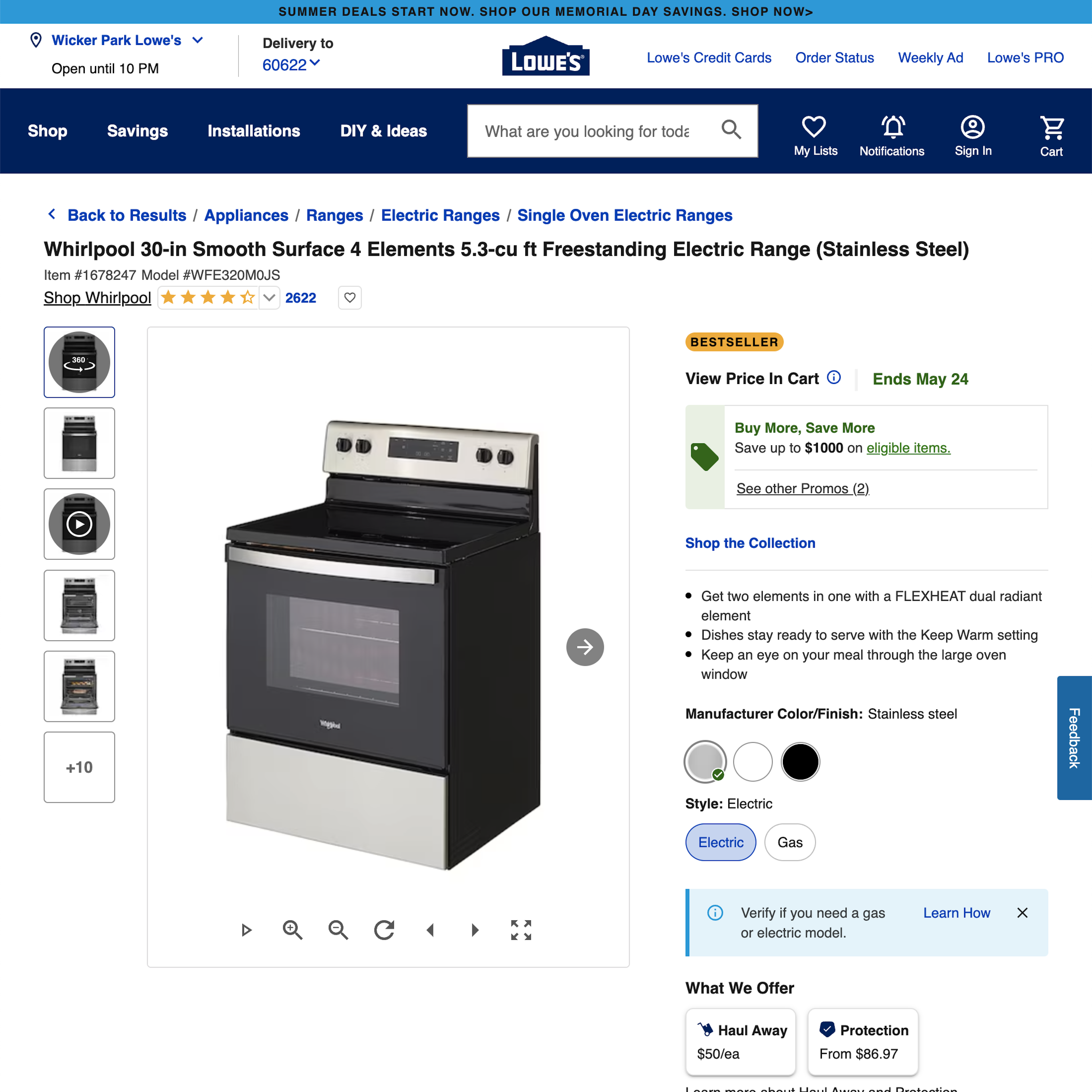
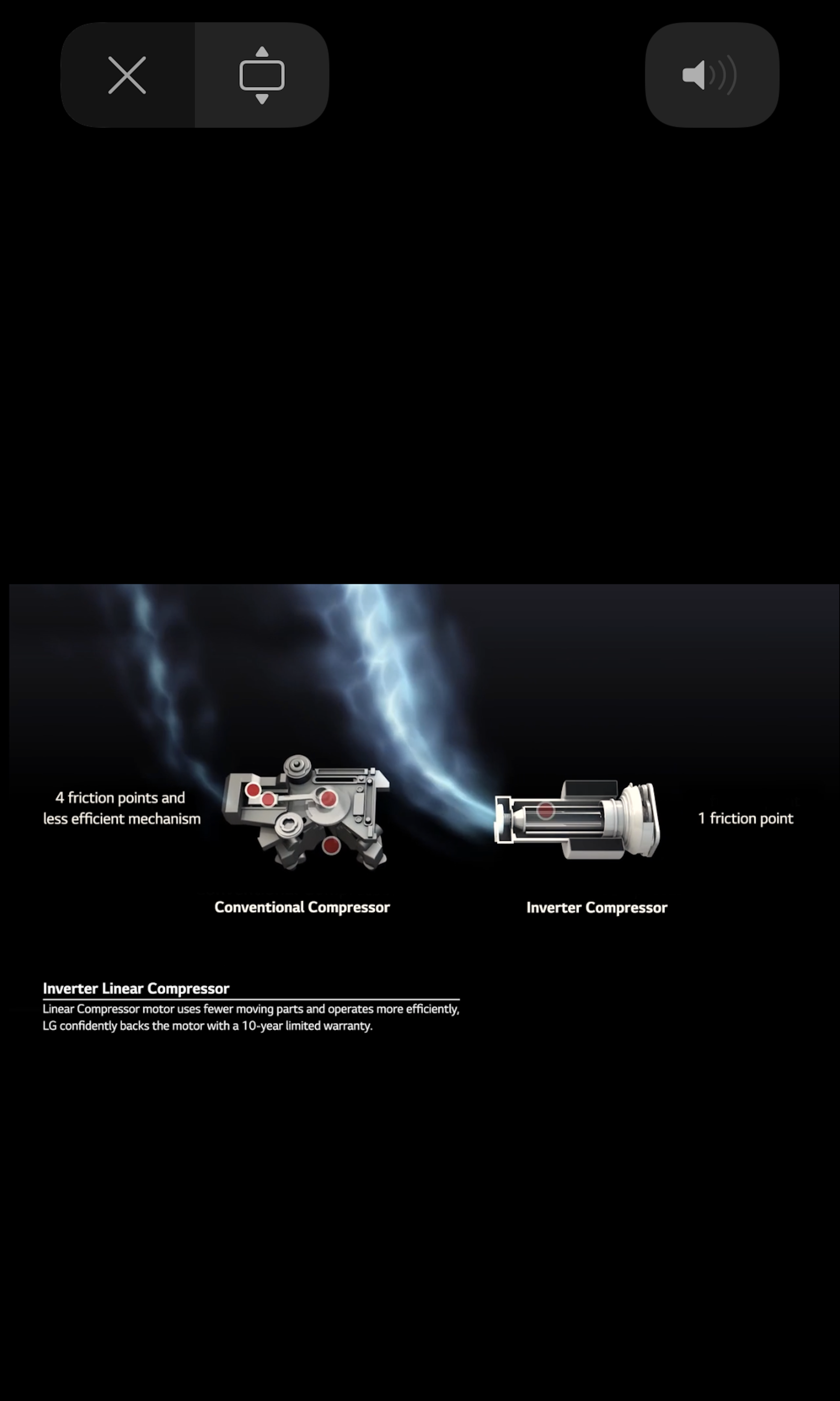
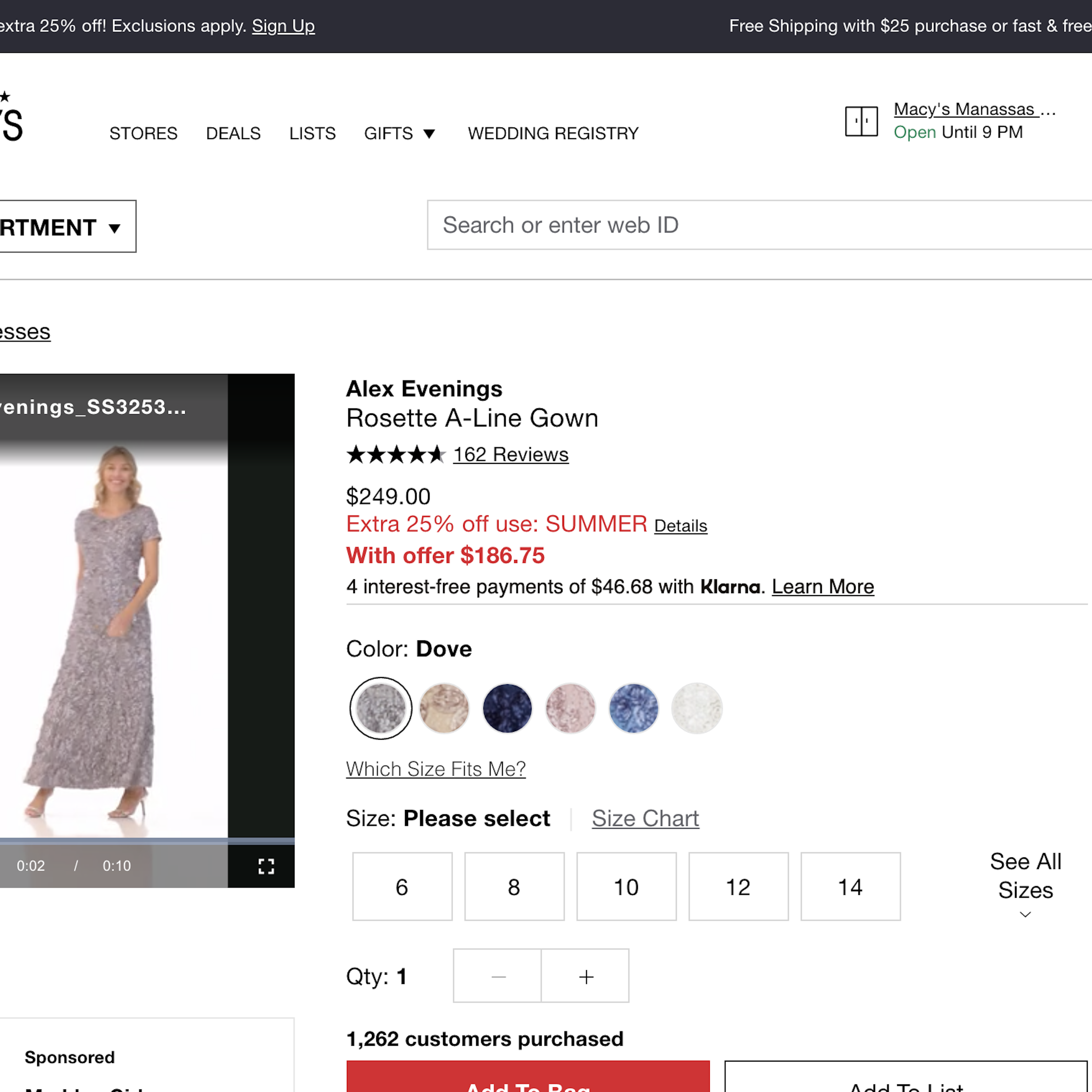
As product images are static and flat, there’s a limit to the amount of visual product information they can convey. Unsurprisingly, in our large-scale UX testing, the more visually rich product videos and 360-view features were received very well by a subset of users, providing a “feel” for the product that static images cannot convey.
More ‘Video & 360-Views’ Insights
-
Yet, our testing also revealed that these “rich visuals” should still only be considered a supplement, and not a replacement, for providing users with a high number of diverse product images: 59% of users consistently skipped product videos when exploring product pages, and 83% did not even try using the 360-feature on the product pages where it was available — both despite those users doing extensive visual inspections through the available product images.
-
Learn More: Besides exploring the 440 “Video & 360-Views” design examples below, you may also want to read our related article “Product Page UX: All Products Need at Least One ‘In Scale’ Image”.
-
Get Full Access: To see all of Baymard’s product page research findings you’ll need Baymard Premium access. (Premium also provides you full access to 200,000+ hours of UX research findings, 650+ e-commerce UX guidelines, and 275,000+ UX performance scores.)
User Experience Research, Delivered Weekly
Join 60,000+ UX professionals and get a new UX article every week.

User Experience Research, Delivered Weekly
Join 60,000+ UX professionals and get a new UX article every week.

Explore Other Research Content

300+ free UX articles based on large-scale research.

327 top sites ranked by UX performance.

Code samples, demos, and key stats for usability.


