
Ecommerce Category Pages: Definition, Usage, & Design Tips
For ecommerce stores, category pages can be a huge help for customers.
What is an ecommerce category page?
An ecommerce category page is a navigational hub that organizes a section of a product catalog and helps shoppers find their way to the right subcategory or product type.
Rather than displaying a browsable, filterable grid of products in a list, a category page presents the structure of what's available — subcategory tiles, featured brands, editorial banners, and curated sections — so users can orient themselves and navigate deeper into the site.
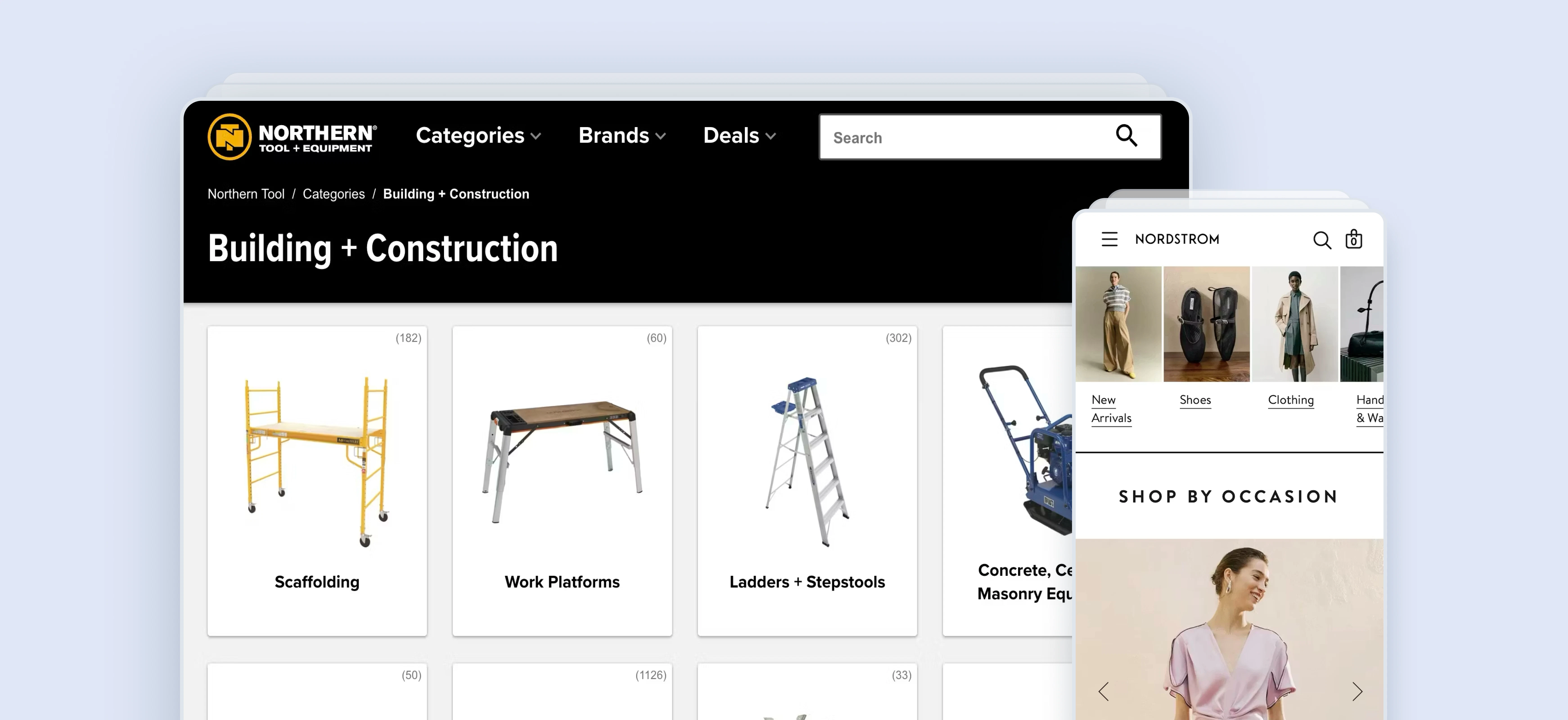
Think of a homeware store’s "Power Tools" page. A shopper landing there doesn't see hundreds of power tools in a filterable grid. Instead, they see clearly grouped subcategory links (Drills, Saws, Sanders, Grinders, etc.), along with featured brands and promotional banners for current offers. The page's job is navigation, not browsing.
Note that sites with a small catalog of products may not need these intermediary category pages between the homepage and product listing pages (PLPs). However, they are effective for sites with a large catalog. For especially large online stores, a secondary layer of category pages may also be necessary.
"Intermediary Category Pages are category pages used at the first one to three levels of a site’s hierarchy (depending on the size of the product catalog) that don’t show a list of products, but rather show the subcategories they contain – each depicted with a representative thumbnail."
— Christian Holst, Co-founder, Baymard Institute
Why category pages matter for ecommerce
32% of ecommerce sites don’t have any kind of category pages, despite them consistently performing well in Baymard’s usability testing.
Category pages carry more strategic weight than most teams give them credit for, for three reasons in particular.
They are the first navigation layer most users encounter
After the homepage, category pages are where users form their first impression of how a site is organized. If the structure is unclear, subcategory options are ambiguous, or the page is dominated by promotional content that obscures navigation, users abandon; not because they couldn't find a product they wanted, but because they couldn't find where to look for it.
"The clear strength of the category approach is that if a user is in doubt of which product he wants, a category page is a great place to explore his options."
— Christian Holst, Co-founder, Baymard Institute
They offer a chance to highlight promotions & valuable content
Users often need inspirational paths or guidance to make the right navigation choices, and category pages offer a great way to surface relevant content to help those users. Consider linking to inspirational content such as editorial pieces, buying guides, and help center content that can assist a user’s buying decision (this is particularly important for large purchases).
Intermediary category pages can also be used to highlight category-specific offers and deals, but proceed with caution: Baymard’s research shows that these promotional assets should come after initial subcategory links rather than vying for prime placement on the page.
They are primary SEO landing pages for high-value head terms
Broad, commercially important search queries — "power tools," "women's clothing," "garden furniture" — typically map to category pages, not PLPs. A well-structured, well-optimised category page can rank for and capture significant organic traffic that represents some of the highest-value visitors on your site.
Category Pages vs. product listing pages vs. collection pages: What’s the difference?
These terms are used interchangeably across the industry, which can sometimes cause design confusion. Here's how they differ:
Category page/ICP
- Primary purpose: Navigation; helps users find the right subcategory
- Core content: Subcategory tiles, brand links, editorial banners
- Example: "Power Tools", "Women's Clothing”, "Electronics"
Product listing page (PLP)
- Primary purpose: Discovery; helps users browse and filter products
- Core content: Filterable product grid, sort controls, pagination
- Example: "Drills", "Women's Jeans", "4K TVs"
Collection page
- Primary purpose: Editorial; groups products around a theme or campaign
- Core content: Curated product grid, editorial content
- Example: "New Arrivals", "Summer Picks", "Staff Favourites"
Brand page
- Primary purpose: Brand navigation or browsing
- Core content: Brand subcategories or filterable brand product grid
- Example: "All DeWalt Products", "Nike"
The key distinction is that a category page helps users navigate to products; a PLP is where they browse and filter them. A user clicking "Power Tools" in a site's main navigation lands on a category page. A user clicking "Drills" within that page lands on a PLP.
It's worth noting that some retailers combine both functions on the same page, showing subcategory tiles above a product grid. This hybrid pattern can work for mid-depth categories, but it introduces design complexity and requires careful visual hierarchy to avoid confusing users about what mode they're in.
Anatomy of an ecommerce category page
A well-structured category page is made up of several distinct components. While not every page will include all of these, understanding what each does helps clarify how they should be prioritized:
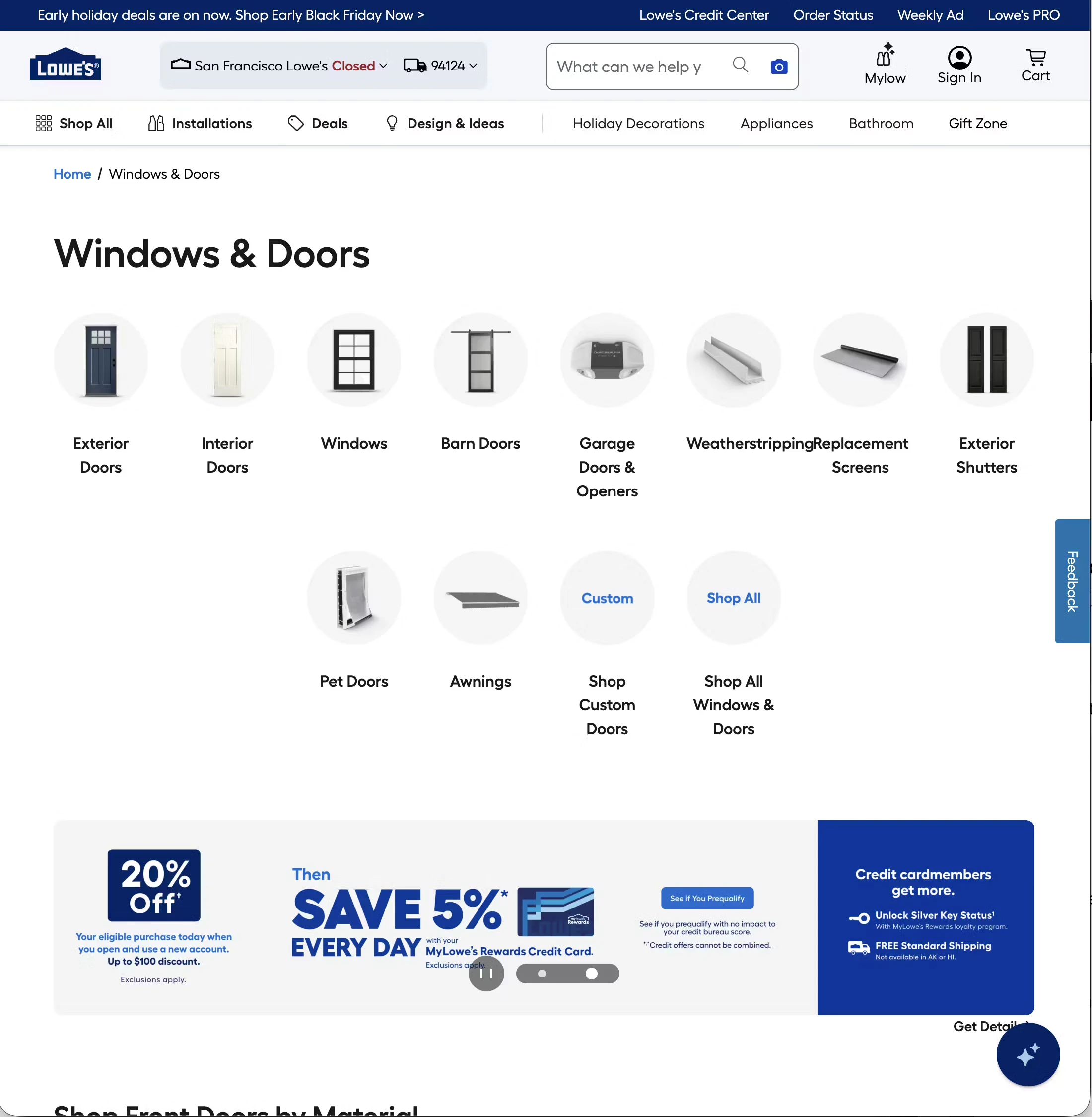
- On-page title (H1 heading): Clearly names the category in language users recognize and search for (e.g., "Power Tools," not "Powered Equipment Solutions").
- Breadcrumb navigation: Shows the user's position in the site hierarchy (e.g. Home > Tools > Power Tools) and provides a quick path back up the tree.
- Subcategory navigation tiles: The primary content of the page. Visual tiles or cards linking to child categories. These should be prominent, above the fold, and use clear labels and identifying imagery.
- Featured brands section: Brand logos or tiles linking to brand-specific pages. Particularly common in multi-brand retail categories like tools, electronics, and sports equipment.
- Promotional/editorial banners: Hero banners or inline banners surfacing current sales, new arrivals, or campaign messaging. Valuable but should not compete with or delay access to subcategory navigation.
- Curated product sections: A selective display of individual products within the category (e.g. "Top Sellers in Power Tools," "New Arrivals"). Useful for surfacing purchase intent earlier, but should remain secondary to navigation.
- Cross-category suggestions: "You may also need" sections linking to adjacent categories. Useful on complex categories where users may not know exactly what they're looking for (e.g. suggesting "Power Tool Accessories" on a Power Tools page).
- Buying guides or resource links: Common on high-consideration categories like tools, electronics, and appliances, where users benefit from educational content before they start browsing products.
- Category description: A brief descriptive paragraph that provides context.
Types of ecommerce category pages
Not all intermediary category pages are structured the same way. The approach a retailer takes typically reflects the depth of their catalog, the complexity of their taxonomy, and the role editorial content plays in their brand.
- Pure navigation pages contain subcategory tiles and brand links with minimal editorial content. Clean, fast, and easy to scan — but can feel sparse on large screens. Most appropriate for utilitarian or trade-oriented retailers where users arrive with clear intent and want to navigate quickly.
- Editorial-heavy category pages blend subcategory navigation with hero banners, campaign content, and curated product selections. Common in fashion and lifestyle retail, where the category page is also a brand expression opportunity.
- Hybrid ICP + PLP pages show subcategory tiles above a product grid, allowing users to either drill down into a subcategory or start browsing immediately. This can work well for mid-depth categories where the subcategory count is small and the product set is manageable. It requires clear visual separation between the navigation layer and the product grid to avoid confusing users.
- Brand hub pages are structured around a manufacturer or brand rather than a product type. Common in tools (a DeWalt hub page), electronics (an Apple hub page), and sports equipment. May function as a pure navigation page (linking to DeWalt subcategories) or as a hybrid page (showing top DeWalt products alongside subcategory tiles).
Ecommerce category page design best practices
Baymard’s large-scale usability testing has uncovered a number of user behaviors and expectations when it comes to category pages. Here are some best practices to follow.
Make subcategory navigation the primary content
The fundamental job of a category page is to get users to the right subcategory quickly, yet 76% of sites don’t feature subcategories as the primary content on intermediary category pages. Subcategory tiles should be the first thing a user sees when they land on the page — above promotional banners, above curated product sections, and above everything else except the page header and breadcrumb. If a user has to scroll to find subcategory options, something is wrong with the hierarchy.
Take a look at this video for more information:
Use plain language for subcategory labels
Tile labels should use the language customers use — both in conversation and in search. "Circular Saws" outperforms "Rotary Cutting Tools." "Women's Jeans" outperforms "Denim Bottoms." Where internal naming conventions differ from customer language, customer language wins. Reviewing your search query data is one of the fastest ways to audit this.
Use imagery that helps users identify, not just decorate
Subcategory tiles work best when the imagery genuinely helps users identify what's in each category, such as a clear photo of a drill on the "Drills" tile, a saw on "Saws."
“During testing we observe that it’s the intermediary category page’s display of the subcategories, each with an accompanying thumbnail, that helps to clarify the differences among the available subcategories and thereby guide users."
— Christian Holst, Co-founder, Baymard Institute
Abstract or lifestyle imagery that looks attractive but doesn't immediately identify the category slows users down and increases wrong-turn navigation. Use images that help users decide their next move quickly and easily.
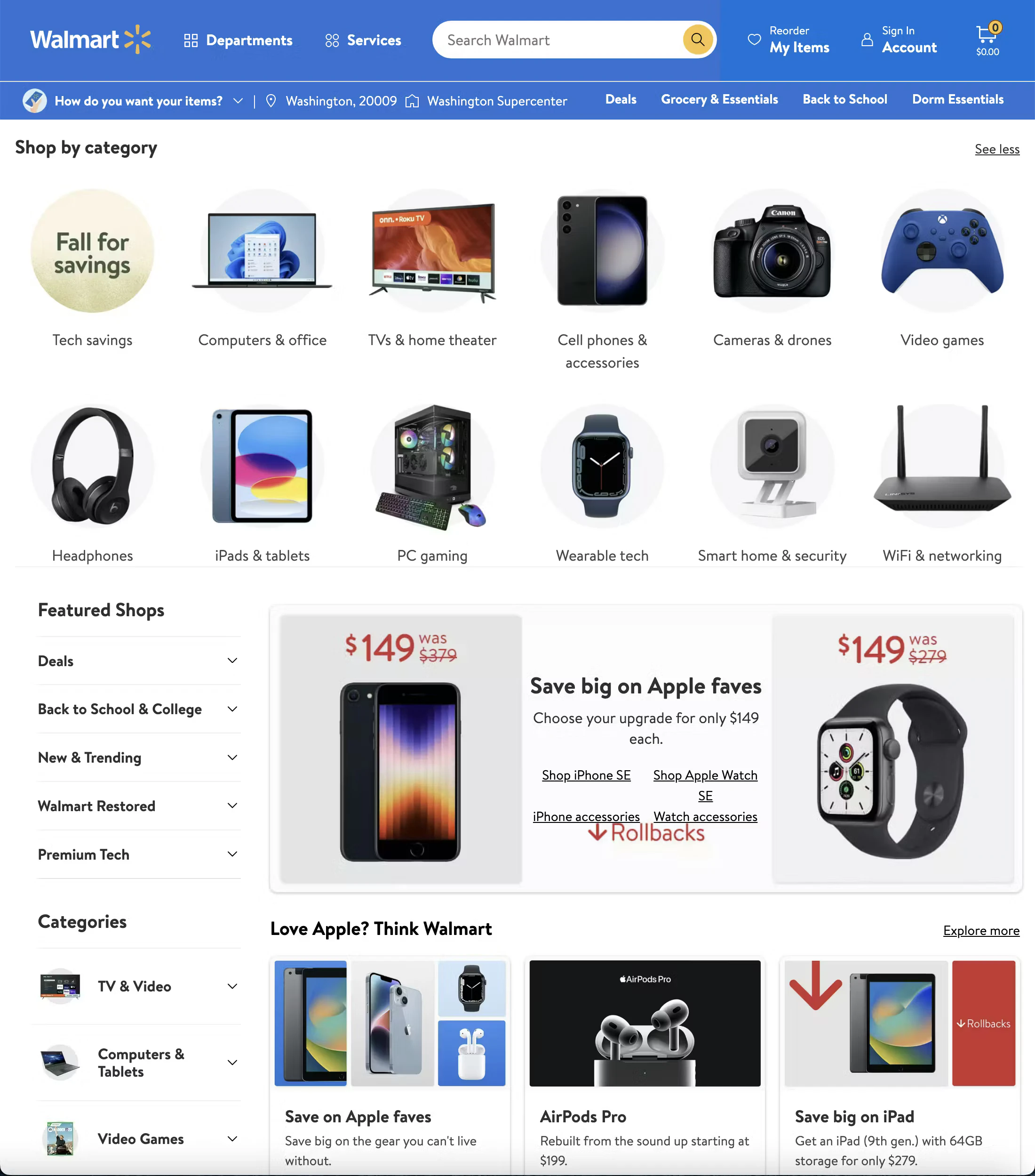
Walmart's electricals category page has subcategory links supported by clear thumbnail images.
Consistency of image style across tiles also aids scanning — a mix of product photography styles and backgrounds makes a tile grid harder to read.
Keep the number of top-level subcategories manageable
Presenting 20 or more tiles at the same visual weight creates decision fatigue. Where a category has significant depth, consider grouping subcategories under section headings (e.g. a "Saws" section with Circular, Table, Mitre, Jigsaw tiles beneath it) rather than listing every variant as an equal top-level option. Grouping helps users navigate large catalogs without being overwhelmed.
Integrate promotional content without obscuring navigation
Promotional banners and editorial sections have a legitimate place on category pages – but only on desktop (they should be avoided on mobile due to the limited screen real estate).
They surface offers, highlight new products, and provide a brand experience moment. But they should not come at the expense of navigation clarity. A hero banner that pushes all subcategory tiles below the fold on desktop — and entirely off the first screen on mobile — is a navigation failure dressed up as a marketing win.
Surface curated products selectively
A small curated product selection within a category page (top sellers, new arrivals, editorially chosen highlights) can be valuable — it gives users with clearer intent a faster path to a product without drilling through subcategories. But the product selection should be genuinely curated and clearly labeled, and it should remain secondary to subcategory navigation in both placement and visual weight. A product section so large it starts to function as an unfiltered PLP defeats the purpose of the category page.
Tip: Get instant UX feedback on your category pages
See how your category pages stack up with UX-Ray. Scan your site and uncover the usability issues impacting conversions. Powered by 200,000+ hours of UX research.
Category page SEO: What UX designers and developers need to know
Category pages are typically the most valuable SEO real estate on an ecommerce site. Here are a few principles worth building into your process:
- Match the H1 to search intent. The page title and H1 should use the natural language your customers search for, not internal naming conventions or brand terminology. "Power Tools" ranks; "Powered Equipment" doesn't.
- Category copy at the bottom is fine for search engines. Google indexes content wherever it sits on the page. Placing the category description below all navigational and editorial content is both the correct UX decision and entirely compatible with SEO objectives.
- These pages attract your highest-value organic traffic. Head-term category queries ("power tools," "women's clothing," "outdoor furniture") represent users with broad but genuine commercial intent. Investment in category page quality — both UX and content — pays back directly in organic traffic quality.
- Internal linking from category pages distributes crawl equity. Clear, well-structured links from category pages to subcategories and key product pages help search engines understand site hierarchy and ensure important pages are crawled efficiently. A well-structured ICP is good for users and good for SEO simultaneously.
- Thin category pages struggle to rank. A category page with nothing but a handful of subcategory tile links and no other content gives search engines very little to work with for competitive head terms. A category description, curated product sections, and resource links all contribute to page depth.
Mobile category page design tips & best practices
Traffic from mobile drives the largest portion of visitors to ecommerce sites (74% in March 2026, according to Mastercard), meaning mobile is a primary shopping channel and can’t be treated as a secondary consideration.
Baymard’s research also shows that around a third of mobile app shoppers like to browse through categories especially when they are unsure of exactly what they need or are looking for inspiration.
Yet category pages present specific UX challenges on mobile devices. Large navigational pages with multiple content types need to work within a significantly constrained viewport.
Here are some mobile category design tips to ensure you provide a good experience for mobile shoppers:
- Subcategory tiles adapt to a two-column or single-column layout. On mobile, a large desktop tile grid will typically reflow to two columns. Ensure that tile labels remain fully readable at smaller sizes and that images still clearly identify their category at thumbnail scale.
- Hero banners need mobile-specific sizing. A large landscape banner designed for desktop can consume the entire mobile viewport, pushing all subcategory navigation off the first screen. Either use separate mobile-optimised banner crops or significantly reduce banner height on smaller screens.
- Horizontal scrolling subcategory strips are an efficient mobile pattern. Rather than a vertical tile grid, subcategories can be presented as a horizontally scrollable row of chips or tiles near the top of the page, surfacing the most popular or important subcategories without requiring vertical scrolling to see them.
- Sticky navigation aids orientation in deep category structures. A sticky department tab bar or header that remains visible as users scroll helps users reorient themselves and move between major categories without scrolling back to the top. Particularly valuable on editorial-heavy category pages where users may scroll a significant distance.
Common category page design mistakes
When designing intermediary category pages, avoid these pitfalls:
- Leading with a hero banner that pushes subcategory navigation below the fold. This is the single most common and most damaging mistake on intermediary category pages. When the first screenful of content is a promotional banner and the actual navigation is below the fold, a significant proportion of users will never reach it.
- Using decorative imagery on subcategory tiles instead of identifying imagery. Abstract, lifestyle, or brand photography that looks attractive but doesn't immediately communicate what's in the subcategory slows navigation and increases wrong-turn clicks.
- Too many top-level tiles without grouping. An ungrouped grid of 20+ subcategory tiles presents users with a near-identical choice too many times. Grouping under section headings dramatically reduces cognitive load.
- Conflating the category page with a PLP. Adding a large, unfiltered product grid to a category page without clear visual hierarchy creates a page that tries to do everything and does nothing particularly well. Users aren't sure whether to navigate via tiles or scroll through products.
- Category names that reflect internal logic rather than customer language. Naming conventions that make sense to the buying team often don't match how customers think or search. Audit your category names against search query data regularly.
Category page UX examples: What good looks like
Below are three UX best practice examples of ecommerce category pages (one each from desktop, mobile, and app) that demonstrate the features outlined above.
Home Depot’s desktop category pages
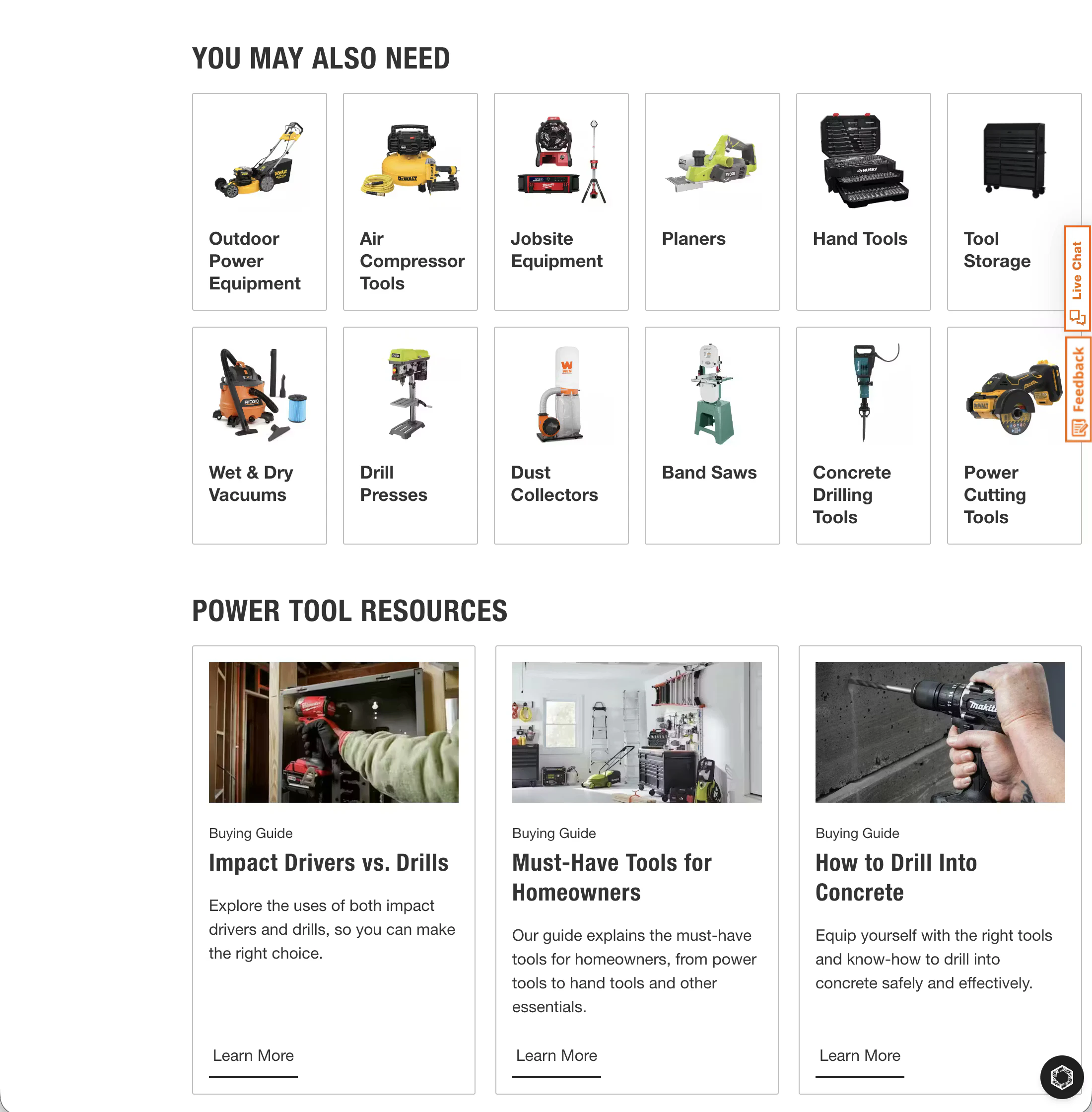
Home Depot provides a good user experience via its category pages. Subcategory navigation is well-organised into logical groupings, making a large and complex catalog feel navigable.
Cross-category "You May Also Need" links help users who don't yet know exactly what they're looking for, and there are helpful links to secondary content pages like buying guides to support the user’s decision-making process.
Apple’s mobile category pages
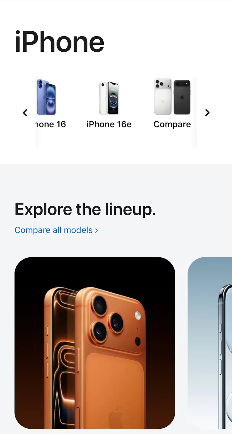
Apple uses intermediary category pages well on its mobile site, presenting the initial product catalog in logical categories. Once users have navigated to their chosen category, Apple displays relevant subcategories, allowing users to narrow their search further.
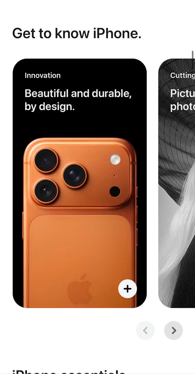
Apple also surfaces additional content on the category page to aid users in their buying decisions.
Crate & Barrel’s mobile app intermediary category pages
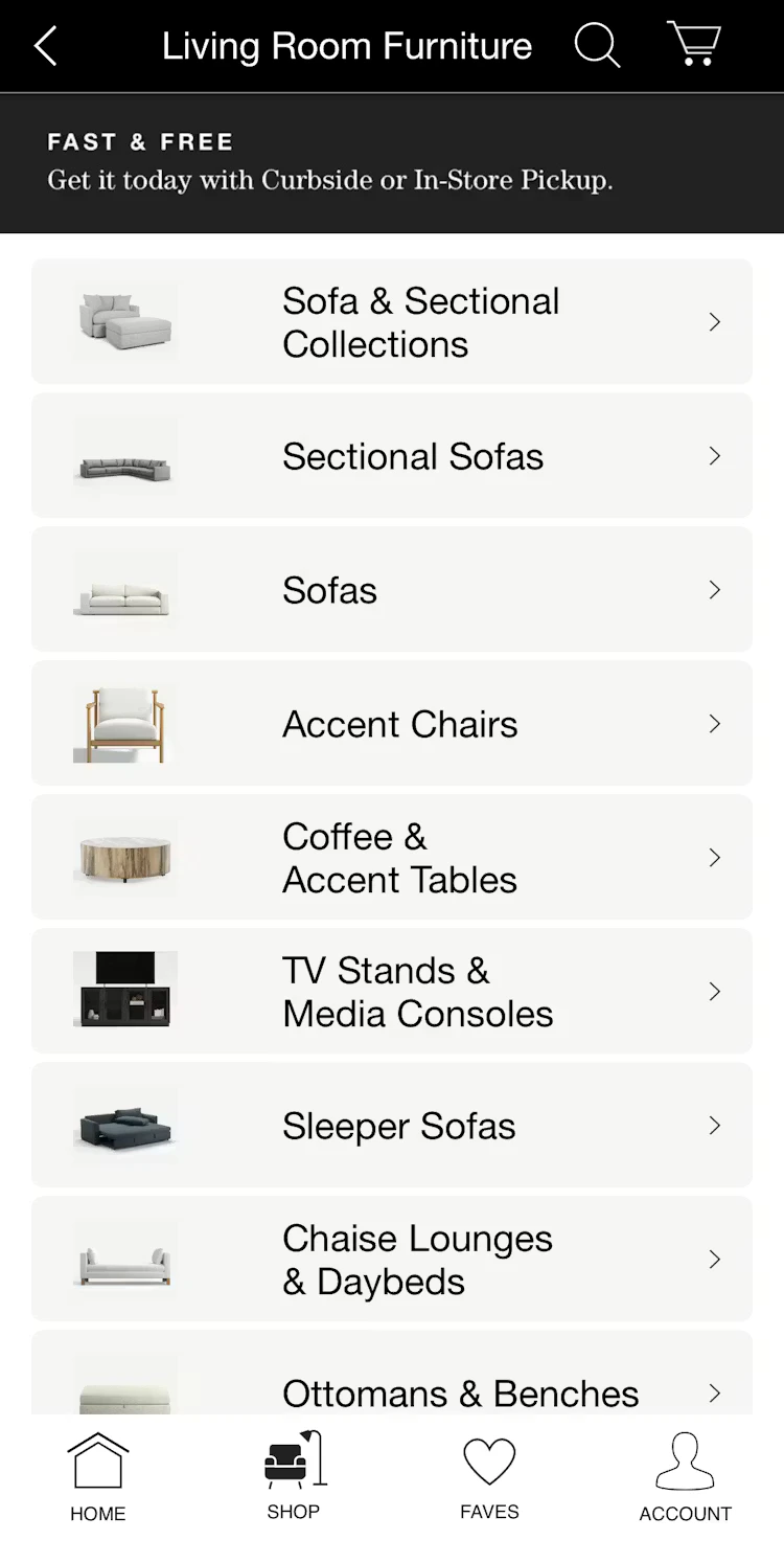
With a large and broad product catalog, home furniture retailer Crate & Barrel uses intermediary category pages at levels one and two of its taxonomy. For example, in the above screenshot, the user is presented with subcategories after initially browsing the “Living Room Furniture” category page. Crate & Barrel also uses thumbnail images that clearly show what the user can expect when they navigate to their chosen subcategory, reducing friction and aiding decision-making.
Build category pages backed by real user research
If you’re looking for more category page UX design inspiration and evidence-backed insights to help back up your recommendations, Baymard has 900+ annotated best (and worst) practice category page design examples from our large-scale usability testing.
Access UX Research
Sign up to Baymard for free to get access to our UX research, best practice guidelines, benchmarks, and more, based on 200,000+ hours of usability testing.
Ecommerce category page frequently asked questions
What is the difference between a category page and a product listing page?
A category page (or Intermediary Category Page/ICP) helps users navigate to the right subcategory. It displays subcategory tiles, brand links, and editorial content. A product listing page displays the actual products within a subcategory in a browsable, filterable grid. A user clicking "Power Tools" lands on a category page; clicking "Drills" within that page lands on a PLP.
What should be on an ecommerce category page?
At minimum: a clear H1, breadcrumb navigation, and subcategory tiles using plain-language labels and identifying imagery. Depending on the category and audience, a category page may also include featured brand sections, promotional banners, curated product highlights, buying guides, and a brief description. The category description should always sit at the bottom of the page.
How many category pages should my ecommerce website have?
Rather than aiming for an arbitrary total, your site's category count should be dictated by your catalog size and the distinctiveness of your products. As a general rule, aim for 10–15 top-level categories and no more than 10–15 subcategories per section, ensuring each subcategory contains at least 10 products to justify its existence.
If product types share similar attributes, they should be handled via filters rather than separate pages to avoid fragmenting the shopping experience. Ultimately, large catalogs may require intermediary pages to manage broad scopes, while smaller sites (under 25 total products) should maintain a shallow, simple structure to prevent unnecessary navigation friction.
Research Director and Co-Founder
Christian is the research director and co-founder of Baymard. Christian oversees all UX research activities at Baymard. His areas of specialization within ecommerce UX are: Checkout, Form Field, Search, Mobile web, and Product Listings. Christian is also an avid speaker at UX and CRO conferences.