
What Is an Ecommerce Filter? UI Best Practices
An ecommerce filter is a user interface (UI) mechanism that allows shoppers to narrow down a product catalog by selecting specific attributes (such as price, size, color, brand, or customer rating). Rather than scrolling through hundreds of irrelevant results, users can define exactly what they're looking for and surface only the products that match.
Filters are a foundational component of faceted navigation, a system that lets users apply multiple attributes simultaneously to refine results. You'll find them on virtually every major ecommerce site, from fashion retailers to electronics stores, because they solve one of the most fundamental challenges in online shopping: helping people find the right product, fast.
Why ecommerce filters matter for UX
When filters work well, they're nearly invisible; users simply find what they're looking for. When they don't, shoppers abandon the page. That means money left on the table and frustrating consumer experiences.
"With the right filters and a clear filtering interface, users are able to narrow down product lists with thousands of generic products to only the few items relevant to their unique needs and interests."
– Christian Holst, Co-founder, Baymard Institute
However, Baymard’s research consistently finds that product filtering is one of the most problematic areas across ecommerce sites. Our large-scale usability studies find that the majority of ecommerce sites have filtering experiences that are "mediocre” to “poor”.
The UX impact of filters goes beyond convenience:
- Reduced cognitive load. Instead of scanning hundreds of products, users make a few targeted selections and work with a manageable result set.
- Shorter time-to-product. Effective filtering directly shortens the path from landing on a category page to adding an item to cart.
- Higher conversion rates. Users who engage with filters tend to be more purchase-intent — they're narrowing down, not browsing casually.
Filter UI components
Not all filters are created equal. The right filter UI component depends on the attribute being filtered. Here are the most common types users will come across:
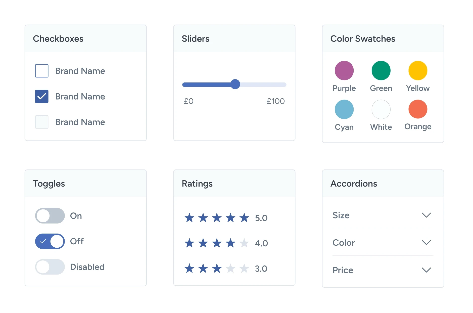
- Checkbox/multi-select filters: The most common filter type. Users can select one or more options within a category. For example, ticking "Nike", "Adidas", and "New Balance" under "Brand”. Multi-select is important here; forcing a single selection creates unnecessary friction.
- Price range slider: A dual-handle slider that lets users set a minimum and maximum price. Works best when paired with a text input so users can type exact values. Common on sites like Amazon and Wayfair.
- Color swatches: Instead of solely text labels like "Red" or "Navy", color swatches display a visual chip. Visual color chips are more intuitive for fashion and home goods. Swatches should include a tooltip or label for accessibility.
- Toggle filters: Binary on/off filters for attributes like "In Stock Only", "On Sale", or "Free Delivery". These are typically displayed as a toggle switch or a single checkbox at the top of the filter panel.
- Rating filters: Lets users filter by minimum star rating (e.g., show only products rated 4 stars and above). Common in high-consideration categories like electronics and appliances.
- Collapsible/accordion groups: When a site has many filter categories, grouping them into collapsible sections keeps the panel manageable.
Less important filter groups (e.g., "Material") can be collapsed by default, while key ones (e.g., "Price", "Size") remain open.
Filters vs. sorting vs. search: What's the difference?
Filtering, sorting, and search features are often used together, but each tool serves a distinct purpose.
Filter
- What it does: Narrows the result set by attribute
- Example: Show only products under $50 in size M
Sort
- What it does: Reorders the existing result set
- Example: Display results by lowest price first
Search
- What it does: Queries the catalog by keyword
- Example: Find all results for "running shoes"
A well-designed and user-friendly product listing page typically offers all three. Search brings the user to a results page, filters help them refine it, and sorting helps them prioritize within those refined results.
Filtering is great at removing all the irrelevant options. Sorting is great at prioritizing all the relevant results after your most important criteria.”
– Christian Holst, Co-founder, Baymard Institute
Ecommerce filter UI best practices
Good intentions often fall apart in execution when it comes to filtering. Here are the most important principles for designing filter UI that actually works.
Allow Users to select multiple options of the same filter type
Baymard’s testing revealed that consumers like to be able to select more than one option within a filtering category. However, 14% of sites in our benchmark don’t let users select multiple filter options, causing them to abandon products.
To overcome this, use “AND” Logic for filter types and “OR” logic filter options.
This video provides a quick overview of how to design the filter logic that works the way users expect.
Show result counts next to each filter option
Displaying the number of matching products next to each filter option (e.g., "Blue (34)") gives users confidence before they click. It tells them the selection will return results, and helps them gauge which options are most relevant.
This is one of the single highest-impact improvements you can make to a filter UI.
Keep filters visible on desktop; use a drawer or sticky apply button on mobile
It’s important to keep applied filters visible during the user’s browsing experience, yet 20% of ecommerce sites fail to do so.
On desktop, a persistent left-hand sidebar is the standard pattern for good reason: checkmarked filters remain in view as users scroll through results, making it easy to adjust selections without hunting for a panel.
On mobile, screen space requires a different approach; try providing the selected filters as an overview in a horizontally scrolling list, or as a stacked list above the filtered results as removable chips. Alternatively, a separate filter interface with a sticky apply button can work well on mobile.
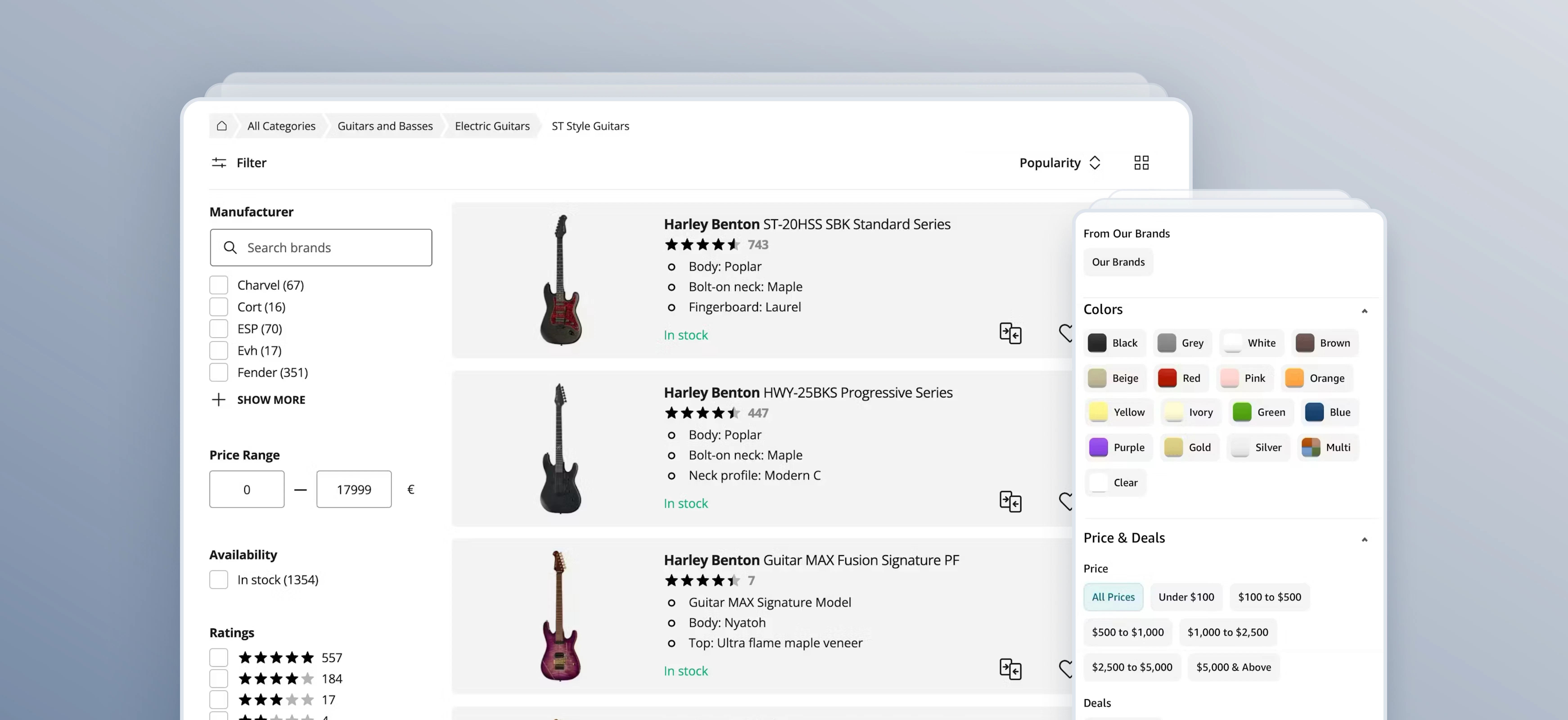
Use category-specific filters for key product attributes
Generic filters are often insufficient for the nuanced needs of modern shoppers; if a customer is looking for a laptop, "Price" and "Brand" aren't enough when they really need to filter by things like "RAM" or "Processor Speed."
According to Baymard's large-scale usability testing, users instinctively expect a corresponding filter for any key attribute displayed in a product listing, yet 25% of desktop sites and 40% of mobile stores use unclear labels, which users may skip when trying to filter for desired items. When these category-specific filters are missing, shoppers don't just move on, they waste time repeatedly scanning the sidebar in frustration, assuming the option "must be there somewhere."
Aligning your filtering interface with the specific vocabulary of each product category helps reduce cognitive load and empowers users to confidently narrow down hundreds of items to the perfect selection.
Include special-purpose filters when they matter to buying intent
If your catalog supports it, users benefit a lot from “On Sale”, “New Arrivals”, and product status filters like in-stock, fast shipping, or pickup availability.
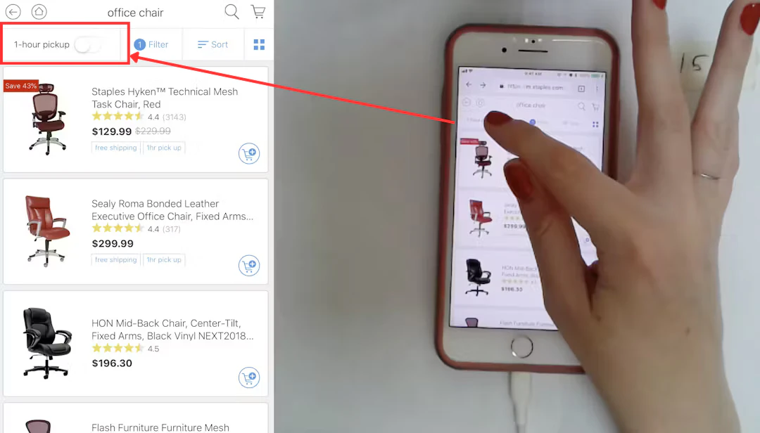
In this example, a user is able to filter the search results to show only items on the Staples mobile site that are available for pickup within one hour.
These often reflect the user’s primary shopping intent and can remove a lot of irrelevant items fast.
Consider offering filters that align with delivery, collection, and condition expectations, as this can help you streamline the comparison process and ensure that every item on the results page is a viable candidate for purchase. This transparency reduces search friction and builds trust by respecting the user’s specific timeline and budget requirements.
Allow multi-select within a filter category
Users rarely want to filter to a single brand, color, or size. Restricting selections to one option per category forces users to make an either/or decision that doesn't reflect how people actually shop. Checkboxes (not radio buttons) are the correct UI element here.
Persist filter state on “Back” navigation
If a user clicks into a product, then hits the "Back" button, their filters should still be applied. Losing filter state on back navigation is a significant frustration point that forces users to start their refinement process over. This is a technical consideration as much as a design one — ensure filter state is reflected in the URL (query parameters) so it survives navigation.
Provide clear reset options
Include both a "Clear All" option to wipe all active filters, and per-category reset links (e.g., "Clear" within the Brand group). Give users control at both levels.
Mobile filter UI: Key considerations
Mobile shoppers interact with filters very differently to desktop users, and most ecommerce sites perform significantly worse on mobile filtering. Here are some key principles for mobile filter design:
- Use a full-screen or bottom-sheet drawer. Trying to squeeze a sidebar into a mobile viewport doesn't work. Filters should occupy their own layer — either a full-screen overlay or a bottom sheet — triggered by a clearly labeled button.
- Make the trigger button sticky. The "Filter & Sort" button should remain visible as the user scrolls through results, not disappear off the top of the page. Users often want to adjust filters mid-scroll.
- Always include a prominent "Show X Results" button. On mobile, filters should require a deliberate apply action rather than updating results in real time (which causes jarring page refreshes mid-interaction). The CTA should dynamically update the result count as selections are made, so users know what they're committing to before tapping.
- Design for thumbs. Filter options should have generous tap targets (minimum 44×44 pt per Apple's HIG guidelines), and filter groups should be easy to expand and collapse with one hand.
Common ecommerce filter design mistakes
Even experienced teams fall into these traps. Here are some common filtering issues to avoid:
- Too many filters. Presenting 20+ filter categories at once overwhelms users. Prioritize the 5–10 attributes most relevant to that category, and collapse or hide the rest. A fashion site's filter panel for trousers doesn't need a "Material" filter as prominently as it needs "Size" and "Fit."
- No visibility of applied filters. If a user has filtered results but can't easily see what's active, they lose orientation. This is especially common on mobile, where filters are hidden in a drawer — always surface active filter chips in the main results view.
- Filters that silently return zero results. Allowing users to select a combination that produces no result, then showing them an empty page, is a dead end. The page needs to handle this gracefully, either by preventing the selection or by offering a clear recovery path (e.g., "No results for these filters. Try removing X.").
- Inconsistent naming. If your filters use "Colour" in one place and "Color" or "Shade" in another, users lose confidence in the system. Naming should be consistent, plain-language, and reflect how your customers actually describe products.
- Requiring a page reload to apply filters. Filters that require users to click an "Apply" button and wait for a full page reload feel slow and dated on desktop. Real-time filtering (results update as selections are made) is the expected standard for desktop experiences.
Ecommerce filter examples: What good looks like
Below are three real-world examples (one desktop, one mobile, and one app) of good filtering UX. All of these examples are from Baymard’s extensive usability testing research and benchmarking and incorporate the logic and elements outlined above.
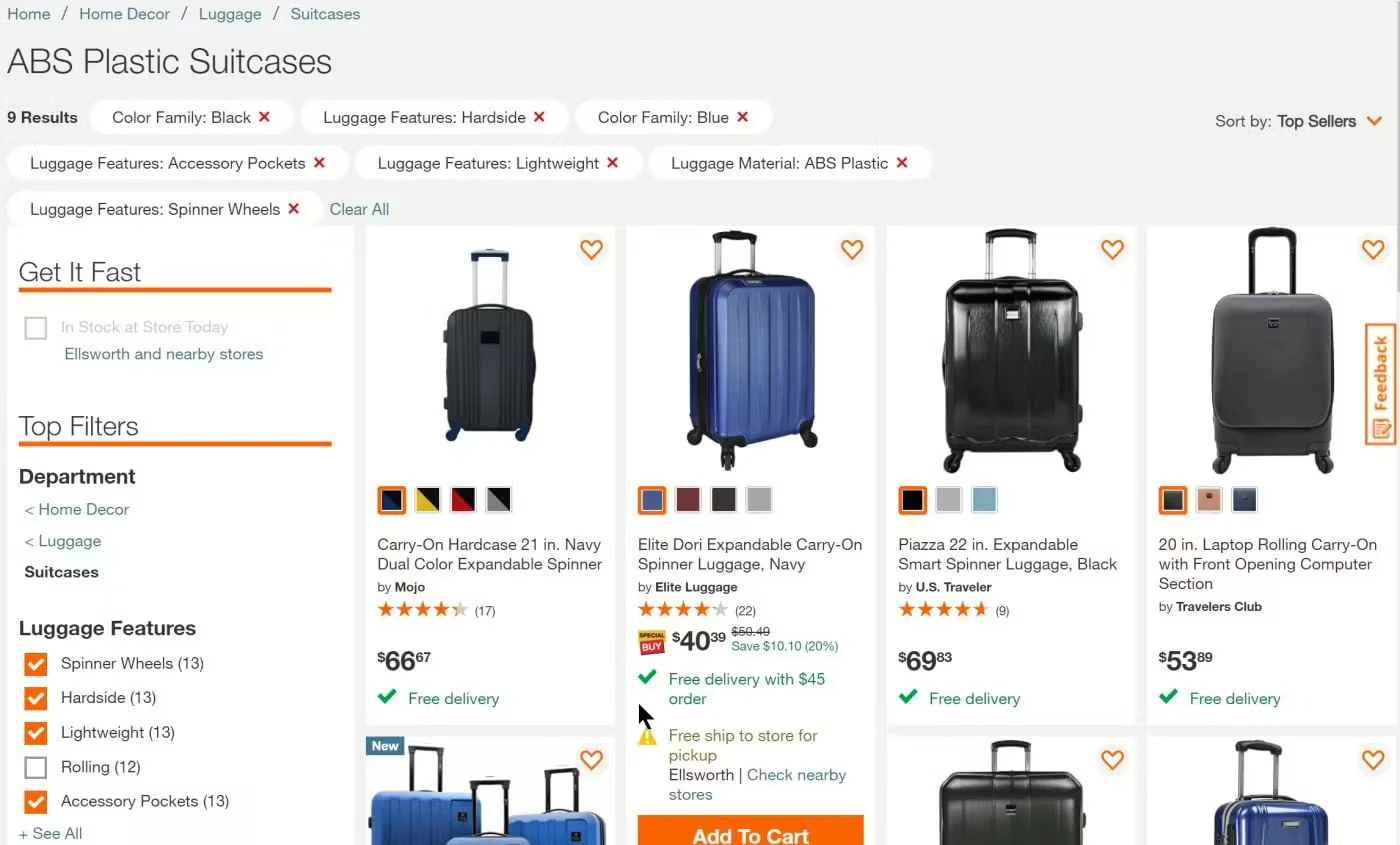
B&H Photo’s desktop filtering
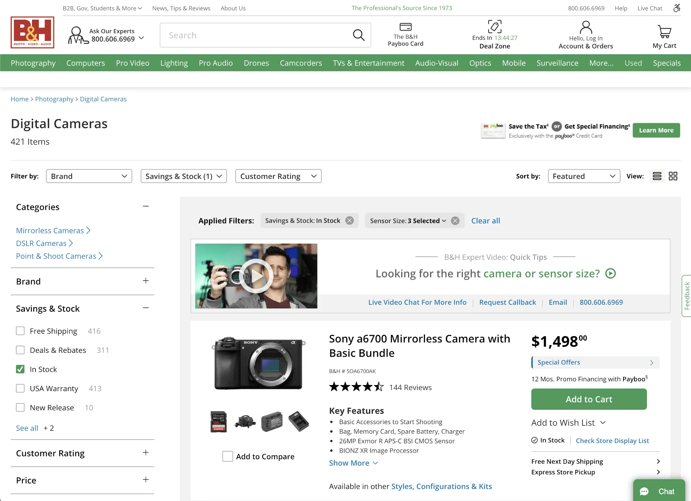
B&H Photo provides a best-in-class filtering experience on its desktop product listing pages. The store has all the typical filters a user would expect (like “Brand”, “Price”, and “Ratings”), but also includes category-specific filters which are explained in more detail via tooltips.
Applied filters are also displayed above the product list, showing users which filters they currently have selected, and enabling them to quickly remove a filter if they want to broaden the result set.
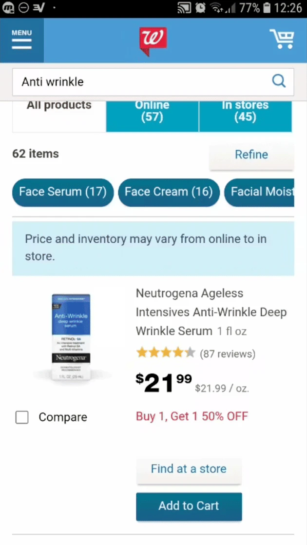
Lowe’s’ mobile filtering
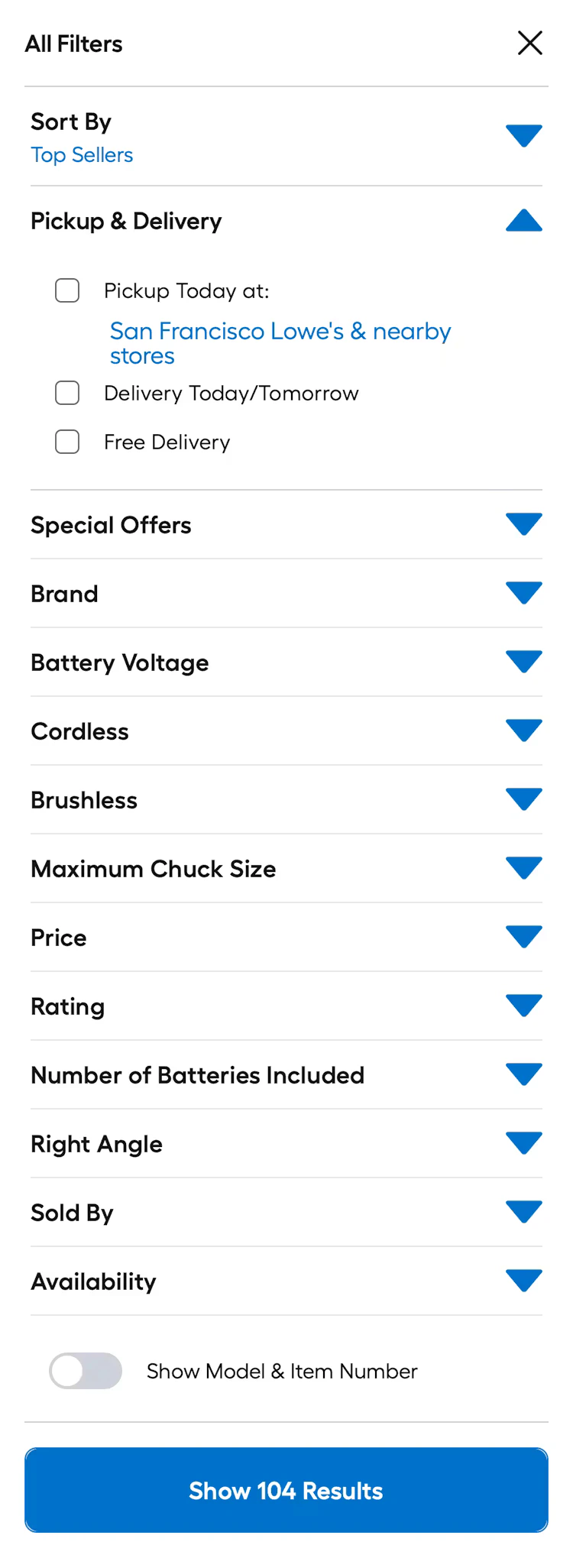
Home improvement store, Lowe’s, implements several best practices on its mobile product filtering experience. It allows users to narrow their search by the main filter types, as well as product status and “Special Offers”.
Users can also search within filter types such as “Brand”, which is helpful when there is a long list of options on mobile.
Macy’s mobile app filters
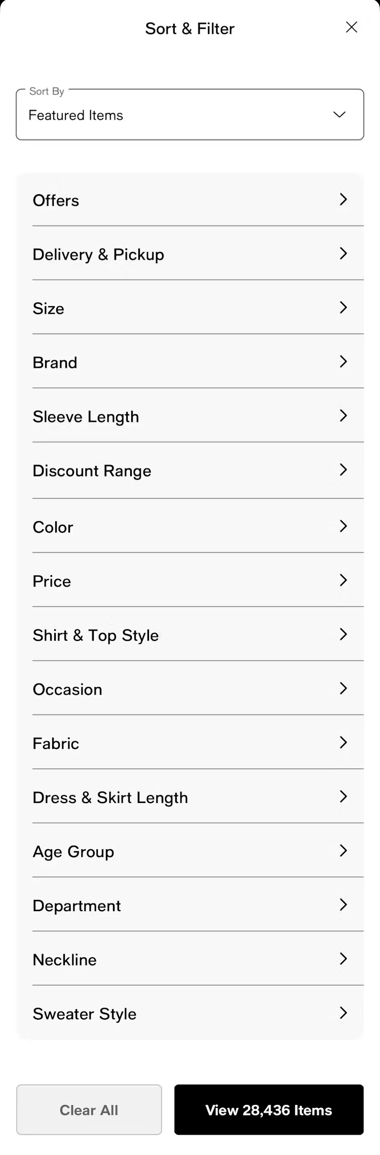
Department store, Macy’s, provides a strong filtering experience on its mobile app. This includes prioritizing important filters such as delivery/pickup, size, and brand. The app also has a clear “apply” button, which follows best practice guidance for mobile filtering experiences.
Macy’s also helpfully displays the number of results within a filter selection, setting users’ expectations as to how many items they’ll see when selecting a filter. The expected number of results is also displayed on the “apply” button.
How to test and improve your filter UI
Filter design is not a one-time build. It should be treated as an ongoing optimization opportunity, where you continually test and iterate.
Firstly, focus on usability testing. Run task-based tests where participants are asked to find a specific type of product using filters. Watch for hesitation, wrong selections, and moments of confusion. Tree testing can also reveal whether filter labels and categories match users' mental models.
You might want to record instances and events such as:
- Where users hesitate before selecting a filter
- Whether they understand the effect of a filter before applying it
- Whether they can recover from over-filtering
- Whether they can explain what’s currently applied
- Whether they can find buried options in long lists
You should also review behavioral metrics and filtering performance to measure effectiveness. Analytics signals to monitor include:
- Filter usage rate (what percentage of category page visitors use filters at all?)
- Which filters are used most and least
- Drop-off rate after filtering (high drop-off may indicate zero-results or poor label clarity)
- Zero-results events (how often do filter combinations return nothing?)
You can also run A/B tests to help refine your filtering implementation. Here are some ideas for split tests to run:
- Filter panel position (left sidebar vs. horizontal filter bar above results)
- Default open vs. collapsed filter groups
- Real-time filtering vs. "Apply" button on desktop
- Label wording (e.g., "Price Range" vs. "Budget")
Small changes to filter UX can have a measurable impact on conversion; it can be one of the higher-ROI areas to test on a product listing page.
Scan your site and get UX recommendations
Try UX-Ray by Baymard to get evidence-backed suggestions and feedback overlaid directly on your website.
Plug in your site’s domain, and UX-Ray will scan your site, assessing all component types (including filters) across both desktop and mobile. You’ll get a research-backed, personalized UX to-do list in seconds that helps you make meaningful improvements to your website today.
Get research-backed best practices for filter UX decisions
If you’re looking for more filter UX design inspiration and evidence-backed insights to help back up your recommendations, Baymard has 900+ annotated filter examples that show which ecommerce sites are doing it well (and which aren’t).
Sign up for Baymard for free to get access to our UX research, best practice guidelines, benchmarks, and more, based on 200,000+ hours of usability testing.
Ecommerce filter frequently asked questions
What filters should an ecommerce site have?
It depends on your product catalog and category. At a minimum, most ecommerce sites should offer five essential filters (“Price”, “Brand”, “Average Rating”, “Size”, “Color”), plus any relevant category-specific attributes (e.g., “Screen Size” for electronics). The best approach is to identify the top attributes your customers use to make purchase decisions and prioritize those.
How many filters is too many?
There isn’t a single “too many filters” number. You should worry less about the total count of filter types and more about whether the filter UI becomes hard to scan, hard to predict, or hard to use. Findings from Baymard’s large-scale usability research shows that users generally benefit from more relevant filters, but they struggle when individual filter groups get too long, when filters aren’t prioritized, or when the UI hides the impact of choices.
Prioritize the most relevant attributes for that specific category and collapse or deprioritize the rest. Quality matters more than quantity: a few well-designed, relevant filters outperform a long list of rarely-used ones.
What is faceted navigation in ecommerce?
Faceted navigation (also called faceted search) is a filtering system that allows users to apply multiple attributes or "facets" simultaneously to refine a product set. For example, filtering by Brand = Nike AND Color = Black AND Price = Under $100 are three facets applied at once. It's the standard approach to product filtering on large-catalog ecommerce sites.
Should filters update results instantly or require a button click?
Baymard’s research shows that on desktop, real-time filtering (results update as you select) is generally the preferred pattern. It feels responsive and removes a step. On mobile, an explicit "Show X Results" apply button is recommended because real-time updates can cause disorienting page refreshes mid-interaction, and users often want to set multiple filters before committing.
Research Director and Co-Founder
Christian is the research director and co-founder of Baymard. Christian oversees all UX research activities at Baymard. His areas of specialization within ecommerce UX are: Checkout, Form Field, Search, Mobile web, and Product Listings. Christian is also an avid speaker at UX and CRO conferences.