Key Takeaways
- Our 2026 Mobile App UX benchmark includes ratings of 11,000+ UX elements and 9,000+ implementation examples across 30 leading mobile apps
- Mobile apps still struggle with ecommerce UX, with 71% performing “mediocre” or worse on average across this platform
- Avoid these 11 common ecommerce UX pitfalls to immediately improve your mobile app UX
Frequent mobile app users are often fans of the site’s brand, and value the convenience of being able to repeatedly shop via a familiar mobile app.
It’s therefore important that mobile apps perform well for users.
However, Baymard’s latest ecommerce Mobile App UX benchmark reveals that only 29% of the leading US and European ecommerce mobile apps have an overall “decent” UX performance — and none have a “good” or better overall performance.
Clearly, there’s much room for improvement in ecommerce Mobile App UX.
Our 2026 Mobile App ecommerce UX benchmark — based on our extensive Baymard research findings — contains 11,000+ mobile app elements that have been manually reviewed and scored by Baymard’s team of UX researchers (see the benchmark performance below).
Additionally, we’ve captured 9,000+ worst and best practice examples from leading ecommerce mobile apps in the US and Europe (performance verified).
In this article, we’ll analyze this dataset to provide you with the current state of Mobile App UX, outlining 11 ways to start to improve mobile app UX.
The Mobile App UX Benchmark Performance
Each of the 30 mobile apps’ 11,000+ UX performance scores are summarized in the interactive scatterplot below — showing you how they perform collectively and individually:
Our findings are gathered from 11,000+ mobile app usability scores for the 30 benchmarked mobile apps across 380+ research-backed UX guidelines grouped in 39 topics and plotted in the scatterplot above.
The scatterplot features these individual site scores. Each dot, therefore, represents the summarized UX score of one mobile app across the guidelines within that respective topic of the mobile app ecommerce experience.
The first row lists the overall (or averaged) ecommerce UX performance of each individual mobile app. The rows that follow are the UX performance scores within these 39 topics that constitute the overall Mobile App UX performance.
The Current State of Mobile App UX
As the scatterplot shows, the averaged Mobile App ecommerce UX performance for these leading benchmarked apps is decidedly “mediocre”.
In fact, 67% of mobile apps are tightly clustered in the “mediocre” category with just 29% faring “decent” and only 1 app rated “poor”.
Further, none of the benchmarked mobile apps rated “good” or “perfect” overall, leaving considerable room for improvement in the ecommerce user experience.
Below we outline 11 research-backed best practices that serve as a solid starting point to improve most ecommerce apps.
(Note: These topics were chosen for being interesting or suitable for discussion in an article. If you have access through your Baymard account, find the full list of topics by navigating to the Mobile App theme.)
11 Ecommerce Mobile App UX Best Practices
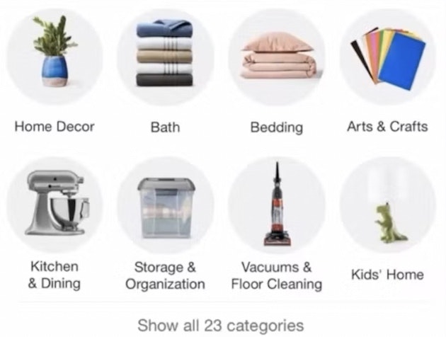
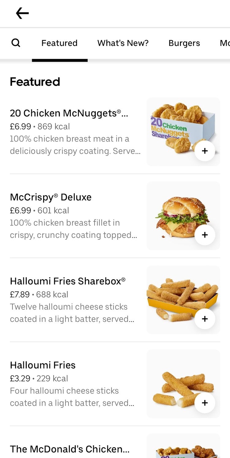
1 ) Provide a Highly Visible “Shop” or “Categories” Path that Leads to an “All Categories” Page (40% Don’t)
While many app users rely on search to find products, around one in three prefer to browse through categories, especially when they are unsure of exactly what they need or are looking for inspiration.
However, if users struggle to find a path to “All Categories”, some may resort to search and may then end up in a scope that is too narrow for their purposes.
Usually Amazon is all over the place as far as finding the category. So it’s easier for me to type exactly what I’m looking for [into the search box] on Amazon because they never have anything at the top for it to be easy for you to find, to be honest. This participant was one of many (60%) that was unable to find a way to start browsing categories on Amazon. In fact, the hamburger icon in the bottom navigation is the path that leads to “All Categories”.
This seeming lack of support for browsing categories is particular to app users.
On desktop, users can search for inspiration in the main menu, and with hover-activated menus won’t even have to click on anything until they decide on a category (see guideline #266).
On mobile sites, there is usually a main navigation menu that can be viewed and scanned for ideas before a specific category is chosen (see guideline #2257).
But in apps, users are reliant on the bottom navigation bar or the top navigation menu to provide access to categories, and if those elements fail to guide users properly their attempts to browse to suitable items may not succeed.
Apps should therefore offer this key path in either the top navigation menu or the bottom navigation bar (see guideline #3159).
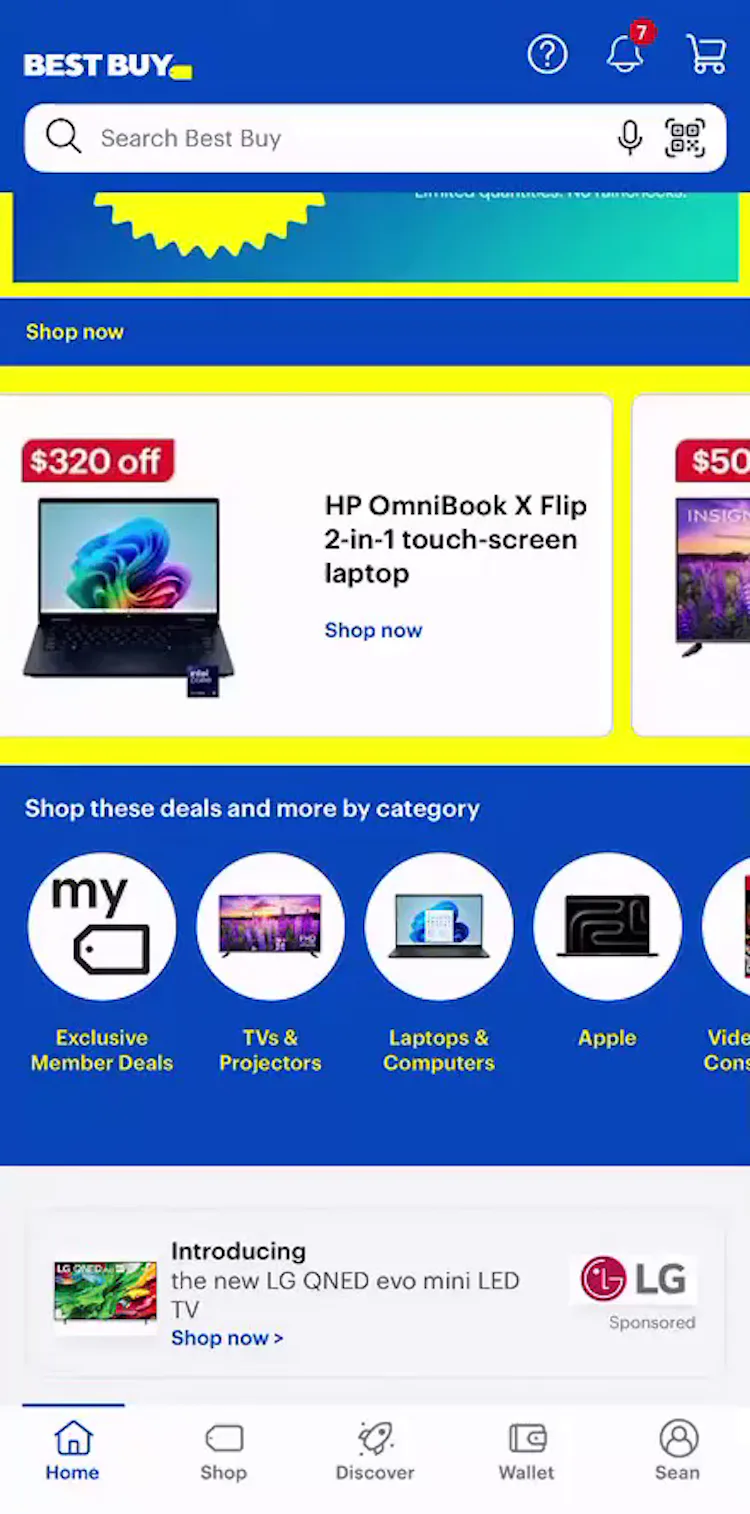
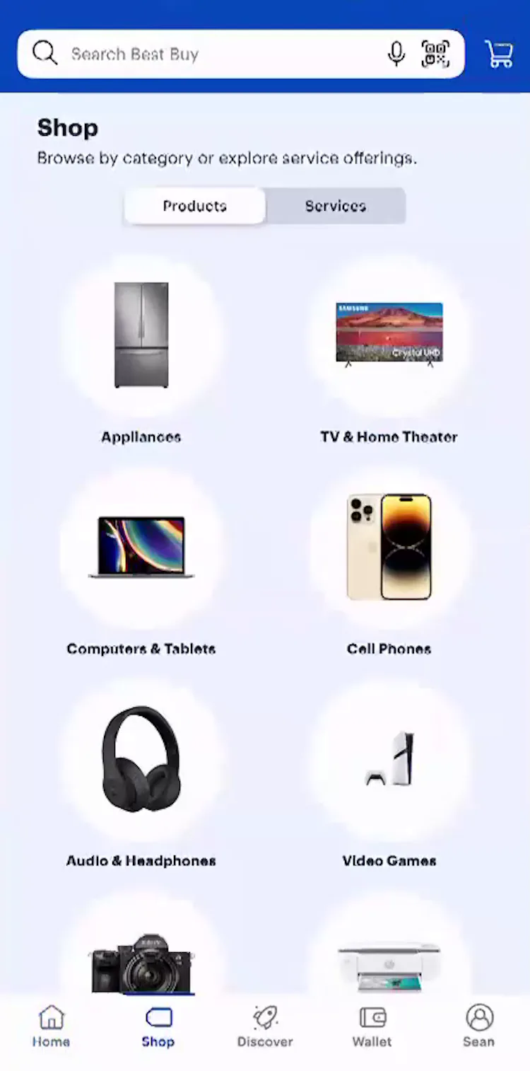
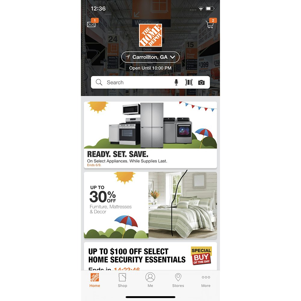
I wouldn’t think that it shows all the categories [on the homepage]. So maybe you’d have to press on ‘Shop’. Yeah, there we go. If you press on ‘Shop’, then it’ll show you all the different products. This test participant in the Best Buy app, having spotted nothing of interest on the homepage (first image), quickly found the Shop button in the bottom navigation bar and was able to start browsing categories without delay by tapping it (second image).
A bottom navigation bar item that leads to an “All Categories” page proved to be an effective way for participants to access all product categories.
However, it’s vital that the function of the path is immediately clear so that users don’t have to guess what will happen if they tap it. Therefore, the path to the “All Categories” page must be unambiguously labeled — specifically, as “Categories” or “Shop”.

And that’s right at the top, right underneath the search bar, which I kind of like. So it makes it a little easier to go to. I would naturally go to the top one. When this test participant decided to browse to find products in the Shein app (iOS), she tapped without hesitation on the All menu item in the top navigation bar to start browsing. Note how following the “All” link are links to individual product categories. This provides crucial information scent — a simple link to “All” without the accompanying product categories would very likely be misunderstood by many users.
Users also expect to find product-related links in the top navigation menu if it is provided.
The most foolproof way to provide access to all product categories in the top navigation links is to include a link to “All Categories” as the left-most link in the list.
2) Present Subcategories as the Primary Content on Intermediary Category Pages (50% Don’t)
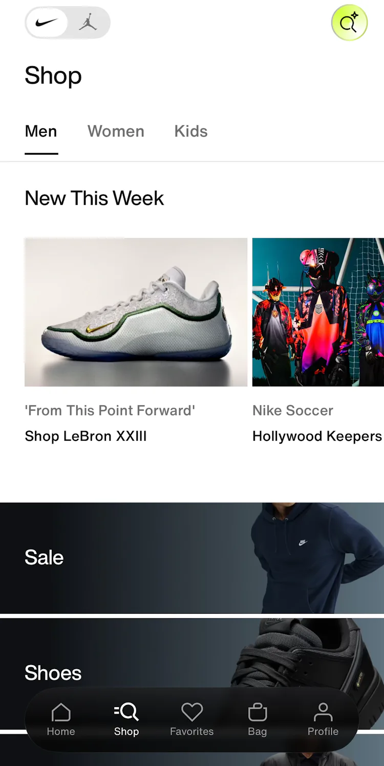
The intermediary category page for “Men” in the Nike app features a very prominent group of featured links that overshadowed the subcategory links further down (e.g., “Shoes”).

Likewise the “Refrigerators” intermediary category page in the Home Depot app (iOS) is dominated by promotional content.
Some intermediary category pages performed poorly in testing because they prioritized promotional or auxiliary content above subcategory navigation.
Such implementations distract users from their original task of navigating to an appropriate subcategory and make it more difficult for users to find and choose among subsequent navigation paths (see guideline #308).
Furthermore, without clear access to subcategories, some users will have difficulty identifying that they are on intermediary category pages at all.
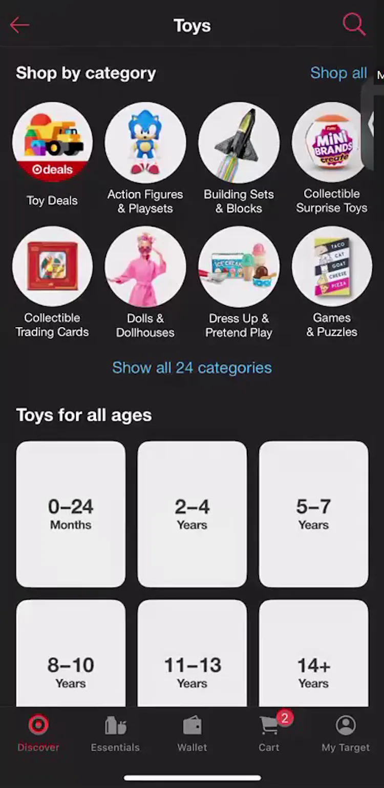
And now I have ‘Shop all categories’ again, which is my favorite. Because they’re a little girl, I would probably go to see this ‘Dress Up & Pretend Play’ [subcategory]. When users like this test participant looking for a gift on the Target (iOS) land on the ‘Toys’ category page, they can quickly look through their options for subcategories and choose one that suits without having to scroll through the full page.
Intermediary category pages perform best when they prioritize subcategory navigation, locating subcategories front and center at the top of the page.
3) Provide a Cross-Sell Section that Only Contains Alternative Products (31% Don’t)
To ease users’ efforts to quickly find suitable substitutes, it’s important to always provide a list of alternative cross-sells on the product details page (see guideline #810).
76% of users say they look at cross-sells at least some of the time or more, and 59% look at product suggestions specifically to see if there’s a better option they missed (2025 survey of 1,005 online US shoppers).
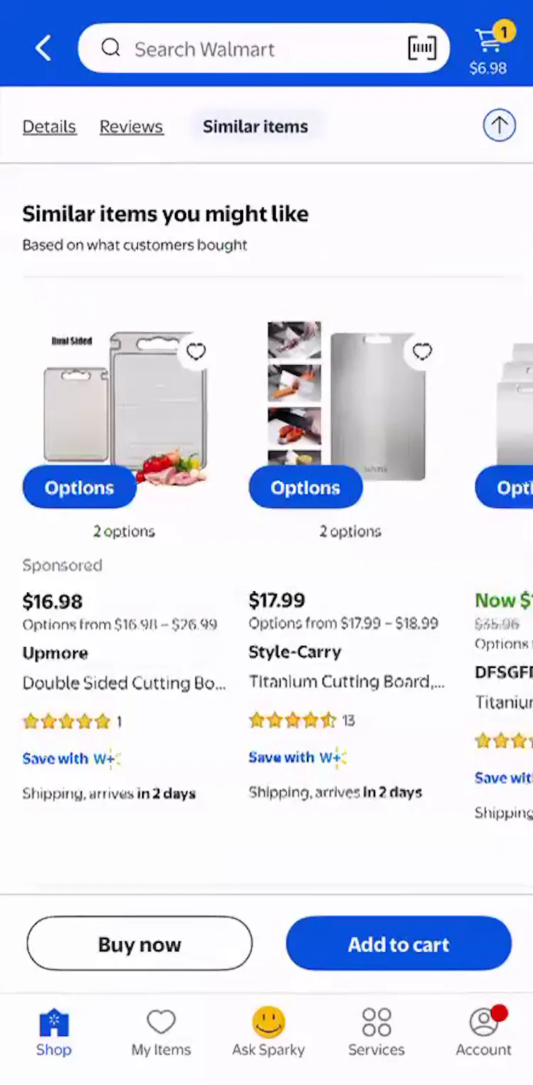
Yeah, I noticed there’s ‘Similar items…” on the top. So I’m gonna tap that. Looks like this one’s on sale. This test participant in the Walmart app (iOS) valued the ability to find alternative cross-sells easily, including one that was cheaper.

‘Discover more options’. It’s the same kind of great t-shirt, and it has different funny things on it. Another participant in the Target app (iOS) got inspiration from the cross-sell section from seeing other variants of the product she first found.
Providing a list of relevant alternative items gives users viable options without the friction of endlessly navigating back-and-forth between product pages and product lists or search results.
During app testing, participants often took advantage of cross-sell sections containing alternative products, as the cross-sell section streamlined the process of finding similar items.
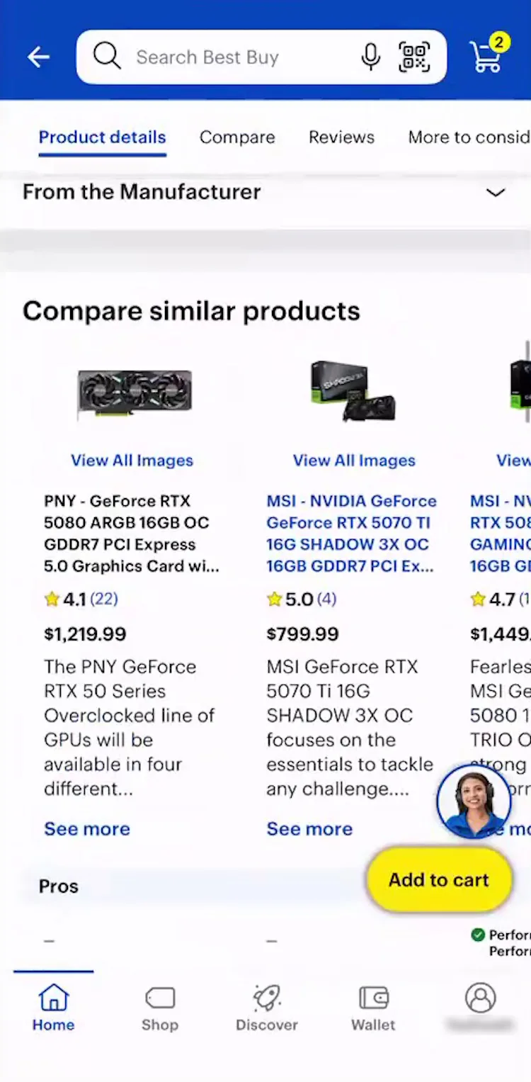
Okay so I definitely use ‘Compare similar products’ a lot. I feel like this comparison is pretty accurate at least from my experience. This test participant looking for graphics cards in the Best Buy app (iOS) felt the cross-sell suggestions were highly relevant and helpful.
However, test participants largely ignored alternative cross-sells they deemed irrelevant, so it’s critical to ensure relevancy of the product suggestions (see guideline #813).
4 ) Always Include the Full Scope in Homepage Links (57% Don’t)

Many users don’t read every line of text and therefore won’t notice this path leads to a charcuterie board collection on the Aldi mobile app homepage. Users who tap “Shop Now” without spotting the narrowed scope can be disappointed by the limited selection of cheese products they find.
While providing quick access to tailored lists of products on the homepage can help alleviate some of the problems inherent with mobile app ecommerce experiences, there’s a catch.
Notably, if users fail to notice they’ve selected a narrowly scoped path, they can misinterpret the product catalog entirely.
Mobile app usability testing shows that, for some scoped paths, a subgroup of participants never noticed that they were viewing a more narrow list of products (see guideline #958).
Consequently, these participants often abandoned the app, thinking that the brand’s catalog didn’t have the products they sought.
For example, users may be unaware that they tapped into “Kids’ Clothes” in a “Back to School” promotional ad instead of the broader “Kids’ Clothes” category.
Details that seem obvious when designed are often overlooked by users who scan text strings quickly and rely more heavily on the page’s visual elements.

Here Lowe’s links to top-level categories on its homepage, foregoing narrower scopes that lead to a limited selection of items.

While Crate & Barrel’s homepage features more narrowly scoped paths, it provides the full scope in the button text.
When providing a path to a narrower scope on the homepage, always specify the full scope of the featured paths to prevent misunderstandings.
Clearly worded paths on the homepage are time savers, allowing users to avoid unexpectedly narrow results and backtracking.
To remedy this common pitfall, design your mobile app to:
- display only top-level categories on the homepage, and
- describe the full scope in the text link or button (instead of relying on text outside the link).
5) Avoid Displaying Overly Prominent Ads on the Homepage (76% Don’t)

“I feel my first reaction to this homepage is that it is a bit overwhelming. There are a lot of different things going on”. App homepages dominated by ads can confuse users, such as this participant using the Home Depot app for the first time.

The mobile app homepage for Burger King features an entire viewport of ads, making it difficult for users to grasp the range of product options.
During testing across all platforms, overly flashy ads in a prime content location on the homepage (particularly in the upper part of the page) were often met with negative reactions from participants, and pop-up banners and overlays were met with even greater disdain (see guideline #240).
Meanwhile, our mobile app testing revealed that homepage ads, especially those taking up lots of space in the viewport, can cause even more severe issues:
- Preventing users from gleaning an overview of the products
- Overwhelming users with a cluttered homepage
- Creating friction through unintentional interactions with them

The Just Eat mobile app provides a homepage free of ads, which makes it easy for users to scan and access the range of products available.
Therefore, especially for mobile apps, it’s critical to be particularly mindful of the size, placement, aesthetics, and integration of ads within the overall homepage design.
If ads are placed on mobile app homepages, ensure they aren’t overly prominent or visually distracting to avoid interfering with users’ product-finding tasks.
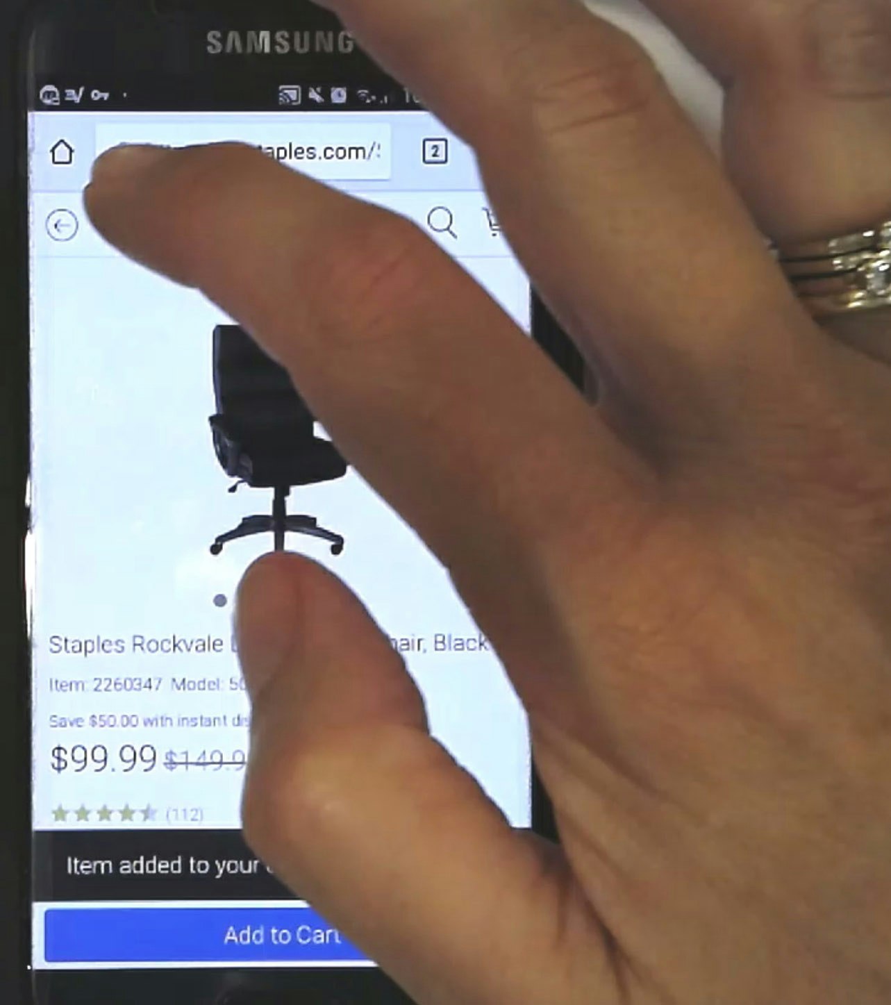
6) Provide a Submit Button next to the Search Field (90% Don’t)

Many users at KFC will first look for a way to commit the search within the search field UI and may accidentally clear the search by instinctively tapping the cancel icon instead, adding unnecessary frustration to their task.
When searching for products on mobile apps, users won’t always look towards the touch keyboard to submit their searches.
Indeed, some users will peruse the search field UI first, pausing and scrolling around as they fail to notice or recognize the submit button on the touch keyboard provided by the mobile OS.
During mobile app testing, we’ve observed that the absence of an explicit search submission button in the UI impedes the search process and increases the potential for errors such as inadvertently cleared search terms (see guideline #944).
Further, hidden search fields that are accessed via a search icon coupled with having to use the inherently more difficult touch keyboard create additional pain points.
Thus, users will often become severely frustrated by the friction produced while trying to submit a search — a seemingly basic task.

Staples is one of the very few mobile apps that display a submit button (the search icon) within the search field UI, making it easy for users to commit their search. However, the app could still improve its Search UX by optimizing the submit button on its touch keyboard.
On the other hand, positioning an explicit submit button directly next to the search field aligns with users’ expectations, enabling them to both rapidly refine the text and submit the search without delay.
To better support those who do use their touch keyboards for search tasks, the keyboard’s gray-by-default “return” button can be optimized to display the word “search”, along with styling the button blue to create a much stronger call to action.
Thus, combining a submit button directly in the search UI with an optimized touch keyboard helps ensure an intuitive and efficient mobile app search experience, regardless of the user’s favored method for submitting a search query.
7) Persist Users’ Search Queries in the Search Field on Results Pages (33% Don’t)
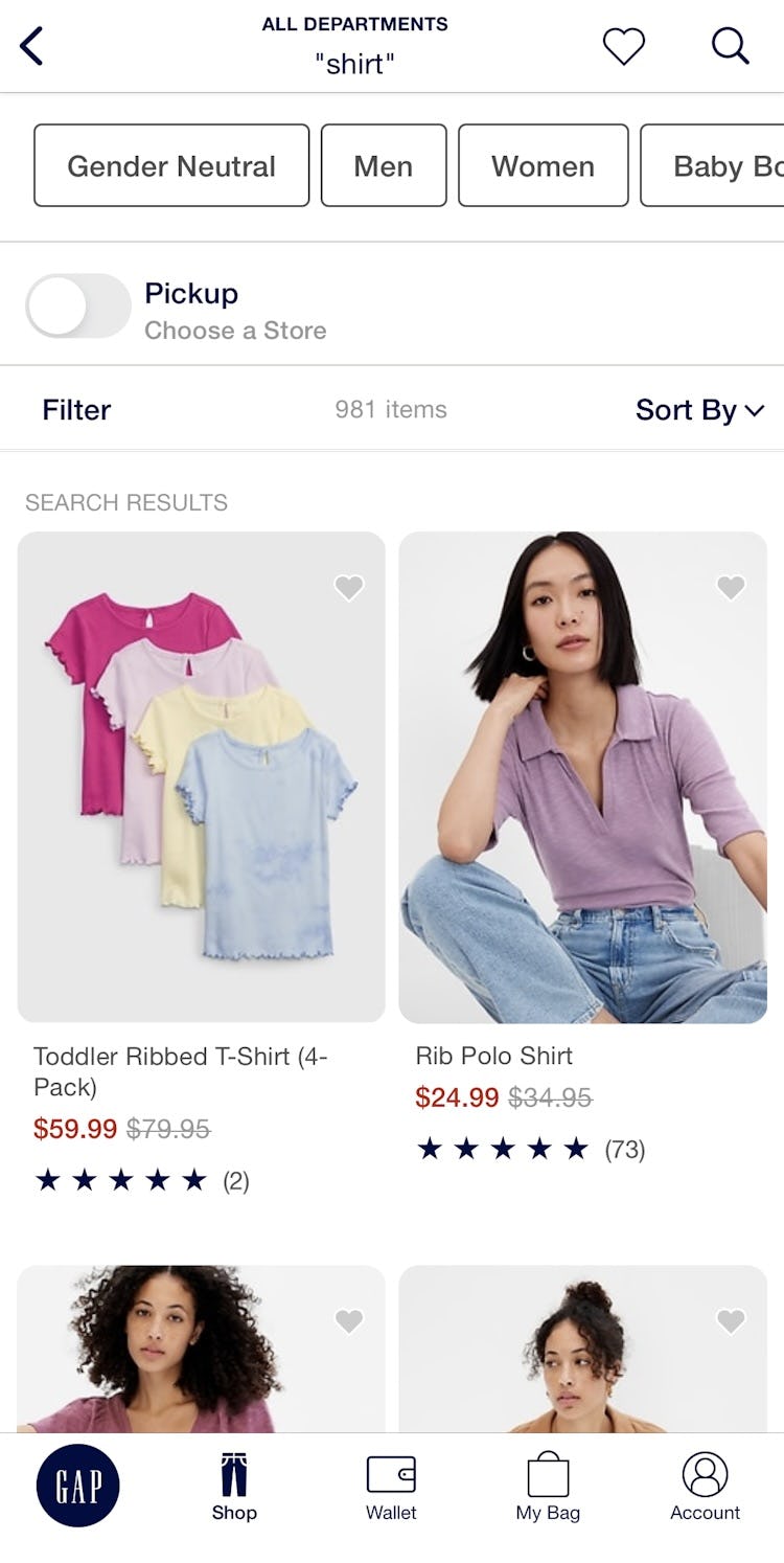
At GAP, users are forced to construct a search query every time they need to iterate on a previous one, which becomes a tedious task on mobile apps.
During usability testing, we’ve observed participants frequently needing to alter the words they type into the search field when the results are unsatisfying (see guideline #346).
When the search results display and search terms are cleared — either immediately or when the user taps on the field again — users must start from scratch each time to adjust their query.
Indeed, failing to persist the carefully entered search terms on mobile apps introduces friction at the worst possible time: exactly when users haven’t received a relevant set of results (hence the need to iterate).
Consider that users already must grapple with small tap target sizes and numerous taps to backspace-delete characters before typing new ones — both of which are tricky interactions.
For mobile app users attempting to revise text in the middle or beginning of a search field, just trying to position the input cursor precisely in the search field can make the act of searching exceedingly tedious.

Sephora not only persists users’ search terms to make them easier to iterate, it also supports a way to search by speech instead of typing.
Persisting search queries on mobile apps, therefore, reduces the overall burden of searching and makes any iteration a smoother experience.
Indeed, when search terms are retained after the search results page loads, users are better equipped to continue their product finding, despite receiving:
- too many search results
- too few search results
- unexpected search results
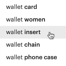
8) Avoid Repetitive and Irrelevant Autocomplete Suggestions (42% Don’t)

When autocomplete suggestions are well designed on mobile apps, they help users quickly narrow down their desired search scope.
However, mobile app testing shows that duplicative or irrelevant autocomplete suggestions are unhelpful as they conjure confusion and slow the search process (see guideline #368).
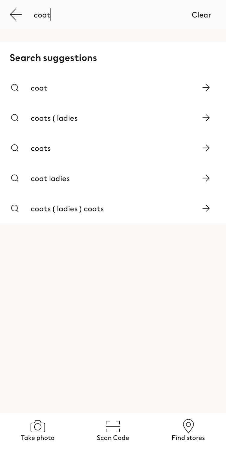
Duplicative suggestions are those that add noise and elongate the list, appearing as separate suggestions even though they are essentially the same thing (think “camping tent” and “camping tents” or “kid’s shoes” and “children’s shoes”).
Irrelevant suggestions are those that appear at the top of the suggested list but have no direct relevance to the user’s search, such as showing suggestions for women’s purses and shoes when “women’s wallet” is entered.
When faced with poor autocomplete suggestions, users must decide whether to choose an imperfect suggestion, refine their search query, or browse the categories instead — all actions that can hamper their quest to find the desired product.

Users searching for a “hammer drill” at Lowe’s find a relevant set of suggestions with no duplicative or illogical items in the list.
Avoid irrelevant and redundant entries to ensure that the suggested queries in the autocomplete feature are relevant and helpful.
Lists scoped to the most meaningful suggestions streamline users’ search tasks and help build trust in your app’s search feature.
Key recommendations for providing better In-App Search UX include:
-
Use search log data to rank query suggestions but not produce them, identifying the high-performing search queries and demoting or skipping those that perform poorly
-
Map queries that are semantically identical so that only one appears in the autocomplete suggestion list
9) Support Pinch-to-Zoom (80% Don’t)
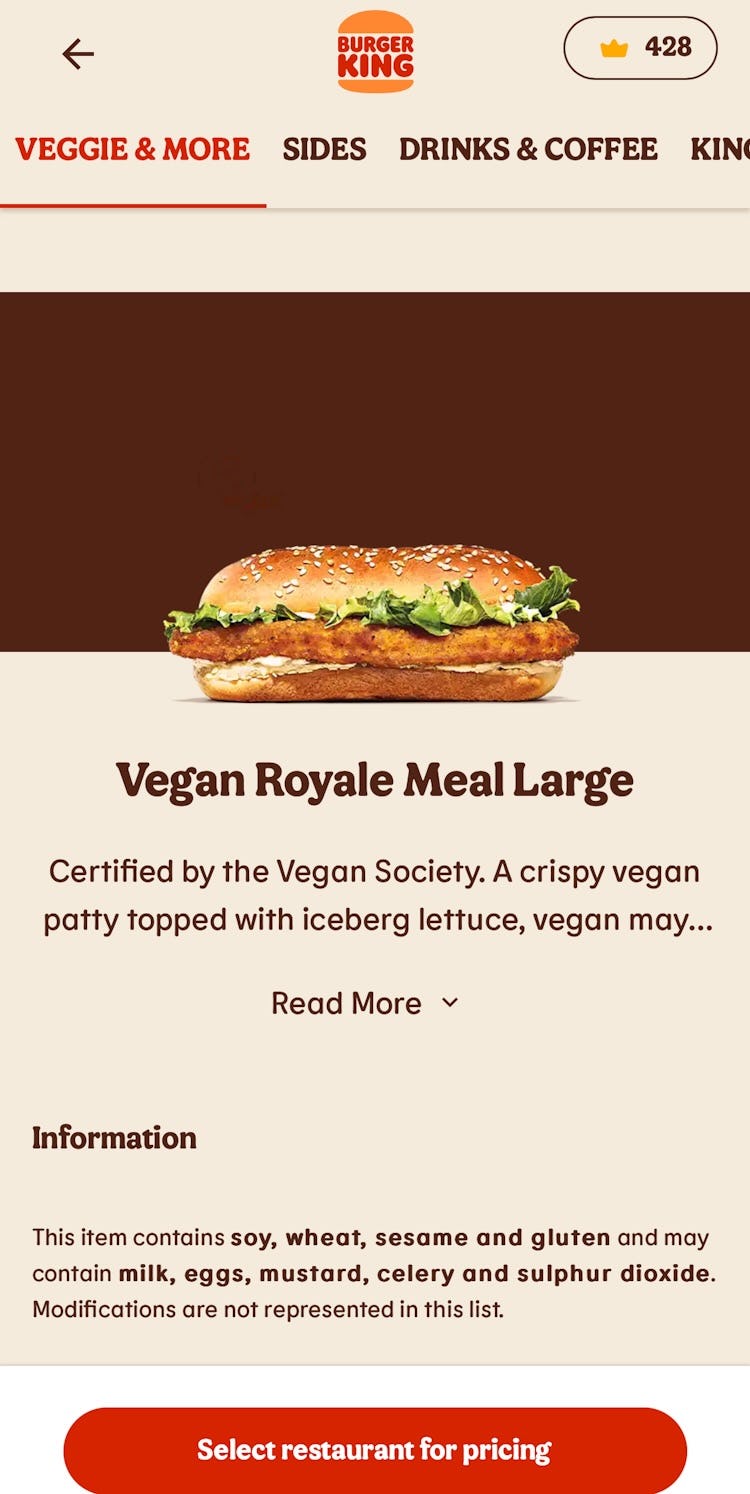
Neither Uber Eats nor Burger King offer image overlays or any zoom functionality for their primary images, so users are unable to zoom in to spot any distinctions or differentiators between products displayed in the apps.
Unsurprisingly, users expect to be able to use touch gestures in mobile apps, and zooming in on an image (or other content) using the pinch gesture is widely considered a standard convention.
We’ve observed that users in mobile app testing are extremely frustrated by the inability to zoom in easily on the main product image to inspect visual or written product details (see guideline #1142).
Sometimes, the primary image in the product list or the product page’s image gallery is the only place that users spend time considering whether the product is a good fit (i.e., they don’t review the other content on the product page).
Thus, when images contain critical information but no pinch-to-zoom functionality exists, users often overlook tap-to-zoom features and mistakenly believe the app offers no zoom function at all.
Without a better view of the product or the text-based information provided within images, many users will simply abandon a particular product when too many questions remain unanswered.


At ASOS, pinch-to-zoom is supported on the main product image and for all images in the image gallery, making it easy for users to get a close-up view of the embroidery details sewn into this shoe.
Due to mobile devices’ smaller screen sizes, mobile apps inherently demand the zoom feature even more than the desktop platform.
Therefore, always provide a pinch-to-zoom gesture for images in the image gallery and on the product page to support the critical task of viewing important details and text.
Following these 4 implementation details will further help users inspect image and text content more closely:
- Support pinch-to-zoom app-wide
- Support both the pinch and double-tap gestures as some users may rely on the former while others expect the latter
- Visually indicate zoom features exist
- Avoid low-resolution images by fetching images at a higher resolution when users begin zooming
10) Avoid Excessively Tall Horizontal Scroll Areas (53% Don’t)
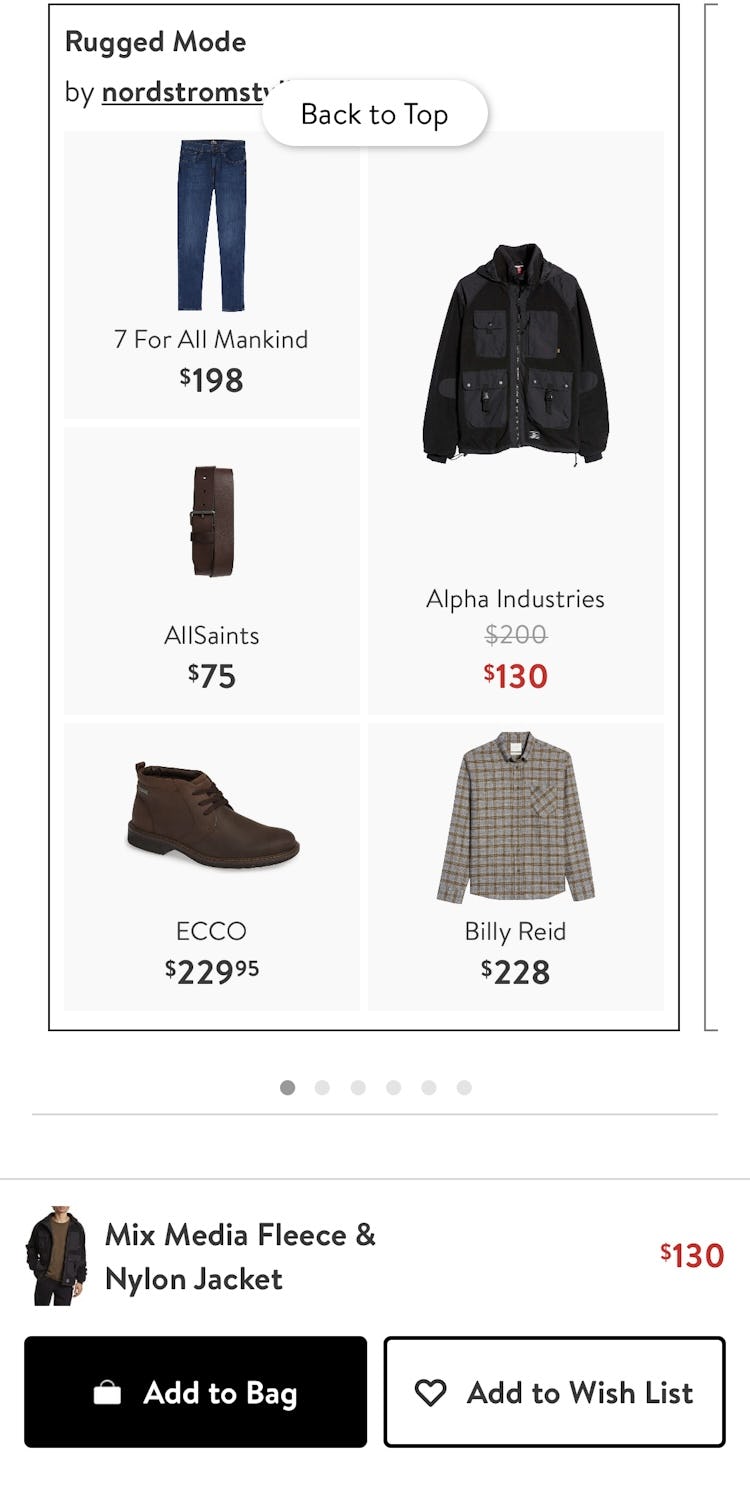
The horizontally scrolling component that contains the “Rugged Mode” collection at Nordstrom makes tap mistakes far more likely to occur. By taking up more than 50% of the available viewport, users can accidentally open a product page from this component when trying to scroll vertically in this overlay.

Multiple tall, horizontally scrolling components at Kroger can also accidentally hijack users vertical scrolling efforts, producing unnecessary friction for an otherwise simple task.
Unlike on desktop sites, users must constantly interact with mobile app pages to browse for products and information.
With most pages taking up more than just one viewport, vertical scrolling is a practical necessity.
During testing, horizontally scrollable content sometimes accidentally “hijacked” participants’ intended vertical movement down the page (see guideline #1096).
Very tall horizontally scrolling components that take up over 50% of the viewport are the likeliest culprits of this friction as they tend to reside in the areas users naturally tap to scroll down the page.
Albeit a more minor point of friction, repeated occurrences can frustrate users who simply want to scan down the full page.


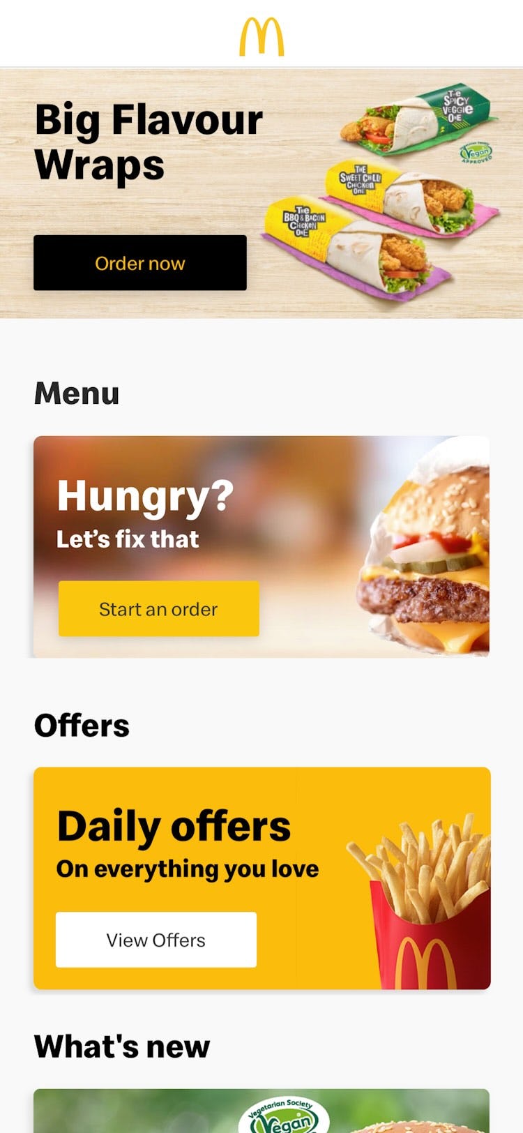
By limiting the height and number of horizontally scrolling components, both Just Eat and McDonald's leave room on the page to tap and vertically scroll without the added friction.
These 2 techniques reduce this glitch in users’ scrolling UX:
- Avoid horizontally scrolling components altogether, instead showing all content in the viewport by default
- For non-critical content, ensure horizontally scrolling components take up less than 50% of the vertical height available
Reducing the height of this type of component is recommended for content that is not critical to users’ product-finding activities, such as promotional ads, cross-sells, and other secondary content.
Meanwhile, it is entirely appropriate to devote more height to horizontally scrolling content that is crucial to users’ decision-making, such as visually rich image galleries on product pages.
In these cases, the importance of the content to the user’s primary task outweighs the scroll-hijacking considerations.
By carefully weighing which elements on the page are high-priority versus supplementary, mobile app teams can better decide how to properly size or avoid horizontally scrolling components.
11) Avoid Having Images with Illegible Text Overlays (21% Don’t)

Users at Crate & Barrel will at best struggle to read this sentence, and at worst not even try, as it overlays a busy image of flower stems that heavily interfere with its readability.

Even though the text callouts within this image at Staples are featured in opaque colored shapes, they contain text that is nearly impossible to read at the default size. Further, users may assume the tiny text contains promotional “gotchas”, which deters their desire to follow those paths.
Usability testing with mobile apps reveals several common issues when text is baked into images, many of which negatively impact users’ next steps.
Text that overlays an image is usually less scannable and readable than text on solid or more opaque backgrounds and can lower the information scent for the featured content — causing some users to hesitate and question which path to take next (see guideline #290).
Additionally, text that is very small by default has been shown to breed mistrust, with some participants wondering whether the illegibility of the content was purposeful.
Lastly, embedded text within images can fail accessibility guidelines and is typically unavailable to those using the search function.
Text within featured images at McDonald’s sits atop more opaqued or solid backgrounds, ensuring high contrast and legibility for readers.

At Target, the embedded text within images is sufficiently sized to be readable without zooming, which makes it far easier for users to decide which path to follow.
Instead, ensure that any text overlaying an image sits atop a semi-transparent or solid background with a high-contrast color to make it easy to read.
Without those standards, mobile app teams will need to manually design and verify the text microcopy for length, color, position, font, and size to avoid readability problems.
In particular, to avoid text that is too small to read, it’s best to implement image text with proper HTML markup (and use CSS to embed any special fonts), although this can induce a few technical and practical constraints in regard to styling and positioning.
Untapped Potential within Mobile Apps UX
Our benchmark reveals that 71% of ecommerce apps perform on average “mediocre” or “poor” across the primary themes, so it’s clear that there’s significant room to improve users’ experience.
Considering that no benchmarked apps performed “good” or “perfect” overall, adhering to the 11 Mobile App ecommerce UX best practices presented above is a great first step.
Note: In comparison, in most of the other ecommerce UX studies we’ve conducted at Baymard Institute, the average UX performance also amounts to “mediocre” but tends to have a wider spread of variation and performance scores (see our overall ecommerce UX benchmark).
Also, note that this is an analysis of the average performance across 30 leading US and European mobile apps.
When analyzing a specific app there are nearly always a handful of critical UX issues, along with a larger collection of worthwhile improvements to make.
This is the case even when we conduct UX audits for Fortune 500 companies.
For additional inspiration, consider clicking through the Mobile App Page Designs. Once you’ve opened a specific page type, click the “App” filter to view implementations from leading US and European ecommerce apps, which can be a good resource when considering what to emulate when redesigning a mobile app — but also for what to avoid.
This article presents the research findings from just a few of the 700+ UX guidelines in Baymard – get full access to learn how to create a “State of the Art” ecommerce user experience.
If you want to know how your mobile app performs and compares, then learn more about getting Baymard to conduct a UX Audit of your app.