
Page Control UI: Definition, Features, & Design Styles
What is a page control UI?
A page control is a navigational user interface (UI) component — typically a row of small dots, dashes, or indicators — that shows a user two things at once:
- Where they currently are within a sequence, and
- how many total pages or steps that sequence contains
You'll encounter page controls most often in mobile app onboarding flows, image carousels, and product galleries. They're a small component, but they do important work: giving users a sense of how much content exists or how far through it they are.
Where is page control used?
Page controls appear across a wide range of UI contexts. The four most common are:
Image carousels and product galleries
In ecommerce, page controls serve as both a navigation aid and a signifier — telling users that more images exist and can be accessed by swiping. This is often the case on homepage image carousels and sliders highlighting promotional information.
On a product detail page, dots beneath the main product image are the standard mobile pattern for indicating additional views.
"When implemented with care, carousels are a powerful way to promote features, offers, and popular product types. Yet, carousels can cause more harm than good if serious usability issues aren’t addressed."
– Edward Scott, Research Lead, Baymard Institute
Content sliders
Hero banners, featured article carousels, and promotional content sliders on marketing pages frequently use page controls to indicate position within the set. These are often auto-advancing, making it especially important that the active indicator updates in real time. Note that autorotation is not recommended for mobile shopping experiences.
Mobile app onboarding
When a user first opens an app, they're often guided through a series of introductory screens explaining features and value. Page controls sit at the bottom of these screens, showing users how many steps exist and confirming they're making progress. The expectation here is reassurance — users want to know the sequence is finite and that they're nearly through it. Duolingo and Airbnb both use page controls prominently in their onboarding flows.
Multi-step forms and wizards
Page controls can indicate position within a multi-step flow — a sign-up wizard or a checkout process broken into stages. That said, a labeled progress stepper, (showing "Step 3 of 5: Delivery address" like the example above) is usually more appropriate here, as it provides context that plain dots don't.
Page control vs. tabs vs. progress indicators vs. pagination: What's the difference?
These four components can look visually similar — especially in their bar and line variants — but they serve meaningfully different purposes:
Page control
- Purpose: Shows position within a finite, swipeable sequence
- Typical form: Dots, bars, or pills
- When to use: Carousels, app onboarding, image galleries
Tabs
- Purpose: Switches between distinct views or sections
- Typical form: Labelled tabs or icon tabs
- When to use: App navigation, content categories
Progress indicator/stepper
- Purpose: Shows completion through a multi-step process
- Typical form: Numbered steps, labelled stages
- When to use: Checkout flows, multi-step forms
Pagination
- Purpose: Navigates between pages of content
- Typical form: Numbered links, previous/next
- When to use: Large product catalogs (product listing pages), search results, articles
There are a few distinctions worth calling out. The bar variant of a page control can look almost identical to a tab bar. The difference is function: tabs let users jump freely between non-sequential views; page controls indicate position within a linear, swipeable sequence.
Similarly, the continuous bar variant of a page control can be visually confused with a loading bar or progress indicator — context is the key differentiator. A loading bar represents an ongoing process; a page control represents position within a content set.
Anatomy of a page control UI component
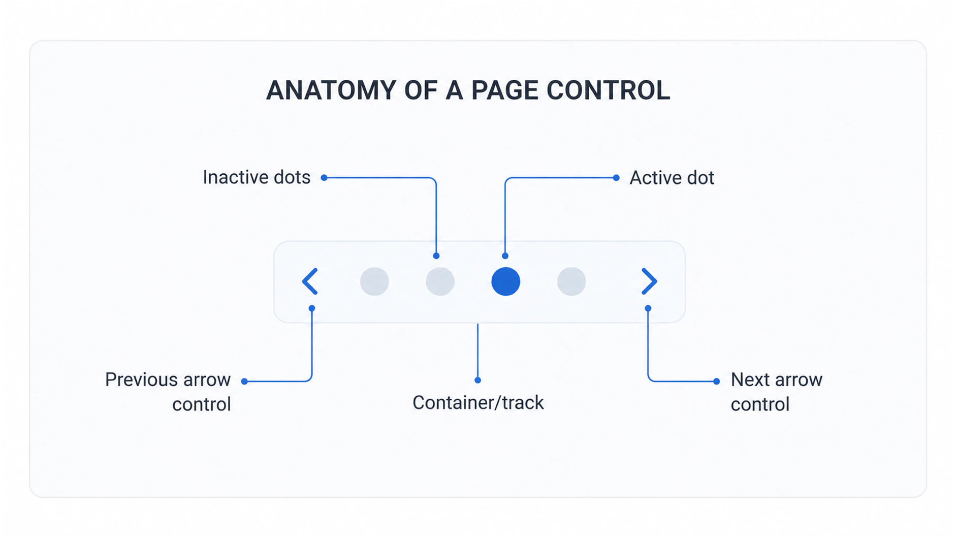
Despite its simplicity, a page control is made up of several distinct parts:
- Inactive dots: The indicators representing pages the user is not currently on. Typically smaller, unfilled, or lower-opacity than the active state. Their job is to communicate how many total pages exist.
- Active dot: The indicator representing the user's current page. Differentiated from inactive dots by fill, size, color, or shape. This is the primary communication of position.
- Container/track: The row or group that holds all indicators together. Usually centered horizontally and positioned at the bottom of the content area. In some implementations, this is a visible element (a pill-shaped background); in others, it's transparent.
- Previous/next arrow controls (optional): Arrow buttons that accompany the dots and provide an explicit tap target for navigating forward or back. Particularly useful on desktop, where swipe gestures aren't available, or in accessibility contexts.
The most important visual relationship in a page control is the contrast between active and inactive states. If the two states are too similar — for example, a small difference in opacity on a mid-tone background — users may not be able to determine their current position at a glance.
Types and design styles of page control
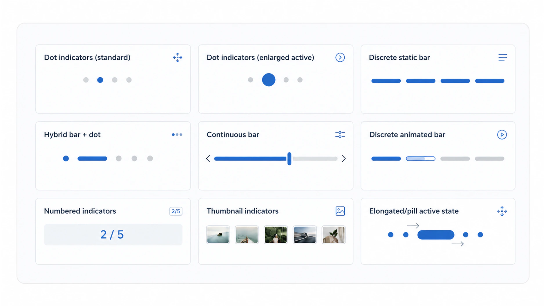
Page controls can come in a wider range of visual styles than the classic dot pattern. Here are some examples:
- Dot indicators (standard): The iOS default and the most widely recognised implementation. Active and inactive dots are the same size, differentiated only by fill (solid vs. outlined or reduced opacity). Works well for most short sequences. Best for: onboarding, simple carousels.
- Dot indicators (enlarged active): A variation where the active dot is noticeably larger than the inactive dots, giving the current position indicator more visual weight. Popular when additional emphasis is needed without changing color. Best for: contexts where the active state needs to stand out more clearly against a complex background.
- Discrete static bar: Horizontal line segments that function like dots but in bar form. A finite number of bars represents a finite number of pages; no animation. Best for: contexts where a more minimal or editorial visual style is preferred over dots.
- Discrete animated bar: The signature pattern of Instagram and Snapchat Stories. Individual bars fill progressively from left to right over a set time, then the next bar begins. Communicates both position and time remaining before auto-advance. Best for: auto-advancing content with a time component. Not appropriate for user-paced navigation.
- Continuous bar: A single bar that shows relative position within a sequence without indicating a precise page count. Functions more as a positional scrubber than a page counter. Best for: very long sequences or content where the total count isn't meaningful to users.
- Hybrid bar + dot: The active page indicator is rendered as a bar or pill, while inactive pages are shown as dots. A space-efficient way to introduce animation and visual differentiation while retaining the dot-based structure for inactive states. Best for: carousels where animation is desired but screen space is limited.
- Numbered indicators: Displays the current position and total as text, e.g. "2/5." Best for: contexts where the total count is genuinely meaningful to users (a product with many images, a long onboarding sequence), or where the indicator needs to be space-efficient.
- Thumbnail indicators: Small image previews replace abstract dots as the indicators. Best for: desktop product image galleries where showing the content of each page adds navigation value. Less practical on mobile due to size constraints.
- Elongated/pill active state: The active dot stretches horizontally into a pill shape on selection, creating a satisfying animation that reinforces the sense of movement. A popular modern pattern in mobile UI. Best for contemporary mobile interfaces where motion design is a priority.
When to use (and when to avoid) page controls
Use a page control when:
- Content is swipe-based and arranged in a linear sequence
- The number of pages is small — 3 to 7 is the sweet spot where dots remain readable and meaningful
- A lightweight positional indicator is sufficient — users need to know where they are, but don't need labels or steps
- You want to signal to users that more content exists and is accessible by swiping
Avoid a page control when:
- The sequence has too many pages — beyond 7 or 8, dots lose their meaning and become visually noisy (switch to a numbered indicator or pagination instead)
- Content is non-linear and users need to jump between sections — use tabs instead
- Users need context about what each step contains or represents — use a labeled stepper instead
- The sequence has no defined end — page controls imply a finite, known set. Don't use them on infinite or dynamically loaded content.
Page control UI design best practices
Here are some key considerations and tips when implementing page control indicators.
Get the size and spacing right
Dots should be large enough to perceive clearly without dominating the interface — an 8–10px minimum diameter is a reasonable baseline, with spacing between indicators at least equal to the dot diameter. Cramped or undersized dots are a common issue on lower-effort implementations and one of the most frequent causes of poor page control UX on mobile.
Ensure sufficient contrast between states
The active and inactive states must be clearly distinguishable at a glance — particularly on image backgrounds, where a light dot on a light sky or a dark dot on a dark product image can disappear entirely. A semi-transparent backdrop or subtle drop shadow behind the indicator group is an effective solution for variable backgrounds.
Keep the count manageable
A page control with more than 7 or 8 dots stops being a useful position indicator and starts being visual noise. For longer sequences, switch to a numbered style ("3/12") or a progress bar. If you find yourself with too many dots, that's often a signal to reconsider the content structure.
Position at bottom-center by default
This is the overwhelmingly standard position on mobile, established by Apple's iOS conventions and reinforced by virtually every major app. Users expect to find page controls here. Deviating from this convention — placing indicators at the top, or to the side — introduces unnecessary friction without a compelling reason.
Pair dots with other interaction signals
Dots alone don't tell users they can swipe. Combine page controls with visible swipe affordances (partial visibility of the next item at the edge of the screen) or previous/next arrow controls to make the interaction model clear, especially for first-time users or older audiences.
Animate the transition between states
When a user swipes to the next page, the active indicator should animate smoothly to the new position. A static jump between states feels broken and fails to reinforce the sense of lateral movement. Even a simple 150–200ms transition makes a meaningful difference to the feel of the component.
Accessibility considerations for page control
Accessibility is an area where page controls frequently fall short. Poor visual design and styling can make it difficult for users with visual impairments to access and understand information on a site.
The visual simplicity of page control dots can mask a lack of underlying structure for assistive technologies. Here’s how to ensure you maintain accessibility in any page control UI.
Use appropriate ARIA roles and labels
A page control should be marked up with role="tablist" on the container, with each indicator as a role="tab". Each indicator should carry an aria-label that communicates both its page number and the total — e.g. aria-label="Slide 2 of 5". The active indicator should carry aria-selected="true".
Ensure keyboard navigability
Users navigating by keyboard should also be able to move between carousel pages using the left and right arrow keys. This is particularly important on desktop implementations where swipe is unavailable.
Meet WCAG 2.1 contrast requirements
The WCAG 2.1 non-text contrast guidelines require a minimum contrast ratio of 3:1 between UI components and their adjacent colors. Active and inactive indicator states must both meet this threshold.
Don't rely on color alone
For color blind users, a difference in fill color between active and inactive dots may be imperceptible. Differentiation via size, shape, or outline ensures the active state is distinguishable regardless of color perception.
iOS UIPageControl handles much of this natively
Apple's built-in UIPageControl includes accessibility support out of the box — VoiceOver announces the current page and total when the component is focused. Custom implementations on web or Android need to replicate this behavior manually.
European Accessibility Act 2025
Accessibility is particularly important for businesses operating in the European Union (EU), as they must comply with the European Accessibility Act 2025.
Page control in ecommerce: Homepage carousels
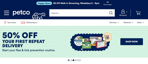
Many ecommerce websites use homepage carousels to highlight key categories, promotional offers, and supplementary content. The Petco example above does this well, and is a best practice example of a homepage carousel that adheres to user expectations.
However, Baymard’s research shows that homepage carousels can actually cause user friction.
"If carousel controls aren’t easy to discern, some users will be unable to pause autorotation or to manually navigate through the slides. Others who spot the controls may have difficulty interacting with them if they have small hit areas."
– Edward Scott, Research Lead, Baymard Institute
Here are some tips on proper implementation (if you implement them at all).
Avoid autorotation (especially on mobile)
Baymard’s usability testing has uncovered that carousels are often overlooked, hard to interact with, and especially problematic when they autorotate.
On desktop, if autorotation exists at all, it requires restraint:
- It shouldn’t rotate too quickly
- It should pause on hover
- It should stop after any user interaction
But the stronger recommendation is simpler: don’t autoplay homepage promos; let the user manually rotate using the page control UI.
On mobile, you should avoid autorotation entirely. This is a well-documented usability problem: users fail to discover content, lose control of the interface, and can get pulled into unintended detours.
Controls need to be obvious, not elegant
If a homepage carousel survives, its controls should be unmissable. Subtle dots and faint arrows are a bad fit here because homepage users are scanning broadly and won’t invest effort in decoding weak controls.
Baymard’s guidance is to use prominent manual controls with sufficient size and contrast, placed at the sides of the carousel. On mobile, controls also need to be easy to tap and paired with swipe support.
Page control in ecommerce: Product image galleries
Baymard’s usability testing reveals that users frequently miss or ignore content in carousels and product image galleries due to poor control design. That’s because 32% of sites that use carousels implement them incorrectly.
Product image galleries are among the most common and highest-stakes homes for page control in ecommerce. On a product detail page, the image gallery is often the first thing a shopper engages with.
Page controls play a dual role here: they communicate position, and they signal that more images exist.
To ensure users can effectively explore visual content, prioritize "information scent" and clear signposting over minimalist aesthetics.
Prioritize thumbnails over dots
Dots communicate quantity, but thumbnails communicate content. Baymard’s research shows that without thumbnails being present, users (particularly on desktop devices) tend to overlook additional images.
In product galleries, therefore, thumbnails are the most effective control because they allow users to jump directly to specific details (e.g., a close-up of a fabric or an alternative product view).
Conversion impact of thumbnails over dots
A very large US retailer that Baymard provided UX audit services for saw a 1% conversion rate increase after changing to use thumbnails instead of dots to indicate additional product images.
Use dots only as secondary cues
Dots are an "orientation" tool, not a navigation tool. They are insufficient as a primary control because they lack information scent and make direct navigation difficult.
Use dots only as a lightweight supplement to show progress (e.g., "Image 2 of 6"). Avoid relying on dots on mobile, where they are easily obscured by fingers or overlooked.
Avoid autorotation
Similar to homepage carousels, autoplaying image gallery carousels reduce user control and often lead to users missing the very content being promoted. For that reason, never place essential information exclusively within a carousel slide.
If used on desktop, rotation must stop immediately upon any user interaction and pause on hover. On mobile, autorotation should be avoided entirely.
Common page control design mistakes
- Too many dots. Eight or more dots at the same size and spacing become near-impossible to parse quickly. If you're routinely hitting this threshold, consider whether the sequence should be shortened or a different indicator style used.
- Insufficient contrast between active and inactive states. A subtle opacity difference between a filled and unfilled dot — particularly on an image background — can render the active state invisible. Test page controls against a range of background colors and images, not just a white background.
- Dots too small to perceive on mobile. A dot below 8px in diameter is difficult to see clearly on a standard mobile screen and almost impossible to tap intentionally as a navigation target. This is a surprisingly common issue on production implementations.
- No animation on state change. A page control that jumps instantly between active states — no transition, no movement — feels unfinished. The animation is load-bearing for the component's communication of direction and momentum.
- Using page controls on open-ended sequences. A page control with dots implies a finite, known set of pages. Using dots on a dynamically loading or infinite sequence misleads users about how much content exists and how long the sequence is.
- Omitting page controls from auto-advancing carousels. An auto-advancing carousel with no positional indicator leaves users completely disoriented. They have no way to know where they are in the sequence, how many items exist, or whether the carousel has looped. Always include a page control on auto-advancing content.
Page control UI examples: What good looks like
Here are some examples from desktop, mobile, and app that show good implementations of page control UI features.
Microsoft’s homepage carousel
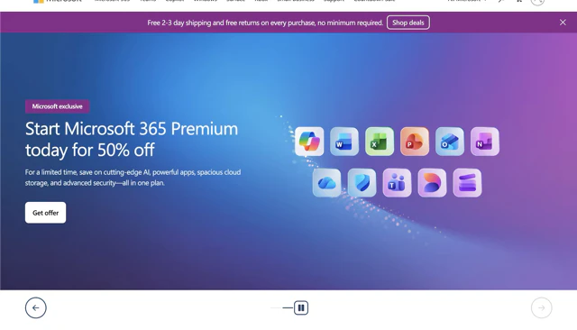
This example from Microsoft’s homepage shows a carousel with clearly defined and prominent controls. As well as the slide indicator, there are forward and back arrow buttons so users can manually navigate to the next or previous slide. Users can also manually stop the autorotation with the pause button, and the carousel also pauses automatically on hover.
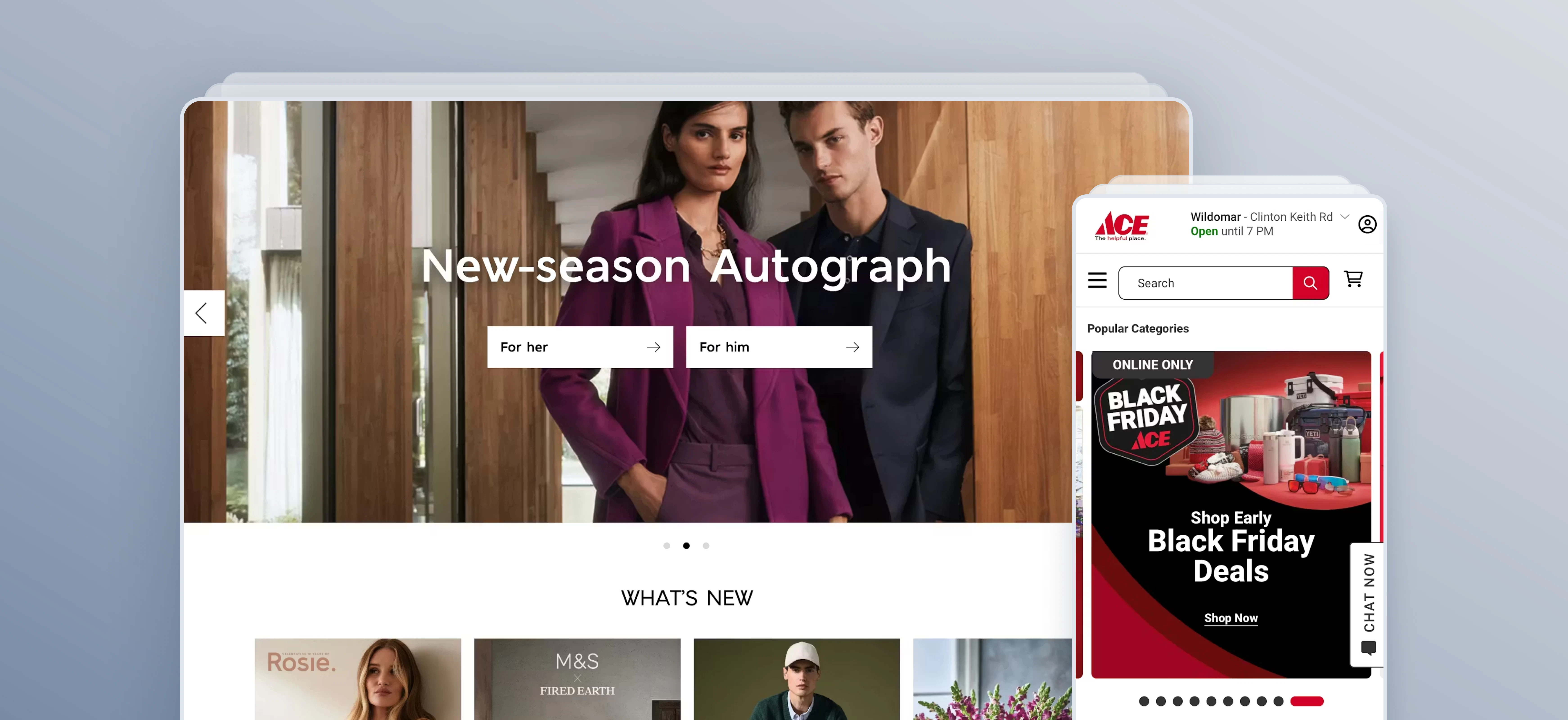
Ace Hardware’s mobile homepage carousel
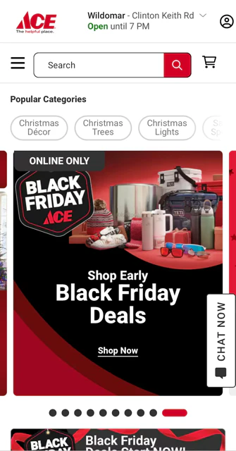
Ace Hardware’s homepage carousel on its mobile site aligns with best practice, as it does not automatically rotate. Instead, the user is able to swipe to move to the next slide. Previous and next slides are visibly truncated, showing the user that there is further content to consume.
The page control container is clearly visible, and the active slide shows an elongated pill in a different color to show the active state.
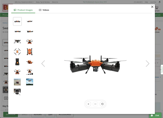
Guitar Center’s product image gallery carousel
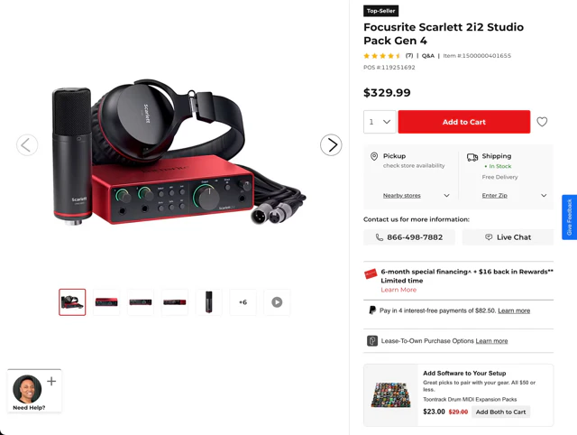
Guitar Center’s product image galleries are user friendly, providing several visual indicators and controls to ensure images aren’t overlooked and that users can easily navigate through the image set.
Thumbnails are used to represent additional product images, with prominent arrow controls allowing shoppers to move through the gallery easily.
Marks & Spencer’s app homescreen carousel

Marks & Spencer’s app features a carousel on its homescreen. The carousel page control is clearly visible (white squares on the image), and is controlled via a manual gesture (swipe). This aligns with the best practice of not having an autorotating carousel on mobile screens.
Get research-backed best practices for your UX decisions
Looking for more UX design inspiration and evidence-backed insights to help back up your recommendations? Sign up for Baymard for free to get access to our UX research, best practice guidelines, benchmarks, and more, based on 200,000+ hours of usability testing.
Page control UI frequently asked questions
What are the dots at the bottom of a carousel called?
The dots at the bottom of a carousel are called a page control, carousel indicators, or pagination dots. They're a UI component that shows how many slides or pages exist in a sequence and which one is currently visible. The term "page control" comes from Apple's iOS, where the component is a native element called UIPageControl.
How many dots should a page control have?
Between three and seven dots is generally the sweet spot for a page control to remain readable and useful. Beyond seven or eight dots, the indicators become difficult to parse quickly and lose their value as a positional signal. For sequences with more pages, consider switching to a numbered indicator ("2/10") or a different navigation pattern entirely.
What is UIPageControl in iOS?
UIPageControl is Apple's native iOS component for displaying a row of dots that indicate position within a paged sequence. It's built into UIKit and provides out-of-the-box support for dot indicators, active state styling, and VoiceOver accessibility. The visual convention it established — small dots, filled active state, bottom-centred — has become the accepted standard for page controls across mobile platforms.
What is the difference between a page control and a progress bar?
A page control indicates a user's position within a fixed set of pages or slides — it tells you where you are, not how far through a task you are. A progress bar indicates completion through an ongoing process, such as a file upload or a form submission. The continuous bar variant of a page control can look similar to a progress bar, but the context makes the distinction clear: page controls navigate content, progress bars track processes.
Research Director and Co-Founder
Christian is the research director and co-founder of Baymard. Christian oversees all UX research activities at Baymard. His areas of specialization within ecommerce UX are: Checkout, Form Field, Search, Mobile web, and Product Listings. Christian is also an avid speaker at UX and CRO conferences.