
Key Takeaways
- Complying with the EU Accessibility Act of 2025 requires a substantial investment in making your site accessible
- Baymard has 19 guidelines that discuss how to implement accessibility features and requirements specifically for the ecommerce context
- This article discusses 5 ways sites can start the process of compliance
The European Accessibility Act 2025 (EAA) was enacted to provide a new understanding that cultivates a culture of inclusivity that transcends traditional distinctions based on ability or disability.
As such, the EAA outlines a set of criteria that digital products and services must follow in order to be accessible to users with disabilities or users who rely on assistive technology.
To comply with the act, websites and apps should implement various accessibility features, including text-to-speech, keyboard navigation, and screen reader compatibility.
In this article, we detail 5 ways — drawn from both the WCAG requirements and Baymard’s ecommerce UX research findings — to avoid non-compliance to the EAA.
1) Provide Text Alternatives for Non‑Text Content

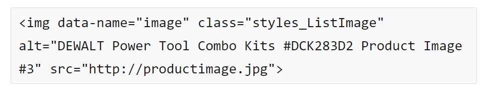
At Lowe’s, most of the visual elements on this product page have alt tags. For example, there is the primary alt text for the product image (“DEWALT Power Tool Combo Kits #DCK283D2 Product Image #3”). Then there is an additional alt tag for the badge at the top (“new lower price”). Finally there is an alt tag for the review stars (“5.0 out of 5 stars with 305 reviews”). Together these tags convey all the necessary nontext information visible on the page. Note, there is no separate alt tag for the thumbnail image.
Many users who use assistive technologies will rely on screen readers to describe a site to them.
For sites, special attention must be paid to non-text content which, in the case of ecommerce, is largely product images (which are crucial to users’ purchasing decisions).
If screen reader users can’t access or understand a site’s imagery, there’s a good chance that they’ll leave the site.
Therefore, to meet the needs of these users it’s important to use ALT text to communicate the core content of images; for example, “Informational” images and “Decorative” and “Functional” images.
Note that in particular images with embedded text can be problematic as they are inaccessible to assistive technologies such as screen readers and other tools that provide adaptive text sizing.
2) Support Keyboard Navigation
While many ecommerce users rely on keyboard navigation at one point or another, users with disabilities often rely completely on using the keyboard to navigate an ecommerce site.
For these users, the main navigation menu, filter interfaces, and list items can be particularly challenging.


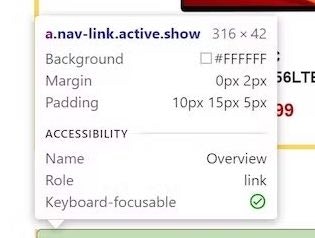
At Dell, the site navigation displays a keyboard focus indicator on all menu and submenu items to represent the unselected “hover” action (first image). Once a menu item has been selected by the user (second image), a background color change is used to indicate that selection.
Therefore, it’s key to ensure all interactive elements are fully operable from a keyboard.
This includes, in part, ensuring that keyboard focus indicators are implemented appropriately, ARIA landmarks for all major page sections are included, and skip links are provided as the first interactive element on each major page section.
3) Provide Sufficient Contrast and Readability
Ecommerce site information can be given directly through textual information, such as in a product description, or be indirectly communicated through other means, such as color, placement, and white space.

At Squarespace, several page elements violate the minimum contrast requirement for both regular-sized text and large text — coming it at a 1.2:1 ratio. In their unselected state, the buttons (e.g., “Marketing”, “Technology”, etc.) fail to achieve both the minimum 4.5:1 contrast requirement for normal-sized text as well as the 3:1 ratio for page elements (i.e., buttons). Additionally, the placeholder text (“Describe your site…”) also fails the minimum contrast requirement.

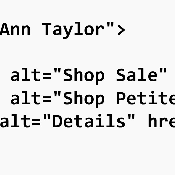
At Ann Taylor, the contrast between the form field borders and the background is sufficient (19.2:1).
However, poor visual design and styling can make it difficult for users with visual impairments to access and understand information on a site.
In particular, the EAA requires additional contrast in foreground images so that users with low vision can see them.
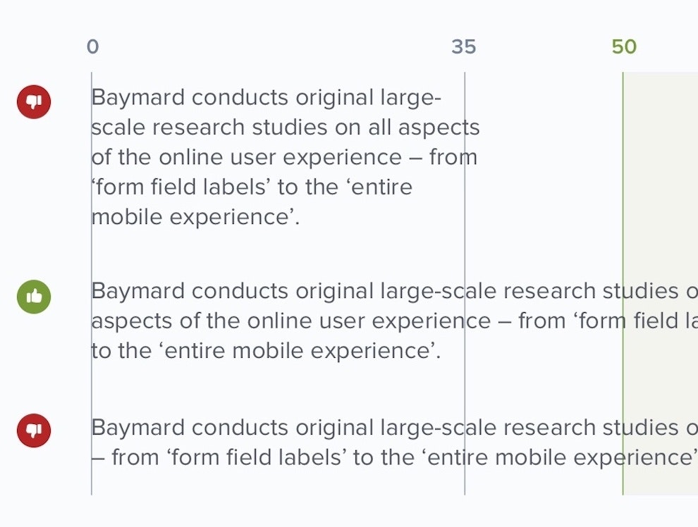
Additionally, in order to be in compliance with accessibility standards, text styling must be able to be set as follows:
- Line height (i.e., the spacing between lines of text): 1.5em (i.e., 1.5 times the font size)
- Paragraph spacing: 2em
- Word spacing: 0.16em
- Letter spacing (i.e., tracking): 0.12em
Note that specific site elements, such as tables and overlays, are often overlooked when it comes to accessibility compliance.
Yet to meet standards, it’s key that all text styling meets accessibility standards — including styling in elements that may be less heavily used by users.
4) Ensure Accessible Forms and Error Handling

At Hitachi, the user-entered data in the “Email address” field has failed validation. However, the only indication that there is any issue with the submitted information is a change in the color of the input field label from black to red, making it very difficult to notice — especially for color-blind users.

At Tesco, not only is the form field label color changed from black to red, but the form field is outlined in a slightly heavier line weight and in red. Additionally, a message is presented just below the form field with a slight change in background color behind the error message, making it stand out significantly from the surrounding page elements.
Poorly implemented form fields and user inputs can make inputting user information difficult, as users can be unsure of what information is being asked for and in what format the information is accepted — especially for users aided by assistive technologies.
The EAA requires that when an error is triggered, users relying on assistive technology should be able to apprehend that an error is occurring.
(Note that error messaging — or the lack thereof — can also bring users not relying on assistive technology to a halt.)

At Neiman Marcus, error messages alert users to formatting requirements for input fields. For example, the Zip code entered by the user was missing a digit, so the site alerts them to their error, as well as giving alternate formatting requirements for international users: “US zip codes must be limited to 5 digits. International postal codes may be up to 10 digits’‘.
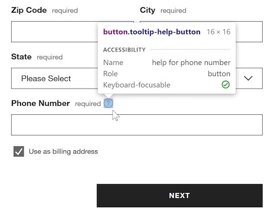
Errors and accessibility is a big topic; however, some examples of areas to focus on include providing screen reader–accessible group labels for forms, grouping form fields together within the markup language, and ensuring appropriate labeling of individual form fields.
If accessible markup language is missing from form fields and user inputs, it will be much more difficult — if not impossible — for users aided by screen readers to progress successfully through an ecommerce site’s various flows, particularly checkout.
5) Provide a Clear Structure with Headings and Landmarks
Users aided by assistive technologies can have difficulty navigating a site when the page titles aren’t clear and the heading order isn’t understandable in the markup.
For example, in order to be in accessibility compliance, it’s essential that all pages contain a <title> element, and, further, that the text each <title> element contains is accurate and descriptive of the current content, as well as ideally including where the page sits in relation to other areas of the site.

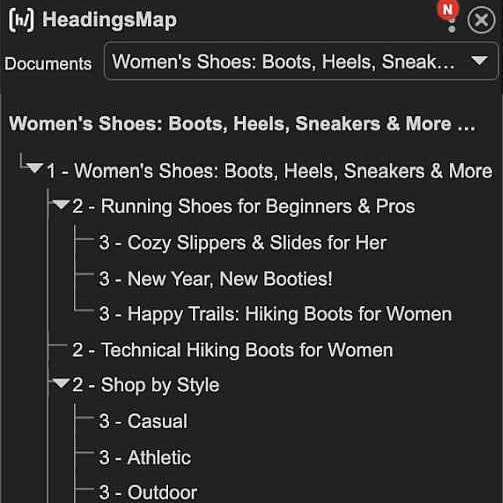
At HP, headings are presented out of order (e.g., <h5> ranks above <h3>), aren’t nested correctly (e.g., <h5>, <h3>, and <h2> are all listed at the same level), and some heading levels are skipped completely (e.g., <h1> and <h4> are nowhere to be found).

At Crutchfield, a screen reader displays a list of headers which would be announced to the user. From here, the user can choose to navigate down the page to any of these headers to further explore the page content.
Additionally, just as sighted users are able to use the various levels of text headers as visual landmarks, users aided by screen readers rely on the <header> elements in the HTML markup.
These range from <h1> for main headers, descending down through <h2> to <h6>, each with their own distinctive visual styles.
Finally, in addition to native HTML elements, ARIA landmark roles (e.g., role="heading", role="navigation") may be used to identify areas of a webpage’s layout that are important for users.
While there is some substantial overlap between the function and interaction of ARIA landmarks and HTML elements with screen readers, ARIA landmark roles are specifically designed for interaction with assistive technologies.
Putting Accessibility Guidelines Into Practice
An accessible interface is one that can be used by individuals with disabilities or impairments, allowing them to access and benefit from the same functionality as other users.
Yet our research shows that nearly all ecommerce sites in our benchmark have accessibility issues.
Clearly, much work remains to be done in order to make ecommerce websites accessible.
To that end, by implementing these requirements — adding text alternatives, enabling keyboard navigation, maintaining strong contrast, building accessible forms, and structuring pages clearly — websites can start to become more accessible for all users.
However, the topic of accessibility is much broader than this.
To delve into this topic in more depth, see our accessibility research, which provides 19 actionable UX guidelines for ecommerce sites that include intensive discussions of accessibility features and requirements, and include examples from ecommerce websites, videos, and code snippets.
Getting access: all 19 accessibility guidelines are available today within Baymard. (If you already have access through an account, open the Accessibility Study.)
If you want to know how your website performs and compares, then learn more about getting Baymard to conduct an Accessibility UX Audit of your site.