
Diapers.com UX Case Study
This is an old and partial case study of Diapers.com’s ecommerce user experience (UX) performance. We encourage you to explore the 334 up-to-date and exhaustive case studies of major ecommerce sites for a complete and current picture of the ecommerce UX landscape.
Diapers.com’s Desktop Web Ecommerce Design
9 pages of Diapers.com’s ecommerce site, marked up with 79 best practice examples:


Diapers.com’s Mobile Web Ecommerce Design
16 pages of Diapers.com’s ecommerce site, marked up with 76 best practice examples:


Explore Other Research Content
Every week, we publish a new article on how to build “state of the art” ecommerce experiences — here’s 5 popular ones:

Drop-Down Usability: When You Should (and Shouldn’t) Use Them
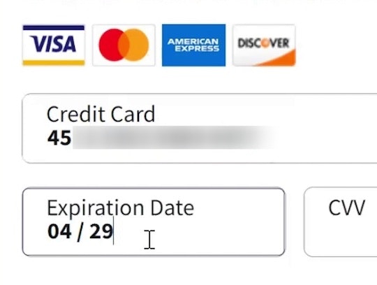
Format the “Expiration Date” Fields Exactly the Same as the Physical Credit Card (72% Don’t)

Avoid Using “Horizontal Tabs” for the Main Product Page Sections (29% Don’t)
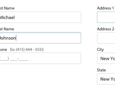
Form Field Usability: Avoid Extensive Multicolumn Layouts (16% Make This Form Usability Mistake)
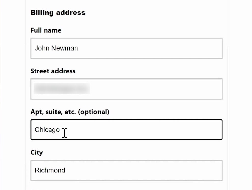
Form Usability: Getting ‘Address Line 2’ Right
See all 456 articles in the full public archive.