Key Takeaways
- A “Horizontal Tabs” product page navigation pattern has performed poorly over many years of large-scale testing
- Our latest testing confirms the continued poor performance of this pattern — yet it’s still used by 29% of sites
- Better-performing product page navigation patterns are “Expanded Sections” and “Vertically Collapsed Sections”
A basic assumption relied on by most users while navigating any product page is that simply scrolling vertically will allow them to access core content sections such as ”User Reviews” or ”Shipping Info”.
However, this assumption will be invalidated if some of that content is hidden by default, as is the case when “Horizontal Tabs” are used.
When this pattern is used, users’ instincts to scroll vertically could in fact make it less obvious how to reach relevant product information.
Consequently, during Baymard’s large-scale usability testing, participants were repeatedly observed to overlook core product page content that could only be reached via “Horizontal Tabs”.
This increases the risk that users will be left with an incomplete understanding of the product, which may affect their decision to purchase.
In this article we’ll discuss our latest research findings on product page navigation:
- Why using “Horizontal Tabs” for core product page content can be harmful for users’ ability to learn about and explore a product of interest
- Two alternatives to consider instead
Why “Horizontal Tabs” Make It Difficult to Find Content

“And I’m noticing this one doesn’t have any reviews. I don’t know if it’s because it’s brand new or…” On Ashley Furniture, this participant wanted to view user reviews of a product. Despite scanning up and down the page twice, she failed to notice the second tab, labelled ”Product Reviews”, so had to move on without this potentially valuable product-related information.
On product pages using “Horizontal Tabs”, once test participants wanted to view content not contained in the first tab (most commonly the “Product Description”, and always visible by default), the first instinct for some was to focus their attention below, not to the right, of their current location.
As “Horizontal Tabs” are situated just above the content they relate to, this meant that participants’ initial focus was moving away from the tabs, not towards them.
Additionally, “Horizontal Tabs” are not “sticky” UI elements that persist within the viewport.
Therefore, the tabs quickly disappeared once participants began to scroll down, removing from view the direct route to the information the participants were looking for.
Multiple scans up and down the product page were then insufficient for some participants to locate the relevant tab.
Tellingly, this was the case even when participants were actively scanning the page for specific sections, such as ”User Reviews”, that could only be accessed via a “Horizontal Tab” using that exact title.


“I will just check to see if this [item] is returnable.” On Houzz, this participant wanted confirmation that he could return the item if needed. Despite starting with his cursor hovering over the ”Shipping and Returns” tab that contained the information he needed (first image), he first scrolled to the bottom of the page then slowly back to the top before finding and clicking on the relevant tab (second image).
Furthermore, the main navigational issue counteracted by the inclusion of “Horizontal Tabs” is long-scrolling product pages.
In some cases, long-scrolling product pages can potentially disorient users on the product page and add significant friction when locating information.
Yet, despite the increased friction sometimes caused by long-scrolling product pages, “Horizontal Tabs” were observed to be a poor solution to this potential problem, whether on desktop or mobile sites (see guideline #753).
“Horizontal Tabs” on Desktop Sites


On Barnes & Noble, this participant was keen to see some of the content from the book she was considering buying. However, she did not notice the ”Read an Excerpt” tab (first image) and scrolled down the page. Only after prompting did she return to, and click on, the tab (second image). ”Now see this is the section I was looking for: ‘Read an Excerpt’. So that’s good to know that that’s there… but I didn’t see this section at all before…I overlooked it. I didn’t see that until just now.”
Due to the relatively large viewport on desktop, long-scrolling product pages have not been observed in testing as a major obstacle to product page content discovery on these devices.
The main potential benefit of “Horizontal Tabs” is therefore rendered largely irrelevant for desktop users — while the inherent risk remains.
So the net effect of using this pattern on desktop is to make it more likely that users will struggle to find core product page content that can only be accessed via tabs.
Note: where there is excessive scrolling by users on desktop product pages, it’s more likely that the product page contains unnecessary ads, cross-sells, and other secondary content, most of which will be located below the core content the majority of users will be scrolling to find.
Thus hiding core content behind tabs is treating the symptom (overly long-scrolling product pages) rather than the underlying disease (i.e., too much secondary or unnecessary content to scroll on the product page).
“Horizontal Tabs” on Mobile Sites


This participant on B&H wanted to view user reviews of a laptop. She started scanning down the page and reached the bottom of the page without finding them (first image): “So, where did the reviews go?” She then started scrolling back up the page, and noticed the “Horizontal Tabs” this time (second image). Then she had to scroll horizontally through the tabs to find ”Reviews” and tap on this to reveal the content she had been looking for (third image). This added significant time and effort to a common in-page navigational task.
Conversely, on mobile, the smaller viewport means that it is more common for long-scrolling product pages to make it significantly harder for users to navigate within product pages.
Despite this, “Horizontal Tabs” is also an unsuitable approach for in-page navigation on mobile.
The smaller viewport makes it more likely that mobile users will begin to scroll while reading content within the default tab, removing from view the remaining tabs that will give them access to the other core content sections.
As a result, after reading the content section expanded by default, mobile users will be forced to remember to scroll up — potentially several viewports — to return to the tabs and then select the next section of interest.
Again, this counters users’ instincts to continue to scroll down the page to find subsequent content sections.

On the LG mobile site, due to width limitations of the mobile viewport only two of the four tabs are fully visible at any one point, forcing users to scroll horizontally to view all of the available tabs.
Additionally — and a major drawback to horizontal tabs on mobile — the reduced width of the mobile viewport means that some of the tabs themselves are likely to be hidden by default.
This will require users to recognize the additional need to scroll horizontally to reveal these hidden tabs.
Only then will users be able to determine which tab would be best to tap on to access the information they are looking for, adding further navigational friction.
“Horizontal Tabs” Perform Poorly across Many Different Product Pages

This participant on Equal Parts repeatedly overlooked the “Specs” tab when looking for specific product details. Note the faded text for the section headers, which makes it even harder to see them.

“I’m still looking for, I don’t mind reading this big description, but I’m still looking for all of the things, I wanna see a list, I like lists, and I think a lot of people like just ‘list and bullet’, where I can just look and see the amenities. Oh here. I missed that. I totally missed this little tab thing here.” This participant shopping for rental properties at TurnKey during large-scale Travel Accommodations testing nearly overlooked the “Amenities” tab on the property details page.

“Let’s check out reviews because, and I should — I figured if I clicked that, that option here, it should have shown the reviews, and it didn’t show me the reviews. So let me go down, no reviews. Where the hell are the reviews?” Another participant shopping for rental properties at TurnKey nearly overlooked the “Reviews” tab on the property details page, expecting instead that clicking on the star rating would lead her to a “Reviews” section.


“Oh, but I’d have to check which one this is, the ‘10’ or the ‘16’. I think it said ‘10’ earlier, but it would be nice to see it somewhere on this page so I didn’t have to go back to check. Yeah, I don’t know which one it is”, remarked a participant (an electronics engineer) unable to find desired information on a product page at TE Connectivity during our large-scale B2B electronic components and machinery testing (first image). He abandoned the page and returned to the “Product Table” to search for the information. In fact, the desired information was available under “Contact Features” on the “Features” tab, but he overlooked it (second image; screenshot taken after testing concluded by researcher).
Regardless of platform, testing revealed that “Horizontal Tabs” caused findability issues for users on many different types of sites, including mass merchant, direct-to-consumer, and B2B sites.
Indeed, the reduced findability of content held within “Horizontal Tabs” makes this pattern a poor choice as the primary means of navigation.
This is true whether it’s navigating among “standard” product page content sections such as the “Product Description”, “User Reviews”, ”Q&As”, and “Shipping Info”, or navigating between more specialized core sections such as “Amenities” on Travel Accommodations sites or “CAD Resources” on Electronic Components and Machinery sites.
This increases the risk that some users will either fail to discover this information entirely — and missing key content can be the critical factor in a user’s decision not to purchase a product.

“Okay. I want to buy it. I’ve already decided I want to buy it, but I can’t. I still can’t see an option to buy — Oh, ‘Sample and Buy’.” A participant (an electronics engineer) initially overlooked the tabs at the top of product details page at STMicroelectronics during our large-scale B2B electronic components and machinery testing, only noticing them after he returned to the top of the page.
Even users who end up finding the content will still have to expend significant additional effort, slowing down their product discovery.
This is an especially serious issue for complex products that have lots of product page information to consume (as is often the case with highly technical products).
Exception: “Horizontal Tabs” Can Work for Secondary Content Subsections


“Oh, I like that you can go from one [subsection] to another. That’s good…So, I’d go through these [subsections].” On LG, this participant reacted positively to the use of tabbed navigation between various subsections of a product’s ”Features and Specs”.
While using “Horizontal Tabs” for core content sections was observed to perform poorly, there was also some evidence from testing that participants were less likely to overlook information when “Horizontal Tabs” were used as the means of moving between content subsections.
For example, when switching between different aspects of a product’s technical specifications.
The lower incidence of navigational issues in this context is most likely a consequence of users’ differing instinctive behaviors.
When looking to move on to a completely new section, users are more likely to begin scrolling, and scanning, down the page for visual clues to its location, leading to the navigational issues described above.
However, once in the section they believe contains the information they need, users will examine it in detail without scrolling, increasing the likelihood that they will notice and interact with the tabs required to access the other subsections.


This participant on the Walmart app accessed an overlay that split the product details into three different tabbed subsections: “Then we get more details” (first image). She was able to move quickly between subsections using the “Horizontal Tabs” to find the information she needed: “And we go into the _‘Specifications’. It’s an ‘Unlocked’ cell phone…I appreciate that, it doesn’t feel like anything’s hidden” (second image).
However, the fundamental physical size restrictions of mobile devices remain a design constraint.
Using “Horizontal Tabs” on mobile, even in this more limited role, should still not require users to scroll horizontally to reveal tabs.
This means there is a practical limit of around 2–3 subsections that could be displayed this way on mobile, depending on the number of characters in each subsection title.
What to Consider Using Instead of “Horizontal Tabs”
Product page navigation is a complex topic.
In short, there’s no “one size fits all” answer to what sites should provide for in-page product page navigation.
Deciding what design pattern to use depends on the amount of content typically provided on a site’s product pages — if the product pages are generally content heavy or content light.
Additionally, whether it’s preferred to use the same pattern across desktop and mobile sites matters as well.
That said, 2 patterns were generally observed to perform well for most participants during testing, depending on the platform they were on.

On Evo, navigation within the “Expanded Sections” layout is supported by the inclusion of a “Sticky ToC” at the top of the viewport. This allows users to either scroll vertically to reveal content on the page, or to use the permanently visible section links to jump to a specific section.
On desktop, the “Expanded Sections” layout should be considered.
Testing revealed that “Expanded Sections” best matched participants’ expectations of being able to reveal the core content on the desktop product page using only vertical scrolling.

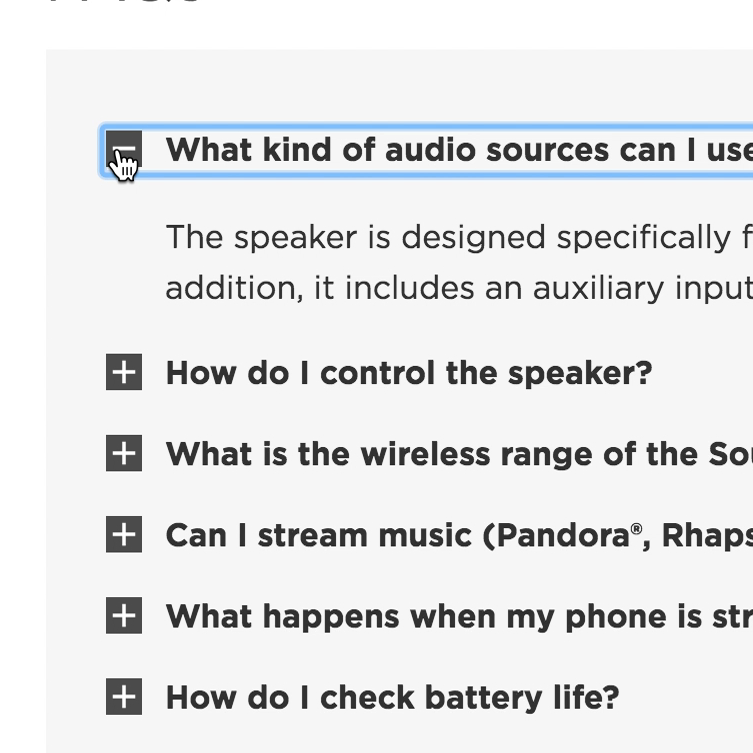
“Collapsed Sections” are used on the Lowe’s mobile site to provide clear navigational options to users seeking a specific section, as well as supporting users’ assumption that they should scroll down the page to view each content section in sequence.
On mobile, consider using either an “Expanded Sections” layout on shorter product pages or “Collapsed Sections” on longer product pages to counter the issue of excessive scrolling.
Note that on either desktop or mobile sites, truncating content is also an effective solution to overly long product page sections — in particular, for very long product descriptions, Q&A sections, or other content-heavy sections.
However, truncation needs to be clearly indicated to ensure users don’t miss the truncated content (and thus run into the same problem caused by “Horizontal Tabs”; see guideline #846).
Finally, it’s worth repeating that many product pages contain too-many unnecessary ads, cross-sells, and other secondary content.
In general, it’s better to allow users to focus on fully exploring the product, without interrupting them by including many overly prominent ads or other secondary content.
Ensure Users Can Find the Product Content They Need

”I’m just trying to find a bit more information about the materials.” A participant on Caraway overlooked the “Features & Materials” tab despite its location next to the default ”Overview” tab.
A space-saving product page content design may seem to be the best for users — yet our testing revealed that this is a false assumption.
While “Horizontal Tabs” may make the overall product page appear smaller on the front end, this design pattern ends up shortchanging some users who completely miss the hidden content.
This is a critical issue, as it can lead directly to users abandoning a product page, assuming the content they’re looking for isn’t available, when it’s just hidden by a “Horizontal Tab”.
Instead, opt for much safer product page content patterns of “Expanded Sections” or “Collapsed Sections”, as testing showed these patterns don’t have the content discoverability issues that the “Horizontal Tabs” pattern does.
This article presents the research findings from just 1 of the 700+ UX guidelines in Baymard – get full access to learn how to create a “State of the Art” ecommerce user experience.
If you want to know how your desktop site, mobile site, or app performs and compares, then learn more about getting Baymard to conduct a UX Audit of your site or app.