Key Takeaways
-
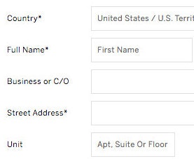
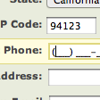
“Address Line 2” is a field that causes a surprising amount of friction for users
-
Hiding “Address Line 2” behind a link resolves the issue for users
-
However only 20% of sites in our benchmark hide “Address Line 2”
Video Summary
“Address Line 2” form fields — where users add an apartment number, suite, or other “secondary” address information — will typically only be used by a minority of users.
While there’s nothing wrong with including “Address Line 2” in the shipping address form, our large-scale Cart & Checkout testing reveals that the “Address Line 2” form field can be a surprising hurdle for some users to overcome when filling out their address information.
In fact, our usability testing shows participants coming to a halt and puzzling over the field, inputting incorrect information in the field, or simply becoming distracted by the field and staring at it, without ever entering any information into it.
Yet only 20% of sites in our e-commerce UX benchmark alleviate this issue for users by hiding “Address Line 2” behind a link.
In this article, we’ll discuss our Premium Research findings from our Cart & Checkout usability study related to the “Address Line 2” field. In particular, we’ll discuss:
- Why “Address Line 2” fields are so distracting for some users
- How to include “Address Line 2” in the address form to avoid distracting users
“Address Line 2” — A Surprisingly Distracting Field
It may seem that “Address Line 2” — which likely won’t be used by many users — would simply be ignored by those users who don’t need to input anything in the field.
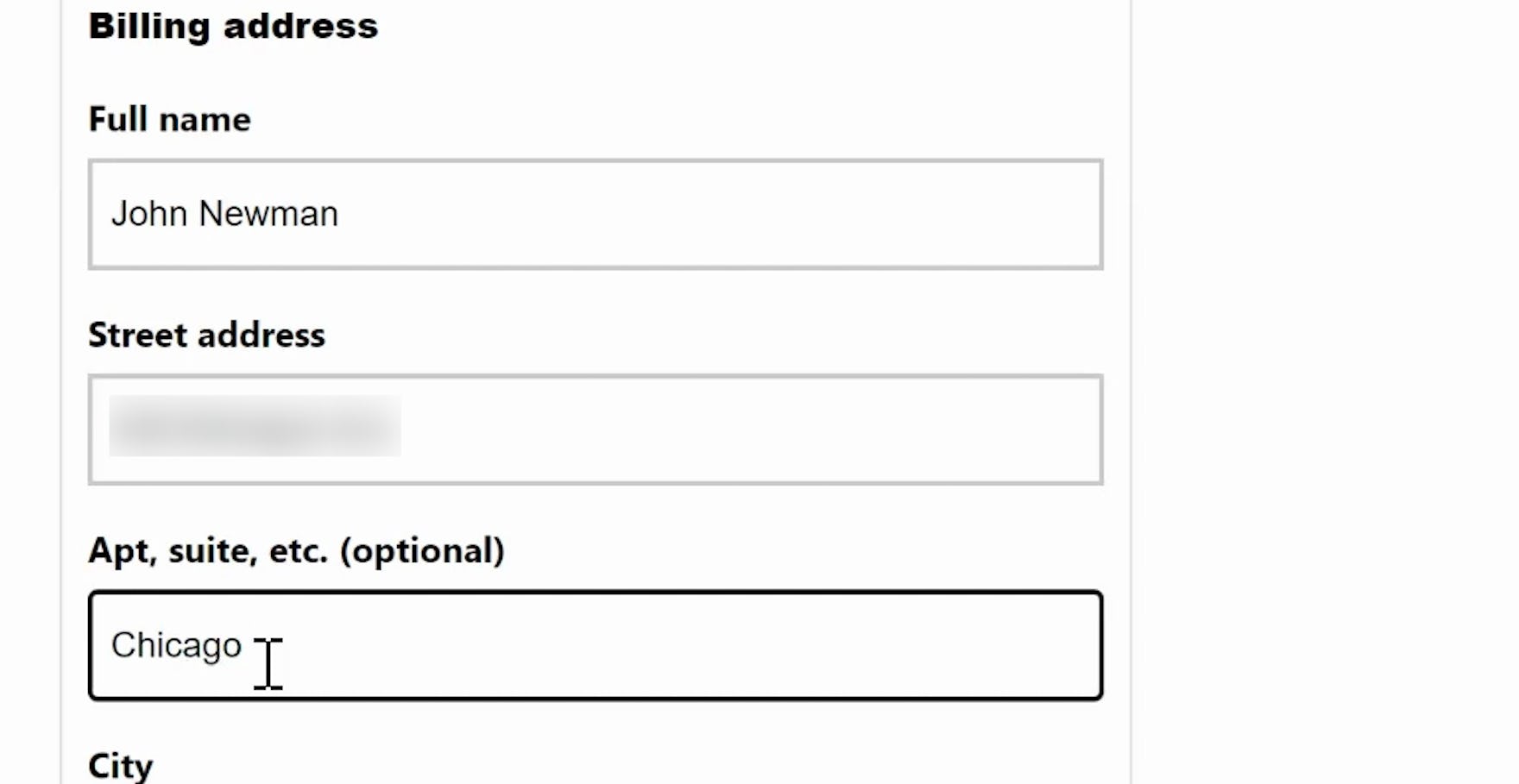
“I dunno why I didn’t enter an address. Oh, I put it in the wrong field. Oops.” On Snowe, a participant accidentally entered her address in the “Address Line 2” field and received an error message.
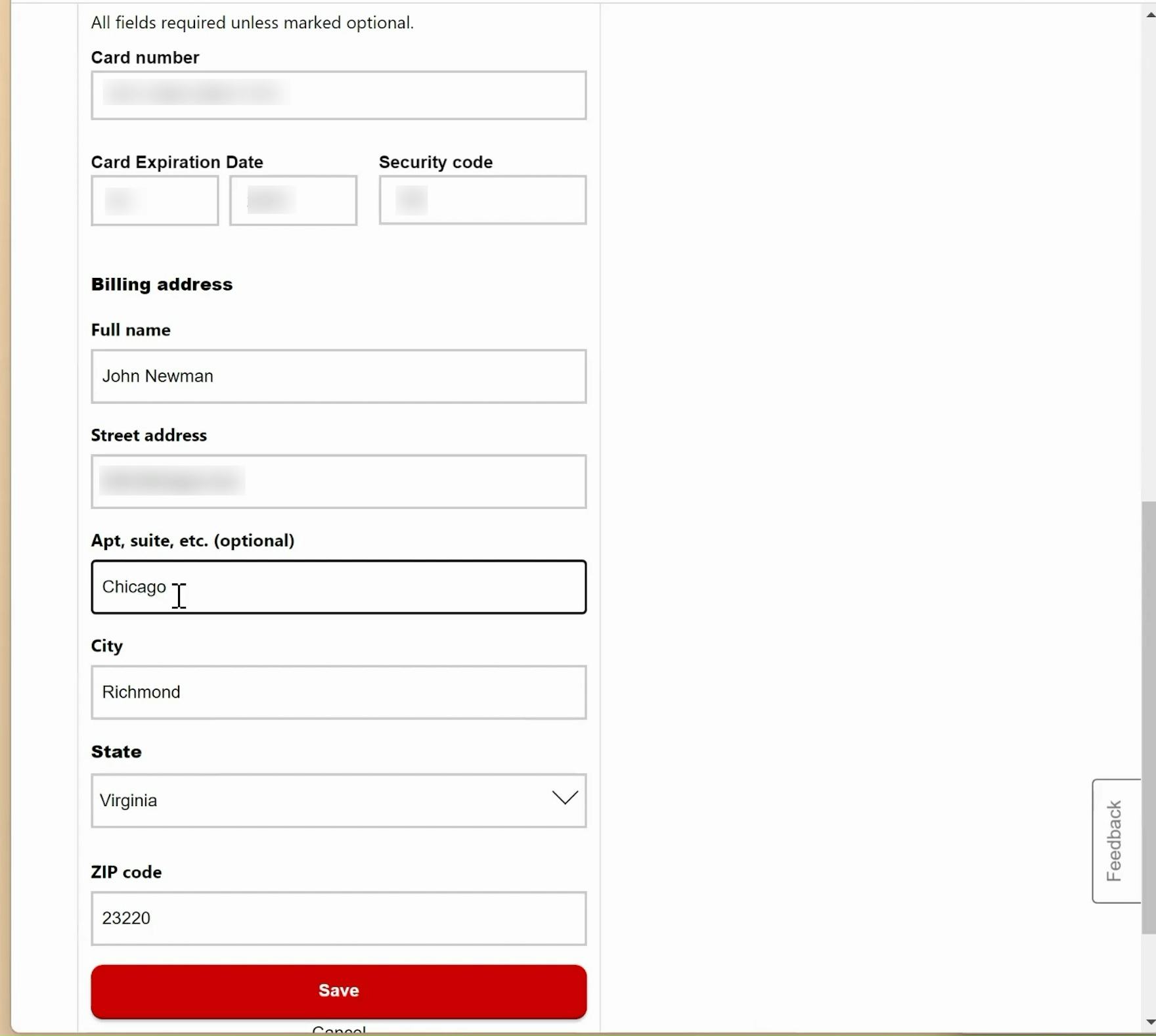
“Oh, that’s not the apartment. There we go.” A participant on CVS accidentally began typing in the “Address Line 2” field before realizing the error.
Yet, during testing, some participants were observed to be confused by “Address Line 2” fields — many came to a stop to consider the field, while others, upon seeing the field, began to doubt that their input in the “Address Line 1” field was correct.
In general, many users, faced with long checkout forms, try to get through them as quickly as possible.
Consequently, users will often not read the labels and instead rely on the general location of the field to infer what should be typed in it.
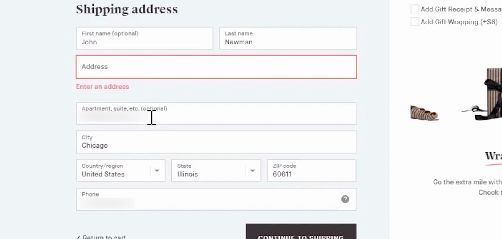
Hence, many users inputting their address information are likely to not read the label “Address Line 2” — instead, they’ll simply continue filling out their address information, only to realize later that they’ve entered information in “Address Line 2” that shouldn’t be there.
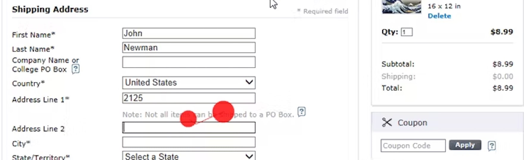
Having provided the street number in “Address Line 1” at AllPosters, this user tabbed to “Address Line 2”, and only then realized that both the street number and street name should be placed in the “Address Line 1” field.
Furthermore, while “Address Line 2” fields are almost always optional, we consistently observe that optional inputs presented as open text fields nevertheless demand a disproportionate amount of attention — seen especially in our eye-tracking study gaze plot data — as users still have to notice that the field is optional and determine whether the field is relevant for them.
In order to understand whether it’s relevant or not users will need a somewhat good understanding of address formatting and structures, and it was in particular observed that the participants without anything to input in the “Address Line 2” field struggled with understanding it.
Moreover, besides the high amount of focus, the most commonly observed issue with the “Address Line 2” field during testing is field ambiguity, with users often wondering if they should type all street information in “Address Line 1” (street name, number, apartment floor, apartment number, etc.) or divide it into two, following the logic of “Two form fields, two inputs”.
The presence of an “Address Line 2” field can therefore unintentionally confuse users who don’t have any use for it.
During testing, most participants were able to solve this issue themselves and the presence of an “Address Line 2” form field will therefore seldomly provoke a direct validation error.
Yet it should be noted that users will generally go to great lengths to try and preempt validation errors during the checkout process.
Hence, even though “Address Line 2” may not directly provoke a validation error, testing showed how “Address Line 2” often results in users coming to a complete stop in the typing flow as they worry about inputting the wrong information — resulting in a needlessly cumbersome typing experience.
How to Include “Address Line 2” in the Address Form
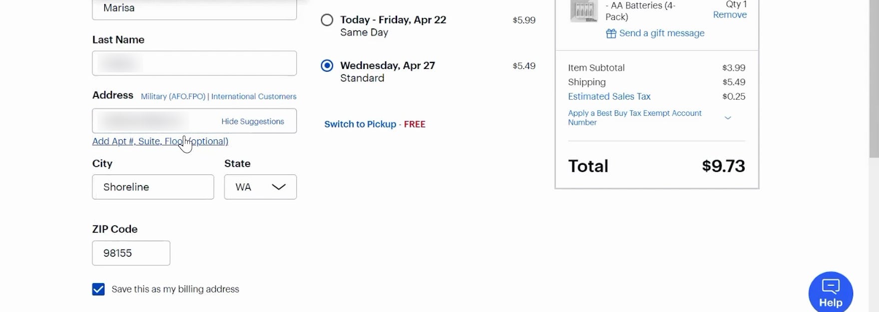
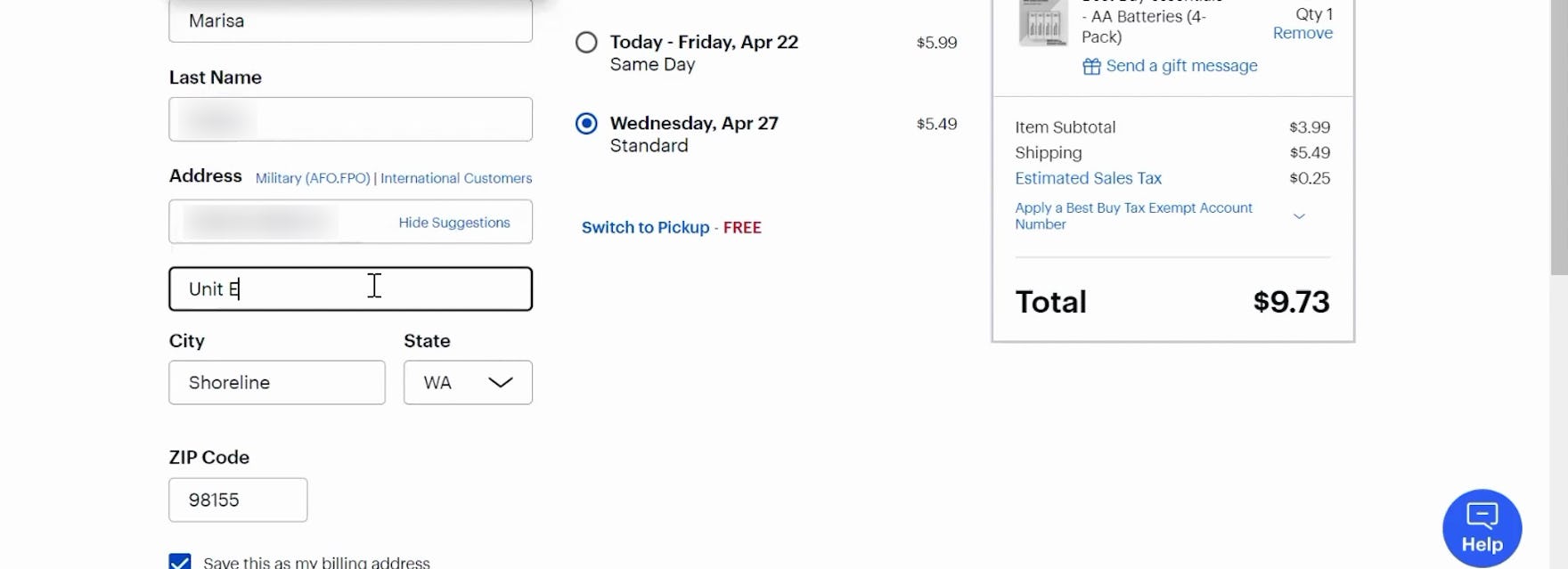
At Best Buy, a participant opened the “Address Line 2” field (first image) and entered her unit number (second image)
On Target’s mobile site, “Address Line 2” is also hidden behind a link, allowing the likely majority of users who have no need for it to quickly skip past and continue filling out their address information.
A design pattern that during testing was observed to perform well is to simply hide the “Address Line 2” form field behind a link.
By only permanently displaying “Address Line 1”, users are much less likely to second-guess their initial input, as there’s no immediately available option to divide the address in two.
As importantly, on the sites that provided a link to reveal the “Address Line 2” field, our eye-tracking testing revealed that all participants noted the links before moving on or engaging with them.
This is a crucial detail, as the subset of users who do have a use for “Address Line 2” of course need to be able to spot the link.
Besides reducing ambiguity and speeding up typing, an additional bonus of hiding “Address Line 2” is showing one less form field by default, making the step feel less intimidating.
Note: hiding “Address Line 2” behind a link is naturally only advisable if the majority of site users don’t need it. If a significant amount of users do need “Address Line 2”, it should be permanently visible as a form field. If in doubt, it’s advisable to run a custom analysis of the current order data to gauge the usage, but also analyze the type of usage (i.e., the amount of wrongly submitted “Address Line 2” data).
Ensure “Address Line 2” Doesn’t Bring Users to a Halt
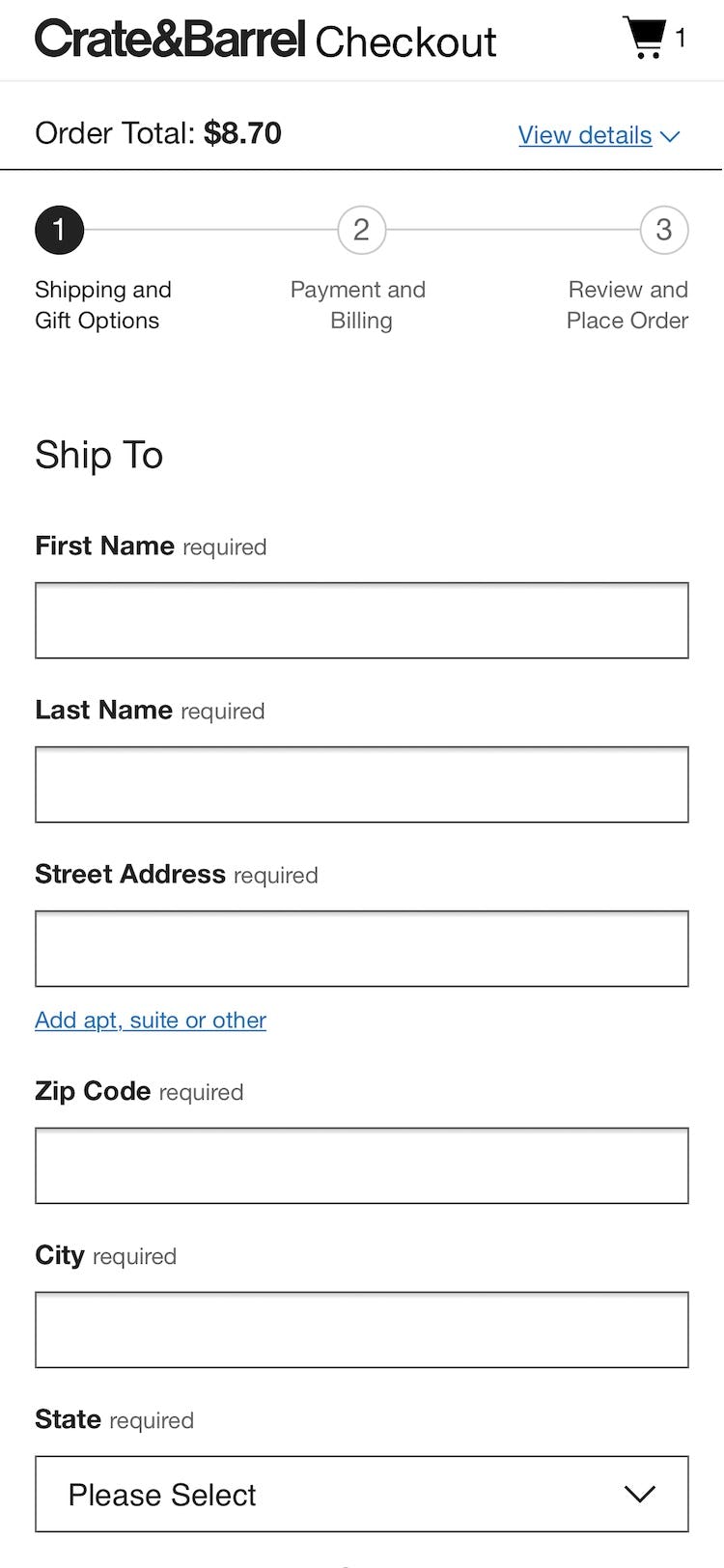
At Crate & Barrel, “Address Line 2” is hidden behind a link, and required fields are marked “required”. To perfect this implementation, “Address Line 2” should also be explicitly marked “optional”.
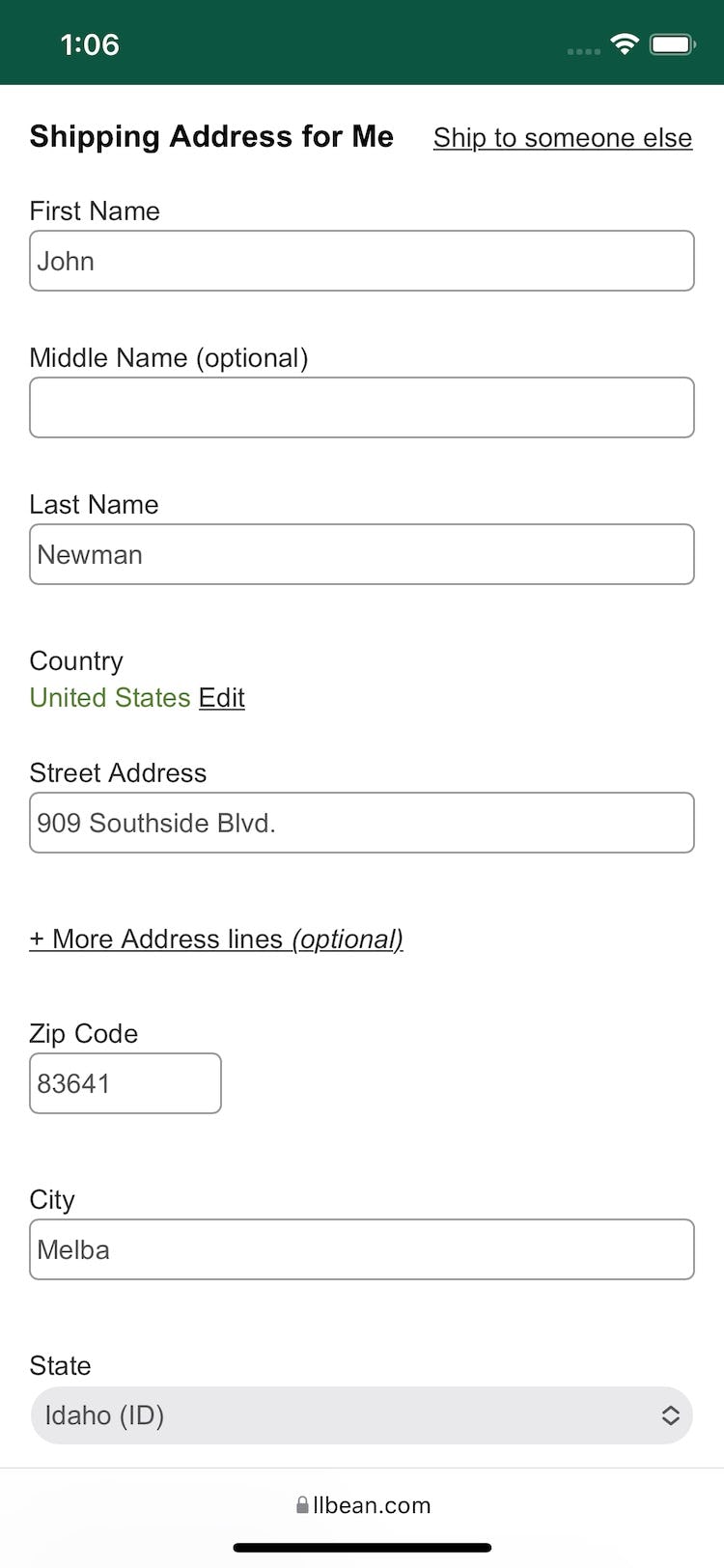
At L.L. Bean, “Address Line 2” is hidden behind a link, and is marked “optional”. However, required fields aren’t marked. In addition to hiding “Address Line 2” behind a link, it’s important to also mark “address” and other fields as “Required” or “Optional”. Doing so makes it clear to users scanning forms which fields they must fill out and which they can skip. However, no sites in our benchmark mark both “required” and “optional” fields, and hide “Address Line 2” behind a link.
The “Address Line 2” field certainly isn’t that one single thing that will make or break your entire checkout experience.
It is, however, one of those 10–20 smaller improvements that it takes to lift a checkout experience from good to great.
Testing revealed that “Address Line 2”, despite being an unneeded field for most users, caused unnecessary disruption to the form-filling process when it wasn’t hidden behind a link.
On the other hand, hiding “Address Line 2” behind a link is, for most sites, a way to improve the checkout experience without requiring many resources to implement — in other words, low-hanging fruit.
Indeed, hiding “Address Line 2” is one way of further optimizing the checkout UX for users to ensure they’re able to move efficiently toward finalizing their order.
Despite the benefits of hiding “Address Line 2” and the likely low implementation costs, only 20% of sites in our e-commerce UX benchmark hide “Address Line 2” behind a link — causing unnecessary friction for the majority of users who don’t need to input any data into the field.
This article presents the research findings from just 1 of the 700+ UX guidelines in Baymard – get full access to learn how to create a “State of the Art” ecommerce user experience.