Key Takeaways
- 46% of test sites in our benchmark don’t let users reliably search within the filter types, resulting in needless friction
- Long lists of filter options that hinder users from easily locating desired filters can cause users to give up on filtering
- Providing a search feature within a filter type with many options allows users to easily find exact part specifications they require for projects
In Baymard’s large-scale UX testing of B2B Electronic Components & Machinery, long lists of filter options in “Product Tables” on desktop for spec-heavy products like B2B electronic components and machinery were observed to significantly impact users’ ability to locate desired options.
Indeed, as observed in testing, B2B category-specific filter types can often have 100+ filter options; for example, a large distributor site will have hundreds of “resistance value” options by which to filter its selection of “single-surface mounted fixed resistors”.
Consequently, some users will struggle with long lists of filter options because of how they are presented, finding it difficult to locate needed filtering options.
To enable users to efficiently zero in on the items in the “Product Table” that precisely match their specific product-design criteria, B2B electronic components and machinery sites should allow users to search long lists of filter options.
This article will discuss our latest Premium research findings on how to display product listings for extremely spec-heavy B2B electronic components and machinery products:
- Why long lists of filter options are difficult to scan
- How a search feature helps users to quickly find desired filter options
- Why ordering filter lists logically (based on individual filter type specs) supports users scanning filter options
Why Long Lists of Filter Options Are Difficult to Scan
”I am looking for a 1K resistor. I’m having trouble finding it here. The values are also not sorted…so for me to even find a ‘1K’ is difficult here. Where is it?” laughed a participant (a senior hardware engineer) as he scrolled the long list of options in the “Resistance” filter list above the “Product Table” at CoreStaff. ”Okay, I see a ‘5k’. Okay, we’re getting close. Oh, nope…If I were doing this for work, I’d be like, ‘I’m out of here. I’m done.’” Unable to locate the desired filter value, he eventually gave up trying to filter by “Resistance”.
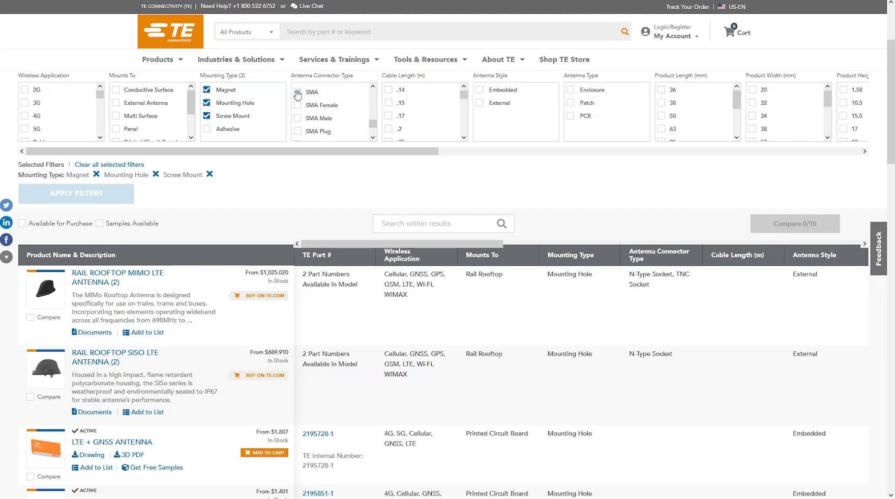
”There’s a lot of these. I’m not going to find what I want quickly”, remarked a participant as he scrolled through the long list of “Series” filter options for “Power Relays” at TE Connectivity. He abandoned that filter and decided to focus on the “Relay Mounting Type” filter instead.
When users shopping at B2B electronic component and machinery sites are presented with long lists of filter options, it can be challenging to locate desired options — for example, there are likely to be many more than 15–20 options in the “Capacitance”, “Voltage Rating”, and “Equivalent Series Resistance” filter types for film capacitors.
In practice, when faced with long lists of filter options, users have to scroll through potentially hundreds of options in each of the sometimes small-sized dedicated inline scrollable areas to find the exact part specifications they require for their product design.
Meanwhile, as observed during testing, a subgroup of users will face challenges scrolling vertically in the lengthy lists.
Moreover, during testing, some sites which displayed filters in a vertical layout sized the dedicated inline scrollable lists so small that only a couple of filter options were visible at a time — requiring participants to expend extra effort to locate and apply desired filters.
How a Search Feature Helps Users to Quickly Find Desired Filter Options
”Okay. ‘Resistance’. Um, let’s see. Do you have ‘2.2MΩ’? No, you don’t. ‘200kΩ’.” This participant (a field engineer) shopping for thermistors at Future Electronics searched for a resistance value in “megaohms” (MΩ) (first image), then, based on the results, switched his search to “kiloohms” (kΩ) (second image).
After briefly scrolling the long list of “Capacitance Value” filter options at Arrow Electronics, this participant decided to search. He quickly found the desired “1μF” value and filtered the 44,000+ capacitors to 777.
Therefore, a search feature should be provided when many filter options are available for a particular filter type (e.g., more than 15–20).
Indeed, testing revealed that participants were able to quickly find desired filter options when there was a search feature within a filter type with many filter options — as a participant (an electronics engineer) positively remarked after searching a “Resistance” filter which contained hundreds of options, “I’m going to go ahead and use the search feature and see if I can do ‘1.2K’. Okay, that does come up pretty easily. So, that was fairly simple.”
Yet, at 46% of test sites, participants couldn’t reliably search within the filter types, resulting in needless friction and frustration.
Additionally, search features within filter types should adhere to the general guidelines for designing such features, such as showing the number of matches for each suggestion, having a way to clear the search term (such as an “X” within the search box), and highlighting the portions of suggestions that users don’t type.
Why Ordering Filter Lists Logically (Based on Individual Filter Type Specs) Supports Users Scanning Filter Options
”[Here] ‘0ohms’ is right next to the ‘1.1kΩ’ — that’s really useful”, snickered a participant (a senior hardware engineer) sarcastically as he searched the long list of “Resistance” filter options at CoreStaff for “1kΩ”. When there is no discernable order to the filter options, users must spend valuable time and effort scrolling and scanning the list.
”This is very odd to me. They don’t have it sorted — I can see what they did here. They have ‘680 kiloohms’ and then ‘680 ohms’, which is a very big range right next to each other!” This participant shopping for through-hole resistors at RS Components, Ltd. questioned the numerical order of the “Resistance” filter options. He eventually gave up scanning the list and turned his focus to the search box to locate the desired resistance value.
As observed during testing, if there is no discernable order to the filter options, users will experience additional friction as they will have to scroll more slowly through the long lists, scanning for the desired part specs.
As a participant (a senior hardware engineer) shopping for surface-mount chip resistors complained, “I would expect the ‘Power’ to be in order, not starting at ‘1W’ and then going to the ‘0.1’…rather than sort of by smallest to largest. Same here for ‘Tolerance’.”
In practice, if users want to be sure they’ve selected all of the most relevant filter options, they will need to scroll up and down the list a few times before being satisfied that they have selected them all — and they may still miss some relevant options.
Therefore, as observed in testing, the filter options must be ordered logically — based on the individual filter type specs — so as to support users’ product-finding efforts.
For example, when filtering resistors, manufacturer names would be ordered alphabetically, and temperatures would be ordered numerically; however, the ordering of options for filtering the resistors by resistance measurement unit (ohms) may need to be unique to that part specification — ordering values numerically first by milliohms (mΩ), next by ohms (Ω), then by kiloohms (kΩ), and finally by megaohms (MΩ) — so that they are truly ordered smallest to largest.
Help B2B Users Quickly Find Exact Part Specifications in the Product List
”So, I’m just going to use the search here…So, I type in ‘1 kiloohm’, and I select that…and then ‘1,000 ohms’, which is the same thing.” A participant (an electronics engineer) quickly filtered over 61,000 resistors in the “Product Table” at Future Electronics to just over 650. He then applied two additional filters, further reducing the number of parts.
As our research has shown, narrowing items in the “Product Table” to contain only parts that precisely match users’ product-design requirements can take significant time and effort.
Therefore, it’s important to support users’ exacting parts requirements by allowing them to search within filter types that contain many options.
Thus providing a search feature allows users to easily find exact part specifications they need for their design projects.
However, manufacturer and distributor sites that force users to scroll through unwieldy numbers of options in order to find desired parts hinder users’ product-finding efforts — causing them frustration and risking that they abandon the site.
Getting access: our current B2B Electronic Components & Machinery research study is ongoing and new industry-specific guidelines are published every month in Baymard Premium. The full study is expected to be completed in Spring 2024.
If you want to know how your B2B electronic components and machinery website performs and compares, then learn more about getting Baymard to conduct a B2B Electronic Components & Machinery UX Audit of your site.


![”[Here] ‘0ohms’ is right next to the ‘1.1kΩ’ — that’s really useful”, snickered a participant (a senior hardware engineer) sarcastically as he searched the long list of “Resistance” filter options at CoreStaff for “1kΩ”. When there is no discernable order to the filter options, users must spend valuable time and effort scrolling and scanning the list.](https://baymard-assets-cdn.imgix.net/research/media_files/attachments/99554/original/research-media-file-8232728efcd63e7a2c21b6d0bd8ae9da.jpg?auto=format&dpr=2&fit=max&q=50&w=880)


