Key Takeaways
- Providing a “List View” on desktop makes it difficult for users to evaluate and compare extremely specialized products
- Product listings layouts that don’t support complex filtering and sorting can cause users to overlook suitable parts
- Using “Product Tables” to display item listings on desktop for highly spec-heavy products allows users to efficiently find relevant parts for their business projects
In Baymard’s large-scale UX testing of B2B Electronic Components & Machinery, the layout or “View” used to present the product listings on desktop for spec-heavy products like B2B electronic components and machinery was observed to significantly impact the site’s overall performance.
Indeed, B2B electronic components and machinery typically have many complex attributes that factor into a user’s purchasing decision.
However, as shown in testing, when the layout of the product listings interferes with efficient and effective evaluation and comparison of individual product attributes, users have to spend additional time and effort to identify the most relevant parts for their business projects.
Meanwhile, a subgroup of users risk overlooking or misinterpreting important product attributes and disregarding perfectly suitable matches.
To enable users to easily evaluate and compare highly specialized products so they can find suitable parts for their projects, B2B electronic components and machinery sites should use “Product Tables” to display item listings on desktop.
This article will discuss our latest Premium research findings on how to display product listings for extremely spec-heavy B2B electronic components and machinery products:
-
Why “List View” layouts are less effective on desktop for complex product-finding needs
- How “Product Tables” help users easily find relevant parts
- Why product lists instead of “Product Tables” are a better choice for mobile
Why “List View” Layouts Are Less Effective on Desktop for Complex Product-Finding Needs
As observed during B2C testing, the layout of list item details can significantly impact users’ ability to efficiently and effectively identify relevant products.
For example, when there aren’t enough product specs and attributes shown in list items for spec-driven products such as TVs and large appliances, users will be unable to fully evaluate and compare products directly in product lists.
Thus, a “List View”, which allows more product attributes to be included in the list item details, has long been recommended for regular spec-driven products (as opposed to a “Grid View”).
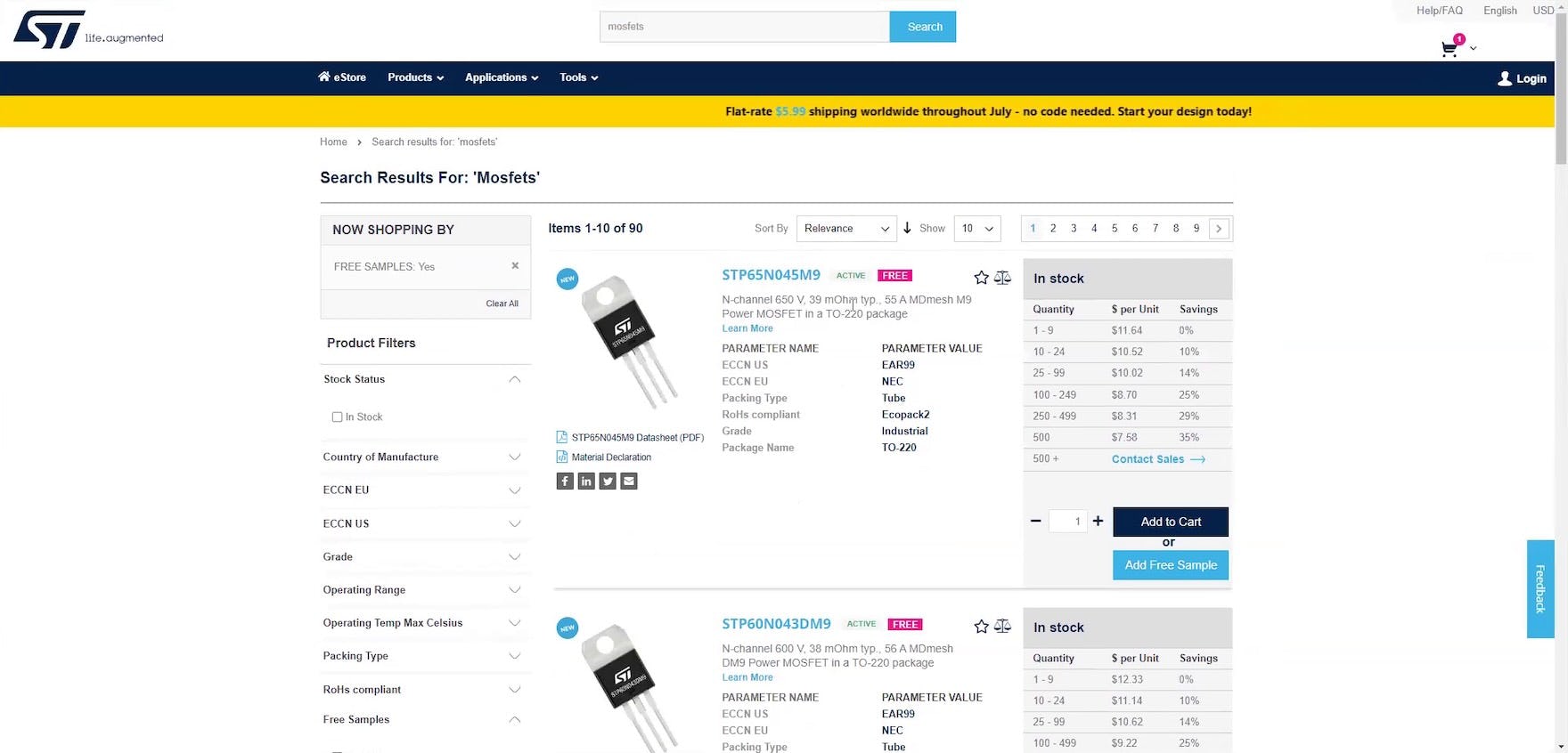
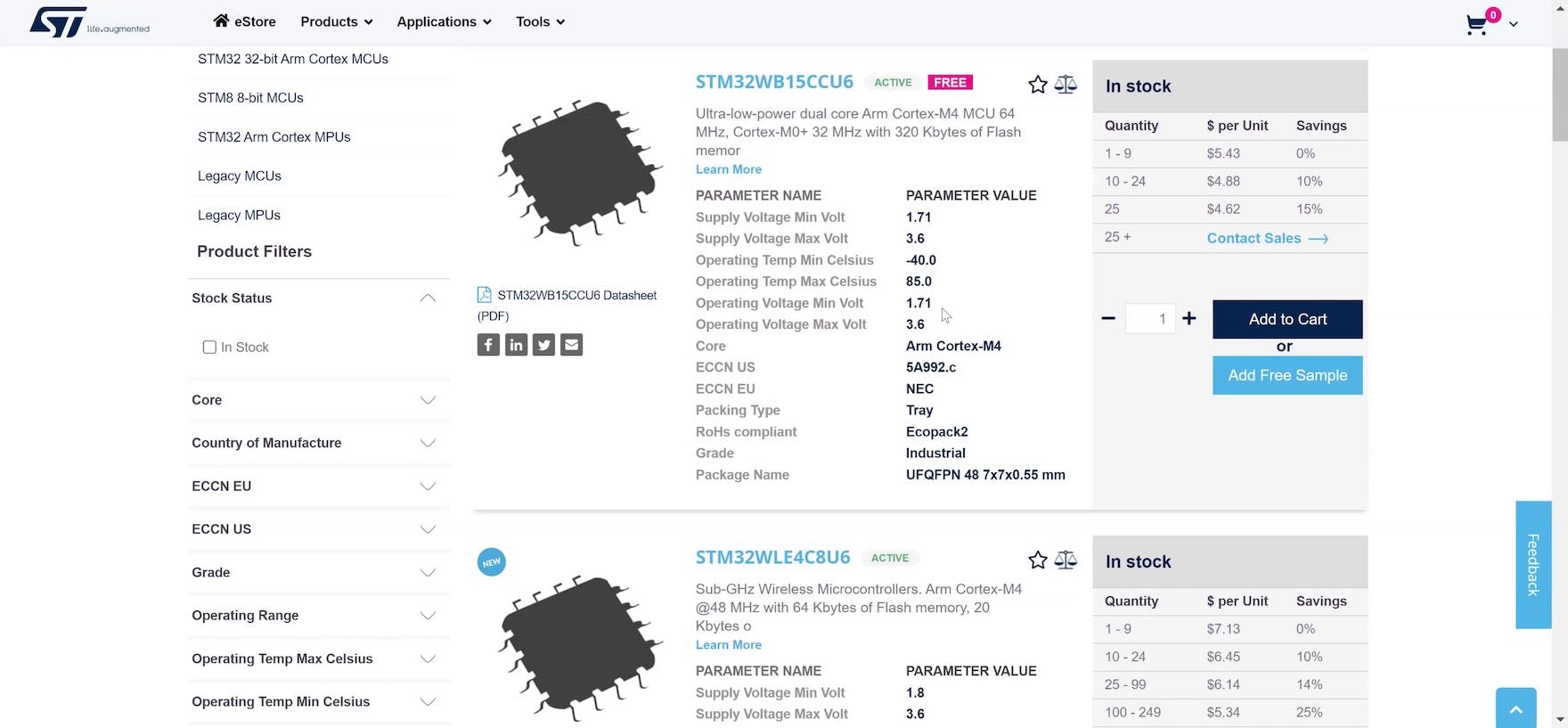
“It’s slower to scroll through. It’s not bad, but I do like the table option a little bit more because you can really scan for key characteristics instead of trying to read through this text here”, remarked a participant (a design engineer) about the “List View” layout of his search results for “MOSFETs” at STMicroelectronics eStore.
![“I like the other [sites] because you can sort it by different parameters. Whereas I don’t feel like I would be able to with this one”, remarked another participant (a biomedical engineer), frustrated because he couldn’t sort the list of “Pressure Sensors” at STMicroelectronics eStore by minimum and maximum pressure.](https://baymard-assets-cdn.imgix.net/research/media_files/attachments/98514/original/research-media-file-69149843c21f687dc61bb6efba91b55d.jpg?auto=format&dpr=2&fit=max&q=50&w=880)
“I like the other [sites] because you can sort it by different parameters. Whereas I don’t feel like I would be able to with this one”, remarked another participant (a biomedical engineer), frustrated because he couldn’t sort the list of “Pressure Sensors” at STMicroelectronics eStore by minimum and maximum pressure.
However, during testing of B2B electronic components and machinery sites, the “List View” was in fact observed to fall short of both meeting participants’ intense information needs and supporting detailed comparison.
For example, one participant — a biomechanical engineer — comparing microprocessors in a “List View” nearly overlooked multiple key differences: “‘Flash Memory’, okay. ‘Supply Voltage’, ‘Operating Voltage’, okay. ‘Arm Cortex M4’. If I were to compare these 2, the ‘minimum supply voltage’ is similar — Oh, no, this [one] is wireless, and [there’s] less flash memory”.
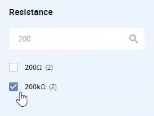
Additionally, a “List View” doesn’t adequately support the complex level of filtering and sorting that was observed to be crucial for many participants during testing who wanted to zero in on the most suitable parts for their projects — as this other participant (a biomedical engineer) scanning the “List View” at one of the test sites complained, “It would’ve been nice to actually be able to sort by technical parameters, like how much pressure we’re sensing and things like that”.
How “Product Tables” Help Users Easily Find Relevant Parts
“I can scroll through, and it will show me some of the attributes of the part — probably the same attributes as when I click into the part — which helps a lot”, explained a participant (a computer engineer) as he scrolled horizontally in a “Product Table” at Newark. As observed during testing, “Product Tables” are highly effective because they allow users to quickly scan, evaluate, and compare a wide array of complex product information to zero in on the most suitable products.
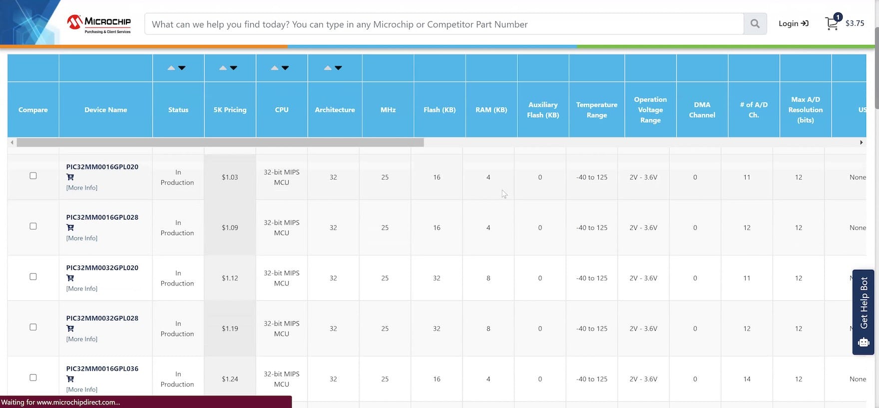
“I’m a fan of having kind of like a spreadsheet — a table layout like this — just because it kind of shows everything all at once. I like to see all the details all at once because I’ll forget if I can’t see them”, laughed a participant (a biomechanical engineer) viewing a “Product Table” at Microchip Direct.
Therefore, “Product Tables” should be used instead of a “List View” on desktop to display search results and product lists for B2B electronic components and machinery sites.
(Note: while we tested only electronic components and machinery sites, it’s likely that other spec-heavy B2B sites would also benefit from displaying product listings in “Product Tables”.)
During testing, nearly all the manufacturer and distributor sites tested presented search results and product listings in a “Product Table” — thus making it even more likely that it’s a convention for the industry that has come to be expected by users.
In practice, “Product Tables” are optimal for supporting desktop users in evaluating and comparing highly spec-heavy products because they allow users to view even more product attributes than is possible with a traditional “List View”.
Additionally, “Product Tables” allow users to more efficiently and effectively compare the highly specialized and often complex attributes across multiple rows of products to quickly identify which items to examine more closely and which they can skip.
As one participant (an R&D researcher) remarked, “Okay, so this looks like something I’m more familiar with. It looks like it’s got a table with just very slightly different parts, and then it tells you what is so slightly different about them. Yeah, this could definitely give me some good information”.
Moreover, “Product Tables” provide users with robust features to manipulate the product listings.
Indeed, several participants during testing were observed to filter product listings by multiple parameters, then reorder the listings by sorting on individual spec columns.
As one participant (an electronics design engineer) explained, “Every single column also has the ascending, descending order, which is useful depending on what you want. Like with ‘Quantity’, I would obviously go descending, ‘Price’, ascending, and ‘Size’, probably ascending”.
Why Product Lists Instead of “Product Tables” Are a Better Choice for Mobile
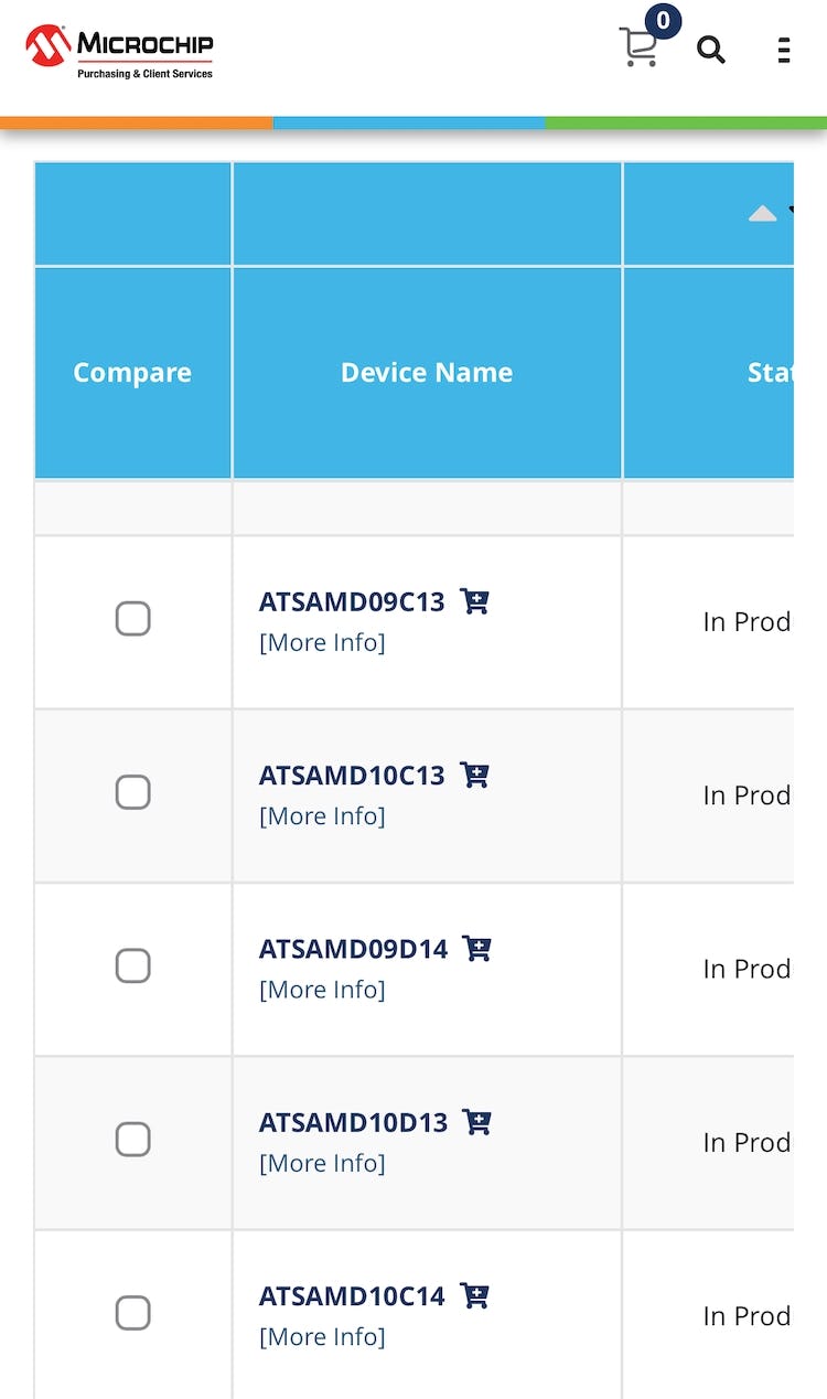
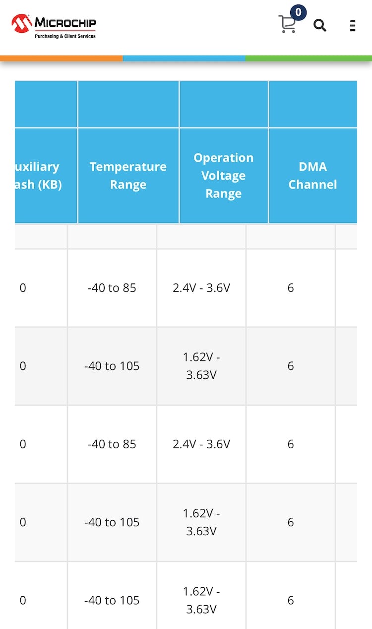
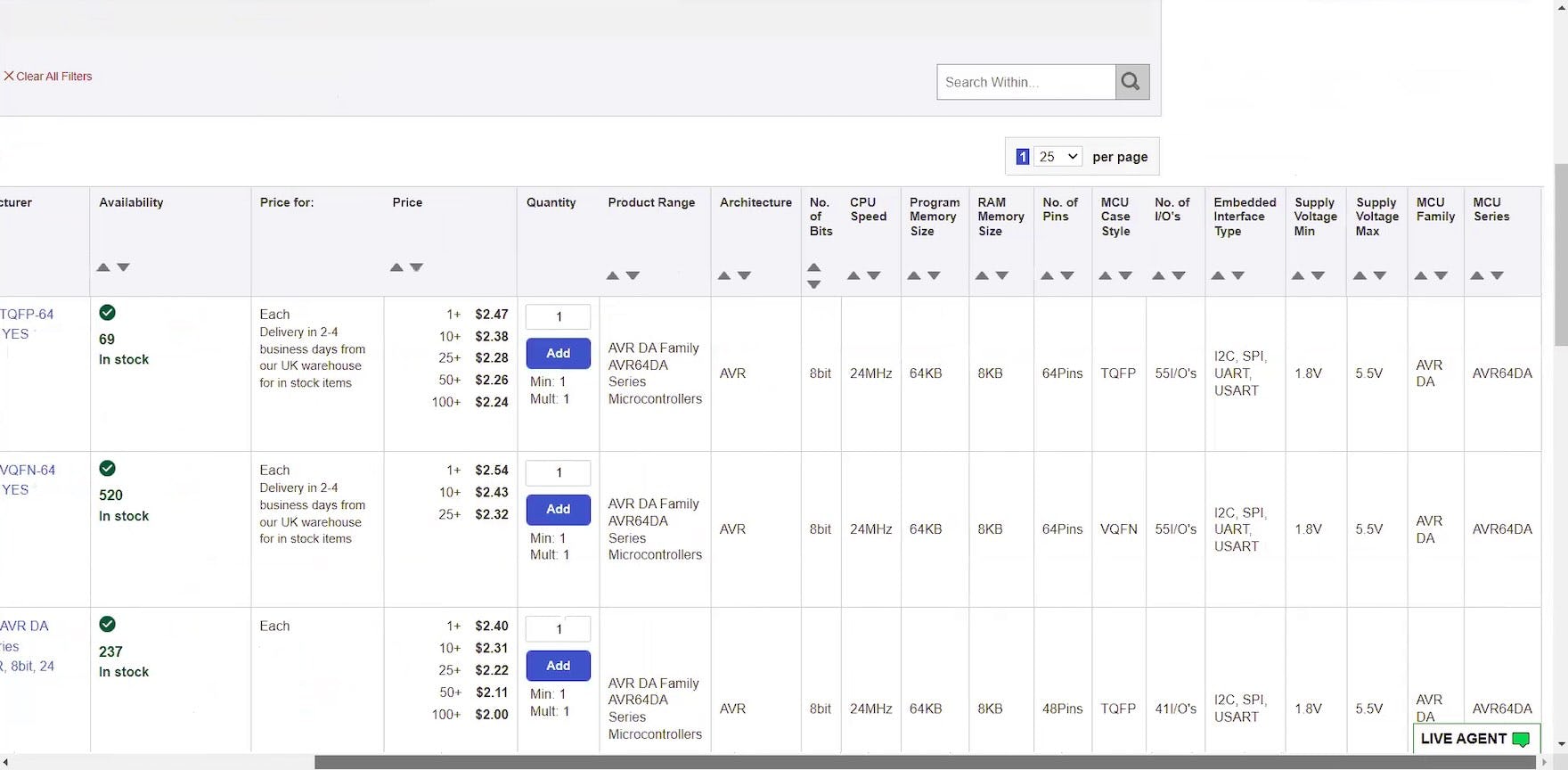
At Microchip Direct, only a few columns in the “Product Table” for 32-bit microcontrollers were visible at a time in portrait mode (first image). Moreover, an exorbitant amount of swiping was required to scroll horizontally within the table to view additional attributes such as “Temperature Range” or “Operation Voltage Range” (second image; screenshots taken after testing concluded by researcher). Lastly, remaining oriented within the table was challenging as the column headings did not persist while scrolling vertically within the table on mobile.
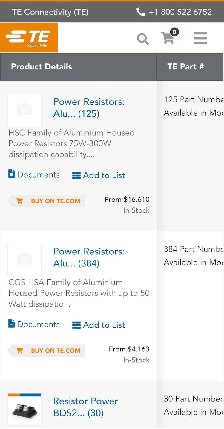
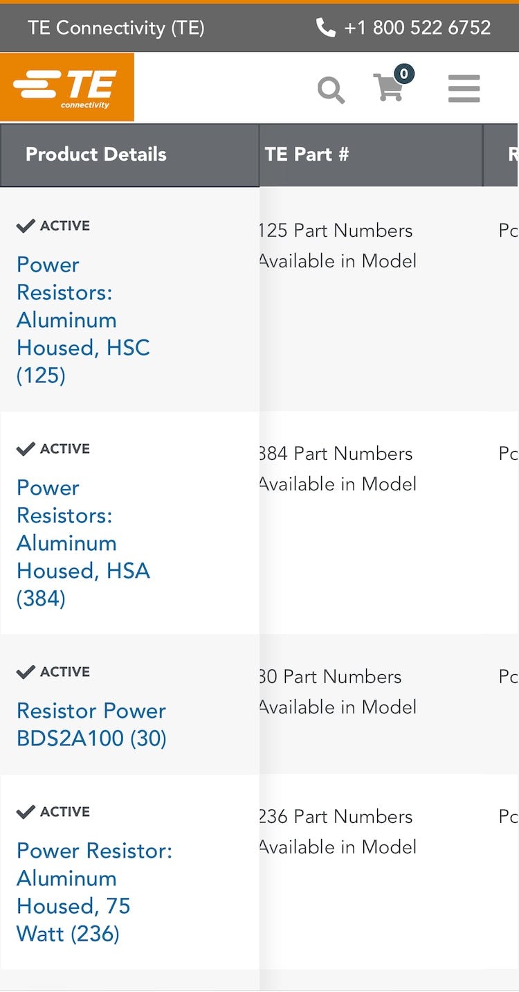
The “Product Table” at TE Connectivity displayed key product details in the persistent first column (first image). Swiping horizontally in the table truncated the information, slightly reducing the width of the column and the height of each row (second image; screenshots taken after testing concluded by researcher). However, visibility to additional columns was severely limited even when the “primary” column was truncated.
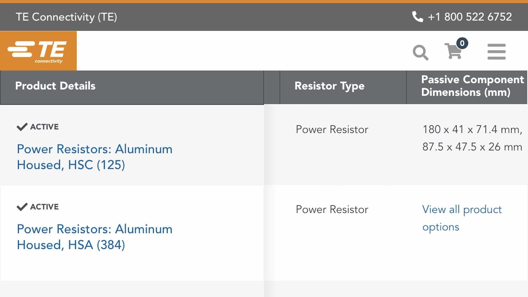
In landscape mode, when the “primary” column in the “Product Table” at TE Connectivity was truncated, only 2 additional columns were visible across 2–3 rows of products (screenshot taken after testing concluded by researcher).
Although only desktop B2B electronic components and machinery sites were tested — though our research indicates that most B2B electronics components and machinery users use their desktop or laptop computer when browsing electronic components and machinery sites, rather than a mobile device — our B2C e-commerce testing revealed that a number of mobile-specific factors reduce the usefulness of employing a “Table” layout on mobile.
Most importantly, tables that allow easy comparison of a wide range of product attributes on desktop do not lend themselves well to the small and narrow mobile viewports.
In portrait mode, most often only 2–4 columns would be visible at once, so users would be unable to see more than a few key product details at a time.
Even in landscape mode, where up to 5–6 columns might be visible at once, vertical space would be very limited, allowing users to see only 1–2 rows at a time.
In either case, users on mobile would be forced to scroll horizontally to view all of the specs for each item and vertically to compare the details for multiple rows of items.
When users have to scroll horizontally and vertically, it becomes very challenging to understand and compare complex product details for multiple rows of products and remain oriented within the “Product Table”.
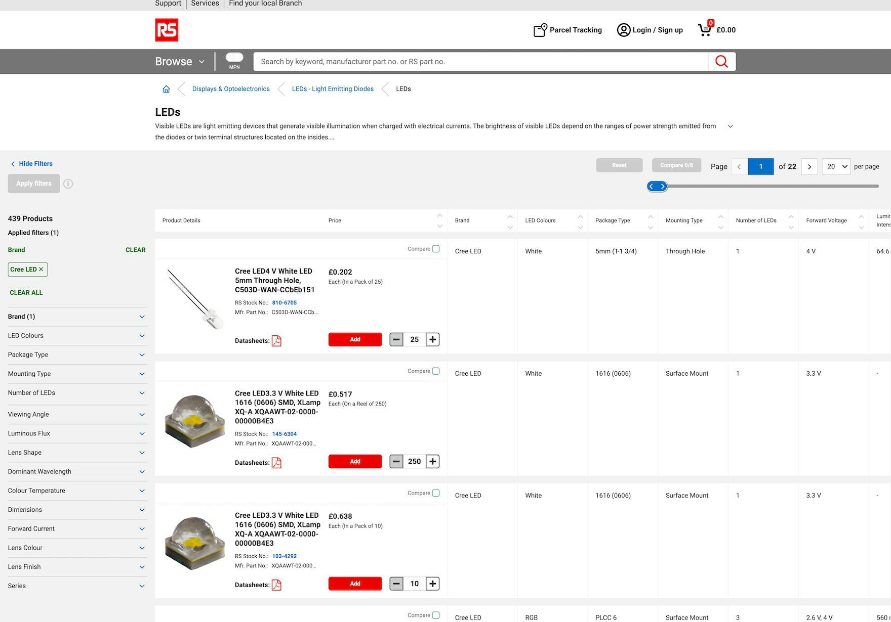
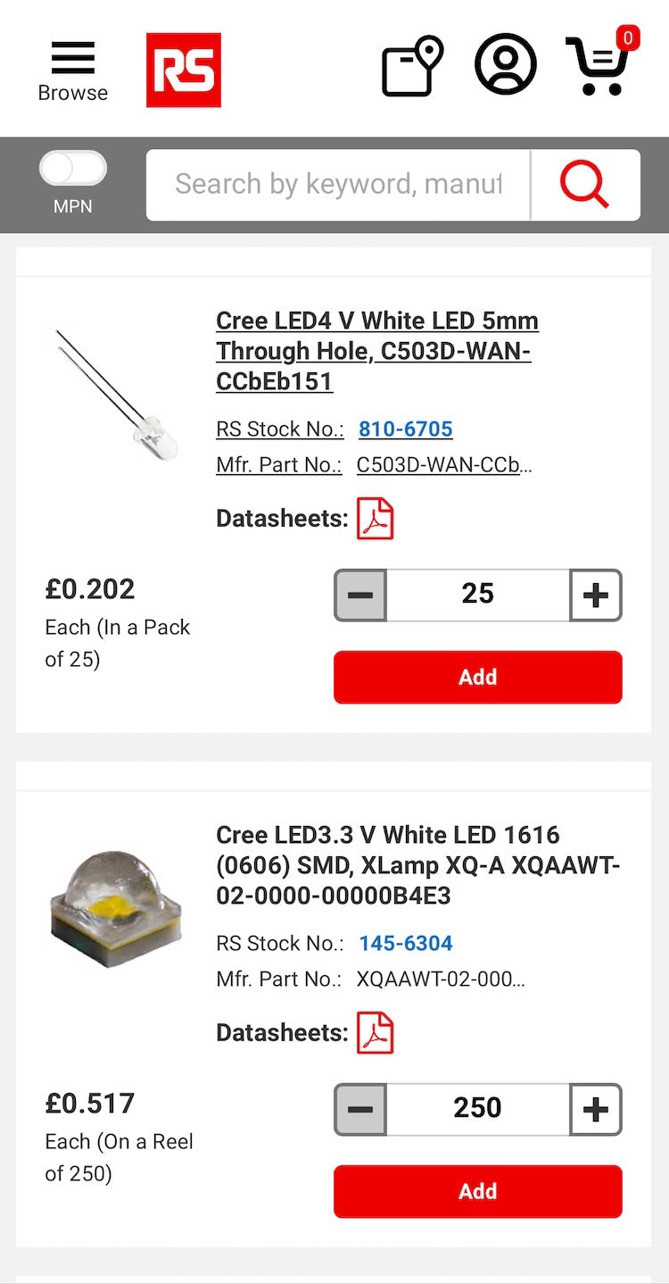
At RS Components, Ltd., a “Product Table” is used to display search results and product lists on desktop (first image). Meanwhile, on mobile, a “List View” layout is used (second image). The product listings on mobile include the same key product details contained in the first 2 columns from the “Product Table” on desktop (both screenshots taken after testing concluded by researcher).
Therefore, a “List View” is still most likely the optimal choice for viewing spec-heavy products, such as electronic components and machinery, on mobile.
In practice, displaying spec-heavy products in a “List View” on mobile at least provides the space needed to include essential product details (i.e., part number, name, thumbnail, minimum order quantity (MOQ), price, and availability details, such as inventory and lead time) plus 2–3 critical category-specific attributes for 1–3 list items, while preventing unnecessary friction and frustration caused by the need to scroll vertically and horizontally within a “Product Table”.
Help B2B Users Quickly Compare Specs in the Product List
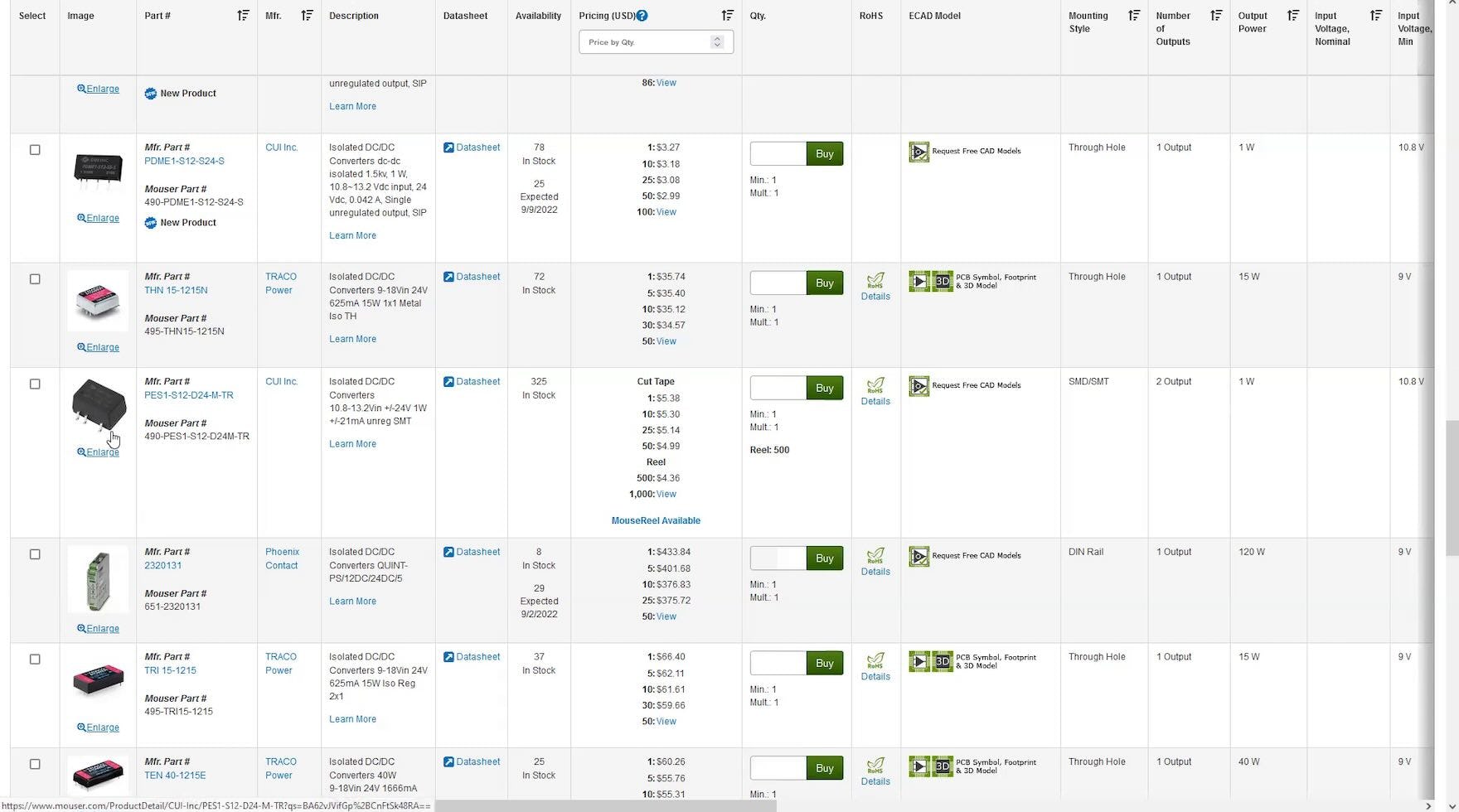
At Mouser Electronics, the “Product Table” layout for a product listing for converters allows users to effectively compare and evaluate specs.
As our research has shown, scanning and evaluating B2B electronic components and machinery product listings can pose a challenge for users.
Thus it’s important to support the advanced filtering needs of users evaluating spec-heavy items by providing a “Product Table” instead of a “List View” on desktop to display search results and product lists.
By formatting product listings as a table, sites can enable users to more effectively find suitable specialized parts necessary for their business projects.
However, manufacturer and distributor sites that display extremely spec-heavy products in a “List View” risk impeding users from adequately identifying relevant products.
Getting access: our current B2B Electronic Components & Machinery research study is ongoing and new industry-specific guidelines are published every month in Baymard Premium. The full study is expected to be completed in Spring 2024.
If you want to know how your B2B electronic components and machinery website performs and compares, then learn more about getting Baymard to conduct a B2B Electronic Components & Machinery UX Audit of your site.