Technical errors can obviously be highly problematic as they can prevent the user from proceeding. Here Amazon is asking the user to fix a problem that isn’t there.
Bugs can be pure poison to e-commerce sites. Layout bugs and flawed interactive features not only leaves a poor impression on users but can in some cases even lead them to think the site has been hacked. Page errors and site maintenance are even more disruptive as they can outright prevent users from proceeding.
During our usability studies we repeatedly get to observe just how impatient and unforgiving users are of such layout bugs, faulty interactive features, page errors and site maintenance. In fact, when faced with page errors and site maintenance, nearly all of the test subjects during our checkout studies abandoned their purchase.

“This looks a bit strange. Especially when you are about to pay”, a subject explained during testing of Foot Locker, “This makes you think of some phishing or whatever.” Layout bugs can make some users believe the site may have been hacked and are thus particularly critical when they appear on key pages and paths (such as the checkout process).
We’ve similarly observed how seemingly innocent layout bugs and quirky interactive features have caused test subjects to believe the site had been hacked or wasn’t currently working properly, causing them to abandon their purchase due to a lack of trust in the site, even for major brands such as Amazon and Walmart. (If a user believes your site has been hacked, having even the most trustworthy of brands won’t matter because they no longer think it’s you.)
Despite just how critical these bugs can be to the user experience and site conversions, they are astoundingly common. For the past 5+ years we’ve conducted 4 large-scale usability studies and every single time the test subjects have stumble into a wide host of UI bugs and server errors, and for the past 3 years we’ve audited numerous multi-million and billion dollar sites and during every single site audit we’ve identified lingering technical errors, layout bugs or flawed interactive features (despite always testing in up-to-date browsers).
Server bugs and downtime are obviously critical too but they tend to be a lot easier to monitor with automated alerts bringing the issue to everyone’s attention, making it obvious that something needs to be done urgently.
Now, if a server is down, the entire organization turns upside down with everyone rushing to fix the issue. Yet, layout and interaction bugs get to linger around for months or years before they’re fixed. It’s largely a visibility issue – if people in the organization knew about the bug, it would surely get fixed. However, because in-depth testing and quality assurance often isn’t prioritized sufficiently, these bugs can go unnoticed for months.
Server errors and 404 pages are easy to monitor but they only represent a fraction of the bugs that we encounter when reviewing e-commerce sites. The much more common but unfortunately also trickier-to-spot bugs that are at the center of this article are the CSS layout bugs and flawed interactive JS-enabled features. Such layout bugs or interaction quirks don’t invoke a server alert and therefore aren’t brought to anyone’s attention, making them much more difficult to identify – yet that doesn’t mean their impact isn’t just a harmful as a server outage.

Layout bugs on key pages can scare away users; especially those that haven’t yet committed to buying a product are likely to simply head over to a competing site rather than try calling customer support if they feel unsure about the site.
Now, obviously nobody intentionally implements buggy features or deploy technical errors. Yet they undeniably happen, at major and minor sites alike, and the price tag is undoubtedly in the million dollar category. While some degree of bugs is probably unavoidable, and bug fixing like most other investments is subject to diminishing returns, nearly every single production site we’ve reviewed could benefit greatly from making it a bigger priority. But given resource constraints, where should e-commerce owners and developers focus their energy?
The rest of this article will outline strategies for how to deal with these types of bugs in a deliberate manner. In summary, there are three principles to follow:
- In general: Focus on common and critical paths first, and revisit them regularly. (Typically: product pages, checkout process, search results and engine, homepage, popular categories, and the help section.)
- In dealing with layout bugs and flawed interactive features: Minimize their occurrence by building a rock-solid foundation instead, and then progressively enhance that baseline with increasingly sophisticated features based on device and browser capabilities.
- In dealing with server errors and site maintenance: Minimize their pain by making it as easy as possible to recover from page errors (e.g. via client-side data persistence), offering the customer useful alternatives (e.g. completing the order via phone), and incentivizing customers (e.g. with coupon codes) to make them return to your site later once it is working again.
(For a beginner’s introduction to UX, start with our primer, UI vs UX.)
1) Focus on the Critical Paths First
In e-commerce, the chain really is no stronger than its weakest link. You might have brilliantly designed product pages, but if the checkout process is ridden with bugs, potential customers will still abandon. And similarly, you may have a great checkout process but if users find your site suspicious or misinterprets product features due to layout bugs on the product page, many will never stick around to actually breeze through that brilliant checkout flow.
Now, for sites with thousands of pages, it may not be realistic to regularly test them all across a range of different use contexts, browsers and devices. However, sites should at the very least test all their key pages and processes on a weekly basis. Having bugs in the checkout process is simply unacceptable.
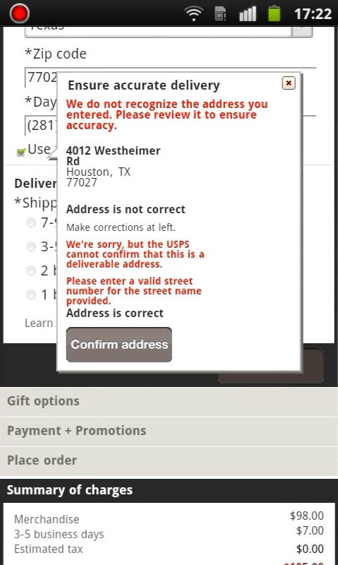
Here a front-end coding bug results in a rather contradictory set of messages to the user: first the user is told to review their address to ensure its accuracy, then a bolded line states “Address is not correct”, then the user is told that they must “enter a valid street number”, and finally, a new bolded line states “Address is correct”, followed by a button asking the user to “Confirm address”. Confused yet? Having bugs like this in the checkout process is a sure-fire way to drive up abandonments.
In general, e-commerce sites should focus their energy on all critical paths – pages and processes that all users must go through in order to purchase from the site. Specifically, this means the product page, cart, and checkout process. Once these have been thoroughly tested and are largely bug-free, other well-trodden paths (such as the homepage, search engine, search results page, popular categories, and help section) should be put through the testing mill.
Of course, a lot of these bugs tend to get squished during development and testing, and possibly shortly after larger deployments where some sites perform extra testing on their production systems. Yet, given how frequently these types of bugs pop up, it would seem that they often appear after those major deployments (for any number of reasons), and on-going testing of key pages in the production environment is therefore required. These pages and processes should be revisited regularly – preferably once a week – for testing across a range of browsers and devices. Furthermore, make sure to test the live production site rather than a test environment to ensure you get the exact same experience as your customers.
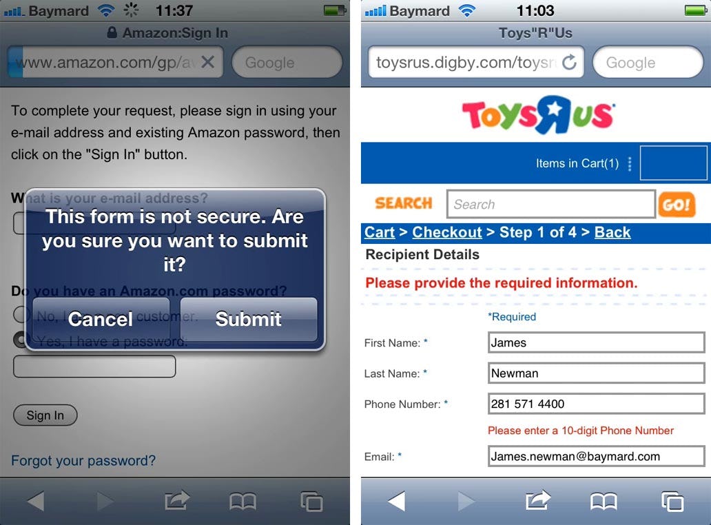
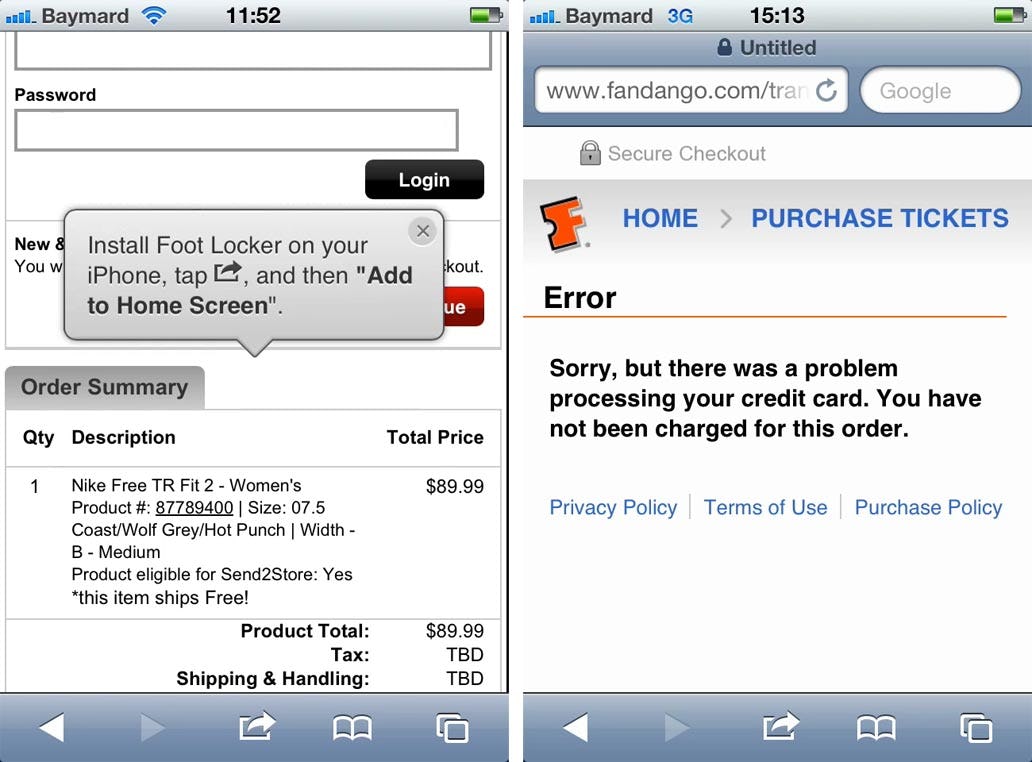
Amazon’s sign in form provokes security errors. Toys’R’Us’ checkout process yields errors for perfectly valid phone numbers. Footlocker’s checkout has boxes flying around the screen, covering the ‘continue’ button and key information. Fandango tells the user they couldn’t charge their card, but doesn’t give them a way to try a new one. These aren’t exactly minor errors, on obscure pages, on miniscule sites…
During our most recent usability audits we’ve run into checkout errors such as: the browser back-button breaking user expectations in accordion flows, credit card type detection only working when the card number is written without spaces, “Learn more” links opening the wrong help pages, the “Different billing address” checkbox not working when going backwards in the checkout flow, an “SSL Security” help page hijacking the entire checkout window, and users getting error pages when returning from a 3rd party payment page, and the list just goes on and on. The fact that these types of errors occur frequently during the checkout process on live production sites of multi-million dollar brands, underscores the importance of continuous on-going testing of key pages and processes.
In short: Focus on common and critical paths first, and revisit them regularly.
2) Layout Bugs and Flawed Interactive Features: Minimize Their Occurrence
Given the diversity of browsers and device capabilities out there, it’s probably unfeasible to completely avoid bugs and flaws in the increasingly sophisticated layouts and interactive features that e-commerce sites are sporting. What we can do is minimize their occurrence by adopting good web design and development principles: in particular, progressive enhancement.
In short, progressive enhancement is when you gradually enhance a basic “baseline” user interface with increasingly sophisticated features based on the capabilities of the browser and device displaying it. This allows the site to always work perfectly fine in older browsers and on less capable devices because they are only tasked with displaying layouts and features they were designed to handle.
Meanwhile, users with a more modern browser will receive the more sophisticated layouts and features supported by their browser. Similarly, if a device has GPS capabilities, anyone visiting the site from such a device can be presented with geo-location features while users on devices without GPS will have to be asked to enter their location.

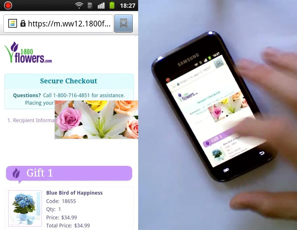
Here a layout bug is causing the focus outline of a field below the calendar widget to be displayed atop of it – causing the user to think a different date range had been selected.

Instead of relying on native technology to display input placeholders, BestBuy has rolled its own buggy solution which in older versions of iOS caused the placeholder text to behave as user input, forcing the user to delete the entire placeholder example before they could enter their own input. A better solution would be to progressively enhance the user interface with placeholder text in browsers that support the feature natively.
One of the benefits of progressive enhancement is that native technologies can be used instead of trying to simulate them with complex and error-prone CSS and JS. Native technologies tend to be incredibly well-tested and highly reliable (e.g. CSS3 animations, HTML5 History API, etc), as long as you only utilize the ‘stable’ features in the browsers and devices that support them. But what about browsers and devices that don’t support them? They simply receive the simpler baseline interface elements.
A checkout process doesn’t need a sophisticated grid layout or animating transitions between steps in an accordion layout. Of course these things can certainly make the user experience better – but only so when implemented flawlessly and displayed on devices and browsers that were actually meant to handle those features.
Decorative images can certainly make for a nicer layout but they aren’t essential, so if they end up being misplaced due to advanced layouts the device isn’t capable of handling, they will end up having the exact opposite effect and actually worsen the user experience.
By upgrading the user interface in accordance with the capabilities of each user’s particular browser-device combination, the optimal user experience is ensured. They get the admittedly simpler but rock-solid and lightweight baseline elements in the areas where their browser-device combination is limited, while other areas of the page are upgraded to take advantage of more sophisticated features that the combo was designed to handle. This greatly limits the chance of layout bugs and flawed interactive features and ensures that the interface is as performant as possible because the user’s browser and device are only ever asked to do things they were designed to handle.
All of this is done without compromising on the design or user experience, as devices capable of modern sophisticated layouts and features will receive those. In fact, because less capable browsers and devices don’t have to support those features, new technologies can be adopted much more quickly, allowing sites to take advantage of the latest and greatest web design and development features.


Sites must be careful when reusing media assets and styles across mobile and desktop sites (particularly common problems include oversized images and illegible text), and try to avoid reliance on 3rd-party plugins.
In addition to adopting progressive enhancement and relying on native technologies, it’s generally a good idea to build to be mindful of how media assets and styles are shared across device contexts. For instances, if reusing media assets on both desktop and mobile sites, it’s key to develop and follow strict content guidelines to ensure text legibility. Also, when dealing with responsive web design, setting smart CSS defaults is particularly important to ensure good scaling of images and text across devices and contexts.
Also, try to avoid or at least limit the reliance on 3rd-party tools and vendors (and ads!). The problem with having these external plugins at the center of a design is that their unavailability can bring down key processes of the site regardless of how bug free your own code is. Again, implementing these 3rd-party resources following the principles of progressive enhancement ensures this won’t happen – by only using external tools to improve the user experience if / once they load, users will be able to use your site perfectly fine even when they don’t (i.e. their servers are down, code is buggy, etc).
In regards to running A/B tests, it’s important to note that any layout and technical quirks will silently invalidate the results, leading to false conclusions about which test version is actually better. Monitoring the experiment performance across browser type and versions, and device types, can help spot any such edge-case quirks.
In short: Forget about fancy and advanced designs and features – focus on building a rock-solid foundation instead, and then progressively enhance that baseline with increasingly sophisticated features based on device and browser capabilities.
3) Server Errors and Site Maintenance: Lower The Pain
Now, we’d be remiss not to touch upon server errors and site maintenance, things that take down the entire site and prevent the user from proceeding. Obviously these should be minimized to the extent possible – that’s a given. However, if we accept that some degree of server errors and the occasional site maintenance is unavoidable, then the question should be: are there ways to make that experience a little less painful?
There are three fundamental approaches to lowering the pain of blocking server errors and site maintenance: A) Make recovery easy, B) Offer alternatives, and C) Incentivize users to return at a later stage.

Server errors during checkout can be particularly upsetting to users – both due to the anxiety produced by errors happening when you’re about to enter sensitive information (e.g. credit card details), and because of the potential data loss involved.
Making recovery easy (#A) is a matter of making sure the user can seamlessly resume where they came from once the error has been fixed. A key aspect of this is preventing data loss. This can obviously be challenging in the case of server errors because the error can blast the usual data persistence mechanisms, causing the user’s input to be lost. However, there are ways to prevent this by temporarily storing the user’s input in a client-side database (check out localStorage) until the server responds with a success message. (Just make sure to implement this using progressive enhancement so it doesn’t break older browsers!)

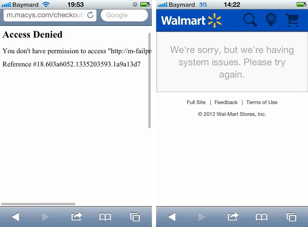
Compare the Walmart error to Macy’s “Back in a few..” site maintenance page – one leaves the user with little other to do than leave the site, whereas Macy’s give their users alternatives such as calling customer service.
Error pages aren’t created equally. Offering users alternate ways (#B) to complete their goal or interact with your brand can be a great way to minimize the pain introduced by server errors and site maintenance. This can help salvage otherwise lost sales and turn a bad experience into a positive one.

“Bribes” are a great way to get customers to wait for your site to get back up again.
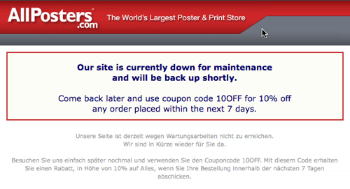
Incentivizing users (#C) with coupon codes or similar offers can give them the necessary incentive to wait for your site to return to normalcy. This is especially true for sites selling generic products that can be bought from other sites as well – here a coupon offering 10% off their order will give them a reason to wait for your site to get back up instead of simply heading to a competitor whose site is working.
In short: When errors do happen, make it as easy as possible to recover from them (e.g. via client-side data persistence), offer the user alternatives (e.g. completing the order via phone), and consider incentivizing users to return later with coupon codes or similar offers.
Make Testing A Priority
The numerous examples littered throughout this article should help illustrate the diversity of e-commerce bugs and how commonplace they are even on sites with millions of dollars in revenue. Clearly it’s time to make testing a priority.
While most of the clients we work with tell us that testing is an integrated part of their development process, we often find that it isn’t treated as an independent, on-going strategy. This is problematic because layout bugs and flawed interactive features are often introduced during smaller, on-going site updates, A/B test versions, and sometimes even caused by browser changes. Therefore, these very common yet difficult-to-monitor bugs often find their way into production sites and stay there for months because there isn’t a procedure in place for continual testing of key pages and processes to uncover such bugs.
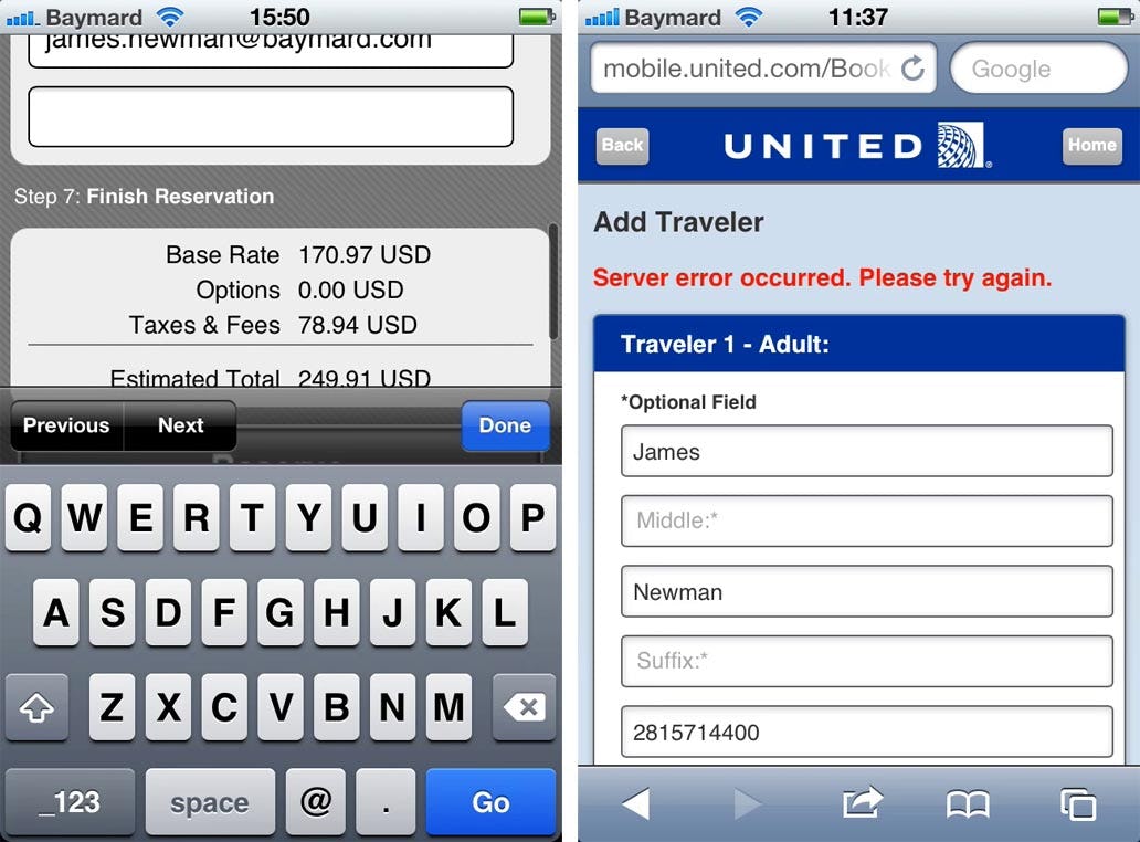
Even major brands have fundamental flaws in key processes – here a blank field in AVIS’ booking process (what on earth are you supposed to enter there!?), and a rather unhelpful error message on United Airlines.
So before throwing yet another bunch of resources towards “the next big thing”, maybe it’s time to allocate a few people to finding and fixing bugs every now and then. Fix the holes in the leaky bucket rather than giving it yet another coat of glossy paint. And when you do, consider following the three principles outlined in this article:
- Focus on the most common and critical paths first, and test them regularly.
- Minimize the occurrence of layout bugs and flawed interactive features by building a rock-solid foundation and then progressively enhance it.
- Minimize the pain of server errors and site maintenance by making it easy to recover from them, offering the user alternatives, and incentivizing them to return with coupons or similar offers.