Key Takeaways
- Primary CTAs are heavily promoted on Meal Kits & Consumables Subscription Service sites
- Testing revealed a disconnect between where sites take users after they click the primary CTA and where users expect to be taken, leading to abandonments
- Delaying a request for users’ personal information can avoid unnecessary abandonments
On Consumables Subscription Services and on Meal Kits websites, the primary CTA — for example, “Get Started” — is ubiquitous, appearing on the homepage, the “How It Works” page, in the main navigation, and in other highly visible site areas.
Given its visibility, it’s no surprise that, during Baymard’s large-scale usability testing of Consumables Subscription Services and Meal Kits websites, users were drawn to the CTA, which many of them clicked.
Yet there was a clear misalignment between what users expected to see after they clicked the CTA and what they actually saw — a form requesting their personal information.
This misalignment had a severe impact on many users — with some deciding to abandon the site rather than supply the information requested.
Yet there is a way to gather the personal information desired from users — without causing such a severe disruption.
In this article we’ll discuss our Premium research findings from testing Consumables Subscription Services and Meal Kit sites.
In particular, we’ll discuss the following:
- What users expect to see when they click a primary CTA (e.g., “Get Started”)
- What sites typically show instead
- How to resolve the issue to avoid major user disruption (while still gathering the personal information desired)
What Users Expect to See When They Click a Primary CTA
For most users, a generically labeled CTA like “Get Started” implies that the following page will introduce them to the site.
Indeed, many users expect that, after clicking the primary CTA, the site will “get them started” exploring the products and services.
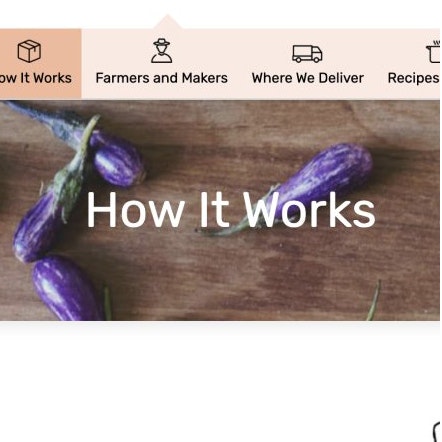
Freshly’s “How It Works” page contains important subscription-service details users look for when they’re considering a new subscription service.
For example, on a meal kit site, this could be introducing users to the diversity of meals available. On a site selling beauty product subscriptions, users may expect to see the different quantities of products that can be subscribed to, along with information on adjusting their frequency of delivery.
After all, it’s important to remember that many users will be unfamiliar with the service being offered.
Unlike on traditional e-commerce sites such as Amazon and Walmart, users on Consumables Subscription Services sites will often need to be introduced to both the service and the company (similar to the information needs of users on direct-to-consumer sites).
Thus, users approach a Consumables Subscription Service site from a more exploratory mindset — with the goal of information gathering — rather than a task-oriented mindset (which is much more common on traditional, large, B2C e-commerce sites).
As a consequence, users are primed to assume that ambiguously named links like “Get Started” will lead them to more information about the service.
However, many sites during testing failed to meet this user expectation.
What Many Sites Show after Users Click a Primary CTA
After users have gotten some overview of a Consumables Subscription Service — for example, by perusing the homepage or “How It Works” page — they’re ready to dive in and learn more about the specifics of the service.
Spotting one of the ubiquitous primary CTAs, many users opt to click that — yet are often severely disappointed when they reach a form requesting their personal information.
During testing, when users were immediately requested to provide personal information after clicking a primary CTA many quickly clicked the “Back” button to return to where they were.
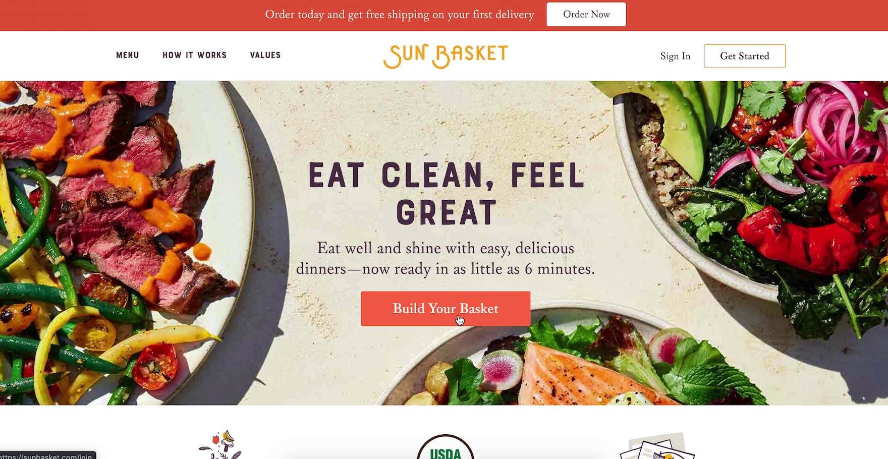
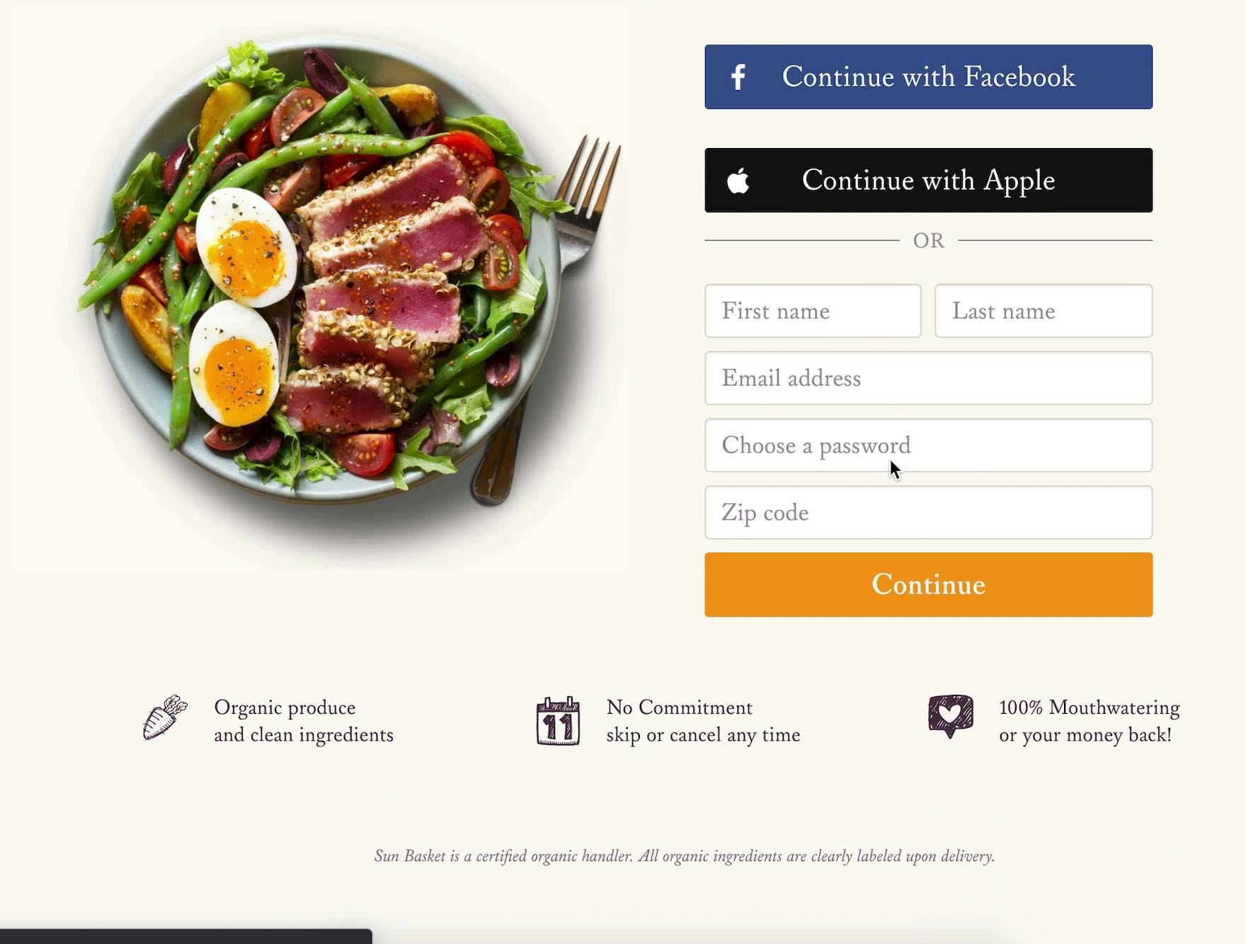
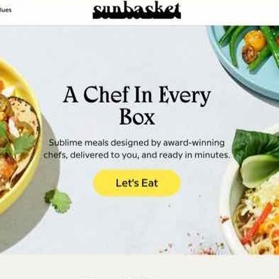
“Maybe I’ll try this [‘Build Your Basket’], instead of ‘Get Started’. No! I want to see…if I can choose 2 days a week, or 3 days a week.” At Sunbasket, a user — who was looking for meal plan information when clicking the “Build Your Basket” CTA (first image) — was disappointed to instead arrive at an account wall (second image).
For example, one user, testing the meal kit service Sunbasket, clicked a “Get Started” button and was upset that an account wall was the subsequent page: “I can’t get to pricing, I can’t get to the schedule. I can’t get to anything that I really care about [laughing] without logging in. I don’t love that. I don’t need spam…I don’t need to sign up and get a hundred emails a day from these guys. Yeah, I’m gonna skip that one.”
Notably, on the site the user was on there was significant information about the meals and the service — but this user was so frustrated by the “Get Started” CTA throwing him off-track that he abandoned to view a competitor’s site.
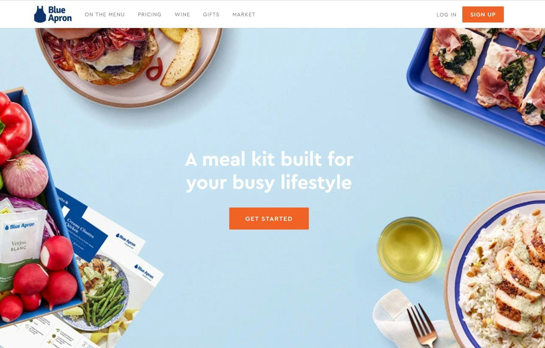
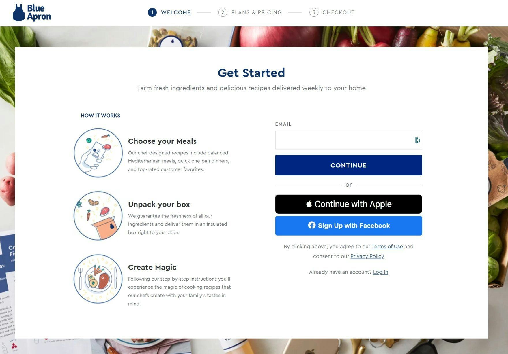
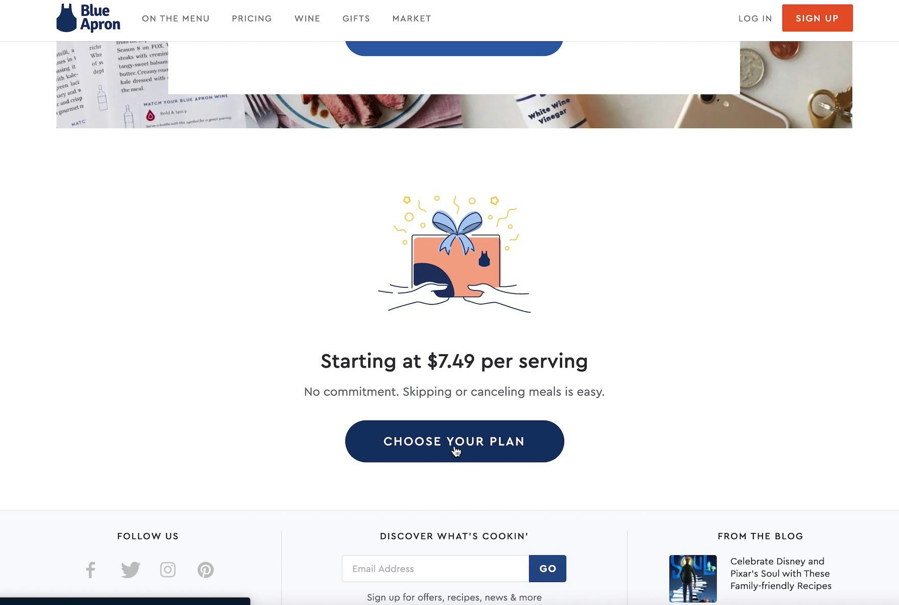
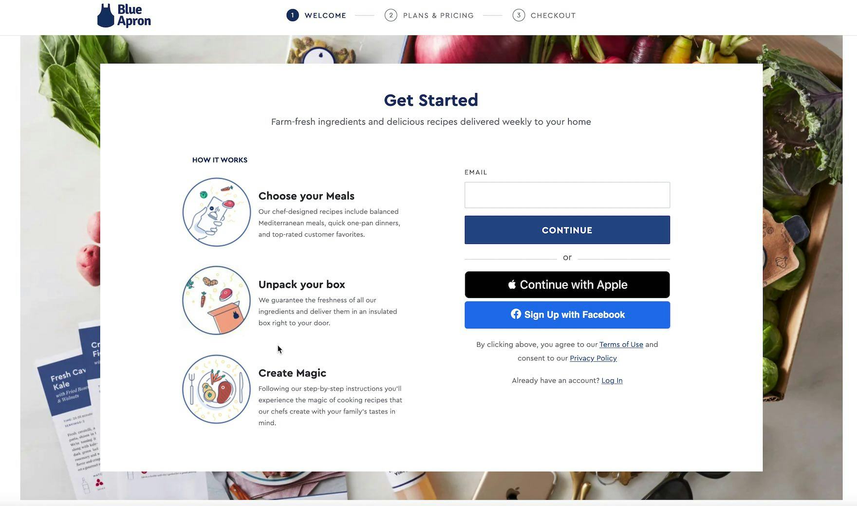
“I can’t seem to go anywhere else. [I’ve gone] as far as [I can] looking at information without signing up [and] giving another person my email. I thought the ‘Get Started’ was gonna take me somewhere [with more information], but it only took me to a page where I was forced to sign up before deciding if I wanted to sign up.” At Blue Apron, a user clicked the primary CTA — “Get Started” (first image) — to learn more about the subscription service but was unexpectedly stopped by an account wall asking for an email address (second image).
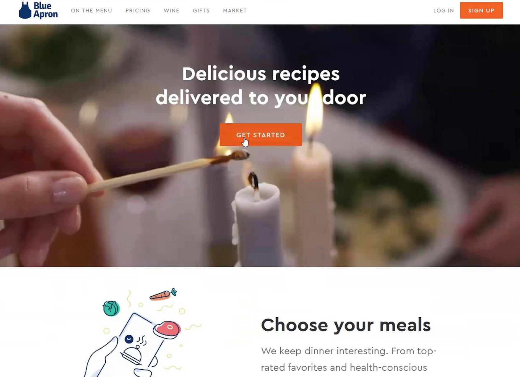
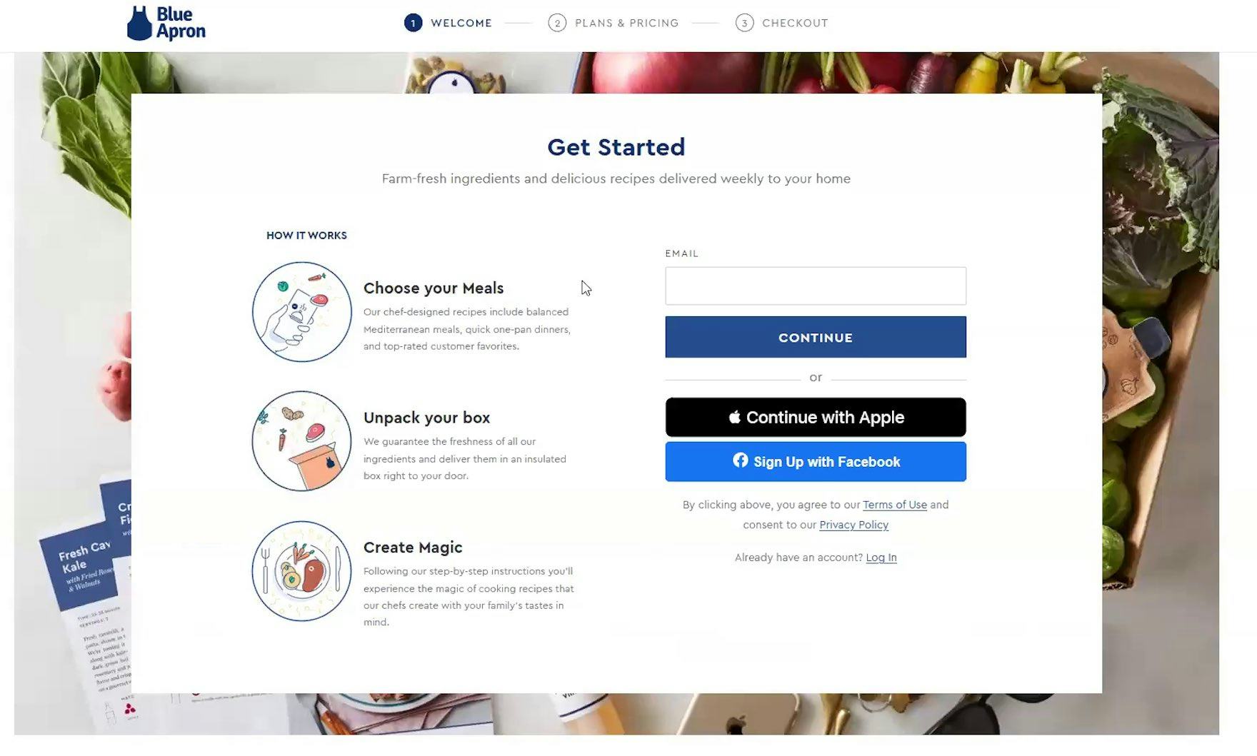
“Well, the first thing I would click is ‘Get Started’, because that’s obviously where they want you to start…And immediately, this is why I don’t use Blue Apron. Immediately, they want you to enter an email address to continue.” Another user at Blue Apron was extremely annoyed that “Get Started” led to an account sign up page.
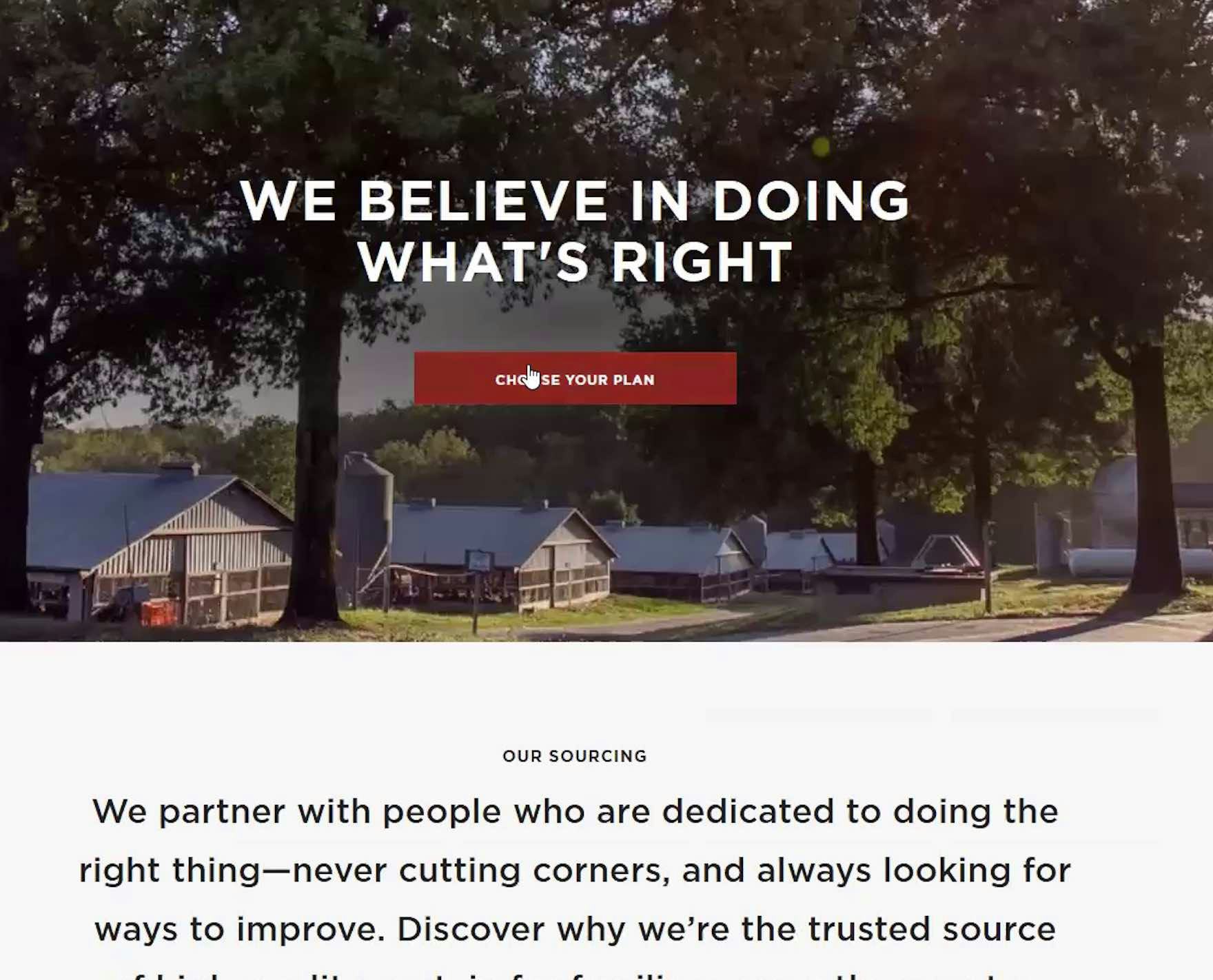
“Maybe if I click ‘Choose Your Plan’. ‘Free bacon for life’, it says, that’s weird…When I said ‘choose your box’, I did not expect to see ‘free bacon for life’…Did I click the wrong thing? It just says…That’s weird…And it wants my email address too, okay. So here’s where I would stop. I want information before I give them an email…I understand that’s how you would start an order, but I want to maybe assemble my order first, before, and see what that process is before I gave them my email.” At Butcherbox, another user clicked the “Choose Your Plan” CTA from the “Sourcing” page and was so thrown by the subsequent email form field that he abandoned. Note that plan details were below, but this user never scrolled to see them.
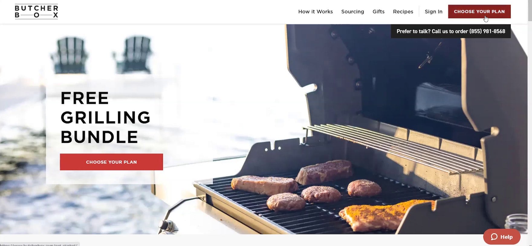
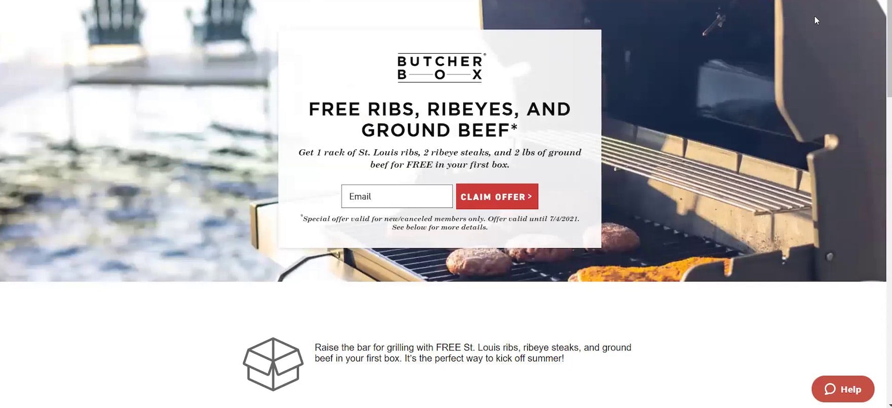
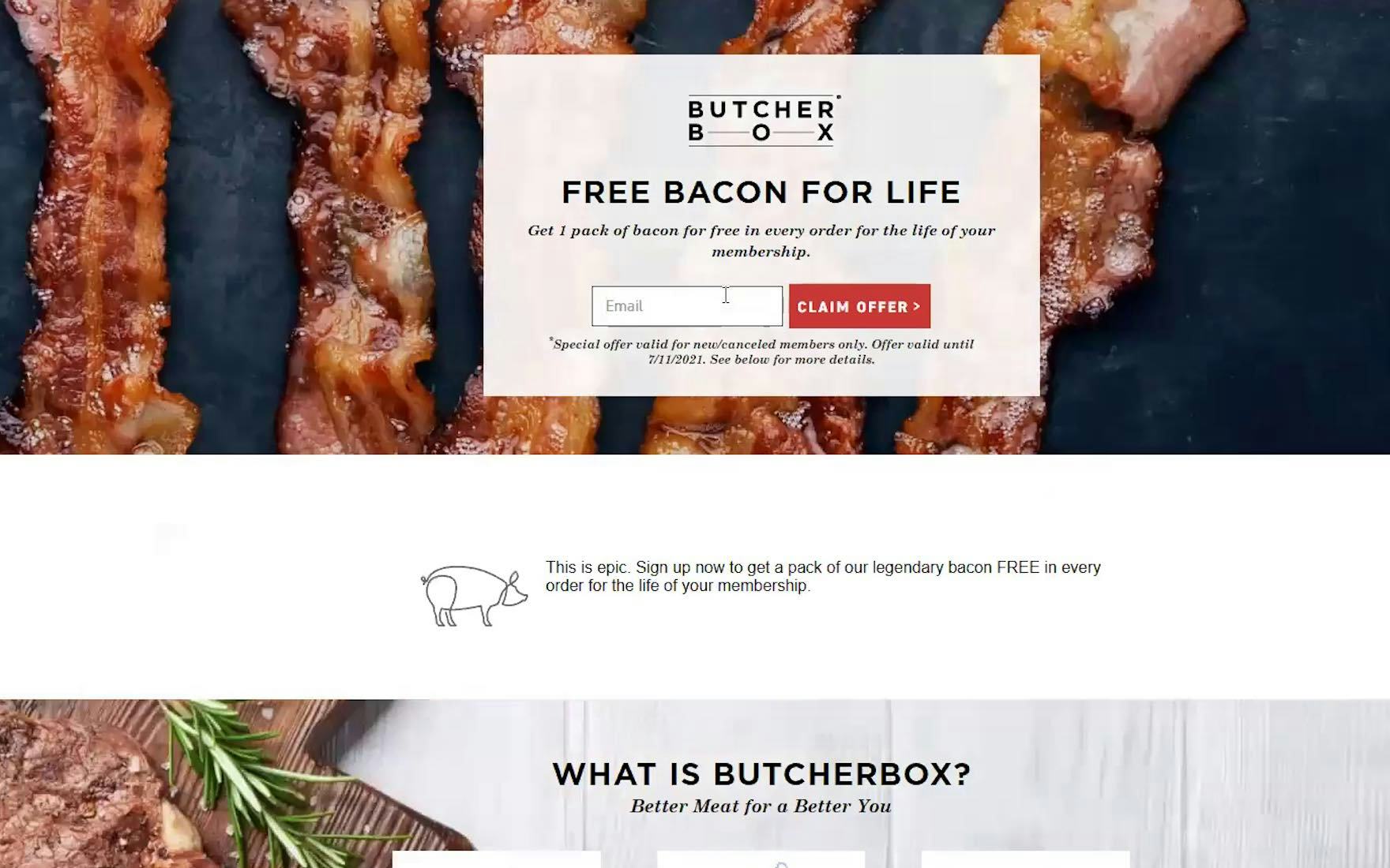
“So ‘Choose Your Plan’. Let’s see. I don’t really need to claim the offers right now. I just want to see [plans]. Okay, I don’t know. I clicked a thing that said ‘get your box’, but now, it’s taking me to claim an offer.” At Butcherbox, the CTA titled “Choose Your Plan” (first image) unexpectedly led to a “Free Ribs, Ribeyes, and Ground Beef” promotion (second image) at the top of the subsequent page. During testing, 73% of users were surprised by seeing this promotion after clicking a CTA at Butcherbox, with 41% of users voicing frustration at having being misled by the CTA microcopy — causing several users to abandon the site altogether.
Indeed, what’s clear from testing is that, not only were many users disoriented by where they were taken after clicking a primary CTA, but they interpreted a request for personal information as an overly pushy and aggressive attempt by the site to sell them the service.
Thus, many users are likely to develop negative perceptions of the brand due to what they interpret as a “hard sell” by the site to get them to sign up for the service before they’re ready to commit.
Forming a negative perception of the site can have long-lasting consequences as users simply write off a site from consideration (“If they’re so pushy now before I’ve even signed up, what will it be like when I need to change or cancel my subscription?”).
How to Gather User’s Personal Information without Causing Disruptions and Abandonments
Of course, to provide services to customers Consumables Subscription Service sites need to obtain a user’s personal information.
After all, a service can’t deliver, for example, meals on a weekly basis without knowing the customer’s name, address, email, etc.
Yet testing revealed that the issue isn’t that this information is required — users know they’ll need to provide it at some point — but rather it’s how aggressively the information is requested from users browsing the site.
Therefore, to avoid users becoming disoriented and upset at where they wind up after clicking a primary CTA, avoid requesting personal information immediately after users click the CTA.
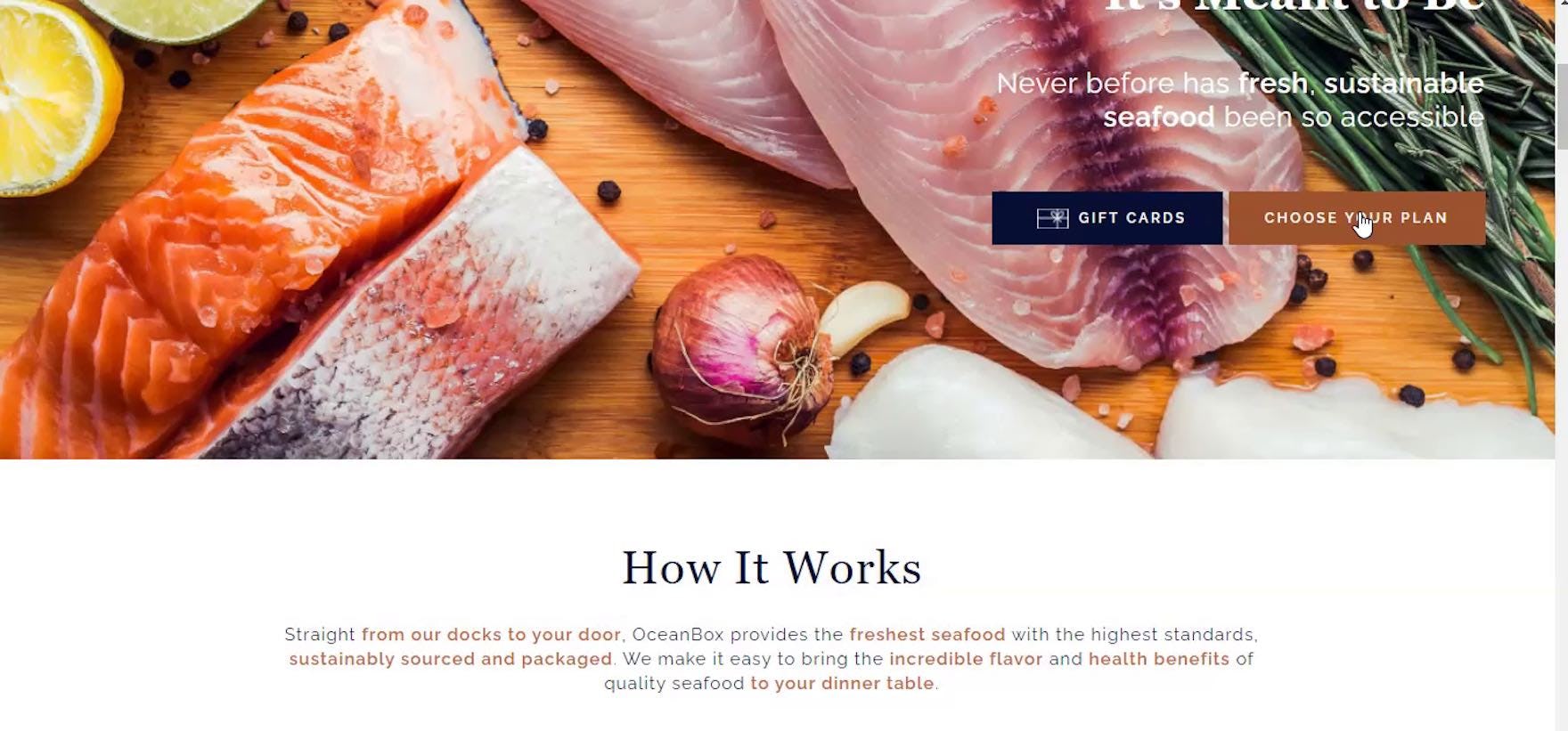
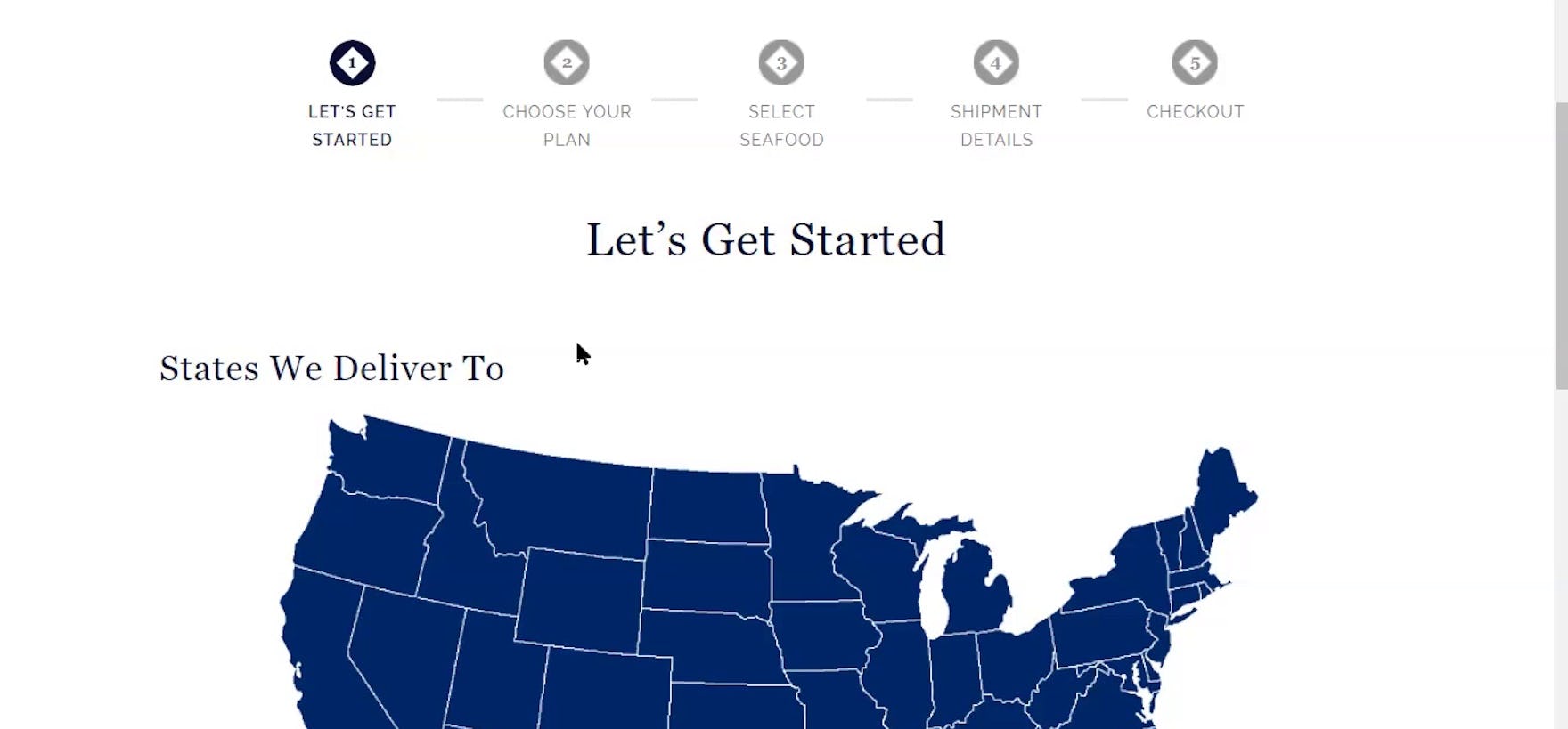
“‘Choose My Plan’. Let’s see if it’s any different than [Butcherbox] was.” At Oceanbox, the primary CTA was titled “Choose Your Plan” (first image). However, instead of leading to an unexpected account wall — as the user had experienced at both Crowdcow and Butcherbox — the user was brought to the first step in the plan-selection process (second image), where the only information required was a zip code. Oceanbox only asks users for personal information at step 5 of the plan-selection process (“Checkout”), after users have selected a plan, determined a frequency of delivery, and learned a bit more about the process.
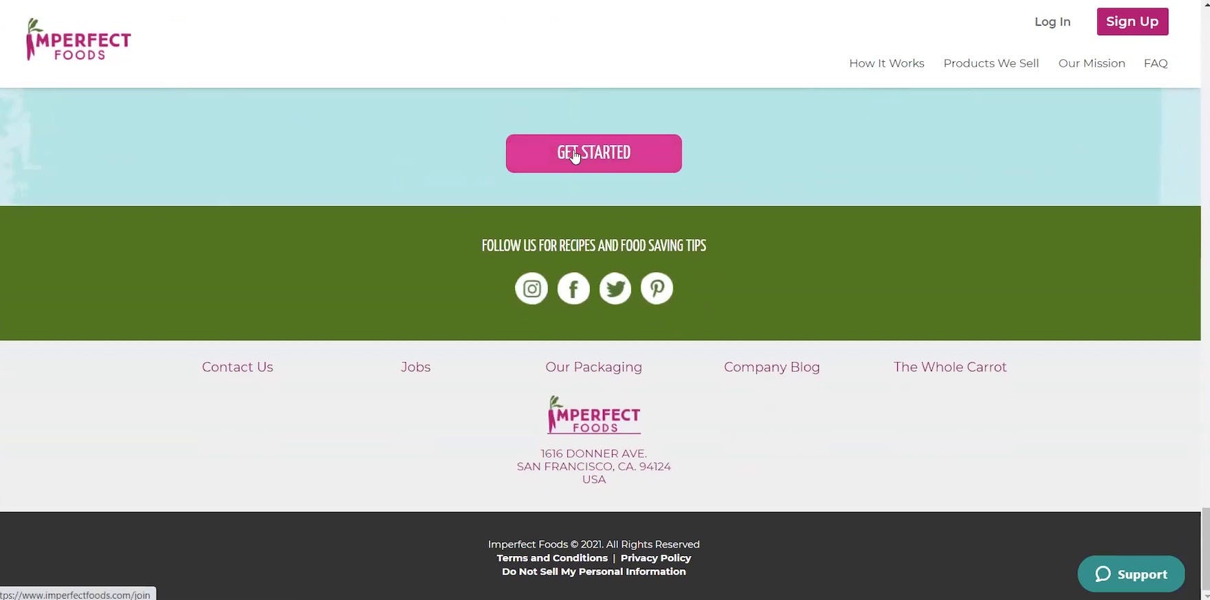
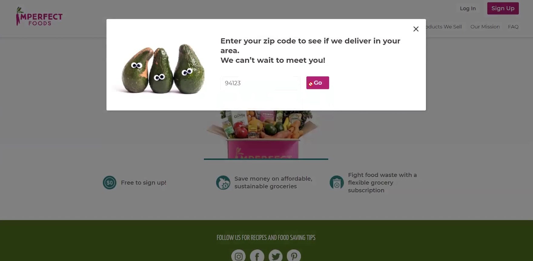
“Then I say we ‘Get Started’. ‘Enter a zip code and see if we deliver in your area’. I will say, ‘Let’s Go’. And see…this one immediately brings me to the quiz without making me put in any personal information, besides a zip code to see if they deliver. I really, really like that.” At Imperfect Foods, the “Get Started” CTA at the bottom of the homepage (first image) initiated the first step of the user-preference quiz (second image), which only required a zip code. During testing, users were fine with providing information such as zip codes after clicking primary CTAs, as they understood the service offerings often depended on a user’s location, and they didn’t view the request as overly intrusive.
Instead, save such requests for later — ideally, during the checkout flow, or at least at the end of a plan-selection flow, quiz, or page that first describes the service in more detail.
Having seen what they expected to see first — more information about the service — users are much more likely to be okay with providing their personal information.
At the very least, saving requests for personal information for 2–3 views after users click the primary CTA will reduce users’ tendency to view the site as giving them a “hard sell”.
Consequently, some users, having seen more of what the service has to offer, will be sufficiently convinced at this point to provide their personal information, and continue to finalizing their subscription-service plan.
Help Ensure the Primary CTA Isn’t an Abandonment Point
“How do I get rid of this? I don’t know what happened. I clicked on ‘looking at a plan’. But instead it wants me to ‘Get Started’.” At Blue Apron a user expected to begin choosing among plan options after clicking the _“Choose Your Plan” CTA (first image). However, he was thrown off-track when the resulting page was an account sign up page, with a title of “Get Started” (second image).
“Let’s see if we can ‘build our basket’. [Clicks CTA.] Nope. These guys are all in cahoots to make sure they get your personal email before you get to look behind the curtain.”
From a Consumables Subscription Service site’s perspective, primary CTAs like “Get Started” might clearly imply that clicking the button will start the sign up process by asking users for their name and email.
However, as testing revealed, for most users, a generically labeled CTA like “Get Started” implies that the following page will introduce them further to the service rather than immediately requesting their personal information.
Failing to meet this user expectation will result in some users immediately abandoning a site, with no intention to return, due to their having developed a negative perception of the brand.
Therefore, to avoid the appearance of a “hard sell”, Consumables Subscription Service sites should delay requests for personal information for as late as possible — for example, saving such requests for the checkout, or at the end of a user-preferences quiz — and never immediately display a form requesting users’ personal information after the primary CTA is clicked.
Doing so will not only avoid alienating users but is also one of the e-commerce best practices for e-commerce conversion rate optimization.
Getting access: all 300+ Consumables Subscription Services and Meal Kit UX guidelines are available today via Baymard Premium access. (If you already have an account open the Consumables Subscription Services and Meal Kit studies. You may also want to visit our audit page page for information on booking an audit of a consumables subscription-service site with a Baymard auditor.