
35 Data-Driven Ecommerce Best Practices

If you’re looking for ways to improve conversions, one of the most effective things you can do is follow ecommerce best practices based on extensive UX research.
Capturing and holding customer attention in the challenging ecommerce industry gets harder every year, and maximizing your conversion rates can often come down to making small, powerful changes that move the needle in surprisingly big ways.
In this post, you’ll find 35 data-driven ecommerce best practice recommendations. They’re specific guidelines sourced directly from Baymard Institute’s 200,000+ hours of large-scale research that go beyond UX basics.
Some of the world’s most successful ecommerce sites, including 71% of all Fortune 500 ecommerce companies, use Baymard’s UX guidelines to improve their user experience and boost their conversion rates.
The research behind these best practices is available in the Baymard platform, where you can find all 700+ guidelines with in-depth insights from usability testing, actionable advice for implementation, and a review tool to assess your site.
Access research-backed UX guidelines
Make best-in-class design decisions and improve conversions with 200,000+ hours of validated, industry-specific UX research and benchmarks.
Homepage Best Practices
Although many users will land on your site by landing on a product page through a direct link or social media post, your homepage is still a valuable "front door" that welcomes people and acts as an anchor as they shop.
Follow these UX best practices to build a helpful and easy-to-use homepage that creates a positive impression of your brand, guides the user through your site, and encourages them to explore your content.
1. Feature a Broad Range of Product Types on the Homepage (Guideline #237)
Putting a narrow selection of product types on your homepage can lead to misinterpretation. During Baymard’s research, many participants misunderstood the type of site, or underestimated its product range, due to a narrow selection of product types on the homepage.
Feature a broad range of product types, aiming for at least 40% of your product types. On mobile, you can use text links in place of (or in addition to) thumbnails and images.
2. Avoid Autorotating Carousels on Mobile Homepages (Guideline #957)
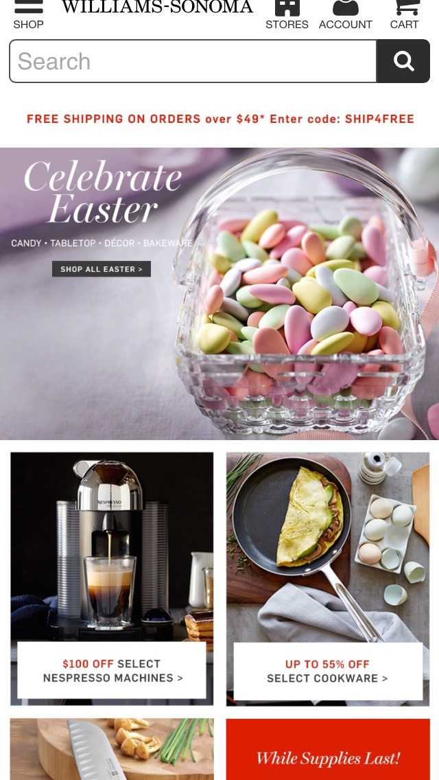
A generally better-performing alternative to carousels is simply displaying the slides as dedicated sections at the homepage, as Williams-Sonoma does.
During testing, several participants wound up going on unintended detours due to auto-rotating carousels on mobile — but our benchmark database shows that 52% of mobile sites and apps have a homepage carousel that auto-rotates.
If you do use a mobile carousel, follow these conventions:
- Turn off auto-rotation of slides
- Vital features shouldn’t only appear in carousel slides
- Support touch gestures
- Make controls visible and text legible
Instead of a carousel, you can also consider using static content sections on a taller homepage.
3. Make a Great Impression with High-Quality Images (Guideline #238)
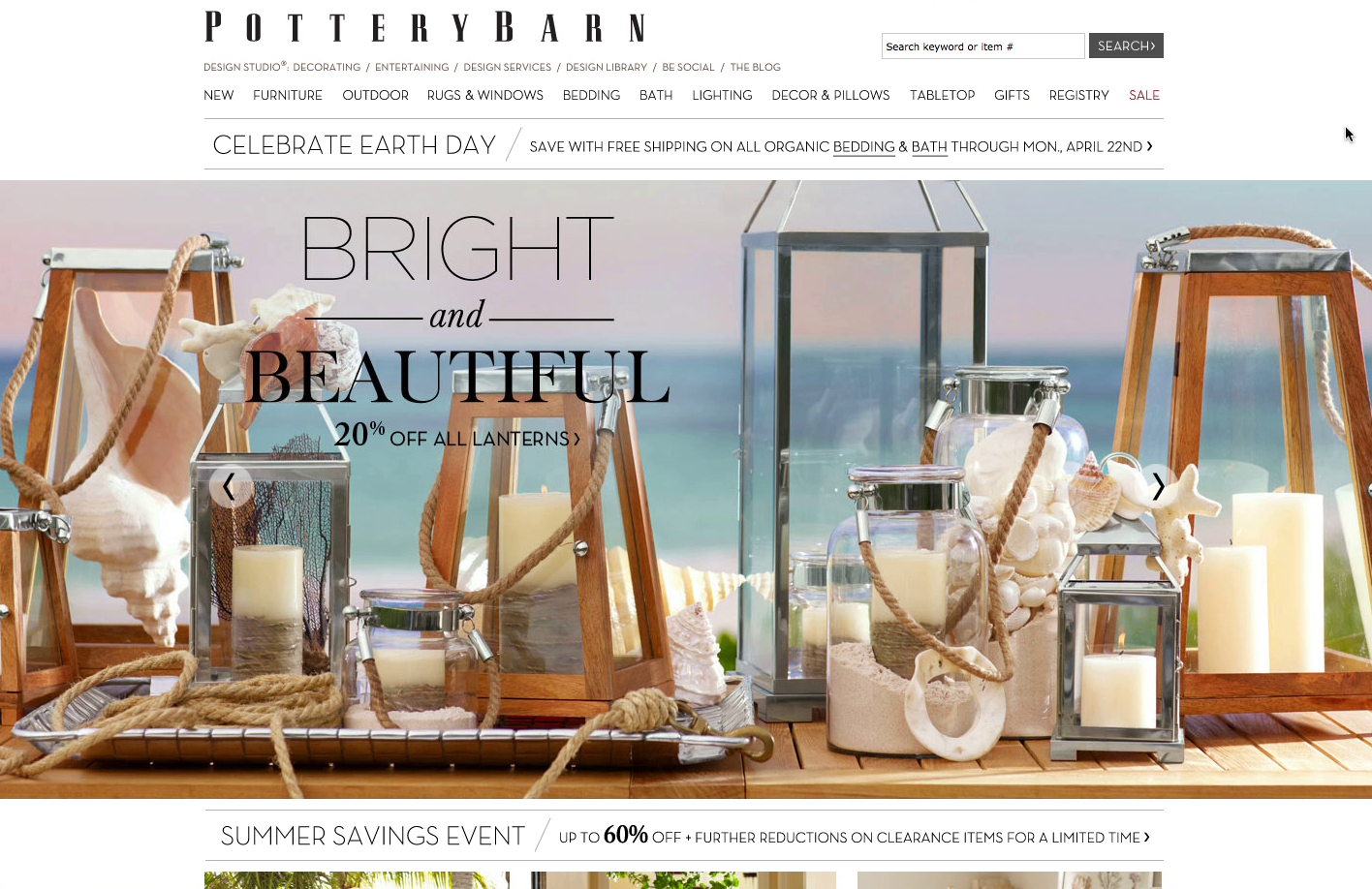
Pottery Barn’s simple design and beautiful photography made test participants want to browse the site for a long time — a stark contrast to many test sites where participants just wanted to find an acceptable product and move on.
During Baymard’s research, sites like IKEA, Pottery Barn, and REI received positive remarks from test participants about inspiring photography on the homepage. More importantly, participants generally showed more patience for technical hiccups on sites with vibrant imagery.
Use premium images and design on your homepage, but be cautious if considering highly stylized, unconventional designs.
4. Carefully Consider How to Implement Country and Language Selection (Guideline #239)
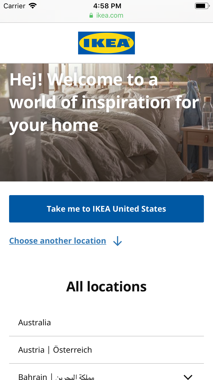
IKEA geotargets a user’s location and prompts the user to select that country to browse the site in. However, it’s easy to choose a different country, as other countries are displayed immediately below.
For country and language selection, some sites use a splash page, while others use a less obtrusive method, autoselecting settings based on a default or IP address.
Only use splash pages if you have significant regional customizations or restrictions. Because they will be imposed upon all users, it’s crucial to make these splash pages as seamless as possible.
Consider using IP geotargeting instead, but ensure it’s easy to change the country or language (e.g., on desktop sites by using a flag icon in the upper-right corner). On desktop, never display the country or language selector in an overlay dialog.
5. Make the Search Field Obvious on the Homepage (Guideline #241)
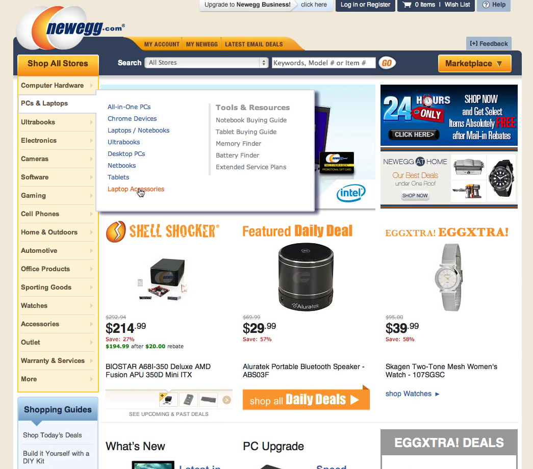
“You don’t really notice the search field,” a participant explained at Newegg. Many different elements fight for the user’s attention on the homepage, and the search field often loses out.
When you have a sea of eye-catching graphics on your site, it’s easy for the search field design to get lost. But our testing found that participants rely on search as a fallback strategy when they get stuck browsing the site, so it needs to be easy to locate.
Make your search field immediately obvious by taking your existing field design and then dynamically adjusting its appearance with bolder borders, contrasting background colors, and bigger fields and fonts. You can also increase the vibrancy of the “Go” button to make it stand out.
Category Navigation Best Practices
The category taxonomy (how your site content is classified, organized, and connected) is at the core of ecommerce design. If your category taxonomy is off, users will have trouble finding products on the site.
These category navigation recommendations will help you make your products more accessible.
6. Divide Categories and Subcategories into Manageable Chunks (Guideline #261)
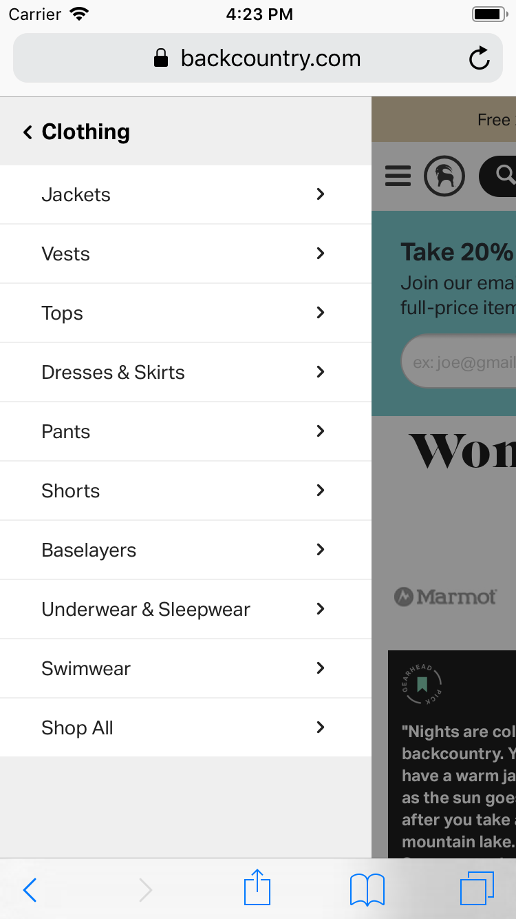
Backcountry’s “Women’s Clothing” category has 9 subcategories — a reasonable number that allows for fast scanning of available options.
When presented with too many choices within a category, users can feel overwhelmed. But when they see too few products in a category or subcategory, that can be frustrating, too.
Divide your categories and subcategories into manageable chunks. Subdivide when you reach approximately 10 categories, and aim for at least 10 products in the categories at the deepest level.
7. Avoid Redundant and Overlapping Categories (Guideline #263)
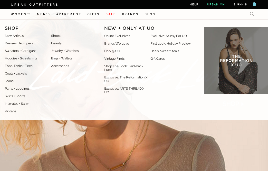
Urban Outfitters avoids obvious overlapping or redundant subcategories in the “Women’s” category.
Overlapping or confusing categories confuse users and create a negative user experience.
Remove redundancies in your categories, especially when using combined categories and imported third-party categorization. Periodically assess and revise your taxonomy to make sure the categories are logical and well-defined.
8. Avoid Shallow Parent Categories (Guideline #266)
On sites where headers were selectable parent categories, test participants often relied on them to get an initial overview of an entire category. From there, they could make an informed decision about which subcategory to select.
Category hierarchies that are just labels and headers force users into fewer choices and prevent product browsing.
For easier navigation, ensure that your headers or groupings of product categories are selectable and are part of your actual product catalog hierarchy.
When you follow this best practice, users who haven’t fully decided what they want or are looking for inspiration on what to purchase can explore broad categories before diving into narrowly defined ones.
9. Include an “Accessories” Subcategory within Relevant Categories (Guideline #268)
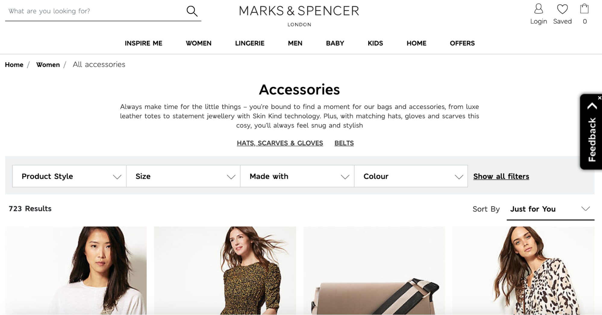
Marks & Spencer has an “Accessories” subcategory nested within “Women.” That subcategory contains hundreds of products. To help users quickly narrow their scope, two “Accessories” subcategories are prominently featured (“Hats, Scarves & Gloves” and “Belts”), as are filtering options.
Finding accessories for products is often difficult for users, so you want to make that subcategory easy to find while not cluttering up your site with “accessory pollution.”
Nest “Accessories” subcategories below product categories if there’s a sufficient number of accessory products, and provide users with tools to narrow down large accessory product lists. In general, avoid displaying accessories in the category product list.
10. Consider Including a “Best sellers” Category (Guideline #1666)
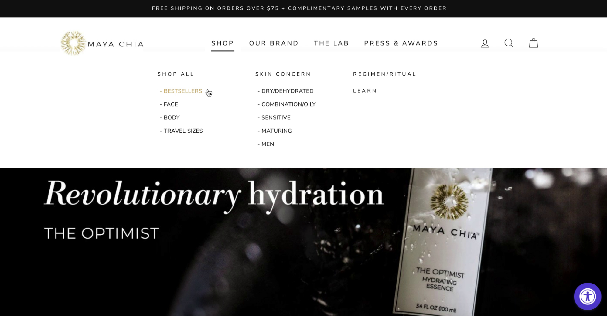
A test participant navigating the Maya Chia site went to “Bestsellers” as a way to learn about the brand’s most popular offerings. Popular products serve as an introduction to the broader product catalog.
New users often look for popular offerings on your site as a place to begin browsing. This is especially true for younger brands or direct-to-consumer (DTC) sites that are unfamiliar to users.
During testing, we observed that promoting a “Best sellers” category provides an essential path to finding relevant products and serves as a great entry point to begin exploring the site.
On-Site Search Best Practices
The backbone of delivering a good ecommerce search experience is understanding user queries and delivering the best possible matches for those keywords.
Use these practices to deliver a great ecommerce search experience.
11. When There’s an Exact Match, Include the Product at the Top of Search Results (Guideline #333)
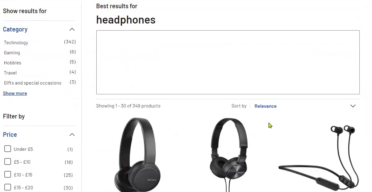
“So let’s search for some headphones … so we’ve got 30 of 349 products on this page.” Exact search worked well for this test participant on Argos (UK) during large-scale European testing.
When a user searches for a product using its exact title or ID and the item doesn’t show up in search, the user will assume the site doesn’t carry that item.
Search tools need to search within secondary product data to produce relevant results when users copy-paste information like manufacturer’s model number or SKU number. Problems also occur when all variations of a product’s title are not stored, including alternate spellings, title translations, international brand and model names, censored words, etc.
When there’s an exact match, display that product at the top of the search results. Consider redirecting to the relevant product page if you’re 100% certain what a user is looking for — but always provide a way for the user to see the full search results instead_._
12. Show Relevant Products in “Product Type” Searches (Guideline #334)
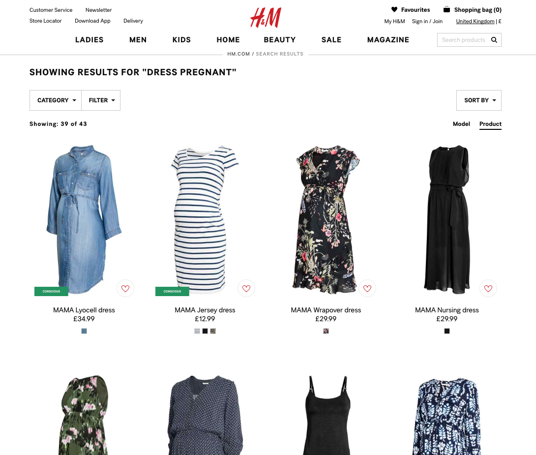
Your users won’t necessarily know what product type your site uses to identify a particular product. The H&M site designers have mapped synonyms like “maternity” and “pregnant” so users who search for “dress pregnant” will also see all the “dress maternity” results.
If relevant products don’t show up when users search by “Product Type,” they’ll see unwanted or limited results — or worse yet, they won’t see any results at all for an entire product category.
Provide support for “Product Type” searches and respective synonyms, including support for multi-word queries. Ideally, suggest relevant categories in the search field.
13. Support “Feature” Searches (Guideline #340)
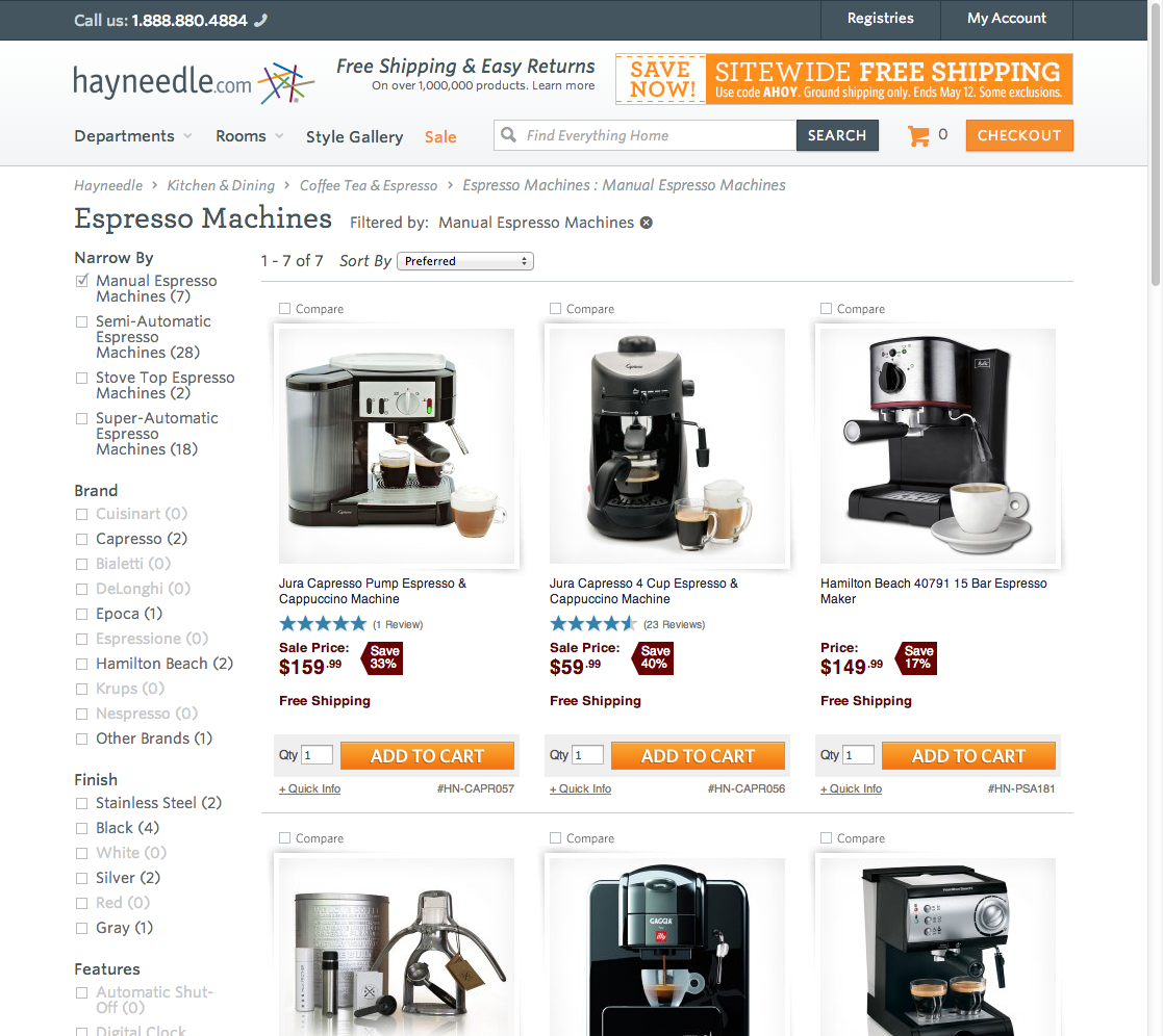
Searching for “manual espresso machine” on Hayneedle sends the user to an “Espresso Machines” category with a “Manual Espresso Machines” filter applied. This results in a list of highly relevant search results.
Many users will submit search queries that include one or more product attributes, and they will expect the site to apply these filters to their search.
To present users with results that closely match the product attributes they’re looking for, support “Feature” searches by leveraging product content like features, specifications, and descriptions.
14. Enable Abbreviation, Symbol, and Slang Searches (Guideline #344)
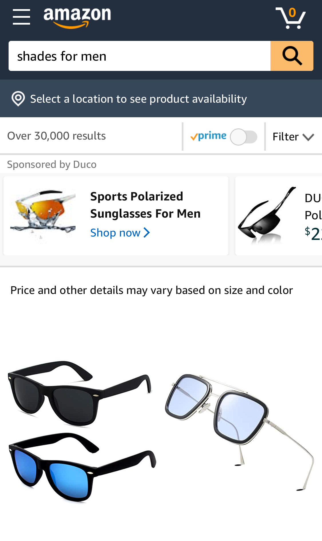
On Amazon, the slang search “shades for men” is mapped to sunglasses, offering over 30 men’s and unisex sunglasses on the first page of results.
Users often use abbreviations, symbols, or slang in their queries. When they don’t get results with those types of searches, they often assume the products they’re looking for aren’t available.
Use dictionaries, search logs, and conversations with customers to understand and map commonly used abbreviations, symbols, and slang to synonymous keywords within your product catalog.
15. Support “Symptom” Searches (Guideline #338)
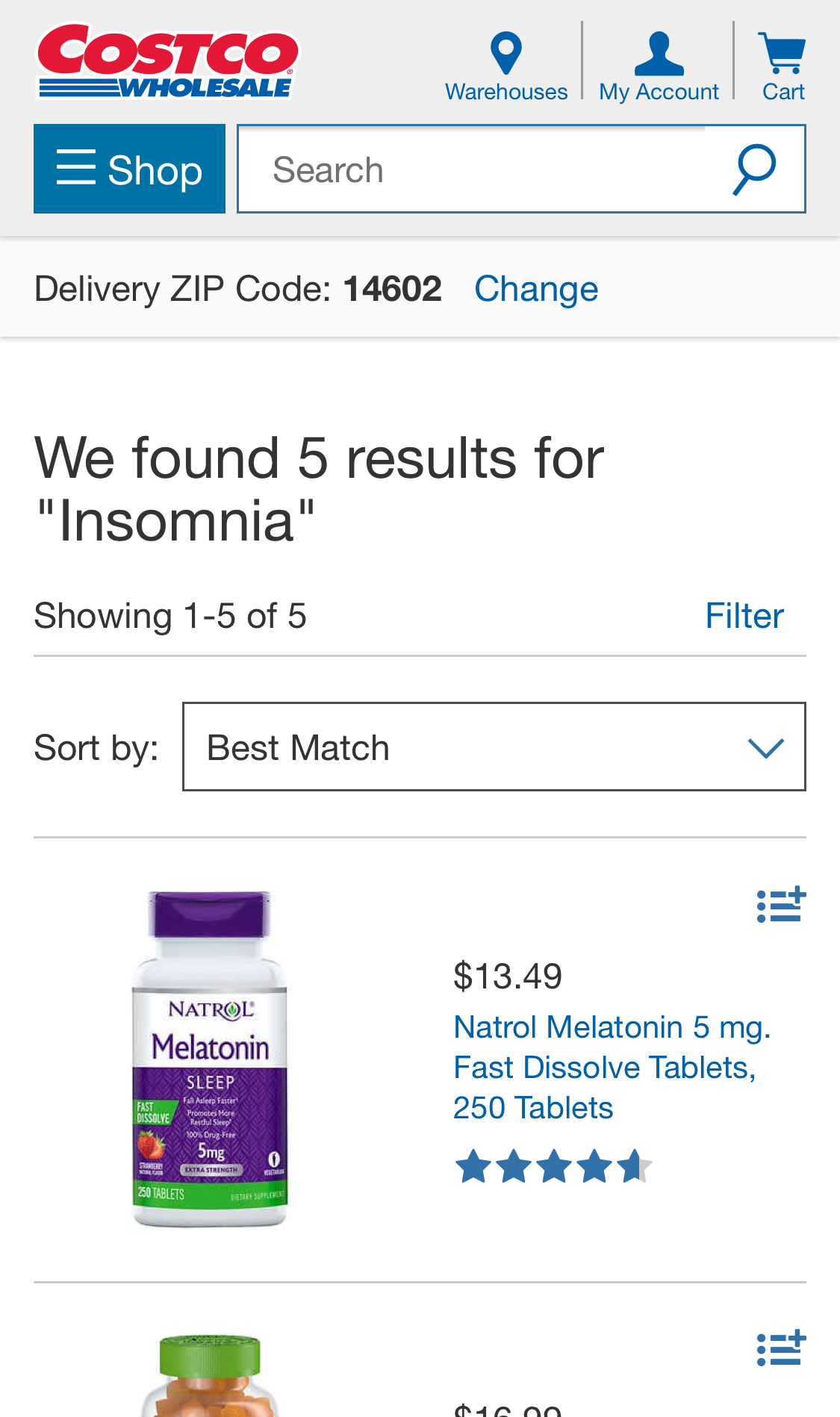
At Costco, a query for “insomnia” yields 5 relevant results, including a few products that don’t directly include “insomnia” in their product titles.
When users don’t know what type of product they are looking for, they often use problem-oriented keywords to discover products that can provide solutions. When searching for symptoms yields poor results, users might not find the products they need and will go elsewhere.
To discover common “symptom” searches, look in your search logs and map those queries to appropriate products or content.
For sites where “Symptom” searches are particularly important, consider suggesting its usage via placeholder text in the search fields. You can also provide relevant non-product content, like help and buying guides on the search results page.
Best Practices for Product Lists and Filtering
Managing an ecommerce website includes the design of product lists and filters. Currently, the state of product list UX in major ecommerce sites leaves a lot to be desired.
Baymard benchmarked 60 top-grossing US and European ecommerce sites and found the average site performed mediocre at best for product list and filtering — and 36% had major design and feature flaws that interfered with users’ ability to find and select products.
Follow these guidelines to improve users’ ability to find, evaluate, and select the handful of products that are most relevant to their needs.
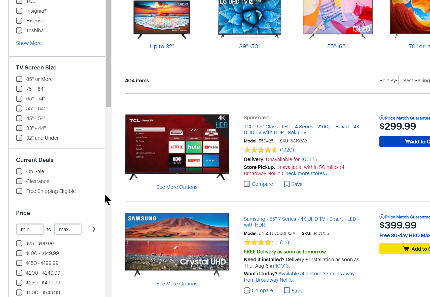
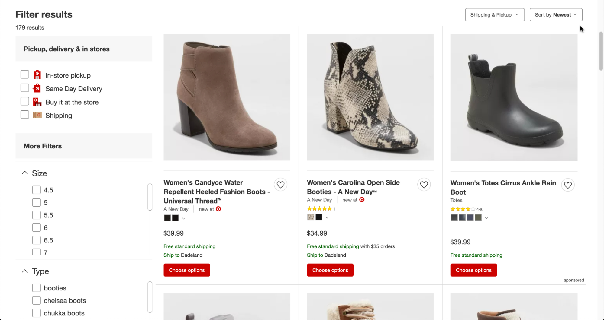
16. Show the Total Number of Items in the Product List (Guideline #531)
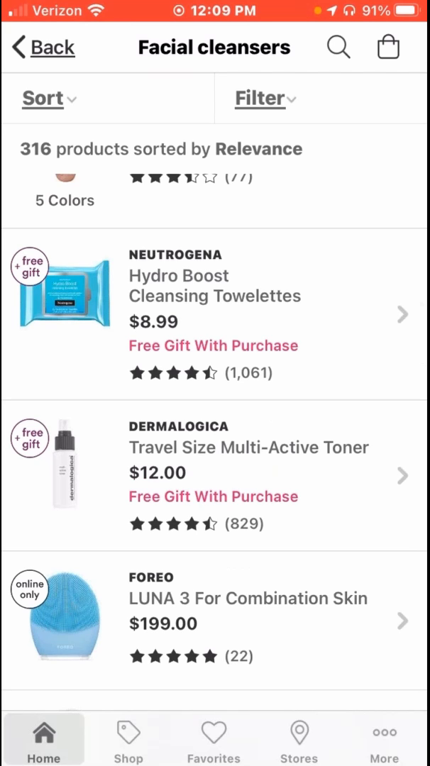
“So I’ve got 316 products. I would try to filter because I’m not going to look through that many products.” The excessive number of items in the product list in the Ulta app prompted this test participant to apply additional filters.
When users don’t know the number of items in the product list, they’re missing important information on the relevance and quantity of the items they’re browsing.
Clearly display the total number of items in the product list, both above and below the list. The size, placement, and styling of the number of items should be clear to users who need to know the number, but at the same time not distracting for other users.
17. Replace Endless Scrolling and Pagination with “Load More” Links (Guideline #501)
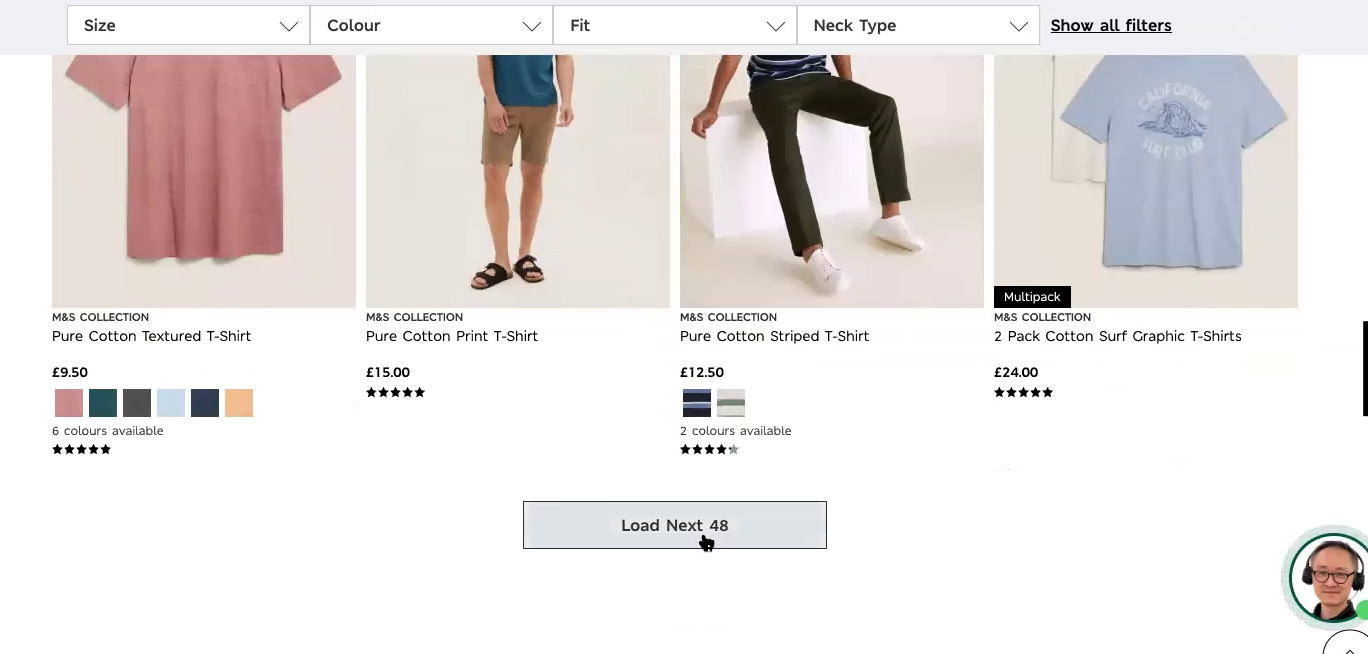
“I guess it’ll load the next 48.”, said this participant on Marks & Spencer during large-scale European testing. When the next 48 items loaded, she said, “Okay, they all loaded on the same page and it didn’t take me to a new page. That’s pretty good, I like that.” When both previously viewed and new items are on the same page, users don’t have to visit multiple pages to compare items from each set.
Users will find it difficult to navigate between pages of results, and can be overwhelmed by more and more results that load in as they scroll to the bottom of a product list.
Therefore, avoid “Pagination” and “Endless Scrolling” on both desktop and mobile sites. Instead, use a “Load More” button, combined with lazy-loading for category-based product lists. Make sure your “Back” button works properly so your users can move back and forth between product lists and product pages.
18. Include the User Rating Average and the Number of Ratings (Guideline #441)
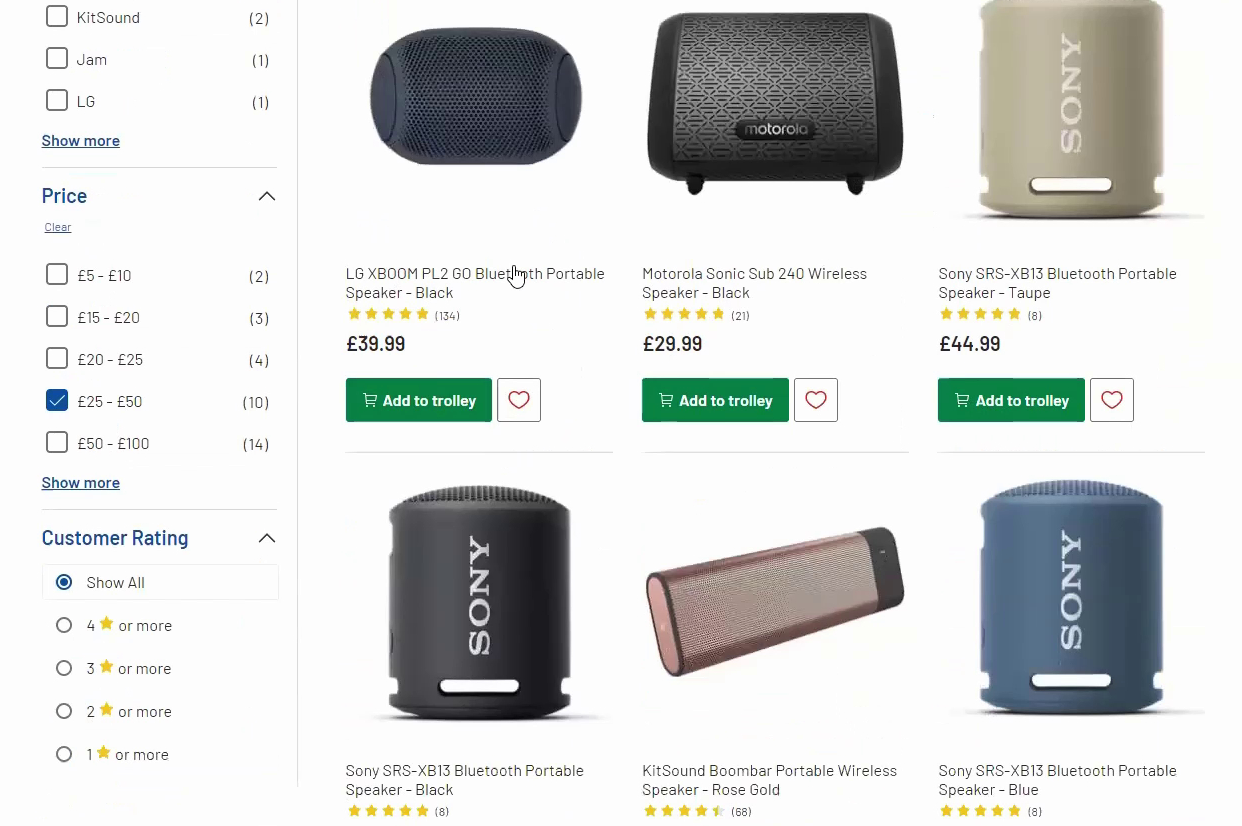
“I can see this has got 134 ratings and the average is five stars. So, immediately I think, ‘Well that must be pretty good.’” Another participant testing the Argos (UK) site commented that when the number of ratings is relatively high, they trust the rating more.
Your users rely on ratings and reviews to select products, but displaying only the star rating doesn’t give visitors enough information to make a decision.
Always include both rating averages and the number of ratings in product list items. Ensure the average of star ratings is easy to see on desktop and mobile. Consider including a numerical representation of the rating (like “4.9”) as well as an image that shows the average number of stars.
19. Make List Item Info Elements Visually Distinct (Guideline #448)
IKEA, product types and names are separated using font variations, making it easier to scan list items.
Users may have a difficult time scanning and interpreting product list items if the name, type, brand, and features aren't visually distinct.
Use font style variations, bullets, line breaks, and spacing in your product list design to make list item information elements unique and easily recognizable. Follow similar UX design process steps across list items of the same product type.
20. Have a “Sales” or “Deals” Filter (Guideline #1191)
Best Buy includes a filter for “Current Deals” with options for “Clearance”, “Sale”, and “Free Shipping Eligible”. Users looking for discounted items can easily exclude products that are not part of sales promotions.
Your users want to find products that are on sale, but if they can’t easily filter out items that aren’t discounted, it can slow down the shopping experience and lead to frustration.
Always provide a “Sale” or “Deal” filter type, and ensure that it is visible in the main filter interface. Don’t hide it within a “Price” filter type or anywhere else.
21. Always Provide Checkboxes for Filter Options (Guideline #479)
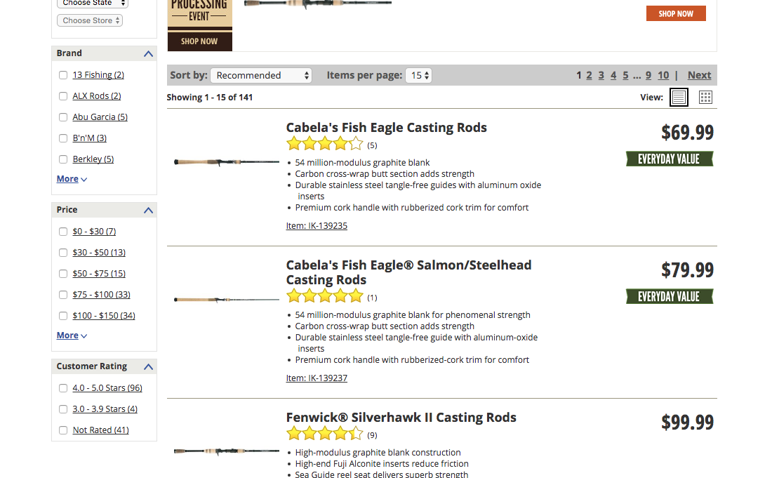
Cabela’s site uses both link styling and checkboxes to highlight filter options.
If users don’t see (or don’t understand) the function of your filter options, they won’t be able to successfully narrow down their options and find what they need.
Display a checkbox for each filter option. Consider using the site’s default link styling, differentiating filter types and options using spacing and text styling, and adding a hover effect to filter options.
22. Allow Users to Sort the Product List by Price, User Rating, Best Selling, and Newest (Guideline #511)
Target offers a “Newest” sort type that helps users interested in new arrivals.
Ensure availability of the essential sort types most commonly sought out by users. Users should be able to sort products by Price, User Rating, Best Selling, and Newest within a product list.
You can also offer additional category-specific sort types that reflect the most important product attributes.
The default sort order influences a user’s willingness to explore a product list. Implementing a diversity-based “Relevance” default sort method ensures users get an immediate understanding of the range of products within the category and promotes exploration.
Product Page Best Practices
Nearly all users will view and explore a product page before making a purchase — but the layout and features of the product are often templated for everything sold on a site.
Follow these best practices to maximize conversion on your product pages, which are the centerpiece of your user’s shopping experience.
23. Consider Using Vertically Collapsed Sections on Product Pages (Guideline #751)
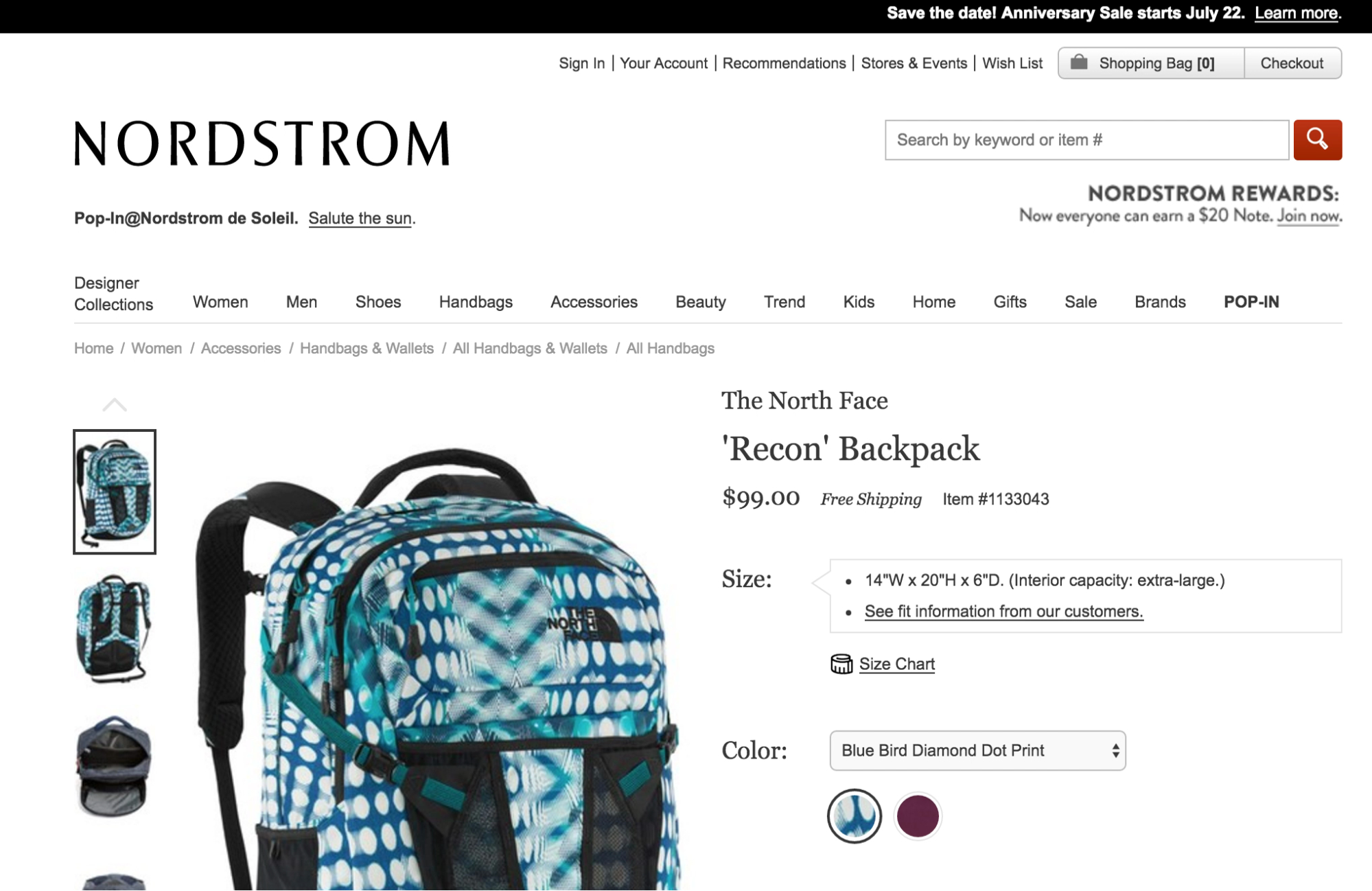
A test participant found this page and wondered if shipping is free with Nordstrom. With the vertically collapsed section, she was able to click on the “+” next to “Shipping and Returns” and find the answer to her question.
On Product Details pages, long uncollapsed sections make it difficult for users to get an overview of the product.
Consider using vertically collapsed sections on your product page, both as full- and partial-width page sections. If you use this format, use the same layout for all content sections and include clear section titles.
24. Feature at Least 3 to 5 Images for Each Product (Guideline #740)
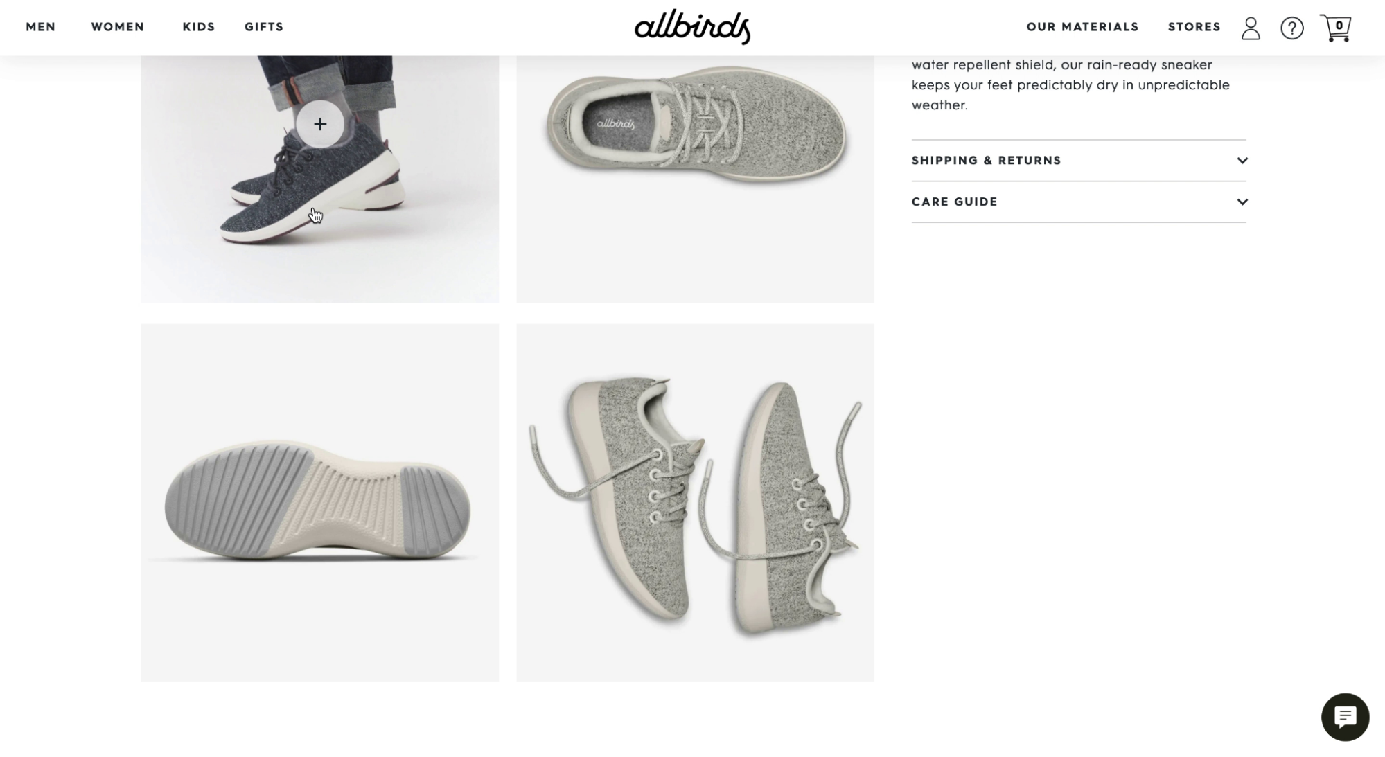
“You can really tell what it is…you can see the angles…it’s cool.” On Allbirds, a test participant appreciated the diversity of images, which gave them a visual understanding of the product from all angles.
Users rely on product images to evaluate products and decide if they are the right fit.
To provide sufficient visual information, always include no fewer than 3 to 5 images for every product. If your catalog is large, focus on providing a variety of images for the most important, most popular, and best-selling products.
25. Use Video to Showcase Products (Guideline #759)
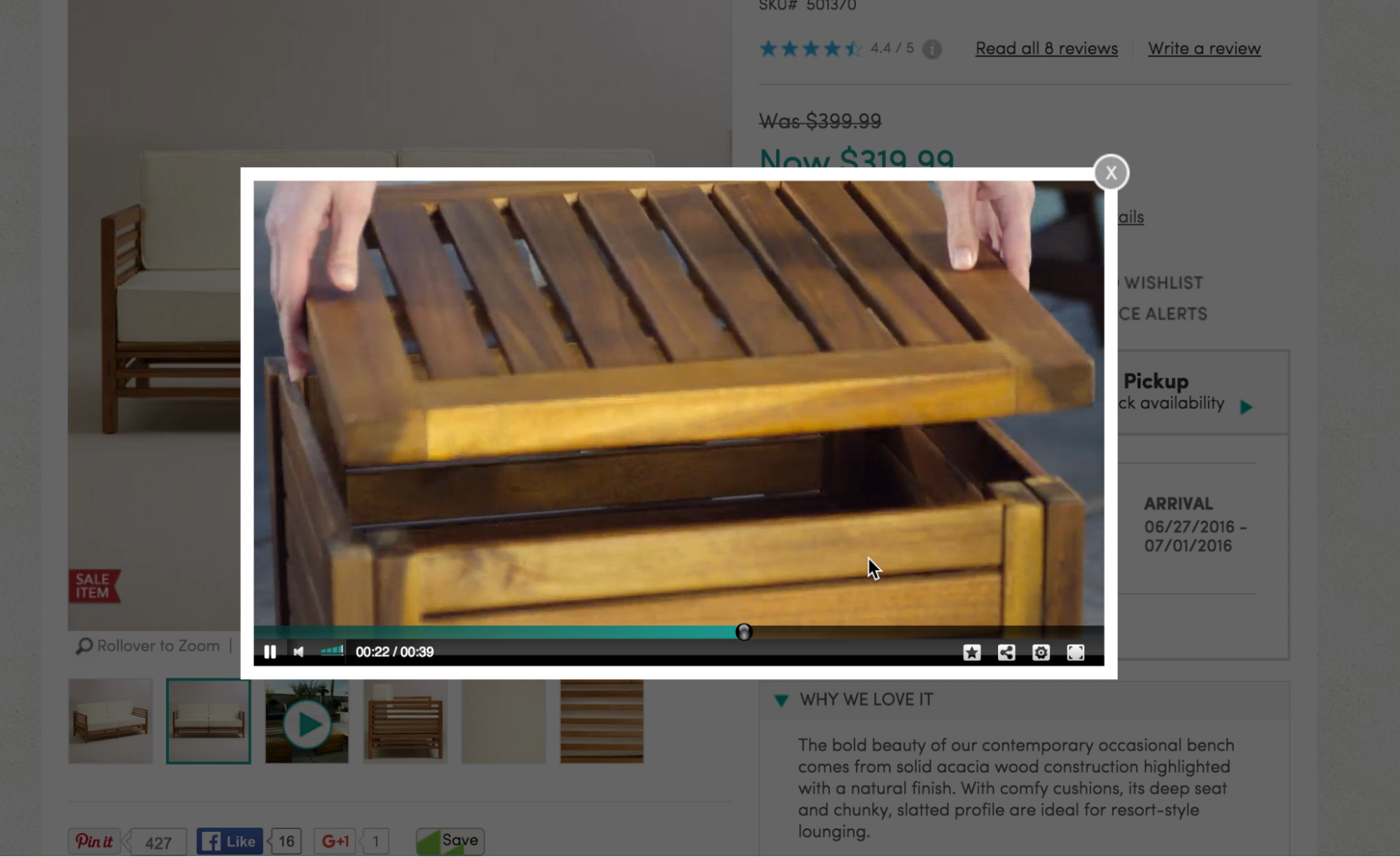
“I love the storage, so I would be interested in this.” At World Market, a user learned about features of the patio furniture from watching the product video.
Product images are an important way for your users to explore products — but in many cases, it can be difficult to convey features using static images alone.
Product videos can provide an engaging way for users to learn about key product details. At the very least, provide product videos for your top-selling products, and products that are complicated or expensive.
26. Make the Primary “Add to Cart” Button Prominent and Unique (Guideline #791)
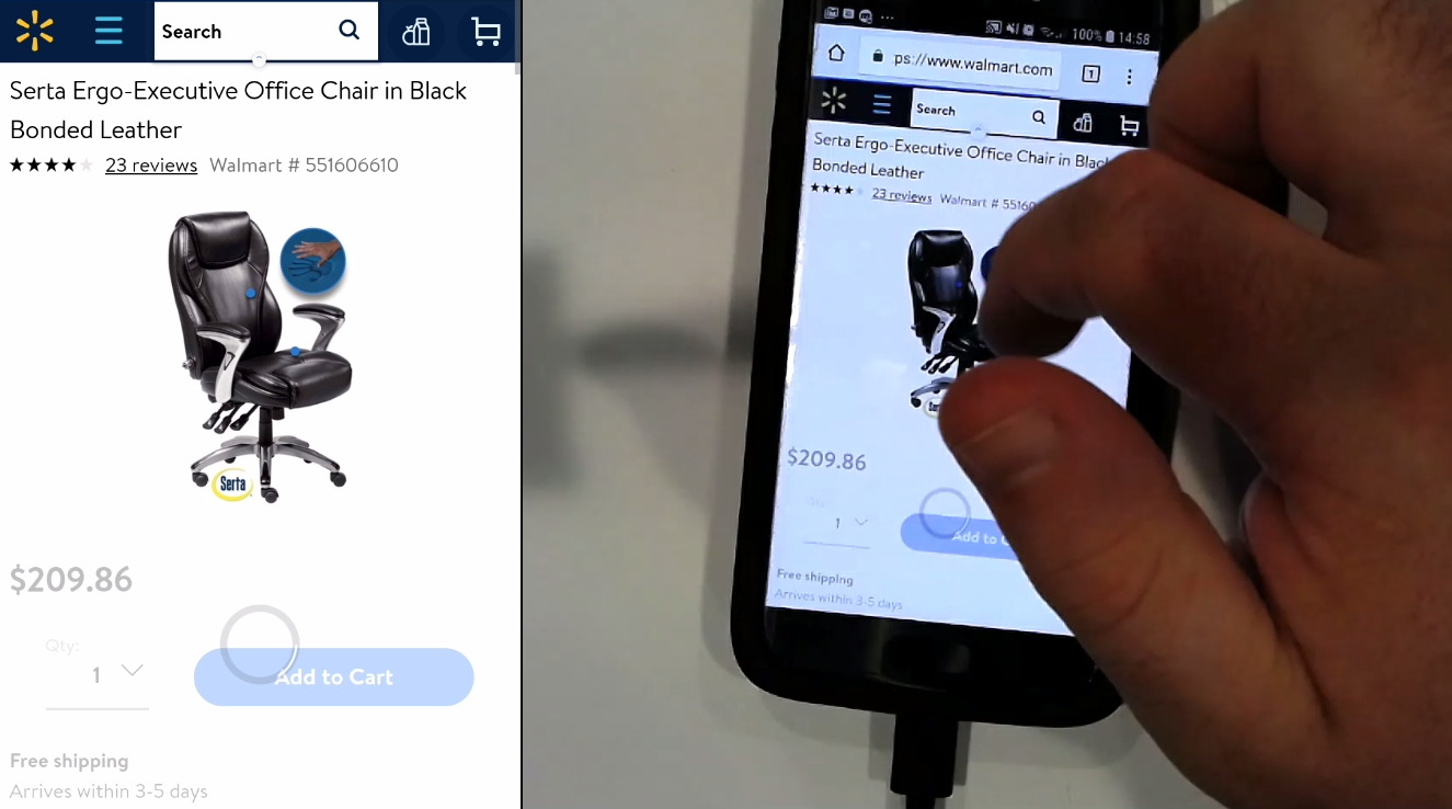
“I’d be happy to buy that chair. Yeah. That’s grand,” said the test subject about this Walmart product detail page. The unique blue color of the button and the absence of competing buttons help draw attention to the button as the next step to purchasing the chair.
Competing call-to-action buttons are distracting for users, and they can make it difficult for users to add a product to their cart and complete a purchase, which could result in a high cart abandonment rate.
Distinguish your main “Add to Cart” button by using a style you don’t use on other buttons. If you are using a sticky “Add to Cart” button, surround it with sufficient white space — don’t use a full-width button.
27. Make Return Policies Easy to Read and Understand (Guideline #1501)
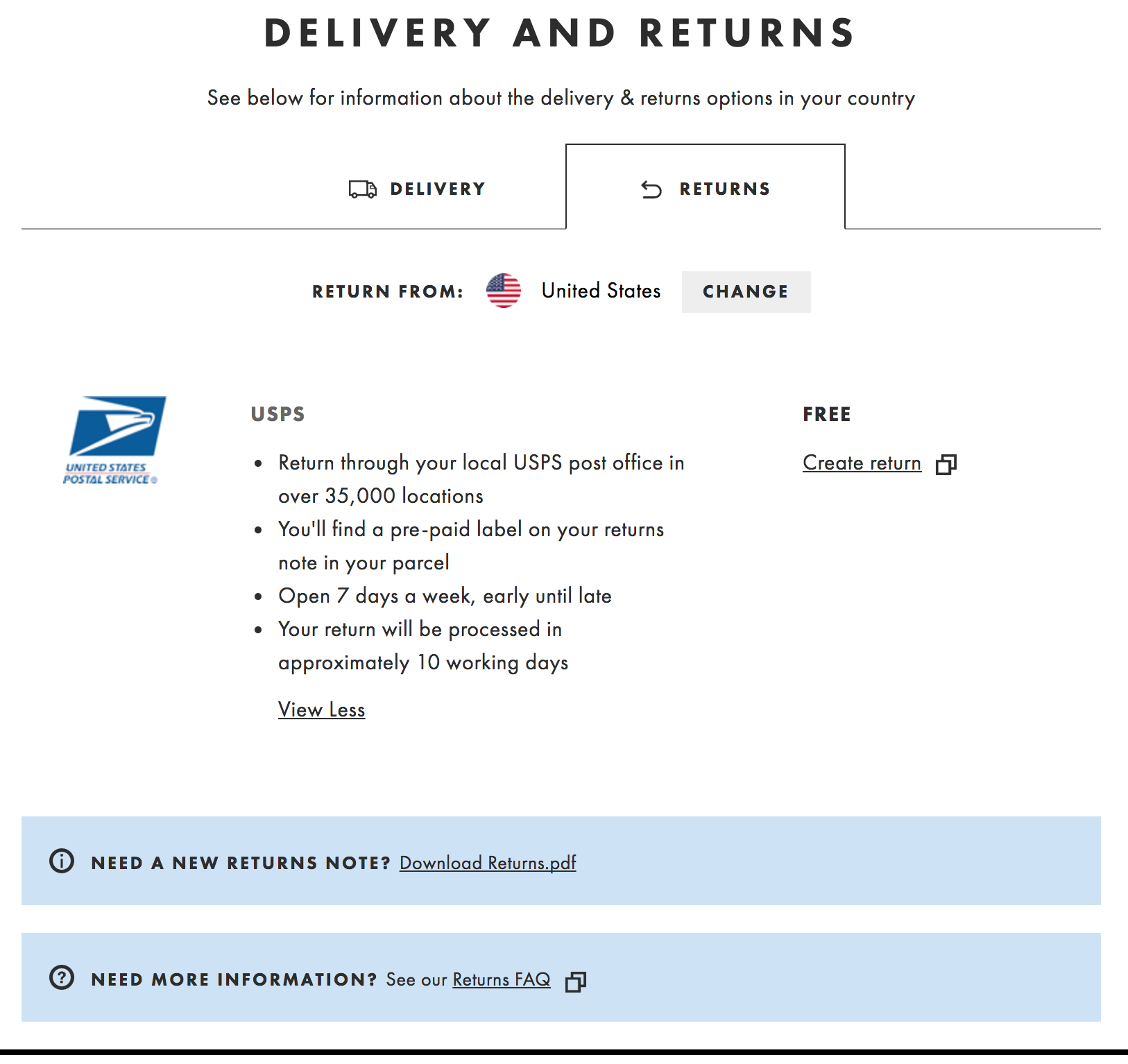
ASOS offers a concise overview of their return policy information on their “Delivery and Returns'' page. Users see a short bullet list covering shipping logistics, a link to download their full return policy, an FAQ, and a link to the “Create Return” tool.
Users who understand your return policies will feel more confident about purchasing from you.
Provide clear, concise answers to common return policy questions in an easy-to-read format on your site. Include a summary and headers on the page, and write in plain language. If you offer free returns, explicitly state that your company covers the cost of return shipping.
Accounts Dashboard Best Practices
The Accounts Dashboard and Self-Service area of an ecommerce site or app is often the most personal side of any user experience. Users have more “skin in the game” when they’re tracking packages, trying to cancel orders, or returning products than they do when they’re just browsing.
Follow these ecommerce best practices to reduce friction for users as they’re managing their accounts and using self-service options.
28. Place the “Account” Drop-Down in the Upper-Right Corner (Guideline #886)
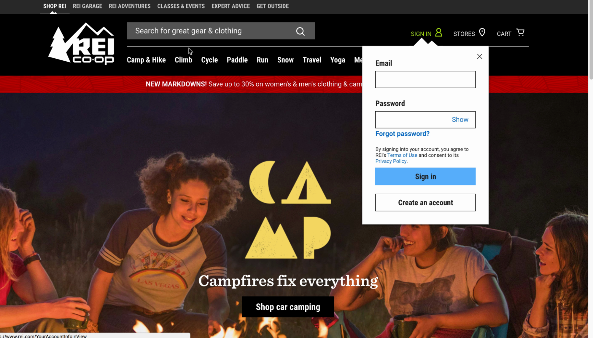
On REI, placing the “Account” drop-down in the upper-right corner of the interface aligns with user expectations.
If users can’t locate the Account area, they won’t be able to complete tasks and will become frustrated.
Always place the “Account” drop-down in the upper-right corner of your interface, and make sure it is highly visible with plenty of white space around it.
29. Highlight Recent Orders in the Account Dashboard (Guideline #873)
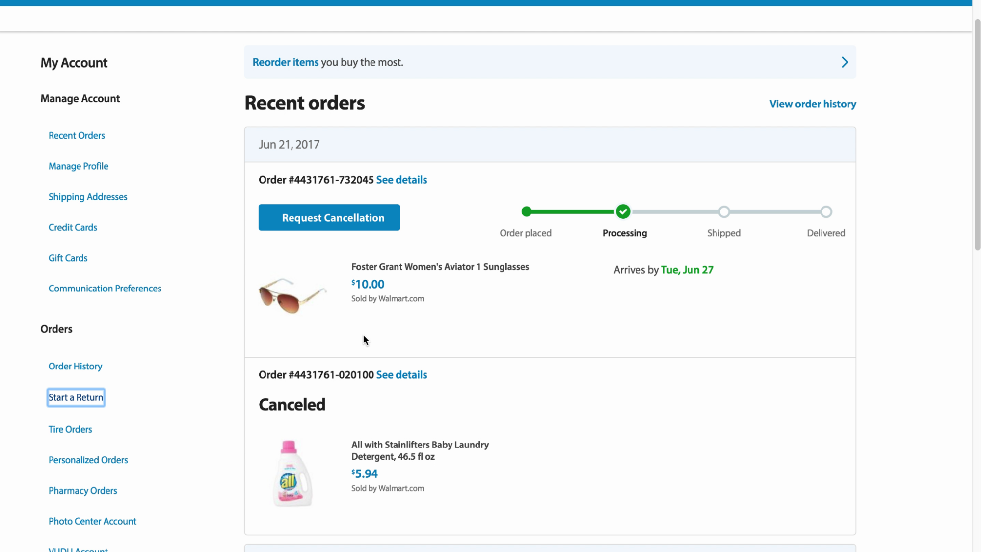
On Walmart’s account dashboard, orders are visible by default. Users have access to the most important information and actions right away, and the tracking graphic makes it easy to understand order status at a glance.
Most account dashboards include many management options — but many users use the dashboard strictly to track orders.
Highlight a user’s open orders in the account dashboard, and consider removing the section or deemphasizing it when users don’t have open or recent orders.
30. Provide the Ability to Print and Email the Shipping Label (Guideline #867)
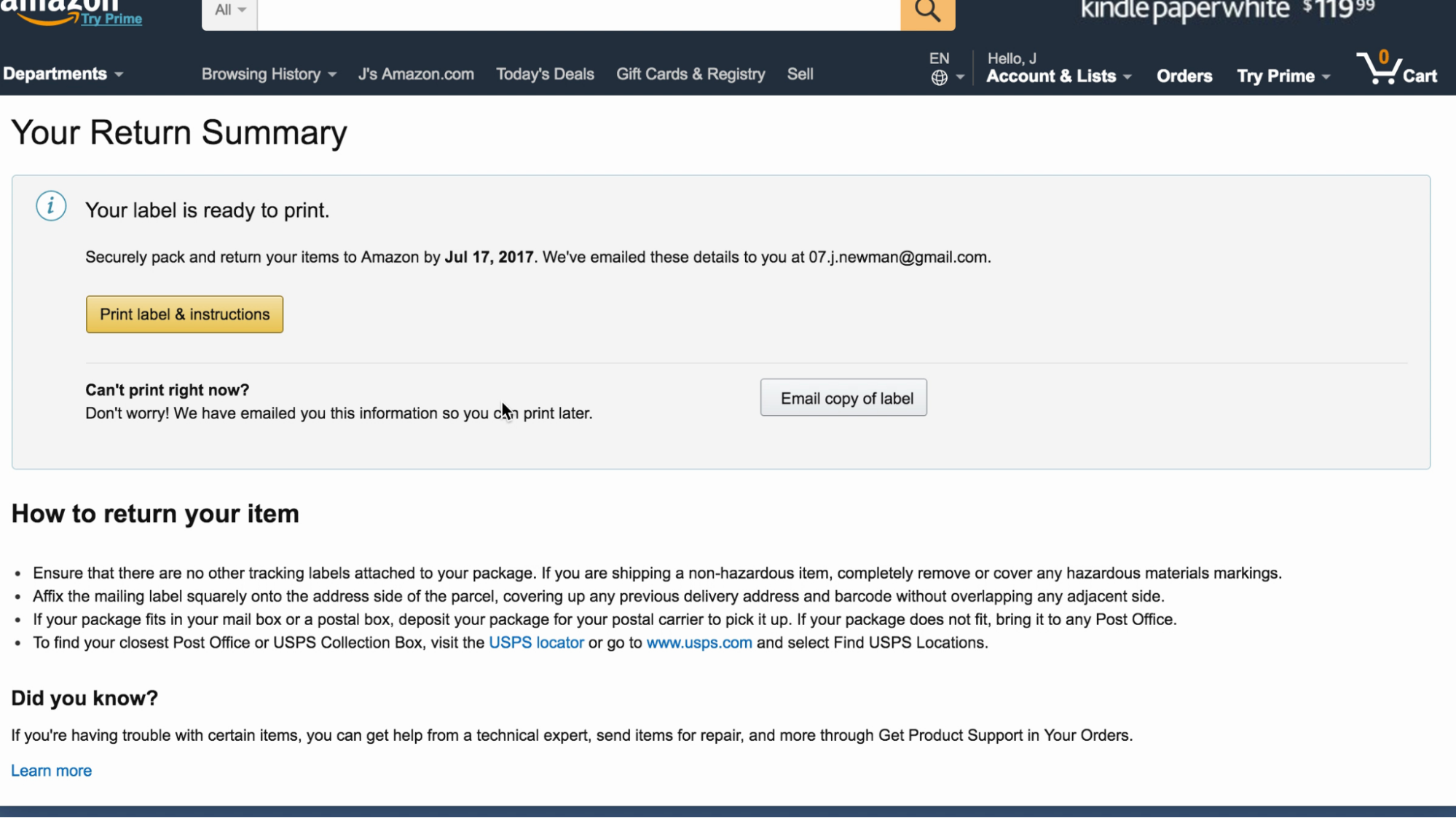
Amazon makes it easy for users to print a label later. One test participant said, “I’m seeing if I’d have to print it off now, but it looks like they emailed me the information. I’d probably wait and print it later.”
Many times, users don’t print shipping labels for order returns right away, and they may be anxious about their ability to find the right label at a later time.
Allow users to postpone printing their shipping label by automatically emailing the shipping label after they’ve completed the return process. Also, provide the ability for the user to manually save, print, or email their label.
31. Provide an “Apply” Button for Users Changing Account Data (Guideline #893)
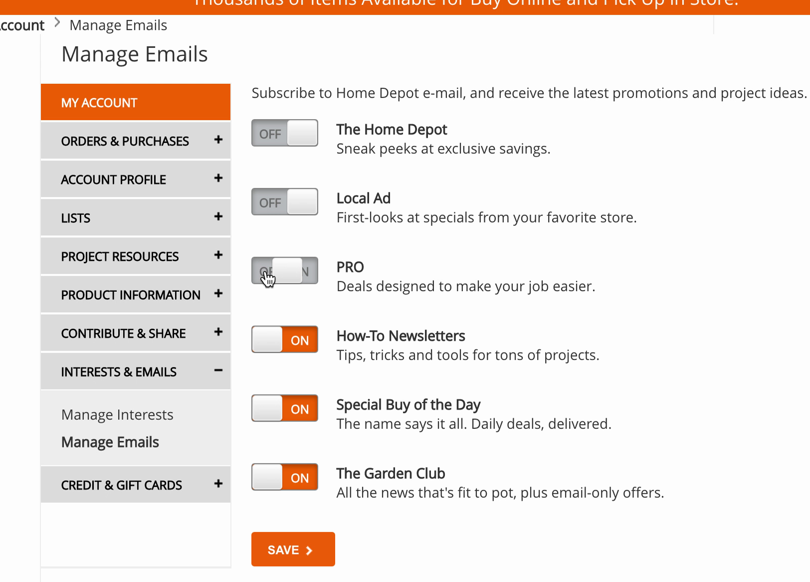
Home Depot’s unsubscribe interface performed well during testing. The “Save” button at the end of the form matches users’ expectations about how changes are saved during account updates.
Requiring users to click the “Apply” button when they are editing, creating, or deleting data in account features provides a bit of friction that can keep users from making changes they’ll regret.
Place the button at the bottom of the account form or make it sticky. Keep the “Apply” buttons inactive until the user has made changes.
32. Display Key Milestones in Order Statuses (Guideline #922)
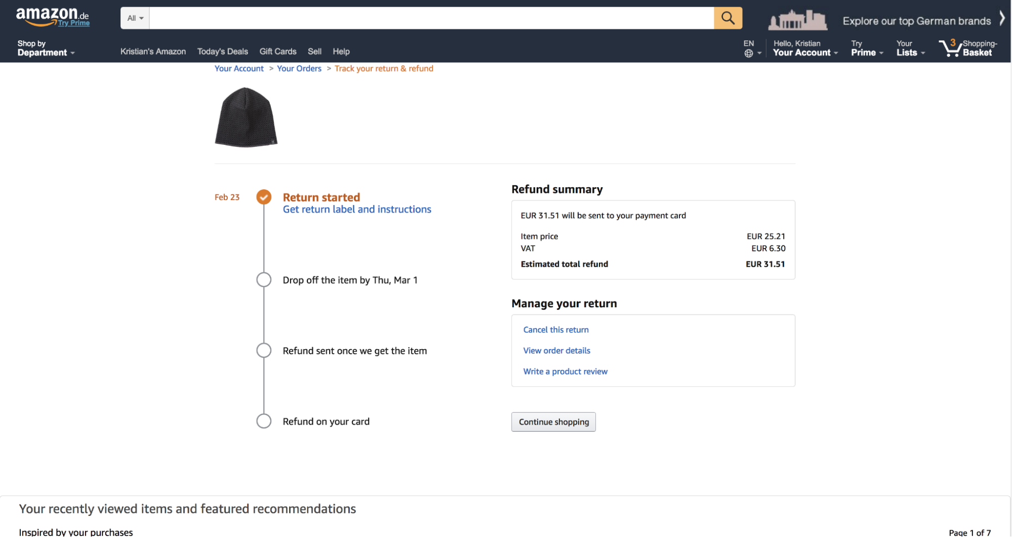
On Amazon, test participants could view a concise summary of the refund process, including a timeline with key milestones. Providing clear information lessens the likelihood of a customer needing to reach out to customer support with questions about their return.
Keep users apprised of the status of their returns so they know if the return is proceeding as planned.
Update the order status on the account page when a returned item has been received, and when the refund has been issued. Always provide clear updates about any partially returned orders.
Sitewide Best Practices
Some issues occur across an entire ecommerce site, including problems with the design and implementation of features and elements, overall behavior and performance, mobile optimization, and accessibility compliance.
Follow these best practices to improve the overall user experience on your site.
33. Visually Emphasize the Cart Link in the Sitewide Header (Guideline #607)
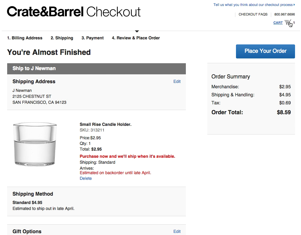
“That’s nice...the icon with the cart where it says “1” gives me an overview.” Crate & Barrel’s cart icon is located in its own row in the upper right, with sufficient white space around it.
If your user can’t see their cart quickly and easily, they will have more difficulty starting the checkout UX or viewing saved items.
Place the link to the cart in the upper-right-hand corner of the sitewide page header. Use a clear, contrasting icon or button and plenty of surrounding white space. Avoid using a text-only link for the cart.
34. Avoid Automatic Live Chat Boxes (Guideline #940)
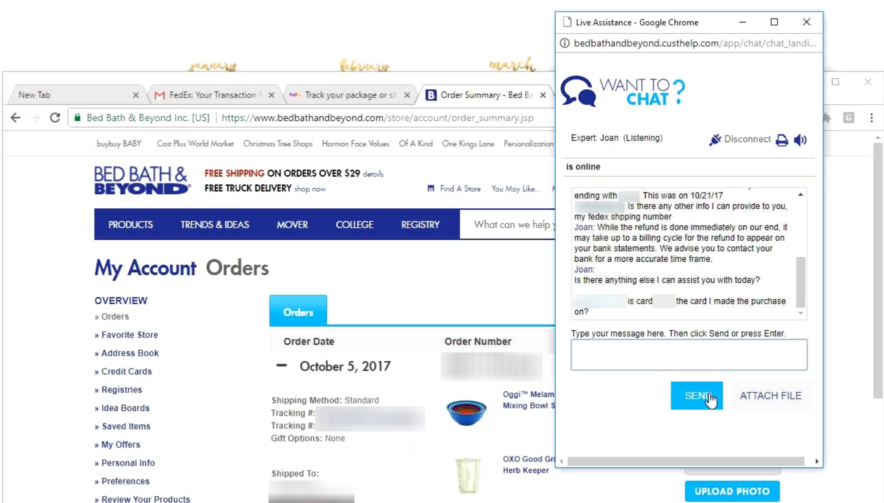
“I like to use these chat functions whenever I can because sometimes you can get a really fast answer or they can take care of a problem right there.” A participant testing Bed, Bath & Beyond successfully used live chat to answer a question she had regarding a refund for a product she returned.
Site-initiated live chat dialogs are disruptive and annoying, and “sticky” chat elements often block critical page content on mobile devices.
Avoid live chat overlay dialogs in general. On mobile, be cautious about using any kind of “sticky” chat elements. Instead, place static links to live chat functions in your header, footer, and help sections.
35. Include a Link to the FAQs in Your Footer (Guideline #1705)
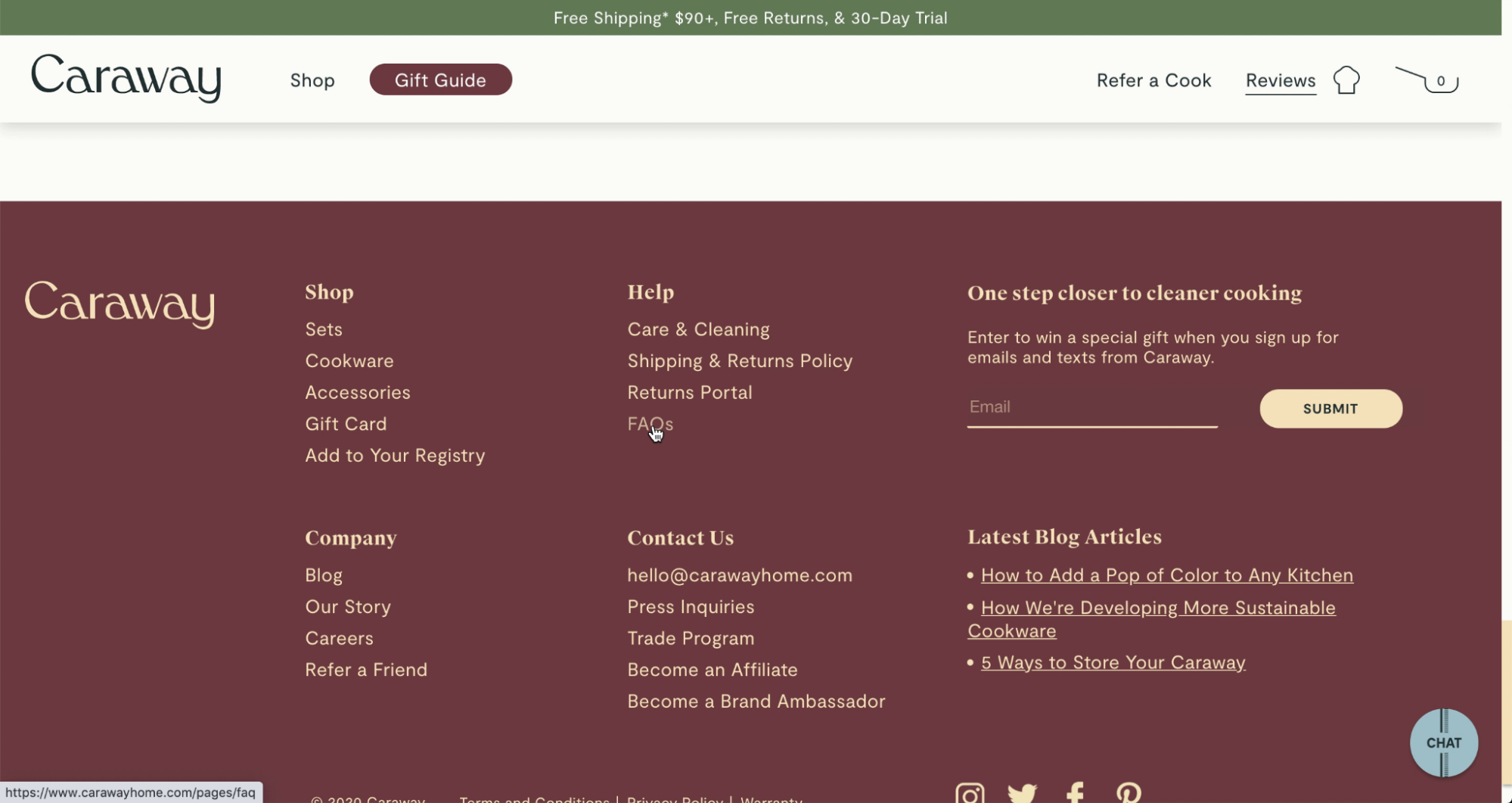
“I want to figure out that 30-day trial.” This user on Caraway specifically sought a link to FAQs in the site footer to get answers to a question about the site’s trial membership. Providing a clear link to the FAQs gives users the quickest and most intuitive access to resources.
Users might abandon a site when they can’t easily find answers to their most important questions. Sitewide FAQs are a vital ecommerce best practice for solving common problems.
Provide a link to sitewide FAQs in the footer, and title it “FAQ” or “FAQs.”
Discover More Ecommerce Best Practices
This is just a sampling of the 700+ UX guidelines — based on 200,000+ hours of research and testing — you can get with Baymard Premium.
Ready to speed up your ecommerce designing decisions and consistently develop high-performing ecommerce sites? Then it’s time to get access to all of our actionable recommendations, UX case studies, and benchmarking data.
Find out more about Baymard Premium here or Try a Free Plan Today.
Research Director and Co-Founder
Christian is the research director and co-founder of Baymard. Christian oversees all UX research activities at Baymard. His areas of specialization within ecommerce UX are: Checkout, Form Field, Search, Mobile web, and Product Listings. Christian is also an avid speaker at UX and CRO conferences.