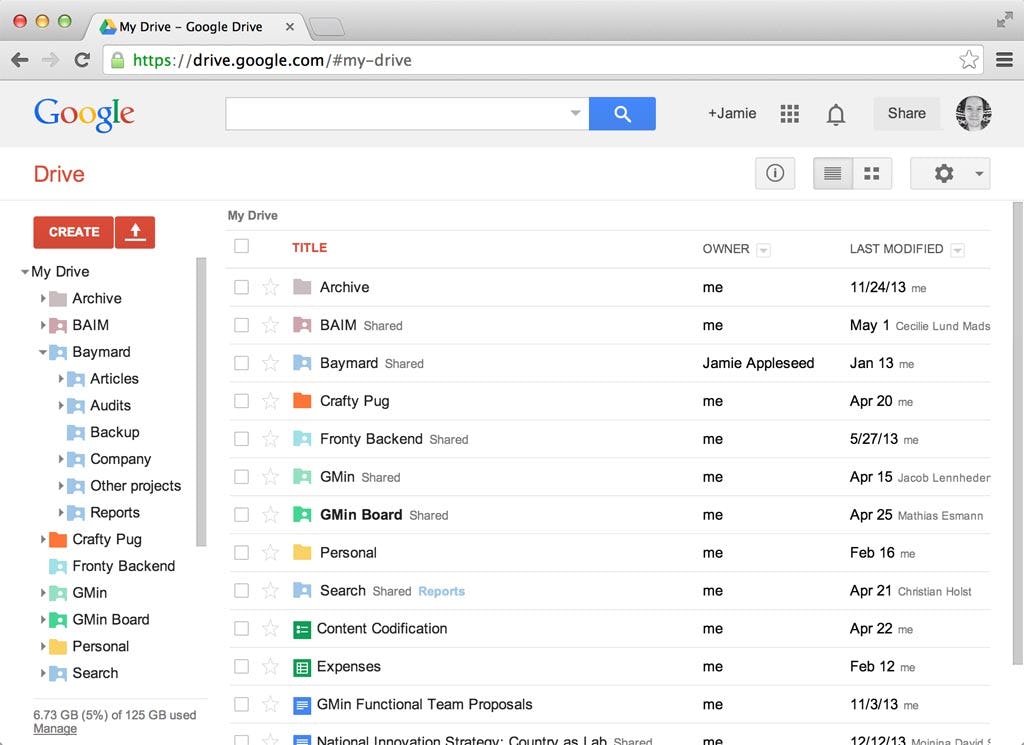
During our recent large scale usability studies of both e-commerce navigation and search inline scroll areas were found to cause a myriad of usability issues. Whenever a section scrolled independently from the rest of the page, the test subjects ran into several low-level interaction issues along with some more fundamental conceptual difficulties.
Designers often use such inline scroll areas to confine the space a given section takes up on the page, typically in an effort to afford the user a better overview of all the sections present on the page. In fact, our search usability benchmark reveals that 26% of the top grossing e-commerce sites use inline scroll areas for listing filtering options. While the intention is good, the outcome of using inline scroll areas isn’t.
In this article we’ll go over the usability issues brought on by having such separate scrollable lists within the page, outlining both the conceptual and 5 concrete interaction issues that crop up when relying on this unfriendly design anti-pattern.
(For a beginner’s introduction to UX, start with our primer, UI vs UX.)
Inception-style Scrolling
Users are often perplexed by inline scroll areas because they introduce nested scroll panes, with any inline scrollable areas being placed within the larger scrollable area of the webpage. It’s scrollable areas within scrollable areas – like nested dreams in the movie Inception! While such complexity may be desirable in a movie plot, it certainly isn’t in a user interface design.
Scrolling within scrolling is simply not an easy concept to grasp. However, even when users do manage to wrap their head around it, the design causes significant mental overhead because it introduces dependencies between the scroll areas. The user has to keep track of the relationship between the scroll areas because they are interrelated – for instance, the state of the page scroll area may cut off part of an inline scroll area.
Inline scroll areas is conceptually very different from having multiple scroll panes within a window – a common design patterns that users are familiar with from native desktop apps. Here the scrollable areas aren’t nested, but instead clearly control separate parts of the interface and therefore aren’t interdependent. Multiple scroll panes thus don’t suffer from the conceptual issues brought on by inline scroll areas.
While tech savvy users may be able to make these distinction, and most regular users eventually work out the conceptual nuances (subliminally of course), inline scroll areas introduce a lot of needless complexity and mental overhead to the page – before the user has even started interpreting and interacting with its actual contents.
And these are just the conceptual challenges of such nested Inception-style scrolling. During testing we frequently observed five concrete interaction issues that the subjects ran into when faced with inline scroll areas.
5 Interaction Issues
Inline scroll areas suffer from 5 core interaction issues in particular: a lack of overview, scroll hijacking, invisible content and scrollbars, overly sensitive scrollbars, and “activation” of scroll areas. Let’s go over them one-by-one.
1) Lack of Overview
Getting an overview of the content inside the inline scroll area is often difficult for the user due to its constricted space. By design inline scroll areas make it impossible for the user to see all of the options at once, and users must therefore memorize any content that’s out of view.
In other words, the overview problem many designers attempt to fix by using inline scroll areas is simply shifted from a lack of page-level overview to a lack of section-level overview. While this may be slightly more acceptable it certainly isn’t ideal.
2) Scroll Hijacking
Inline scroll areas can hijack page scrolling when the user is using the mousewheel or are on a touch device (i.e. smartphone or tablet).
When scrolling the page via a mousewheel, an inline scroll area may be scrolled into the position “occupied” by the user’s cursor, causing the inline area to “hijack” the page scrolling. And similarly, when deliberately scrolling an inline area, once the end of the area is reached, the whole webpage will begin scrolling. During usability testing this proved of great annoyance to the test subjects, who often expressed a lack of page control due to this jerky scrolling experience, requiring them to be constantly aware of their cursor position whenever scrolling.
Scroll hijacking can be even more disruptive on touch devices, where large inline scroll areas can “trap” the user, making it impossible for them to scroll the page instead of the inlined content. This is particularly common for embedded maps and similar scrollable and draggable content on mobile-optimized web pages.
3) Invisible Content & Scrollbars
The current default scrollbar design for iOS, Android, and Mac OSX trackpads, is to hide non-active scrollbars. This means the vast majority of all your tablet and smartphone users won’t actually be able to tell where the inline scrollable areas are.
This not only leads to unwelcome surprises as the user operates the page, but also means the user often lacks the necessary visual affordances to even perceive that the currently shown content is cropped – that they’re only seeing excerpts of the full page content.
Indeed, we’ve seen test subjects leave e-commerce sites because they thought certain options simply weren’t offered, when in fact the options were just cropped by an inline scroll area which was difficult to perceive due to disappearing scrollbars – a case of false simplicity.
4) Overly Sensitive Scrollbars
Some desktop users will drag the actual scrollbar instead of using the scrollwheel. During testing this was observed to be a frequently-used fallback for those experiencing the earlier mentioned “Scroll Hijacking”. From a technical viewpoint there’s nothing wrong with dragging the scrollbar, however, in practice, the scrollbar easily gets overly sensitive when long lists are confined to a small scroll area.
In fact, many of the test subjects unknowingly skipped past numerous relevant options because they were scrolling the area too briskly due to a highly sensitive scrollbar. This can have severe consequences, as users may (wrongly but understandably) conclude that the site doesn’t offer those options, when in fact they unintentionally whizzed by them due to an extremely sensitive scrollbar.
5) “Activation” of Scroll Areas
A few times during testing we observed that some subjects would click within the inline scroll area in an attempt to “activate it”. However, since most of the inline scroll areas contained lists of links (such as filtering values), this click would often result in the test subject unintentionally applying one of the values, sending them on a detour.
In a similar vein, some users thought the scrollable areas would support various types of keyboard commands. For example, one subject looking for Lego for her kid pressed the keyboard letter “L”, expecting the area to scroll her to that part of the “Brands” filter list (an expectation likely carried over from native drop-downs). Others tried using the up and down arrow keys. Even if keyboard commands could potentially be supported, none of the tested sites did so in practice and the subjects often weren’t hovering the scrollable element when trying to apply these keyboard interactions (making it difficult for a site with multiple filters to predict which one the user is trying to navigate).
Avoiding Inline Scroll Areas
Given the conceptual and interaction issues introduced by inline scroll areas, it’s clear that they should be used very sparingly in web design, if at all. While we as web designers may find inline scroll areas to be a convenient solution to a spacing issue, and we as expert web users have few difficulties navigating them ourselves (especially on our own site), it clearly isn’t an appropriate design pattern for most scenarios considering how difficult they are for our users to perceive and operate.
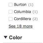
Truncation is often a better solution for dealing with long lists of values since it doesn’t cause havoc to the user’s scrolling yet still manages to achieve the desired design qualities of affording a better page overview while still keep all of the options accessible to the user.
There are better ways to deal with any spacing or page overview challenges, including progressive disclosure and sub-categorization. Truncation is perhaps the simplest solution, and performed rather well during testing as long as the design made it clear to the user that the list was in fact truncated.
Update: By popular demand, we have published a follow-up article on proper truncation design.
This article presents the research findings from just 1 of the 700+ UX guidelines in Baymard – get full access to learn how to create a “State of the Art” ecommerce user experience.


