Inline scroll areas cause a myriad of usability issues, and should therefore generally be avoided, as outlined in our previous article, Avoid Inline Scroll Areas. But this of course begs the question: what is the best way to deal with long lists of select values within a web page (e.g. a list of 10+ filtering values)?
During our recent large scale usability studies of e-commerce navigation and e-commerce search, truncated lists performed better than displaying all available filtering values or using inline scroll areas – as long as a number of truncation design guidelines were met.
In this article we’ll go over the research findings from our usability tests in regards to list truncation. We’ll briefly look at a number of UX design examples highlighting the benefits of truncation, and most importantly, explore the 6 identified design guidelines necessary to make a truncation design perform well.
The Benefits of Truncation

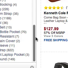
Here the subjects had scrolled down at Best Buy and Newegg to look over the available filters. With the values of each filter truncated, it’s possible for the user to get a complete overview of all the available filtering types. Yet, this design also runs the risk of hiding the filtering value(s) the user is looking for, which is why proper truncation design is so important.
Like the inline scroll areas, truncating the list allows the user to get an overview of all the available filtering types. In comparison, simply displaying all the select options / filter values in one long list will push other available filter types out of view – for example, a “Brand” filter may have 30 values, which would push any other filtering types such as “Color” far down the page, making it difficult for the user to get an overview of all the types of filters available to them.
During testing such lack of overview of the available filtering types typically resulted in the subjects making inferior filtering choices, as they began using less relevant filter types simply because they were the ones immediately visible to them. By truncating the filtering values for each filter type, the user is able to first get an overview of the available filter types, and then – once they’ve decided on the most relevant filter type(s) – they can dive into (and possibly expand) the values.
In addition, a truncated list doesn’t suffer from the 5 interaction issues of an inline scrollable area because there’s no additional scroll areas on the page. Rather, when the values are expanded, it’s simply a regular list of options on the page, subject to the same interaction rules as all other webpage elements. And because it’s one long list when expanded, the user is also able to get an overview of all the filtering values within the expanded filter type(s).
6 Guidelines for Proper Truncation Design
While truncation performed better during testing for handling long list of e.g. filtering values, the testing also revealed that the performance was entirely dependent on avoiding the risk of users overlooking the truncated values. When the below design guidelines were not adhered to, the risk of users mistaking the truncated list for the full list increased manyfold (with the test subjects thinking the non-truncated values were the only values available).
During testing the following 6 design elements of truncation design were therefore observed to have a profound impact on the performance of the truncation design:
1) Display up to 10 Values before Truncating
During testing, including at least 6 filtering values before truncating the rest seemed to be the lower limit (displaying less would confuse users, as they didn’t see any logic in truncating such as short list and therefore simply assumed the list to be displayed in its entirety). Displaying as many as 10 filtering values before truncation was observed to perform decently, although 15+ options began to cause issues, depending on the number of filtering types available. Generally, if there’s fewer filtering types, it’s possible to include a few more filtering values for each without impairing the user’s ability get an overview of the filtering types.
2) Use an Appropriate Link Style
The link style of the truncation link is vital in making the user notice that it’s a clickable option, and that it carries a different function from the rest of the filtering values. Ideally the default site-wide link styling is used for the truncation link to indicate it’s clickable, especially if the filtering values don’t use the same link styling, as this will help provide extra contrast and further indicate that the two types of links invoke different functionality.

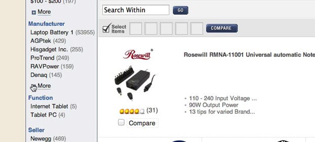
Using an underlined link style help users at REI to distinguish the truncation link from the filtering values (which use a checkbox design instead).
3) Make Sure the Proximity is Right
The link should have more padding than the filtering values, to indicate that it’s not just another value. Yet it needs to be positioned in close proximity to the filtering type it belongs to, so users doesn’t mistake it as either a separate link or a link that belongs to any subsequent filtering type placed below. In short: ensure proper “affiliation by proximity.”

Toys’R’Us provides an example of good proximity, with the “More…” truncation link placed right below the filtering values. The healthy dose of white space added between the filtering types further clarifies which collection of filtering links the “More..” link belongs to.
4) Include a Visual Indicator
You may tap into the metaphor of a collapsed section of content by using an appropriate visual indicator. The most commonly used visual indicator is a “plus” + or an “arrow” v icon. Using icons or characters further increase the link’s visual distinction from the other filtering values.

Even though the link styling is not distinct and the proximity could be better at Office Depot, the icon, and especially it’s placement (unindented), help users distinguish the truncation link from the filtering values.
5) Consider Fading the Last Filtering Value
Gradually fading out the last value can help further indicate that the list extends beyond the visible options. This way the user can literally see that the list is incomplete (as some of the options are fading). Furthermore, the gradient fade can help draw the user’s attention towards the truncation link (granted that it’s placed right beneath; see recommendation #3 on proximity).

A simple mockup of TigerDirect showing how fading the last filtering value can help indicate that some of the list is currently hidden.
6) Never Truncate a Single Value
It simply doesn’t make sense to truncate a single value since showing the truncation link will take up the same space as just showing that value. It’s only when 2+ options are truncated that the desired space efficiencies can be realized (and thus justify the truncation interface). Programmatically this can be achieved by simply offsetting the truncation logic by one, so that the threshold is actually 2 items off the list size that invokes a truncation interface.

Truncating a single value, as seen here in the Mac OSX interface, adds needless friction as displaying the truncation link takes up as much space as displaying the actual value would. The truncation threshold should instead be offset by an extra item so it only truncates 2+ values.
Truncation and Hidden Content
Truncation is better than the two alternatives of either displaying filtering values in their full length (preventing users from getting an overview of their available filtering types) or using inline scrollable ables (which suffer from a host of interaction issues). However, truncation really is the lesser of 3 evils, with usability issues of its own.
When designed poorly, truncation can be downright harmful as it may mislead users to think they’re seeing all available options when in fact they are seeing a truncated list. Proper truncation design is therefore critical, although the truncation interface still adds complexity to the page (the user must make distinctions between collapsed / expanded sections and links with different functionalities).
The consequence of users mistaking truncated lists for “the full list” are grave, and was the cause of site abandonments during testing, as users were unable to find the filtering values they were looking for. Indeed, overlooking collapsed content is a general problem in web design, and is also observed for tab designs, carousels, accordions, mega drop-down menus, etc., as explored further in UI: Proper Indicators for Hidden Elements.
It’s therefore vital that the risk of overlooking truncation is reduced by utilizing a combination of the 6 above mentioned guidelines for proper truncation design:
- Display up to 10 values before truncating.
- Use an appropriate link style.
- Make sure the proximity is right.
- Include a visual indicator.
- Consider visually fading the last value.
- Never truncate just a single value.