While product descriptions may not often get as much attention or resources as product images, videos, “360-View” features, or user reviews, they are a crucial component of the product page.
In fact, our large-scale Product Details Page usability testing shows that every single user relied on the product description at some point during test sessions to draw conclusions about the suitability of a product for their needs — across industries and product types.
However, our testing also revealed how product descriptions are often a missed opportunity for sites, with users often finding the descriptions “bland” or “boring” — resulting in some users spending less time on the product pages of suitable products.
On the other hand, we’ve also tested design patterns where the product descriptions are “structured by feature highlights,” which consistently cause users to perform more in-depth explorations and consequently make some users view the products very favorably.
In this article, we’ll discuss the test findings from our Product Details Page usability study related to structuring product descriptions by feature highlights, including:
- How simply styling product descriptions using traditional “text blocks and bullets” can be a missed opportunity
- How product descriptions structured by “feature highlights” can enhance a product’s standing with users
- Which products are best suited to have descriptions that are structured by feature highlights
Text Blocks and Bullets: Often Adequate but Rarely Inspiring
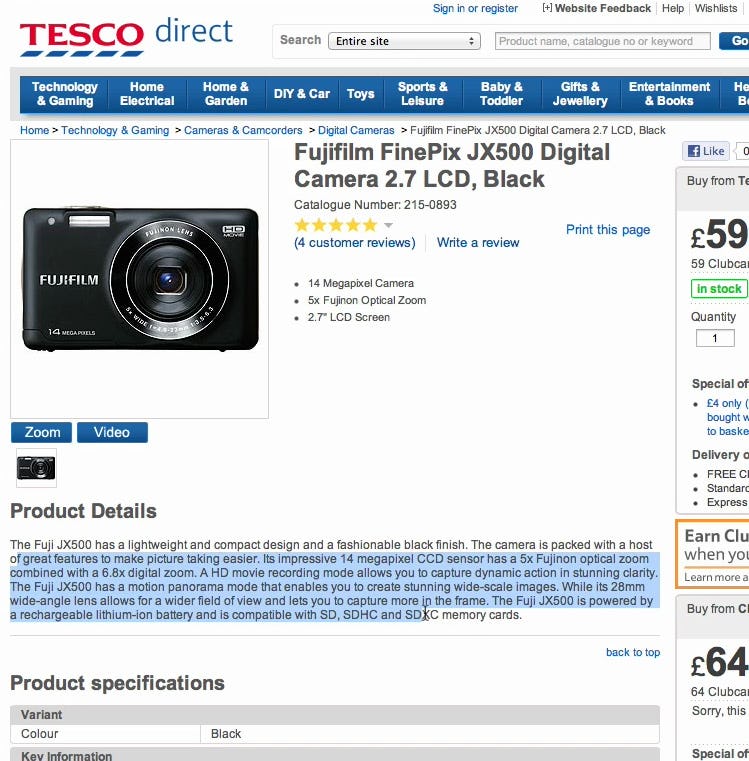
“It’s like…all of this text…you don’t really want to read it.” A subject at Tesco found a product description intimidating. Users rarely look forward to reading text blocks that have a “wall of text” appearance.
It’s first important to state that there’s nothing wrong with relying on the traditional product description structure of text blocks and bullet points of the feature highlights. As long as the descriptions are well written and well structured (e.g., with section titles if the descriptions are long), most users will be able to find the information they’re looking for and determine if a product meets their needs.
That said, testing revealed that users generally respond well to long product descriptions that are “chunked” by highlights, each with an accompanying image, since a quick scan of the product page reveals the key product features, and the high-quality images make the page more attractive.
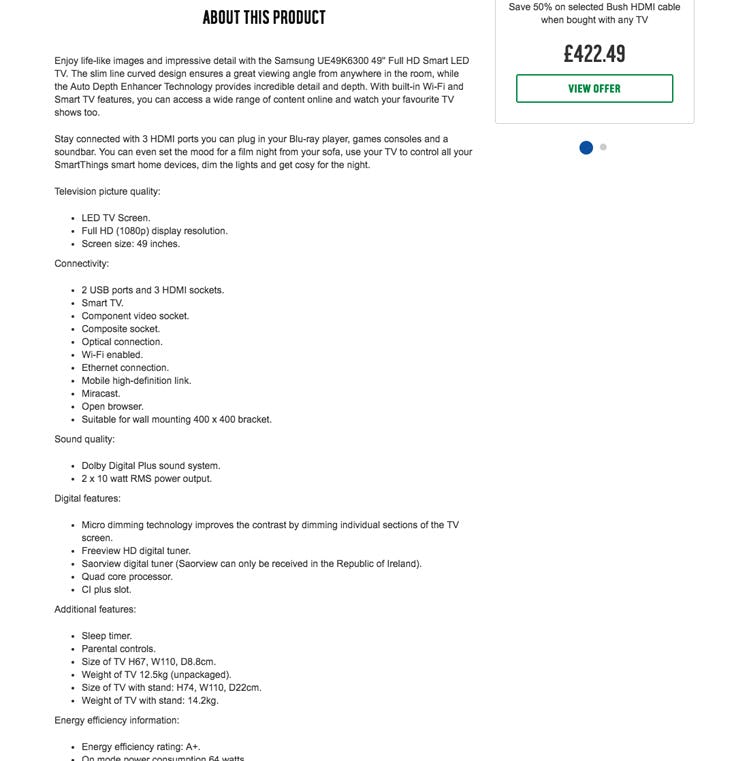
At Argos, a product description for a TV suffers from being a “feature dump,” which hinders users’ ability to focus on each feature of the TV in detail.
While “bullet lists” and “blocks of text” by themselves often work well together, they still have the disadvantage of being text-heavy “feature dumps,” where users are presented with a great deal of information very quickly.
The end result is that users may miss or skip product features that would have otherwise sold them on a particular product’s suitability.
Furthermore, conventional product description structures often fail to inspire users. While they will be adequate for many users’ needs, they can appear perfunctory to some users. Users seeing a conventional product description may think, based on the appearance of the description, “If the site’s not excited about this product, why should I be?”
Feature Highlights: Calling Attention to a Product’s Unique Selling Points
Structuring a product description by feature highlights means including an image, graphic, or icon that represents a particular feature alongside a description of that particular feature.
Compared to traditional text descriptions of products or bullet lists, descriptions structured by product highlights encourage users to slow down and investigate each feature in detail.
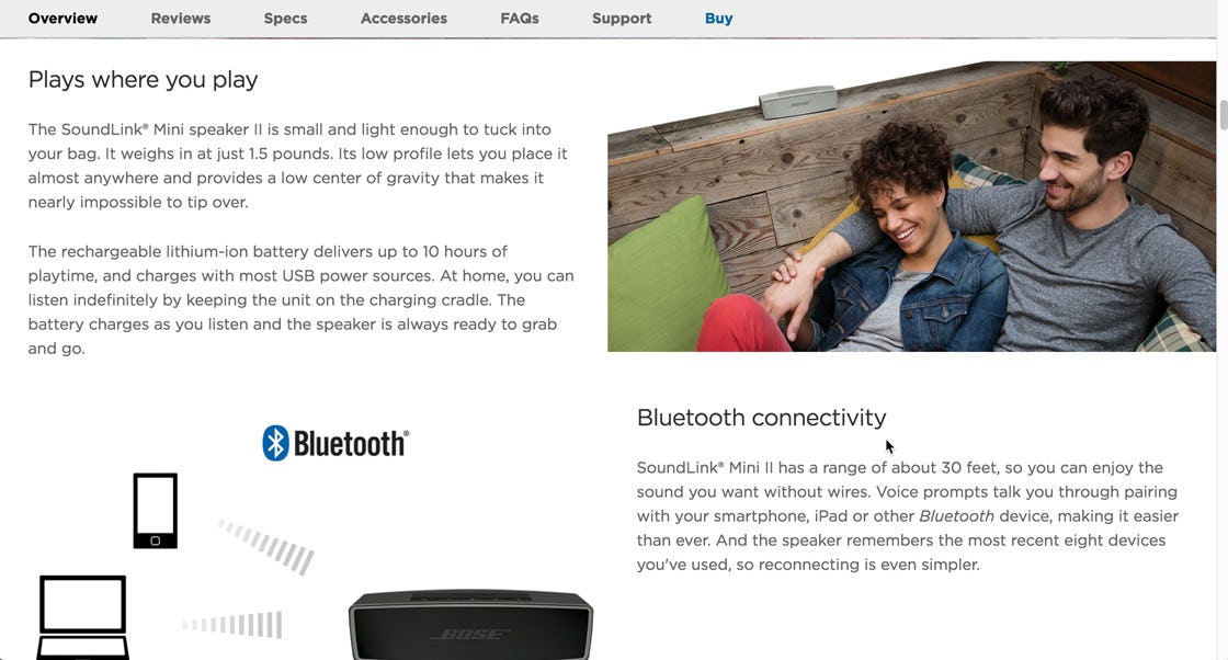
“They’re making a different point with the “Plays where you play”…“Bluetooth connectivity”…it’s a lot easier for me to understand. You can tell that…these are the selling features that make our speaker different from others, and this is what makes it special.” A subject at Bose appreciated being walked through the product’s features.
Testing revealed that structuring product descriptions by product highlights is an effective way to help users engage with a product. Rather than simply quickly scanning a product page, users are observed to instead explore core product features at a more leisurely pace.
This often proceeds with users casually scanning the feature highlight images, then, if intrigued, glancing at the header for the highlight. If the header confirms what they saw in the image, then users read the associated paragraph of text.
As a result, this was in testing observed to lead to users feeling they were only casually scanning the page but, in fact, they were performing a much more in-depth and thorough exploration of the product description, compared to pages that only use traditional text blocks and bullets.
Consequently, these users are observed to generally become more impressed with the particular product.
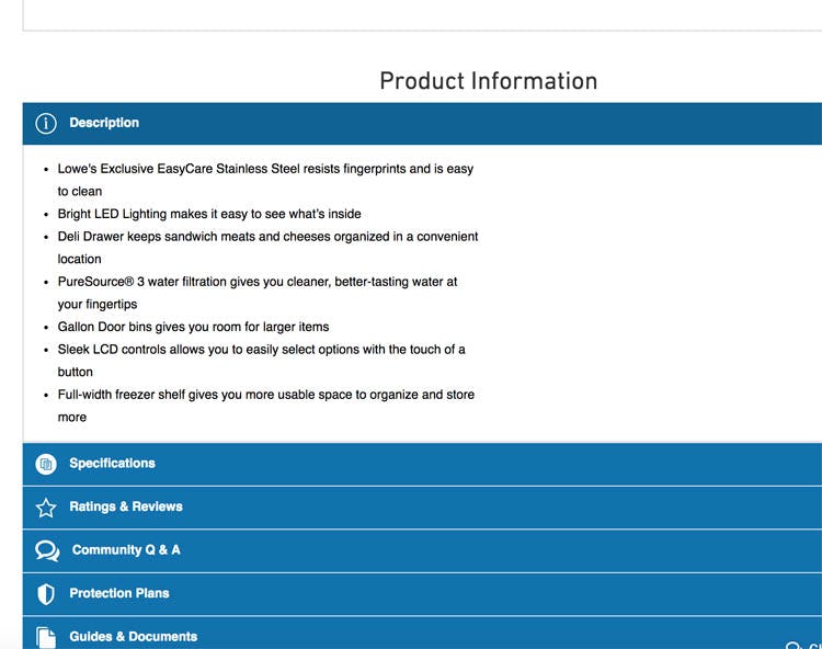
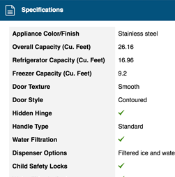
At Lowe’s, a refrigerator’s product description is simply a bullet list of features, which risks users skipping important features and being uninspired by the description.
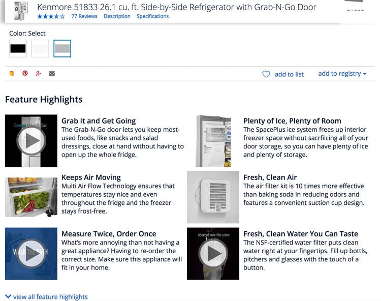
At Sears, however, a refrigerator’s description is structured in part by feature highlights, helping users focus on individual features.
For example, consider a user trying to decide between two refrigerators. One refrigerator’s description only includes bullet points describing the features (e.g., “Deli Drawer”, “Puresource® 3 water filtration”).
On the other hand, the second refrigerator has images (or videos) that accompany each feature callout, and includes a more in-depth discussion of the features. Many users are likely to respond more positively to this refrigerator, simply because the product description forces them to focus more intensely on the product’s features.
Of course, products can have long lists of features associated with them, in which case describing each feature in detail can become impractical.
For products with lots of features to highlight, consider only highlighting the key features that are the product’s unique selling points (often called out in “Feature Callout” images or product headlines).
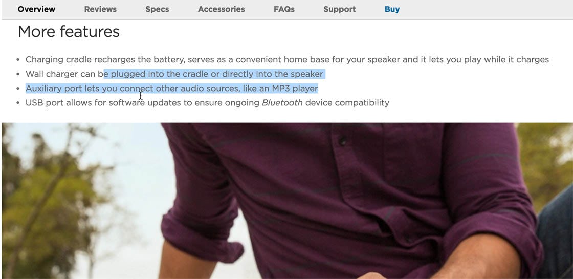
“It talks more about how you can plug it in…I mean the more information I gather, the more in love with it I fall.” Continuing her exploration of a speaker at Bose, this subject considered additional features of the speaker that weren’t called out individually in the sections above.
Features that are of secondary importance can be listed “as normal”; that is, in a bullet list or text block or both, and placed in an “Additional Features” section to avoid creating overly long product pages that may be overwhelming to some users.
Deciding Whether to Structure Product Descriptions by Feature Highlights
Structuring product descriptions by feature highlights can be a daunting prospect. Instead of simply text blocks and a bullet list, product descriptions structured by feature highlights may require custom page structures, more in-depth descriptions, and potentially more high-quality product images or graphics. These requirements can often be too resource intensive for an entire product catalog.
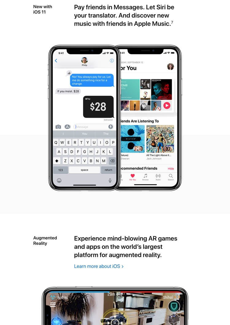
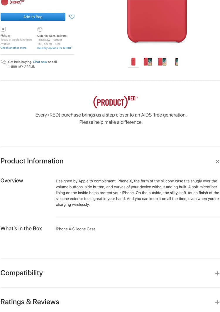
At Apple, the most important products, like the new iPhone, have descriptions that are structured by feature highlights (first image), while less-important products, such as an iPhone case (second image), use conventional text blocks for descriptions. Structuring product descriptions for relatively simple products like accessories by feature highlights is often unnecessary.
Typically it isn’t possible or desirable to structure product descriptions by feature highlights for all products in the site catalog. Therefore, focus on creating this structure only for the most important products on the site — for example, the best-selling products within each category, the products that generate the most revenue, or the most complex products. Simpler or less-important products can be described using normal text blocks and bullet lists.
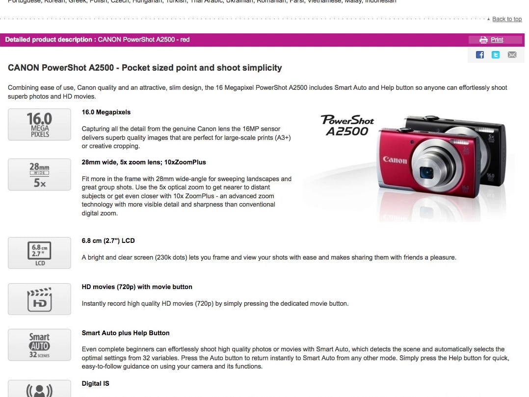
Pixmania structures the product description for a camera by its highlights. Note how individual specs are used for headers and how icons are used to represent different features.
Additionally, to reduce the resources required to structure product descriptions by feature highlights, consider using “feature icons” instead of feature images. While feature icons didn’t perform as well in testing as images did, they still vastly outperformed text/bullet-only descriptions, and are significantly cheaper than images, as these feature icons can be reused across all products of the same type. For example, using a raindrop icon to signify waterproofness, or an “HD” icon to signify a camera’s ability to shoot HD video.
Help Users Focus on Important Product Features
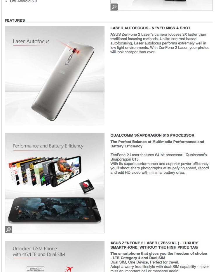
Newegg helps users to slow down and focus on a phone’s unique features, such as its laser autofocus. Many users would otherwise be likely to skip over such features if they were simply included in a text block or bullet list.
Users viewing product page descriptions structured by feature highlights often come away impressed with a product. When a product description is structured by feature highlights, users are observed to start by casually exploring the product description, but often end up performing in-depth explorations of a handful of core product features.
Furthermore, a product description structured by feature highlights can help reduce strain on the spec sheet. If the most important specifications are presented as feature highlights, users will have a better chance of understanding a product’s key specifications, compared to if they had to simply rely on the spec sheet.
Therefore, consider using product highlights to structure a product’s description.
- Use a product highlights structure mainly on the products that are either complex or “important enough” to warrant the extra resources required for a more tailored product description.
- The product highlights structure is often used for 2–6 core product features, and can be as simple as a bespoke image illustrating the feature or its benefit (to draw attention), a short headline (to confirm what the image suggests), and one paragraph of text explaining the feature.
- For a more scalable approach consider using graphics to illustrate key features that are reusable across multiple products of the same type.
Yet, despite the increase in attention paid to features when product descriptions are structured by feature highlights, only 22% of sites use this structure, even when we benchmark only their top-5 selling products.
This article presents the research findings from just 1 of the 700+ UX guidelines in Baymard – get full access to learn how to create a “State of the Art” ecommerce user experience.