
52 Product Page UX Articles
These articles are based on observations and test findings from our usability research on product page designs and features.
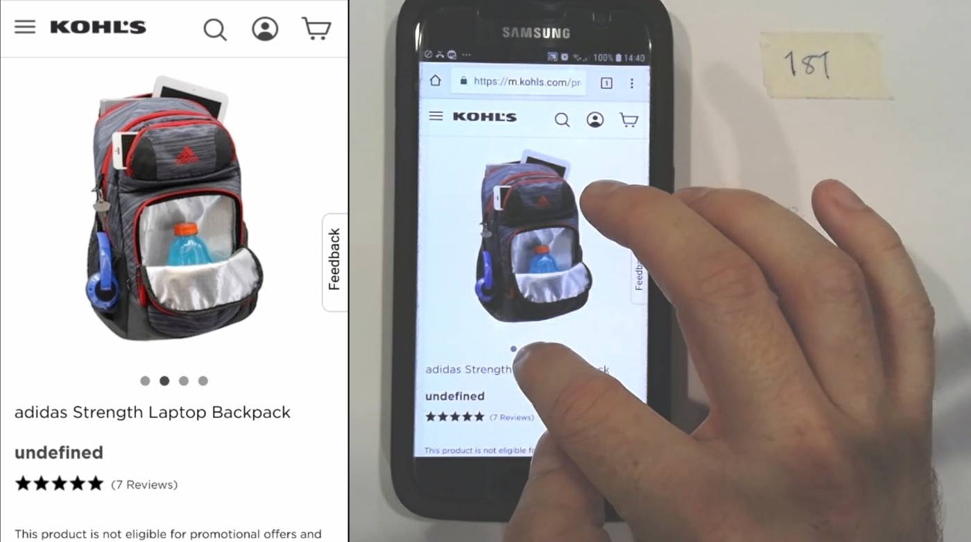
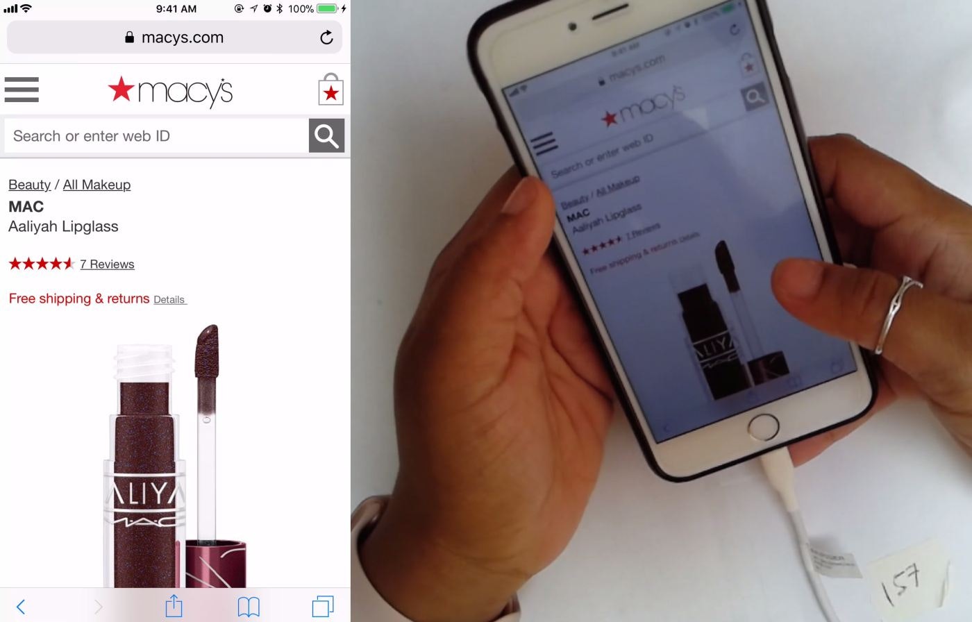
Always Use Thumbnails to Represent Additional Product Images (76% of Mobile Sites Don’t)
Product images are key in users’ decision-making. Why, then, are product page image thumbnails — ubiquitous on desktop — so rare on mobile? See our latest usability test findings on image gallery thumbnails:
Featured
Avoid Using “Horizontal Tabs” for the Main Product Page Sections (29% Don’t)
July 8, 2026 (Updated)Popular
Always Signpost Hidden Thumbnails in Image Galleries
June 10, 2026 (Updated)Popular
Mobile App UX Trends: The Current State of Ecommerce App UX (11 Common Pitfalls & Best Practices)
April 14, 2026 (Updated)Popular
Product Page UX 2026: 10 Pitfalls and Best Practices
March 18, 2026 (Updated)Popular
Ecommerce Gifting UX: 4 Ways to Provide a Superior Gifting UI and Flow
November 20, 2025 (Updated)Popular
6 Important Aspects of Well-Performing Mobile Product Page Breadcrumbs
Mobile users rely on breadcrumbs to understand where they are and navigate the site hierarchy — yet 36% of e-commerce sites don’t provide full category paths, while others make it difficult to find breadcrumbs.
Featured
10 Cyber Monday UX Best Practices
September 16, 2025 (Updated)Popular
Mobile UX Trends 2025: 9 Common Pitfalls & Best Practices
June 17, 2025 (Updated)Popular
5 Best Practices for Communicating Sustainability in Ecommerce
April 22, 2025 Popular
4 Ways to Improve the Post-Checkout UX
March 25, 2025
Desktop UX Trends: 10 Common Pitfalls & Best Practices
March 6, 2025 Popular
10% of E-Commerce Sites Have Product Descriptions That Are Insufficient for Users’ Needs
Detailed product descriptions are crucial for users’ deciding whether to purchase a product — yet 10% of sites provide inadequate descriptions, leading users to abandon. See our latest test findings on product page descriptions.
Featured
Furniture & Home Decor UX: Always Provide a “Dimensions” Image
October 15, 2024
Always Integrate Social Media Visuals on the Product Page for Relevant Products (67% of Sites Don’t)
October 2, 2024
Apparel & Accessories Sites: Always Provide an Aggregate “Fit” Subscore in the Reviews (33% Don’t)
September 24, 2024
Always Allow Users to Navigate across User Reviews via Reviewer-Submitted Images
May 28, 2024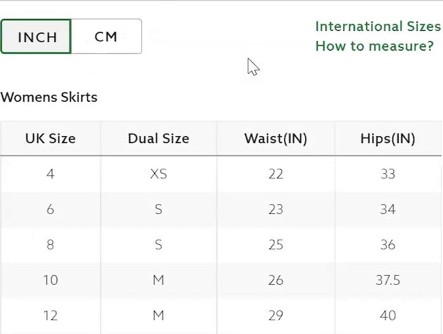
83% of Apparel Sites Don’t Provide Sufficient Sizing Information — 10 Best Practices on Sizing
July 6, 2022
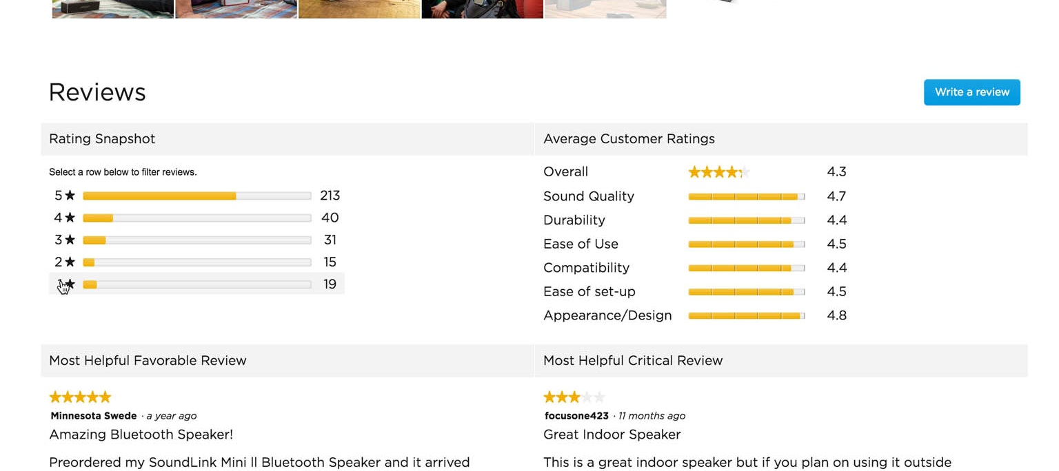
Ratings Design UX Research: 5 Requirements for the ‘Ratings Distribution Summary’ (65% of Sites Get it Wrong)
Users rely more on the ratings distribution summaries than individual reviews, yet 43% of sites don't have a distribution summary, and, of those sites that do, 39% aren't clickable.
Featured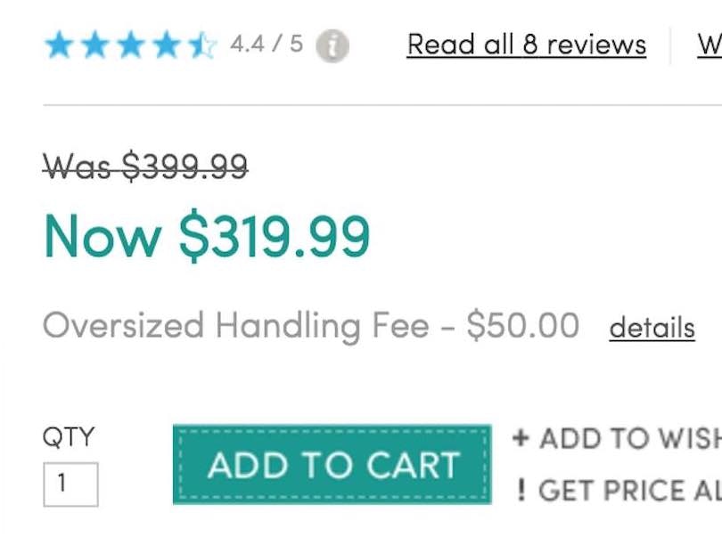
How to Display Price Discounts on the Product Page: Avoid These 4 Pitfalls (18%+ Have One or More)
May 25, 2022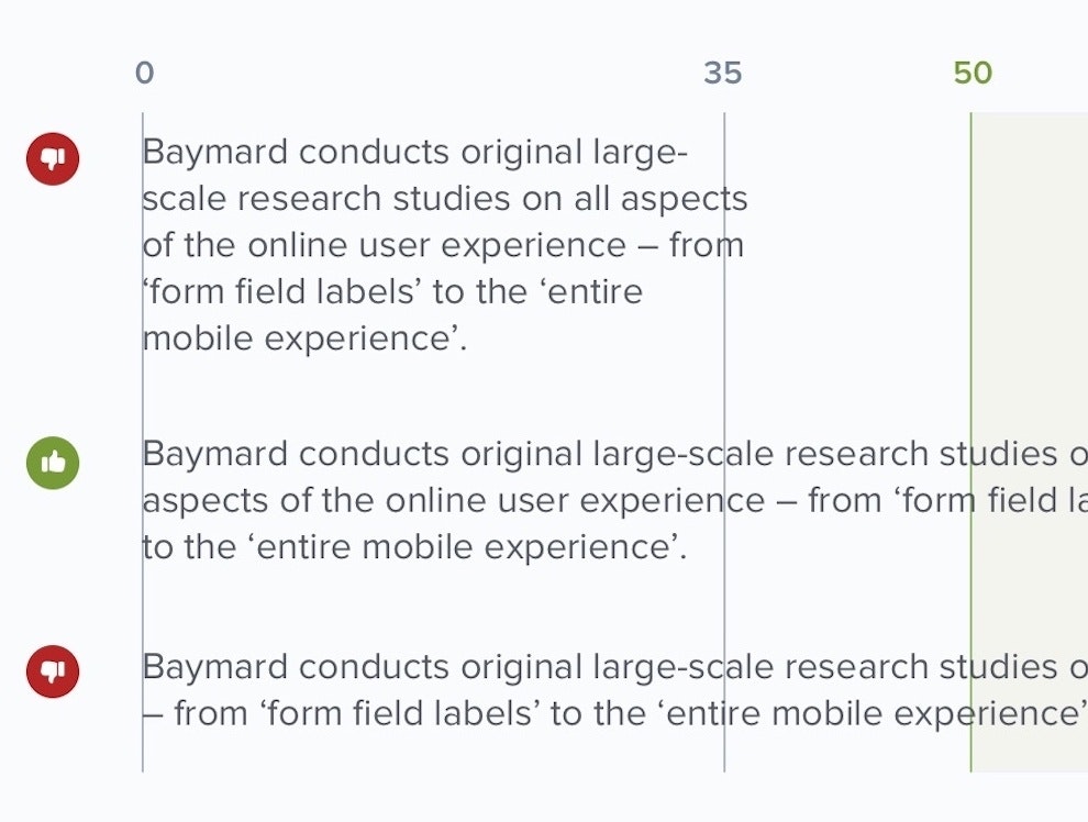
Readability: The Optimal Line Length
May 10, 2022 Popular
Direct-to-Consumer UX Benchmark: 5 Common DTC Pitfalls
February 22, 2022
DTC E-Commerce: User Reviews Are Much Less Important for DTC Sites
January 4, 2022
250+ New Examples Added from Large-Scale Testing on European Sites
November 9, 2021
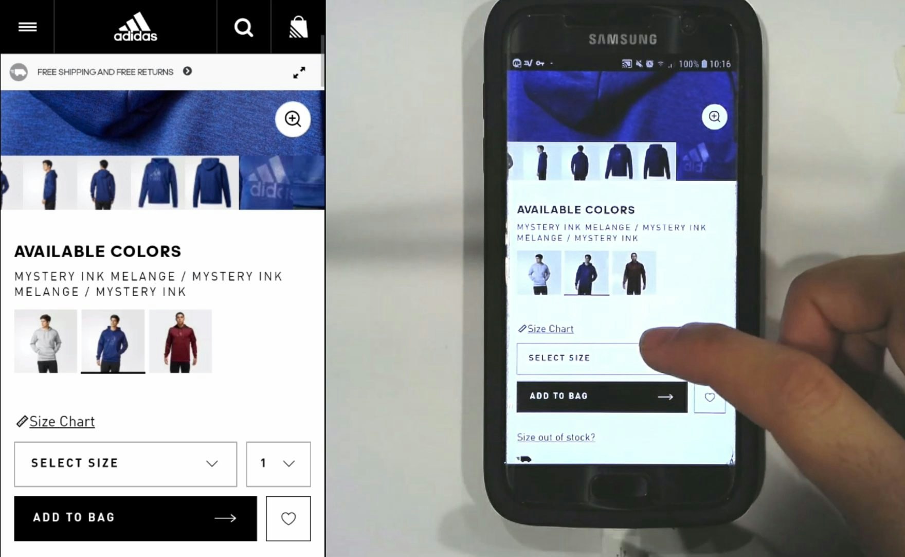
Always Use “Buttons” for Size Selection (28% of Desktop Sites Don’t)
Individual "buttons" are a common design for selecting sizes, but are they really better than drop-down menus? See our latest usability test findings on product page size selectors.
Featured
Baymard Update: 13 New Case Studies and 3 New 2021 Benchmarks (Checkout, Product Page, and On-Site Search UX)
October 12, 2021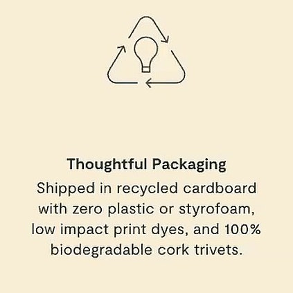
Direct-to-Consumer Research: 5 Effective Ways for DTC Sites to Tell Their ‘Brand’ & ‘Product’ Stories
June 22, 2021
New Research Study on “Digital Subscriptions” (SaaS) UX
May 11, 2021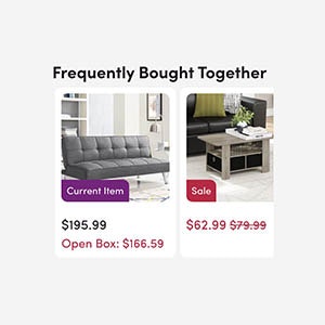
6 List Item Attributes to Include for Cross-Sell Recommendations (68% of Desktop Sites Are Missing One or More)
March 23, 2021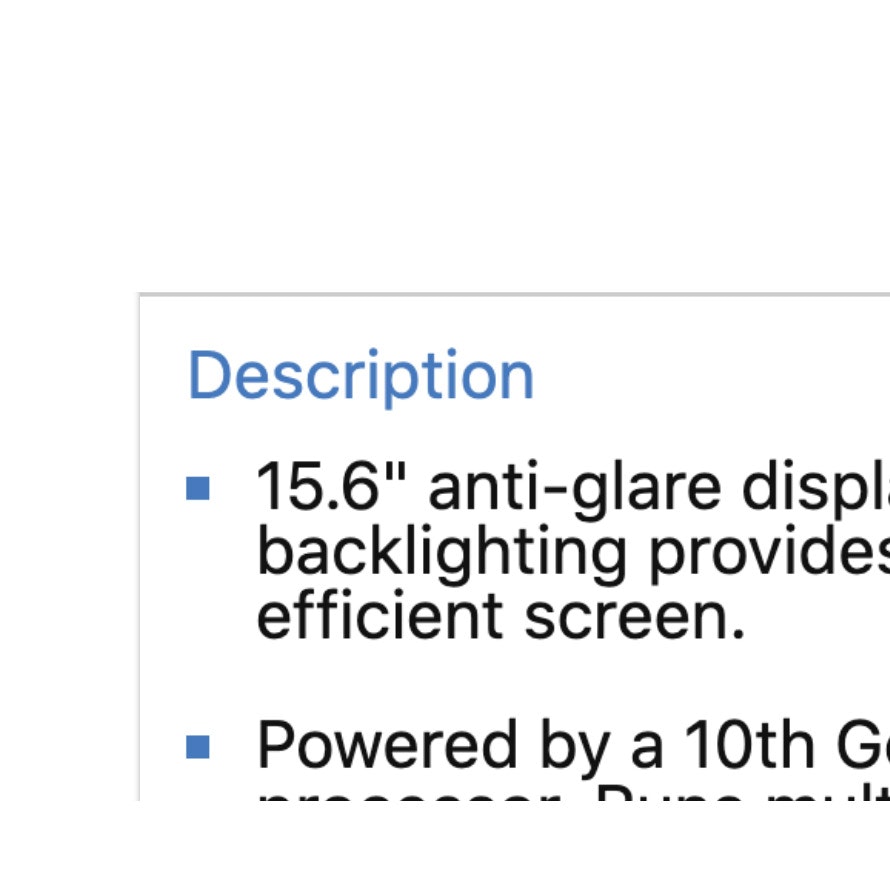
10% of E-Commerce Sites Have Product Descriptions That Are Insufficient for Users’ Needs
March 9, 2021
Product Pages: ‘Free Shipping’ Should Not Only Be in a Site-Wide Banner (32% Get It Wrong)
Our latest Product Page UX research reveal that 32% of sites display their “Free Shipping” offer using methods that are very prone to users overlooking it — see our full test findings.
Featured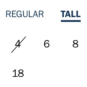
Always Use “Buttons” for Size Selection (28% of Desktop Sites Don’t)
February 9, 2021
Provide Images of Accessory, Apparel, and Cosmetic Products on a Human Model
December 1, 2020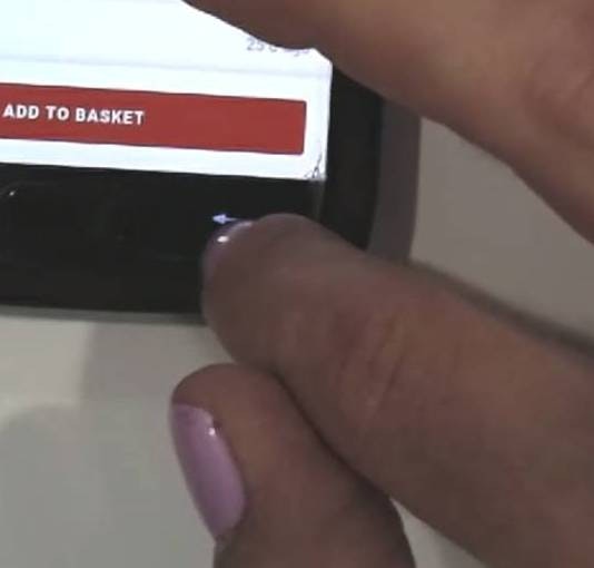
Return Users to the Same Place in the Product List When Returning from the Product Page (13% Don’t)
November 17, 2020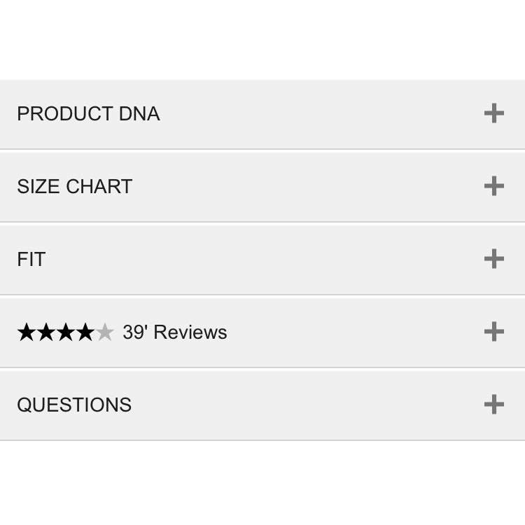
Mobile UX: Avoid Using Subpages within the Product Details Page (26% Don’t)
November 2, 2020 Popular
Always Use Thumbnails to Represent Additional Product Images (76% of Mobile Sites Don’t)
October 20, 2020 Popular
6 Important Aspects of Well-Performing Mobile Product Page Breadcrumbs
September 21, 2020 Popular
Inspirational Images Should Link to All Depicted Products (9% of Sites Don’t)
September 8, 2020
Allow Users to Upload Images with Their Review (34% of Sites Don’t)
August 4, 2020
4 Design Patterns That Violate “Back” Button UX Expectations – 59% of Sites Get It Wrong
July 20, 2020 Popular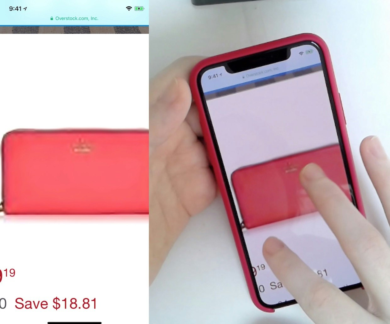
25% of E-Commerce Sites Don’t Have Product Images with Sufficient Resolution or Level of Zoom
April 2, 2020
E-Commerce Sites Need to Respond to Some or All Negative User Reviews (87% of Sites Don’t)
August 6, 2019
UX Research on Product Page Videos: Where and How to Embed Them (35% Get it Wrong)
May 14, 2019
Product Page UX: Data Should Be Synchronized Across Product Variations (28% Don’t)
April 18, 2019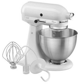
PDP UX: Provide an ‘Included Accessories’ Image and Clarify That Optional Accessories Are Extra (44% Don’t)
February 19, 2019
Product Page UX: Include Descriptive Text or Graphics for Some Product Images (52% Don’t)
November 28, 2018
Structuring Product Page Descriptions by ‘Highlights’ Increases User Engagement (Yet 78% of Sites Don’t)
April 24, 2018 Popular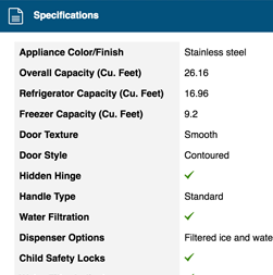
Product Spec Sheets: 4 Ways to Make Spec Sheets More Scannable for Users (50% of Sites Get It Wrong)
March 27, 2018
E-Commerce UX: Post-Process Vendor-Supplied Product Data (52% Don’t)
March 6, 2018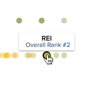
7 Product Page UX Implementations that Make REI Best-in-Class
October 18, 2017 Popular
Product Pages: ‘Free Shipping’ Should Not Only Be in a Site-Wide Banner (32% Get It Wrong)
August 22, 2017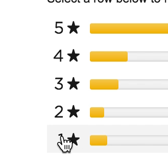
Ratings Design UX Research: 5 Requirements for the ‘Ratings Distribution Summary’ (65% of Sites Get it Wrong)
August 8, 2017 Popular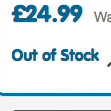
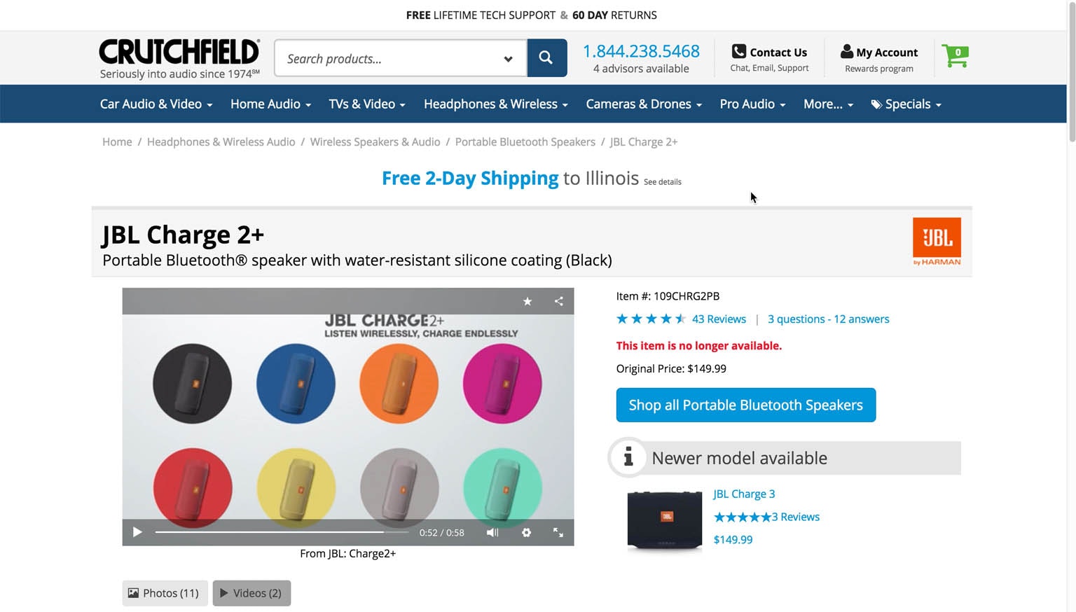
Allow Users to Purchase Temporarily ‘Out of Stock’ Products by Increasing the Delivery Time (68% Don’t)
July 18, 2017 Popular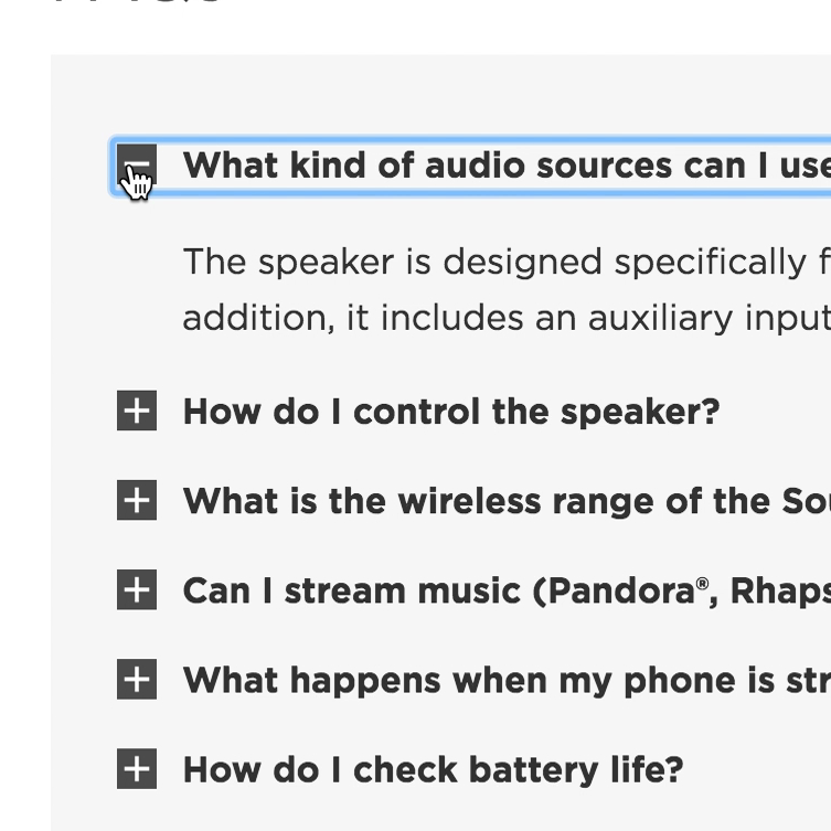
Product Page UX: Provide Both Site-Authored FAQs and Community-Driven Q&As (70% Get it Wrong)
July 4, 2017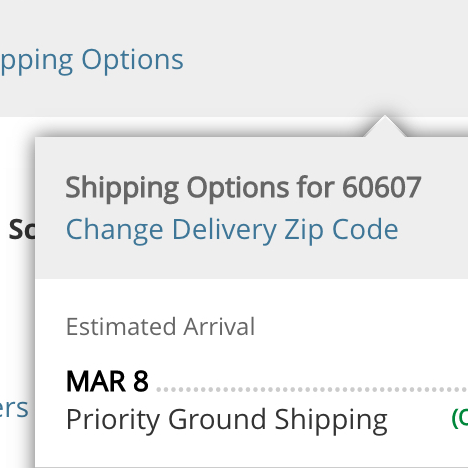
Product Pages Need to Show ‘Estimated Shipping Costs’ (Yet 43% of Sites Don’t)
June 20, 2017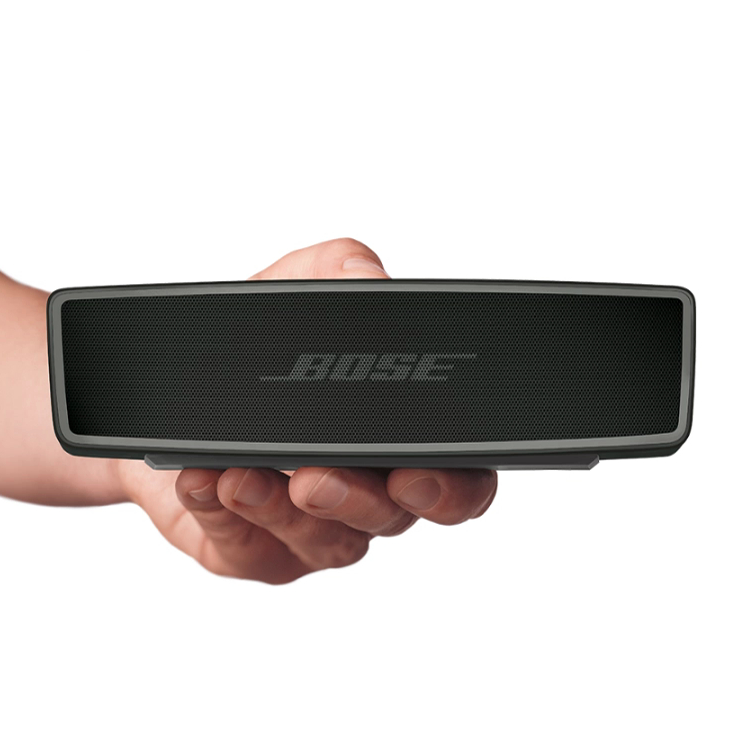
Product Page UX: All Products Need at Least One ‘In Scale’ Image (28% Get It Wrong)
May 30, 2017 Popular
Product Page Usability: 82% of Sites Have Severe UX Issues (New Research Study)
May 23, 2017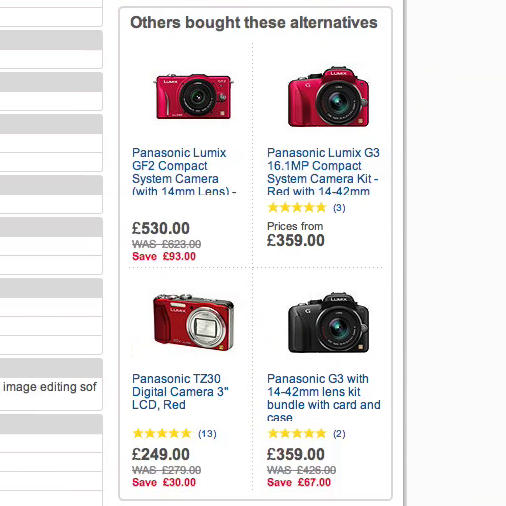
Product Page Usability: Recommend Both Alternative & Supplementary Products (Only 42% Get it Right)
November 25, 2014
Want to learn more about this topic?

Explore Other Research Content

328 top sites ranked by UX performance.

18,000+ annotated designs for systematic inspiration.

Code samples, demos, and key stats for usability.