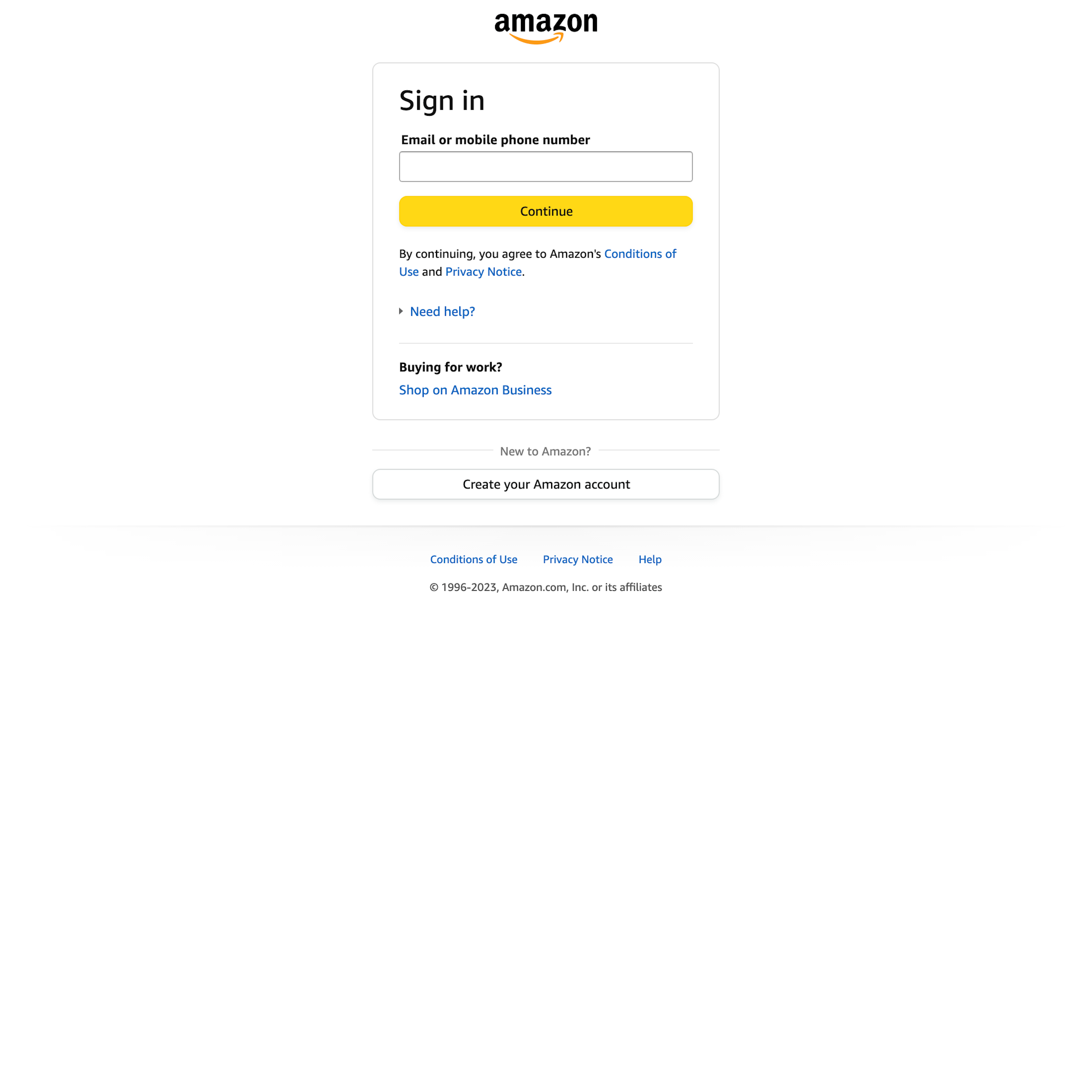
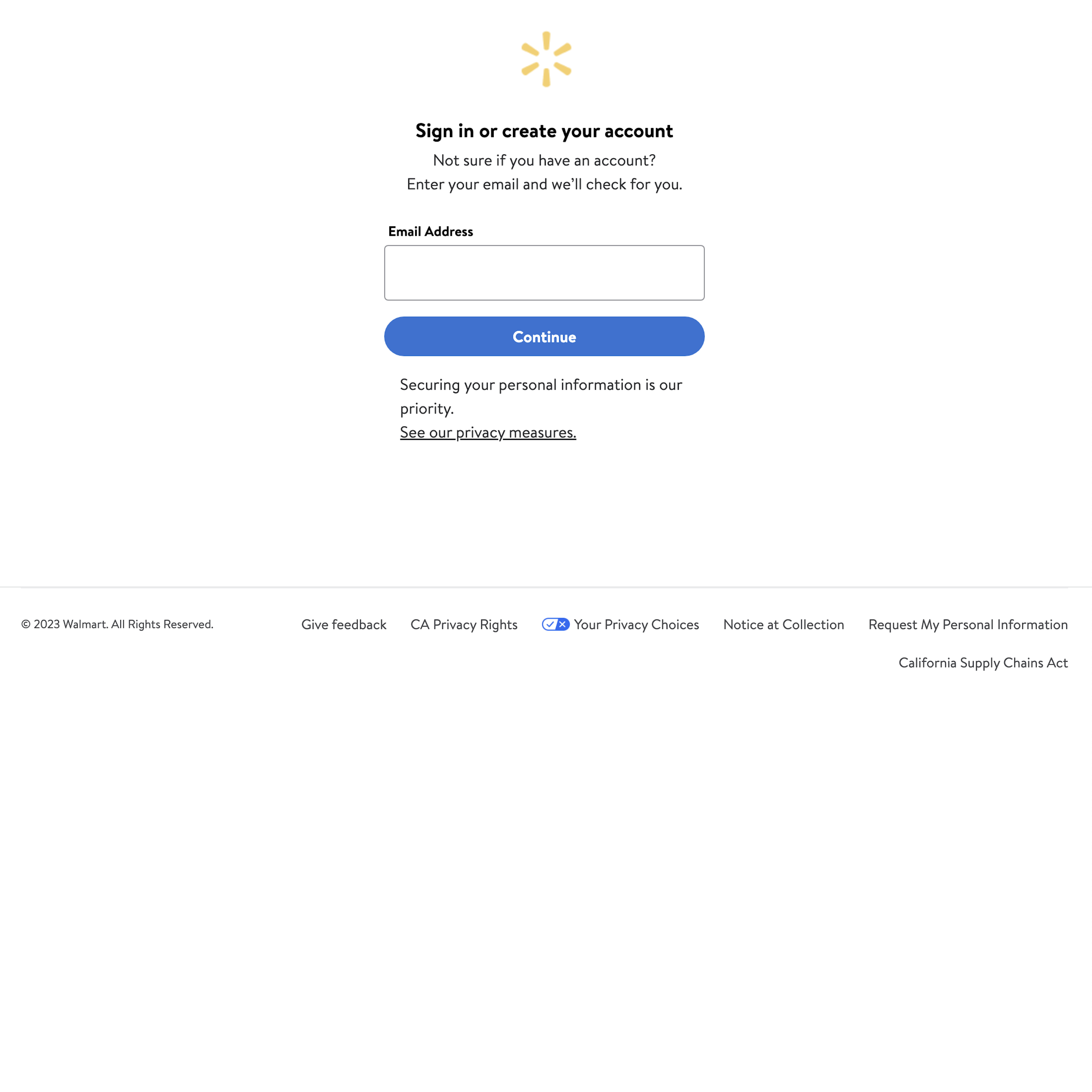
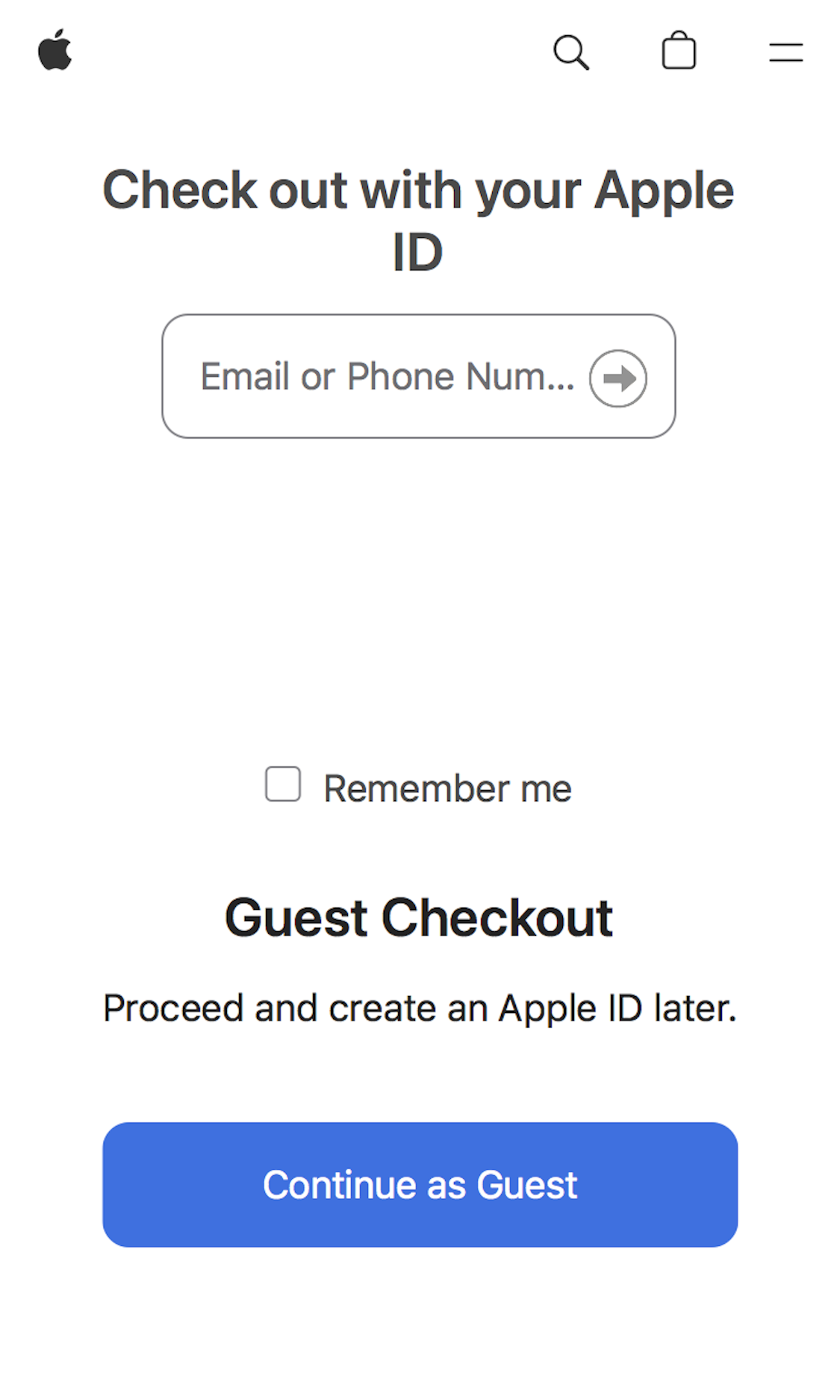
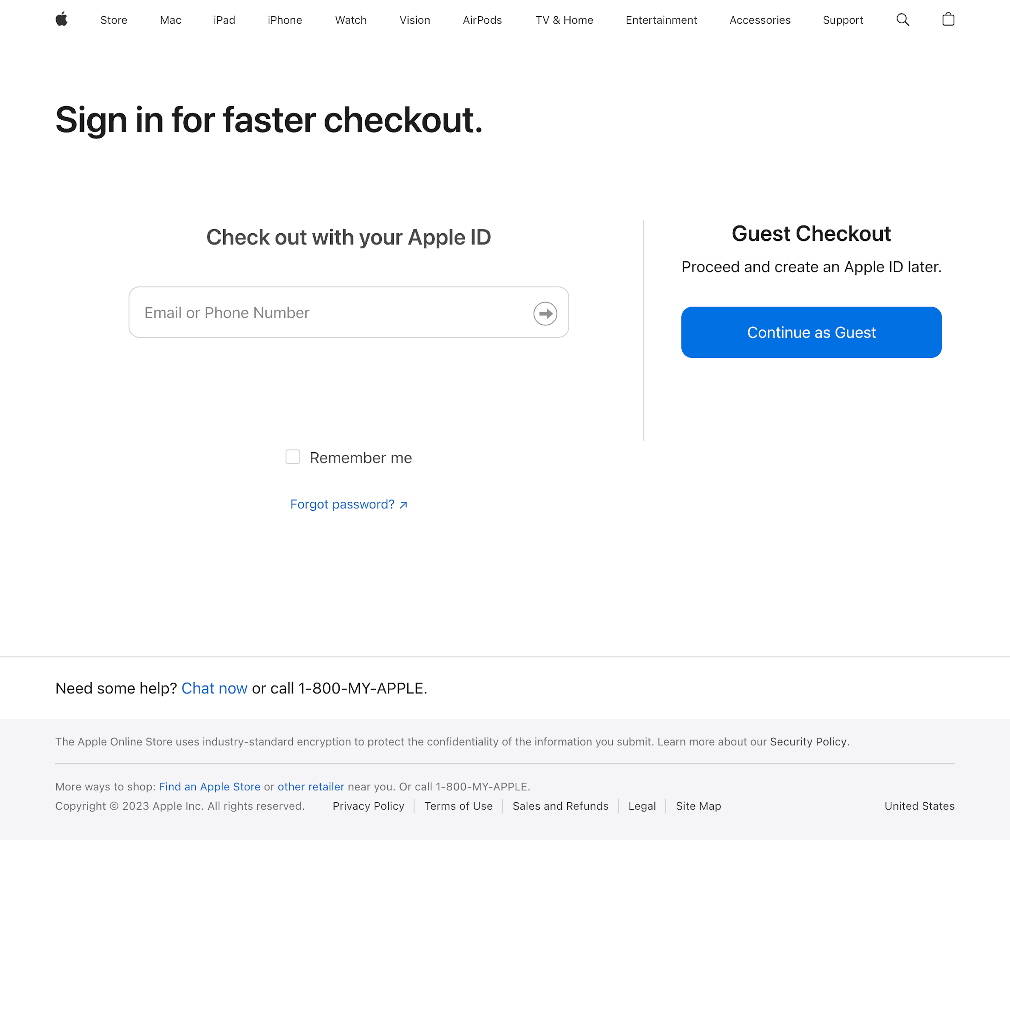
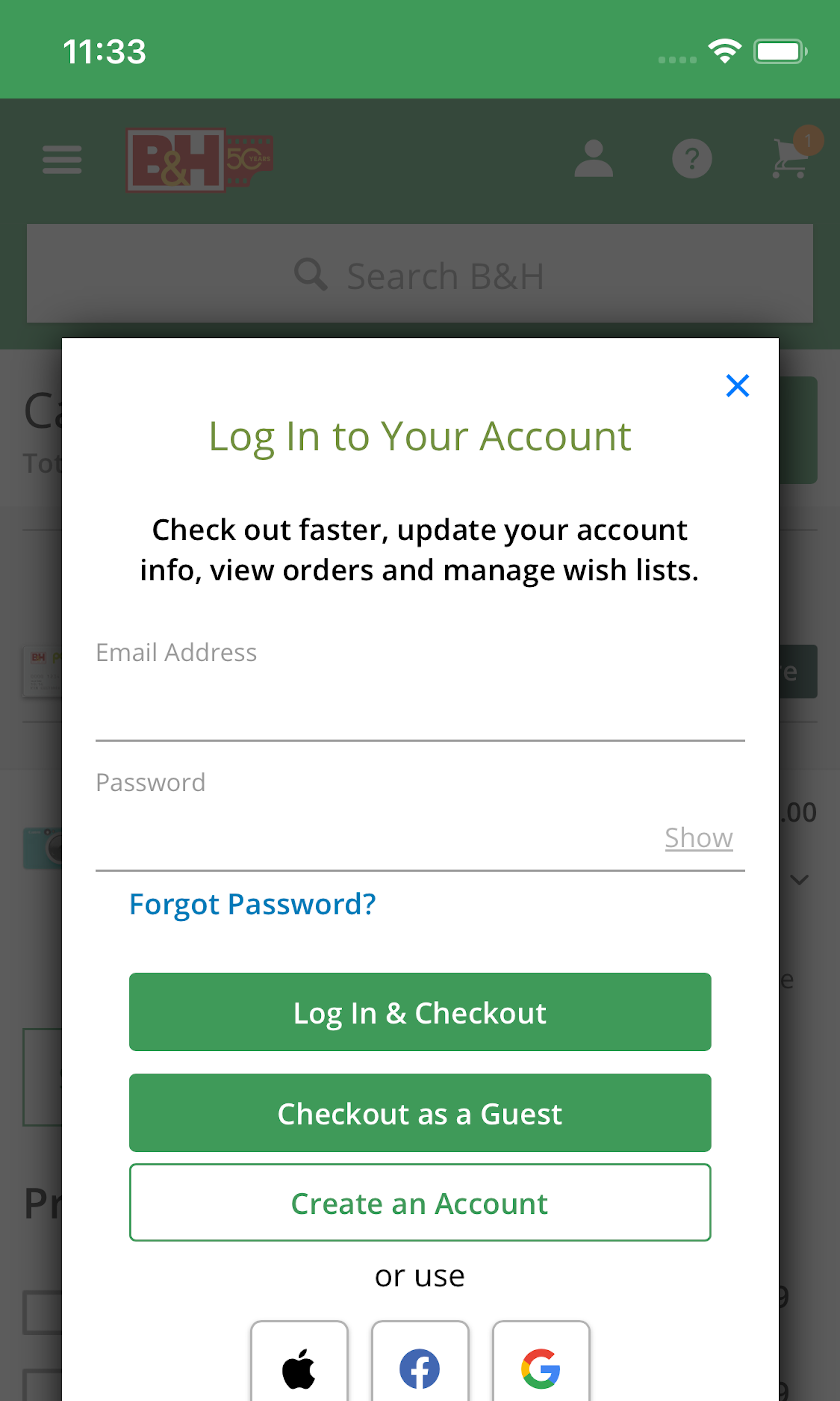
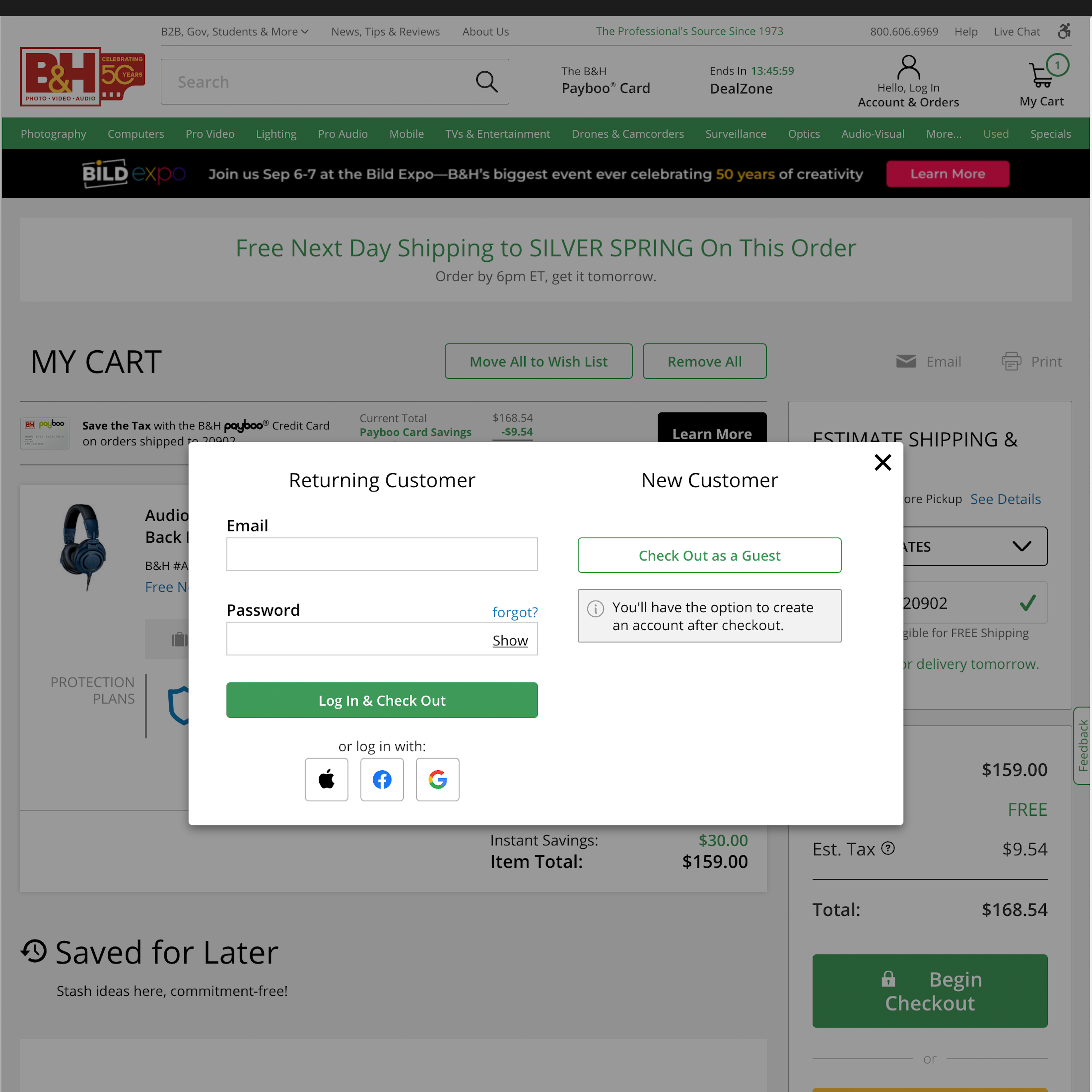
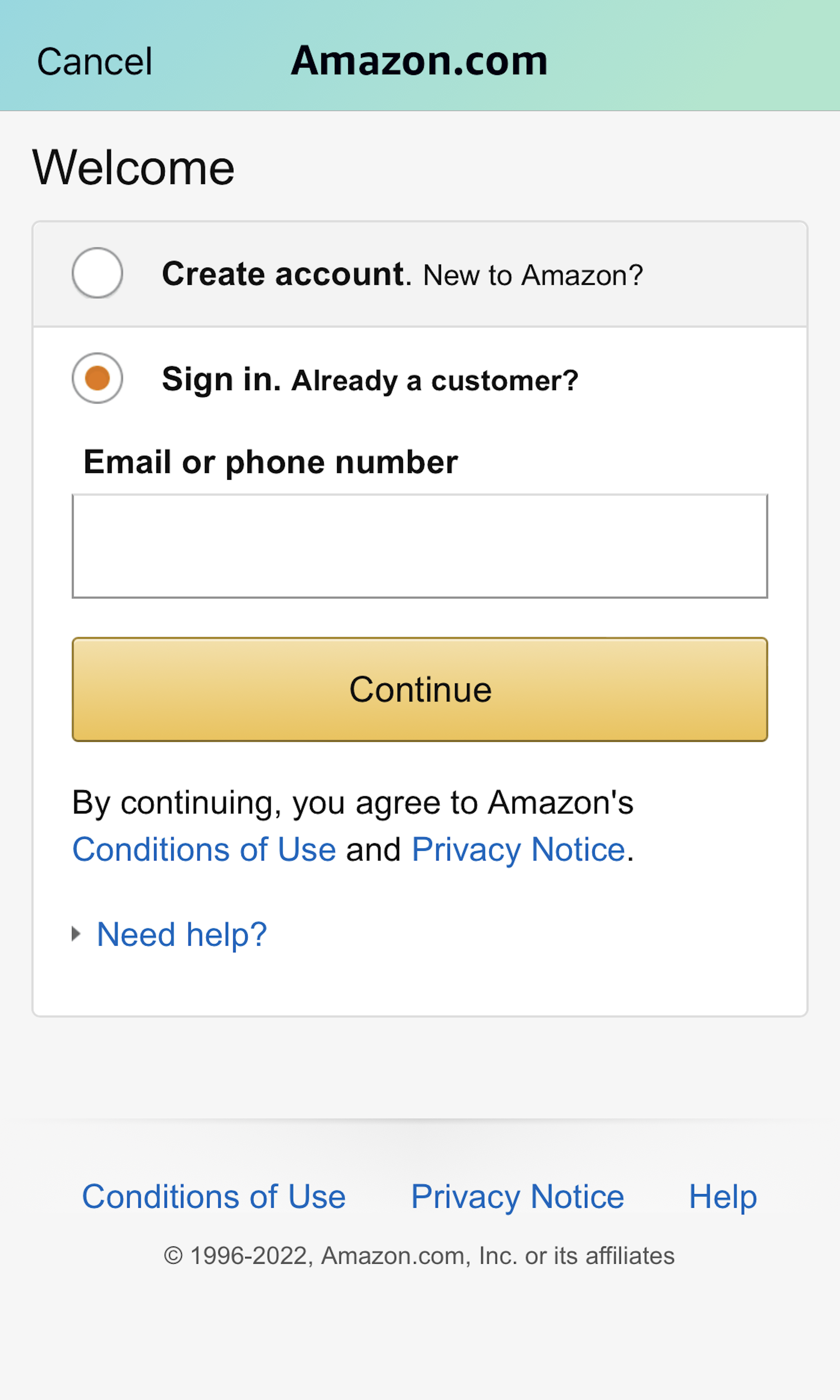
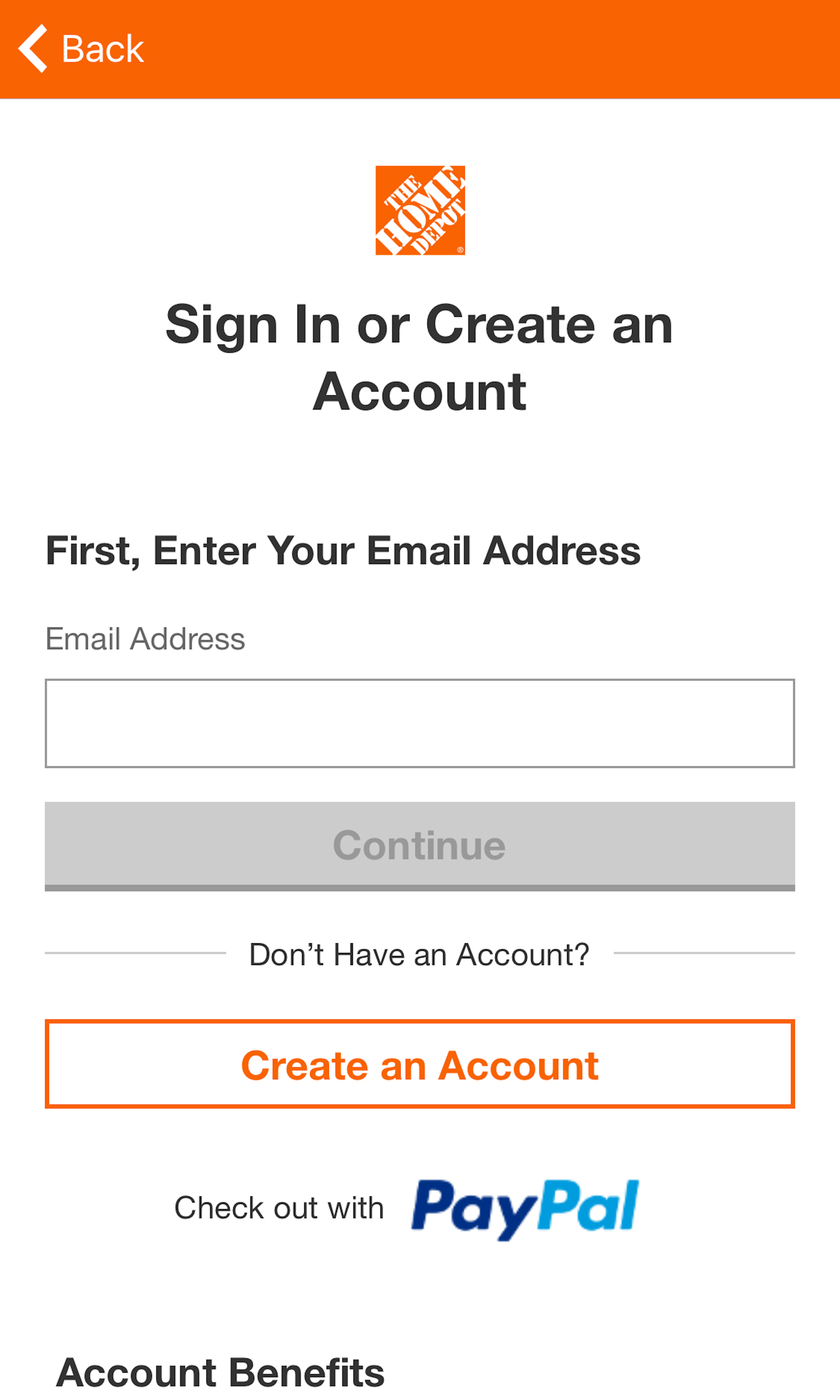
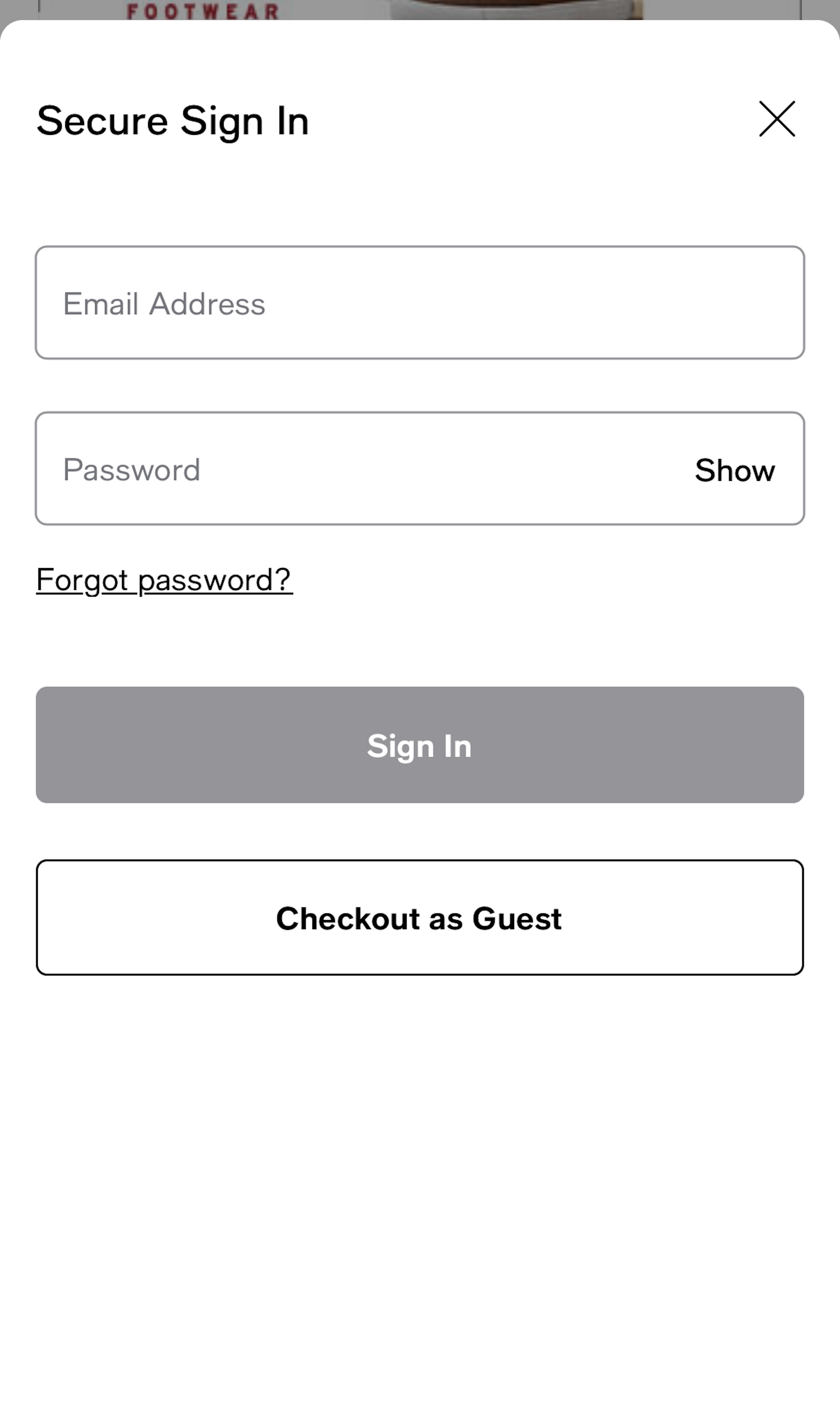
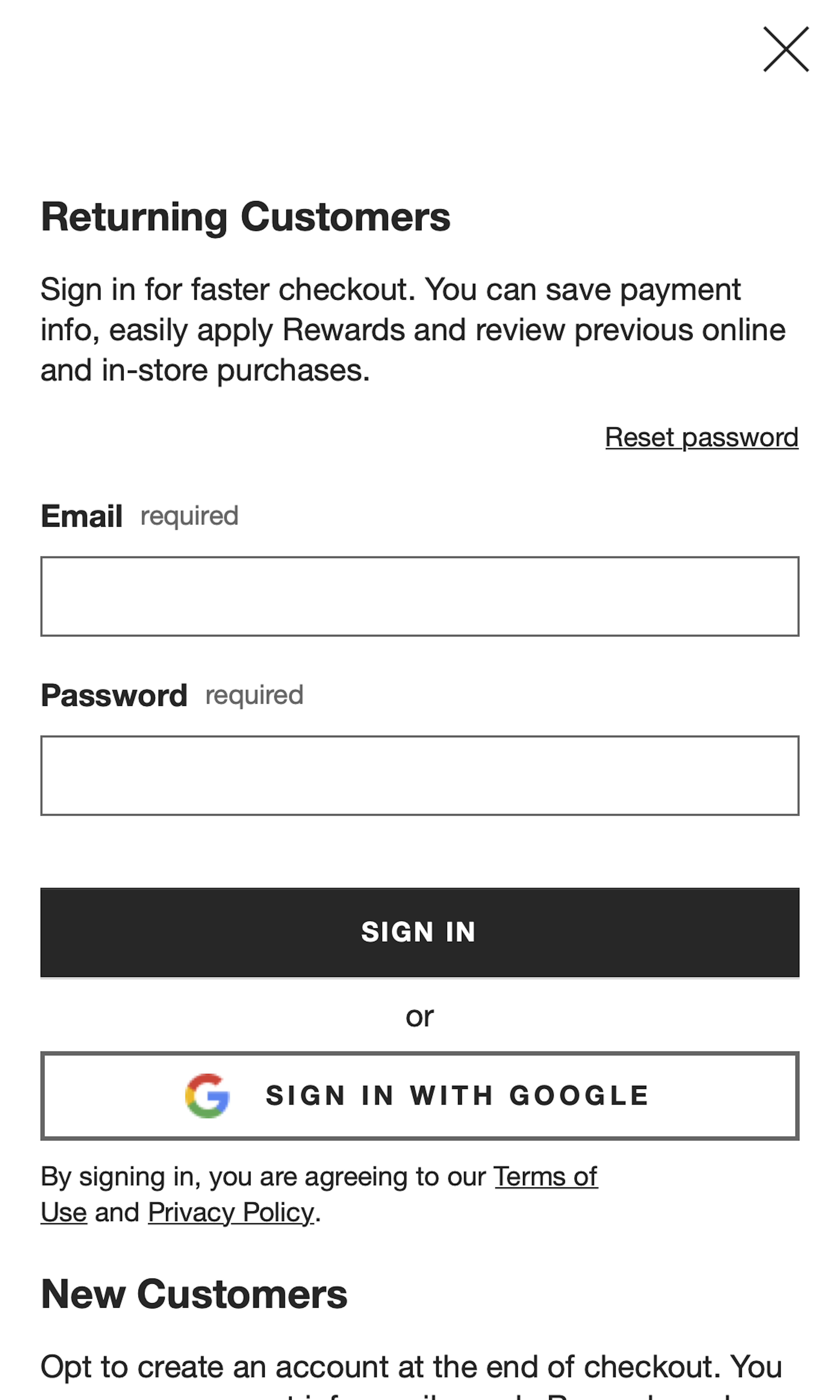
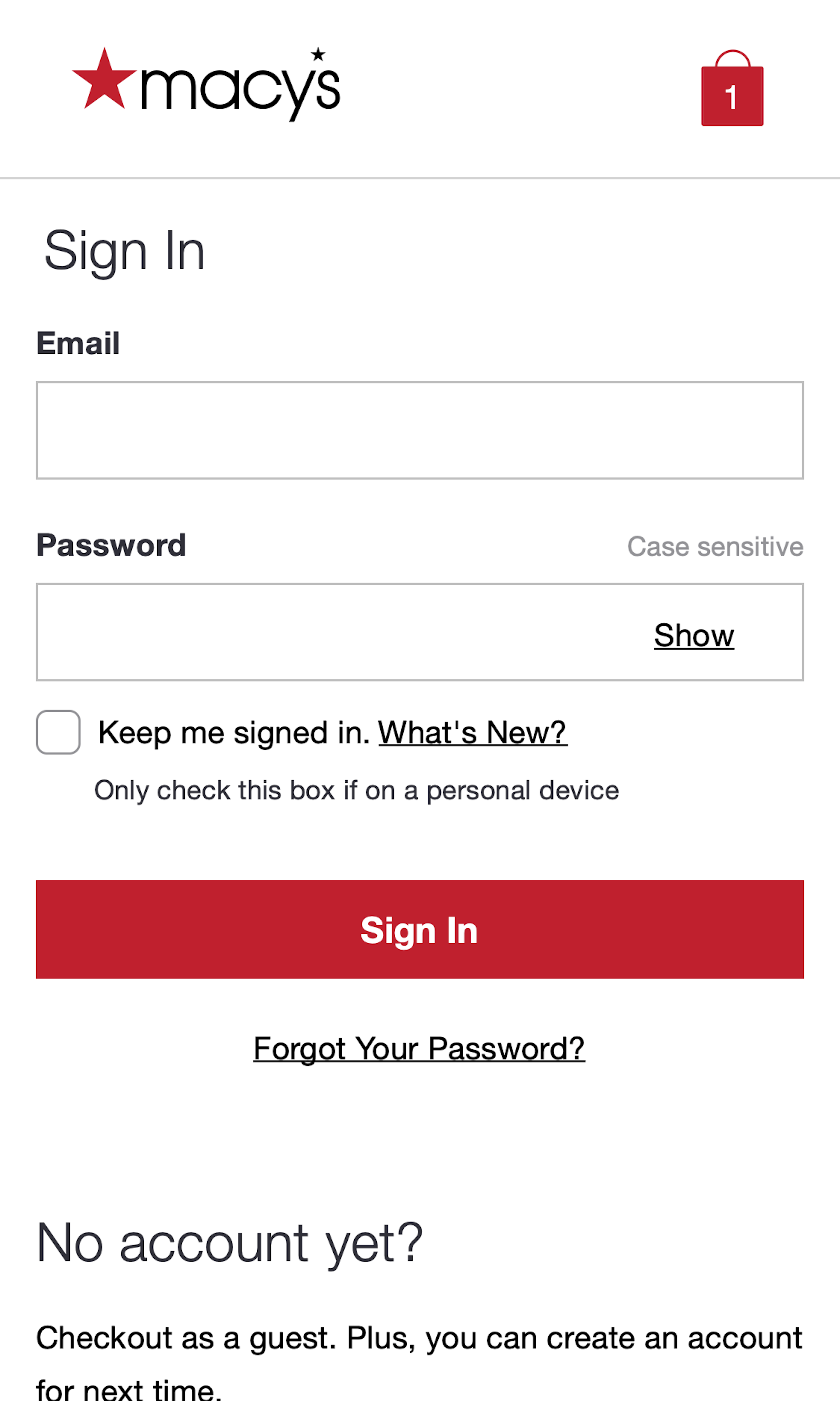
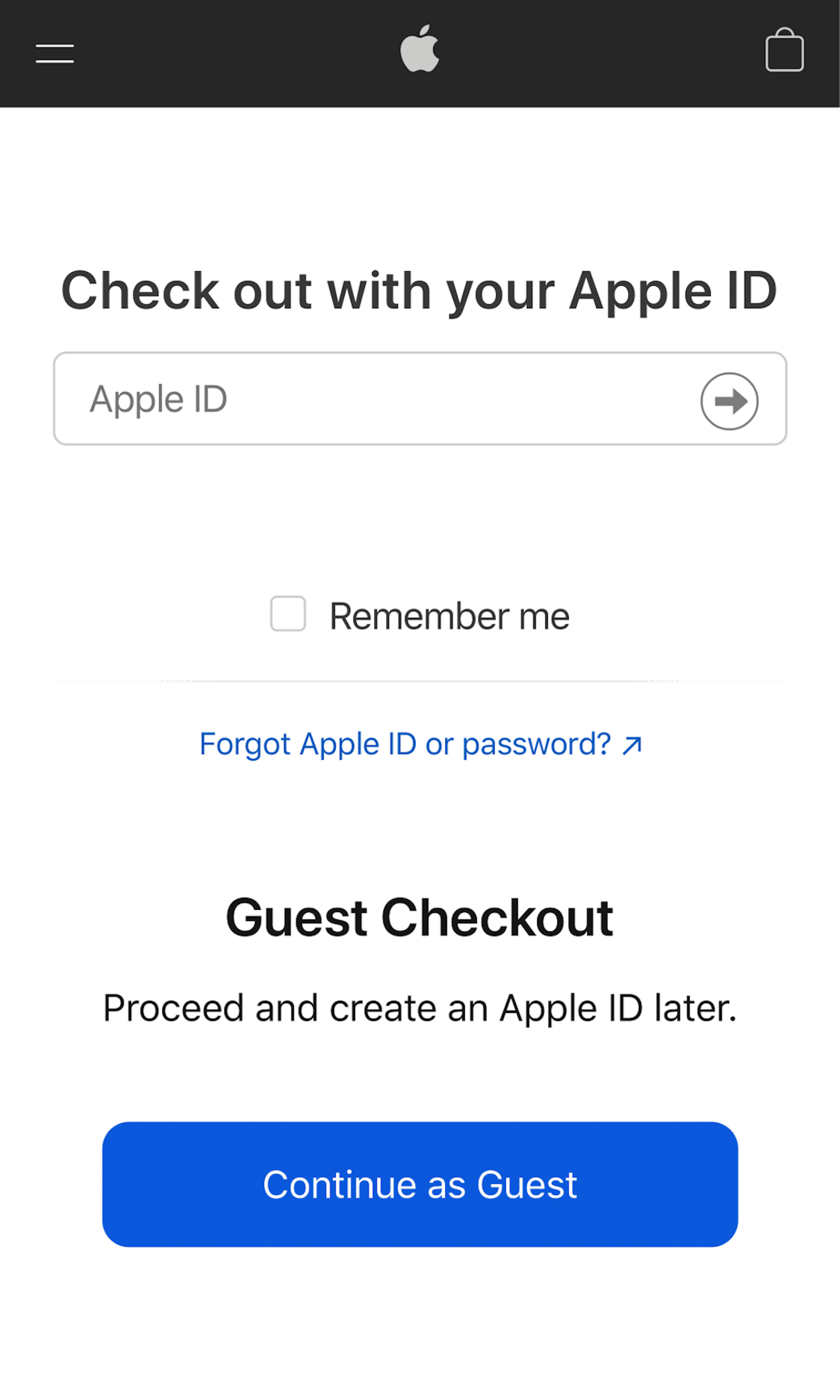
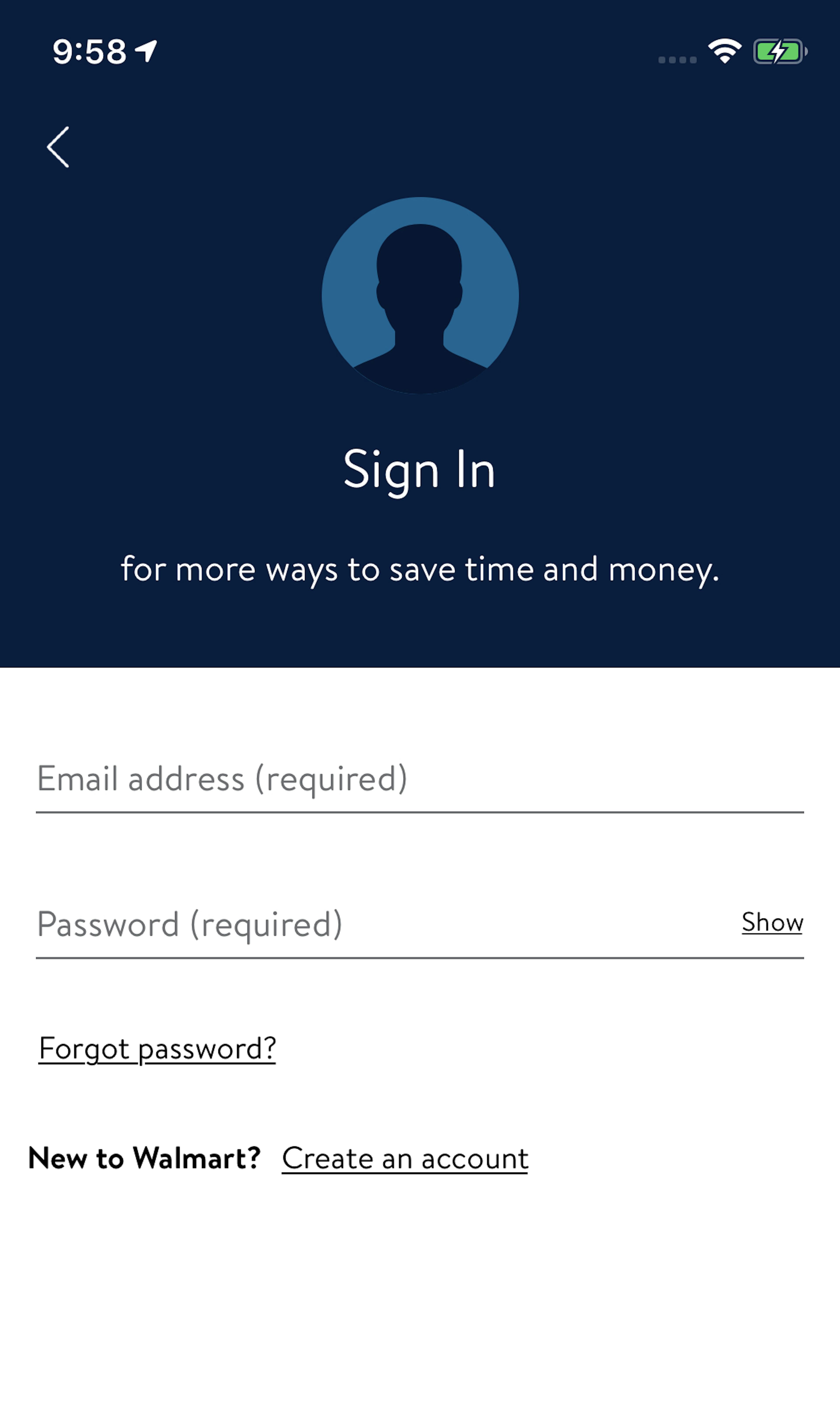
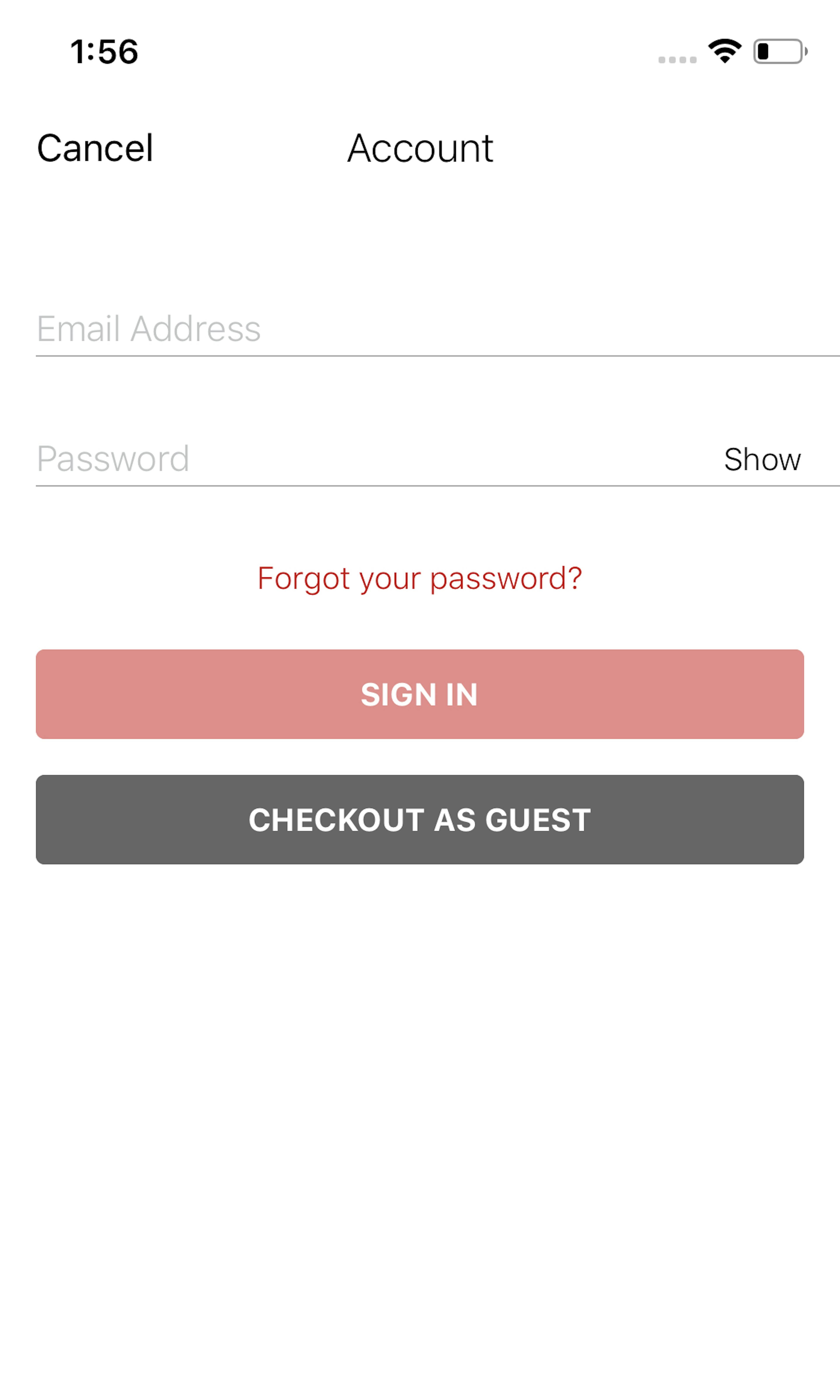
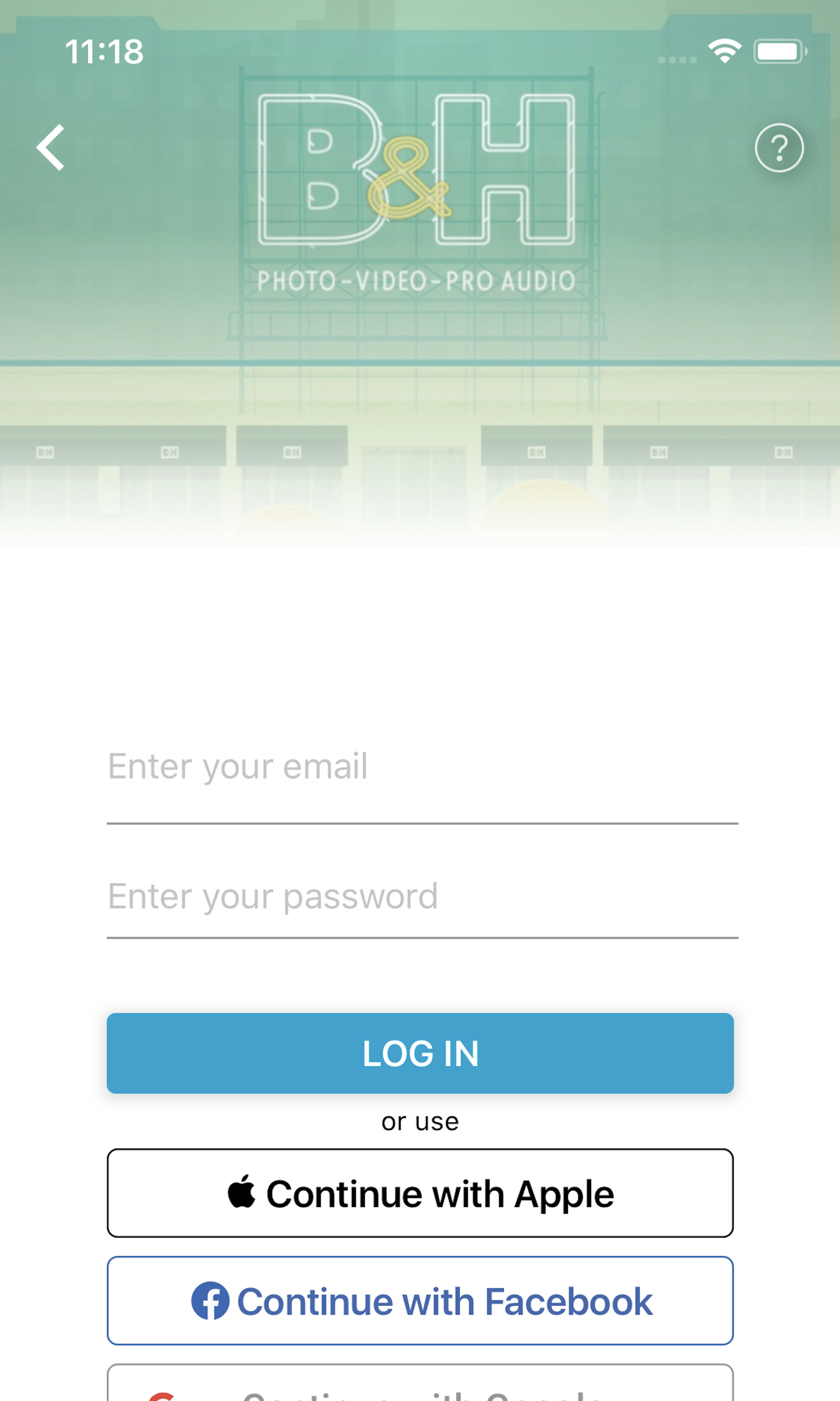
1026 ‘Account Selection’ Design Examples
Also referred to as: Guest Checkout
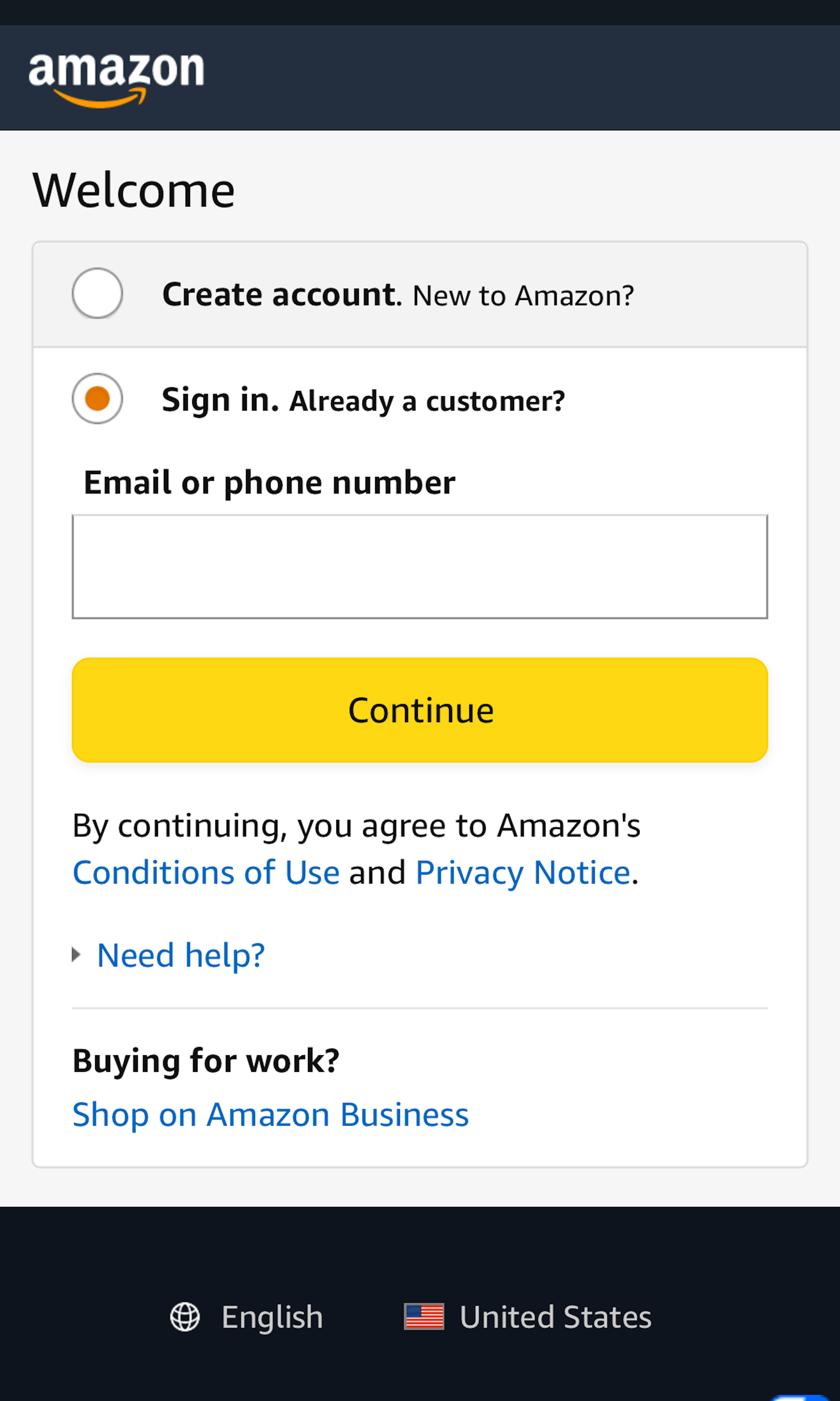
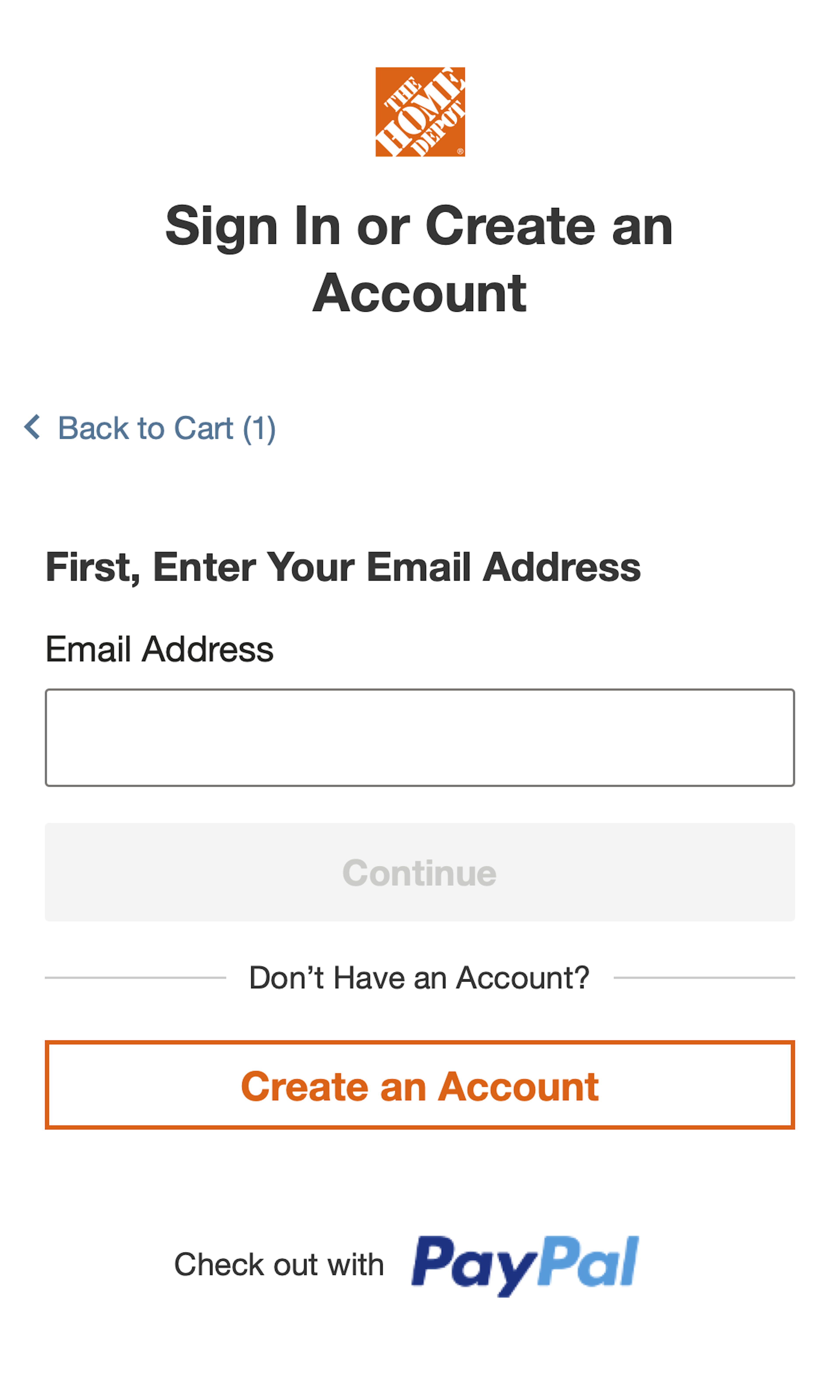
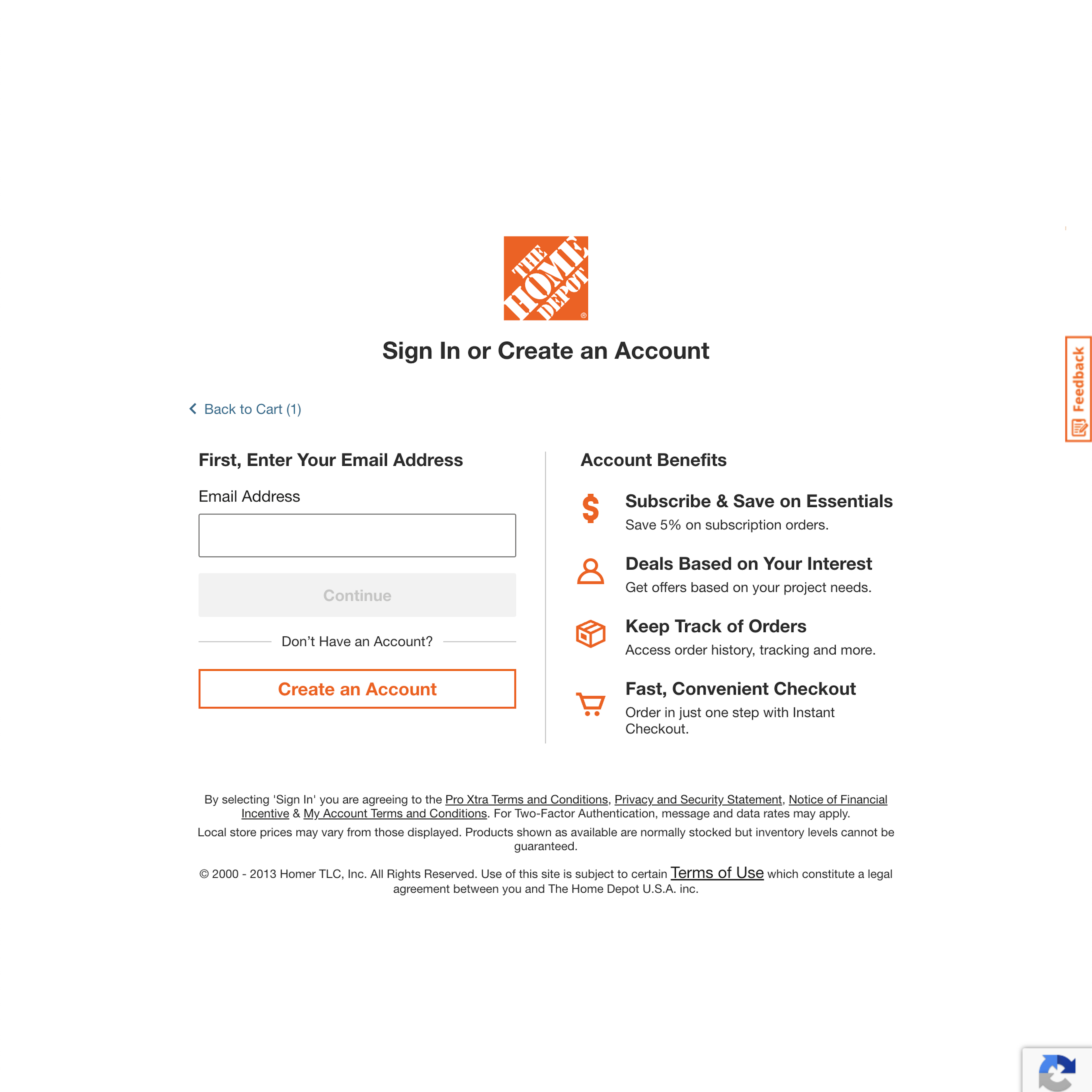
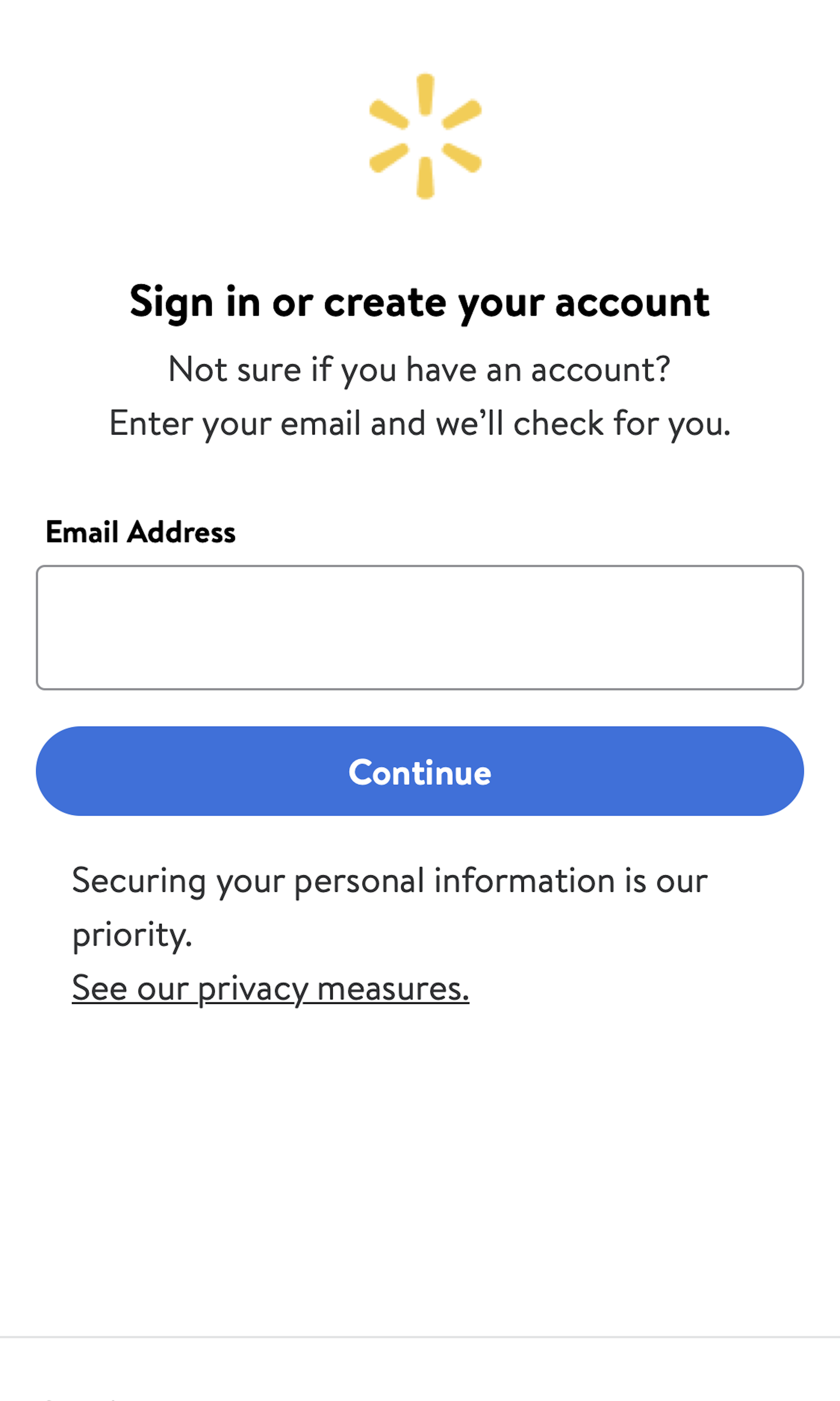
What’s this? Here you’ll find 1026 “Account Selection” full-page screenshots annotated with research-based UX insights, sourced from Baymard’s UX benchmark of 326 e-commerce sites. (Note: this is less than 1% of the full research catalog.)
The account selection step during the checkout flow is where users choose to sign in to an existing account, check out as a “Guest”, or, sometimes, sign up for a new account. However, all our checkout usability testing has consistently revealed that several account selection designs are prone to cause users to overlook the guest checkout option.
More ‘Account’ Insights
-
Our benchmark reveals that 44% of sites have a design that makes it needlessly difficult for users to actually locate that guest checkout option — something we during our user testing frequently observe can cause users to overlook the guest option entirely, and thus make them (incorrectly but understandably) conclude that account registration is required.
-
Learn More: Besides exploring the 1026 “Account Selection” checkout design examples below, you may also want to read our related articles “Offer ‘Delayed Account Creation’ at the Confirmation Step – 38% Don’t” and “For Returning Users, Overly Strict Password Requirements Can Lead to an 18% Abandonment Rate”.
-
Get Full Access: To see all of Baymard’s cart and checkout research findings you’ll need Baymard Premium access. (Premium also provides you full access to 200,000+ hours of UX research findings, 650+ e-commerce UX guidelines, and 275,000+ UX performance scores.)
User Experience Research, Delivered Weekly
Join 60,000+ UX professionals and get a new UX article every week.

User Experience Research, Delivered Weekly
Join 60,000+ UX professionals and get a new UX article every week.

Explore Other Research Content

300+ free UX articles based on large-scale research.

326 top sites ranked by UX performance.

Code samples, demos, and key stats for usability.


