
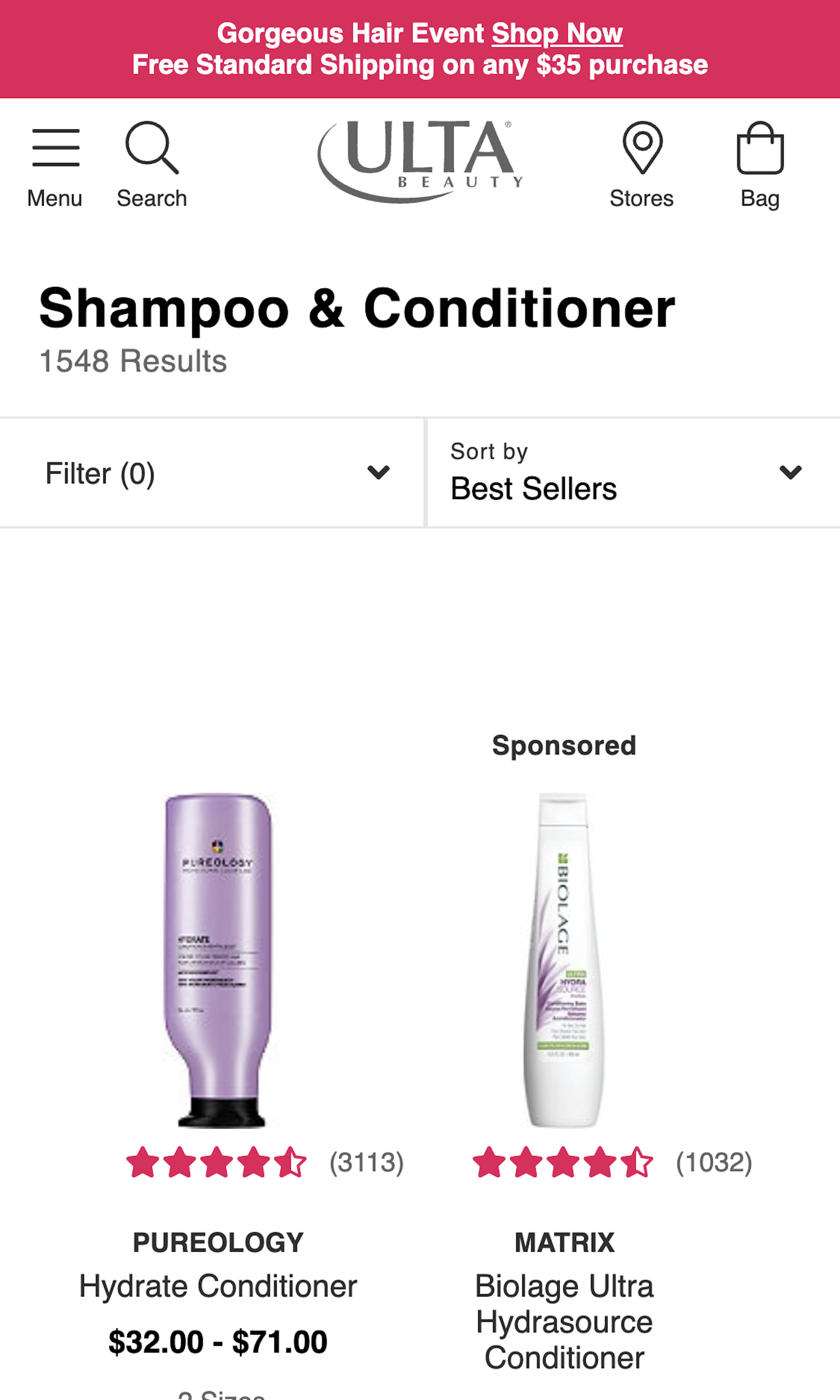
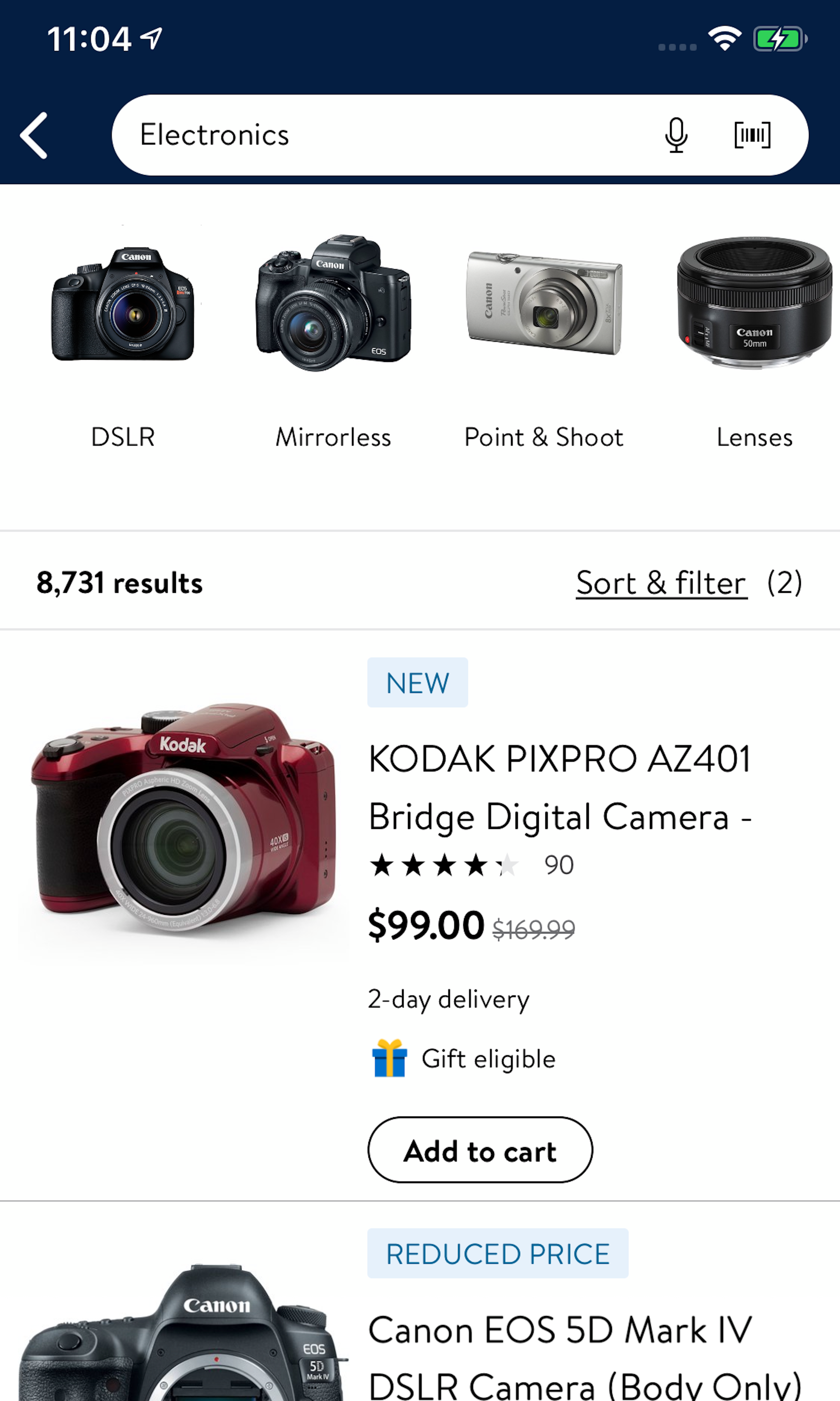
1263 ‘Product List’ Design Examples
Also referred to as: Product Listings Page, PLP
What’s this? Here you’ll find 1263 “Product List” full-page screenshots annotated with research-based UX insights, sourced from Baymard’s UX benchmark of 327 e-commerce sites. (Note: this is less than 1% of the full research catalog.)
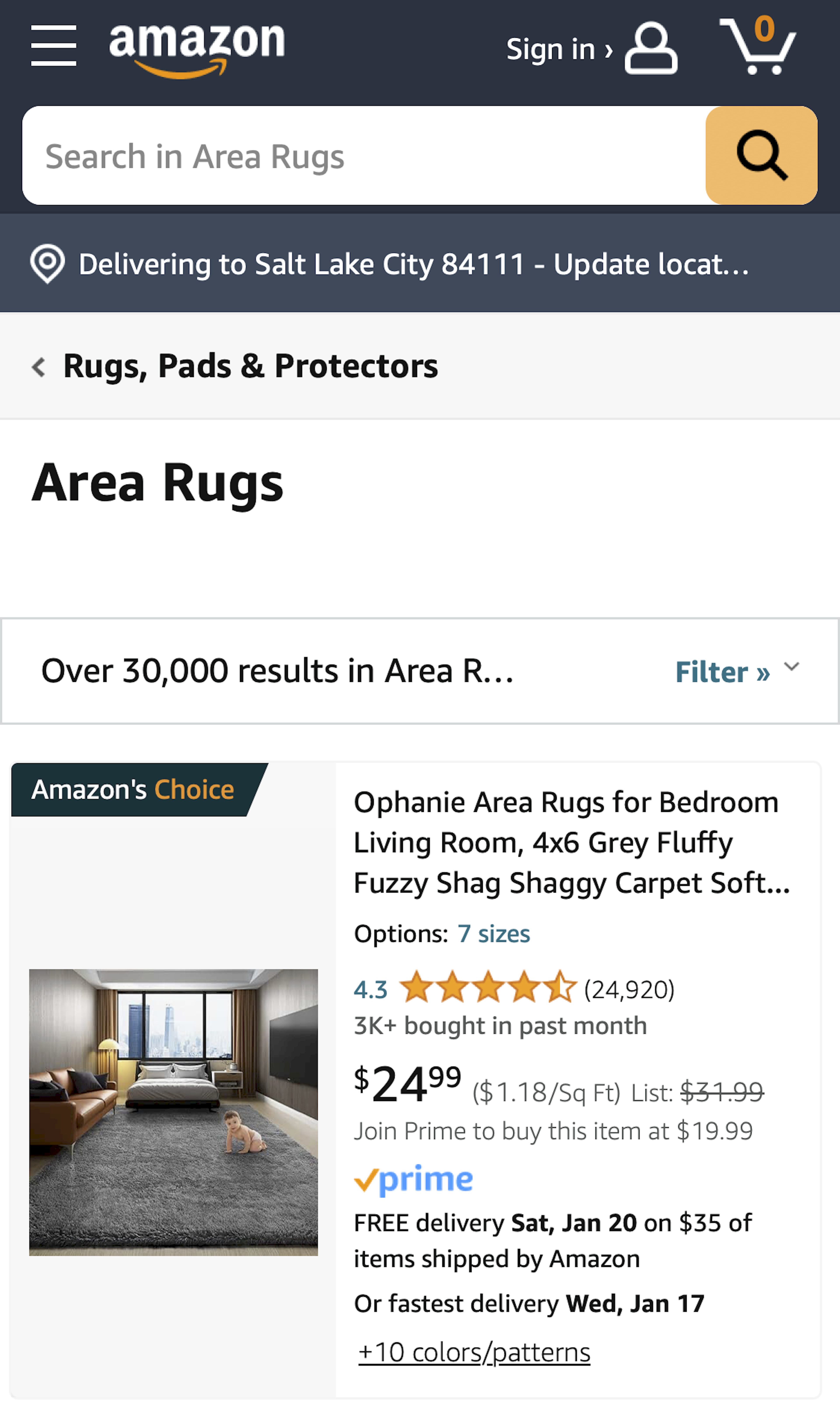
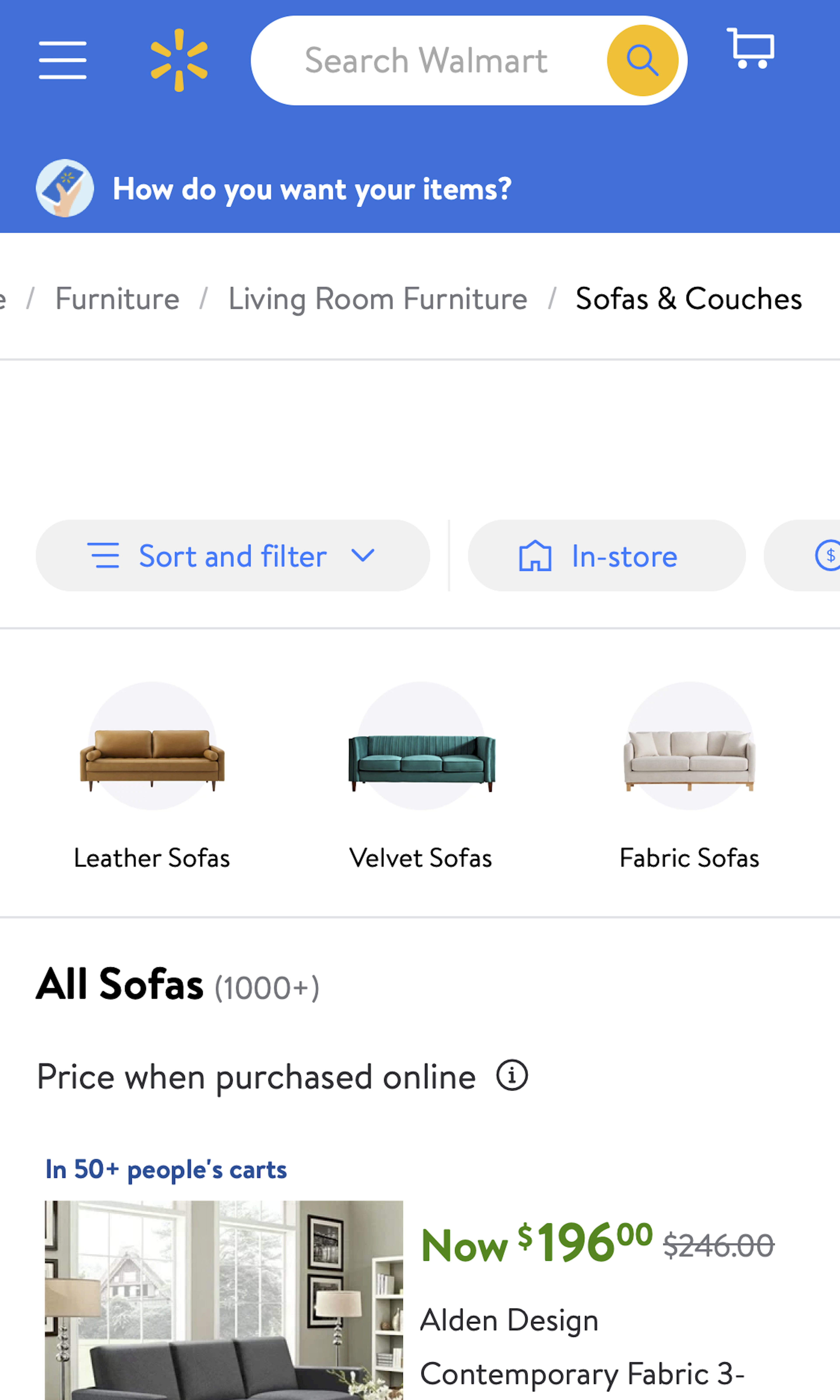
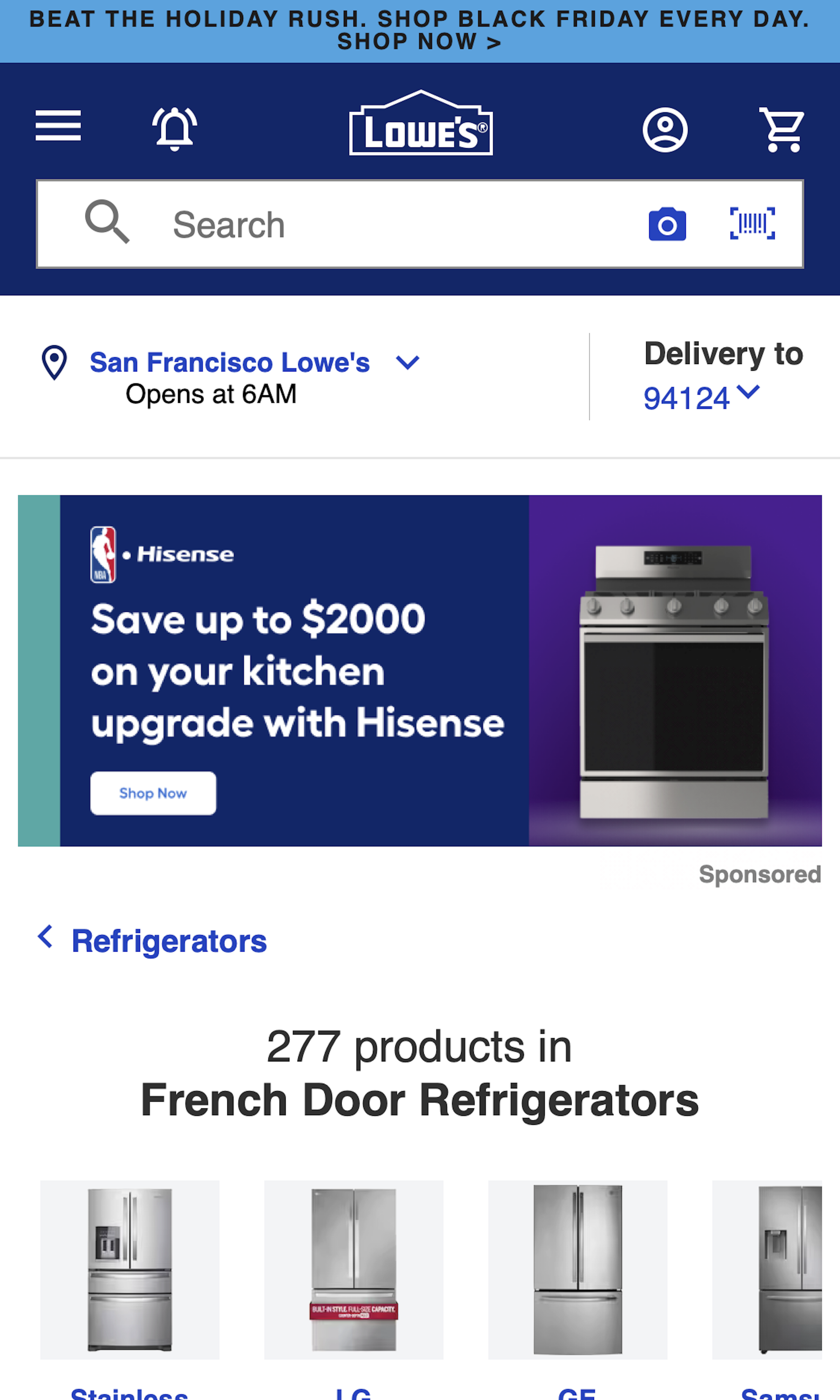
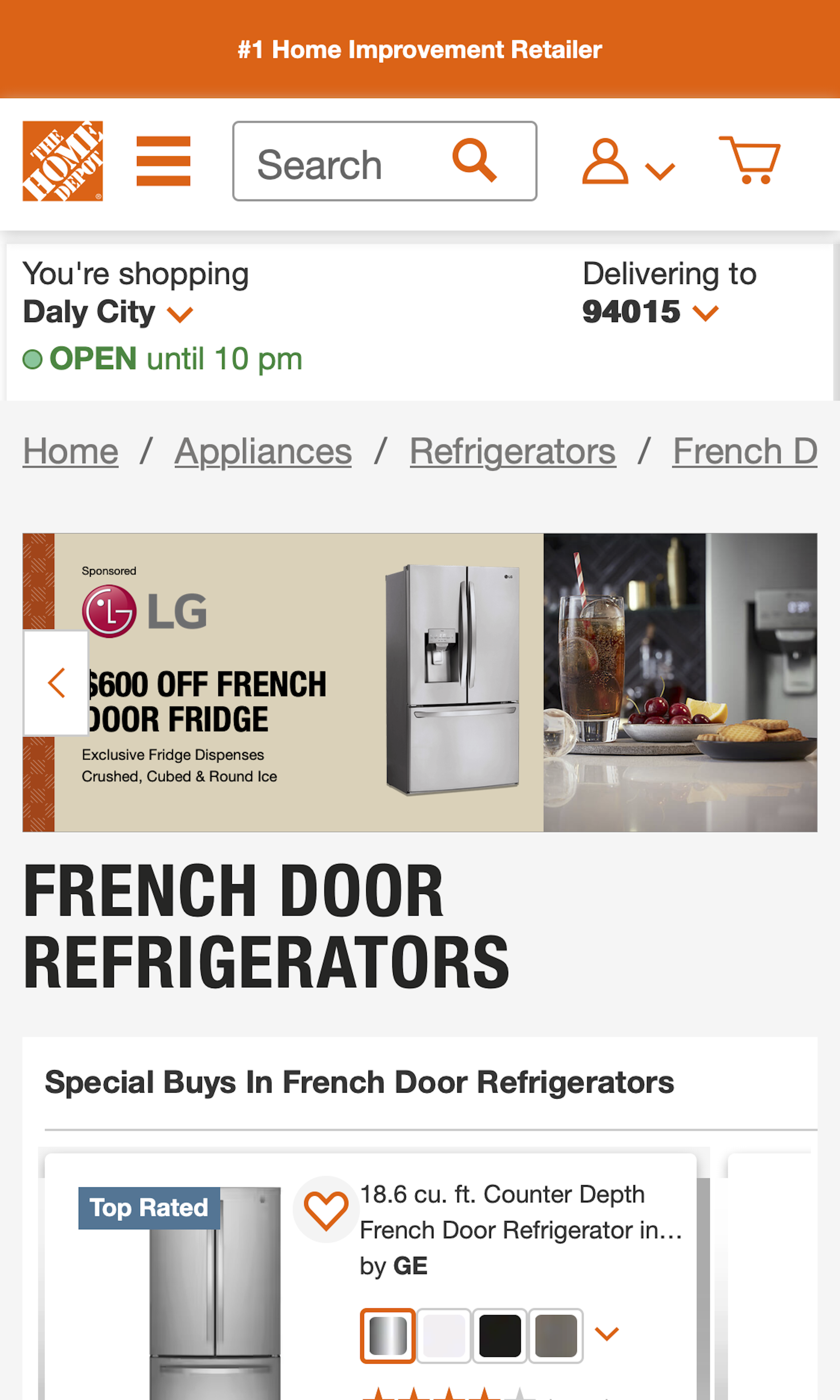
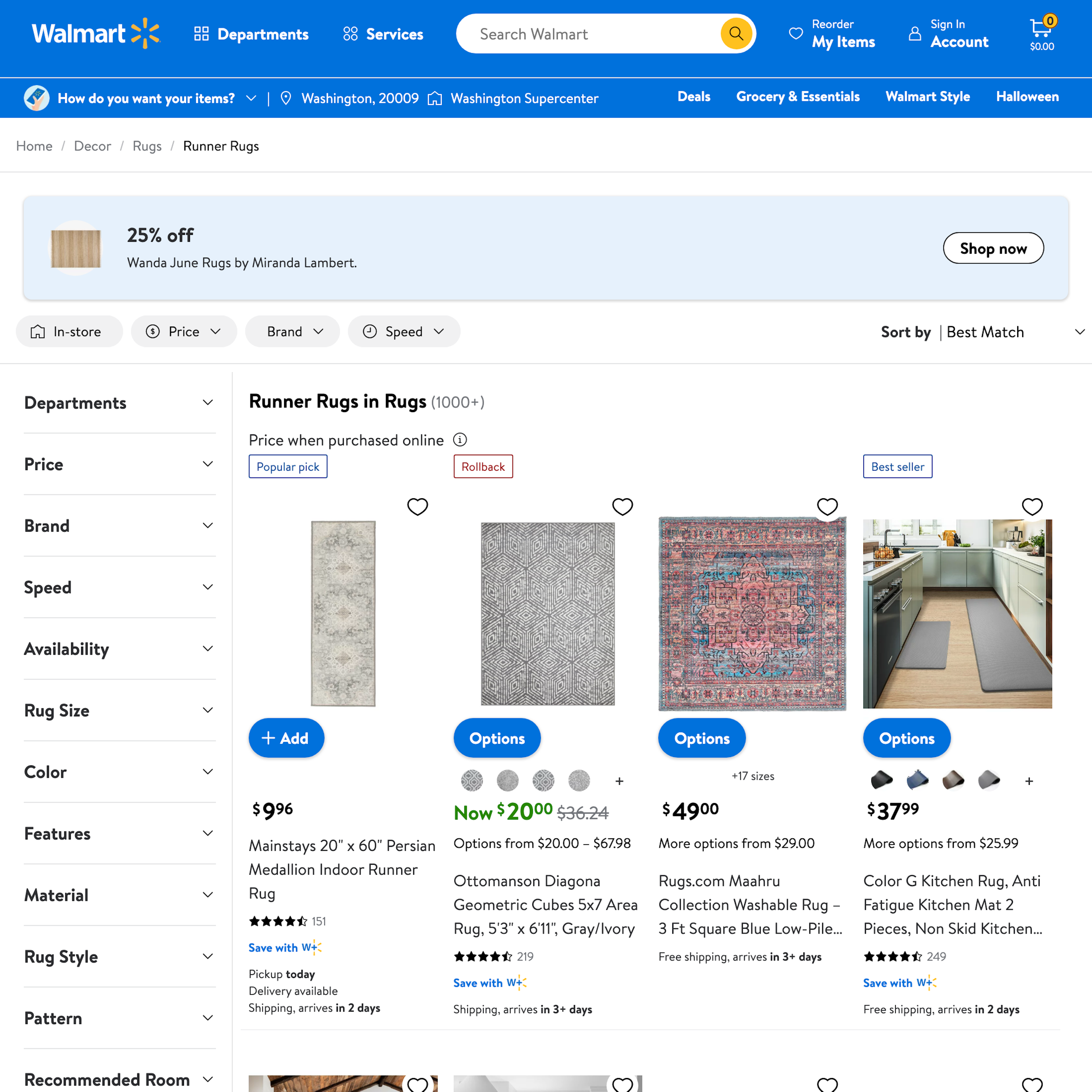
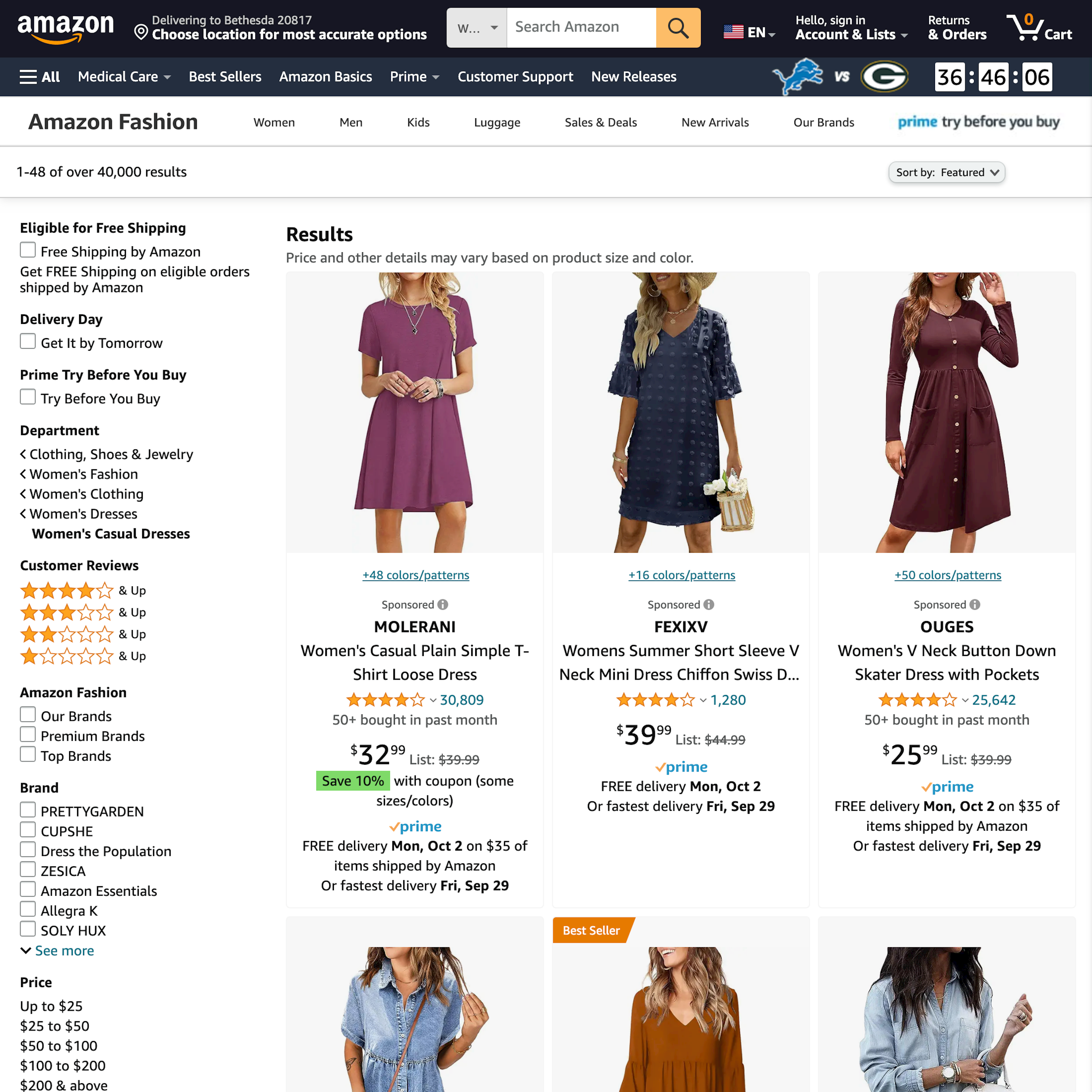
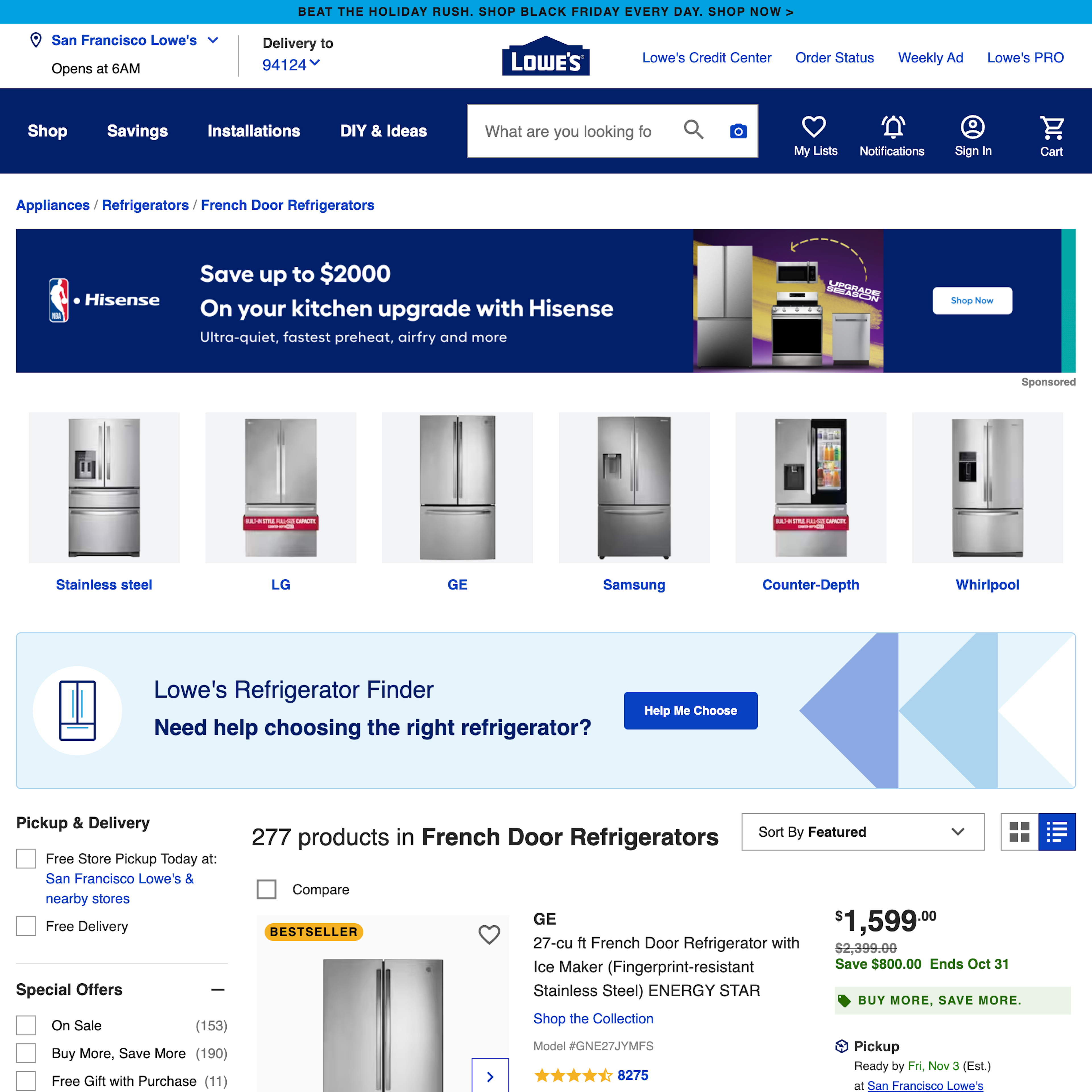
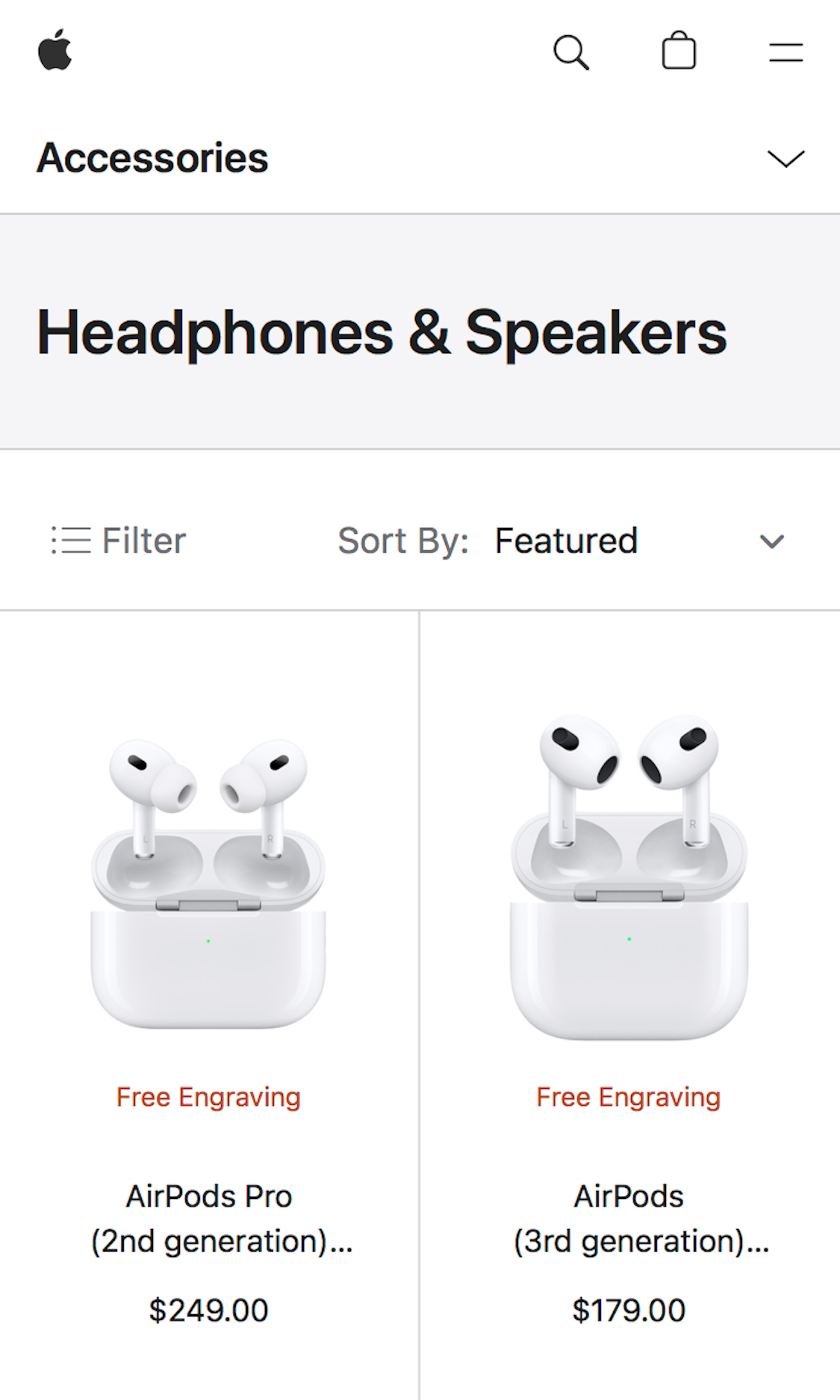
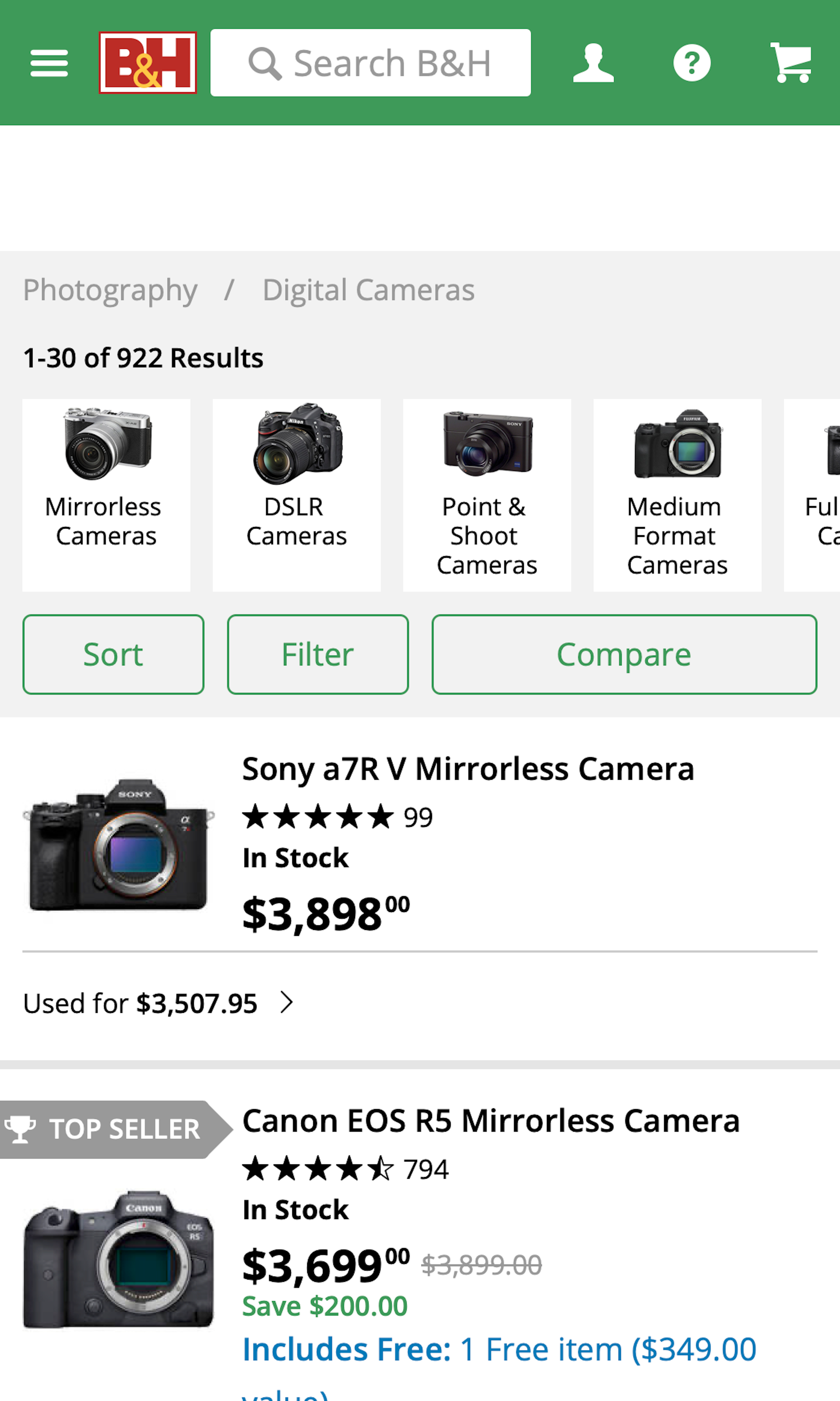
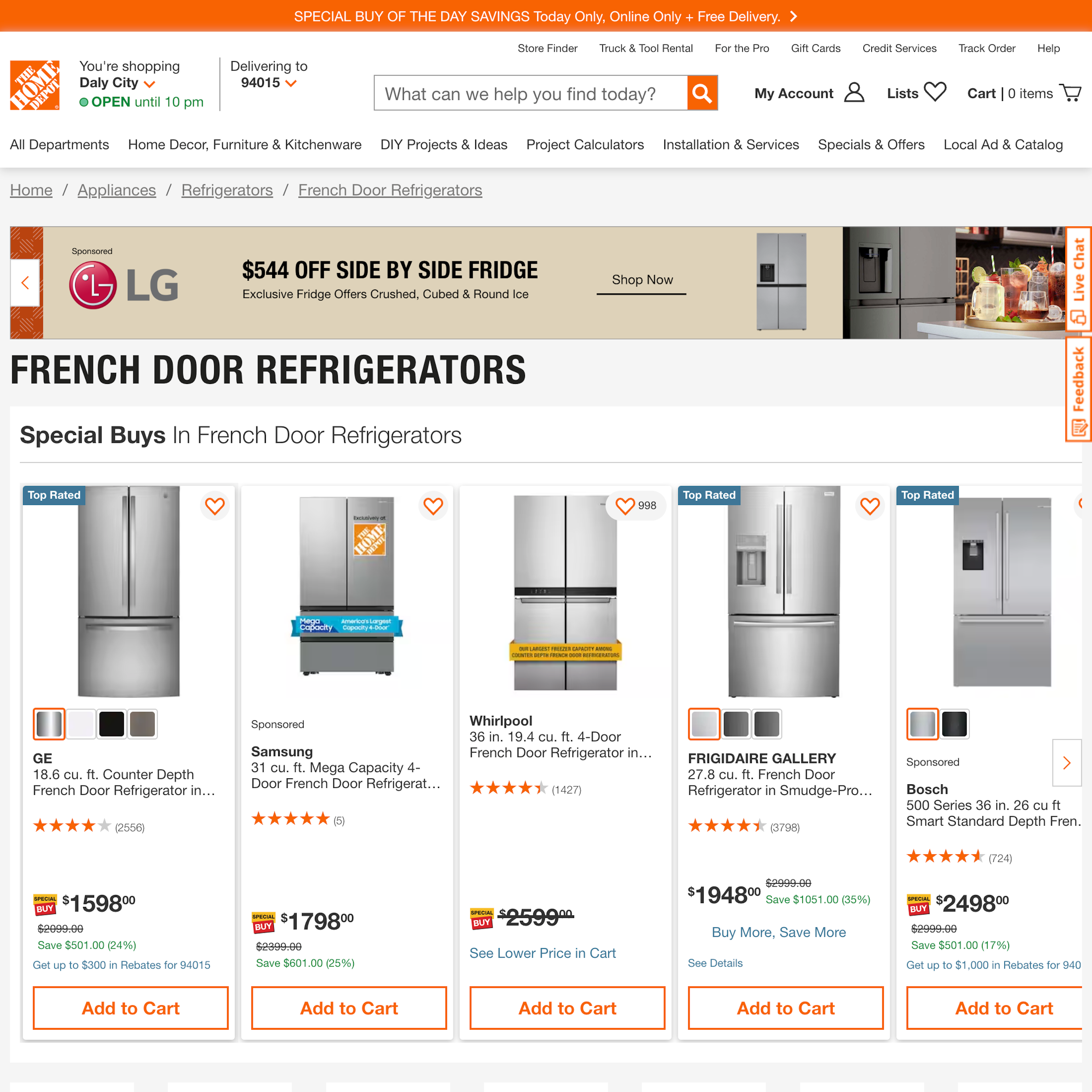
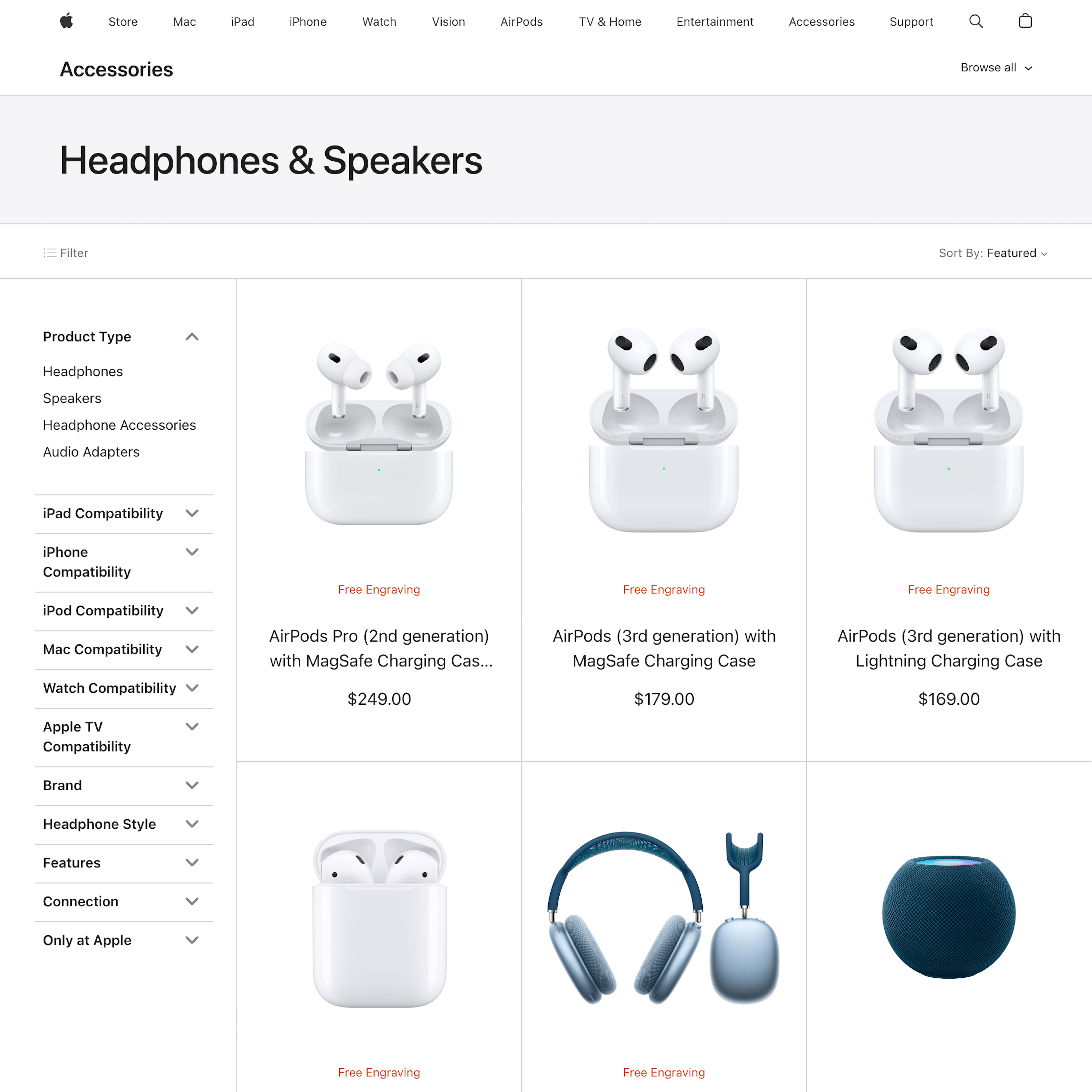
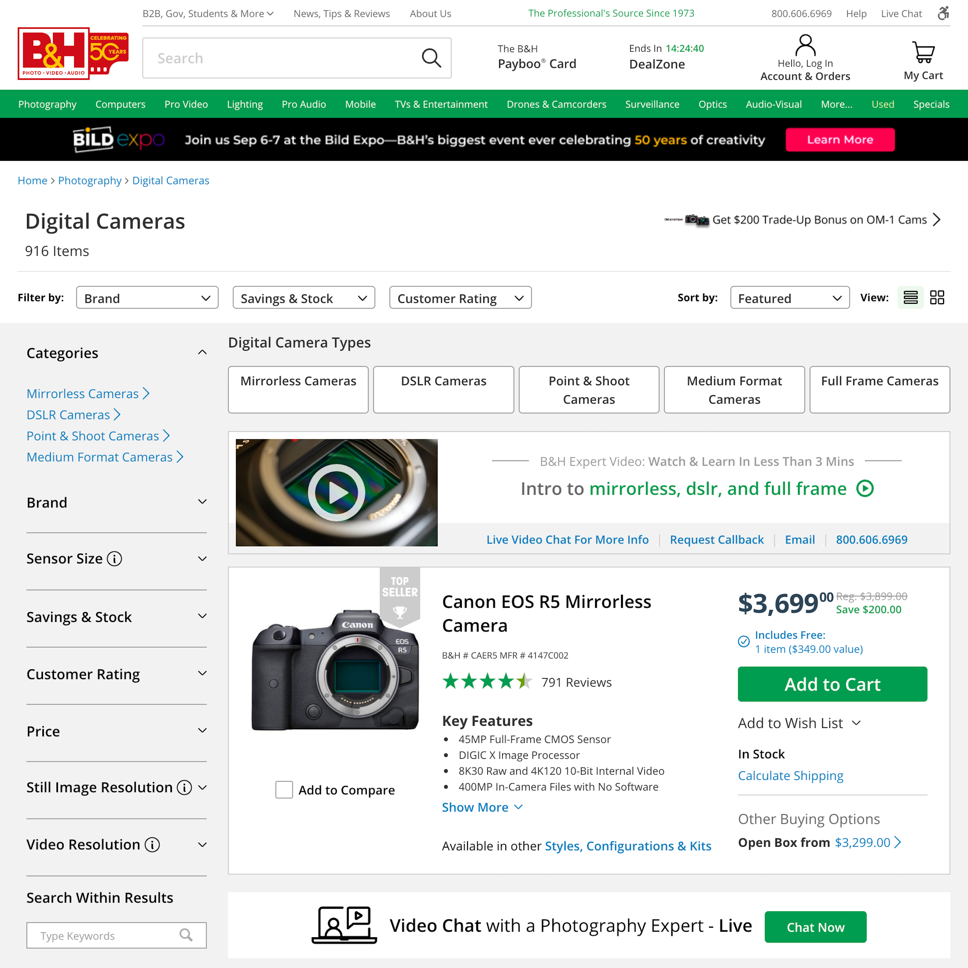
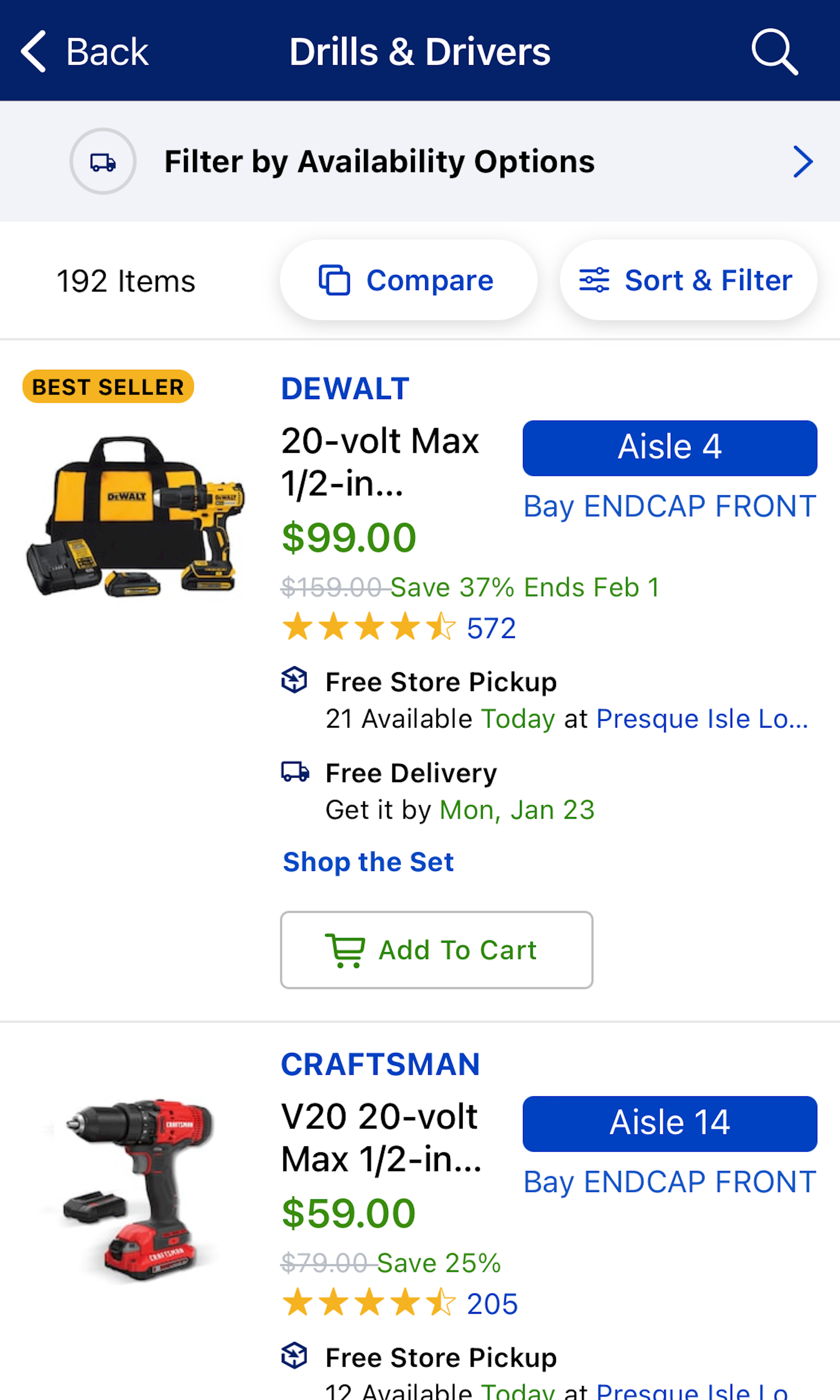
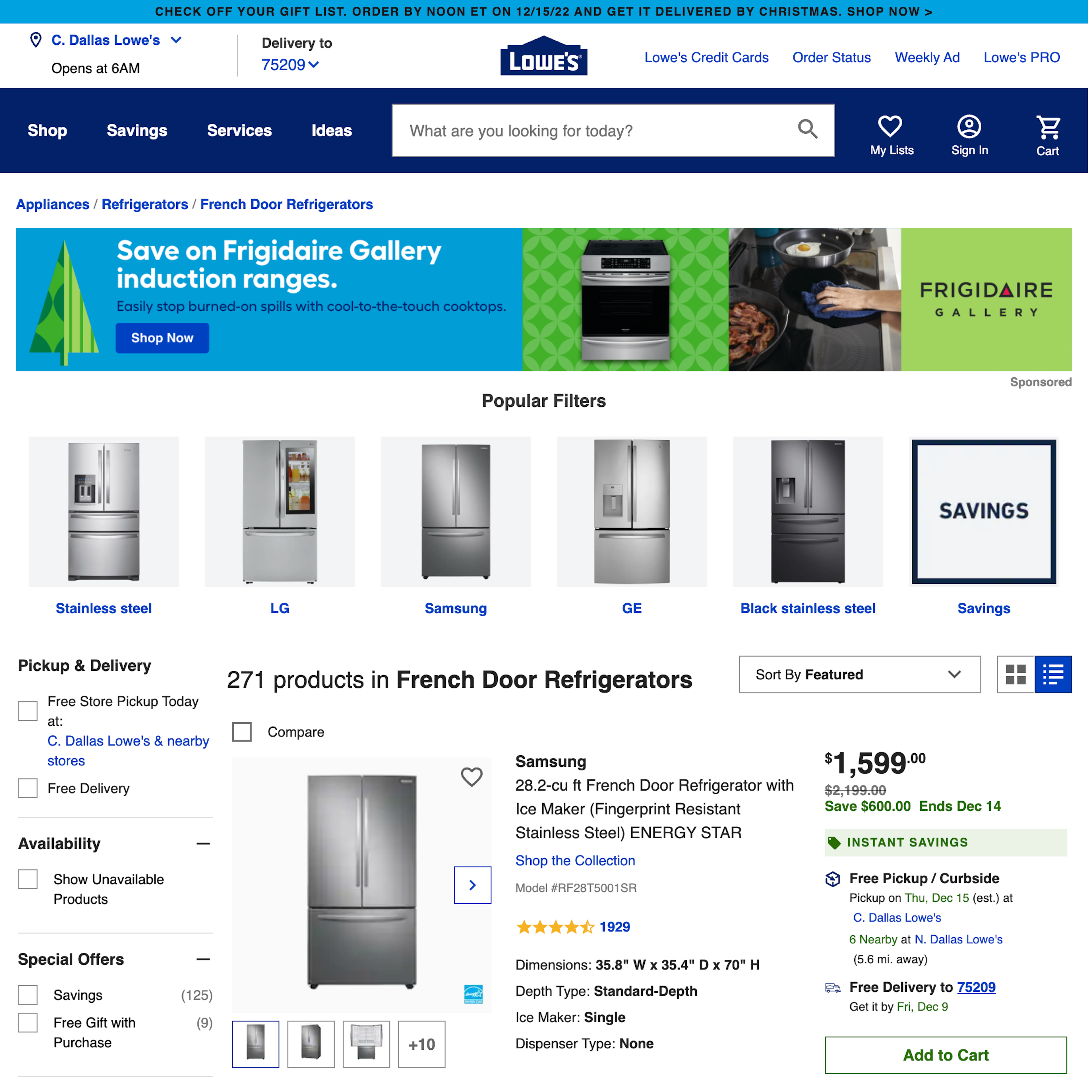
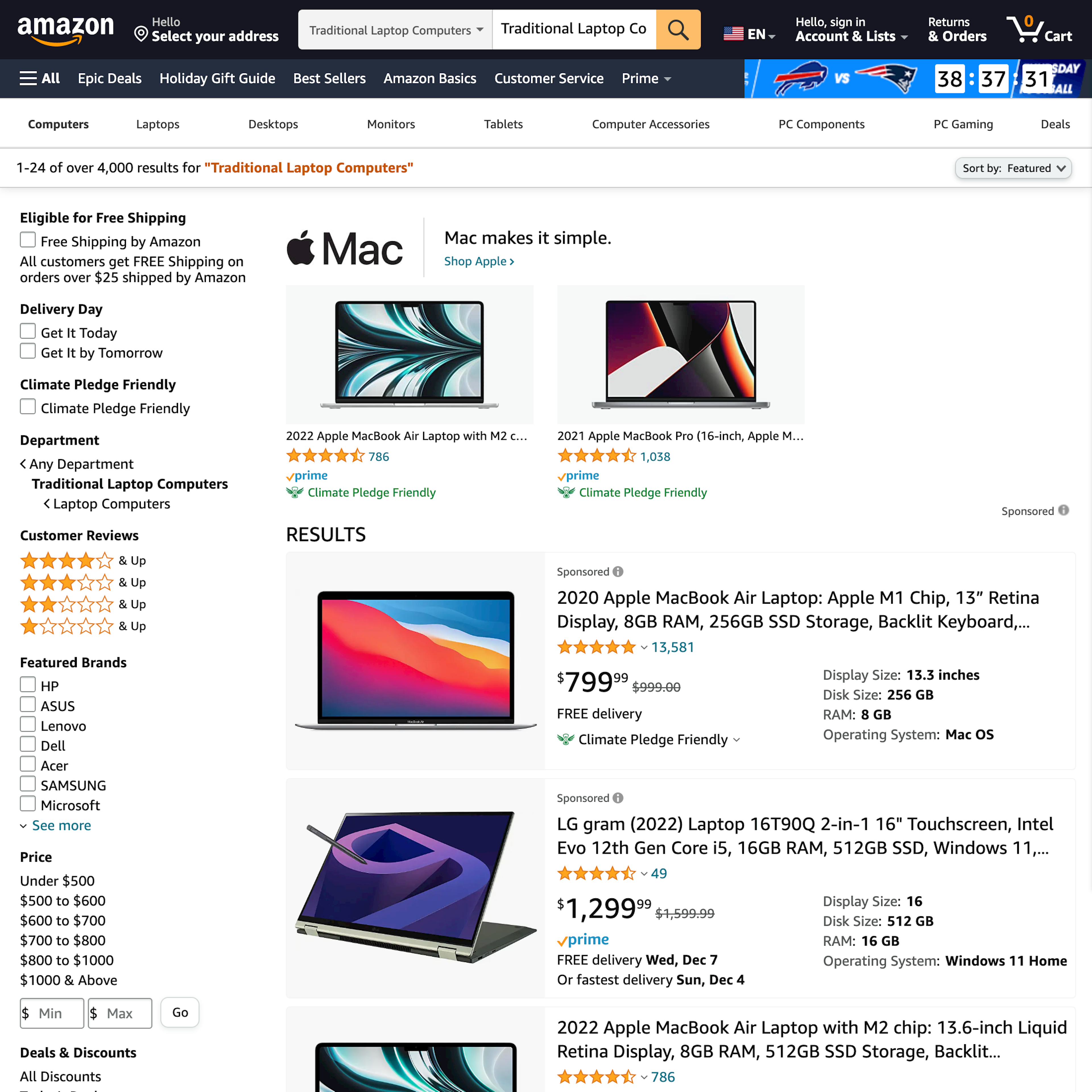
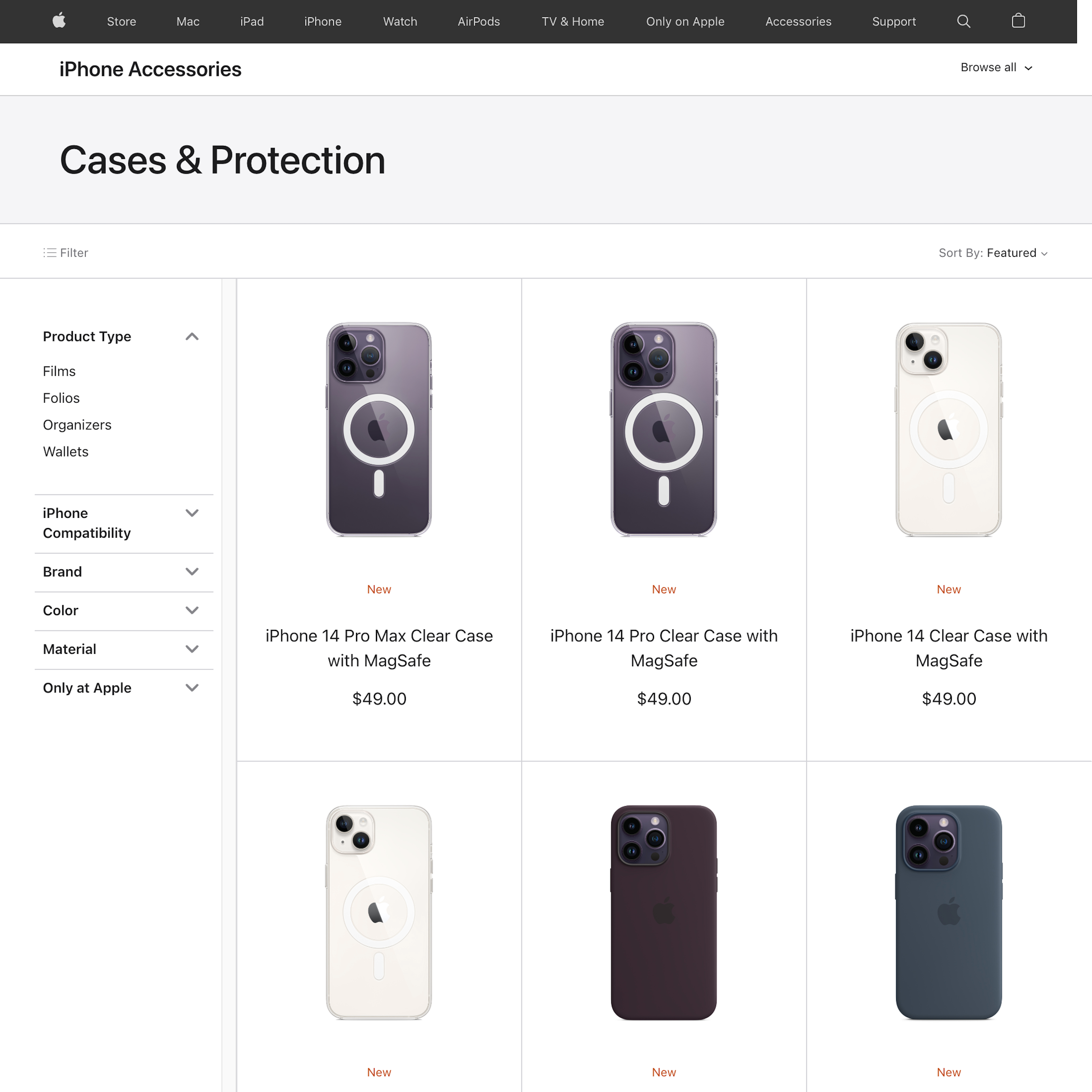
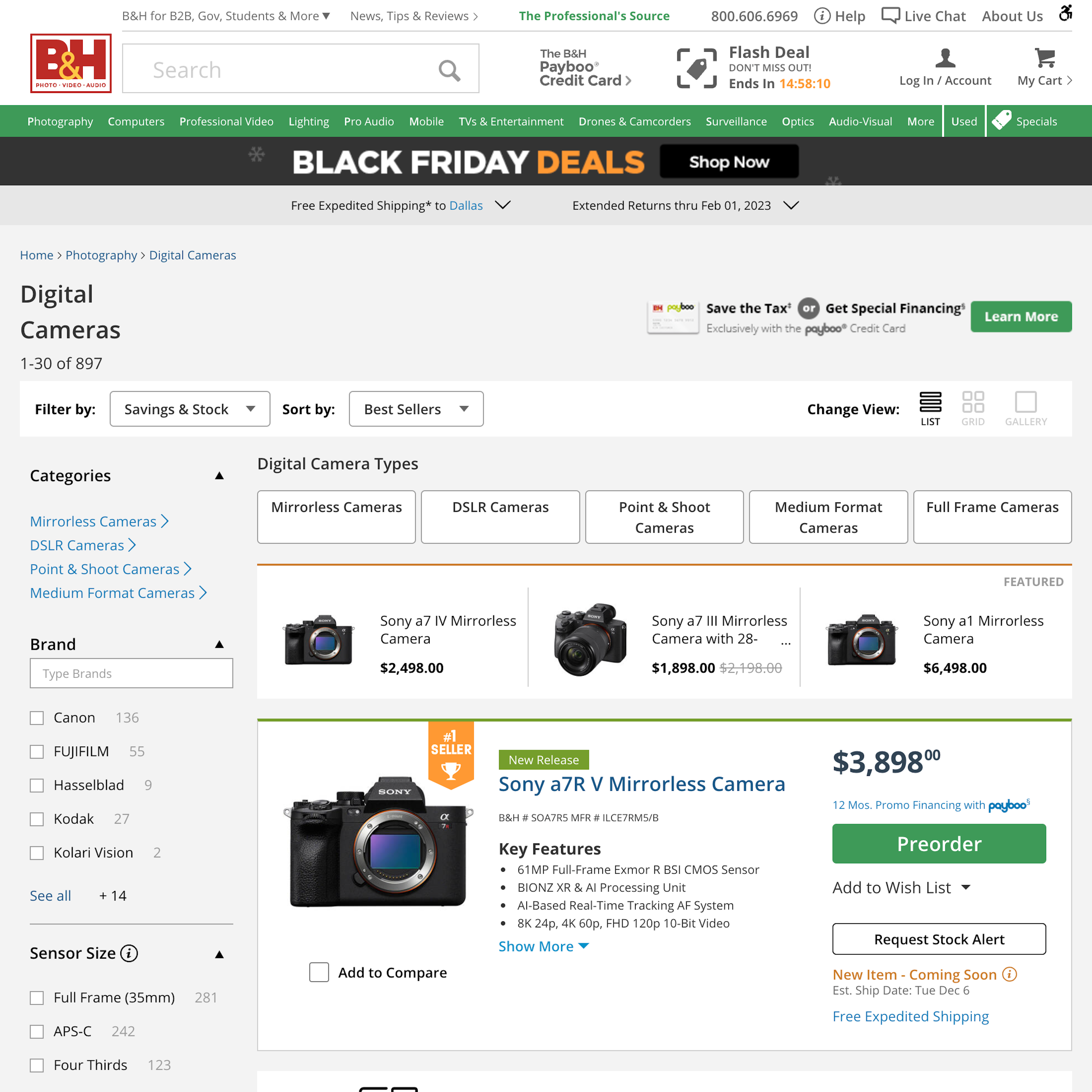
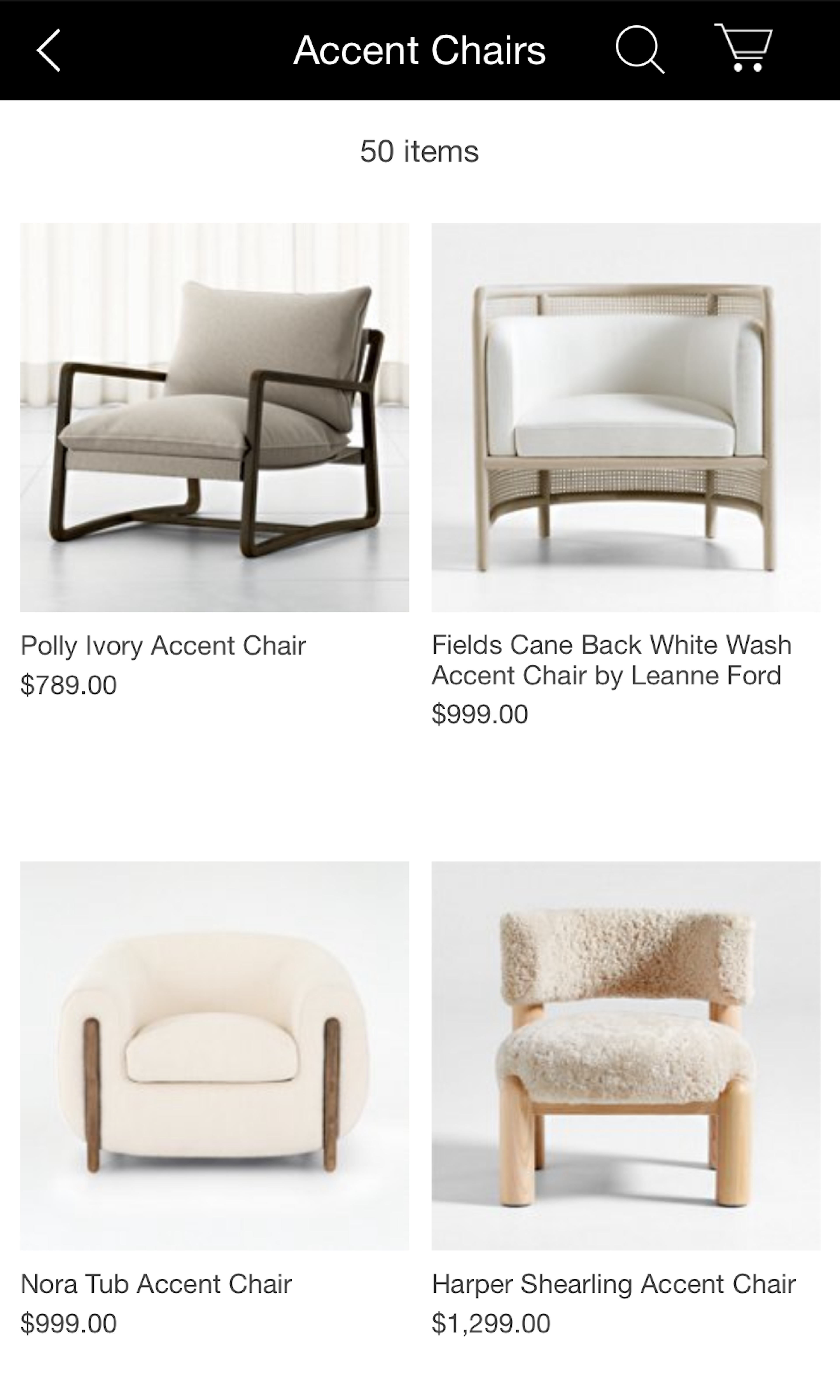
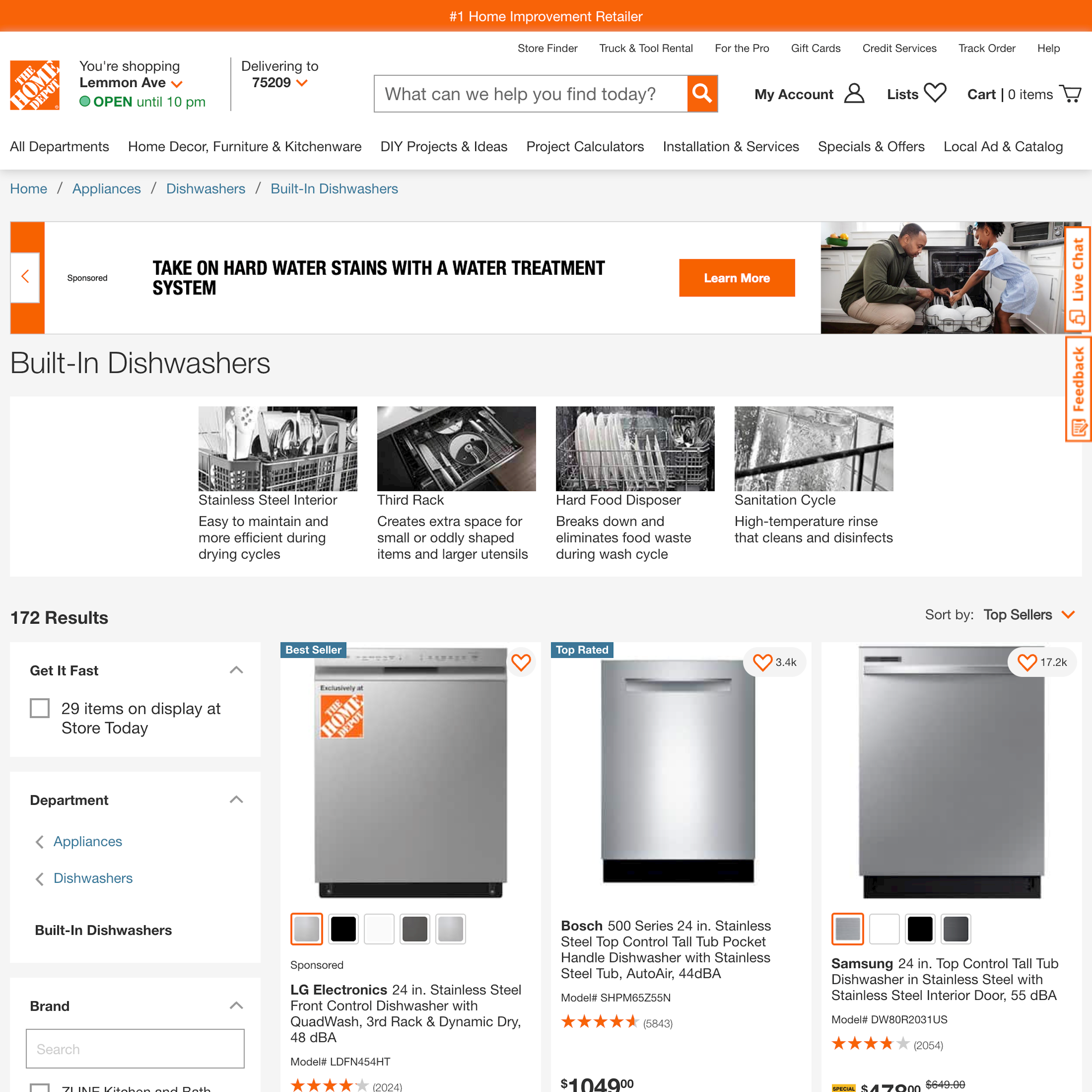
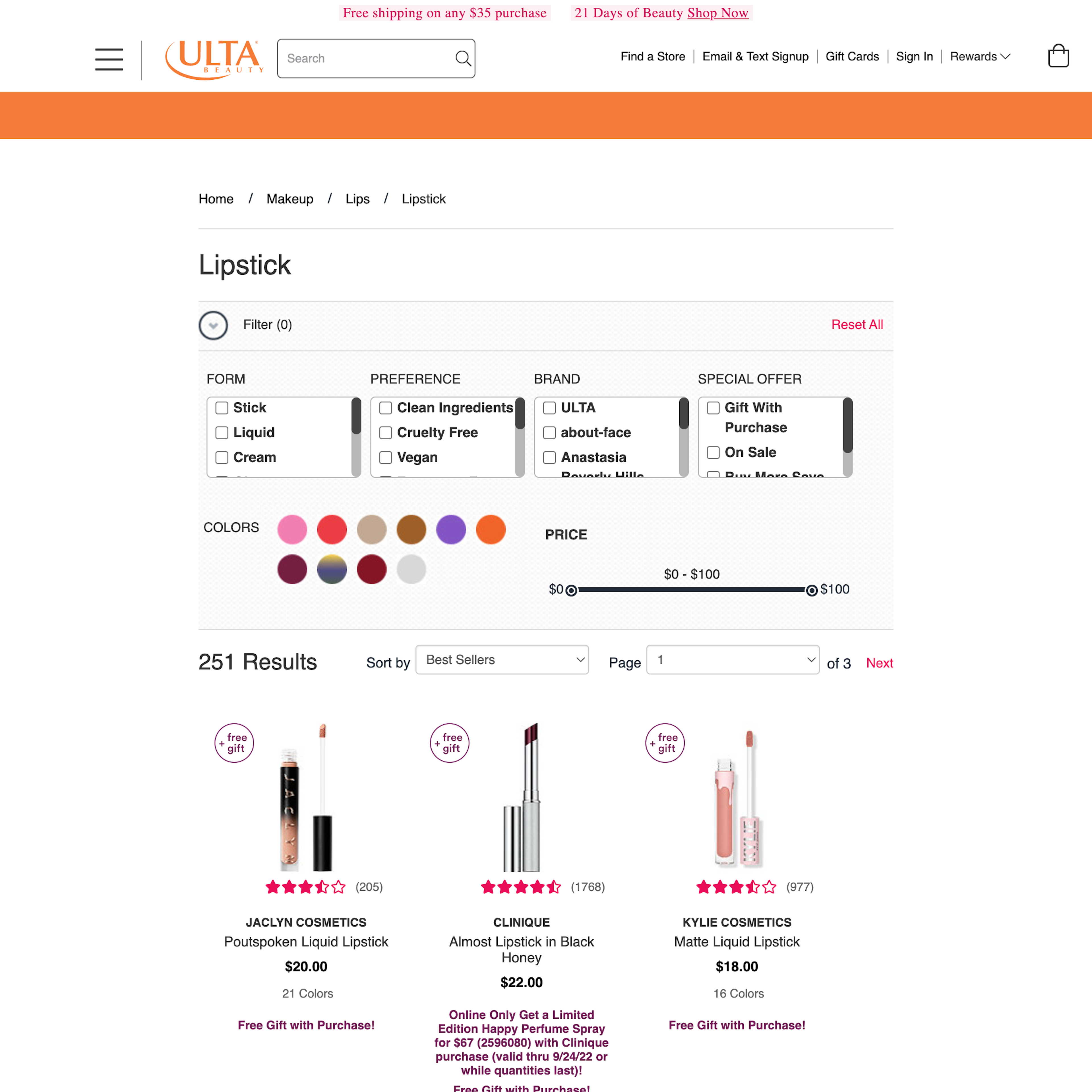
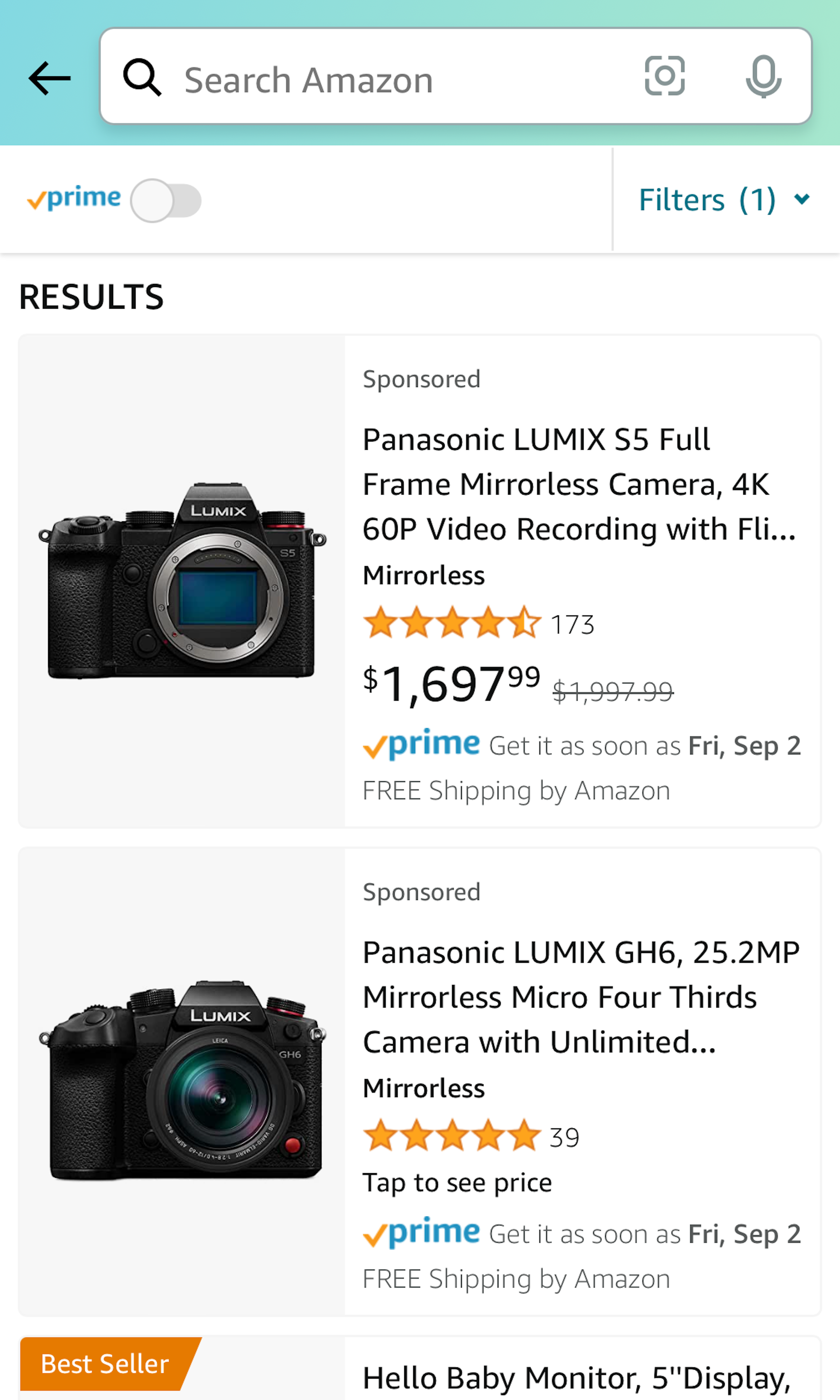
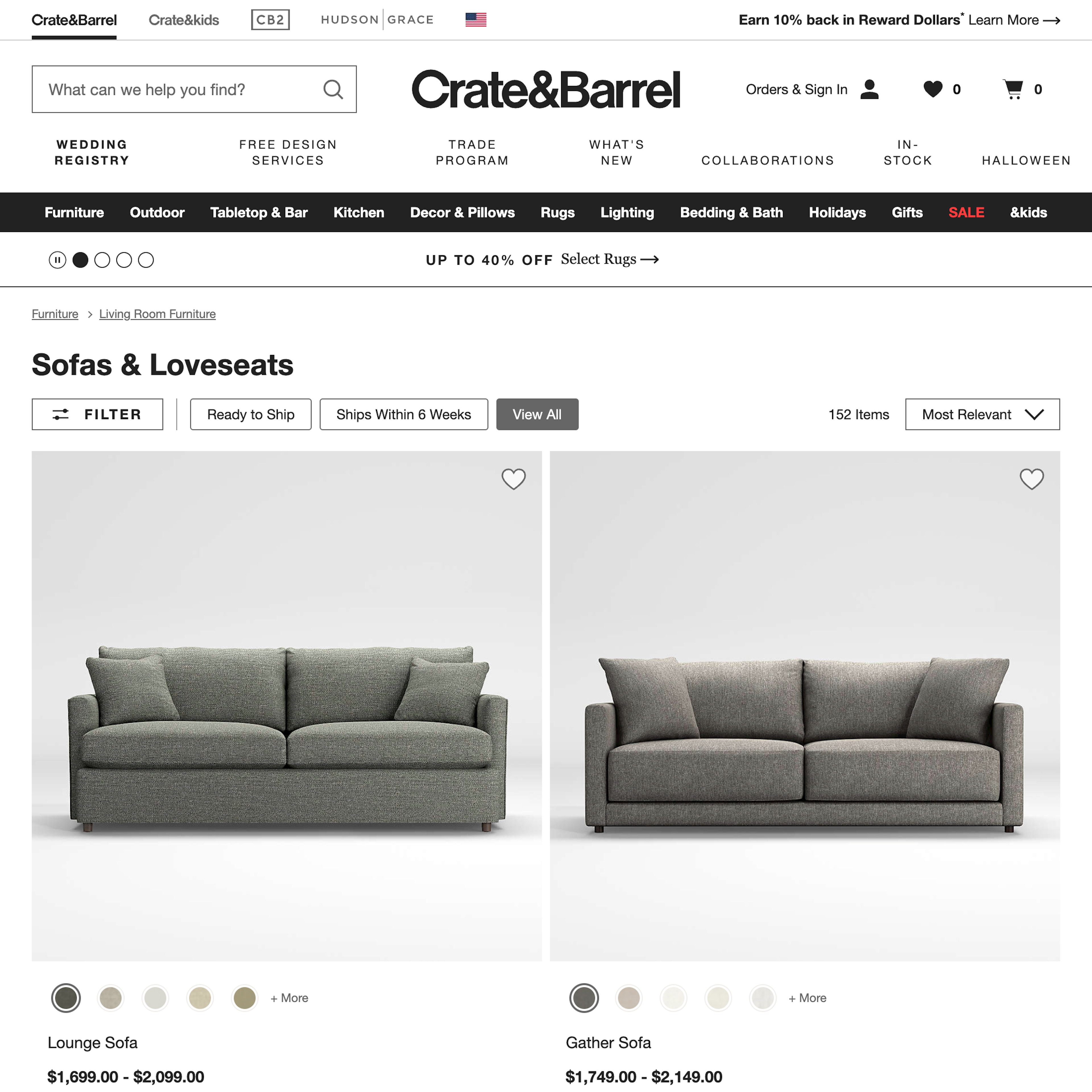
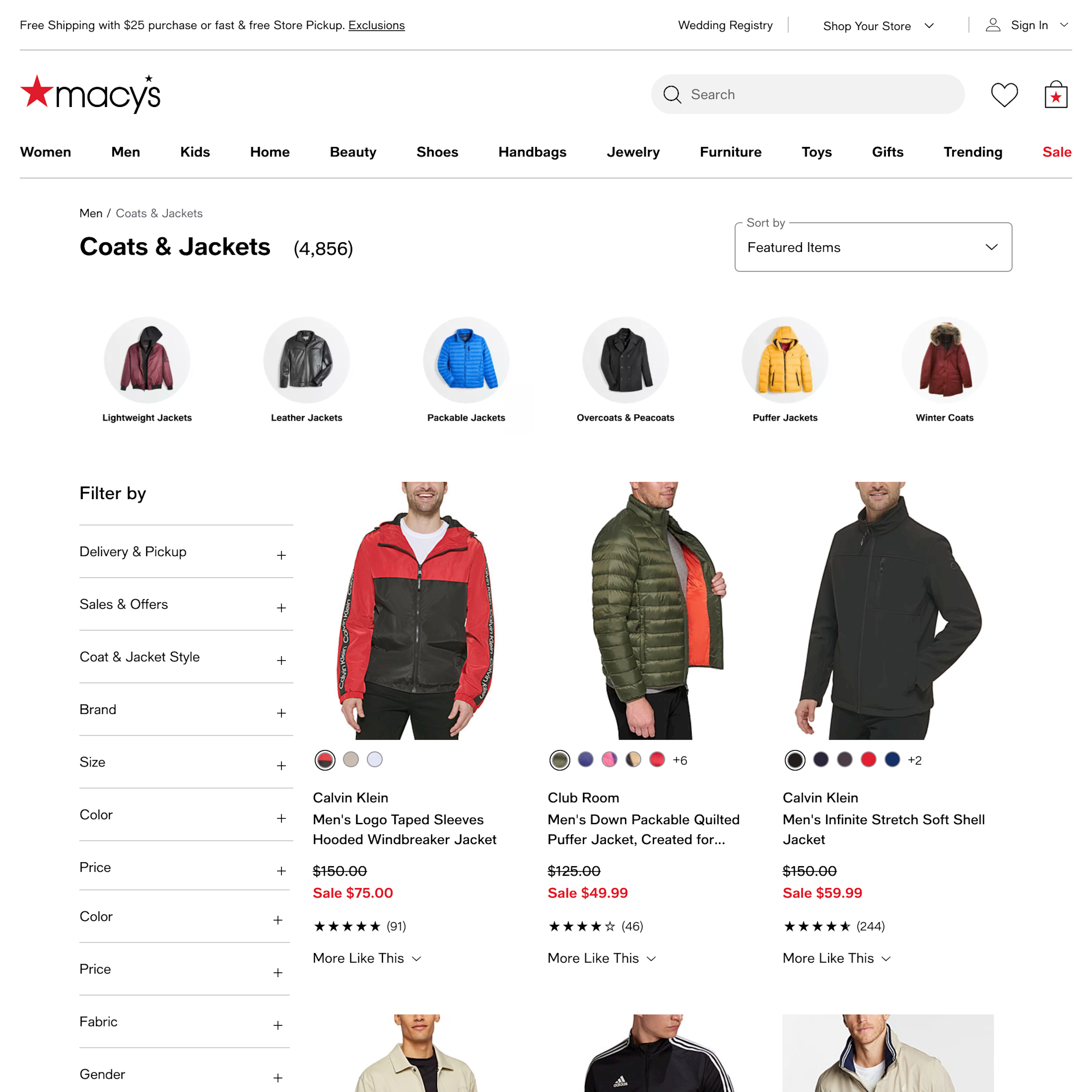
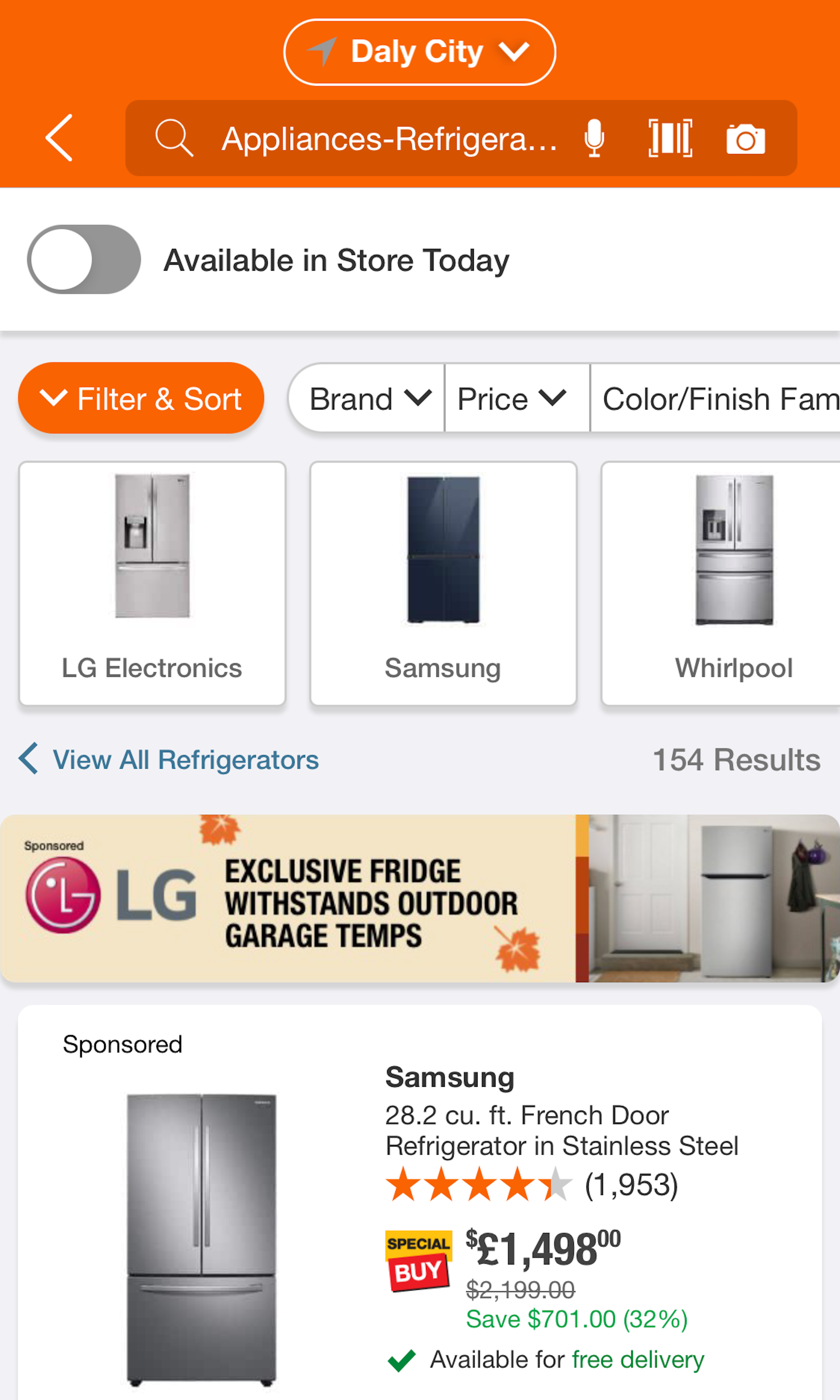
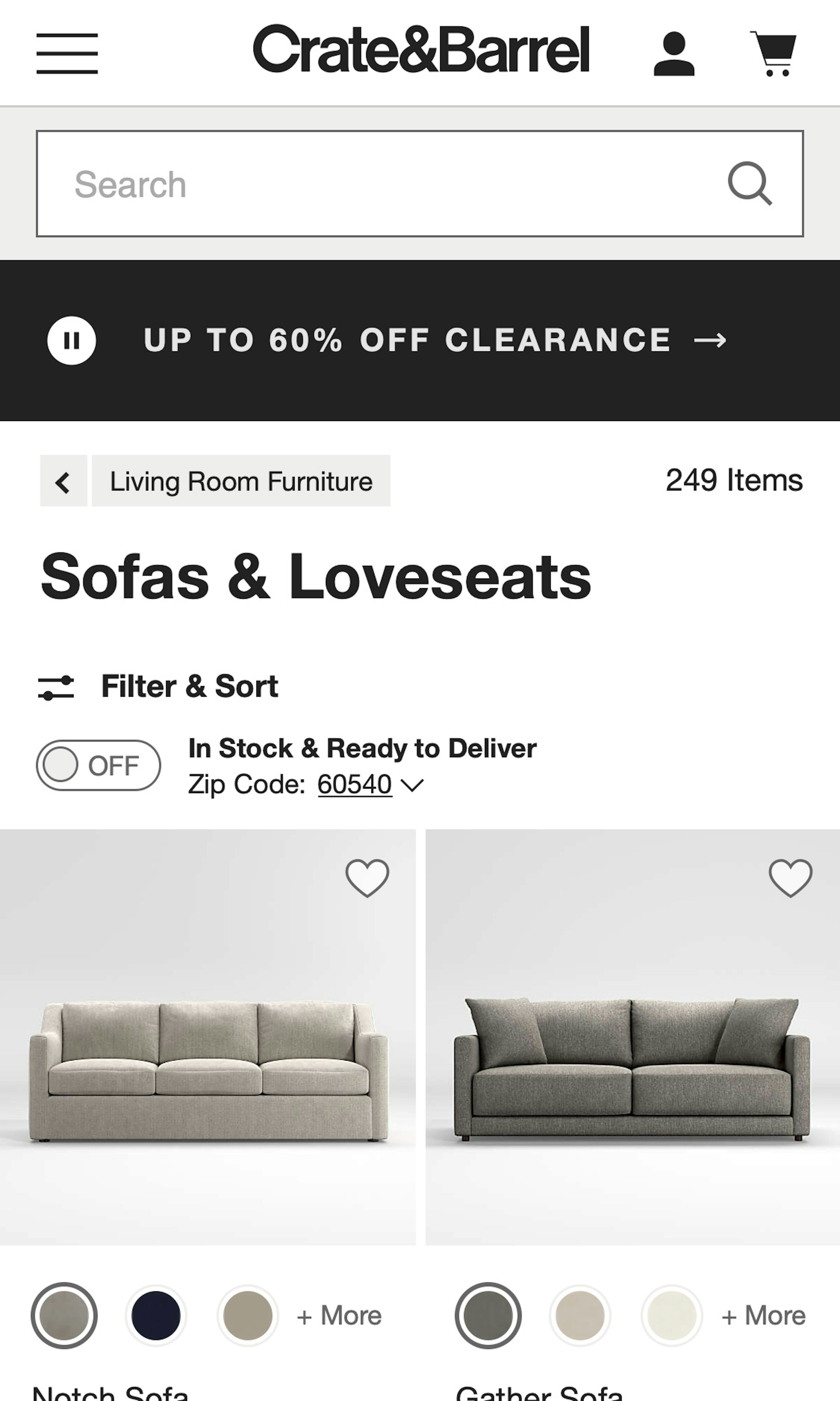
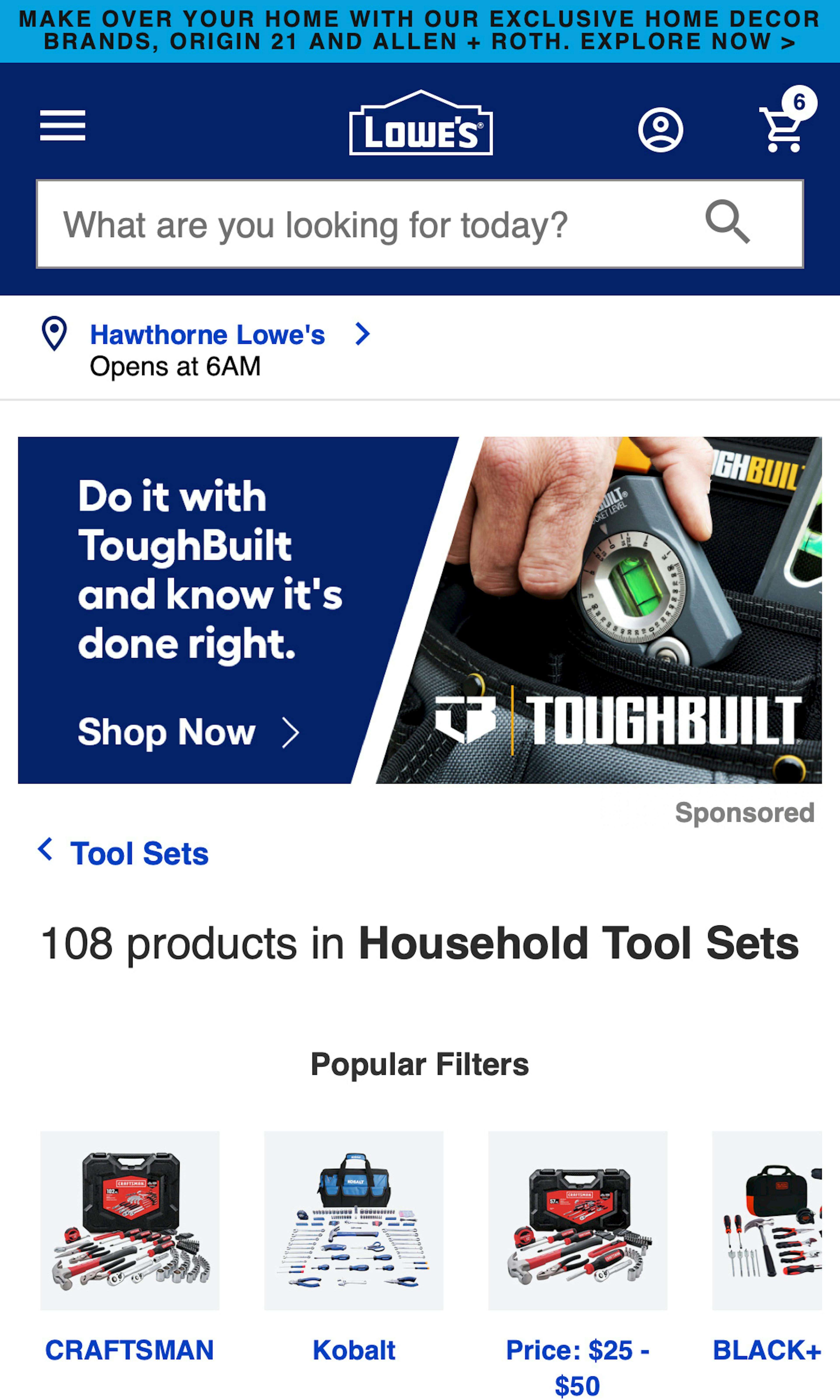
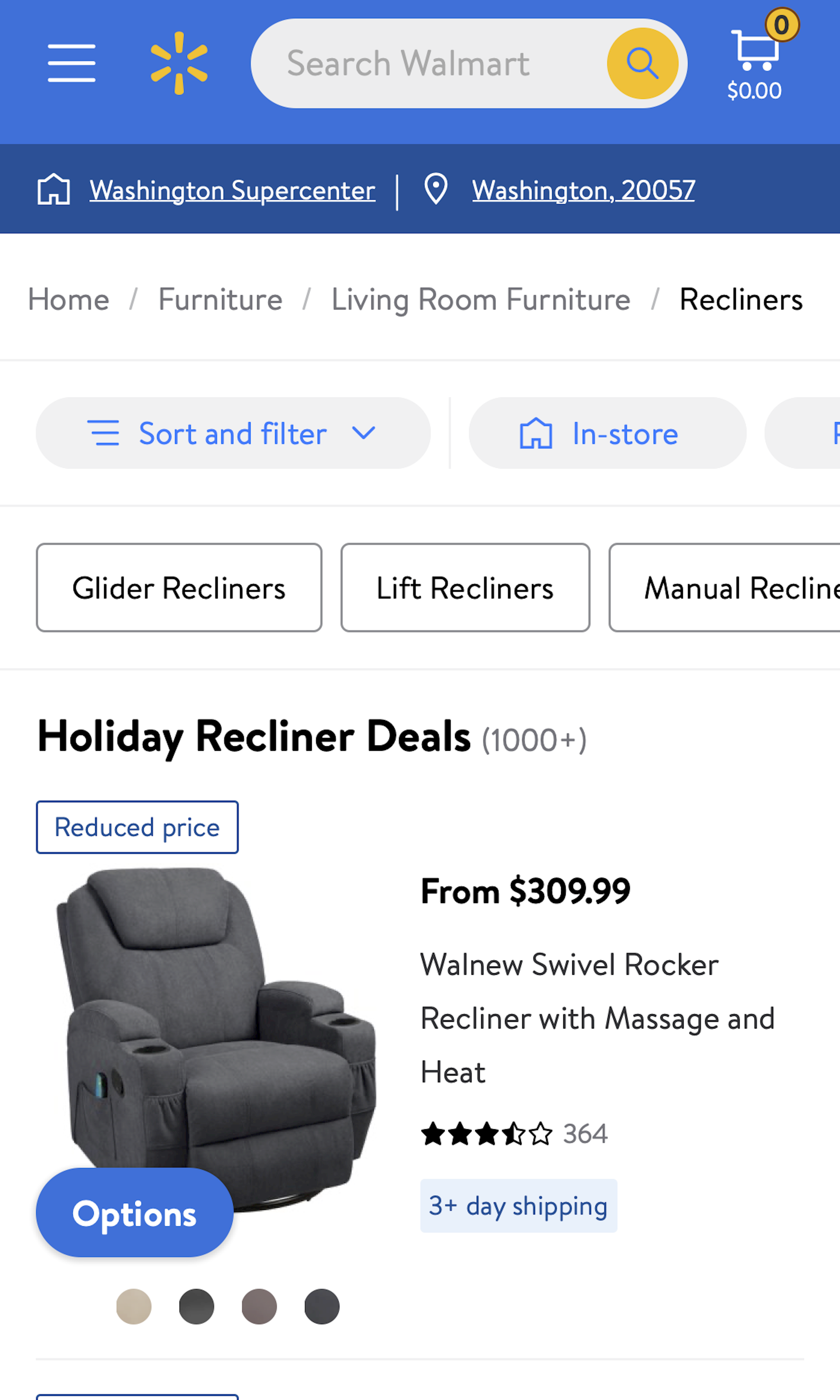
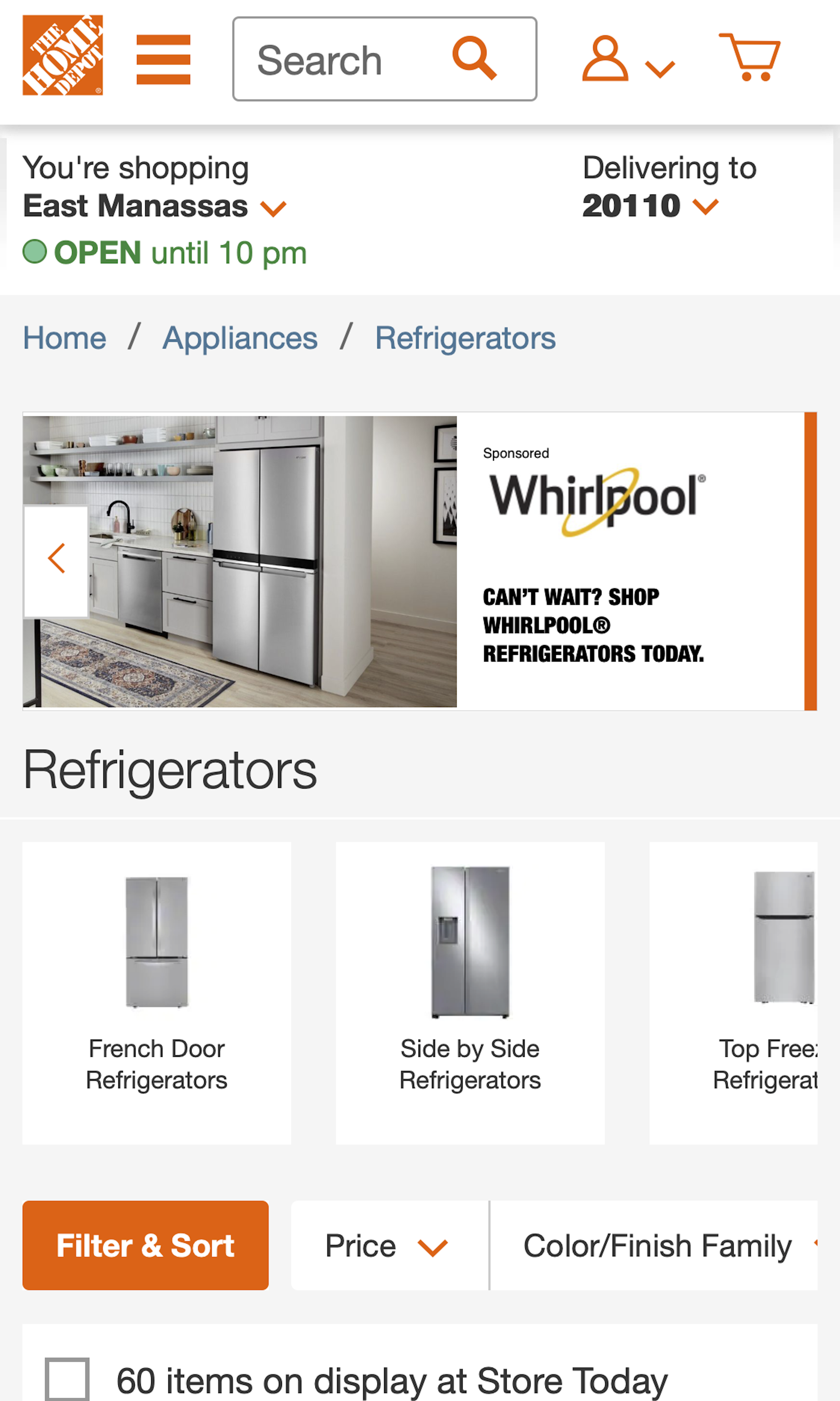
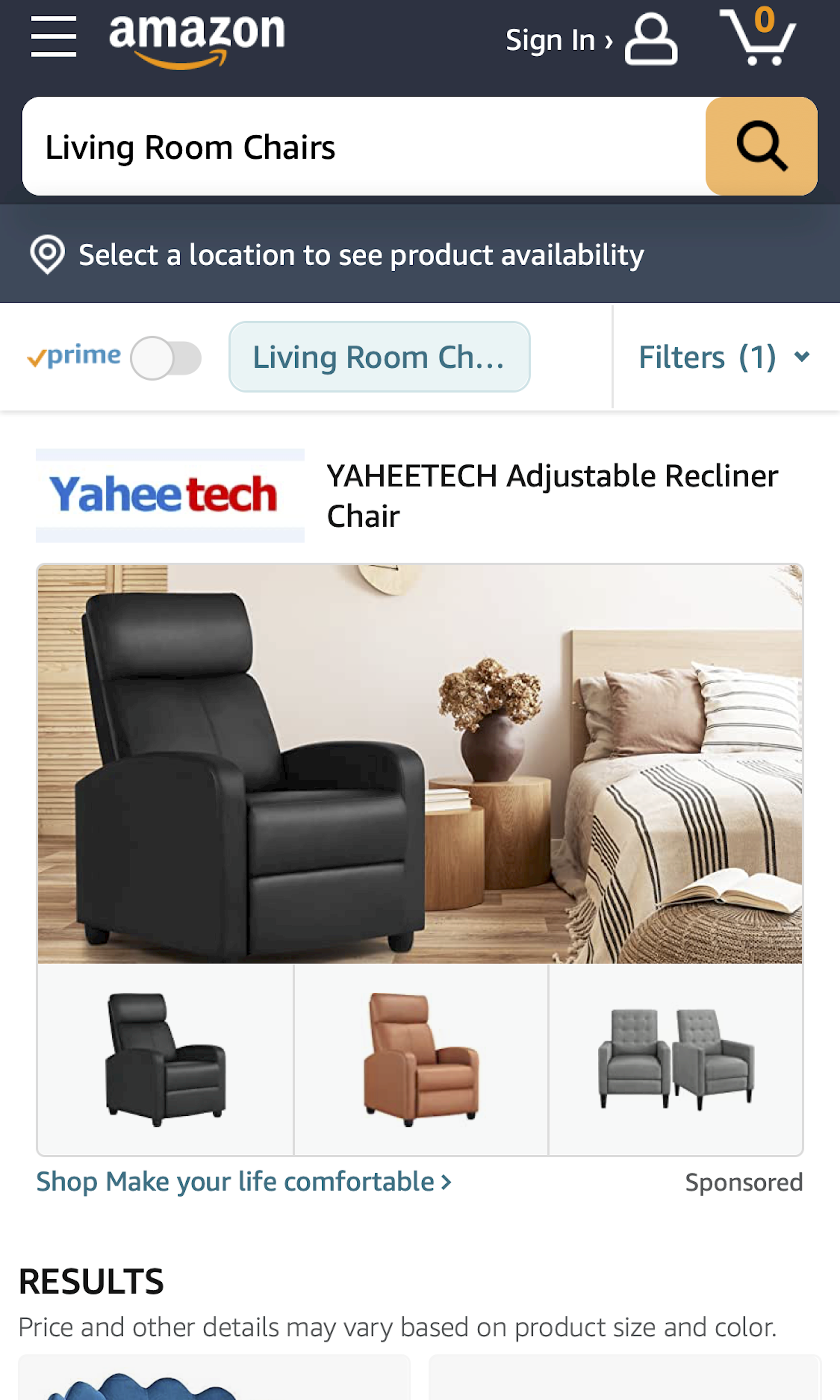
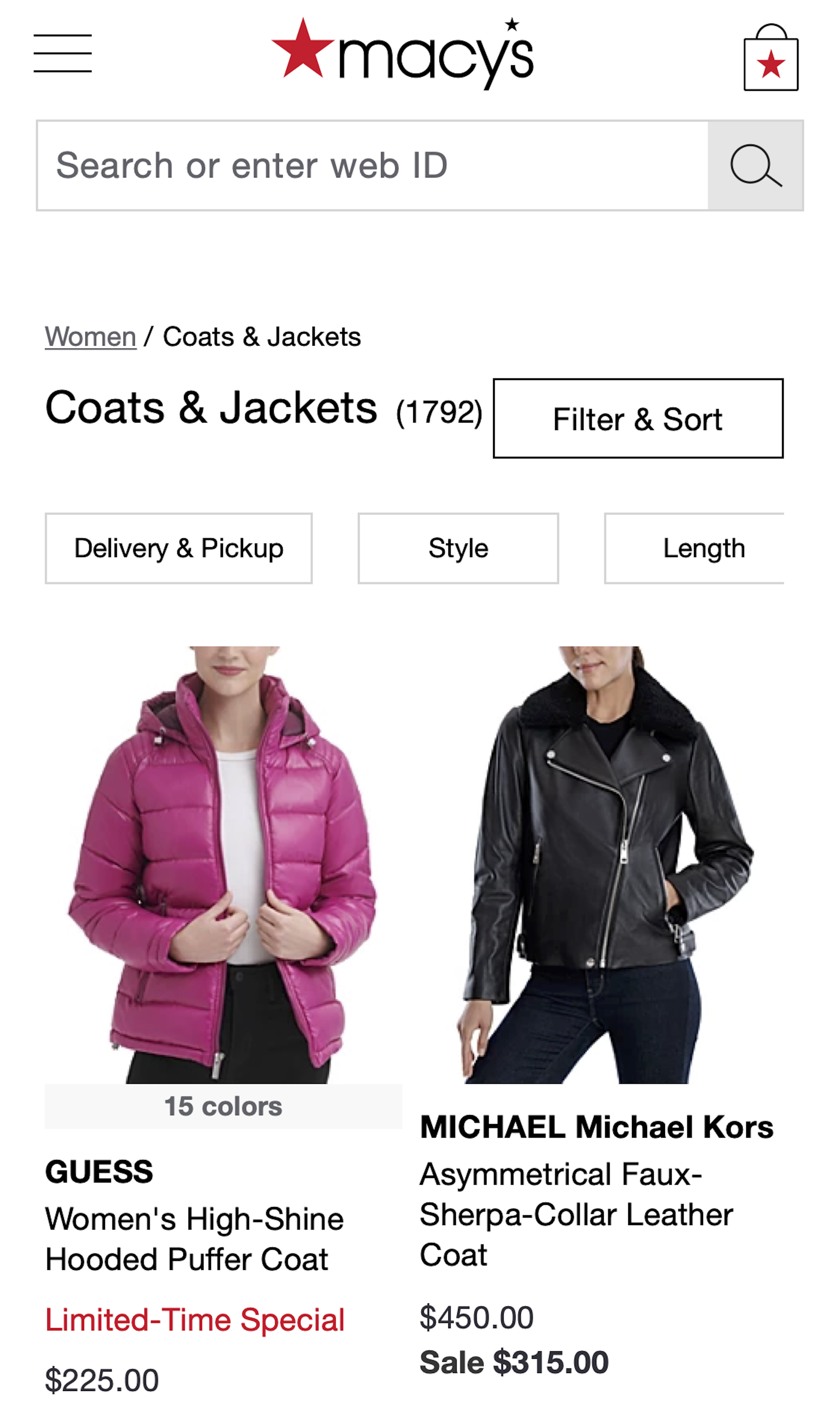
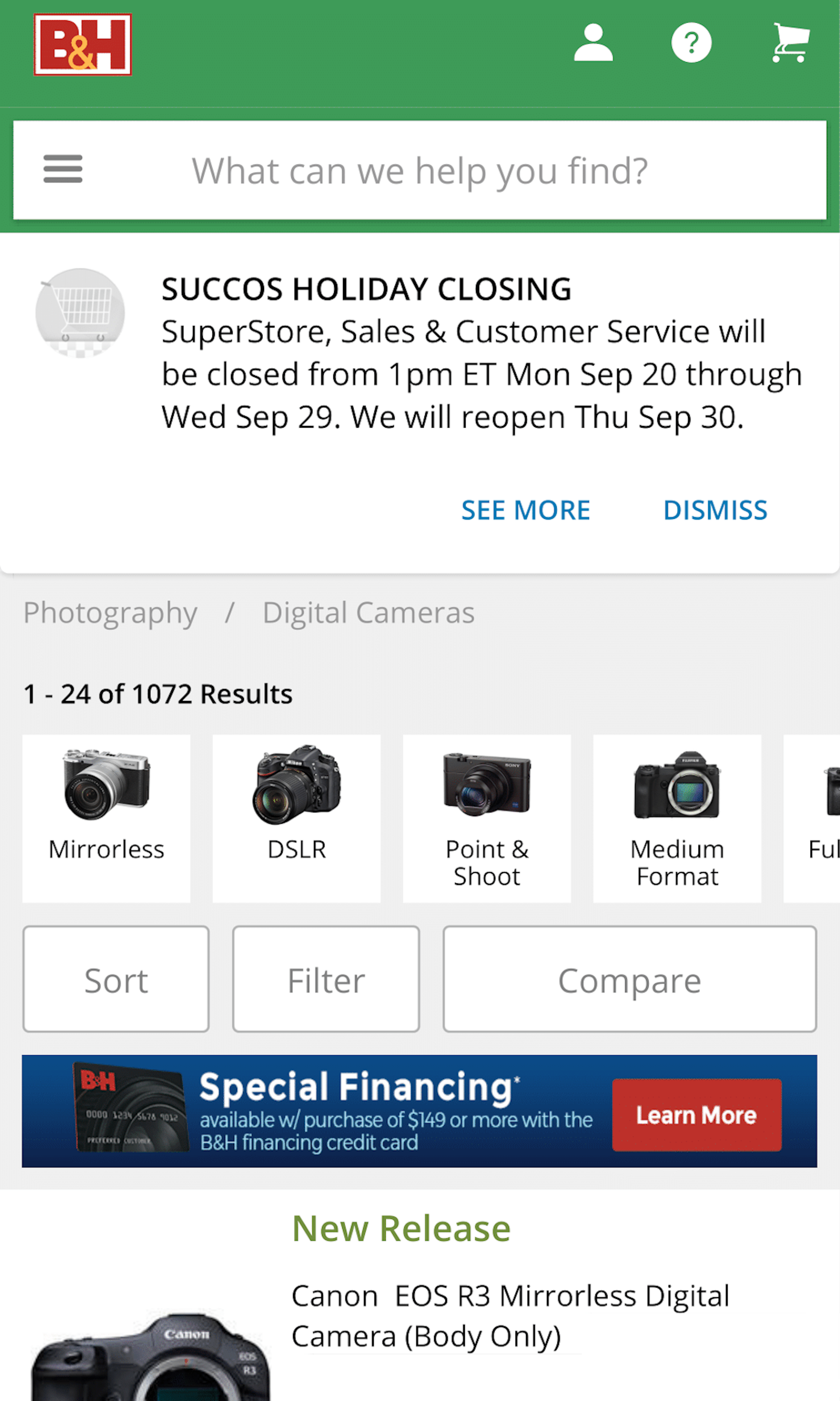
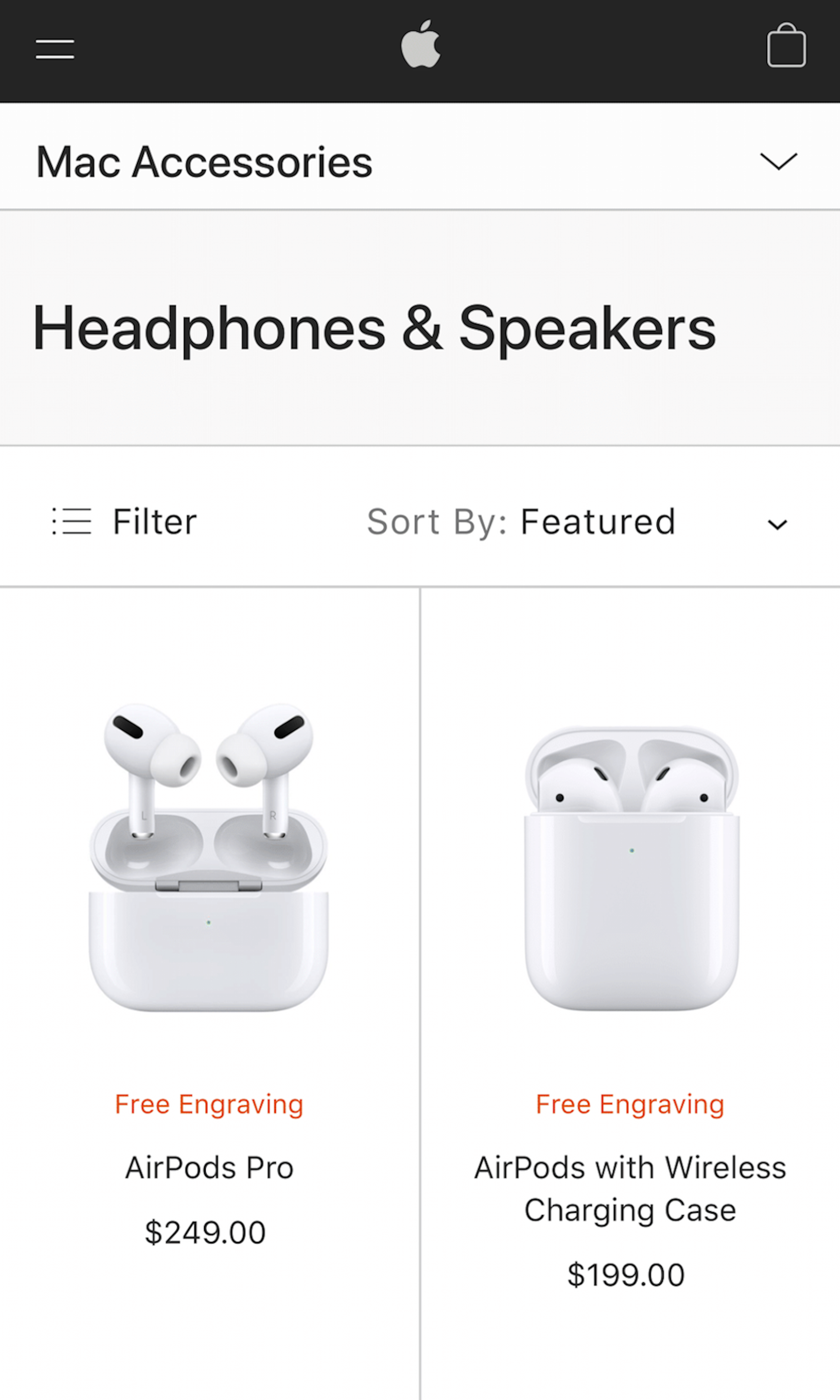
E-commerce product lists and their filtering and sorting tools determine how easy or difficult it is for the user to browse the site’s product catalog. The product list effectively dictates product presentation and provides the pathway to the right (or wrong) product page. During our large-scale usability testing, solely the design and features of the product listing page impacted users’ success rate in finding products they wanted to purchase by up to 400%. Product Lists are sometimes also referred to as “Product Listings Page” or abbreviated “PLP”.
More ‘Product Listings’ Insights
-
A balanced product list design provides users with a better overview of the products available and helps them more accurately determine which products to investigate further — essentially whether a list item’s product page is worth opening or if it should be skipped. This ensures that the scarce time users are on your site is spent on actually evaluating products they may want, rather than excessively navigating back-and-forth in a product list (also known as “pogo-sticking”).
-
Filtering is about empowering the user to take a large generic product list and narrow it down to a small manageable selection of products that is uniquely tailored to their needs and interests. It is about taking a product list with potentially thousands of items and weeding out all products that are irrelevant to the user until just a few handfuls of highly relevant items are left. Yet our extensive UX performance benchmarking shows that 34% have a poor filtering implementation, making it almost impossible for users to narrow down a generic list to include only (or mostly) suitable products.
-
Learn More: Besides exploring the 1263 “Product List: Category” page design examples below, you may also want to read our related article on “3 Pitfalls to Avoid if Implementing “Quick Views””, “5 Essential Filter Types Users Need on Product Listing Pages (57% Don’t Offer All 5)”, and “Display “Applied Filters” in an Overview (32% Don’t)”.
-
Get Full Access: To see all of Baymard’s product list and filtering research findings you’ll need Baymard Premium access. (Premium also provides you full access to 200,000+ hours of UX research findings, 650+ e-commerce UX guidelines, and 275,000+ UX performance scores.)


User Experience Research, Delivered Weekly
Join 60,000+ UX professionals and get a new UX article every week.

User Experience Research, Delivered Weekly
Join 60,000+ UX professionals and get a new UX article every week.
Explore Other Research Content
300+ free UX articles based on large-scale research.

327 top sites ranked by UX performance.

Code samples, demos, and key stats for usability.