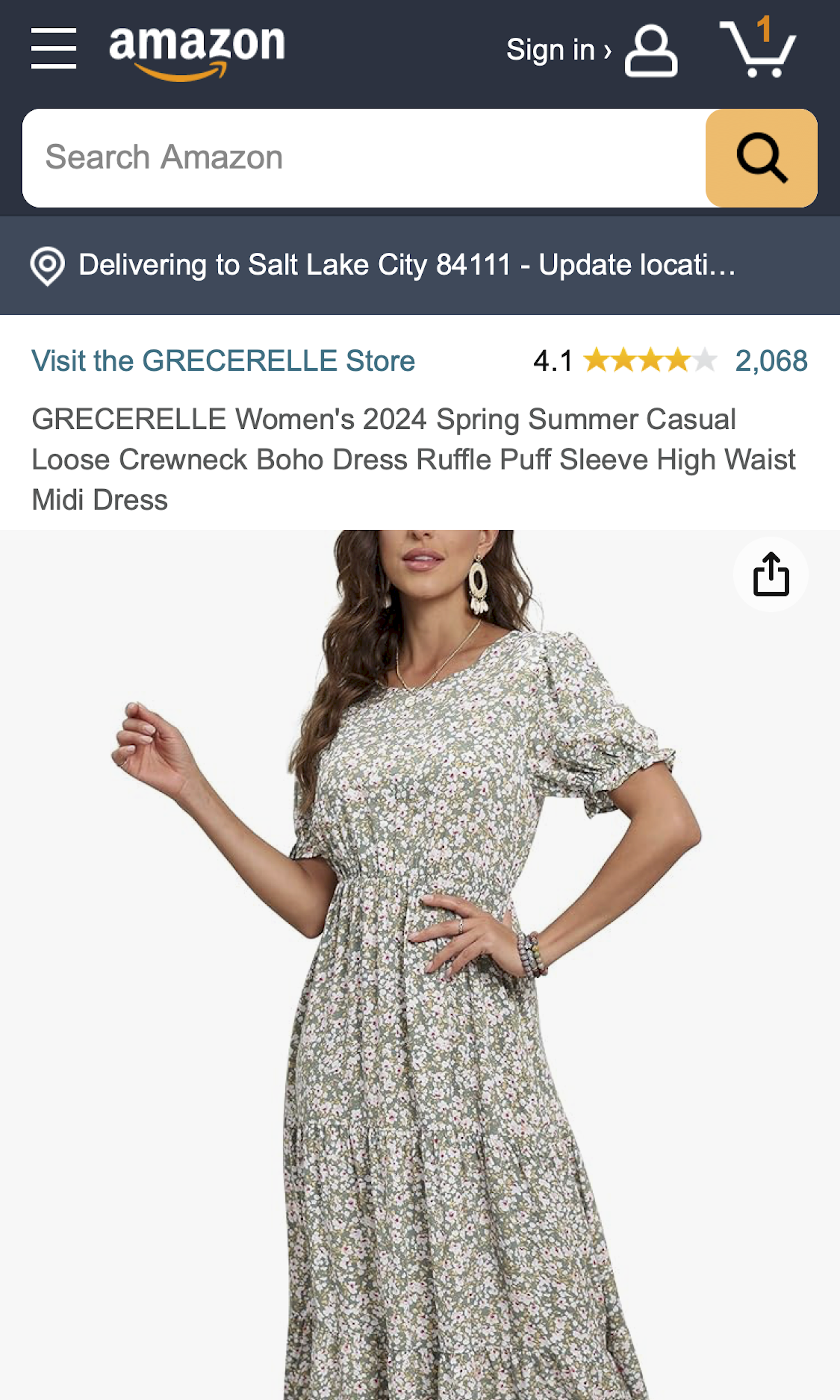
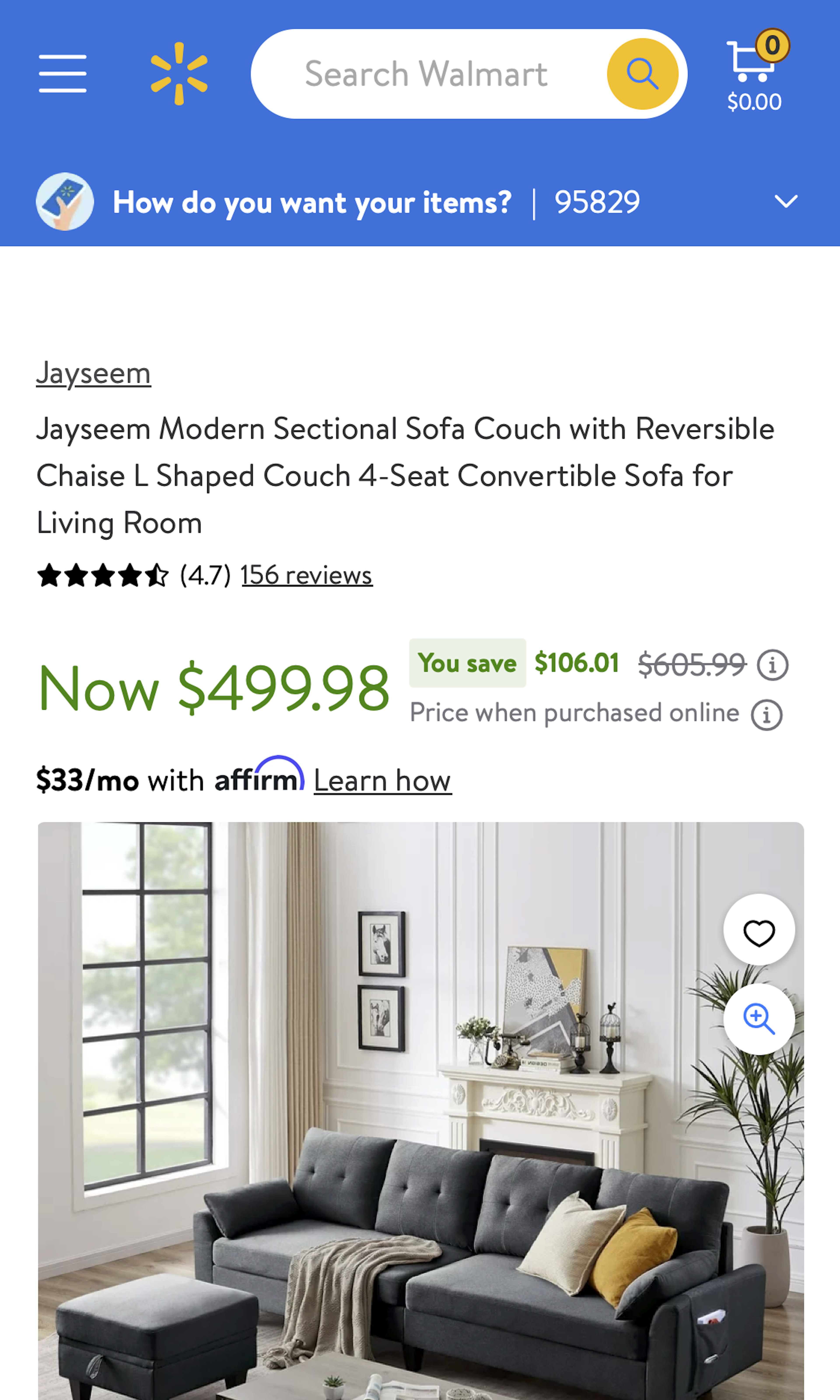
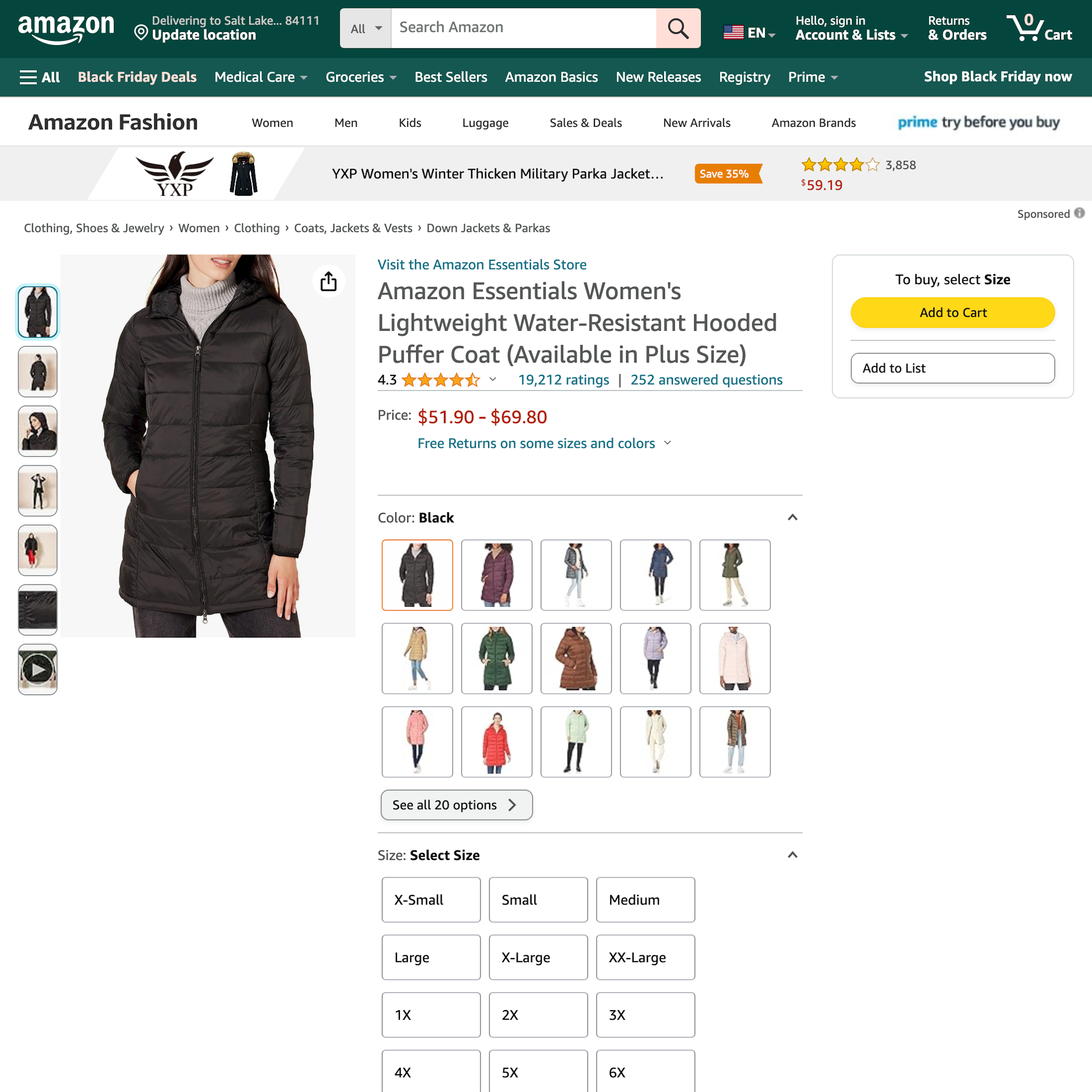
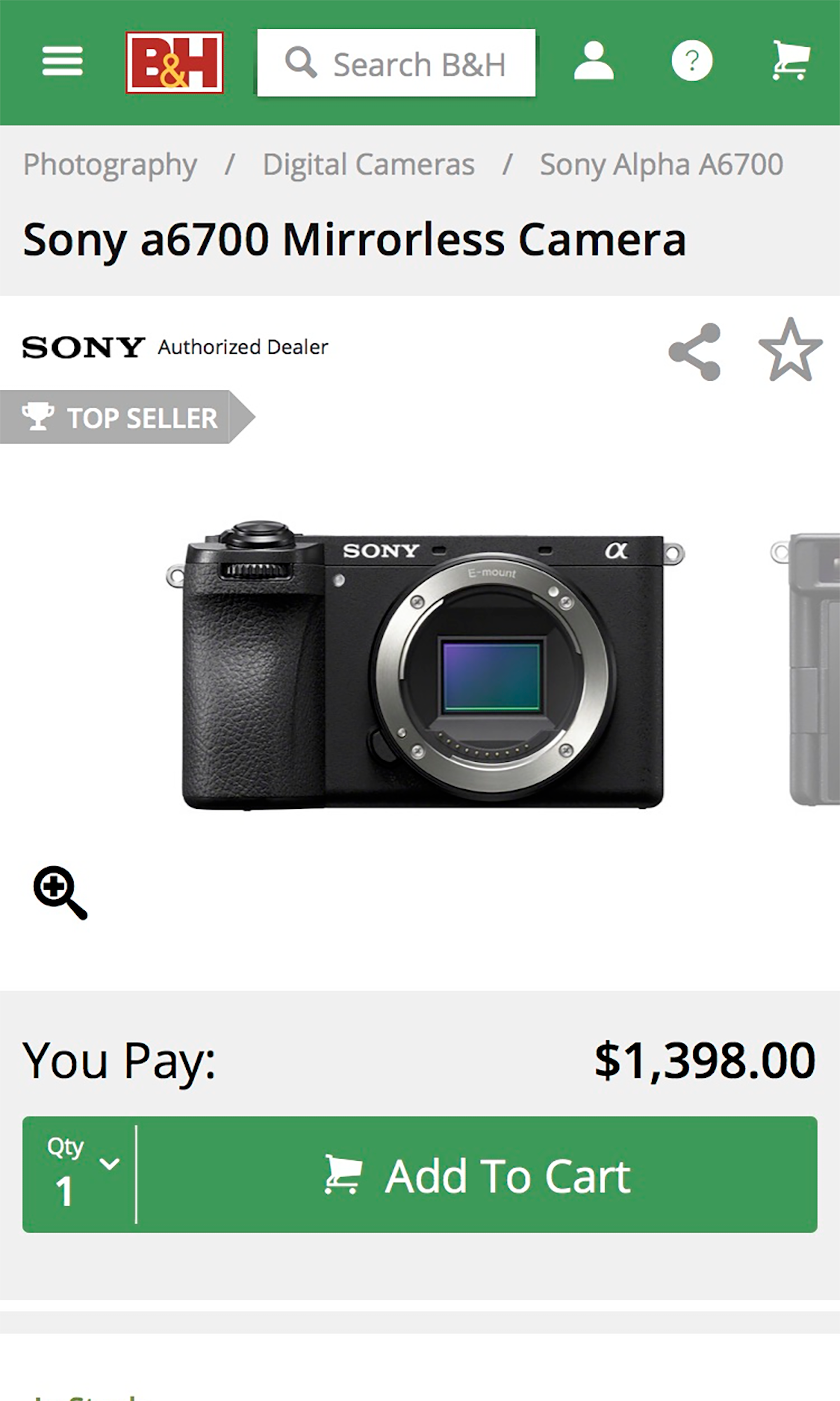
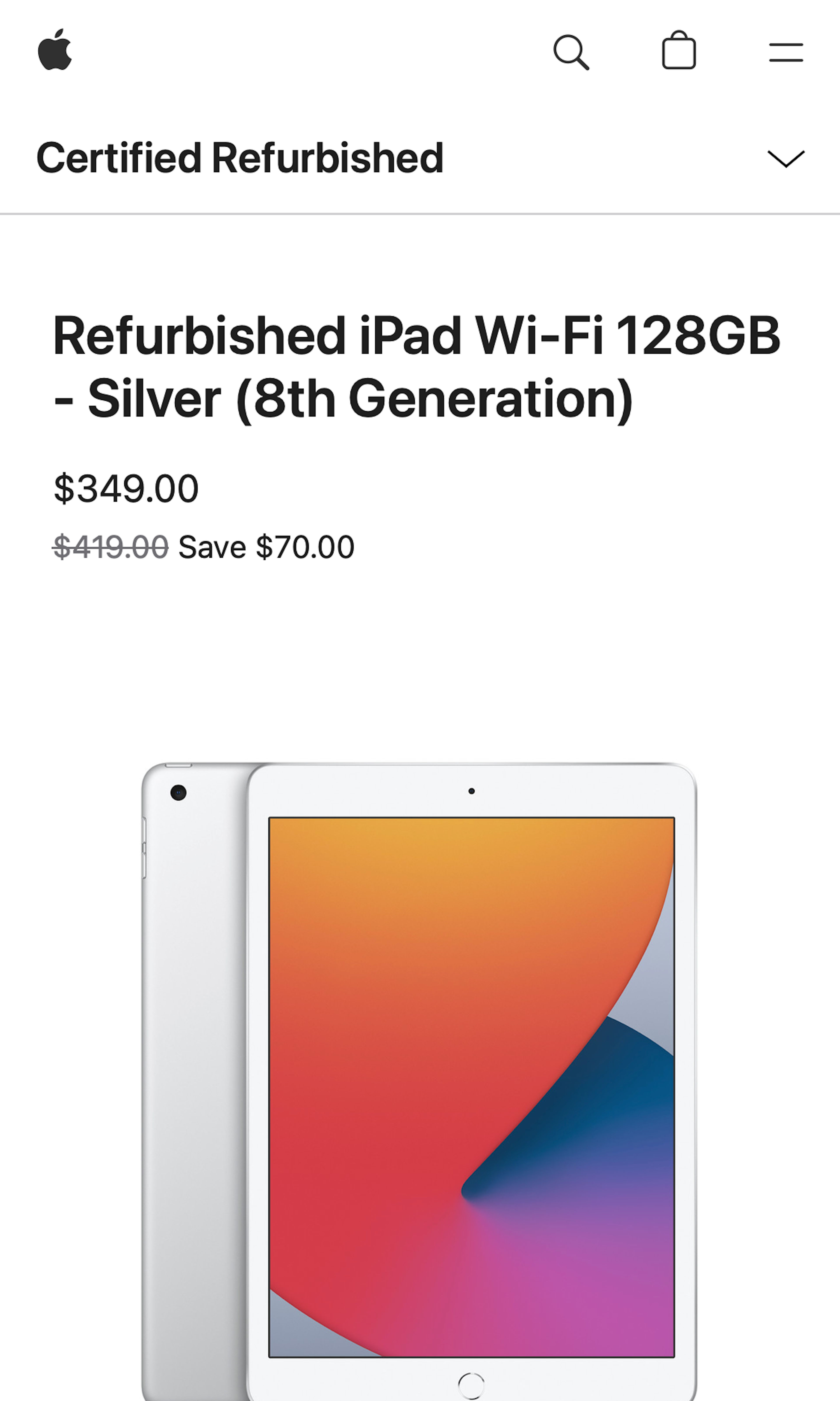
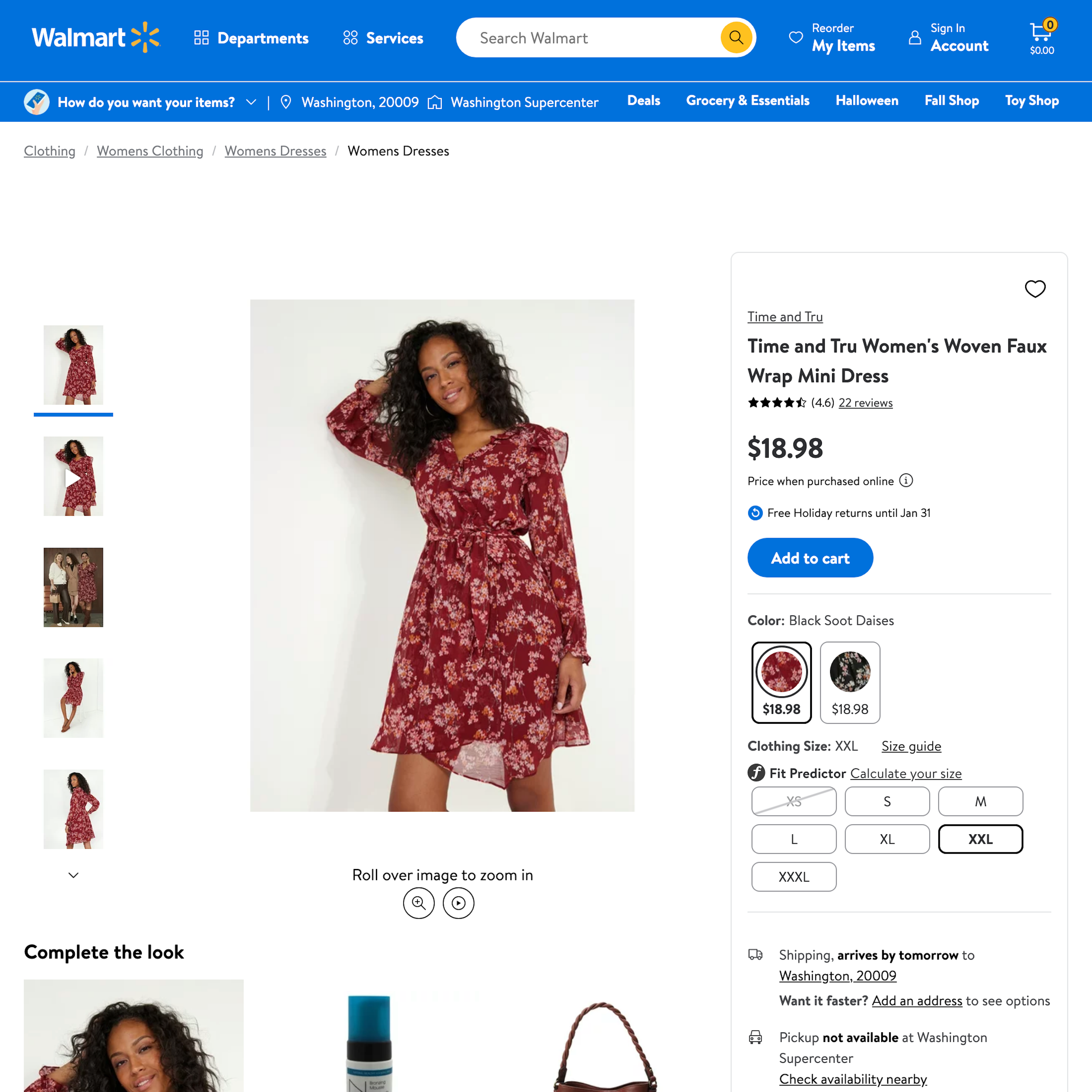
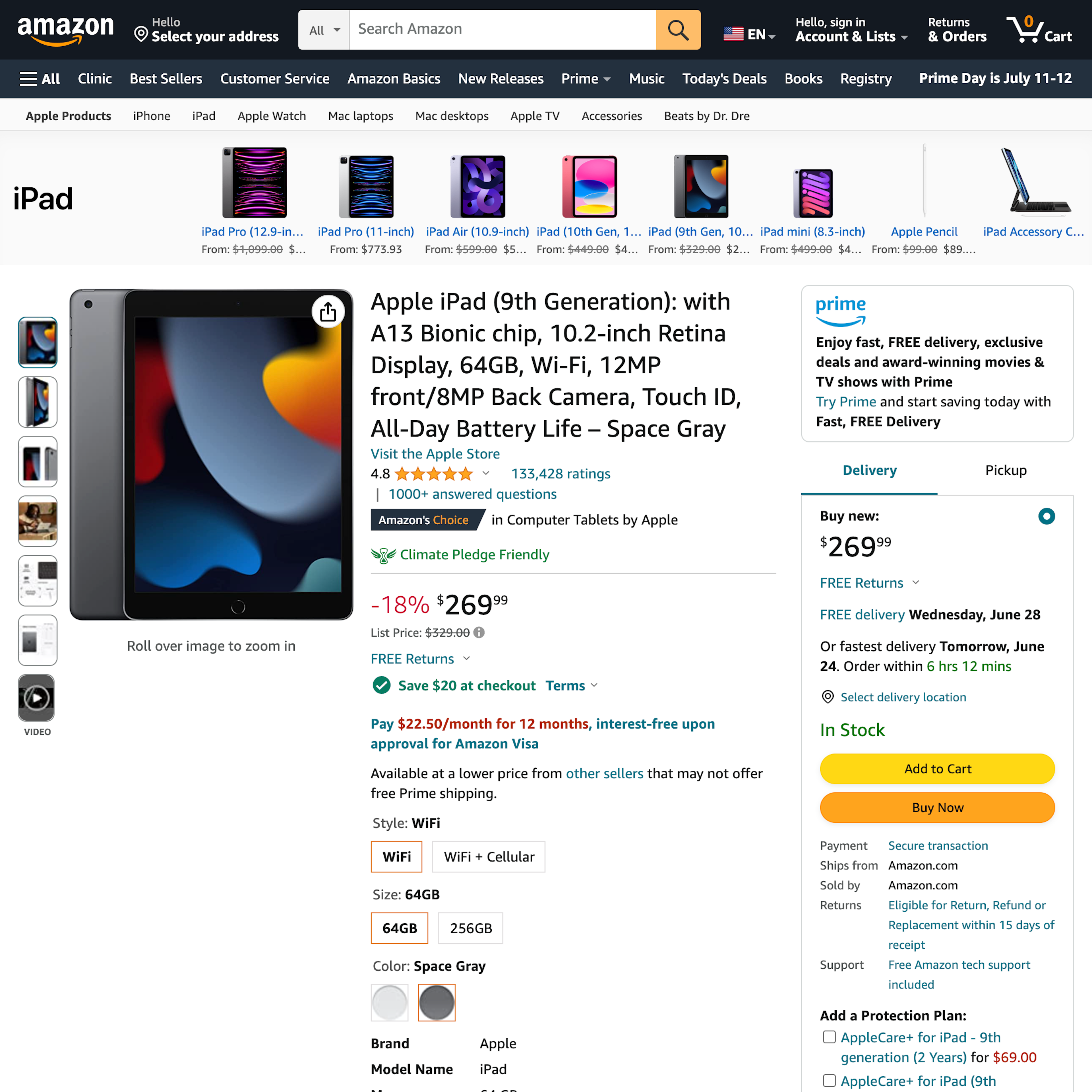
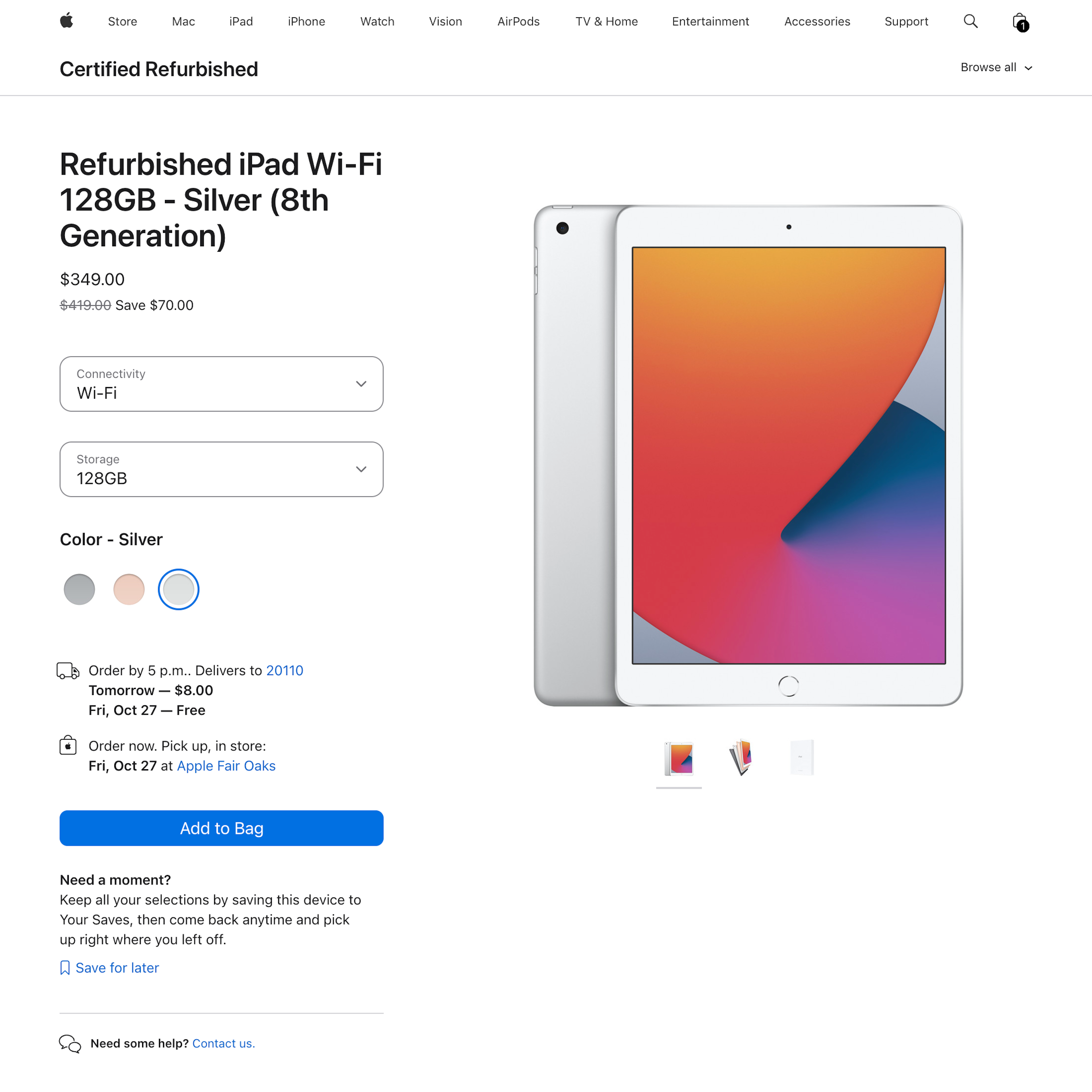
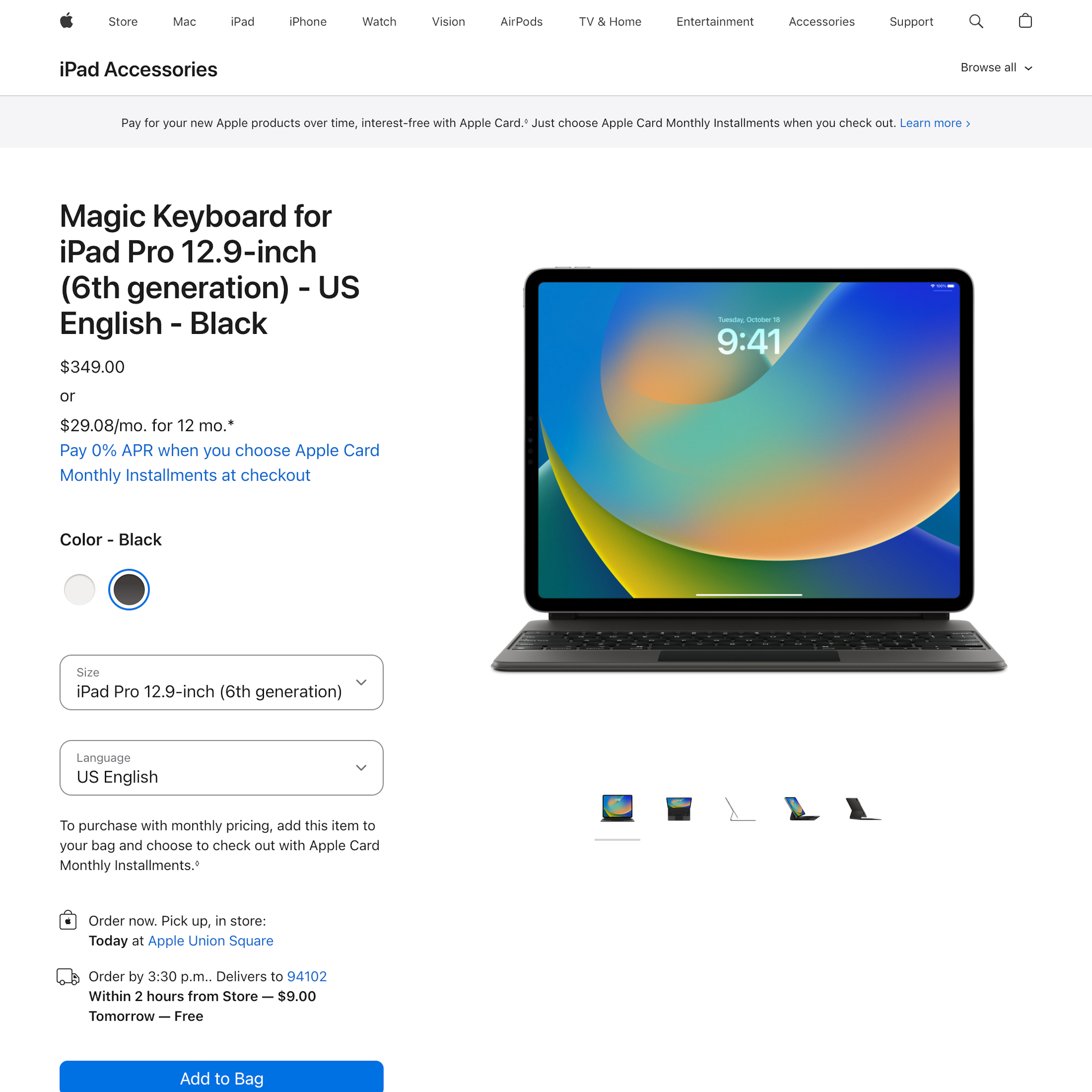
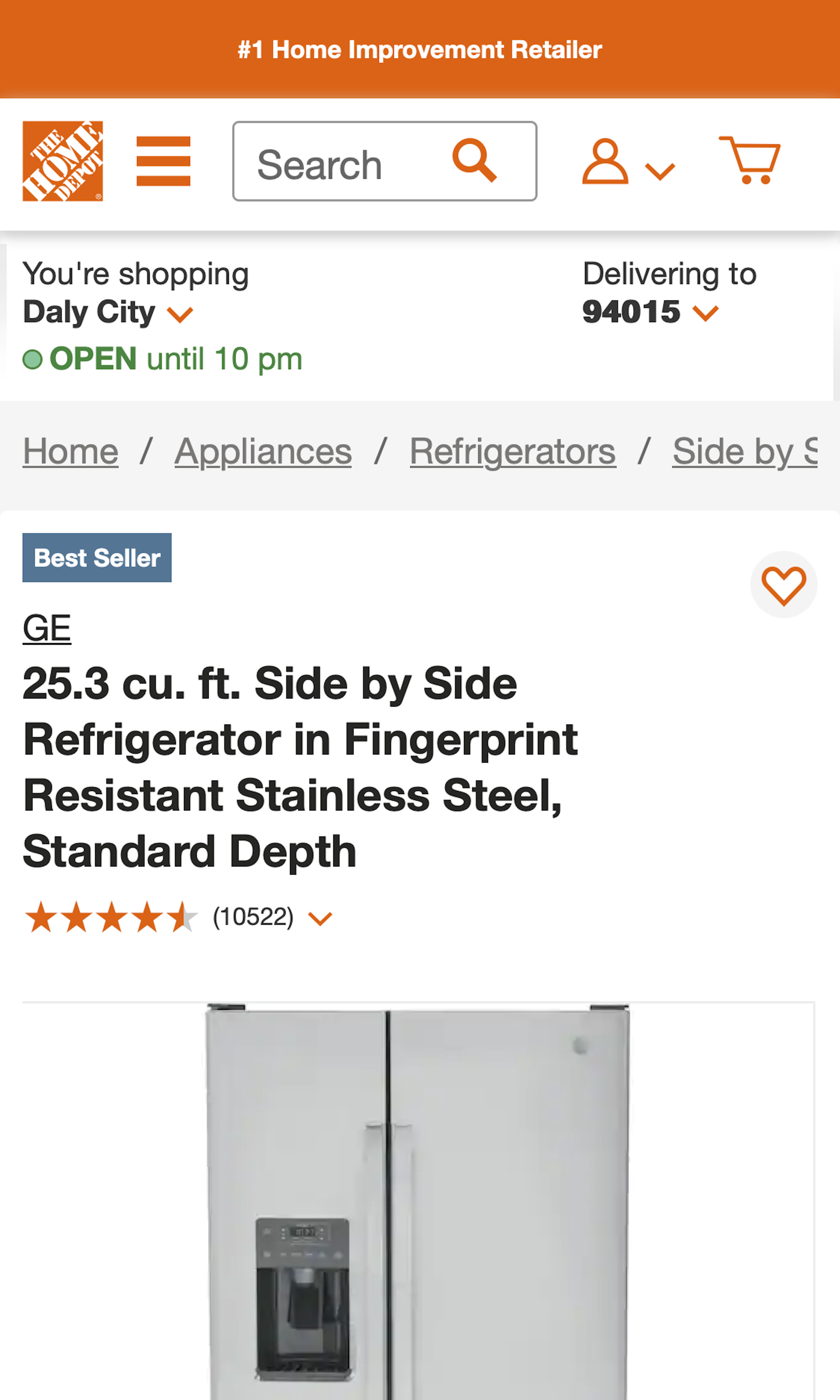
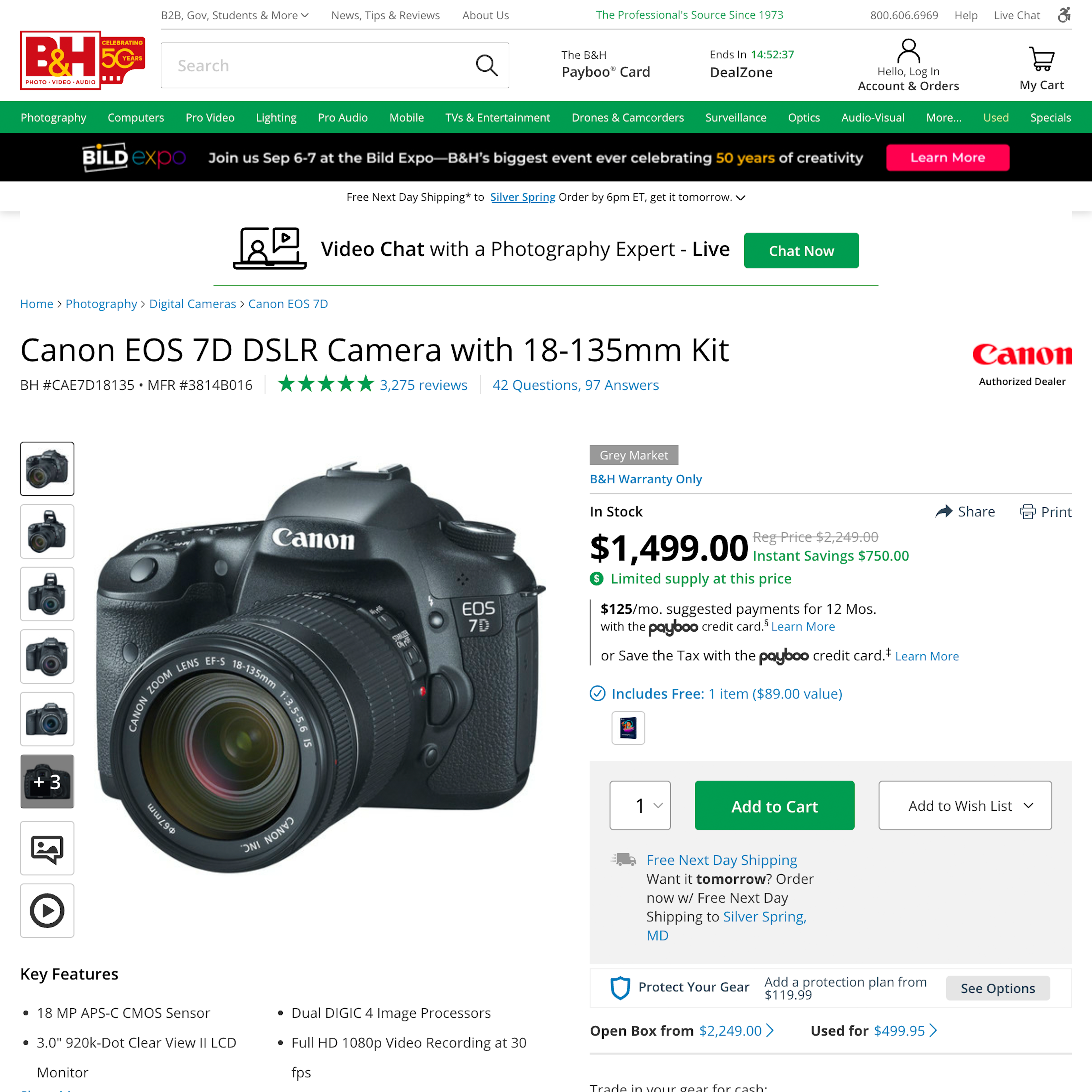
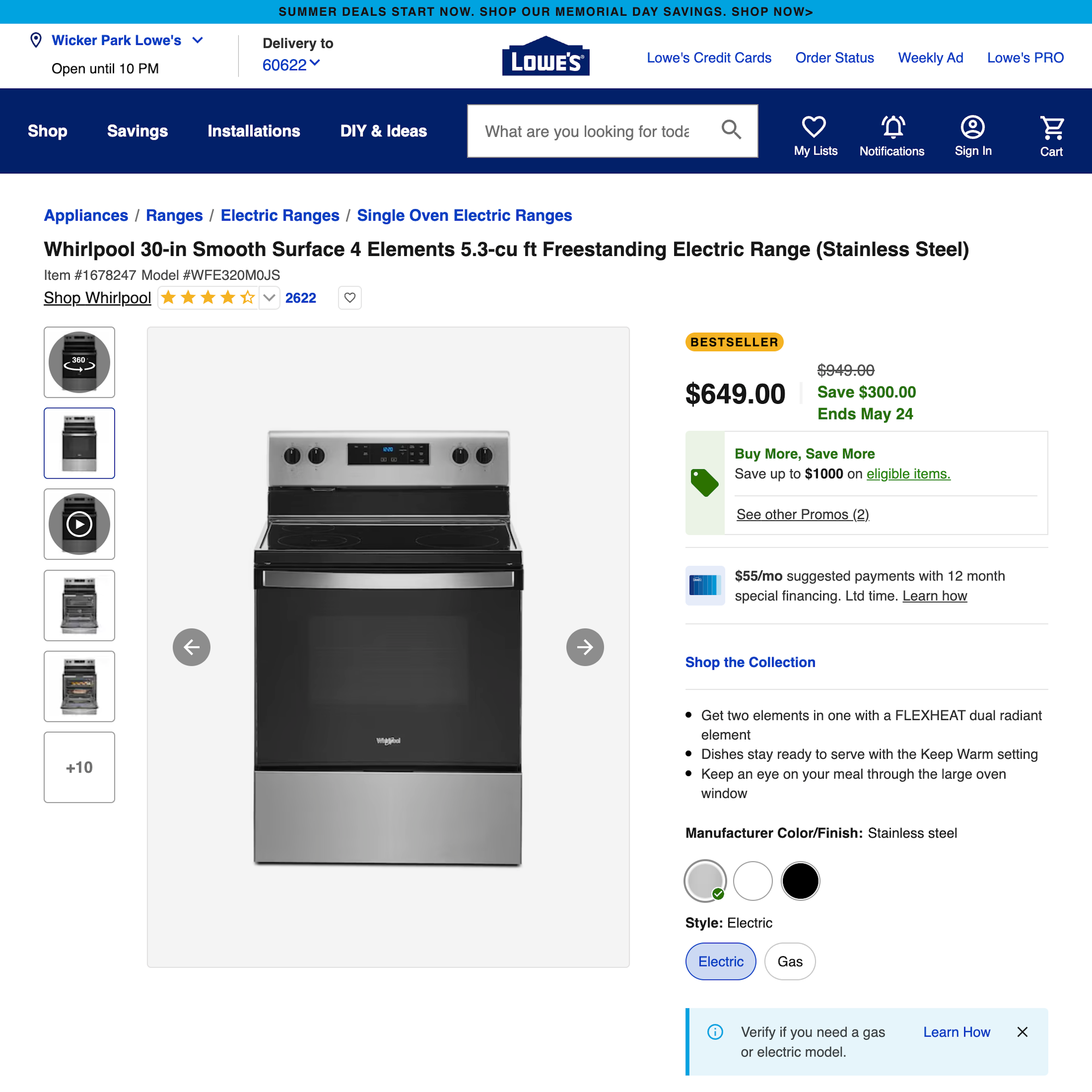
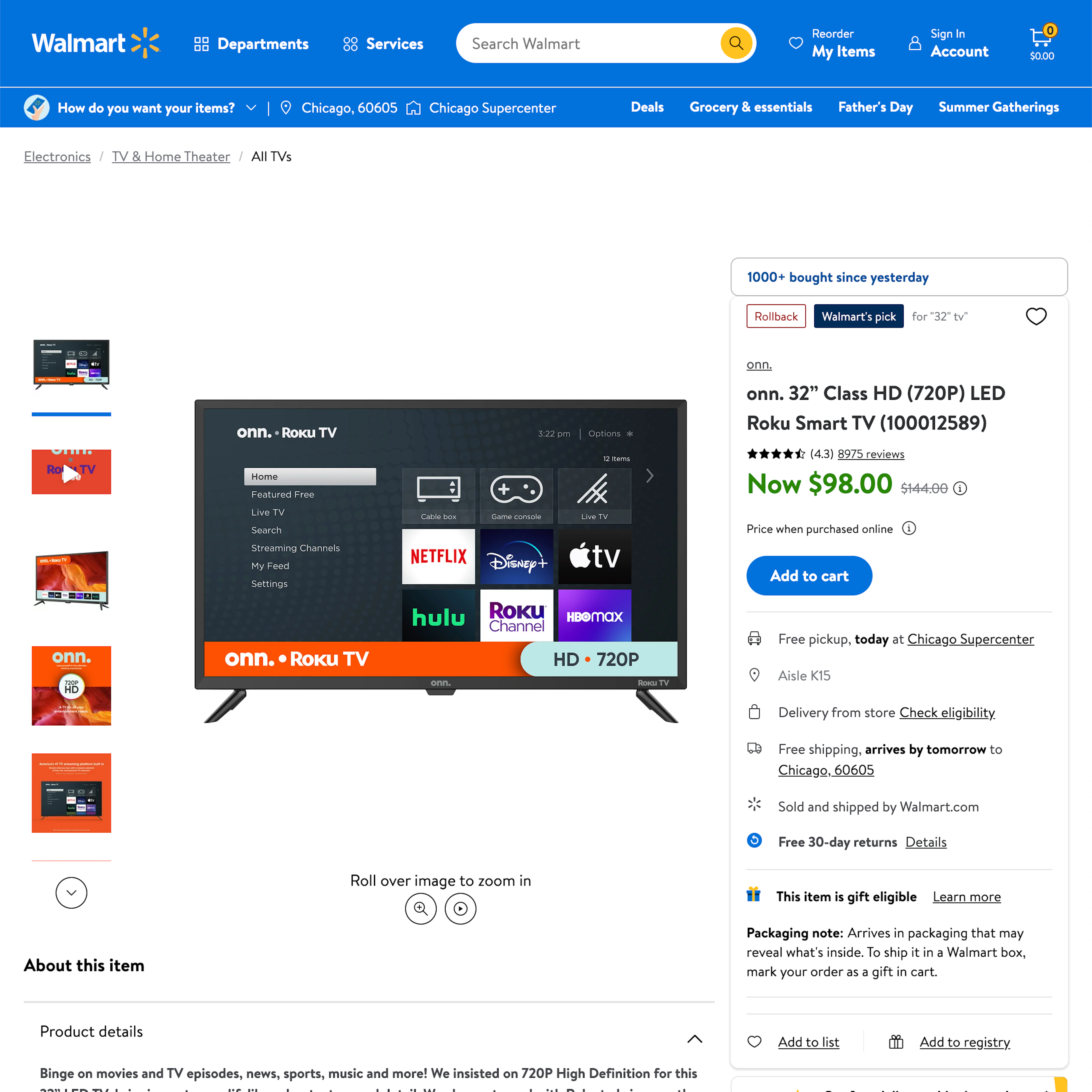
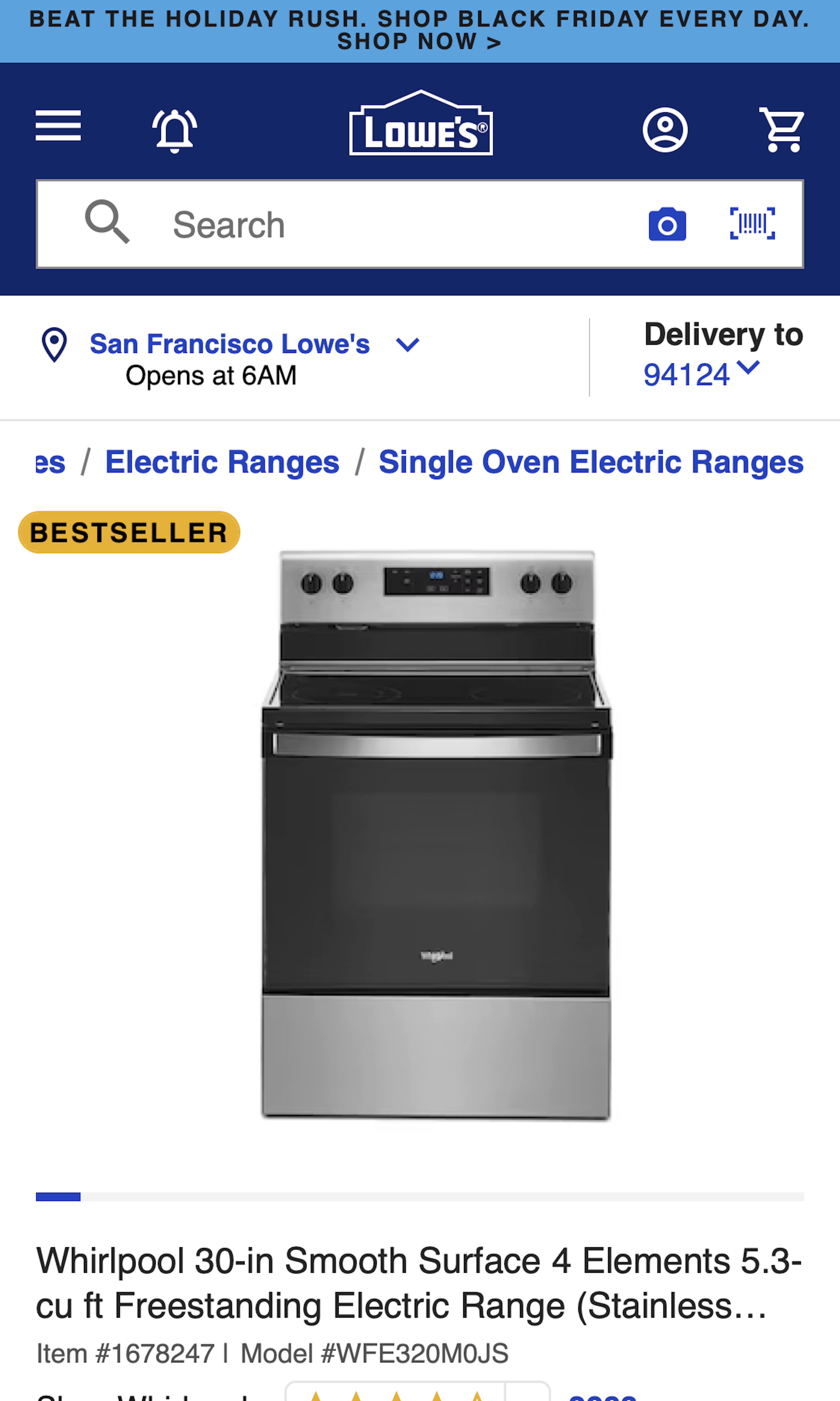
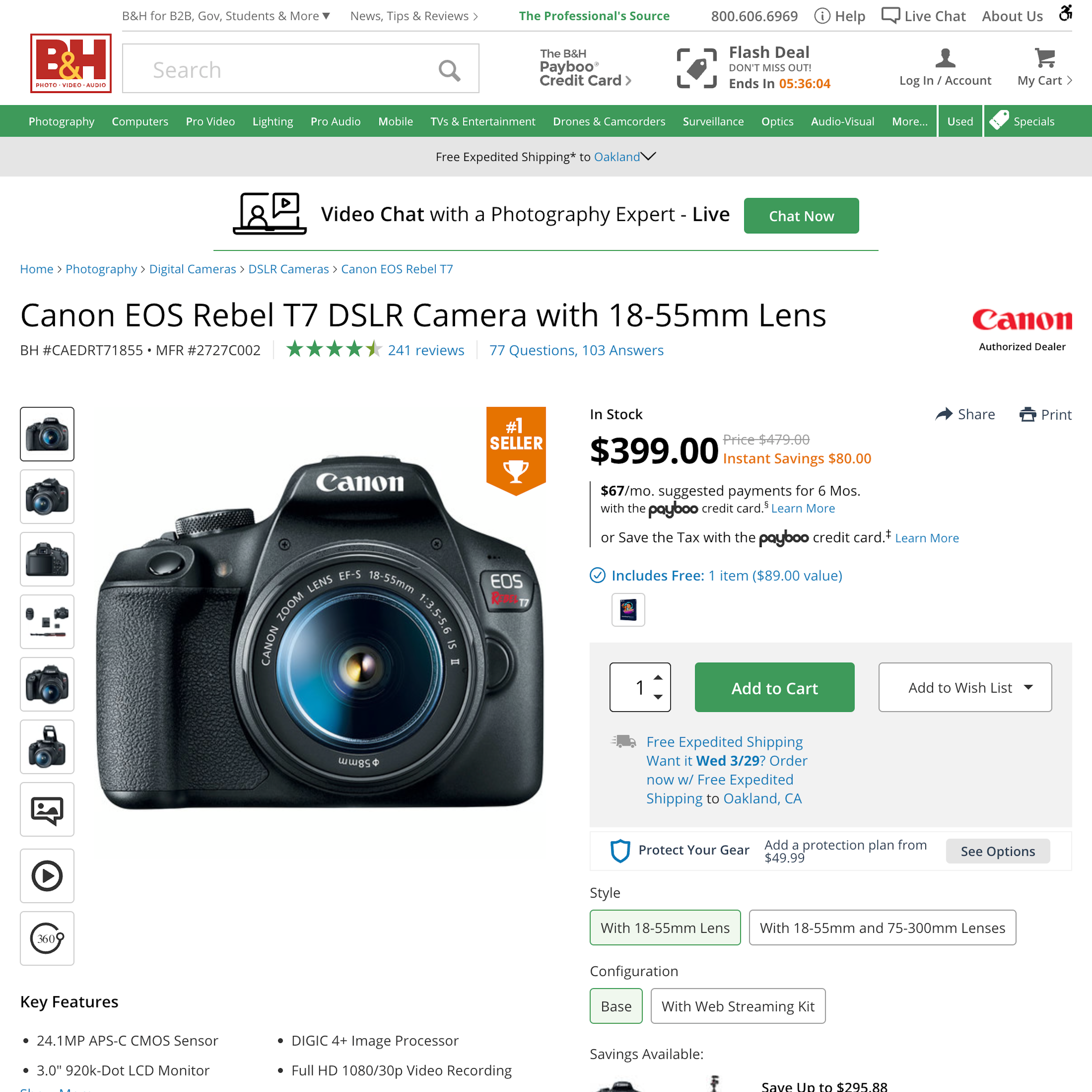
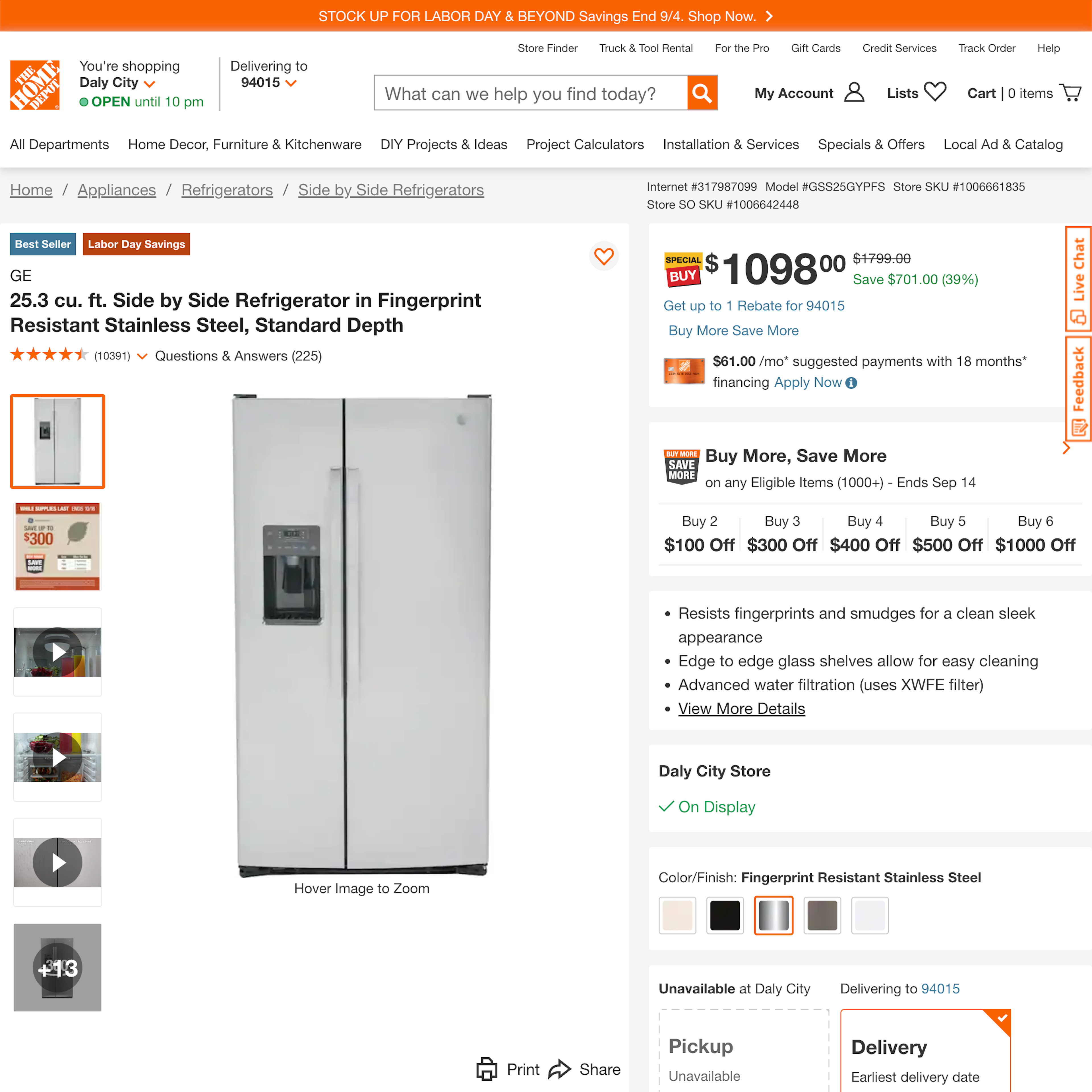
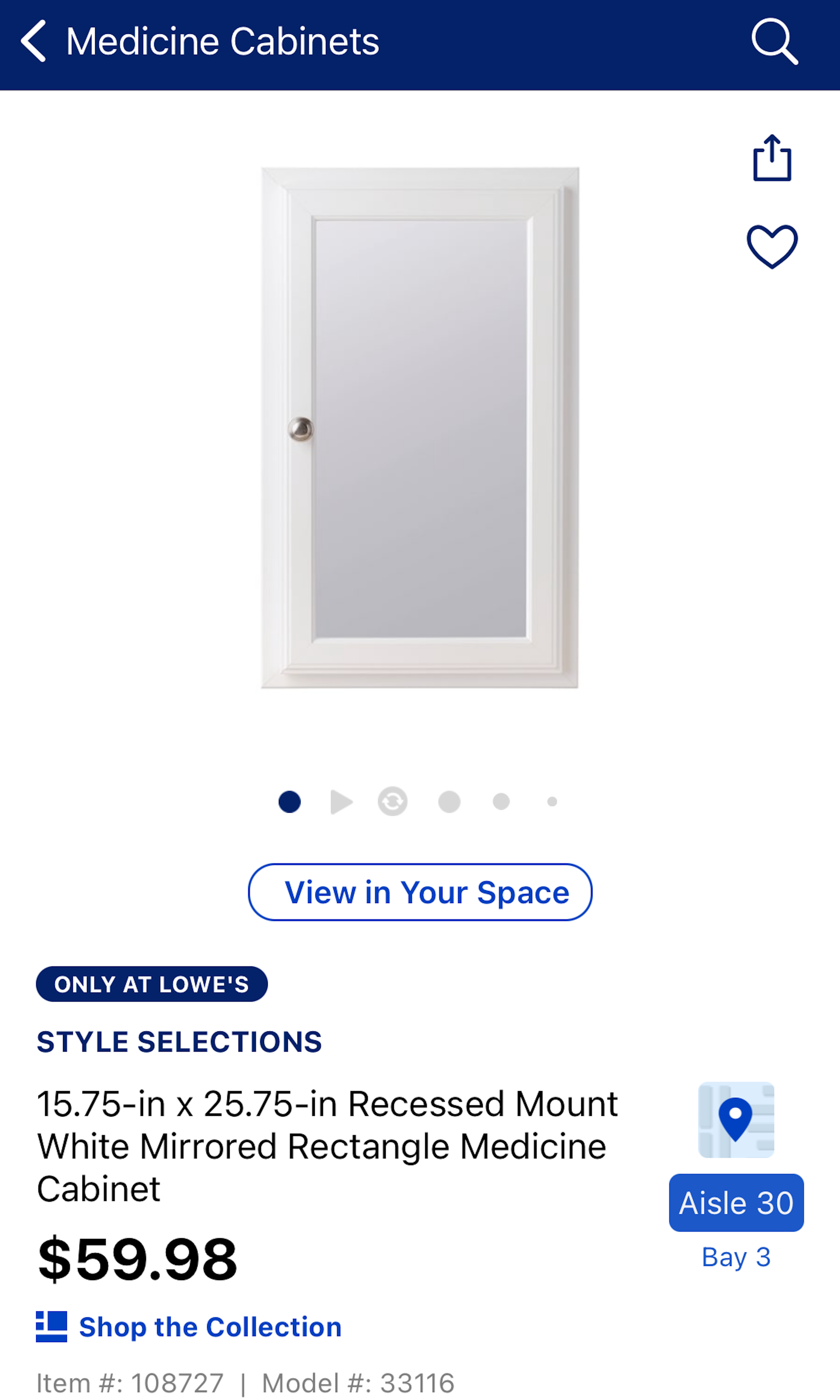
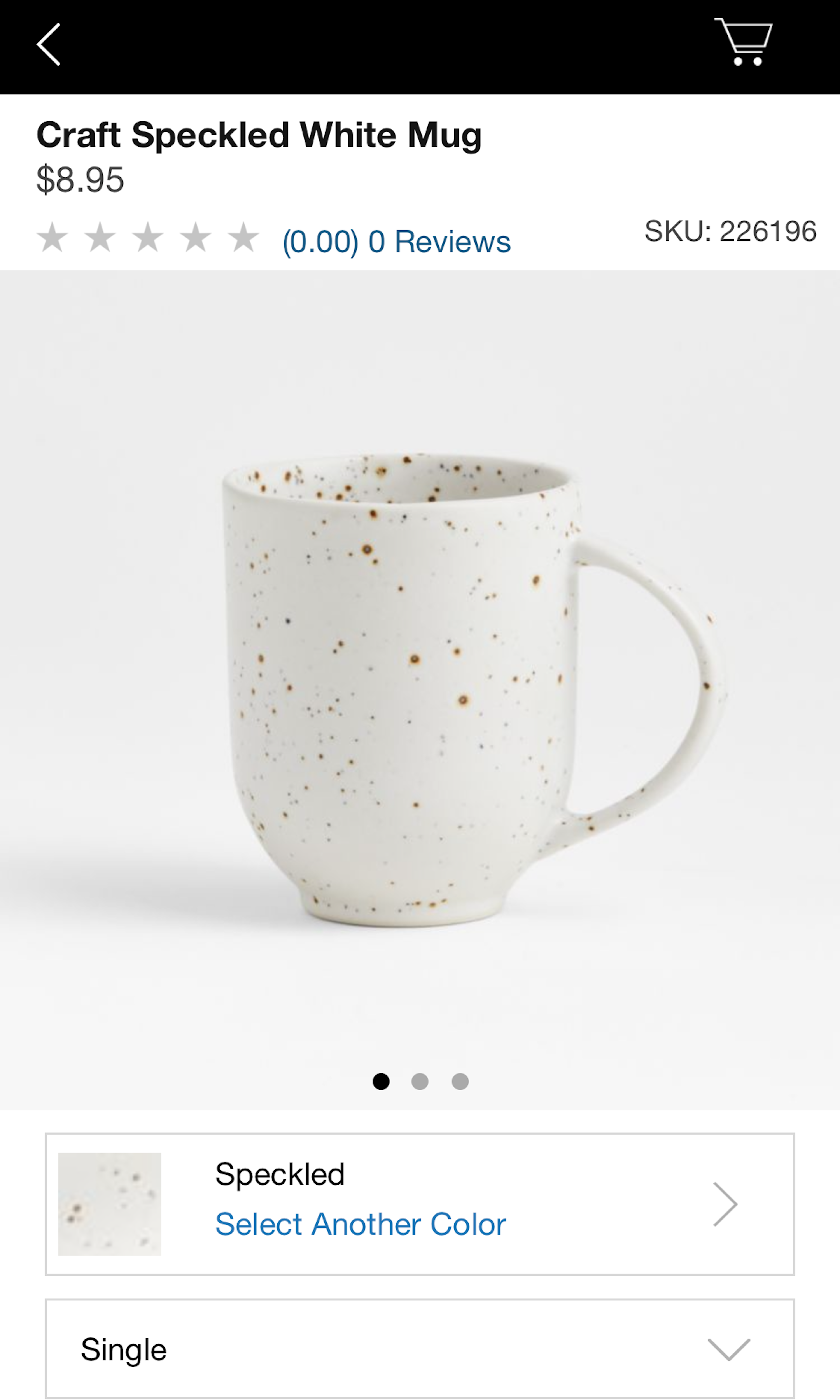
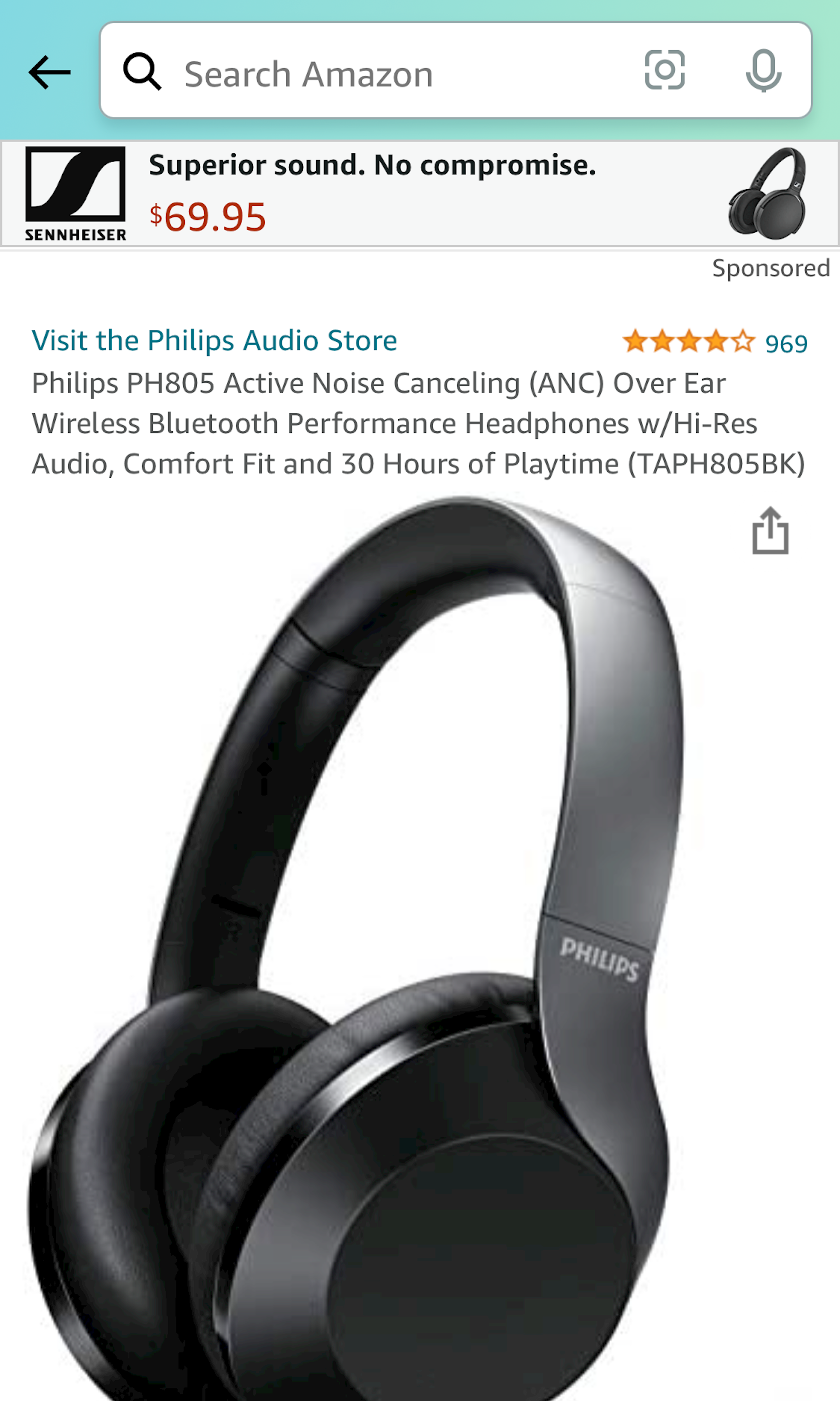
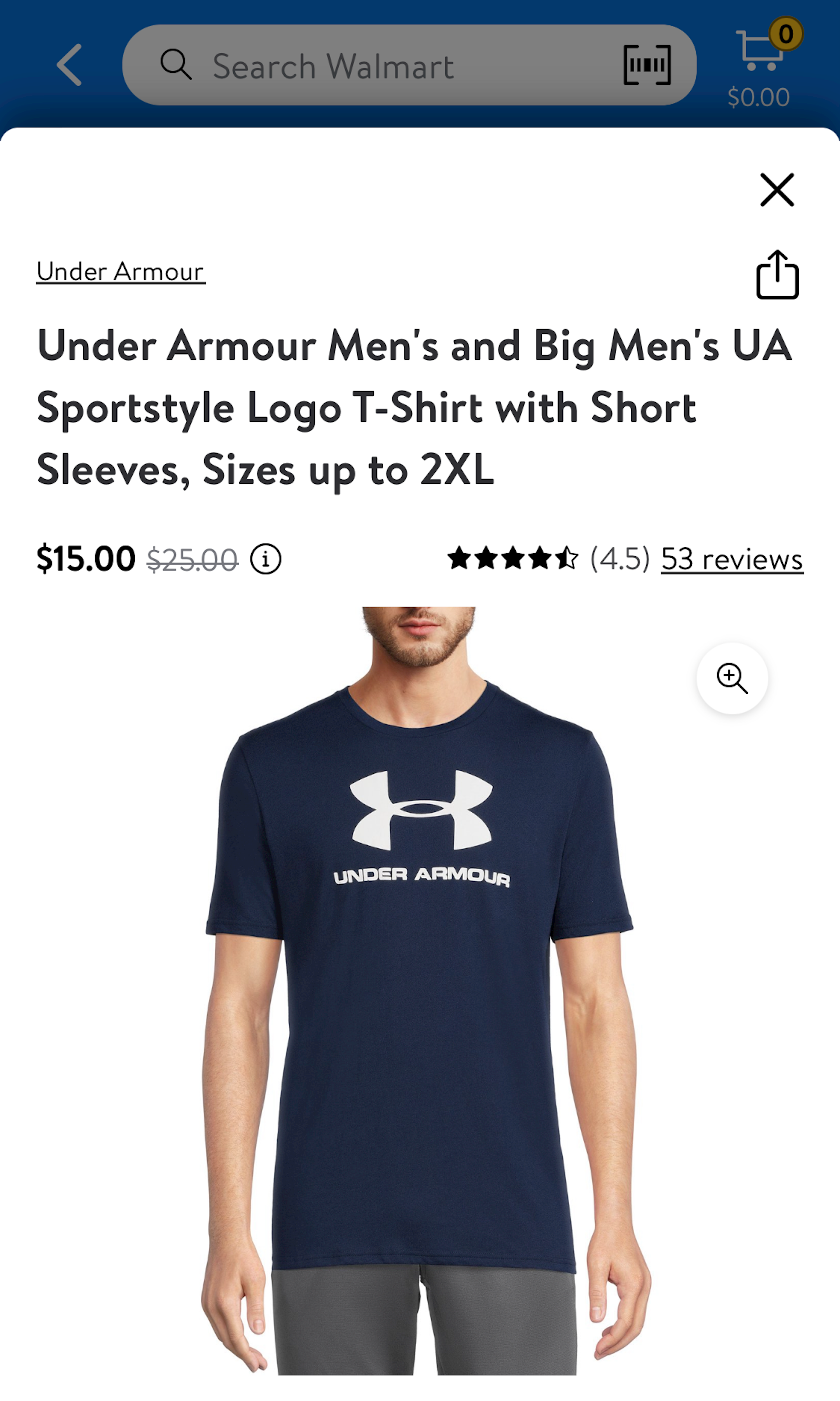
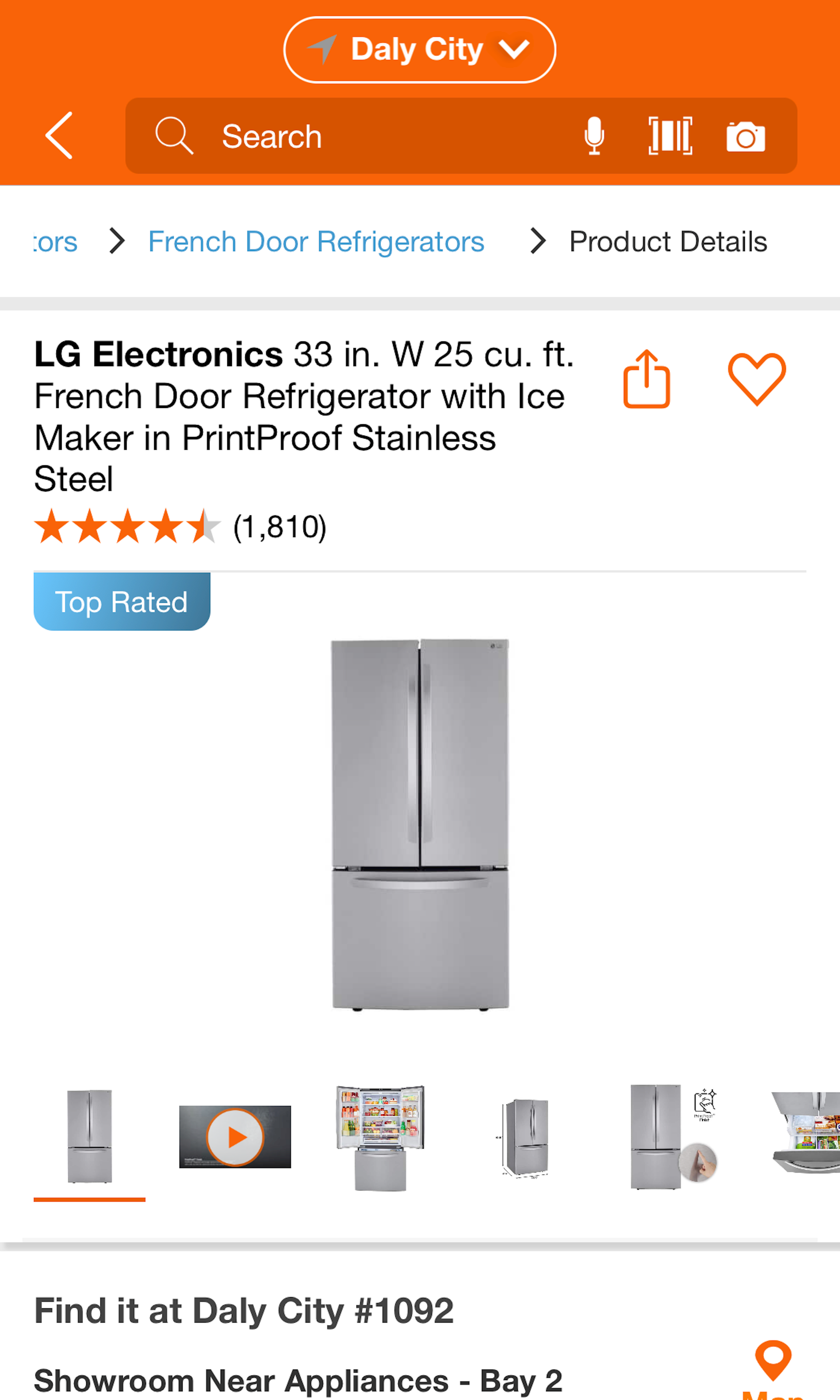
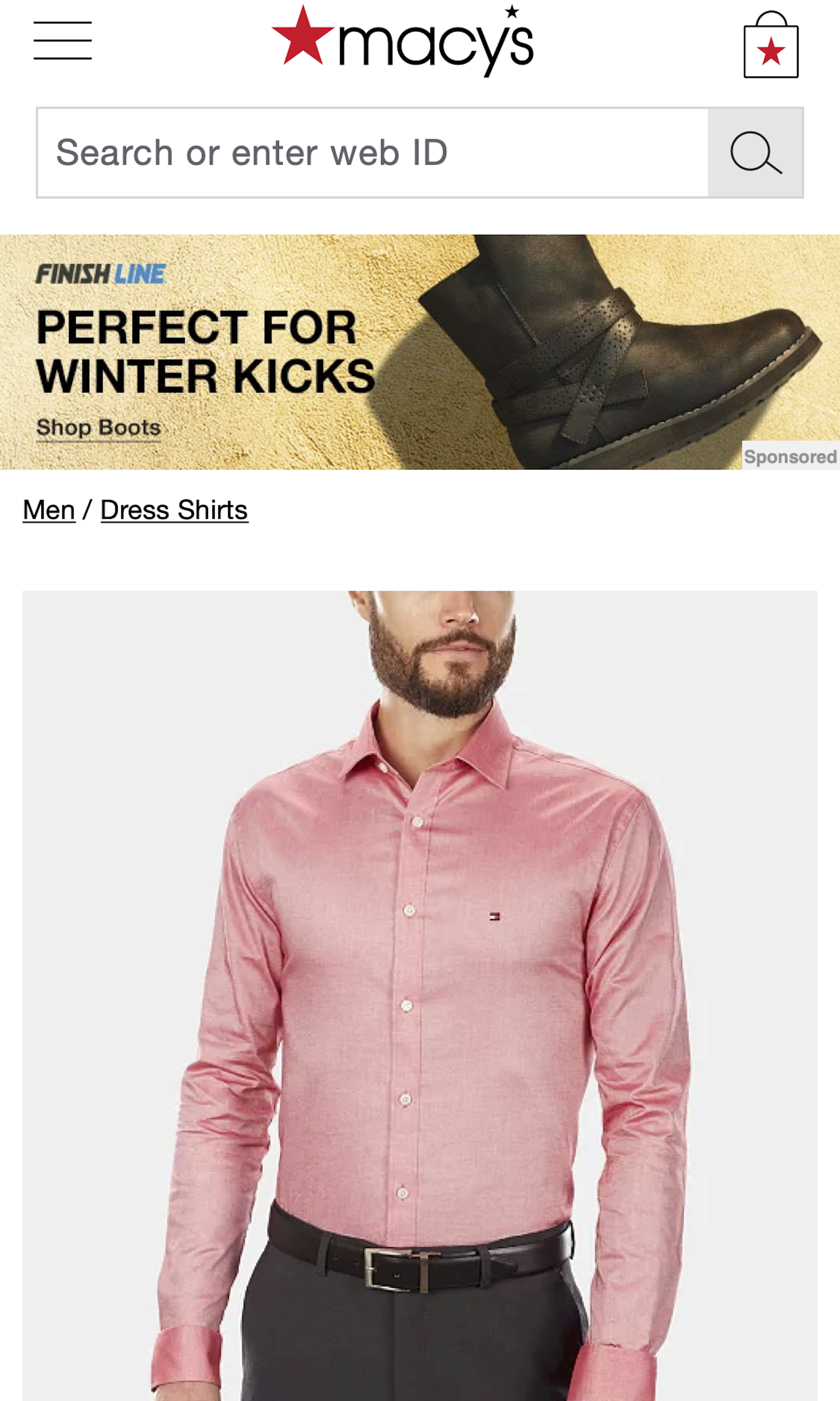
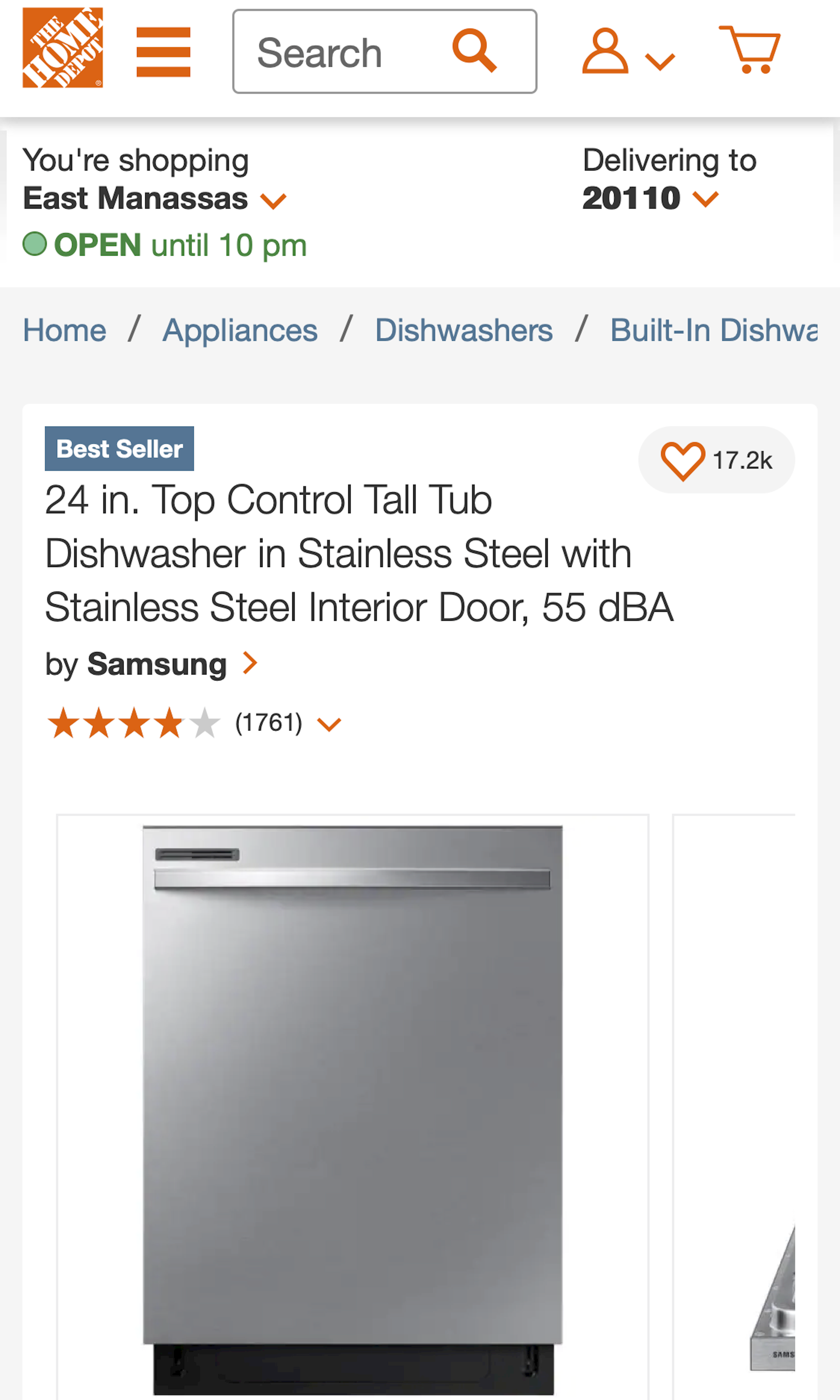
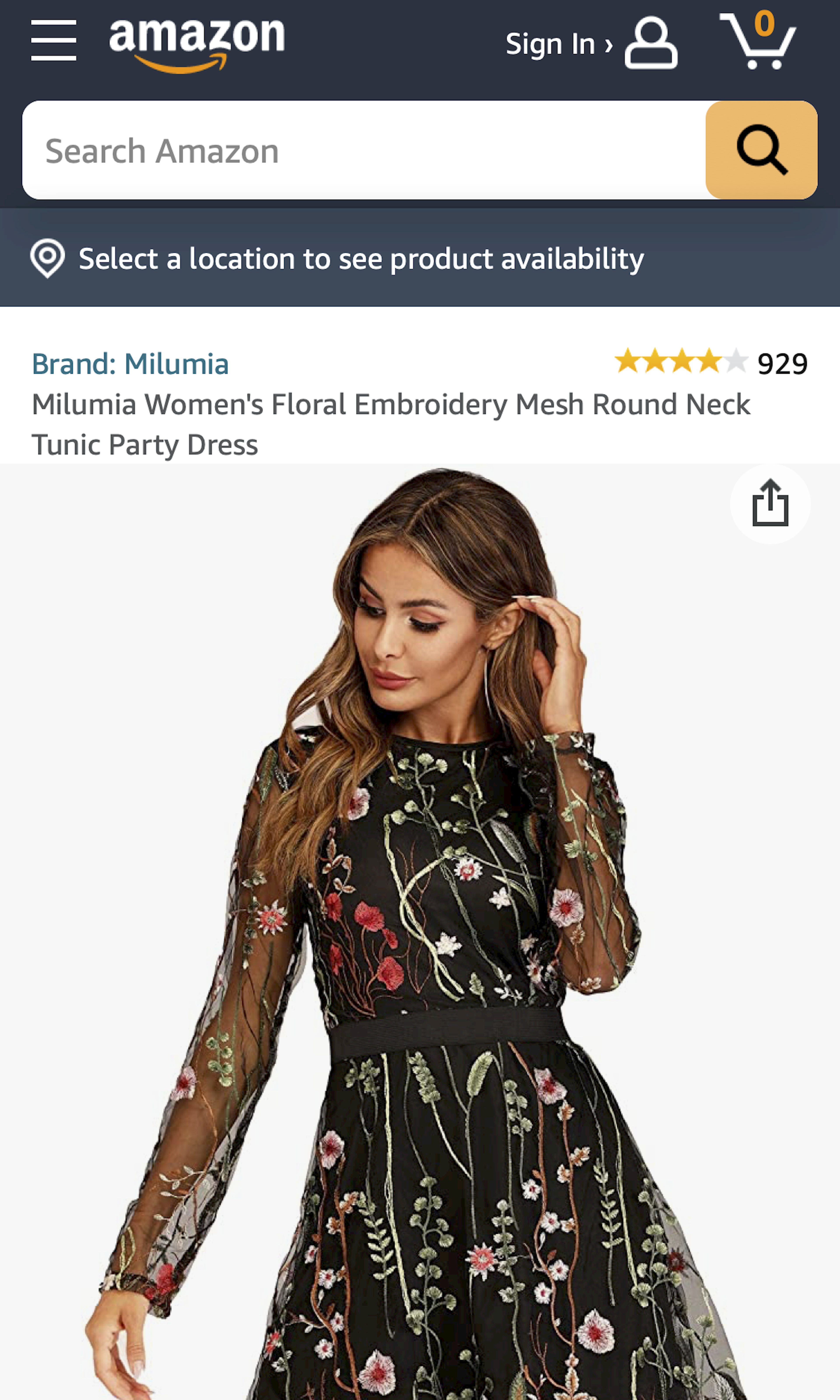
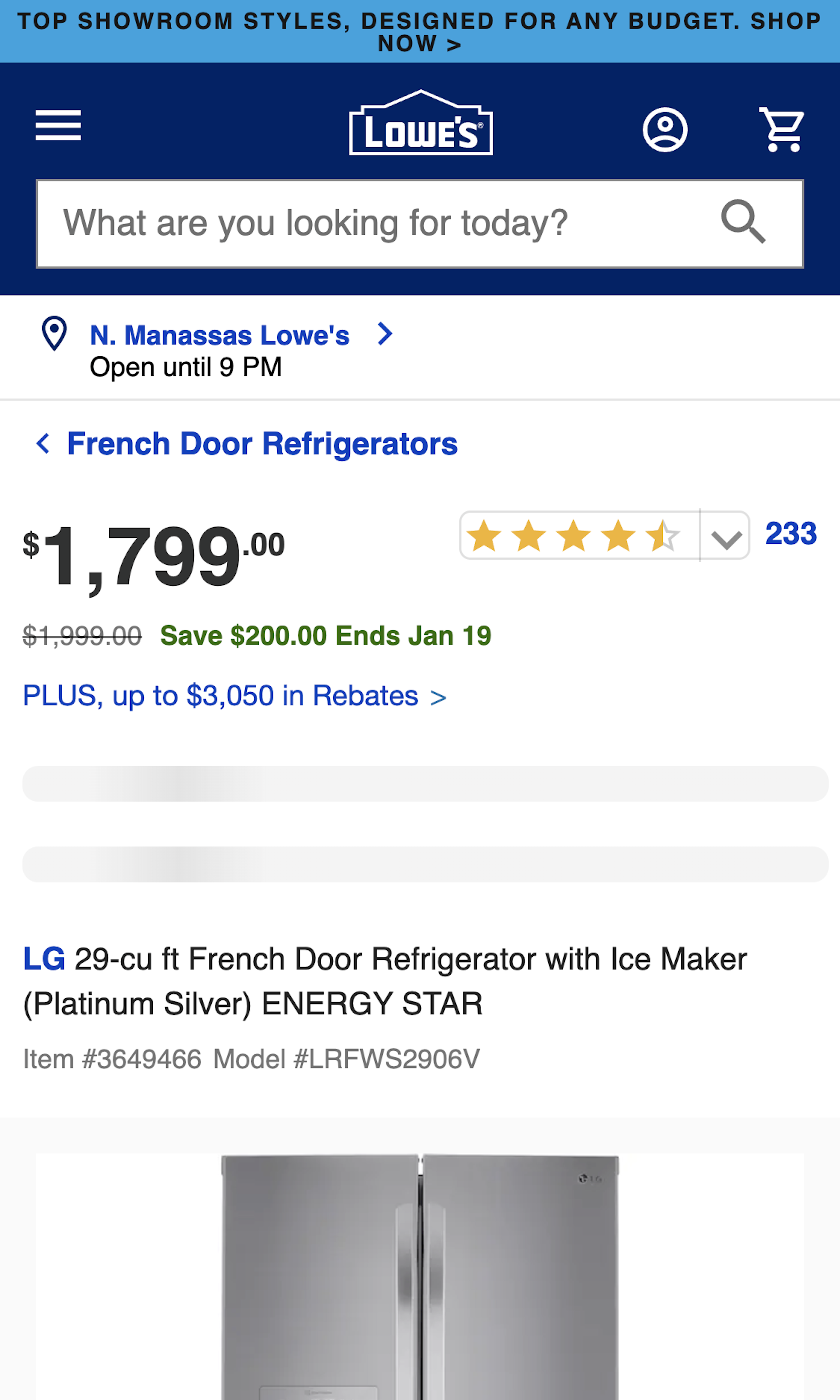
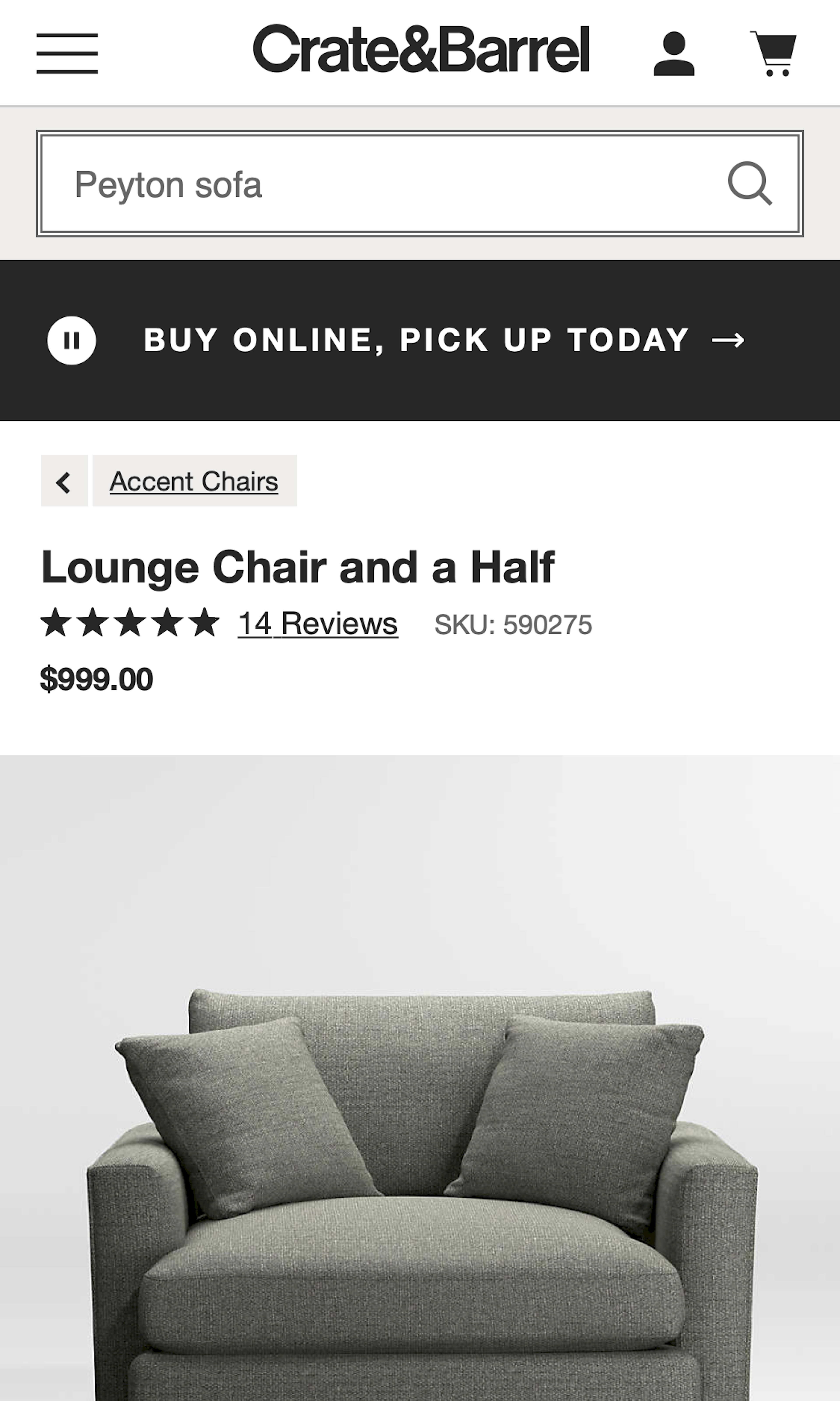
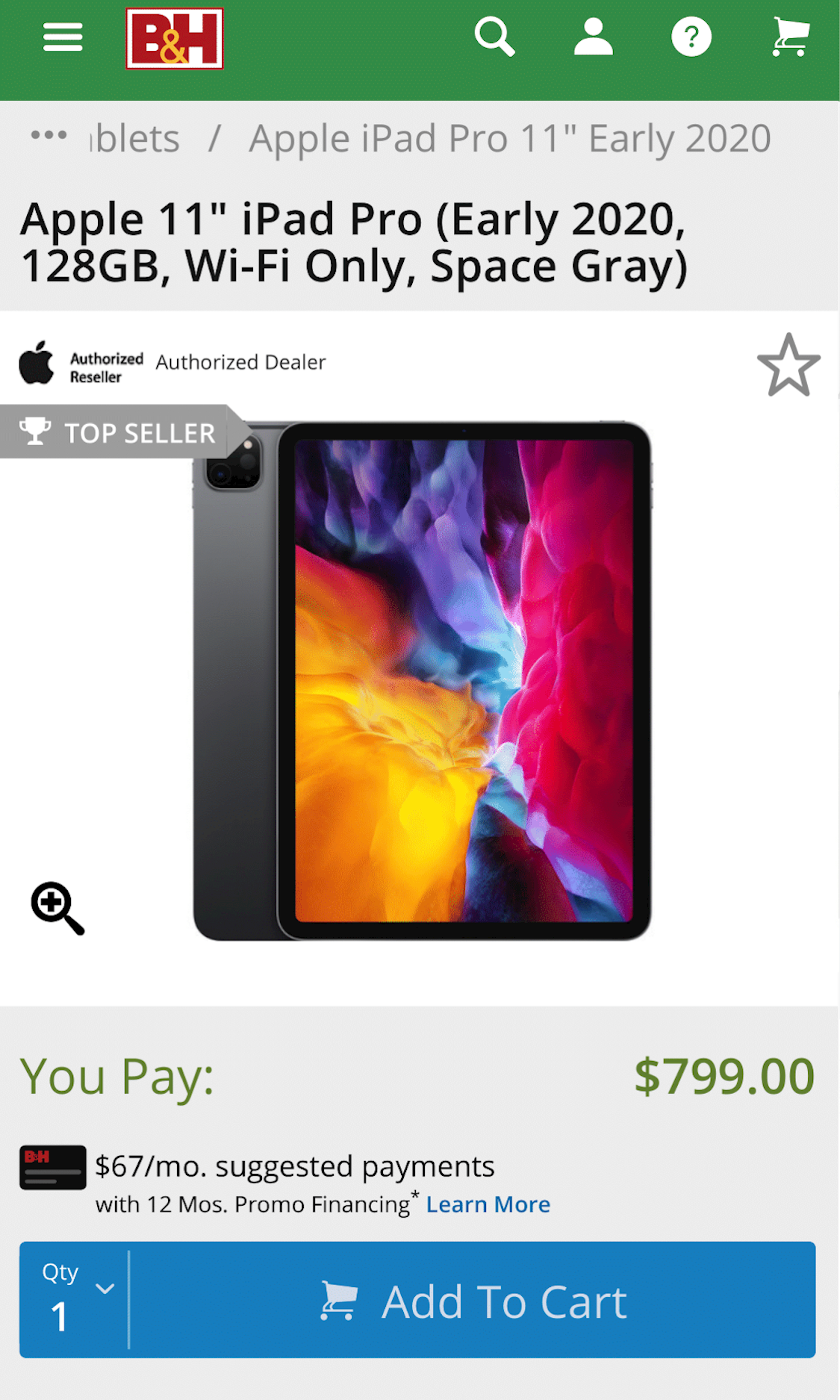
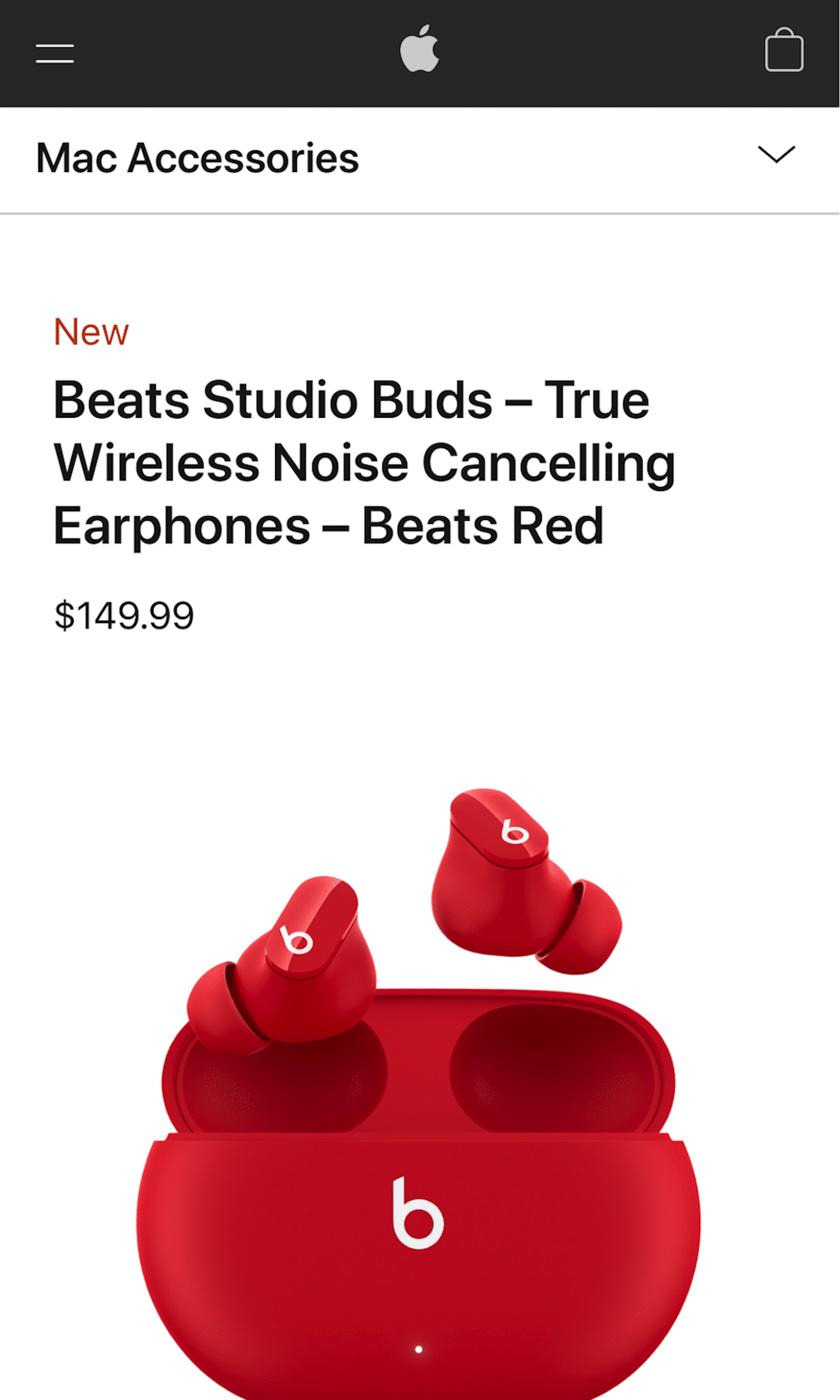
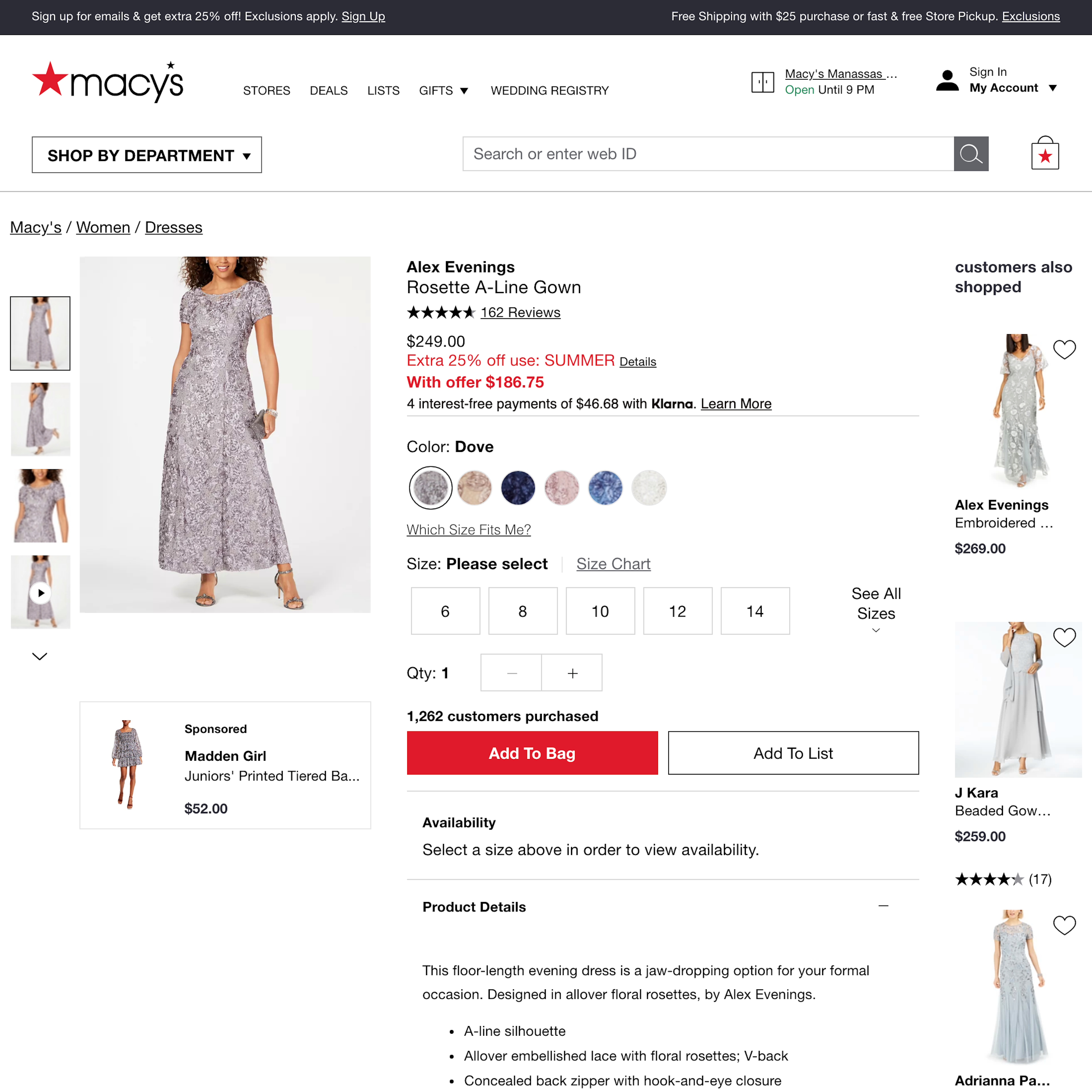
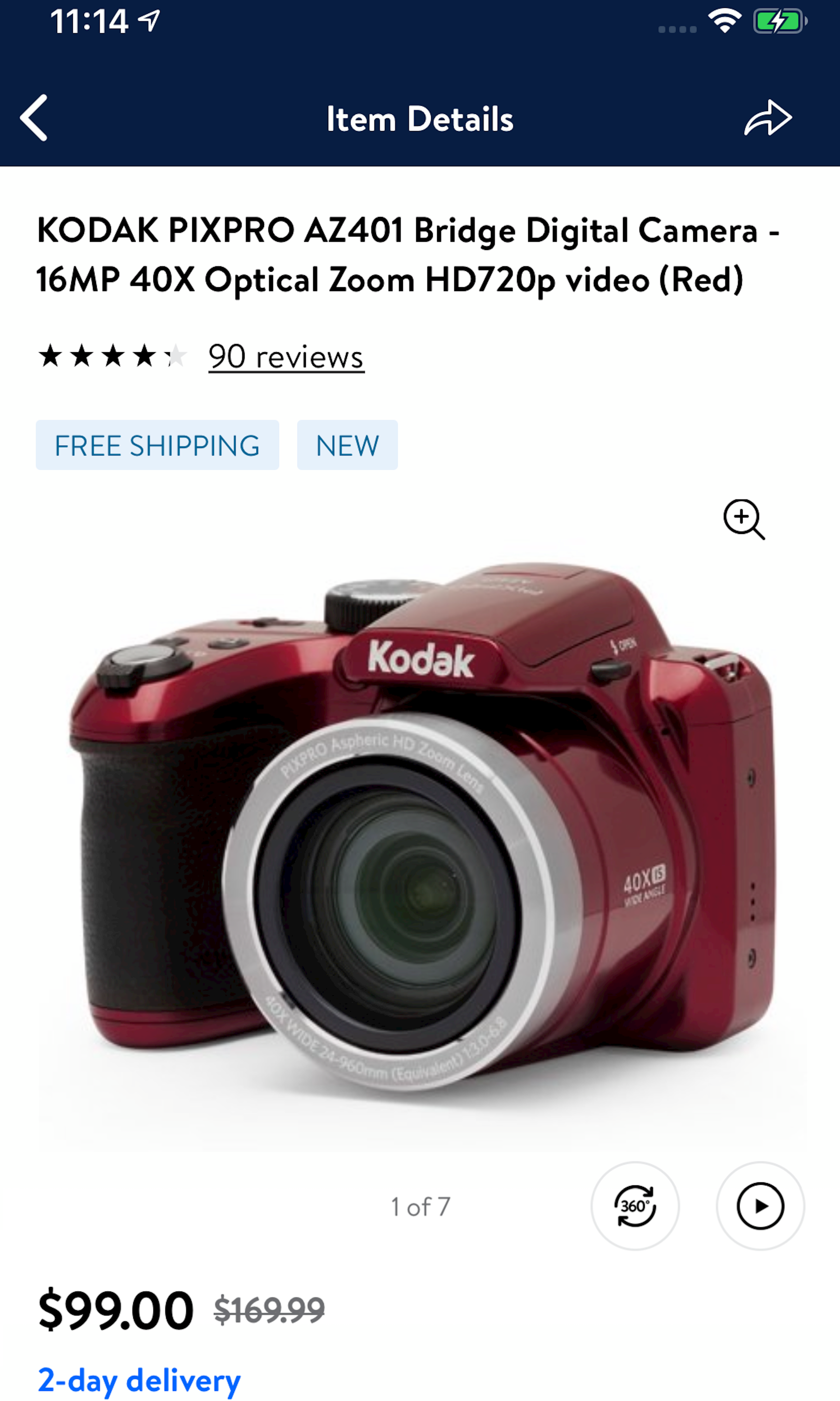
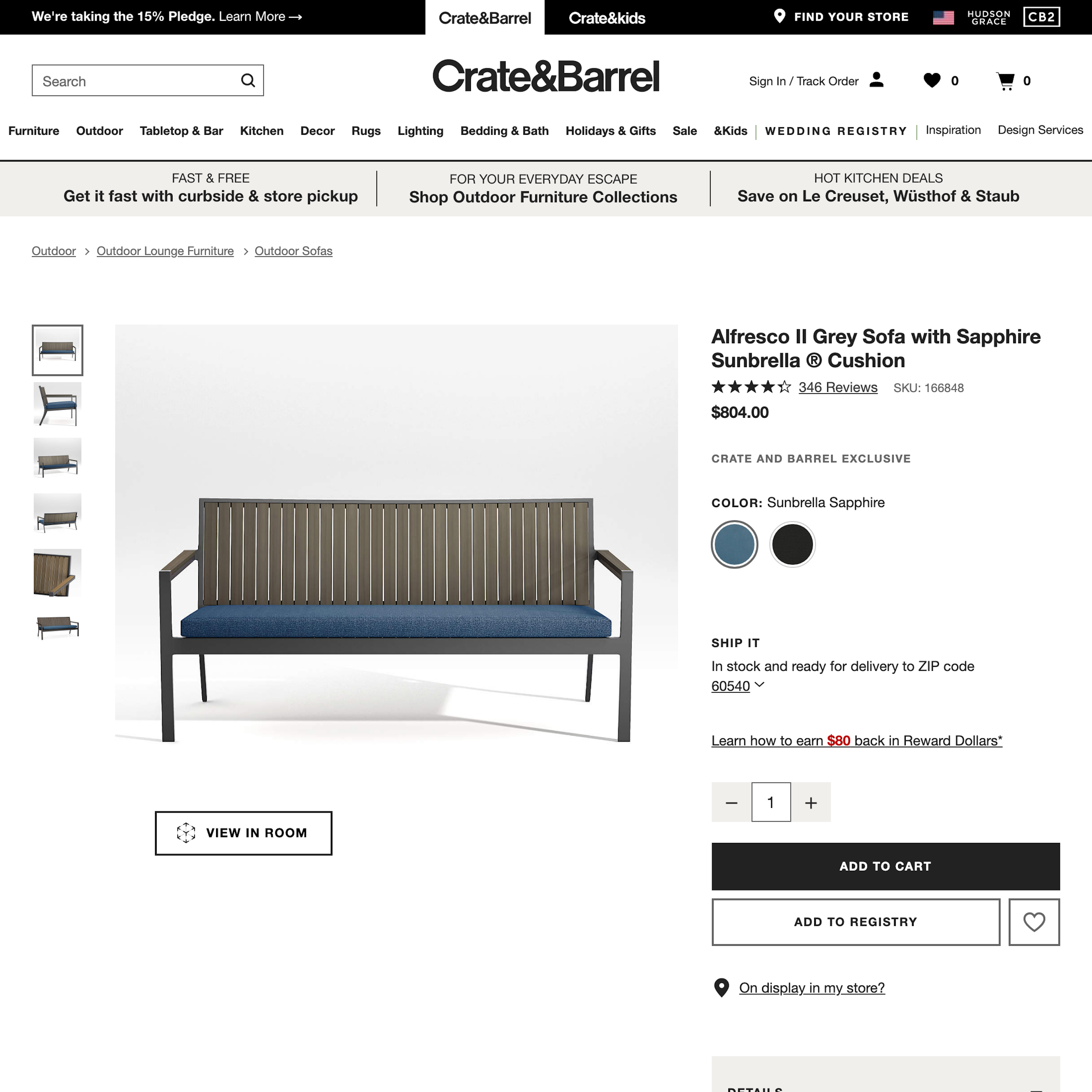
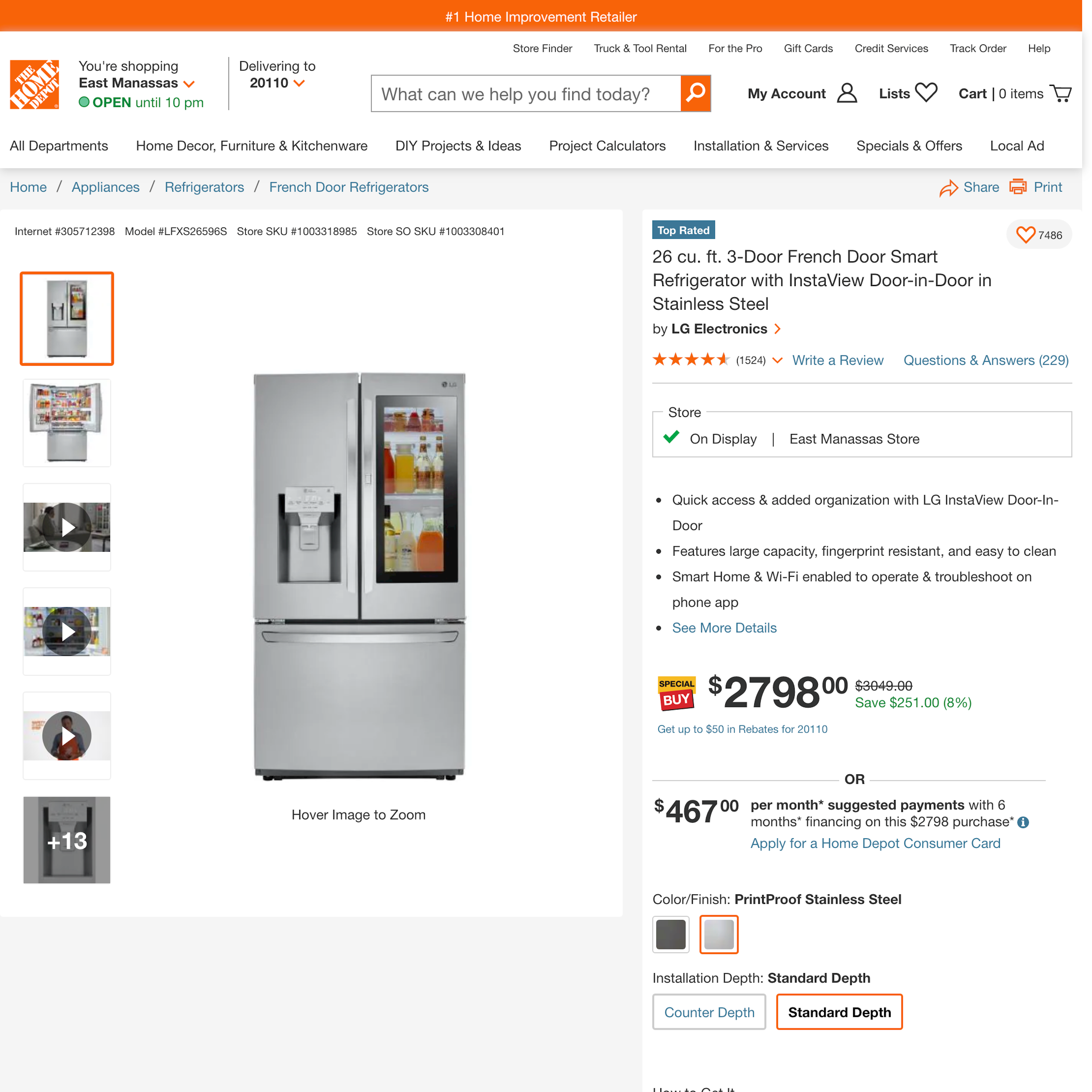
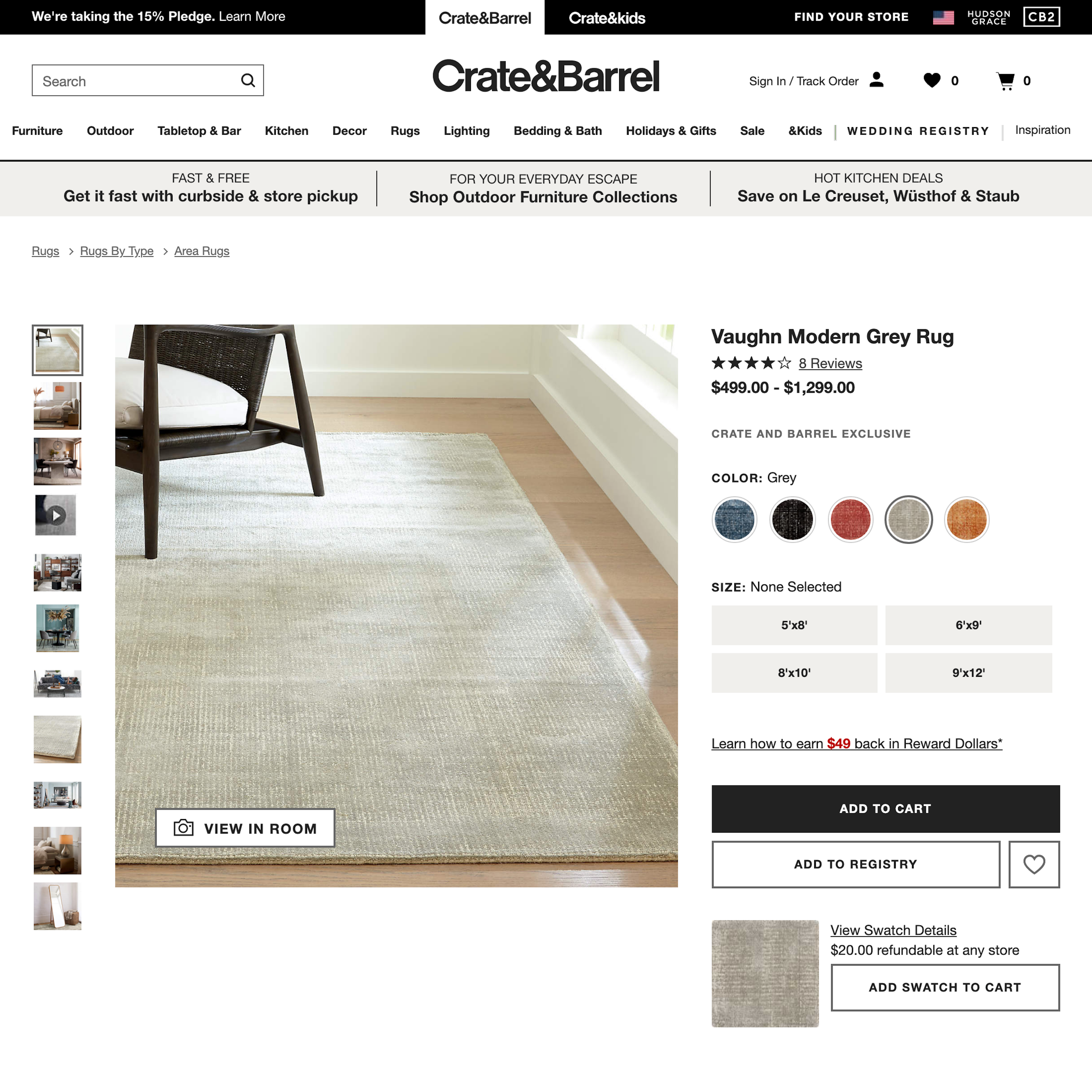
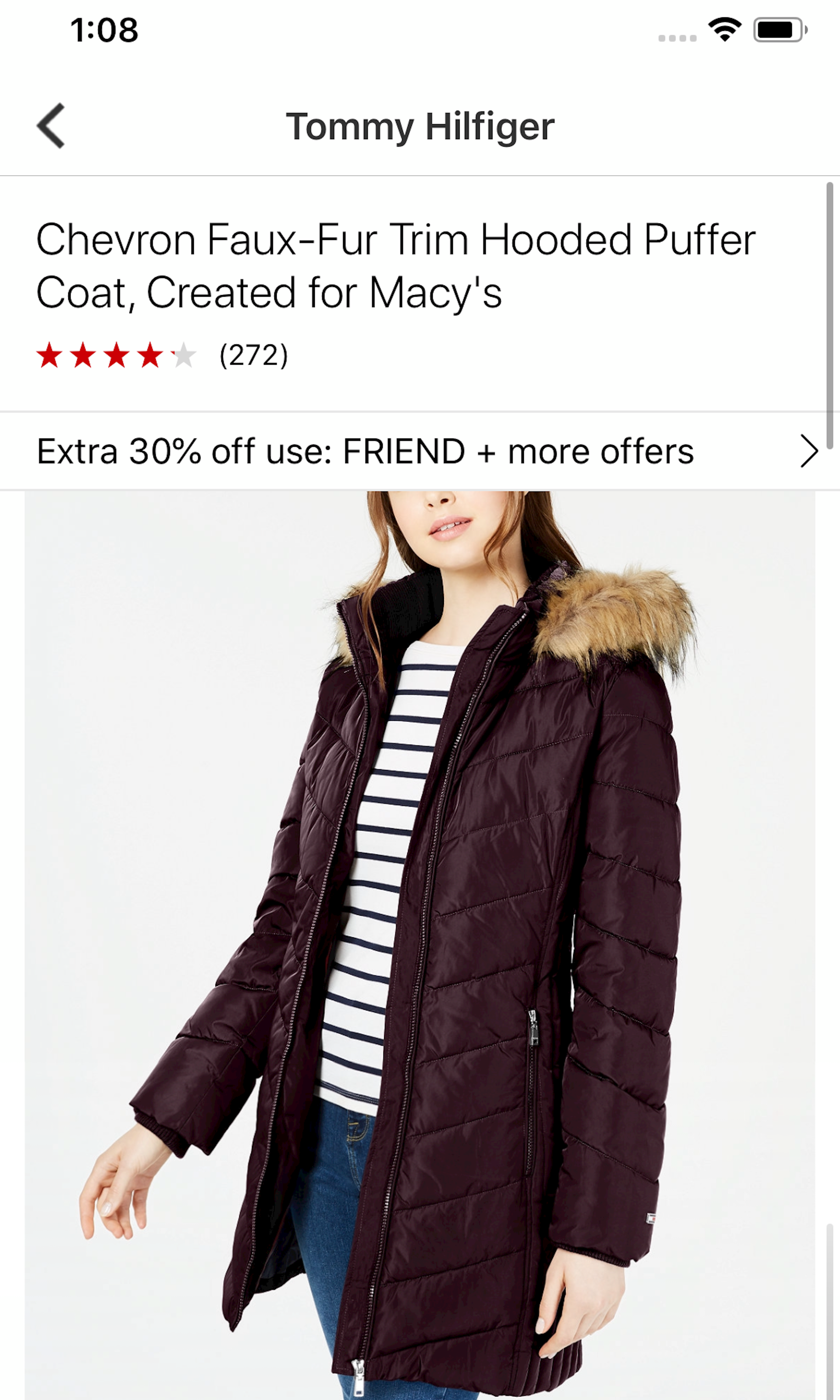
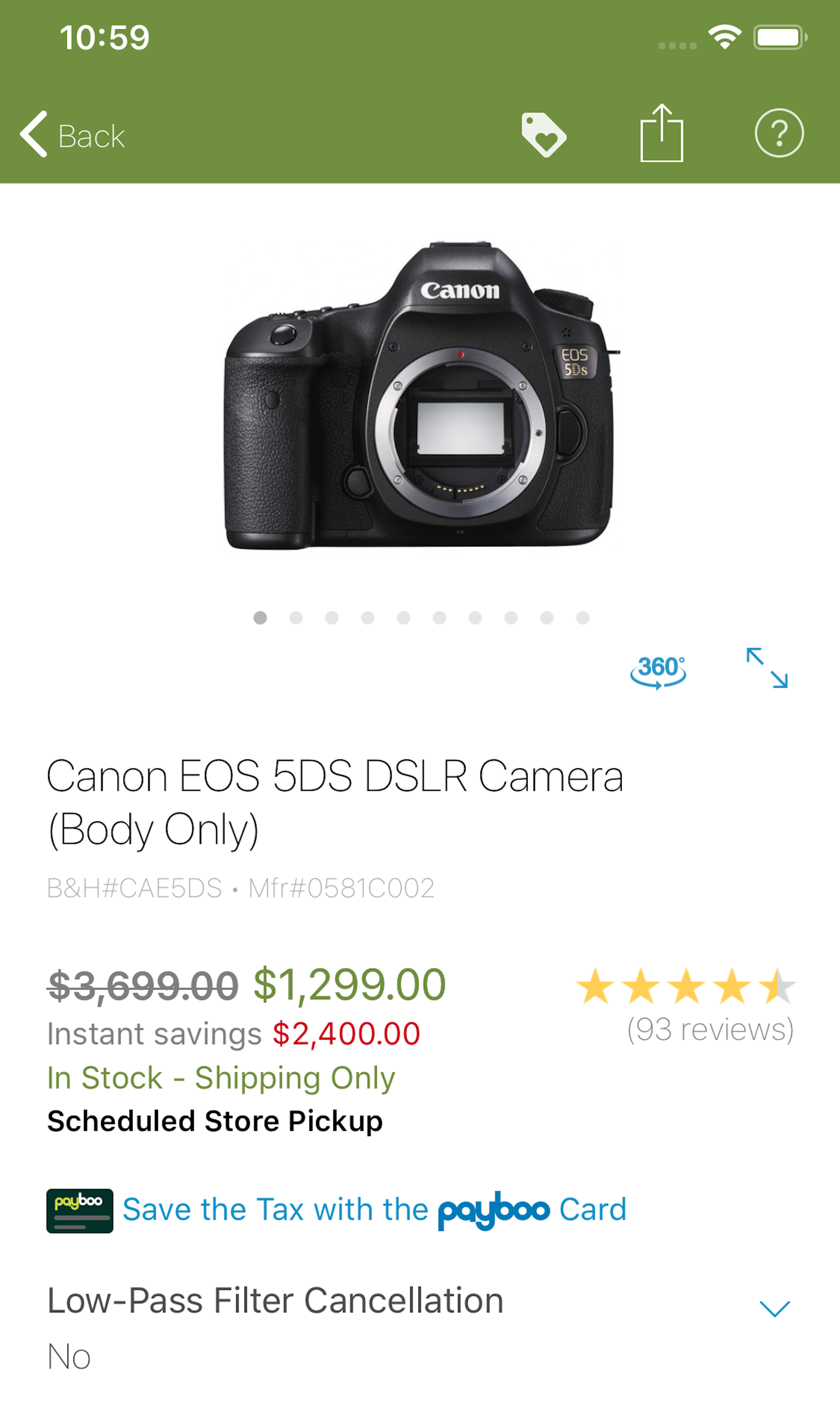
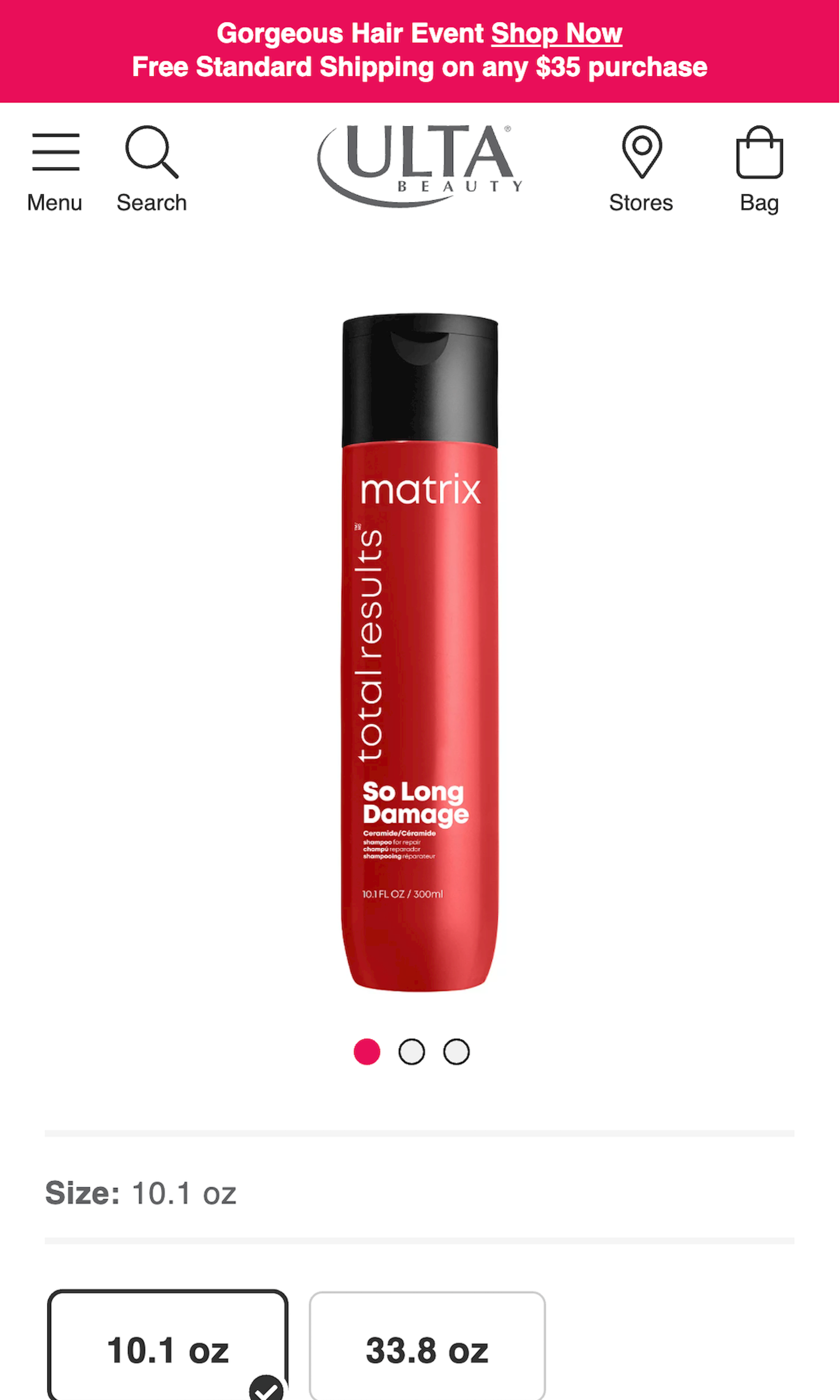
1547 ‘Product Page’ Design Examples
Also referred to as: Product Details Page, PDP
What’s this? Here you’ll find 1547 “Product Page” full-page screenshots annotated with research-based UX insights, sourced from Baymard’s UX benchmark of 327 e-commerce sites. (Note: this is less than 1% of the full research catalog.)
The Product Details Page (or just “PDP”) can be difficult to get right. It’s typically a ‘template’ reused for every single product on the site (despite the individual products varying greatly in style and popularity), while at the same time any vendor-supplied product data and images often vary greatly in amount and quality. On top of this, it’s often on the product page where users make up their mind on purchasing the item or not. Hence, we’ve observed that even small UX issues in a site’s product page implementation will often cause direct site abandonments.
More ‘Product Page’ Insights
-
Our UX benchmark of product page implementations at 60 of the world’s top-grossing e-commerce sites reveals that getting the product page right is no easy task: the average e-commerce site has a full 24 structural usability issues with their overall product page design and features, and just 18% of e- commerce sites have an overall “acceptable” or “good” product page UX performance.
-
Learn More: Besides exploring the 1547 “Product Page” page design examples below, you may also want to read our related articles “Product Page Usability: 82% of Sites Have Severe UX Issues”, “The Current State of E-Commerce Product Page UX Performance - 19 Common Pitfalls”, and “7 Product Page UX Implementations that Make REI Best-in-Class”.
-
Get Full Access: To see all of Baymard’s product page research findings you’ll need Baymard Premium access. (Premium also provides you full access to 200,000+ hours of UX research findings, 650+ e-commerce UX guidelines, and 275,000+ UX performance scores.)
User Experience Research, Delivered Weekly
Join 60,000+ UX professionals and get a new UX article every week.

User Experience Research, Delivered Weekly
Join 60,000+ UX professionals and get a new UX article every week.

Explore Other Research Content

300+ free UX articles based on large-scale research.

327 top sites ranked by UX performance.

Code samples, demos, and key stats for usability.


