Key Takeaways
- “How It Works” pages are critical to users considering consumables-subscription services
- A well-organized “How It Works” page should be optimized for easy scanning to showcase basic subscription service details
- Failure to properly structure the “How It Works” page can result in users failing to grasp how a particular service works — and thus more likely to consider a competitor’s service instead
The variety of service options across subscription-service sites can often vary widely from site to site. Therefore, according to our Premium UX Research, “How It Works” pages for these sites need to provide users with detailed information on the subscription-service basics and any unique features offered by the site.
Our large-scale user testing revealed that how information is presented to users matters just as much as what specific information is provided — when it comes to how easy it is for users to conceptualize the variety of plans and other subscription-service offerings available on a given subscription-service site.
Consequently, the “How It Works” page on a subscription-service site can actually contain all the subscription-service information users are looking for but — if that information is difficult to access due to a poor layout or insufficiently noticeable text styling — some users will be left without a sufficient enough grasp of the service essentials to feel comfortable using the subscription service.
In this article we’ll discuss 3 design patterns that worked well for structuring “How It Works” pages:
- Using text blocks accompanied by images or icons to showcase basic service details
- Using grid layouts for displaying the variety of available subscription plan options
- Including embedded FAQs at the bottom of the page for page-specific and common questions
Additionally, we’ll discuss 1 layout and 1 style pitfall to avoid.
1) Text Blocks Accompanied by Images or Icons to Showcase Basic Service Details
It’s important to keep in mind that the “How It Works” page will be many users’ first exposure to the subscription site’s service details — and potentially users’ first experience of the site, such as if they happen to arrive on the site via an external link (e.g., a social media link).
Consequently, users are often in an exploratory mindset — looking to get an idea of the subscription site’s overall service options without getting overwhelmed with too much detail.
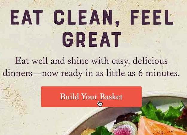
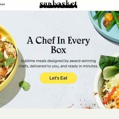
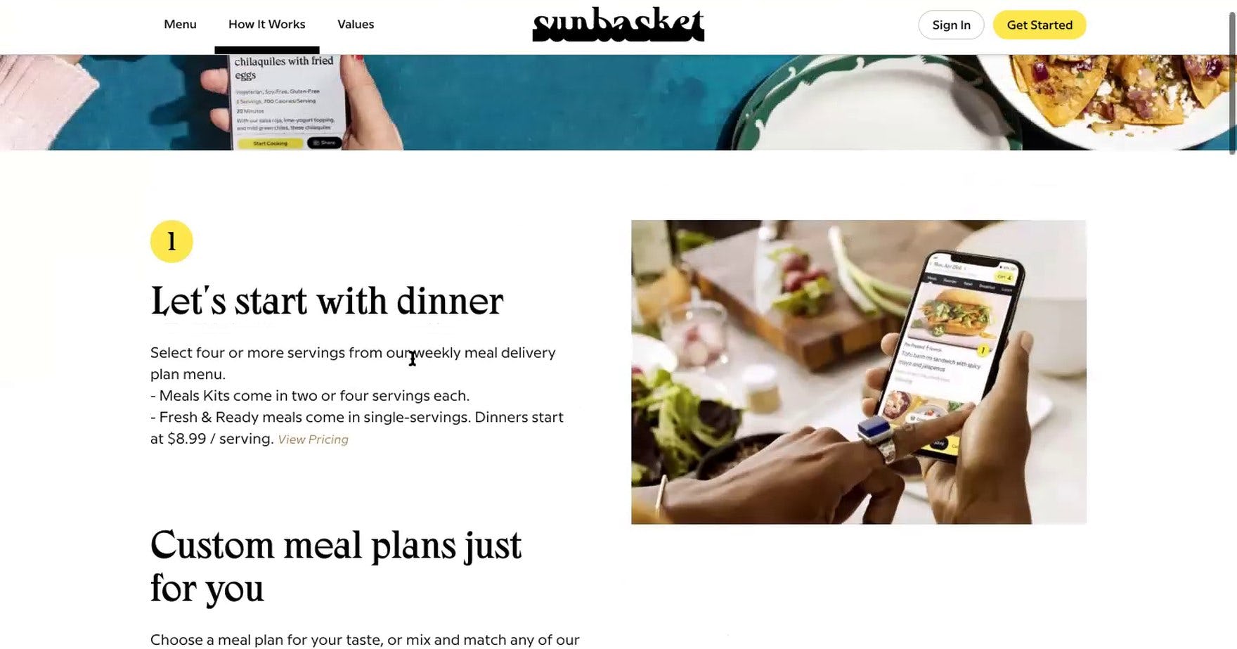
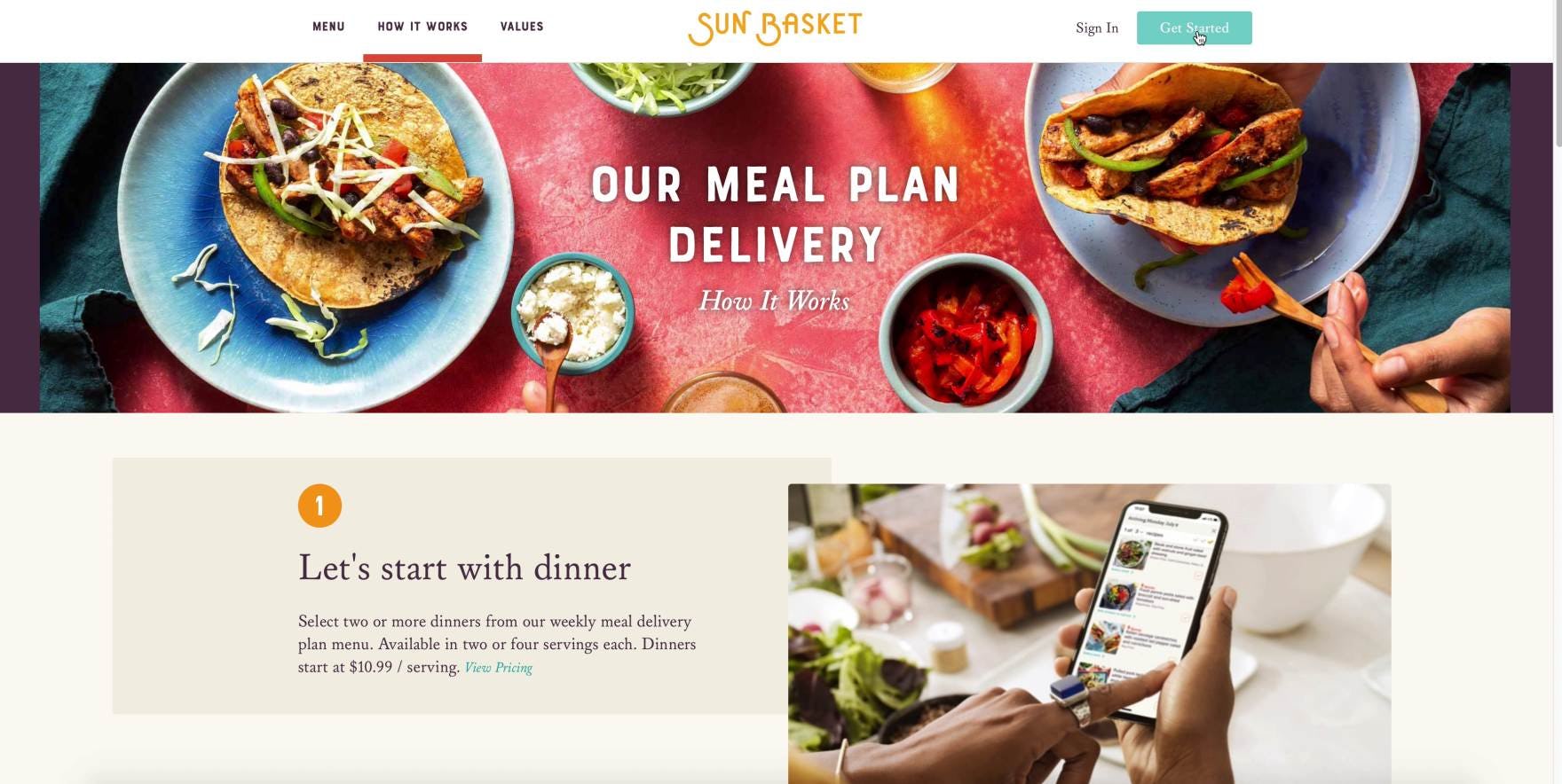
“‘Select 4 or more servings from our weekly meal delivery panel menu’. ‘Meal kits come in 2 or 4 servings each’. And they’re ‘Fresh and Ready meals’.” A user at Sunbasket quickly grasped the service basics listed in a text block, accompanied by an image.
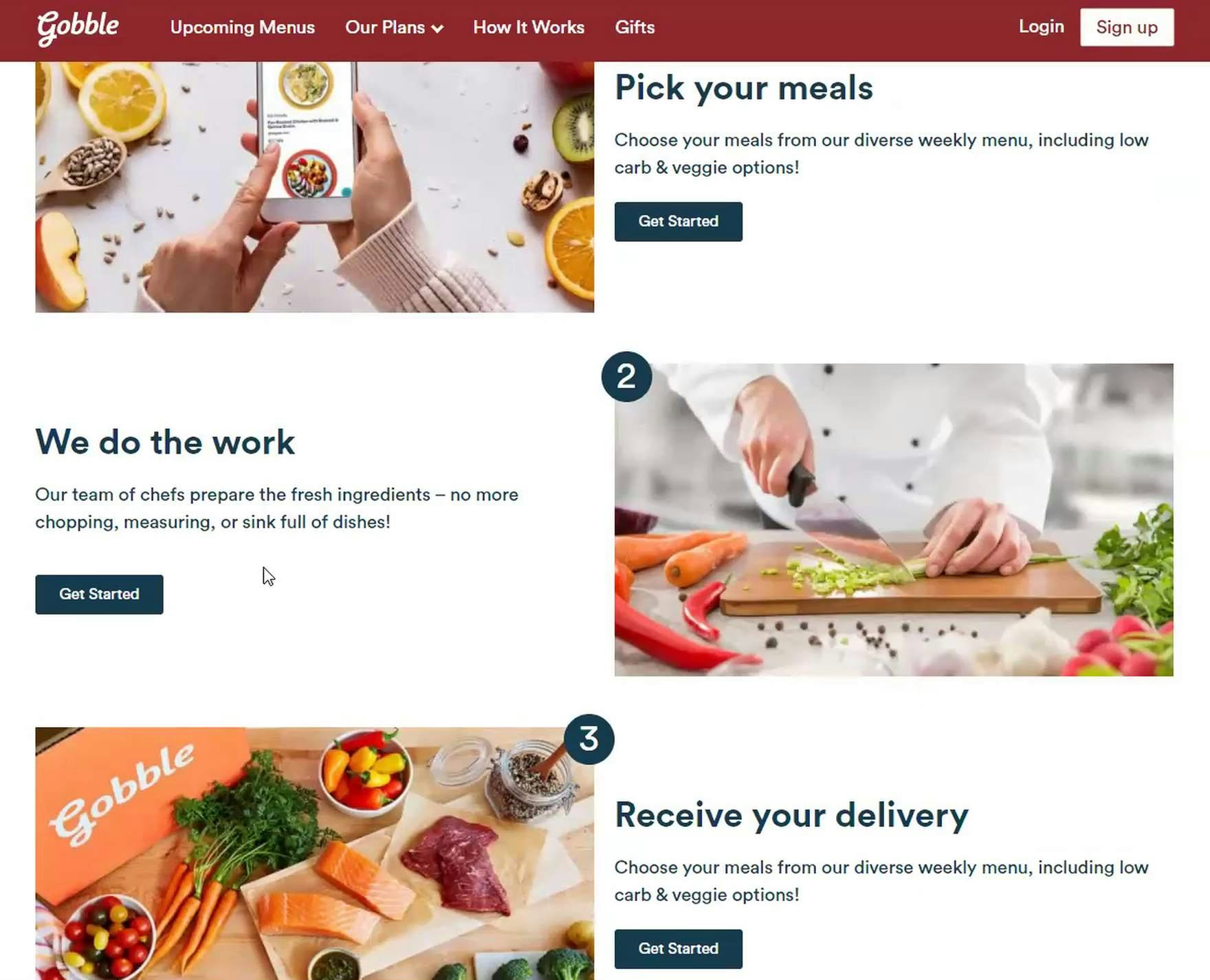
“Oh, they prep the ingredients. ‘No more chopping or measuring’, that’s helpful.” A user at Gobble similarly learned the basics of the service from the text blocks accompanied by images.
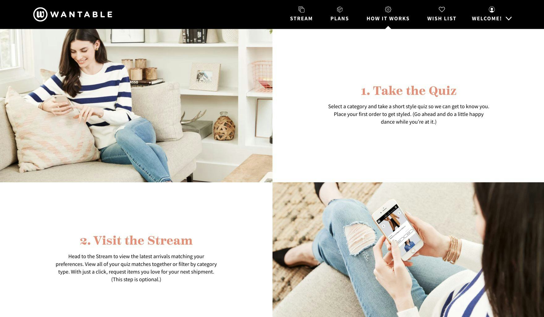
At Wantable, a subscription service that offers curated clothing boxes, the “How It Works” page showcases each step in the service process.
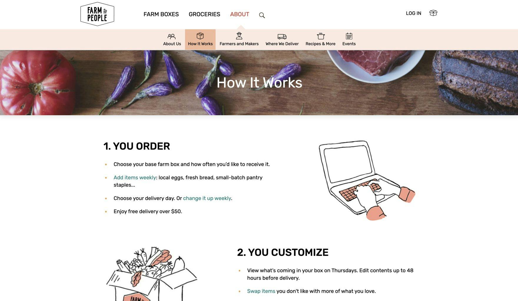
At Farm to People, a monthly subscription-service box that connects farmers and consumers, the “How It Works” page is split up into distinct sections with text and graphics that describe the service highlights.
Our large-scale user testing revealed that, to introduce users to the subscription-service basics, text blocks which included headers and short descriptions, accompanied by images or icons (or both), are a good way to quickly provide users with basic information about how the subscription service works.
This layout — very similar to a “Product Highlights” layout for product page descriptions (e.g., see Apple’s product page for an example) — offers a nonintimidating way for users to get acquainted to the subscription service or food box subscription service.
The approach of using headlines, text blocks, and images serves to break the subscription-service information into easily digestible chunks, which primes users to learn more about the subscription site’s service details.
Typically, this layout is the first used on the “How It Works” page, since it serves as the introduction to the service.
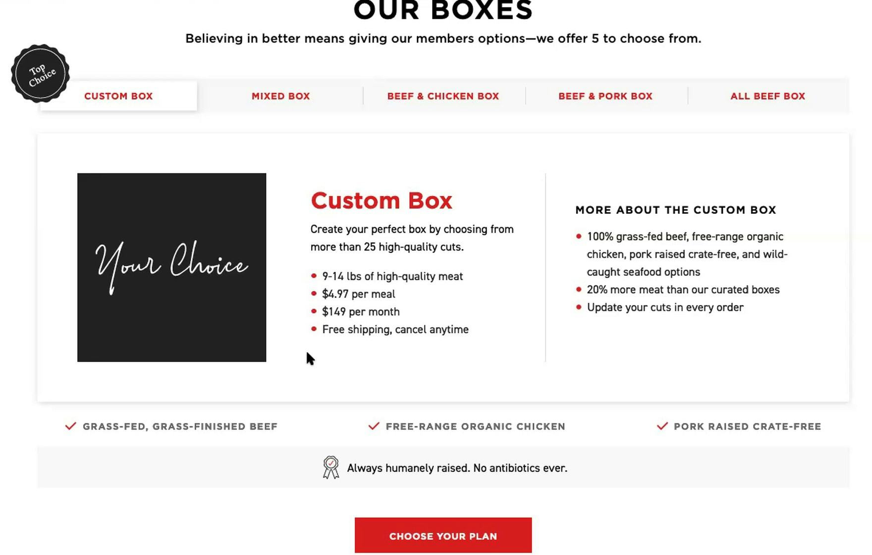
2) Grid Layouts for Displaying the Variety Of Plan Options
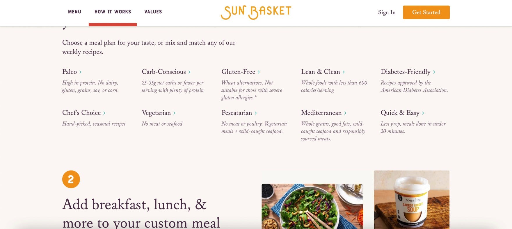
“I do like that they give a lot of options. Like, you could do ‘Paleo’, or ‘Carb-Conscious’, or ‘Lean’, or ‘Mediterranean’. I like that.” A user at Sunbasket scanned the meal plan options and was impressed by the variety of meal types offered.
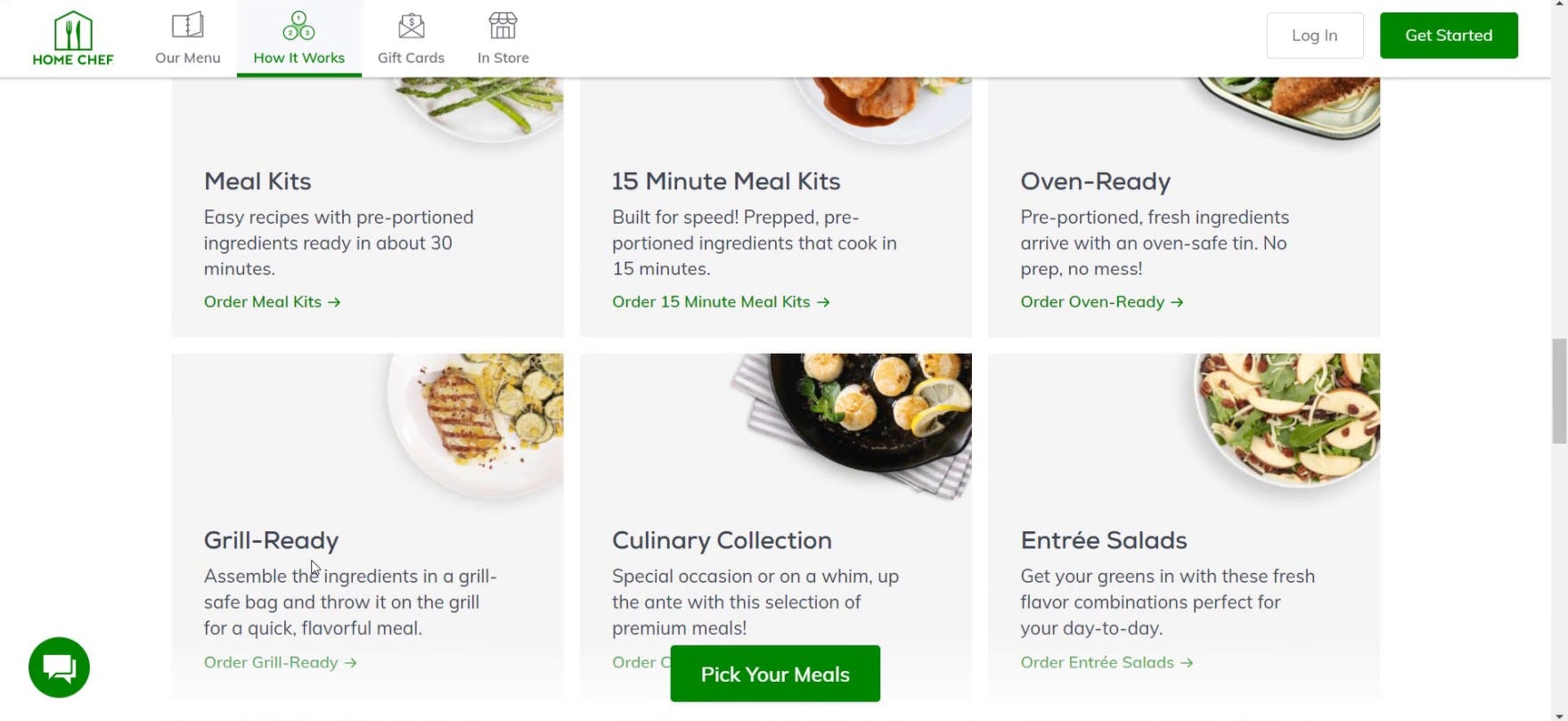
“This is different…Having a ‘Meal Kit’ versus ‘Oven-Ready’ versus ‘Grill-Ready’…That’s kind of cool.” Another user at Home Chef similarly liked being able to compare the different meal options available.
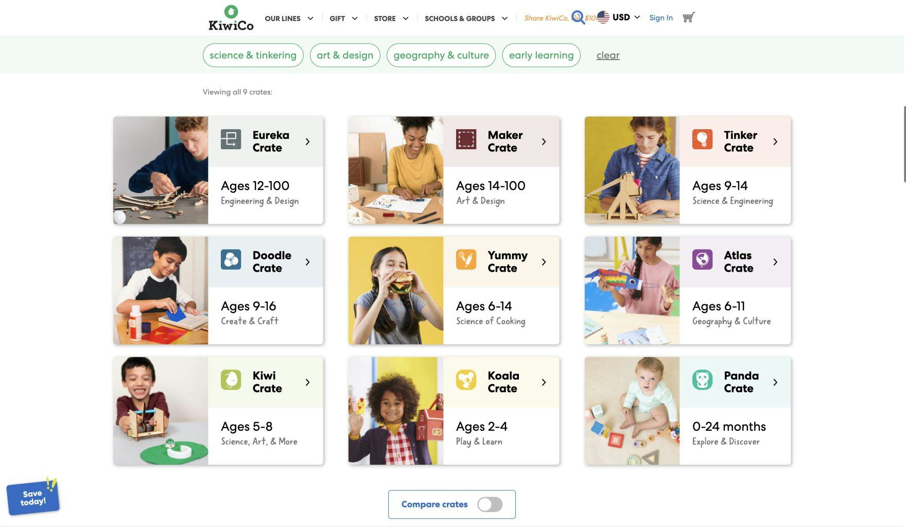
At KiwiCo, a subscription activity box for kids, the range of plan options are arranged in a “grid layout” so users can see all the different options on one page. Note that this matrix of plan options is displayed on the homepage, as KiwiCo doesn’t have an explicit “How It Works” page.
Once users have a basic understanding of how the consumables-subscription service works, many users are ready to get into more detail regarding the different subscription-service options available.
Our large-scale user testing revealed that, when there are a number of options for users to choose from — for example, meals categorized by dietary preference, or different food subscription boxes to choose from — displaying them using a grid format allows users to easily compare available options and plans.
Indeed, an approach that focuses on progressive disclosure works well on the “How It Works” page, as users will first want to scan the different available options for an overview, before getting into more specific details about each option.
Therefore, rather than provide the full details for each subscription-service option, instead provide each option’s name as a headline accompanied with a basic, 2-to-3 line description — including a sufficiently visible link (or button) where users can learn more about each option.
Furthermore, a grid format effectively showcases the diversity of subscription-service options available using comparatively little space.
For example, during our testing of meal kit subscriptions, many users began to get excited about trying the plan when they realized the subscription service included tailored dietary options — for example, when users saw that meal kit sites offered “Carb Conscious” options, or when food subscription boxes allowed users to select “mostly beef”, “mostly chicken”, or some custom combination of meat for their subscription order.
This grid layout of specific plan options is often best placed in the middle of the “How It Works” page, directly after the subscription-service overview.
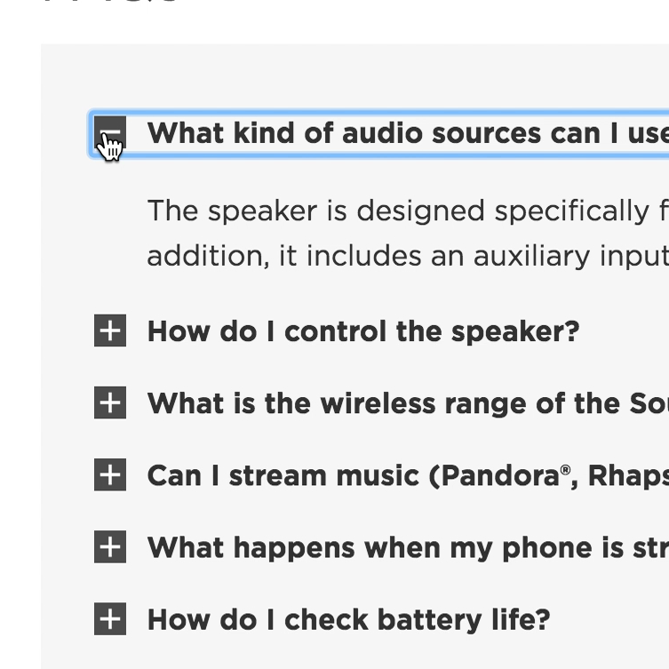
3) Embedded Faqs at the Bottom of the Page
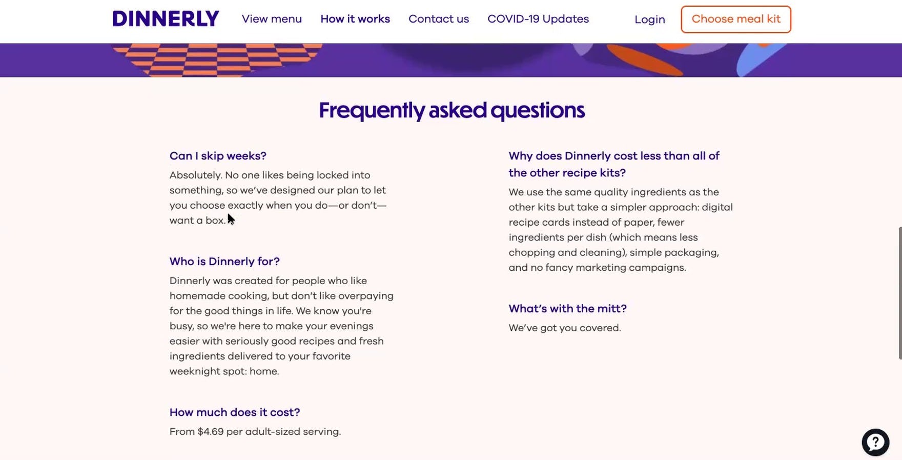
“Okay, can I skip, oh, okay. So, I guess, right now, this would be like number two, just because, again, it gives you the flexibility about skipping weeks.” A user on Dinnerly wondered if it was possible to adjust the delivery schedule, and found an answer in the FAQs at the bottom of the page.

“I like how it has the ‘Frequently Asked Questions’ automatically with the explanation because then I don’t have to click on another tab.” A user at Sunbasket also appreciated finding FAQs at the bottom of the “How It Works” page.
Finally, once they’ve have gotten a basic introduction to the subscription service and learned a bit more about the different subscription options available to them, some users will still have specific questions that haven’t yet been answered by the “How It Works” page.
Testing revealed that making the final section of the “How It Works” page consist of embedded FAQs — that is, a short list of page-specific FAQs — was a good way to address some common user questions for the basic information every “How It Works” page needs.
In a previous round of testing, FAQs were observed to be very helpful to users considering small product catalog, direct-to-consumer sites.
Similarly, FAQs were observed to be a good way to provide additional, sometimes crucial information to users considering signing up for an unfamiliar site’s subscription service.
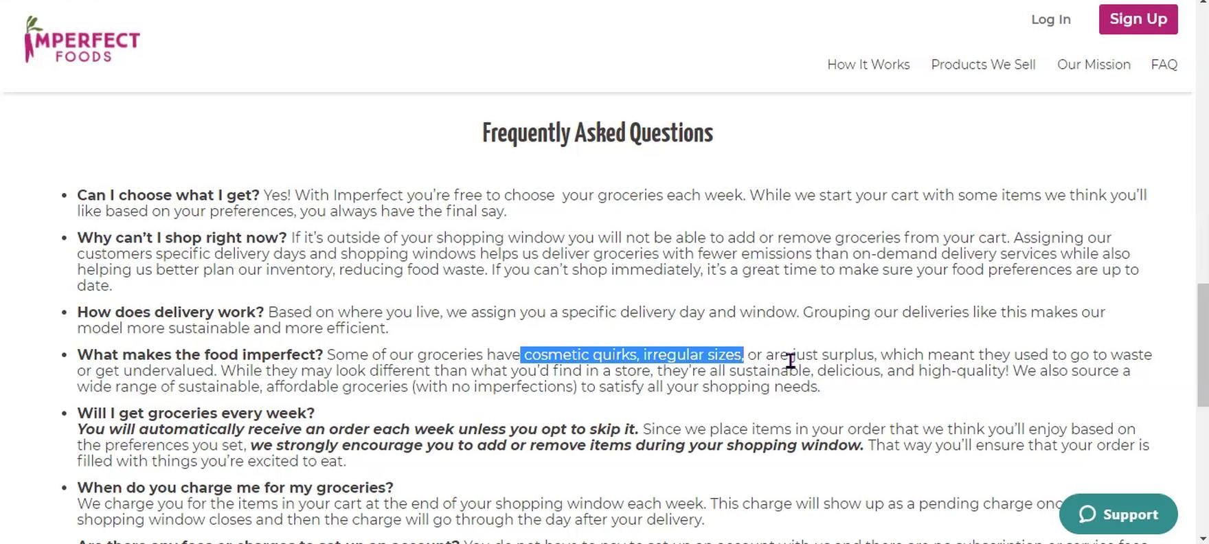
“And I see it says ‘cosmetic quirks, irregular sizes’, ‘surplus’…I kind of pick out keywords because I don’t want to read all this.” A user at Imperfect Foods struggled to scan the FAQs, which were presented as a dense text section.
One word of caution: as embedded FAQs are often the most information-dense section on the “How It Works” page, this section can easily become an overwhelming and intimidating info dump for users — the despised “wall of text” that users are discouraged from reading.
While most users anticipate that FAQ sections will consist of a large amount of text, it’s crucial that the text is broken up by styling the questions very differently from the answers, and using progressive disclosure and white space to allow users to “breathe” as they scan the information.
In terms of the number of FAQs to include, testing showed that a range of 5–7 individual questions and answers was generally observed to answer most users’ questions without making the section overly intimidating and difficult to navigate.
Of course, the questions picked should be representative of the most popular or critical user questions (which could come from surveying an individual site’s users or from a log of previously searched for answers).
FAQs typically will best be placed as the final content section on the “How It Works” page.
1 Layout and 1 Style Pitfall to Avoid
A well-structured “How It Works” page will help most users quickly find information that they’re looking for, and allow them to consume it as efficiently as possible.
A layout that has a 3 level-information hierarchy — text blocks and images for service basics, grids for plan options, and FAQs for specific details — was observed in testing to perform well for most users.
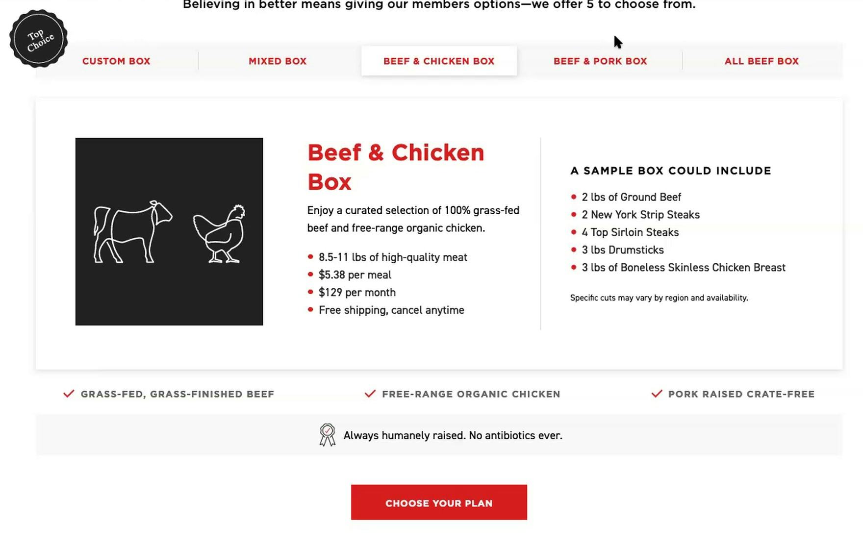
“It seems like there’s gonna be a lot of clicking back and forth to start to compare those prices and what’s gonna be inside of each box. Yeah, I don’t think that it works well for me. I love to be able to see everything in one view instead of having to click back and forth and compare and remember, right? How do I memorize what the custom box had in it when I’m looking through all of these other options?” A user on Butcher Box complained about the “Horizontal Tabs” layout for the different box options.
However, while only negatively affecting a few users during testing, one layout that didn’t perform as well was a “Horizontal Tabs” layout.
Indeed, a few users struggled to get an overview of the information on the “How It Works” page when a “Horizontal Tabs” layout was used.
This observation supports our Product Page findings, which similarly found that “Horizontal Tabs” layouts should be avoided for most product pages.
Therefore, the “Horizontal Tabs” layout — which is most likely to be considered when providing the plan options (as an alternative to the grid layout discussed above) — should be avoided.
“How much is the monthly or weekly fee?” A user on Sunbasket wanted more information on pricing, which was provided on the “How It Works’’ page as a small blue link. However, he never found the link, and clicked the “Get Started” button to try and find pricing information.
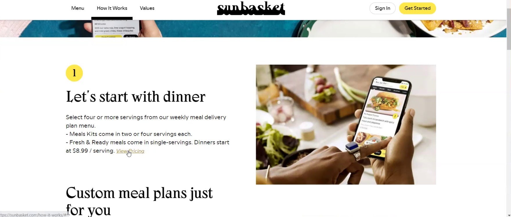
“Okay, ‘View Pricing’. Here we go.” Another user struggled to find the “View Pricing” link at Sunbasket, eventually locating it at the end of the first text block describing the service. (Note: Sunbasket’s design changed over the course of testing.)
Finally, it’s important to keep in mind that, while linking to additional details is fine (and preferred if the additional details would generally overwhelm users trying to get an overview of the service on the “How It Works” page), the links have to be prominent enough to be easy to spot when scanning the page.
During testing some users initially missed key links that were relatively inconspicuous on the page. Moreover, the inconspicuous styling made some users question if the site was intentionally trying to hide information (e.g., about plan pricing).
Therefore, when linking to other information from the “How It Works” page, ensure the links are easy to spot for scanning users.
Ensure the “How It Works” Page Supports Users’ Information-Gathering Behavior
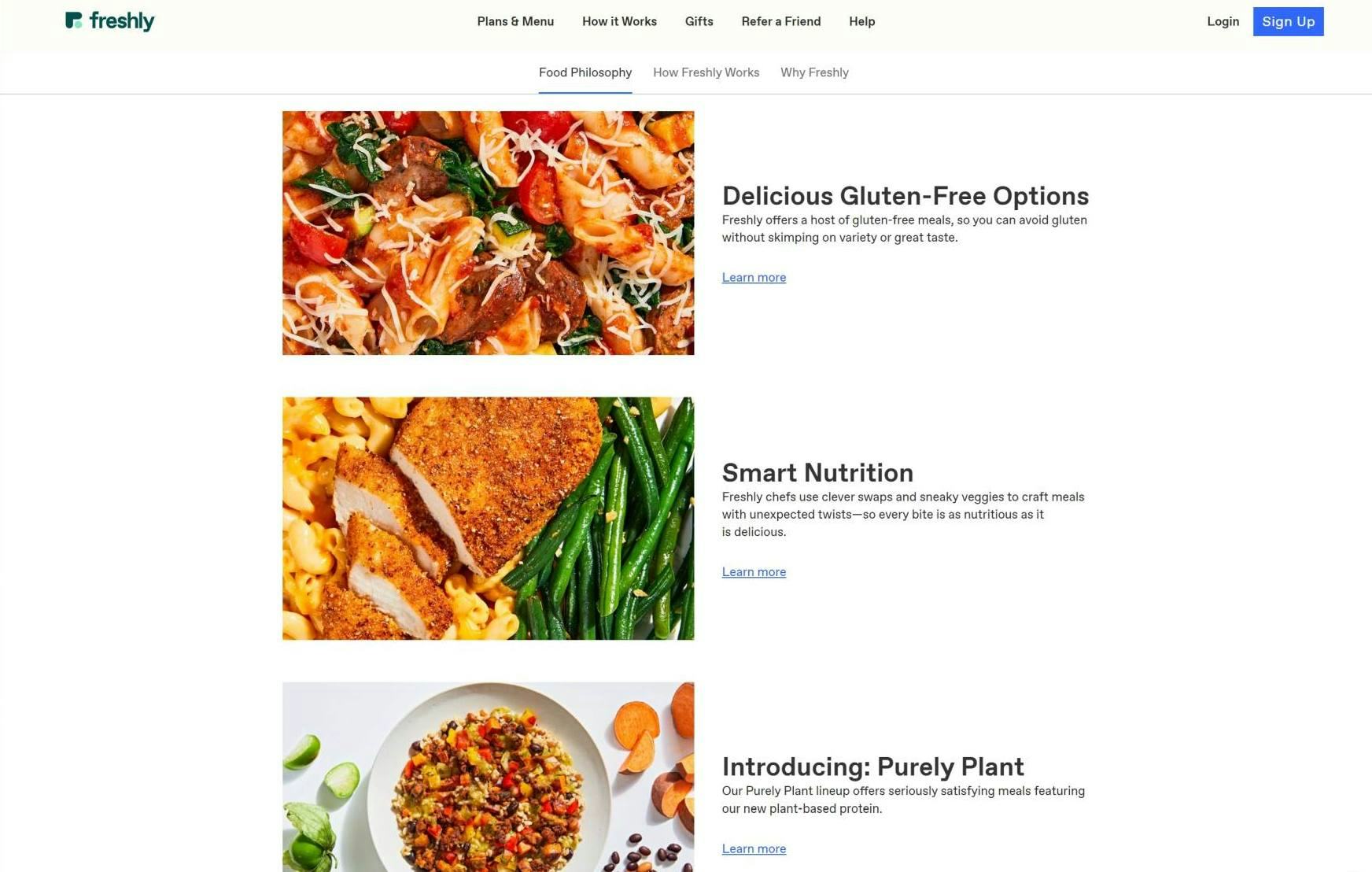
Freshly’s “How It Works” page showcases important subscription-service details using a combination of images and text.
With such an abundance of information to convey to users about consumables-subscription service basics on the “How It Works” page, sites often run the risk of overwhelming users with too-much information.
However, our testing has revealed that using a 3-level information hierarchy provides an effective communication infrastructure for both providing basic subscription-service details and directing users to where more information can be found.
Indeed, providing users with an effective starting-point for learning about a consumables-subscription site — in the form of a well-designed “How It Works” page — supports the information-gathering behavior of a wide variety of users by allowing each user to choose for themselves how to further explore the site’s information and resources once they’ve gotten an overview of the consumables-subscription service.
Most importantly, providing a well-structured “How It Works” page on a consumables-subscription site will help alleviate the hesitation many users will inevitably feel when they are unfamiliar with the industry in general — or a particular brand’s business model specifically.
Therefore, ensuring that new users have a clear on-ramp for learning about a new consumables-subscription site by structuring a “How It Works” page with a 3-level information hierarchy will do much to give users a welcoming introduction to the brand — as well as provide an effective safety net against early site abandonment.
Getting access: all 616 consumables-subscription services UX guidelines are available today via Baymard Premium access. If you already have an account open the Consumables Subscription Services.