During our large-scale usability testing of Checkout Flows, Product Pages, and Accounts & Self-Service, we observed that users sign in to their site accounts from a diverse array of starting points.
For example, some users sign in immediately upon arriving at the homepage, some wait until after they’ve found relevant products and therefore sign in on the product details page, while other users wait until they are in the checkout.
Wherever and whenever users sign in, it’s key that users’ current path is kept intact after they’ve successfully signed in. However, our benchmark reveals that 34% of sites don’t take users to their intended path after they’ve signed in. In testing, we observe that failing to send users where they expected to go after signing in leads to difficulty in refinding their prior path, e.g., refinding the product page they were at before signing in. During testing, we even observed this to be the direct cause for site abandonments.
In this article, we’ll therefore share our test findings exploring: what happens when sites take the user away from their current or intended destination after the user has signed in, common pitfalls that sites overlook, along with sign in UIs and methods we’ve observed in testing to best to honor users sign in expectations.
2 Ways Users’ Expectations Aren’t Met after Signing In
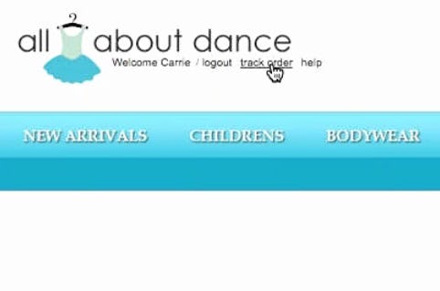
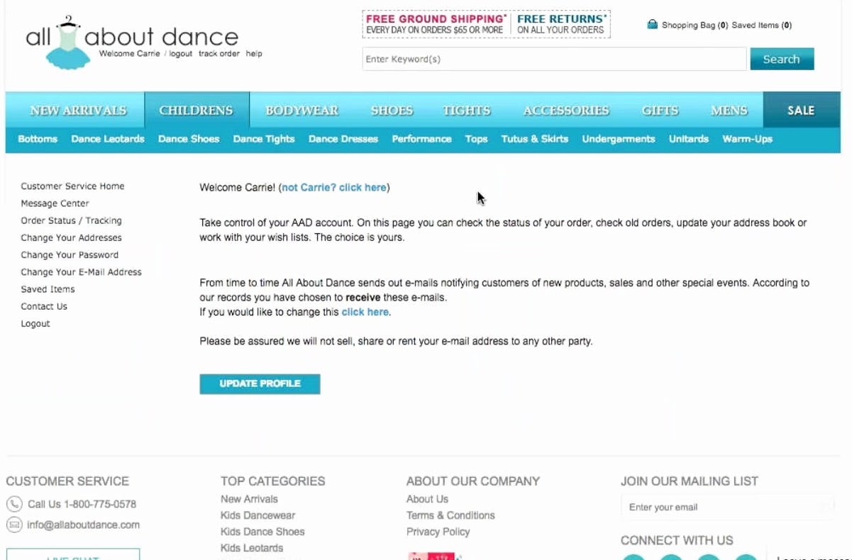
A user at All About Dance clicked the “track order” link in the header (first image) and was sent to an “Account” sign in page. After signing in, however, she was sent to a profile page (second image), rather than being sent to order tracking. Users have to re-find account features unnecessarily when their desired path isn’t honored by the site after signing in.
During our testing, one issue users encounter after signing in to their accounts is not being taken to where they’d indicated they wanted to go before signing in.
For example, a user may indicate that they would like to go to the account dashboard (e.g., by clicking a link to “My Account” in the “Account” drop-down) but haven’t signed in yet, so they are sent to an “Account” sign in page instead.
Once the sign in process is complete, however, the issue comes when rather than sending the user to the account dashboard — as they had previously indicated that that’s where they want to go — the site “ignores” their selection and instead sends them to the homepage, or back to the page they were already on (e.g., an order tracking page).
When not taken to where they’ve indicated they want to go, users have to refind the the path they had previously selected, adding needless friction to the navigational experience.
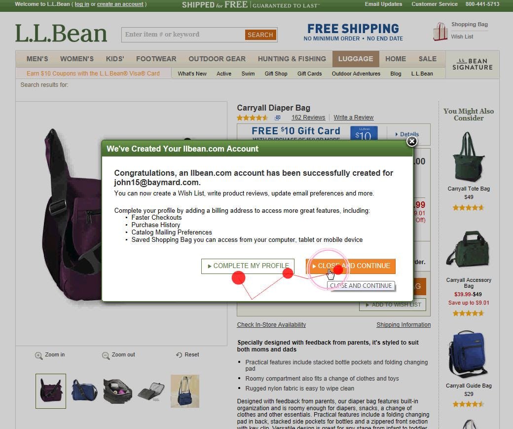
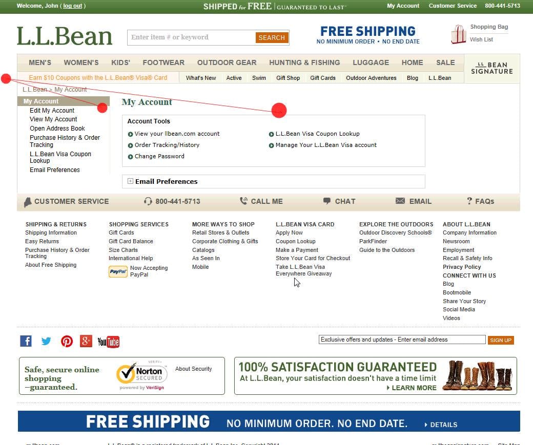
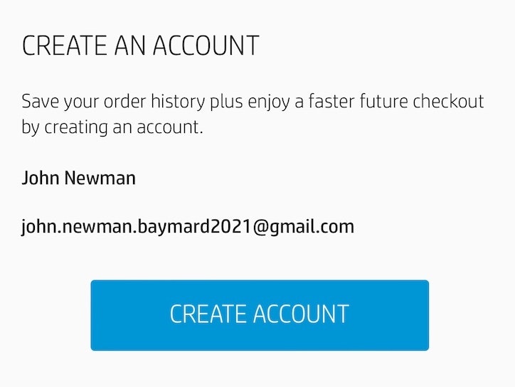
“I don’t know if I can find it again. Aargh it’s impractical that you can’t find it again.” A user during one of our previous eye-tracking studies had just created an account while on a product details page on L.L. Bean. After selecting to “Close and Continue” in the overlay (first image), the user was taken to the account dashboard rather than being kept on the product page (second image), making it unnecessarily cumbersome to refind the product he was viewing.
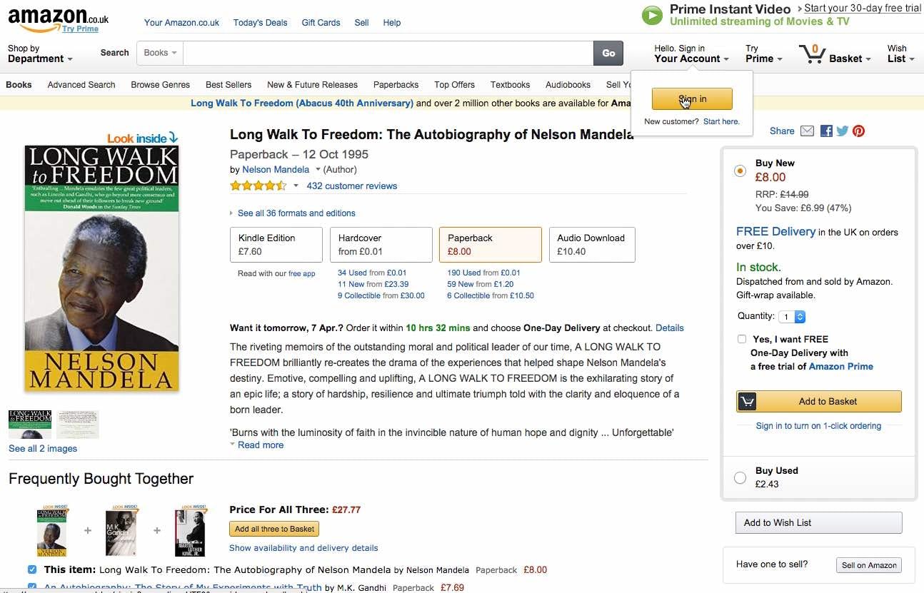
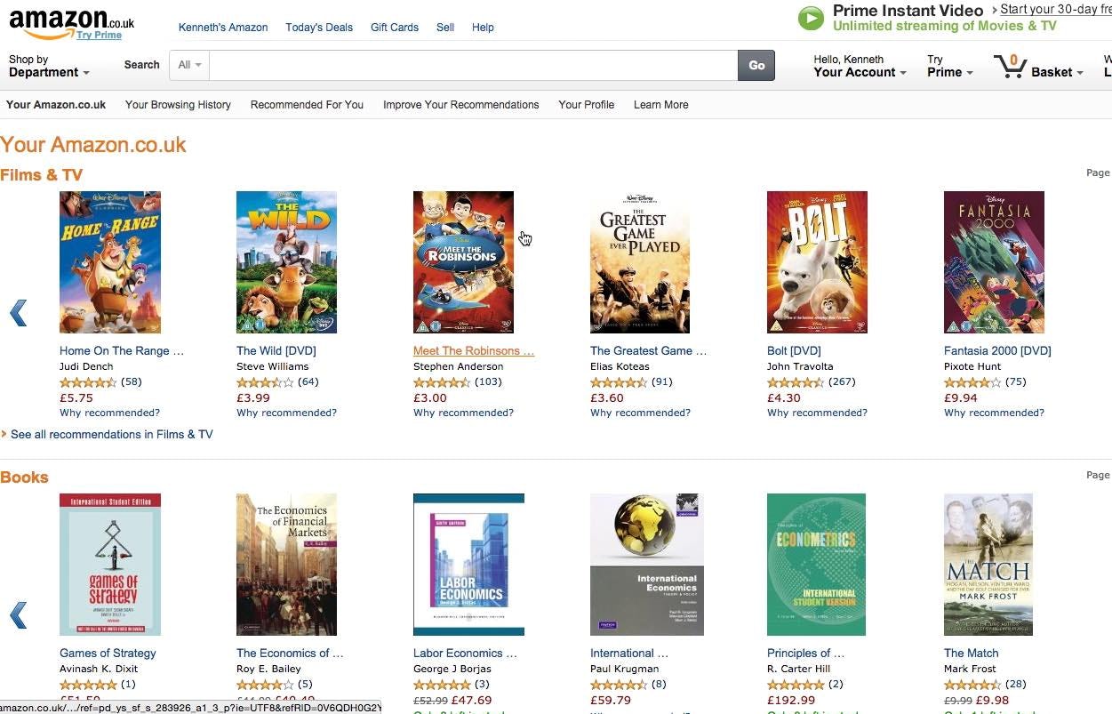
“Well now the Nelson Mandela book is gone. It’s a bit strange that it just disappears.” A user from an earlier round of testing at Amazon signed in from the product details page (first image) and was sent to an “Account” sign in page. After sign in, however, he was sent to an account homepage (second image), rather than being returned to the product details page. Having to refind a product details page can be a challenge, especially at large mass-merchant sites like Amazon.
Conversely, another issue users have is not being returned to the page they were on before the “Account” sign in page. Whereas the previous issue is often simply a minor annoyance, as most users will be able to refind the path they had previously selected, taking the user to an entirely new page can be severe, in that users may have trouble refinding where they were before signing in.
For example, a user might be on a product details page that took them a long time to find (e.g., they had to perform multiple searches, apply many filters, etc.). If the user decides to sign in from the product details page and, after signing in, is sent to the account dashboard rather than being returned to the product page they were on, they may decide it’s not worth it trying to refind the product that took them so long to find in the first place.
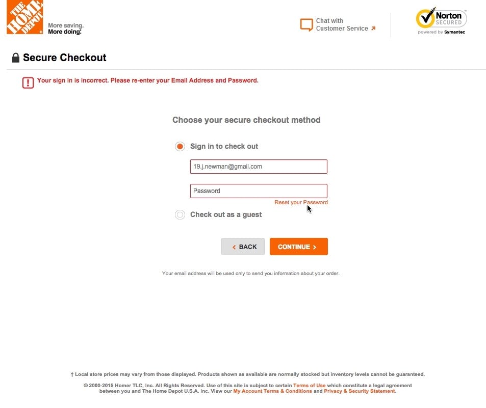
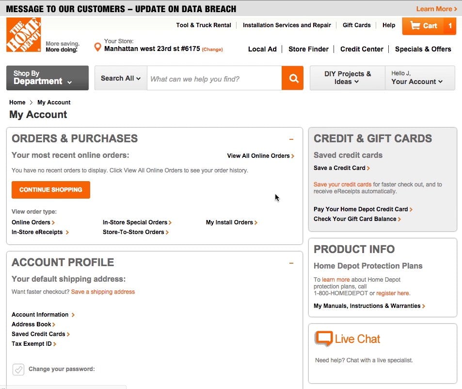
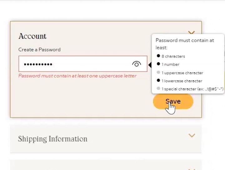
While on Home Depot, a user at the account selection step during checkout can’t remember the password and decides to reset it (first image). After going to her email account and resetting the password, she’s sent to her account dashboard rather than being returned to the checkout (second image). Failing to return users to where they were after resetting a password can be very disorienting.
The issue of not returning users to where they were after signing in can be most acute during checkout, when users are on the account selection step and can’t remember their password.
During testing we frequently observe users forgetting their account passwords. If they aren’t returned to the account selection step after resetting their passwords, however, some will simply give up if they become too disoriented and have difficulty restarting checkout.
Furthermore abandonments are even more likely during mobile checkouts. Users in the mobile context often struggle with locating where they are on a site due to the severely reduced overview the mobile viewport offers.
It’s therefore critical that users during checkout are returned to where they were before resetting their password (in most cases, the account selection step).
Honor Users’ Expectations after Sign In
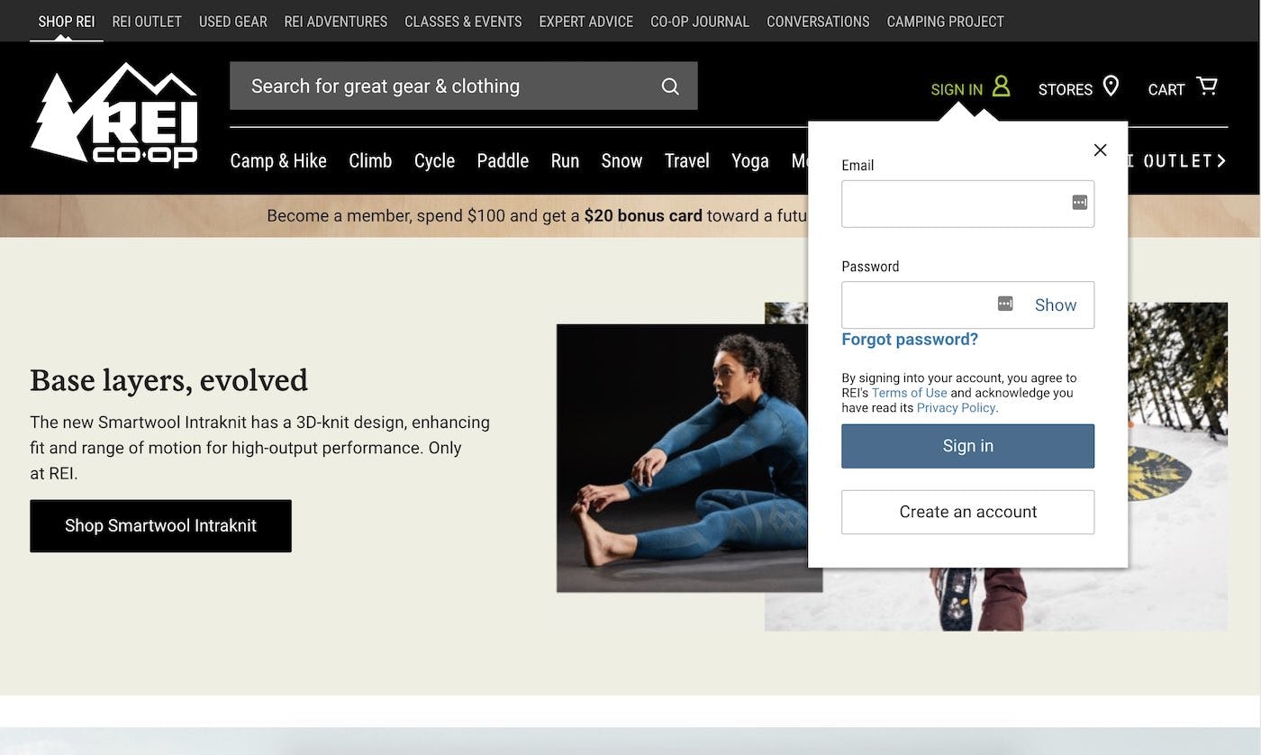
REI allows the user to sign in from the “Account” drop-down rather than redirecting them to a dedicated sign in page.
While honoring users’ expectations after sign in is crucial, note that there are ways of avoiding the sign in detour, and the issues associated with it, altogether.
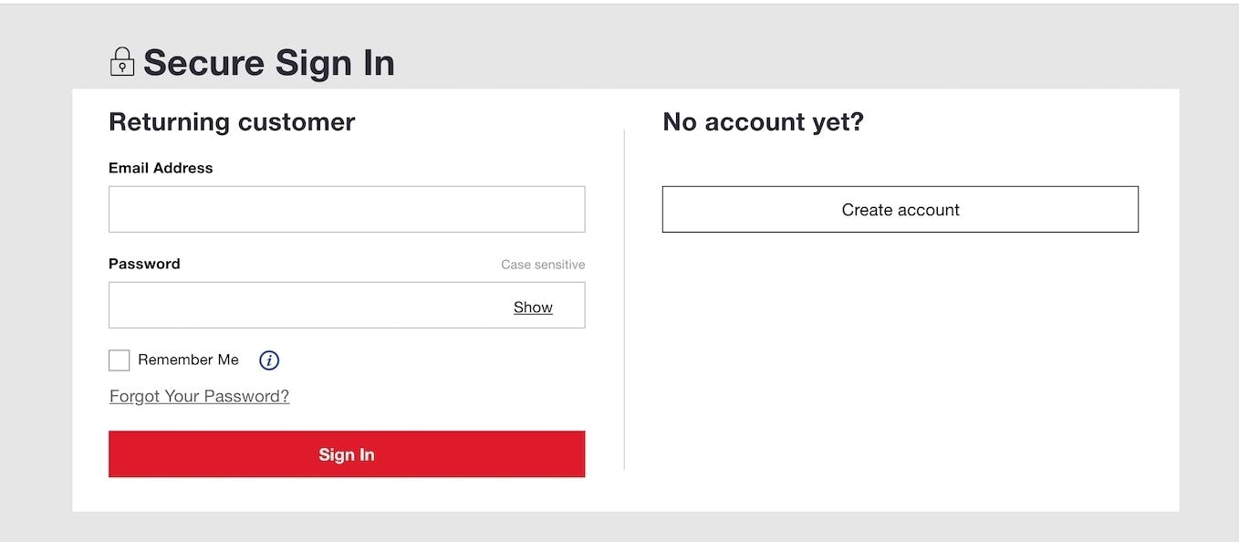
One alternative is to consider allowing users to sign in directly from the “Account” drop-down. By allowing users to sign in directly from the “Account” drop-down users are likely to feel more confident that they’ll stay on the current page, as they aren’t sent to a separate “Account” sign in page but simply sign in from the drop-down itself. Our benchmark reveals that 12% of sites allow users to sign in directly from the “Account” drop-down.
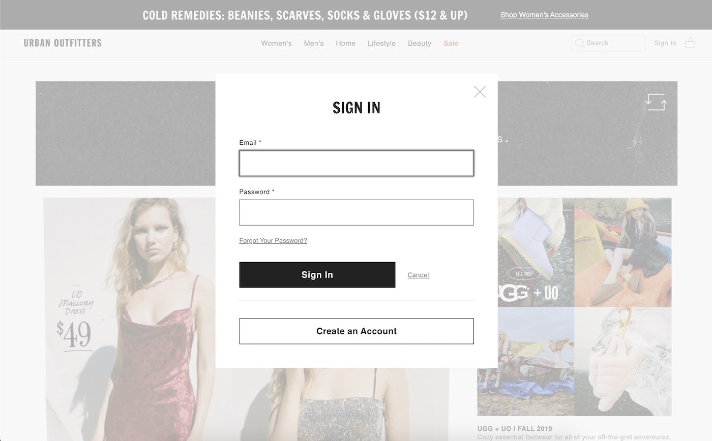
Instead of taking the user to a dedicated account sign in page, Urban Outfitters shows the account sign in as an overlay.
Another option is for the account sign in ‘page’ to appear as an overlay that sits on top of the page that the user is currently on. This can have a similar effect to signing in within the drop-down menu in the sense that the user isn’t actively taken away from the page that they are currently viewing. After successful sign in, a simple refresh of the page that the user was viewing can highlight the successful sign in without their overall journey being heavily disrupted.
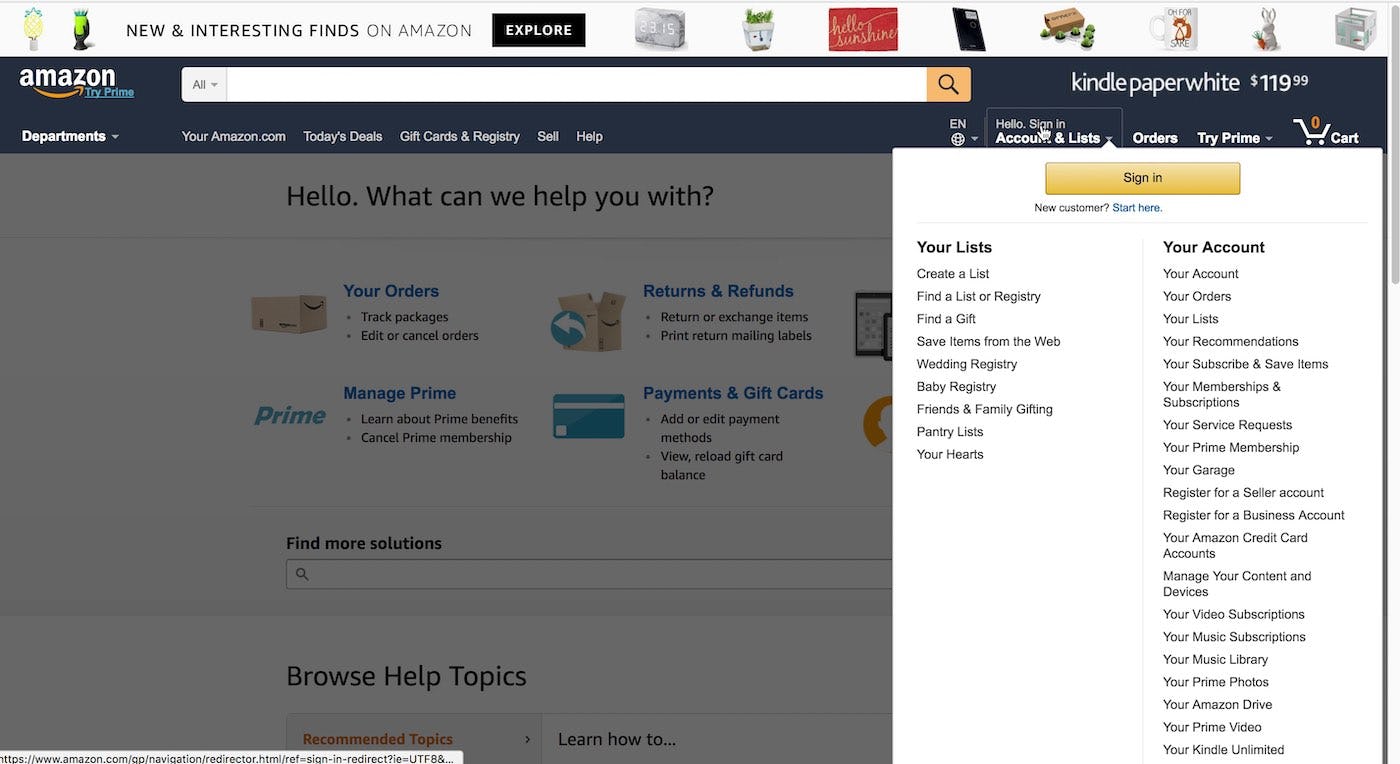
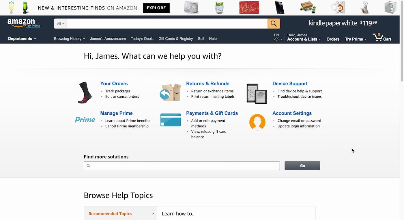
A user on Amazon decided to sign in while on the help page (first image). After signing in on the “Account” sign in page she was returned to the help page (second image), helping her to quickly resume from where she left off.
If users aren’t kept on their current page during sign in, to avoid disorienting them they should be sent to where they indicated they wanted to go before signing in (e.g., to the “Order Tracking Page” if they click the “track orders” link).
Even more importantly, users should be returned to where they were after signing in if they don’t signal their desired destination (e.g., if they click a “sign in” link from the help center, they should be returned to the help center).
The aim is to cause as little disruption as possible to the user if they choose to sign in to their account, or even reset their password, at any point and from any page on the site. Yet 34% of sites fail to honor users’ expectations of where they’ll go after account sign in.
This article presents the research findings from just 1 of the 700+ UX guidelines in Baymard Premium — get full access to learn how to create a “State of the Art” Accounts & Self-Service user experience.