Sorting allows users to rearrange products so that those of most interest are at the top of product lists.
During our large-scale usability testing, we observed that there were 4 essential sort types that were commonly sought out by users.
However, our latest benchmark shows that 64% of desktop sites don’t offer all four of these sort types.
Failing to provide all 4 basic sort types means that some users will be unable to rank products by the criteria that matter to them.
In the absence of relevant sort types, users who are interested in particular attributes must either find a way to use available filters to approximate their desired product list — risking they exclude potentially relevant products — or manually sift through the product list to pick out products that might meet their criteria: a tedious process in many lists, but an almost impossible one in longer lists.
Moreover, alongside the essential sitewide sort types, category-specific sort types are an extra help to users in certain contexts.
Yet, similarly, when these aren’t available some users won’t be able to adjust the product list to their liking — resulting in suitable products remaining unfound by users.
Finally, it was observed in testing that there are sort types that don’t help or actively impede users trying to manage product lists.
Yet, several sites in testing included these sort types that end up doing more harm than good.
This article describes sorting types that large-scale e-commerce sites need to provide to ensure users are able to effectively manipulate product lists. In particular, the article describes
- the 4 sort types that should be available on all sites,
- why category-specific sort types are also helpful, and
- 2 sorting types to avoid.
4 Sort Types to Always Provide
When it comes to sorting, our large-scale testing has revealed that there are 4 basic sort types that almost all large e-commerce sites need to provide:
- Price (all sites offer it)
- User rating average (36% don’t offer it)
- Best-selling (52% don’t offer it)
- Newest (16% don’t offer it)
1) Price (All Sites Offer It)
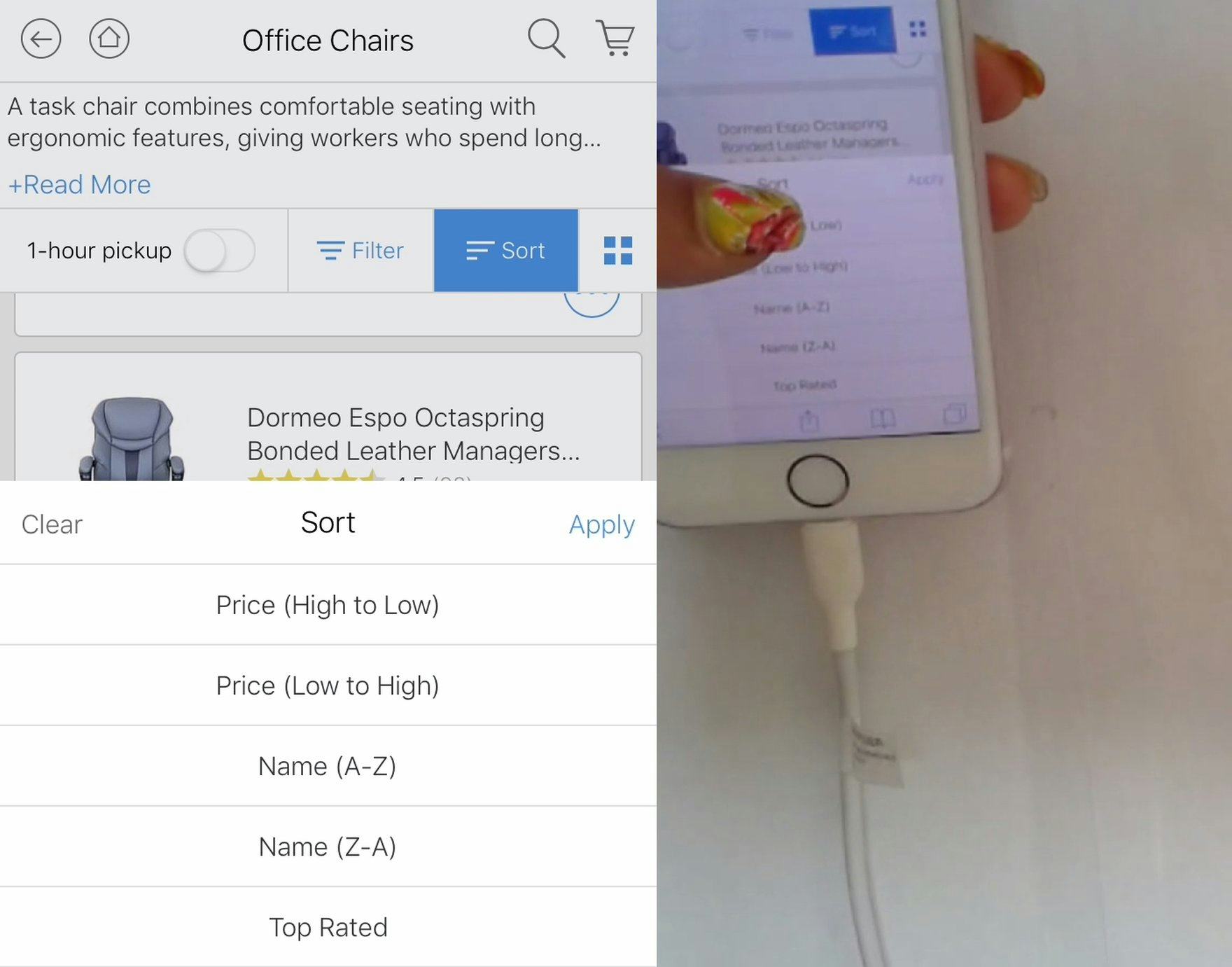
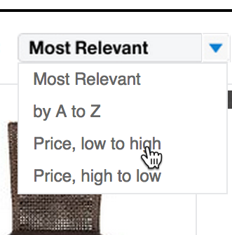
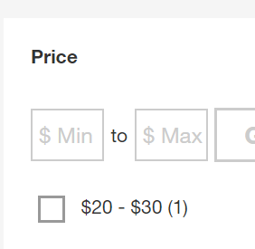
“I want to sort low to high because I don’t want to spend $100 for a chair.” Rather than apply a price filter, this test user opted to sort the product list by price. Seeing all available products from least-to-most expensive allows users to set their own “soft” boundary, and allows them to peek slightly above or below their desired cutoffs to see if any interesting products reside just outside.
Across both desktop and mobile testing, sorting by price was the most commonly applied sort type, with users most often opting to see items sorted from least-to-most expensive.
However, users also occasionally sorted from most-to-least expensive, either because their budget was larger or as a proxy for quality. Therefore, based on UX design principles, “Price” is the only essential sort type that should always be bidirectional.
Given its importance, it’s not surprising that all sites in our benchmark allow users to sort by price.
Yet, when auditing other sites, we occasionally find sites that don’t allow users to sort by price.
Not only does this fail to provide users with an essential sort type, but this also is strongly perceived by most users as “wrong” or an “error” — after all, as sorting by price is clearly a web convention, when it’s not provided it gives users an impression of a site that seems “unfinished” or “amateur”.
2) User Rating (36% Don’t Offer It)
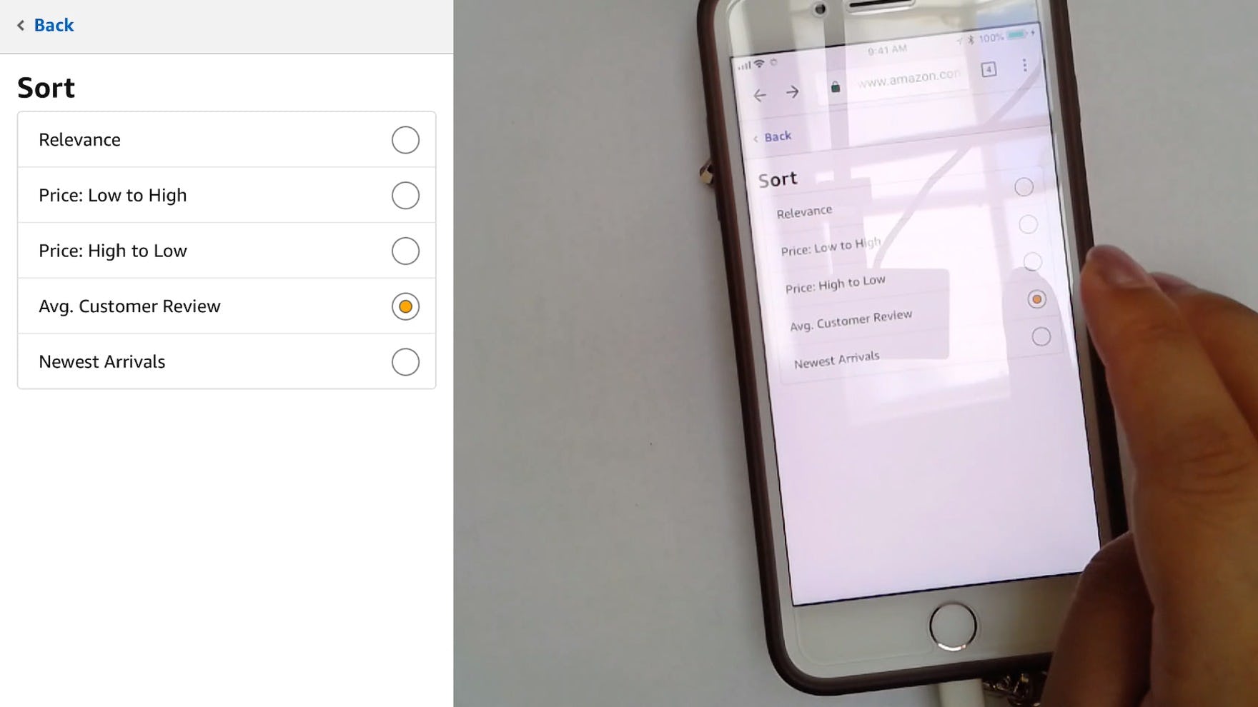
“When I go to Amazon…I sort by the reviews.” This test user immediately sorted the product list by “Avg. Customer Review”, prioritizing products with a high average star rating as a good starting point for browsing.
The next most commonly used sort type observed during testing was “User Rating”.
Unlike when sorting user reviews in product pages, where finding critical low-star reviews is part of performing due diligence, users sorting product lists rarely (if ever) seek out products with a low overall star rating average.
Accordingly, sorting by “User Rating” should be offered as a one-directional sort type, with the highest-rated products appearing first.
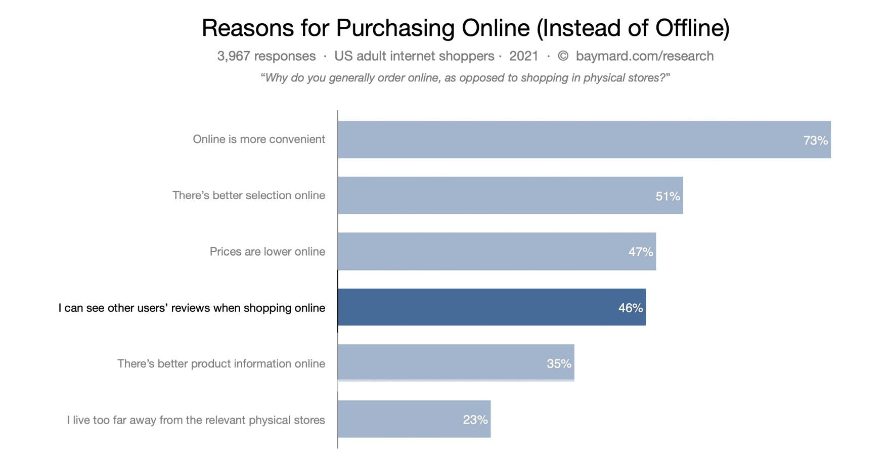
According to our latest survey of “Reasons for Purchasing Online (Instead of Offline)”, 46% of users cite that being able to see other users’ reviews when shopping online was a key factor.
Yet, despite 46% of users stating in our “Reasons for Purchasing Online (Instead of Offline) 2021” survey that being able to see other users’ reviews when shopping online was a key factor, a surprisingly high 36% of desktop sites in our benchmark fail to enable users to sort by “User Rating”, thus increasing the likelihood that suitable products with decent reviews will be overlooked.
3) Best-Selling (52% don’t offer it)
“Maybe “Best Sellers””, ’cause I don’t really know what I’m doing.” This test user on B&H Photo, unfamiliar with the wireless speakers he was browsing, opted for “Best Sellers” as a way to tap into the most popular products.
During testing, we observed users opt for the “Best-Selling” sort type when they were unfamiliar with the product domain, seeking to find quality product options based on the collective wisdom of past purchasers.
Additionally, users who were skeptical of the “User Rating” sort type relied on sorting by “Best-Selling” as a more trustworthy alternative.
As one test user stated, “I assume that if something is “best-selling” it will have a high rating. I can actually trust “Best-Selling” a bit better, because more people have rated it. Whereas “Highest Rated” I wouldn’t even go for, because probably less people rated it”.
Surprisingly, 52% of desktop sites don’t allow users to sort by “Best-Selling”.
Given how users rely heavily on the opinions and buying choices of their peers when assessing products, sites that don’t offer this sort type are at a disadvantage, particularly if users are not convinced by the user ratings.
4) Newest (16% Don’t Offer It)
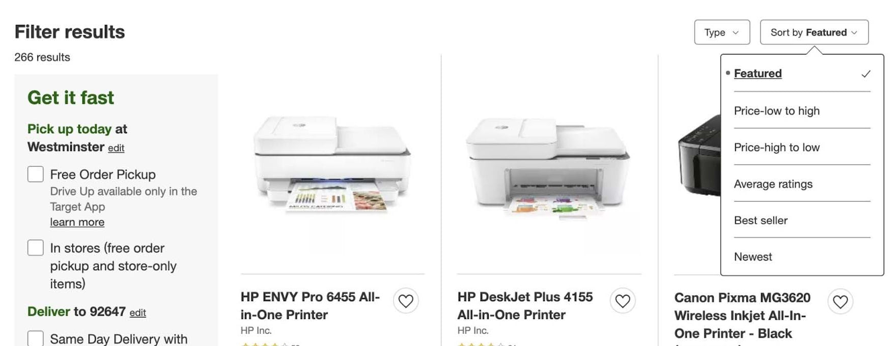
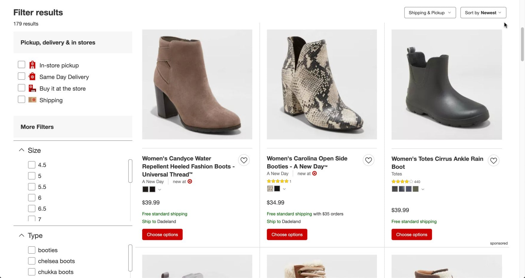
At Target, offering a “Newest” sort type helps users who are particularly interested in new arrivals.
Sorting by “Newest” — looking for the most recently added or released products — is particularly beneficial for returning users, who may wish to only see what’s new (rather than having to manually sift through products they’ve seen before), as well as for those seeking trendy or seasonal items.
As one user stated, “H&M is one of the websites that I check from time to time, so I might pick ‘New Arrivals’ and see what new stuff they have”.
As with “User Rating”, users are unlikely to need the bidirectional counterpart for this sort type (i.e., sorting to see the oldest items first).
Yet 16% of desktop sites don’t offer sorting by “Newest”, a significant minority. Given that well over three-quarters of sites offer sorting by “Newest”, the lack of this sort type could come as a surprise, compounding its negative effect on product finding.
Provide Category-Specific Sort Types for Relevant Product Types
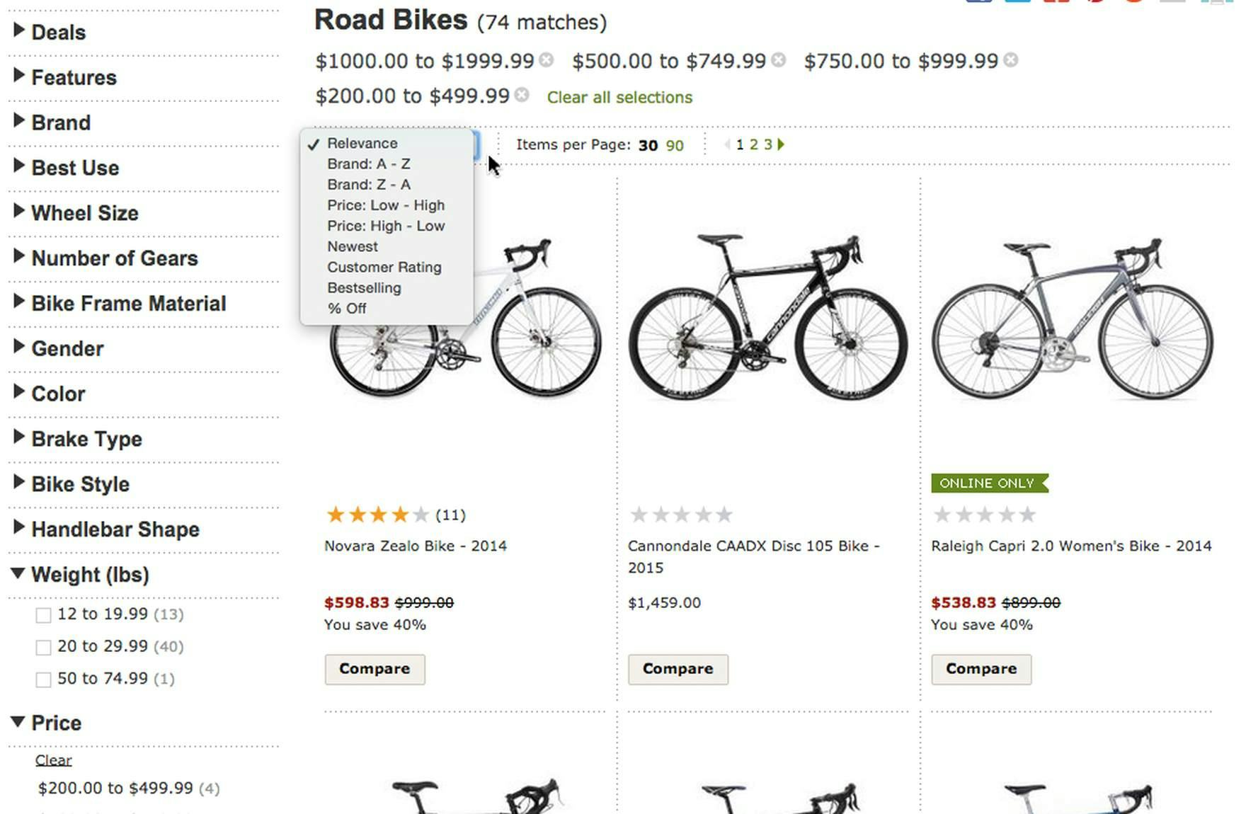
REI doesn’t offer category-specific sort options that would make it easier for users to find relevant products (e.g., sorting road bikes by weight) even though there are many category-specific filters included. Sorting by product attributes allows users to apply soft-boundary product requirements rather than hard-boundary filters.
In addition to the 4 essential sitewide sort types, many sites have additional opportunities to provide unique and contextually relevant sort types.
Examples of category-specific sort types include the size of bike wheels, the release dates of movies, and the weight of winter jackets.
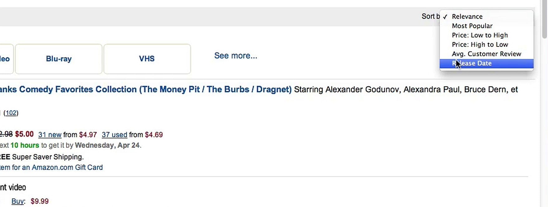
During desktop testing, Amazon included category-specific sort types for some of their product categories, such as “Release date” within the “Movies & TV” category. This contextually relevant sort type was found and applied by the vast majority of the test users, who found it highly useful when browsing for this specific kind of product.
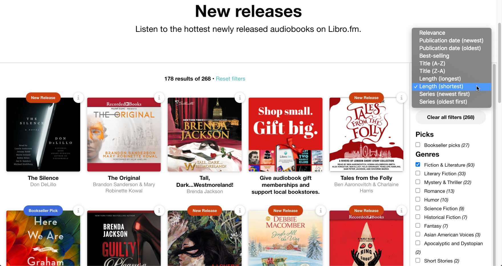
Libro.fm allows users to sort audiobooks by “Length”, which can be a valuable attribute (for instance, desiring a “short” audiobook but not having a specific maximum length in mind).
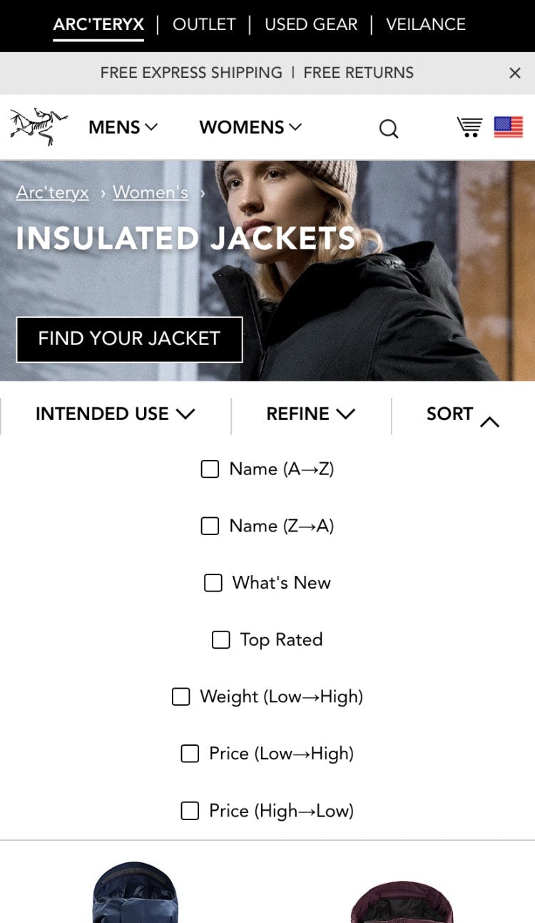
Arc’teryx features a “Weight” sort type that allows users to see lighter jackets first, providing a useful alternative for users who aren’t confident in using hard “Weight” filters to exclude products from the list.
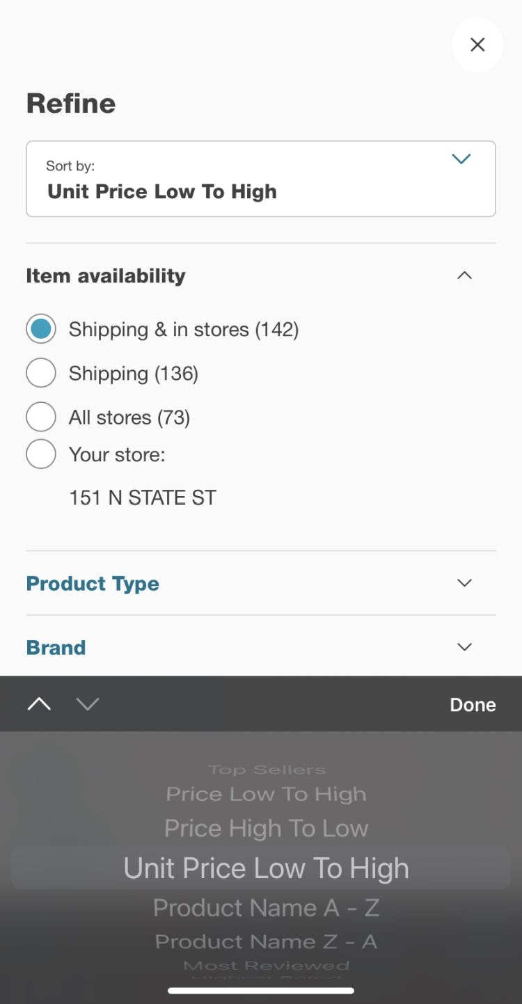
At Walgreens, users can sort by “Unit Price”, which can be more useful for grocery, health, and personal care products than standard “Price” when comparing among different products.
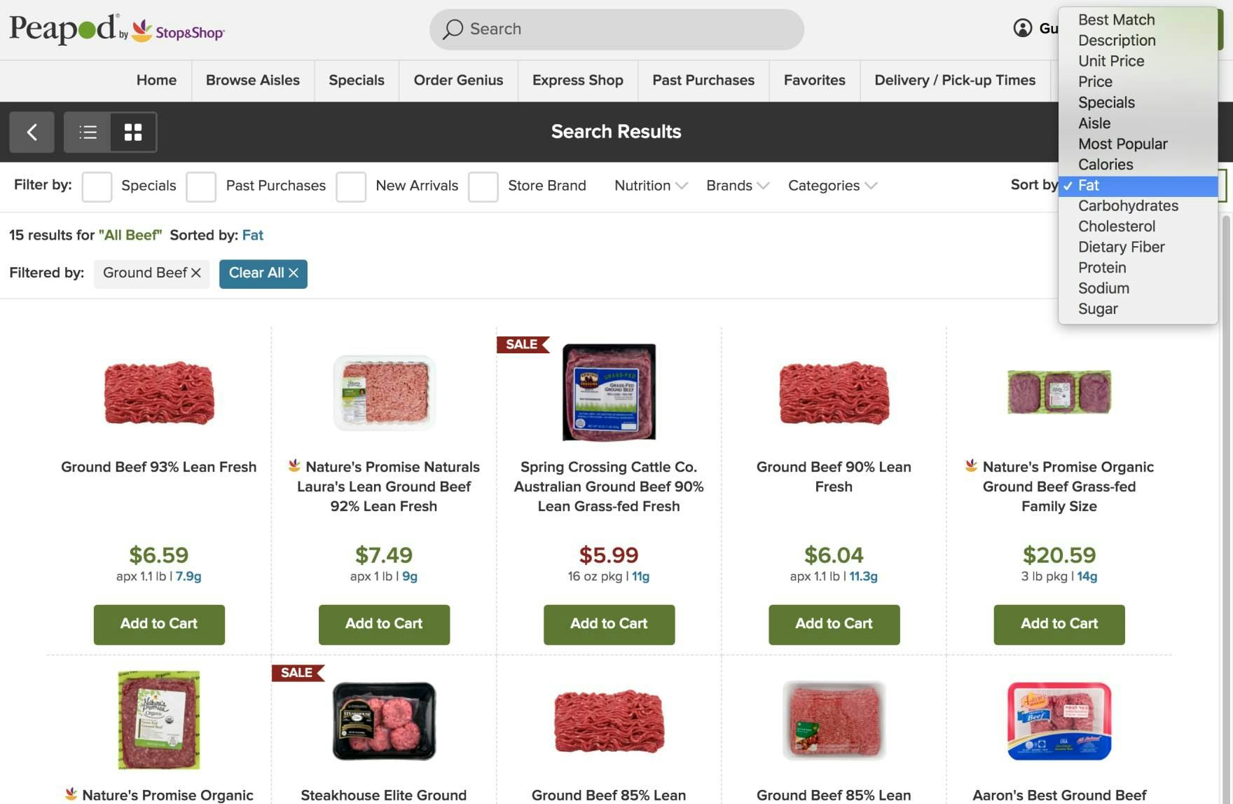
At grocery site PeaPod users have several category-specific sorting options, like calories, fat, protein, etc. This allows users who care about a specific product attribute to simply express their broad soft-boundary interest in, for example, “low-fat” products, without specifying several specific filtering values for that attribute (which still wouldn’t display lowest-fat products first).
During testing, users at times tried seeking out category-specific sort types in order to specifically target product attributes that were important to them. (See also this earlier article for an outline of the fundamental concepts of category-specific sorting.)
In fact, during desktop testing, on a test site that had (partially) implemented category-specific sort types, it was used extensively by test users.
Specifically, category-specific sorting can provide a superior alternative to the “hard” boundary enforced by filters for users who have flexible requirements (e.g., wanting a cereal that’s high in fiber without having specific upper or lower limits in mind) or for those who aren’t familiar or confident with domain filters (e.g., wanting a warm down coat, but not understanding “Temperature Rating” or “Fill Power” filters).
Additionally, many users rely on a combination of both hard boundaries (i.e., filters) and soft boundaries (i.e., sorting) depending on their needs and preferences.
For example, they may opt to both filter and sort audiobooks by “Length” as a way to intensely control the product list according to their most important product attribute.
In effect, category-specific filters provide additional flexibility for users browsing product lists, and they are thus an important piece of the puzzle when it comes to helping users get suitable product lists and search results.
2 Sort Types to Avoid
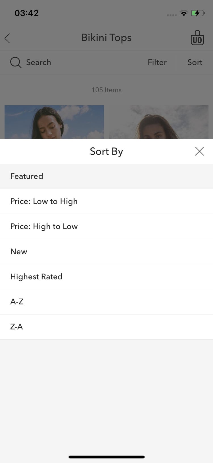
While there are 4 essential sort types, there are 2 more that were observed in testing to actually hamper users’ efforts to manage product lists according to their needs — “Alphabetical” and “Sort By”.
1) Alphabetical Sorting
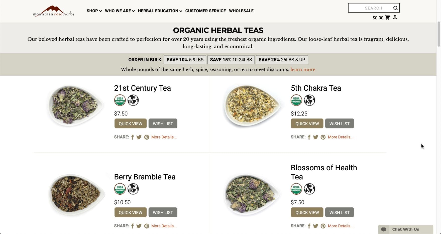
At Mountain Rose Herbs, the default sort order “Alphabetical” makes it hard for users to find relevant products. For instance, herbal tea blends with obscure names (that don’t necessarily indicate their effect, benefits, or ingredients) result in those with numerals in their names appearing first, with the rest falling in alphabetical order. In effect, it’s impossible for users to predict the name of teas they may be interested in, making this sort type less helpful.
Finally, in testing we observed that users deliberately sorting product lists by “Alphabetical” was extremely rare.
For instance, during both mobile site and mobile app testing, no users opted for this sort type when it was available.
Sorting a list of products alphabetically by title, name, or description requires users to accurately predict the site or product manufacturers’ naming schema.
In practice, this is nearly impossible, and such alphabetical sorting often leads users on detours or becomes a direct dead-end.
This lack of predictability is further worsened if the product-naming structure is not consistent across the site’s entire product catalog; for example, if the title supplied by the product manufacturer is used.
Therefore, for the majority of sites, “Alphabetical” sorting should be avoided.
2) “Sort By”
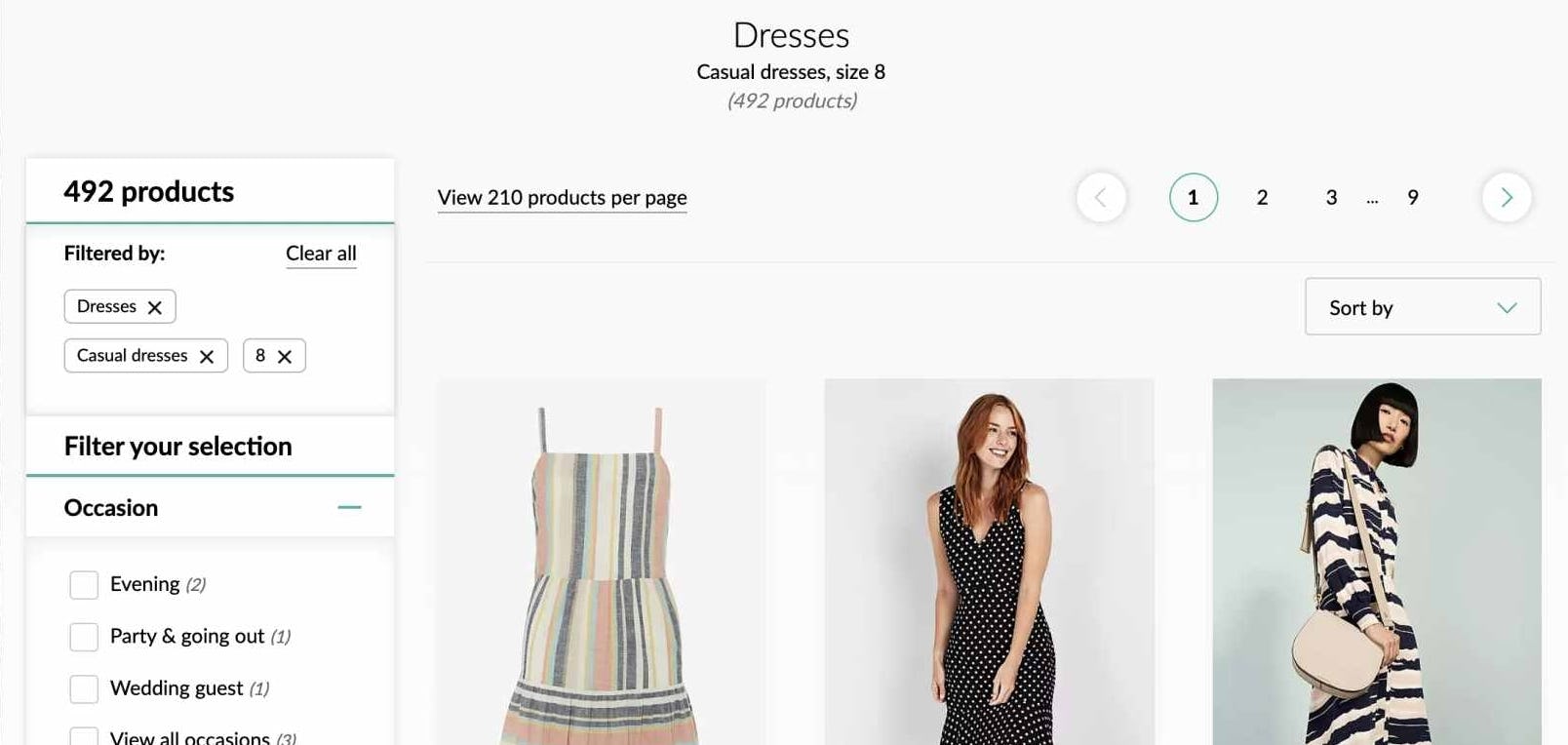
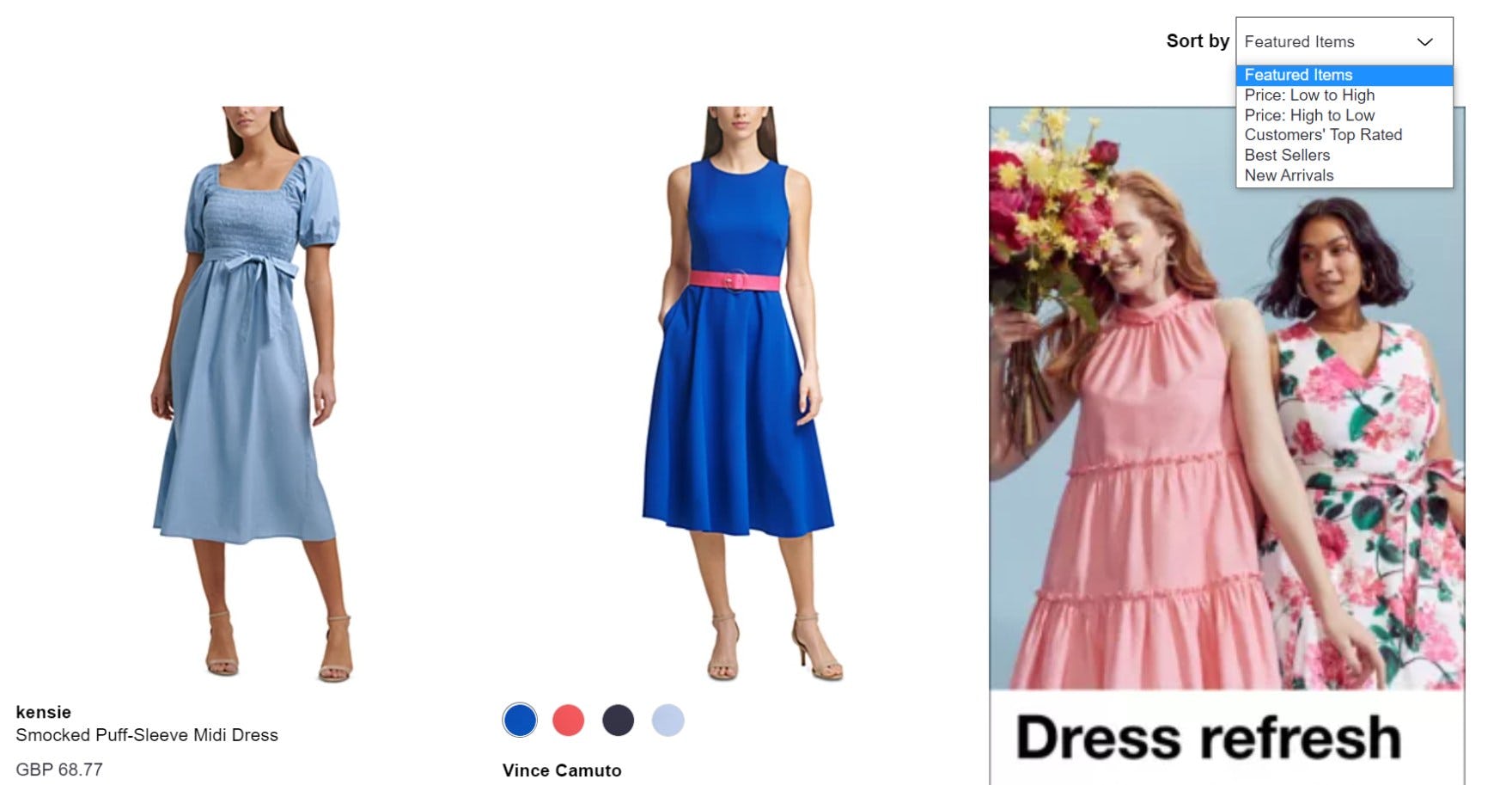
Debenhams relies on a “Sort By” option, which doesn’t communicate to users anything regarding how the list is currently sorted.
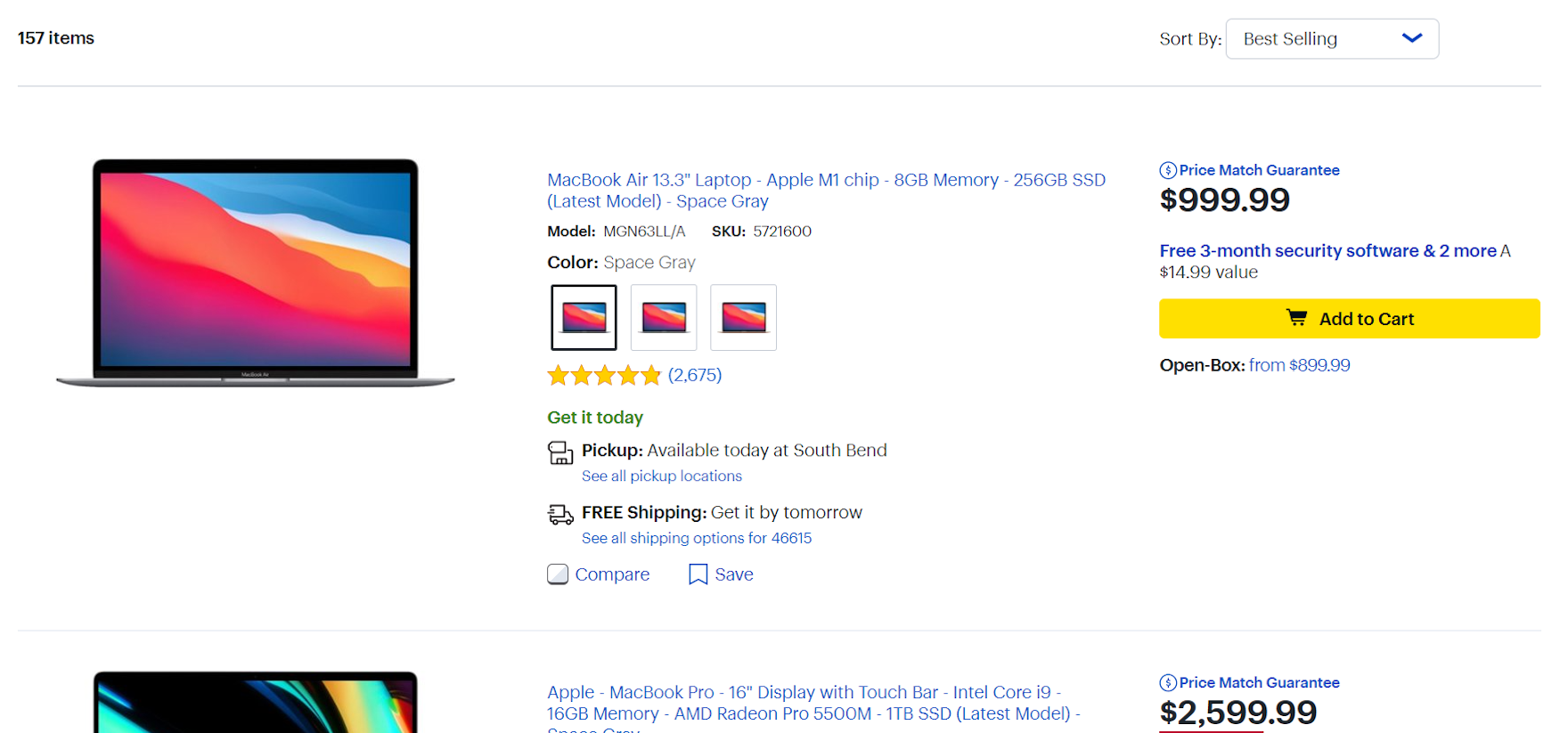
Best Buy places the “Sort By” label outside the sort dropdown, so it’s clear that the default sort order is “Best-selling”.
Testing revealed that using “Sort By” as an inline sorting label made it difficult, if not impossible, for some users to determine how the product list was sorted.
Furthermore, having a “Sort By” option within the sorting drop-down can cause additional confusion as users attempt to change the applied sort option, because returning to the “original state” of the product list requires them to remember and select the ambiguous name “Sort By”.
Nevertheless, 30% of our benchmark sites include “Sort By” as a sort option, needlessly complicating the process of managing and tailoring product lists.
Instead, sites should have a clear label alongside the sort drop-down (e.g., “Sort By”), with the selected sort type visible by default.
Enabling Users to Sort Effectively
Macy’s provides all of the essential sort types, while avoiding those that can cause issues for users.
Sorting is especially useful for users that don’t have an exact cutoff in mind for an attribute like price, but would like instead to look at items in and around a certain range.
In conjunction with filters, sorting is a powerful method for users to contextualize the product list and organize it in ways that are meaningful to them.
Reordering the product list by certain criteria can make the process of finding suitable products easier and more efficient, helping users compare products in a relevant ranking.
During our large-scale usability testing, we observed that there were 4 essential sort types:
- Price (all sites offer it)
- User Rating Average (36% don’t offer it)
- Best-selling (52% don’t offer it)
- Newest (16% don’t offer it)
In addition, carefully chosen category-specific sort types provide users with even more control of product lists.
Finally, “Alphabetical” and “Sort By” should be avoided as sort types.
If a site fails to offer the right sort types, users will have a more difficult time finding the products they most want to see, and some may not find what they need at all.
On the other hand, providing the essential sitewide and category-specific sort types (in addition to the 4 essential filters), while avoiding troublesome sort types, provides users with the ability to effectively manage product lists.
This article presents the research findings from just 1 of the 700+ UX guidelines in Baymard – get full access to learn how to create a “State of the Art” ecommerce user experience.

