When users aren’t allow to place orders for temporarily out of stock products they are likely to go to a competitor.
Updated with new data in 2025.
During our usability testing of product pages users would sometimes stumble on products that were listed as “out of stock.” What’s clear from testing is that if users are simply told a product or product variation is out of stock, some will look for alternative products on the site but 30% are likely to simply abandon to look for the product elsewhere.
Presenting users with text that simply states a product is “out of stock” is a UX dead end: users can’t go any further on a site if they are truly set on purchasing that particular product.
Amazingly, our latest benchmark of product pages reveals that 68% of sites don’t allow users to place orders for temporarily out of stock products, which greatly increases the likelihood that a user intent on purchasing a particular product listed as out of stock will abandon and look for the item at a competing site.
In this article, we’ll cover the research findings from our latest product page study, as well as from our other e-commerce studies, that relate to users’ experience with products or product variations listed as out of stock. In particular, we’ll address:
- Why users should be allowed to purchase temporarily out of stock products,
- Why “e-mail me when back in stock” and “save to wishlist” features are insufficient strategies for temporarily out of stock products, and
- What to do when a product has been permanently discontinued or deprecated.
The Difference Between ‘Out of Stock’ and Truly ‘Unavailable’ Products in E-Commerce
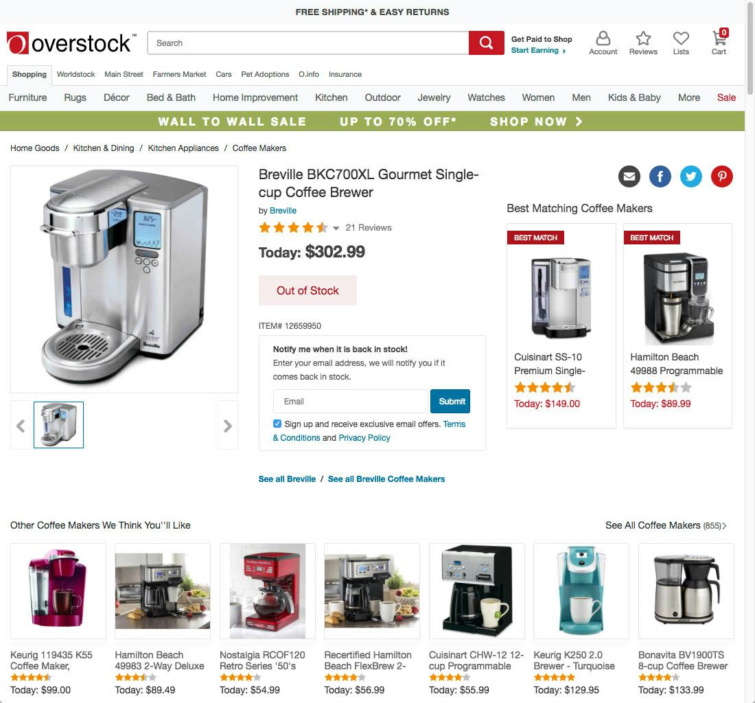
Telling users a product is out of stock and removing the “Add to Cart” button, as is the case here at Overstock, brings them to a complete halt and prevents the user from purchasing the item.
When customers shop at brick and mortar stores they usually expect to be able to leave the store with the product or products they intended to purchase. Hence, if the customer can’t purchase the product at that very moment, for all intents and purposes the product is truly unavailable.
However, the context is different in e-commerce, where there’s a built-in time delay, and users thus don’t expect to receive the product they’re interested in immediately.
It’s perhaps easy to forget that users assume they’ll have to wait for a product when shopping online. From the perspective of site owners, there isn’t any downtime once users complete a transaction by finishing the checkout process: confirmation emails are sent, order processing begins, and the products are readied for shipping. However, from the user’s perspective, there is always a period of downtime while they wait to receive their order. Depending on the shipping method selected, it could be as soon as a couple of hours to several weeks until they expect to receive their order.
This gap of time, from when users first place the order to when they expect to actually receive it, can be be taken advantage of by allowing users to place orders for items that are only temporarily out of stock.
For example, an apparel site may have a dress that’s extremely popular in red, while other variations of the dress (black, white, etc.) are less popular. Consequently, the red dress is frequently out of stock online, though the stock is regularly replenished by the manufacturer. Since it’s know that the red dress is almost certainly going to be replenished in a reasonable amount of time, and that the user might only have to wait an extra day or two to receive the product, the user should be allowed to complete the checkout and the delivery time should simply be increased for the red dress.
Why E-Mail Notifications and “Wishlists” Aren’t Viable Alternatives
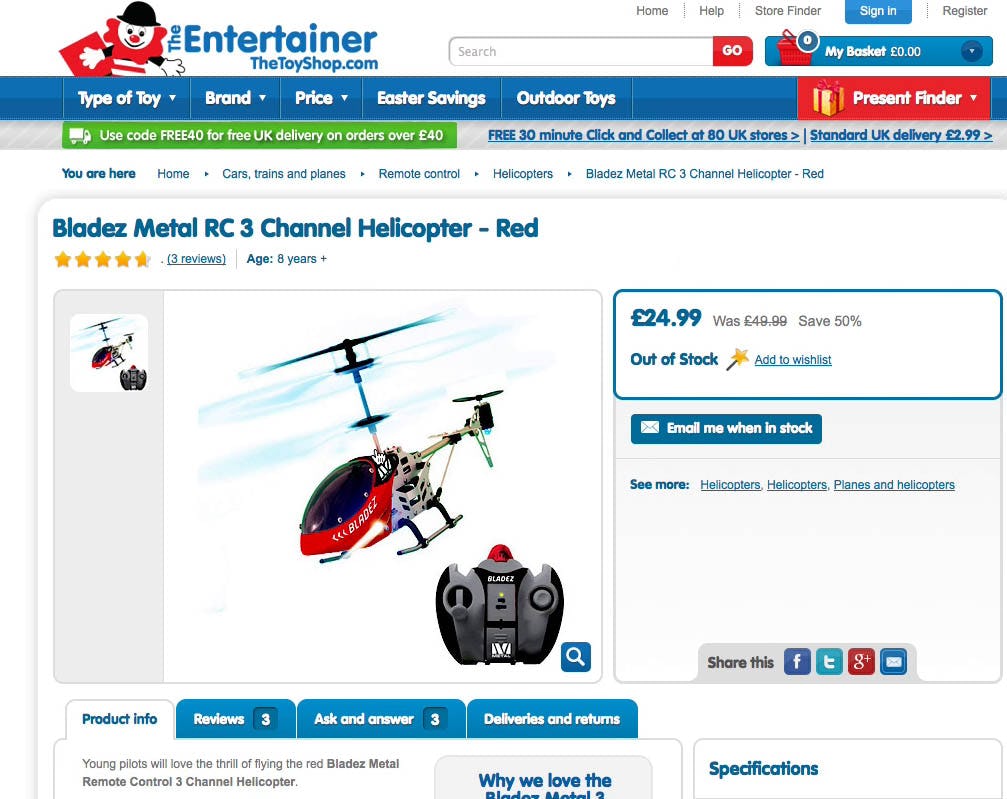
This subject arrived at a product page on The Entertainer only to see the product was out of stock. The subject immediately clicked the “Back” button and didn’t click the “Email me when in stock” button. Rather than losing a potential sale, consider allowing users to purchase temporarily out of stock products.
Our testing has revealed a couple of different strategies some sites use for out of stock products, including providing an “Email me when in stock” button or allowing users to add the product to a list.
However, testing indicates that in general these strategies for handling out of stock products are likely to perform poorly with users.
Providing an “Email me when in stock” button essentially lets users off the hook, by saying, “Don’t worry about completing this purchase now — come back later when we have it in stock.” In reality, of course, unless the product is unique or hard to find elsewhere, many users are likely to simply see the “Email me when back in stock” button as a notice that they should look for the product on another site. Or, as testing showed, many users will decide they don’t want to bother with the “Email me” button at all. Why wait to receive an email from one site, alerting them that a product is in stock, when they can likely purchase the product immediately at a competing site?
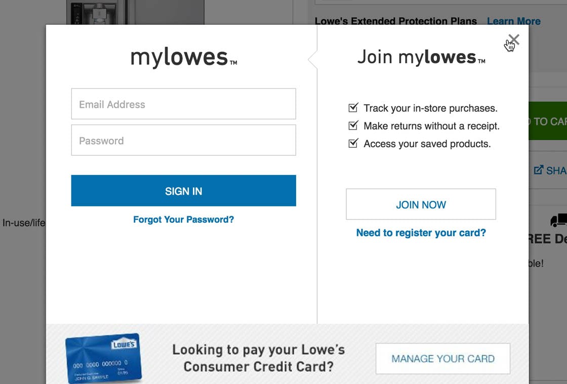
“Maybe I want to save it.” This subject was interested in a refrigerator at Lowe’s but refused to create an account to save the product: “No never mind I don’t want to do that. They can’t have my name.” Account walls ensure that most users won’t use the “Save” feature, making the feature unhelpful to many users interested in out of stock products.
Allowing users to add a product to a list can also lead to issues, given that our benchmark reveals that 75% of sites require users to create an account to use these “save” features.
Product page testing, our previous checkout testing, and our survey data, all reveal that users have a strong aversion to forced account creation. In fact, Baymard’s quantitative study on reasons for checkout abandonment shows that 19% of US internet shoppers have abandoned one or more shopping carts during the past quarter solely due to forced account creation. Indeed, when we’re working with audit clients it’s not uncommon to see account walls cause a 30% drop-off rate, even for large Fortune 500 sites. Thus, users are unlikely to use any “Add to list” or “Save” features for out of stock products, given their desire to avoid the hassle of creating an account.
Therefore, “Email me when in stock” and “Save to list” features shouldn’t be relied upon as primary strategies for handling temporarily out of stock products. They simply aren’t as powerful, and therefore shouldn’t be considered as alternatives to allowing users to actually purchase the product with a later delivery date (although they may serve as supplements to this).
How to Approach Out of Stock Products: Considering Out of Stock UX
In order to decide whether users should be allowed to purchase an ‘out of stock’ product, it first must be determined whether the product is:
- Temporarily out of stock, or
- Permanently discontinued or deprecated.
Scenario #1: The Product Is Temporarily Out of Stock
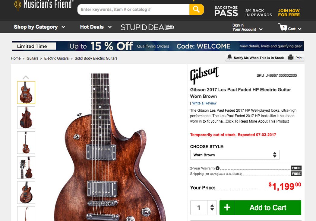
Note how the guitar at Muscian’s Friend is listed as “Temporarily out of stock” yet users are still allowed to add the product to the cart and proceed to the checkout.
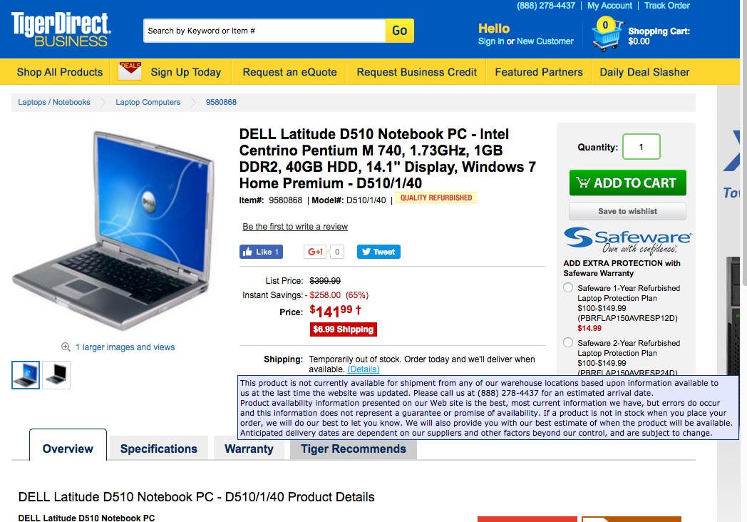
TigerDirect provides a tooltip that explains to users the details on how purchasing an out of stock product will affect the actual delivery of the product.
If a product or a product variation is temporarily out of stock at the moment when the user is attempting to purchase it, but is expected to be replenished soon, then sites can leverage users’ expectation that they’ll have to wait to receive the product by – as already discussed – allowing users to place an order for the out of stock product and simply increasing its delivery time. In some cases users may not even realize that a product is currently out of stock, if the product is replenished regularly and the delivery date therefore isn’t much later than if the product was technically in stock.
Additionally, it’s worth considering providing a tooltip or text somewhere on the product page (likely near the “Buy” Section, as our product page usability research has found this section to draw significant focus from users) that explains to the user why there’s an extended wait time for their product.
Our previous Checkout research has found users to generally be receptive to tooltips when they need more information to make an informed selection (e.g., for warranties, security code fields, or site-specific features or options), and it’s reasonable to assume similar tendencies from users when faced with extended delivery times for out of stock products (especially if the delivery time is noticeably longer than what’s normal for other products at the site).
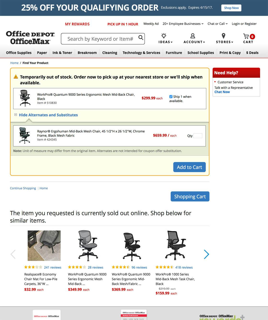
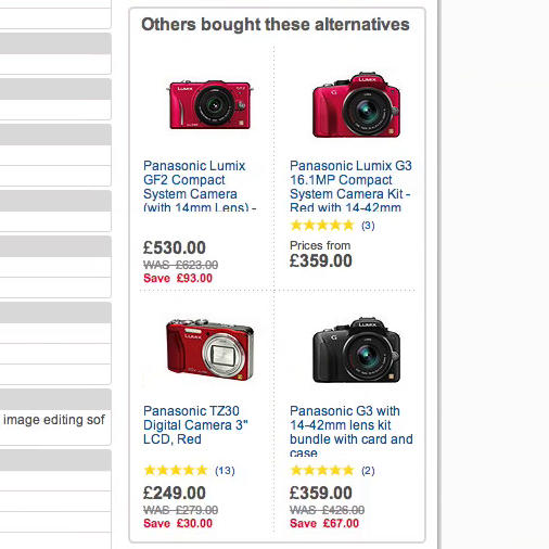
Office Depot allows users to purchase the out of stock chair but also promotes alternatives for users to consider. Users are given multiple options for adding a suitable product to the cart and finding a chair they like on the site.
Of course, sometimes users don’t want to wait for products that have an extended delivery time because they are out of stock. Therefore it’s important to promote alternatives to the product the user is currently viewing that is temporarily out of stock (note: in this case, make sure they are alternative, and not supplementary, product suggestions). That way the user can choose to wait for the product they’re currently viewing, if they’re dead set on purchasing that particular item, or they can choose to select an alternative product and receive it sooner. Either way the user is allowed to purchase a product on the site, and won’t reach a dead end.
Scenario #2: The Product Is Permanently Discontinued
If, on the other hand, a product has been discontinued or deprecated, then it is truly unavailable and users should be informed of that fact by clearly marking the product as “discontinued” or “deprecated” – and cross-sells should be heavily promoted.
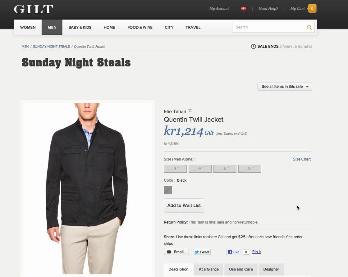
When arriving at the product page for a jacket at Gilt, this subject was surprised to find all the sizes crossed out. Without prominently displayed alternatives, the subject was at a dead end.
It’s important to remember that the first purpose of a product page for an unavailable product is to communicate to users that the product is in fact unavailable. It should be immediately clear to users when they arrive at the page that the product can’t be purchased.
Yet, users who arrive at a product page that simply says “Product no longer available” or “Discontinued,” without being offered alternative products or paths to consider, are very likely to leave immediately to seek out the product at a competing site. This represents a missed opportunity, since it’s already known what type of product the user is interested in based on the deprecated product they’re currently viewing.
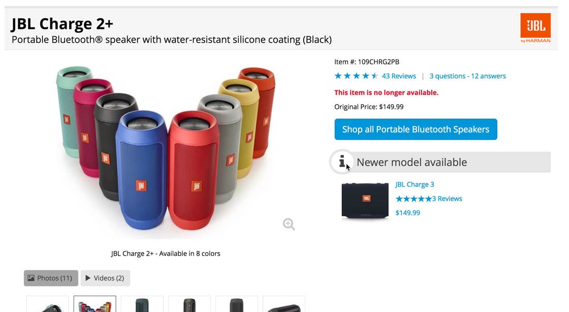
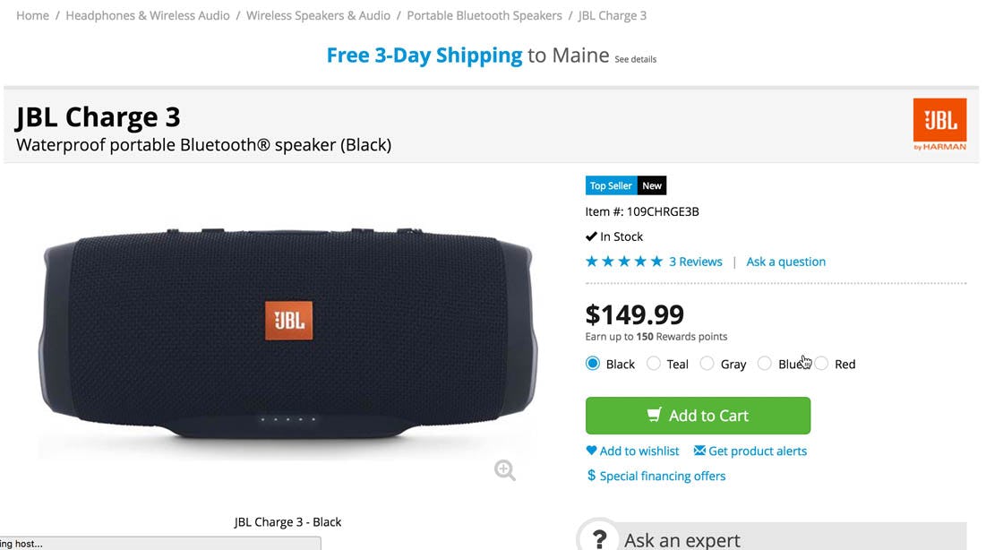
This subject arrived at a page for a speaker at Crutchfield (first image) that was deprecated. “I can go to the newer model,” she said, noticing the display of the newer model available. She clicked the provided link for the newer model and found it available to purchase (second image).
On product pages for deprecated or discontinued products, the alternative products should therefore be promoted very aggressively. Indeed, the alternative products should be shown at the very top of the product page, for example as a replacement for the “Buy” section, or even injected between the main navigation and product page contents. The prominent placement will nudge users to explore products that can be purchased on the site, and thus avoid leaving it up to the user to figure out where to go next (since that next destination may then very well be another site).
It’s About Avoiding Product Page Dead Ends
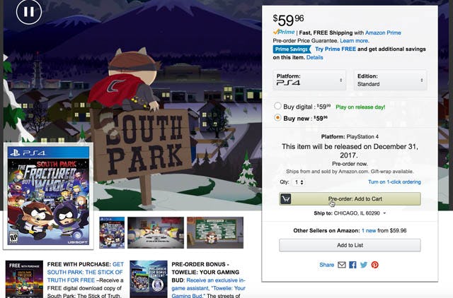
Pre-orders can be treated the same as a product that’s temporarily out of stock, ensuring that users are able to purchase products that won’t be available for months, as is the case here at Amazon. Consider instead how simply noting “Product Not Yet Available” or not having a product page at all for a future product would prevent users from purchasing the product.
Allowing users to purchase temporarily out of stock products is similar to allowing them to pre-order products that aren’t available yet – effectively accepting orders for products that aren’t currently in stock but will be some time in the future. This ensures that users are able to purchase the product at your site, and not forced to go to a competitor.
Testing revealed “Email Me” buttons or waitlists to be vastly less effective than orders, and they should therefore be avoided as the sole strategy for temporarily out of stock products (and probably pre-orders too). This effect is likely because e-mails and waitlists don’t produce nearly as strong a commitment between the site and user as a real order transaction does.
Therefore, for temporarily out of stock products:
- Allow users to purchase the products and simply increase the delivery time, and
- Prominently display product alternatives for users that aren’t dead-set on this particular item but are time-sensitive.
And for discontinued or deprecated products:
- Let users know that the product won’t be available to purchase by prominently displaying text such as “Discontinued” or “Deprecated” at the top of the product page or as a replacement for the “Buy” section, and
- Heavily promote alternatives to keep users engaged and encourage them to continue their product finding search on your site.
Remember that, in the end, the goal is to keep users on your site, and have them purchase their product there, rather than at a competitor’s site or at a brick and mortar store. These two strategies help you do just that by taking advantage of the inherent time-delay in online shopping.
This article presents the research findings from just 1 of the 700+ UX guidelines in Baymard – get full access to learn how to create a “State of the Art” ecommerce user experience.