A core aspect of the product list is leading the user towards a product page – yet, our benchmark of 50 major US e-commerce sites reveals that 76% of sites have a list item design where it’s unclear to users exactly what can be clicked, and where they will then be taken if clicked.
Indeed, during our large-scale e-commerce usability testing and benchmarking of how users navigate product listing pages, it’s surprisingly often unclear to the test subjects exactly which elements in a list item can be clicked and what action may result from doing so.
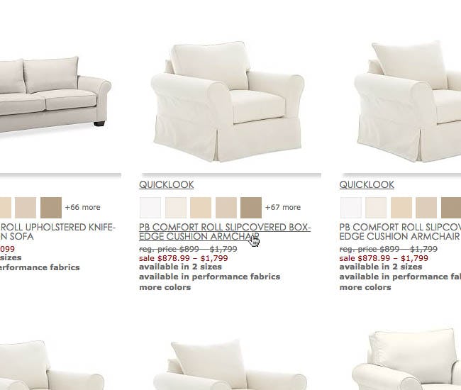
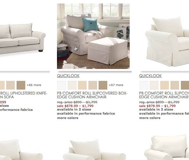
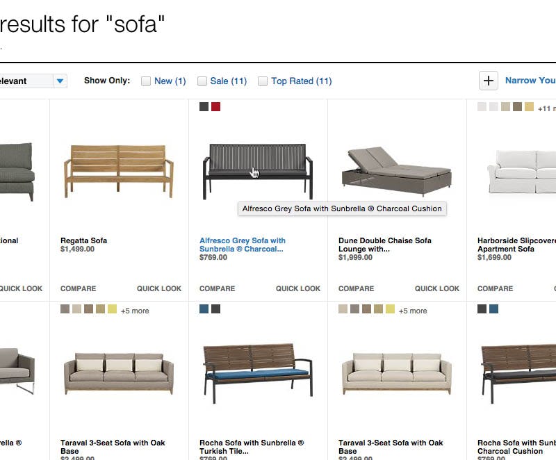
At Pottery Barn, this test subject had a difficult time predicting what clicking each element in the list item would do. Notice how users have 3 different paths spread across 5 different interactive elements, none of which react in a consistent manner: the product title is underscored on hover (left image), whereas the ‘Quicklook’ link above it is permanently underscored. And while the product thumbnail changes on hover (right image), the color swatches below it do not. Meanwhile clicking the color swatches change the list item’s thumbnail whereas its accompanying “+ more” link takes the user to the product page. Confused yet?
This violates a core principle of web usability: making it clear to users what elements can be clicked and – just as importantly – accurately predicting the site’s response to those clicks (i.e. what new page will be loaded, or which elements on the current page will change).
Luckily, our usability testing has also revealed some very simple design patterns that consistently address these issue of unclear hit-areas and poor information scent (e.g. uncertainty about link destinations). What’s more, these solutions are mostly basic front-end changes that neither requires complex new back-end logic nor new data structures. In fact, considering the ease of implementation, the potential impact on usability, and the low adherence rates across e-commerces at large, this may be considered low-hanging fruit.
Distinguishing Between Single- and Multi-Path List Items
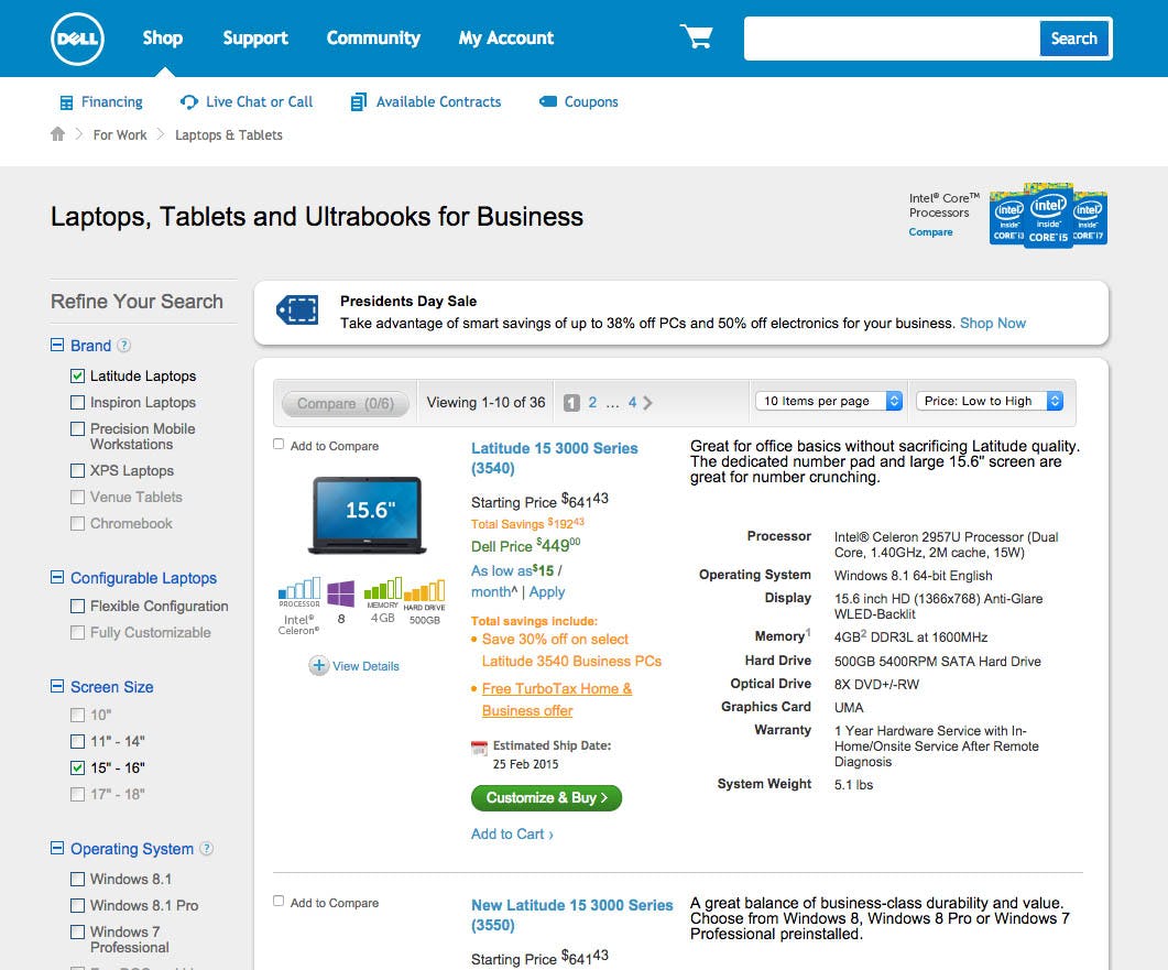
Note the sheer amount of links, buttons, and icons in Dell’s multi-path list items. It’s simply unclear which links lead to the same destination and which lead to separate paths. Some elements open descriptions of offers, others expand various product details, while others yet will open tooltips, and finally there’s of course all the elements that actually take the user to the product page. Alas, none of the hover styles are synchronized to help users understand all of this.
When talking about list items, their hit areas, and how easy it is for users to gauge the different paths within them, it’s important that we first distinguish between two main types of list items:
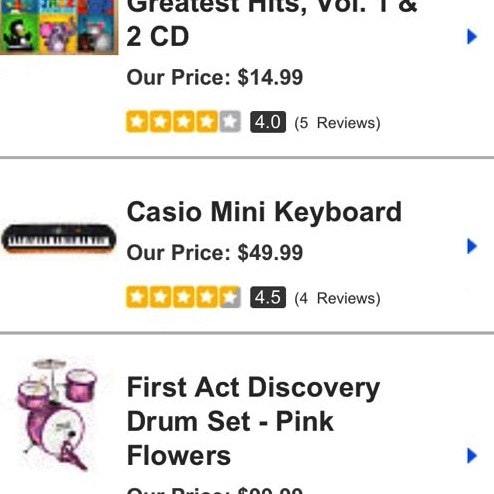
- Single-path list items: is when all clickable elements take the user to the product page.
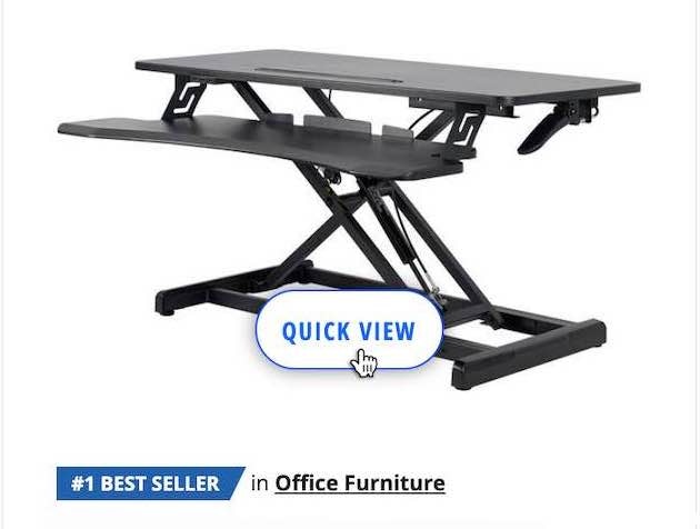
- Multi-path list items: is when there are clickable elements with different destinations – some of which won’t take the user to the product page. Typically this can be: clickable color swatches (that change the list item thumbnail), “Add to Cart” buttons, “Quick Views” (which testing reveal should seldom be used), deep links to the User Reviews section for the product, links for offers, terms and conditions, and highlights of items that the user already have in their cart.
Because single-path list items only lead to the product page they tend to be easier for users to understand conceptually and interact with. Compare this to multi-path list items which include multiple possible interactions and therefore require the user to pay close attention to what they are clicking within the list item so they don’t accidentally invoke an unintended feature when trying to access the product page – an issue we observed numerous times throughout testing.
That said, we want to underscore that multi-path list items are warranted in some circumstance and they by no means represent an unsolvable design challenge. However, due to their increased complexity, multi-path list items do require a somewhat different design than single-path list items. We’ll cover the design solutions for both single- and multi-path list items in the next two sections.
The Single-Path Solution
During testing the mouse hover effect proved important to the subjects’ understanding of what would happen when they clicked an element. Well-implemented synchronized hover effects can increase the user’s ability to navigate the product list without any hiccups, helping them effortlessly activate the list item features they intended to.
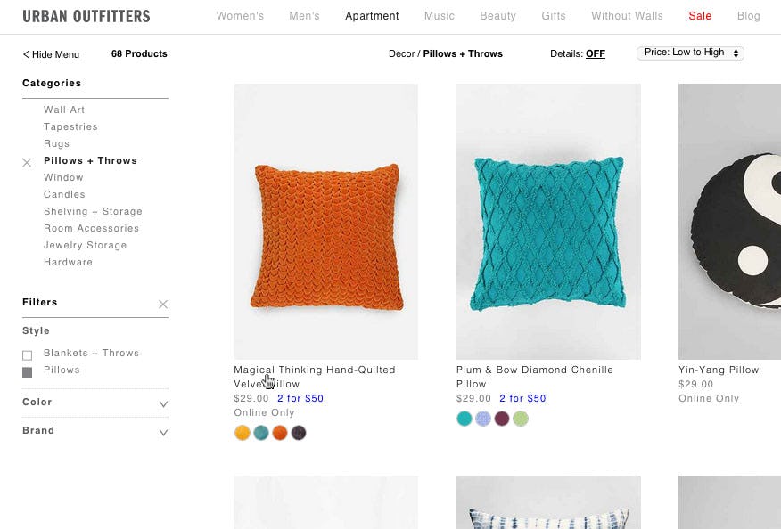
Notice how it’s not immediately evident if the different list item elements at Urban Outfitters all lead to the same path or not – for instance, will clicking the blue offer text or color swatches take them to the same path as the product title? Are they even clickable? The lack of a synchronized hover effect across the list item elements makes this needlessly difficult for the user to effortlessly infer.
Single-path list items are easy because the entire element only has a single interactive function: taking the user to the product page. However, it’s important not to assume that users will know this upfront because it varies widely across the web. The lack of a web convention often makes it difficult for users to tell up-front if a list item with multiple visually distinct elements will take them to the product page or if some (or all) of these distinct elements invoke other functions. Luckily, the solution is easy: visually activate the entire list item upon hover to underscore that all its different elements lead to the same place.
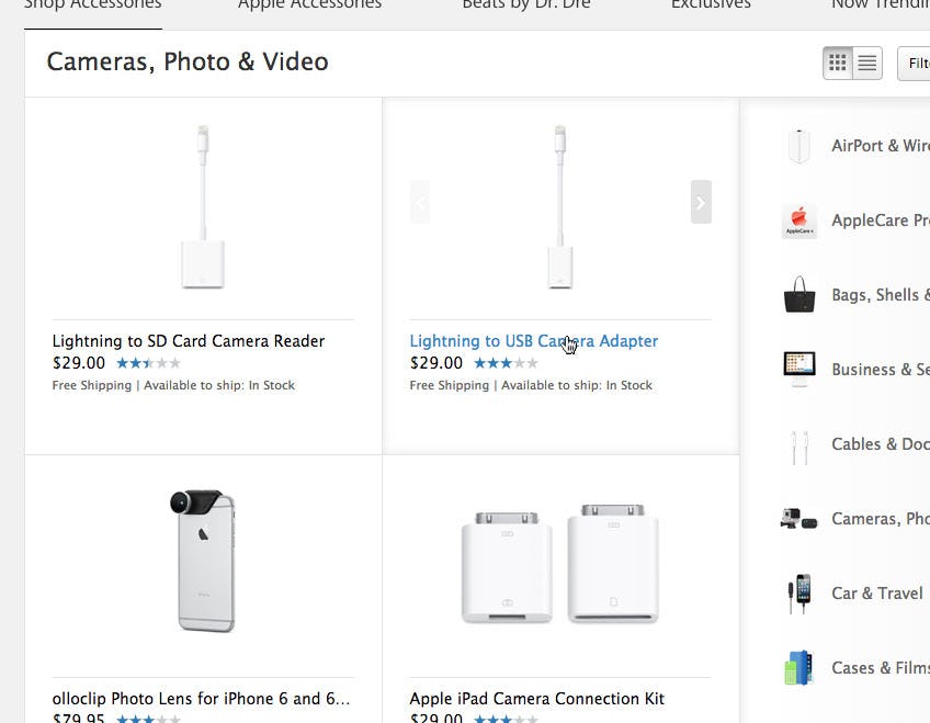
The single-path list items at Apple highlight the entire list item – clearly communicating this is one large hit-area that will take you to the same path regardless of where you click. Regardless of whether the user hovers the product title or thumbnail in the list item, both elements’ hover style gets activated, and the entire list item gets a border shadow. This kind of synchronized hover effect makes it instantly clear to the user that all elements within this list item lead to the same destination.
When all clickable elements within the list item leads to the same path it makes sense to synchronize their hover effects so they all get activated regardless of which element is hovered by the user’s mouse.
Things can be taken a step further by defining the entire list item as one large clickable element, and possibly even having a hover effect for the list item as a whole (e.g. adding a border around the list item or applying a shadow to it, changing its background color or opacity, etc). This has the additional benefit of also vastly increasing the size of each list item’s hit-area, reducing some of the many wasted clicks we so often observe when test subjects try to click product descriptions or attributes which turn out to be static text.
The Multi-Path Solution
Multi-path list items are a little tricker to solve because different elements lead to different paths and may invoke a number of different actions. During testing, multi-path list item resulted in the test subjects activating unintended features because they thought a given element would lead them to the product page when in fact it invoked a different outcome, such as expanding list item content, a tooltip, taking them to an offer page, etc.
At Staples’ multi-path list items it’s unclear which links lead to the product page and which lead to other paths. For example, the ‘See Details’ link will not take users to the product page, but is instead a link opening a tooltip for a breakdown of applied discounts. It’s furthermore unclear what list item elements are even clickable.
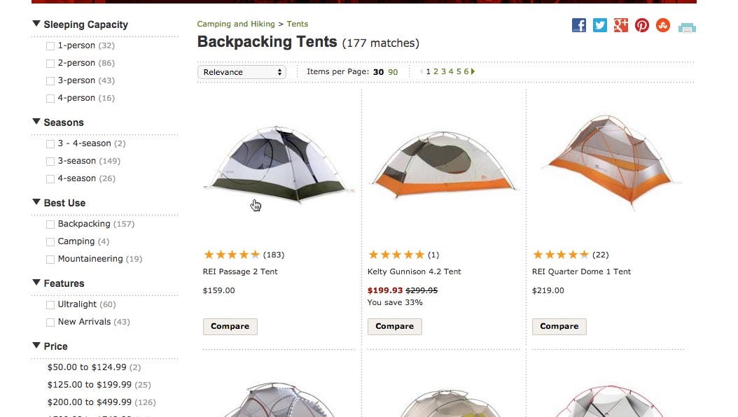
Similarly at REI, notice the lack of synchronized hover styles and how the different paths are intertwined, making it difficult to immediately grasp how many paths there are. For instance, can the title be clicked? The price? Breaking the actual element paths down from top-to-bottom: the thumbnail takes you to the product page, rating icons and count leads to user ratings, product title to the product page, the price cannot be clicked, and finally the compare button invokes a comparison feature.
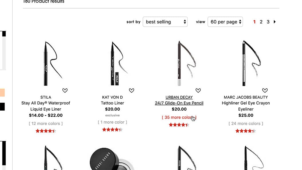
Compare Sephora to the previous two examples and notice how their synchronized hover effect helps clarify that the text link “more colors” leads to the same path as the product title (its underscore hover-effect has been activated too), whereas the user ratings will not.
During testing, two design patterns were found to reduce – and often entirely eliminate – any hit-area confusion, as it helped the test subjects understand which elements in the multi-path list item led to the same path and which didn’t.
1) Synchronize the Hover Effects for All Elements That Lead to the Same Path
When there’s multiple interactive elements within the same product list item, it becomes increasingly difficult for users to figure out where each element will take them. To help users understand where each interactive element will lead them, a simple solution is to synchronize all elements which lead to the same path.
For example, when the thumbnail is hovered, all elements which lead to the same path as the thumbnail should also be visually highlighted – e.g. underscoring the product title, product description, etc. This helps clarify which elements invoke the same function and which don’t, and gives the user additional logical clues to infer the end destination. For instance, the product title pretty much always leads to the product page, so if a user hovers some other element (like the “more colors” text in the earlier Sephora example) and the product title also receives a hover effect, the user will immediately know that clicking will take them to the product page.
Additionally, because some elements aren’t highlight, users are furthermore able to infer from this contrast which elements in the list item invoke alternate functions.
2) Group Elements by Path and Functionality
Note how Crate & Barrel utilize both a synchronized hover effect, and group the elements that doesn’t point to the product page (‘Compare’ and ‘Quick Look’) together at the bottom of the list item.
Typically multiple elements in a multi-path list item will take the user to the product page with other interactive features mixed in between them. Yet our usability tests revealed that it is generally advisable to separate elements by their path and functionality so that related paths and features are grouped together.
For example, it is desirable to have the product thumbnail and title follow immediately after each other as they both link to the product page, and then have elements with other functionality, such as links for the review section, ‘Add to Cart’ button, etc. appear later in the list item.
Improve Hover UX by Clarifying Hit-Areas and Paths
Clarifying the hit-areas and paths may seem like a minor UX detail given how simple both the design and technical solution is. Yet being able to accurately discern which elements on the page are clickable and what they will do when clicked is important to the user’s confidence in their ability to navigate an e-commerce site. Considering that list items are the cornerstone content of both category and search results pages, even small UX changes like these can end up having a real impact.
Unclear hit areas, too small hit-areas, and multiple different (and unclear) paths – it all adds needless friction to an essential part of the user’s product finding experience.
This article presents the research findings from just 1 of the 700+ UX guidelines in Baymard – get full access to learn how to create a “State of the Art” ecommerce user experience.