Key Takeaways
- When list item information is incorrectly displayed, users have a difficult time evaluating and comparing products
- 64% of sites in our e-commerce benchmark failed to adequately display list item attributes, leading directly to multiple site abandonments
- Carefully designed product listings enable users to scan product attributes and compare products while gaining an overview of the relevant information
Video Summary
The 2 videos below summarize 2 visual design aspects discussed in the article — information consistency and scannability.
Users often select and reject products based on how list item information is displayed — it is therefore essential that the presentation and layout of this information supports users’ ability to evaluate and compare products.
However, in Baymard’s large-scale UX testing of Product Lists & Filtering, we’ve observed that hard-to-scan and -evaluate list items caused users to disregard suitable items because they couldn’t properly assess the list item information — leading to site abandonments.
In fact, during testing difficult-to-scan product list information impeded participants from assessing products almost as much as not having any list item information at all (see What Information to Display in Product Listings).
Yet, our e-commerce UX benchmark shows that 64% of sites fail to adequately present information in product listings.
In what follows, we’ll discuss our Premium research findings on how to implement 2 key design principles for your Product Lists:
-
Why including product attributes consistently across list items is critical for all sites
-
Why making separate list item information elements visually distinct is essential
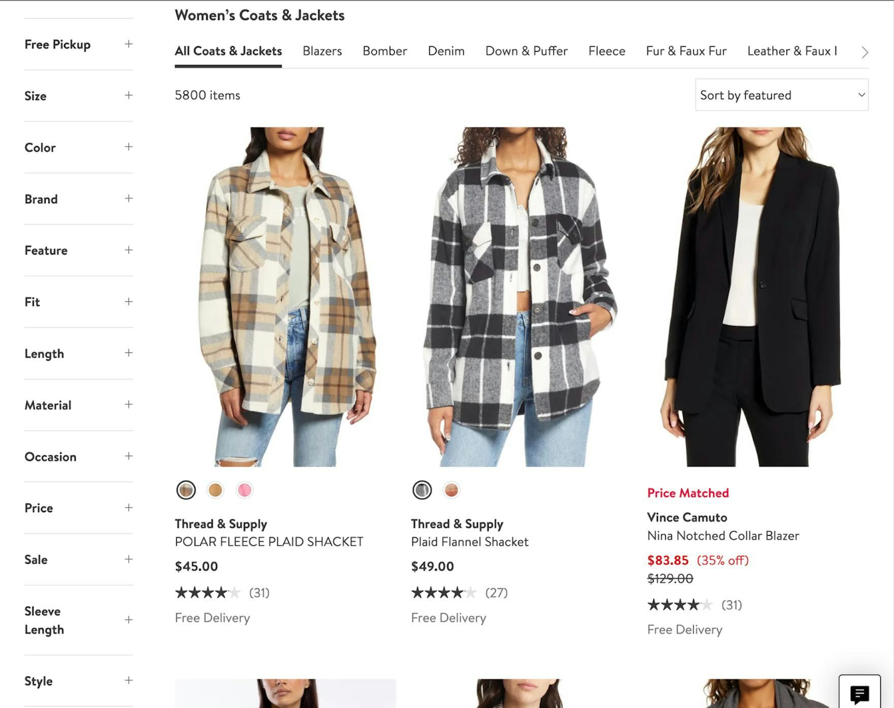
1) Why Including Product Attributes Consistently Across List Items Is Critical for All Sites (64% Don’t)
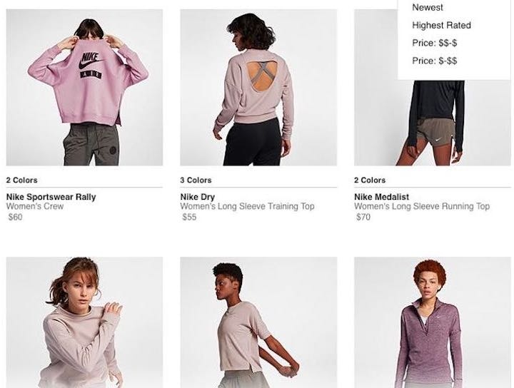
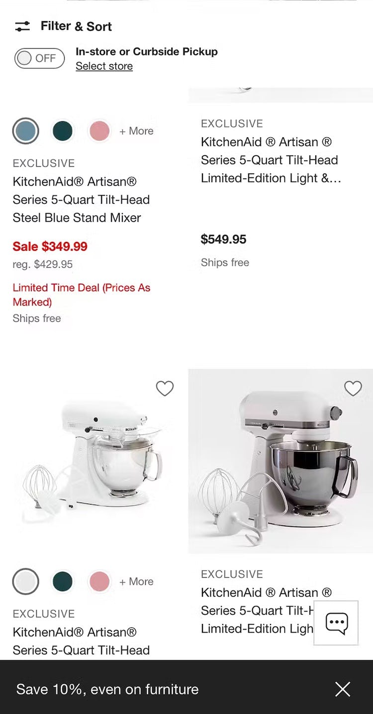
On Microsoft, only the product at the bottom right shows product specs, making proper comparison between items impossible without visiting product pages.
Likewise, on Target, the upper list item contains no product attributes, while the second contains information on ingredients, fragrance, and how much moisturizer is included.
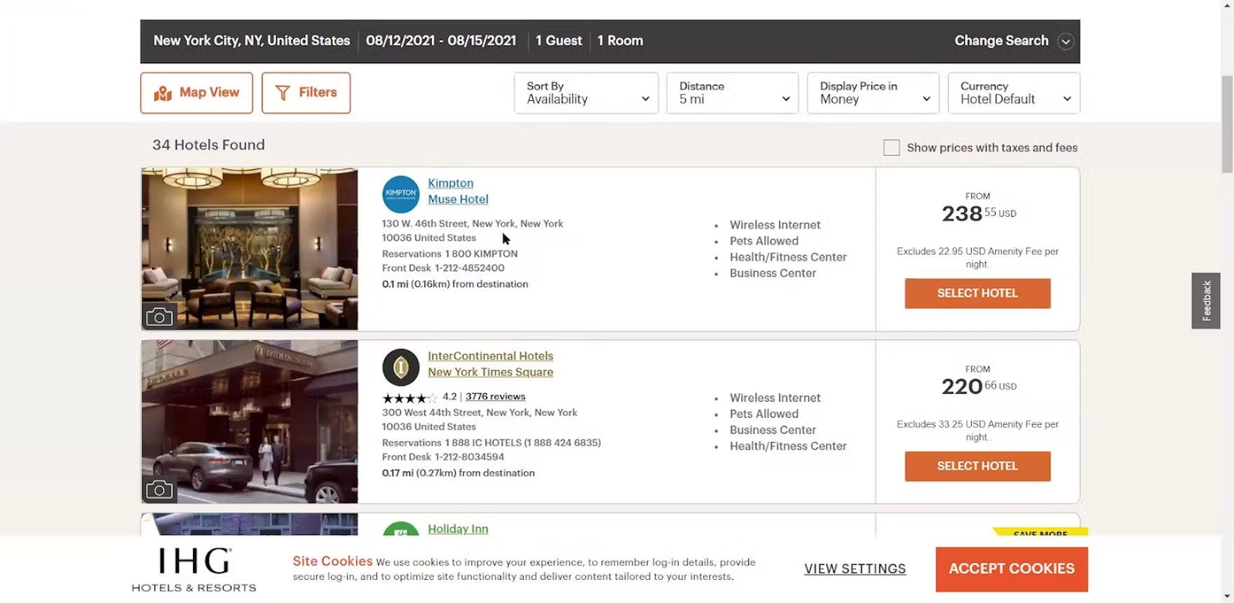
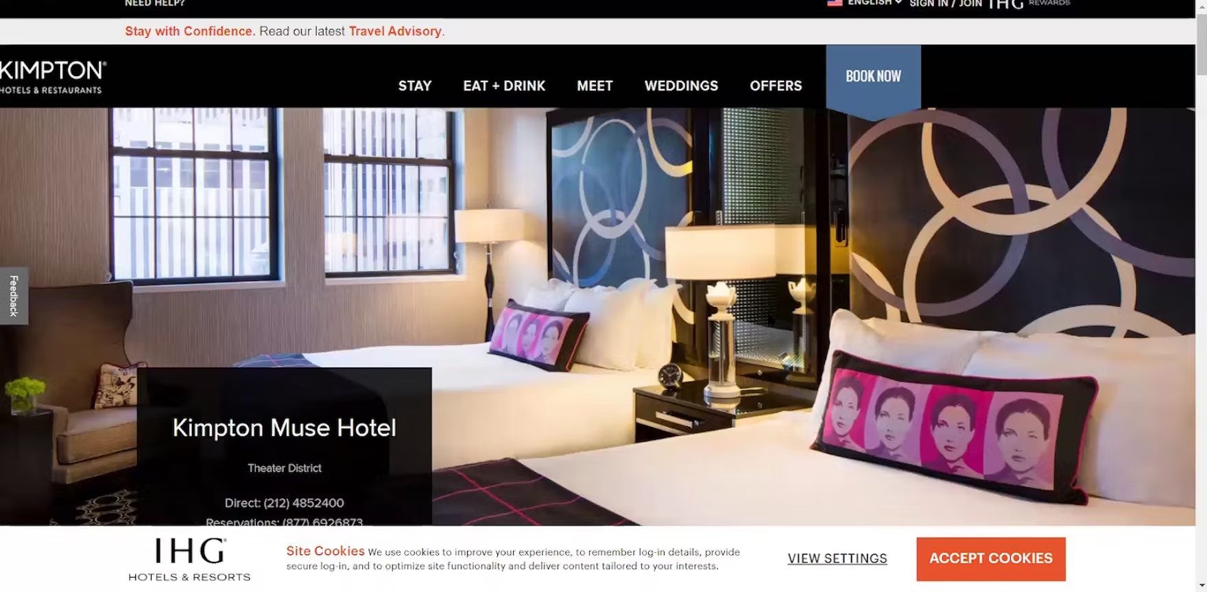
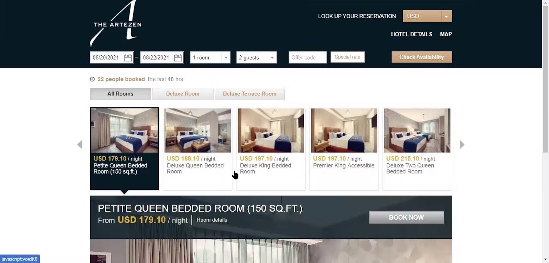
“So this one is, looks like it’s — so these say ‘Times Square’, which is nice, ‘Times Square’, okay, this one’s ‘Midtown’, I was curious like why this [first] one doesn’t say where it’s at. I sorta know the address, but it’d be nice if it said like ‘Midtown’ or what area of the city it’s in”, a participant shopping for hotels in NYC at IHG remarked negatively as he viewed the hotel listings in his search results (first image). He had to click through to the property details page to learn the hotel was located in the “Theater District” area (second image).
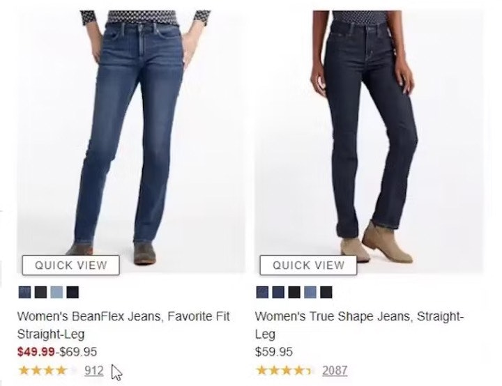
During testing, many participants dismissed items that didn’t show the same attributes that were present in other list items for similar products (see also Display “Price Per Unit” For Multiquantity Items).
This is highly problematic since users are effectively excluding a large number of perfectly relevant products simply because they can’t see a specific product attribute in the product list item info.
As a consequence, users are likely to think that the number of suitable products is much smaller than it actually is — during testing, a lack of consistency for list item attributes indirectly caused multiple site abandonments because the participants assumed the site didn’t carry enough relevant products.
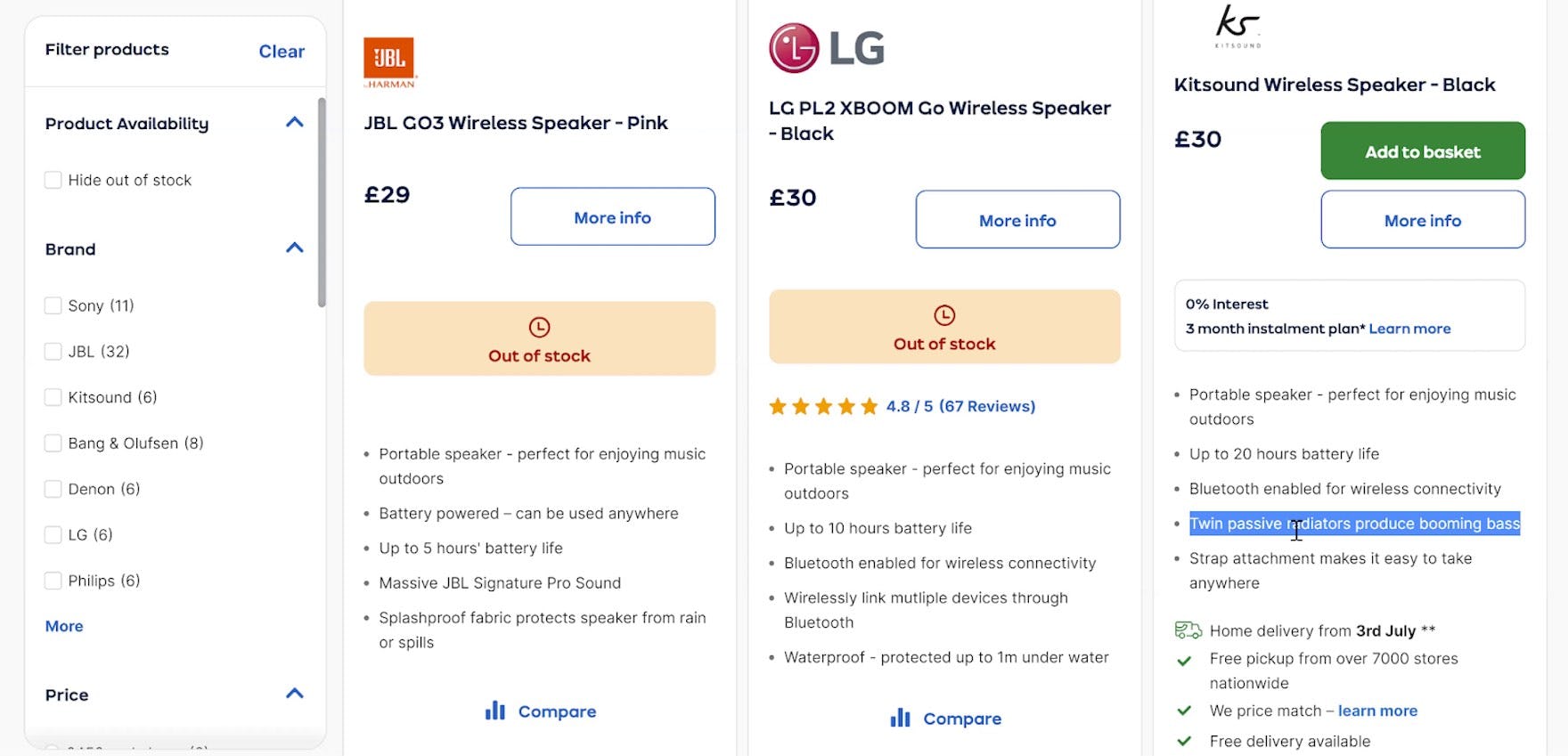
“So it’s not entirely standardized. So this one’s saying like ‘Wirelessly link multiple devices’, this one’s saying ‘Twin passive radiators produce booming bass.’” When some key attributes aren’t displayed, users can’t reliably compare products.
Inconsistent inclusion of product attributes across list items may happen for a number of reasons, including the following:
-
Information is unknown. Sometimes all product attributes simply aren’t available for all products in the list. For instance, a site might not have “Touchscreen” information for all their laptops.
-
Information is unstructured. A common cause for list item inconsistencies is that the product attributes aren’t stored in a consistent structure. Inconsistently included information was the most common issue observed during testing, where the needed attributes were available on product pages, but weren’t consistently included in list items.
-
Information is controlled by vendors. Product vendors typically want to highlight different information about their products; hence, they will tend to highlight different specs and benefits in list items if they are allowed to control this information (e.g., if they supply the “product summary” description).
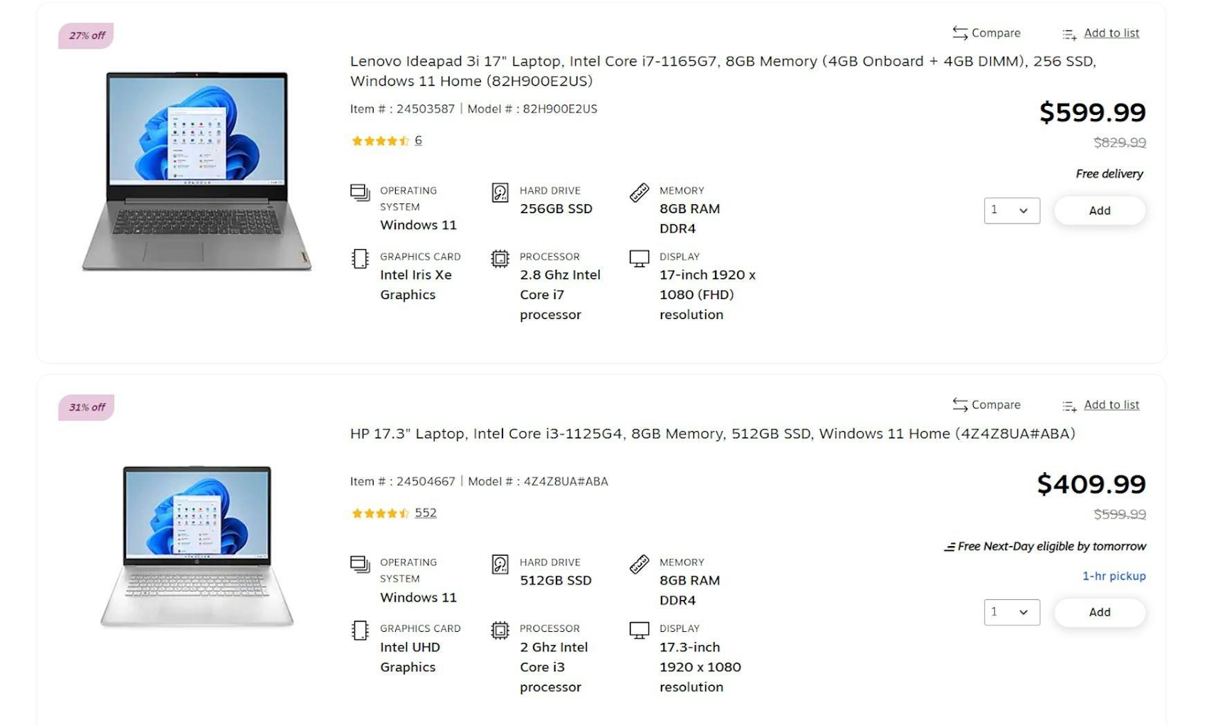
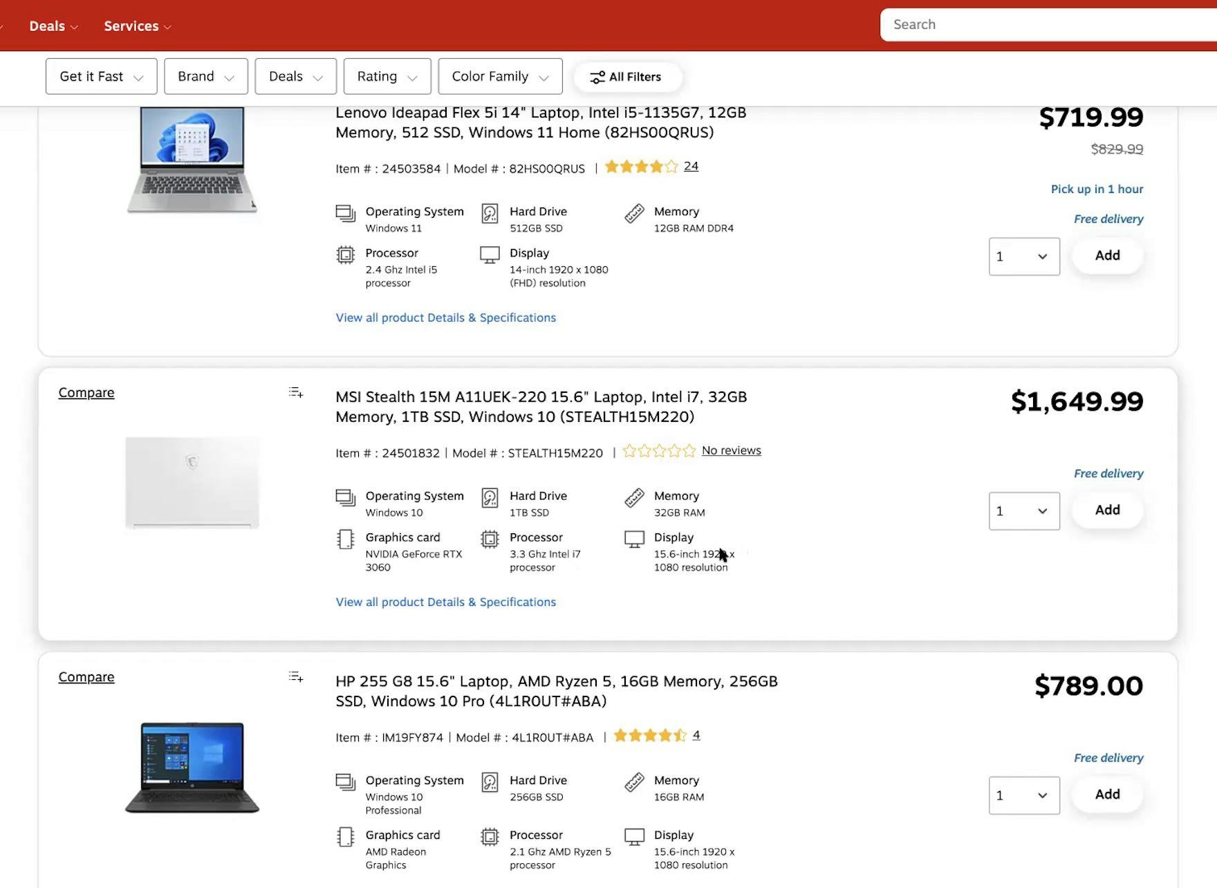
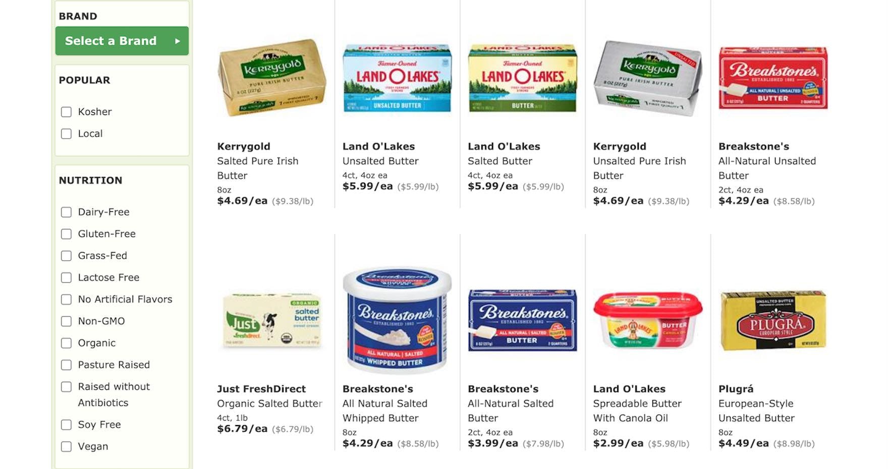
“And the way this is presented is pretty nice. You have all the specs here laid out and organized — operating system, graphics card, memory, display, processor. Yup, very nice.” With consistently available laptop attributes on Staples, users will have little difficulty comparing key specs.
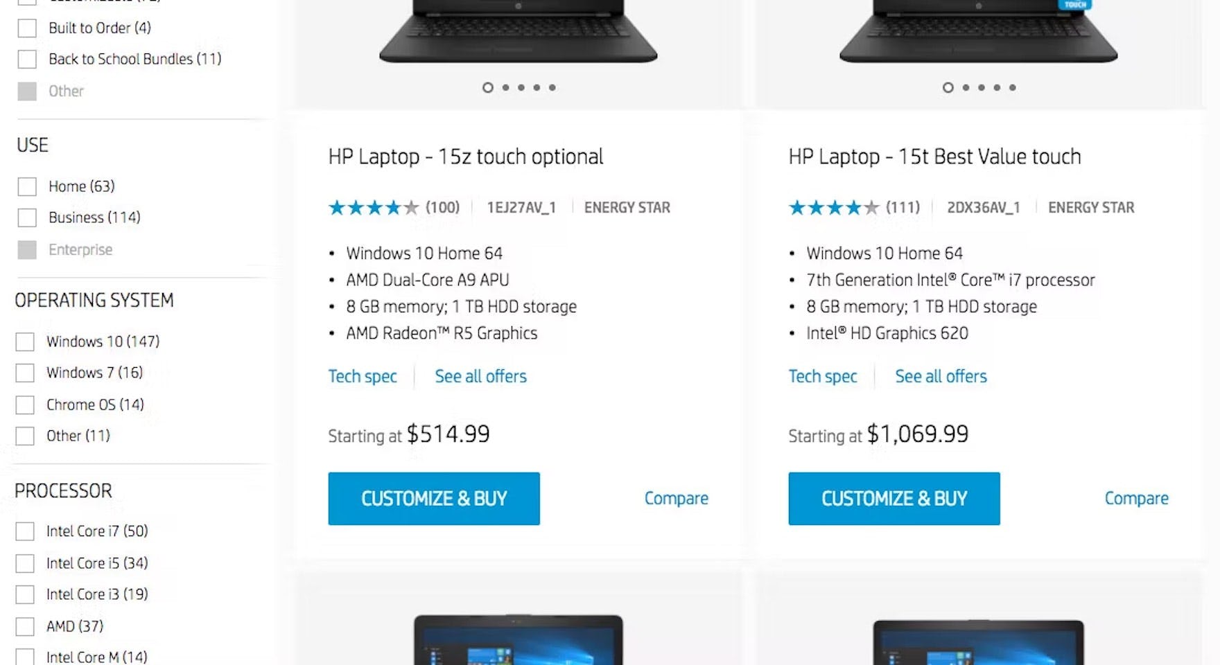
On HP, similar specs are consistently included across similar items in product lists. The presentation of the specs, each on a separate bulleted line, allows users to easily compare attributes across different laptops.
Therefore, it’s critical to make sure the same attributes are included consistently across similar list items in the same product list.
Doing so allows users to easily and quickly compare these attributes at a glance across multiple items (see also Combine Variations of Products into One List Item).
Depending on the underlying issue, the solution may be approached in 1 of 3 ways:
-
For information is unknown, there are two solutions: either don’t display the unknown information in any of the list items, or explicitly state the attribute’s unavailability for the products where it’s missing rather than hiding it altogether.
-
For information is unstructured, rigorous internal structuring of data or well-defined tagging is needed to ensure that product data is pulled in a dependable manner.
-
For vendor-controlled descriptions, the solution is to keep tight control over the very limited information that is displayed in list items and not simply use vendor-supplied product summaries or highlights.
2) Why Making Separate List Item Information Elements Visually Distinct Is Essential (40% Don’t)
“They have the specs here but this is in a paragraph form, less helpful than the bullet point form or table form with graphics. It’s not listed clearly; I need to pay more attention.” Users, such as this test participant on Best Buy, have to work harder to assess product details when they are listed together in the same style.
“It’s not easy to read like this. This makes it seem like this is just some third-party seller and that Office Depot doesn’t really know what they’re doing.” Lack of attention to styling list item info elements not only makes them harder to assess but can also make a bad impression on users.
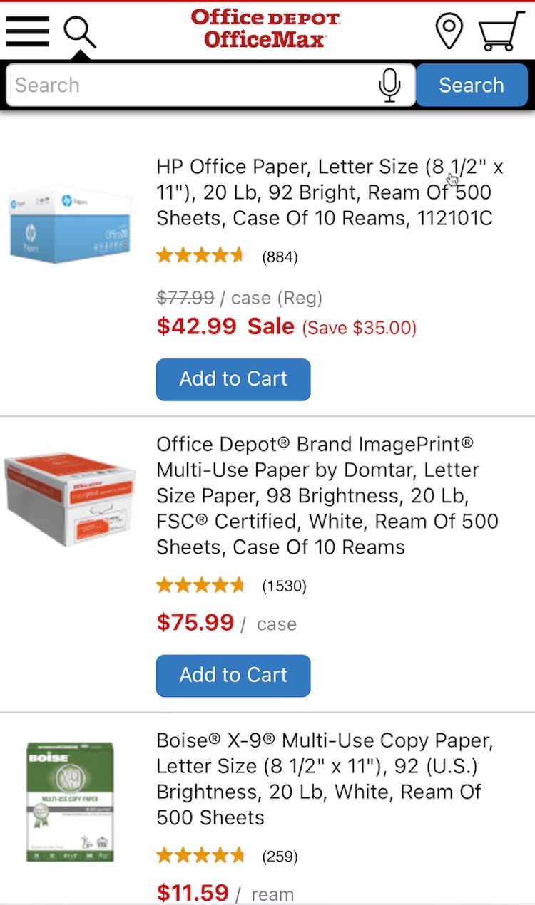
The fact that the attributes for these copy paper products are listed without any differentiation on Office Depot makes it needlessly difficult to compare them.
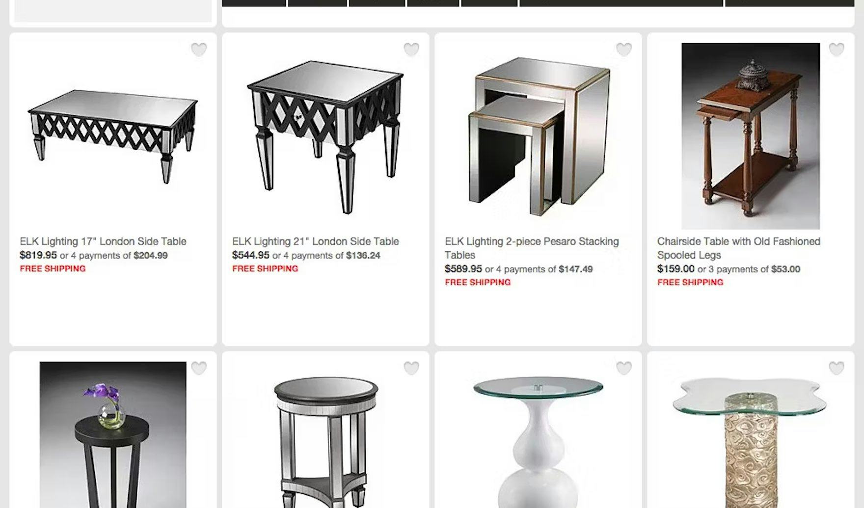
Listing all product features in a single sentence without any styling variations doesn’t help users on Crate & Barrel assess and compare these items.
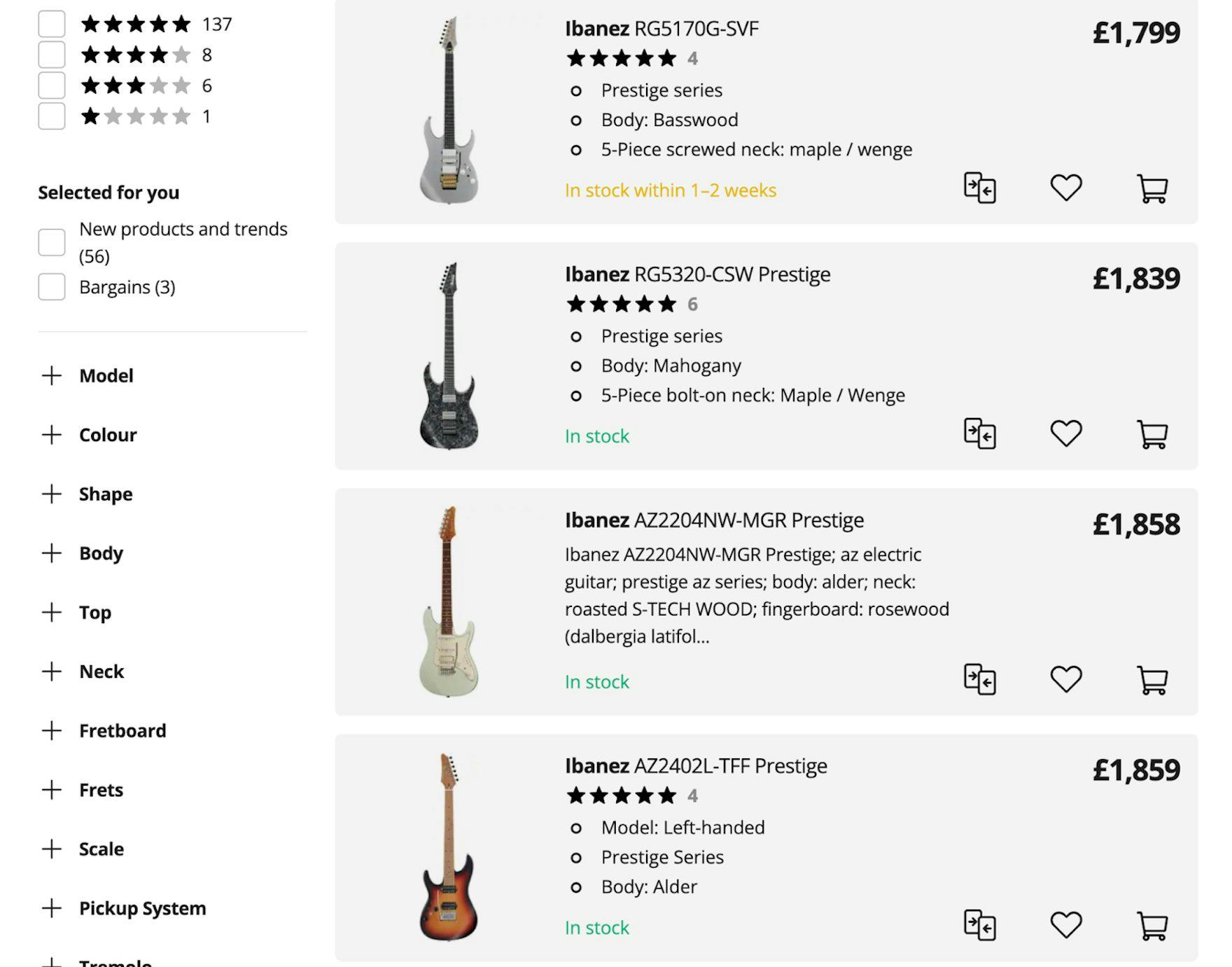
Working out the differences between similar products on Thomann is made more difficult by the way the attributes of the third guitar are presented — without differentiation — compared to the attributes of the others shown in bullet points.
On HSN, list item info includes brand, size, and description in one style on a single line, making them hard to differentiate at a glance.
When different elements of list item info are mixed together, users will need to carefully read all of the info and do the work themselves to break it down into its various components.
Furthermore, they’ll have to do this for each list item if they want to properly compare the suitability of products.
During testing, some list items included only a single undifferentiated list item title consisting of the product name, type, and features all mixed together.
This made it difficult for participants scanning for a specific feature — for instance, the screen size of a laptop — to quickly spot this info at a glance in each list item.
Consequently, they ended up rejecting or investigating products based on inaccurate assumptions.
Because of the difficulty of picking out important characteristics, a number of participants overlooked relevant products and wasted time on irrelevant ones before deciding to reject them (see also Avoid “Quick Views” for Spec-Driven Product Types).
“These have the specs right here in this little box underneath, which makes it really easy to see as you’re scrolling down. So you don’t really have to read this jumbled stuff up here. It has it spaced out in each box, so I can see exactly. It’s easier to read. And I can easily rule out things that don’t meet my criteria, without having to click on anything.” With specs clearly differentiated in these Staples list items, users will be able to quickly spot key features and compare similar products. However, the product title elements should be visually differentiated rather than simply presented in one line with no variation in formatting — “jumbled stuff” as this participant called it.
On Nordstrom, the brand is listed separately on the top line of list item info, reflecting the particular importance of brands on apparel sites. The product title is easy to pick out on the line below, making it easy for users to scan the product list.
To enable users to easily pick out product attributes in list item info, ensure each element is visually distinct.
For example, product specs could be presented in bullet points, enabling easy scanning and comparison.
Or, font style variations and spacing can be combined to make elements easier to pick out.
Importantly, list item info elements don’t necessarily need to be presented in separate rows if doing so would take up too much space.
If it’s aesthetically desirable or if space is limited — for example in list items laid out in a grid view — the info can be presented as a single line of text, as long as the individual elements are styled differently.
For instance, font size, capitalization, color variations, and bold or italic styles can be used to visually separate elements, thereby allowing them to run as a single line of text without sacrificing list scannability.
Support Users Scanning Product Lists
Each line of list item info is styled differently on FreshDirect, minimizing the time needed for users to assess key grocery attributes.
Implementing these 2 key design principles for your product listings will enable users to more easily evaluate and compare products:
-
Displaying the same information consistently for items of the same product type will support the large group of users who rely on the product list in order to compare products
-
Ensuring each info element is visually distinct will enable users to easily pick out product attributes in list item info
However, 64% of sites fail to include the same attributes consistently, while 40% fail to ensure that each one is visually distinct, making it difficult for users to easily compare items — and increasing the risk of abandonment.
(For more on Product Lists & Filtering, see The Current State of E-Commerce Product List UX Performance and New 2023 Product Lists & Filtering UX Benchmark.)
This article presents the research findings from just a few of the 700+ UX guidelines in Baymard – get full access to learn how to create a “State of the Art” ecommerce user experience.
If you want to know how your desktop site, mobile site, or app performs and compares, then learn more about getting Baymard to conduct a UX Audit of your site or app.