Key Takeaways
- Users considering supplements rely on the main image gallery for ingredients information
- However, our large-scale testing reveals that this visual information is often lacking or insufficient on Vitamins & Supplements sites
- As a result, users discard otherwise suitable supplements because they can’t find a visual representation of the ingredients information
During Baymard’s large-scale testing of Vitamins & Supplements sites, ingredients information was, not surprisingly, key to participants’ purchasing decisions.
Yet on many of the test sites, this information was missing or difficult to access — leading some participants to abandon suitable products.
While it’s important to have ingredients information in many places on the supplement details page, a key area was revealed to be the main image gallery.
Indeed, many participants expected to find a visual representation of supplement ingredients here — similar to how in a physical store customers can simply turn the bottle around to view the “Supplement Facts” label.
In this article we’ll discuss our Premium research findings for our new Vitamins & Supplements research study:
- Why the main image gallery is a key location for ingredients information
- How main image gallery images often fail to support users’ information needs
- How a “Supplement Facts Label” image efficiently meets users’ needs
- 1 implementation detail to follow to ensure “Supplement Facts Label” images are found by users
Why the Main Image Gallery Is a Key Location for Ingredients Information
During testing, difficulty finding specific ingredient information was observed to have a cumulatively negative downstream impact on users’ ultimate product-finding efficiency.
Some users who can’t locate critical supplement ingredient information (i.e., names and amounts) within the first few moments of arriving on the product page will end up mistakenly dismissing perfectly suitable supplements in favor of moving on in their product search.
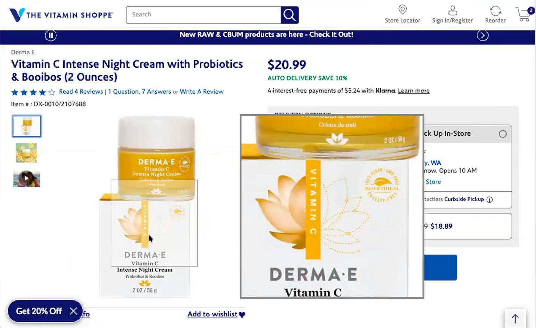
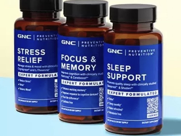
“It doesn’t have a picture of the back with the ingredients on it, and it wasn’t easy to find the ingredients on here.” At Vitamin Shoppe, a participant was unimpressed by the otherwise high-quality packaging and marketing images in the supplement gallery.
During testing, we observed that most participants started their preliminary product evaluation (i.e., deciding if the supplement warranted deeper investigation or quick dismissal) by quickly clicking through the supplement image gallery.
While most sites we included in our testing sessions provided participants with multiple images of the supplement’s packaging from different angles, some Vitamins & Supplements sites actually failed to provide participants with additional packaging images beyond the front-facing packaging.
As a result, users are left without critical information they need to make a purchase decision.
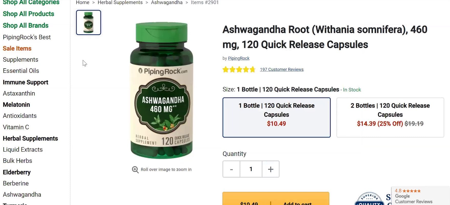
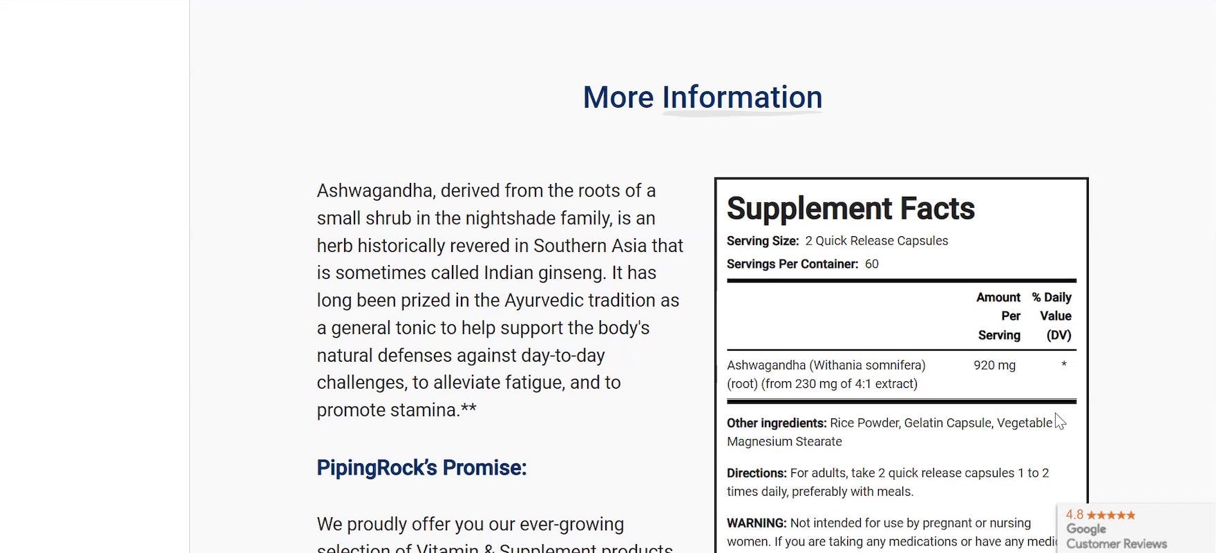
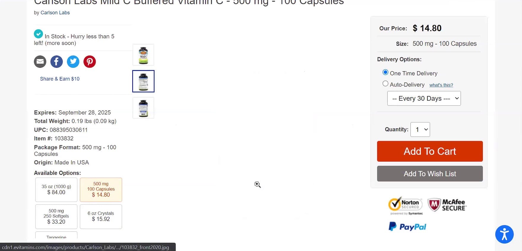
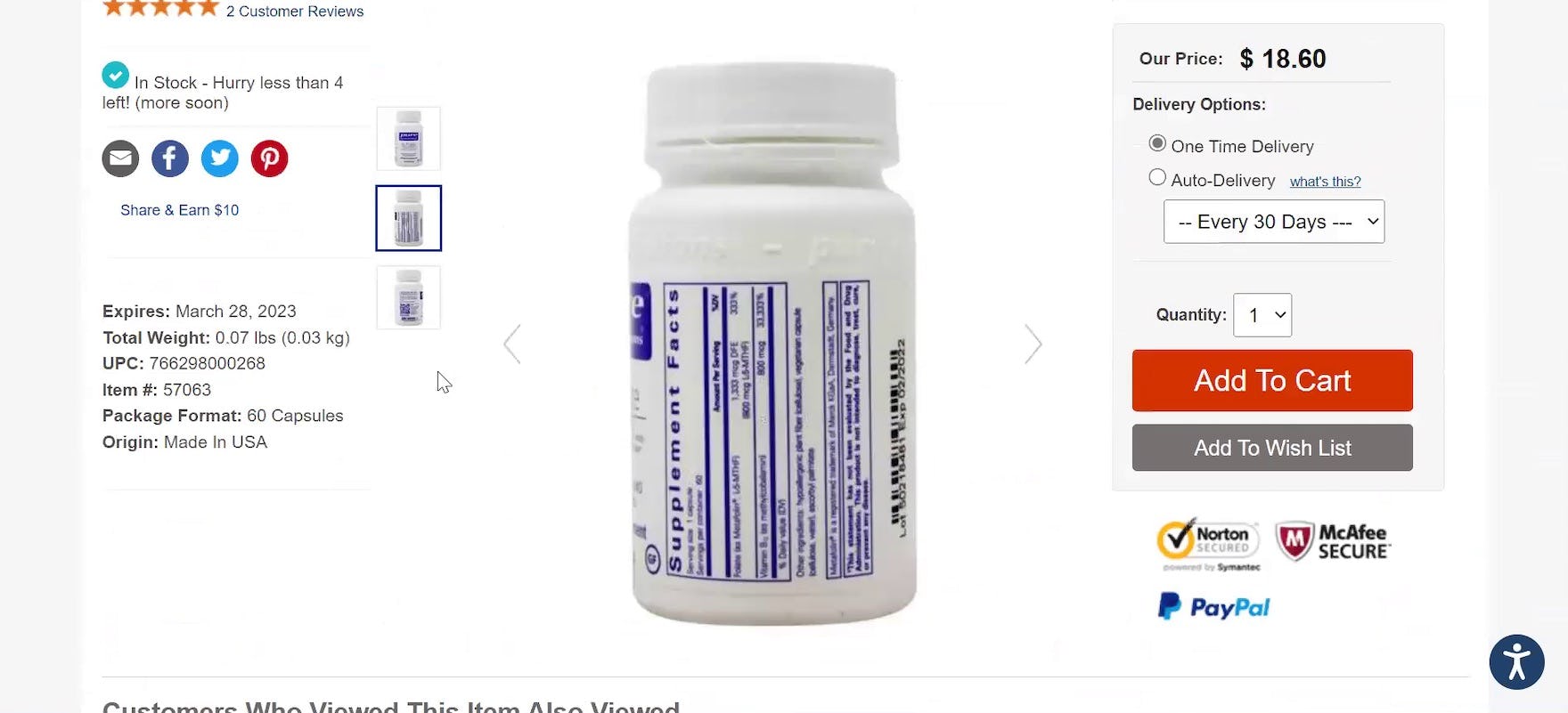
“Yeah. So what I want on the site is the ingredients list.” At PipingRock, a participant was initially concerned that the supplement page might not contain detailed ingredient information because they didn’t see a “Supplement Facts Label” in the image gallery (first image). Only after they scrolled down to the supplement description section (second image) were they able to find the “Supplement Facts Label”: “Okay, this is literally what I was looking for. I wish that this was next to…the photo [gallery]. Because, at one point, I thought [the ‘Supplement Facts’ label] wasn’t on here at all.”
Even when ingredient information is available further down the page — for example, in the product description section — some users will fail to scroll all the way down and thus conclude that ingredients information is missing for the product under consideration.
Indeed, during testing participants who happened on ingredient information further down the supplement details page were observed to remark negatively when sites didn’t include a complete “set” of packaging images.
In the end, testing revealed that, for users on Vitamins & Supplements sites, an image of the supplement label is crucial to their purchase decision (similar to how an “In Scale” image is crucial for general e-commerce users).
How Main Gallery Images Often Fail to Support Users’ Information Needs
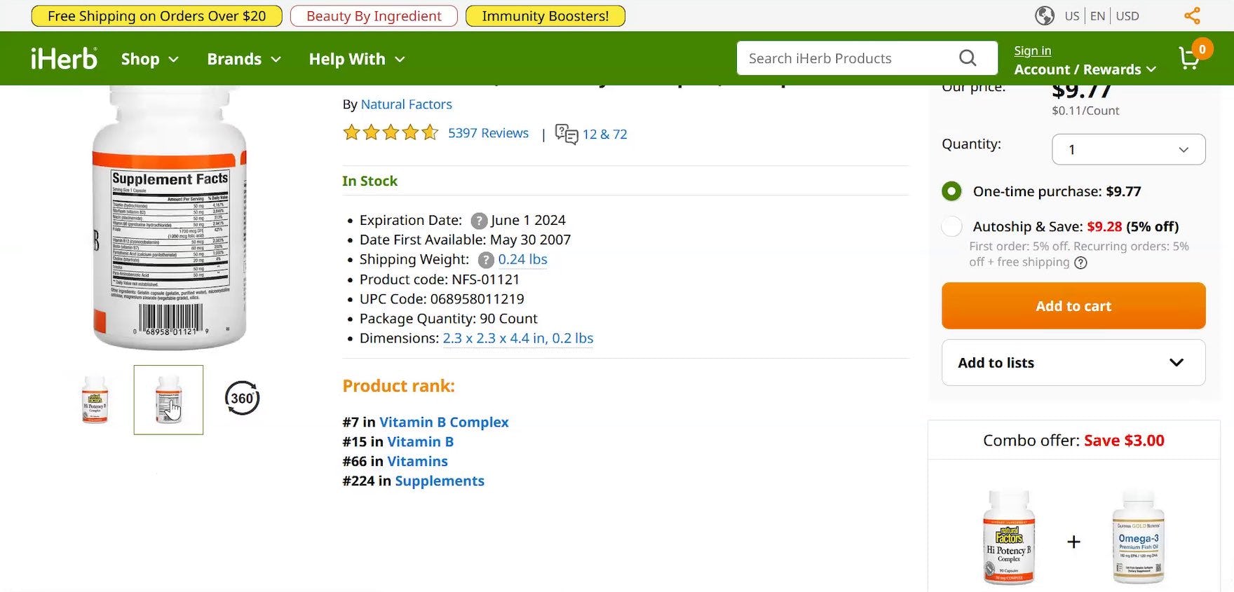
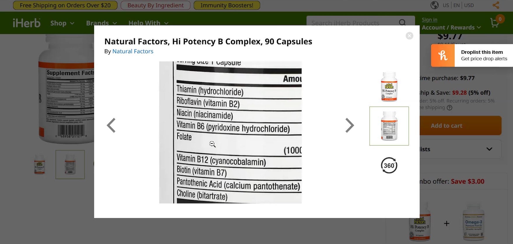
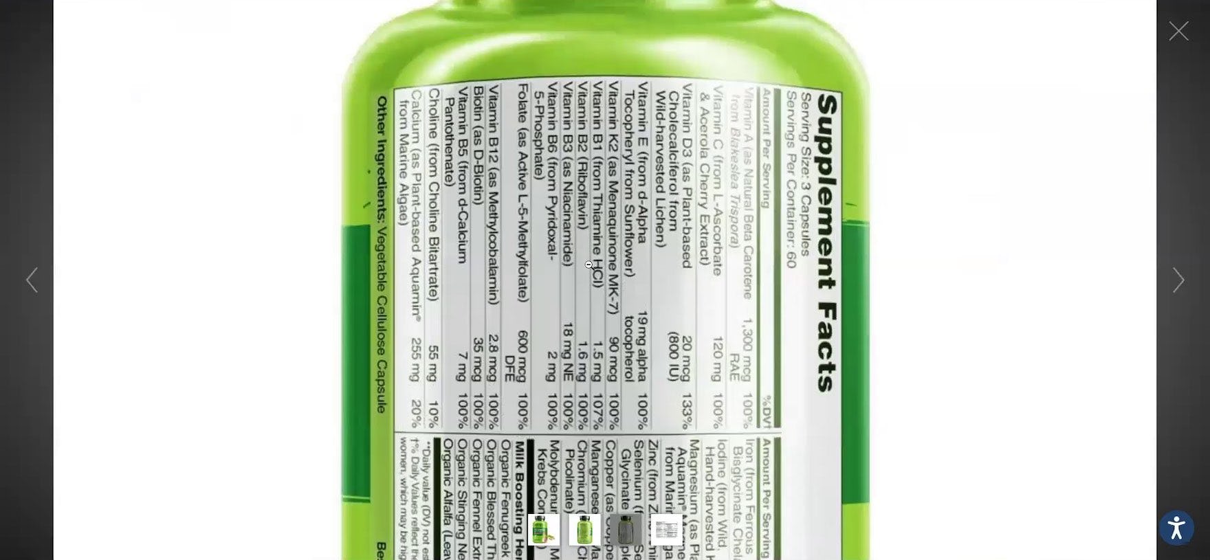
“I’ll just go through [the image gallery] and start looking to see what’s inside the product.” At iHerb, a participant quickly located the packaging image with the “Supplement Facts Label” visible in the thumbnail gallery and clicked on the packaging image (first image). Using a hover-zoom effect, the participant was able to read the ingredient information, although the presentation of the ingredients made it unnecessarily difficult to do so (second image). Note that users will have to use extra mental energy when the default hover-zoom window is smaller than the zoomed-in “Supplement Facts Label”.
“Well, I guess I’d have to click on a picture to see what the ingredients are. I’d prefer not to do that, but…[participant hovers their cursor over the image] Whenever I scroll over [the ‘Supplement Facts Label’ image], it seems to just disappear. I don’t enjoy this site.” At eVitamins, a participant struggled to read the supplement packaging image containing the “Supplement Facts Label” (first image): every time they hovered their cursor over the image — where they expect a hover-zoom window to appear — the packaging image disappeared (second image), causing this participant to abandon the site.
During testing, some sites attempted to support users’ desire to see ingredients information by including images of the back of supplement bottles.
However, while some users will be able to use the “Back of the Bottle” images to meet their needs, testing also showed that these images frequently fail to provide the visual information users are looking for — or make it unnecessarily difficult to read that information.
For example, Vitamins & Supplements sites can overlook when manufacturers include packaging images that are a suboptimal quality, or the zoom window may be too small to view the entire label area at once (as shown in the iHerb example above).
![“Where’s the nutritional label? [After locating the “Supplement Facts Label” image.] Oh, here it is. It’s an image. This doesn’t have any [hover-zoom feature]. Okay, so honestly at this point with this site, I might already ditch it.” At Nature’s Sunshine, a participant was irritated that the stand-alone “Supplement Facts Label” image was difficult to read and subsequently found the site had no zoom feature.](https://baymard-assets-cdn.imgix.net/research/media_files/attachments/86312/original/research-media-file-9d9af493d3999ea837e79c0ce1559fb3.jpg?auto=format&dpr=2&fit=max&q=50&w=880)
“Where’s the nutritional label? [After locating the “Supplement Facts Label” image.] Oh, here it is. It’s an image. This doesn’t have any [hover-zoom feature]. Okay, so honestly at this point with this site, I might already ditch it.” At Nature’s Sunshine, a participant was irritated that the stand-alone “Supplement Facts Label” image was difficult to read and subsequently found the site had no zoom feature.
Furthermore, during testing, participants encountered numerous “unwrapped”-style supplement packaging images (i.e., the label graphic appears in its entirety).
However, while the label’s surface area was visible in a single image, participants often had difficulty extracting ingredient information due to insufficient zoom or other image-quality issues.
“So, I would probably try to read the label, which is a little bit hard.” At eVitamins, a participant struggled to read the ingredients listed on the back of the bottle because they were presented at a 90-degree angle to the viewport, requiring her to either read the label sideways — which would require additional mental effort — or physically turn her head to read the ingredient information.
Another common image issue observed during testing was when the “Supplement Facts Label” image was presented at a 90-degree angle to a user’s viewport — causing the user to have to either twist their necks to the side, so they could read the text as normal, or expend additional mental effort to read the ingredient information text while the label remained sideways.
During testing, improperly formatted “Supplement Facts Label” packaging images were observed to bring some users to a full stop, as they struggled with the decision with whether to engage with the poor-quality image or move on.
How a “Supplement Facts Label” Image Efficiently Meets Users’ Needs
“This has different pictures of the box, tells you how to store it…and the ingredients, okay. So that’s cool.” In addition to the typical product packaging images (first image), a participant at Lucky Vitamin was easily able to find the stand-alone “Supplement Facts Label” image in the thumbnail gallery on the left (second image). Note how the prominent “Ingredients” text (styled as bold black text in the thumbnail) helps draw attention to the thumbnail.
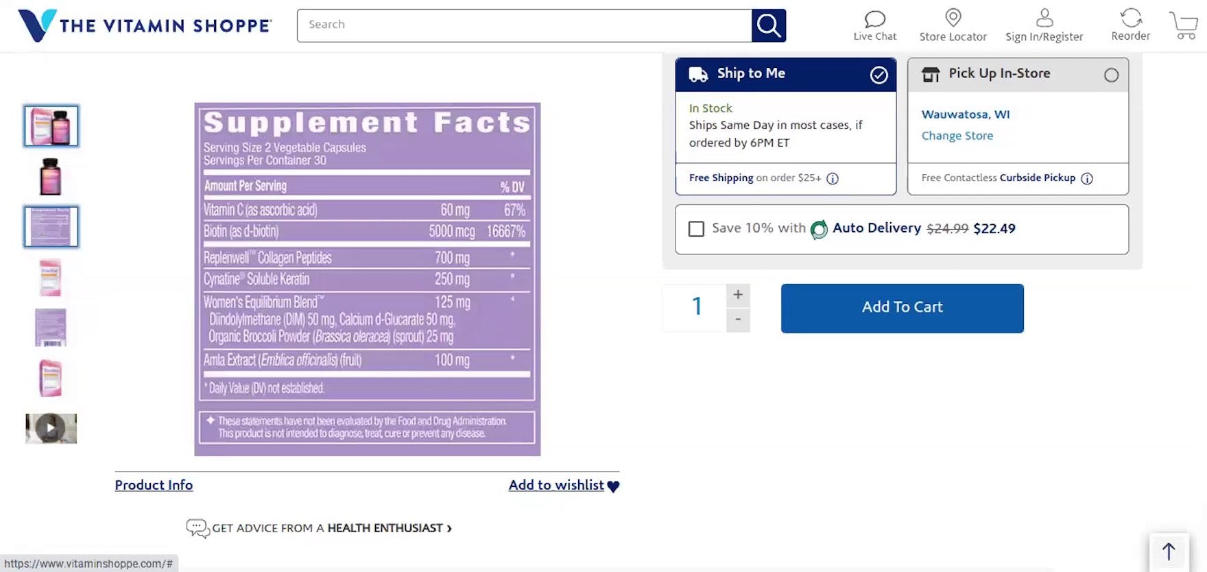
“Okay, so it has pictures to the left.” At Vitamin Shoppe, a participant was quickly able to locate the stand-alone “Supplement Facts Label” image — which was highly visible, as it was the 3rd thumbnail, styled with a purple background, and clearly a label (communicated by the square shape, as opposed to the bottle thumbnails).
Therefore, always provide users with a stand-alone “Supplement Facts Label” image — essentially, an image dedicated solely to listing the supplement ingredients and ingredient amounts.
During testing, participants were observed to efficiently use stand-alone “Supplement Facts Label” images to access the included information with minimal friction.
Testing also showed that participants were much less likely to run into readability issues with stand-alone “Supplement Facts Label” images, compared to images of the back of supplement bottles.
Consequently, when provided with a “Supplement Facts Label” image users are able to more quickly access supplement ingredient information and subsequently move on to other supplement considerations (or dismiss the product as fundamentally unsuitable).
Implementation Detail: Ensure Thumbnails are Sufficiently Sized
![“I don’t know how helpful it is to have a picture of the [‘Supplement Facts’] label when it’s sideways. I have to tilt my head to look at it. [Participant laughs.] Sometimes, on Amazon, they don’t even have like the nutrition label, which drives me crazy, so I’m at least happy they have it. But have [the ‘Supplement Facts’ label] be easy to read.” A participant at Pure Formulas struggled to read the sideways text on the “Supplement Facts Label”. Note that there was a stand-alone “Supplement Facts Label” image included in the gallery but the participant never clicked on the appropriate thumbnail — likely due to the very small size of the thumbnails making it difficult to see what they represented.](https://baymard-assets-cdn.imgix.net/research/media_files/attachments/86323/original/research-media-file-53247ff94aa2c627cb673f22680e319a.jpg?auto=format&dpr=2&fit=max&q=50&w=880)
“I don’t know how helpful it is to have a picture of the [‘Supplement Facts’] label when it’s sideways. I have to tilt my head to look at it. [Participant laughs.] Sometimes, on Amazon, they don’t even have like the nutrition label, which drives me crazy, so I’m at least happy they have it. But have [the ‘Supplement Facts’ label] be easy to read.” A participant at Pure Formulas struggled to read the sideways text on the “Supplement Facts Label”. Note that there was a stand-alone “Supplement Facts Label” image included in the gallery but the participant never clicked on the appropriate thumbnail — likely due to the very small size of the thumbnails making it difficult to see what they represented.
“This is hard to read. I wouldn’t be trying to do that because it’s sideways.” A participant at eVitamins was looking for ingredient details in the packaging images but the image of the back of the bottle showed the ingredients sideways. Even though the very next image in the product gallery is a stand-alone “Supplement Facts Label” image the participant never opened it.
Finally, even if a stand-alone “Supplement Facts Label” image is included in the image gallery, users must be able to identify this image type by its thumbnail representation to select it from the gallery when looking for ingredient information.
During testing, participants were observed to not click on “Supplement Facts Label” thumbnails — despite looking for a clear depiction of the ingredients information — if the thumbnails in the image gallery were too small.
Overly small thumbnails provide poor-to-no information scent — users simply don’t see what they’d be getting if they clicked on the thumbnail.
And not clicking on a thumbnail because it’s too small is, for the end user, just as bad as not having the thumbnail in the first place.
Therefore, to ensure users recognize that “Supplement Facts Label” images are available, the thumbnail for this image (as well as the thumbnails for the other images) must be sufficiently sized to make it obvious at a glance what they represent.
Help Users Quickly Access the Ingredient Information They’re Looking For
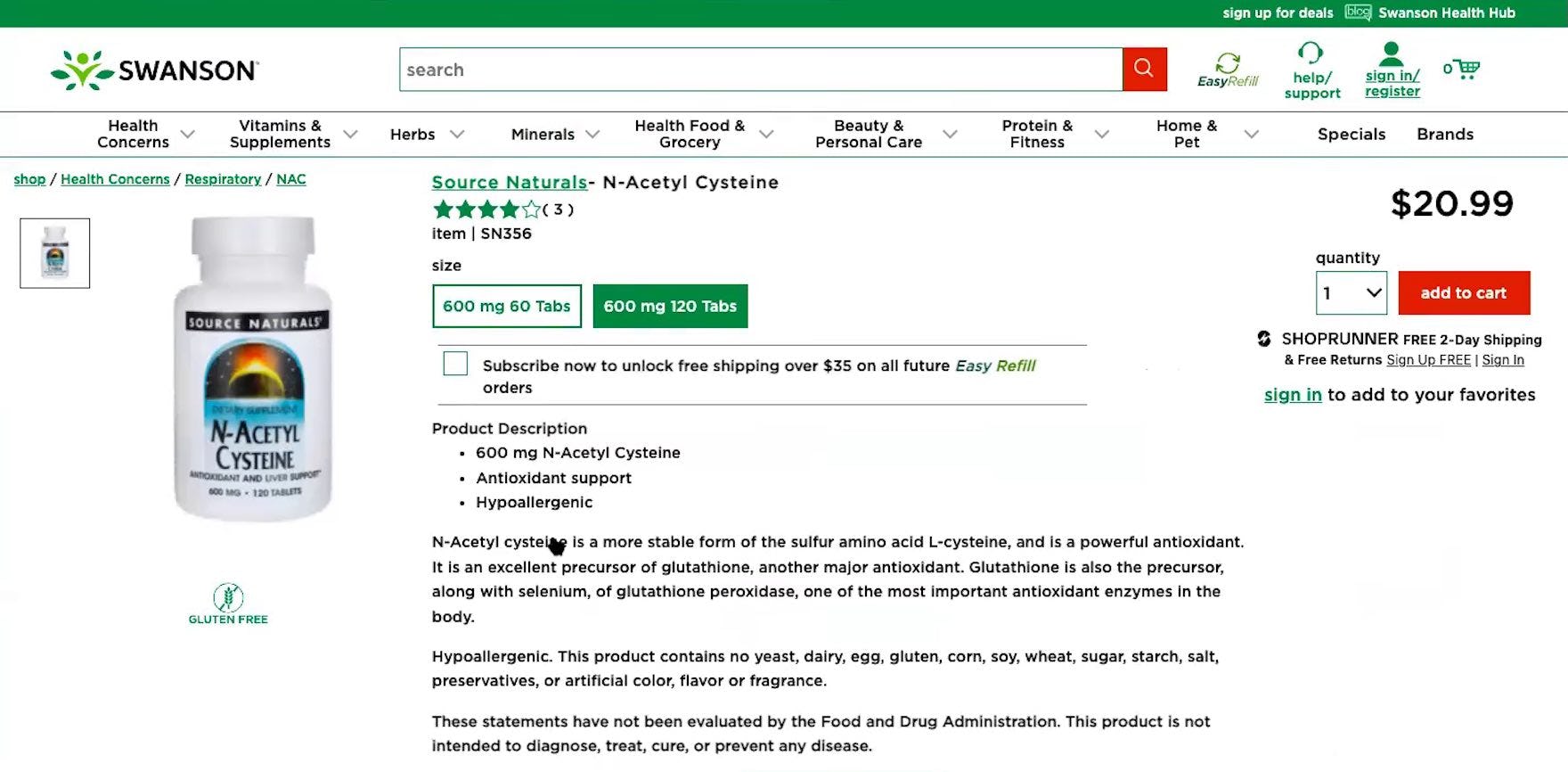
![“Okay, [it] still doesn’t show me the back of the bottle, I don’t know why. I mean, even if it has [product description information], I just like [to] see the back of the bottle. It’s like…you’re at the store. You can turn [the bottle] around [and] see the whole thing.” This participant at Swanson Vitamins felt uneasy about buying a supplement when they couldn’t see the back of the bottle where the “Supplement Facts Label” is typically found.](https://baymard-assets-cdn.imgix.net/research/media_files/attachments/86333/original/research-media-file-e50a1a1ef1d5673163bc86baa398ed80.jpg?auto=format&dpr=2&fit=max&q=50&w=880)
“Okay, [it] still doesn’t show me the back of the bottle, I don’t know why. I mean, even if it has [product description information], I just like [to] see the back of the bottle. It’s like…you’re at the store. You can turn [the bottle] around [and] see the whole thing.” This participant at Swanson Vitamins felt uneasy about buying a supplement when they couldn’t see the back of the bottle where the “Supplement Facts Label” is typically found.
When users are shopping online for supplements, it’s important to keep in mind that they’re often comparing multiple supplements from different sites.
Thus, users tend to move quickly on the supplement details page — if they don’t find the information they’re looking for in a reasonable amount of time, they’re likely to simply leave the page and remove the supplement from consideration.
Therefore, to give users the visual information they need, always include a dedicated “Supplement Facts Label” image in the main image gallery.
Testing showed that such images were optimized for reading the typically small text size of ingredients information.
Moreover, providing this information visually mirrors the in-store experience (to an extent), where users are accustomed to physically picking up a supplement bottle and turning it to read the ingredients information.
Despite this basic user need, many sites in testing failed to provide a “Supplement Facts Label” image — leaving their users without necessary information and increasing the risk of abandonments.
Getting access: all 490+ Vitamins & Supplements UX guidelines are available today via Baymard Premium access. (If you already have an account open the Vitamins & Supplements study.) If you want to know how your Vitamins & Supplements website performs and compares, then learn more about getting Baymard to conduct a UX Audit of your Vitamins & Supplements site.