
Key Takeaways
- Product images are critical for many users’ purchase decisions
- Products with many product images sometimes hide additional thumbnails
- Failing to appropriately signpost additional hidden thumbnails will leave some users without the visual information they need to make the decision to purchase
When an image gallery contains a high number of images, sites may choose to show only the first 5 or 6 thumbnails by default.
For example, 5 thumbnails may be displayed in the default carousel view when there are 10 thumbnails in total.
However, Baymard’s large-scale testing revealed that truncating the thumbnail carousel in this way meant participants did not always realize additional images were available.
Given how important product images are (see guideline #740), users are more likely to miss vital visual product information — and, as a result, abandon suitable products — if they do not find hidden thumbnails.
In this article, we’ll discuss our latest Product Page research findings on Image Gallery UX:
- How truncated image gallery product images can be missed
- 4 ways to ensure users can find all product images available
How Truncated Image Gallery Product Images Can Be Missed

The thumbnail carousel on Castlery is truncated but there is no visual indication of this (first image), increasing the risk that users will overlook the additional images which contain potentially useful product dimension information (second image).
Thumbnails are ubiquitous in desktop image galleries and act as a valuable navigational aid for users on desktop.
However, testing revealed that truncating the thumbnail carousel without any accompanying visual indicators can lead users to make the false assumption that the set of thumbnails viewable by default represents the total number available.
This could then dissuade these users from scrolling beyond the last image represented in the default set of thumbnails, increasing the likelihood that they will miss vital additional visual product information.


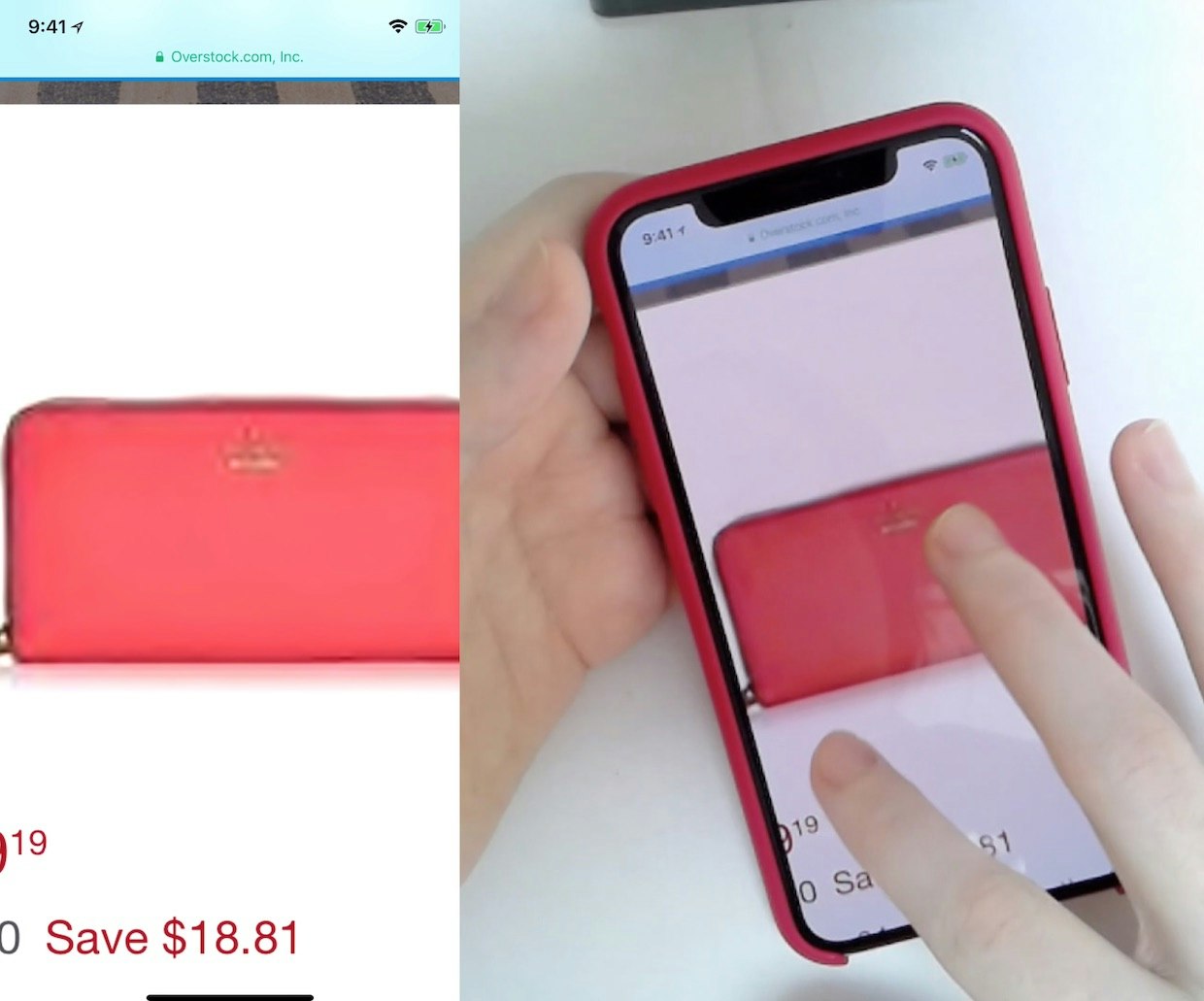
“So I went back up to the top but just to see if there was any kind of difference in the pictures, which I’m not really seeing. [The 32oz and 42oz options] look exactly the same.” On the Yeti mobile site, this participant wanted to use the product images to compare the size of the two options, but could not find an image that showed this. Instead, she selected each size option in turn and then viewed the default image, concluding that both options looked the same (first image). A size comparison image was available (second image, captured by the researcher after testing had concluded) but its thumbnail was not shown in the default thumbnail carousel and no indication was given of the presence of additional thumbnails beyond the four shown by default (as shown in the first image).

“It looks like it slides to ‘reveal a hidden leaf’. Let’s see if they have a picture of that.” This participant at Article on iOS read about the table’s hidden leaf feature in the product description, and scrolled to the main gallery to look for a “Feature Callout” image. She clicked on all 5 visible thumbnails but none showed the hidden leaf: “It doesn’t have a picture of it with the leaf extended. That’s a little disappointing.” Seeking the image, she then scrolled down to the reviews. She never realized she could have swiped to see additional thumbnails, including one of the hidden leaf.
Image gallery thumbnails are much less common on mobile than on desktop, with indicator dots used instead on 75% of the mobile sites in recent testing.
When thumbnails are used, testing revealed that truncating the thumbnail carousel without indicating the existence of hidden thumbnails can lead mobile users (just as it can desktop users) to assume incorrectly that the set of thumbnails viewable by default represents the total number available.
Indeed, as mobile users will resort to the “swipe to scroll” gesture so readily, the risk of mobile users overlooking gallery images can be greater when hidden thumbnails are included than when indicator dots are used.
4 Ways to Ensure Users Can Find All Product Images Available
To ensure the additional thumbnails are noted by users, it’s therefore key that the presence of additional thumbnails is obvious.
4 solutions performed well in testing:
- Display all thumbnails
- Provide carousel “arrow” controls for “Manual Carousels”
- Provide a “Truncation Thumbnail” image
- Provide a clearly truncated “Partial Thumbnail”
1) Display All Thumbnails

The image gallery on this Macy’s product page displays all image thumbnails by default, giving clear and direct access to all 9 product images and one video.
Displaying all gallery image thumbnails by default bypasses the discoverability issues related to hidden thumbnails altogether.
The greater viewport space available on desktop means that this approach can be used without significantly compromising the discoverability of other important elements on the product page.
Testing showed that desktop participants had no problem reviewing product thumbnails on the product page, even if the product thumbnails spanned two rows.
Of course, there’s likely an upper limit to the number of product thumbnails desktop users will tolerate on the product page, but for products with up to as many as 10–14 product thumbnails, simply displaying them all on the product page will often be the easiest and “safest” design solution.
On mobile devices, horizontal space is very limited in portrait orientation.
Therefore, displaying all thumbnails on mobile devices is more difficult compared to desktop.
If a site has only a limited number of thumbnails to display for all products, then displaying all the thumbnails could be a viable solution (but see guideline #740).
However, it will often be easier to adopt one of the solutions described below for the mobile interface.
(Notably, we observed no evidence in testing that users would be willing to switch orientation to view gallery images, so sites can’t rely on users switching to landscape to see any hidden thumbnails.)
2) Provide Arrow Controls for Thumbnail “Manual Carousels”


A “Manual Carousel” is used on J&P Cycles (first image) and Staples (second image), with arrows signposting the existence of further thumbnails and providing a clear indication of the action required to access them.


Both the Advance Auto Parts (first image) and Guitar Center (second image) mobile sites use “Manual Carousels” with arrow indicators to signpost the existence of hidden thumbnails.
The most common successful approach on in recent testing (used by half of the desktop sites tested) was the “Manual Carousel”.
Here, the presence of hidden items in the thumbnail carousel is indicated by the arrow icons placed at either end of the carousel.
This proved highly effective both in signifying the existence of further thumbnails and as a means for users to navigate to them.
While a causal link cannot be established from the test data between the formatting of the arrow icons and their effectiveness in signposting hidden thumbnails, bold formatting of these UI elements will increase the likelihood that their presence and purpose will be recognized.
3) Provide a “Truncation Thumbnail” Image


“[It’s] always the first place I go…to look at the [product] photos…I guess in some ways I see it as sort of a substitute to seeing [the product] in person, you know.” The first instinct of this participant on Costco was to investigate the image gallery. They were able to access additional product images easily by clicking the “Truncation Thumbnail” image (first image) which opened an overlay containing additional images (second image).

On Musician’s Friend, a “Truncation Thumbnail” is used to indicate that additional hidden thumbnails are available. This approach also provides an indication of the number of additional thumbnails, although there is no evidence from testing that the inclusion of this number will influence whether users choose to investigate the hidden thumbnails.
A slightly less common solution on desktop — used by a third of the sites tested — is to indicate the existence of hidden product thumbnails with a “Truncation Thumbnail”.
This is the final thumbnail in the default thumbnail carousel view and contains text such as “+5”, with the number indicating how many additional thumbnails have been hidden in the default view.
Again, this makes it clear to users that further thumbnails are available and, when clicked, this “indicator” thumbnail often opens an overlay that displays all the thumbnails available.


“Let’s see…3 burners….gas option… Looks like I can cook a good amount of food on it. Based on these pictures.” Another participant on Costco, this time using the mobile version of the site, also began his investigation of a product by browsing images in the gallery. In this case, the “Truncation Thumbnail” was noticed by him. He was then able to move easily from the default thumbnails (first image) to the additional truncated thumbnails by swiping to the left to scroll the thumbnail carousel (second image). From there he was able to access the additional gallery images.

Grainger uses a “Truncation Thumbnail” in this vertical thumbnail carousel on their mobile site to indicate that 3 more items can be accessed.
On mobile, the “Truncation Thumbnail” likewise makes it clear to mobile users that further thumbnails are available in the thumbnail carousel.
Users can then either continue to swipe the main image gallery to reveal additional images, or tap the “Truncation Thumbnail” to view the additional images in an overlay.
4) Provide a Clearly Truncated “Partial Thumbnail”


Both Etsy (first image) and LEGO (second image) use “Partial Thumbnails” to signpost hidden items in the thumbnail carousel. The LEGO site also includes a scrollbar to further emphasize the ability to access hidden thumbnails. However, even without the scrollbar the “Partial Thumbnail” approach was effective in recent testing.


“The camera looks really retro and cool…I would definitely buy this one. Just for the aesthetic of it.” This participant on Polaroid was able to access images of the product using the “Manual Carousel” control (second image), augmented by the inclusion of a “Partial Thumbnail” (first image) to further highlight the existence of the hidden thumbnails.
Finally, another design that was observed to be effective in recent testing was the “Partial Thumbnail”, where the last image in the carousel is itself truncated, indicating that it (and potentially additional thumbnails) can be accessed.
While this implementation lacks an indication of the number of hidden thumbnails, it does encourage the user to explore beyond the thumbnails displayed in the carousel by default.
In some cases, the “Partial Thumbnail” was used in conjunction with the “Manual Carousel” approach described above.


On the mobile version of the Away site used in testing, hidden thumbnails were indicated by the “Partial Thumbnail” at the end of the section of the thumbnail carousel viewable by default (first image). Although only a small portion of the “Partial Thumbnail” was visible, this was enough to indicate the presence of hidden thumbnails to this participant, who swiped in the thumbnail carousel to assess the remaining thumbnails before moving on (second image).


The “Partial Thumbnail” approach was equally effective in recent testing on mobile.
Moreover, mobile users’ tendency to swipe means they are unlikely to overlook hidden thumbnails once their existence has been signposted in this way.
Ensure Access to All Product Visuals


“First thing I’m going to do is take a look at the photographs.” This participant quickly noticed and accessed the hidden thumbnails on Kroger using the arrow controls. Note that the formatting of the arrow controls is quite bold, potentially aiding recognition of their presence and function.
During all of our large-scale product page testing, product images have proven time and again to be critical for users’ purchase decisions.
It’s therefore vital that users can view all the product images available.
Yet testing showed that failing to appropriately signpost additional, truncated product images can leave some users without the visual product information they need.
This is especially frustrating given that sites are providing this information — but their design choice of how to indicate its availability hinders the additional images’ discoverability.
Instead, by making all thumbnails visible, providing arrow controls, using a “Truncation Thumbnail”, or providing a clearly truncated “Partial Thumbnail” sites can ensure users will be able to easily find and explore additional product images.
This article presents the research findings from just 1 of the 700+ UX guidelines in Baymard – get full access to learn how to create a “State of the Art” ecommerce user experience.
If you want to know how your desktop site, mobile site, or app performs and compares, then learn more about getting Baymard to conduct a UX Audit of your site or app.