Key Takeaways
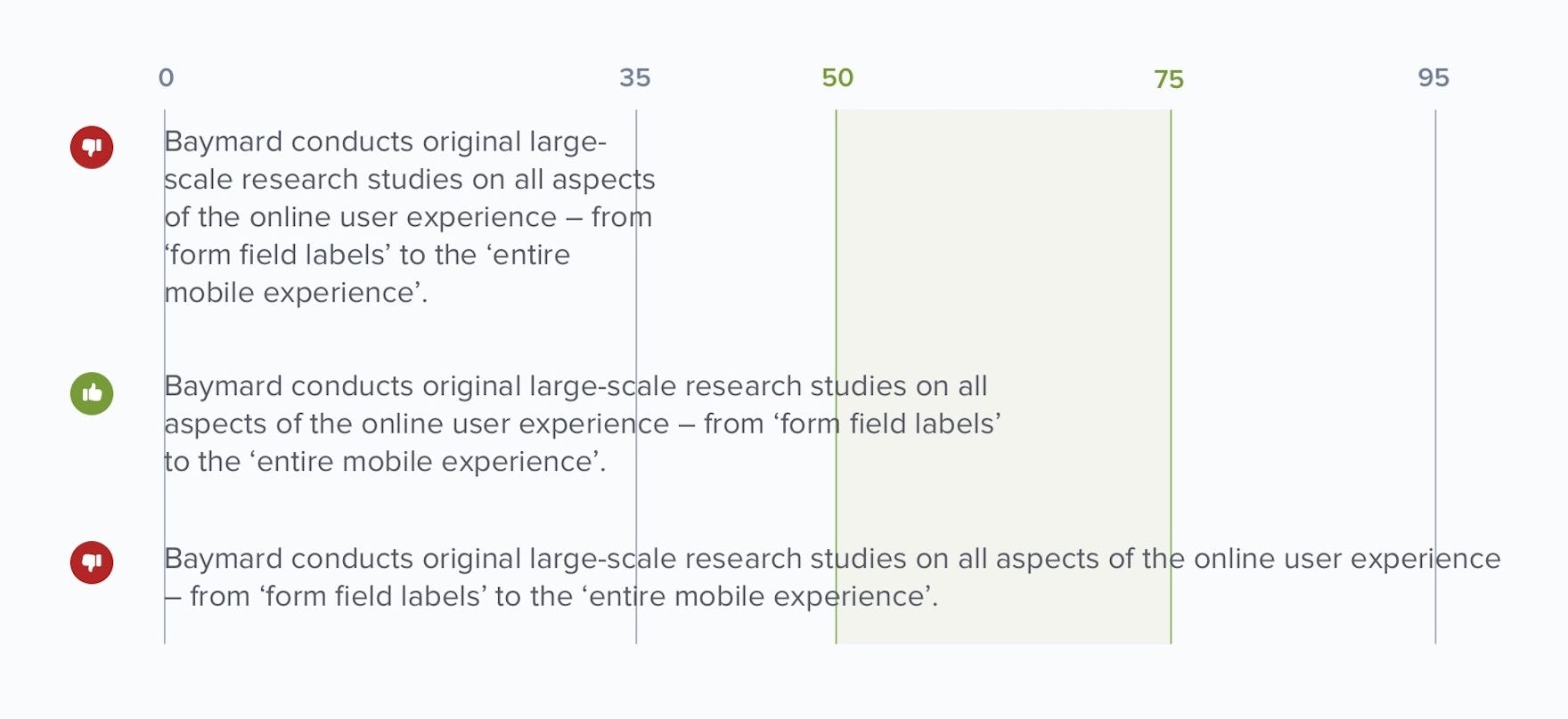
- The optimal line length for body text is 50–75 characters
- Shorter or longer line lengths can hurt readability
- Our large-scale testing reveals that text line length often makes product or service descriptions unnecessarily difficult for users to read
Video Summary
Having the right amount of characters on each line is key to the readability of your text.
Indeed, our Premium UX research and large-scale e-commerce UX testing reveals that long lines of text are typically perceived by users as intimidating and overwhelming.
As result, users faced with overly long lines of text are more likely to avoid reading the text.
Consequently, as readability drops more users will fail to fully understand a product’s or service’s benefits, and thus decide that a particular product or service won’t meet their needs.
In this article we’ll discuss the following:
- General principles regarding text line lengths and readability
- How overly long lines of text negatively impact e-commerce users
- The optimal text line length for e-commerce sites & accessibility concerns
1) General Principles Regarding Text Line Lengths and Readability
Varying line lengths ultimately end up impacting the overall readability of a site’s text.
Having the right amount of characters on each line is key to the readability of your text.
Indeed, it shouldn’t merely be your design that dictates the width of your text — the ability of users to easily read through the text should also be a critical factor.
Some fundamental exploration of line length and readability was conducted by Emil Ruder, a mid-twentieth century Swiss graphic designer.
Ruder concluded that the optimal line length for body text is 50–60 characters per line, including spaces (“Typographie”, E. Ruder).
Other sources suggest that up to 75 characters is acceptable.
Setting aside the specific number for the moment, what are the downsides of violating this range?
- Too wide: if a line of text is too long the reader’s eyes will have a hard time focusing on the text. This is because the line length makes it difficult to gauge where the line starts and ends. Furthermore it can be difficult to continue onto the correct line in large blocks of text.
- Too narrow: if a line is too short the eye will have to travel back too often, breaking the reader’s rhythm. Too-short lines also tend to stress readers, making them begin on the next line before finishing the current one (hence skipping potentially important words).
It turns out that the subconscious mind is energized when jumping to the next line (as long as it doesn’t happen too frequently; see above bullet point). At the beginning of every new line the reader is focused, but this focus gradually wears off over the duration of the line (“Typographie”, E. Ruder).
During our e-commerce testing, we’ve verified these basic readability precepts for users who are navigating e-commerce sites.
2) How Overly Long Lines of Text Negatively Impact E-Commerce Users
While images, videos, gifs, and other content play an important role in e-commerce users’ ability to evaluate products and services, for many users text is the critical factor in their decision-making process.
Of course, the importance of a site’s text depends greatly on the product or service being considered: users considering dresses in apparel e-commerce are much more likely to be swayed by the visual representation of the product compared to users considering a new grill or digital subscription service, where the product and service features and benefits are typically communicated largely through text.
However, even if text isn’t as important for certain products, for the site as a whole text will always play a critical role — for example, in the FAQ UX or for reviews or when users are attempting to navigate the checkout UX.
Yet when text is difficult to read due to the length of the lines, users are much less willing to engage with the text, or struggle to read efficiently.
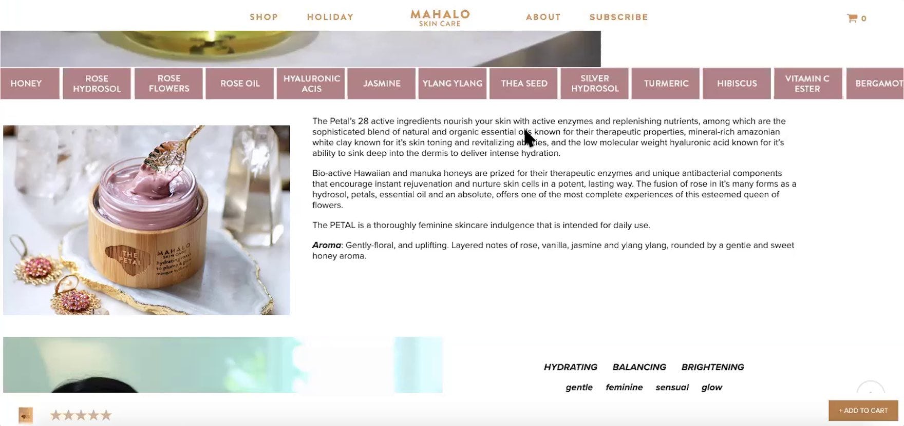
“There’s way too much here, I can’t even suss out what would be helpful.” This user on Mahalo found the lengthy description paragraphs hard to digest.
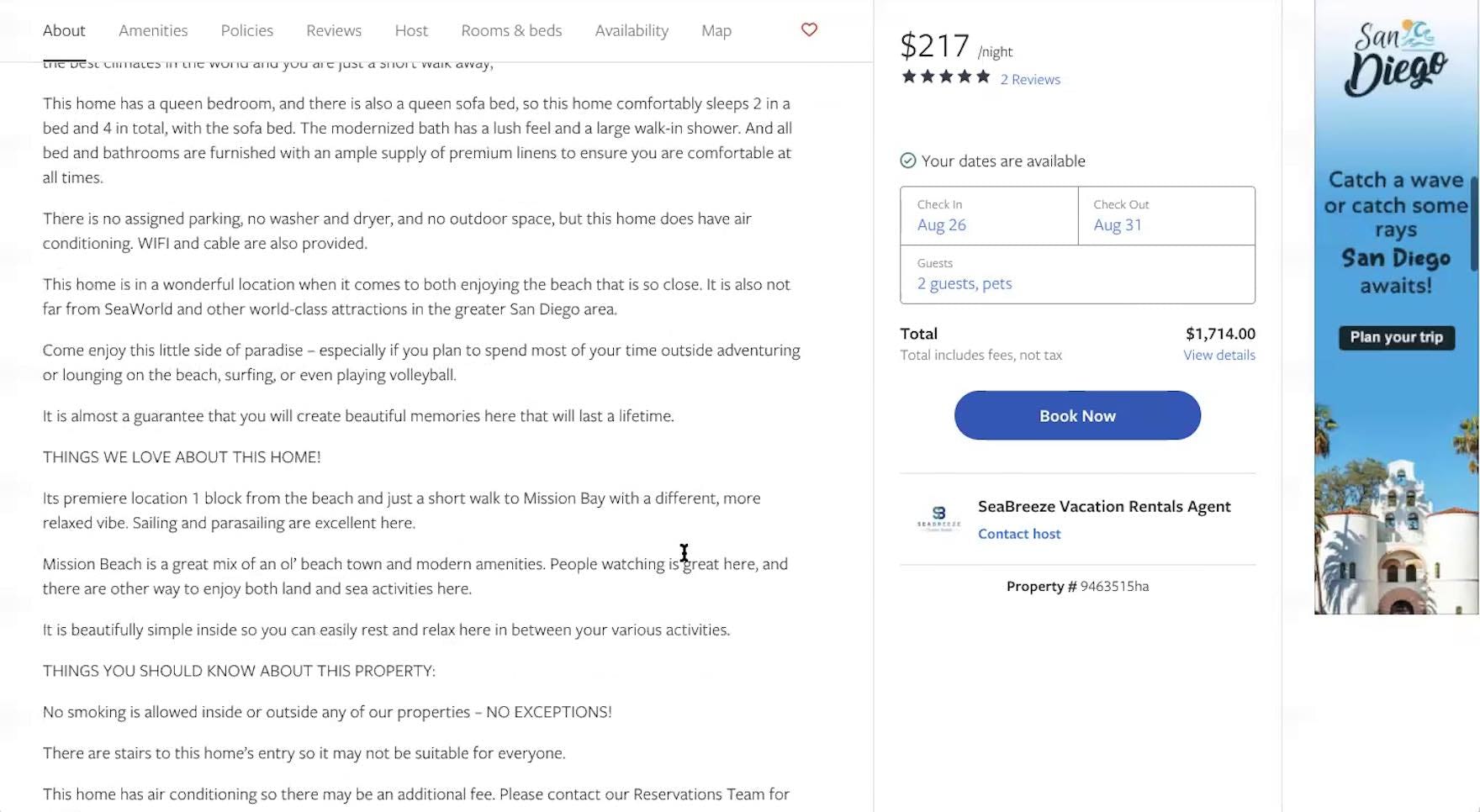
“It’s a little more difficult, I would say, to just kind of read through this…I’m never a fan of having to read through all this material.” This user shopping for rental properties at Vrbo complained about the lengthy “About Us” section for a property he was considering. Lengthy lines of text are intimidating and discourage users from reading.
Indeed, during testing we’ve observed users immediately go back to a previous page when arriving at a page that includes long lines of text, as they simply didn’t want to bother trying to “get through” the information.
Other users we’ve observed will reluctantly decide to read the text, but they often fail to read through the entire text and instead leave the page without a full understanding of the product or service.
Either way, long lines of text will be an impediment to users’ ability to gather more information about a product or service.
3) The Optimal Text Line Length for E-Commerce Sites & Accessibility Concerns
Given the issues caused by overly lengthy lines of text, what’s the ideal line length to support readability?
The Web Accessibility Initiative (WCAG) guideline 1.4.8 states that, in order to be accessible to all users, lines of text should be 80 or fewer characters (or 40 or fewer characters if the text is Chinese, Japanese, or Korean).
Our accessibility research, as well as our other general e-commerce Premium research, supports this guideline, as users have been observed to get fatigued when trying to navigate extremely long lines of text (e.g., 100+ characters).
Thus, this is another case where adhering to guidelines written based on accessibility principles will, at the same time, improve the experience for all users, including those without accessibility needs.
To ensure line lengths don’t exceed 80 characters, the CSS max-width property can be set using font-relative lengths of around 70ch or 34em (note that this value will need to be adjusted slightly up or down depending on the font used).
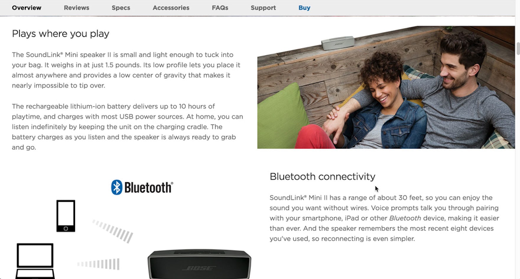
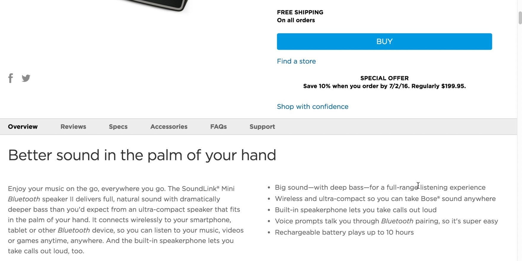
“They’re making a different point with the ‘Plays where you play’…‘Bluetooth connectivity’…it’s a lot easier for me to understand. You can tell that…these are the selling features that make our speaker different from others, and this is what makes it special.” A user at Bose found it easy to navigate the product description for Bluetooth speakers, which was structured by “feature highlights” and had line lengths that supported readability.
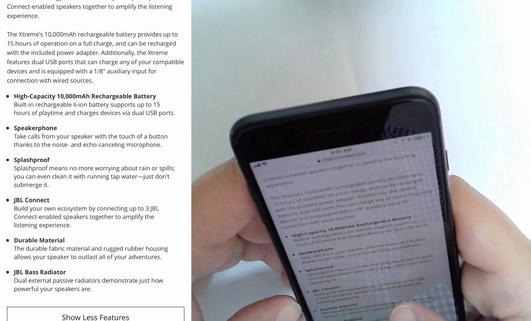
“I wanted to see if it was waterproof…and it said ‘Don’t submerge it’. Which I thought was helpful to know.” The product description for the speaker at B&H Photo explained the speaker’s features in an easy-to-read format featuring blocks of text and bullet lists. When it comes to the mobile UX, line length is less likely to be an issue due to the narrow viewport in portrait mode, but line length can become an issue in landscape mode if the design doesn’t support keeping lines of text at 80 characters or fewer.
Additionally, using blocks of text together with bullet lists can help break up lines of text, as can structuring product pages by feature highlights.
Support Users Attempting to Learn More about a Product or Service
“I can’t immediately tell from this picture but the fact that it says it fits ‘in the palm of your hand’ means it is quite small.” A user at Bose relied on product description text to get a sense of a speaker’s size. Images are critical for users considering products online, yet they often fall short. In these cases it’s critical that the text supports readability so that it can serve as an effective fallback.
Providing users with text line lengths of 80 characters or fewer is one step toward more readable text on a site.
However, it’s important to keep in mind that line length is only one component of text readability.
Additionally, in order to be in compliance with accessibility standards, text styling must be able to be set as follows:
- Line height (i.e., the spacing between lines of text): 1.5em (i.e., 1.5 times the font size)
- Paragraph spacing: 2em
- Word spacing: 0.16em
- Letter spacing (i.e., tracking): 0.12em
(Premium subscribers can view our guideline for more on general page design requirements for accessibility.)
By setting line lengths to support readability, sites will encourage users to learn more about their products and services — which, as our testing has shown, typically results in increased user interest and increases the likelihood that users will decide to purchase a product or service.
This article presents the research findings from just 1 of the 700+ UX guidelines in Baymard – get full access to learn how to create a “State of the Art” ecommerce user experience.

